Transcripts
1. Introduction: Hello, and welcome to this
watercolor painting Tutorial. Today we'll be painting
beautiful, elegant orchids. This painting is a
bit more challenging. It requires patience and
includes some tricky techniques, but it's absolutely doable, and I believe the final result
is well worth the effort. Tutorial focuses mainly on
the wet on wet technique, which we will use for both the
background and the petals. It's one of the most rewarding
techniques in watercolor, and it's always worth practicing whenever
you get the chance. So if you enjoy this method or want to improve
your skills with it, this lesson is perfect for you. I will guide you through
the entire process step by step in a calm
and relaxed way. We'll take it one section at a time so you can follow along comfortably and bring
these flowers to life through clear,
simple instructions. You will learn how
to paint a smooth, dark background, how
to achieve crisp, yet soft edges on
the main flower, how to manage the wet
on wet technique, how to create those soft, blurry lines on the petals, and how to bring out vibrant luminous colors
in your painting. My hope is that you approach this painting with patience
and a relaxed mindset. Take this time
just for yourself. No pressure, no rush. Enjoy the process and let it become a quiet
creative moment. With a little patience
and my guidance, we will create something
beautiful together. By the end of this tutorial, you will have a beautiful,
vibrant floral painting. I hope you'll feel truly
proud of what you've created. So gather your supplies,
take a deep breath, and let's begin this
joyful painting journey together. Happy painting.
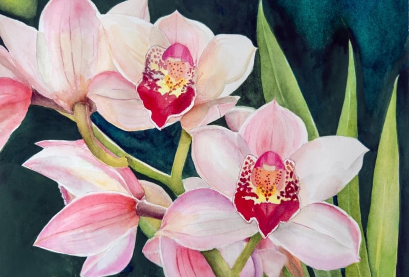
2. Project and Resources: I've prepared a selection
of helpful resources for your project available in the projects and
resources section. You'll find a PDF file with the supply list I used
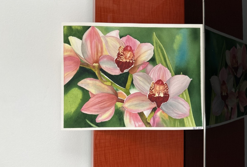
for this painting, along with a reference photo and an image of my finished
artwork for guidance. Line drawings in various sizes are also provided so
you can print and transfer them onto
your watercolor paper in the size that best
fits your needs. My painting is in a 12
by nine inch format. Additionally, there are
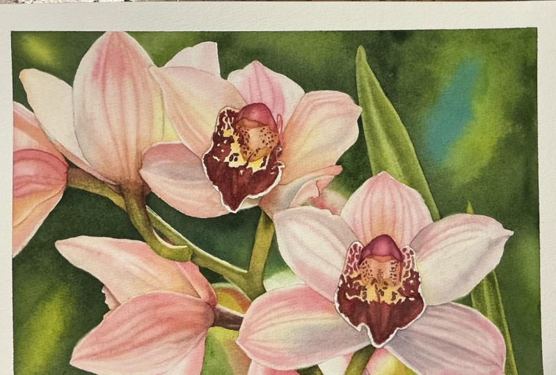
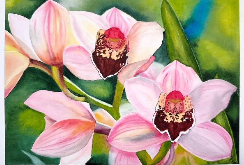
working progress photos to help you follow the process and focus on specific areas. Feel free to explore
these materials and use them to create your own unique
and beautiful painting. Please share your
final painting in the projects and
resources section. I also encourage you to
take the time to view each other's work in the
student project gallery. It's always inspiring to
see what others create and the support of your
fellow students can be incredibly comforting. Don't forget to like and
comment on each other's work. Lastly, I highly recommend watching each lesson
before you begin painting. This will give you a
clear understanding of what to expect at each
stage of the tutorial. If you find this class helpful, I would greatly appreciate it if you could leave
an honest review. Your feedback will help me
improve my content and assist other students in
deciding whether to join the class. Thank
you in advance.
3. Painting Plan: Before we begin painting, let me say a few words about the reference photo
and our painting plan. The reference photo
isn't perfect for me, but it's very close. I usually prefer
stronger lighting on the petals with clear cast
shadows and bold highlights. In this reference,
the light is more diffused and there aren't
any dramatic shadows. However, it has other
strong qualities that make it truly captivating. It's the kind of
image that's hard to walk past without
stopping to admire. First of all, the
subject itself is beautiful and the
composition is excellent. It follows the rule of thirds, which is my favorite
compositional guideline. The flower in the bottom right sits right on one of
the focal points. The way the flowers flow toward the left gives
a sense of movement, but also a feeling of
stillness and elegance. It's a lovely balance. The colors are also
very striking. There is a nice contrast between the
complimentary colors, the pinkish petals, and
the green background. On top of that, there is strong tonal contrast between the background and the petals. All of this makes it a wonderful reference and still a great
choice for a painting. We'll paint this
in several stages, and in each stage we'll
apply at least two layers. First, we will start
with the background. Then we will paint
the leaves and stems using the same green
mix from the background. After that, we will
clean the palette and switch to pinks and yellows
to paint the petals. Finally, we will finish by painting the centers
of the flowers. There will be plenty of helpful tips along the
way, but a quick note. This won't be a short tutorial. I encourage you to take
your time with it. Ideally, watch each video at least twice before
painting that section. I don't recommend jumping
into painting right away. First, watch the video
for the section, then watch it again, and only
after that begin painting. I know it takes more time, but each time you watch you
will notice something new. And I truly believe that's very helpful for developing
your painting skills. Now, let's prepare our
sketch in the next part.
4. Paper Preparation: In this part, I'd
like to briefly show you how I prepare my sketch
and what I use for that. After printing out
the line drawing, which I did in Procreate
app on my iPad, I cut it out and tape
the two pieces together. You might notice that I cut precisely along the
dashed line only on the sides that need
to match while leaving a small margin
around the outer edges. I do this to ensure I can
clearly see the corners of the image when I place it on a light pad with the
watercolor paper on top. When the line drawing is ready, I take a sheet of
paper from the pad. Here I'm using an arches
cold pressed pad, size ten by 14 ", which is perfect for a 12
by nine inch painting. I attach the line
drawing underneath the watercolor paper and
place both on a light pad. The light pad I'm using is a simple inexpensive one I found on Amazon, nothing fancy. It's very thin and gives enough light, which
is all I need. When I turn on the light pad and switch of the room lights, I can clearly see the lines and start tracing
them with a pencil. I always begin by marking
the four corners. This helps me later when placing the masking tape
in the correct position. For tracing, I use
a three H pencil. It's quite hard, I know, but I found that
it creates lines that are just perfect
for my liking. Tracing takes a bit of time, but I think it's worth it. You end up with a precise sketch with accurate proportions. Some people say that
tracing is cheating, but I strongly disagree. It's simply part of the process. If we have tools that make things easier, why not use them? It saves time and
it's a great help for anyone who struggles with
maintaining proportions. Personally, I'm
not interested in spending hours
perfecting a sketch, when I can do it in 5
minutes by tracing. I'd rather spend my
energy on painting. Many professional artists use
light pads or projectors, and I see nothing wrong with it. There are more
serious problems in the world than tracing an image. For me, it's not
an issue at all. Once I finish tracing, I double check that
all the lines are in place while the outline
is still attached. If I missed anything, this is the time to fix it. When the sketch is ready, I place the paper on a Gator board and
secure it with staples. This is the most
important step because the staples will firmly hold the paper
while I'm painting. Watercolor paper expands
and shrinks as it gets wet, but the staples keep it flat, so the finished
painting won't buckle. Used to soak the paper
and let it dry overnight, but I realized
that with staples, that step is unnecessary. So I no longer pre wet my paper. After stapling it
to the gator board, I use masking tape
on all four sides. This is where the corner
marks come in handy. They show me exactly where
to place the tape so that the finished painting will
measure exactly 12 by 9 ". The masking tape isn't there to hold the paper. The
staples do that. Its main purpose is to create a clean white border around
the finished painting. That border will be useful
later if I decide to frame it. Now that this is done, we can move on to
masking the main shapes.
5. Masking: I was wondering whether or
not to mask out the flowers, since the outlines of the
shapes aren't very complicated, and we could easily
paint around them. If you don't have masking fluid or simply
don't like using it, you can definitely
skip this part. You'll still be fine without it. However, I've decided to go ahead and mask the main shapes. We'll be painting the background wet on wet using two layers, and that technique requires
more focus and water control. I'd rather concentrate
on that instead of worrying about accidentally
painting over the flowers. Masking will take
just a few minutes, but it will allow me to paint the background with
much less stress. I'll be using Windsor Newton masking fluid with
a yellow tint. It looks green, but that's
just the color of the battle. Gently roll the battle to mix the yellow pigment
evenly into the fluid. We'll also need
an old battle cap or small dish for pouring
the masking fluid, a small piece of soap, and I keep mine in
a little container. A brush specifically for
masking fluid, a cheap one. This brush is only for masking
and a container of water. Now pour a small amount
of masking fluid into the separate container and
close the barrele right away. We don't want the
fluid in the barrele to be exposed to
air for too long. It can start to dry
and form clumps. Just pour what you need for the moment and keep
the rest sealed. Start by dipping
your brush in water, then gently rubbing
it on the soap. This creates a
protective layer on the bristles and helps prevent them from
sticking together. Don't worry the
soap won't affect how the masking fluid
behaves on your paper. Next, dip the brush into
the masking fluid and begin applying it around the edges of the
flowers and stems. Take your time here and
try to create smooth, clean edges, since these will become the actual
edges of the flowers. We don't want them
to look jagged. In the class materials, you will find a reference image showing exactly where I
applied the masking fluid. When you're finished, rinse
your brush thoroughly, clean it with soap again, and it should stay in good
condition for a long time. Now leave everything
to dry completely. In the next part, we'll begin
painting the background.
6. Background - Initial Layer: This part, we'll apply the initial layer
to the background. We'll be painting the background
in two layers and let me explain why I've chosen
to do this this way. Usually, one layer is enough. However, as you may know, watercolor paints often
experience a drying shift, meaning that the colors lose some saturation and lighten
in value as they dry. This shift varies
from color to color. To prevent the final background
from looking too faded, we can apply a light
first layer to help maintain color depth and
richness in the final result. This first layer doesn't
have to be dark. A light to middle value
is more than enough. It's especially
helpful when we are aiming for a dark background,
like in this painting. Not only does this initial
wash minimize drying shift, but it also helps keep the second layer more saturated
and easier to control. I start by spraying my paints with clean
water to activate them, making them softer and
easier to pick up. Then I prepare a few
petals of color. First, I use transparent yellow, which is an excellent
color for an underlayer. It's rich, glowing, transparent, and staining, perfect for keeping the vibrancy
of the greens. If you don't have this pigment, try mixing your cool
yellow with a bit of warm yellow to get a
nice primary yellow. Aim for a slightly
cooler yellow overall. Next, I prepare a Windsor
blue green shade. When mixed with
transparent yellow, it gives a beautiful
versatile green that we can shift toward either blue or yellow depending
on what we need. You can also use Windsor Green, hookers green or sub green. It doesn't really matter. These are just colors. What matters much more
is your tonal values. I also mixed permanent
rose with a little bit of transparent yellow to shift the pink slightly
toward the worm side. I'll be using a size 12 brush
and painting wet on wet, focusing on one
section at a time. Let's begin by applying a clean, even layer of water
to the first section, the upper left corner. Make sure there is a high
sheen on the surface. That means the paper is
wet enough but not soaked. Let me pause here to show you an illustration of
the five levels of wetness I like
to distinguish. For wet and wet painting, we want to reach the wet level. You should see a bright shen, but no petals, which would
indicate the soaked stage. If water gathers near the
masking fluid or tape, use your brush to gently redistribute those
petals evenly. We are aiming for even wetness, no dry spots and
no excess water. Now apply the paint. Start with yellow plus
a touch of green. Then add more green
near the petals. Remember this is just
the first layer. We're not trying to
achieve full depth yet. In the next area, I see a soft neutral gray. To mix that, use the
same three primaries, transparent yellow, Windsor
blue, and permanent rose. If you mix it too blue, neutralize it with
pink and yellow. If it's too pink, add a
bit more blue and yellow. And if it's too yellow, add a little bit
more pink or blue. Keep adjusting until you
get a soft balanced gray. Mixing your neutrals from
the same colors you're using throughout helps
maintain color harmony. Now wet the next section
with clean water. This one is larger, but with a big brush and the flowers
masked off it's manageable. It's a very hot day
as I'm painting this, so everything is
drying very quickly. By the time I reach the
bottom right corner, the upper section is already
drying, and that's okay. Just re wet the area
to even it out. A second layer of
water won't dry as fast because the paper
inside is already damp. When I tilted the board, some water flowed back into
the first painted area. We want to avoid that because
blooms are likely to occur. So I use a clean brush to
gently remove the excess water. Now the paper looks
evenly wet again. You can see from the angle that there is a nice high shin. I spread out any
remaining petals, and now I'm ready to paint. I begin with the neutral gray, then switch between blue, green and yellow using lighter versions of
the final tones. I apply more yellow in areas where I want to
feel warmer later. So when we add green
in the second layer, the yellow underneath
will sadly warm it up. And here is a very
important part. If you take anything
from this video, I would love for it
to be this moment. Once you've applied the
paint to the wet surface, start tilting the board
to move the paint around. This is extremely important, and it serves two main purposes. One, it helps the colors blend evenly without
brush strokes. Use the brush only to
deliver paint to the paper, and the blending is
done by gravity. And the second
purpose is that it helps even out wetness
across the entire surface. Uneven wetness causes
uneven drying, which can lead to blooms. Tilting the board, we can gently guide where
the paint flows, but we don't have full
control, and that's okay. A bit of unpredictability is
part of watercolors nature. As I tilt, I also clean
the masking tape, gently blotting away any water or paint with a paper towel. I continue tilting until I see the paint settle
and stop moving. Then I move on to
the next section. I repeat the same process. I choose one section, apply water, and then paint with the basic
colors I see there. Here I'm using a muted pink, which is permanent rose mixed
with that neutral gray, and I'm filling the
rest with green. I continue the same process
through the smaller areas. From certain angles, you can
see how wet the paper is. There is a clear shin. When I spot any excess water, I remove it with a brush
or distribute it evenly. In this larger section
on the bottom left, I'm also using some
permanent rows to suggest a flower
in the background. At this stage, the colors
blend together with no clear distinctions between petal and background,
but that's okay. We'll define the shapes more
clearly in the next part. For now we are just
creating a color roadmap, placing lighter versions of the main colors in roughly
the correct spots. Finally, in this last section, try to place the colors
similarly to how I did or follow your own interpretation or the reference more closely. It's your painting and you
can do whatever feels right. I'm simply sharing
how I would paint it. Here I'm placing some pinks and warm greens with a light
gap between the colors. Once all the colors are applied, let this layer dry completely. In the next part, we'll move on to the second
background layer.
7. Background - Main Layer: In this part, we will transform our background from the
pale underpainting into a deep and vibrant
version that creates beautiful contrast against the light
colors of the flowers. Let's begin by preparing
larger amounts of paint. First, I mix transparent yellow with Windsor
blue green shade. This will be my main green. Next, I mix the same
yellow and blue, but this time using
more yellow than blue to create a warmer green. For the darkest green, I again use transparent
yellow and windsor blue, but now I darken the
mix with pains gray. So now we have three
shades of green. We also need pure windsor blue, which we'll use in the
upper right section. Start by applying a
layer of water to a section you feel comfortable
painting in one go. You don't have to wet the
entire background at once. Just focus on one
manageable area at a time. Take a moment to notice the smooth gradients
from the previous layer. If you followed
the steps so far, your colors should blend softly without any
blooms just like mine. Once the paper is evenly wet, begin applying your colors
in a similar way as before. But this time, be a bit bolder. Don't be afraid to
use stronger colors, but here is something
very important. Using strong color or a dark tone does not
mean using thick paint. That's a common misconception. When mixing on your palette, especially the dark green, aim for a deep color but
not a thick consistency. The paint should
still flow easily. We look at different levels
of paint consistency, I've included a small
illustration here. I'm using something
between cream and honey. The value is dark or mid dark, but the mixture still moves
smoothly on the palette. It's not thick and heavy. So don't think of your brush as a tool
for blending colors. Think of it as a delivery tool. Your brush's job is to carry paint from the
palette to the paper. The blending happens on the paper with the help
of water and gravity. After applying the paint, tilt your painting to help the colors move and
blend naturally. This distributes
the paint evenly and creates those
beautiful soft gradients. Let the paint do it something. Try not to overctrol
it with your brush. Just deliver the color, then tilt and let it go. In this small section, I continue with the dark
green, and at the bottom, I add a few strokes of pink to suggest a petal
in the background. It doesn't have to match
the reference exactly. This is just a minor element, so don't worry about
being precise. The goal is simply
to suggest a petal. In the next three
smaller sections, there is nothing unusual. I'm just placing colors
I see in the reference, more or less in the same areas. Keep in mind, this is
just the background. It doesn't need to look
like anything specific. These shapes are
blurry and abstract, and that's exactly what we want. When combined, these
abstract shapes will suggest flowers
in the distance. If you add too much detail, the background may distract
from the main subject. So don't stress over it. Just lay in some greens,
yellows and pinks. Refine a few of these areas gently with a
scrubber brush later, but only slightly, we don't want to spend
too much time here. In the bottom left section, I'm not applying water
over the entire area. In the illustration, I've
marked the wet area. You can see that I stopped just before the edge of
a background petal. We'll apply color up to
that point and soften the edge later to suggest
blurriness and distance. Again, I use dark
green, warm green, and a touch of permanent
rose on the right, letting the colors
blend naturally. I blot any excess water or paint off the masking tape
with a paper towel. I only move on to the
next section after tilting and making sure
that the paint has settled. Finally, in this last section, there is nothing special
to mention really. I'm just looking at the
reference photo and placing colors in
roughly similar spots, not thinking about details, just blocking in
the main colors. At this point, we can finish this part and leave the
layer to dry completely. In the next part, we'll finish the background and remove
the masking fluid.
8. Finishing the Background and Preparing the Flowers: Once the background
is completely dry, there are a few things I like
to do before we move on. First, I use a scrubber brush to soften certain edges and
lift out some paint. I'm using a Windsor Newton
Galeria brush size four. I've used this one for years. If you don't have
it, you can try any acrylic brush with
slightly stiffer bristles. But if you don't have
one of those either, your regular round watercolor
brush will work too. Will just take a bit more
time since it's softer. The stiffer scrubber brush simply makes the
process quicker. I dip the brush in clean water, blood of the excess
on a paper towel, and then gently
scrab along the edge of the background petal
moving back and forth. This reactivates the hard edge, and I can dab it with a paper towel to
lift out the paint. I repeat this process until
I'm happy with the result. This softens the edge, makes it look blurry and helps to create the
illusion of distance. Pushing that flower further into the background as if
it's out of focus. I do the same in
a few other areas to enhance the out
of focus effect. We can also lift a bit of
paint from other spots just to create highlights or add a little light to
balance the composition. Next, I switch to
a round brush size eight and a smaller
liner brush size zero. I'm going to add more
color to the petal in the background and paint
a few soft blurred lines. I begin by wetting the
area because I want to paint wet and wet to
achieve smooth gradients. Then I pick up a mix
of permanent rows and just a touch of transparent
yellow to create a warm pink. I drop this color into the petal to build
up the intensity. Now, here comes a
very tricky part, and we'll be repeating this
technique on many petals, so it's a good
place to practice. Watch how your paper dries. Once the hychen fades and the paper reaches
the moist stage, you can refer back
to my illustration. It's the perfect time to use the liner brush to paint
soft lines. It's not easy. You might pick up
too little paint or paper might still be too
wet or already too dry. It's really tricky to
catch that perfect moment. But if you get it
right, your line will have gently blurred edges, not as sharp as wet and dry, but not fully
diffused either like wet on wet, a subtle softness. Using that same small brush, I also add a darker tone to the stem I noticed
on the right. I darken the left side with a
purple mix, permanent rose, and Windsor blue,
and then I lift out a highlight by gently
dabbing with a paper towel. I also want to show
you that you can lift paint even with a regular
watercolor brush. Green pigments, in
particular, lift easily. I'm using my round
brush size eight, gently applying clean water
to a dark green area, and then dabbing it
with a paper towel. I repeat this process gradually. It's best to do it
step by step because if you lift too much at
once, you can lose control. Keep repeating until you
achieve the desired effect. In this case, a blurry out of focus leaf
in the background. Now that the background
is finished, we can remove the masking fluid. If the masking was applied correctly and the
fluid is fresh, it should come off in one piece. Once the masking
fluid is removed, I always inspect the
edges of the flowers. Here, for example,
you can see that some green paint
crept into a petal, creating a slightly uneven edge. I like to fix things like
this for a cleaner finish. To fix it, I use a clean damp scrubber
brush placing it on the unpainted white side and rubbing gently
along the uneven edge. Then I dab the area with a
paper towel to lift the paint. This smooths out the edge and makes the final painting
look more polished. Yes, while doing this, some background color may bleed slightly into
the white area, but that's not a problem. It won't be visible
in the final result. There's also a larger leaf in the upper right that's
further back in space. To make it feel
more out of focus, I use the scrubber brush
now to soften its edges. That way, when we paint it, it will look slightly blurred and sit behind the
more defined leaves. And with that, we can
finish this part. In the next section,
we'll paint the leaves.
9. Leaves: In this part, we'll start
painting our main subject, beginning with the leaves. This should be a fairly
straightforward process. I'll be using a size eight
round brush for this step. I'm using the same greens as
we used in the background. On the left, a
middle green made by mixing transparent
yellow and Windsor blue, and on the right, the same mix, but with more yellow, making it a warmer green. I begin by picking up the more yellowish green and using
the wet on dry technique, I apply the color
to the first leaf. In hindsight, wet and
dry might not have been the best idea since it was such a hot day and the
paint dried very quickly. I probably should have applied a thin layer of water
first to avoid hard edges, but I managed to make it work. After applying the warmer green, I shift to the middle green to paint a larger
portion of the leaf, leaving the tip in that
later warmer tone. Then I pick up the dark green, which is transparent yellow, winds are blue, and paints gray, and I run my brush along the left and right
sides of the leaf. This way, the edges in the
center stay lighter and warmer while the darker areas create a sense of
indentation and depth. Let the first layer dry and then repeat the same
process on the second one. Now let's dry the leaves with a hair dryer and once
they are completely dry, we will add some
finishing touches. First, I want to lighten
the edge of the leaf. To do that, I'm using a regular round watercolor
brush and clean water. I apply water to
the edge and then dab it with a paper towel to
lift the activated paint. This creates a subtle highlight. I'm not using a scrubber brush here because that
would be too harsh. I only want a gentle
soft highlight and a regular soft brush
is perfect for that. On the second leaf, the
one that's closer to us, I want to add a bit of shadow. Painting over green
can be tricky, since it lifts very easily, so we need to be very gentle. One way to do this is by using
the dry brush technique. I spread the bristles
slightly to create a small fan shape
and then pick up some drier paint from the
palette in a darker tone. With just a small amount
of paint on the brush, I gently apply to the
areas I want to darken. This is a very subtle method. It darkens the area slightly and adds a natural looking
texture at the same time. To there's also something
here that we can fix. Do you see that darker line along the left edge of the leaf? We can remove it by
applying a bit of water to that edge and then
dabbing it with a paper towel to lift the paint. That should remove
the darker line. If we lift too much and
the spot becomes too pale, no worries, we can always add a little color back
in to even it out. Now we can move on to
painting the stems.
10. Stems: At this stage, we
can paint the stems since we still have the
green mixes on the palette. Later, we will switch to a different color
palette for the flowers, so it's a good idea to finish
all the green areas now. In terms of color, we'll be using very similar
mixes to before. First, transparent yellow and windsor blue with more
yellow than blue. Next, a slightly
more natural green, the same mix, but with a
touch of permanent rose. Adding a complimentary
color shifts the green into a
more natural tone. For the dark green, we again
use transparent yellow, windsor blue, permanent
rose, and pains gray. The rose shifts the
tone slightly and differentiates it from the cooler greens
in the background, making it feel warmer
and more distinct. We'll also need a
brownish maroon color, which is easy to mix. Start with permanent rose and then add some of
that dark green mix, which already
includes pains gray. You can also add a
little more pains gray to deepen the tone. You can see, we're still working with the same limited palette, which helps maintain color harmony throughout
the painting. The fewer pigments we use, the more unified our
painting will look. So if we don't need to
introduce a new color, we won't painting the stems, I will use a size
eight round brush, and we will divide the
process into two parts. First layer, a lighter base
that maps out the colors, and the second
layer applied after the first dries to
deepen the tones. In this first layer we're
just mapping out the colors. Placing a lighter version of each final tone in
the correct spots. This step helps build stronger, more vibrant color
in the next layer. Pay special attention to the highlights along
the edges of the stems. There is one particularly
strong highlight that we need to leave
completely unpainted. That's the brightest spot
in the whole painting, and we don't want to lose the pure whiteness
of the paper there. Cover all the stems with these base colors and then
leave the layer to dry. I used a hair dryer to
speed up the process, but if you do this,
always let the paper cool for a few minutes
before continuing. If the paper is still warm, the paint will dry too
quickly in the next step, and you will lose your control. Once the first layer
is completely dry, the second layer is
quite straightforward. We've already mapped
everything out. Now we just reinforce
the colors with a second pass using
the same mixes, but with slightly darker values, especially in the areas near the petals where the
stems fall into shadow. Here on this curved stem, I begin with a light warm green. While the paint is still wet, I drop in a bit of our brownish maroon color and let the colours
mingle naturally. I won't be adding any
more detail here. I don't think it's needed. The goal is to get the
tunnel values right and place the colors roughly
in their proper spots. After applying the second layer, let everything dry completely. There is one more
optional step we can take after the
stems are dry. I'm going to use a
scrubber brush to gently soften the edge of the
highlight on one of the stems. I need to be very careful
here because the white stripe is very narrow and the brush
I'm using isn't small. With a damp scrubber brush, I carefully activate the edge of the paint and dab it
with a paper towel. This softens the hard edge and creates a more
realistic glow effect, enhancing the illusion of light. And with that, we can
finish this part. In the next one, we'll
start painting the flowers.
11. Flowers - Initial Layer: After finishing the stems, it's finally time to
paint the flowers. We'll begin by applying an initial layer
to all the petals. Notice that we are following
the same approach as before. First, we apply a
lighter version of the final colors to
build a foundation. Then in the second layer, we deepen the tones
and add details. I'll be using a size ten
round brush for this part. Start by preparing
a large petal of permanent rose and one
of transparent yellow. Mix these two colors in the
middle of your palette, creating a range
from pink to yellow. The most important color will be the orange tone in the center, which you can shift
more toward pink or yellow depending on
the area you're painting. On the other side of the palette, I'm mixing a neutral gray
from transparent yellow, permanent rose,
and windsor blue. Adjust the ratios until you
get a soft grayish bage. The goal of this
layer is to cover all the petals with
their base colors. Let's compare the
reference photo with how the painting looks at
the end of this stage. You'll notice that there
are no dark tones yet. At this point, we're only concerned with light
and middle values. We want to preserve
the lightest areas and apply soft subtle colors
across the petals. You'll also see that the colors
blend between the petals, and that's perfectly fine. We're not focusing on
edges or separation yet. We're simply building
a foundation. In the next layer, we will
deepen the tones at shadows and details and make the
petal shapes more distinct. We'll be painting wet and
wet to achieve those soft, delicate transitions
between colors. This helps us build the
signature watercolor glow, smooth gradients, no hard edges. Start by applying
a clean even layer of water to the first
flower on the left. I'm wetting the
entire flower and painting all three
petals at once. Then I pick up the orange mix and begin in the upper part, leaving the edge later. Next, I switch to
yellow and pink, depending on the tones I
see in the reference photo. Again, don't think about
the details or dark tones. This is just the initial layer. Focus on keeping the lightest
areas clean and untouched. Once the first
flower is finished, move on to the next, but skip any petals that touch wet areas
you just painted. We want to avoid
having new water or paint bleed into a wet petal, which can create blooms. So on the second flower, I skip the left petal, which touches the first
flower and paint the rest. I apply a clean water layer and make sure I
see a high sheen, just like we did
for the background. This ensures the paint flows smoothly, creating
soft gradients. Here I begin with yellow, then move to orange and
pink in the upper areas. Notice how soft the
pigments look on the paper. That's exactly what we want. No harsh edges, just
gentle spreading color. If the reference photo shows an area that will
eventually be much darker, you can slightly
deepen the value now, but still stay within the
light to middle range. For example, the bottom part
of this petal that will later be dark can receive
a bit more pigment now. If there is a soft shadow like the one on the left
side of the flower, I paint it using our gray mix. If the paint flows too far, you can always rinse
and blot your brush and then use it gently
to lift the axis. This works well for
creating soft highlights also or shaping the
shadows more carefully. For the next flower, I'm applying water to the
three petals on the right, but skipping the two on
the left since they are touching wet areas
we just painted. Once those dry, I will come back and paint
the skipped petals. Throughout all the flowers, I'm using the same
set of colors yellow, pink, orange, and
the neutral gray. This consistency helps
build a harmonious palette. Everything looks unified
and intentional. This is a perfect
painting to train your eyes to notice
subtle shifts in color. Sometimes you will see a
slightly dirty yellow, a less saturated pink, or a more muted orange. Whenever you spot a neutral
or slightly brownish tone, just add more of that gray mix. For example, mixing pink with gray gives
you a muted pink. The same principle works
for orange and yellow. Just mute them slightly
with gray when needed. Also, don't switch
to a smaller brush. I'm using a size ten, and I think it's perfect here. Using a smaller brush might tempt you to focus
on tiny details, which we want to avoid for now. A larger brush helps you
work more smoothly and keep your focus on big shapes
and smooth transitions. On the last flower, I'm using mostly
pink and gray with a touch of yellow on the
bottom left and top petals. Once this layer dries, don't forget to go back and finish any petals you
had to skip earlier. And now with
everything filled in, we have an excellent
base for developing tonal values and adding
details in the next part. Let this layer dry completely, and in the next part, we will
begin finishing the petals.
12. Finishing the Petals: This part took me the
longest to complete because now we'll be adding
details to the petals, and that requires more
care and attention. As you will see, we're
going to deepen the colors and really start thinking
in terms of tonal values. We'll darken areas that need more depth and we'll also add those soft blurry lines that give the orchids
their elegant character. Let's get started. I'll be using two brushes for this step. Size ten, round brush, and a size zero liner
brush for the fine lines. At this stage, I'll be focusing
on one petal at a time. This is the most time
consuming part of the process, so I encourage you
to take your time, relax, and paint mindfully. If your mind is calm and
your movements are slow, your result will be soft and
controlled. Don't hurry. You can start with
whichever petal you like. I prefer to work
from left to right, so I will begin with the
petal on the left flower. There are three main questions I ask myself while working now. Which areas need to be darkened, which colors need to be deepened to achieve the
correct tunnel value. And this is the most
important question because tunnel values are
more important than color. Second question is, are there light areas I
need to preserve? If so, I will be extra careful not to cover
them accidentally. And the third question is, are there any blurred
lines I need to add? And these help give the
petals structure and texture. I keep these three questions
in mind as I work, and I follow that order. First, I deepen the colors, then I make sure that I
don't lose any highlights, and if I did, I lift excess
paint with a damp brush. And finally, when the hyen
disappears from the paper, I add blurry lines
using the liner brush. To darken areas, I'm not
mixing any new colors. I simply use more
saturated versions of the colors already
on my palette. And if I need to go darker, I just add a bit of
our neutral gray mix. On the first flower, I paint
the upper and bottom petals, and then I have to pause because the middle petal is
touching the wet ones. We'll come back to it
later once those are dry. Moving on to the next flour, I repeat the process, apply a layer of clean water and then apply deeper colors. This part is actually
my favorite. The second layer gives the petals so much
more depth and body. With the first layer
already in place, this step feels smoother
and more relaxing. The new transparent washes blend beautifully with
the previous ones. For the deepest browns, I use concentrated mix
of transparent yellow, permanent rose, and
the neutral gray. Now, let's talk about
the blurry lines. Once the colors are down and the tunnel
values feel right, wait until the paper
loses its high shin. And this is the moist stage. Refer to the earlier
wetness chart. While waiting, load
your liner brush with pink paint and test a line. If the paint spreads too much, the paper is too wet, or your paint is too watery. If the line disappears, your paint might be too dry or there is not enough
paint on your brush. You need to adjust
the wetness of your brush to match
the papers surface. This takes practice because the conditions change
quickly as the paper dries. Each brush stroke
is a kind of test. You'll get better
with experience. Might need to go
over the same spot a few times until
the line appears, and that's totally fine. You'll have plenty of
opportunities to practice this technique with all
the remaining petals. From here, the process repeats. I will show you a
few more petals and then leave you to
continue at your own pace. You can refer to the work in progress photo to help
guide your choices. But I strongly
encourage you to try painting at least two
petals on your own without looking at my work in progress photo and then
compare with the photo. This will help you develop your own judgment
and confidence. This petal here has
a strong color, similar to the one
we skipped earlier. After applying
water to the petal, I begin with a mix
of permanent rose and transparent yellow
to create orange. Then I shift to a
more pinkish version using more permanent rows. Oh To deepen it into a maroon tone, I add some of the neutral gray. I prepared a more concentrated
version of the gray, but it's the same mix as before, yellow rose and windsor
blue, just stronger. I apply a lighter tone of this grayish mix to the
bottom part of the petal. Then I mix a deeper maroon red using permanent
rose as the base, a bit of orange, so permanent rose and
transparent yellow, and neutral gray to darken it. As long as the
paper is still wet, I can continue adding color. But once the surface becomes
dull and mat or just moist, it's too late for adding washes. At this point, the
only safe thing to do is to add those blurry lines. Each brush stroke is a test. Do I need more
paint on the brush? Should it be more concentrated? Am I getting the effect I want? If the paper is still moist, your lines will
blur just a little. Perfect for this stage. If your paint is
too watery, though, you risk pushing pigment
around and creating blooms. So make sure your paint
isn't too watered down. On this petal, I
also add more pink, more gray, and a bit of a muted orange near the
center of the flower. Then I start adding lines, extremely delicate and soft. Here is one more example. You can see the petal has a high shen when
viewed from an angle. If there is a small petal, I distribute it evenly with a clean brush to ensure
the petal is evenly wet. Then I add more pink, one spot in the middle
and two side stripes. Then I wait about 45 seconds and then tilt the
painting again. The shin is now low, a matte look, and that's
my sign to add lines. I test the first stroke, don't see it clearly, so I adjust and try again until the
consistency is just right. So that's how we
finish the petals. Now I would like you to finish the remaining petals and I
will join you in a moment. Here is my result. I've added more color and
lines to all the petals, and before moving on
to the flower centers, I take one last good look. I try to assess whether there
is enough contrast between petals and whether the darkest
areas are dark enough. For example, I notice
one flower has two petals on the left side
that don't stand out clearly. Also on the right side, I could add darker tones near the center to enhance
the illusion of depth. So with my size ten brush, I apply water to the petal. I want to adjust and then drop in more
pigment, wet on wet. This increases
contrast and makes the petals more distinct
from one another. I also add more brownish yellow near the center on the right, and also a bit more of that dark maroon red in the
flower in the bottom left. Finally, I darkened
the two bottom petals on the last flower. The petals are now finished. The very last thing you
might want to do is lift out some paint to create
highlights or smooth edges. You can use a damp
scrubber brush or a regular round
brush for this. I do this mostly
along the edges, not all edges, just a few ones, just to soften them slightly. It's a small detail, but it really contributes to the overall look of
the finished painting. And with that, we have finished the most
challenging part. Congratulations. Well
done. In the next part, we'll move on to painting the
centers of the flowers. And
13. Centers - Initial Layer: Some completed the petals, and I think they look really beautiful against the
dark green background. There's not only contrast in tunnel value with
the light petals against the dark background, but also color contrast
between the pinks and greens. That's a very
powerful combination, and it really makes
the orchids stand out. Now we'll begin finishing
the painting by working on the centers
of the flowers. I will divide this process into three short manageable parts to make it easier to
follow step by step. For this first part, I will be using a size
eight round brush. Let me just clean my palette bit to make room for cleaner colors. I'll be using the same
pigments as before, transparent yellow and permanent rose mixed in
various proportions. Start by applying a water layer but not over the entire area. The central part of an orchid consists of
two main sections. I looked this up for accuracy. The upper part is called the column and the lower
part is called the lip. By the way, I also
learned that two of the flower parts are
technically petals, and the other three are sepals. But for simplicity, I've just been calling them all petals. When wetting the area, avoid applying water
to the edge of the lip because we want to keep that border
clean and white. Once the water is applied, begin painting from the
column using permanent rows. As you move downward
into the lip, gradually shift toward
orange and yellow tones. Remember to leave the
very edge unpainted. We want to preserve
that nice white border. This is just the initial layer, which will remain
visible beneath the darker markings
we'll add later. At this stage, I thought the
colors were dark enough, but as you will see later, I will end up darkening the
center quite a bit more. It always amazes me
how deep we need to go with watercolor tones to
achieve the right contrast. While the area is still wet, you can drop in more intense
yellow in the center and even a bit of strong orange
just below the column. That area will eventually
become quite dark. Now, repeat the same process
on the second flower. Both centers are
constructed the same. They just differ in the
angle we see them from. Once you have applied the
initial layer to both centers, dry the area with a hair
dryer and as always, let the paper return to room temperature
before moving on. In the next part, we will build up more depth and detail. The
14. Centers - Mapping Out the Markings: We are very, very close to finishing this
beautiful painting. Now we'll add a little
more character to the flowers by mapping out
the markings on the lips. At this stage, we will apply a lighter layer just enough to define where the
markings will go. It also serves as a base for the darker layer we will
add in the final step. Let's begin by mixing two
shades of a rich maroon color. If you're familiar
with Perlin maroon, the pigment number is PR 179. That's the kind of
tone we're aiming for. To mix this, use transparent
yellow, permanent rose, and then add a touch of surprising windsor blue
to deepen the mix. This time, use more
permanent rose than yellow. On the other side
of the palette, I mix the same
three colors again, but with more pink and blue to get a deeper
cooler maroon tone. I will also keep pure permanent rose ready
on the palette. We'll now be painting
small details, so I'm switching to
a size four brush. Start by picking up
a lighter tone of your first maroon mix and apply it to all the
markings on the lip. I already drew these
shapes in the sketch, so now I just need to fill
them in no guesswork. I'm painting wet and
dry here because we need sharp edges
for these shapes. It's a simple
straightforward process. Just follow your pencil lines. Don't worry about blooms or
patchy colors in this layer. It doesn't matter at this point. This is only a mapping layer. It gives us a visual guide and a tunnel base to help maintain depth in the
final darker layer. I also painted the small dots in the center at this stage, but later, I realized that it would have
been better to wait. After darkening the center, I found that the value
was still too light, and having the dots already there made it very tricky
to paint around them. So my advice is skip
the dots for now. You will likely need to darken
the central area later, so it's much easier to
add those tiny dots at the very end once the
darkest tones are in place. When you finish applying
the slight maroon layer, pick up permanent rose and
apply it to the column. Then dry everything
thoroughly with a hair dryer and as always, let the paper cool to room
temperature before moving on. In the next part, we'll
finish the painting. But
15. Centers - Finishing Touches: This part is
especially satisfying. After adding these
final dark details, the flowers will gain much
more depth and character, and we will officially finish
our beautiful painting. I'm using the same brush and
the same colors as before, but now we'll be working
with much darker tones. I'm also using slightly more
permanent rows in the mix. You may be wondering,
why didn't we just use the dark
color from the start? Why do we always divide the
process into two stages? Well, here is why. If we had applied a single
dark layer right away, it would likely have dried
too pale due to drying shift. And we would have had to
apply a second layer anyway. By working in two steps, the first layer acts as a base, and it's much easier if the first layer is
less pigmented. And here's the logic. A lighter, less pigmented layer adheres
better to the paper. When you apply the
second darker layer, you're less likely to disturb
the paint underneath, which can otherwise cause
patchiness or lifting. The first layer were
more saturated, it would be easier to damage it while applying
the second one. So in short, the
light base layer helps prevent drying shift. It builds up ton gradually, and it protects the surface from unwanted lifting when
applying dark details. I hope that makes sense. Now I'm applying a much
stronger maroon tone using our dark mix and deepening
all the darkest areas. This not only makes the
markings more eye catching, but it also helps define
the form of the leap, suggesting slight
indentations and structure. Next I mix permanent rose with a dark mix and apply to the
shadow areas of the column. Then I fill in the
remaining space with pure permanent rose. Below the pink shape
of the column, I add a bit of
orange and drop in some darker color in the
corners for contrast. Now, when the dark
tones are in place, it's clear that
the very center of the flower is too pale compared to the
surrounding values. And that confirms what
I suspected earlier. This area definitely
needs to be darkened. And yes, I'm now
wishing I hadn't added those dots earlier because I have to carefully
paint around them. And that's why I
recommended earlier that you wait until
the end to add them. I repeat the process
on the other flower, and I also noticed a very thin line running along
the left edge of the lip. So I paint that in as well
to add clarity to the shape. The very last touch is to
use a clean damp brush and a paper towel to gently lift out a bit of pink
paint from the column. This creates subtle
highlights suggesting the reflective shiny surface
of this part of the flower. And with that, we can officially call this
painting finished. Now it's time to
sign your painting. I always sign in the bottom right corner using
the initial of my name, my surname, and the year. It's a simple but
meaningful habit. It helps me track
my progress and remember when each
painting was created. After signing, we can remove the masking tape
to reveal a clean, crisp border around the image. To detach the painting
from the gator board, I always use a palette knife to carefully lift each staple. Finally, I trim of the extra
margins with the staples, and the painting
is ready to frame or store in my archive. Let's now take a moment to sum up everything we've learned
from this painting.
16. Summary: Thank you so much for joining me in this orchid
painting tutorial. I hope this project brought you as much joy as it
brought me and that you feel proud of your progress and inspired to explore
further with watercolor. Before we wrap up, let's take a moment to reflect on what
we've learned together. Began by preparing a
clear pencil sketch and masking of the flowers. Then layer by layer, we built a soft, smooth background using
wet on wet techniques, focusing on fluid
transitions and harmonious greens to support
the delicate flowers. We practiced applying
light initial layers for the leaves, stems, and petals, always preserving the highlights and gradually
building up the tones. We learned how each
first layer provides both a guide and a foundation for the more
detailed second layer. The tutorial gave us space to refine our wet on wet skills, creating natural
color gradients, soft petal textures, and beautifully diffused
background elements. We emphasized
letting the water do the blending rather than
overworking with the brush. Working on the petals
and flower centers, we developed greater brush
control by practicing how to add soft blurred lines at just the right
moment of dampness. We also introduced
small tools like the liner brush and
scrubber to soften, lift, and define without
overcomplicating. We also saw the power
of tonal values, how darker tones
in the centers and shadows added form,
contrast, and depth. We balanced warm and cool
tones to bring harmony and using layering intentionally to avoid lifting or disturbing
previous washes. In the final steps, we refined edges,
lifted soft highlights, and signed the painting. We learned how to check
our work as a whole, make subtle adjustments,
and create a clean, professional finish
from removing the masking fluid and
correcting the edges of the main subject to
detaching our paper from the gator board and leaving a white border around
the finished painting. Have to say this. This was a detailed and
demanding project, and I'm truly proud of how
much you accomplished. Thank you for trusting
me to guide you through it and for taking the
time to slow down, observe, and enjoy each
step of the process. I hope this painting gave
you a sense of calm, focus, and joy and that it inspires you to keep growing on your
watercolor journey. Take care and happy painting by
 Krzysztof Kowalski, Watercolor artist