Transcripts
1. Introduction: Hello, everyone, and welcome to this cheerful tutorial
in which I will show you how to paint colorful
pansies in a glass vase. This is a very lovely and
vibrant painting with a beautiful color
composition that will hopefully bring you lots of joy and fun
while painting it. You may think that
it looks difficult because there are many
elements to paint, but I would like to
shift your thinking from This is difficult
to this is easy, but I need to slow down and paint everything step by step. I will guide you through
the entire process, and you will see that it
is definitely doable. We simply have to paint
many smaller elements that will eventually come together into one big,
beautiful painting. Won't be using any
difficult techniques here, not even masking fluid. We'll paint everything using only two basic
watercolor techniques, mostly wet on dry and just
a little bit of wet on wet. There is nothing challenging
in terms of technique. The main challenge
in this project is patience and carefully
following the process. This painting will take
a bit more time to finish if you decide to
follow my steps closely, but I truly believe that the final result
will be worth it. In real life, the painting looks beautifully
vibrant, colorful, and positive, and it makes me happy every
time I look at it. I hope you will feel the same once you finish
your own version. I would describe this project as suitable for more
advanced painters, but only because there are
many flowers to paint, not because any single part
is technically difficult. You're a beginner, you can
absolutely give it a try. You can simplify the
way you paint or use this project as a
gentle challenge and follow all the steps. You can also paint
just one pansy or perhaps a small
composition of three flowers. You do not have to paint
the entire final artwork. A small study of
just one flower is a wonderful way to practice
the order of layering. And to see how each layer
affects the others. This is a very helpful exercise. I hope you feel inspired
to try this painting, and if you are ready,
let's move on, and I will explain
the painting process we are going to follow.
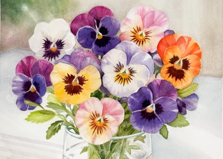
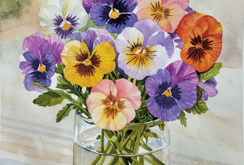
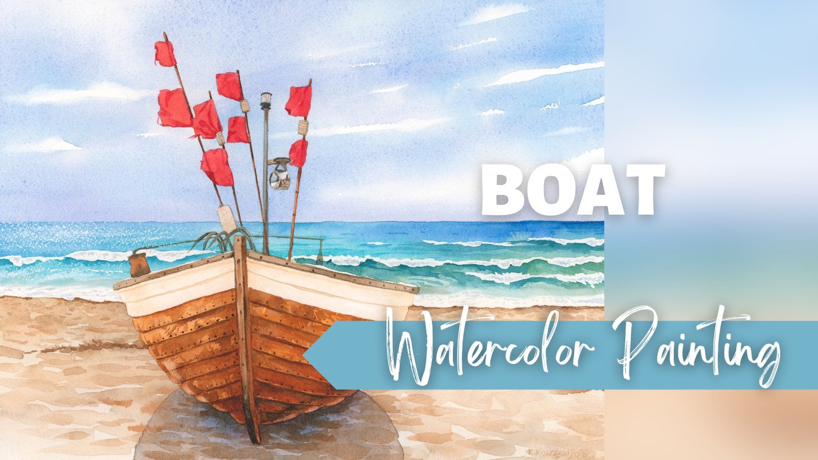
2. Project and Resources: I've prepared a selection
of helpful resources for your project available in the project and
resources section. You'll find a PDF file with the supply list I used
for this painting, along with a reference photo and an image of my finished
artwork for guidance. Line drawings in various sizes are also provided so
you can print and transfer them onto
your watercolor paper in the size that best
fits your needs. My painting is in a
15 by 11 inch format. Additionally, there are working progress photos to help you follow the process and
focus on specific areas. Feel free to explore
these materials and use them to create your own unique and
beautiful painting. Please share your
final painting in the projects and
resources section. I also encourage you to
take the time to view each other's work in the
Student Project Gallery. It's always inspiring to
see what others create and the support of your
fellow students can be incredibly comforting. Don't forget to like and
comment on each other's work. Lastly, I highly recommend watching each lesson
before you begin painting. This will give you a clear
understanding of what to expect at each
stage of the tutorial. If you find this class helpful, I would greatly appreciate it if you could leave
an honest review. Your feedback will help me
improve my content and assist other students in
deciding whether to join this class.
Thank you in advance.
3. Painting Plan: In this painting, I
didn't use masking fluid, which may be a relief
for some of you. However, if you like
working with masking fluid, you can apply it along the edges of the
flowers and the vase. This will allow you to
paint the background more freely because we are going
to start with the background. I felt that the outlines of the flowers and the vase
were not too complex, so I decided not to mask them and simply paint
carefully around them. We will begin with
the background and paint it in two steps. In the first step, we will apply a basic wash to the
entire background. In the second step, we will add another layer to the green
area in the upper left. We will paint the stripes and deepen the shadow
under the vase. After that, we will start
painting the flowers. I divided them into similar
color groups because this is the most practical approach
and helps us avoid mixing too many colors and
ending up with muddy shades. We will begin with
the lightest flower, the white pansy with
the purple center. Then we will paint the
three main purple pansies. First, we will apply
the initial layer, and then we will
add the details. Since we already have purple
mixtures on the palette, we'll use them to paint the remaining purple
petals as well, and also one more white
and purple flower with a yellow center. At this point, the
painting will start to look more colorful
and full of light, and it usually brings a nice burst of energy
to continue painting. Use this energy to paint the
yellow and orange pansies, and after that, we will finish the flowers by painting the
ones with pinkish petals. Once the flowers are finished, we will switch our
color palette to greens and paint all
the green elements. We will apply an
initial green layer to the leaves and stems. Then we will add a second
layer to create shadows and finally finish the greenery with the deepest
dark green accents. In the final stage, we will focus on the glass vase. This step will complete the painting and bring all
the elements together. At the very end, we will also
make a few adjustments to the shadows under the vase and bring a bit more
light into that area. At the beginning stages
of the painting process, you may experience the
so called ugly stage, which often appears
in many paintings. This particular project, I
felt it right after finishing the first background layers and after painting the
first white pansy. Even though I understood exactly why the painting looked
strange to me at the moment, I still had to overcome some
negative thoughts about it. When we start painting
the background, I will explain why
I felt this way and also why I didn't give up and
why you shouldn't either. Now that we know the
steps of the painting, let's jump right
into the process.
4. Background - Initial Layer: In this first part, we will apply the initial layer
to the background. In this painting,
I treat everything around the vase and the
flowers as the background, including the
striped tablecloth. We need to divide the background
into two separate steps. The reason for that is that
we have very soft shadows on the table combined with stripes that
have harder edges. Whenever soft and hard edges
appear in the same area, it is always easier and safer to first paint everything
that is soft and blurry. And only later at the
elements with sharper edges. So in this first step, we will create a
soft base layer, and in the next step, we will paint the stripes. Before we start, I would like
to draw your attention to the colors and the overall
look of the background. You will notice later that
I paint the stripes quite quickly without worrying about
perfectly straight edges. You'll also see that I
paint the background in a fairly loose way without
focusing too much on details. In the work in progress photos, you can see soft blurry
colour transitions, but also some sharper edges and what we might call
small imperfections. I didn't try to make
this background perfect. I wanted to stay loose and put more attention
into the flowers, which are the main
focus of this painting. Would really like you to
let go of any pressure when painting the background and
not focus on small details. When you loosen up, use a
bigger brush and more water, you will achieve a softer, more painterly
watercolor effect. Of course, if that is the
look you are aiming for. Personally, I didn't want
to overwork this area. The second and even
more important thing I would like to mention
is the color choice, especially the colors
of the stripes. Notice that, apart from the slightly brighter greens
in the upper left corner, rest of the background
colors are quite neutral. We could even say they do not
look very clean or fresh. This was actually
the reason why I initially didn't like the
background when I finished it, because, as you
may already know, I love bold and vibrant colors. However, this was a very
intentional decision, and there is a good
reason for it. Because we want the flowers to look bright, vibrant,
and cheerful, it is a very good idea to use less saturated and more muted
colors in the background. This way, when we
paint the flowers, their colors will naturally
appear more vibrant because they are placed next to a quieter, more
neutral background. This is one of the simplest
ways to make colors look stronger by placing them against softer,
more muted tones. In addition, there are already beautiful color contrasts
within the flowers themselves, such as yellow petals
next to purple ones, which also helps to create a
lively and energetic look. So when you paint
your background, try not to use very saturated
colors and do not get discouraged if your background looks dull or strange
at this stage. I promise that once
you paint the flowers, everything will
come together and the whole painting will
look vibrant and colorful. For the background, I
will use a 12 brush, the biggest round brush I have. Try not to use a
very small brush because it will make you
focus too much on details. Here, our goal is to cover the entire background
quickly and loosely. Let's prepare our colors. We will need some warm browns, so I will start with
burnt sienna and mix it with a small touch
of Windsor yellow deep. Add plenty of water and keep this mixture very
light and watery. We'll also need a neutral gray, so I will mix burnt sienna
with ultramarine blue. This combination creates
a soft natural gray. For the upper left corner, we will also need some greens. I will use green
gold on its own and also a mixture of green
gold and ultramarine blue. This gives a very nice,
natural looking green. You can also use sub green or any similar green you
have in your palette. I also add a small touch of
burnt sienna and ultramarine blue to my first brown mix to make it slightly
more neutral. I still keep it very light
in value and very watery. I decided to start painting on the right hand side and
then move counterclockwise. If this does not feel
comfortable for you, you can, of course, start
in a different area. Because I want to create soft color transitions
in the background, I will be working
mostly wet on wet. However, I'm not wetting the
entire background at once. Instead, I only wet a small section that I'm
going to work on immediately. The water dries quite quickly, so working in smaller
manageable areas gives you much better control. I start by applying the brown mixture and then
gradually switch to the gray. If you feel that
the painting pace is a bit too fast for you, a very helpful tip is to prepare a separate
container with clean water and use a second brush only
for wetting the paper. This way, you do not have to constantly clean
your main brush. One brush is used only for clean water and the other
one is used for painting. Above the flowers, try to use larger vertical brushstrokes to suggest those soft vertical, blurry shapes in the background. But remember that you can always adapt the background
to your own vision. You do not have to paint
these vertical shapes at all. You can create a simple
light background with just a little
color variation. You can also make it more interesting by
splattering some paint or clean water to create lighter
spots. Make it your own. The reference photo
is only a guide and does not have to
be followed exactly. Make sure that this very
light background wash reaches right up to the
edges of the flowers. It is perfectly fine if you accidentally paint
slightly over the petals. The layer is very light, and it will be easily covered later with
the flower colors. We can also lift some paint afterwards
to clean up the edges. It is actually better to go
slightly over the flowers than to leave a
visible white gap between the flowers
and the background, which would look unnatural. Now I wet the upper left corner and switch to my green mixtures. I only want to suggest some
plants in the background. I'm not trying to recreate
this area exactly. I simply add a few
soft green shapes. I try to hold my brush
at a slight angle, imagining pointing it
toward about 4:00. In this way, I start to suggest the overall direction
of the background. The light, the shadows, and later the stripes all move from the upper left
towards the lower right. I want to support this
movement with my brushstrokes. Add some brown near the
bottom and mix a little more ultramarine blue into
your greens to vary the color. So parts of the paper may
already start to dry. When you add more paint, you may see a few harder edges, and that is completely fine. Allow that to happen. We actually want to see a combination of
soft and hard edges. This contrast usually looks
very beautiful in watercolor. Try not to be tense
while painting, relax and allow
small imperfections. If you use a bit too much
water, that is also fine. In watercolor, it is
usually better to have a little more
water than not enough. You can gently tilt
your painting to help the colors move and
blend on the paper. This will help create
smoother transitions. Now continue with the left
side of the background. Mix burnt sienna and
ultramarine blue again and paint with
this gray mixture. Notice how watery the paint is and how light the value remains. Vary the color by switching between gray and
warmer brown tones. Leave a few small
unpainted areas and quickly rinse and blot your
brush to soften some edges. The idea is to keep a few lighter spots while
maintaining soft transitions. At this stage, I'm
actually painting wet on dry without pre wetting the paper because
I feel comfortable working quickly and
softening the edges as I go. But please feel free to
pre wet the paper first, if that makes the painting
process easier for you and helps your colors
blend more smoothly. I use a large brush
and work quite fast, softening any hard edges
as soon as I notice them. Now paint the shadow
cast by the vase, apply the gray mixture on
the left and on the right, and leave the middle
area lighter. And Under the vase, add more burnt sienna
and gently place the warm brown also around
the lighter middle area. At the very end
of this tutorial, when everything is
completely dry, we will use a scrubber brush to lift out a few highlights here. Next, continue painting
the right side, apply a very light
blue gray tone, following the
general direction of the shadows from the upper
left toward the lower right. This first layer
is our foundation. We have placed the
main soft shadows, and in the second
background layer, we will add the
tablecloth stripes and deepen the tones of the plants
in the upper left corner. Now, I like to clean the
masking tape around the paper, and now we can let
everything dry completely, and in the next part, we will finish the background.
5. Background - Stripes: Now we are going to
take the background one step further by adding another layer to the greens in the upper left corner
and most importantly, by painting the stripes on the tablecloth and deepening
the cast shadow of the vase. You'll notice that
after this stage, the beautiful reflected light in the middle of the shadow
begins to appear. Is not fully visible yet, but we are getting
there step by step. I will first clean the left
side of my palette to create more clean mixing space because now we are going to shift the color
palette slightly. But before we move
on to the stripes, let's finish the green
area in the upper left. I need a bit more green, so I mix green gold
with ultramarine blue. I will use this mixture to add more definition to the plant
shapes in the background. I also keep a spray bottle
with clean water nearby. I pick up my green mixture and start adding more texture by applying many short brushstrokes that suggest small leaves. I vary the shade of
the green by adding more ultramarine blue or
more green gold to my mix. After placing a
few brushstrokes, I gently missed that
area with clean water. The idea is to keep some edges sharp and
allow others to blur. This creates a nice
combination of soft and hard edges on top
of the softer first layer. Now, I'll move on to
painting the stripes. For the stripes, we
will need a violet, an orange, and a blue. Stopped using Windsor
violet some time ago, but I still keep
it on my palette. And for this painting, I decided to make an exception and use it for the stripes. I will also use a ready made transparent orange and also I will need
ultramarine blue. I add a small amount of Windsor yellow deep to the
orange to warm it up, and a little permanent rose to the violet to shift it
slightly more towards purple. The stripes in the back are
softer and more blurred. So after applying the paint, I immediately rinse my brush and soften the edges with
a clean damp brush. The closer the stripes
are to the viewer, the more defined and
sharper their edges become. I keep changing the colors slightly and notice that I'm not using a ruler or any other
tool to paint these stripes. I want to achieve a
more painterly look, so I don't mind if the lines
are not perfectly straight. In this painting, I
want to loosen up a little bit and not stress
too much about perfection. This is also a good moment to talk a bit more about color. As I mentioned earlier, the stripes and the
background colors in general are not very vibrant. The violet, orange and blue
are intentionally muted down. In fact, they may look a little dull or even slightly
dirty at this stage, which can feel uncomfortable, especially if like me, you love clean and
vibrant colors. However, muting these colors
is very important here. If the stripes were painted
with strong saturated colors, they would attract
too much attention and compete with the flowers, not only because of their color, the stripes also have two other features that
naturally draw the eye. They form a repeating pattern, and they have
relatively sharp edges. Three elements in particular, attract attention in a painting, strong color or tunnel contrast, sharp edges, and
repeating patterns. Because the flowers are the
main focus of this artwork, we need to be more restrained
with these stripes, even if they do not look very
attractive at this stage. This is exactly what allows
the flowers to shine later. Regarding Windsor violet, I personally do not use the
color anymore because I much prefer mixing my own
violet using ultramarine blue with either quinacrodon
magenta or permanent rose. This mixture gives me far more
interesting violet shades, ranging from bluish to pinkish, and it also looks more vibrant. We will use this mix for
the purple pansies later, and you will see how beautiful
those purples can be. In the shadow area
of the stripes, I mix a little violet
into my orange to create a more muted brownish orange and to suggest that this part
of the stripe is in shadow. Once everything is
completely dry, we can add one more
very light layer to deepen some of the shadows, but only if you feel it is
needed in your own painting. In my case, I definitely need to darken the cast
shadow of the vase, and I also want to add a few
soft shadows on the table. I mix a very light and watery
mixture of burnt sienna, ultramarine blue, and
a touch of purple. I use this pale grayish mix to gently paint a
few shadow areas, and I soften the edges
quickly as I go. The stripes underneath
must be completely dry, otherwise they would blur too much while
applying this layer. I paint very lightly
and quickly with a large brush because I do not want to disturb the stripes. In the cast shadow of the vase, I use a slightly
darker value and carefully preserve the
lighter middle section. By darkening the
surrounding areas, the reflected light in
the middle of that shadow becomes much more visible because of the
increased contrast. Later, we will lift
even more light and soften some of the edges
using a scrubber brush. I also vary the color
inside the shadow, moving between bluish
and brownish tones to introduce more
visual interest. Otherwise, the shadow would
look flat and lifeless. I add a few soft shadows
on the right side, and after that, we can
take a short break. Let everything dry completely or use a hair dryer
if you prefer. In the next part, we will start painting the first flower. We will return to the scat
shadow of the vase again, at the very end of this tutorial once all the flowers and
the vase are painted, so we can adjust its final
tonal value if needed. For now, let everything dry, and let's move on to
the first flower. Of
6. White Pansy: In this part, we'll paint
our very first flower. It may not be the most exciting
one in terms of color, but we have to start
somewhere and beginning with the lightest flower
is a very good way to gently ease into the
process before we move on to stronger and
more saturated colors. For this flower, I will use a size six brush to start with. I'll clean the left
side of my palette to keep my colors fresh
and clean and I will also change the water
after painting the background so that I can work with
completely clean water again. You take a closer
look at this flower, you will probably notice that some background color
is still visible on the petals and that the edges are not perfectly
clean and smooth. In situations like this, I like to use a scrubber brush. I'm using a galeria brush
size four by Windsor Newton. You do not need
this exact brush. Any small flat brush with
slightly stiffer bristles, for example, a small acrylic
brush will work just fine. This galeria brush is actually
made for acrylic painting. I wet the brush,
gently dab it on a paper towel to
remove excess water, and then lightly wrap the
edge of the petal back and forth to reactivate
the background paint. After that, I dab that area with a paper towel to lift the paint. This way, I can clean unwanted background color and also soften and refine
the edges of the petals. Another optional step that I often use is a needed eraser. This is a soft moldable eraser that I can shape
into a thin roll and gently run over
my pencil lines to remove excess graphite
and lighten the sketch. I usually do this,
especially when I'm painting light colored objects because I do not like very dark pencil lines
showing through the paint. Sometimes for tutorial purposes, I intentionally leave
the pencil lines darker so that you can see them more clearly in the videos. But generally, I prefer
very light sketches. For the center of the flower, we will need a violet mixture. My favorite is a mix of quinacrodon magenta
and ultramarine blue. This creates a very bright
and flexible violet, and we will use this mixture for all the purple
pansies in this painting. I really like this combination because I can easily
shift the color towards either pink or blue depending on
what the area needs. I often keep both
colors slightly separated on my palette
and mix them in between, so I have a full range
of violets available. We'll also need Windsor yellow
deep for the yellow areas. And the last mixture we need is a soft gray made from burnt
sienna and ultramarine blue. I add a tiny touch
of Windsor yellow deep to this gray to
warm it up slightly. Now pick up a very light gray and using the wet
on dry technique, start painting the
shadows on the petals. Apply the gray and if necessary, quickly rinse and
blot your brush and then gently soften
the edges of the shadow. While the paint is still wet, I also pick up a small amount
of yellow and drop it into some areas of the gray so that the colors softly
blend on the paper. Some of the shadows
have soft edges, so I soften them immediately
with a clean damp brush. Other shadow shapes are sharper, so I simply leave those
edges as they are. Alternatively, you can leave
all the edges sharp and soften them later with a scrubber brush once the
paint is completely dry. Normally, I avoid painting two neighboring petals
at the same time. However, with these pansies, I intentionally leave a very, very thin unpainted gap
between adjacent petals. Some of the petals
have lighter edges and the stiny unpainted line helps
to suggest a lighter rim. On the right petal, I
drop in a small touch of violet because that is what I can see in
the reference photo. Notice that I'm
carefully leaving the brightest
highlights unpainted. I preserve the
white of the paper because it is the purest white
we can have in watercolor. There will be several such bright highlights
throughout the flowers, and they play a
very important role in creating a strong
sense of light. You'll also notice
that I'm painting around the purple
areas in the center. The reason for that is
that I'm thinking ahead about how gray and
violet would interact. If I painted gray first and then applied violet
on top later, the violet will be dulled
by the gray underneath. By leaving these
areas unpainted now, I can apply clean bright
violet in the next layer. Of course, we do not have to follow the reference
photo exactly. We are painters and we can
change anything we like. I'm also trying to simplify the shapes as much as possible. I am not aiming
for hyperrealism. Once the first
layer is finished, we can dry it with a hair dryer. Always remember to
wait a minute or two after using a hair dryer
because the paper becomes warm. If you start painting
immediately, the paint will dry very fast and can be very difficult
to control. Give the paper a short moment to cool down to
room temperature. When the paper is
completely dry, we can pick up our
quinacrodon magenta and ultramarine blue mixture and
paint the violet center. We do not need to
match the colors from the reference
photo perfectly. We can simply take the general idea and translate
it into our own painting. I apply the violet while leaving a few tiny white
areas in the center and also leaving a small
unpainted shape on the bottom petal for that
beautiful yellow accent. After that, dry
the violet layer. While the paper is cooling down, mix a slightly darker shade of violet using the
same two colors, quinacradon magenta
and ultramarine blue and add a little paints
gray to darken the value. Once the center is
completely dry, use this darker violet to paint the characteristic fine lines
radiating from the center. These are simple, delicate
lines painted wet on dry. I also decided to deepen the
violet close to the center, so I placed the same dark violet between the stripes
around the center. Next, I want to
add a little more gray to the petals
on the right and on the left to create more depth and gently push those
petals further back. The stronger shadows help show that the bottom petal
is coming forward. The bottom petal is
also partly in shadow, so I add a slightly darker
gray there as well. As a final touch, I place Windsor Yellow
deep in the center, and if needed, add a very light hint of
yellow on the left side. And that completes
our first flower. It is a gentle and
simple start and a very good warm up before we move
on to the next flowers. In the next part,
we will begin by applying the first layer
to the purple pansies.
7. Purple Pansies - Initial Layer: In this part, we will start
painting the purple pansies. For now, we will focus only
on the three main flowers. After we finish these, we will move on to the
remaining purple petals later. I would like to work on these
three flowers first because they are very similar
in color and structure, and it makes sense to paint
them all at the same time. Will switch to a slightly
larger brush size eight because it will be easier and faster to apply this initial layer to the
petals with a bigger brush. At this stage, we are
not focusing on details, so a larger brush helps
us work more efficiently. We'll use exactly the
same violet mixture as for the previous pansy, quinacrodon magenta
and ultramarine blue. I'm not mixing any
new colors here. I begin with a mixture that contains more
quinacrodon magenta, so the color is warmer and
more on the purple side. Notice that the two upper petals are warmer and
slightly more reddish, so I use more magenta there. The side and bottom petals, however, are cooler
and more violet. So for those, I will add more ultramarine
blue to the mixture. I start by painting the upper warmer petals and then move on to the
cooler, more violet ones. If a petal shows variation
in value, for example, lighter areas and darker
areas within the same petal, try to observe and capture
that in a very simple way. At this stage, focus only on applying the main general color. For example, some petals clearly have a darker shadow
with a sharper edge, and we cannot
realistically paint that kind of contrast
in a single layer. It is much easier to first
apply the base color while carefully preserving the highlights and
lighter areas. Then once this layer
is completely dry, calmly build the shadows and deeper purple tones
in the next layer. For the cooler violet petals, I mix in much more ultramarine blue and less
quinacrodon magenta. Be careful not to make
the color look blue. We still want a violet. So try to find a good balance
between the two pigments. As I apply the mixture, you can clearly see
the shift in color. It is no longer a warm purple, but it is also not blue. It is a clean, cool violet. Of course, if a petal contains a slightly warmer
more purple area, you can drop in a little
more quinacridone magenta while the paint is still wet. In general, however, I try to keep these petals more
on the violet side. But for example, the outer edges of some petals tend to
be a bit more purple. Also notice that I
continue to leave very narrow gaps between
the petals and do not forget to preserve the tiny
white and yellow areas in the very center
of each flower. It may not be very visible in the final painting in
the scanned image, but in real life, the
ultramarine blue in this mixture creates a very
beautiful and vibrant violet. On this flower, there are
some very strong highlights, so I leave a few small triangular unpainted
shapes to capture them. My paint consistency
is quite watery. I'm not trying to apply a
dark heavy layer of paint. This is only the
initial layer and it can stay light
and transparent. We don't need to achieve
strong dark values yet. Once this base
layer is in place, it will be much easier to build darker tones
in the second layer. You'll also notice that I
paint over the areas that will later become much darker in
the centers of the flowers. In the previous white pans, we left the centers unpainted so that we could apply
clean violet later. Here, we do not need to
leave those areas untouched because the darkest areas in these flowers will
also be purple. This first layer will
not harm the next one. On the contrary, it
will help us achieve a deeper and richer purple
in the following step. Once you have applied
this initial layer to all the petals of
the three flowers, let everything dry completely. In the next part, we will start working on the details
in these purple pansies.
8. Purple Pansies - Details: Once the first layer on our purple pansies
is completely dry, we can move on to adding
shadows and details. This part will be a little
longer because I would like to show you the exact steps we use for painting
these flowers. The same process
will be repeated for all the other
pansies later on. Want to explain the stage in
more detail now so that you can later paint the remaining
flowers more confidently, even without closely
following every single step. Of course, I will still show you how I paint
the other flowers, but with less
explanation maybe so that the process does not
become repetitive or boring. Before I start, I spray my
paints with clean water to activate them and make
them easier to work with. I will continue using the same main violet mixture,
quinacrodon magenta, mixed with ultramarine blue, but we will also need a
darker, deeper purple. For that, I prepare a second mixture of quinacrodon
magenta and paints gray. I will be using a
size eight brush. I pick up the regular violet
mixture and start applying it in the shadow areas using
the wet and dry technique. Notice that my paint
is still quite watery. The value is not
very dark by itself, but when it is placed on
top of the first layer, it immediately becomes deeper. If I need an even darker tone, I can always add
a small touch of the darker purple from
the second mixture. At this stage, I focus
mainly on deepening the shadows and creating the slightly crinkled
texture of the petals. To achieve this effect, I deliberately leave some hard
edges of the darker paint, especially close to the
edges of the petals. We don't need to soften
all of these edges. On the contrary,
they help to create a lively texture and the characteristic structure
of the pansy petals. Now I use the deep
dark purple mixture to paint the dark
centers of the flowers. We don't need to copy the
reference photo exactly. It is enough to suggest
an irregular star like shape with uneven arms
radiating from the center. Remember to leave the
two small white shapes and the yellow center
unpainted for now. Once these dark
centers are in place, it becomes much easier to judge how dark we can push
the surrounding petals. On the lower petal and
the petal on the left, I use more ultramarine
blue in the mixture. On the right petal, I add slightly more
quinacrodon magenta. Ultramarine blue plays
a very important role here because it creates that beautiful, fresh glowing violet. Notice how I leave small gaps
between my brushstrokes. The simple technique
helps to create the natural crinkled
texture of the petals. We can always go back
over areas we have already painted and add
a darker tone if needed. Here, for example, I add a
deeper purple to strengthen some shadows and push those
petals a little further back. Now we can move on to the next flower and
repeat the same steps. For the two upper
petals, I again, use a warmer purple with
more quin acrodon magenta. I apply the paint mainly in
the darkest areas and decide case by case whether I want to soften the edges
or leave them sharp. For example, on the
upper right petal, you can clearly see
a sharp shadow edge where the petals overlap. I deliberately leave a hard edge here to represent that overlap. I also pull the color towards
the edges of the petal, again, leaving small gaps
between the brushstrokes. This adds texture and also helps to describe the
shape of the petal. These broken irregular strokes suggest that the petal
is slightly curled. On the lower petal, I again begin by establishing the darkest
tones in the centers. Once the dark centers
are in place, I continue adding shadows
to the surrounding petals. Again, notice how I
leave small gaps between the brushstrokes and how I simplify the shadow shapes compared to the reference photo. And On the third flower, I follow exactly
the same process. This time I start by painting
the dark center first. There is no special
reason for this. It simply caught my attention, so I decided to begin there. In fact, starting with
the darkest area is often a very good approach
because it immediately establishes the
maximum darkness in the flower and helps you judge all the other
values more easily. I especially like the
color interaction between quinacredon magenta and
ultramarine blue in this flower. It creates a very rich
and lively violets. Once you have applied the second layer to
all three flowers, dry everything thoroughly
with a hair dryer or simply wait until the
paint dries naturally. When the paint is
completely dry, we can add the final details that bring these
flowers to life. First, we take Windsor
Yellow deep or any warm yellow you have and
paint the yellow center, remembering to preserve the
two small white shapes. Now with the tip
of a small brush, we're going to paint the veins. This is a very important step, even though these details
are quite subtle. I believe the veins add
a lot of character to the flowers and help us describe
the form of the petals. The direction of these lines
is especially important because they show how the
petals are curved and folded. At first, I use a
size four brush, but later I switch to a much thinner brush that is
easier for me to control. If your small round brush
has a very fine tip, you can easily use it instead. Make sure that the lines
are very, very thin. We do not want them
to be thick or heavy because that
would look unnatural. For the veins, I use the same violet color as on the petals, only
slightly darker. Try not to make them
too dark either. If some of the lines
are barely visible, that is perfectly fine. We can make a few of
them slightly stronger, especially closer to the edges of the petals, but in general, aim for a tone that is just one step darker than the
surrounding area. Use only a small amount
of the deep dark purple to reinforce the shadow right in the very
center of the flower. Optionally, we can also use a clean damp brush
to gently reactivate dry paint in some areas and lift a little color with the paper
towel to restore highlight. We don't need to use a
scrubber brush for this. A regular round
brush works well. This step is not essential, but it can be helpful if you, for example, accidentally
lost some lighter areas. More importantly,
I also use the tip of my clan de brush
to soften the edges, where I left tiny white
gaps between the petals. By gently rubbing along those thin gaps and blotting
with a paper towel, the edges become softer and integrate more naturally
with the petals. I repeat the same
vein painting process on the other flowers. At this point, I switch to
a liner brush say zero. If you have a rigor brush, that will work
perfectly as well. It is simply a very
small thin brush with longer bristles, which makes it easier to
paint long delicate lines. Notice that these veins
are not straight lines running from the center to
the edges. They branch out. They start close together
near the center, and as they move towards the
outer edge of the petal, they gently change direction and split into smaller lines. Finish the flowers by adding a final touch of dark
purple in the center. With just a few
careful brushstrokes, we have completed the
three main purple pansies. In the next part, we will paint the remaining purple petals and one lighter purple pansy
with a yellow center.
9. Other Purple Pansies: We have finished the three
main purple pansies, and since we still have our purple mixtures
on the palette, we can continue with the
remaining purple petals in this composition. Many of them are single petals scattered throughout
the bouquet, but we also have one more
lighter purple flower. This one is a little different. It is lighter in tone than the previous pansies and has a beautiful yellow area
on the lower petal. I would like to
draw your attention to the tunnel values and especially to the highlights
on some of these petals. For the brightest highlights, I deliberately leave the paper unpainted to create a
strong sense of light. Really love how these
tiny white highlights appear here and
there on the petals. It almost feels as if shimmering
light is dancing across the flowers and creating a
fresh luminous atmosphere. Try to preserve
these highlights and paint around them as
carefully as you can. I will use ai six
brush for this part. Let's begin again with our rinacredon magenta
and ultramarine blue mix. Use this color to
apply the main tone to the petals that sit
behind the yellow ones. Normally, I would
paint one petal, skip the one right next to it, and come back later after
the first one dries. Here, however, I simply leave very small gaps between
neighboring petals. Later, I will soften these gaps so that they become
subtle lighter edges. Very both the color and
the value as you paint. Use more quin acrodon
magenta for warmer, more purple petals, and more ultramarine blue for
cooler, more violet ones. In the darkest areas, you can also drop in a little of that deep purple mixture. Apply the same violet mixture to the small petals visible between the larger ones and also to the opening butt on
the right hand side. I quickly dry these
first petals with a hair dryer and then apply the violet to the
remaining two petals here. Make sure to preserve a
small unpainted highlight. At this stage, I'm only placing the main
colors of the flowers. I'm not thinking
about details yet. I'm focusing mainly
on highlights and lighter areas that
need to stay very light. Now I switch to a larger
brush size eight and begin painting the two upper petals of the lighter purple flower. Don't go too dark here, even though these are the darkest petals of
this particular flower. Keep the tone fairly
light for now. We will deepen it
in the next layer. And again, remember to leave the highlight areas unpainted. Once you finish this layer, dry it with a hair dryer. Next, I mix a very,
very light violet. I use the same quinacrodon
magenta and ultramarine blue, and I add a tiny
touch of Windsor yellow deep to slightly
mute the color. Yellow is complimentary
to violet, so it gently neutralizes
the intensity. Add plenty of water. This mixture should be very, very light and transparent. Use the pale violet to paint the three bottom
petals of this flower. Again, remembering to
preserve the highlights. While the paint is still wet, you can drop in a
little stronger color, either more violet or a touch of pure quinacrodon magenta to
introduce some variation. In the reference photo, you can see a beautiful
transition on these petals, especially on the largest
one from yellow through a very soft lavender tone and
into slightly darker edges. Once you're happy with
this first layer, dry everything thoroughly. No. Now we move on to the second layer where
we will deepen the colors. Because the initial layer
is already in place, it is much easier to
achieve richer darks. The first layer now serves
as our lightest tone, and while painting
the second layer, we can intentionally
leave small gaps between brush strokes so that the lighter color
underneath shows through. In this way, we not only deepen the color but also build
a little visual texture, especially along the
edges of the petals. In areas like this one here, don't try to analyze exactly what you see
in the reference. We don't need to fully
understand every shape. Instead, focus on the main color areas
and most importantly, on the tonal values. Make sure you create some strong deep
shadows where needed. Now we can also apply
another violet layer to the petals here and
deepen their color. Notice how the very light
violet from the first layer remains visible in
the highlighted areas that we paint around. Let's also deepen the
color on the second petal. For the lighter petals, I add slightly darker
shadows on both the left and the right petal just
above the main lower petal. These shadows gently
push the side petals back and allow the large
lower petal to come forward. I also drop a little more violet into the main lower petal. As a third step, I switch to a smaller liner brush size zero, and just like on the
previous flowers, I add the very thin veins. I feel that these delicate lines add a lot of character
to the flowers, and I truly enjoy painting them. Sometimes, even if
a petal does not clearly show veins
in the reference, I still like to add a
few simply because I find that flowers often look
more expressive with them. The final step for this
flower is the center. I apply Windsor yellow
deep to that area, and while the paint
is still wet, I rinse my brush and
gently soften the edges of the yellow with a clean
de brush to create a smoother transition into
the surrounding violet. After drying the yellow, I also add a few
very subtle veins to the lighter petals
using my liner brush. We also need to add a little more violet to
the two side petals. Then using the same thin brush
and a deep purple mixture, I paint the darker stripes
radiating from the center. As a final touch, I use this dark purple
again to deepen the shadow right in the
very center of the flower. And with that, the purple
flowers are finished. In the next part,
we'll move on to painting the yellow
and orange pansies.
10. Yellow and Orange Pansies: But in this part, we will completely shift
our color palette and paint the beautifully
contrasting yellow and orange pansies. In terms of technique
and the order of layers, nothing
changes dramatically. The main difference here
will be in the colors. I will use a size eight
brush for this stage. I have already cleaned the left side of my
palette and changed the water in my container so that we can work with
fresh clean colors. Let's begin by
preparing the colors. I will start with Windsor
yellow, my cool yellow. And mix it with
Windsor Yellow Deep. This combination works very
well for these flowers. As always, the first
layer is the base layer. I begin by looking for the lightest colors I can see in the petals
I'm about to paint. On the first flower, the left petal has
beautiful highlights, but they are not pure white. So instead of leaving the
paper completely unpainted, I apply a very light
wash of Windsor yellow. At the bottom and
on the right side, I can use a stronger
yellow because there are no very bright highlights that need to be preserved there. For the second pans, I use Windsor yellow deep as the base color and apply
it to the entire flower. This creates a perfect
foundation for the later layers. I also think ahead about how this yellow will affect
the next colors. In this case, it works very
well because yellow is one of the main components of the orange and red tones
we will apply later. The deeper orange
will be created from Windsor yellow deep
and quinacrodon red. Even if you use a
ready made orange, such as transparent orange, this yellow underlayer will only make the color
look more vibrant. I also consider the very
dark maroon centers. The yellow underneath will not harm those dark colors either, so I don't need to leave
these areas unpainted. Once this first
layer is finished, I dry everything
with a hair dryer. Now we move on to the
second layer where we deepen the colors
and paint the shadows. If we mix a cool yellow
with warm yellow, we obtain a more neutral yellow that can work as a
basic shadow color. But to make it slightly
darker and more natural, we only need to add a very small amount of
complimentary color. In this case, violet. Just a tiny touch
is enough to shift the yellow and create
a believable shadow. Using complimentary colors is a very effective way to
create neutral shadows. I start with this
neutralized yellow mixture and apply it in
the shadow areas. This first flower, however, we can also see some
warmer shadows. We can create them
by using colors from the same color family or from neighboring
analogous color range. We could use transparent orange or a touch of quin acrodon red. But in my case, I
add a little bit of burnt CNA to the yellow to create a cleaner,
warmer shadow. There are many ways to modify
yellow for shadow areas, but the most important
thing to remember is to use only a very small amount
of any additional pigment. Yellow is extremely sensitive, and it is very easy to make the shadows look
muddy and unnatural. A tiny touch of violet, brown, orange or red is
usually more than enough if you want
to get warm shadow. On the upper right petal, I use a little more burnt sienna to warm and deepen the shadow. Now for the second flower, we start building the
deeper orange red tones. Here I mainly use
quinacridone red, which turns into a rich orange when applied over the
warm yellow base. I would like to show you two different ways of
applying the paint. The first method
is to start with a darker color and
apply it wet on dry. In this case, I place quinacrodon red directly
onto the dry yellow layer. After placing the strong color, I quickly rinse my brush
and soften the edges with a clean de brush unless I intentionally want to
keep a sharp shadow edge. Here is another example. I place the red along
the edge of the petal and then soften
it toward the center, creating a smooth transition
from red to yellow. The second method, which you may find easier works in
the opposite way. We start with a light tone. Here I use a light wash
of transparent orange, but you can just as easily
use a diluted quinqudon red. I apply the light color
to the entire petal, and while the paint
is still wet, I drop in a stronger
quinacrodon red near the edges and pull a few longer strokes
toward the center. In this case, we are
working wet on wet, which makes it easier to
achieve soft transitions. Let's repeat this once
more on the largest petal. First, I apply a light wash
of transparent orange. Again, you can use a
light quinacrodon red instead or even just
winds are yellow deep. And then while the
surface is still wet, I add stronger quinacrodon red around the edges and
allow it to blend. Both approaches
work equally well. It simply depends on whether you prefer working mostly wet on dry and softening edges
or painting more wet on wet. I then dry these
petals and apply quinacrodon red to
the final petal, leaving a small
triangular gap so that the yellow from the first layer remains visible as a highlight. Once the previous layer
is completely dry, we can add the
characteristic dark details. I switch to a size six brush
and mix a deep maroon color. I combine burnt sienna with permanent Alizarin crimson to create the lighter
version of this color. Then I mix a second darker petal by adding a small
amount of paints gray. We now have a lighter
and a darker maroon. I begin with the lighter
maroon and paint the characteristic dark shapes on the three yellow petals. I've learned that these shapes
in the center of pansies are often called blotches
or central blotches. Make sure you place them in the correct position
and avoid painting over the very center and the two small light corners
on the side petals. Try to keep the overall shape
similar to the reference, but remember, it does not
have to be an exact copy. While the paint is still wet, I pick up the darker maroon
and drop it into parts of the blotch to introduce
more variation in value. Repeat the same process
on the second flower. In this case, I use a little more permanent
lazarin crimson to keep the color slightly
more on the red side. After everything
is completely dry, I use a smaller brush and the dark maroon mixture to paint the thin lines that
radiate from the center. I've also learned that these are sometimes called whiskers. Now, with a very light
tone of quinacrodon red, I add a few delicate shadows to enhance the texture
of the petals. I begin with a small
pinkish shadow on the left using
my liner brush. Then I switch back
to a size six brush, and using a very light
mixture of quinaquedon red, sometimes mixed with a
little Windsor yellow dip, I add soft shadows
in a few places. Most importantly, I place a soft shadow just
above the bottom petal. This helps separate
the bottom petal from the side petals and pushes the side petal
slightly backward. I also add a few elongated
triangular shadow shapes on the petals to suggest their slightly crinkled
papery texture. Notice that these
shadows are very subtle. They are only slightly
darker than the main yellow. We really do not want to
make them too strong. I also deepen the center
of the flower with a darker maroon mixture to
increase the sense of depth. On the second flower, I start by making sure that the upper petals
are dark enough. I mix quinacrodon red
with a small touch of permanent sarin
crimson to create a deeper red and apply
it to the upper petals. After that, I use
transparent orange or we could also use a ton of quinacrodon red to
add more markings and texture on the petals to
enhance the crinkled effect. As a finishing touch, we can also add a few very
thin veins here and there. And Make sure to deepen the center of the flower again to push it back visually. Finally, using the
tip of a clean brush, I gently run along some
of the petal edges to reactivate the paint and lift a little color
with a paper towel. This makes the edges slightly
lighter and much softer. If we left out too much paint, we can always gently
reapply a little yellow. And this completes the
yellow and orange pansies. This contrast between
the purples and the yellows really starts to make the painting come alive. In the next part, we will
paint the pink flowers, which will help us to create a beautiful balance of colors
across the composition. Take a short break if you like, and when you're
ready, we will move on to the final two flowers.
11. Pink Pansies: In this part, we will paint the last two flowers
and complete a very important stage
of the painting. Once these flowers are finished, all the blooms in our
composition will be done. So this is a perfect moment to pause and appreciate
how far you have come. Remember that painting
is not about speed. It is not a race and
there is no competition. Take your time, do not rush
and enjoy the process. We set small goals along the way and reach
them step by step. I will use now a size eight
brush for this first layer. I have cleaned the left
side of my palette and changed the water so that I
can work with clean colors. Let's start by mixing
a neutral yellow using a combination of cool winsor yellow and warm
winsor yellow deep. In addition to yellow, we will also need
quinacredon red and a slightly cooler pink, in my case, permanent rose. These three colors are enough
for this initial layer. Here I notice that I forgot to draw one of the petal shape, so I quickly sketch it in. Now we can begin by
applying a very, very light wash of yellow. In my case, it looks
slightly more orange because there is still a
bit of red on my brush, and the water is no
longer perfectly clean, but that is absolutely fine. We only need a very
light warm base. While this first
wash is still wet, drop in some quinacridone red and let it gently spread
into the wet paint. Notice that I'm using a lot of water and very watery
paint consistency. Helps to create soft washes and smooth colour transitions. I place the red mainly
in the areas that immediately draw my attention
in the reference photo. This is only an initial layer, so I focus on placing the main colors I can
see in the flower, but in a lighter tonal value, and at the same time, I preserve any lighter areas
and highlights. The bottom petal is more yellow. Near the center, I use
a stronger yellow, and towards the edges, I keep the tone lighter. Along the outer edge, I add a touch of
quinacrodon red. So this petal shows a
gentle transition from a yellow center to a warmer
slightly orange edge. Three While the paint is still wet, I can also drop in a little more quinacrodon red to
slightly deepen the color. For the upper right petal, I start with a
very light wash of quinacrodon red and then drop in a stronger tone
of the same color. I also add permanent
rose because that color pink is clearly
visible in that petal. Near the center, I also add
a small touch of yellow. I paint the left petal
in a similar way, again, adding a slightly stronger yellow
closer to the center. The second pink flower is very
similar to the first one. Apply light washes
of yellow and pink, keeping the yellow close
to the center and placing quinacudon red along the
edges of the petals. In this flower, the two upper
petals are slightly cooler, so I use permanent
rows for them. Also, remember to leave the small unpainted
highlight on the left petal. Once the initial layer is
finished on both flowers, let everything dry completely or use a hair dryer to
speed up the process. When the first
layer is fully dry, we can move on to deepening the colors
and adding details. I now switch to a
size six brush. I begin by strengthening the warm red tones
on the left petal. I apply quinacrodon red using the wet on dry
technique and then soften the edges
so that it blends smoothly into the
previous layer. At the same time, I add
a few subtle strokes with harder edges to suggest
a gentle crinkle texture. I also deepen the color
on the upper right petal. I start with quinacridon
red in the shadow area, but I can see that the value
is still not dark enough. So to deepen this shadow, I use an analogous color with
a wider tonal value range. In this case, permanent
lazarin crimson. This allows me to reach
a darker, richer red. I then add more pink to the
surrounding areas to the petal and dropping a little
more yellow near the center. Overall, I keep these
two upper petals slightly darker than
the rest of the flower. I also add shadows to clearly separate the
overlapping petals. I really enjoy
painting these short, elongated triangular
shapes along the edges of the petals. They create a lovely
crinkled effect. By softening some of the edges and leaving
others sharper, we add variety and
visual interest. Next, I add a little more
yellow to the petals. After that, I noticed that the upper petal still
needs more depth, so I use a more
concentrated mixture of quinacridone red and permanent rose to darken that shadow. To keep the flower balanced, I also slightly darken
the left petal. On the second flower, I begin by darkening
the upper left petal using a stronger
permanent rose. I also deepen the
bottom petal with a stronger pink and reinforce the yellow
close to the center. Then I strengthen the colors
on the right and left petals by applying the same
colors as in the first layer. This second layer
naturally makes the colors richer
and more intense. On the upper right petal, there is a beautiful
overlapping shadow, so I begin by shaping
it with permanent rose. These overlapping petals
are very attractive because they introduce a
feeling of translucency, just like in the purple
pansies we painted earlier. Once the second
layer is finished, dry the flowers completely. Then we can add
the final details. Mix winsor yellow deep with
permanent sarin crimson. This creates a warm
vibrant brown, quite similar to burnt
sienna, but slightly richer. Use this color to paint the central blotches on the
petals in both flowers. Dry the paint again and
prepare a much darker tone by adding more permanent
zarine crimson and a touch of paints gray. With this dark mixture and a small liner brush or simply the tip of a
fine round brush, paint the delicate dark
whiskers in the centers. Now, deepen the very center of each flower to create a
stronger sense of depth. I also add a little more Windsor yellow deep
around the center. Finally, finish the
flowers by painting the thin veins using the same
colours as on the petals, quinacredon red and
permanent rose. Repeat exactly the same process on the second pink flower. First, the dark whiskers, then the deeper center, and finally, the delicate veins. And with that, we have reached a very important milestone
in this painting. All the flowers are finished and the artwork already
looks bright, sunny, and full of life. We still have two smaller
goals ahead of us. First painting the leaves
and stems and the second, painting the glass face. Take a short break if you like, and in the next part, we'll come back to the painting with fresh eyes
and fresh energy.
12. Leaves and Stalks: I hope you're ready
to move on to the green elements
in our painting. In this part, I will show you how I paint the leaves
and the stalks. We will divide the stage
into three clear steps. In the first step, we will apply basic green layer to
all green elements. After this layer dries, we will apply a second layer
to darken selected areas. Finally, in the third step, we will add the darkest tones to increase depth and
dimensionality. Believe that working in at least three layers is a
very effective approach. The first layer represents
the lightest tones. The second layer
creates the mid tones, and the third layer establishes
the darkest values. This wider tonal range helps us create more convincing,
three dimensional forms. Let's mix the color for
the initial base layer. I mix green gold with
ultramarine blue, and I also add a small
touch of Windsor green, yellow shade to make the
green look a little fresher. I also keep some pure
gold on the side as well. You do not need to use
exactly the same pigments. If you have sub green
or hookers green, for example, they will
work perfectly fine. You can simply adjust
them slightly. For example, add a little
warm yellow to hookers green. Can also use Windsor green, yellow shade or
even Windsor green, blue shade and modify it by adding a little
bit of yellow. I will use a size six
brush for this part. I also change my water because I want to work with
clean fresh greens. I first pick up a very light, neutral greenish color from
the upper part of my palette. There is still some leftover
background color here. I use the soft green to fill the spaces between the
flowers in the upper area, and then I drop in a
little more green. And now comes the easy
and relaxing part. This stage is
actually very simple. It really feels like
coloring in a coloring book. All we need to do is apply a basic green layer to
all the green elements. At this point, we're not
thinking about form, light, or shadow yet. Only want to cover everything with a yellow green base layer. While doing this, you can, of course, vary the
shade of green, add more green gold, more ultramarine blue,
a touch of yellow, or even a different
green if you like. You're simply establishing the overall feeling
of the foliage. You can make the greens
look fresher by adding more winds or green or a
touch of transparent yellow. You can make them more olive by adding a little
Bnciena or orange. Use any green mixture
that you feel will work well
with your flowers. A good drawing is very
helpful at this stage. So make sure your main
leaf and stem shapes are sketched clearly. I have the main shapes in place, but I'm constantly checking the reference photo and
deliberately leaving small gaps between
some green areas to suggest spaces between
leaves and stems. You can see that on
this smaller leaf, some background color
is still visible, but that is not a problem because the green
will easily cover it. Try to use a paint consistency that allows you to apply smooth, even washes without
too many hard edges. But if you do get a few
blooms or sharp edges, don't worry about them. They will only add more natural
texture to the foliage. Fill the spaces
between the flowers and carefully paint along
the edge of the vase. There are also a few
leaves on the right side, so don't forget to include them. As you can see, we are using a very simple wet on dry technique and
applying flat washes. Oh. Now move downward and
start painting the stalks. Here I want to draw
your attention to two very important areas
before it's too late. In the working progress image, you can clearly see where I applied the green at this stage. Notice that I leave an unpainted strip along
the edge of the vase, and even more importantly, I also leave an unpainted area
in the middle of the vase. This is where the surface
of the water will be. Please try not to paint
over these two areas. They are essential for creating the transparent
glass effect later. In the second and
third green layer, we will also carefully
paint around these areas, and only when we
move on to the vase, we will fill them with color. From this point on,
I can work a bit faster because nothing
very complex is happening. I simply apply the
light green layer to all the stalkes
always remembering to avoid the two areas
I just mentioned. Once the first green
layer is finished, dry everything completely, and then we can move on
to the second layer. Now, the first green layer
is dry and we are ready to deepen some areas and
add more dimensionality. I'm still using a
size six brush. For the colors, I continue
using the same green mixture, green gold with ultramarine blue and a touch of Windsor
green yellow shade. In addition, I prepare a darker green mix by
mixing green gold, ultramarine blue,
and paints gray. M starting from the left side, I work through the green
area section by section, constantly comparing my painting with the reference photo. Wherever I see that an
area should be darker, I apply the second layer
and I simplify everything. I do not really need to know
whether I'm painting a leaf, a stem, or something else. My only goal is to place darker shapes to
introduce more depth. In most areas, I don't
bother softening the edges. Hard edges are
perfectly fine here. If you look at the work
in progress image, you can clearly see where the second darker green
layer is applied. On the larger leaf, I leave very thin unpainted
gaps to suggest the central vein and a
few secondary veins. I repeat the same approach
on the smaller leaf. At this stage, you
can already begin to introduce the darkest
greens in a few places, but we will mainly focus
on the darkest accents in the third step unless a particular area is very
dark in the reference. You'll notice that shapes
start to look quite abstract, especially in the areas
between the flowers. I'm not trying to describe
each leaf precisely. I'm simply building
abstract shapes that will later read as foliage
when viewed as a whole. On this leaf here, I paint
the central vein and the branching veins
directly with the green instead
of leaving gaps. I do the same on the lower leaf. Everything is painted in a very simplified way using a
basic wet on dry technique. Now, I move on to the stalks
above the water level, and this is the more
intuitive part of the painting and honestly
the hardest part to explain. I simply observe the
reference photo, notice the areas that
stand out to me the most, and then translate
them into my painting. I focus mainly on the
darker areas between the stalks because they
attract my eye the most. I also drop in some brown to introduce a bit of
color variation. My main goal is to increase
the variety of tunnel values. I keep in mind that
the light source is coming from the left side,
and for that reason, I often leave the left edge of a stalk lighter to
suggest light hitting it. I pick up a little burnt sienna and mix it into
my lighter green. I also introduce the warmer tone on the stalks below
the water surface. These stalks are a
bit easier to paint because their shapes
are clearly defined. I can treat each stalk individually and apply the second green
layer to darken them. Again, I avoid painting along the left edge to keep a
lighter sunlit strip. I also darken the
stalks that are further back and more in shadow. The second layer is finished, dry everything
with a hair dryer, and in the third and final step, we only add a few carefully
placed darkest accents. I use the darkest
green mixture with paints gray and switch to
a smaller size four brush. I go over the green areas and
compare each section with the reference photo looking for spots that need to
be pushed darker. These are very
small adjustments, tiny shapes and short
lines that strengthen the depth and make the foliage feel more
three dimensional. I also compare the tunnel values of the greens with the flowers, especially with the very
dark centers of the flowers. To keep the painting balanced, the foliage also needs a
few deep dark accents. Otherwise, the leaves would look too light in comparison
with the flowers. Once these darks are in place, the flowers and foliage
feel much more harmonized. They now share a similar
tonal value from very light through mid
tones to deep darks, which helps the painting feel more complete
and realistic, even though the green
areas still look quite abstract when
viewed up close. Now, dry everything thoroughly, and in the final part
of this tutorial, we will paint the glass vase.
13. Glass Vase: Welcome to the final
part of this tutorial. In this stage, we will finish
the painting by working on the glass vase and slightly adjusting the
shadow underneath it. I will start with
a size six brush. I prepare a clean area on the left side of my
palette for mixing pure ultramarine blue and also a neutral beige color made from burnt sienna and
ultramarine blue. Let's begin with the
rim of the glass vase. Pick up ultramarine
blue and mix it with a dark green to create
a deep turquoise color. Apply this dark
color to the rim, starting with the darkest areas. From this point on, we will
paint abstract shapes that will eventually come together to create the illusion
of a glass vase. I would like you to slightly
shift your mindset here. Instead of thinking that
you are painting a vase, think of it as creating
a collection of small, abstract, light and dark shapes. These shapes are very
small and we will often be working only with
the tip of the brush. If you are painting
in a smaller format, you will need to
simplify the shapes even more or switch
to a smaller brush. But try not to rush. Carefully observe and
recreate the shapes you can see on the rim later
around the water surface, and finally at the
bottom of the vase. These three areas require the most patience and precision. Start with the most
prominent darkest shapes and slowly build the
lighter colors around them. Make sure to leave some
white areas unpainted. Now I switch to a size four
brush for better control. I pick up a mixture of ultramarine blue
and burnt sienna and start painting the
edge of the water surface. These elongated horizontal
shapes describe the glass wall and the edge
of the water inside the vase. While painting vary both
the color and the value. Focus especially on
the darker tones and place them next to white areas
to create strong contrast. When painting glass, sharp edges and high contrast are
extremely important. Next mix ultramarine blue
with a little dark green again and use this
dark turquoise to paint the darkest shapes
at the bottom of the vase. It is much easier to start with the darkest accents and
establish their placement first. Once they are in, it becomes easier to fill in
the remaining areas. You'll notice greens, blues
and browns in the reference. Try to incorporate
all these colors. In glass, colors are
distorted and mixed together, and we want to
suggest that effect. Don't worry about uneven
washes or hard edges. They are actually
very important here. Hard edges help create the reflective shiny
surface of the glass. Use light values
to paint some of the lighter shapes and then add a few darker,
more saturated marks. Always remember to leave the brightest white
areas unpainted. Once the three most
important elements are in place, the rim, the water surface edge, and the darkest
shapes at the bottom, we already have a strong
structure for the vase. From this point on, the process becomes easier
because we will be working with larger areas and we no longer need
to be so precise. Now mix a light,
neutral brown using burnt sienna and a little
bit of ultramarine blue. And focus on the upper part of the vase and especially
on the water surface. Because we have a
clear pencil line indicating the water level, we can lightly mark this
area with the beige mixture. However, notice that
on the left side, there is a light vertical shape. Leave this area
unpainted for now. There is a reflection
that we want to preserve. Apply the light brown
and then switch to more bluish tones and continue
painting abstract shapes. Near the edge, there is a darker shape that resembles
a small heart to me. So I paint a simplified
version of it. Now, fill the water
surface area with very light washes of
brown, blue and green. Again, leaving some white areas. Try to follow the curved
shapes of the vase. Imagine that you are
painting on a round surface. After that, fill the
upper left corner of the vase with a very
light blue brown wash. Move to the right side
of the water surface and again apply light
blue and brown tones, leaving some areas white. My paint is very watery here
and intentionally uneven. I also deliberately allow
hard edges to form. Oh in the corner at a very light beige brown. When observing the reference, I can see some vertical shapes. So I paint a simplified
version of them, leaving thin white gaps
between the shapes. Now I mix a bit more of my beige color Bnciena
and ultramarine blue. And this time, I also
add a small touch of Windsor yellow deep
to warm it slightly. With this very watery mixture, I paint the left
side of the vase. Then I switch to a
more neutral gray, followed by a little green. I'm gradually filling the
remaining white areas with very light layers
of different colors. At the bottom of the vase, there are still some
abstract shapes that need to be painted. Again, remembering to preserve
a few white highlights. Use a variety of colors, browns, grays, greens and blues. You can start with
very light marks and then strengthen
them if needed. In general, the very bottom of the vase contains more broken, irregular shapes, while the glass above
looks colmer and smoother. For the upper part,
apply softer, more unified washes of
gray, brown and blue. On the right side of the vase, I can still see a few
bright highlights, so I leave those
areas unpainted. Sharp edges against soft washes are essential for suggesting
reflective glass. I Now, let everything dry. When the paint is dry, we can add a few final accents. Start with a gray mixture of burnt sienna and
ultramarine blue, and paint the vertical lines on the left side of the vase. Add a few very light vertical
shapes with sharp edges. These hard edged
marks placed over softer washes create a
convincing reflective effect. Add a few darker spots at
the bottom of the vase. Finish the vase by adding
a few barely visible, delicate vertical shapes on both the left and
the right side. The settle marks play
a very important role in creating the illusion
of transparent glass. After finishing the vase, I noticed that the shadow underneath it is still
slightly too light. So now using size 12 brush, I darken the shadow
with a mixture of ultramarine blue
and burnt sienna. I also drop in a
small touch of green. I deepen the shadow
on the left side, on the right side, and
directly under the vase. Now, dry everything completely. As a final touch, we can enhance the
reflected light of the glass on the table. For this, I use a
scrubber brush. I wet it, blood it
on a paper towel, and gently wrap the
surface in a few places. This reactivates the paint. I then lift the paint with
a paper towel to create soft lighter spots that look
like dancing reflections. Can try this with your
regular round brush, but it's much harder. A scrubber brush,
which is actually a flat brush for
acrylic painting has a bit stiffer bristles
and it makes it much easier to activate the
paint and then lift it off. With this brush, you can also
soften a few other edges or left small highlights elsewhere on the
table if needed. Now you can sign your painting, remove the masking tape, and take a moment to look
at what you have created. I hope you are happy with your result and that you
enjoyed this tutorial. I'm very happy with how
the painting turned out. I love the colorful bouquet and the illusion of glass
created on the paper. It is a bright, cheerful painting that would look
lovely on the wall. In the final video, we will briefly recap the most important ideas
from this tutorial.
14. Summary: First of all, congratulations
on completing this colorful pansies
painting in a glass vase. This was a longer and
more detailed project, and finishing it is a
wonderful achievement. Now, let's take a
moment to recap what we explored together
in this tutorial. We learned how to approach a detailed bouquet
by breaking it into smaller manageable elements
and painting them step by step instead of trying to tackle the entire
composition at once. We created a clear painting plan and worked in a logical order, starting with the background, then moving to the
flowers followed by the greenery and finishing
with the glass vase. We explored how softer more
neutral background colors can make bright flower colors appear more vibrant and
luminous by contrast. Focused on painting
the pansies in multiple transparent layers,
preserving highlights, and carefully placing darker
tones to create form, depth and delicate
petal textures. We learned how to mix
expressive violets, warm yellows, oranges, pinks, and how subtle shifts between warm and cool tones add life
and variation to the petals. Use a combination of soft and hard edges,
broken brush strokes, and thin veins to suggest
the slightly crinkled, delicate surface
of pansy petals. We built the leaves and stalks
in three stages, light, mid and dark to create depth and a natural three dimensional look without overcomplicating
the shapes. We learned how to
paint a glass vase by focusing on abstract, light and dark shapes, strong contrast and sharp edges rather than trying to
paint the object itself. Finally, we used
lifting techniques and subtle tonal adjustments
to enhance reflections, highlights and shadows, bringing more light and clarity into
the finished painting. Thank you so much for
painting along with me. I hope you enjoyed this project and
discovered new ways to approach complex
floral compositions with confidence and patience. Happy painting and hopefully
see you next time. Bye
 Krzysztof Kowalski, Watercolor artist