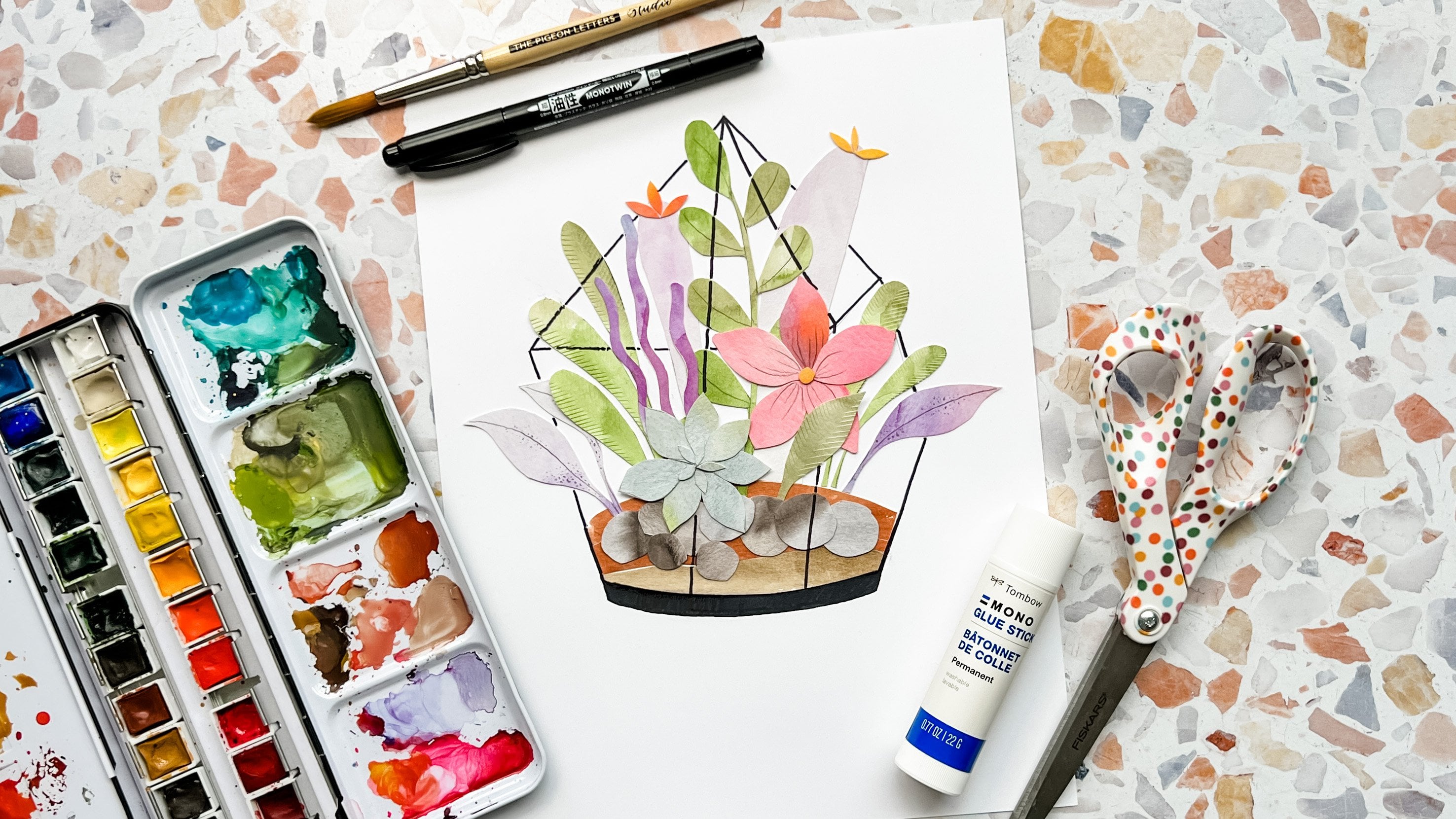
Transcripts
1. Introduction: Hi, I'm Jessica from
brown paper Bunny. I'm the author of
watercolor with markers. And today I'm going to
show you how to paint a watercolor look galaxy
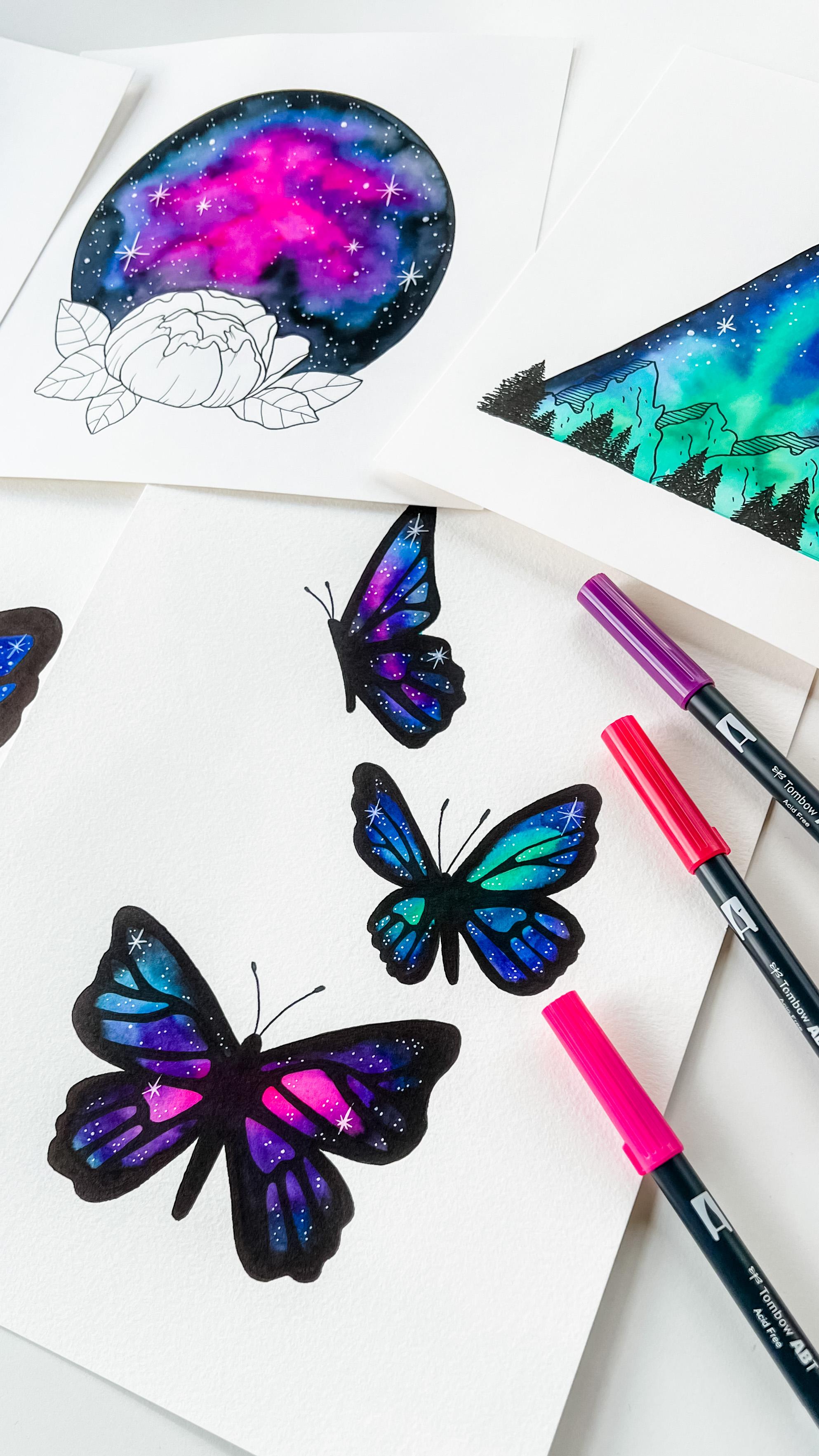
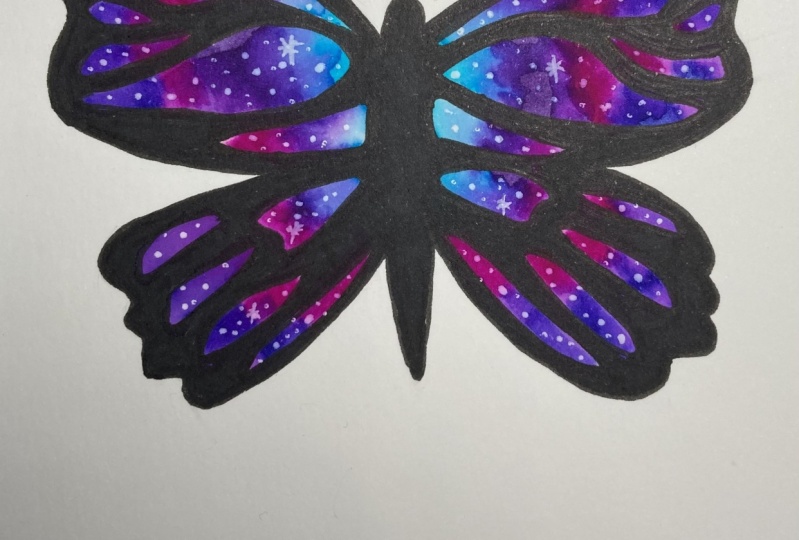
using water-soluble markers. And for our project, we're going to paint one of these beautiful
galaxy butterflies. You'll get to practice blending ink with border
and a paintbrush. And I'll show you several
different color combinations so you can decide which one you want to use for your project. Plus, once you get the hang of painting a watercolor
look galaxy, you can really paint mining, Amy silhouette you like.
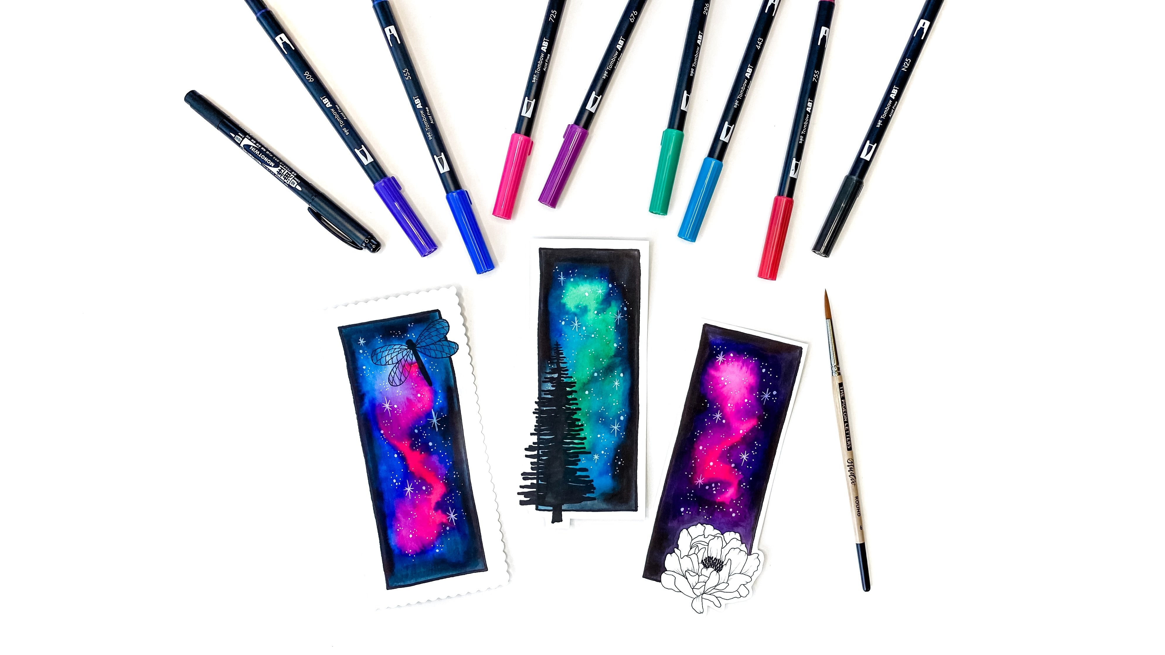
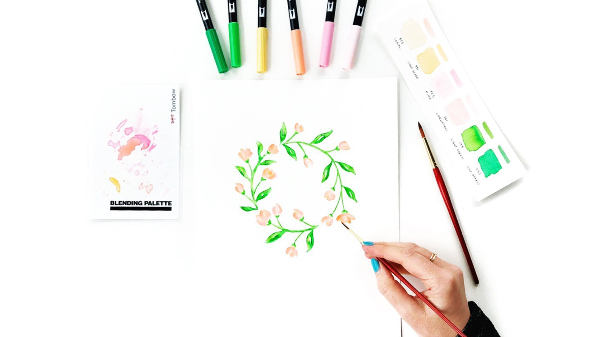
2. Supplies: Okay, Let's go over all the supplies you're going to need for today's project. You'll want some water-soluble
markers and on using Tombow dual brush pens
because the ink blends really beautifully and
they're nice and vibrant too. And they've got
ready-made packs. They've got a 10
pack galaxy set, or they have a six pack. But of course you can
use any markers that you have at harm that
blend with water. Choose any colors you like. You'll want some
water for blending. You'll want a white gel pen. Or you could use some white
acrylic gouache paint. You just need it to
be fairly opaque. And if you are
going to use paint, you'll want a
teeny-tiny paintbrush to do the styles with. At the end. You'll probably want a pencil. And I'm using a very light
for H because I find that the darker or softer lands tend to bleed a little bit when you use water over
the top of them. So 4 H is really good. And I've got a water
resistant marker. This is the Tombow Mono Twin permanent marker and it's got a bullet tip on one side
that's a little bit thicker and great for coloring
larger areas. And then it's also got a
ballpoint on the other end, which is good for
finer, smaller details. And you'll want a round
watercolor paintbrush. And you could use a size six or a size 4 or honestly
use whatever you have. Of course you're going to
need some watercolor paper. And I really like this
Strathmore 300 series because it's not too smooth or to raphe, it's
really in-between. And the IEP plans really
beautifully on the paper. And then you can either draw
your own butterfly or you can download my template and trace it onto your
watercolor paper. And I'll put the link in the about section
for the clause. Let's go.
3. Choosing your colors: Okay, The first step is to trace your butterfly onto
your watercolor paper. And you could use one or all of the butterflies from
the downloadable template, or you could draw your own. And you can either sketch
it out in pencil first, which I do recommend. And then when you're
happy with it, you can go over the line, work with a waterproof
marker ahead of time, or you can wait till the end, like I'm going to do. And the next step is to choose
your color combination. So here's a couple of examples. We've got some purples
and violets and blues or greens going into
some blues and purples. Or this one which
is not symmetrical, but I like the color
combos of blues, purples and pinks, which
might be what I use today. But if you're not quite sure which color combo
you want to use, just grab a scrap of paper, grab a few markers, and play around with some of the different color
combinations. Scribble just a
little bit of ink, and choose some colors to
sort of blend it with. And that way you can find a color combination that
you're happy with before you actually start
applying the colors to your beautiful butterfly. It's got some violet, my try pink straight to
violet, purple and violet. Some more down here. Try some with blue. I like this blue,
really vibrant. Maybe purple to
blue, pink to blue. Man, just grab your water and your paint brush and just blend and see what you think of that
particular color combination. O bit more water. Just kinda let it
blend together. I recommend starting with
the lightest color usually. Because if you go straight
from the dark to the light, sometimes it'll just blade
completely all over your, your ink and then
you weren't really see any of the individual
colors anymore. Say like this blue right next to the pink is a little bit strong. It's kind of overwhelming
everything else. So my not do the pink next to the strong blur or
maybe use a little bit less blue and a little
bit more purple. Let's see what we
think of this blend. And if you really
want to say what the colors will
look like together, I recommend testing out your different blends and
then letting it dry to see what it looks like when it's completely sort
of when it's old, bled together and then been
allowed to dry on the paper. Okay, But once you're happy
with your color combination, we can move on to
painting our butterfly.
4. Blending the ink: So first I'm going to start
by just scribbling on some pink ink into some of the wing segments that are closest to the butterfly's body. And you can really solve with
whatever colors you like. I tend to do the lighter
colors closer to the body and then work my way out to dark colors on the
tips of the wings. But like I said, it's
totally up to you. You choose whichever color
convert makes you happy. Now switching over
to you the purple. And I'm just going
to scribble that on right next to the pink. And this step does not
need to be made at all. In fact, I encourage you make your butterfly
look like a hot mess. It can look like a three-year-old
drew it at this point. It is perfectly fine. And like I said, Encourage, so have some fun with it. Now I'm just moving my
way through the colors, like I said, from light to dark. So putting on actually
looks quite blue on camera, but it's more of a violet color. Once I've finished just putting
a little bit of this one, I'm going to switch and just keep filling in all of those little wings segments
until they're all completed. And make sure you
go all the way up to the lines or over them. You know, you can be
messy, like I said. Now grab yourself some water. And this is the fun part. We get to start blending
those colors together. And I recommend starting with your lightest color and then blending towards
the dark colors. Because if you do it
the other way around, starting with the
darkest colors, they're likely to overwhelm
the lighter colors. And it'll all just
be one dark shade instead of being able to still identify some of those
individual colors. So just work your way along
each segment of the wings. Blending, wash your brush out whenever you feel
like you need to. If it's starting to blend
the colors too much, just give it a little rents and it doesn't need
to be dripping wet. It just needs to be
reasonably damp. So if you dip it in the
water and you think, oh, it's going to drip
all over my butterfly. Just dabbing on a little
piece of paper towel or something just to get some
of that extra water off. Once you finish blending
all of the ink, you just need to
let it sit and dry. And then we'll move
on to the next step.
5. Adding outlines: Okay, Now that our ink
is completely dry, it's time to add the black around all of the
non colored areas. So I'm going to start by outlining all of the
segments just so I can say what needs
to be colored in. And under CZ, my fat bullet
point on the Mono Twin. Because I want to I'm ultimately going to be filling in a larger amount of space so it can be a little bit wider and doesn't need to be super fine and
detailed or anything. I might speed this
up a little bit. You don't have to watch
me outline in real time. So you can just turn the black ink on
your own and come back when you're ready
for the next step. Now, on the other side, I got a little bit
enthusiastic with my coloring and let quite
far into this shape. So I had to make it a
little bit smaller. So I'm going to make this one
a little bit smaller too, just so it matches a bit more. These mistakes happen. Just roll with it and pretend like it
was meant to be there. But hopefully, you'll
agree that it's looking a little bit less like a three-year-old painted
the butterfly. And it's starting to
come together and look just a little bit more
finished with the black ink. And it's funny, we're
just talking the other day about how some
people absolutely love the sound of markers or paint brushes
and things on paper. And other people
absolutely can't stand it. So if you're one
of the people that can't stand the
sound, I apologize. I quite like it. I like
the sort of the cell that makes over the texture
of the paper. Right? We have all our black ink, John, starting to
look a little better. And next we're going to move
on to adding the stars, which is the part that
brings the magic out.
6. Adding twinkly stars: So you want your gel pen, or if you're using gouache
or acrylic paint in one, a really tiny paint brush. Because we're just
going to go around all the colored areas and start adding little dots of different
sizes, little bit bigger. Maybe a cluster of
little tiny, tiny dots. Might want to do a couple
of little starburst, just little lines. And if the gel pen or the acrylic isn't as are paid as you'd like it the
first time around. Just let it all dry and then he can just
kind of dot over the top and the second layer. And I'll make it really
bright white in, stand out. So I'm just adding little
clusters of stars, some videos, some smaller. Find this really relaxing. The middle twin goals. There you have it. A beautiful watercolor
galaxy butterfly. So I'd love if you share
it on social media, if you tag me because
I'd love to take a look and make sure you pop it in the student project
areas so everybody can admire your beautiful
butterfly painting. Thanks for joining.
 Jessica Mack, BrownPaperBunny