Transcripts
1. Introduction about the class: everybody. Welcome to my trust on oil bastions for absolute beginners. My name is Samira and I'm from India. I've been working with oil pastels for the past five years, and I have created humorous tutorials on how to use oil pastels on my YouTube channel salmon style. This class is for those people who are totally new toe oil pastels. I'll be covering the basics off water in oil. Pastor is where to use it on how you can blend it and what tools you can use. And I'll be comparing different brands so that you get a clear idea on which oil pastoral brand to choose and in the end, will be making a small, beautiful composition using oil pastels. Thank you so much for watching so far. I hope to see you in the next part of this class.
2. What is an Oil pastel?: everybody thank you for joining in my class. First, let's see what exactly is an oil bustin? Because many people confuse them to be crayons on. Do they think that oil pastels are only to be used by kids and students? But that is not at all true. In fact, the great artist, because so also used oil pastels to make some office iconic artworks. Even if you have Children, I'd highly suggest that you give them oil bastards instead off crayons. They're available in different brands, Andi, for different purposes, which we'll talk about later but even definitely give them student great oil pastels for a start. Because there any day better than crayons. No, let's see what exactly an already bastard is. It's basically a stick. The Charles pigment mixed with Kovacs bindle on the major component that makes it the oil pastor. Just the oil because off the presence of oil in the early bastard, it gives a kind off all You painted a sect. Do it here. I have a clean with me. And here is an oil arrested. As you can see, there is a Lord off difference between both of them. No, he would have the very popular scenario oil pastor with me, and you can see how beautifully it lies on paper. And you can clearly see that because of the presence off the oil content, which is very high in this brand, which is a scenario, it almost resembles that off an oil painting, we just reason many professional artists use oil pastels for their worlds. Why busters can be used anywhere on everywhere they are, the worse it'll medium, which means they can be used on gondolas. They can be used on wood blas people on anything and everything. Personally, I like to use oil pastels because off the beautiful texture, only that they are very easy to use. They are portable. Whenever I go out, I make sure to have a sketchbook with me, along with a small set off oil pastels. That is all that I need to capture everything around me. At that point, the coloring is very easy. You don't need to get your hands messy. Andi. All I think they're a great companion to an artist
3. Does brand matter? A Comparision: in this lesson, I'm going to be demonstrating different brands of oil faster so that you can get a clear idea on which, let's start with the cheapest ones which are storing great ones on. This is from the company called Camera. This is a student favorite in India, and a lot off Indians have these with them. Whenever you want to test oil, Preston's these are the things that you need to keep in mind. Plus, take the darker colors. I'm swatch them. As you can see, there is enough pigment in here, but it is not at all smooth. It just feels like a crayon. Next, you take the lighter colors and swatch them. Even the lighter colors are showing not well, however, it's the same thing. They're a bit scratchy, and also they're leaving a lot of dust. Now dust is something that is not preferable. It usually happens when there is not enough oil content. In the past. All that binds all of the big men together. So always go for brands. They do not give a lot of dust. Now we see the opacity off the white oil bustin. I'm just going to dig this on, swipe it on. The darkest Carlo, as you can see the white is visible on did didn't blend much into the layer beneath it. Now let's try the same thing with black. So as you can see, black is also pigmented enough on it is visible. Now let's check with the blending. This is my favorite part because this test tells whether or not that oil pastoral is suitable for my paintings. Now this is a big no brand on. It is the cheapest off all the colors available here, which is the reason it might not perform well. Now, if this is the only brand that you own, please don't be disheartened. And please don't think that you need to purchase all the other expensive brands to make your paintings. I had the set for quite a while before I had my hands on even the cheapest off the other brands. So let's check for the blending forced Andi. One is yellow, all right, so blue and yellow have marched to form green. But no, let's see how well taken blend to form a uniformed Gallo. So usually I use my fingers to blend. We'll talk about blending later in depth. But this is what I do to blend all of my colors. So I have applied a good amount of pressure. And yet I wasn't able to blend all of this to get a uniform color. That's because these colors don't spread as much. Let me show you that. So here I have one column on and I will try to spread it now and see how long the color can go. If you can see, I was able to manage to get some pigment down. But you can see that it is all very patchy on this part. This is the reason when you blend two colors, it might not be uniform. You can also do one more blending dist. Just take one condo, switch it on paper, and then take another color. Switch it on top of it. Now, as you can see, there is a lot off dust. It is just scraping away the layer beneath it. We did get a yellow What if you blended really hard? It is not very uniforms on. We lost most off the vax bindle from the people. So this is how typical student great Brian would perform or a Children's oil personal set with before. If you're really serious about investing your time into making some great oil pastel paintings than I'd suggest, that you go for some higher brands that have better performance. Now I'm going to show you how the other brands perform and I'm going to be going in the ascending auto with respect to the price. Let's move on to pray for us. - All right, so here are the swatches off all the brands. As you can see, there is a considerable difference between one brand to other the Foresee brands, which are the Camel Creepers and the specialists prepare specialists have less oil content in them, which is why they feel on look more like rounds. However, I'd say that the Creepers Expressionist performs way better than the specialist in many respects. Firstly, it is much more smoother, and you can see that it blends very well. Next we have the intermediate level, which is the primary oil pastels they are highly pigmented on. They can be blended considerably village. Next, we have the Mongol Guerry soft oil pastels. Now I've used these for the longest time, the very creamy as well as deeply pigmented on the blend very, very well. However, if you really want to experience the beauty off oil pastels, then you should get your hands on the scenarios. They're very, very smooth there, off bottle, smooth lipstick. Consistency, however, let me tell you that painting with them is quite tricky. Andi. It is not as easy as painting with any off these brands, and also storing them can also be very city. There's another point that you have to keep in mind while testing different brands. The line between the two colors is where the actual blending can be tested. If the line is more visible, like the common one, it means that the colors don't blend very well. If the line is more smudged on, it merges into the two colors. Then we can say that the colors blend very well. Here. You do not see a line as such that separates bold the colors, which means the blending takes place quite well here. And as you can see, the line is quite visible in both off these colors. But here these colors are much more pigmented on, much more smooth to use on here. The line is again almost invisible. As for scenarios, you can see that they bring a uniform color whenever you blend any off. The only disadvantage with this level of blending is that as you go on working on the drop Leo's, they get marched into the layers beneath. And sometimes that is undesirable. Which is the reason many artists before to use harder pastels like the Creepers Expressionist at the bottom layers. And then they use thes smoother ones on garbage like the Sun Ilias or the New Bastards. I hope you got a clear idea on how different oil pastel brands perform. Based on these comparisons, you can choose an oil pass with Brand do you alighting on that fits your budget. Now let's move on to the most important part, which is how to use oil pastels and what other tools required in order to paint with them.
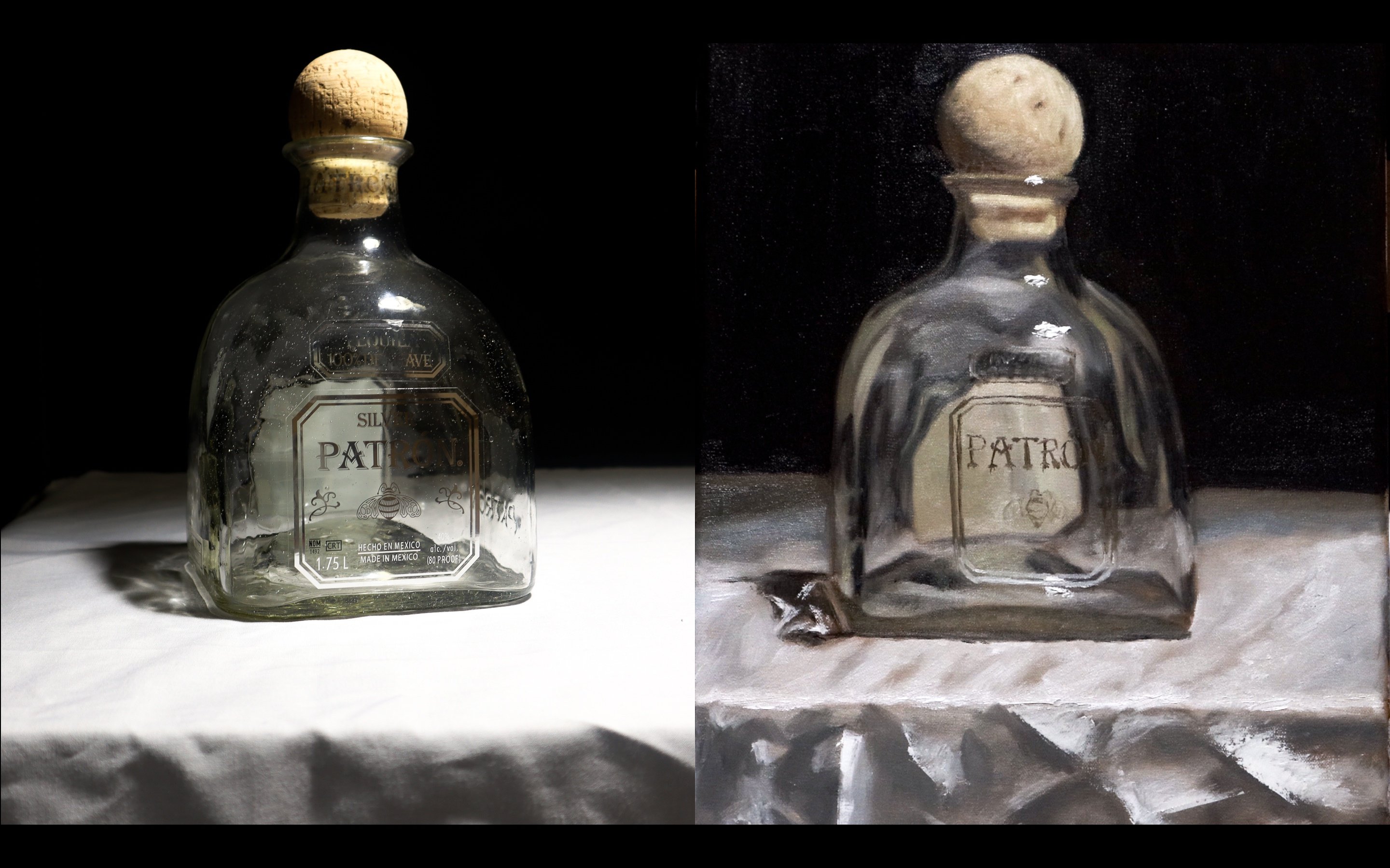
4. Other tools required: in this lesson, we're going to see what tools you require to paint it orange bastards like we discussed before. Oil pastels are a worse it'll medium, which means that they can be used on any surface. I need to use them however you like, but having some tools, heads and enhancing the texture as the less it helps you in painting better. So these are the tools that are used in general. I'm going to walk you through one by one. The 1st 1 is a scraping tool. Now I got this with the camera in colors. It's just a plastic tool to scrape of a. The oil passed away wherever needed. It helps and given texture like grass. Or you can also do graffiti technique techniques with two, said these. However, if you don't have something like this, you can always. He was a big or even on old ballpoint pen, which doesnt right. Next one is a Q tip, and this is preferred by some people in order to blend. However, I'm not a fan off. Q. Tip. I always use my fingers to blend. Next one is official. This is used toe clean away, the oil pastel once you use it. So if there is any excess amount of pigment, you can just clean with a tissue like this or a paper towel. However, a more sustainable way off doing this is by using 1/4 clock like this, you can wash it off to remove all the oil on. You can use it again and again. On it seems people as well s streets when it comes to people, feel free to use any sketchbook paper that we have around. I usually use the normal 8200 GSM paper that comes along with a sketchbook. However, if you're very serious about it and if you want the paintings to last for long on if you're using artists, grade on. If you're using artist rate bastards like scenarios, it's always recommended to use a very good. Now you can use something like this. A normal water con, the people 300 GSM, its preferred if it's cold pressed, that is if it has a rough texture so that it can hold more or faster so that it can hold more bastard. Or you can also use something like this. This is an oil painting paper it has a texture like that off can. This is what we're going to use for today. But please do remember, if you're using something like scenarios, always tried to use the best quality paper available, because otherwise the oil will just seep into the people on and on. The painting doesn't last for long. You can also use a canvas, all alluding board for your painting. Now that we've seen all the tools to use, let's learn how to blend.
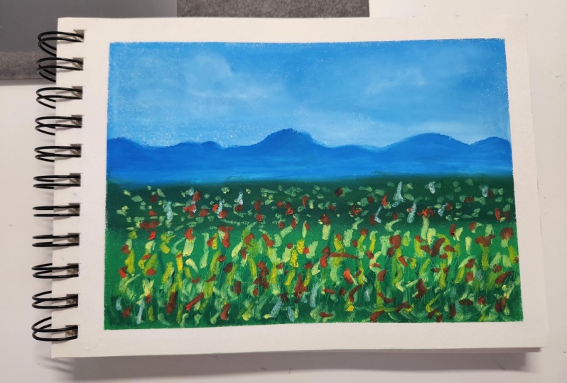
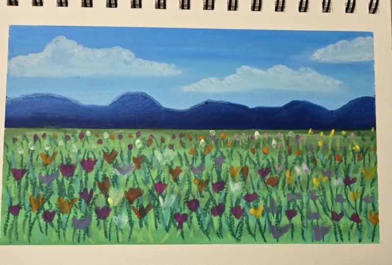
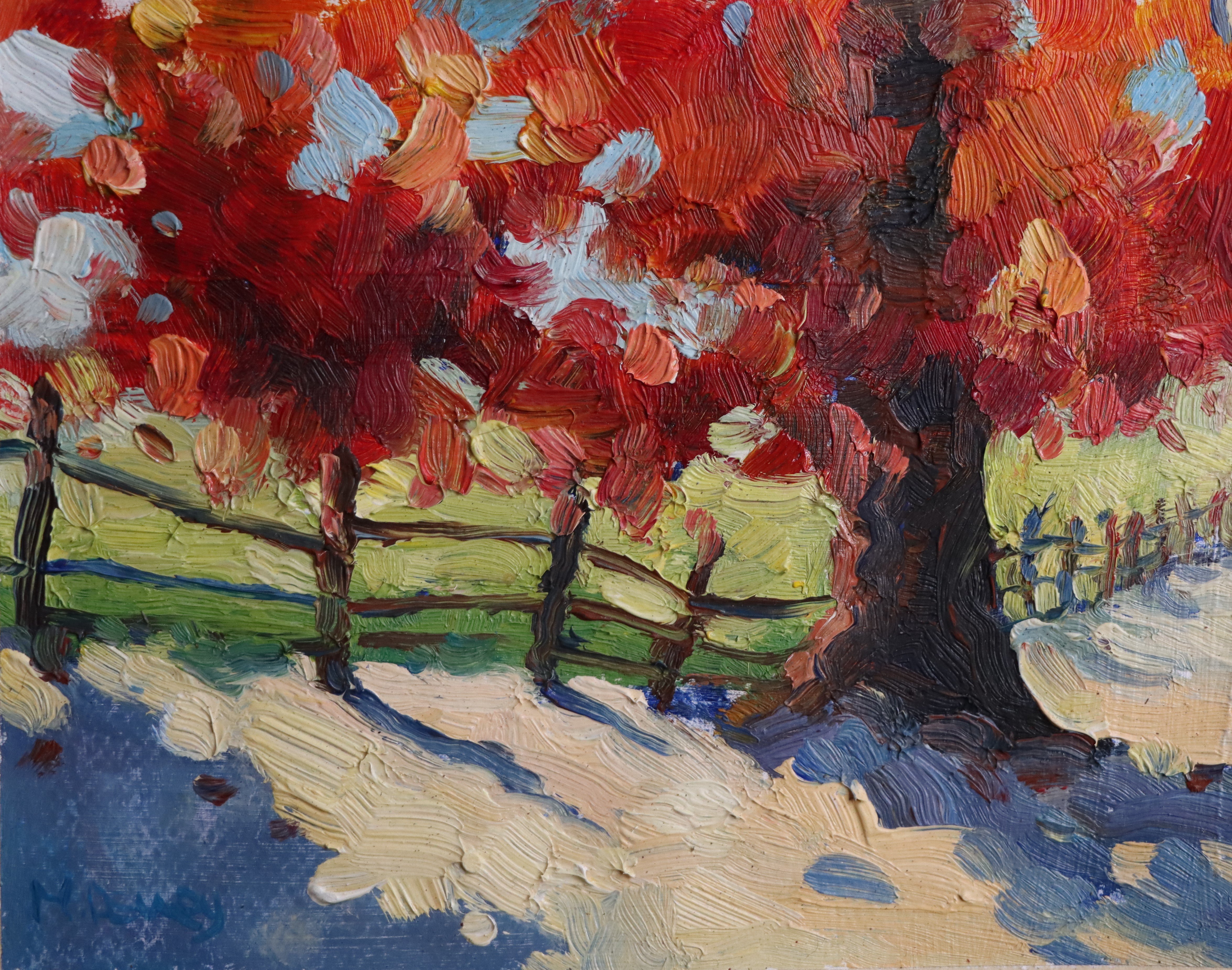
5. Making a Composition: Now I'm going to make a small composition using oil pastels, and I'm going to be demonstrating some off the technique city learned before. For this composition, I'm using the similiar oil pastels. The sky is the favorite part for me to paint because you can do a beautiful ingredient from the top to the bottom. Ready Horizon line is next. I'm adding some flouts. It's just going to be some simple white clouds, although you could add a gray shadow in the back. But I just wanted to keep this little composition very simple and quick. I'm taking the darker blue Andi, adding the mountains for the fields, have used a mix of colors ranging from yellows, greens in order to give the beautiful yellow fiend. I just dotted some flowers, which are dense in the beginning on which goes pars as we go upward. This is the stippling technique that I talked about before. - In the end, I added some orange in between the yellow flowers to kill a bit more contrast, and that's it. Our little composition is complete. Do just the oil passed in city have with you and try out the different blending techniques on make a small composition and posted in the class project. Thank you very much for taking my class for more such tutorials. You can check out my YouTube channel salmon spiral and you can follow me on instagram at salt and somber where I make comics on some inspire florals. Very paint. Beautiful, lose watercolor. Florence, thank you very much for taking my class.
 Sameera Maruvada, Artist