Transcripts
1. INTRODUCTION: Hyperrealistic drawing with oil pastels: Hi everyone. Welcome back to another Skillshare class. My name is Susan Sharma. I'm a visual artist. I like to experiment with different kind of medium. Today. In this class, we will be focused on how to do all the store painting in a simple way. One thing I noticed, participate, always want to know about new things, tips, techniques. So today we will talk about material, getting value, paper selection and how to make pebbles or strong with all base color with simple way. By the end of this class, you will come to realize that that is an easy task. More overeat. It's fun. Bel, believe in yourself. I am really excited to teach you this class. Please feel free to join and share your project so I can review it. So let us start to know about why wild beast to color. On base two colons, slightly crazy stick, easily blended. They are pigments mixed with a binder. Binder made up of mineral oil and wax. Really dry. While oil stick use secretive oils. Many points are sprinting, produced by the stone. Like Zazi, object and non-representational art. Art history has bubbled for impressionist effects based on when the VARK dark over light and light over dark. And unlike based on who can scrap through outer layer to reveal the fascia stemming the people. Join me in the next video so we will talk about material. Thank you.
2. MATERIALS: So we discuss about by bestial color is it's really simple and easy way to use that. And now we are talking about material, oil, distal block or pencil I'm using based abroad. If somebody is not comfortable in pastry Brock taking US as pencil, which is most helpful for realistic portrait drawing technique and really helped to make better artworks. Unlike soft Besser, colored pencil, professional, oil-based, or are not available from an auto manufacturer. Data only a few girls are discrete bands in a market. Each of them has on formula. So let's talk about Benson is from our resident in a duty rules on their own, but many artists also use them in combination with other best on types, including oil vessel. They can use dryer read and can be blended. Just like other Bistro. You can sharpen them to a barn to create precisely date or use them blank before solved, hazy lines. Many artists also use them for primaries sketches, which is especially handy given that graphic pencil and are not compatible with Bessel. I find them super convenient because they are docked, messy like soft pesto. So Benson, pistol columns. You can have them in your supply. And ventrally you can see there I wanted. Also it is awesome on standard people and BSW Foundation technique. Basically paper sheet is really very important. You have to learn about the people as it play a major role in Besser artwork. Tried to have them all and explore the possibility with Dan. Practice on various people will really help you to understand based on mode. In this video, I'm using Canson pastoral pet, but traditionally bestial paper and sport bar just as well for all bisschen especially does sanded base just bought like ampersand? Based on board walls, sanded B is true before, and the another one is colored extended base 2 of b. But these doors are different, different company and qualities. So you can find out and you will get out and practice on, on, you can see the difference. But my personal favorite is Canson base strawberry jam, using this video on. So I'm going to cover all the topic in this class. So here are some pointer to vote while working with oil-based to be pumping oil based on four blending. Before starting to color, decide what your main color and highlight over the painting. Once you draw, outlined what you want to be colored and darker tone when using dark dawn oil based on that brick is to color with the color. And the practice. When you think you have practice, practice, more, practice coloring using while Bistro to check how you can create an effect of feeding in and out in European team and experiment with applying pressure. Make sure that you can get an idea how you can leverage the richness of the oil-based to buy a plague. Now applying pressure and blending of colors and the comparison for shading. So which all topic we are going to cover in this class. So see you in next video. Thank you.
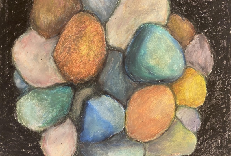
3. COLOUR MIXING WITH OIL PASTELS: So in this video I'm going to demonstrate about making their differentiator pebble so strong. I mix different color to make different sheet. For this color, I choose yellow, orange plus white and burnt sienna. First I apply yellow, orange, then chop one Santa, then white. I blend my finger and the I band with the paint bucket tool. You can plan with your finger and paper. You can choose any, any of them. For next color, I choose burnt sienna in white. I bend it white and I give the shape lighter shade. Then I choose the Montana to fund Cenacolo. Next color, I choose banana plus black. I blended the paper and you can bring it to your finger too. Another color, I choose that yellow ocher, burnt sienna. I mix them together. See yellow ocher. I put yellow ocher, then white, and then I use that brown one center. So in this color, I use that dark gray and white. I blend with white color. And then next color is dark grey only. And another next color, I choose jock Li plus Persian blue. I blend all together. In another color. I use that ultramarine blue plus plus Grade 4 give, get a different shade of pebbles. And another color, I choose that plaque on your black. So for your convenience, I also mentioned color names, which I mix in this video for pebbles. So you can easily make your colors for your project. For next, i2 plus white. Then a little bit in shock, burnt sienna, mix them. And because very nice color. So we, we are using foreign store also in another color. I choose yellow and white. I blend it white. Then I put some burnt sienna and the tin chops, olive green. I mix all together. You can see this really nice color for a yellowish color for a stone, also. For another color, I'm choosing. What is beveled or stone. Olive green. And blend with white is a nice color, is light, lighter green. And another color which I'm going to make that first great press, Walker green, dark green, olive green, and blend with black. So it's really nice. Color is a darker and a little bit darker, darker green color. The last color I, using that gray, olive, yellow, and green, I mix all together. You can see that it's really, really nice. Color will store and goes into colors which we are using enough for strong. So those are the colors, a technique that, and mix that I'm using for my strong project 2. Next video, I'm going to show you how to make this door and how to blend deck and mix all together. So make a nice strong and how to decorate your stone and give them a realistic look. So I'm going to show you in the next video. You can join me in the next video. Thank you.
4. CREATING STONES WITH OIL PASTELS: So in this video we are going to cover that. Blending and mixing tips for one piece is two colors. Keeping all this tool for planning, highlighting for the beating, darker tone. And we are doing the practice and blending of colors, Comparison not for shading and the beach. And I cannot put to demonstrate that my video, I just create those stones strike now is I'm just creating two or three straw. And then high, I'm going to show you how to color and then blend it alone or together. I know all the bulb we are mixing and feed the one sheet between me for a project or painting. Right now, I'm using that gray color. First. I'm going to add that to lights, sky blue. So now I'm going to demonstrate how to prepping in oily fish oil for blending before starting to color, decide for crew were mean Conner is going to be, this would be the overall tonality of your painting. Next, pick your mid color, these qualities TO will be the second tree colors in your painting. And once you have drawn outline of what you want to color, you will be a clear idea of what you want to be highlighting European team USD lighter color, work best when it comes to be highlighting in showing the reflection of play. So Michael is, I choose Skype, cobalt blue, gray, green color for this tune. On the background, I foss package sky blue and the gray than the fifth grade. And then on the darker area, I use both Hindu and odd degree. Then neglect k. I've cleaned the background and start that shadow in the darker color. On shading, I go into the value, more scholarly and how to create hard and soft edge. Somehow. Both will be used in this stone study. So next state blending with the bite create a smooth mixture. In the upper part, I bend both the heavy pressure Losing gray, the lighter gray on the shadow, a blended version do in dark brown mix with the jar. Great. I bought all these colors up into the shadow side of the rope or the stone and touch them. It really it look cooler or warmer. Then on many shadow, I've blended with gray. I use more of the black closer to the edge of the storm and change it the shadow, lighter as it moves away from the store. For Nick, strong eyes, darker background with yellow, orange color. Then add burnt sienna over the yellow orange for data sheet. Then over the upper part, I blended both with heavy pressure using a color. I bought all these color and Effect Texture up into the stone. Connect strong. I started background with the burnt sienna, darker tone. That good on when using darker tone in the oil-based, trickiest to color with the darker color first and then blending them could lighter color. To blend holder to the owning your hand and move it. In a circular motion, of course, your paper being blending from the up button darker color in more gradually toward the lighter color. So now you can see is that ramen comes together darker and lighter shade. So when it comes to shading, blending play a big role in getting good results. There is a right way to break out the blended look in European doing. Blending can help show the reflection of the light or shadow. Daring, adding a very realistic test to your painting point. This can be very opaque if applied heavy and you don't want to boost the base color. In some of the very dark India, I allowed the pulpal to show strong shadow and shadow area, the storm behind the stone. And tried to understand why the shadow is cast in the certain position and whether it is a weak shadow or strong one, shadow will be the same color as the material under them, only. Dark intensity, three-dimensional object also show reflected light at the edges. This is really aggregated in the strong, which is why I chose them to demonstrate this principle. Dot dot print area is real dark, sharp best gov is, and very little light hit there. So the lower area catches refracted light from the surrounding edema and become more local color. In the shadow. I covered it with the ground and then started adding Prussian blue over it to create the same texture. Darker menu. I also use darker brown like team to see media on the shadow side of the stone itself. So painting, pebbles and other natural subject, for me is a metro contrast, a homogenized similarity. And contrast can consist of light and dark, not in small Lydia and sharp it is, but being finger stone, keep the edges soft. Those adaptations for you guys. Then there are the textural contrast of the pink and the manner in which it's applied. This texture contrast dimension to have been doing and please dies. So next papillary, start with my bargain blue color background when painting pebbles, Joan or rock. It, textural contrast in my oil painting by progressing from team to take their application to final. So I started adding by Shem feel great, I have blended Prussian blue. So I bought all these colors up into the shadow side of the rock in, touch them into its looks and split where it looks cooler or warmer than on many shadow area I blended with degree. I use more of black closer to the edge of the strong and shaded the shadow lighter as it moves away from the stone. So next one, I start with the yellow ocher, then add some olive green banana in blended bit heavy pressure using white color. And now also I use the marker, black marker and white mark. Good to get that texture for the storm. So last pebble I use been Santa and vendor good white color. So I achieved of write-offs textural effect. So I'm going to use all the tips and techniques for my final project. So see you in next video. So I'm going to demonstrate those things for final project.
5. FINAL PROJECT!: So after demonstrate process, now I'm going to show you my class project. I am falling all the steps to complete my class project. You're being also joined with me. Bright all the step which I am falling, no strong demonstration, blending, burnishing technique using student clip, all instruments. You can use any brain. Have I believe, on any following people, if you use exactly that color, I did on the same surface, I feel that back down and start that shadow in a darker color than strongest bed new contrast in the whole setup aside for my dining dock area to the right on the stone. So firstly, I have begin toning down the beam and white another column do with dark brown. So I choose appeared the warm brown or reddish brown can be used when you want to boil it to agree on a natural. The shadow, I covered it, fit the brown in, then start adding Persian blue. Already, do the create the same mixture after darker value. I also use drug round, likely to seem area on the shadow side of the stone itself. On shading, I going to value more tolerably in how to create hard and soft? Did some of the boat the middle used in these stones to the next stage, blending with the light color to create a smooth mixture. On the other hand, back when I first gave some widely than ultramarine blue in ready tin, like Lear, over the brown, then over the upper bar Thai brand board with heavy pressure with you using gray. The lighter gray. When the shadow, I blend the ocean blue and dark brown mix with dark. The, I bought all these color up into the shadow side of the Dutch. Then shadow ADI a blanket. Up to this challenge, this transparent, the underpainting higher interests, the central trust using the most eye-catching media, using flat and bright, I apply color from dark to light, paying attention to proportion, Please man, literally give local color, ready relationship and lost and found images I don't crush could lead the center of interests. But to finish. And then adding machine glue. Before starting color, decide what your mean is going to be. This will be the next color. Will be the scan tricolor in your pinky venue is how light or dark. And I also use a dark brown into the shadow side of the stone itself. When shading, I go into more in how to read harder, Solve, gauge. Some of both will be used in this in this stone study. Next is blending with the light color to create a smooth mixture. So readily is how light or dark and the idea is in their painting. Like also use darker brown light into some area on the shadow side of the stone itself. So when using dark dawn in oil paint stole the precursors to color with dark color. Blending them with lighter color. To blend older crayon in your hand and move it in a circular motion across your paper. For getting a different kind of stone. I use different shade for all oil-based to color. For darker brown, I use burnt sienna plus black and medium brown. I use ocher yellow, burnt sienna, and little red, white, and more lighter shade. I used that more whiter, yellow ocher and burnt sienna. For stone. I use olive green for darker. I just mix black color. And for a medium, I put some yellow ocher and oligarchy. And for lighter, I just mix the white color. For gray shade. I used ultramarine blue, black, sky blue, cobalt blue. And for glider sheet, I just mix more whiter color plus sky blue and blue. And I use some violet color. Shading. I go into value more tolerably to create hard and soft edges. And then next, state, blending with the light color to create a smooth mixture. On the other hand, back down, I postgraduate some violet and ultramarine blue in very thin layer over the brow, depth over the upper part. I blend bought with heavy pressure using gray. The lighter gray on the shadow, I blend up partial blue and darker brown mix with dark gray. I bought all these colors up into the shadow side of the road. Then on many shadow area, I blended with Gree. I use more of dark black, closer to the age of the stone and shaded the shadow lighter as it moves away from the stone. So make sure that you get an idea on how you can leverage the richness of oil by a blank pressure, dry, different level of pressure to see how this looks on paper. So once you get disease, you will be better equipped to color in your final project. Blending can help show the refraction of light or shadow. Then adding a very realistic touch to your painting. So the last tooth isn't refinement. Touching more likely. They are needed in the split and plagues of the stone. She'd the shadow side of the stone carefully to where the original or your real strong In most of them. I went over it again with another color. I use, little black into the dark is doing very likely. Input, please. That owner, the heavy heavy layer of oil is true. In most of them. I 1 over it again with another color to blend it in. I hope this lesson has been helpful. Try several small still life. This way. Using pebbles. You find in sitting them in bright sun on a medium value surface. See how the scene one look on different background color. Practice. Because practice makes a man perfect. Hope you liked that video. Thank you so much.
 Sushma Sharma, Don’t think Just go with the flow