Transcripts
1. Introduction: Welcome to this class in which I'll be painting a sunset scene based on a photograph. I'll be doing this complete exercise in a step by step manner and explain my thinking all along the way. My name is Mandara, a fine artist. Ernest Sculpture. I'll be leaving you through this course first. I will go through that well, considerations that I meet when I decide what to paint and then compose the picture. Then come the steps in which I do a value sketch pretty mix the colors and then go through the actual painting process. If you love art, you will love the journey from photograph to a painting and also learn a few things along the way. I've used oil colors for the spending, but you can also use squash. Acrylics are casing toe paint in the manner of shown, So I invite you to join me on this journey. See you inside the class
2. Planning: welcome. I've clicked this photograph a few months back, and I'm trying to do a painting based on this. And here I've noted about well for points, which I considered generally, though sometimes unconsciously. But before I make any painting. But I've listed down, and it's always a good thing toe. Go through them with a lot off planning or consciously go through them so that there is nothing which is a surprise when you actually put paint on the canvas. So first thing is, Toby answered, is Why am I painting this painting or whatever I want to suggest in or communicate with the viewer. So it's sunset time for the graph and the the move, which I want to convey, is contemplative mood. So I am imagining myself sitting cured somewhere on the edge of the cliff and, uh, then thinking about how was that? They inward way need toe tomorrow onwards, that kind off thinking about what has gone by and what is yet to come. The next thing I decide is what for my toe paint on, and I have chosen six by eight for men. It's a small painting that I'm going to do and the reason behind choosing this format. It's It's neither too horizontal our panoramic as this photograph is, nor is it very vertical painting. I wanted to be a relaxed kind of format in which there's no tension, and I think the format off six bite souls that purpose in terms off division off space. I need to plan what's going to be the foreground, What's going to be the middle ground and what's the background. So obviously you can see what I've done here is, uh, I've made this shape, which I can bring in here and then try to compose the painting. So and me explaining that with reference to that frame. No. And I've chosen this corner of the painting as the source and let me see if my pencil is connecting years. So now, coming back toe the division of space. So for no for a minute. If I hide this, I just layer, I want this part, Toby the I want this part to be the four round This is the middle ground, the Blue Mountains and obviously the sky will be the background in terms of competition aligns. I do not want to suggest any part or road. Oh, and I wanted to be a kind of relax spending, so most of the lines will be horizontal. Don't not exactly hard until they will be kind off. Won't be suggesting any dramatic slope in terms of competition. Since I've chosen this expired format, I have taken this frame and I'll be composing with that. No. So, as you can see, I can zoom in and only take kind of crop the image so that I can see only what I want. So if I zoom in, it's something like this. Though I would like to have the street somewhere towards the right. What I can do that when I draw the sketch for or the value study for the spending. So the in terms off grouping I want to group these together if they are to trees here. I don't want to trees here because that will be repetition. And that's kind off. No, no. In ah, good composition in terms off center, off interest and we painting the red orange colors off the sky here and the time of the sunset. Though you cannot see, there is a tinge off orange and red. Here and I want, oh, bring it more so that it becomes obvious that it's, Ah, sunset painting, and that will be the area off interest. I want these to be pleased to be kind off supporting the center of interest, but also balancing that if I don't have anything here, will be too obvious are too boring of ending. So I want these two have some tension kind of foot thing. Then, in terms off tonality, I can see that it's already. It's obvious that it's a low key painting, so they'll be darker shapes. And the lightest light here is also not a white. It's a light colored sky in value relationship. It's always good to be clear about where the darkest darks will be there and wearing the lightest lot lights. So it's a fairly simple, kind off composition in which the lightest light will be the sky. The foreground will blighter are slightly darker than the sky, and these vertical areas on the vertical shapes, which are few trees here, will be their darkest axe. So that's the kind of value distribution in terms off abstract Brighton. Let's draw a note on or abstract pardon and see whether that looks interesting with this kind of composition. So I have chosen wine charcoal with which I'll be drawing and let's see what kind off north and we can drive it. So let's reduce the sides on. When I say no done, it'll be something which is which has only two values. So let me increase the size of the brush and then so I can see that the foreground is dark and in this tree is dark here. I just want to have to values Andi, see if this becomes our This looks interesting. There'll be some shit up here. So it's this is, ah, simple nor done structure for this painting. And I think this is interesting enoughto at least give it a try and convert into a painting . Well, at least this clarifies what I'm upto in terms of color hard me. This is a more towards blue. The painting is more towards blue, then towards warm colors. It's a cool color painting on in terms off negative shapes. I need toe. Be sure that I don't need to repeat any negative shapes anywhere. They need to have some different shape and not the repetition will not look good. And so that pretty much is what has what I have thought about before I tried to apply pink . And now let me do ah kind of value study, which I will, which will clarify things for me much more. So this is the photo known. There will be a shrub here and the three I don't want I don't want this to be a really little drawing would just value study and give some guideline for me. And I'll also have this photograph as my reference things might change. Or at least in my case, I sometimes change things up when I'm actually painting From what I've in my well, you study. But it's always good to have reference and then you can go on changing things with you actually want, but without a reference, you don't know where you're going. So this will be the distant mountain and the flat land, and there'll be some grass here, which is the full room. I'm just feeling it in not too much bother about the details anyway. And then be this bright spot here on the remaining will be darker sky. Once I have the sky in place. I can see that I need to increase their darkness off this distant mountain and plains, and this tree or shrub will be even darker. I don't want these toe have the same size and shape, so I'm going to increase this of it. Let's see how it goes when we when I actually start painting. But this is kind off what I have in mind for this painting because there are no colors here . It's kind off, hard to see if this is sunset pain, you know. But there be clear once me oflife int. And I think I have done good amount off homework or preparatory work, so to say, and I can at least hope for a good painting as an outcome from this exercise. So thanks for joining me on this journey and see you in the next video.
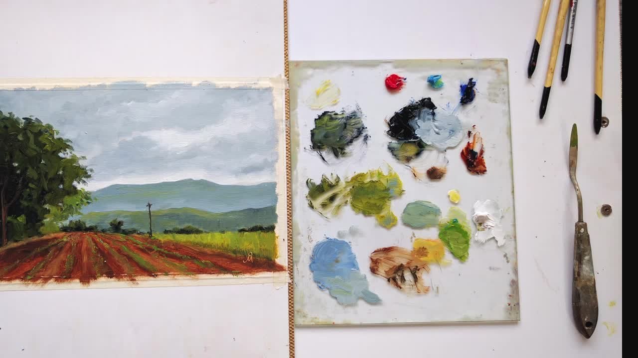
3. Premixing Colors: in this little it's mixed some colors to start with. Low. As we start painting, I might need a few colors, but then it's always good to start with some premixed colors. I'll explain what these colors are, which colors I'm using. This is burnt Sienna, Mrs Chrome Yellow. This is ultramarine blue and died anyway, if I require and add one or two colors. But mostly I tried toe the pain. The complete painting with all these only these four colors. So let's get started with mixing the colors. So I want to first mix their darkest done. Or they're please mixing buoyancy and I and and the money in glue. And also there is some greenish tinge in that colors and one toe have some yellow and more glue. As I said, it's going to be predominantly ah, color pending. So instrument this color. I want to have this color, so use discover for maybe the foreground, and this will be my color for the trees. I can't even make it more some more. Anything. I It started with this color and make adjustments. You've required wine actually using the color, so the next color, which I'm going to mix is the alerting the full grown, So it's ah, greenish brown color. We won't paint the full grown in one color, but this is the color which will be there, okay as the first color, and then we might some green to it. The next layer next color that I need to mix is some, but it's gonna and I bring down the chroma on the saturation, basically, with some way dinner and in the colors for the distant mountains. First color. The need is a real on and is to release some grow. I'll put in some bone and on CNN it and then a lot of weight. I think this will be cool light, so keep this late, alert person. Extend and add blue. Any letting meaning one? I mean, I need to bring down the good old. There's a small mountain which will be even darker because it's much more vertical surface , so you have darker blue in some burnt sienna to bring down the coma, and then we need to mix the sky gunners sky colors the post one will be. You can use some off this pillar also, and then some bright yellow I think I need to finish in red. So you get that? What a 1,000,000 This is what? Immediately. I need it in small quantity. I mean that Wait some bright color. So I kind of have this range this pure yellow orange and then more rare on and and as and when required, more color school. And then I need the sky color, which is very similar to this. But in if you can use some of this, this means you're dark and some weight with bringing. I don't in some coordinating even use right in yellow. But that decisional take when actually pink I like to use only Lindsay. Nine Make the paint 10. I get heady if I use done bending. So I tried to stick only the And it has worked pretty well last year or so since when I stopped using open Dane. I think I'm good to start actually applying the colors on dso See you in the next video
4. Painting Part 1: medical. This is where all the fun starts. We've done the hard work. Now it's time to put paint. So the canvass. So I'm looking at the value study on dime taken just the born sienna on. I'm just linking whatever I had drawn in the value study. I'm putting the color very thinly. I've I have this. Can we spend a lot on which I've applied some buoyancy and earlier. So it's dry now as the ground Andi now I'm using in brown burnt sienna toe indicate my drawing. This is where the big pre will be on. Let's indicate the four legs. I'm using this Conover as dry as possible because I don't use stop in time. Andi, I don't want the layer toe buildup and this very dry implication of color. This is where the district mountain will be. Then the flat land. I definitely want this tree out of this bush. Oh, rise beyond ah, lane of the mountain. And though they'll be some radiation in the color of in the background in the foreground. But I won't necessarily be inflicting any role or fuck. Let's not make it really off this on day. Really be some since it currents here. And the rest of the sky will be blue ish. The first thing to get dirty are the bright colors. So I lied. Those first you will be the bright colors, Andi. Then you know. No, you were off the sky one. After I'm applying this blue, I think it is too bright. Mixing some blue and brown in it Make it slightly done. And I think this is good color. So this and I'm like, maybe what I want the sky holds to me. Uh huh. Okay. I'm using operative big brush, because if I use a smaller one tends to get Ridley. I don't want that to happen. - I don't want this. This edge, Toby. Very sharp. I'm dragging my brush over this, and I might come in with some weight color just to make life and think of. Yeah, let's see. Let's go ahead with this color for this guy and then right to adjust to typically quiet. It's required. You're wrong. I think I'm using Ah, the brush. Bigger than what I need to. We're gonna took a Let's anyone All this spending done. So no one really do being the distant mountain. We just slightly darker in color in the sky, Off course coming something like this. It's too dark, I think. Within and drew Sharp one. So I think I should go along with the smaller brush. You? Yeah. You know, Morgan is God. Then what? I wanted to be dragging my brush order? No, no. Snoopy. Base of the mountain. Yeah. I want to introduce some green in this area. You were dashed off it and then glad I let's see undergoes.
5. Painting Part 2: have changed to a much softer brush because that's giving better control over. You may want to paint, and there are some lighted areas in between. I want going again. Those with indication of some stories and some exposed land there, coming in with darker color in I want don't want this edge Toby so sharp, and I might come back to this area later on. But for now, I'm goingto stop forcing within on DNA will come to the foreground. Generally, I don't start with lighter areas. First, I started with, like the darker areas, but then what? Somebody's in. I started the sky first, and the reason I think is I wanted these details to be clear. I also didn't want a sky to get mixed up on the Are these colors toe enter the sky when it's just under me off printing generally in oh, Pickler to start with dark colors first and then introduced lighter ones. But it's good. Once in a while ago, bring the rule and see what happens. And no, since I'm I have come to the darkest banks. We'll start introducing this, not Bush, anything. Stop at this point for us. What is this Bush is concerned on and come back to it later if required. Let's get into the darks off this side when laying the colors in the years will have not applied the sky glove first. So they drank in those areas really fast and then come and are the oh views were there is no are smaller. Leave areas that will be done faster. No coming to the tree trunks. I'll be using the edge off the brush tool. Do that down the lane. Color is Rick. I don't get really clean lines on sharp lines with this brush. So my I might have to use some of the technique. This area had become too light. Who liked for this kind off lighting conditions The middle ground glue on this 80 eyes become cool light and have toe come in with you in the sky. I think it's too bright for me. We'll have to our I'm to reduce their darkness of the solent. The contrast enough for reduces. Right now I'm going to feel that the light is going in from here on. This whole area is in shadow, so maybe that's a different effect. But then not necessarily what I had intended, but I think I'll come back and stay on with this painting to blanket. This is the end. It may not be where I wanted to be, but it will teach me something. And these drunk will be almost celebrated because the lighters coming from behind the street and come back to this. See you in the next video.
6. Painting Part 3: I'll be coming in on drink dark in the middle ground on background, mixing blue on. Let me see home. This works. I think it's OK. I can go ahead. I now just I'll have to be careful toe ring around this foliage. It is not always an easy task when I can get most of the media coverage. It's This is kind of stumbling because I'm dragging my brush over the earlier on that we it's getting applied without any. I'll be there with minimal mixing all the paint underneath. Maybe we're not true. Sky holds still one the left inside to be more blue looks okay to me. Know the thing would I need to do is like darkened the sky. Let's see how old are, because this, I think, as a color. It's too dark. But when I tried to meet secret doors color already there, this will do the job. I just go over these and come back later on. Okay, it's getting better. At least that's what I feel right now. I don't want this to be a hard edge something you're great . And now I will have to darken the top part of this guy do this and make it even more good here. I think it's coming together. I still meet on making this car darker. We're done. We did. It's on playing with values that matters. Right now. This tree looks quite ugly, but then I'll come back to it later. I think it's looking a lot better. I just I will come again in the a portion of the sky, which is smuggling. We're gonna make it even more darker that will create the relation from dark like, which is what is required. Yeah, I think I'm happy with the value structure now. Even the middle ground is looking better. I just no need to get the threes off properly. Introduce these small leaves again. I think I'll get a smaller brush toe the foliage on the tree. Smaller brush. Ari. When I let me drive the corner off this press, yeah, I think this will work. I just want tohave minimum detail, and we did only where it's required because the street is not, though for confine. One can get quite Canada. We I want to start doing these details, but you need to stop before it's much
7. Painting Part 4: because I want to paint this in one setting, which is Allah Prima on, Not wait for one layer toe dry before I apply the next layer. I'm having trouble with thinking these details are dark on this surface. If I I decided to wait for this underlying or this layer of color to dry, then I can come in with smaller brush and not have to worry about They're in the lane color under Lincoln getting mixed. Well, then I don't want to do that. I like the fun bringing in one sitting. If I was doing, if I were to go bigger painting, maybe I would have tried that matter or used that. But for a small painting, the this think a lovely my works best, at least for me. Let me step back and see how this painting looks and I think it means something here. Maybe I can I mean this street dollar. But when I think I'll wait for some time and then think of on turning in thing, it's I just want to indicate some kind off a place to sit. Maybe it's ah, well, the viewer can come in and sit off sometime I don't want to mimic the shape off this mountain. So it's when it's this small Indians than to name. Have let me do this. It's really tempting across this line. I think I think that, you know, I think that it stopped. I don't want the signed to be too obvious. A little distracting. Well, same likely anything That's okay. I hope you injured pending this on Learned something from how you develop the painting from the photograph. How I had various choices off competition and what consideration sided before even mixing the pain or mixing the colors and then a playing it a lesson each pending is and learning experience And the more often you pink you didn't toe remember the lessons learnt more effectively on. And I think I've bean ableto capture the more which I was after But then there is always an expanding See you next time
 Mandar Marathe, Fine Artist, Sculptor, Illustrator, Designer