Transcripts
1. What is this Class About?: Hello. In this class, I'm going to be helping you discover how to use
your oil painting more effectively so that you have vibrant color and
impactful paintings. Now, what is the
secret to getting your painting to really stand
out from all the others, to pop when somebody walks into the room and
grab their attention. Now, people often say your paintings have
such beautiful color, such strong color,
such vibrant color. But that's not an accident. I've learned those techniques over many years of painting. I'm going to share two of
the most important tips and demonstrate it for you
in a painting as well. We're going to look at
effective color mixing mixing color on your palette. Without all the theory, this is practical stuff that you'll be to
easily understand, and it's deceptively
simple but so important. Then we'll look at how to apply clean color notes
to your painting. It is so important that your color note remain
vibrant on the canvas, not just on the palette, but how you apply the paint so that it doesn't get muddied up and lost and over
mixed and blended away. Then we're going to look at
how to simplify a scene. I'm using a beautiful
reference of an autumn tree, and we're going to
see how we can adjust that scene just a bit to
get the most out of it. Emphasizing important
characteristics. These are practical tips. You can then download
the reference and have a go at the
painting yourself. I've been painting
for many years. You've seen some of my
other courses, perhaps, and I've been a professional
for over ten years. What I've learned is don't waste the opportunity to create a powerful and vibrant painting. This is an opportunity
for you to learn a few techniques from me and apply them to your
own work straightaway. Let's begin.
2. Color Materials Explained: All right. Let's have a look at the materials quickly before
we start mixing paint. These are paints
made by May Mary. It's in their classical range, which is a very good
student quality paint. For most purposes, it will be sufficient to rival
artist quality paints. You won't miss out by
using these paints at all. Main palette consists
of two blue colors, cerlian blue and
ultramarine deep. And cerlian will be cool and
ultramarine is the warm. Titanium white, then
cadmium yellow light, or cadmium yellow lemon. Those two are interchangeable. Then there is a yellow deep, which is good for
those autumn type of scenes where I have
warmer color in general, then cadmium red light
and sum crimson, zum crimson being a
cool red, red light, being a warm red, and then yellow lemon
being my cool yellow. Regular cadmium yellow is fairly warm compared to
the lemon yellow. That's how you get
your warm and cool. It's simply how one
color relates to the other and have a warm and a cool of each
of the primary colors, that is very important. You'll see there's
no tubes of green. I mix all of those
greens myself, and that helps me get a
more accurate green color. Now, the main tool for mixing color is your
painting knife. This one I've had
for many years, and it's actually got
quite sharp. Watch out. They don't cut you accidentally when you've been
using it for a long time, they get a really
fine blade on it. But this is to get very clean mixes on
your palette as well. You can also mix clean
color notes with a brush, and that's what I'll be showing
you in the demonstration. Now, what do I use as far
as mediums are concerned, the simple answer there
is I don't use a medium except to clean the brush
during a painting session. I will use ds white spirits, whatever brand is in your area, but they must be ds and
say artists white spirit. I find that quite good to use, and I put some of it in a container when I do need
to wash the brush off, I will just weight it with the white spirits
and then dry it off and wipe it clean
with some tissue paper. Don't put it
straight into paint, you will get too much solvent into your paint and
weaken your color. Dry your brush off
well with tissue, then go back to Mxing. I wash the brush during
painting very seldom, I'd rather use a
number of brushes, one for shadow, cool colors, one for warm colors. In that way, I don't worry too
much about brush cleaning. For the most part, if
you've been painting, let's say, painting with
some ultramarine color, and then you want
to switch over to a dark red All you need
to do in between is give the brush a good white down with the tissue
and you'll get all the excess paint off and
you can just scoop up some of that and you won't
have contaminated paint. That is the way I make
sure that I don't accidentally get
too much solvent into my paints
while I'm working. That's a good tip. Try and use as little medium as possible and then your paints will always be fully saturated with color.
3. Color Notes Mixing Tips: Before I start the
painting demonstration, I'm going to show you
some of my color mixing tips to ensure that you
get good vibrant color. It all starts with how you mix your colors on the
palette and how you handle the paint on the palette because that's where
the color is made, and then you transfer
that onto your canvas. It's good to have a confident working
process on the palette, and these color
mixing tips are very simple and easy to follow, you just have to practice
them Then in the next video, I'll start a demonstration
where I'm going to be painting a very
simple painting study, but the focus is on
good strong color, keeping it simple and
vibrant and easy to do, you'll be able to take that exercise into your
other paintings as well, involving trees and light. Let's get into
some color mixing. All right. Let's do
some color mixing. Let's start with
some yellow lemon, and then some yellow light. Some red light, serine crimson,
Serdan blue ultramarine. Last off, we need
some white paint. Now, in most of our mixes, I'll be using something like cadmium yellow lemon and to
get a clean mix of orange, I'll use some red light, and we can mix those two
and get a vibrant orange. That's almost like milion More yellow, and you get a more
yellow orange. So you can get a
good combination. Lean to the red or
lean to the yellow. You've got to ask yourself which one of these is
warmer or cooler. Because yellow is
the warmer color, the yellow orange will be
warmer than the red orange. Maybe that doesn't make
sense straightaway, but if you just remind yourself that red is
cooler than yellow, it would follow
that yellow orange is warmer than red orange. All right. But just to
take things further, if I add serine crimson to this, I get a beautiful rich
red orange as well. But because the serum crimson
is cooler than red light, this is going to make a
cooler red orange than that. You can see we've got
three colors here, all of them a type of orange, but different temperatures
compared to the other. I should say warmest, cooler and then coolest. That is each of those are clean color notes because it's
very clear what they are. They've been mixed up carefully, and you can put that in
your painting and you'll get a nice, vibrant
yellow orange. The same with this, of course. You'd get a an color
note there and so on. Now, the same thing would
apply with the blue range. Cerulean is cooler,
ultramarine is a bit warmer. You might ask why is it
that ultramarine is warmer. It's because it leans to
purple and purple is somewhat warmer because it would
have a degree of red in it, and that's the
reasoning behind it. Let's take some yellow
and put in a bit of cerlian blue and we
get a fantastic green. Okay. No need for a tube green when
you see how simple it is to make a vibrant
green like that. That would be a yellow green. There's a good degree
of yellow in there. I can obviously add more yellow and get a much
stronger yellow green, or I should say a much warmer one because
there's more yellow than blue. That means it's going to be warmer than this one
that has more blue. I can, of course, bring in more blue and we get a
very cool green. You would probably put this in a shadow as a shadow green. Now we have these three,
cool, warm, warmest. All clean color notes. What about a purple? If I take some ultramarine
and some z, they would make a good purple. Now, this one is
very strong color. Well, that's a very
powerful purple. That's practically a black, and I would rather use
that as a black color in my extreme shadows
than using tube black. This one is more natural, and it will only really show up as purple when I
bring white into it. Put white in and it clearly
gets that opaque color. Now because white is in there, this will be not only lighter, but it will be cooler. White on its own is
a very cold color. I cool that down. All right. If I want to cool this
down even further, I can bring in more blue. Of course, and get
a blue violet, a very attractive color. Beautiful shade of color. Drop a little white into it, that'll take it even further. But that will make it look so that the blue
really stands out. I can bring in
cerlian and make that even colder, very attractive. A bit of white in it, and you can really see
how that cerlian sent this purple and leans it to
the blues very strongly. What to remember is
that when you mix your colors by mixing
color into color, you get a very clean color mix. If you bring in white, those color mixes change
very dramatically, they lose their transparency
and become opaque, but also tend to cool down. A color temperature only really makes sense when you compare
one color to another. You cannot say yellow
orange on its own is warm or cool unless you
compare it to something else. It's all relative
one to another. Now, you'll see in
the painting that I try to use color
on its own for as long as possible and leave white out for as
long as possible. To get my strongest color, I use as much color as I can and as little
white as possible. Especially in my shadows because you saw what white did
to this shadow color, I made a dramatic change to it. I want to keep white
out of the shadows and stick to the more
transparent shadow colors, and that is pretty much the
introduction to color mixing. You'll see this in practice
as I do the painting, and you'll get to understand
how it's put into practice. Now, the final aspect I want
to talk about is how to gray down a color without
turning it into mud. If you mix the complement of
one color into the other, you will gray it down or what
is called knocking it back. Let's say I take some red and I want to reduce the
vibrancy of this green. I could mix in some red. It's no longer that
vibrant green. It is now a olive green. Very dangerous territory, although that olive
green may look okay. If you get white paint
into it, it gets sickly. It can really look quite pale. But in the right place, in a painting, it might look right. I can't tell you
definitely here, whether it's bad or not. If you want to get that
strong color back again, you would have to bring
in more proper color. And a bit more of the blue and you start getting
that color back again. You are restoring the
balance of yellow and blue and reducing the
amount of red in there, so it gets back to a
more colorful color. So if it gets too gray or
starts to look really muddy, you can always rescue
it by bringing back proper strong color and also reducing the influence
of that white paint. Whatever complement you mix, it could be blue into orange, that will gray it down as well. Suddenly, it's all gone. To get that back,
you would have to bring in those colors
and try and get it back. It might not be possible
to get it right back, but at least it's now
got some color back. And of course, the
yellow and purple. That immediately knocks
back the yellow. But you could rescue it if you needed to bring in
more yellow again. And get something
back. Not quite the same, but it could do. That is all you really need to know about mixing
color on your palette. I hope that helps you and
gives you some ideas and maybe some confidence
to approach your color mixing
process on the palette. Now let's jump into the painting and see how I put these
mixes into practice.
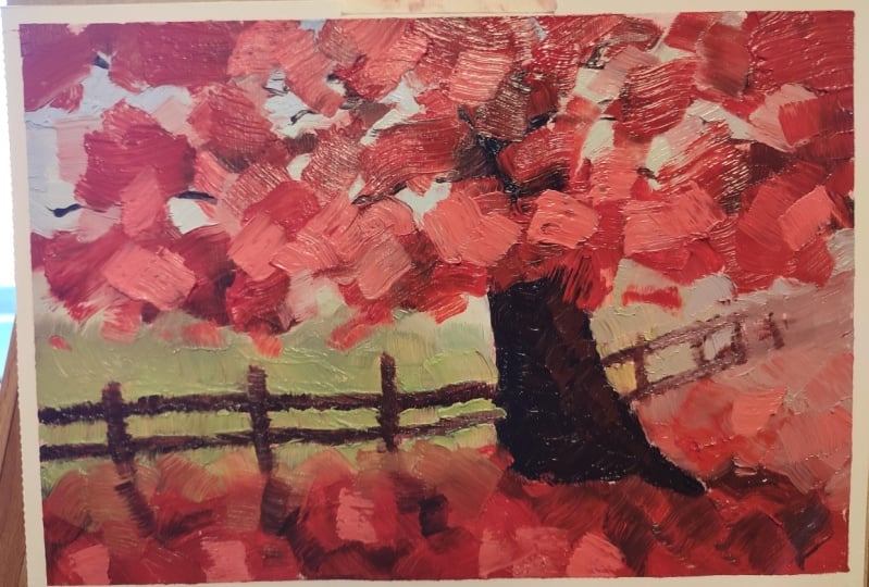
4. Part 1: Compose Simple Shapes: What a beautiful reference. We'll start off with
the composition, more or less in getting the diagonal lines that play such an important
part in this composition. These two lines will
feature strongly. I try to place all the shapes in relation to these initial lines. Now, the dark tree is a focal point and is going to be a significant
light dark contrast. But the second tree, I'm
going to leave that out. And that's because
two trees like that are two shapes that will constantly force the eye to bounce between
the two of them. If you're going to
have trees like that, I would rather have
three than two. The patterns are important. Fence posts avoid
perfect fence posts. It's such a frequent
mistake that artists put perfect lined
up fence posts, even though in the reference, they are not perfect. Try to accentuate
the imperfection of those fence posts
and the general fence itself to get that more rustic and
interesting appearance. Okay. Now the shadow pattern. There's a very small shadow
around the dark tree. It's not very
brightly lit scene, but I'm going to increase
the shadow pattern. Now painting in
very loose lines, very loose pattern because I don't want to paint
leaves and twigs. Very important not to get caught up in trying to paint
leaves and twigs. It'll end up with a
very stilted painting. M.
5. Part 2: Block in Simple Shapes: Now, composition done,
let's block in some color. It's my sort of
standard palette. Maybe the cobalt blue is a bit of an extra but
pretty much standard. So big mass shape. And since the Autumn tree
colors are not very dark, I'm going to start off as
I explained in my color mixing with some clean
rich color notes, cool red, and get those color notes in warming it up with a
bit of yellow as well. Look at the white paint
change that makes to it. In this early stage, keep the white paint
out, get the color in. Big brush. Transparency
is so important. That's why I start off with as little white
paint as possible to keep the rich transparent
colors strong. Just scrubbing that in. Most often, I will just wipe
the brush off in between paint strokes to keep
those color notes clean if I pick up some of the blue of the
ultramarine underneath. You'll notice it's lower down, so there's color
temperature variety. The values of the red
leaves are fairly similar. Put darker underneath
in the shade and getting warmer and lighter
at the top, but not a lot. Look how rich it
already comes across, just by using pure color, mixing those oranges, Okay. And there's a bit of a dark
value area over there, and that's quite important because it's going
to butt up against the cool and vibrant
greens in the background.
6. Part 3: Light Colors: All right, let's get
into the light colors, and I'll show you what I mean. So I've got a bit
of cerlian blue, a little bit of titanium white, and we're going to
get some sky holes. I put in just a touch
of lemon yellow as well to keep that sky warm. Now, as I put that down, I'm cut into some of the reds.
But that doesn't matter. And that's a good thing
because cutting in actually creates a more
interesting shape. Of course, I can cut back in
to the sky holes with red, which I will do as well and manipulate the edges
of the leaves. Well, I should say
the mass of leaves. I'm not painting individual
leaves as you can tell. Just mass shapes. A few more sky holes. The sky holes are not
that bright and that's correct because the holes let through a small amount of
light so the sky holes are actually a little darker than
if it was just pure sky. But you notice touches of blue against the orange set
off the orange so nicely. So we're getting strong
sky and sky notes against the oranges and reds.
7. Part 4: Focal Area & Darks: Let's get into the focal point. This is going to be
the strongest dark. I've left it to this stage of the painting because it's
a relatively small shape. The dominant shape
is, of course, the mass of red leaves. I'm making up a dark with
Burns and ultramarine blue. I don't like to use burnt umber. I don't recommend
using burnt umber. To be honest, I find it's a muddy color
waiting to happen. I'd rather mix something
out of burnt sienna. It just seems to be better
and more manageable. Put a shadow as well on
the right hand side, making it quite dark. Also, don't make the tree perfect with perfect
parallel lines heading up. A as I say, I like a tree that has had a difficult upbringing. It has a more interesting shape. Add some interest, vary
the shape a little. You can see I've done that
on the base of the tree. Just a bit of light
as well hitting the bottom left
tiny bit of white, bit of yellow Okay. And as I mentioned before, very little white
paint being used. I will increase that in
the foreground though. Okay.
8. Part 5: Middle Values & Greens: Into the middle
values of the greens. There's a bit of variety, shadowy next to the fence into light and hazy
in the distance. I've got a variety mixed
up here with lemon yellow, marine and cerlian blue,
a little bit of white. You'll notice when I put
white paint into a mix, I will then bring
a bit more yellow back into it or whatever
color I'm using. White is very cold. And just credating
this now very quickly. Yes, I'm losing some
of those fence posts, but I know where
they're going to go. Trying to keep the paint
fairly thick, fairly loose. Using in this case, a
number six bristle brush. This is a small panel. It's basically six
by eight inch. Clean color notes. That's
what it's all about. You put the color note down, lift your brush
off wipe if you've picked up some stray color that you don't
want on the brush. Then pick up more green and
put that down and you'll have clean color
notes. Color mixing. Keep that disciplined, I
like to mix with the brush. Then as you apply color, be very disciplined about
cleaning your brush. Making a little lighter
in the distance, but look at the
amount of paint and the texture that's from the
bristles and keeping paint. Don't go back and mix up
and blend your paint. A bit of distant aerial
perspective there, but I'll probably go
over most of that again. I've cleaned off the brush
with a little bit of white spirits because I'm
going back into the reds. I can't change the
brush, but in this case, I'm just in the flow and carrying on Softening
those edges, you can see of the trees leaves. Okay. All right. So these light color notes against the dark
underside of the tree. It sets off all the
colors that contrast. So as the light comes
through sky holes, it tends to refract around
the edge of the leaves. Try and give that impression by lightening up the edges
as well with your paint. It tends to soften the edge and merge the tree naturally into the sky
in the background. Some lighter yellows
coming through, I should say really
light oranges and working nicely against
the cool rich reds, Azar and crimson featuring quite strongly in the deep rich reds. I getting a little bit of sunlight through my
window onto the palette. I'm really not even noticing it, but if you do have that
and it becomes a problem, block off that light if you
can because it can throw off your value perception of
the colors on your palette. Just now refraining a few shapes cutting in here or there. Make sure my tree trunk is not getting wider as it goes up. So I just got to get that more
realistic that should do.
9. Part 6: Foreground & Details: All right, now time
for the foreground. This is where a lot
of people struggle. They're not sure what to
do with the foreground. Well, I've got to get
those fence post back in. So I'm just dragging
the brush down. I never use anything to
aid a straight line. I'm not a fan of straight
lines as you can tell. I'll work free hand. Just holding the brush loosely and move parallel to the panel. Don't hold a brush like
it's a pen or a pencil. Keep it loose. I just got to come back in
and reestablish some of those greens and cut into the fence post here or there where
they're a little thick. You can see it's easy to
correct shapes if you use a generous amount of paint and put down
your paint decisively. Don't blend, don't mix
into your color notes. Put them down and
lift off the brush. Okay, now, some of those
just got lost a little. When I finish the fence posts, it's time to get into the all important shadow
pattern in the ground. Okay, because I'm using quite a lot of paint
for this foreground, I'm going to mix up a
large amount of paint. Put a cerdan blue and
ultramarine and white, little bit of that red and
getting a grayish color. I just push it to
blue a bit more. That shod do for a shadow. Don't forget the cross
pieces for the fence. And I look at these as
compositional elements, diagonal lines that
will lead the eye. Also, keep a note
of perspective. You don't have to make it
perfect, but of course, perspective is applying
and the fence posts will get narrower and more
spaced as they move away. And that's just part
of basic perspective. Just observe that
in your reference and try and get it
more or less correct. I don't build these
fences, I just paint them. That's probably just as well. If I built them like I painted
them, I'd upset somebody. I can't resist a little
note of light as well. And then a few little
spots like that, it just gives the
impression of leaves, but of, you could
never paint them all. So the distance posts, I'm actually cooling down with
a little bit of that blue. Don't have warm
colors too far in the distance. All right. Let's get those shadows in. And what would you call this? It's kind of a gray, but it's leaning to blue violet. I'm using the colors I've
used already in the painting, so everything relates and is
automatically in harmony. And of course, violet, whether it's blue
violet or red violet, it still works beautifully
with yellows and oranges, as you'll see, as
I put this down, how the two colors work
so nicely together. Look at that. So
my light colors, got white bit of orange, bit of yellow And it picks up on the blues in this foreground
where I'm going to have bluish violet shadow. So very simple, isn't it? Use thick paint in
your light areas, thin paint in your shadows, and it just looks right. It's very natural. It's how we react to a scene
and we read it like that. Fence post shadows are in. Now, let's fill it up
with thick juicy paint. I could do with a bit
more light paint as well. Cool it down into
the distance there, a little bit of blue, and that just keeps it down and heading
off into the distance. Now you can see how the big
tree just anchors the scene. Otherwise, the eye
would just fly along that fence post and out
the right hand edge. This is a bluish violet. I will break that up a little
get a few notes of light. Just add that little light in the grass and see
how it livens it up. Break up the edges. And it's quickly
coming together, softer edges and shapes in the distance because
of aerial perspective. As you go, you'll at a few
of these shapes and edges, but the painting is
practically complete. Now, it's just a
case of refining a few little shapes, cutting in
10. Part 7: Refine & Finish: I'll also go back
into the trees and add a few little changes. Yeah, this isn't quite right. We need something a
bit more punch here. I did say I need
a bit more light, and I got not skim
pon paint, so. Okay, a few edges
must be refined, a few dashes and dots. Also, some of those sky holes, the one in the
center is a bit big. We just need to work
into that as well. This is all about variety, not not letting
mass shapes be too flat and keeping the eye
entertained as we go around. Very difficult to
explain the stage of a p Completing a painting
is very individual, very unique to each person. Okay. I always say, stand
back, have a look, see if something
stands out and looks like it needs attention.
If not, leave it. But practice will add more ideas to your
painting repertoire. So you won't know
everything straightaway. It's just the way it is. And Don't just got to break that up a little. I think that's a bit better. A few light reddish notes as well to add a bit of spark
in your just like that. When to stop. Who knows? We stop when we have
nothing more to say. But this demonstration
was simply about how to use clean color
notes that you mix and apply so that you have a vibrant painting
that your colors remain vibrant and exciting. And I hope it's helped you see the effect of clean color
notes on your palette, transferred to the painting. And to turn a simple
composition like this into a unique painting. Overall, I'm happy with this. I think it's a delightful burst of color and it will look good. We've got that variety. I encourage you to look up any autumn scene and have a go. Just keep it simple
and then keep your color notes nice and clean. No, it's just I think a little bit of
touches here or there, get rid of that symmetry there. There we go. All done. A.
11. Your Challenge: I hope you enjoyed this class, and it's given you
some ideas in how to use large shapes,
but most importantly, mixing clean color notes and putting those
color notes down, leaving them alone so they can be vibrant and really
get attention. This class is part of an
extensive course that I've created called painting
trees and light in oils. You can find this in
my painting school. If you go along to my website, you'll see all that information
about painting courses, and you can look this one up. I've got lots of long
form demonstrations all about trees and light. Now, have a go with
your own painting. Download the
reference, have a try and see how it turns
out. Doesn't matter. If you have to do it again, that's the way we learn. Add it to your class work, and I'll be happy to give
you a critique as well. Well, that's it and
enjoy your painting and creating vibrant and impactful
paintings. Chairs for now.
 Malcolm Dewey, Artist and Author