Transcripts
1. Welcome + Intro: Hello and welcome
to oil painting, how to paint an abstract
painting like Mattie. I'm so thrilled
to have you here. I'm Haley And in today's
skillshare class, we're going to explore the expressive world
of Henry Mattie. And we're going to learn
how to infuse that spirit into our own colorful
abstract landscapes. Now Mattie was a
revolutionary artist, really known for his bold color, simple forms and the ability to capture the
essence of a scene. In this class, we'll learn about his techniques and
process so that you can confidently create your own Mattie inspired
abstract landscape. We'll cover everything from how to let the white of
the canvas shine through to understanding
Mattis's approach to brush jokes and blending. And by the end of
this class, you'll have a landscape or two that reflects Mate's
distinctive style with your own personal touch. I cannot wait to see
your interpretations. So grab your brushes,
set up your paints, and let's dive into the world of Mate inspired oil painting.
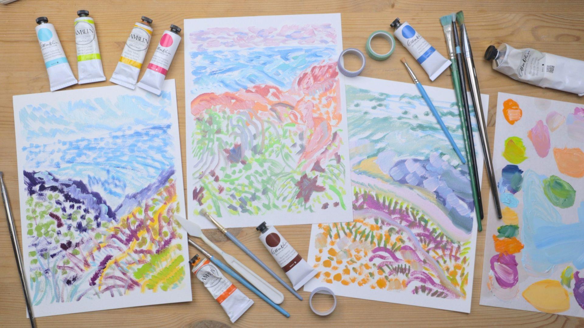
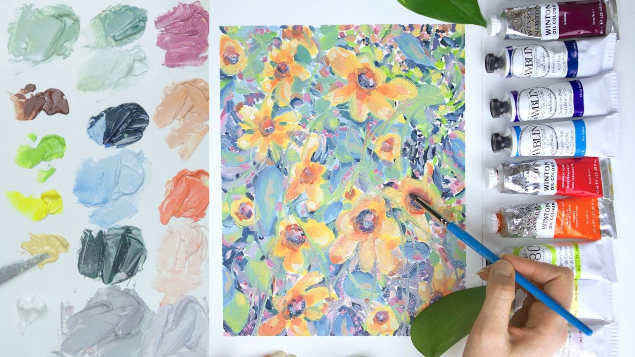
2. Materials Needed + Project: Now before we jump
into painting, let's talk about the
project for this class and the materials for the
project for this class. I want you to create a matise inspired abstract
landscape painting. And when you're finished,
please please make sure to take a photo and upload it to the project gallery
of this class. I'm so excited to see what
you come up with and I can't wait to chat with you and
just see what you create. I'm using old paint
for this class, but if you want to use like
a different type of paint, that totally works as well. Now let's get into the materials that you'll
need for this class, All right, so here are the
materials that you'll need. You want some palette paper or something to mix
your paint onto. So this could also be
like an old piece of glass or plastic rags,
or paper towels, oil painting paper, or something to paint your
actual painting on, such as canvas or wood panel. If you don't want
to use my photos, you'll want to have
a landscape photo of your own to paint from. And then a medium such
as safflower oil or gam salt to thin your paint
and a jar to put it in. And of course, brushes, I like to have a variety. But if you only have a
couple, that is okay too. Just use what you have.
And then of course, paint, I'm using oil paint. A variety of colors is nice, but you can also get
by with just like red, blue, yellow and white. But yeah, I like to have
just a few different shades of kind of each color. Matte style painting
isn't an exact formula, so you really can use any
colors that you have. It's a lot more about incorporating various
shades of colors and mixing things up versus having the exact colors
that your photo has. So basically when
I paint with pink, you can also use pink,
or you can use red. When I paint with blue, you can use blue or green. Again, use whatever
you have available. I also have painting
gloves and washi tape, but those are optional.
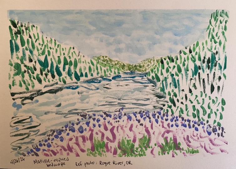
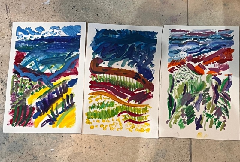
3. Landscape 1 - Desert Hike: Okay, let's get started for our first painting here is the landscape image that
I'm going to paint from. All of my images will be in the class resources of course. Essentially, I look
for photos that have varied directions and
colors and textures. This photo is like
perfect for that. It's not too flat or stagnant
and there's many colors. I also sort of love
that the ocean and the mountains are going different directions
and so is the sky. There's just a lot going on which is perfect for painting. All right, so I feel like starting with lighter
colors today. So I'm grabbing
some titanium white and Indian yellow with
a medium round brush. But really any brush is okay. And we're going
to just carve out those nice diagonal
lines that you see in the photo where
that golden dirt is, this color just really
stuck out to me. It's so beautiful and it's
just easy to start with. I'm just doing some
squiggly lines here. Remember, we are
not doing realism. We really want the white of
the canvas to show through. We want sparse brushstrokes, we want it to feel a bit cartoony in order to
get that matise effect. It almost feels like painting
like a child sometimes, But I promise you, you know, it will turn out good
at the end and it will just look very matise like
I'm grabbing a new brush. I have a small square brush, but any will do of course. And I'm grabbing some serilian blue and titanium white
and a little bit of safflower oil just
to loosen the paint up for the middle sky area. We're going to do pressing brushstrokes to get
little square marks. Mattis like to use these often. Then I grabbed a little bit of turquoise and I'm just making some longer lines that will
signify where the ocean is. I'm just doing some
sweeping brush chokes here. Next I'm grabbing some
magenta and thalo blue and we're going to go ahead and draw out
this mountain. I'm just adding loose lines wherever I see those dark
values in the photo, Keeping it very
loose and sketchy. Just kind of filling
in the lines so that it's not too
harsh of a line. I'm just going to grab
some more magenta to warm up those colors a bit. We want to mix up the brush
strokes and directions. Often I'm just adding some lines to mimic
where the lavender is. Just keeping things fairly
spaced out so that it doesn't look cluttered
or feel too muddy. Next, I'm grabbing my yellow
brush and mixing that with my blue color from earlier
just to get some green. We'll do some pointlism. Wherever we see the
green grass areas, you can layer the color on top of the other
colors a little bit. You don't want to mix
or blend too much, but layering is totally fine. I always really want to blend and start making
it look more realistic. But I have to remember, this is a Met style and it's
a certain style. We're not going for realism. You really want to make
sure and keep that white of the canvas
showing through. And keep your marks
just very sparse. I'm going to grab
some blue and add little tiny brush jokes because there's a lot of lavender
on this mountain, but we already have a
lot of purple tones. I think blue sounds pretty fun. Grass is always longer
when it's close to us, so that's why I'm adding
longer brush jokes in the bottom of the painting. The purple mountain top is
looking a little harsh. Let's add some lighter blue up here to create a
high light effect. Again, super loose, super free, and just moving all over,
adding some details. Next, clean your brush off and grab some light blue
again for the sky. Pressing short brush jokes in a downward sweeping motion as the clouds are in the photo. I'll grab some
serilian blue here and add this to the
horizon just to mix up those blue shades and kind of signify like
ocean versus sky. Okay, well that is
pretty much it. Again, we want to keep it
loose and we want to go ahead and stop while we're ahead so we don't add
too many details. So that is painting one, and let's move on to
painting two now.
4. Landscape 2 - Rocky Beach: Okay, let's get started
on painting number two. This is a photo I took at
the beach that also has lots of colors,
directions, and textures. So again, perfect for painting. So I'm going to start with
these bright red flowers. So I'm grabbing some magenta
and I'm just going to add some loose lines wherever
I see those flowers. You could also use red or
orange or anything you want. I just have this magenta already here and I
like that color, so that's why I'm using that. Again, not realism with
Matt style painting. You just kind of want to think
about different types of breast strokes and sort
of alternate those. So you can think about
like squiggly lines, pressing breast strokes,
sweeping movements. You can think about point, all types of breast strokes. And, you know, just make
sure you have a variety in your painting with
these red flowers. Those could be pointism. They don't have to be the types of breast strokes
I'm doing here. They could really be
anything. You just want to, again, mix it up
throughout the painting. So let's grab some light blue and we'll map out the ocean. I'm feeling some long connected
lines for some reason. That just sounds good
so we'll do that. And then I grab
some thalo blue and a little bit of yellow for
these darker ocean waves, adding some point Eism. Just filling in this whole
space with varied movements. Now I'm grabbing
some purple with a little extra
thalo blue to draw out these dark rocks on
the right of my photo. You could also do dark
green or another color if you wanted just some
kind of dark value. While we're here, we'll go ahead and add some light blue as well for the reflected
top areas of the rock. Let's grab some
Indian yellow and we're going to fill in
the bottom left with these short brush
strokes just pressing quickly everywhere that we see that golden dirt color
on the mountain. I've been loving Indian
yellow recently. I really didn't use it
at all for a long time, but I just recently got into it and it's just such
a beautiful color. It's so tempting to paint
realistically here, but just trust the process. Next, I grabbed a
larger flat brush and some cadmium green. And we're just going to add some vertical grass
brush jokes all over. And mixed up a
little bit of darker green to add all over as well. Just kind of moving all around, layering the color a little bit. I grabbed a new brush and
with magenta and white, I'm going to add
this bright walkway that I see in my photo. You could also do this with like a lemon yellow or a burnt
sienna or anything like that, adding some highlights wherever I see those lighter values. Grabbing some Indian
yellow to just add to the walkway and give
it a little bit of depth, fill in those areas, filling in the sky
just a little bit, and adding a little
bit of blue on the walkway just to
make it pop a tiny bit. Okay. And before I overdo it, I'm going to call it done
and that is painting two, so let's go on to
painting three.
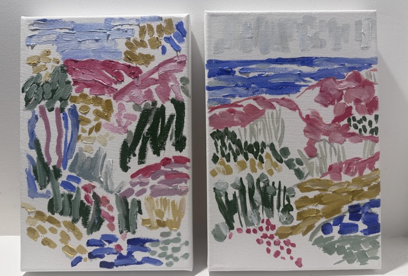
5. Landscape 3 - Ocean Cliffs: Okay, painting three,
let's get started, and apologies, the palette got
a little bit cut out here, but I'll walk you through
the colors that I'm using. It's very straightforward
to start, I'm grabbing cadmium
orange and just carving out the mountain
with loose lines. Then I'm adding in the horizon
with some Cerilian blue. With the same brush,
I grabbed some Hansa yellow to make a green. And we'll just mark
out where some of those trees are in the photo. Back to cadmium orange. Let's add some thicker
lines to mix it up wherever we see that rock
color in the photo. Just adding some
red or magenta to give the rocks a little
bit of depth and shadow. Making sure to always
vary my lines thick, thin up down sideways
dots, longer lines, just always cycling through
the different types of brush strokes then, same with the water here. I'm keeping some
lines really short and sketchy and brushy, and then others are more pronounced and pressed
into the canvas. I grab some turquoise and just adding in some ocean waves. This type of painting is
really all about the essence. It's not about getting
the details accurate, it's about just getting a
very essence of a scene. That's what Mattis's
landscapes feel like. To me it's just a
colorful feeling versus a depiction of something adding some white lines
into the ocean section. Here I grab some magenta and white for the sky to separate the clouds
from the ocean. Creating little
pockets and almost doing like little
sea motions here. And adding a little bit of
blue to mix up the clouds. Then just filling in little areas of the
clouds here and there, making sure to leave that
white shining through. Still adding some
darker Cerilian blue to the ocean with magenta,
orange and white. I'll fill in some of
these mountain dirt areas just adding that
lighter color next to any darker areas that I see. I love adding a light color
on top of a dark color just to have that highlight and
shadow next to each other. Just sketching out
where I see the dirt. Little short brush strokes. Now I'm grabbing some
blue and yellow and making a green color just to map out where these trees or maybe they're like
bushes. I'm not sure. Mapping those out with different types of
brush strokes here, mixing up point eism
and connected lines. Then I'm just making
this little star where I see this dark
shadow in my photo. And I grabbed some red or magenta to also add
to this darker value, added a little blue
as well to mix it up. They kind of look like
little stars. I like them. Then just moving
around the canvas with that blue and red
mixture and just adding it wherever I see those
dark shadows in my photo. Then we'll do some little
highlights with cadmium green. And a small brush, just moving all over those
little dots will really help the greenery like
shine through and it offsets those darker
values that we just added. I really like this effect. This cadmium green really just gives a gloss
to the painting. Really brightens it up
and feels like spring or then I just took blue, magenta, and white and created a light
gray, purple color. And filled in any areas where I saw those purple stick plants. The long brush jokes really offset the short
brush jokes as well. I think this was my favorite
one out of the three. I would love to hear
which one you enjoyed the most or if you did
your own photo, I would love to hear
about that as well. Yeah, I hope you enjoyed this exercise and
learning more about Mattie and his style and creating your own
Mattie style paintings.
6. Final Thoughts!: Oh my gosh. I had so
much fun going on this painting journey with
you today in this class. Thank you so much
for joining me, and I really cannot wait
to see what you create. So make sure to
upload your photos to the project gallery so we
can chat and talk about art. And I can see your
beautiful paintings. And I would love to connect
on other social media. I am Haley Hawkins on Youtube, and I have other
skillshare classes here, so make sure you
check those out. And I'm Hayley Hawkins,
underscore on Instagram. I'm looking forward to
connecting with you guys and I'll see you in another class
very soon. All right, Bye.
 Hayley Hawkins