Transcripts
1. Welcome!: Underpaintings are
an essential part of any painter's journey. Once you begin to
implement underpaintings, you will likely be amazed at how your paintings come to life. By using simple techniques, you will create depth and dimension in your
artwork and the way that you see colors and
values will be heightened and changed forever. In this class, we'll
go over the methods, colors and mediums that
you can choose from. I'll show you my
tips and tricks in a simplified way and by
the end of this class, you will feel completely
clear on how to use underpaintings in your
artwork going forward. If you want to take
your paintings from flat and patchy to vibrant, colorful and alive, then underpaintings might be the missing link that you need. They really are that wow factor, that secret ingredient that so many pieces of artwork have. This class is
completely beginner friendly and if you're
a seasoned artist, then I'll provide
some frameworks and examples that may be
new to you as well. We'll discuss the most
common underpainting types, when to use each one, the pros and cons
and I'll mention my favorite tips for oil
and acrylic painters. I'll also talk
about when you may not need an
underpainting at all. My name is Hayley and
I'm an oil painter from Kentucky and I live in
San Diego, California. I am so excited that
you're here and I just can't wait to dive into
underpaintings with you. Don't forget to follow
me on Skillshare and my other social media platforms
so we can stay connected. Alright, let's get started
with underpaintings.
2. Purpose of an Underpainting: [MUSIC] What is an underpainting and why would you
want to use one? An underpainting is essentially the initial layer of paint on your canvas or other surface. It's the ground first layer. It serves as a foundation
or base and it's implied that you
are going to add more layers on top of
your underpainting. Underpaintings are
completely optional, but they have some
amazing benefits that we're going to talk about. It's good to have it
in your toolkit so you can bring it out and use
it when you need to. One of the most common reasons to use an underpainting is to create depth and dimension by building up layers of paint. This also can create
subtle texture as well. Underpaintings help
you build up color. The underpainting
will shine through the top layers and
enhance shadows, contrast and create
varied colors. For example, if you have a blue shirt and you want
to paint that blue shirt, you can just paint
the normal shirt on one sitting and
it will look good. But let's say you do
a pink underpainting, there will be speckles
of pink that will shine through the blue
shirt and create purples, blues, pinks, and all kinds
of interesting layers. You really can't
get that effect if you were just to
try to paint that, you have to create it with the underpainting
shining through. Things will often look more interesting and dynamic
with an underpainting. The color that you choose
for your underpainting can dictate the entire mood
and tone of your painting. It's helpful to try out
a few different methods and colors to see what
you gravitate towards, and we'll talk all about
those in this class. For example, burnt sienna
underpaintings can create like a
sunsetty, warm glow, while a bright pink under
painting might signify energy, and vibrance, and brightness, while a blue underpainting
might cultivate a cold, lonely, or even sad feeling. Underpaintings can also help your paintings look
less flat and patchy. They can help your paintings
look full and deep, and in turn more professional. I think my favorite benefit of all of an underpainting
is that it creates a foundation and it really helps you draft out the proportions, values, layout, shapes,
and composition, and then you have a
built-in guide that makes the next layers
so much easier. If you don't like how
the underpainting looks. It's really easy to change
it up right there before you commit to multiple colors and full shading and everything. I like that it's like
a test run and you can see what everything looks
like and see if you love it, if you hate it, what
you want to change. I always feel a sense of accomplishment too after I
finish my underpainting. Because like I said, it's almost like a mini-draft version. You cover up the scary
blank white canvas and you get everything down and it really serves as like, I got the big first layer done. You feel excited to
go to the next layer and it just makes you
feel accomplished. Then other times I absolutely
hate the underpainting, so I'm always happy that I
tested it out and I'm able to change it before I went in with all those colors because
paint is expensive, so we want to be careful and test things before
we commit fully. [MUSIC]
3. Which Type of Paint to Choose?: Let's talk about the types of mediums you can use for
your underpainting. For mediums, underpaintings
work well with oil paint, acrylic paint, and
I've even heard people using them
with gouache as well. I think I've also heard people
doing them in watercolor, but that's a little
bit less common. I'm primarily an oil painter, but I dabble in acrylic
and gouache as well. If you're an acrylic painter, you can use acrylic paint
as your underpainting. You never want to paint
acrylic over oil paint, so always keep that in
mind if you're a beginner. Now for us, oil painters, we actually have a few options. You can either use
acrylic paint, oil paint, or water mixable oil paints
for your underpainting. As an oil painter, I typically use oil paint as
my underpainting as well, simply because it keeps my
studio organized and simple. Oil paint is also super luscious and thick and
I really just love it, so I just prefer to
use it all the time. A con is that oil paint
does take a while to cure. I like to make sure my
underpainting is dry to the touch before I move
on to the next layers. That can sometimes
take 2-3 days, and that takes a lot of patience
and planning sometimes. Now, benefits of using
acrylic paint under your oil layers is that
acrylic dries really fast. So this means if
you wanted to paint a second layer in the same day, you likely could because
the acrylic dries so fast. Acrylic paint is also typically
cheaper than oil paint, so you could save a few bucks by using acrylic paint
for your under paintings. Acrylic paint also tends to
be thinner than oil paint. It dries pretty flat, whereas oil paint tends
to create some texture. If I need to rework or edit my underpainting,
sometimes with oil, I will need to sand down that texture before I can redo the underpainting, with acrylic, it dries pretty flat, if I don't like
the underpainting, I just paint over it with a new underpainting and
that can be a benefit. Acrylic paint has a really
easy cleanup process. You use water to thin
the paint while you're painting and water to clean
your brushes at the end, it's very easy, it's non-toxic, it's
just super simple. That's a pro for beginners
or people with kids or pets, and they don't want
to worry about all the different mediums that you might need
with oil paint. Acrylic also doesn't
yellow as it dries. It stays pretty bright
and vibrant as it dries. Oil paint cures and the yellows
over time a little bit, which can be a con. I've been experimenting
recently with using acrylic as my
underpainting more and more because I like
that it stays bright and I get frustrated that
oil yellows over time. If you have a bright
underpainting with acrylic, that can help offset any yellowing later on with
the top layers of oil. Cons of using acrylic paint under your oil layers is
that you're going to have to keep track of two types of paint and your brushes
and your mediums, which isn't a huge
deal but for those of us with limited space
in their homes, it can be something to consider. Then another con is that
acrylic just doesn't feel as rich and nice on the brush. Like when I'm painting, I just really like how
oil feels and looks. You just don't get that same depth with
acrylic in my opinion, but sometimes the pros
can really outweigh it, so it's good to try both. Then lastly, for oil painters, there is a fun option of using
water mixable oil paints. I recently started
experimenting with these, and I actually love them. They're decently
priced, they're easy to clean because you can use water, and they're still pretty
luscious like oil paint. They're in-between
acrylic and oil, and the colors tend to be
pretty vibrant and pretty. Water mixable oils
are also fast drying, which is a huge pro. They're not as fast as acrylic, but they're not slow like regular oils, so
they're in-between. I think my painting dried in about a day or so,
my underpainting, so that's been really
helpful to speed up the time from the underpainting
to the next layer. Another pro with
water-mixable oils is that you can get nice washes. A wash is when you have a
thin watery layer that's difficult to do
with regular oils if you don't use
solvents like me, so this is a really
good option of getting that wash that is
hard to do with oils. But beware of using too much water with the
water-mixable oils. I've actually heard
the paint can become brittle and break off, which is a huge bummer because if it says water-mixable oils, you would think that it's fully able to mix with
water, but apparently, too much water can
be a bad thing, so I have been really cautious and I don't
use too much water. That is a bummer. Just be careful if you're
doing watery washes or layers. Just try to not use
too much water to be safe or research more about it, test it, but I'm erring on
the safe side with that. But overall, a
really great option, and I've been really
enjoying them. For any of these methods, whichever one you choose, just make sure to let
your underpainting fully dry before you go in
with the next layers, make sure your
proportions, shapes, and values are correct, and if you don't like it, you can edit, rework
it until you're happy and then you can go
in with the next layers, but make sure it's fully
dry and that will prevent your colors from muddying
or mixing in the wrong way. [MUSIC]
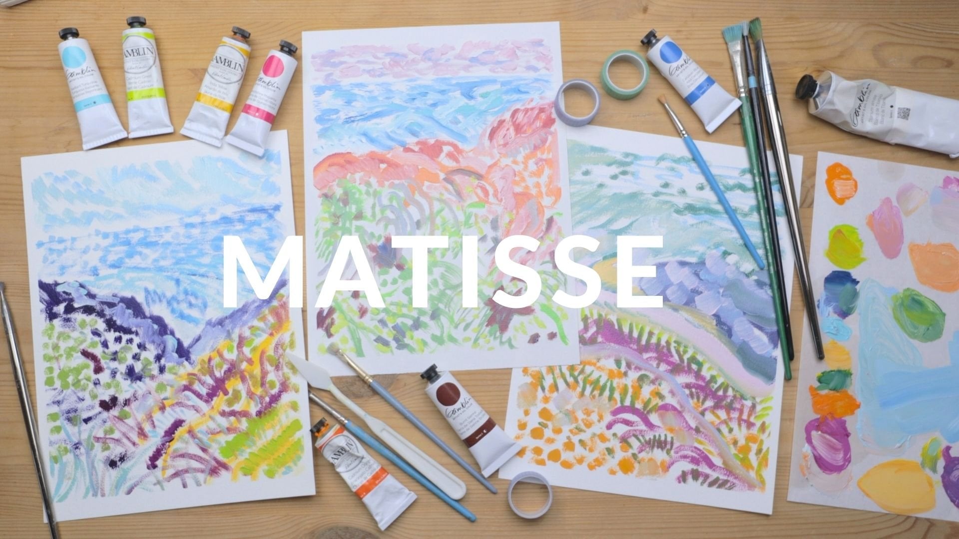
4. Materials Needed: [MUSIC] Let's talk about
the basic materials you'll need for this class. In the last lesson, we talked about a few
different types of mediums that you can choose
for your underpainting. You'll want to make
sure you watch that and decide which type of
paint do you want to use, whether it's oil paint, acrylic paint, gouache,
or something else. If you're a total beginner and not sure which one to choose, I would recommend acrylic paint. It's really easy to clean up
and it's fairly inexpensive. You can typically
find a value pack at Michaels or Joanne's that will have all the colors
that you'll need. For the materials, first you'll need
something to paint on. I like good old
fashion cotton canvas. There's also wood panel and also painting paper
which I love. I really like Arches
and Canson paper. If you're a beginner, then
paper is a great surface to start on because it's cheaper
than like a big canvas, and it's easy to throw it
away if you don't like it, without worrying about the
cost of the materials. Just make sure that the
surface you're painting on is designated to be used with the type of paint
that you're using. You'll also need a
brush or brushes. I like using a medium
brush for under paintings because you can
get nice broad brushstrokes, but also little smaller
details if needed. For brushes, I prefer synthetic and I like
the Princeton brand. But really, any brush that
you have will work fine. Then you'll need something
to mix your paint on. You probably won't
be doing a ton of mixing for the underpainting, but it's still good
to have a surface to squeeze your paint on. For acrylic, I like those
really cheap plastic palettes, for oil paint, I like palette
paper or glass palette. There's also would palettes. If you want to DIY it, you can find the back of a picture frame that you're not using and take out the glass, that can be a nice palette. Or even like an
old ceramic plate that you're not using
from the kitchen. You'll want some paper towels or reusable rags to
wipe your brush on. If you're painting on paper, then you might want some tape. I like washi tape, and then painter's tape or
frog tape works fine too. It helps hold down
your paper and keep it steady and also creates
nice clean edges. A palette knife is also pretty essential for mixing colors. I didn't have one
for a long time when I first started painting, so if you don't have
one, that's okay too. But for long-term, it is
a really crucial tool. You'll need a reference
photo to paint from, either one that
you took or one of the ones from the resources
section that I provided. Or you can find
something to paint from Unsplash or Pixabay or
another royalty free sites. That's a good option as well, if you don't like my photos or you don't
have any that you like and you can just find a
pretty one on those sites. But I usually recommend
having your own photo because the more connected
you are to the photo, the more excited you're
going to be to paint and the more likely you are
to finish the painting, and be excited
about the painting because you're
connected to the photo. Then you'll also need a
medium to go with your paint, to thin the colors and
help with blending. I like to use oil paint and
safflower oil as my medium. You can also use [inaudible] if you use solvents with
your oil paints, I don't use solvents personally. For acrylic paint, you can just use water to thin your paint, or you can use some gel or other medium that
goes with acrylic. For gouache paint, you
can just use water. Then for water
mixable oil paints, you can also just use water,
which is really nice. Just make sure that
the medium you choose goes with a type
of paint you're using. You wouldn't want to use
oil paint and water, for example, because
they don't mix. Then, of course,
you'll need paint. For these specific colors, that will depend
on the color that you choose for your
underpainting. We're going to go
into depth about all of those in
the next lessons. If you don't have any
paint at home yet, you may want to skip ahead
to the next lessons, and see which colors
you gravitate towards, which type of
underpainting that I talked about that
you like that way, then you can just go
to the store and buy one or two colors that you need. You can also buy a
small value pack of acrylic oil or even gouache, and that will have a few
different colors and that should cover all your
bases for getting started. [MUSIC]
5. The 2 Types of Application: [MUSIC] There are
two basic types of application for
underpaintings. The first one is tonal
grounds under painting. The second one is
tonal underpainting. These are really
just fancy words for a single wash of color, just one color, or actually mapping out the shapes
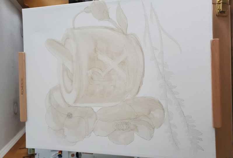
that you're painting. A tonal grounds under painting
is a single wash or stain of one color that covers your entire canvas
or other surface. It is a single
layer of one color, but it doesn't need
to be perfect. It's actually encouraged
to have imperfections or a sense of varying values. Something fun to do
with this type of underpainting is to press harder in some areas so that you get some
areas that are lighter, some that are darker, some that are more
translucent, that thing. It is a single wash, but it's still fun to play with the values and how hard
you press with the paint. Those darker spots, where
you pressed harder, can actually become the starting
point later for a tree, or a nose, or something. So having those uneven values can help you map out
shapes later on. A tonal underpainting is
similar, but this time, you're actually mapping out
the shapes in your photo, or still life, or
whatever you're painting. You're mapping out your lights, and darks, and proportions, and basically outlining the whole first draft
of your painting. As far as how to
get light, medium, and dark values with one
color, for the light areas, a lot of people like
to leave that blank actually and just let the
canvas shine through as white, or you can wipe out
those areas with a rag. You could do a single
wash and then you could wipe out
shapes with a rag. For the darkest tones or values, you can press harder with your paintbrush and use
more paint as well. For the lighter
areas, you could just do a tiny bit of paint, and then also you
can use a medium. I personally don't
paint with solvents, so I use safflower oil. I could thin my paint with safflower oil for
the light areas, and then use no safflower
oil for the dark areas, and use thicker paint
and press harder. If you use Gamsol
or another solvent, you can do the same thing. Just thin your paint
for the light areas, and thin it a little bit
for the medium areas, and don't thin at all for the darker areas,
something like that. I personally don't use the tonal grounds single
wash method very often. I really like to
map out my shapes. It's just a personal preference. I like the sense of
accomplishment you get from mapping out
the whole image, and just seeing the proportions, and seeing if I need to correct anything
before I move on, but I think they're both
great in different ways. Especially if you're
an abstract painter or something like that, the single wash
might be helpful, but we'll talk more about when
to use each type later on. [MUSIC]
6. Monochromatic Method: [MUSIC] Now that we've gone
over the materials, paint mediums, and
types of application, we can now go over the different color methods
for your underpaintings. Firstly, monochromatic
is very common. This means you're only using one color for your
underpainting. You'll see burnt sienna
used all the time. That's probably the most popular
color for underpainting. An artist I love, named Jenny Morgan, uses red for her underpainting. Some artists use blue or gray. There are two
routes you can take when it comes to
monochromatic underpainting. The first one is harmonizing, which means you're going with the colors in your
image or still-life. Then there's contrasting, which means you're painting
the opposite colors or the complimentary
colors than what you're seeing in your
image or still-life. For example, if you're painting a beautiful forest that's
full of greens and blues, a harmonizing
underpainting would be a blue or green
underpainting, whereas a contrasting
underpainting would be full of red or orange. Both of these types of
underpaintings will give your end result a completely different
mood and overall look. It will make a big difference as you'll see once you
start playing around. It's really good
to test and just try all of these and see
what you gravitate towards. But also realize that some paintings may
have a different need. I feel like harmonizing colors can brighten your paintings and give them like an energy
and almost a modern look. Whereas contrasting
can sometimes give your paintings a moody, earthy or emotional
type of look. They're both amazing
in their own rights. I think it really
just depends on the style and the mood
that you're going for, and also how realistic
you want the painting to be or how impressionistic
you want it to be. All of that matters as well, which is why we're just going to go over all the methods and then you can pick and
choose as you wish. With only using one color
as your underpainting, you may be wondering
how do you map out all the values
in your image, the lights, mediums, and darks? How do you do that
with one color? Well, there's a few tricks. For example, if you
want a darker value, say you're using burnt
sienna, one color, and you have a really dark
spot on your image, well, you can either press harder
with your paintbrush, you can use more
paint or you can use less solvents or
mediums in that area. Alternatively, if you
want a lighter value, you can leave the area blank, you can use less paint
or you can use a solvent or medium
to thin your paint. Some people also like to wipe away the lightest
areas with a rag. You could paint the medium
in dark tones and then wipe away the
lightest areas with a paper towel or a reusable rag. Benefits of using a
monochromatic underpainting. Well, you only have to get one color out, which is awesome. That means you can jump
right into painting and you don't have a big setup process. I'm really into the idea of lowering the barrier to
entry with our habits, so sometimes sitting down
to paint can be difficult. If we only have to get
out one color and we know the cleanup process is going to be really
quick and easy, that's a huge benefit. Using one color for
your underpainting is a great way to just get
started and dive right in. That also gives you momentum. It makes the rest of the
painting journey a lot easier. Another benefit of
monochromatic underpainting is that you learn to see
values much clearer. Values are the light, medium, and dark areas in a painting. A helpful tip that you can do is that you can take the
photo that you're painting and you can change the colors to sepia or black and white. That will automatically
show you all of the values without distracting you with
the colors in the image. When I was a beginner, I would do my
underpaintings with burnt sienna and I would
change my photo to sepia. Then when I was done
with the underpainting, I would change the photo
back to have the colors. Having the values correct in
a painting creates balance. Doing the monochromatic method over time will train you to pick out values and to see those subtle differences easily. What color should you use for your monochromatic
underpainting and when should you use it? Well, that is completely
up to you and subjective. But I will mention a
few common examples. For landscapes and photos
with a lot of sunshine, burnt sienna will
be your friend. Landscapes really need
that glow that is naturally occurring from
the sun and the earth. Burnt sienna just
works incredibly, historically with
these type of photos. You can actually leave some of your burnt sienna
underpainting shining through, so you don't paint over it. Actually it looks
so realistic for sunsets and nature paintings. You really can't get the same effect by just
trying to paint that on. It has to be coming from
underneath, if that makes sense. Just make sure to let your burnt sienna underpainting dry for a couple of days, that way it doesn't muddy
up your top layers. Then for a wintery, cold landscape scene, I would love a blue
underpainting for this. But you could go bold
and contrasting and try orange or burnt sienna
as well, take a risk. For ocean scenes or
nighttime scenes, I also really like blue. For portraits, I
like burnt sienna. It just looks nice for skin
tone and gives a nice glow. If you're interested in glazing, which is something that the
old masters commonly did, then you could do grayscale, so you could find
a nice gray color. I also really like red, orange and even pink
underpaintings. I tend to gravitate
towards the warm colors. They just always look
good as an underpainting, but it really just depends
on your subject matter. That's why it's great
to try them all. If you do want to try the monochromatic method for
your project for this class, which is to create
an underpainting, then just choose a color, whether it's burnt
sienna, blue, red, maybe check your image first and just see what you
think would look best, and that will be
your color to use. [MUSIC]
7. Two-color Method: [MUSIC] Another method you can do for your under-painting
is the two-color method, and it's as simple as it sounds. Instead of just using
bright sienna or gray. I really like to
use white as well. That would be an example
of the two-color method. That way I don't
have to wipe away the light areas or use
a bunch of medium. I can just use white
for my light areas. You could also do bright
sienna and raw umber. For example, having
a really dark value or gray and raw amber,
something like that. You could also do two
harmonizing colors or two contrasting colors. For example, earlier when
I talked about doing a green under-painting to harmonize with your
forest painting. You could now with a two-color
method do green and blue. Just vary those colors in your under-painting as a
harmonizing two-color method, or you could do red and orange for the contrasting
under-painting for the forest. You'd have a really
beautiful warm contrasting under-painting
for your greens and blues. Another rule for the
two-color method that I like to follow is having a warm white
and then a dark cool. For example, you could have a dark navy with a light orange, or a dark violet
in a baby yellow, or a forest green
and a light red. You may want to let
one color dry first before doing the other
if they overlap at all. But this is a really fun, beautiful combo and it really covers all your bases tonally. It also helps things not
look out of place under your top layers because you have all of your bases covered. [MUSIC]
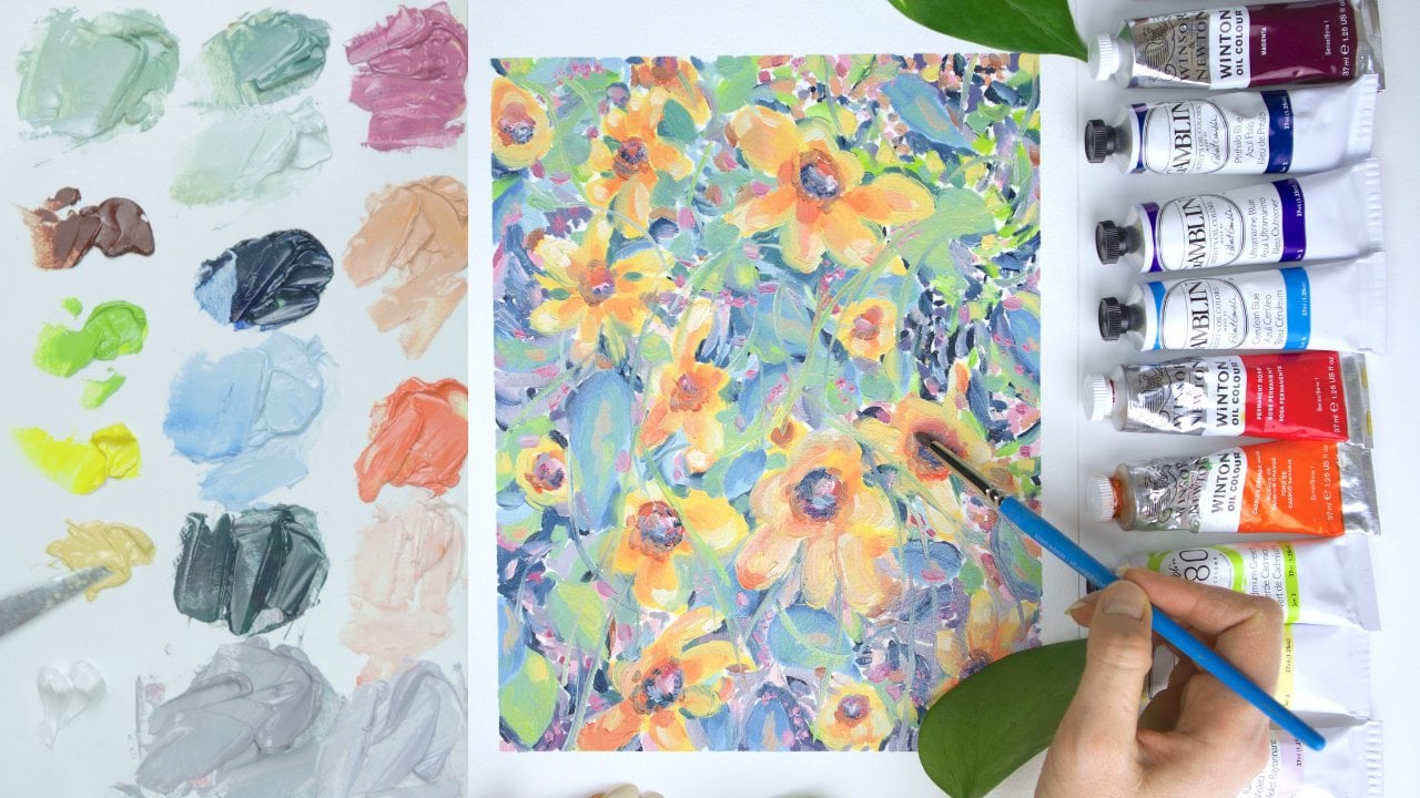
8. Multicolor Method: [MUSIC] Lastly, the multicolor
underpainting method. Instead of using
one or two colors, as we've previously
talked about, in this method, you would
use multiple colors. There's a couple of ways to approach the multicolor method. There's of course, harmonizing, where you would
essentially just paint a first draft of your painting. You would use the same colors
that you see in your photo, but it's like a less precise
version of your painting. It's just a first draft, but you're using all
the colors that you see in your photo in
the correct spots. This is a nice approach
because you actually see like a sneak preview
of your finished painting. If you really don't
like something, you can edit the colors
or proportions or anything you want before you
go in with the next layers. I like this method because then when you go to paint
your top layers, you already know where
all the colors are. It's almost like a
paint by numbers. Like, you see the blues,
you see the reds, you just have to
paint more layers, more of that paint, but you already did
all the hard work, so you get a really nice
sense of accomplishment, and the painting process feels smoother and quicker
the rest of the way. Then there's contrasting
so you would paint the complimentary
or opposite colors as you see in your photo. You would also paint
the full image, but it would be all
contrasting colors. I really like using the contrasting multicolor
method when I'm painting people and skin tones. I feel like the
contrasting colors really dull down the top layers and
it gives it a realistic, earthy feeling, and that's a good tip if you're a beginner, the opposite color on
the color wheel or the complimentary color
always dulls the other color, so purple and yellow, green and red, blue and orange. If you have a really
bright orange and you need to dull it down to make it a
little bit more realistic, you just add a tiny bit of blue. If you have a really
bright green, you want to dull it down, add a tiny bit of red,
that kind of thing. Having those opposite colors
as your underpainting, it already has a foundation, a base of dulling your
top colors in a good way. One of my favorite artist, Chloe Wise, does this
method beautifully. She shows it on her Instagram, and that's how I really
learned about this method, actually, is watching her. With this method too, I think it's okay to use paint
straight out of the tube, which I normally would never do. I always mix really nice colors. I don't just use one plain
color out of the tube. I like to mix and get
really unique shades. But with the underpainting, I think it's okay to use it
straight out of the tube because you are going to be
adding a bunch of layers. But if you have time to
mix, that's great too. I'm all about making the barrier to entry as low as possible. Another thing you can do is
you could pick 3-4 colors and just paint those around your canvas for
your underpainting. So you're still
getting varied color, but you're not having to
pick out all of the colors. You could do like two cools
and two warms, for example. Maybe like a dark cool and a light cool and a dark
warm and a light warm. That's just an example, but that would look really nice and still give you a nice, interesting base that
has all the tones there. The only con with the multicolor method
is that it's not as quick as the other methods because you have to
get out more colors, so it takes a little
bit longer to set up, but it pays dividends. It's a great method. [MUSIC]
9. When You May NOT Need an Underpainting: When do you not need
an underpainting? Well, anytime you
want, honestly, they are optional of course, but I recommend getting
comfortable with them, and learning about
them because they are an essential tool for
every artist's toolkit, and they can really take
your art to the next level. But I do have a few real-life examples when you
may not want to use one or in the past when
I've not wanted to use one. The first instance is if you're painting all
in one sitting, also called Alla
prima or Alla prima. I like painting
in one sitting if I'm just doing a
quick study or if I'm testing an idea that I want to paint on a larger
canvas later. Now you could do a
quick sketch with a color that harmonizes
with your image. For example, if you're painting a body of water and you do a quick sketch of
the ocean with blue. That's not going to cause any issues with Alla prima because it won't
muddy up your colors, it will just blend in, so that would be fine. But you wouldn't want to
do a full red or burnt sienna underpainting and then go in with blue right
on top of that, because it would
be wet-on-wet and the colors would muddy up and you would lose some
of that vibrance. In another similar instance
will be plain air, which is painting outside. You won't see what you're going to paint until you get outside, so there really isn't a chance to do underpainting anyway. But again, you may want to find a color that harmonizes and you can do a quick
sketch just to get the shapes.
That's totally fine. What I mean is that you
just don't want to do a full burnt sienna
underpainting if you're painting all
in one sitting. Another time that you may not want to use an
underpainting is if you're painting very
translucent images. For example, this is
a personal experience I used to paint
fruit all the time. Fruit is very vibrant and
bright and translucent. I learned that if I
did underpainting it dulled my fruit a little bit. I learned that doing it
all in one sitting with the bright colors and no underpainting
actually looked better. But of course, there's a
million examples out there of beautiful fruit with
underpaintings as well. It's just depending on your style and how you
approach painting. Just play around and see because everybody
paints differently. It's one of those
things of knowing the rules so that you can break the rules
when you want to. Another time where you may not need an underpainting is if you want to just
get started right away and you're short on time, and you don't have time to
let the underpainting dry. Depending on how thick
you paint and how important light and shadow
is within your artwork, it may be okay to not
have an underpainting. I think paintings typically look better with
an underpainting, but if you are creative
and you're short on time, go ahead and skip it and see how you like painting
without one. I've learned over time that
certain paintings really need one and certain ones I can
get away with not having one. It's good to experiment and just test things
out for yourself. [MUSIC]
10. Project: Let's talk about the
project for this class. You guessed it your project is to create an underpainting. I recommend choosing a
photo that you took, whether it's a
portrait, landscape, your dog, your breakfast,
a flower outside. Just go through your phone, camera roll and see if there's any photos that you took
that you connect with. It's important to be connected to the photos that
we paint and to be excited about them or we're not going to want to
finish the painting. You can also use one of the photos that I
showed in this class. I'll add a few to the
resources section. So you can definitely
just paint one of those if you
prefer that as well. Once you decide what photo
you're going to paint from, look at your photo
and think about what underpainting might
fit that photo best. Does it have a cool, windy feeling or is it a
sensory glowing feeling? Just decide what
might fit it well, or just choose an
underpainting from this class that you were drawn to,
that you wanted to try. You can choose if you want to do a tonal grounds underpainting
or a tonal underpainting, you can choose the
color that you want to use and the style. If you want to do one
color, two-color, multi-color, it's up to you just choose one and try it out. Then you're going to just
paint the underpainting. When you're finished
with your underpainting, make sure to take a
photo and upload it to the project gallery of
this Skillshare class. For lighting, I recommend going outside and just
finding a shady spot on the ground and laying
your painting down and that always
provides good lighting. That's what I recommend. You can just use your iPhone or cell or whatever,
that works great. I'm really looking
forward to seeing your underpaintings
and I just can't wait to see what photo you chose and what underpainting
you chose to paint. Definitely get those
photos uploaded and I'm just super excited
to see what you created. [MUSIC]
11. Final Thoughts: Thank you so much for going
through this class with me. I hope you now feel
more confident diving into under paintings and you really have an
important tool in your toolbox now that you can
pull out when you need it. You should celebrate
yourself for spending this time learning and
growing in your artwork. That's a huge win
anytime you sit down and focus on your process
and getting better. If you enjoyed this class, make sure to follow me on social media and
Skillshare so we can stay connected and talk
about all things art. Make sure to also leave a review if you
enjoyed this class, that helps so much more
than you even know. Thank you for joining me
and I can't wait to see you in another class soon. Happy painting.
 Hayley Hawkins