Transcripts
1. Welcome & Intro: I like to think that learning about brushstrokes
helps you go into your paintings with a plan
by gathering knowledge of the various types and
methods of brushstrokes, you'll really go
into your paintings armed with options
to choose from. And you'll really avoid
that familiar feeling. What do I do with my
hands when I'm painting? In this class, we're
going to go over seven very common types of brushstrokes you can
use in your paintings. You can use any type of
paint with this class. My goal with this class is to keep things
really simple and straightforward so
that you can leave confident with all these
new brushstrokes to try out in your
paintings without feeling overwhelmed
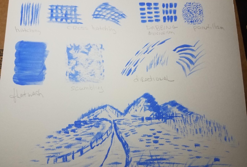
from crosshatching, stippling, scumbling, flat
wash, and a few more. You're going to learn
the exact hand movements and brushes to use to
create these types of brushstrokes will also
touch on how you can use these brush strokes to create texture, pattern, and shading. And of course, I'll mention other factors that will
influence your brushstrokes like thickness of paint and even how hard you
press with your brush. The project for this
class is simple. You're going to test
all seven types of brushstrokes and really just
get familiar with them. Well, I am just so excited to dive into
brushstrokes with you. My name is Haley and I will be your instructor
for this class. I'm a painter and I
live here in San Diego, California, and I'm just
super excited to get started. So let's dive into the class
and begin on brushstrokes.
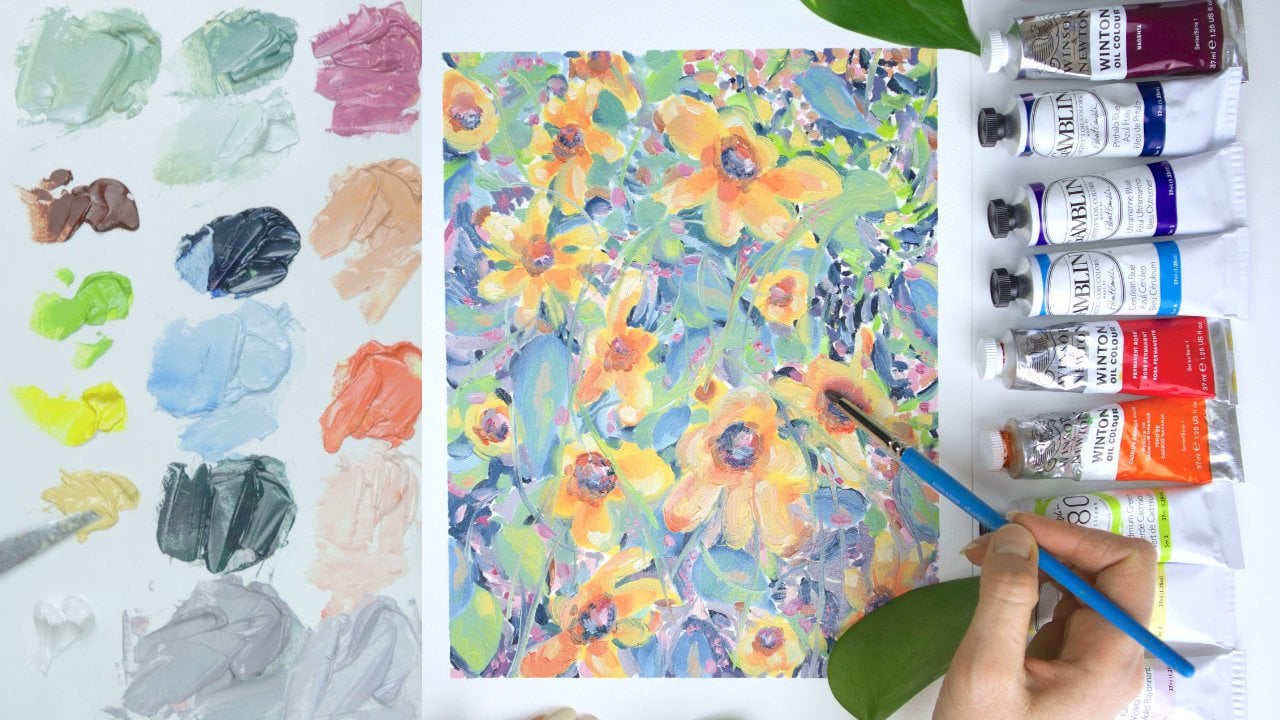
2. Materials Needed: Alright, let's talk about the materials you'll
need for this class. We're going to keep
it super simple. Okay, so the first thing that you'll need is
something to paint on. So this could be some type
of painting paper, a pad, like a canvas pad or a canvas that stretched
on stretcher bars. You could just, just so like
a page of a sketchbook. Anything will do as long
as you can paint on it. You can use any type of
paint for this class. So just make sure
that your surface works with the type of
paint that you're using. So the next thing that
you need is some paints. You can really use any type of paint, watercolor, gouache, acrylic oil, anything
that you have available, I'm going to be using acrylic. So something like
this for this class. And you will want a medium to
go along with your paints. So for acrylic, I use
water, watercolor, and gouache uses water
or oil paint you can use like safflower
oil or gam Saul, just something to dilute
the paint a little bit. And then you'll want something
to squeeze your paint onto like a pallet of some sort. So you can use paper
palettes like this, really anything, just
something where you can put your paint onto it if you
don't have any pallets. A budget friendly
option is to use like a paper plate or an
old ceramic plates. Okay, So brushes, you want
a little bit of variety. So I have one brush
that has a fine tip, one brush that has
a flat square edge, one brush that's a little
bit wider and flats, I have one brush that's a little bit older and
cheaper and round. And we're gonna kinda
messed that one up, which is why you want
it to be old and cheap. And then I also
have a fan brush, which is optional, but
it's nice if you have one.
3. Cross Hatching: Okay, Let's learn
at crosshatching, this is one of my favorites. I'm using a brush with
a flat square edge. You can use any brush with
a square root edge or a fine tip because we really
want precise brushstrokes. And I like to grab a
tiny bit of water with my paint just so that my
lines lay down smoothly. So cross hatching is
a technique that uses two sets of parallel lines
that cross over one another. You can use this
technique to add texture to shade and
create light and shadow. Or just to simply fill
in an area loosely. And you want to keep a
fairly loose hand because too much pressure will
flatten and smush your lines. And we really want to see
that beautiful web pattern. You can add more space in-between the lines
for lighter values and less space and closer together lines for
darker values. As I'm showing here, I'm darkening this area by keeping the lines
close together. You can vary the
thickness of your lines or use less paint for a dryer, sketchy effect,
which can be fun. Horizontal and vertical lines
will appear more fixed, while diagonal lines will create more of a sense of movement. Cross hatching can also
create a 3D effect. You may think of MC Escher who used a ton of crosshatching
in his works. And the drawings really
jumped off the page. I just switched to longer brush to try out some
thicker lines here. You can also blend it
with crosshatching. So just have thick lines that don't have any
space in between. But you're blending
will look less flat because of the
cross hatching. Your lines also don't
need to be straight. You can actually
curve or swirl or squiggle or squiggle
them for fun effects, or to create more movement, or to portray waves
in the ocean, or grass blowing in
the breeze, e.g. which also reminds me if you're
painting a landscape e.g. and you use cross hatching, make sure to vary the direction and
appearance of your marks. Have diagonal,
vertical, horizontal, short, long, curved,
jag it and so on. That way your painting will flow organically and it will
look more dynamic. You can use cross
hatching to signify patterns and your paintings
such as a plaid shirt, a linen couch, a textured
rug, wallpaper or tile. So some feelings that are conjured up when
using crosshatching, elegance or neatness,
feeling unfinished, maybe a feeling of being
dated or old timey. I often think of Appalachia and quilt patterns when
I see crosshatching. So it gives a feeling of a simple life or getting
back to the roots, as well as melancholy
or mysteriousness. Okay, so I'm just
going to demonstrate some subject matter
with crosshatching. So I'm just sketching out a
rough little flower here. So you can see how the
areas that are lighter, I'm going to keep
the spaces pretty wide for the darker
values on my image. I'm going to tighten the space in-between the lines
to create more shadow. And then I tried to curb some of the lines to make it a
little bit less static. This is obviously a very
quick and messy painting, and this is not
something I would sell or anything is
just for this video. But I just hope this gives
you a quick idea of how you could use this technique
and a real painting. Now I'm just painting
a little tree here. We're using vertical
lines purposefully on the tree trunk to
really signify height, strength and a solid
fixed tree trunk. And then on the leaves, I'm really curving a
lot of those lines. I'm really showing the
hanging nature of the leaves, the heaviness of the tree top, the leaves blowing in the wind. So we can really use
the direction and shape of the line to our benefit. Another tip is you can use cross hatching on certain
areas of your painting. You don't have to use it
on the whole painting. It's really a style,
it's very sketchy. It's not necessarily how I'd want my whole painting to look, but if you have a small area
in your painting that needs some texture or you just want to fill in a background area. You've got some
distant trees are a person who isn't
the focal point. He just kinda sketch
it out and it kinda shows that they're
in the background, but you don't have to
spend a lot of time. You could even do
like a horror vibe, like maybe you got a weird
baby who's like sketched out, but everyone else is in the painting, painted
realistically. So that's just kind
of a fun example. Or again, a pattern on
a shirt, shoes, couch, wallpaper, ocean
waves like there's so many opportunities
with crosshatching. Now I'm just blending out
some quick graph down here. So yeah, It's also a
great blending technique. You don't have to use it
just like for the pattern. You can just blend and go
back and forth diagonally. And it's just kinda
an easy guide to help you know how to blend. Okay, well that
was crosshatching. I hope that was helpful
and educational. I really love this
technique myself. So, okay, let's move
on to the next lesson.
4. Flat Wash: Okay, let's learn how
to paint a flat wash. So you want a medium
or large brush, you can use round or flat. I personally like flat. You just don't want
anything tiny. And I also like
synthetic soft bristles. So first you want to grab a little paint and grab a
little water on your brush, you can start on
the left and simply make sweeping motions
with your brush, holding down with
medium pressure and just do that over and over. You're kind of overlapping
the lines just slightly. Basically, you're
creating rows of paint. So a flat wash is essentially
what it sounds like. You're pressing a
larger brush in smooth, bold lines and you're creating
a flat area of color. So think longer, one
direction, repeated strokes. You'll often see
washes in watercolors, but you can really apply the same principle to
any type of paint. Washes can be used to create a solid background of color
before you start painting, or it can be used as just a regular
painting brush stroke. The results should
be semi-transparent. So there's typically a
decent amount of water or medium used to
dilute your paint. Basically, you just
don't want thick paint. You want that watery,
flowy consistency. Another tip is to paint with your arm instead of your wrist. So you can get like a bold
line that feels confident, but at the same time effortless. I'm showing here how
you can use two colors. So I'm basically just painting
the opposite color on the color wheel on top
of the previous color. And that will kinda
dull it down. So it can help if you have
a super bright color, e.g. flat washes are also
really helpful if you want to create a sky or grass. You can do a flat
wash, let it dry, and then go over the wash with more layers and more details. I also like to use this technique as a
brushstroke itself. You just want to keep
their brushstrokes fairly short so you don't run out of paint and
get those dry, awkward edges. And if you ever get too
much water on your brush, just simply plot it on
a towel and keep going. Okay, so that was flat washing. I hope you enjoyed. Let's go to the next lesson.
5. Scumbling: Okay, let's learn
how to stumble. Some people also call
this method dry brushing. I recommend using a semi
old or cheap brush for this technique because
the brush will inevitably get freight
out and try it out. Any shape of brush will work, but I like the round ones. So you don't want a lot of
liquid or even a lot of paint. I like to get some paint
on my brush and then dry the brush on the
towel so it's extra dry. And essentially we are keeping a loose hand and
using the side of the brush and we're
just moving in circular directions
very lightly. You don't want to
press too hard here. You can see that the
texture underneath shines through and
that's what we want. And I press a bit harder here, which is also okay. It's up to you how much
pressure you want to use. And you can use
more pressure for darker areas and less
pressure for lighter areas. You can also go back and forth horizontally or vertically if you want instead of circles. And again, you're just
lightly brushing against the surface of your
paper or canvas. We're also not looking
for a smooth blend. We kinda like to embrace the roughness or
unevenness with scumbling. Okay, so now I'm
just going to add a normal layer of green paint. And then once that dries, we'll come back and we'll
stumble over the green with red paint and you can
see like a two-color effect. I'm also just painting
a little house here. So I'll show you how you
could use scumbling to blend or shade in a
real-life painting scenario. So again, you can see how
uneven the paint looks. And that's actually the point that's like the
charm of scumbling. And I actually really
like how it looks. I'm trying out a larger flat
squared brush for the grass. I'm still scumbling
and using the side of the brush and just going
in various directions. And I'm realizing I really
like this technique for grass, so I'm probably going to use
that again in the future. Okay, so our green
layer of paint is dry. So I'm going to grab some red
paint and just dry my brush off and just go lightly
over that green area. If you ever need to
dull a color, meaning, say if you have a bright
green shirt and it just looks a little bit
unnatural or too bright. You can take the opposite
color on the color wheel, which is red in this example. And you stumble lightly
over that green. And the effect
makes it so that it looks like you painted the
two colors at the same time. And it makes the colors look more dimensional
and interesting. And you're also making
it a little bit more realistic because it's
not so harsh and bright. Or say you have like a
tree or a flower that just looks kinda flat in
one-dimensional. Just kinda like stumble over and you're giving
like texture and multiple colors and just like
more interesting of a look, this technique is also
helpful if you just don't like your
first layer of paint and you just want to slightly
edit something or update it or change the temperature
or cover up something. It can be really helpful. So we're still holding
our hand lightly. If you over blend
with scumbling, you'll really lose the color
variations and the texture. You want a soft
transition of the colors. So you're essentially like
scrubbing them together. And you can see my very
frayed out brush here. So that's why I use cheaper
brushes for scumbling. I will mention too, that
some people like to use a rag or paper
towel and actually like why did up in
a ball and kinda go over an area with little paint and you
can scramble that way. So you could stumble
with a paper towel. So that's just like an idea
if you want to try it out, I'm just scumbling over my other areas to show you
what it will look like. This is making me feel a
little bit Christmas Eve. How about you? I'm just
so pumped for Christmas. It's like my favorite
time of year, so I didn't even realize I was accidentally getting
into spirit here. Okay, So we're at the end. I just want to recap quickly. You want to keep a loose hand, you want to keep a dry brush. You want to use the side of the brush and you don't
want to over blend. Okay, that was scumbling. Let's go to the next lesson.
6. Divisionism / Dabbing: Let's talk about dabbing now. For dabbing, it's helpful
to use a flat brush. You don't want a
fine tip to brush because we are going
to be making dabs, which are essentially
like little squares. You want your paint
to be fairly thick. So I didn't grab any
water for this lesson, we're going to be
making repeated small, short, but visible marks. The marks aren't as
small as pointillism, but they are similar in
that they're repeated. These marks are bold
and deliberate. You're giving a good
amount of pressure with your brush to create
these intentional marks. And you really want to see that brushstroke texture
that's encouraged. So dabbing is used in
an art movement called division as it's associated
with Neo impressionism. And again, it's similar to pointillism and has
a lot of overlaps, but the marks are more bold, more colorful, just a
bit larger than life, whereas pointillism is
a bit more subdued, more blended looking
with division is, you can really see the
clear brushstrokes like they're very bold and
separated almost. You can use dabbing in
various directions. You can have large
or small dabs. You can have them close
together or further apart. And they don't need to be
perfectly parallel or uniform. There is, of course,
an optical effect when the painting is
seen from far away. The same as we discussed
with pointillism. When dabbing, you're creating
a sense of movement. You're creating life and light. All of the brushstrokes work
together in layered affects. So again, you aren't blending, you're adding the colors
next to each other. There's also often a focus on ordinary subject matter
with revisionism. So here I have a
photo of a cake, which is a quite ordinary
object, I would say. So it fits the bill. And I'll try out some
dabbing with this cake. So you can play with
adding colors next to each other and on top
of each other as well. You don't want to blend them super hard on
top of each other, but a little bit of layering
is definitely encouraged. I really liked that dabbing
makes a painting feel alive. It feels like it's
moving around the page. There's really no static
or flat feelings at all. And it's a bit messy
and life-like. I just really enjoy this
style for that reason. I love the loose,
messy, alive feeling, that impressionism and
expressionism and revisionism, pointillism, they all
really provide that. There's a lot of
color theory going on because placing certain colors side-by-side will look like a completely new color
from farther away. Adding complimentary colors next to each other will
create shadows, or even adding a blue and a
yellow next to each other, it can create a
green from far away. There's also an element of using directional brushstrokes
with dabbing. And you're often pointing towards or away
from focal points. Alright, well that
was a quick demo of dabbing and division ism. I really hope you
enjoyed this lesson. I had so much fun
learning more about these movements and just playing around with all the
colors and brushstrokes.
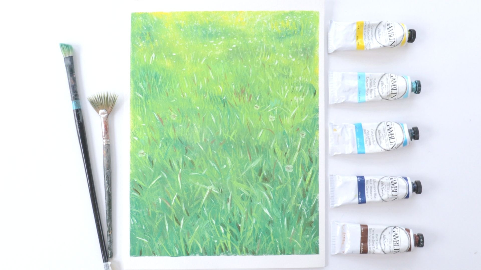
7. Directional: Okay, let's learn about
directional brushstrokes. Also, a completely
forgot to turn on my camera a couple
of minutes ago. So you'll see some
of the brushstrokes that I already started here. So what are directional
brushstrokes? Well, they're essentially
repeated brushstrokes that move your eye in a
particular direction when you're looking
at a painting, these brushstrokes encourage
you to follow them. So you're not just looking
at subject matter. The subject matter is
taking you somewhere. Directional brushstrokes
are incredibly helpful if you're trying to
insinuate movements, create perspective, or to
simply live in a flat painting. They can also help you portray
certain subject matter, such as waves in the ocean, e.g. as you can see here, you can do horizontal, vertical, diagonal way,
the curved, long, short. So many different types of
directional brushstrokes, you can add less detail. Four items in your
painting that are farther away are less
important and then stronger, more detailed brushstrokes
for focal points or items closer to the
forefront of the painting. Basically the key is
to repeat, repeat, repeat in a particular direction so that you create
that movement. And as I mentioned, directional
brushstrokes can help the audience identify the focal
points in your paintings. So here I'm sketching a quick cartoony mountain scene and I want my highway to be
one of the focal points. I will give it the highway, those brush strokes that go in a direction
towards the mountain. And you can see that it's driving you towards
the mountain. And then for the grass on
the sides of the highway, I want it to look
like rolling hills that are moving away
from the highway. And this is a good example
if I did brushstrokes that were similar to the highway
and I did those on the grass, on the outside areas. You'd probably think
it was just like a ten lane highway instead
of a highway and then Hills, you wouldn't be able to
tell the difference. For the water. I'll add some
long wavy horizontal lines. Then for the mountain, I'll have some sharp curved
lines to show the height. And it kinda helps your eye move upwards towards the
mountain peaks. Alright, well, that was a quick overview of
directional brushstrokes. Let's move on to
the next lesson.
8. Hatching: Okay, Let's talk
about hatching now. I'm using a smaller flat
squared brush here. But you can really
use any brush for hatching, round, flat, short, small, whatever,
because hatching is essentially just parallel
lines that are repeated. So different brushes will
give different effects. We already went over cross hatching if you
watch that lesson, and I will say that hatching
is of course a very similar. They are cousins, if you will. So hatching is a series of repeated parallel lines
going in the same direction. You aren't crisscrossing like
you are with crosshatching. It's just lines
in one direction, so it's just one set of lines
versus two sets of lines. I actually love the way
that hatching looks. It's so versatile and it really reminds me of like comic
books for some reason. It just has a fun,
animated, sketchy style. Hatching can be a
beautiful pattern to utilize when shading, filling in areas or simply giving some
texture to a flat area, It's really fun to
play around and try various brush sizes and shapes and just see what kind
of lines you come up with. Your lines can be broken,
jagged, uneven, rough. They really don't
need to look perfect. Your lines can also be
diagonal, vertical, horizontal, wide,
thin, short, or long. They can also be wavy or curved. You really just want
them to be repeated going in the same
direction and parallel. Feel free to also change up the direction and move
freely around your subject. Feel free to hatch in one
area of your painting. You really don't need the whole paintings
would be hatched. It's just a tool in your
toolkit that you can pull out for specific subject or
areas in your painting. And as we mentioned
in the other lessons, when you're using this
technique in a painting, you can keep the lines
closer together for darker values and have the lines are further
apart or lighter values, you aren't blending
the lines together. You're just layering them on top of each other and
next to each other. Doing this exercise actually
reminded me of like Charlie Brown or a
newspaper comic strip. There's just something so
nostalgic about hatching. It's used in a lot of
cartoons and I'm just really drawn to it for
that nostalgic feeling. And of course, I'm just going to quickly demonstrate
how you might use this in a painting with
this flower and tree here. Very similar to cross hatching, but you're only going
in one direction. Here's just a quick example of a painting I did for another
video demonstration. And I use hatching in the
grassy like mountain areas. So it's actually
great for landscapes. Grass, mountains like really a lot of nature
paintings use hatching. Alright, Well that was hatching, one of my favorite
brush strokes ever. I hope you enjoyed it. Let's
go on to the next lesson.
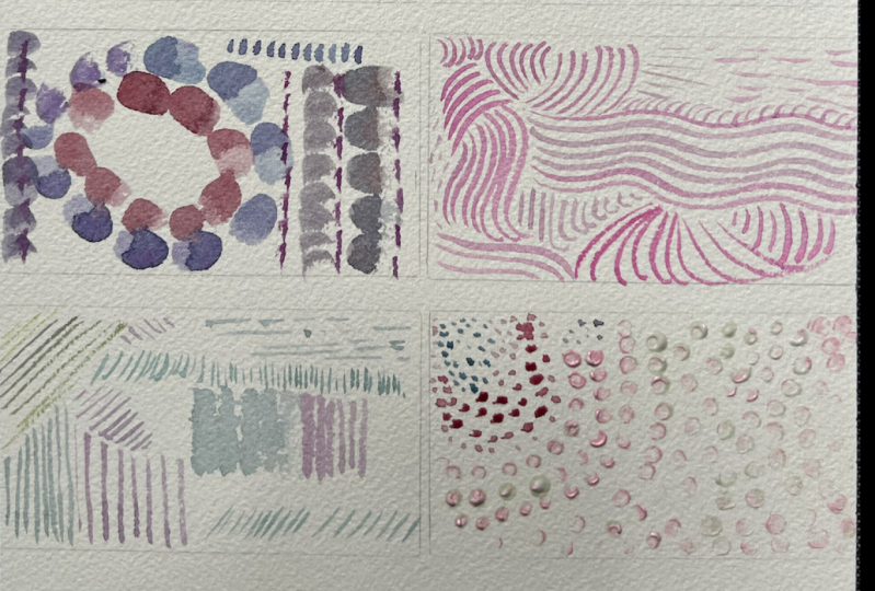
9. Pointillism / Stippling : Okay, let's learn
about pointillism. Pointillism, It's ideal
to use a fine tip brush, or you can use a fan brush, or you can also use the
edge of a flat brush. So pointillism is
essentially painting with repeated dots
to form images. I find it very fun and meditative actually
because it's really easy and you just have to focus on repeating the dots when
holding your brush, it helps if you hold it upright and you're basically
stabbing the paper. It's a press and lift motion. Makes sure not to linger
too long in the paper or your dots will
get kinda smushed. And also don't hold your paint
brush sideways too much. Or you might get lazier marks that are more of
like a line shape. I want to quickly mention that many people including myself, often get stippling and
pointillism mixed up. So they're very
similar in that they both use repeated dots. However, stippling is
often done in one color, black and white, and it's
usually in pen or ink. Wears pointillism, uses many colors and it's
typically done in paint. In this class I'm only using brown because it's
just a quick demo. But in a normal painting, if I was using pointillism, I would have multiple colors. So just remember that stippling is black and white,
usually done pin. And then pointillism is multiple colors,
usually done in paint. As I'm showing here, you can vary the
size of your dots by pressing a bit harder
with your paintbrush. Or you can use more
water or more medium to get more watery, flowy dots. You can also change up
the size of your brush if you want smaller
or bigger dots. So pointillism was
created in the 1880s in Paris by George Sarah
and Paul signal back. This movement came
after impressionism, and it was meant to be more of a scientific approach to art. Van Gogh also use pointillism
in his art as well. With pointillism, there's an
optical effect on the eye. So when you're
standing farther away, all of the dots will
visually blend together and they'll create larger
images and colors. But then up close you can
see the individual dots. You're not blending
the colors in your painting as you
would traditionally. You're just repeating
so many dots that eventually they look
blended from far away. For the fan brush, I like to get all sides did in the paint
for an even layer. The fan brush is kinda like a cheap way to do pointillism. You will see the fan brush shape as you go to put your dots. It's not as nice-looking as the individual dots,
in my opinion, but it's really good
for like trees or bushes or some kind of
like quick landscape. And it's a lot faster
to use the fan brush. You'll notice that Bob Ross
uses this technique a lot. He always has this fan brush. And remember you
don't have to go in one direction or one motion. You can move all around,
change the direction, create circles or
shapes with your dots, and just a few tips. Never let the paint become too runny or you'll really lose
the detail of the dots. If you want to have
multiple colors, you could dip your brush
in multiple colors, like maybe two
colors will be good, and then the colors
would already be blended on the same brush. Or you could do a
layer of color, let it dry and then go
over with another color. Another tip is to always
step back frequently from your image to assess
how things are going. Because with pointillism, It's really an optical
effect from far away. So make sure you're
always stepping back. Another tip is if you have any like dried out old brushes, particularly like animal hair
because they're stiffer. Those actually work really
well for pointillism because you can
lightly the brush and paint and all those
stiff bristles will actually
create little dots. And I'm just sketching
out a quick, ugly little apple here. It looks like a pumpkin,
but it's actually an apple, just kinda showing how
you can place the dots closer together or farther
apart for different shades. For darker areas
in your painting, you can add more dots close together, even overlapping them. And then for lighter areas, you can leave more space between the dots and have
less dots overall. And then also for darker areas, you could use e.g. the complimentary color
on the color wheel. So if you had an area with red dots and then you went
over them with green dots, the opposite color that
would sort of give the illusion of a shadow
and a darker area. And then with a lighter area, maybe you want to do like
yellow dots or a lighter color, and then maybe don't use
the complimentary color on top because that will automatically dull
and darken it. Alright, well that is
about it for pointillism, I hope you learned some
fun tips and tricks.
10. Project & Final Thoughts: All right, Well we are at
the end of our class here, and I really just hope that you found a few types of
brushstrokes that you really liked and are excited to implement into your painting
practice going forward. I would love if you created
a very simple project and just posted it into the
project gallery of this class. Basically, I want you to try all seven types of brushstrokes that we talked
about in this class. Here's an example of something
I would like to see. You can test them on a piece
of paper and take a picture, and that will be your project. I am so excited to
check out your projects and I just want to thank you for taking the time to
watch this class. You should really be so
proud that you invest it in yourself and are taking the time to learn
more about painting. Keep learning, keep growing
and just keep painting. And I promise you, you will see progress and growth over time. Have a wonderful day and happy painting and happy
brushstroke creating.
 Hayley Hawkins