Transcripts
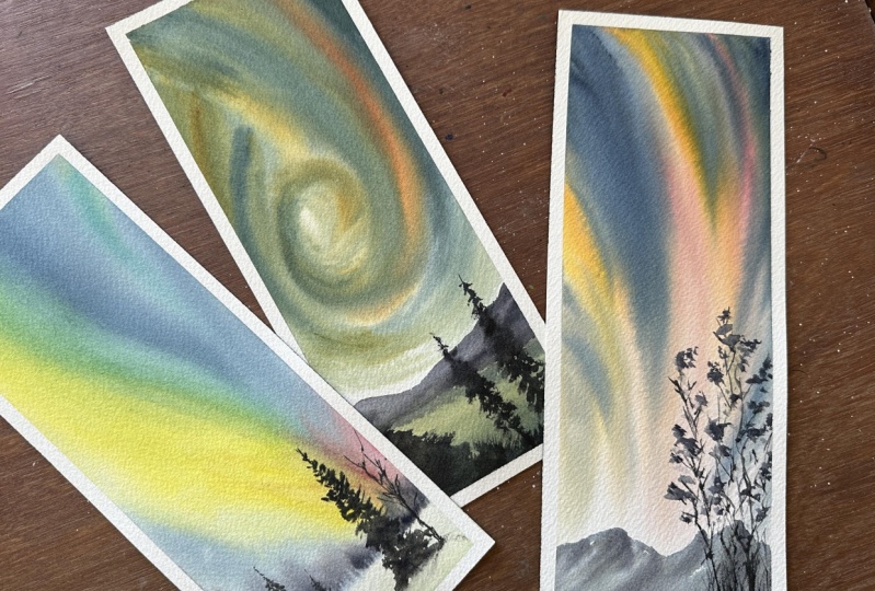
1. Introduction: Aurora Borealis, also known as Northern lights
are so fascinating. For sure, watching
these dancing lights is a dream for so many people. In this class,
let's join together and paint these Northern
lights using watercolor. Hi, I'm Suchita, your
instructor for this class. Here we are going to paint three beautiful
Aurora landscapes, which are not very complicated and don't demand too much
of your time either. In this class, I have talked about different
watercolor techniques, how to achieve depth
in our painting, different exercises that would help to improve, et cetera. I would say this
class is more for an advanced beginner or
an intermediate artist. But even if you are
an absolute beginner, still you can join
because I'll be guiding you at every
stage of the process. I'm very excited
about this class. If you are feeling the same, come and join me here.
2. Materials Needed: Okay, let's talk about the materials needed
for this class. I'm starting with a
watercolor paper. I'm using arches 100%
cotton watercolor paper, but it's a big block. So I have cut that into
smaller pieces like this, and I'm using this in
our class project. Then I'm using this cardboard as a support to my
watercolor paper. Next, let's see the brushes. Dawnci size four brush
for initial washes, Dawnci size two brush for painting the sky
and other details. I'm using silver
black velvet brush for painting the pine trees. I'm using Brasto size two
brush for smaller details, and also I'm using this
rigor brush from Princeton. I'll talk about the colors in the beginning of each project. Don't worry about the
brand or the exact shade. Just try to have a similar
shade that I'm using. We need a palette
to mix the colors. I have also used a
porcelain plate, as palette in this class, a jar of water for
initial washes, for cleaning the
brush, et cetera. Using a pencil and an
eraser for the sketches. You can also use a
scale if you prefer. I haven't used it in the class. I'm using this masking
tape to attach the watercolor paper
to the cardboard. A pair of scissors to
cut the masking tape. We need a cloth
towel to wipe off the excess water or
to clean the brush. You can also use the
paper towel here. I think that is all we need. So grab your supplies, and let's start with our
first class project.
3. Yellow - blue aurora : background : Hey, guys. Welcome to our first class project of
this North and Light series. Here I have used
a masking tape to attach the paper
to my cardboard. So first of all, we shall see what colors we need
for this project. I'm using Hansa Yellow Light. It's a cool yellow color
from Daniel Smith. Next I'm using halo blue. This is also a cool blue
shade from Daniel Smith. Then I'm taking Indigo. This is from the
brand white Knights. Next, we need quinocridon red. Again, it's a cool shade
from Daniel Smith. Then I'm using paints
gray for detailing. That's all for the colors. We shall start with a
simple pencil sketch. I'm using this
mechanical pencil, and we shall draw
a straight line by leaving almost like two to three centimeter space at the bottom. This is the line that separates
the sky and the ground. You can use a scale
if you prefer, but this line doesn't need
to be super straight. Next I'm taking the
Dawnci size four brush, and I'll apply the clean
water to the whole paper. Always use the clean water
for the initial washes, because if the water already
has some pigments in it, then we might get muddy
colors in our painting. As this is 100% cotton
watercolor paper, we have to spend a good amount of time in wetting the paper, as we are working
mostly wet on wet here, so our paper has to stay
hydrated for long time. I have made sure that I
haven't left any spots, and the paper is evenly wet. Now let's add some colors, okay? I'm taking my Dawnci
casano sized tu brush. So I want to start with
the lightest shade, which is hansa yellow
light, in our case. These cool yellows, when they get mixed with the cool blues, they create really
nice green shades. Now I'm picking the yellow, applying it from the top, and then moving downwards. You see? I'm making
these big wavy strokes. Also, I'm adding
some smaller ones. If you observe, all
these wavy lines are kind of converging
at the right bottom. Now with a clean brush, I'm picking this to blue color. This is a cool blue color. So when this cool blue color mixes with
a cool yellow color, which is hansa yellow light, they create nice green shade. See, the green it is creating. Next, I'll pick the
quinocradon red. This I will add at the bottom right corner and try to blend with
the other colors. Okay, my brush has
picked up blue colour. I'll wash my brush and pick
the quinocradon red again. I'm keeping this
red shade mostly to the bottom part because I want this yellow color
and the green colour to be more prominent
in our painting. Next, let's take the indigo. We have some white areas
on the sky, right? So I fill those
areas with indigo. Again, my brush has picked up some red shade,
so I'll clean it. Now taking more indigo
and I'm adding it like a filler between other
colors. You see that? On the bottom part
near the horizon line, I have kept this area lighter. I haven't added so many colors because we need to have
some room for details. Do you see those hairs that are formed? I want to soften it. So I'm dragging my brush
all the way from the top to the bottom and blending
some of these colors. I lift the board now and help the watercolor to
flow downwards. But before lifting the board, just make sure that there is no water on the masking tape. Otherwise, the
water from the top, as well as from the sides can move onto the
painting and spoil it. I should have done this before
as well, but it's okay. There wasn't much water
on my masking tape. Now we shall add some
colors to the bottom. I'm using the same colors as the sky but more lighter shades. I'm starting with
the Hansa yellow, adding some halo blue
color, then some indigo. It's like the snow
covered ground slightly reflecting
the colors of the sky. We have to do one last thing
before our paper dries. I'm picking the gray color, and I'm applying some
vertical strokes here. The horizon line we added
is our reference point. So I'll keep adding these
vertical lines all the way. As I mentioned, my
paper is still wet, so these lines would smudge
and they become blurry. So this way, we can show that
they are far away trees. At this point, if your
paper has already dried, then wait for the paper to dry completely and rewet the paper. But if you don't
prefer to revet, then I would suggest adding these trees with a very
light shade of gray. That way, they won't
be too prominent. I'll not add any
details to these trees, maybe just vary the
height and tonal values. Now the tree line we added is bleeding towards the ground. I want to fix that with
a clean damp brush, picking that extra color from the paper with my damp brush. Now we don't have those
hairs anymore, right? We are done with the background. After this tries, let's
add some details.
4. Yellow - blue aurora : details: Welcome back. It's time
to add some details. I'm using silver black
velvet brush of size four for adding some
foreground pine trees, picking this gray color. Now, I want to add
a pine tree here. So starting with
the vertical line. Then with a tip of my brush, making these quick
strokes. You see? They are to suggest the
leaves and branches. I'm keeping these leaves
smaller at the top, and as I go down, they get slightly bigger. It's like a cone shape. It is broader at the bottom, and it tapers down
towards the top. Let's add another small
tree beside this. Again, draw a vertical line. Then you can start from the
top or from the bottom, but make sure to
have bigger base. And as it goes up, the leaves and
branches get smaller. Adding some thin lines in
between to fill those gaps. Now, I will pick my Danci brush. It's a clean, damp brush. No extra water in it. With that, I'm softening
the bottom of these trees. You know, it gives
that feeling that they are attached to the ground. On the right side, I'll
add a big pine tree, again, with a gray color. I'm drawing a vertical line. It is bigger this time, so it's more prominent
and detailed. Like before, I'm adding
smaller leaves on the top and slowly increasing the size of these leaves as I
move downwards. You know, while
painting the pines, not all brushes give the
same results, right? I would prefer to use a
brush with more pointy end, which would help to create
those thin strokes. But then I won't
pick my rigor brush, which has a really pointy end because we need to paint those
bigger leaves, too, right? In that case, a brush like this, which has some
thickness in its belly, but has a pointy tip as
well, would be helpful. I've tried all other brushes from my collection
to paint the pines. There are only very few brushes that are suitable for painting the pines in my collection. So I would recommend you to try different brushes that you have and see which would
create the best pine tree. Our big tree has taken shape. Again, I'll take
a damp brush and soften the bottom edge
of this big tree. Remember, no extra water in
the brush at this point. Now, with a rigger brush
using the same gray color, I'm adding a small bear tree. I thought it would
be interesting to add a bear branch
with no leaves. I'm not going to
make this too big. Our main tree is
still the pine tree. This one would be
in the back and part of it would be covered
by the main pine tree. I'll add one more branch that is going behind
the big pine tree. Adding some thickness
to the trunk part. I think that's all for the tree. Next, let's paint some
grasses on the ground. If you observe the gray color that we are adding is spreading. That's because when I soften the bottom of the pine trees, I move the damp brush all
over the ground region. That's why it is wet, which is making the pigment to spread. I like that blurry
effect anyway. It gives that fluffiness
to the grass. Now, again, with
more gray pigment, I'm adding some highlights,
some darker lines. This I'm doing only
for the first one, which would be more near to us and would be more detailed. That is all for our painting. I'm removing the
masking tape now. It's always a relief to see the colors
haven't seeped out, and we have a clean border. Even though I'm using
a good masking tape, sometimes the
colors still bleed. This is our first painting.
It turned out nice. Now let's meet in
the next section to start with the new project.
5. Coral - red aurora : background: Welcome to our second
class project. Now let's see the
colors quinocldon red, coral, pains gray, u
gamboge, and indigo. I have all the colors
in my palette, quinocridon red,
coral, new gamboge, indigo, and pains gray. Basically, we start
with a quick pencil sketch like some
small mountains. I'm going to take my
mechanical pencil, then draw these small
mountains side by side. I'm keeping them quite small. It's only three to 4
centimeters from the bottom. Then I want to add
some trees here, but I think I'll
keep them loose. I don't want to add a
detailed pencil sketch, only like some lines to have an idea where my trees would be, maybe one or two big trees and some smaller trees on the sides. So this is sketch. Next step is to wet the paper. I'm taking my Danci
size for brush, applying the clean water. It's important to wet
the paper well enough so that we get longer time
to work on the painting. This is so true when we use
wet on wet technique a lot. For example, when
painting these auroras, we have to keep adding a lot of colors and let them blend. If the paper is dry, the colors won't blend. Instead, they create
these hard edges. Each and every brushstroke
would be visible. That's not so nice, isn't it? So I usually spend quite
some time wetting the paper, especially if I want to work on the wet paper for longer time. Remove the extra water from
the edges if you have any. You can either use a damp
brush or a tissue to do this. I'm taking my Dawnci sized to brush and picking the first
color, which is coral. This is a special color from
the brand white knights. I know if you don't have coral, you can mix this tiny amount of red color to white to
get a similar shade. Now I'll apply the
coral at the center. Here I'm making
these curvy strokes, and also I'm not touching
those mountains that we added. Mm hm. I have talked about mixing colors to get coral in one of my
skill share classes, green galaxies and globules. You can check that if you want. Next I'm taking the
quinocridon red. Let's apply it around coral on both the sides and also let's add some highlights
on top of the coral. I think they both go
very well together. Then I'm taking the new gambos. I'll add it on both sides. Let it mix with
the red and coral. This will create this
orange shade in At sky. Now, let's blend
these colors, okay? I'm somewhat mixing these colors and creating
smoother transition, but don't mix them too much. We have to make sure that
the lighter shades like coral that we added in the
beginning is still visible. Next, let's take this
darker indigo color. I'll mostly apply on the
sides on top of the yellow. This indigo when mixed with the yellow creates
this greenish shade. But in this case, our painting
has more orangish yellow, so we are getting some
brown shades in between. Next with a clean damp brush, I'll slightly blend the colors. You see, I have kept this lower
right region quite light. That's because we'll
be adding arteries, and they should be visible. If it's too dark
in the background, arteries will not be visible. So I intentionally made this pthama above the
mountains lighter. You see, I have been
working so long on this and still be able to
blend all these colors. This is because I
added good amount of water to the paper
in the beginning. That has kept it wet for
long enough for us to work. I'll take some more indigo
and add some highlights. You see, the left top
part looks more yellow, and I want to make it more
blue by adding some indigo. Okay, we have completed adding the colors
to the background. Let this dry and then we
can add some details.
6. Coral - red aurora : details: Okay. Now let's give some
colors to these mountains. Using my size to brush, I'm picking the indigo, more of a lighter shade this time than applying
it to the mountains. I'm softening these edges
with a bit of water. If you observe, I'm changing the tonal values of the indigo by varying
the amount of water. This will create lighter
and darker areas. Now I'll pick more indigo
and add some highlights. When I say highlights, I'll make sure that the
darker color we are going to add will not cover the underlying
lighter color entirely. See, I made it darker
only at some areas, adding more darker values now. Here we can absorb three
different shades of indigo, lightest shade, middle tone, and then some darker tone. Now, this has to be dried
before we add further details. Our mountains have dried. I'll take my rigor brush
and pick the gray color. Remember those tree
lines we added. So I'm going to take that
as the base for our trees, painting the skeleton of the
tree with some branches, starting with a vertical line. I'm making the lower trunk
region more thicker, and as it goes up,
it gets slender. Some branches emerging
from the tree trunk. Oh, I'm leaving some space here. That is to add some leaves. One more tree to the left side. We will be adding
a bunch of trees. Some are more prominent and
some are in the background. I'm taking my brusho size to brush to add some leaves now. We are using the
gray color again. But this time, I'm
adding more water and very less pigment.
It is quite light. Now I'll add this watery
gray mixture to the tree. They're like leaves of the tree. My leaves are mix of both
smaller and bigger dots. So when I want smaller dots, I only use the tip of my brush. If I want to cover
the larger area, then I usually use the belly of my brush and apply
more pressure. I'm picking the gray color
with my rigor brush. I want to add more
branches to these trees. So I'm loosely adding
some branches. If you feel you have to have
a sketch for these trees, I think you can add a detailed sketch in the beginning itself. I have attached a pencil sketch for this in the
resources section. If you want, you can use that. I'm going for some
background trees now. You know, this
rigor brush I have, it has helped me a lot to
develop this loose style. I really like those
thin lines it creates. I feel this brush is a must for me when I want to
paint trees like this. I have added some lines at the background with
lighter shade of gray. Here, the front ones
are more darker, and the ones in the background
are of more lighter gray. Picking darker
gray this time and adding more branches
to the front trees. The leaves we added here
are very light, right? So you might be thinking
why plan here is to add more leaves on top of
it with darker gray color. So these lighter colored leaves represent the background trees, and the darker leaves
that we are going to add would suggest the
foreground trees. I have added enough branches. Now with my brush
row size to brush, I'll pick the darker
gray pigment. Then I'll add it as
leaves to these trees. You see, as those
previously added leaves are not completely dried, we get a smoother
blend at many places. Like I mentioned before, if you touch the paper
with a tip of the brush, then it will make
smaller leaves, and with the belly of the brush, it will be bigger leaves. Do you see why have I kept the right bottom region
above the mountains lighter? As we have some trees and
leaves with lighter shade, they would be visible only if
the background is lighter. With the darker background, we cannot make these
lighter colors to pop. Adding some small
grasses at the base. We are done with
our class project. I'll go ahead and remove
the masking tape. I'm carefully lifting
the tape outwards so that it won't tear
off the painting. This is our completed project. We made it this far.
Let's meet again in the next section to start
with our final class project.
7. Scarlet - yellow aurora : background: Okay, let's start with
our final class project. First of all, I list all the
colors that we need today. I'm using four
colors Pyl scarlet, Pains gray, indigo,
and Indian gold. I already have all these
colors on my palette, Indigo, Indian gold, Pyl
scarlet and paints gray. I'm starting with
a pencil sketch. I will leave around two
thirds of the paper for the sky and add
a straight line. It's our horizon line to
separate the sky and ground. I'm not using any scale here. I thought I can
manage without scale. Now it is time to wet the paper. So I use my favorite pig brush, which is Danci size four brush. I'll apply the water
to the whole paper. You know, I'm using
this cardboard to stick the watercolor paper. I think it also absorbed some water and
started stretching. Now it's not flat anymore. It's very uncomfortable
to work with this because if the
surface is uneven, we can't control the moment
of the colors, right? I do have an acrylic board
which is very useful, and I use it quite often. But the problem is,
while recording, I do have some lights on the top because it's
somewhat dark here. And then it would get reflected
on this acrylic board. That's why I avoid using the acrylic board while
recording something. Hopefully, this
will be solved soon because I'm planning to
set up my new studio, which is quite exciting. We have added enough
water to the paper, and now it is time
to add some colors. As my first color, I'm picking the Indian gold, nice and thick consistency
of Indian gold. Then applying the
Indian gold like this, like a spiral shape. You know, the best
thing about painting the Northern lights is that
we can go for any shape. It can look like anything and
still it would look good. Next, I'll take the Pyl scarlet, then apply it on top of the
yellow, more like highlights. They both get mixed and
create this orangish shade. Now let's take the indigo. I'll apply the indigo
mostly in between. We want to keep the
shape of the spiral. Also, other lighter colors like orange and yellow
should be visible. So I'm following the
same spiral shape and also making sure that the
lighter colors are visible. Defining the shape of the spiral by moving and
adding more colors. I'm trying to stick with
the initial shapes. Picking the indigo,
darkening some places here. Like we discussed before, these Northern lights
can be of any shape, and also here I have taken the freedom to choose
the colors that I like. They might be far from
real, but, you know, I get to see my imagination on the paper. That's
awesome, right? My suggestion for you is
to play with the colors, take different colors,
let them move, mix, and create their own
shapes on your paper. Don't control the movements
of those colors too much. This will help you to
understand more about colors, contrast, water
control, et cetera. See, I have kept this lower part lighter because we are going
to add some mountains there. Now for the bottom part,
it would be water, so we need to use the same color as that of sky to
show the reflection. I'm taking the Indian gold, mixing a bit of pyral scarlet. I'll apply this to the
bottom part. See that? Next we are taking indigo
as our next color. This would go on top of
the yellow orange layer, more darker tone at the bottom, some lighter areas as we go up. Let's quickly blend
these colors. With my clean damp brush, moving these colors, I'm letting them to
mix with each other. Lifting some extra
colors from the paper. If you see the colors
on the sky region have moved down as if I
have lifted the board. That's because the
board is not flat. It has stretched a bit and it is making the colors to move. But we can fix this. I'm using my clean damp brush, removing those hairs
that are formed. Okay, this is all
for our background, but we are not done yet. We have to add some details. So meet me in the next section.
8. Scarlet - yellow aurora : details: Welcome back guys.
Paper is dry now. I think we can start
with the mountains. I'm taking the gray color. This time, mixing
a lighter value of gray with more water
and less pigment. Then you see this
white space, right. I'm going to add
mountains there. So let's apply this
light gray color above the horizon line. Trying to keep this bottom line straight and filling the colors. I recommend starting from the lighter tonal value and then add darker values on top of it because it's
hard to work from darker values to lighter values when it comes to watercolor. If you apply the dark gray
color in the beginning itself, we will lose all the highlights. Here in our painting, as we started with the
lighter tonal value, you will see how we are
going to build upon this. Now we added the mountains. Let me take a smaller brush, that is silver black
velvet brush of size four. With this, I'll take the darker gray color with less water. Then adding some lines. As our mountains
haven't dried yet, these lines will smudge, and we won't get any
hard edges here. I'm trying to keep the
horizon lines straight. Don't want the colors
to go outside of it. Now let's blend them using this clean damp brush
to soften those lines. Make sure to keep the contrast between the lighter
and darker areas. You can add more
pigments if you need, or you can pick up some
pigments from the paper. Here you see, I'm lifting some colors to make
this area lighter. Now, let's add some flat ground. With my size to brush, I'll pick the gray color again. Then we're going to
add some land area, starting from the left, quickly making these
horizontal strokes. You know, as I don't
have a sketch, I'll pause and take
a moment to decide. When we are working
on a painting, it helps to pause and decide what is missing and
what can be added. Again, with the tip of my brush, adding some more
horizontal strokes, applying more darker gray
tone to the front part. I want to keep this area wet because next we are going
to add some grasses here. So adding the colors again helps the paper to stay wet
for longer duration. Applying some more gray color to the front area then
adjusting the shape. Now we have our sky, mountains, water,
and the land area. Further, we shall add
some grasses and trees. Next I'm taking my
Bastro size to brush. Is bristles are very suitable for painting
grasses, you know? Now with a dry brush, I'm dragging these
colors outwards. See, this creates grasses
for us, easy, right. But, you know, this
works only when the colors we added
haven't dried yet. So that's why I wanted
to keep this area wet so that we can
drag these colors out. Next I'm picking the gray color directly with the dry brush, and with that, I'm making
the same upward strokes. This creates some textures. You see? It is to suggest
some leaves or flowers. Now without much effort, we painted these
thin grass blades. Now I'm taking the silver
black velvet brush of size four to add some pine trees. I prefer to start
with a vertical line so that I would know how big my tree would be and
where to add the leaves, starting from the top,
adding uneven strokes. There the branches and
leaves for the tree. As I go downwards, I'll increase the size
of these branches. If you are new to the watercolor and not yet comfortable
painting these trees, then I would suggest
you to practice these trees beforehand
on a scrap paper. This can be applied to your
other projects as well. So try to practice
individual elements from a reference beforehand if you are not comfortable
painting them. For example, it
could be rocks in a landscape or a boat in an
ocean or a car on the road. This would help us to simplify the painting process
and be more confident. Now with a darker gray color, I'm highlighting some leaves. This gives some volume
to tree, you know. By making few leaves darker, we are suggesting lighter
and shadowed area, which creates some
depth to our tree. I'll add another tree
beside the first one. This I'll keep it shorter. Again, starting with
a vertical line, adding branches on
both the sides, wearing the size of these
branches as we go down. Adding some small lines in between to make it more uneven. I'll not add any
more trees here. I think if you had
too many trees that would take our
focus from the sky, I was about to remove
the masking tape, but notice that I did not add the reflection
of the mountains. This should have been added
before adding the trees, but it's okay. Mistakes happen. Now I'm taking the lighter
shade of gray color, slowly applying it as
reflection of these mountains. See how light this
gray color is. We want to differentiate between the ground and the
reflection, right? So I'm keeping it lighter. Now with those trees in between, we have to be careful
not to disturb them. I'm trying to match the
shape of the mountains. This we should keep in mind. Sometimes it can be
difficult to paint the exact copy of an
object in the reflection. Try to match as
much as possible, but it doesn't need
to be perfect. Also, if you don't feel
comfortable painting upside down, you can rotate the painting and then add the reflection.
It's all right. Yes, that's it. We have completed the final
project of this class. Now I'll remove
the masking tape. Here is our finished painting. Not very complicated, right? I hope it was easy
to follow along, and the tips that I
gave were useful. Do try these paintings. If you have finished projects, please upload them in
the project section. Thank you so much for
joining. I'll see you soon.
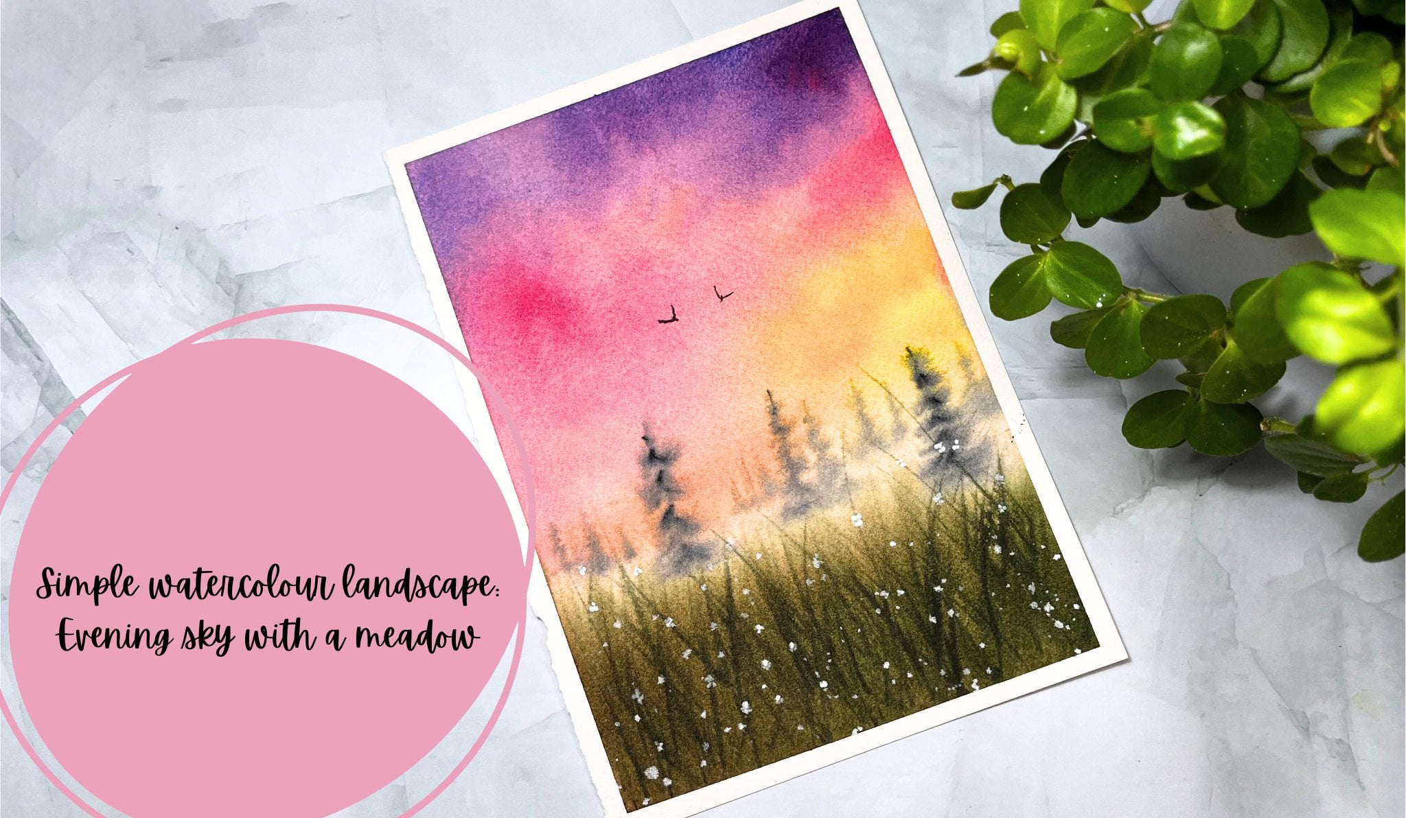
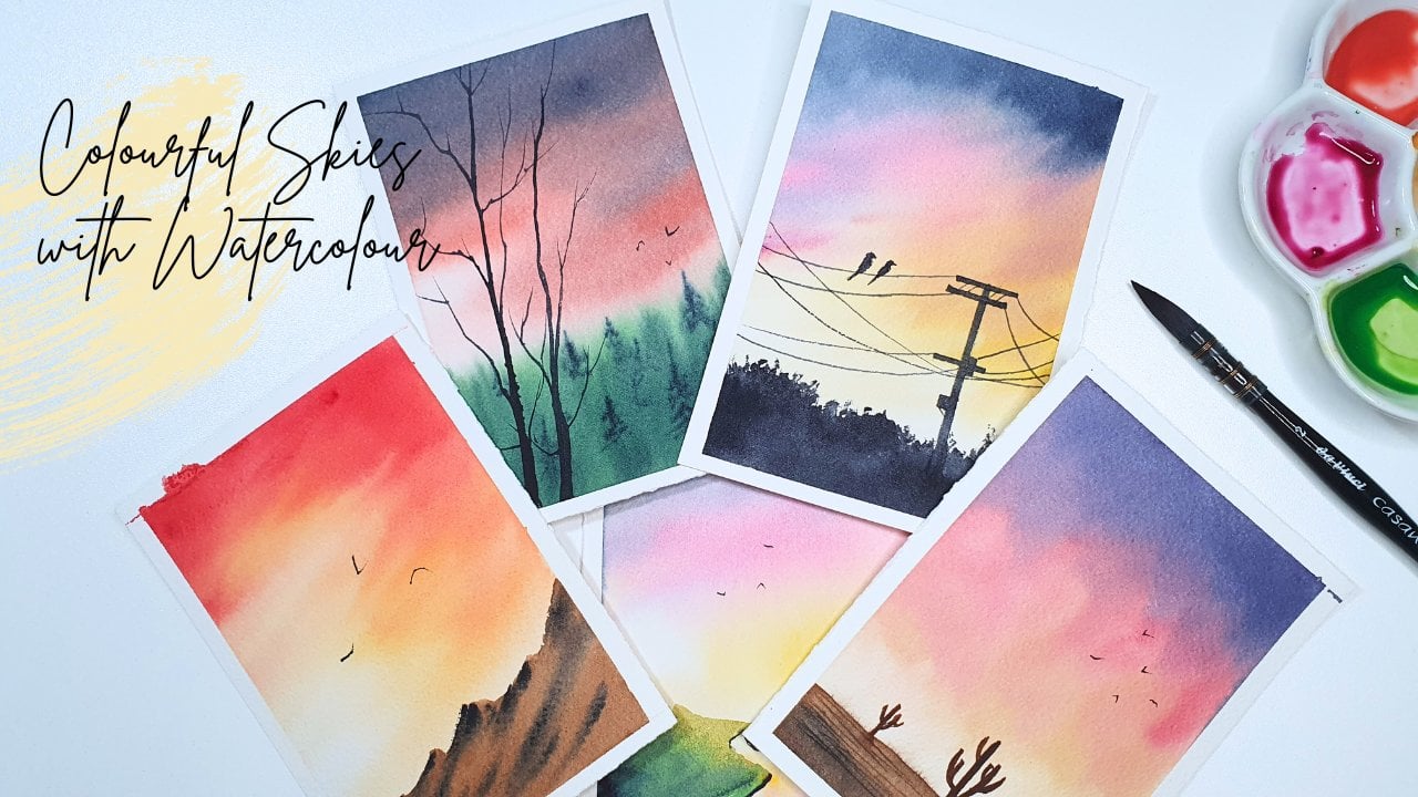
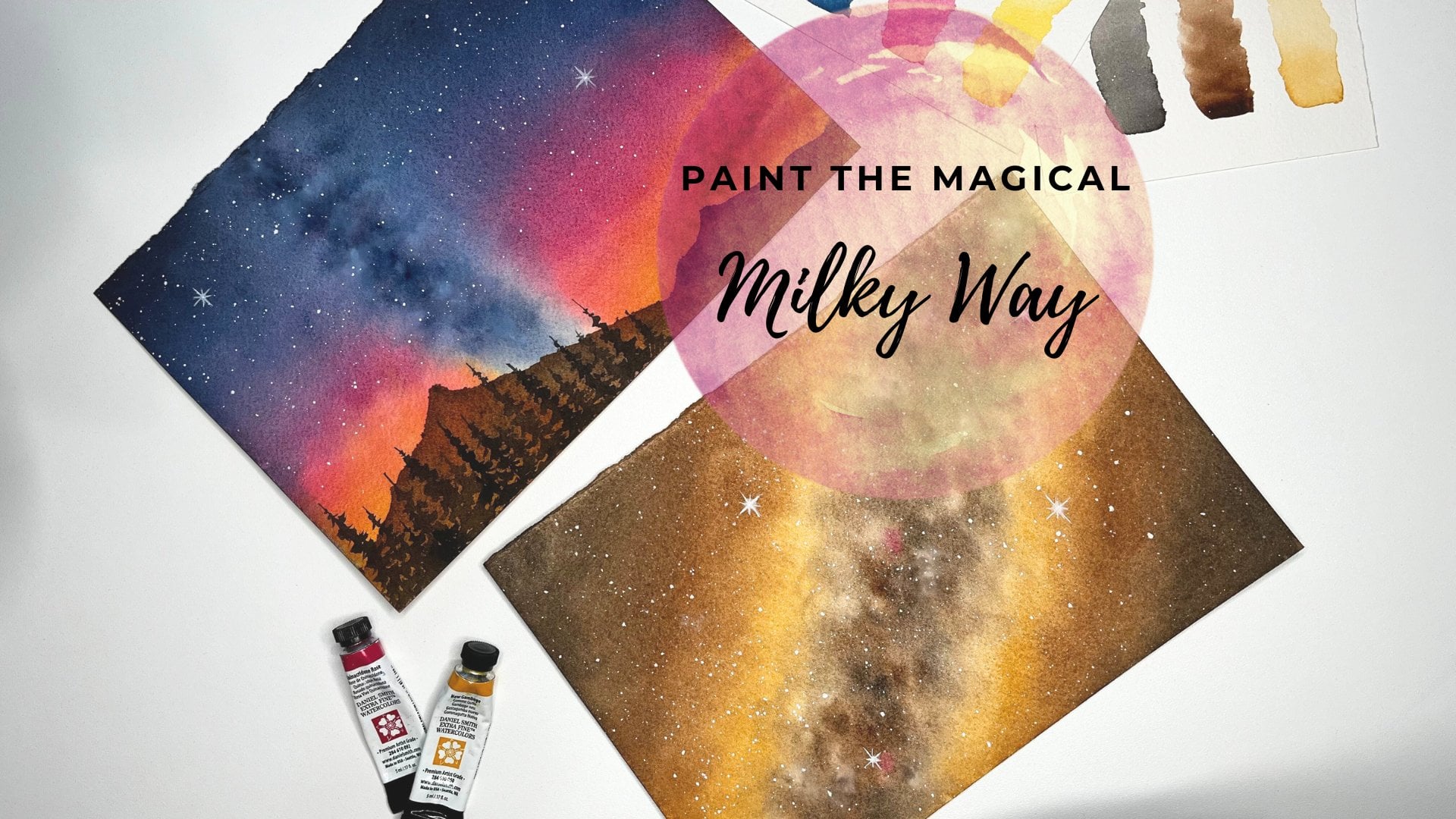
 Suchetha KN, Watercolour Artist