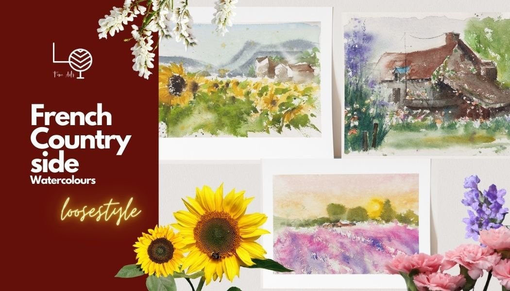
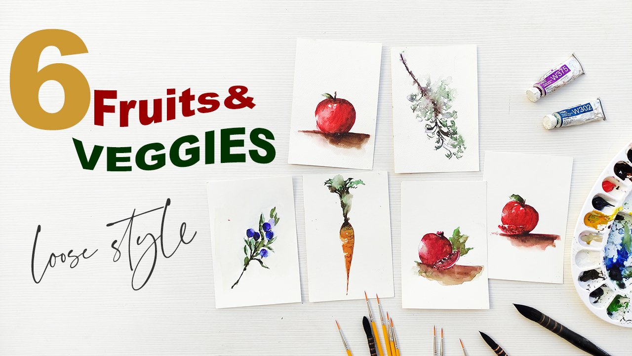
Transcripts
1. Introduction: Sometimes less is more. Hello, my name is Dona. I'm a Filipino, French
artist in Spain. So in this class, we
are going to paint three wonderful
watercolor city scapes. I am going to teach you
how to paint minimalist, pressionist way of painting. Without a sketch. Yes, no
sketch, you heard me, right. And it's because
in this painting, we are just going to
have fun and relax. Not to be too stressed with
a ticnic and everything. And I think when
you are having fun, when you're enjoying this, is when you are
learning the most. We are going to learn
how to paint loosely. Get familiar on
shadows and lights, and how to do it effectively. This class fast design for begins and also for
more experienced one. So this is not something very stechical why you
should take this class. This class is something
that you're going to enjoy and you're going
to learn at the same time. And I'm going to be giving
you some tips that's going to be useful as you continue
your journey in watercolors. So just a little
background about me. I started painting
four years ago. I've sold around 300
paintings around the globe, and I've collaborated
with some art galleries, and I had my first sole
exposition last summer. I'm really happy that I am
able to share my art with you, and I really hope, and I wish that I can see you
in this class. So I'm waiting for you in
the class and let's go.
2. Materials : Thank you so much and
I'm going to show you all the materials
for this class. I'm using watercolor paint tube, which is better paints. Cobal blue, Chinese, white, Van **** brown,
crimson alysarine, lemon yellow sap, green ivory, black ponziana, and yellow. Or I am using the caddy
papers, 100% organic cotton. And it's 4.5 and
14.5 centimeters, so it's a perfect square. This is the mixing
palette that I usually use on my paintings. Of course, the brushes you can use any
brushes that you have, as long as they
are not that big. Usually, I'm using
brush number two. This one is a secret
brush and this is Da Vinci Maprash to pick up brushes
that are pointed. This is zero, The smallest
brush I have, this is one. This is also a very
thin and small brush that I have for the small
edges. There you go. I, like I said, downloaded everything and put them on video files for you. We also have the bucket, the packing tape, and that's it. I look forward to seeing
you in this class.
3. Modern Watercolor Techniques: Hello, thank you so much for joining me and this
is the practice video. And I know you are very
excited to start right now, but I really advise you
to do this video, okay, because it's going to
build your confidence when we will be doing
our actual class. I'm doing wet on
dry and then wet wet technique for
this rule here, I'm using brush number two. And we are making the shadow, it's Chinese white
plus the cobalt blue, but it's more on
the Chinese whites and we're doing it very light. Here you go again.
One straight brush stroke for the shadow. Do not overdo this. One of I'm using the
100% cotton paper. This is your shadow. And shadow is very
important in every painting because it gives also
the light effect. It's very nice to
see shadows because it's very effective to make
your painting more beautiful. Here it's white and cobalt
blue for the shadow of this is the quick dry brush, I am pressing the brush, I'm using brush number two
and my brush for this one, it's really quick and
I'm pressing my paper. Of course, you need to use this. I need to work on this on a rough surface of paper
to get the sparkle. You have to press
your brush very well onto the paper with
thick pigment. Now we're going to do a
little bit of mixing. I've been mixing
different colors. For example, Pon Siena
and I worry black, to get the Van **** brown tint. I encourage you to mix on
the paper all your colors. And of course, buy primary colors and do
your own experiment. You don't have to buy all the watercolor paints in the store. But I'd rather advise you to play on your own mixing paint. Now I am doing the wet
and wet technique, so my paper is still
wet and I'm just going after the loose effect. We're going to do this
with our painting later. The water in the tin is just flowing on its
own. This is wet. That's it. We are very excited to start this
class. Let's go.
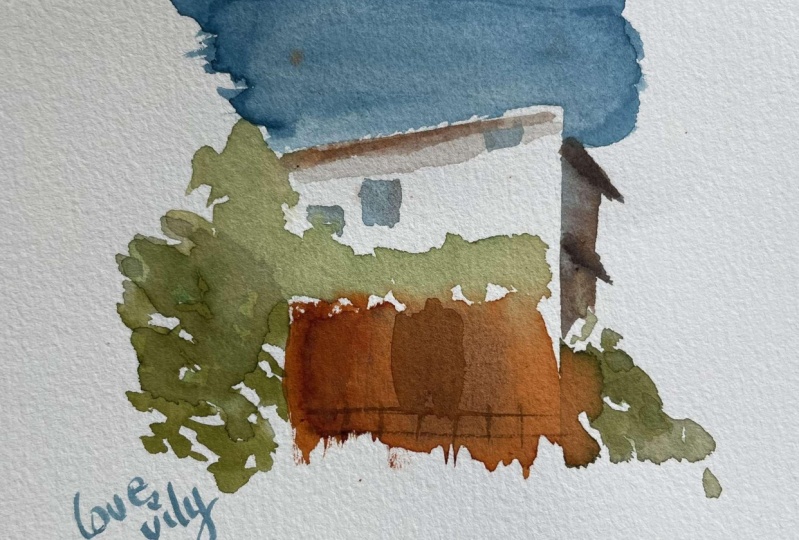
4. Project 1 Paris Cityscape: Thank you so much for
joining me in this class. I am so happy to have you here. We are going to start
putting, right now, I am putting my
packing tape onto my paper that's 100%
cotton from caddy. With my brush number two, I, using the cobalt blue
water color paint, I am leaving some
white sparkles by pressing the paper very
well with my brush. That's my brush number two. As I've said, we've done this practice before
starting this class, and I hope you did it
and didn't skip it. Now, I've changed my brush
and this is brush number two. But the normal one, we have to make sure
that the, the paint, I mean, the packing tape
is not going away from the paper so that all the paints are not
going to go inside it. This reference photo is from
Paris. It's a restaurant. I haven't been there, although I was a part
for probably four years. It's one of my favorite subject to paint, romantic restaurants. Now with brush number
two, the normal one, I'm using Bon Ziana and
ivory black for the roof. I am just dragging the
water color paint, I am leaving some white and sparkles by pressing
it very well. As you have noticed, I've changed the
reference a little bit. Well, actually a lot. I always like doing it, making the reference and
my painting on my own, I think it's a fun way to
explore and be unique. Now I'm just dabbing
colors, Watercolor paints. This is the sub green
mixed with ivory, black, and Sanborn Siena. I wanted my green to be a bit
darker and not too bright. I'm always mixing it
with warmer color. We are adding some plans. I'm just helping a little
bit of water to run, now I'm adding yellow,
the yellow Orc. These are greens again, on the other side
of the building. What I'm trying to do in here is that at the edges of
your packing tape, I'm adding more colors in there because if you add more
colors in there is going to make the shape is going to create the shape that we want for the building. Now, I'm just adding yellow,
alternating with green. This is the most exciting
part of the video. I am peeling off the
tape and I hope we won't have any surprise,
we'll see about that. Oh, well, that's not
bad. And the other one. Okay. That's really nice. Now, I am doing the
ponia watercolor paint with the sparkles and
I'm still using the brush. Press your brush very well onto the wrap surface of
your watercolor paper. The white eda, lights
of your paper. You see in the same brush. I'm a mix the bone sienna to create the effect
of windows in. I'm just adding a little
bit of ivory black. We have Van **** Brown
with a mix of ivory, black, and bone sienna. Here in the balcony. I've decided to add
more greens because I love flowers and greens
in restaurants like this. I've completely changed the
reference as you can see. There you go. More
flowers, more greens. But if you want to
copy completely the deference that I have or you can use your own,
feel free to do so. I always encourage you to be, always explore on your own and discover things. There you go. I'm just adding darker
tonal value on the leaves. Spare mix with Bornsiana
or ivory black. Now we're working on the roof. I'm leaving a lot of white on top of that and I'm going
to leave it like that. I'm the watercolor
paints onto the paper. I'm just adding a little bit
of highlights for the roof. One advice that I
can give you is that when you are mixing
your watercolor paint, try to do that on your paper. Okay? I'm quite happy with that. It's a beautiful day. It's a sunny day,
and it's always nice to paint.
Okay, there you go. On this side, I want to define
the edges of my building. I'm adding more greens. I should have done that
with my packing tape on. But anyway, it's not too late. Always remember that
you can always improve your painting with this style
because it's not loose wet. You can always add
because this is wet. On dry, the paper is dry and
you can always add details. One of the advantages of
using this technique here, I'm not adding any
colors anymore, I'm just using the
colors from the deep, from the water color that we
already have for the leaves. I'm just dragging them now. I'm using the smallest
brush that I have, that zero with pointed tip. And I've mixed the
porceana ivory black to have this darker
color to make our fence. I'm adding fence because I
like adding fence everywhere. I think it's very cute. I'm just adding more
details onto the window and the door. Well, there you go. I really hope that you are
enjoying this as much as I do. It's really fun and I know it's something
that you want to do when you are starting just enjoying the process and
not being too stressed. Using the same brush number two, I'm adding cobalt blue. This is mixed with just 2% of ivory black to
make the windows. I'm just adding
some more windows to give it a little bit
of the realistic feel. Although this one is
impressionist style minimalist, this is the best part, the shadow, so we're
working on the dry paper. This is the mix of 80% Chinese
white and cobalt blue. Cobalt blue is only very little, that's 20% your shadow. Always make this realistic
effect on your painting. And I think that's
really cool and it's always lighter than your
subject. There you go. I'm super excited to see
your own version of this. Please share it to me
through Instagram. You can tag me or you
can post it here, everyone can see and it's
always good to share. Well done for this painting.
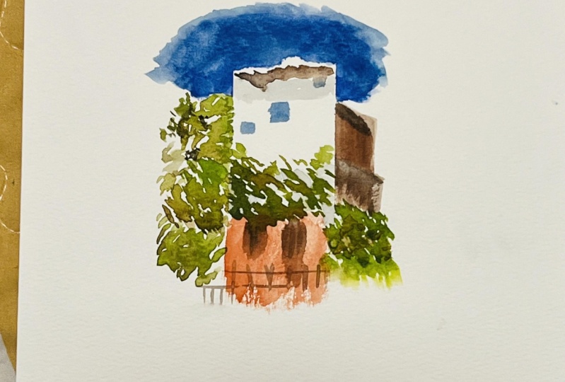
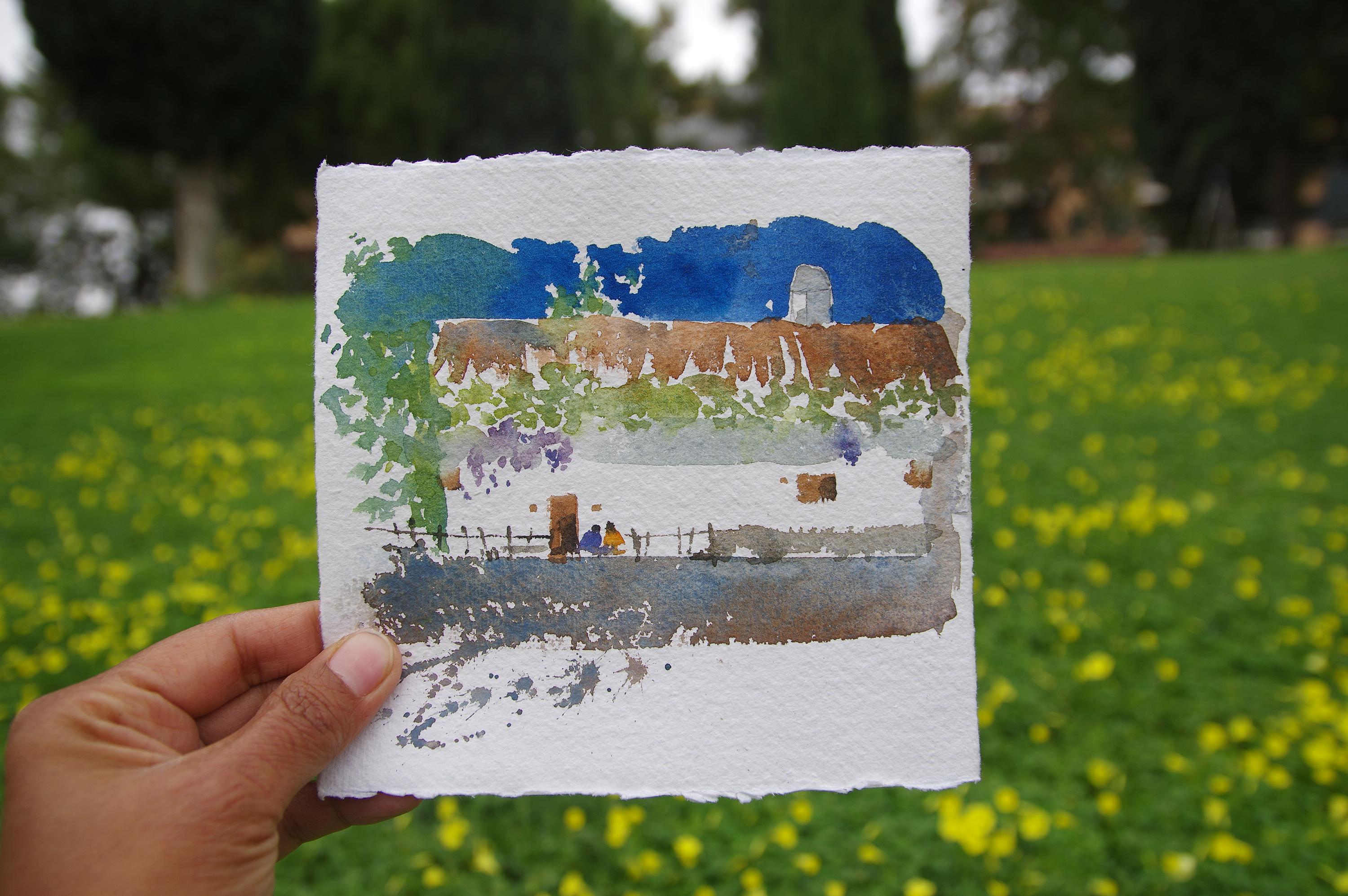
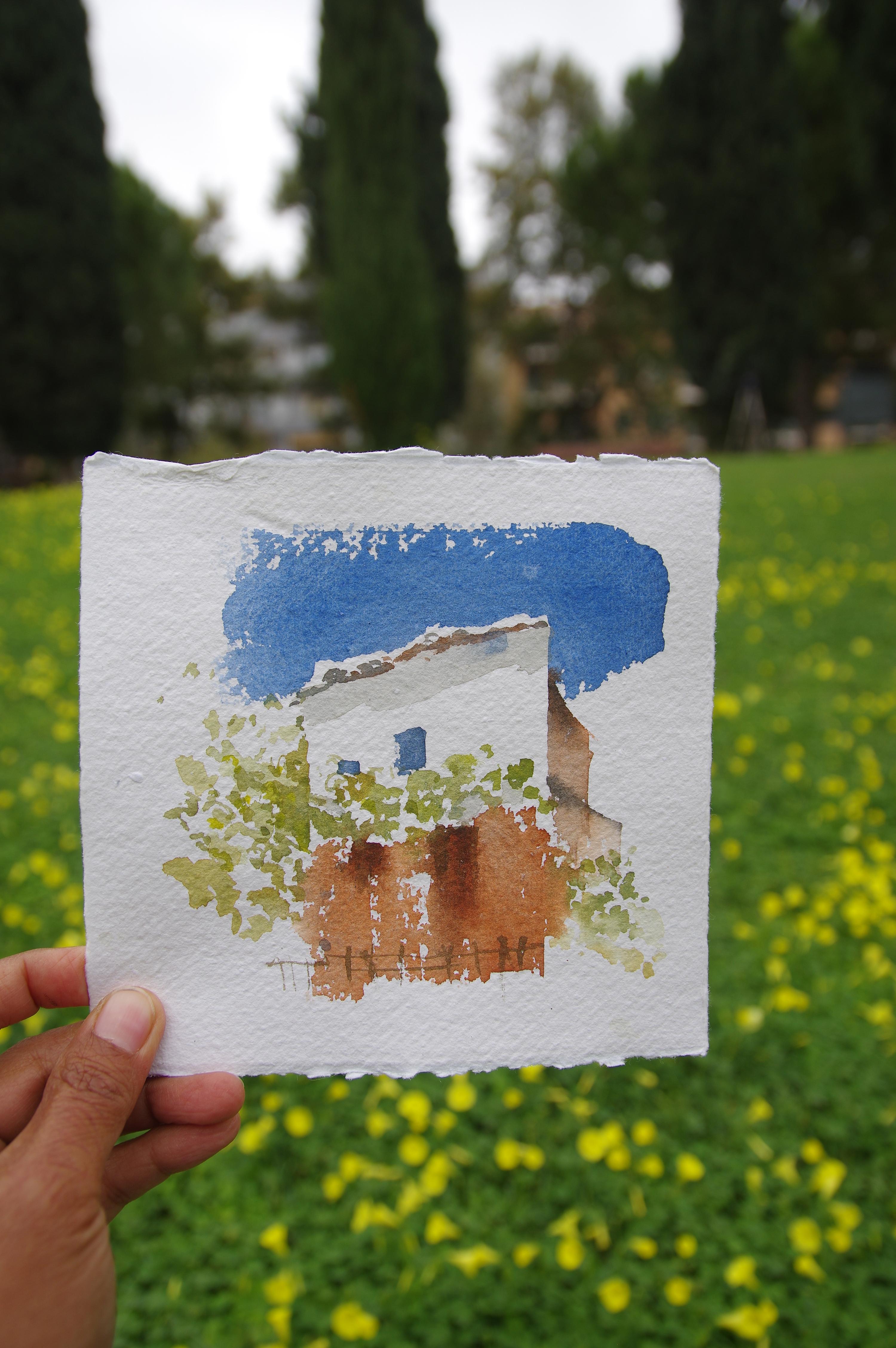
5. Project 2 Spain Cityscape : Now we are working on
the next painting. Thank you so much
for joining me again in this class. Let's begin. I have prepared my packing tape and this is the reference photo
that we are going to use. Also, I am going to change
the composition again. You can use your own photo
or you can use mine, which you can download from your video files. Let's begin. I am using rush number two. This is cobalt blue and
we're working on the sky. I am putting and loading a heavy thick of cobalt
blue onto the background. I'm going to leave
a little bit of white here for our leaves, later for the trees. I'm just really doing
really quick brush strokes. And I'm not dabbing a lot here. I'm mixing it with greens. Mixing the watercolor
paints to the paper, which is better than mixing
that colors on your palate. We're working on the
rough watercolor paper. I think it's very important with this style that we are using. Now, I'm just working outside
the edge of our tape. I've made sure that the
tape is fully taped. We don't want any
surprises in there. I'm just leaving off
some white and we are working with the
plants. There you go. This is a really fun style of painting because
it's always exciting to peel up that tape
as much as we can. We try to do some
really quick brushing. I'm still using the same brush. That's brush number
two, the normal one. But you can use your
own small brushes as long as you feel that it's comfortable for you to use it on this type and the shape and
the size of your paper, the smaller your paper is, the smaller your brushes are. I would say that you choose
any position that you like, whether you stand
up or you sit down. But the most important thing
is you feel comfortable. I am adding quick brush
of the foreground. We did this in the practice
already That was cobalt blue, born ana and ivory black, and we did a little
bit of sparkles. That one was a bit fast, but don't worry because we already did that
with a practice. Okay. So now I am using the bigger brush
and that's for the roof. The Vince brush, it's brush
number ten for the roof. This is Bornsana mixed with
a little bit of ivory, black. There you go. And we are just mixing
it with more colors, cobalt blue to just have edges. We're doing it while
it's a little bit wet. Now we are still using
the same brush number ten and that's your grapes, the vines, the worry, some nibs might touch the roof. The roof watercolor
paints and that's fine because we are working
on a dry surface. It's not going to get
out from that shape. We're doing it really quickly. The leaves, the
vines of the grapes. As you can see, I've
completely changed the reference photo and I'm adding more greens
on my painting. As I've said, you can always use my reference photo and do it exactly as it is or
you can use your own. Okay? I'm so happy
with my packing tape. It all left the whites on
the paper that I want. Now I'm using the smaller
brush with a pointed tip. That's brush number two. I am adding some purples. Purples could be
the mix of crimson, alysarine, or ivory black, or you can have your
own mixture of purples. For this, we are making
it smaller as possible. That is possible to do
that because as I've said, we are working on a dry paper, we are trying to make
the shape of the grapes. Just keep adding more grapes. Or if you want, you can
add flowers if you like. You can change whatever
you like and the spots. And you can add more colors
as well if you like. But with mine I'm just
adding some grapes. The shadow working
on a dry paper. I'm just drying it,
so that's 80% Chinese white and cobalt blue
with some green. The grapes is still a little
bit wet, but it's fine. Here I am working with the
windows and the door and that is ponia my doors and windows, they are very irregular shape. They're not perfect
square or rectangle. I like it that way because it's more moving,
it has movement. I don't want to paint
very static painting. That is for realistic ones, this is more like impressionist, Minimalist style of painting. I really hope you are
enjoying this process. Just staying calm and
not to be too stressed. Here, I'm leaving some white. This is some bench in front
of the house and this is born Siena mixed with ivory
black, and some blue. I'm just working
on the lines and adding more details
onto the painting here. This is completely ivory black. I'm adding to add
more definitions to our windows and door. When you are doing this
impressionist style, we are just working with
the light and shadow. The whites are the lights and
of course you have a shadow using the pointed
tip of my brush. I'm adding some fences again because I like fence and
this is completely black. This is ivory black. Really light touch
for it to stay very thin and light.
There you go. I am so happy with the result and I hope that you are two. I'm going to add
two people in here. Rush number two with Bon Sienna, or you can have your own colors. This is the head, of course. I'm going to add another one because it's a bit
lonely to be alone. I'm putting another one there. We are finished
with this painting. I really hope that you've learned something from this
and that you really enjoyed. I really want to
see your painting. Please share it with me
before we forget the chimney. I'm just adding light color of, of cobal blue and cred mixture. We are done and we are finished. You download everything
and watch the practice. Before watching
the actual videos, please share your
paintings with us. We are so excited to see that you can always
tag me in Instagram. I will be very happy to
comment on your painting. It's always important to show your paintings
because this is how you improve with
constructive criticism and encouragement
of the community. Well done, and I
congratulate you for taking the courage to
paint these paintings, because cityscape is not always the easiest subject to tackle, especially with water colors. Bravo, and keep up the
good work. I'll see you.
6. Project 3 Palm Trees: Thank you so much for joining me in this class and we'll be painting this beautiful
countryside landscape in Spain. We are going to start now. I've added sub green ivory black to make our green a little bit darker
than it should. I'm using normal
brush number two with a very pointed tip on our
di, 100% cotton paper. I'm starting from the middle to outer brush stroke to make the palm trees notice the
position of my hands. I'm actually standing up and it's easier for me to
manage this brush stroke. Of course, you can do
whatever you like, whether you want to
sit or stand up. As long as you are comfortable
with your position. Now I'm descpeating the same
breaststroke inner to alter. I've added a bit of porn sana to make the
greens a bit warmer. I am just alternating
the watercolor tints. This painting is
minimalist style. We don't really paint
everything that we see. We are going to live
more white than normal. Those white is your light
as we practiced before. Those make your painting looks a bit more unique
and interesting. Here I drop some greens. And those greens are darker
than it should be because two are greens with ivory black. And I've also added
some cobalt blue. We keep repeating the same
process over and over again. Palm trees are
everywhere in Spain, Is every corner of when
you turn your head, I really like it
because it makes you feel like you are always
in holidays and vacation, even if they are not
bearing any coconut fruit. I wish they were here. I'm of the branches and the tree trunks with and brown to have
this Vandyke brown. I mix with porsana
and ivory black. I'm doing my best to make
one quick brush stroke with confidence so that
it will look more natural and overdoing it. I'm adding a little
bit of contrast because when the paper is already dry is not
easy to add and to work on the leaves
at the palms here, I'm just really alternating the three colors and I'm
mixing it very well. These are the sparkles. During the practice, we
have to press the paper. I mean the brush very
well in order to have the sparkles and
those are the lights. The practice that we
had before was very important in order to do
this actual painting. It's spring, but it feels
like summer in Spain. I'm just dragging the
watercolor paints down and I'm leaving some
white for the light. We try not to overdo it by just making quick
brush strokes. A little bit of story about me. I'm a self taught
artist and I've started painting
probably four years ago. It's just my passion and I'm
so happy to have found this. Of course, it's not always
easy when you start. There's always a challenge
you have to get better, especially if you are a sub
taught with your technique, because you haven't
learned that in school and you are
learning on your own. It's safe to say that I've
taught myself to paint from editorials and from learning from others and observing
how they do it. I am also very tactical, so I have to do it in order for me to learn it completely. When you are doing
tutorials like this, try to be more confident and not always to
follow what I do, but to get out of that box
and do your own experiment. I think this is the only
way for you to get to know the watercolor medium
at the maximum level. I'm just plushing here and give it a little
bit of movement. I don't really care where they drops because we are
doing blues painting. I am defining the palm leaves by adding some darker greens. These are the mix of green, ivory, black and blue. The cobalt blues that we have. Now, the palm leaves
is more visible, this is crimson alysarine. I decided to drop
a little bit of colors on our
landscape painting, and I've added some
borsa, some yellows. Feel free to experiment on your own with the
watercolor paint mixtures. I think watercolor is one of the best medium that
you can have as a painter because you are free, it's very transparent,
is very loose. And I think it's very challenging as
well at the beginning. But once you get to
know ahead of it, it's going to be more easier
as you use this media. More and more practice
daily and sketch daily, although in this painting
we didn't skate that much. But sketching will definitely
improve your painting. In the end, I'm still using the same brush number
two and I'm just adding some water and dragging the watercolor paints for the
flowers to keep it loose, to give it a little bit
of atmospheric ambience. We're almost there,
we're almost finished. Please share your
paintings with me and to all the other students is always amazing to see your work. I'm so happy. And you can also tag me in Instagram the sit, and I'll see you in the next
painting class. Well done.
 Dawna Mae, Watercolor Artist & Illustrator


 Check the RESOURCE SECTION for the photos of the reference and final art.