Transcripts
1. Video 1 Introduction to Color: Hi, I'm Nancy Rainer. Thank you for joining me for this video where we will learn how to mix and match color. I think color matching is so much fun. It's a major part of my painting and it helps resolve issues, and it also adds visual interest to my painting. I don't think I could live without it. It's my number one tool, and this whole video is a one section off my new book called Create Perfect Paintings. I want to show you a couple of examples of why I think mixing color is so important. Let's look at this painting. Here's a painting in process that I already started, and it's a nice tropical seen tropical landscape. But if we look at the bottom here, there's a lot of repetition. There are many, many red flowers that are very similar. Kind of gets jammed up with the bottom. What I want to do in this painting is create a sense of space, breathe ability, and right down here it feels too dense. So my solution would be to get rid of or remove some of these red flowers. Not all I like them, but there's just too many. So how would I do that? How do I remove some flowers? Well, the first thing you might think of is white out and not really white out, but taking white paint or primer and just taking a brush and whiting it out. I would not recommend that. And here's why. If I take white paint and let's say I want to get rid of this flower first. If I just put white paint on now it stands out, and it's a real distraction. It's not helping me to make this painting look better and more breathe herbal. So that's not a good solution. And some of you might think, Well, how about sanding? I like sanding, But if you took some sandpaper and sanded that flower out, then you would have the same problem. You would have a distraction. There'd be a sanded area. They're the best solution, for this is to mix and match the colors in the background behind the flower, as if the flower was suddenly removed with a magic wand. What would be there would be this dirt color that's that's right here, behind on either side of the flower. So the best thing I think to resolve this issue of removing this flower would be to match this brownish, orangey color behind so I can. And I'm gonna do this pretty quickly because the rest of the video is going to show you exactly how to match a color. Exactly. But if I come kind of close, so here's an orange color, and so many times we just want to take the shortcut and say, Oh, that's sort of close. It's not exact, but it's okay if it's sort of close and not perfectly matched, it will stand out just like the white glob or sanding that we talked about before. That's not a good solution. So again, what we really have to do to remove something in a painting is to match the exact color that we want it to be. And that would be that exact color. So this color looked a little bright. I'm gonna dull it down a little bit. And while I'm matching the color, you may notice that I am using this whole array or most of it is not all of it. But I'm gonna just put a little dot here to see it's close. But not close enough. I'm going to still work on it until it gets perfect. And every time I add a little bit more color, I'm just gonna put it down and see if it works. These little green, it's a little more orange color. Matching is very fun, I think. One of my favorite parts of painting green. Once you know the ins and outs of color matching, you can do this pretty quickly. Now I'm mixing the color with a brush so that I can get kind of a dirty mix. And there I couldn't got most of it out. I'm going to start removing this flower here and my background clothes, getting more orange. If it looks like I'm making it easy and doing a too quickly, don't worry, it is easy. But all you need is this video and a lot of practice, and you could do it this fast, too. But I'm not explaining what I'm doing because I'll be doing that in the rest of the video. What I want to do is just show you how much we need to be able to match color exactly to remove and make things disappear like this one benefit of matching color. Okay, so I'm gonna keep working on this, and I'm gonna start to remove a couple of other is the problem. When you become a perfectionist, you still I want to go at it a little bit. Okay, so I'm gonna keep working on this, and I'm gonna remove a few more flowers Now, I finished removing several of the flowers in here. Let's go back and compare this final piece, which I'm liking a lot better. There's a lot more breathe ability in the bottom, not more space doesn't feel cramped up like wallpaper. And let's compare it to the original. Before I started making the corrections and see the difference between the two. So color matching gives us the one big important tool, which is that we can remove items that we've already painted. Let's look at another example. Let's say you were painting green grass in a realistic landscape or you were painting a green square in an abstract painting. If I took green straight out of the tube, here is permanent green light right out of the tube and just took green and painted either green grass or a green square lips green square and a blob. Here's the green. It's very flat and solid one green. No variation in the color to green square. Not that interesting. But if I want to create a sense of space and my paintings, even an abstraction, I need to vary the color and varying the color will add much more visual interest of the painting. So how do I do that? Instead of taking a color straight of the tube? If I took this green color and I made six variations So here's the color. I'm gonna add white to one to make it lighter. I'm gonna add yellow toe one to make it lighter and yellow er good Add blue toe another make it a richer blue allowed the opposite of green We'll get into that later to make it dollar. And a little later. In other words, I'm gonna add a little black toe one, and I'll make this a little brighter here. They still look kind of similar. So I'm gonna play with them a little more so that I can get six greens that all look like they're part of a family, but each one different. So here I have instead of one green out of the tube looking the same, I have six different greens, and while I paint this square, I can start to vary the green. And I have all these options to use to make the square much more interesting. Hopefully. So now here's the difference between the green squares. One. It's a flat square, no sense of space. And here, as soon as you try to vary your color, you could see the brushstrokes a little bit more. Because you have a variation in color, it's just much more interesting. Same thing with, say, green grass I could. Still the same idea holds that if I change as I'm painting the grass, I keep changing the color. It looks much more interesting than the same color repeated over and over again, creating a pattern. Let's look at this in a painting. Here's the same situation since we're talking about green squares and green grass. Here is a painting by Gauguin and let's look at the bottom here. This whole bottom foreground is a grassy hillside, and Goguen obviously did not use green straight out of the tube. It's fascinating is what makes his work really interesting. One of the aspects that makes his work interesting is having this variety of green and I Photoshopped and altered it as if Goguen used one tube of green. And now we have a much more boring foreground. So if you look at the difference between these two, this one has much more variety and much more interest than this one where the color is buried uniform.
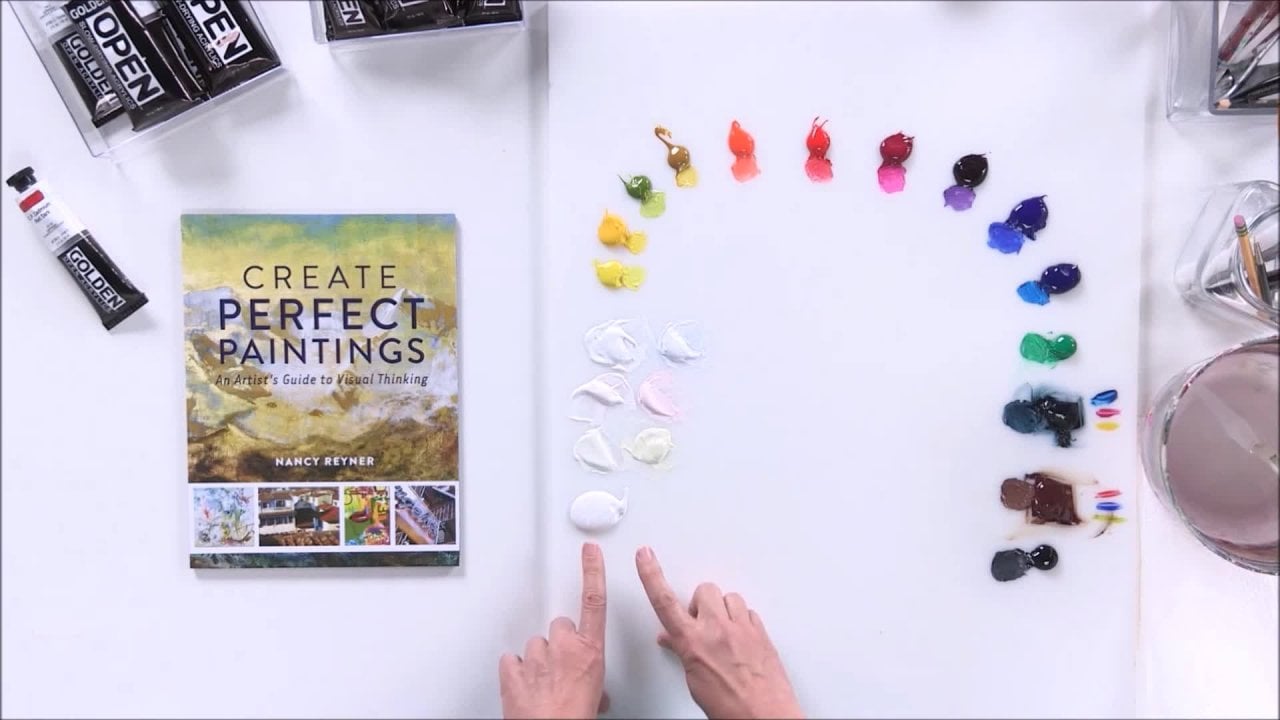
2. Video 2 Materials & Preparing Your Color Palette: So let's get started. The first thing we need to do is make our palate. Now I want to define palate because palette has two different meanings and can be very confusing. The word pal. It could be the actual surface or material that you're gonna use to put your paints on and next. The word palate can also be an arrangement of how you place your colors in the best way for you to mix and match colors. So it's either the material that you're actually using, And it could also be the arrangement that you're doing, and I use it both ways, so hopefully it won't be too confusing. I'll try to make sure I clarify each time I use the word. So first, let's start talking about the actual material, the palette as a surface that you're gonna use to mix and match pain. You want to make sure it's smooth so that as you're mixing paint, you don't get globs of something else coming up. You wanted to be smooth. It should be easily clean herbal, and it should be non porous, which means it should be shiny or glossy so that the paint won't sink in and absorb into the surface, so I like to use a plexi. This is called H D P E E, which stands for high density polyethylene plexi, and that is a nice palate. But you can also use a piece of wood that sealed. You can use a piece of glass. You can use a freezer paper. Now. Freezer paper is not the same as wax paper, but if you can get freezer paper and you just rip off, a sheet comes in rolls and you can tape it to any kind of aboard a piece of cardboard. Your table freezer paper works really well. Another type of palette that I like to use, especially in workshops, is a gray palette or gray pad. Um, there are many different types of palettes like this. They're disposable. That means that the when you're using the page when you're finished or it gets crowded, you can just ripped the page off, and there's another one. So I like that in workshops. You can just keep using the same pad and renew its page easily. The other thing I like about it is that it's gray and gray. Color is perfect for color matching. So I love using these in videos and workshops, although it's not big enough for me for this video, often in workshops I'll put to together and use it that way. But in this work in this video, I'm going to choose to use this. It's just bigger and without a seam, going down the middle with two of them. Another option is a store bought palette that comes, uh, there's several different brands, and they come with a, uh, top on it, a lid so that if you're working outdoors landscape painting, you can put your paint in and put the cover back on. And if it tilts or something, you won't have the paint spill out on something else. I like thes, but I they come with a foam in them, and I don't like the foam. I don't like bouncing pallets. Some people do, but without the foam, it actually is. HDP, the high density polyethylene plastic and works very well as a palate. Okay, once you pick your favorite type of palette in any of those options are great once you pick your type of palette. Now, let's use palette. In the other definition, which is How are we going? Toe. Arrange our colors and what colors? Air. We're gonna pick weather's hundreds, hundreds of colors when you go to the art store or the craft store. Wherever you're going to buy your paints, do you buy hundreds of paint that would cost a lot of money? What I want to tell you is that you only need six colors, plus white that is it to make what I call a full palette. Ah, full palate is basically your primary colors and ill defined that little later red, yellow and blue. But with just one red, yellow and blue, it's not gonna make it for you. You're not gonna be able to match every color, however, if you got a warm and a cool read. A warm and a cool yellow, a warm in a cool blue that six plus white. That seven I like toe add black, even though you can match. You can mix your own black with those colors, so my full palate is 86 colors. That's two of each of the three primaries, plus white and black. Let me go into this a little further. Let's look at primary colors. Okay, here are two reds to yellows, two blues. If we look at red, yellow and blue and say what would be the perfect Read the perfect yellow and the perfect blue for us if we just wanted one of each The perfect red, yellow and blue don't exist in physical form. That's I don't want to sound to metaphysical. But if we think of the perfect red, yellow and blue in our ideal it comes down to us and the physical world in paints that are a little warmer and a little cooler of your ideal. So if you can picture in between these two reds is your perfect ideal read that doesn't exist in pain form. Same with the yellow and same with the blue. But as painters, we can cover our bases by getting a warm and cool off each color. What do I mean by warm and cool? Well, if we look at these two reds, this is like a cadmium red. This is like a quinacrine own red. And I'll explain what those names mean. Soon if we look at this, I would call this warm this red here, and I would call this red Cool. This looks like a tomato red that's like a warm red. And think of big Sorry. Think of being Cherries as your cool red, and the words warm and cool get a little confusing for some folks. So instead of warm and cool, I like to use the terms leaning towards yellow and leaning towards blue. So if you look at this warm red, you could say that this red leans towards the yellow. This red leans towards the blue, and it works that way for all the colors. So this blue here, this one right here and leans towards the red, and this blue leans towards the yellow. Same with the two yellows. This one leans towards blue. It's like a slightly greenish yellow, and this one leans towards the red. It's a slightly red or orangy yellow, so that's our full palette, a warm in a cool off or leaning towards one of the other of the three primary colors. So let's pick our colors and squeeze the about on the palate. Here is the white. Here are the two yellows that I'm gonna use, by the way, I'm using this slow drying paint from Golden called open so that once I put the paints out on the palate, they will stay wet for the whole video. And I will talk later about other types of arranging the palate for using Watercolor Inc and fast try acrylic. But for now, let's just assume for oil painters and slow, dry acrylic. This palette is gonna work. So I've got my white and my two yellows, Would you, please to blues? And I'm gonna use these two reds and a black. The black was optional, but I like having that. So here are my eight colors. All you need is eight colors for what I call a full palette, which will enable you to mix and match any color. And I mean any color as long as they're the right warm and cool colors. So let's go over that first titanium. White is a good white because it's very opaque, and I like toe have a workhorse white. So I am going Teoh, move the tubes out of the way so that I can arrange my palette here. I'm using the word palette in terms of an arrangement. We'll start with the white now what I want to do is squeeze them out in an arc like this. I don't want to put paint right here in front of me or I'll be dragging my clothes through it and everything else. So think of an arch with no bottom. And I'm gonna start with the white. I like to go from light to dark, so I'm gonna start with white, then go yellow, red, blue and black. So here's my white clips. And then I'm gonna use a cool yellow for a cool yellow. You can use hands, a yellow light or cadmium yellow light. And there's some other new paints on the market. But those are the two ones that are the most common and easily, too easily attainable in the cool yellow. You want something that looks lemony or almost greenish. This is a warm yellow. This is called Hansa medium hands, a yellow medium. You can also use cadmium, yellow, medium, and those are the only two that I know that are easily attainable for reds. The first time want to put down is a warm red. Now there's a lot of options in warm red. Um, notice I'm at I'm saving some space in between the colors because I'm gonna be adding later some other colors and mixtures so you don't want to put your colors so tight that you can add things in between. Leave lots of space for warm red. This is a pie roll read. You can also use nap ful. Red light or medium can also use cadmium, red, light or medium. There's a lot of warm red choices, but with the cool red, there's only one. And this is it. Quinacrine on magenta. If you don't have quinacrine on magenta, you will not be able to mix decent purples and many other colors, too. So quinacrine. Oh, magenta is a must for cool. Read some people like a lizard in red, but it's also darker, and then you would be missing out on your capability of matching color. So we've got white. We got are two yellows. We've got our two reds, and now we'll have to blues for the cool blue or the blue that leans towards red. I'm going to use ultra marine blue, and another option would be anthro. Quinn known blue. It's hard to say, but it's a beautiful, cool, reddish blue and for my yellow blue, my blue that leans towards the yellow. I am gonna use fellow blue green shade and there are no substitutes for this yellow blue green shade is a must And then I've got black And again I said black was optional cause I could mix ah, yellow, red and blue together and get a really nice black. But I like having it out of the tube to now that we have our colors spread out on the palate, we have our arrangement. Are palette arrangement on the palate? I want to take a moment and talk about the difference between two categories of paints. The chemists call them inorganic and organic, and this is based on the type of pigment that's used in the paint. This is going to sound a little bit scientific, but it's very important to understand that these two categories of paints act very, very different from each other, and I've got them here. I've got both categories represented in this palette instead of organic and inorganic. I like to say modern and mineral just easier to say. So I'm gonna call organic paints the modern colors, and I'm gonna call the inorganic paints the mineral colors. And let me just explain the difference between the two. About 60 years ago, all paints were made from natural sources bark soil, dirt, rocks, beetles And they were all, um, they sound like names that you might. It's sound familiar, like burnt sienna, cadmium, ultra marine blue, those air colors that you would imagine someone like Rembrandt would use. That's all the colors that were available up until about 60 years ago. And right about then, uh, some of the sources started. Teoh get depleted, for instance, Ultra Marine blue was made from Lapidus, and that was getting kind of expensive. So some scientists got together and said, How can we synthetically reproduce ultra marine blue instead of using lap ists? How can we make it cheaper and make it synthetic? And they did on this technology so ultra marine blue? Most of your ultra marine blue is now synthetic, but that new technology it created a whole different type of pigment. If you can imagine, a cadmium is a mineral pigment in a microscope. It looks like a dusty dirty boulder and suspended in the binder, in this case, acrylic for using acrylic. Whereas this new technology produced pigment that looks like in a microscope, little pieces of stained glass suspended in the binder. So in a might in a microscope, they look totally different, and that makes them act very different. Let's compare to, and I'll show you. I am going to compare quinacrine on magenta with the cadmium red. Now, if we just look at the names of the colors, that's a good clue. But it's not always correct. But in this case it will help us decide which one is modern, in which ones mineral. If we look at the word cadmium that sounds familiar, it sounds like something Rembrandt would use. It sounds like something that's been around for a long time, and that's true. A cadmium is a mineral color, and it's probably still made from natural sources, whereas the word Quinn acrid own sounds very modern and it is a modern color. Any fellow or quinacrine own our modern colors. Some of the other names you can't really tell, but in this case we can. So we know the cadmium is mineral and the quinacrine on this modern. Let's look at the two together. I am going to take a magic marker, and I'm going to put black lines down because I want to show you something about the transparency of the two colors. So here's some black lines at the top of this one. I'm going to put the cadmium red, and at the top of this one, I'm going to put the quinacrine own magenta. Okay, so we have the two reds at the top of this board. It's just a piece of Jessica cardboard. I just want to show you the difference between the two reds. I'm going to do what's called a draw down and take my palette knife and draw down over the black lines. What do you think? Do you think that's opaque or transparent? The word opaque means that you can't see through it, and the word transparent means you'd be able to see the black lines underneath. That's pretty, pretty opaque to me. I can't see any of the black lines now if I take this quinacrine are magenta and this one is a mineral color. Mineral colors in general have good opacity like that. If I take this one and I'm putting it the same way I drew down that you can see it. Not only is it transparent, but it's also very streaky, and this is pretty much the definition of between the two. A mineral color has pretty good coverage and evenly applied, whereas a modern gets kind of streaky. Now, why is that? Well, let's look at some characteristics of the two paints. A paint has what's called a mass tone and an undertone that's M a SS math tone and undertone. Ah, mass tone is where the color is thick and an undertone is where it's kind of thin, and you could scrape it to get it thin. Or you can rub it with a paper towel is what I'm trying to do here. If I rub it now, I have a mass tone in an undertone of the cadmium, and there they're different. Obviously, this one's more transparent, and that's more opaque, but they're still kind of the same color, whereas with a modern color. When I get a thin version of it next to its thick mass tone, it's very, very different. And that means that as I painted out, it's gonna have a streak equality, because there's a big difference between the mass tone in the undertone. Let's look at what happens when we add white. So if I take some white paint and in the old days they basically said, Don't add white. If you want to make something lighter, put it next to something darker because, adding white, does this watch? If we look at this color, it has a certain I don't know. I like to think happy equality or brightness to it. As soon as we add some white, it gets lighter, but it also gets a little chalk year. You could say kind of limp, not so intense. The color gets a little bit boring in a way, whereas with the modern color it gets, it's pretty dark in a mass tone. And when you add a little bit of white, it really brings out the flavor of the color. Almost matches the undertone here, so when you're using modern colors, it's really good to know that you need a little bit of white to bring out the colors, and I use the word pop. Uh, most people call something a tent. When you add a little bit of white, you're making a tent. But in the case of a modern color. When you add a little bit of white, you're really kind of turning the light on underneath that color and making it bright. Now, if I keep adding white to it, it will just turn into a tent. It'll start to get chalky, so maybe it'll make more sense when I look at my palate. So with this palette, there are some colors on there that are pretty dark. Here is the quinacrine own magenta, and here is the yellow blue, and they both look very, very dark. You could even think that this blue is black. So what I like to do when I set up my palate first thing I want to do is I put a little bit . It's important to have a clean palette knife when you do this. What I want to do is take a little bit of white and put it next to each color. It's like having a little white tail, and this will tell me whether it's mineral in modern because I'm gonna give it its little a tent here. So let's see. Here is the quinacrine own magenta with a little bit of white, and that really gives me a visual clue how different it is when I add some white to the original color. And here's the ultra marine blue, which is a mineral color. You can see it's getting very chalking right away, whereas look at this fellow blue, because how that pops, it's that little bit of white. It's like turning a light on and even the black. I like to see what it looks like when you add a little bit of white to it. Added a little too much black. Here we go. So for me, a full palette when it's finished gives me full visual indication of what these colors conduce. Oh, so almost finished. Just gonna look at these yellows. Okay, so I have my paints in an arc in the order that I like. This is all I need to match any color I want, and I've given each one what I call a little tail, a little indication of what they really look like when they add when I add a little white, that shows me what the color could really be. Otherwise, I just everything could look like black. All these modern colors
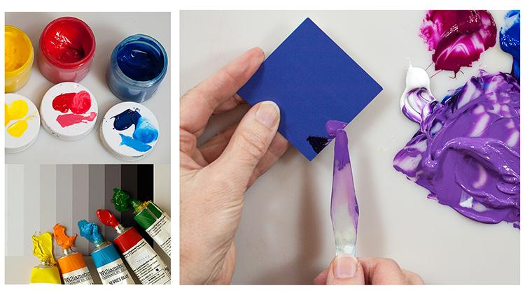
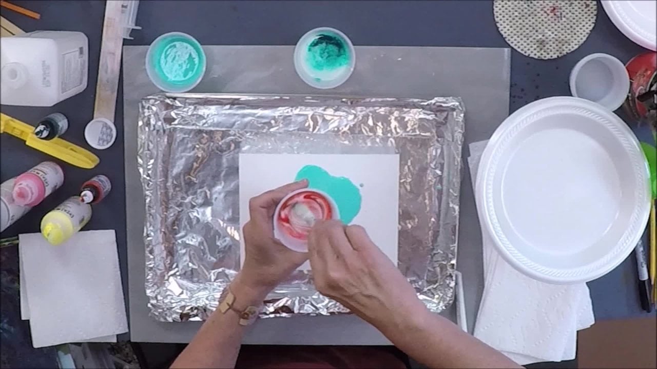
3. Video 3 Mixing Purple Colors – And All Secondary Colors: we are now going to match three colors not all together, but separately. We're going to start with a secondary color, then a primary color and then a tertiary color. If you don't know what those terms are, don't worry. I will define them all as we go. So let's start with a purple color. And, uh, by the way, this is the best way to practice. Matching color is to go to your paint store and get these free paint chips. Hopefully, they won't get angry at me for saying this, but these paint chips are great. There's nice, big area of color that you can you can match. So that's what the's air from. Here's a purple from the pain store, and a purple is a secondary color. What is a secondary color? It's basically ah, color that's made from two other colors. So remember I talked about primary colors red, yellow and blue. Primary colors are colors that cannot be obtained through mixtures from other colors. They are your basic baseline colors red, yellow and blue. When you combine any of those to red with yellow yellow with blue red with blue, you come up with a secondary color. Let's look and one of those is gonna be purple. Let's go back to this chart that I had of Primary Colors. We move this over so you could see it. Remember, I said, there are three primary colors red, yellow and blue, even though we're using two of each. The category is called red category blue category yellow, so three categories of primary colors. Now there's three categories of secondary colors orange, green and purple. Here they are. So each one of these colors is made from two of these categories. So if we look at purple, that'll be the first color we're gonna match. It's made of red and blue. So what kind of put it like this? In fact, I'll just make life really easy. Here we go. Red and blue makes purple and yellow and red makes orange. I'm gonna have trouble with the line here. Yellow and blue makes green. So we've got our three secondary colors in three primary. Now we are going to mix this particular purple. And remember I said that I wanted to give you the skills, the tools to be able to match perfectly. So we're not just gonna match any purple. We're gonna match this purple. Exactly. And that will strengthen our eyes. I think of our eyes as muscles and this exercise that we're gonna go through where we're gonna match this purple. Exactly. It's really lovely exercise to clarify and strengthen your eye muscles, which I have to say. It's more than just color matching. I use I strengthening muscles in the way that I look at my work and figure out how to make it better, how to improve it and to analyze it so back to what we're working on, which is matching purple. We know it's made of red and blue. Okay, so I'm gonna move this chart out of the way. So it's made of red and Blue. But here's our first dilemma. I've got two reds and two blues. Which red and which blue are gonna make me the best start for this purple. Now, the way to start matching a color in general is to start with the brightest version of that color. If this is a purple, we want to make the brightest purple first and keep changing it until it becomes this particular purple. So it's a lot easier to start bright and get dollar darker, more muted and move into this purple than it is to start with something that's dark and dull and try to get brighter. So, by the way, this system that we're doing with this purple can be used for any secondary color Green, orange, purple So let's start with the brightest version of this purple and we've got How many choices do we have? We have to resin to blues. So the way that I start the first purple that I start to mix I have four choices this red and this blue this red in this blue this blue With this read this blue with that red side four choices and how to start And it makes a big difference in how I start. Let's go back to the tubes. This is the fellow blue. This is the ultra marine blue. This is the quinacrine on magenta and this is the pirate red. Okay, which one's gonna make us the brightest purple? Here's how we think about it. This purples made of red and blue and there's one primary color that's missing from that. That would be yellow. So we have red and blue in here and we want to avoid yellow. Well, you could say, Hey, Nance, that's easy. I just won't put yellow into my mixture. Ah, but here's the trick Is that one of thes reds? And one of these blues has a small amount of yellow. Not not. It has a small amount of a yellow lean towards it doesn't actually have yellow pigment in it. One of these reds is a little warmer Orleans to the yellow, and one of the blues is a little warmer Orleans to the yellow, and you might not be able to see it in the color. But it's in there. And to prove it to you, I'm gonna mix the brightest purple and the Dulles purple from different combinations just to show you. So if I take this red, which I don't know if you can see, but it has a little bit of yellow in it. I don't want to mislead you. It doesn't have yellow pain. It just leans towards the yellow. So if I used this red with the blue that leans towards a little yellow, that would be this blue, and I mix it together for a little more in there. Now you notice it's very, very dark. One of the colors, the fellow blue, is a modern color. And to really see what the color is, I'm gonna have to pop it or give it a little tale of white just to see what that color is. And you could call that a purple. But it looks pretty dull, especially compared to when I use the correct pair. This is the red that has no leaning towards yellow. And this is the blue that has no leaning towards yellow gonna mix it together. This has a modern color in it to Therefore I will have to add a little bit of white not to the whole pile, but just a little tail so I can visually see what I've got. Here's a little bit of white, all right, these air both made from blue and red. But look at the difference between the two. One looks like a very pure purple on the other. Looks like a very muted, grayish neutrally purple. And I made this chart here to show you what I just did. Here is the yellow blue with the PIRA red the original two mixed together. Here's their mass tone and their undertone, or a thick version and a thin version of the color. And here it's popped or tinted a little bit of white to show you that this blue and red has just made a lovely gray. Whereas the ultra marine blue here and the quinacrine are magenta mixed together thickly, here's its mass tones. Very dark. I did a thin version. Here's the undertone or the thin version is very bright and a pop version looks like purple , so you could see that how you start is very important. So now we know we want to start with the brightest purple. We're going to start with the ultra Marine blue. I just realized I could use this pile, but we'll start again here. Okay, so here is how I'm going to start matching this color. The first thing we did was pick the correct pair to make the brightest that we can. And the next thing we're gonna dio is not Look at this wet color here and compare it far away from the card. But I'm actually gonna take a piece of it on my palette knife This is very key to the whole matching system is don't match four feet apart. You want to put it directly on your swatch like that? Uh, I'm sorry. I'll call this the Swatch so we don't get confused and I'll call this the paint chip that I got from the pain store. And immediately when you put it on, you can see that it's too dark. So the first thing we do is say it's too dark. The opposite of dark is light. We want to make it lighter. We're gonna add some white, take some white, mix it in, and every time I do something, I'm going to put a swatch on this paint chip until it matches perfectly. And it's easy to say, Oh, I can tell from this glob of paint. I just need to add this this in this, but it's better to do it one at a time. There's no awards for fast mixing. What we're trying to do is exercise. Are I? Every time we put a swatch on this paint chip card, are I records that amount of pain in this mixture on this, and then, pretty soon after practicing, you can while you're painting, you can mix and match without doing this watch, but for now, so that made a big difference. It's getting closer now again. The trick is to stare at it and stare at your swatch on the paint chip until you can see a difference between the two. Now there's six ways that this swatch can differ from the paint chip. There's only six. It can be lighter or darker. It can be warmer or cooler in this case, redder or bluer or brighter or dollar on Lee. Six. So if you get confused and say they look close eye, I can't see a difference keeps staring. The more you stare, your eyes will actually shift them to more Contrast you so you can see the difference more clearly. Your eyes are really wonderful muscles, so the more I stare at this, it still looks a darker, so I'm gonna add more white. Now you can mix with a brush if we don't remember before. When I did that first example in the introduction, I used a brush to next color. Now I'm using a palette knife, and it's very important to know the difference. Ah, brushes meant to hold paint and a palette knife is meant to release paint. So if I want to match a color and have enough of it to paint with, I'm gonna want to use the knife. If I mixed this with a brush would all end up on the brush, and I wouldn't have a pile of pain here. T match. Notice that each time that I make a difference in this batch of paint, I wipe off my knife so it's clean and I get a clean glob of paint. Swatch and swatch it. Mm. Looks like I went a little too far lighter. That's OK. It's all fun exercises for your eye. So now I'm like, a little bit lighter. Uh, I can go and add more of that same purple, and I have some up here. This was same purple, but I can also see that it's a little bit brighter and the swatches dollar. So if I want to make a dollar, I could do two things. I can add what's called its complement, and that is the opposite of what's blue and red. We talked about that in the beginning. If the purple is made of blue and red. What's the one primary that's missing is yellow. That's also called its complement. And that's what we want to avoid if we want to make the brightest purple. But we want to add it in if we wanted to get dollar, so if I added a little bit of yellow and doesn't matter which yellow, uh, just been a yellow and let's put it in. So I added a little more purple and a little yellow this time to make it a little darker and a little dollar, and it's really important to mix it very homogeneous. Lee, instead of leaving it all marbleized so you can see what your color is doing. So I'm gonna dip it in to my new batch and notice. I'm putting them lining them up, not just putting them everywhere so I can really see the succession of what I'm doing. It's getting better, but it still needs a little bit more of both, so I'm gonna go ahead, add more purple now. Another way to get something dull is to add some black. That's why I like to add to have black right from the tube on my palette so I'm gonna add a little black instead of the yellow, just to see if that makes it move a little quicker to that color. And I'm moving my palette knife like this in a spiral, and then I'm smashing it. One student once told me, she said, You should call it this push and smash method of mixing color. But anyway, I'm tryingto. Instead of spreading it out all over, I'm trying to push it into a little pile. I'm wiping my knife off again, and it's getting there. Some people would call that close enough, but I I don't know if you noticed, but the color starts real contrast E. And now it's starting to get closer and closer. It's almost looks like it's fading out and disappearing. I want my color toe almost disappear into this watch. I want to say one thing, which is that I picked a mat Swatch. I'm sorry, Matt, paint chip instead of a gloss paint chip so that you wouldn't have a reflection on the video. But gloss paint chips would be easier to match when you're working with gloss paint just up to you. The other thing I want to mention is that you could be blow drying your pain each time to see what the color actually is gonna look like when it's dry and I'm not using the blow dryer. I'm just gonna match it wet just to save us time. So you don't have to watch me blow dry each time we do a swatch. But if I want a super perfect match when it's dry, I would have to blow dry and I have one here. We have to blow dry until it's dry, then look at it to decide what I need. So I would say when you're home doing this, do it with a blow dryer, so that can really get it matched exactly. But what we're gonna do is just magic wet. It's the same process eso I'm gonna keep, adding It still looks bright and a little bit lighter, so I'm gonna add more of the yellow, not more of the purple, and I'm going very, very slow. It's better to go slow, and it's also good to get multiple paint chips of the same color because you could actually fill up a whole card and then go to another card. It's good to have more than one. It's slowly getting Let's see. Now it looks a little more still Looks brighter. I'm going to try to some black. The good thing to know is that everything I have on this pallet is all I need to make this absolutely perfect is getting better. Uh, but to stare at it for a little while and I think it's going in the right direction. So I'm gonna keep adding more and more black. Oh, I might have added too much. I think I did, which is good, cause then I can show you what will happen if you overkill color. Let's see. Well, that's pretty good. I don't know in this light if you can see it, but it's almost disappearing, and that's what you want. You want to be able to look at the card and not even see what your last swatches and I'm gonna be real picky. And I'm just going to add a little more white and a little more purple just to brighten it up again, because I went a little too far with the black and see if that helps and really is. It's so easy to say, I don't want to bother keep wiping off my knife, but it really is important to get a clean swatch on your paint chip. And also, I want to mention it's good to start with more paint than you think you need because you end up using a bunch of paint doing this. This matching process. I'll cover the logo there. That's pretty good. I don't know if the lighting is working here, but from my point of view, I can barely see the difference between the paint and the paint chip from the wet paint and the paint chip. So we've just finished matching the purple and let's summarize, uh, this system works for any secondary color. Remember, we're gonna mix a secondary than a primary than a tertiary. So for the category of secondary, which are anything that looks orange, green or purple, you want to start with the brightest pair, the brightest pair of the initial components. So with the purple, it was a blue in a red with green. It's gonna be blue and yellow, and with orange it's gonna be a red and a yellow, and you want to look at your palate and decide which are the two that you're gonna use that will give you the brightest version of that mix that up. If it's got a modern color in its component, it might need a little bit of white right away to kind of pop it and see what the color is really looking like. And from there you just watch your paint chip and you keep changing it until you're finished until it's absolutely perfect.
4. Video 4 Mixing Red Colors – And All Primary Colors: Now we're ready to mix and match our second color. A red and a red is a primary. So the purple was a secondary. And this is a primary color. Uh, notice. I got some paint chips and I have many. In case I need to use more than one card. I'll put these to the side for a second so we can concentrate on the one red. Now, remember, with the purple, the way we start is by mixing the brightest purple. And we did that by avoiding the complement of purple, which was yellow, and picking the correct red and blue that would give us the brightest purple. When this case for the red red is not made of a combination of two of the colors on the palette, it's actually a primary color. So how do we start? How do we start with the brightest red to match this red? Well, we have two choices of red. We could start with either one of them, but ah, fun trick to matching a primary color is to use the warm in the cool off. Both of them. The warming, the cool both together to start your primary colors So here we have a cool red. It's a good practice to wipe your palette knife off before you dip it into the next batch of color. So here I have a warm in a cool read together. I'm going to mix them up. That would give me the brightest. Read those for my two options and because my knife is clean. If I added a little bit of something else in that, it would dull it immediately. So it is important to keep your palette knife clean. Now. I've just made my first batch. I'm going to put my first watch on this paint chip, and I'm going to look at it and I keep staring at it. Sometimes it's real obvious, like in the purple. The first thing was, it's too dark, but here it's kind of close. So I'm gonna keep looking at it until something becomes obvious and it will be one of six things. It's either going to be lighter or darker, so if I look at that, the value, the light or darkness of it is very similar. So I'm going to move on to the second pair, which is warmer or cooler, that would be a little more of the cherry red. I'm sorry. The tomato red versus the bing cherry red. So the warm red or the cool red. It almost looks like this is warmer, my swatches warmer than the paint chip. The paint chip is cooler. That means I could add more of this quinacrine own magenta. And I'm going Teoh. So I'm gonna take some from the two because I think I got mine a little contaminated with some blue there and want to make sure I keep it real clean first. So take more of the magenta and accident. Now, remember I said, when you're using a modern color in your mixtures, you may need to pop it to bring out that darkness. What's interesting here is that the warm read the pyro red is actually popping or slightly illuminating the quinacrine. Oh, Magenta. So I don't need to add some white. And I'm glad I didn't because the value is so similar. If I had added White, it might be too light, So better toe error on the side of not very much change subtle changes one at a time. So let's see if this made a difference do that. And every time you do it, you're exercising your eye muscles so that now I see that adding that quinacrine are magenta made it, ah la cooler and a lot closer to the paint chip. Here, it's starting to look a little bit darker, so I'm gonna add a little bit of white, even though I said better not add it yet. Now's a good time. Okay, having a little bit of white probably had a little bit more, but I like I said, I'd rather err on the side of not enough really very relaxing and meditative about color mixing. And sometimes if I don't know what I want to paint, I will just go into my studio and for an hour, just mixed colors and often get my best ideas that way. So let's see here. I'm adding a little bit of white now. It doesn't look lighter or darker, but it looks brighter to me, a little bit dollar. So my choice in going dollar is to add a little bit of reds compliment or black and reds. Compliment would be green Bread is a primary color. The two primaries that are not included in red or blue and yellow that makes green so green is a complement of red. So I could either add the compliment or black. And if I answer myself, which is better to add while I'm staring at it, it actually shows me that black is better. I don't know how the eye does that, but trust me, if you really stare at it long enough, you could start to see the colors telling you what they need. So I'm gonna add just a little bit of black. I learned my lesson last time. I added too much. So I have a small amount. It's hard to get tiny, small amounts of color on your palette knife. Real trick. But after a little practice, get good at it, Okay? Doing the push and Smush trying to get it all in a neat little pile, all homogenized, one color. Wiping off my palette knife. Dip it into that nice, clean batch of color who it's getting closer, but it's getting a little dark, which makes sense, cause I'm adding black. The value was pretty close last time. Manning black. It's getting dollar, but it's also getting a little darker, so Now I'm gonna add a little more white. Oops. I think I added too much, but we'll see. It's really hard to tell right from this glob of pain. What you've just done on Look, till you actually put a clean swatch on your paint Chip. It's so easy to want to take shortcuts. Our brain doesn't like us. Toe take a long time with things. Okay, Now I'm gonna see what I did that's pretty close. And again, if you look at the colors succession going from here to here, you can see how the closer you get to the color you want, it almost looks like it's sinking into the paint chip itself and slowly disappearing. I could still see it. It still looks a little brighter. I'm gonna add a little more black again. Very small amount. I recommend to go all the way until the color is completely perfect. You cannot imagine it anymore. Perfect. If you stop short, you're really compromising. And this is a good practice. Even when painting when I have issues to resolve, it's too easy to say adds close enough but to make every issue to resolve every issue in a painting and make it the best you can. Something very fulfilling about that. This is a nice exercise. That kind of gets your brain in your eye, moving in that direction where you're just going to keep going until it's exactly what you want. Color or your painting, huh? It's getting better, So I just a little bit more. You could call me a perfectionist, but me bam. But, uh, I think that that striving for perfection is what makes us interested in making art in the first place. I just want to keep making something beautiful or mawr of whatever our intent is for our work. And if we have to compromise that, it's not a satisfying. Okay, let's see what we came up with. I think it needs a little more yellow from my point of view. Just gonna add a touch of yellow, see what that does. Well, that's that's so close it I just the only thing I see is the shadow here of Thea, the swatch of pain on it. So we have successfully matched a primary color. And remember the this will work with any primary colors a red a blue or yellow in any type of red, blue or yellow. There's variations, right? It's category red, blue and yellow is primary color, and we start with the brightest. And in this case, instead of a combination of two primary colors, were using our warm and cool off that one particular primary color. Start with the brightest, and then we could just keep mixing and looking at it. And Reese watching our paint chip until it's perfect and it can Onley change in six ways. It can only what can I say Thus the wet paint on your paint chip Can Onley differ six ways lighter or darker, warmer or cooler? And in this case with the reds, the pyro red versus the quinacrine on red or brighter or dollar and there you have it.
5. Video 5 Mixing Neutral Colors: well, I've cleaned off the pallet and gotten ready for our last color are third and last color, which is going to be what's called a tertiary. And here we see this is a tertiary. A tertiary color is a color that has a red eye, some red, some yellow and some blue, and it has all three of the primary colors. That's why it's called Tertiary three, and my shirt is probably a good tertiary. Tertiary is anything that looks gray, muddy, sort of looks like an orange, but not sort of looks like a purple, but not sort of looks like a green, but not so We call this khaki, which is really a tertiary green or a muddied brown green. So OK, um, with the tertiary, here's the trick. Instead of starting with the brightest because it's so dull and it has all three primaries in it, you can't go wrong. So what we're gonna do is take a shortcut. We could the long cut would be to say, Well, this looks kind of greenish, so we'll start with the brightest green, and we'll just keep mixing like we did before until we get here. But we could also start with the dullest green combination. Remember when we made the purple? There was a blue and a red that made the Dulles purple and a different blue and red that made the brightest purple. So now we're going to pick out a combination of colors that gives us the dullest. So what would that be? Well, anything. This was so great about tertiary colors. You can't go wrong no matter how you start your almost there. So as long as you have a yellow, red and blue, so I could actually start with already yellow and blue mix that together. But I think what I'll do is I'll start with the dull green that I had mentioned earlier. So instead of a bright green, make a dull green. So that way we get to review what makes things bright and what makes them dull. So let's just say a dull green. Well, a green is a secondary color, and it's made of blue and yellow, and if we wanted the brightest green, we don't. But let's just go backwards a little bit if we wanted the brightest green and the green is made of blue and yellow What is the one primary that's not in that pair? That would be red and red would be the complement of green or I. When I taught fourth grade, I used to call it the Muddy Buddy. What would you add to the secondary to make it muddy So the green is made of blue and yellow. Any red that we add is gonna make it muddy and bring it to a tertiary state like this. So one of these blues and one of these red I'm sorry, one of these blues and one of these yellows has a little bit of red in it, and that's the ones we're going to choose. So here's the two yellows. I'm gonna pick the warmer yellow, the one that leans towards the red, and we'll start with that wipe off my knife before I dig into the Blue Choice that has a little bit of red in it. Well, this is called fellow blue green shades, so that's a good clue that it's not the one that has red in it. And this is the ultra Marine blue, and that's the one that does have red in it. And I'm gonna take what's here? See if I need more. But I think this might be enough. Right? And mix it together Blue and yellow Makes green. This blue and yellow makes an incredibly dull green, bringing it pretty close to a tertiary already. And pushing Smush until I have ah, homogenized color wipe off my knife and I'm gonna swatch right here. Oh, that's that's pretty different. You could see neutral. Tertiary is in their pure form, if you will are really very dull. Okay, so this looks to green. It looks too dark. Um, tertiary Zahra. Lot easier. You don't have to. You could be heavy handed with your mixing. You don't have to do little light touches. So let's just go right into, uh, doing a combination of three things. It looks darker, Some good add white. It looks greener. So I'm gonna add the opposite of green red. So let's just start with two. I said three, but someone add white and a little red which read, Doesn't matter and Christian smash it around. And while I'm doing this, looks like Oh, it's lighter. I should add more something. But I'm not. I'm gonna wait until I give it its proper swatch on the paint chip. Oh, boy, that's a lot lighter, this one. I'm really swinging all over the place, but it's lighter, but it's still kind of close. It still looks like a green, so I'm going to just go ahead and add black because it looks a lot darker and grayer. Okay, let's see what that's like again. I'm putting it in an order every time I do something. I put it next on the on the line up so I can see that I'm moving in the correct direction. It should slowly look. It should look like it's slowly fading into the into the card. I don't know. I'll move it around a little bit. If the light is different, it's getting close. Okay, so I'm gonna just stare at it for a little bit. Is it too light or too dark? The value is pretty close, so let's go to the next step. Instead of saying Is it warmer or cooler? I could say. Is it red or yellow? Er bluer, greener. It looks a little greener. I could still add maybe little red to make a dollar. Um, brighter and dollar. Sometimes they're hard to tell with a tertiary, so I'm just gonna go ahead and add a little more of the compliment for the red. Okay, that's so I'm moving in the right direction. It's getting a lot closer. Um, OK, looks a little lighter to me, so I'm going to add a little more black, see what that does. I almost wanted to add a little purple, but that's the fun thing with Tertiary is. You can add whatever you want and you'll get there eventually. If you feel like you're not understanding the color mixing, start with one of these neutral colors. Okay, let's see where we're at. It's getting pretty close, lips getting messy here on the palate, that's getting pretty close. What I want to do is add a little bit of purple I still want it looks a little yellow where the opposite of yellow is purple. That's red and blue. So I'll add a little bit of that. And if I wanted to make a clean purple, I would be adding this blue and this red. So try those two. I think I might have had it too much. Yes, I did, probably. But let's see it's already. Yeah. See, I went a little too overboard with the red. That's okay. I'm gonna keep going. It's redder. So now we need to add green. I'm gonna add some of this blue on the green side and the white because it's also gonna get darker. If I add more that blue should see. Sometimes there's just not a easy linear succession to getting that color. Sometimes you just go all over the place. But that's OK, because again, it's about exercising your eye muscles, and it helps. Like I said, it helps with more than just mixing color. It helps with decision making and painting. Okay, try this one. Good thing I got extra cards. Well, it's getting better now. It needs a little yellow little yellow. It's almost like our eyes or little databases. And every time we had a little of something and we swatch it, it records it. This is just my theory records it, and then when you need to mix colors, it stays in. There is a as resource. It's getting better. I think a little more yellow. Let's try the other yellow and every color has its own strength. Its own tinting strength. So if I wanted a little bit of blue, um, I'd have to add a tiny bit of this modern color, but I could add more of the mineral color, and you start to get used to that with the color mixing is that everything has its certain amount and its strength and mixing. Let's see where we're at. Oh, it's getting much better. See that? Maybe pretty close. I think it needs to be a little bit lighter and a little redder. So I'm gonna add Not as much read as I did last time. I'm gonna add a little bit of read a little bit of white, see if we can get it. Really perfect. This must be like watching a cooking show. When do we get to taste it? It's it. Okay, let's see. That is really closed. Really close. So we did it? Yep. I was really close. That. See this light? I could have just a hair black. Okay, I'll do it. Might as well get it, actually. Really perfect. Okay, It's good. I only have room for one more swatch. Anyway, there we go that it's a perfect match now. I wanted to add something here. So first, let me summarize. This was a tertiary color. A tertiary color has all three red, yellow and blue. All three primaries in it on a tertiary is kind of hard to identify, you might say, Well, it looks like a reddish yellow or blue or green or purple, but it's more brown. It's usually in brown and money and a tertiary. Instead of starting with the brightest, we could start with the dullest and take a shortcut.
6. Video 6 More Tips on Color: What if you wanted to match a color that was on a piece of fabric or in a painting that you're working on or a photograph that you don't want to ruin? You don't want to swatch here. I'm so watching a paint chip. Eso I don't care about the paint chip, But what if I want to just watch something that I care about? In which case, uh, let's look at. Let's just say you have a print and you really like the print. Don't want to ruin the print with little paint swatches all around. One could piece of advice is to use index cards, so grab an index card using the side that is blank, and you can swatch the card and match it to whatever color your matching. Let's say a matching. I would pick a color in here and say, Why? What? That orange. I want that green. And then you would keep matching. Keep changing your color and keeps watching it and putting it next to it without ruining your print. If you were working with watercolor or a fluid paint or inks, then instead of swatch ing on a paint chip or an index card, you would want to swatch in the way that you're gonna be painting it. For instance, if I was going to make this in tow a washy acrylic wash or watercolor, it was watercolor. I would want to add water to it each time I mixed and added on to a watercolor paper, Whatever surface I'll be working on to see what the color looks like. Then I could blow dry it if I want or match it wet and hold it up next to what I'm where I'm working now, this palette that we've been working with this full palette again, a full palette is a warm and cool off each of the three primary colors red, yellow and blue, plus titanium white. And then I like to throw in black, even though it's optional. This full palette has worked really well to match colors. But when I'm painting, I need to improve this palette a little bit more to give me some more options, and I call that an enhanced full palette. So when I'm ready to paint, what I'll do is I'll add these following items. First of all, all of my paints here each one has its own opacity and transparency. I know we talked about a little bit. The modern in the mineral colors, the mineral had mawr, oven, opaque coverage and the moderns. They're opaque when they're used thickly, but when you try to use them normally in a medium or thin amount, you could start to see streaks because they are somewhat more transparent. But every color here I can make it more opaque or more transparent by, uh, adding white to make it more opaque and mediums or gels to make it more transparent. So I have white on my palette, so I'm able to take white and added to the different colors to make. Remember when we made the little tales? I can make a tent. The minerals will tent. That means as soon as I add white and these two are mineral colors. I cleaned up my palate, so somehow I lost my little tails. There you can see that the color gets lighter, but also chalky er on all the mineral colors. Let's try it. A one on here in this red. This is a mineral red. It gets lighter, but chalk here it loses its intensity it loses its punch, its brightness now with the modern colors. When we add a little bit of white, we can actually, not only do we bring out their brightness, see if I could do it here. Here we go. Look at how bright that is compared to how it is in its mass tone or thick quality, but also we're making it more transparent. Were almost turning it in tow. What a mineral color will act like by adding the white so we can make things more opaque by adding white. But again, we're also making the minerals talky and the moderns pop or bright with that wife. But if we want to make something more transparent, we need more medium. We need more clear binder toe add to the paint to make it more transparent. So, um, in this line of pain called open, there's an open medium, and I usually put it right in the middle of the palate. Uh, this medium looks white when it's wet, as most acrylic does, and it will dry, clear. It also comes in a gel. If I like texture, I might want tohave the gel version instead of the medium version. Either one will enable you to while you're mixing a color, if I take this color and while I'm mixing it, if I add medium or gel to it, I'm making it much more transparent. And then when I apply it over something that means whatever's underneath will be able to be seen. So by adding medium or gel, I can now make any of my colors more transparent. And I added, in the middle of my palate, because it gets very confusing, you will think it's white paint if it's over here near the white. That's why I always set up my palate the same way. The white paint is always here on the left, and then I make an arc like that, and my mediums and gels are always in the center. That way, I don't have to keep remembering. Oh, this white stuff over here is gonna turn clear. So that's one thing that I do to improve. Ah, full palette, bringing it into what I call the enhanced full palette. The next thing I like to do is I like to add secondary colors on my palette, even though I can mix them. It's nice toe have them to go to quickly. So our secondary colors are orange, green and purple. And so this This is optional, obviously, because I could make my own orange. It's nice toe have it, and I like to put them in between their primary components. So I'll put the orange purposely between the yellow and the red to remind me that's a secondary. And here is a green. I can't really put it between the blue and the yellow, so I'll just put it over here. Can't always be perfect, I guess. And then, um, purple. I like having a purple, and I used what's called dioxins in purple. It's a modern color, and the other two that I put down the orange and the green are mineral. Let me talk a little bit more about mineral modern. I really covered it very briefly before, but it is very important to understand the difference between the two types of pain. Um, let me summarize it this way. When you have a palate, what you're doing is you're arranging enough colors and enough options to give yourself the most variety, the most potential in your painting to go warmer or cooler with a color and to go with a modern or mineral color. And then, of course, you have transparency and opacity, lots of choices. And that's what the enhanced full palate is about, giving lots of choices. So let me just talk about that modern and mineral again. Any color looks like it's very bright right away. The yellows, the orange, the red. You can see these four colors in a row. They are the brightest. They are right out of their tube or jar. However they come. These air mineral colors, mineral colors remind me of crayons. He grab a crayon, and it is what it is that looks screen. It's green. It looks red. It's red. The modern colors are the trickier ones. Look at these. Look at these two right here, this dioxins in purple and fellow blue. Both of those names sound modern, and they both look black. They both look like black. If I make a little tail as we did before, you can see this color is gorgeous Purple. You wouldn't know it from its mass tone or its amount That's thick there. Same with this fellow blue Um, my decision of adding a modern or mineral while I'm mixing colors. I didn't mention this before, but when I looked at my paint chip and my swatch and I said, I need to add a little bit more red I could use either read, but one is going to be cooler. One's gonna be warmer, so I would make that decision based on what the swatch was. But I'm also looking at mineral versus Modern. I would choose the modern color if I needed a real kapow read. A. Modern colors are very, very strong mixers. You only need a tiny little bit toe. Add to your color to change it, whereas the mineral you can add a lot more and they're kind of slower in the mixing, their slower changing the mixture. So it is good to have modern and mineral on here. Um, in fact, since I have on Lee, I have a cool in a warm yellow here. But these are both mineral yellows. I'm going to add, uh, the modern versions of a cool in a warm and here I think it'll be a little bit more obvious . Um, I'll just put him here because I want to compare modern colors are very deceptive. When you see them in their mass tone, they just don't look like what they really can dio. So if you look at these two colors, it looks like an okra and green. But actually, let's look at the thin version. Look at that beautiful yellow who would know from that mass tone? And so if I put a little bit of white in a tale here, you can see that it's a gorgeous warm yellow very close to that and the same with this green gold. This is Nicholas so yellow, and this is green gold. If I add a little bit of white, you could start to see it turn into Ah, very nice, beautiful, cool yellow. So it's nice toe. Have you need to have warm in the cool of each primary, but it's also nice toe. Have a mineral in a modern version, too, so that you can use something a small amount of something and really punch up that color or use more of it and have a slower change in the color. So I hope that makes more sense between modern and mineral in my book, create perfect paintings I do spend more time talking about the mineral and modern colors on, and it is important on your palate. So, uh, now I've added medium and gel to allow myself to be able to change the transparency of the color. I've added some secondary colors orange, green and purple merely for convenience, so I can just grab them without mixing them every time I needed them. And there's another change that I'd like to make to this palette to make it a lot easier for me to paint and to come up with better results in my painting. And that is to make extra light mixtures an extra dark mixtures. Let me explain why we need that. Here is a gray scale. Or you could say it's a tonal scale. It's in 10 steps. We could say that one is white and 10 is black. Number one is white in number 10 is black, and it goes all the way from white to black with all the grace in between. Now it's, I think, it's important to be able to translate color into tone because when you make a painting, sometimes if it's all the same tone, if it's all a gray in terms, but you still have red, blue and green. They can all be transformed into a tone. So if we took all of the tubes of color that we have, let's start with yellow. I'll just take a yellow red and a blue color right out of the tube is pretty strong right away, yellow. Some people think that that's a number one, but it's not. If we look yellow is really somewhere between a three and a four there, this is it. Usually great. It's usually a four. This grey scales a little darker and as soon as we get to all the other colors trying to match them up with what I think that there tone would be if you took a color your color palette and took a photograph of it and put it in your computer and ran it in photo shop or whatever software you have, often they give you the option to change it into a grayscale or atonal scale. If you do that, you might be surprised to see if you have a full range of values. Full range of values isn't always important in every painting, but it's good to be able to evaluate your painting based on grayscale and tone. All I wanted to say is that this pallet is really warped into the dark area of this tonal scale. We have white over here, and almost all the other colors are going to fall in this darker range. So what happens often with paintings is that all the life values are either white out of the tube or a yellow, and I think that the more nuanced, subtle light values you have on your palate you will also get in your painting, and you'll have to do that by pre mixing or you don't have to, but it's a better way to do it. In other words, I want to say that the way you set up your palate is going to foreshadow how your painting is gonna look. If you don't have a certain color on your palate, it's not gonna end up in your painting. So if you don't have light values and actually a variation of dark values to on your palate , you're gonna end up with kind of your painting is gonna have a total value that's kind of warped into a darker range. So here's what I do for my enhanced full palette, this big jump between white and yellow. I don't want to have that happen in my painting, so I'll squeeze out three more whites, and each one is going to get a small amount of red, yellow or blue so small that it's not gonna look like much difference. But in a painting, it will really make a difference. The more variety you have in a painting, the more interest you'll get visual interest you will get. It will look more spatial. I don't know if you can see the difference between this, but I don't want to turn it into a light yellow. If I put too much yellow in, it'll be a light yellow. I wanted to be a yellowish white. Then I'm gonna take a tiny bit of red. If it gets to be pink, it's too much red. I got these a little close together, but and then I'll put a little bit of blue, and in this case I'm picking mineral colors because I want a subtle change. If I use that much in a modern color, it would turn to a light blue Now I have These are all number ones. The white is a number one and I have a slightly yellow a slightly red in a slightly blue white. So now I'm gonna divide them up. Should have given myself a little more room here, a lot more room still work. And when I add a little bit more of each of the same color So now I have a number two or number three value of each had a little more red and this one and a little more blue in this one. I recently had a student just last week and she said, You don't really do this whole pallet for every type of painting you do. And I said, Well, not every type. If I'm doing a wash ground wash or something, I won't. But if I have to fix a small area on my painting, I have to have all the colors because once you fix one small area, you end up fixing other areas. And if you don't have a full and enhanced palette, you're going to end up taking away a lot of nuance and your painting. So I don't know if you could see this, but I now have white. I have seven choices for light values. I have a white and I have a number 1 to 1 and two in yellow, red and blue. Now I'm going to give myself some variations and darks. I have black straight out of the tube. If I you Every time I want to use a black, I use the same black. It's going to look like wallpaper. My painting is just gonna look boring. The more variety you have, the better. So I'm going to make a mixed black. And for that I'm gonna use the modern colors. Remember the modern colors in their mass toner? Always dark. So I'm going to use the say hello Blue and the quinacrine. Oh, magenta. So it's a blue, a red and a yellow. And for yellow, I can use modern yellow or mineral yellow. Doesn't matter. Well, does matter. It makes different blacks, but let's start with old moderns. Here's all modern's. The blue, the red and the yellow were all modern. Let's mix them together and see what we get. Then I'll try adding some mineral colors. We'll look at the difference now. Modern colors always look black in their mass tone. Not all of them my green gold doesn't but most of them dio Let's add a little bit of white and see what we got. It's very green. If I want to neutralize that, make it more of a black black. I can add more of the red in it. More blue. Other words. You can actually shift your black around instead of just dealing with same kind of boring gray black out of the tube you can make, Ah, black. That's a little bluer, little red or a little mellower. Now it's starting to get more neutral, so it's fun to add to add mixtures of black If we did the modern version, I'm sorry, the mineral version of a black. So we take a red and a blue ultra marine blue pirate red, and I'll use the hands a yellow. I'll just take it from here. I've got plenty there. So here is a mineral version of red, blue, and yellow makes it together. The more yellow you put in, the more brown the black will get. But this will still give you a really beautiful black just tends to go a little more brown than using the modern colors. This is more of a brown, so if I add more of the blue, I see get it cooler stretched a look more like less like a brown and more like a black. So now I have my enhanced palette. I've got my warm and cool primaries that I set up with the full palette. I've got my extra secondary colors just for convenience sake. I have my medium and gel to make it more transparent, and I have lots of choices of lights and darks, which I think really add some punch to your painting, the palate that we just went over. The full palette and the enhanced full palette are perfect for when you're using a slow drying paint like oil paint or the open acrylics, the slow drying acrylics that I was using. But if you're using something else like the regular acrylics that aren't open are usually pretty fast drying. And where I live in Santa Fe, New Mexico, they dry really fast. This type of palette arrangement would not work. By the time I finished putting out all my colors, the first ones would be dry I wouldn't get to use it, so I do a different system. Four. Using the fast drying acrylic. Let's let's look at that. What I found really works and that keeps me from wasting paint is that I get these small jars with lids and I will mix up the color in the jar. Uh, let's say it's a cool yellow or warm yellow right out of the tube. I'll actually put the pure color in here, and I find the two paints a little thick for me, so I'll add a little bit of water, maybe a little retard er or a little glazing liquid to slow down the drawing just a little bit. Because I live in Santa Fe, New Mexico. You don't have to, but the key is that they're in these jars with lids, and what I do is I swatch the lid on the top. Here's the mass tone and the undertone, or thick and thin. And then here is a tint, adding a little bit of white. So right here, I see what my color looks like in the jar. If I opened the jar, the color looks very, very different. Presence in the shadow. I could barely see it, So this really helps. I'll do this with all my colors here. I just put out a yellow, red and a blue, but I will do the whole full palette, two yellows, two reds to blues, black and white in the jars when I'm ready to paint. And then also all add the orange green, purple mediums, gels and the light values and dark values to If I'm ready to do an enhanced full palette for just mixing colors, I can go back to that regular full palette of the 86 basic colors plus white. And then I like black. And then when I do is, I will just instead of of scooping them out of the jars, I will just do this. I put them out on a plast on the HDP e plexi or the other palettes that I mentioned, and I'll put the lid right in front of it, almost like the tales that I did so you can see what the color is, and then I could just go into the jar whenever I want, And if I want to take a break, I just close them and it really keeps them wet a lot longer and it states paint. So that's a great idea for your fast drying acrylic. Then I just have them all. I have a pretty big table at this point. I have about this size filled with jars. Also watched with the color, so it's kind of fun saves time. I don't have to mix many colors anymore unless I want to, uh, by just grabbing the colors that look close to what I need and spreading them out that way . So that's one solution to the fast drying acrylic. What if you're using ah krilic in washes or watercolor or thanks anything that's very, very fluid. You wouldn't want to use the jars, and you wouldn't want to use the palate if you use the big pallet like I just did. As soon as you add water to everything, it's kind of puddle all into one big puddle. And in here you can't really make dilutions like you'd want. You can't make it. Add more water and less water if you're taking it right out of the jar. So what I like to do is I like to take my paints, and here's the fluid paints, you can see them. I'll put them like this. And for my full palette, I want to reds to yellows. Two blues, just like before. But I will put them on plates, and I can usually get two colors per plate without them turning into, uh, mud. Now, when I'm using washes with acrylic paint, I Onley use modern colors. So here's another distinguishing factor between the modern and the mineral. I'm gonna use this green gold, and the nickel is a yellow as my to yellow's a warm in a cool yellow. And why am I using modern instead of the mineral colors? Well, if I used the mineral colors as soon as I add water and it's over white, it's going to get chalky. But the modern colors, when I add water, stay super bright. So if I want to have maximum color, I have to use the modern colors when I'm using washes, which means I'm deluding them with a lot of water. So let's just look at this blue here. Here's the Two Blues Oops Grill. This is an through Quinn own blue and fellow blue to modern blues, and here's my to modern reds. I actually like to use quinacrine own burnt orange as my warm red and quinacrine own magenta as my cool red. And remember how we made little pop tales by adding white to the each one of the pants on the other pallet. This time, instead of adding white, I'm just gonna add little bits of water and that you could see the difference between the mass tone and the undertone we'll call different. These colors are when you start to add water, going to try one more here just to show you remember how beautiful these yellows looked when we added white. It's the same thing when we're adding water and putting it over white. So for a full palette, when I'm using washes where one imitate watercolor, I will work this way I will take plates and I'll do two per plate, and I also instead of adding a lot of water to the paint itself. I like to make this little puddle here, and then I can regulate as I paint. I can go into more off the paint and make it more intense, or it can go more into the water and they get less intense. So again, every palate should give you maximum opportunity, the maximum potential for getting the most variety you can out of how you're working. Another cool trick is if you're using washes a lot, Um, I really do like this method, but you can always use ice cube trays to make sort of a general wash. You're still going to need a palette to mix some of them to be able to add more water or more color. But when you add them in the ice cube trays and get these, these are obviously dry or they would be spelling. But when you get these giant ziplock bags, you can store them, leaving them upright. Once you close off your Ziploc bag, they will last for months, so it's another way of not wasting too much paint. These are some alternatives to the palate that I was demonstrating with any type of paint you're using any type of painting style you're using, like washes or opaque paint or transparent paint you're still going to need ah full palette or an enhanced full palate still going to need all of those options, so hopefully this will help and this concludes our video. I thank you so much for joining me
 Nancy Reyner, Fine Art Painter, Author, Instructor