Transcripts
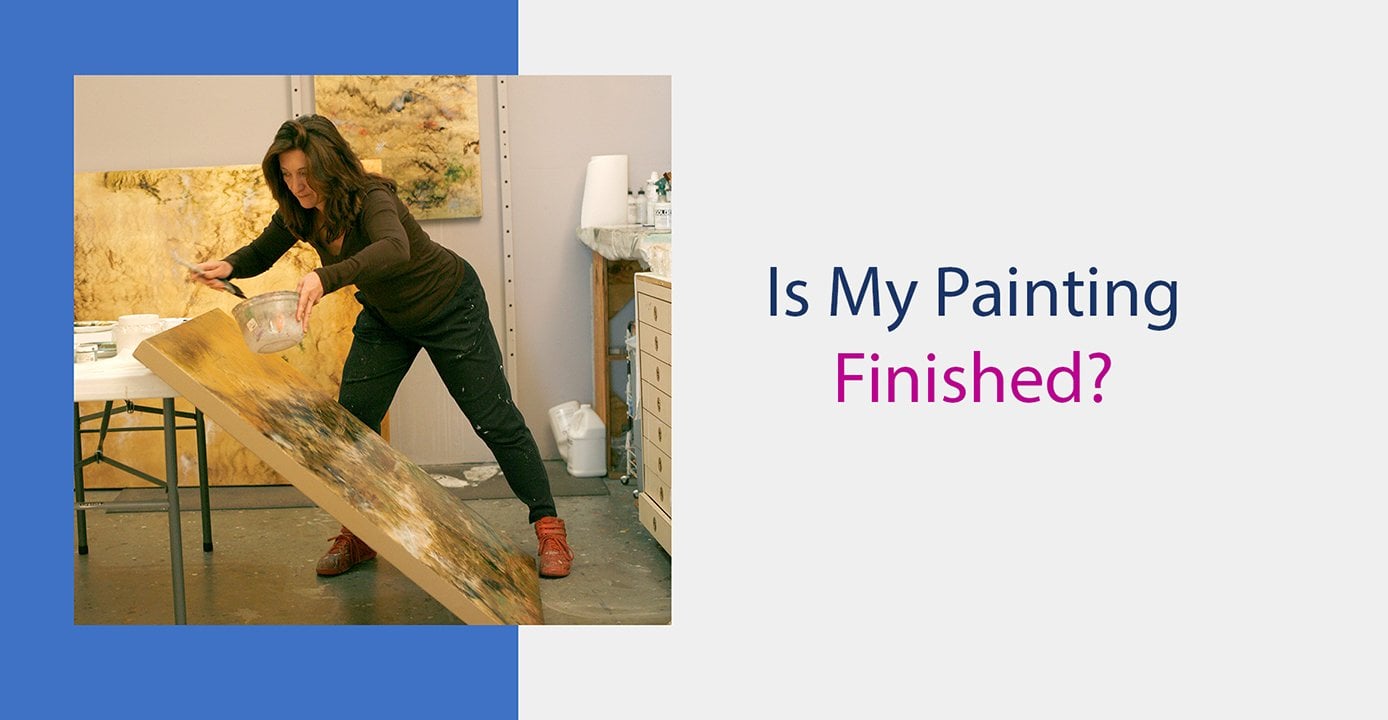
2. 1. How to Identify Painting Issues: Hi, I'm Nancy Rainer. Thank you for joining me for this video where we'll focus on ways to improve your painting . We'll take a look at some of the most common painting issues and their solutions. All painters deal with issues or problems. In fact, I like to think of painting is just that a series of problems to solve? The first problem is the blank canvas. Add something to that, and voila! You have your next problem when they're no more problems to solve its finished. It might not always seem that simple, but it is an easy way to think about our painting process. In the beginning, when I start painting, it feels fun, playful. But then, after a while, I often find myself asking. Now what? Or is it finished? This is a key moment. It means I'm ready to move from what I call a play phase to a critique phase a time to analyze what to do next and to see if there are any issues that, if resolved, would make our painting more attractive, more attention getting more visually exciting. My book create perfect paintings, focuses on both phases and contains a special system to identify issues. One of my favorite ways from the book to find issues is to look at a painting I'm currently working on and say It's too. And then I fill in the blank with the first thing that pops into my head. It's too busy. It's too dark. It's too boring, etcetera. Let's take a look at some of these issues more closely.
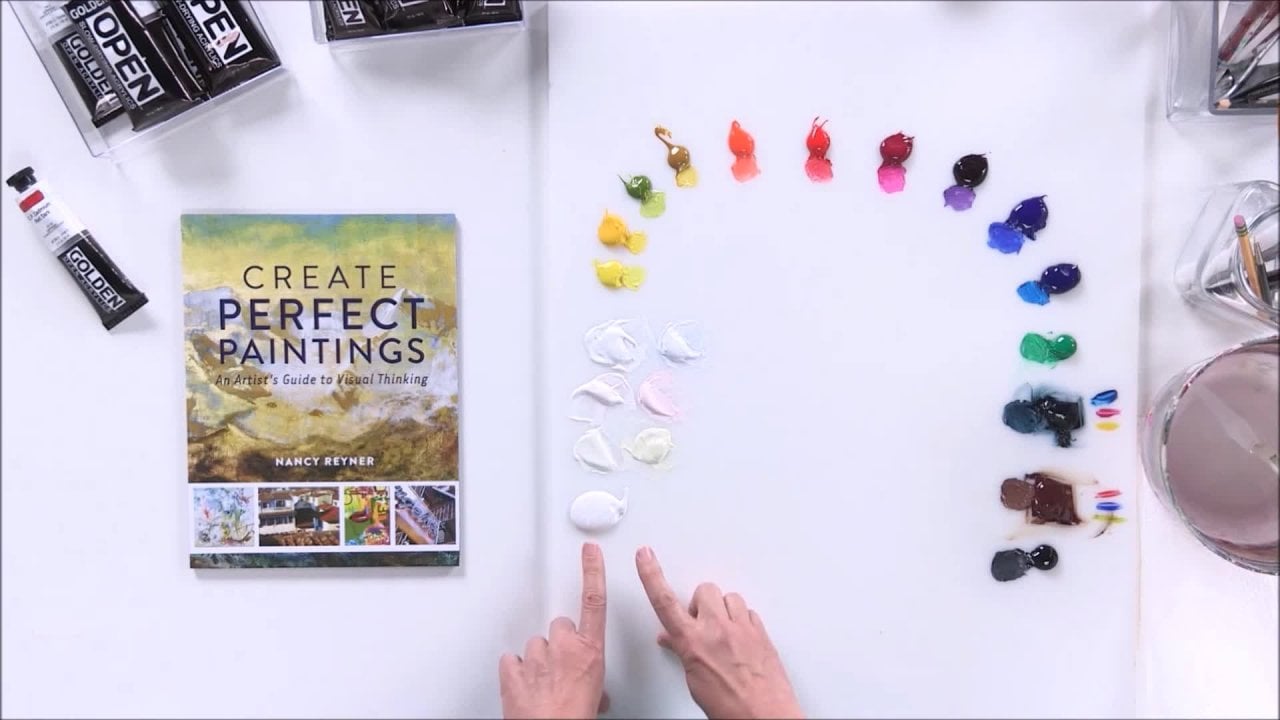
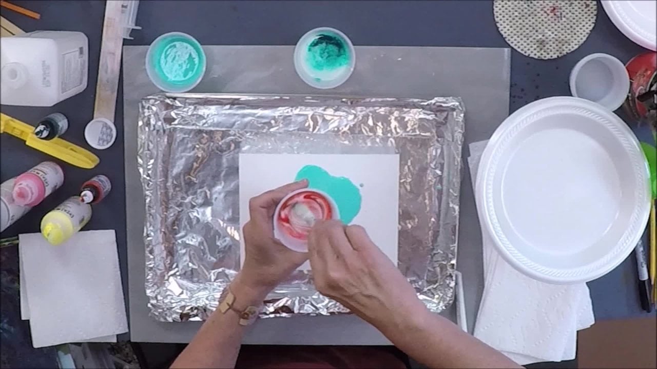
3. 2. It's Too Yellow: It's too yellow, you might say, Well, what's wrong with yellow? I like yellow. There's nothing wrong with yellow. In fact, it's one of our main primary colors red, blue and yellow. It would be very difficult to make a painting without yellow. Yellow is very important. The issue comes when yellow is overused when yellow is a substitute for light values. In a painting, Let me show you. Here is on Rometty's woman with a hat, Beautiful painting, Beautiful Portrait and I took this image in photo shop, and I altered it so that all of the light values anything that's close to a white or light value is turned to yellow. Let's compare these two this type of painting. I see this issue this too much yellow. Very often. I see it in galleries. I see it in workshops, and there is a specific reason why this comes up a lot. But if you look at this without the original Matty's, if we just look at this, it looks like a fine painting. There's nothing really wrong with it. It's just that when we compare it to this painting, let's just look right here at this area right here next to her red hair and blue hat. Do you see the white, the cool white and the warm yellow right here next to each other? Let's just look at that little area right here where I made it all yellow again next to her red hair and blue hat. Here is the yellow. The space here is much deeper and much more interesting than the space here. In fact, we could say this is kind of a flat space. It looks like it's one plane, whereas here it looks like it could be evoking a deeper, more interesting space. We could look at other areas to like this, compared to this. Here is very heavy, and it's almost pushing against her hat. Here it's going back and receding, and there many other places, too. Let's start to look at this more carefully. The issue comes from the idea of values and tones. Here is a grayscale or a tonal scales in 10 steps. Let's call white over here number one and black Over here. Number 10. Any pair of well. First, let's say that any color can be transformed by our I into a gray scale, and some of us are more used to doing that than others. If this is new to you and transforming or transferring color into a gray scale is difficult or something new, then I recommend a fun idea, which is to take whatever you're working on, snap a quick photograph of it, put it in some kind of a software like photo shop or something that you might have. Usually, all the software programs that deal with images have something called a gray scale, and you can go and change it to a grayscale and see what you're painting looks like in terms of values. So let's talk about what is needed in a painting. In terms of values, any pair of colors that can be translated into a white and a black next to each other would be considered a high contrast, and any pair of colors that is close together on the grayscale here here here would be called a low contrast, so high contrast pairs of color and low contrast pairs of color. If you have both of those in your painting, you will increase the depth of space. You will increase the idea that this flat image this image painted on a flat surface is actually an illusion of a deeper space. That's what gets people interested in looking at your painting in the first place and allows them often a deeper viewing experience. So let's look at some more examples. Here's our gray scale. Here is a painting by a friend of mine, Rick Garcia, and I did just that. I took his image and I put it in Ah Photoshopped program and turned it into a gray scale, and we can see that these colors have translated into these tones. And let's see if we can find a high contrast pair. Well, any white and black next to each other is gonna be a high contrast pair, and that would be right here and right here. And if we look here, it is in color here, in here. Let's find a low contrast pair that would be to graze a light in a dark grey together. There's a lot of low contrast here in here, hotsy here in here, and then we can transfer over to this color and see what it looks like in color. And this is a good practice to take some of your images and turn them into a grayscale. Just a practice going back and forth between How does this translate into gray wherever you have? Ah, high contrast pair like this in this our eyes will naturally go. There we are. Our eyes are and I say our eyes meaning our eye and brain The whole perception mechanism We are hard wired for high contrast. If you've ever been walking on a beach, your eyes are gonna naturally scan the beach for something sparkly Something high contrast . And so in a painting arise to the same thing. They move through the painting looking for high contrast. And I always say that as painters our main job is is to create I choreography. We're creating movement through the painting and this use off high contrast, along with low contrast, gives us a great tool to create this kind of movement through any painting that we create. Do we have to have high contrast in a painting? No, we don't. Let's look at another example. This is 1/16 century Chinese painting and they did the same thing. I took the painting and transformed it into a gray scale. Can we find high contrast pair in this painting. Well, we can. It's not going to be as high contrast as the white in the black here, that's the highest contrast is white next to black. But can we find something that's a number, say, instead of a one and a 10 next to each other? Could you find something that's maybe a two and eight next to each other? In other words, what is the highest contrast pair in this painting? And that would be right here. I don't know if you notice it, but your eyes will automatically be drawn to wherever you have. Ah, high contrast pair, and that would be in here on this artist very smartly. Put it on the figures on the horses to draw your attention there. So do you see how contrast, whether it's high or low, is important To be able to evaluate in your painting to create this I choreography or eye movement viewing on you vomit. The best way to make sure that you have good contrast or appropriate contrast for your painting is to make sure that it's in your palate before you start painting. Now here is the same gray scale. But what I did is I took a picture of tubes of paint to show you that if you use paint right out of the tube and used on Lee that instead of adding some extra pre made mixtures on your palate, you're gonna end up in this darker tonal area. Right in here we have white is number one and yellow. And here is the key to the whole too much yellow issue is that most people will think that yellow isn't number two, especially if you have only white and then yellow on your palate. And then you move to all the other colors which are really in this 5 to 10 range. So what I do is I create appellate that adds pre made mixtures to fill in this gap. And here is something that I think is very important when you're painting, whatever you put on your palate is what is gonna end up in your painting. If you don't have a variety of color and a variety of value in your palate, you're not going to end up with that in your painting. So set up is very important, so I'm gonna bring out a palette that I set up already, and I go into this much further. In another video that I created in this series, there's a series of three videos together, Uh, based on my book Create perfect paintings. But if we look at this arc of colors, the colors that air right out of the tube are this white. Here it's titanium white, and this is hands a yellow light and hands and yellow medium. I like a warm in a cool of yellow. I also, by the way, having a warm in a cool of yellow will also help alleviate the too much yellow problem. Often the too much yellow means you're only using one yellow and none of these premixed colors that I'll talk about in the sec. But so we have titanium white. We have two yellows, a warm in a cool yellow hands, a yellow light hands, a yellow medium. We have two reds. I'm jumping to show you what I think is called the full palette, or absolutely necessary in a pallet, which is to reds a warm in a cool red. This is PIRA red medium, and this is quinacrine own magenta. And here are the two blues a warm in a cool blue? Or, you could say, Ah blue, that looks a little purple e and that's the ultra marine blue. And here is the yellow blue green shade. It has a little bit of a green tint to it, and I like to have black. This is carbon black right out of the tube, even though I like to also make my own dark mixtures to so a full palette review is white. Two yellows, two reds to blues that full Pallett alone can mix and match any color. You don't need the rest of them, but I do what I call an enhanced full palette, which is, I like to add some extra things I like toe have some secondary colors, like orange, purple and green, even though I could mix those with by to warm and cool of each primary. So again, my secondaries are cadmium, orange dioxins seen purple, and my greens actually gave myself to grains. Ah, fellow green yellow shade and permanent green light. So in addition to those thistles new to you again, my video goes into how to set this up and much more detail but there are something called modern colors and mineral colors. Chemists will call them in organics and organics. I also in addition to having warm and cool of the primaries on the secondaries. I like to make sure I have a mix of modern and mineral colors. So in addition to the warm in the cool mineral yellows here, I've added a warm in a cool modern yellow pear. I've got Nicholas Oh, yellow and green gold, and that is why I have the two greens. By the way, this one's a modern green and this one's a mineral green. But the key here, to our issue of too much yellow is right here. This is the key solution. Every time I paint, I make sure that instead of just having white and yellow in a big gap between the two, I fill it in with numbers two and three values. So again, white is a number one, and yellow would be really a number four, and I am missing, then twos and threes. So I took white here, here, in here, and I added a little yellow, a little red and a little blue to each. Such a small amount that it still looks like white. It's still a number two. Then I separated each one of these and added a little bit more of the yellow, red and blue, making these and number three. So if I took a black and white photograph of this or a photo and transformed it in photo shopped to gray scale, I would have a full range from 1 to 10 off all my values. Now I know they're gonna end up in my painting. So let's look at how we would fix a painting that has that problem. Here is a painting that I've been working on. If we look at it, it's pretty bland and boring without the high contrast. And again, I don't have to have one's intense next to each other. But even a two and a nine or a three and an eight would add what I call I gems, I think of. Remember I said that were hardwired to look at high contrast pairs, and I call them I gems those air where your eyes, if they're looking in the sand, we would, uh, perk up when we saw something sparkly in the sand. That's what happens as we move through a painting our as our eyes move through a painting, they're directed from one I gem to the next. And those I gems are going to be anything that's high contrast in reference to what? Your images. So right now if I squint, it all looks like one big, blurry gray. And sure enough, if I took this into Photoshopped, it would be all gray scale. It would be all, maybe 4 to 6. So the first thing I want to do is now that I have my palate, I can add those high contrast value pairs and high contrast means a pair that's something light with something dark. So that's why I have not just black but a couple other options. A cool black here. Ah, warm black hero, Mr Brown and my black straight out of the tube. So now I'm gonna go ahead and add what I think would be some nice places for I gems, which is another issue if you're going to have an eye gym in your painting and when you should have an eye gym in your painting, but you don't want to stick them in corners or dead center. You want to say I'm making a treasure hunt for somebody's eyes? Where do I want to plant the's? That would be an interesting place, So I'm going to start with just lighting, lightening up or brightening up. It's nice to have some options, and every time I dip into white, I'm gonna dip into one or the other along with White so that I can make this more interesting. He's gonna get a smaller brush so that I can get into those detailed areas better. I'm just making it easy for myself. Picking a place that isn't in the corners isn't in the center, just somewhere. Fund to draw the eye. When you put one on it looks like it stands out and doesn't fit. So I recommend when you start doing this by correcting an issue corrected in three places that are strategic somewhere again, not in the corners of the center, and then decide if it works. So if I just looked at this now, the first thing I'd want to do is take it out. It doesn't fit, so I have to do to more places before I can determine that I like it we're not. And sometimes putting a light value over paint that's already there. It starts to get grey er it needs a second coat and I'm using the slow drying Ah, Krilic. So if I I probably should actually wait on over pain it. But for the sake of the video, see if I could make it a little more intense in color. Well, I'm here. I see. All right. And I said three places. That's one. I kind of consider this one. I consider this to places. Even though this is separated, they sort of attached themselves together. And I'll find one more place just to see if this is working for me and these air light values. And now I'm gonna find a place to put a dark value and pairs high contrast. Pairs don't always have to be touching. They could be close together. So what would happen if I took this and made it darker notice every time I didn't my brush into a paint Every time I'm changing the color to make it more interesting, adding variety, let's take there and one more place to put a dark Let's see, a dark doesn't have well I've been using whites and blacks. You see if I can do, um, something that's not black. I think I'll try a read and add some brown to it, make it more of a brown. And then I think I'll try one more light value and put it somewhere near the middle. Okay, I am starting to like it. I now feel like I have more planes of space. There's these air coming forward. The darks and the lights are both coming forward, and this the rest that was there before is kind of getting pushed back in space. I still think it needs more, and I would like to add more to this. In fact, I already have the piece finished over here and let's go back to before I added the corrections. Let's look at an image of what it was before and compare it to what I feel is finished. And let's look at these two and compare them. How does the space feel? One. The one before I added the high contrast pairs looks flat. It would be difficult for it to get too much attention, probably if it was hanging on a gallery wall. People would walk right by it as soon as it has some I gems, some lights and darks. It starts to be perkier and more interesting, more visually exciting. So also it cuts that amount of too much yellow. So I would say that if you look at your work and you analyze it and say, Who does this have a too much yellow problem? If it does, we have two solutions. One is while you're painting, or at that point when you notice it that it's got a lot of yellow. Start to practice looking at your painting in terms of grayscale. Take moments while you're painting to step back, Look at your painting and say, How's my value range? It's hard for you. Go back and take a photograph of it. Turn it into a gray scale on a computer. But the rial solution, I think, is to make sure on your palate that you have premixed some light values so that they end up getting and some dark mixtures to eso. They end up getting into your painting in the first place. You may ask, what does having high contrast pairs in a painting have to do with an issue of too much yellow. Well, if you don't have the light values premixed on your palate, there's a tendency to keep taking your brush and loading it up with yellow as a substitute for those light values. You'll have white there, but you might not want to use white all the time for all your life values. So you go to yellow so you end up with a little bit of white and a lot of yellow instead of a large variety of light values.
4. 3. It's Too Boring: common issue is it's too boring. Paintings magic exists in its ability to move the eye around and within the painted image. And our job is painters is to choreograph that eye movement. So let's look at a couple examples of how our eye when reviewing a painting, does move through an image. First, let's take an example of a traditional landscape. This painting is by August Wilhelm Lou. It's called Morning over a mountainous Norwegian landscape, and it's from 18 46. And if we look at this, our eyes usually start on the left to view an image because as Americans, we read from left to right. So normally we are eyes start on the left. I just want to say a lot of times people think that when you view a painting, your viewing it all at once, and I believe that when we view a painting, if we slowed down that viewing process, we would actually be entering the painting at some point and moving through it like we would watching a movie. There's a time element in there in a sequence and that therefore we have to enter the painting somewhere, and so when we read from left to right, we will enter from the left or near the bottom. And in countries that read from right to left, they would have a different way of entering imagery. So with this painting, we would probably come. If you look at this path right here, there's actually a path that's painted and it starts right in here. We'd probably our eyes just like we were a person walking in this landscape. We would start over here, and we would kind of spiral around like this and maybe move out through these mountains and out. So there's a lovely little meandering I path, if you will in this piece. Now this represents one of two types of space that we can create in a painting. This base is called a spatial depth, or its away by meandering like this, snaking their way through. It's a way of creating the illusion off a spatial depth depth of space, so we feel as if we're looking in a window and out at it landscape. This was developed in the Renaissance as a way of encouraging a viewer to just forget that it's hanging on the wall and allow themselves to feel like they are, in fact, looking out of a window and enjoying a landscape. This type of space is called plastic space by artist Mark Rothko, a well known color field artist, And it can also be used with abstraction so we can see how it's obvious that it's used in a landscape, this idea of looking through a window at a depth of death of space. But in an abstraction here, you can see that some things appear to be coming forward, and some things appear to be going back in space. There's a set up. This looks like it's in front of that. This looks like it's in front of that, and I can still enter somewhere on the left and move around like it's moving back in space and forward. So even abstraction can make use of this depth of space, the second type of space that we can use as painters to encourage our viewer to move through the image is more of a flat space. So if we look at this painting by Gustave Clint, we can see that it's kind of hard to feel like there's a depth of space in here we might enter on the left in some of these places, but everything feels like it's on a flat plane. This is called a flat space or narrow depth of field. And instead of using depth to create eye movement, the artist is encouraging the I to move across and within the piece, using design or composition. It's also called a graphic way of creating imagery, so the two types of space were dealing with this painters. It is a death of space where we feel like we start in a front plane at the front, the first object that's closest to us, that looks like it's closest to us and that we can move back through the space into a depth . And the other type of space sweeps from left to right across the frontal plane of the surface. So we could say that the first type of space, the depth of space, moves perpendicular from the viewer or the front plane of the canvas back. And we could say that the second type of space, often called designer composition, moves flat along or parallel to the surface. An image can seem boring if it has neither of those two types of space. If it has no depth of space, then it definitely needs to be worked on in terms of, ah, designer composition moving across. And if it has no designer composition, it definitely needs the depth of space. It needs one or the other to make it more interesting. So let's look at an example that happened to me where I discovered something was too boring because it lacked depth of space and it got to this point. I really thought it was finished, and I sent it off to my gallery, where it was on exhibit for about a year and 1/2. And after that point, I often call my gallery if something hasn't sold, and I asked to have the painting come back to me so that I can hang in my studio for a while and look at it to see if it could use some per cups. Or maybe it has an issue that I didn't notice. So I brought it back and it was hanging on my wall and it catch kept bothering me. It just didn't feel right, so I was looking at it, and I started to use my system. It's too. And I said It's too flat. It only for me felt like it had two planes of space. It basically has this mountain range here. By the way, this is called a dipped IQ. When I have two panels using the same painting is separated in two different surfaces. But this dipstick had one foreground here and the rest felt like background. It all felt like it was on one plain and this one foreground in one background plane. So two planes and I thought, that's just not enough depth of space because certainly I'm not dealing with a flat, narrow space. Your I wants to go back, but then there's not much to go back to. So I changed it to this painting. And so here are the improvements that I made. Now, if we look at the two together, I feel that this one has a much more directed I path, and it also has much more depth of space. So I left this same. I left the foreground the same. But if you noticed I broke this whole area into two more distinct mountain ranges by using a hard edge here and a hard edge here. This felt like patterning, sort of like the clipped painting that had similar graphic design going all the way across . But in this case, I wanted the I to go back, not fly all the way across. So I took all of that out and turned it into something that would recede further back by being more butin did and lighter. And I'd like to show you an example with paint in terms of how to do that. What I basically did is I felt that this was too boring because it only had two planes of space, not enough depth of space. And all I did with this was add Ah, few more planes of space, things that were obviously in front of each other and in back toe ADM or of that depth of space. Let's look at an example that I can show you how I resolved it with paint. Here is a painting with the same issue, basically, has two planes this and this. Now I could say, Well, maybe this is two planes, but if I look at it through the same value, and this hard edge here doesn't really separate them in terms of a space for me. It really does feel like it's stuck with two planes of space. So I'm going to add another mountain range right here just so that I have 123 even three is better than two and adds more visual interest going to do that by mixing a color that's pretty neutral, and I'm not gonna use high contrast. I'm not going to use a one and a 10 pair because that would come forward, and that would stick itself onto this. I am going to use colors that are very close together in value. So maybe a a number three and a five or a four and a six Together. Low value pairs of colors tend to go back in space, whereas high contrast and bright colors tend to come forward. And what I'm trying to do again is create a mountain range or another plane in space that goes back. So I'm going to start with, um, a gray and first I'm just going to take this gray and just sort of outline, and it's kind of a dry. My paint is a little dry. That's good. I'm sort of dry brushing it out and I could add water to the paint or I can add medium instead of just one mountain. I think I'll add another one. So I'm gonna make this one a little higher up. I'm just outlining it, because if I just keep that line the same going all the way across, it's just gonna look flat. But all vary it later. Right now, it's easier to just figure out where I'm putting What? And then I'm gonna put another mountain range down here. So we have two mountain ranges now. I want to vary it. Right now it just looks like a white line and a gray line. And to me, that's the fun part that's painting is all about taking paint and transforming it into something else. When does paint start to look like it's something riel? And that means that I have to add more variety in it. So this mountain range, as opposed to this one is gonna have more contrast than the one below it. I mean, then the one behind it. So I am gonna I want this line to stay clean, so I'm gonna tape it. So I'm using Scotch tape and I make sure that tape always goes outside of the board so that it's easy to lift later. And now I don't have to be so careful with that. I could just go right over the tape, and it will give me a clean line when I remove the tape later, and I think I put a little color in it instead of it being too gray. One of my favorite things to do is every time I try to load up with paint, I change the color a little bit. I add something different. It was Rauschenberg. His definition of painting was load up your brush and unloaded. There's a simple definition of painting. I'm wiping off my pain on the paper towel so that I can apply what's called a dry brush, just a little bit of color instead of a lot full of it, more off. And I'm just gonna keep working it until it starts to, like I said, transform into something else. Sometimes it's easy to just say, uh, looks sort of like it, but I just really like to work and work until it feels like, definitely is no longer paint right away I see. So I actually have this finished to show you. So what I would probably do is work a lot more on getting variety. So even though I'm working with graze here, you can see there's a cool and a warm There's light and dark but nothing goes to contrast he maybe this is a little too contrast to hear. I keep looking at it in terms of planes of space and saying, Do these still go back? And this looks a little dark. I'm gonna take that out. We take the tape off and see what we've got. And as you can see from the finished piece, I did work on it a lot more. And here is the final piece. So now I still like having this graphic hard edge right there. What I'm trying to do is add a little visual tension so that instead of like the piece that I showed you of, lose the landscape where you just get the easy ride going back for my work. I like toe add a little, throw a wrench in the works there. And so instead of softening this and making it look riel, I like the fact that you could still go back in space. There's still more plains, but there's this edge there that's a little bit of a jolt, and sometimes it's fun to put in something that's a little unexpected, especially for contemporary work. If this was a realistic landscape, obviously that wouldn't work. But I like to use the form of contemporary landscape and add something. I I said, like a jolt or something unexpected. Let's go back and look at what it looked like before and compare it to the final piece. And if we look at these two together, then you can compare how they feel in terms of the depth of space. And remember, this was about It's too boring. Which one has more interest? When you have more planes of space and more depth and that's what you're going for in your painting, then you really need to start counting the planes to make sure you have enough for your visual interest. Here's a painting in process, and it's pretty boring. It has the same issue as before, and I talked about two types of space. One was the depth of space, and one is moving across in a design pattern and this painting being in process, it could go either way. So it's too boring. And to make it more interesting, I could add more planes like I just did, to make more of a depth of space. But instead, what if I wanted more of that contemporary look, that flat space look like we had in the Gustav clipped and we had with Rick Garcia's image here? If we look at these two, they would not be enhanced by a further depth of space. They are working so well. They're very exciting because they use shapes and forms that relate to each other. Like here. We have a square here and here. We have a square here and here so that I can move in terms of what I call buddies, things that relate to each other. Forms, shapes, marks, areas of color that are similar also create I gems where your eye moves from shape and form to another shape and form. For instance, Here we have a red in the cup and or I would move to another area of red and then another area of red. Here's a high, hard edge, and we could move to another hard edge, and then another one and another. So cups two cups. There's many forms in here that are related without being identical, so you have related forms that vary, and that's what keeps something visually exciting. So a painting can be, uh, it's too boring if you don't have enough visual excitement in the work. And so instead of adding more planes of space, which we did before here, the idea would be to add mawr relationships or a dialogue between mark shapes and forms. I like to think about the things in my paintings as having a chat or a dialogue with each other, and that's how I look at to see where my eye is moving. Here. We have interesting, swirly designs, and here we have another swirly designs. So Clint has done a good job in creating enough visual interest to keep our eye moving. Even though it's on this flat surface. Let's go back and look at this painting that I have that's not finished, see, alternate like this, eso. Instead of adding depth of space, which I could, it's already starting to evoke some kind of depth of space. I would like to go the other way, and I would like to create more visual interest by moving the eye from left to right, and within that way. So the first thing I'm gonna dio is used my favorite tool, which is the idea of the concept of opposites. I look at what's here and to add visual interest, I'm going to add what's not here. So I'm gonna create some adjectives that I think describe what's happening in here now. It has a lot of organic, curvy shapes. It doesn't have hard edge. So anything hard edge is gonna make a difference in here. The value range. What is the value range? I don't see any one's white or 10 black. I see a lot of four and five in the middle. So anything high contrast using a white in a black or light in a dark is going toe also add contrast to this. We have hard edge. We have high contrast. The other thing is recognizable imagery does it? Everything's kind of blurry. It looks kind of organic, like a garden. But there's nothing definite nothing defined, So anything defined is also gonna add a contrast to this and D and I gem or create eye movement. So I'm gonna start with high contrast and hard edge, and I'm going to use my tape, and I'm going to create something that's not in here. See, squares. You've got lots of curvy shapes. I'm just gonna put some squares down from the start over here, and I think I'll put it Said, just one square. I'll put three in a row. One there. Someone here. I think I'll move this over three of anything. The same can create a pattern and make it also boring. So I'm doing three squares, but I'm gonna have to do something to make each square different. I think I got Come on 12 And here is my third square. Yeah, I'm gonna make them a little smaller. Make that straight lines. There we go. It's gonna play with this tape a little bit and make sure that they look like they're not too sloppy. Okay, then, to fix this angle, such a perfectionist. Okay, now it bothers me because this is big. This is medium. This is small. I'm gonna change. I'll keep it that size. Okay. All right. Now, I have my heart edge set up, and I want to add contrast. So I'm gonna start by painting them. Uh, just maybe a bright white. I don't have to be that careful because they're taped way go now. Three white squares would add another hard edge somewhere. That's not a square and not white. So I think I will put something on the bottom here, take that off and I'll do this white, and I'll do the other one a different color. So sometimes when I'm trying to put something over dark colors, it's good to paint white as an undercoat. So it looks like I'm painting white on everything. But, uh, there's no way that I'd be able to get a light color or a bright color on this unless I put white on first underneath. And now I'm gonna paint this a, uh, blue color, a little lighter. I wanted to stand out a little bit without looking like I'm creating another plane, and this one just gonna play with a little bit and should break it up. You get a little darker down here sometimes. There's no reason why you're doing something. You're just doing it because it feels right or just tryingto change it a little bit and transform it. Think I will make this a little purple on the top. So now that it's what it I can change it a little bit. And I said, Hard edge and also hot a contrast and the third was something defined. So I think what I'll do is because the background reminds me of something botanical or floral. Gonna add a flower in this It will also give me. I have a lot of these hard edge, hard edges that air straight, so I'm gonna use a flower, and it'll allow me to create something that's a line that's a little bit different. Let's see, Stand like that. Here is the flower stem. Just because I'm working with abstraction doesn't mean I can't add something realistic in there. That's another set of opposites, too. If you have something that looks like a garden, it's nice to have something that's maybe more definitive. So I'm gonna makes a nice warm color cause there's a lot of cool colors here and I have a nice little flower here. Okay, Before I go into too much detail, I'd like to add a little more details of that. But before I do that, um, I'm gonna go up here and change something, but he's so see, I think I will instead of three white squares that will look like somebody just made a mistake and put white on there. I'm gonna kind of add some color to work in here. Change a little bit and maybe a little blue on this one, So make each one a little bit different. Andi, A little bit of green blue on this one, And one of my favorite ways of painting is to remove paint, put it on and take it off a little blurry. Oops. And now I'm gonna add something on each one of these. Uh, see, I have a lying here that's kind of organic. I am going to He had again and going for high contrast. High contrast is usually, ah, pair, lights and darks. So I think I'll add a dark line on this one and maybe some dark here. Some gestures. Let's see, what I've got so far would remove the tape. Oops. My favorite part of taping something very satisfying about being messy and then just peeling off tape and having it look really sharp. I say that as I'm about to get messy. Oops, Well, it's It's getting toe where I'm starting to like it. I am presenting something that does come forward a little bit, but really, the emphasis is going to be a graphic quality moving from from left to right. On this. I do have this painting finished, and after I played with it for a while, here it ISS, and so you can see that I have added a lot more visual interest without really trying to enhance that depth of space. So this is another solution to it's too boring. Whenever you think your painting is boring, you have two solutions. Analyze the space and see if you want mawr depth. If that would make it more interesting. Or do you want more of that graphic decorative quality where you want the viewer's eye to move from left to right and bounce along around related objects and related shapes?
5. 4. It's Too Busy: Our next issue is it's too busy. When a painting feels overcrowded or too busy, it usually means there are too many positive spaces and not enough negative spaces. What do I mean by that? Well, let's look at this green piece of paper and put my hand on it. And first, I want you to just look at this and most likely you are looking at my hand and not specifically at the green spaces in between. Our brain has an easier time looking at what's called positive spaces, which are forms and shapes, and the spaces that air in between the spaces in between my fingers that look green. Those are the negative. Space is so positive and negative isn't really about good bad. It's just about the forms that we quickly look at first, and then the sort of subordinate forms called the negative spaces that support the positive spaces. Now, when you have no negative spaces at all in your image, then it tends to feel kind of cramped. The negative spaces act as a I think of, ah, your eyes as taking a canoe ride or a boat ride through a painting, and they ride in the river through the negative spaces so that you can view the positive spaces. So the positive spaces of the intent, attention getting areas and the negative spaces of the underlying areas that allow you to go from one to the next it's balancing the positive and negative space is in your painting that allows the best viewing experience for that image. So let's look again at the hand on the on the green paper. Our brain automatically goes first for the positive space, the hand in the fingers. Now, if I was to change the spaces between my fingers and ask you to find which space between which fingers is the narrowest. Now, while you're staring at this, you would have to actually go change your focus from positive to negative and notice that this one is kind of thin, whereas this one is kind of thick to compare the negative space is you actually have to change the way you're looking at something rarely do receive positive and negative space is clearly both of the same time. We're either looking at one or the other, which means that while you're painting, you have to actually make a conscious effort, especially at first. If you're not used to doing this and say, I need to look at the negatives faces in my painting and see how they are, see if they're cramped or if they're too expansive. Let's look at some examples. Here is a painting by Coro. Normally, in a painting of like this, a portrait of figure. The figure would mean the positive space and the whole background would be the negative space. This is a really lovely balance in this piece between positive and negative. Space is, and I decided to play around with this, and I took the image in photo shop, and I increased the negative space to such an extent that the figure is really just floating in there. I also took away the detail in the negative space, so I made the negative space overwhelming and a little boring. Look at the difference between these two images in terms of the feeling of the figure, the feeling of the person in this landscape. Here you have a person who's contemplative thinking, sitting there, you know, with some landscape behind her. There's a Peacefulness about it here. She looks overwhelmed by the expanse. If we had to write a little prose about what she might be thinking in this piece, it would change dramatically in this one. It is very important to realize that negative spaces, when they're too much, can feel vacuous and overwhelmed. The positive spaces and when, and negative spaces are too scarce, too sparse in a painting. Then the positive spaces take over and give you a feeling of being too crowded or too busy . Here's a painting in process that is pretty busy. It's pretty chaotic and pretty busy. There's a lot going on, and we talked about entering a painting from the left and moving in. Remember that landscape were removed along the path and spiralled away back in space? What do you think? Is there any way off entering this painting? And if so, if we enter it, where we going? Are we going into illusionary depth of space in the back? If not, the second idea of space was moving across to repeated forms. But the way things are scattered here, we don't really have anything. Toe hold a viewer's interest longer than a second of saying too crowded. So one solution weaken. Do in a situation like this is to say, Well, I would like more illusion of space. I'd like a little bit of breathing room, little depth. There's so many positive forms. I'm going to take some positive forms out. And what do I replace them with the negative space. So I have to look at what's the background color and makes the background color and take out some forms. So let me pick a form that I'd like to remove here. Well, one thing I'm gonna do is I'm just gonna look at the painting for a little bit and notice that these two shapes here seem to come forward already a little bit to start with that they make this green look like it goes behind them. And so then all the sudden it gets cut. And then there's this thing happening here. I'm gonna take this blue green color and then to see if I can stretch it a little further in places to create more of a background. So I'm gonna use this size brush. I think it'll allow me to get into these places. And if not, I could switch to a smaller one later and I'm going to start with that blue green color. But he used this. They yellow blue green shade and you could see it's bluer. Now I'm gonna add some of the fellow green. Pretty close, but little bright. I'm going to take some of this brown here, let me try it out. So the first thing I'm gonna dio isn't gonna take out, um, this area right in here. And instead of saying I'm going to take out this area, what I could say is a little allow this background space to take more prominence over here . I can see them kind of dark. So in general, if you're mixing a large amount of color, it's better to mix it with a palette knife. In this case, I'd like to keep changing my color, so I'm just gonna get it started with the brush and keep going. But like I said, if this was a four foot by six foot painting and I had an area like this, then I would mix the color with a palette knife. See how I'm getting closer here. I don't know if you've noticed, but mixing color has been so far our main way of solving a lot of problems. It was kind of kind of close, a little bit lighter. I need to make it no yellow Where And a little greener blue I see. And I'm just gonna see if I can make the space feel a little bit. I'm gonna take this guy out here, so sometimes we get attached to everything we paint and I don't want to take it out. Took me so long to paint it. But we have to look at the big picture and say, Well, it's better to take some things out and have what's their remaining feel good and And add enough space between those forms for a good viewing experience. And I'm gonna just change brushes for a second. So I'm just picking whatever forms I still want here. And already this area is much more breathe herbal. Well, in my opinion, And let's see now, I think, um, just give more space. They're going to take this whole shape out now look how much more readable it is. And I like to keep changing the color, just adding a little more of whatever was in that mixture. As I move along, I think all Take that out to sea and get a little greener. This corner just feels really crowded. So I'm just gonna go ahead and notice my like to have a brush strokes instead of always like your washing windows. I like my brush strokes too. Move around and not be the same all the time and I'll just keep changing the color. But I'm generally keeping the same blue green color because I wanted to feel like it's this background. I'm gonna have this little guy floating. I think I'm gonna take all this out to so, as you could see, as I put more and more space between forms, gives them some breathing room. And now you can actually relate this with this and that with that. But before it was so jumbled up, I was going to do a little bit more. And then we'll go back to Ah, beginning and compare it to a finished version that I have. Okay, so what I did was just this blue green here, and I could do I could do a lot more in here where it's really jammed up. But I do have this piece that's already finished and that is right here. And if we look at this and go back and get an image of what the piece looked like before I started making the corrections, let's look at the beside by side. Which piece feels like it has more breathing room not so crammed and crowded and which one has more space that we could feel has more of a depth of space and a little bit more of an interesting visual ride as we move through the piece. So here is one solution to our problem. It's too busy, and that is that when you have a piece that feels too busy, see if it has too many positive spaces and not many negative spaces. And your solution would be to eliminate some of those positive spaces that you painted on their by painting over them with what would be the negative space or background areas. Here is another image that I made using the Grand Canyon as inspiration. It has a lot of bright colors and therefore feels too busy. In the last case, it felt too busy because there was a lack of negative space, too many forms crammed together, so I eliminated some here. I don't want to eliminate a mountain, but what I can do is I can change some of the colors from bright, too dull. And once I do that, anything or dull is going to look like it goes back in space. So in this case, instead of thinking of it as positive and negative space and the balance of those here, what I'm looking at is how everything all these bright colors, air coming up to this front plane and there's not much depth of space. So all I need to do is to keep the forms where they are not eliminate any, but change the color of them. I would say in this area here from the, uh, I would like to keep this in the front, in the foreground, maybe this little mountain here and this whole area back here. I would like to mute the colors, make them more gray and push them back in space. That's gonna give me breathing room going back. So just like before, I'm gonna mix colors and match, but a grey version of each one of these here, So I'm going to start with I'm going to think about this Staying bright right here, this red and right behind it, this orange and green. I'm going to make them gray er so, actually, I could just start with the same orange color. Approximate orange color like that get a little better, Something like that. It's not a super bright color, but it's bright enough to create this bouncing off feeling while we're viewing it. And what I'd like is a calm or feeling where this is a foreground, and that's a background. So I'm gonna take this orange color, and now I'm gonna gray it by adding a little bit of black, a little bit of white, a little bit more. It's so easy to add a little too much, and I'm gonna just look at it here and say, See how it's going. I think I like it because even though bright colors are more attractive, I am trying to dole them and make them more neutral to switch to a smaller brush. And now I'm going to make the same color a little greener. So every time my color changes, I'm going to make a change in this neutral gray color, and we don't work this way. Make it a lot later and I like to keep as before. I like to keep changing my color. See this purple color here? I can take purple here, makes a general range of color for it, and then take some of this gray and great out. Make it a little lighter to. So here's the purple color. So do you see how I'm changing every color in keeping the forced the same? Keeping the idea of the color purple or orange or green? And yet I'm, uh, graying them out. So here I'll go in there and a little green not turns a little greenish. Then it goes back to that orange color, and that's kind of dark. And make that a little lighter, that gray, See if I can get in there. I like to just wipe my brush off of the color, and I don't have to rinse it off each time because I am going gray to gray to gray, just a warmer or a lighter gray cooler gray, so I don't really need to keep rinsing. I can just use some of that gray on the brush and just keep adding and changing colors and go back to that orangey color if I can gray that out a little close had a little more white . Here's a nice bright green that I'd like toe dull down If you just look at this area right away already. Even just with this little bit of changes, it's starting to push back in space. I'm just gonna do this one area right in there and I want to show you a fund shortcut. Okay, Look at this area next to this. This bold, hard edged, bright colors Looks like it's coming forward. And that looks like it's going back on this whole. Uh, if I did this this whole area here, it would really push it back in space and give and give a whole new field to the painting if I took this solution, which is to use opaque paint and apply it over What's there? Just changing the color from where it is. Whatever Hewitt is to a more neutral version of that, and I would be doing that all over Now I'm gonna take this off and show you a short cut for using a transparent way too grey and neutral neutralizing area So, Culberson. Opaque method. Because all the paint that I mixed is pretty opaque. And it covered what was there before it was gonna wipe it off. Now. Oh, no. All that work. Okay, so now I'm back at the very beginning. Pop colors. Everything's competing for eyes base. And I'm gonna do the same solution, but a different way. I want this whole area to be gray. What I could do is with a palette knife. I could mix a glaze, a transparent gray, apply it over the whole thing. And because it's transparent as it goes over the red, it'll just mute the red as it goes over the green. It'll mute the green, so it'll still vary, because it's it's okay, so I'm gonna take it. Makes a a light gray. One c might be kind of dark. I'd like to just take these colors here, so I will make an interesting neutral color. How did them on that? Looks kind of dark. So make the nice color the way I want it. Okay. Now, to make something transparent, to make it into a glaze, you have to have a clear medium, and I'm using acrylic. This is the open acrylic, which means that it's slow. Drawing on. Here is the open medium. So for you, if you were using oil paint, you could use all kinds of different mediums that are meant for oil painting. Um, here is the medium notice. It's white when it's wet, but like most acrylic, it will dry clear. So the only way to make a transparent color is to have the color into the medium. If I take the medium to squeeze it out in here, it'll still stay pretty opaque. So I'm gonna take this color, Andi, mix it in with the medium, and now I have a glaze. A glaze is nearly 80% clear, medium to 20% color in general. I mean, it glazes anything. That's a very, very transparent color. And let's just test it. It's hard to tell in a form like that in a puddle. I'm going to use a wide brush, wider brush and just gonna test it right here on the top and go back nice. And so I don't know if you can see that in the camera, but there is an area that has been subtly muted, and I am going to now put it over the whole thing, not the whole painting. Sorry. Just the area that I want pushed back in space. I'm gonna go over in excess of where I want to go, and then I'll wipe off what I don't want just makes it easier. And a nice soft brush allows me to feather it out so that I don't have any streaks. If you have lots of streaks, you can do two or three coats. But every time you do a coat of this, it's going to get less and less transparent, gonna see less and less of what's underneath. But this turned out to be a pretty good transparency. I'm still able to see what's underneath, but I am changing it enough to make a visual difference. Now that I finished applying the glaze, I can take some paper towel and I can wipe off where I wanted the glaze to not go top. Make this a little crisper. Yeah, maybe this mountain stays this mountains days at sea, and now it looks to split. This is all gray. This is all bright. So with a clean paper towel, I'm going to just perk it up a little bit in here by having a little bit of interest. It's not too boring up here now. They're really popping out, so just gonna put a little bit more on. So I'm putting a lighter coat in these areas. You take this off. This is part of that mountain here. Okay, I could play around this a little bit more, but in general, let's compare. I actually have a finished version that would be here. And let's compare this finished version with the original that I had before I put the glaze on on. You can see the difference in the depth of space that's created. One feels very, very busy and flat. And now, by pushing some forms back Onley by muting the colors, we have created a lot more breathing room and taken away. That problem of it's too busy
6. 5. It's Too Flat: Let's say you're interested in creating a minimal painting that has the idea of, Ah, beach and a sky So a tan beach in a blue sky it could look something like this. In this case, there is such a minimal feel. There is no variation whatsoever in the blue and none in the tan. We could say this is too flat, so the idea of creating some kind of experience of space that we've been talking about before. If we had some variation in the blue and some variation of the tan, it would create the feeling of volume. It would feel like some kind of space, and we could still keep it minimal but introduced that idea of volume. So what we need to do is take this blue color and add some variation in the tan. Now I premix to the blue in the tan thes of the two colors that I used here, and what I'm going to do is I'm going to create a family of blue color by changing it a few ways, so I'll take some of the blue out here. I'm going to make thes five variations of this blue. So in one instance, I'm going to make a darker I'm just gonna add black. And over here I'm gonna make a darker by just adding a little bit more blue. And over here I'm gonna make it lighter by adding weight. And I can make the blue greener by adding a little bit of green or yellow. And I think I'll make this one a little more purple er a little more read by adding some of this ultra marine blue. It could also add some of the red. Now I have some other options that all look like they relate to this blue. If I had added a little too much black, too much blue, too much white, yellow and too much of this altering blue, I could throw the colors off so that they would look like, Ah, whole lot of colors, and it would create a very busy feel. I want calm, subtle and minimal feel, but I still want to have some kind of variation. So now I'll take a brush and apply them just to shift that blue. So it's not the same blue all the time. Well, I think I'll put the light boo here being a little messy because I know I'm gonna repaint this tan color to. So just because we have a beautiful blue color and a beautiful tan color doesn't mean we're going to say, Hey, sky and ground, uh, you still have to work with the colors a little bit. I'm going. Teoh, I think this little greener that I could go back into the original blue and I can paint that noticed the original blue wet dries a lot darker, and I think they like to go even darker someone to take a little bit of this. I can use my brush differently to I don't have to just use variation and color to create a variety. It's nice to have the original color to that. I could go back to and help Flint so I could play around with this a little bit more. But you can see I'm already creating some volume. It already looks like it's not too flat, and now I'm gonna do the same thing with tan hand. Take the tan 12 34 five and there's no rule toe what I'm adding to make the variety. But there is a handy list I can say lighter, darker, warmer, cooler, brighter dollar So lighter, darker, warmer, cooler, brighter and dollar. So for lighter is gonna adds weight and darker. I'm gonna add little black You can also instead of adding black and can also add more of the colors that it was made from. So I could add more red and orange and hear from one. And I can make it a little yellow where a little red or a little bluer See lighter. We don't have darker Go add some of this brown that I mixed and dollar the opposite of oranges blue Someone add a little bit of this blue in there Turned it greener and dollar and maybe even lighter version over here. So now I have an interesting variety of this tan color And just like I did with the blue, I'm going to apply it with a brush so that the tan doesn't just look like one big flat color to go at a little more color in here. Darker version cleaner. A little too dark. I attended mixed all my colors together. By the time I have these neat little piles at first and then by the time I'm done. I've got a craziness all over. But that's part of the fun of painting for some of us. Okay, so I'm doing this pretty quickly. You can do it faster. Slow? Oh, I'm gonna make a nicer line at the top. I lost my heart edge there. And even when I'm painting Ah, hard edge, I'm gonna keep changing the color as they move across. Any variation feels like volume. And any time you have the same color on one side as the other, it flattens the whole feeling of space in there. Okay, so here is our, um, flat going Teoh variety there. I've cleared my palate and I've gotten another board exactly the same as what I just worked on because I wanted to show you another way off getting variety to create volume on this piece That's too flat. Remember last time I had an opaque and transparent choice. We usually always have those two choices. You can solve an issue using opaque paint or transparent or glazes. So this time I'm going to create variety. But instead of mixing all the color opaquely, I'm going to make glazes. And just like before, I'm going to start with the clear medium that looks white when it's wet and I'm going to start with a gun instead of having the last one had patches of different color all over this one. I'm going to do a different approach. I'm going to have it The sky move from a green blue to a purple blue So I'm gonna put a green glaze here. I'm gonna leave it playing here and put a purplish glaze over there. This time I don't need my original colors that I'm premixed these air the colors that I used I don't need them anymore. I'm going to be working transparently, which means whatever I lay over here if I makes a green glaze transparent green glaze, I'm gonna put the green over here and this blue is gonna show through the green So it'll still look like it's part of the family and I'll show you. So first I'm gonna make a green glaze. I'm just gonna take green and mix it with the medium and again. What I want to do is I wanna have blue turn green blue near the horizon near the where it meets the tan So I'm making a glaze. This was about 70% medium, 30% green paint somewhere in there. It doesn't really matter, because when you put it on, if it doesn't have enough color, you can add more color. Just wipe it off and make it again. And if it's too intense too opaque, you just add more medium? No, with clean brush. I'm going to apply the green glaze here. But before I start with the glaze, I'm going to say, Where do I want the green to stop? If I don't, uh, figure this out ahead of time, I'll end up with a stripe right across here. So I want the green to end here. But I want it to end invisibly. I wanted to just kind of slowly turn into the blue. So here's a fun trick that I like. I take the medium, and I put it right where I want the green to end. This is gonna look funny because the medium looks white here, but it will dry totally clear now if I want, uh, the green to stop there so I can start it here. And as I move it slowly into this glazing medium, it's going to become invisible, and you'll it's like an airbrush look. Sort of like a very soft edge doesn't have a strike to it. You see how the green just slowly disappears, but it the same thing with the purple up here. So I will mix a purple glaze by starting with the medium. That's the trick. Always start with medium a little more, and I'm gonna add the purple to it, and I'll just take a wild guess and see can always take it off. And this is pretty subtle when it dries. I could do the same glaze on top of it again if I want it more intense. There's my glaze. Which glaze is really just a mixture of medium and paint with more medium than paint, and I want the purple to start at the top and, uh, end right about here. So paint this out nice and smooth right there, giving it a nice landing strip, and I'll start with the purple at the top. Who that's too intense. OK, good. I'm glad I made it. It's not what I want, so you can see that you can just wipe it off and then I'm going to make a new glaze batch if I just add medium to this. Sometimes it just takes a, ah, lot more medium for some reason than going from here to here again. I always start glazes, no matter what with the medium. Sometimes I'll have a few batches of the same color trying to get the perfect color that I want King the trick to a glaze. There's lots of tricks I'm trying to show you. As many as I can is to not have any water in your brush. If I drip watering here and it gets watery, it won't apply as well as as I'd like it to. So here's the purple started the top again when you go back and forth just a little bit more because it's drawing on my brush there. And then, as I slowly move into this medium here, go back and forth a little bit. You could see how this blue area the whole blue sky, slowly going from purple to its blue color to green. You don't see any stripes and hard edges in there because I'm using the glazing, so I could also do the same thing here instead of going top down, or instead of having the color shift from the top down, I'm going to have the color ship from left to right just to change it a little bit. And the first thing I need to do is think of my strategy. What do I want? I want this tan to go from Mm. You know, I changed my mind. Instead of going from left to right, I'm going to continue going from top down. I'm just going to make it warmer here. Yellow. We hear an orange ear here, so I need an orange glaze and a yellow glaze. So here's a yellow glaze and here's an orange glaze, and I think I'll think this time, instead of having it disappear, I'll just have them blend into each other and see what happens. Here is the yellow, and here's the orange. By being transparent, I still see that tan color under there, and if I want to bring some of that 10 color back, I can wipe it with a paper towel. There are varied this tan area and the blue, so that's two different ways off, varying something that's too flat, subtly enough to create a little bit of volume without adding a whole lot more detail and keeping it in that minimal quality. Let's actually go back and look and compare the, um, the finished version of the transparent, the finished version of the okay. And let's compare it to the original peace that has just the flat area. Which pieces do you think would grab your attention? Mawr, then the flat one and versus the ones that have a little bit of variety to create enough volume to have that feeling of space. So just like look at them for a little bit and two solutions to one problem.
7. 6. It's Too Dull: the last issue to take a look at is it's too dull. And here is a good example of that painting that I haven't process. And when I look at it, I think it's too dull. Often when we're analyzing our paintings, it's not just one issue that comes up, but several at the same time. For instance, I could just as easily look at this and say It's too dark or I could say it's too flat. It doesn't have much illusion or depth of space. It's also a kind of boring. So what we could do is when you have several issues together, what I like to do is look at each one of those adjectives for issues and find the opposite of those. That's where my solution is going to be. For instance, it's to dull. The opposite of dull would be bright. It's too dark. The opposite of dark is light, so now I know I need brights and lights in there. Three opposite of flat would be something with depth, and as soon as we have our pair of opposites bright and dull, dark and light, we create depth of space, and it's too boring Well, why don't you just put some shapes and forms in there while I'm putting in the lights on the brights? I could even throw some hard edges in there cause it's too soft edged too blurred. So sometimes I'll just sit down with a pad and pencil and all right, all the adjectives that describe the peace and right next to it, I'll put all the adjectives that are the opposite. I don't take all those opposites and I'll say, All right is my palate set up for that? And let's put it in there. Okay, so I am going to put lights and brights and some extra and in some extra shapes. And the best way to do that, since this is already pretty dark and dull. If I take any bright color like this orange with this red and I put it right on this piece , it's going to soak into this painting and get some of that gray and dark in it. It's gonna darken right away and dull again, so sometimes when we have a piece, I call it the Black hole. If it's too dull, we keep trying to add brights and lights and just sucks it in and get makes everything dull , and it feels like we can't ever get out of that dark hole. So here's what I like to do a big jolt. I like to take white and kind of do a white out in places where I want to put those lights and rights. And in this case, I'm going to use the fast drying acrylic, the regular krilic, as opposed to the open or slow drawing acrylic that I have on this pallet. What I want to do is to layers. I'm going to take this faster drying acrylic in a titanium white. You use this to paint wherever I want the lights and brights. Then I'm gonna blow dry it fast, dry thes pains here do not blow dry fast. I would have to wait till tomorrow to paint on top of them, but I want this white to dry completely. Then I can place the lights and bright colors on top, and they'll be really crisp and clean. So I'll take my brush, take a couple brushes here, and I'm going to start with taking this white and just wherever I want some lights and rights and these are gonna be my eye gems. So I'm not going to stick them in the corners or dead center, try to put them in some places that might draw some interest on. And I think I'll put a little. It's a little shape in here, and I think I'll put something right about here. You may be right here. I'll change brushes, got the same line, and brushstroke whips big globs of paint there. So no strategy other than well, these are like placing I gems replacing like a treasure map. You're placing treasure in places where people can move their eyes, too. Okay, that's a pretty good start. I'll put something coming from up here, all right, This is the regular acrylic, so it dries pretty quick, and if I blow dry it for about 10 seconds, it'll dry completely. All right now, I'm going to vary each one and put a bright color on them, and you'll see how the bright color will stay. It will maintain it's intensity and brightness over this white. So let's try a yellow. Here's a light. Hello? Oops. I wanted kind of a greenish yellow. Let me try this now if I take this green yellow and put it over this white here looking, how nice and bright that IHS and I just want to show you the difference. If I take this same color and they put it over here, look at the difference. It doesn't. This one glows, and this one is starting to mute, and as it dries, it's going to get dollar. And darker really does help having that white underneath wait that off and let's try and orange, hoping to put the orange right on top of it. And again, that same orange. If I did it without the white underneath, it would start to get dollar and dollar as it dried, and I'm to go a little bit darker orange. So already I'm starting to add some I gems love that term, but sounds kind of funny, but you could see that bright colors are separating from the dull colors and creating sense of space. Now I have hard edges with soft, have a little bit of I interest. I've got rights and dolls, and I've got lights and darks. Let's add a few darks. Let's see, it starts there. It's there and now I'm gonna make this green. I see. It's just lovely to have that white already there as a set up for applying my brights. And basically, I'm just gonna pick different bright colors, put them on and play with it. And I do have a finished version of this, and here it is. And you could see that there's a lot more visual interest, more space, the lights and the darks, the brights on the dolls. It warms and cools. We've got things coming in in an entry. We've got design, We've got spatial depth and so three use of opposites. It's a great way to solve problems, and in this case we use the scent of opposites of dull and bright.
8. 7. Conclusion: we've covered many painting issues and techniques to resolve them. I hope they add some easing flow to your painting process and maybe some inspiration and extra joy for your painting.
 Nancy Reyner, Fine Art Painter, Author, Instructor