Transcripts
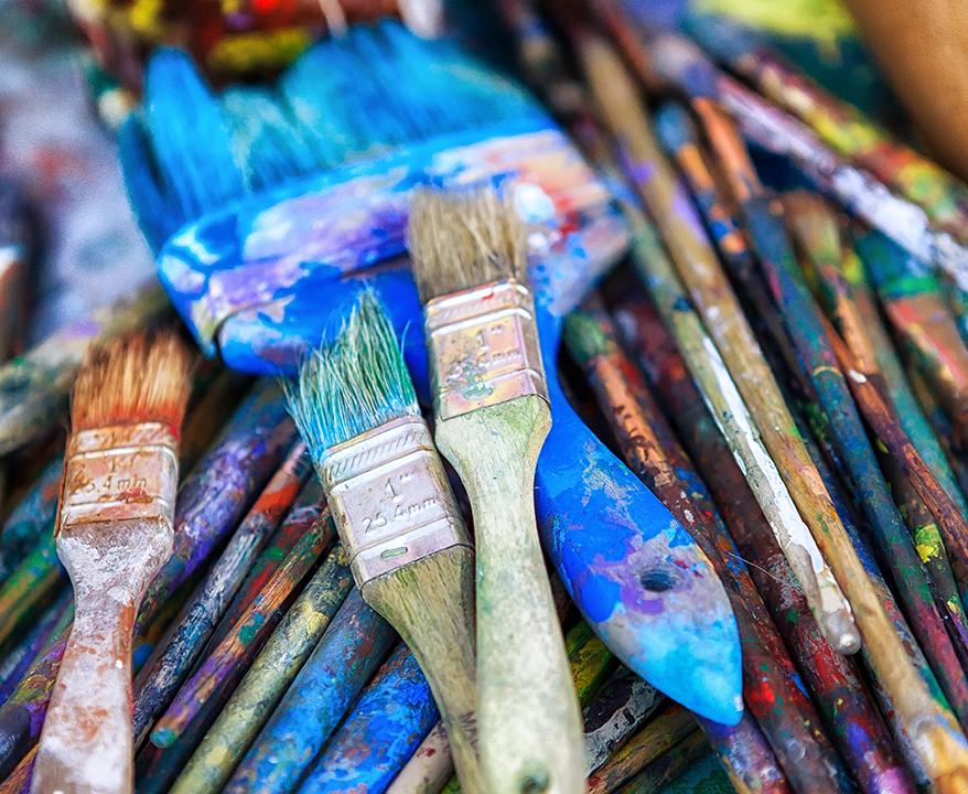
1. Chapter 1 - Creating an Enhanced Full Palette: I am Nancy Rainer. Thank you for joining me for this video where we explore my favorite painting techniques that rely on color. These techniques are all based on my book Create perfect paintings in the book. I emphasize variety and variety is what adds a visual interest to your painting. And the key to getting variety in your painting is by starting with a full palette. And that is what I have here. And let me just talk about how I set this palette up. So what I have here is, uh, white and black and two reds to yellows, two blues. So the primary colors are red, yellow and blue. And instead of finding just one perfect red one perfect yellow one perfect blue. I have a warm in a cool off each of those primaries to give me maximum potential to create variety in my color mixing on my painting. So here's what I've got. I've got more than that to, But let me just start with the warm and cool of each primary. Here is a war many cool yellow. This is hands a yellow medium, and this is hands a yellow light. You could see that the what I call the cool yellow is the yellow that looked a little bit greenish like a lemon yellow. And the what I call the warm yellow is one that looks like it leans towards the orange or red little bit. So those two are very important, a warm in a cool yellow. And then I'm gonna jump over here on the palate to a warm and a cool red I'm using here pyro red. You can also use an apple, red, medium or light, a cadmium red medium. Or like there's lots of choices with warm reds. Again, this one is pyro red, but here I Onley recommend using for the cool red quinacrine own magenta. And now let's move over to the blues Over here, the two Blues. This is ultra marine blue, and sometimes I will substitute instead of ultra marine blue. I'll use anthro, Quinn own blue, and that is a blue that looks a little purple e er, or has a little bit red in it. Ah, here we have a fellow blue green shade and the title, the name of the paint, clues you in to the fact that it leans towards the green. And so I've got two yellows, two reds to blues. I also have white, and I mentioned black. This is titanium white and carbon Black. Carbon black is optional. I like to have it as a convenience color in my palette, because you can mix it with other paints on this pallet, so that would be the full palette. Now, the extra added colors that I have an extra added mixture is you could see the mess over here. Added Mixtures are what I call making the full palette into an enhanced full palette and enhanced full palate is something that I like to work with because it gives me even more options to add variety in to my color mixing color matching and my painting. So let me explain what I did here. I took my titanium white, and because there's a big jump in value or tone between the white and the yellow for me, that's a big jump. I need more light values. I like light values of my paintings. I think they're very important. I call them the I gems there. Where are I as a viewer moves in the painting and I like to use the term I choreography as a painter. I feel like that's what I'm doing with my paintings. I'm creating I choreography, so the light values are like I gems. And so instead of just using white and then yellow would be my only other option for like values, I'm premix some light values. So I take the white. I put it in three places here between the white and the yellow. Also, my palace set up light to dark and in an arc, leaving this area empty so that I don't keep getting it on my clothes and hands while I'm working. And I added a little bit of yellow to this one, a little bit of red to this and a little bit of blue to this. It's very subtle. In fact, with this lighting and the cameras, it might actually all look white, but when you use it in, the painting really makes a difference and adds more of those I gems. So those are all pretty close to a white. I then divided these and pushed them over here and added a little bit more of the yellow to this one a little bit more of the red to this and a little more blue. So if you think of a value scale from 1 to 10 1 being white and 10 being black, we now have all these choices in ones and these air, like a two or maybe even a three. And then we jump to yellow, which is really like a four and then all the way to 10 which is a black here.
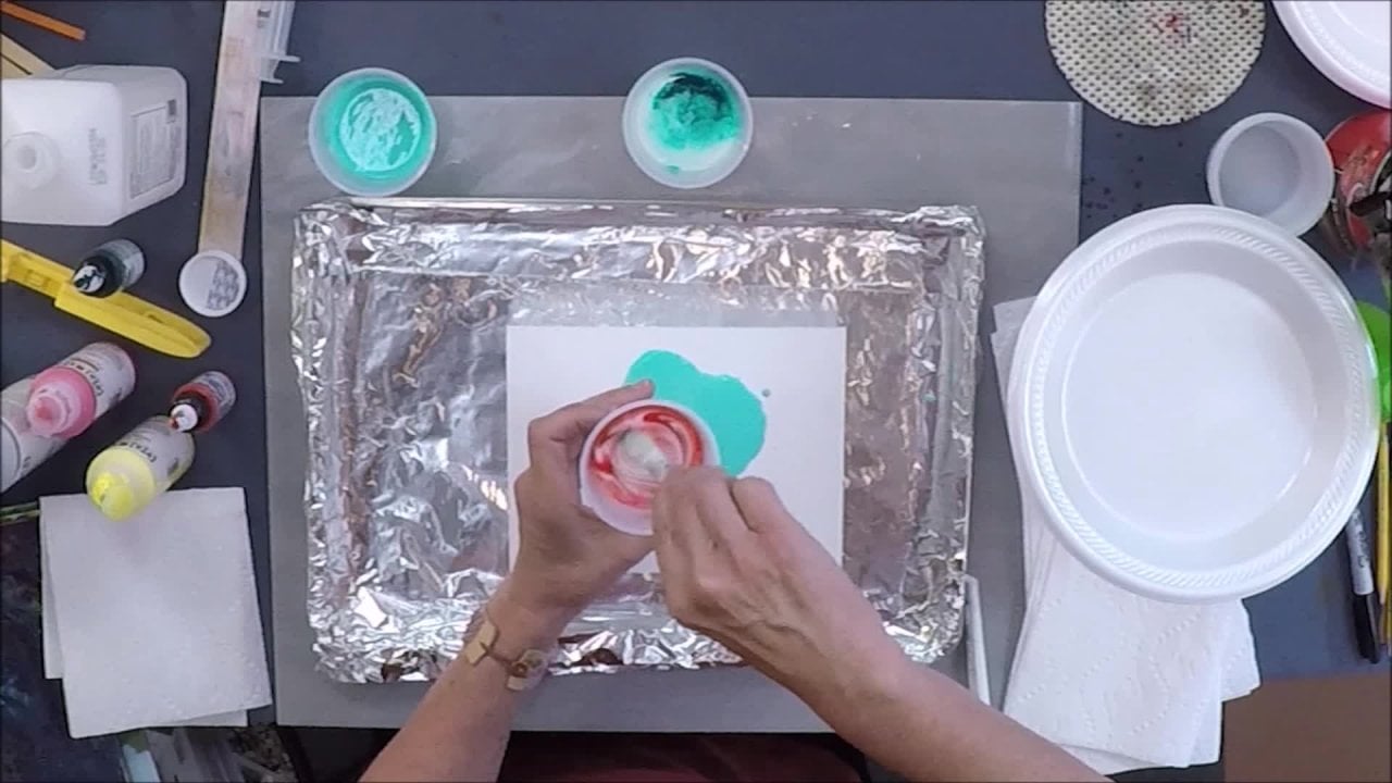
2. Chapter 2 - Project Varying Reds: So now that my palate set up, let's talk about Variety a little bit more because it is so important, I think, and I emphasize it a lot in the book, as I mentioned, So let's just think of as an example. Let's start with a simple idea of a red line. Now, if we were painting a red line in an abstract painting, we would want it to be a little more interesting than just a plain old red line. And if we were painting a realistic painting, a red line could still play a part. We might have somebody's red ribbon in their hair, so let's just look at the idea of a red line and I'll start with red paint. This is a cadmium red. And if I did not have this whole palette that I set up just wanted to paint a red line, I might actually think, Hey, why bother with all these colors? I might as well just start with red. All I want is a red line. So let's pretend all I have is this red and here is my red line, all at a little curve to it, Um, and there's our red line, and it's okay. It has a little curve to it. But, you know, in an abstract painting or if this was a red ribbon on hair, it wouldn't look realistic as a red ribbon, and it would look pretty boring in an abstract painting. Let me show you how different a simple red light can look once we vary. It also want to show you how much more work is involved in making something varied. So we have this palette set up and to vary a red line. I'm going to take this red, and I'm going to make, uh, five more variations of it clips. I'm using this slow drying open acrylic and everything that I demonstrate here could also be substituted by oil paint or watercolor or the fast trying acrylic. But I wanted to mention that I'm using the slow drying acrylic so that it lasts for the whole video shoot. We go now. What are the ways we can vary a color? Well, there are six ways a color can vary. It can be lighter or darker. It can be warmer or cooler, and it could be brighter or dollar. And so with this red. If I want to make it lighter, I'll just add white. And what I want to do is I want to create what I call a family of colors. I want everything to look like it relates like they have the same parents. And so if I add too much white like something like hero over here, it's not gonna look like it relates to this red. So I'm gonna add white, but just enough to make it look different than this Red, but yet still look like it's related. So this looks like to me, a light version of this. And can you see how? If I call this my light version, it would be a huge jump. So I'm looking for small jumps, but enough junk to make a visual difference Now. The next category, the next of variation we can do on the red, is dark. We have light and dark. I'm just going to add some black and I don't want to just add black and just leave it there . I want to really look at this relationship. Do these feel like they're in the same family, This red, with a darker and lighter version of it. And if I go to dark and had too much black it might be too much of a big visual jump and not look believable. So now I've got light and dark Now I'm gonna go warm and cool with red That means we go look at our three primary colors Red, yellow and blue If I want the red to get warmer I'm gonna add a little more yellow And I want this red to be cooler So I'm gonna add a little more blue So I'll go to my yellow And again I'm not just gonna trust how much yellow I added I'm going toe mix it up really well and then look at it and see Sometimes I need to add more because looks the same as the red That looks pretty close. So I'm gonna add a little bit more That's starting to look a little different. It looks like a warmer version of that red. Okay. And now cooler. Well, this red is a warm red already. So I'm gonna go for my Remember I said on my palette. I have a warm in a cool choice of red, so I'm just gonna go to the cool choice of red and mix the two reds together. Well, it still looks pretty much the same. I think what I'll do is add a little bit of a cool blue, which would be this blue, this ultra marine blue. Well, that cooled it down, but it also made it a little bit money. That's OK. It still looks like it's a variation of this red notice. I'm wiping my palette knife off after each mixture because otherwise I would end up with the same mixture. If I used a palette knife with all the same colors on it, I've got one more left now. This Thea other pair that we didn't do yet was bright and dull, and this red is already pretty bright right out of the tube. So too dull it. I'm going to add its complement. And the way we determine a colors complement is to go back to those three primary colors red, blue and yellow and say, Well, if this is red, what's missing? Out of those three, that would be the blue in the yellow. And if we combine blue and yellow, we get green. So green is the complement of red. So if I add a little bit agreeing to it, it should cut. When two compliments are mixed together, they turned brown. And let's see. Is that visually different enough from this red? Mm, I think I'll add a little bit more. Okay, now I have a family of reds. Or I could say I have made a lot of variations of the same red. Now I'll paint a line, and instead of loading my brush up and just unloading it into the whole line, I am going to, uh, Onley go a little short way, Wipe the color off of my brush, dip it into something else. Extend that and then change brushes to a different color. Change the way I'm holding it, change the way I'm applying it and to keep dipping back into other colors. Now I have a line. It may not look like a ribbon. I wasn't concentrating on the idea of a ribbon, but I was concentrating on the idea of showing you how instead of one fluid motion of ah, red line, you can start and stop and keep changing your how you hold it. Change your brush. Change your color, and I can even go back in now. And if I wanted to make it into a ribbon, I could go back in and I could start to soften the edges between the color shifts. You can even add some water and let some of it bleed a little bit. I can even take some paper toe and try softening an edge this way. And now, if you look at this the difference between the two lines, you're I probably goes more towards something that's varied than something that's very uniform. And so, by having a complete, enhanced full palette and also allowing yourself to slow down enough to concentrate on varying, you're gonna put that in your painting and, like I said, make the painting a lot more visually interesting.
3. Chapter 3 - Color Variety in Painting: as a painter. My goal is to work with the paint until it appears to transform into something else, something real, something special, something seductive. That's what I feel is part of the magic of painting. So I wanted to show you another example, using that same idea we just talked about instead of one color going flat across varying and how much variation can create that idea of volume and space and something seductive. So I took for as an example a painting of mine that this is actually a smaller version of a large painting that I have in my studio. That's on Gold Leaf, and I took a print of it so I could bring it in here to show you on a video. And it's at a point where I am thinking that the bottom of this painting needs something. It feels a little bit boring, and I would like to add a Blue River. It feels like a landscape to me, so I would like to put a blue river right in here in a Blue River. You could think of it as a blue line, just like the red ribbon on the red line that we painted before. So when I want to paint that river, I'm going to avoid taking one tube of glue and just squeezing that out and painting a solid Blue River. It will not look realistic on this painting, so I could also go to the store and buy 10 different tubes of different blues. But why spend the money when you can actually mix it so long as you have a palate like this ? So I'm going to actually start with the cooler blue, the ultra Marine blue. That's right here. And I don't need to take it out of the tube. And just like I did the red I'm going to give myself five or six variations of this blue just to create a small river right in here. And I I often feel like, Hey, uh, why don't I just squeeze out a little bit of blue? But I make myself do this every time because that variation is so important. Okay, So, like the red, the 1st 1 over here, we can make it a lighter blue by adding some white, and I want to compare it to its original blue to make sure I'm adding enough white or not too much. So I'm gonna go back to the blue over here and just put it over here to remind me what it looks like without adding anything else. So I can constantly refer to it and say, Does this look like a big enough visual leap without being too big that it doesn't look like it's part of this blue family? And I think it looks pretty good. So I'm gonna leave it so lighter than we can go darker. I'm gonna add black. But I should have done is given myself a little more room between the colors. But I'm careful. I can do it. And I like using this knife that has a step to it. Hold it like this. You can see it goes like a little step, and that is very different from a palette knife that's flat. So if you compare these two, if I tried to mix with this palette knife, I'd be dragging my hand through the paint even more than mixing it. So I like something with step, and plus it has a nice little spring to it, and it's allowing me to that little spring is allowing me to maneuver carefully because I didn't give myself much space here. All right, so we have darker now. This color blue could go warmer or cooler. That means I could add a little bit of red tow one and a little bit of yellow to the other . I could also go to my other blue over here, which is a green or blue, you know, Let me just try that now. This is a modern color. There's modern colors and mineral colors, modern colors, air very dark in there, mass tone, and they actually get super bright when you add a little bit of white. So let me see if I can add just that amount, just that right amount of white to make it what I call popped to make it look like the light just went on. Add a little bit more. When I added white to this ultra marine blue, it got lighter, but do you see how it gets a little bit chalky with this modern blue called fellow? It acts very differently, So look how nice and bright that's getting. And it's also very different than this blue, but it still looks like it's part of a blue family. So I've got two different blues. I've got a dark, a light. I've got a warm and cool. I think I'm going to make one a little more purple earlier, and I could go right into my purple. But if I didn't have that, I could also use a cool read. And it's also looking a little dark. So in addition to the red, I'm gonna add a little bit of white. There's no rules here. The idea is just to give yourself variety. So and it's very meditative in a way just to spend some time saying, How do we want that river to look? I wanted to go darker, lighter, and that's what happens in reality is things shift all over. So I think I need another light one. I want something that's very, very light blue at a little bit of blue. And so here's a nice little family and you can make more if you want, but this will be enough for the demonstration. Now I'm gonna go to this board and at least two brushes I'd like to vary. The brush can also use a knife to to apply, and I'm gonna start with this ultra marine blue and I'm gonna put it on C. I want my river to start about here, and that's just looking pretty dark. So I'm just gonna go with this lighter one, and then I'm going to switch to a brush and change out the brush again, make it look like it's got some waterfall effect and then switch brushes. So painting does take a lot of effort. I know we live in a world where you feel like you just press a button and something happens . And can I just do this Blue River in 30 seconds? But the more time we put into it, the more interesting the painting can get. Once I have a variety of colors, I can then go back in with a brush and just keep working it until it feels like it transforms into something else. I rarely put paint down and leave it and say, Oh, that must be good. Keep working it until it feels like what I'm trying to get to. And not only do I put paint on and with a variety, but I like to take it off in places there you have it. And now the river feels like it fits in with the rest of the painting and looks more riel and looks like it's transforming instead of just a plain old blue stripe.
4. Chapter 4 - Varying Color Using Stripes: Let's expand the idea of a line two stripes. Many known artists have used stripes, including Morris Louis, Gerhard Richter, Barnett Newman, Kenneth Noland. These are very well known, hard edged abstractionist, but it also works in other schools as well. So let's start with the idea of stripes. Here is a simple painting using stripes. Now every stripe is maybe a different color, but within each stripe they're pretty uniform. So again, you have to look at this and say, Is this enough to transform into something else, or does it look like just painted strikes? My idea of a painting is to create an experience of space, some kind of inviting place where the viewers eyes are going to be invited in to maybe unaltered experience or some kind of an unusual experience, some kind of deeper experience. So with Abstract Expressionists, they were using a lot of hard edge lines and stripes, and so the color that they choose was very important and also subtle. Variation was important, and this kind of very blatant, evenly applied stripes might actually feel like wallpaper and might not be enough to invite someone in feeling like it's a sense of space. Let's compare this to another painting by a friend of mine named Willy Bohm Richardson. As we compare these two, think about how your eyes feel when you look at them. Look at this one versus looking at this one. Which one makes you feel like you're being invited in? It has a feeling of space. And look at all the variety that Richardson created in this piece. Every color. Every stripe has a different color. The edges between the stripes. Summer. Hard summer soft. There's overlap. The stripe overlaps. These, uh, this is varied next to something that's pretty uniform. So I wanted to demonstrate how we can take the simple idea of stripes and vary them. So let's start with the idea that I'm not going to use color straight out of the tube. Color straight out of the tube tends to look brass or not very inviting. I think it makes a difference when you just take colors and start playing with them and mixing them. So I am going to mix a few colors together instead of thinking about a family of colors like we did with the red on the blue. I'm going to just make a grouping of interesting colors so they don't have to relate to each other, But they just have to be something that interests you. So I'm just gonna play around with color and I'm gonna mix a few, and I'll just stop when it feels interesting. So that color, I like that color. Now I'm gonna try a lighter one. Don't do what I just did. It's good to really wipe off your palette knife and dip it in water and the paper towel where you end up contaminating your colors like that. But I can always take it off and add more color later. There's a light yellow, but it looks kind of boring, Still looks straight of the tube, even though I added just a little bit of white, so we'll put a little green it, By the way. I didn't mention earlier when I first introduced this idea of an enhanced full palette, I didn't mention that I took the time to take a little bit of white and put it next to each of these colors. So I don't know if you can see it now that I've kind of messed up the pallet But let's look at these four yellows here. You can see that here is the paint that I squeezed out, but next to it I took a little bit of white. I'll do it right now. I took a little bit of white, and I put it next to the color, thanks to this, and I took some of the actual paint and mixed it in to see how it tense with white, because each of these colors tents differently. And remember, I mentioned that there were mineral and modern colors, the mineral colors. If you look at them, this tent is pretty similar to the color doesn't change that much. It just gets a little bit lighter and a little chalky er, whereas these two modern colors almost pop like a light comes on when you add a little bit of white. And if I didn't add these little bit of visual indicators on each color with the little bit of white, I call it a little tale of 10 detail. If I didn't do that, the palate would be a little confusing, because all if you just look at these three colors here without this little tail here they all look dark and this gives me a visual indication of what the true color can be. So I just wanted to mention that. And so I've got two colors here and do something blue. Well, since this is already contaminated, I'll show you my bad habits. This is the good habit. I'll add a little dark, by the way, this enhanced palette. I talked about the light values, but the dark values I didn't mention this is black right out of the tube. I did tell you it was carbon black, but then I like toe have If you look without these two colors here, there's a big jump between this green here and the black, just like there was a big jump between the white and yellow. I like to add my own mixtures of darks, so I made a mixture of brown and a mixture of black. And here are the colors, showing me what I used to mix with them. So I used fellow blue quinacrine are magenta and hands a yellow medium here, and it is fun when you make complicated, complex mixtures to actually put little indicators of what you used to make them in case you want to make it again. And then I put a white tent tail. I call it right here to show me what it looks like when it's tinted here. I'm using also a red, blue and yellow, but the more yellow and warm red that you use, the more it turns to brown. So they both have red, blue and yellow. But this one's more of, Ah, blue black, and this one's more of a brown again, depending on the quantities of the warm yellow and red versus the cool blue that you put in there. And it's nice having that instead of always having the carbon black to go to if you want black. So I think I use that is one of my colors and maybe add a little white to it. Make it more of a gray. It looks too similar to that, and I'm trying to make colors look different from each other, so I think I'll add more. Read it more purple ear. I know I mentioned before that it's easy to want to just do something very quickly and not take the time to mix, but this is actually fun I enjoy mixing colors. It's such a nice part of painting and it's sort of meditative. Gives you time to think about what you're gonna paint. I'm just gonna mix one more. I think I'll use this orange and see what I mean by brass. Look at it in conjunction with the rest of the colors that are premixed that are custom mixed, I should say sometimes right from the tube, they just look like they stand out a little too much. Some tone it down a little with some white at some of this nice brown I made add a little more yellow in here. Okay, this is enough variety for me just to start. And then while I'm painting, I can mix and match them together. The first strike that I'm going to do is a hard edged stripe. And that's because we were looking at hard edged abstractionist. So reminded me of how fun it is to tape. So the first thing I'm gonna do is put some tape down and you should always leave a little bit of tape sticking out so you can pull it off later, okay? And I'll leave this. They're so that Eikenberry it. Okay, I'm going to take one color and make a varied stripe just like I did the red stripe. I'm gonna keep changing color. E don't want that color with this one. Notice. Even though I mix these colors, I don't have to stick with them. I can change them as they go around, and I can dry brushing it and play around with it. I can take a paper towel and I can move color around. Now we'll pull the tape off. I like using Scotch tape. Better than masking tape gets a really nice clean edge. Now we have a variation color. We have a variation in edge. The colors are all kind of blending together, so I think next to it I am going to not take, but I'll do something else. I am going to add some water to the color and try painting a stripe like that when you add water to the acrylic paint. If you were using oil paint, you would be adding turpentine. When you add the solvents to the paints, then you're breaking down the binder and it gets very watering washy and is easy to vary as you can see. This variation was created just because I used a diluted version, whereas this one I had toe really work at it. What can I do? Different next? Let's see Next stripe. I could just change colors and I'll do uneven stripe. Maybe not. I'll try to make even, but I'll leave it a little bit streaky like that. Um, I kind of feel like going into using the back of my I don't like that. I'll go back to this. A lot of variation is about playing around. What I don't have on this pallet that I also recommend is having some kind of medium. Now, this is the open acrylic from golden that I'm using, and so I'm gonna use their medium. I always put the medium in the middle of the palate so that because mediums in acrylic are white when they're wet and dry, clear and I don't want to get confused between the white paint and this white medium that's gonna go clear. But what's good about having medium in on your palate is that you can now make a color transparent so I can take a color. I am gonna pick an unmixed color, so you can see what happens when you add medium to it. Mixed medium in with it, and this means it's gonna be more transparent, which is another way of saying that you're gonna be able to see through it what's underneath, which is white. But it'll still change the quality of the paint, and I think it's time to change brushes. Notice every moment. I'm trying to change something. The color, the brush, how I apply it. Am I diluting it with water and my adding medium. And this is what makes painting fun for me but hopefully more interesting in the outcome. Here is what's called a glaze. When you mix this much medium in with a color, it's called a glaze and look at how different it is from the wash from a solid color. And from lending like that, I noticed that I'm making all my stripes the same with, So hopefully it's not too late to change that. We go make this one bigger and then I will make a small one next to it, and I'll just do one more thing just to show you all these different ways that you can use to vary even just simple stripes, and that would be to overlap. So right now I've been doing stripes one next to the other. I'm going to take one stripe and overlap it. Let's see now. This is also something I love to do. I like to manipulate the brush in my hand, So to do it again and watch this, I'm putting it down flat. And then as I'm turning it, I'm gonna turn my brush and these flat brushes then changed with thin line and then release it. So just handling the brush makes a whole different line. Okay, well, I just wanted to give you some ideas of even though we're just working with stripes how to vary something. So even if you were working with shapes flowers in a floral arrangement hair in somebody's portrait, an abstraction Try as you're painting to every few seconds. Change something, change your brush changed how you hold it, change your breath, change the color change, the dilution. All the things that I mentioned here
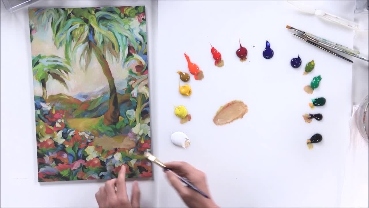
5. Chapter 5 - Favorite Colors & New Painting Idea: Sometimes I like to start with color as the main inspiration for a painting. I might take my palate, mixed three or four colors that I think are great and then make a painting from that. In this case, I actually went to the paint store and found four paint chips that I liked. I found a red green, dark purple and a creamy white. It's kind of fun to see all those rows of color chips, color paint chips and pick out your favorite one. Then I went back to my studio, and I mixed thes exact colors. And here they are. I took jars and I matched each one, and the way I did it is described in my one video from that's part of the Siri's. I go much more into depth about how to match colors exactly, but I brought my swatches that I used from that video to show you. And here is the red paint swatches exact same one that I found in the paint store. Another benefit of using paint chips from paints doors is that they have multiples of the same color, and I started with this red and then I kept changing it until I matched it. Exactly. And the red when it's matched exactly, just blends right into the paint chip. You could barely see it, and then ice watched the top, and so the paint is inside, and the swatch on the top is a different color than when the paint is wet, so it helps to have it dry on the top. Let's look at the green one here. Here's the green paint chip and here was the Siris of color mixing steps that I went through. I started here and I went all the way to here, and you could see that the final color is so close that it almost again disappears into the paint swatch the same with the purple. Here's the purple swatch, and I started over here with a bright purple, and it took me a while. I got all the way over here to match this purple. Same with the cream colored could barely see it. So here are my matched colors, and now I'm ready to make a painting with these colors. But the key to making a painting using favorite colors is to use the opposites of thes colors in addition to these colors in your painting, let me explain in my book, Create perfect paintings. I talk about the use of opposites a lot. If you have something bright in your painting by adding something dull, you bring more attention to the bright pairs of opposites are very important and paintings . So if I look at these colors, what do I mean by opposites? Well, the first thing we think about if you've ever studied color, is that the word opposites can also mean the word compliment. So if those of you they're used to a color wheel, any color that's opposite the other on a color wheel is its complement or its opposite. Let's look, there's only three pairs of complementary colors, so if we look at green here, it's compliment, or it's opposite. On the color wheel is red. Here's one pair of opposites, and the next pair would be ah, yellow with purple again. Purple and yellow are opposite each other on the color wheel. This purple is so dark because it's a modern color. I was gonna add a little bit of white to it, so you could, as a visual clue that it is a purple there, and then last pair of complementary colors is blue again. This is a modern color as well. The fellow blue would add just a little bit of white to bring out the flavor of the color, so we remember it's blue. Otherwise it looks black, and the opposite of blue is orange. This is a mineral color, so it doesn't need to be popped or adding white to look at its true color. Here's our three different pairs of complementary colors. Green, red, yellow, purple, blue, orange, those air what we normally think of when we talk about opposites in color. What I'd like to do is expand or brought in this concept of opposites and say well, in addition to these complementary pairs, we also have light and dark and dull and bright. So if I look at the colors that I picked, here's a green while the opposite is red, but it's also kind of dull. Another opposite for this would be a bright green. Here's a red. The opposite is green, but it's a bright red. We could make a dull red, a dark red, a light red, if you remember right in the beginning, we started working with families of color. So to make a painting that I think would be much more powerful than just making painting with these four colors is to take each color and make as many opposites the concept of opposites as we can. So, for instance, let's just take this red here. Here's red. We have the opposite green, the normal idea of opposite. But now let's think about making this red darker. Here's a darker red. We're adding black to the red, and we could take the same red, and we could add white to it to make it lighter. Just another way of making a palette or an arrangement of colors that once we spend the time to mix the colors, then we have them to utilize it. Are painting quickly because it's, I think it's It's often easier to just makes a lot of pain first and then added into your painting, Then keep painting and mixing and painting and mixing. But, um so we could do the same thing with each one of these colors. We could take the color and use its complementary opposite, but we could also make a darker and lighter version a brighter in a dollar version, Uh, and even a warmer in a cooler version. So here is the painting that I made using the's four colors, along with a grouping of the opposites, a broader scope of opposites of each color. And let's compare the painting to these four colors so you could see the red is here. The green is here, purples here and the cream color, but I've got the sets of opposites. So the purple has a bright purples dull here, and it has a bright orange here. And so this pops forward and the red and the green move forward and back. This bright pink comes forward from this neutral gray. Opposites are what create that sense of space. Some colors come forward and some go backwards when you have pairs of opposites. And I mentioned earlier that by concept, off painting is that I'm trying to create some kind of experience, some kind of sense of space. The use of opposites is what helps the most. So trying this yourself, go to the paint store, find a few colors that you like and then spend time mixing them exactly. That'll give you practice in matching and mixing colors and then on your palate. Add some additional mixtures and brought in that scope of opposites not just the compliments but adding light. Dark, warm, cool, bright and dull versions of those colors and see what happens when you start using all of those in your painting.
6. Chapter 6 - Using Color to Frame & Finish Your Painting: when you're painting is complete, it's time to consider certain aspects of finishing, such as framing to frame or not to frame. Some of my paintings look better framed, while others look better unframed and framing Access a Segway between the image that you've painted on this file of the room or the place where it's gonna be hung, a frame can change. How have you received and ultimately feels about your painting, for example, a traditional imagery like a classic still life, a portrait landscape. These paintings can be enhanced with a traditional frame, while paintings with a more contemporary image, abstraction, something contemporary may look better without a frame. So most of my work is contemporary, and but yet still, as you can see behind me, I have a, uh, I have a variety. I've got one that's framed with a frame traditional frame because I wanted to bring that traditional style to something contemporary. Sometimes it works in your favor, and the other contemporary pieces have no frame. So what I like to do is I like toe work on some of these boards that already come with sides that aren't too small about an inch or more, and they're called cradled boards. These air made by ampersand and they already come with sides. So if you're working on something flat, you can get a carpenter or do it yourself and add some sides to it. Once you add sides, it actually, uh, will come away from the wall when you hang it and make a statement. Make a statement about being an object, and that's a very contemporary thing to add to your painting. What I noticed is that when I walk into a room or walk into a gallery or museum, I often see the sides first. And then the image itself and the sides seem to me to be a foreshadowing about what's to come, what the viewer is going to see. Let me show you what happens when you do something that's completely different from what the image is about. Let's say I take a black paint and just paint the sides black. I'll just paint a little bit here whose painted black about halfway, Uh, just to show you got some on the front. Now, if you were to look at this painting from the side first, here's this nice Black. It's a beautiful black but its glossy, and it's also a very strong color. Then, when you look at this image, it's very subtle, and it's almost like a disappointment when you go from one to the other. What if something very jolting was used like red? You know what? If you say Well, I'd like to perk up my painting. I think I'll paint the sides red. Probably not. A good idea unless you're painting is red. But the same thing will happen if you look at this first. And as you walk in the room and see the red and then you see this, it's just gonna be a disappointment because there's a big jolt between the side and the front. So, um, some artists like to do what's called wrapping the image. They like to actually paint the exact image from the front along the sides. I tend to avoid that because it makes me feel like it's like wrapping paper. The idea is to create the illusion that this is an experience of space. If the sides have the exact same images, the front as you come across it, it's gonna look like it's flat like a wrapping paper wrapping square. My favorite way of handling the sides is to pick the predominant color that's happening in the work itself, and then to make that a little bit lighter and a little grayer and paint the sides with that. So I have premixed what I thought was an average general color that's being used a lot in this painting. And that was this kind of, ah, neutral green. I think I actually did match the green. Exactly, uh, tend to again want to gray out that color. I rarely used the exact same color that's in the image itself, on the sides. But I will come close. I will mix a color that's very, very closed here and then turning gray. Let me show you what I'll do. So here's the green color and almost matches exactly this image. So I start with that. From there, I'm going to add a little bit of black and a little bit of white. I always wanted to be a little bit grayer, a little bit lighter and a little more neutral. Think I added too much black. That's okay. Just add a little more white what you're looking for is a neutral gray that actually that actually relates to the colors in the painting itself. So if we just take the knife now and look, see how that's a little bit grade from the main color in the painting could even go a little bit more at a little more white. And now I will paint aside and we'll look at the difference. There's something very satisfying about finishing a painting and then just mixing color. I love the same color as you probably have figured by the time you finish this video. But there's something lovely about just finding the perfect color to finish off your painting. And now, if we come across this painting on the side and then look at the image, look at what happens. There's just a different experience when you go from here to here, then when you go from here to here. So we want to avoid a jolt and bringing attention to the side, and we want to really just think of it as foreshadowing and creeping up onto the painting itself. Now, sometimes I have paintings that aren't this. Even if we look at the top in the bottom of the the top of the bottom are both pretty the same neutral gray. What if we had an image like this that goes from light to dark in a in a fairly extreme way . If I picked a color that was a general color in here and made it into a gray and painted it , it wouldn't look as good as that one. It would be darker than the top and lighter than the bottom. So in this case, I have a little trick that I do. That I think works really well. I make a gradation of grays that follow this light to dark. So I had pre mix the colors. Here's what I've made mixed a a green gray for the bottom and this color for here and this color for here. And these colors are matched exactly. And then I grade them already, So I'm just gonna go ahead and paint them on the sides. But I'm gonna show you the trick that I use to make them go from one to the other to the other seamlessly, without a hard edge. First, all open them. I really do like this idea of watching the tops of the lids of your jars. Just nice toe. Always know what's in them. So the first thing I dio is just generally pick where I'm going to break those colors. So right about here. Libs. Getting messy right about here is where I'll break the green and then thistles where it's lightest, and I'll break that. I'm going to take that all the way up to about here. By the way, I have, uh, put a layer of Jess. Oh, that's why it's white on it before, when you're working with several colors that are lighter. It's nice to have the primer Jess. Oh, on first. So now I have the two colors, and then it gets a little darker at the top. So it's just gonna paint that. Okay, Once I get the colors where I want them, I then let it dry or blow dry it. So I'm just gonna go get my blow dryer and dry it for a minute. Okay, let's take this one first. Let's go from the green to the tan, and we will use our bigger brush. Yeah. Okay, so then I'm going to paint a second coat over it on a second coat of this pretty much. Always need at least two coats or it look streaky, right? I've got a second coat on, and I'm not gonna dry at this time. Instead going to take my brush and I'm gonna while they're still wet. And if they do dry, you can just put a brushstroke like this. Let's say they're dry. You could just put a brush drug there and one right here. So you re wedding with paint right at the scene, right at that hard edge. Now, make sure your brush is super dry. I don't know if you could see me pounding away the paper towel here, but now, mind brushes really dry, and I'm gonna go back and forth like this, get rid of the excess paint, come back and do it again until it's really like an airbrush radiation. At this point, I'm gonna let it dry, and then when it's dry, I still looks kind of streaky. I could do the whole thing again, wedded here and here, and then brush it until it becomes, um a really beautiful, smooth gradation. Let me just do that for you. I'm gonna blow dry this and I'll do it one more time to get it nice and smooth. If your pain is drawing too fast for you to smooth it out like that, then you might want to add some retard er or some glazing liquid into your paint. If you're using the fast drying acrylic, if you're using the slow drying acrylic like this, it stays dry. Now I'm gonna put a wet area right here and another wet area again wet with paint, not with water. So I put it here in here because here's my blended area. I don't want to put another hard edge there. And now, with a dry, clean brush, who would bring this in? Go right there, back and forth. See, it's getting smoother and smoother Every time I do this, I could blow dried again, do the same thing again, this time again putting the green here in the tan. They're not together where we started, and it will just get smoother and smoother. And then I would do the same thing up here to so that as you look at the painting, it just glides right into the image. This is what I've done for the paintings behind me the one right there. I think you could still see it a little bit on the side. It has a beautiful, great Asian that goes from a dark blue dark dole blue to the brighter blue. And there you have it interesting ways to finish off your paintings on the sides.
7. Chapter 7 - Conclusion: and this concludes our video. I hope some of these ideas can work their way into your creative projects and add inspiration to your art. Thanks again for joining me and best wishes to you for success in your creative endeavors.
 Nancy Reyner, Fine Art Painter, Author, Instructor