Transcripts
1. Hello & Welcome!: Heads up people. This class is going to be super addictive. Hi, everyone. My name
is Redi Rach Pal, and I'm a filmmaker and a multi disciplinary
artist from India. I'm also an art educator and a creative entrepreneur running my own fatter studio by the
name of the color body. I love making art that makes you feel relaxed and reinvigorated. And in today's class,
I want to show you a wonderful way
of getting into a creative flow state by creating vibrant pieces
of neurographic art. Neurographic art is like a magical mood booster that will uplift your
spirits in no time. The intricate continuous
lines and patterns become a mesmerizing gateway to explore and express
your deepest emotions, thoughts, and the
hidden treasures of your subconscious mind. The best part is
that it requires no special skills
or training in art. Whether you're a
beginner or a pro, you'll find plenty of
fresh creative ideas in this class to infuse in
your daily art practice. We'll be developing
three class projects, each with a unique
look and style. And as a bonus,
I'll treat you to two additional
lessons where I'll reveal the secrets of
digitizing your artworks, playing with colors,
and creating endless variations using
the magic of Photoshop. So in a nutshell, this class is that
perfect sweet spot between mindfulness,
relaxation and fun. If this sounds like your jam, come meet me in class
and we'll dive right in.
2. Class Overview: Okay. Alright, so in this lesson, I want to give you a quick
overview of how this class is structured so that you can make the most of your learning
experience today. In the lessons ahead, we'll
start off by understanding what exactly
neurographic art is and how we can make the most of
it in our daily art practice. Then we will talk about
various supplies and tools that you can use to create stunning neurographic
art for yourself. And finally, we'll develop three different artworks which will help you to
practice your skills. Each of the projects in
this class are designed to get your creative juices
flowing and for you to explore the many ways in
which you can personalize your neurographic artworks with your own unique artistic voice. As a bonus, I'm also
going to give you a sneak peek into how I digitize my artworks and
tweak the colors in Photoshop to create more
variations of the same design. This extra step is
the secret to earning passive income via print on demand websites like
Society six and Red Bubble. So if you've been looking
for a way to monetize your artworks and get them printed on products
like cushion covers, wallpapers, bags,
phone cases, and more, then this bonus lesson is definitely going to be
a game changer for you. All right, so now that
we have that covered, let's move on to our next lesson where we'll talk about tools and supplies that you can use to create stunning neurographic
art for yourself.
3. Tools & Materials: All right, so let's
discuss all the tools and supplies that we will
need for this class. The first thing,
of course, that we need is something to draw on. This can be loose
sheets of drawing paper or it can even
be your sketchbook. Now, because we're going to be working with a bunch
of different mediums, you want to make sure
that your paper is compatible with the mediums
that you're working with. So for example, if you're going to be
working with watercolors, then you want to make sure
that your paper supports wet media and that it can
take watercolors well. So a good choice in that case
would be watercolor paper, or you can also opt
for mixed media paper. But let's say you're
going to be working with color pencils or dry mediums, then you want to make sure
that your paper supports that. Now for the projects that I
will demo in today's class, I will be using these
mixed media sheets, which are from a local paper
maker over here in my city. And these are very, very similar to the
mixed media sheets that we get from Strathmore. So I have actually
cut these down to six by 6 " for the
purpose of today's class, but you can work with
any size that you like. Now, the good thing about
mixed media paper is that it supports wet mediums
as well as dry mediums, and this is why these papers are one of my absolute favorites
to work with. But as I mentioned, you don't have to use the
exact same thing as me. You can buy these from
an art supply store, and there are a lot of brands that are very good with
making mixed media paper, or you can use whatever
else you have easily available with you to get
started with today's class. Now, I like to add these
washi tapes to the edges of my papers because
when you peel these off, they create a nice crisp border, which is very similar to having a mat or a frame around
your finished artwork. But this step is
totally optional, and if you don't want
to have that border, then you can totally
skip the washi tape. Next, we will need drawing pens, and I will be using the 01 and the 08 nip sizes from the
Sakura micron series, and these are in
the color black. If you like, you can also use drawing pens of various
different colors as well. Then we will also need some additional
supplies specific to each of our projects. For the first
project, I will use watercolors and we can
use tubes or pans, whatever is easily available. And of course, we will need two jars of water to
go along with that. And you'll see later on that
one of these will become your dirty jar that will be used to clean
your paintbrush, whereas the other jar will be the one from which we
pick up clean water. Then we will also
need a paint palette, and this can be a ceramic dish, or it can even be the lids of your paint sets which are
designed to work as palettes. We will also need a standard
round brush to paint with, and anything between sizes four and eight should work
well for today's project. Now, for the second project, I will use brush pens. And these are from
a brand called O huhu and they give a
nice translucent finish, and these are water
based markers, but you can also use alcohol
based markers if you like. And for the third project, we will be using color pencils. Now, I generally use the prisma color
premiere color pencils, which are wax based
and have a soft core. But you can use
any color pencils that you have
available with you. And to blend the color pencils, we will also need a
colorless blender pencil, and I use the one which is from the prisma
color brand itself. To sharpen the color pencils, we will need a sharpener. And again, minus from
the prisma color brand, but you can use any
other sharpener that's easily available to you. Additionally, we will also
need some tissue papers, as well as round objects
of various sizes. The round objects can
simply be bottle caps or lids to jars and
containers in your house, and we will need these for tracing the outlines
in our second project. Now, one thing that
I want to mention quickly for all the
painting supplies is that you don't really
need to have all of them available with you in
order to enjoy this class. For example, if you only have watercolors and you don't have brush pens
and color pencils, then you can do
all the exercises with watercolors itself. I will walk you
through a bunch of different techniques that
are interchangeable, and they can also be used in various
different combinations. So feel free to customize your class projects in
any way that you like, and don't let the lack
of art supplies stop you from enjoying the
process of neurographic art. Okay, so moving on for the digitizing
portion of the class, you will also need access to a photo scanner or a
smartphone camera. And I will be using
this scanner over here, which is the Cannon Light 400. But you can use any other
photo scanner of your choice, or as I mentioned, you can
also use a smartphone camera. And finally, to make
color alterations, you will also need
the latest version of Photoshop installed
on your computer. Now, for all the supplies that I have mentioned
in this video, I have also created a
handy checklist for you that I have included as part of the resources for this class. So you can download
the document in the projects and the
resources section. All right, so that's it
for all the supplies. Now let's move on
to our next lesson where we'll learn what
exactly neurographic art is.
4. What is Neurographic Art?: And Alright. So in this lesson, I'll give you a quick
introduction to neurographic art and how we as artists can
embrace its wonders. Neurographic art is a
relatively new form of art that combines elements of drawing, doodling
and meditation. It was developed by
Russian psychologist and artist Pavel Piscaev
somewhere around 2010. The technique is based on the idea that by
creating intricate, continuous lines and patterns, one can explore and
express their emotions, thoughts, and subconscious mind. There are three key
defining features or characteristics
of neurographic art. The first one is continuity. The process of creating neurographic art involves
drawing a continuous line or pattern on paper
or canvas without lifting the pen or pencil
until the artwork is complete. This initial line or
pattern is often inspired by a specific emotion,
experience, or concept. As the artist continues to draw, they allow their mind to wander and new shapes
and patterns emerge, resulting in a complex and
interconnected design. Secondly, neurographic
art is abstract. It is not about creating a specific image or
representation of something, but rather about
exploring the process of creation itself and tapping
into the subconscious. It is a meditative and
reflective practice that can help individuals
gain insights, relieve stress, and
promote self expression. And finally, neurographic art has a heavy focus on
self exploration. The practice of neurographic art encourages
creativity, mindfulness, and self discovery, allowing
individuals to connect with their inner elves and express their emotions
in a visual manner. This is the reason why
neurographic art has gained popularity as a therapeutic
tool and a form of self care. It is often used in art therapy
sessions and workshops. However, you don't need to be in therapy to practice
neurographic art. It can be enjoyed as a personal artistic practice or as a form of
relaxation and self care. Regardless of your artistic
background or skill, you can enjoy the benefits of this versatile and
accessible form of art that welcomes both beginners and
experienced artists. Now, at this point, I want to give you
a quick disclaimer. I'm neither a psychologist
nor an art therapist. So I will not be focusing on the traditional flow and process of neurographic art as it is done by licensed
professionals. Instead, we'll be taking
a different approach. As an artist, my goal is
to draw inspiration from this visually
mesmerizing art form and infuse it with my
own creative voice. Think of it as creating
abstract pieces of art that are loosely inspired
by neurographic art, focusing more on the
mindfulness aspect rather than delving into
the scientific side. It's like harnessing
the magic of creativity and relaxation together
while having lots of fun. So now that we have this speedy crash course out of the way, meet me the next lesson
and we'll get drawing.
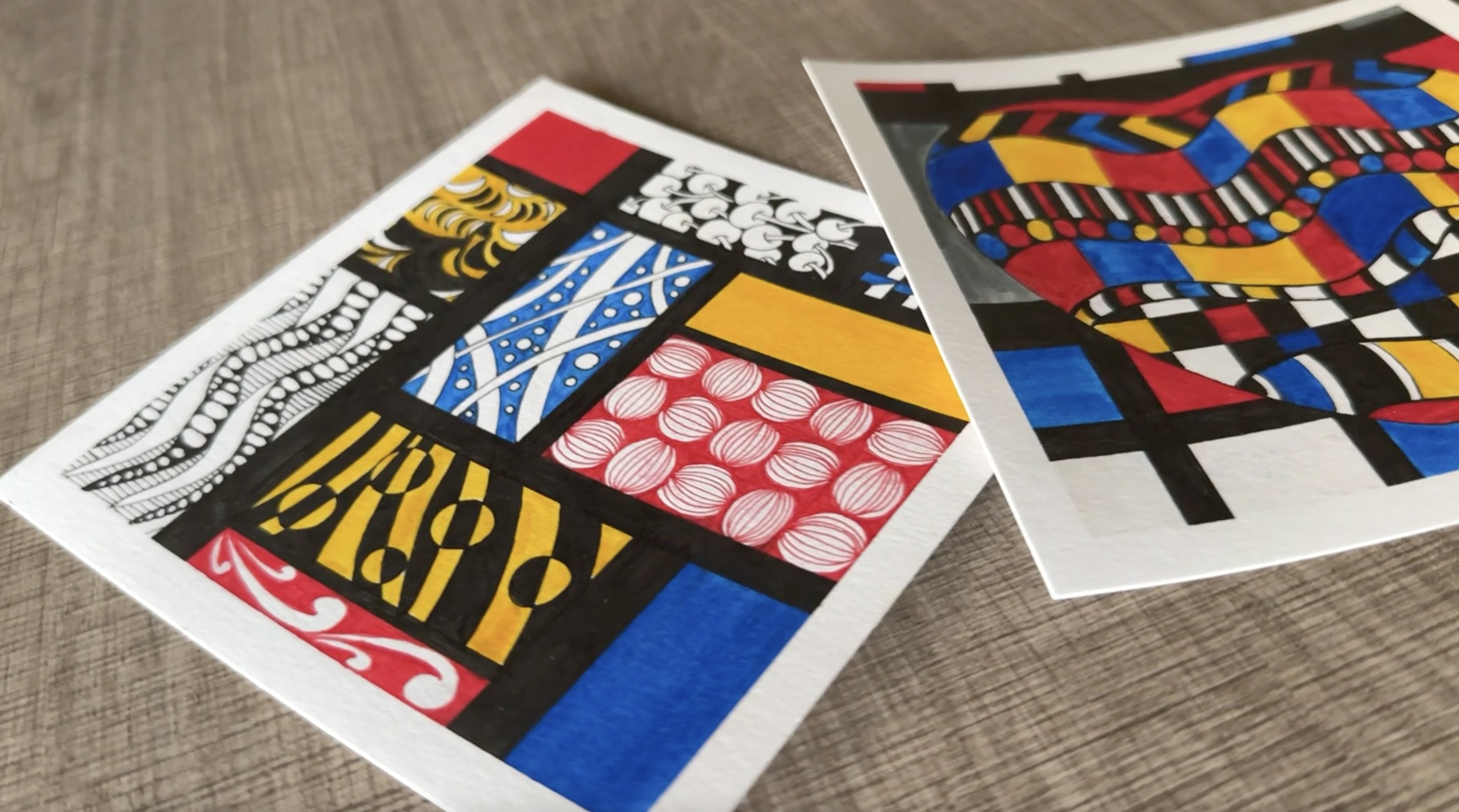
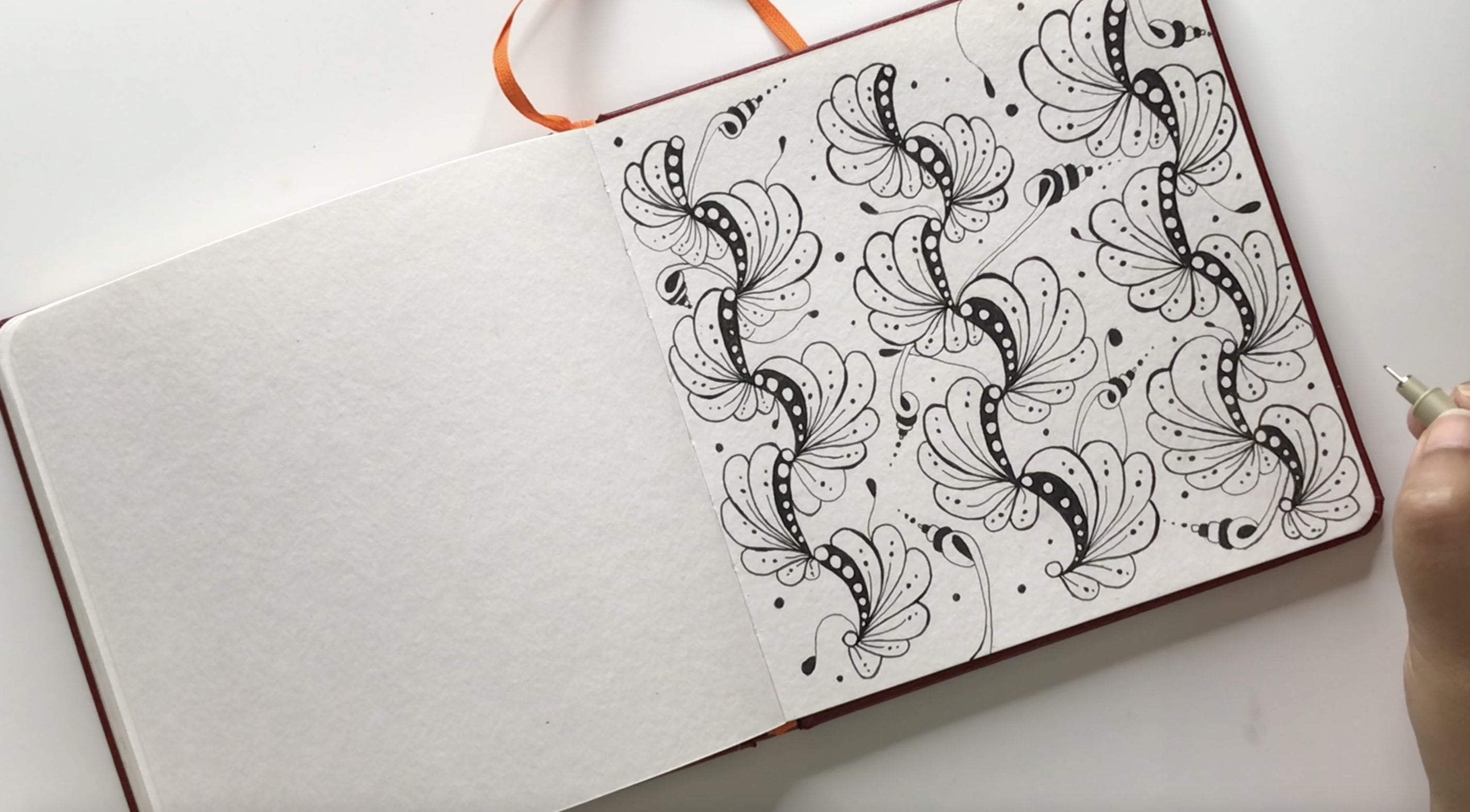
5. Pr 1 - Neurographic Art with Watercolor Blooms: The Okay, so let's get started
with our first project. And to do this, I'm going to
start with my 08 size pen, and I'm just going to randomly place some curvy and wavy
lines across the page, and I'm also going to
look them at some places. And honestly, the best
way to do this is to not overthink this step and
simply embrace a childlike, playful approach
letting your pen go wherever it wants to go. Try to do this in a
continuous motion as much as you can without too
many breaks or jerks. And keep in mind that the more
number of lines you draw, the more dense your
artwork will look. Similarly, if you want
to go for a more airy, light and minimalistic look, then just a few
lines will suffice. So I'm going for a minimalistic diagonal composition over here, which is why I have left some negative space
at the top right, as well as the bottom
left of my composition. But you can certainly fill up the whole page as well if
that's what you prefer. There is no right or
wrong way to do this, and you should just go with the flow and do whatever comes to you naturally. Okay. So once we have the
basic lines in place, we are going to switch
to a thinner pen, which in my case is
the 01 size pen, and then we'll start to look for places where the lines
intersect or turn. And here we will start to add tiny little curves and the curves will
lead to small gaps, which we will then
fill with ink. Honestly, this is my
most favorite part of the process because
while doing this, it almost feels like I'm
putting little stars across my page and making this
fantasy constellation. Now, from a therapeutic or
psychological viewpoint, this process of
creating curves is like building new neural
connections in our brain, and we're doing a visual
representation of that on paper. So this allows us
to solve problems effectively or to release
any blocking beliefs. And as we start to form more and more of
these connections, we start to look at
things in different ways, which eventually
impacts our thoughts and decisions in a positive way. Now, even if you were not doing this from the point
of view of therapy, but just as an art exercise, which is my goal
with this class, then you'd still find this
process very relaxing because you'll notice that your mind will start to
wander away to many, many things, but it'll
wander away in a good way. The best part is that the
stage of the process, apart from being highly
intuitive and improvisational, is also very, very
forgiving because there's absolutely no way that you'll go wrong in making
these connections. They will turn out to be
beautiful regardless of the size and the angle of the
curves that you're adding. The goal is to simply
let your hand and mind work together in
a free flowing manner, allowing the lines to lead you naturally to those
intersections. Now, one thing you'll notice me doing is that while
adding these curves, I also like to blend
them in nicely with the original lines so that there are no obvious
jerks in the strokes. This way, they can all look
very smooth and continuous. This is precisely the reason why working with a thinner
pen is better over here because it helps you to smoothen those lines in
a very precise manner. Okay, now that
you've got a hang of how to build these
curves and connections, I'm going to fast forward the video a little bit
so that you can see my progress and get an idea of how this
artwork will shape up. And time lapses, indeed, are actually one of the most
beautiful gifts of editing technology for us because they're super
satisfying to watch. Now if you're wondering how
long this process takes, then the answer is that it can vary from person to person, depending on the number
of lines you have drawn and the size
of your paper. This process can take anywhere between 20
minutes to an hour. So it's best to enjoy the process and do
this at your own pace, perhaps with a nice
refreshing beverage or your favorite music
playing in the background. So you can pause the
video here if you like, and then come back to
watch the next segment whenever you have finished making all the connections
on your drawing. Okay, now I want to show you something that I do with
these loops over here. So to enhance their look, I also add some more
curves over here and then fill them
in with ink like so. And this approach helps to build some more interest
in the composition, and I think it makes for a
very nice stylish touch. But just keep in mind that
this step is optional, and I personally love to do it because it's just a
tiny little extra step, but it makes so much
of a difference in the overall look
of the design. And as you can see, you can just place these anywhere on the
periphery of the loop. So for example, on this one, I am going to add it right in the middle over
here, like so. And then I'm just going
to fill it with ink, and it just makes it look
so much more finished and polished than the
way it was earlier. Again, we want to blend those in nicely with
the original lines, and the best way
to do this is to go slow so that
you can blend them in a very precise manner and get those curves
to look super smooth. Okay. And once again, I'm sure you've got
a hang of that. So I'm going to speed
up the video slightly to show you some more of
these loops in my design. And of course, it will be
different for all of us. Maybe you have more
number of loops than me or even lesser loops
than me in your design. So the amount of time
that it will take you to finish these loops will
also be dependent on that. And once again, don't
overthink this step and do the first few loops that immediately catch your eye. You don't even need
to do all of them, just a few obvious ones or
a few of the bigger ones, and maybe a few around the outer edges of
your composition. And that's pretty much it. So again, work at your own
pace, and if you like, you can pause the video and
then once you're ready, meet me in the next segment. Okay, now that the base structure
of our design is ready, we are going to start
with our watercolors. And as you can see
in my palette, I have already mixed a
couple of yellow shades, as well as a couple
of green ones. And so basically, we want to try and work with at
least two colors over here because the technique
that we are going for looks nicer when it's done
with two or three colors. So whichever colors
that you pick, try to pick them in
different values. So you want to have a couple of light options and a couple of dark options so that it creates an interesting contrast
in the design. Now, for the actual placement
of these watercolors, we are going to go for a technique which is
called watercolor blooms. And to do this, we
first start by laying out a lot of clean water in
one section of our drawing, and we basically want to create a small puddle or a small
pool over here because the technique of creating
watercolor blooms requires lots and lots of water and lots and
lots of pigment. And so the more saturated
the area is with water or the more of a puddle that we can
form, the better it is. And once we have
the water in place, then we want to start by putting in some pigment and
we just tip, tip, tip and wash our brush and then take the second color and dip that in nicely as well. As you can see, I am not
blending them too much, and I'm just letting
the watercolors float on their own or
blend on their own and do their own thing and it creates this water
marbling pattern. And I'm just going to give them a slight nudge around the
edges, but that's about it. And the rest of the
mix or the rest of the blend is best left abstract so that they can do their own thing and form
their own abstract patterns. And then same way, we're going to wash
our brush and take fresh water and create another pool in another
section of the drawing. And this time, we can work with maybe a different shade of yellow and a different
shade of green. Basically just mix and match the different colors to create interesting effects and to
create interesting blends. The rule of thumb to create watercolor blooms is
to have lots of water, lots of pigment, and to
not blend them too much. So if we were to go for a more realistic
watercolor approach, then we would purposely
try to blend those edges, and we would actually
try to get rid of them. But in this approach, we are doing the opposite because we intentionally
want to create those blooms. After you've added the pigment, you can also add in a couple
of extra drops of water, dip dip dip and just give them a slight
nudge here and there, and then clean your brush, maybe add a little
bit of extra pigment. And then rinse and repeat and then work
on the next section. Now, a couple of days back, I was actually working on a project very, very
similar to this one, and in fact, I was using
the exact same colors, and the lighting on my desk was slightly
different that time. So I've got a little bit of the footage from that
which I can show you. And in this, you
can actually make out how high the puddle is
from the surface of the paper. So that just goes to show that there's a lot
of water on the paper and it almost looks
three dimensional when it's wet because that's the amount of water that
we're placing on the paper. Then you start to saturate it with lots and
lots of pigment, and again, dip dip dip and
let it do its own thing. Then once it dries, then beautiful patterns
start to emerge out of it. Coming back to this
section over here, once again, I'm going to
put lots and lots of water And then just dip the
pigment in lightly. Sometimes you can
take the lighter yellow with the darker green and other times you can do
the darker yellow and the darker green or the lighter green and the lighter yellow. Use them in different
permutations and combinations and
just have the paints diluted really nicely so
that they're absolutely watery and that will create
a very beautiful effect. Now I've just finished
working on this section, but I'm not going to work on the one immediately next to it, and I'm going to work on a
different section instead. And the reason for that is that when you're working on two sections
next to each other, then you have very little
control because the water from one section will start to trickle in
to the next section. So you won't really
be able to create those watercolor blooms
as effortlessly. And the easier way to do that is to just work on sections which are slightly further
apart from each other. And once they are dried, then you can go back in to the empty sections and start
working on them again. So just a little tip to control and manage the
water well on your paper. Also, the number of sections
in which you want to place the watercolor blooms is totally a matter of
personal choice. So in my case, I'm going to
leave some of the sections white because I think it creates
an interesting contrast. But if you want to
fill up every loop and every section with
different different colors, then that also makes for
an interesting design. So go with whatever comes to you intuitively and whatever
you find more aesthetic. And sometimes it's natural that when you're using so
much water and pigment, then maybe you'll
have a couple of blobs or drops like this
happening on your paper, which is totally
fine because you can just take a tissue and sort
of soak that up quickly. And if it leaves a little
bit of a stain behind, then there's no need to
worry because we're going to learn how to clean this up in one of our
lessons later on, where we're going to
talk about digitizing and cleaning up our artwork, don't worry about
that and just soak up the water as soon as
it drops on the paper. This section over here
has already started to dry and you can see some of the blooms have
started to appear. And now that you've got
a hang of the process, I'm just going to speed up
the video slightly so that you can see me working on
the rest of the sections. So do this at your own pace
and don't be in a hurry. Just work on one
section at a time. And try to avoid working on sections which are
next to each other so that you have better control over the pigment as
well as the water. In case you draw up a little bit of paint here
and there, don't worry, you can soak that
up with a tissue, or you can also use
a QTip for that, and that will give you
slight more precision. So to make your composition
more appealing, I would recommend that you have a nice mix of darker sections as well
as lighter sections, and just try to look for interesting ways of
building contrast. So maybe you can have a
super light section next to a dark one and play with the various densities
of your pigment. So sometimes you can have very dense pigment
in one of the areas, and you can have some lesser pigmented or more
watery sections around it, or you can do the opposite. So basically just
do a nice mix of diluted colors as well
as saturated colors, and that should give you more interest in your
composition overall. So once you're done adding your watercolors and once your painting has
completely dried, meet me in the next segment
where we'll talk about final touch ups. Okay. After your artwork
has completely dried, it's going to look
something like this, and you can see the watercolor
blooms popping up nicely. I really like this
section over here. It's got some
interesting detail, and even this one has
come out pretty nice. In fact, all of them have
little areas of interest, and that goes really well with the complexity
of neurographic art. And this is the reason why I wanted to combine
these two techniques. And here is the other
artwork that I was talking about earlier and I showed
you a little video of this. Even this one has some
interesting blooms over here, and then you can really
see the hard edges and you can see how dramatic they
are, especially over here. And so yeah, this is the
final look of the project, and now it's time to take
off that washy tape. It's a very, very satisfying
experience to peel that off. And just make sure
that you do this very gently and only after
your artwork has completely dried because
sometimes these washi tapes have a very plasticy finish and the water tends to stay
on them a little longer. So make sure that
your artwork is 100% dry before
you peel that off. Because you don't
want to accidentally stain your painting
and talking of stains. For this one over here, as I mentioned, we are going to learn how to fix it later on. But for small things like
these ones over here, where it's just a little
outside the periphery, you can either let it be
the way it is because I think it adds to the handmade
feel of the artwork, or you can probably add pen line to some of the bigger ones like
this one over here. So in this one over
here, for example, you can see that I've
added two extra pen lines, and it creates
these little bumps outside of the original shape. Similarly, I have one over
here in this artwork, and I'm just going
to quickly take my 01 pen and just make a
tiny outline around like so. And so it really
depends on how many of these extra watercolor areas
you have in your drawing. If you feel that there are
not too many and if you like the look of them trickling
out or seeping out like this, then you can just let
them be the way they are. But otherwise, if you feel
that you want to clean them up and just keep
your lines super crisp, then we're going to learn about that in one of the
lessons ahead. So yeah, so that's for
the final touch ups. And these are both my finished
artworks, and you can, of course, choose to do
as many as you like, and you can even create
a series out of them. And whether you do a single
artwork or lots of them, I would love to see them
and make sure that you put a picture of your finished project in
the project gallery. And once you're ready, meet me in the next lesson where we'll start to work
on our second project.
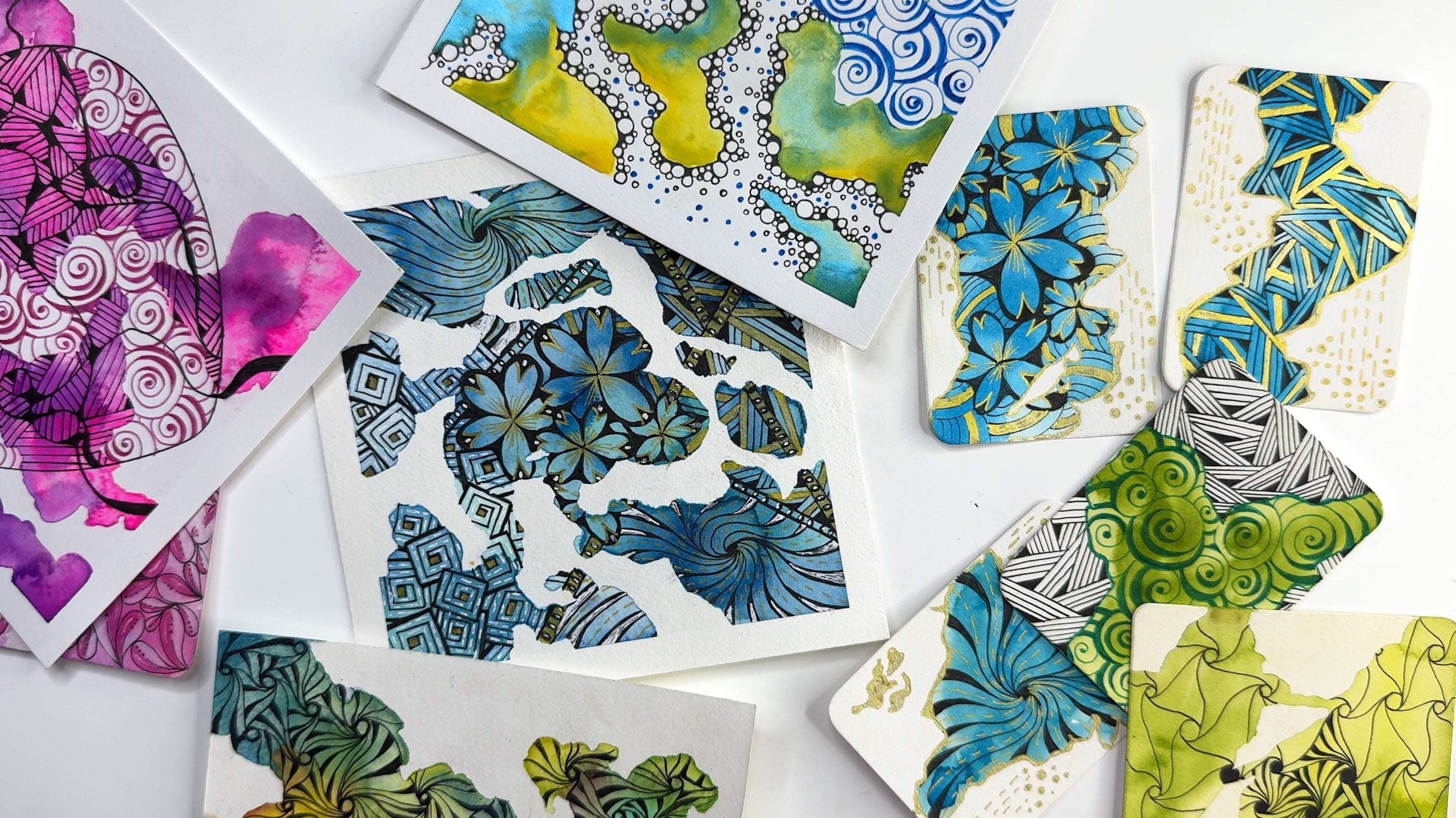
6. Pr 2 - Neurographic Art with Zentangle: All right, so it's time to get started with our second project. And for this, we
are going to start by tracing some circles
all across our page, and you can draw these
circles freehand if you like, but I like to use stencils or round objects of various sizes
to get the proper shapes. Now, you want to try and get different sizes over here for a good variety
in your composition. So look for some bigger circles, some medium sized ones, and some smaller ones. And for the outlines right now, I'm using a 08 pen, but you can of course use whatever nib size is
easily available with you. And if you don't
want to do circles, then you can also opt
for a different shape. So you can go for
squares, rectangles, triangles, clouds, stars, and literally any other
shape that you like. And you are totally
free to customize and personalize this project
in any way that you like. Okay, so now I'm just going
to speed this up a little bit to give you an idea of how this composition
will shape up. And just like we did with
the previous project, you can either fill up your entire page or leave
some negative space around. That's totally your call. So I'm going to be leaving some negative space
once again on the top right and
the bottom left because I want to add some patterns in the
background as well. But if you don't want to
leave that negative space, then you can still add those
patterns inside the circles. Now, once your circles are done, you want to start to
connect them using the same principles that we
applied in the first project. And this will basically give
us interlinked circles, and so it'll appear as if
they're all interconnected. And as an option, you can also draw some extra wavy
lines on your drawing, which are very similar to what we did on the
first project. So I have an example of
that on your screen. And again, these wavy lines are just a tiny little
extra step which goes above and beyond the
circles that we have drawn. So if you want to add these to create a
more intricate look, then go ahead and add those, and it'll make your composition look slightly more complex. But if you want to have
a slightly more airy and minimalistic composition, then you can skip
those wavy lines, and that's exactly
what I'm going to be doing in my project as well. I'm just going to be
doing the circles. And once again, I'm going to be connecting each of these
using my thinner pen, which is the 01 nip size. Again, this will take
you some time to finish, you can do this
at your own pace, and once you're done, meet me in the next segment, where we'll start to add
details into this composition. All right, so now
it's time to start adding zentangle patterns
into this composition, and I'm using a 01 pen now. Sena starts off with a reverse a stroke and then it has a
bulb coming out of it like so, and we color in that bulb. Then we add some line weight to the bottom of the stroke
to create some contrast, as well as to add
some more interest and drama in the composition. And this line
weight is optional, but I personally quite
like it because I think it goes with the overall vibe of neurographic art quite well, and I think it complements
the composition quite nicely. So yeah, if you want to skip
it, that's totally fine, too, but I'm going to be adding this for more
interest over here. And once we have that
first stroke in place, then we just go around the bulb with another a stroke and
land it on the outline. And once again, we will add that line weight
and color that in. Now, these strokes basically divide our shape into two parts. So we will start to branch out more curves on the left
side of the section first, and they're all going to be branching out from
that second stroke, and we will keep
adding line weight to each of them as we
draw them one by one. And this is the beauty of combining Zentangle
with neurographic art because both of them
are very meditative and both of them are very
relaxing and very therapeutic. So by combining tangles
with neurographic art, we are unlocking
double the power of meditation and
relaxation, I suppose. And yeah, I quite like to use this combination and
I hope you enjoy it too. In fact, Sena itself is
such a relaxing tangle to draw that I love to fill up pages and pages with
just this tangle. And just recently,
I used it on a 3.5 inch zentangle tile as
well for a different project. And I think it's that rotating a stroke
that I quite enjoy. I think that's my most
favorite part of this tangle. And then, of course,
adding line weight is also something
that I enjoy a lot. So yeah, overall,
this has got to be one of my most
favorite tangles to draw. Okay, so I'm sure you've
got a hang of this. I'm going to speed
up the video a little bit to show
you how you can branch these off one by one and fill up the left side
of your composition. Oh, while you're doing
that, here's a fun fact. Senna is actually one of the original tangles developed by the Zentangle headquarters, and they have a few
tangles which have been developed by the
founders of Zentangle itself. Was there are other tangles
which are developed by zentangle teachers and zentangle enthusiasts
all over the world. So yeah, this is one which was developed by the
headquarters itself. And if you are interested to learn more about this
entangled method, its origin, its founders, its philosophy, et cetera, then I do have a
separate class on that, and maybe you can check
that out later and combine your knowledge from this
class and that class and create something
unique of your own. Okay, so now we are done with the left
side of the section, and so we're going to switch
over to the right side. And this time, we are going
to apply the same principles, which means we're
still going to be branching out the S strokes, but we're going to be
branching them off from the first stroke that we had drawn instead of
the second stroke. Also, just as a quick reminder, you don't have to use black pens for your entire composition. If you like, you can
also use colored pens, and we are going to be
using brush pens later on for coloring some
sections of our drawing. But you can also add in tangles and other details
with colored pens. Once again, feel
free to customize the project in any
way that you like. All right, once you're
done with one section, pick two more areas in your composition where
you want to add Senna. For example, for me, I will do it maybe here and
here or maybe here and here. Just basically pick
any two sections according to your preferences depending on how
your composition is. And once you are done
filling them up, meet me in the next segment where we will add
our next tango. All right, so the
next tangle that we're adding is called floors, and this one also shares some characteristics
with neurographic art. Now, once again, you can draw
this free hand if you like, or you can use a ruler
for more precision. So over here, I'm
going to be using the centimeter side of the
ruler to create my guidelines, and we will be adding this
tangle in the background. So basically we're adding it in the leftover negative
space behind the circles, and in case your composition doesn't have any empty
space in the background, then you can fill this tangle inside the interconnected
circles as well. So floors basically starts
off with a checkered pattern. So we want to start by creating some horizontal
and vertical lines, which will create a grid for us, and you can choose the size or the scale of this grid
depending on your composition. So for example, over here, I'm keeping these lines
1 centimeter apart. But if you want to
create a bigger grid, then you can also
keep the lines 2 centimeters apart or
even an inch apart. And so it totally depends
on how complex and how intricate you want
your composition to look. All right, so this next step
will feel very familiar. We are basically adding these connections to
the intersecting lines, and this is what I
meant when I said that the tangle floors shares some characteristics
with neurographic art. So we basically add these
connections to the entire grid. And same way, we
will also be adding floors to the remaining empty areas in the
background as well. So for example, in
my composition, I have some empty space in
the bottom left as well, and maybe yours is different. So depending on where the empty areas are
in your composition, take your time to fill
them up with floors, and then once you're ready, meet me in the next segment where we'll continue
adding more tangles. Okay, so the next tangle
that we are adding is called membranat and this tangle has
many different variations, but I'm using a very
simple version of it today so that we can later
on enhance it with color. And as a reminder, if you're interested
to know more about the creators of each
of these tangles, then don't forget to check out the class
resources document, which is available
in the projects and the resources section
for you to download. So it has all the relevant
details about the tangles, the tangle creators, as
well as their stepos. Okay, so for membrant, we basically start with
these curvy shapes, and when we go
around each of them, adding partial line weight, which basically gives
it slight more depth. There are no rules when it comes to the number of these curves. You can just basically
space them out randomly depending on the size of the section that
you're working on. So, again, if you want it to look slightly more
dense and intricate, then you can add
lots and lots of these curves or if you want it to look airy
and minimalistic, then you can add lesser curves. So it's totally your call. And also if some of you don't
want to draw this tangle, but you want to experiment
with other tangles instead, then I do have a bunch
of different classes focused on tangle inspiration
from the entangle method, as well as general playful, easy to draw patterns. So if you need some
extra inspiration to customize and personalize your
neurographic art project, then feel free to check
out those classes, and you'll definitely find some interesting patterns
over there that you can use as fillers for your current neurographic
art composition. So coming back to this one, we are just going to add the line weight partially
to those curves, as I was saying, and then we basically repeat it
for all the curves. And once again, once we're
done with one section, then we're going to pick
two more sections in our composition where we're
going to be adding membranat. Again, do this at your own pace, and once you're ready, meet
me in the next section. Okay, so now I'm not going
to be adding another tangle. Instead, I'm going to be adding some simple lines
to my composition. So up until now, we have added a lot of curvy and wavy
strokes in our design. And I just wanted to bring in some contrast with
straight lines in the composition
so that these are nicely juxtaposed with all
those curvy and wavy lines. And these are just
simple filler lines, which I'm going to be adding to different
sections once again. I'm going to be adding
them to three sections, just like we did with the
previous two tangles. Again, depending on how your
composition is shaping up, maybe you'd like to do a different pattern or
a different tangle, that's totally fine too. Just have fun, play
with your project, and there are absolutely
no rules over here, so enjoy and just have fun. All right. So now let's start
with the coloring process. I have already colored two of my membrane sections
just to give you an idea of how this
is going to shape up, and now I'm coloring
the third one. So I'm using this
lighter seglass like color to fill this up, and you can, of course,
choose to work with a different color and a color
palette of your choice. So these are water based brush pens
that I'm using over here, and they have a very nice
translucent finish to them, which is something that
I absolutely love as a contrast to the
opaque black lines that we have drawn so far. So you can also achieve
similar results with alcohol based markers
or simple sketch pens. So feel free to experiment with the art supplies
that you have and just pick whatever you find easy to use or whatever
you are most drawn to. And now over here, once I'm done with
the base color, I'm just going to go
around those curves with a slightly darker shade
and add some outlines. And this is not a
very, very dark shade. It's just one shade darker
than the base color. So once again, I will do it for all the
curves in this section, and then I'll repeat the process for the other
two sections where I have added membranad
and that way, they will all look the same. Next, I'm going to fill up some sections with
this slide of blue, and I want to have a nice mix of solid colors and patterns
in my composition. So I'm going to place some solid sections
like this one randomly. On second thoughts, I think I want to
make my membranat a little bit more opaque. So I'm going to add
one more layer, and that's the beauty
of these brush pens because you can layer them to create a
more opaque finish. If you want a slightly
translucent finish, then you can just
reduce the pressure of your hand and just go
with a single layer. That'll give you a
more translucent watercolor like finish. I'm going to darken
those curves once again just so that they
stand out a little bit more. Okay. Next, I'm going to add
some dark blue sections, and I'm going to layer this a couple of times just so that there is a more opaque finish to this dark blue
that I'm adding. Okay. And now I'm using the thinner nib of my pen
to add some tiny dots. These brush pens that I
have are dual tipped. On one side is the
brush pen tip, and on the other side, the tip works pretty much like
a fine liner pen. So I'm using this
fine line a side now to add some tiny
dots in my composition. Again, this is just
to add some color as well as some variety in
the overall composition. And depending on how intricate or how busy your
composition is looking, maybe you want to
skip this step or maybe you want to do
more segments with this, feel free to follow along or
deviate from what I'm doing, depending on how your
artwork is shaping up. You are the best judge and
the creator of your artwork, so feel free to do
whatever comes to you naturally and whatever you
feel like doing intuitively. In fact, if you like, instead of doing small dots, you can probably do some other simple filler
patterns as well. Maybe you would like to draw some playful shapes like stars or little clouds
or little flowers. So depending on the overall vibe you want your artwork to have, you can choose to do some
different shapes and basically, again, have fun
with your project. Now, same way, I'm going
to continue adding some small details randomly
inside all the sections. So in some of the sections, I'm going to add
some more tiny dots. Then I'm also going to play
with some straight lines, some diagonal lines, and maybe add in a few
dashed lines as well. So yeah, basically,
just look for simple shapes that you can
fill inside some empty areas. And wherever you feel
that your composition is lacking contrast or wherever you feel that it's
lacking color, you can always go back and forth between the
different pens that you have and just add nice
blocks of color or pattern. And yeah, just basically have fun and treat this like your
personal playground now. And keep adding little
details here and there. And once again, it's totally
your personal choice on how colorful and how pattern heavy or pattern rich you want
your artwork to be. I'm going for a
very abstract feel, so I'm going to place most of my elements in a random fashion. There is no major
thought over here except for trying to
maintain the balance between all the colors
and trying to distribute the dark and the light areas nicely across the
overall composition. And I'm also trying to do a nice balance of
all the strokes. So for example, if I'm
doing diagonal strokes, then I'm not leaving
them in just one area. I'm also going to fill up at least a couple more areas with the diagonal strokes so that
there is a nice balance. And at the same time, I'm
also aiming for a little bit of variety because I don't want everything to
look just the same. I want to have slight
deviations and strokes, maybe play with the spacing, maybe play with the
thickness of the strokes. And yeah, just basically
keep following your intuition and just keep filling random areas
with color and pattern. All right, that's pretty much
it for this composition. So go ahead and add those little details to
your heart's content. And once you're ready, meet me in the next segment so that we can peel off that
washi tape together. All right, so let's
get this tape out. I'm actually quite
excited to see how this one comes out with the white border because
I did go towards the edges to add some pen lines, and I'm not 100% sure
that I got them straight. Oh, yeah. They were pretty
neat in some sections. Not bad. Okay, so
I quite like this, and I'm sure that yours is
looking equally beautiful. As a reminder, don't forget to share your project in
the project gallery of this class because I love
to see what all of you make. It's always a treat for my eyes, and once you're ready, meet me in the next
lesson where we'll combine neurographic art
with color pencil blends.
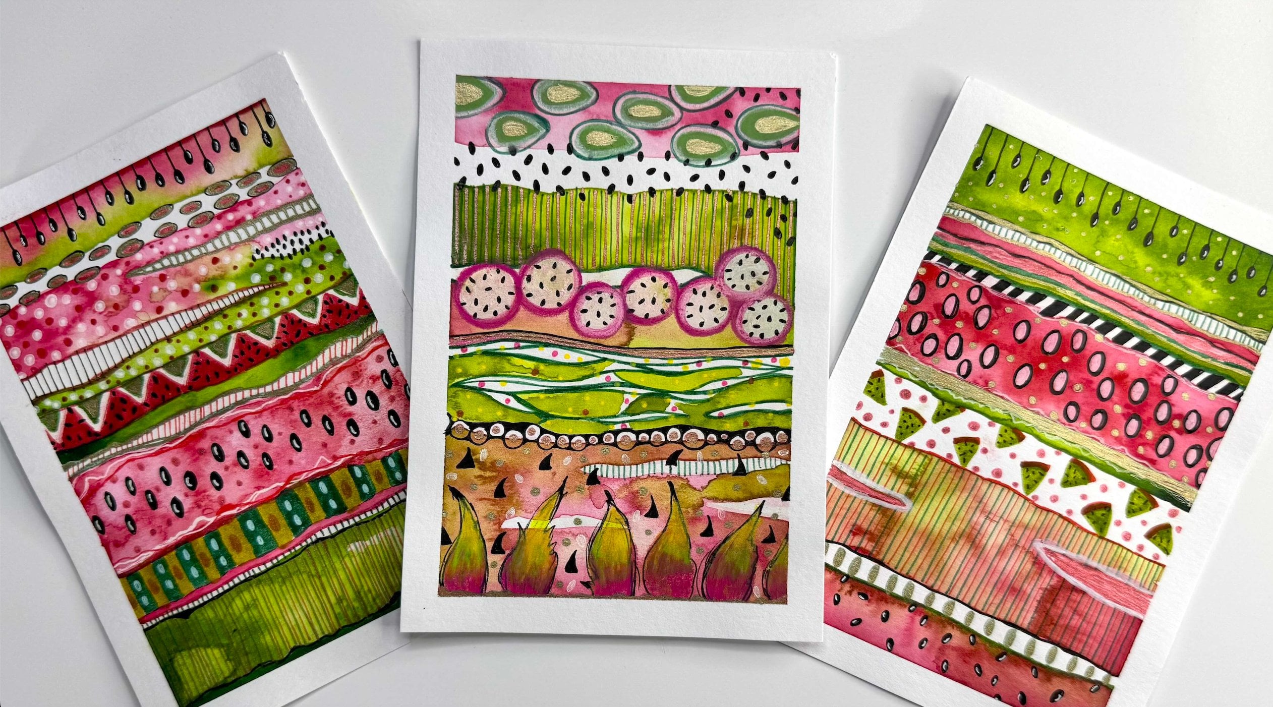
7. Pr 3 - Neurographic Art with Color Pencil Blends: Uh All right, so let's go ahead and start working on our third
class project. Once again, I'm
starting off with my 08 size pen and drawing an abstract
frame around the page. This time I'm not
touching the washi tape to keep my composition
centrally aligned, but you certainly
can take it all the way to the edges if
that's what you prefer. Now, I'm adding some
abstract blobs in the middle and I'm going to turn these into
abstract flowers. You can, of course, choose
to do other shapes and other composition
styles if you have a different idea
in mind. Mm hmm. Mm. Then I'm just going to add some simple lines and break these down
into smaller sections. So it's like having stripes
with smaller sections, some are thick and
some are thin. Honestly, there is no
real thought over here. It's pretty abstract. All I'm doing is just putting random strokes on
paper and creating small sections that I can later on color with
color pencils. By now, you already know
how to add these lines, so I'm just going to
speed this up a little. Okay. Now for the inside shapes, I'm going to do
something similar. I'm just going to add more blobs inside
the original ones, just following
around the outlines, and then I'm just going to break them down into smaller
sections once again. And it's pretty abstract. But in my mind, I'm looking at these as representing
the petals of a flower, and I'm going to
do the same thing on the other two as well. Then just like we did with
the previous two projects, I'm going to switch
to my 01 size pen, and I'm going to start
making the connections. By now, you already
know how to do this. I'm just going to show you a
little bit of the time laps so that you can get an idea of how this one is
going to shape up. And one thing you'll notice
me doing in this project is that I'm not just making the connections on the
intersecting lines, but I'm also making
the lines thicker in some sections because
I want them to stand out as
separate elements or separate sections when we
start to color them in. And this is, of course, optional because if you're already making the lines with a thick pen, then you probably
don't need to do this. But in my case, I'm
working with a 01 pen, so I'm just going to thicken some sections here and there. And once again, you can take your time and finish
making the connections. And once you're
ready, meet me in the next segment where we'll start to color
these sections. Okay, so I've gone
ahead and made my selections for the colors that I'm going to be
using for this project. And if you're using Prismacolor and you want to use the
exact same colors as me, then I'll put up
the color codes on your screen so that
you can follow along. And I'll also include these in the class resources document so that you can have them later on as well for your reference. And apart from these colors, we will also need a colorless blender and
a white color pencil. So I've got mine from the
Prisma color brand itself, but you can of course use
a different brand as well. All right, so let's
start with the coloring, and I'll start with
a lighter yellow over here and color
a small patch. Then I'll move on to
this lighter green, and I'm just adding the pigment lightly so that we can
blend it in nicely. Now I'm moving on to
the darker green, which is the apple
green in my case. Then we're basically going
to add some white to the lighter sections so that we can blend it in with
the lightest color, which is yellow in my case. These are the three
colors that I just used, and you can see that they're
going from dark to light, and that's how we achieve a
smooth gradation when we're moving from lighter colors to darker ones or darker
colors to lighter ones. And now I'm just going
to add my second layer and start to blending those colors for a
smooth gradation. And the beauty of Prisma colors is that they blend really well. So they're really
light on the fingers and I don't have to
apply a lot of pressure. As long as we overlap the colors nicely at those
transition points, we'll be able to achieve really nice buttery
smooth blends. And in case you're looking
for more indepth classes on how to achieve these
smooth color pencil blends, then I have detailed
tutorials in my other course on
color pencil gemstones. So if you like, you
can watch that later on to practice your color
pencil skills even more. Now, once I'm done
adding the second layer, I'm taking my colorless
blender and just burnishing the whole area so that the pigment really seeps
into the tooth of the paper, and that way the paper
tooth gets flattened. So just going into
all those corners gently to make sure that
it's a smooth blend. For all the color
pencil, dust and specks that get
accumulated on the paper, I use a paintbrush
to get rid of them. I recommend not to do this with your hands because
the sweat or oils from your hands can
cause the paper to discolor or it can
even leave stains. So a paintbrush
or a makeup brush is a good way to get
rid of these specs. Now we can move on to
our next set of colors. We can do these three or
these three or these three. We basically want
to do a gradient again from dark to light. I'll start with
the darker color. And then we just bring
in the medium value And then we move on
to the light one. Then we blend that lighter
value with the white. And we add a little more
pigment if required. Now, I'll just clean up my
blender pencil because it still has the residue of the previous colors
that I was using. So I'll just clean this on
a scrap piece of paper, and then we can start
to burnish and blend. So now just doing the same
thing, cleaning up the dust. And now we can do either these three from dark to
light or these three, which will be a combination
of green and yellow. Actually, the darker
greens going into this yellow can also
be a good gradation. So I think I'll go ahead
with the dark green, the medium green,
and this yellow. Same thing, we start
with the darker green. Then I'll move on to
the lighter green. And then I will
bring in the yellow. And this time, I'm
skipping the white and moving straight to
the colorless blender. So once again, I'm just
going to clean this up, and then we can start
to burnish the colors. I'm just going to
brighten this up a tad bit with a
little more pigment. Okay. Okay, now, same way, I will continue
to add the colors randomly all throughout
my composition. I'm going to work
on each section independently going
from Dak to light. And as you work on these
sections at your own pace, you'll experience
a different kind of relaxation and almost like a Zens state
of mind because the experience is
very, very satisfying. It's almost as if you'll enter a very peaceful universe or a different kind of peaceful
realm in your mind. And that I think
perfectly complements the relaxing state we experience when we are making those neurographic
lines and connections. So yeah, color pencil blends go really well with
neurographic art. Just make sure that you're always cleaning your
colorless blender, as well as your white color
pencil on a scrap piece of paper each time you
switch the colors, because you don't
want that residue of the previous color to
interfere with the new ones. And that way you can maintain the true hues of every color. And try to switch the direction of the
gradients each time. So if you have a dark
to light gradient happening from top to
bottom in one section, then do the opposite in
the neighboring section. That will distribute the
dark and light colors nicely all across the page. Of course, don't
forget to sharpen your pencils as and
when required so that you can go into those corners precisely and blend the
colors really well. Also in some of the sections, we can actually add the
darker color on both ends. For example, over here, I'm just going to add the
dark green on both sides of the section and I will basically keep the highlight or the
lighter color in the middle. This just adds more variety and interest in the composition. Now, I'm sure you've
got a hang of this, so I'll speed this up
a little to show you how I'm alternating the colors
and making the gradients. And this is definitely a
time consuming project, but it's totally worth the mindfulness and the
relaxation that it brings to us. I promise you you're
going to have a lot of fun continuing ahead
on this composition. And if you're working
with many colors, then I'm sure that it
would be even more fun and enjoyable to switch between them and create the gradients. For the inside sections, the concept is pretty
much the same except that I'm making the gradient sideways instead
of top to bottom. And if you like, you can also do these abstract flowers in the shades and
tones of one color, while the background can be in the shades and tones
of another color. So that's always a possibility. Mm And then we basically continue working on the rest of the sections
in the same way. Once you do a few sections, you'll pretty much be on
autopilot for the rest of them. And like I said earlier, this is a slightly time
consuming activity. So chances are that you won't be able to finish this
up in one sitting, and especially if you're working with a larger paper size, then you'll probably
need even more time. So don't worry about that and don't worry about how
much time it's taking you. And instead focus on enjoying the process and really getting into that
Zen state of mind. This is pretty repetitive, so I'll actually jump ahead towards the
end of my recording, and here you can see that I
have basically played with the placement of the
dark and light sections randomly in my composition. Same way when your
drawing is ready, come back to this video and we can see the final
piece together. This is how my
composition turned out, and I'm just going
to remove the tape. You can see some discoloration
happening over here, and that's because
I've constantly removed a lot of pencil, dust, and specs, and because my hand was constantly
moving around the paper, of course, some human oils and human sweat tends to
interfere with the paper. So there is a little
bit of discoloration. But we don't have to
worry about that because we can always fix that
in Photoshop later on. So once you're ready
with all your drawings, meet me in the next lesson where we'll start
to digitize them.
8. Digitizing Your Artwork: And Alright, so now that we've made all
our beautiful artworks, it's time to start
digitizing them. If you want to see your artwork printed on multiple products, then digitizing and
prepping your files for printing is
absolutely essential. It's literally the
first basic step to begin your journey in the world of art licensing or manufacturing
your own products. So usually, there are two ways to go about digitizing
your artwork. The first one is scanning
using a photo scanner, and the second one is to click a high resolution picture using a smartphone or a
digital camera. Now, as you start to grow and expand in your art journey
and in your business, you will realize
that scanning is the preferred way to
digitize your images. It eliminates a lot of problems that you encounter
usually with photography. But for today's class,
if you don't have a scanner right
away, don't worry. I will walk you
through all the steps of photographing your
artwork as well. So let's begin with scanning. First things first, you want to make sure that the
scanner that you're using is a photo scanner and not a regular
document scanner. This is because
photo scanners can scan with very high resolutions, which is absolutely essential
if you want to scale up your artworks to be printed
on bigger products, such as duvet covers, curtains, or even wall murals. So the scanner that I use is the Cannon light
400 photo scanner, and a few years ago
when I purchased this, it seemed to be the best
option because of two reasons. One, it was the best fit for the budget that
I had at the time. And secondly,
because it is pretty lightweight and so I can easily
fit it into my backpack. And the second reason was very important for
me because I travel a lot and I almost always
need my scanner with me. But that being said,
there are a bunch of really good scanners
that you can buy from the Epsin
brand as well. Some of them are slightly
heavier and bulkier than the others while some others
are more pocket friendly. At the end of the day, you
want to find a scanner that can scan up to
2,400 or 4,800 DPI, something that fits
in your budget and something that is
the right size for you. So in terms of the size, what I mean is that there
are some scanners that have a scanning bed that can take documents up to an A
four size of paper, whereas there are
other scanners that can take A three
papers and beyond. And of course, the price varies depending on the
size of the scanner. But honestly, the
scanning bed is not so much of a concern or
an issue because you can always scan a larger artwork in smaller sections and then piece it or fuse it altogether
in Photoshop. So in a nutshell, purchasing a scanner
is a lot to do with your personal preferences and how you plan on utilizing it. And of course, every scanner
and every manufacturer has their own set of features to offer and their own
pros and cons as well. But these are the three basic things that you should keep in mind when you're looking
to purchase a scanner. Now, before you start scanning, it's important to ensure that your scanner bed is
completely clean. I work with a lot of
different mediums like acrylics, gouache, watercolors and sometimes even use foil flakes and
glitter in my work. And sometimes these
artworks leave specks of dried paint or a little
residue on the scanner bed. And if you don't clean that up, then it will get scanned with every next piece
that you're scanning. And not only does that increase your cleanup work in
Photoshop later on, but it also sometimes interferes with the beauty of
the original artwork. To an extent that you might
have to rescan everything. So long story short, just make it a habit to clean your scanner bed
before every scan. And the best way to do that is by using a microfiber cloth, and I usually use the same one which we
get with sunglasses. It's really gentle
on the glasses. So of course, it's tentle on
the scanner bed glass, too. And as a tip, don't make the mistake of cleaning
your scanner bed with a tissue because
some of them have very harsh texture and they leave scratch
marks on the glass, and that may not be so
apparent to the naked eye, but you'll see the scratches once your artwork is scanned. Once your scanning bed is clean, you want to place your artwork, face down on the glass, close the lid, and open the scanner software
on your computer. Now, every scanner has a different dialogue box
with different settings, but I will walk you through some of the basic
things to keep in mind regardless of
the scanner brand or model that you're using. So first things first, you
want to make sure that you're doing a photo scan
and not a document scan. And in the cannon interface, it means selecting
the color option and not the text or the
black and white option. So maybe your scanner has a different name
for these settings, but you basically want to
pick the one that represents the photo scan or the color scan and not the one that
represents the document scan. Next, let's talk
about the resolution. So I always recommend
starting with a higher resolution
file because you never know how much you want to scale up your artwork
down the road. If someday you decide to print really large scale
wallpapers or a wall mural, then you don't want
your artwork to look pixelated or blurry. So the best thing to do is to scan it at a higher resolution
in the first place. I usually scan
everything at 2,400 DPI, and some people might think
that it's an overkill, but trust me, I have
scanned stuff at a lower resolution before and then regretted it
a lot later on. And if you don't understand
the concept of DPI very well, then here's a simple guide. DPI basically stands
for dots per inch. Let's say your
artwork is six by 6 " and you scan it at 300 DPI, then you can reproduce or reprint your artwork
at the same size. That means you can create
prints in a six by six size. But let's say you want to print your artwork at 12 by 12 ", which is double the size, then your artwork will
come pixelated because the printing happens with
that 300 DPI setting. So now the printer has run out of those dots
or pixels to print. So instead, if you
scan at 600 DPI, then you can double the size
because the printer can now use double the amount of pixels or dots to
make your print. Same way, 900 DPI will give you three times the size
and so on and so forth. So I usually do eight
times the size, which is 2,400 DPI, and that means that I can use
my 6 " artwork and scale it up to 48 by 48 " without worrying about
any loss in quality. Then some scanners
give you the option to choose how much of the document or the artwork you
actually want to scan. So here you can see
that it is giving me some dimensions of
4.83 and 4.91 ", and that's because
it's automatically detecting where my artwork
is on that white sheet. But I want to scan
everything including the paper edges because I want to retain
that paper texture. So I'm going to adjust the crop to make sure that I get
the paper edges as well. And when you do that,
you get a confirmation over here when it's pretty close to the actual paper size. So in this case, it's
pretty close to 6 " because that's exactly the
size that I was drawing on. And, of course, if you have a different size of paper
that you were working on, then you'll have to set the crop according
to your paper size. It doesn't really
have to be exact, but just try and be as close to the original
paper size as you can get. And now the next thing
that you see over here is that it's set to
detect enclosing box, which basically
means that it will scan everything that I have set for the scanner inside
that box that I just adjusted. I usually save all my files to the desktop before I move them
to their relevant folders. But you can also directly set the destination folder of
your scan right here itself, and then you can also rename
your file right here. You can also do that later, but I just like to do
it right here itself. And then comes the file format. So usually TIF is
better quality than JPAG and TIF gives you more room to play with
color adjustments later on. But honestly, I
scan everything as a JPEG because I'm scanning at super high resolutions
to begin with. And so there is barely
a difference for me in the TIF version and the JPEG
version in terms of quality. But it is a major
difference in terms of file size because TIF stores
in massive file sizes, and that takes up a lot of space on my computer
or hard drives, whereas JPEG saves in
a smaller file size. So just to make the
storage and access easier, I use JPEG, and they also open up and load up
faster on Photoshop. So yes, TIF is better than JPEG, but I personally use JPEG. You can choose to save in whichever format
is easier for you. And then the most
important thing while scanning is to ensure
that you're not applying any kind of filters or image correction tools
to your original scan. The enhancements are
best done in Photoshop. So just let that be at
none as it is right now, and then we go
ahead and we scan. Now, the scanning, of
course, takes a few minutes. The higher the DBI settings
that you have chosen, the larger will
be the file size, and so it will take more time
for it to scan and save. So while that is happening, let's talk about our
second option to digitize our artwork,
which is photographing. Now, one of the most important
things about clicking photos of your artwork is
that you need good lighting. Natural light is the
best so that you can photograph your artwork
in its true colors. But that being said,
sometimes we have to wait for the perfect natural
light that doesn't cast any harsh shadows
on our artwork. Because if there are shadows, then it's very hard to
clean up the work later on. So ideally, you should click the photos in flat
natural light, or if it's a
particularly sunny day, then you want to
click the photo under a shade to eliminate
the shadows. The alternate to waiting for good natural light could be to photograph everything in a controlled setting
with studio lights. But that being said, you have to learn the additional
skill of getting the lighting perfect
to photograph your artwork with the
correct color temperature, as well as without shadows. And of course, it's important
to keep in mind that studio lights are also an
investment money wise. So you want to factor that in your budget in the long run. As a side note, you
probably already know this, but it's worth mentioning that regardless of the lighting conditions in your environment, do not use flash. The flash ruins the colors of your original artwork and sometimes even causes a
glare on the artwork, which can be very hard to
fix in Photoshop later on. The other thing to keep
in mind is perspective. You want to make
sure that you're clicking a straight
head on shot of your artwork and not holding your smartphone or digital
camera at an angle. And that's kind of
obvious because you also want your artwork to
be printed out straight. So it can be a little hard to get the angle correct
in the beginning, but you will
definitely get there with a little bit
of trial and error. As a tip, you can switch on the grid lines or
the guidelines on your smartphone camera or digital camera to help you
get the angle straight. Instead of keeping your artwork flat lay style on a table, you can also just
place it or hang it on a plain white wall and then
click a picture of it. Now, most smartphones
are pretty easy to use, so you can just do a
simple click for that. You just have to place
your camera straight above the artwork or
right in front of it, and then tap the focus
button in the middle to ensure that your artwork
is completely in focus, and then you're good to click. But if you're doing this
with a digital camera, then you'd also have to have some basic photography skills to get the exposure correct. So you'd have to learn a
little bit about aperture, shutter speed, focus, et cetera. So you might want to
reconsider photographing your artwork if you don't have that kind
of time with you. In a nutshell, you've probably understood by now
that photographing your artwork is slightly more complicated and it requires
a few extra steps. And so, of course, after
all these considerations, scanning seems like
an easier option. But then again, if you're a
professional photographer already and already know
how to click good photos, then you probably don't want
to invest in a scanner, and you might just want to
click photos of your artwork, so that's totally fine, too. And at the end of the day, it's totally your call. Either way, the image
enhancement steps stay the same regardless
of the route you pick. Whether you click a photo of your artwork or scan
it for today's class, all the steps in the next
lesson will stay the same. And later on down the road, if you upgrade from
a smartphone camera to a scanner for
digitizing your artworks, then you would still know how to enhance and color
correct all your files. So what we want
to do now is scan or click photos of all the artworks that we
have made in this class. And if you like,
you can also use some of your other artworks. Then we want to save
them on our computer. I have already scanned four of my artworks and they're all right here ready
for me to work on. Once you're ready
with your files, meet me the next
lesson where we'll start with the adjustments
and colorways.
9. Corrections, Adjustments & Colorways: All right, so I have
all my four scans ready with me over
here on my desktop, and I'm going to be using a MAC today for the
demonstration purpose, but I'll also put up the commands for Windows
for you to follow along. So when I right click on one of these and see the
file information, I can see that the file size or dimensions are more
than 14,000 pixels, and we have been able to achieve this large scale because
I scan this at 2,400 DBI. So now I can make really big reproductions
of this artwork. Same way, let's check
the other one as well. And again, this is more than 14,000 pixels in
width and height, which means that we have a
very big size to play with. So basically, the higher
your DPI setting, the bigger your file size will be and you'll get larger
dimensions to play with. And I've done the same
for all of my files. Now, let's open these. So I'm just going to right click and open this with Photoshop. And again, it takes a few
seconds for the file to open. The larger the file size, the more time it will
take to open up. So just be patient
while that happens, and maybe you can use
this time to click a nice behind the scenes photo of your process to put
on social media. So that's a handy little tip
for you over there to keep your fan following engaged
on your social media pages. And once it opens, this is what it's
going to look like. So you will see your
artwork over here on the layers panel on
the background layer. So the first thing that
we're going to do is take this artwork and
place it on a fresh file. So I will click on File New, and then create a custom canvas of 10,000 pixels in
width and height. You can also go
smaller or bigger, but this is pretty
much the size that I use for most print
on demand websites, and it works very well for me. And for the rest
of the settings, we want to keep them the same
as what you see over here. So I keep my color
profile as RGB, but you can also change it
to CMYK if the printer or the manufacturer that
you're working with has asked for CMYK
files specifically, and then we hit Create. The first thing
that we want to do is save our file so that we remember that this is the modified file on which we are doing
all the corrections, whereas the file that
we had opened earlier is the original file that
will stay untouched. So I'm just going to name
this as artwork one modified. But you can use whatever
nomenclature or naming system is easy for you to understand. And then I'm going to save my file in a large
document format, which is a dot PSB file rather
than a Photoshop format, which is a dot PSD file. And the reason for
that is that dot PSD has a limit of two GB when
it comes to the file size. So when we add multiple layers and effects
on a particular file, chances are that we will
need a bigger file size, which is why dot
PSB works better. And this way, you can
keep all the layers in one file rather than having
multiple small dot PSD files. So I'm just going to hit Large document format
and then hit Save. And now the next
thing I want to do is go back to my
original artwork file, select the layer on
the layers panel and hover over to the other tab, and then drop the layer
right onto the canvas. Now, you'll see that your image is going
outside of the canvas, and that's bound
to happen because the canvas that we had
created was of 10,000 pixels, but the image scan
was slightly bigger. So if you remember, it
was around 14,000 pixels. So we're going to
use the corner nodes to reposition our artwork in
the middle of the canvas. And you can also use
the arrow keys on your keyboard to move the artwork slightly
pixel by pixel. And in case your scan
wasn't completely straight, then you can also let your mouse hover over
the corner node, which will give you the option to rotate the artwork slightly. So mine is actually
quite straight, so I don't need
to rotate at all, but you do have this option in case your scan wasn't
perfectly straight. So I can go back to
fixing the placement. And again, I'm just going to use the arrow keys over here to move the image slightly so that I have better control
over the placement. And then once you're satisfied with the
placement, hit Enter, it'll give you a pop up like
this that says transform, and then it's going to
be set on the canvas. And then you'll see
that this is now on a new layer above
the background layer. So this is the layer on
which we're going to be making all of our
adjustments and corrections, and we don't really need the original artwork
file now anymore, so I'm going to close that tab, and this working file
is all that we need. So the good thing here is that in case you want
to start from scratch, your original scan file is
safe and stays untouched, and you can access it
later anytime you like. Now, we want to do this
for all our files. So I'm just going to move
my Photoshop window on the side so I can access
my desktop as well. And then same thing, I'll
open my second artwork. Then I'm going to create
a new file over here, and I'm going to save this
as artwork to modify. And then I'm going to go to the original file and drag
the layer on the canvas. Again, I'm going to
readjust the placement. In fact, for this one, I'm going to take the artwork
all the way to the edges, and I won't leave
the white border. I think it'll look nice
without the border when I use it for a cushion
cover or something like that. And again, once I'm happy
with the placement, I'm going to hit Enter. And then I'm going to close the other tab which
had my original file. And then moving on, I'm going to do this for my
other two files as well. But I'm going to speed
up the video here slightly because you
already know this part. Also, for the purpose
of the demo today, I'm working on multiple
files side by side, but you can definitely do this one file at a time as well. It totally depends on what
kind of a workflow you prefer. And for me, this kind of assembly line editing
works better. So I have all my four
working files now, and you can see that all of the tabs are open
over here on the top. And now the first thing
that we're going to do is define the white point
for each of these files. Now, a white point is
basically a set of color values which define the color white
for the computer. In our case, we are basically helping the
computer understand what exactly is the whitest
part of our image or artwork. Then all the other colors are in reference to that
particular white. This is very similar
to the concept of white balance in photography
and videography. And what this basically does is that it helps to
bring back the levels of your artwork closer to the original white paper that you had painted or drawn on. Now, this might sound
a little crazy, but hear me out for
a second over here. There are many kinds of whites
available in the world. There's snowy cool white, there's warm white, there's
ivory white, and whatnot. What we basically want to
do here is tell Photoshop which kind of white best reflects the white of
our painted artwork. In other words, the white
point specifically refers to the color balance
of the brightest or the most accurate white
parts of the image. By adjusting the white point, you can make the whites
in your image appear warmer or cooler depending
on the desired effect. And setting the
correct white point is crucial for accurate
color reproduction, affecting the overall mood
and feel of the image. If you just scanned your
image and it looks very dull or warm or cool as compared
to the original artwork, then don't worry because defining the white point
will fix that for you. One thing that I've
noticed with most scanners is that regardless of how good the quality
of the scanner is, the color depth
and saturation of your actual artwork
goes down a little bit. The scanner's light is so strong that it
takes away some of the colors and makes them look flat and some of the
contrast also goes away. We can manually fix that. The first step to do that is
defining the white point. So I'm going to really
zoom into my artwork over here and go into the
whitest part of my drawing. And since we had used washy
tape on this artwork, we already know that
the cleanest areas were behind that washy tape, which is why we can see that
clear distinction between the original paper white
and the discolored areas. So I'm going to
zoom in some more. And over here, we can see the
paper texture very clearly. And because of the way the scanner's light
falls on the paper, you can see that
some parts are super white while others
are more gray. And that's just the shadows
of the paper grain itself. So once we zoom in, we basically just have to find the whitest part in
that paper grain, which in this case, is
this little white section here that I have spotted. And then on the layers panel, we click on layer one to ensure that all our changes are happening on
the right layer. Then I will go to image
adjustments levels. In this pop up box, we will see three different
eyedropper tools, we go into the third one if you let your mouse hover
over there for a bit, you will see that it says sample image to set White point. We're just going to
bring that eyedropper to the white point in our artwork and then we're going to click. Now the image has turned
a little bit brighter. We're going to click on O
and then we'll zoom out. And I'll go to my history panel to show you the
before and the after. This is the before,
and this is the after. Again, this is before and after. The difference is
really, really subtle, but this tiny first
step is what makes color correction so much easier in all the
following steps. So we want to go ahead and do the same thing for
all our artworks. So again, we zoom in to
find the paper white. And then we are going to go into image adjustments levels, select the third
eye dropper tool and define the white point. Hit Okay. I'm just going to quickly do this for the
other two artworks as well. Again, you can choose to do
this one file at a time, or you can work
on multiple files together the way I'm doing it. So really, it's all about your own preference when
it comes to the workflow. Okay. And now I will go
back to my first file. And this time, we are going to adjust the levels
in our artwork. Okay, so once again, we are going to select
the right layer, and then we're going to go
into image adjustments levels. And this time, we're going
to play with these sliders over here to adjust the
levels in our image. So the levels tool in Photoshop basically lets you adjust
the tonal range and the exposure of your
images or your artwork by playing with the shadows,
highlights, and midtones. So for example, over here, when I'm moving the
slider to the right, you can see that the shadows
are getting more prominent, but on the left, they're
getting a little lighter. The same way, this slider over here lets you adjust the
highlights in your images, so you can brighten up
some of the lighter areas. So there's basically no
set formula to this. You have to do this manually for each of the images
because each of your artworks will have different colors and a
different tonal range. So the goal is to bring it as close to the original
artwork as possible, or you can take it up a
notch and maybe just enhance it a little bit more than the original if that's
what you prefer. And once you're
satisfied, hit Okay. And then I'm also
going to quickly hit Command S to save my file. You should do this
as frequently as possible to avoid
disappointments later on. And then we do the same
thing for the next one. We go to image
adjustments levels and start to move the sliders, and we keep playing till we are completely satisfied
with the overall look. So for this one, I am basically just trying to
enhance the colors a little bit more so that they don't look as dull as
they are right now. And like I said, the adjustments vary
from image to image. So you kind of have to do this
manually for each of them. And depending on the way your scanner has
scanned your images, maybe you don't need to do this. But again, you'll be the best judge of
what your image looks like and how you want
it to eventually look like. So keep
playing with this. And once you're satisfied, hit Okay and save your file and then move
on to the next one. And so same way, I'll quickly
do the other two as well. And once all your
files are done, we will move on
to our next step, which is to adjust the
saturation of these images. Okay, so once again, I'm going to go back
to my first file. And once again, we're
going to select the layer, go to image adjustments,
hue and saturation. So this time, we will get
a pop up box like this. Now the hue and saturation tool in Photoshop changes the hue, saturation and lightness of an image or specific
parts of it. So for example, if
you want to change the range of colors in
a part of an image, or if you want to make a
color deeper or more vibrant, then this is the tool that
will come to our rescue. So over here, we can play with the saturation slider
to increase or decrease the saturation in our artwork and get it as
close to our original colors. And of course, again,
if you purposely want to enhance the color slightly
and take it up a notch, then that's also
possible over here. Also, you'll notice
that right now, we're just going
to be working with the saturation slider and not the hue and
the lightness one. I'll show you how to use the hue slider later
on in the lesson, and I don't really
use the Lightness one so much because we've
already adjusted the levels in the previous
section with the levels stool. So I prefer to adjust
the levels with the levels stool instead of using the Lightness
one over here. So I'm just going to take
this up slightly and not too much because I don't want it to look
very unnatural as well, and I still wanted to maintain that handmade quality
of the artwork. In most cases, the level
adjustment that we did in the previous step actually gives you a pretty good result. But this saturation play is one step extra than that to really enhance the
look of your artwork. And once you're happy, hit Okay, save your file and
move on to the next one. Now, I'll do the other
ones quickly as well. Again, there is no
set formula to this. You have to do this manually
for each of your files because each of your artworks is going to have a
different look and feel. Really spend time on making these adjustments to make your artwork look
the way you really want it to look and you'll soon really start to
enjoy the process of making these corrections. And once you're done making the saturation adjustments
in all of your files, meet me in the
next segment where we will be using the
spot healing brush. Okay, so on the left
side panel over here, we have the spot
healing brush tool that sort of looks
like a band aid. And on the top here, we can adjust the size of this
tool by moving the slider. So of course, for bigger areas, you can use a larger brush size, and for smaller areas, you can reduce the
size of the pixels. To see the live
preview of the size, it's actually best to
select the layer first. And once the layer is selected, then you can see
the size properly. So 5,000 pixels is this big, and you can use it to
fix large areas quickly. You can also use the bracket
keys on your keyboard, by the way, to make your
brush size smaller or bigger. So I'm going to take this
down to about this much. And now we will
look for areas in our artwork that have paint splatters that
we want to fix, like this one over here. So the spot healing rush tool easily removes any
unwanted spots, marks, or small impressions or even objects in your image. And Photoshop basically selects the pixels that you want to
clean up and blends them with the pixels from another
part of your image so that it looks seamless and it looks like it
doesn't have any errors. So for example, this is the area that I
want to fix right now. So I will basically
click here on the paint splatter
section and you can see that it is cleaning
up quite seamlessly, and it's not affecting the
paper texture beneath. So it's almost as if the paint
splatter never happened. We can also drag it slightly
with our cursor to clean up areas in a single motion instead of doing
multiple clicks. And so same way, I will clean up this little
bit over here. And again, we can make the brush size smaller to
go into smaller areas, and then we continue
the same process. So this whole thing actually
takes a fair amount of time because we have a lot of areas to
cover in our artwork. So for the purpose of
demonstration right now, I'll just touch upon some
of the key points and some key examples and I will speed this up
slightly, as well. But you can actually
take your own time to clean up these tins and
don't be in a hurry to follow along because you
can always pause the video as many times as you like and
do this at your own pace. Now, here's an interesting bit. You'll notice that in some sections such as
this one over here, the spot healing tool actually
does not work very well, and that's because there are not enough reference pixels
for Photoshop to understand how to fix
something like this where the error is so closely
stuck to the actual design. So for areas like this, we'll actually be using a
different tool later on, and the spot healing
tool actually works best with independent or
scattered splatters and marks, such as these ones which are not really connected
to the overall design. So again, this pit is actually very close to
that original pen line. So Photoshop is not
able to understand which spot exactly
is the error and which pixels exactly are the problem areas because it's not able to distinguish
between the two. And so for something like this, we'll use a different
tool later on. And then same thing over here, it's very close to the design. It's very close
to the pen lines. So we'll fix this later. But on your second artwork, where we used color pencils, the spot healing brush will
actually come in very handy. So over here, as you can see, I can remove all
my color pencils, specs, and dust easily. Photoshop can easily
identify the spots that are dirty or the ones that look odd as compared to the rest
of the pixels around it, and then it will clean those
up very quickly for us. So again, I'll just speed
up the video slightly to show you some of the other
spots that I'm cleaning. Now, to be honest, it's
actually very easy to go down this slippery slope of cleaning just about every
speck in your artwork. And somewhere in the process, you have to pause and think about how much you
want to clean and how much of that natural
imperfection you want to retain because cleaning the artwork a lot in Photoshop can take away from its
natural handmade beauty, and you do want your artwork
to look handmade after all. So I would say
that just clean up the bigger spots that are
definitely an eyesore for you. Or especially the areas
where the specs or the dust of one color are interfering with
the other color. But don't aim for extreme
perfection or over perfection because that would completely take away from the handmade character
of your artwork, and that's something you
definitely don't want to do as an artist because you made this with traditional
drawing materials. So you want to maintain
that quality a little bit. And so yeah, so that
would be my tip for you. And again, same way. Let's look at one
more example to see how we can use the
spot healing brush on that one as well. And so I'm going to
zoom out and look for marks and spots like
this one and clean it up. These little brush pen stains are not so visible
to the naked eye, but you can see
them really clearly now in these high
resolution scans. And, of course, if you're
scaling up your design, then you definitely
want to get rid of these imperfections because
they can be an eyesore. So again, I'll just go around my entire design and
clean up these spots. And so over here, once again, this area is too
close to that black line. So Photoshop is not able to differentiate between the
error and the actual design. So like I said, for
something like this, we'll use a different
tool later on. But right now you can just
go around looking for isolated or
independent specs and smudges and marks in your
artwork and clean those up. And again, as I mentioned, this can take a significant
amount of time. So feel free to pause
the video as many times as you like to finish up the cleaning process
at your end. And once you're done with the spot healing in
all your artworks, come back for the
next segment where we'll be using the
clone stamping tool. All right, so it's time to explore one more
interesting tool. And on the left side over here, we have this tool called
the clone stamp tool, which basically looks
like an ink stamp. And if you let your mouse
hover over there for a bit, you'll see that the
description says paints with pixels from
another part of the image. So the clone stamp basically takes the sample
from one part of your image and then replicates that into another
section of the image. Now, over here, I have one
section of the drawing, which is very dirty with
all these blue stains, and I also have another
section, which is fairly clean. So I'm going to use
the clone stamp to take the pixels from the clean area and then replicate those pixels
in the dirty area. So I'll come to the
clean area first, and I'm going to make my brush size a little smaller
using the bracket keys. And then I will hold
down the option key and click the area of the
image that I want to copy. This basically sets a
starting point for the tool, and when you click, you'll see this little target like
symbol that will appear. And now I will start to
paint on my dirty bit. And you can see that as I'm moving my mouse on
the output point, the target source point is
also moving along with it. So it's basically replicating
the surrounding pixels as well and then painting it
on top of the dirty area. Now, if my target
point accidentally hovers over the black
sections of my design, then it will copy
those pixels as well, and it will replicate
them at the output point. So depending on
which sections of your drawing you are actually
trying to replicate, you want to move your
cursor in those directions, and you basically want to be careful with your
movement over here. So, of course, we can undo that and we can define a
new source point. So somewhere at the
bottom over here. And now we can move
upwards like so. So again, wherever my
output point is moving, the target source point
is moving along with that and providing it
with pixels to Sm. Again, I moved too close
to the black line, so I'll undo that
and do it again. You can also do this
in short sections to avoid going too
much back and forth. And now I'm just going to take the source point
from here itself from this clean area
that I just created, and I will just
replicate this around. Okay. And in the same way, we can go around our entire
artwork and do all the fixes. So there is no set formula
to this because each of us will have a different artwork and a different level
of cleanup to do, depending on the stains and
the smudges that you have. So as another example, I'll show you the watercolor
artwork as well so that you can get an idea of how I fix
something like that. So I think you'll remember this area where
we had the stain, very close to the black line. So again, I'm just going
to do the same thing. I'm going to define
my source point in the cleaner section, and then I'm just going
to replicate that over here near the black line. So you can notice that every time that I'm going very
close to the black line, it's replicating that as well. And we can then do this with a smaller brush so that we are absolutely precise in the
areas where we want to go. And you can see over here
just how beautifully it is replicating those
clean white pixels and removing our stain. So it does take a
little bit of trial and error in the beginning,
but with practice, it becomes pretty effortless, and soon you will
really start to enjoy the process of cleaning
up your artworks like this. So just keep zooming in and
find clean sections and then clone stamp
them to where you have the stain or the smudge or any other mark
on your artwork. And again, I'll speed this up slightly so you
can see my progress. Now, again, just keep
in mind that I'm doing a lot of this right now
for demonstration purposes, so I'm leaving some of
the tiny stains behind. But if you're a
perfectionist and you want to get rid of
the tiniest smudge, or if you want to follow along and do everything
right now itself, then you can reduce
your brush size even more and fix each and every pixel to your
heart's content. So again, you can
pause the video and take all the time you
need to make your fixes. And it's really your personal
choice when it comes to how much you
want to clean up or how much you want to refine
your artworks at this stage. I actually don't
mind a tiny stain here and there because I feel it adds to the handmade quality, but it's totally up to you on how much cleanup
you want to do. And so for another example, let's also look at the color pencil artwork that we had made. So again, same thing over here, I can see a lot of color pencil stains and extra
marks on the white areas, which I don't want
to retain obviously. So I will define the
source point for the clean pixels and then replicate them here
on the dirty bits. So here, as you can see, I'm taking the clean pixels
from the edges of the paper, which were the areas that were actually hidden
behind the washi tape. And then I'm just replicating
them on the dirty bits. I really like this method of fixing my artworks because I can still retain that paper texture while cleaning up all my stains. There is an alternate
method as well, where you can
completely get rid of the background and then replace it with a fresh background. But I don't use that method
on artworks like these because I like to retain as much of the
handmade feel as possible. And I use the other method more for my surface
pattern designing work, which hopefully I will cover
in detail in another class. So for now, I'm just
going to keep changing my brush size to fit into
the tiniest of areas, and I'm going to keep using the Clonem tool all
around my artwork. This color pencil artwork
has a lot of work to do. So I think this will
probably take me at least an hour to
clean everything up. But I'll just speed up some bits over here for you to watch. And then same thing
goes for you. You can pause the video and take all the time that you
need once you are done, doing all the cleanups
in your artworks with the spot healing brush tool as well as the clone
stamping tool, then meet me in the next segment where we'll start to make
color ways for our artworks. Okay, so now it is time to make some color ways for all the artworks that
we have developed. And if you're keen to start adding new designs
to your portfolio, then this step is very
useful because you can create so many
different variations using the same artwork, which means you get more
chances to monetize your art. So to get started with this, we are once again going to
do some Photoshop magic. First, we're going to click on the right layer on which
we have our artwork. And I'm going to rename this as original just so we can avoid
any confusion later on. And then I'm going to press
Command J on my keyboard, which will duplicate
this layer for me. I'm also going to turn
off the visibility of the original layer by using this little eye
shaped icon over here. Then I will double check
that I'm on the right layer, and we should be on the one
that says original copy. Then we go to layer,
new adjustment layer, hue and saturation. Hit o. Then on the layers panel, it is going to add a layer above your artwork layer where you can make all
the adjustments. What this means is that our original artwork
layer will stay untouched and the
adjustments will be made on a separate layer without
affecting the original. And you will see that in the
property stab over here, a panel with hue and saturation sliders
will open up for you. And over here, we are
going to play with this hue slider to see some color variations
for our artwork. So you can see that as I'm
moving this to the right, it is giving me
various color options, and the colors in my artwork
are changing accordingly. So same way, I have more color options by moving the slider to the left as well, so we just move the
slider along till we find something that
we are happy with. So for example, I quite like this red orange version
that is happening here. So I will stop there. Then I will go to
my layers panel, and with my adjustment
layer selected, I will press Shift on the keyboard and select
the copy layer as well. And then I will hit Command G, which will put both
the layers in a group. And I will rename that
group as red orange, and that is how we have one color variation
done for our artwork. Then again, I will come back to our very first original
artwork layer. I will duplicate
it with Command J. Then I will turn on the
visibility of that layer. I will go to layer, new adjustment layer,
hue saturation, hit Ok, and I will turn
off the visibility of that red orange group because that is currently on top of this layer that
we're working on. We won't really be
able to see what's happening on the
layers under it. Then I will come back to my property stab and I will start moving
my hue slider again. And this time, I
will stop it here at this mark where I will get
a pink purple variation. Then same thing, I will
group those layers and name this color variation
as preppy pink purple. And now we have two color
variations of the same artwork. Actually, three, if you
count the original as well. So again, I will turn the visibility off and do the
same thing all over again. Duplicate the original artwork, and then we add the
adjustment layer. And this time, actually, let's experiment with some of the preset options
available to us. Here in the preset
drop down menu, you will see some options that can sometimes work very
well for your artworks. So there's a cyanotype
option and options to increase saturation or
boost specific colors. So let's play with some of these and see if something
can work for us. The CPR version
looks interesting, but for my piece, I think it doesn't really go with the vibe of the artwork. So maybe it works
well for your piece, so you can experiment and save this setting as
well, if you like it. But I'll actually
go back to default, and I will play with another option here at the
bottom, which says colorize. So what this option does is that it removes the original
color from an image, and instead it overlays
the image with a tint of a single
hue and saturation. And again, you can choose that hue by moving the
sliders here on the top. So this is also an interesting
option that you can play with to create more
variations of your artwork. Again, nothing is working well
for me as such over here, but maybe it's
working well for you. So play along and just see if you can find
something interesting. I actually like the
multi colored approach, so I'm probably not going
to use this option today. And I will go back to my default settings and use
the sliders as they are. Now, there's actually one more trick that I want to show you guys. So when you come to your layers panel and click
on the adjustment layer, you also have different kinds of blending modes over here
on this drop down menu. So right now we are on
the normal blending mode, but we also have dissolve
multiply color burn, and so many other
blending modes over here, which can give some very interesting results
for your artwork. So I encourage you to experiment with these
options as well. I'm also going to try and
find something that I like and it's not like these options
will work for all of your artworks and it's not like they'll
work all the time. Sometimes they work,
sometimes they don't. So just feel free to play around and see if
you like something. It's not like you have
to have to use them. So I think I'm
going to experiment a bit with the screen
mode over here, and I will come back to my properties panel and
with that screen mode on, I'm going to play
with the hue and the saturation sliders to see if I can find
something interesting. I'm actually not quite sure what I'm aiming for over here, so I'm just going to keep an
open mind and experiment. Most times I actually don't
do this with a set intention. I just play around
with the tools and then some idea just comes to me, just screams at me, and then it just works. But you get the gist. It's all about experimenting and finding that sweet spot on the sliders to get a color variation that you
absolutely like and love. So nothing is really seeming that impressive to me on
the screen mode right now. So I'm probably going
to experiment with some other modes now to see if I can make something
work with them. The exclusion mode seems
interesting. So let's try that. It's definitely not
my usual aesthetic, but it's worth giving
it a shot because it's totally changing
the vibe of my artwork. So let's see where this goes. Again, not something that's
working well for me, but maybe it's
working well for you. So do give it a shot and
see if it works for you. I have a feeling that
the exclusion mode or the difference mode would work very well for the
color pencil artwork. So I'm actually
going to jump onto that file and play with
that for a bit now. So once again, we're
going to name the layer as original and then
make a copy of it. Then once again, we add a new
adjustment layer on top of this and we start to move
the sliders. Oh, wow. This one is actually giving
me some interesting choices. I really like this blue green version that's
happening over here. Then let's move this to the other side as well and
see what's happening there. Again, some interesting
options here as well. Once again, just play with the sliders till you
really like something. I definitely like this red
and green one for sure. I think it gives a very
Christmas like vibe. So I will go to my layers panel and I will group these layers, and I'm going to rename
the group as well. Then I'm going to
create a copy of the original artwork and
do the same steps again. So we will add the adjustment layer and start playing with the
sliders once again. And this time, I
actually want to try a combination of the hue
slider with the blending mode. So let's see what we
can do over here. I love this difference
blending mode. It gives a very
stained glass vibe. So let's try playing with this a little bit more and
move the sliders again. I think I will increase
the saturation a little bit over here
and see how that looks. It's weirdly very satisfying. I didn't expect it to
be this satisfying, but it looks very interesting. Again, it's not my
usual aesthetic, but that's the fun over
here because you can keep experimenting and you
can keep trying new things. So yeah, maybe I'll try some
more versions like this one. Meanwhile, let's move on to our watercolor artwork as well and see if we can
play some more over there. Again, I'm going to
rename this layer, create a copy, and add
a new adjustment layer. This time, I actually want
to show you how you can fix certain specific colors in your artwork using this little
drop down menu over here. So I will click on yellows
and as I move my slider, you can see that
any color that has yellow in it is getting
changed slightly. We actually use
yellow and green in this artwork and green is
made up of yellow and blue. That is the reason
why even the green is getting changed over here. But this is a great
way to actually create more color
variations in Photoshop. It's almost like having a digital paint palette where you can do
your color mixing. So you can play
with the hues and the undertones to
your heart's content. I actually quite like this pink green version that
is happening here, but I want to change
the greens slightly. So I will now select the greens option and then
move my slider again. I want to make them slightly cooler and I also want to decrease the
saturati
10. More Examples: And the All right, so let's have a look at all the different color
variations that I've created for each of my artworks, as well as how I've used
them on different products. So for the watercolor
artwork, I, of course, enhanced the original
color palette, and then I created five
more color variations. And here are some
pictures to show you how this artwork looks
on various products. So these are mock ups
that I've taken from red bubble.com where my
designs are now live. And once you upload
your designs, then you can also see your artwork on
various different products, just like mine. Then this is the
second artwork that we created with brush
pens, and for this, I created three more color variations apart
from the original, and here is a glimpse of how this design looks
on various products. Similarly, I created three
additional color variations for the color pencil
artwork as well, and this is how they look on
various different products. And now I'll just show you a few more examples of artworks that I've created
in a similar style. So this is one which I've created with a combination
of brush pens, as well as watercolor pencils. So it's very similar to the watercolor artwork that we had created in Project one. And I've also used a little
bit of gold over here, which is the UIBL
Signo gold pen, and I've listed that in the
class resources document, so you can check
that out over there. Then these two are slightly
more airy and minimalistic, and these are again
created with brush pens. And in one of these, I've
also used the brush pen to create nice neurographic
lines on the edges. So that's also something
that you can try. Then this one was a slightly more
maximalist design that I created as part of a Christmas challenge
that I was doing, and I was using this
color palette for other drawings during
that Christmas challenge, and so I created one
additional artwork in the neurographic
style as well. And then this one again, is similar to the first
project that we created, except that I've taken the lines all the
way to the edges, and so you get a
full frame effect once you remove the washi tape. Then, of course, as always, you can also play with the various colors of
papers that you have. So this is one experiment that I did on a black zentangle tile. So yeah, as I was telling you, the possibilities with neurographic art
are simply endless. You can play with mediums, you can play with papers, you can play with so many
different techniques and so many different styles, all combined with the base
structure of neurographic art. So I encourage you to have
fun with your supplies and create some beautiful
projects and please do share them with me in the
student gallery of the class. And if you have any questions, please don't hesitate
to reach out to me.
11. Final Thoughts: Okay, then, congratulations
on finishing up this class and making
your beautiful projects. I really hope that you
enjoyed learning about this technique and continue
to practice it further. If you found this class
to be useful for you, then may I please
request you to drop a review about it under
the reviews stab. Your reviews make sure that all my classes and
my presence on skill share continues
going forward and that I can keep building more
valuable content for you. Skill share is truly a
student driven platform, and I value your opinions
above everything else. So if you've got any ideas or suggestions for
future classes, make sure that you drop them
in the discussion stab, which is right below this video. The discussion Stab is also
open for you to ask me any questions about this class or to exchange ideas in general. I also recommend you
to visit my profile on Skillshare and hit the
follow button over there, which is right next to
my name so that you are subscribe to all my
notifications over here. This way, you will
be the first to know whenever I
launch a new class or a bonus lesson or when I plan a giveaway and have other
exciting announcements to make. And in case you haven't
already done this, I want to give you
a quick reminder to post your projects
in the project gallery, which is also right
below this video. I reply to all the
projects posted over here, and this will be a great way for you to receive
personalized feedback. And finally, don't forget to connect with me
on social media. I've created a hash tag
community on Instagram, where you can find students from all my classes posting
their wonderful work. And this way, we can all give
and receive inspiration. So thanks a lot for
joining me today. And until next time,
keep creating.
 Ridhi Rajpal, Artist + Film-Maker + Educator