Transcripts
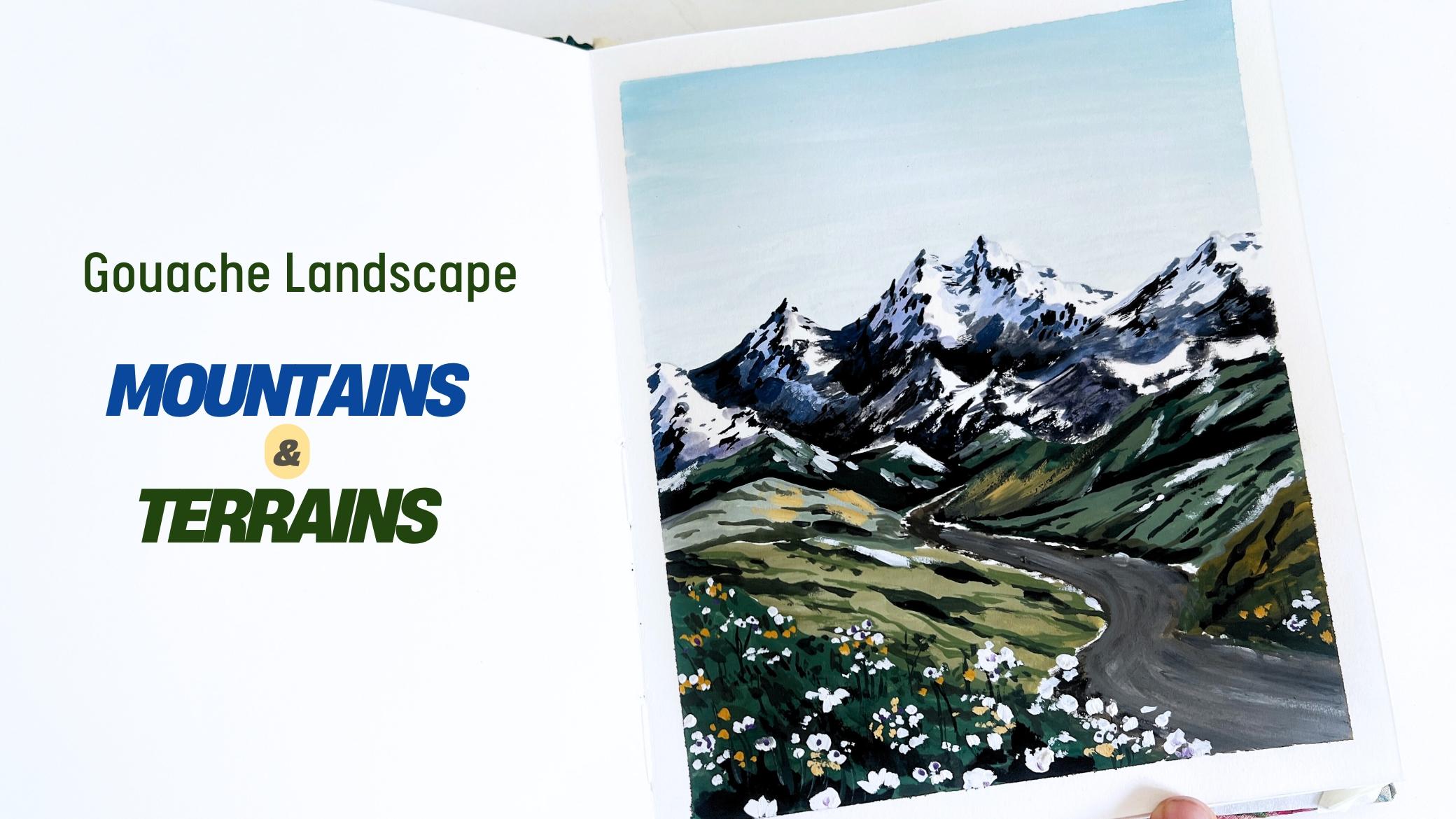
1. Introduction to the class: There in the Skillshare class, I'll be teaching
you how to paint a gorgeous mountain landscape with stunning terrains and
lovely flows using gauze. I'm Shannon Sihan, an artist and art instructor
from Bangalore, India. I have been painting for
over seven years now, and I absolutely love
creating landscapes. You can check out
my Instagram page Watercurs for art updates or explore my previous gauche and watercolor classes
on Skillshare. In this class, I will cover all the key techniques you
need to paint mountains, terrains, and other
beautiful elements. We will start by practicing each component to
build our skills, and I'll guide you
with detailed step by step instructions to make the process smooth
and enjoyable. So let's dive in
and start painting.
2. Art supplies: Before we begin with the class, I'm going to walk you through
the art supplies needed. Let us start with colors. I have art philosophy, set of 24 gauche colors. I'm going to be
using these colors. First is deep green, ultramarine blue,
burn tamber, black, cerulean blue and yellow ochre, you could use any similar
sheets that you already have. And also, we would need white. I'll be using white by
Brostro And for paper, I'm using this sketchbook. This is handmade
sketchbook that I bought from a local
store in Bangdor. The texture of this paper is very smooth like
hot press paper, and the thickness is also good, like almost 250 GSM. You could use any acrylic or watercolor paper
for gauche work. That's completely fine. And we would need a masking
tape to tape down all sides and give
a nice border. Next, coming to brushes, we have size nine round brush, size four round brush, and size one round brush. And also, I'll be using this
Brostro fine liner 30 brush. And two jars of water for
cleaning the brushes. And we would need a napkin
and a tissue paper for wiping the extra water and also to perform
certain techniques. And then we have this palette
for mixing the colors. You could also use a
plate for color mixing. All right. That is it
with the art supplies. Next, let us move on to
practice some techniques.
3. Techniques and practice: In this chapter, we will go over the key techniques and
elements of the painting. So I'll be focusing
only on practicing the elements that are present
in the final artwork. So if you are new
to this medium, I would recommend you check out my older classes on Skillshare, where I have shared all the techniques and
differences in detail. All right. Let's dive in. Let's start with the sky. The first element that we
shall practice is the sky. I want my sky to be slightly
lighter muted blue color. So I'm going to
take cerulean blue, add a little bit of burnt amber. This will help to mute
down the vibrancy of the color, making it diffused. And then I'll add
lots of white to it. The consistency of the paint should be smooth and buttery. When you apply it on the paper, it should glide like butter. So if you find it hard
to move your brush, then it means that you have
less water in the paints. And it shouldn't be
too watery also. Make sure you get this
right consistency. Now you can observe the
paint glides like water. Now I want to create a
slight graded effect. I'm adding more
white as we go down. Watch the brush and
add more white. This will create a
nice graded effect. In the painting,
you can see we have this nice graded effect, right? Another method is to first apply the flat watch
completely same color, and then you can go back and add more white or darker color on the upper and the lower part. I'm sharing this
alternative method to make the process look easier. If you could follow
the previous method, that's well and good. Next, let us paint
the mountains. So I'm going to mark
the basic shape, something like this,
inverted V shape, and then to mark the
dimension in the mountain, I'm going to divide it into
two parts, like a wavy line. One side represents the light, another side
represents the shadow. Then we will draw another set of mountain on the lower part. Let us mix the colors needed
to paint the mountain. We'll start off with
two pastel colors. One is, bluish pastel and another one is
volety pastel color. You add white to the
blue and violet color. We need this color to
paint the shadow side. Take this color in
creamy consistency. Apply the paints on one of
the sides of each mountain. So choosing left side
for the shadow part, which means the light is reflected on the right
side of the mountain. Here, light plays the major role in overall appearance
of the mountain. We're going to apply
this fatal color on all the mountains here. Okay. Applying light and shadows creates a three dimensional
look in the mountain. Now we will switch to slightly lighter tonal value by adding white to the
respective colors. This gives a lighter
tonal value, right? Now apply this color, creating a layered effect on
the mountain shadow part. We will further add some
more white color to the existing mixtures and
make it even more lighter. I'll also apply this light
mix on the other side, which is on the highlighted
bright side of the mountain. Now take black or
darker blue colour. With this, we will paint the darker textured effect on the lower part
of the mountain. A once you're done applying darker color on the
lower part of each mountain, we will then add it on the peak or the upper
part of the mountain. When you're applying the
paints on the upper part, just keep it very minimal. A few lines or dot will do. We will also add
this black color on the lighter section
of the mountain. Now let's create some
textured effect. So for this, you can
take some color, wipe off all the extra colors on the tissue paper or napkin, and it will create this
nice dry brush effect. This will create a nice textured snowy effect
on the mountain. Here, the key elements
are shadow and highlight. This creates a very
nice contrasting effect and makes the painting
very appealing. Next, let us practice
the slopy terrains. I'm going to mark two slopy
areas, something like this. Next, you can take any green
color to block the area. This is called color blocking, where we first block the area
with one particular color. Then we go back and add the
shadows and highlights. For the next terrain, we will use dark or green color. You could use any green color as the base color
to block the area. Let's add some more
terrans on the other side. Okay, so now we have
blocked the color. We will have to let it dry. If we apply the next
paint on the wet surface, it is not going to create
the desired effect. So let it dry first in order to get nice
and crisp results. So for the terrains,
I'm going to use different tonal
values of green. So here you can see this is
very darker green color. Then we have this mid green. Now if we add more white, it becomes a lighter
tone of green. So you have to understand
different tonal values. Maybe you can prepare
the color mixes. Now for this particular terrain, I'm going to add
lighter highlights. So I've used a
light green color, pastel sort of green. Next, I'll add darker green. For darker green, I'm mixing
deep green and black, which gives me a very
dark foresty green color. I'll use this darker color
to create slopy lines, which will create the
impression of terrain. No fixed method or
anything as such. I'm just randomly
adding the lines. For the upper color block, I'm using a different color. Here I'm using lighter green. Now for the terrain
on the right side, I'll use almost black color to define the shape
of the terrain. The key element in painting the slope terrain is to use
different tonal values. Next, let us paint the flowers. So to paint the flowers, we need to have a base
color, which is green. Let the base area dry. Next, I'm going to add some grass blades in
the color blocked area. So using black. Next
using darker green, adding some more grass blades. Now take white for the flash. If the paper is wet, it may not create crisp effect. So let's wait for
the paper to dry. I'm going to demonstrate it on the upper terrain
that we have painted. You can simply dab the brush, creating the
impression of flaws, or you could individually paint the flash,
that's up to you. But I'll be just dabbing the
colors in different sizes, creating the
impression of flowers. Next, we have pathway. So for pathway, we'll just
draw two curvy lines. So for the pathway, we'll be
using a mixture of black, burn tamber, and white. In the main project,
you'll see how I will go back and forth painting the
pathway, but that's right. I still wanted to
include this section in the practice session because I want you all to
practice at once. Around the boundaries
of the pathway, we will dam the brush, creating these
dotted impression. These dots, such as the presence of snow around the pathway. All right. That was all about the techniques and
the painting element. Now let us move on to
the painting project.
4. Skecthing: So let us begin the
painting process. I'm going to tape down the
paper on all the sides. If you don't want to
use masking tape, you could also use
paper clips on all the four sides so that it doesn't buckle
up while painting. All right. So I'm done with
taping down all the sites. You can run your finger over the edges to make sure
it is tightly sealed. Next, let us move on
to the sketching part. Take a pencil and let us mark the composition
of the painting. I'll start with two dots
in the center and then draw a curving pathway
from those two dots. So this is the pathway leading towards the
background mountains. No. Around this pathway, I'm going to mark the area
for the slope terrain. This represents the midground
and the foreground part. And from the center
of the paper, I'll start drawing
the mountains. The ones I have drawn so far are the midground, sorry,
midground mountains. Next, in the background area, we will draw the
mountain shapes. First, mark the basic shape and then we'll come back and add all the dimension
to the mountains. Coming back to the
slope terrains, I will mark the shadow
areas using pencil shading. This is just for my reference. If you don't want to do
this, it's completely fine. Now, let's go back to the mountain area and add
some definition there. Currently, what we have drawn with that mountain
appears a bit flat. You can see there is
no dimension to it. So to make it more dimensional, I will divide them into
shadow and highlight areas. One side will be
illuminated by sunlight, while the other
will have shadow, which will create depth and
more realistic look. So
5. Sky: Moving on, let us take
the colors needed. I'm taking multiple
dolops of white paint. This is just to have easy access to white whenever I need. The next color is deep green. This is a very
darker green color. If you don't have this color, then you could mix
a regular green with some brown and black. Next, I have burned tamber. This is a warmer brown color. And next color is black. For sky, I'm going to
take cerulin blue, and then I'll mix it with white for a lighter blue colour. All right. Now let's
start painting. Take a small amount of cerulin blue or any light
blue that you're using, and we will mix it
with white colour. Okay, so the brush
that I'm using here is size ten round brush. I want the sky to
be very minimal. Hence, I'll be adding more
white to the blue mix. And to diffuse the
brightness of the blue, I'm mixing a little bit
of burnt tamber to it. So now you can see this
muted bluish color. All right. So apply
this color for the sky. I'm simply applying
horizontal brass strokes. Try to seamlessly blend
it into the paper. If your brush is not moving smoothly and you're finding it difficult to cover the area, then you can apply some
water to the paint mixture. Then it will glide like butter. So that's one tip
that you can follow. Your paint consistency
matters a lot. Now carefully apply the paint
around the mountain area. Before moving on to
the next section, make sure the sky is painted smoothly without
any patchy areas. If you have a very
dark or a patchy sky, all the attention will
go towards the sky, which is not what we want. We want the focus to be on the mountains and the
foreground areas.
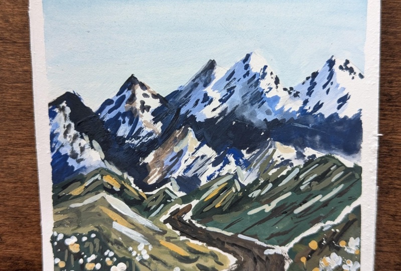
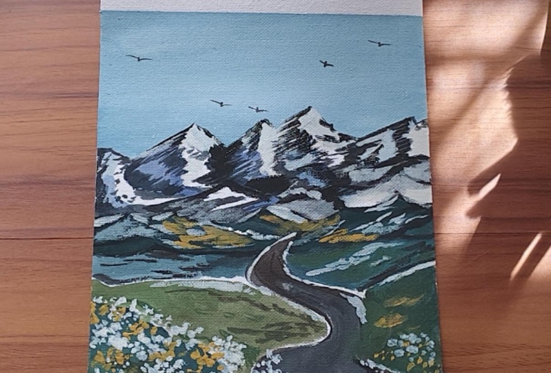
6. Mountains: Okay moving on, let us
paint the mountains. So you can take any violet
or purple kind of color. Take small amount of
let and any blue color, I'm taking cerulean blue. Mix it together to form
a bluish violet color. Now to this mix, I'm adding white color. So you can see it has created this bluish purple pastel color. Apply this on the shadow
side of the mountain. Next I'll also take
ultramarine blue. Now you might wonder that the
snow is in blue or purple, then why are we
using these colors? The fun fact is
that the shadow we are painting is still
technically white, but due to lack of light or direct light hitting on the surface
of the mountain, it takes purple or bluish
color on the shadow area. You will see the purpose of this once everything
comes together. For now, just trust the process and follow the
instructions as we paint. I'm going to apply a combination
of blue and purple on the shadowed sides of the mountain while also leaving some areas
for the highlight. Trust me, it will come together
beautifully at the end. I'll use lighter version of these blue and purple shades to blend them into the paper. Add more white and
make it lighter, then apply a few brtrokes over the purple or the blue color that we have already painted. This step will create
a nice variation and organic appearance in the
shadow part of the mountain. So I'll do this step for all the mountain shapes
that I have drawn. Make sure all the
shadows fall on the same side as the sunlight will be coming from one
particular direction, right? So visualize how it
would look and ensure the shadows are consistent
with the light source. Next, I'll take
very lighter tone by adding white to the blue mix, and I'm going to apply few bras strokes on the
lighter highlighted side. Next take ultramarine blue
and mix it with black, making a very dark blue color. Now, use this color mix to paint the darker surface
area of the mountain, which is mostly on
the lower part. When painting this,
try to create a textured effect by
using thick paint, which is dry on dry technique. This will help achieve a more realistic
textured appearance on the mountain surface. One easier way to
get textured effect is wipe off the excess
paints from the brush. At this point, I can understand how you might feel a
bit confused about which mountain shape
to continue with and how the shadows and
highlights are coming together. It can be tricky, and honestly, it happens to me too sometimes. I think it's completely
okay as long as you maintain a balance between
light and shadows. Your mountain
shapes might end up looking different from
what I have created here, and that's perfectly fine. Try to focus on having at least one or two
prominent mountain shapes, and for the rest, you can
blend them into the background or add whites or grays later. So now on the upper part
of the shadow area, we will add few
tiny brush strokes. This will depict the
uneven appearance on the mountain shadow area. I'll repeat the same step with the darker blue or almost
like a black color. So there isn't any specific rule or pattern to follow here. You can just apply
some dotted lines or some diagonal lines to create a sense of flow and momentum in the mountain
shadow that you're painting. I think you have got
the idea now and you can see how the mountains are
starting to come together. It doesn't look like blue
or purple anymore, right? Isn't it beautiful how
everything is coming together? That's why it is so rewarding
to trust a process. Apply some tiny lines and dots around the
intersection area. This will help us create a nice transition rather than
having those sharp lines. Next, let us further
enhance the darker areas so that the lighter areas
get even more highlighted. There is a saying that goes, if you want to highlight
the lighter areas, don't just add more white. Instead, you should add darker
colors around the object, which will allow the white to stand out and naturally
be highlighted. I'll also add some
tiny black dots on the white section as well. That will ensure that the white
section also is a part of the entire mountain rather
than a separate entity. Moving on, we will paint
next set of mountain. So here, I'm going to use darker color and dry
on dry technique. I'll glide my brush, creating the textured effect, leaving the white spaces to depict the snow part
of the mountain. Next, I'll take diluted
black sort of color, and I'm going to cover the white areas on the left
side of each mountain. A Next, I'll go over the edges
of the mountain and add some tiny dots using black color to give it a
sharper, more defined look. This will enhance the
overall structure, giving the mountain more
depth and dimension. I know painting the mountains are a little time consuming, but I think it's worth
all the efforts. Switching to a
fine line or brush and adding some details
around the peak. It is always helpful
to step back and view the painting
from a distance. This gives you a fresh
perspective on where you can add more details or see
if anything is missing. Personally, that's how I
like to correct and improve my work by observing it from different angles and making
adjustments as needed.
7. Mid Terrains: Now moving on, let's focus on painting the
midground mountains, which are non snowy mountains. Okay, so I'm going to mix a very dark green, almost
looking black. To do that, take green
and a bit of black. Once you have a very dark green, apply it to the mountains
we have already drawn, making sure the color reflects the shadowy deeper
tones of the midground. I'll focus on the slope
areas one by one for now, starting with this midground
darker green area. Take your time to carefully apply the green on the slopes, paying attention to how it naturally flows
along the terrain. This will help create
a sense of depth and contrast against
the lighter areas we have already worked on. So leave a tiny space
for the pathway. These are the mountain ranges on either side of the pathway. Once the darker
green is painted, we can go back and
enhance the shadow of that terrain by adding
some black colour. This will help to deepen
the shadow areas. Now to the same dark green
color that we mixed earlier, I'm going to add some white, which will give me a
sort of pastel color. Now, to make it a
little more warmer, I'm going to add yellow ochre. Yes. Okay, so take yellow Oca and mix it
with the existing mix. It should look
something like this. I'm not sure of the color name, but you can do your
own trial and error, and it's fine if it
looks different. You don't need to follow
every step exactly as I do. If the colors you're using are a little different,
that's perfectly fine. Art is all about expression
and making it your own. So just go with what
feels right for you. So that was the midtone leo. Now I'm going to take white and add some highlights on
this mountain range. Remember to enjoy
the process and not get caught up in making
an exact replica.
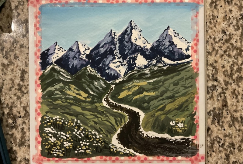
8. Pathway: Moving on, let us
paint the pathway. So for that, I'm going to use a brown color. It
could be any brown. I'm going to use burn tumbo and a tiny bit of yellow ochre. Take this color in
thicker paste form, and we're going to start from the midground and come
towards the foreground area. And while you're painting this, leave some tiny spaces
around the boundaries of the pathway to depict
a snowy accumulation. Then I'll fill up this
area using gray color. For creating this gray mix, you can take black brown
and more white color. Around the boundaries
of the road, we will add this textured effect using slightly dry brush. Moving on, we will paint another section of
the slope terrain. So I'm going to use a pastal
green color for this. First, we will block the area
with one particular color. Then we can add the shadow
and highlights later on. Moving on to the right
side terrain here, I will use slightly
darker green colour. I'm going to mix a
new mid green color. So I've taken deep blue, a little bit of yellow
aqua and white. Okay, let's fill in this block. It's okay if the shade is
slightly darker or lighter. Doesn't matter much. Okay, so we will leave it here
for now and then come back and add more
details once it dries. Moving on, I will use a darker brown color to add fine details
around the pathway. So the white gap that
I'm leaving will represent the patches of fallen
snow along the roadside. A towards the area near the foreground, we will create some
random pattern. Use darker colors to
create these marks. Here I'm trying
to add a sense of natural appearance
in the pathway. Y.
9. Color Blocking the Terrains: Next, we will add some
dimension to the slopy terrain. So I'm going to mix
a darker green color by taking deep green, black, and a bit of brown. So we'll mark the lines in
the same slopy direction. Now take the same
mixture and add a bit of yellow offer to create
a warmer shade. Okay, so this shade
we will apply along the boundary line to add a
sense of depth in that area. And as we move upwards, we will add some brush
marks to create a sense of continuity I will repeat this on the left side
terrain as well. You just have to create some
random slopy bra strokes. There is no specific
pattern or rule as such. Next, let us mix another green color for a
different slopy terrain. So let's take more of yellow ochre and less
green this time. Then I'll add white to make it slightly muted or diffused. I'll apply this color on the mid section
of the left part. So I feel that this color is almost similar
to the pathway. So I'm going to add more
white to this color mix. Okay, so we have almost blocked this area with the
pastel olive color. Moving on to the right side, I'll apply a mix of
different colors here. Moving on to the left
bottommost part here, I will apply very
dark green color. So I've taken darker, deep green and black Fill in this area completely. M,
10. Adding Depth to Terrains: Once this is done, we'll go back to the older areas
that we painted. So now I'm going to paint
the olive green part. So for that, I've mixed a
darker olive green color. Next with this darker
olive green mix, I'm going to paint
the slope lines, creating a sense of direction
and flow for this terrain. I'll also add in some dark tones using darker green color. Adding some thicker brush marks. Further adding some dimension
on this brown slope area. Next, let's mix green and black. Take this darker green mix and let's paint
the grass blades. So you just have to apply some diagonal and
vertical lines. This darker or black green
colour grasses creates a nice sense of contrast
against the green background. I'll go back to all the
sloopy terrains one by one, and I'm going to add details using darker and
lighter respective colors. Next, I'm going to add some
details on the pathway. So I'm going to use thick
black color in dry format. And as I glide my brush, it will create this
textured effect, creating a nice sense of depth and contrast
in the pathway. H.
11. Flowers and Final Details: Next, I'm going to
paint the flowers in the foreground slopy terrain. So for that, I'll use
thick white paint. I'm going to create the
flowers in different sizes. If you're not sure
about the shapes, you can just simply dab the brush creating the
impression of flowers. At this point, do not worry
about creating the stems or leaves of the plant.
We'll do that later. Just dab the pointed
tip of the brush. And if you want
bigger sized flowers, you can apply a little
more pressure on your brush that will
leave bigger brush marks. Now take black or
darker brown color to paint the stems or
the leaves of the plant. Here I'm using a
pointed tip brush and painting some vertical lines
under the white dotch Oh. Next, I will paint some more
yellow colored flowers. So for that, I will take yellow ocher and a
little bit of white, making it a sort of pastel hue. So now apply this color
around the foreground area. So we will have a nice mix of white and light yellow
flowers in the foreground. The midground terrance we painted earlier
looks a bit dull, and I feel it is missing
those darker shadow colors. So I'll go back and
add darker shadows and some contrasting
colors to enhance the details and make it look
more complete and refined. So this is one step that I
always follow while painting, which is looking at
the painting from a distance to see if
anything is missing. I'm not sure if I need to add anything to make
it look complete. So this is the stage. So I want you to
observe your painting. If you find it hard to evaluate, then you can take a picture of it and see how it
looks to your eyes. That's one great way of figuring out what
your painting needs. I'm going to add
some yellow around the midground area to create
a sense of warmth and a seamless transition from the cooler mountains to
the warmer foreground. I will add some white paint to the peak and upper part
of the mountains in the midground section because the same snow that is there on the distant mountains
continues here as well, right? So to create that continuity
and smooth transition, we're applying white paint
on the upper areas alone. Then I'll also add
some white paint to the pathway for a
consistent effect. But if you feel your pathway already looks perfect,
then don't touch it. So I have this tendency
to go back and forth, sometimes ruining things
which isn't always good. Right now, I regret adding this white paint in the pathway. So I'm going to go
back and fix it. But if your pathway looks good, keep it as it is. So one thing I want to share is I am not perfect at painting. I'm always learning, making
mistakes and growing, but I want to share the joy
of the painting process. I don't know if I'll
ever be perfect in this medium or any other
medium, but that's okay. I will keep painting and sharing the process
with you guys. So bear with me if I'm not
perfect at teaching either. So here I just used a clean damp brush to blend
all the colors together. And Voi, it looks nice.
I'm happy with it. Next, I'm going to add some more flowers or
enhance the existing ones. So use thick white panes, and let's paint the flash. If you feel the flowers
look dull after drying, you can apply another coat of colour over the same flower. Okay, so we are done
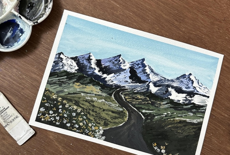
with this painting. Now let us peel off the masking tape and
reveal the final look. There you go. This is how
the artwork has turned out. I hope you enjoyed
painting this with me. Do share your class
projects under the projects gallery, right? It
12. Thank you :): Hi again. Thank you so
much for joining my class. If you enjoyed it, please
leave a review and share your projects in the projects gallery or tag me
on social media. I would love to see
them. Lots of love. See you soon. Bye bye.
 Shanan Subhan, Watercolor/Gouache | Art Educator