Transcripts
1. Introduction - Atmospheric Landscapes : I wanted to paint
the magic of nature, flower filled meadows
fading softly into mist, delicate grasses in the foreground and serene lakes holding quiet reflections. Hello, I'm Shanan Subhan, a watercolor artist
from Bangalore, India. I'm so glad you're here. Welcome to my
Atmospheric Landscapes, a seven day painting challenge. In this class, we will
explore how to paint dreamy atmospheric
watercolor landscape. Over the course of
next seven days, you will learn how to paint flower meadows with
misty backgrounds, delicate grasses,
calm lakes with reflections and use
aerial perspective to create depth and distance. This class isn't
about perfection. It's about showing up daily, experimenting and letting
watercolors do its magic. Beginners can absolutely
attempt these projects while more experienced artists will discover new ways to
expand their practice. By the end of the
week, you'll have seven finished projects and a stronger foundation for creating atmospheric
watercolor landscapes. So grab your brushes, set aside a little
time each day, and let's paint together.
I'll see you inside.
2. Overview of the Class: In this class, here's how
our journey will flow. We will begin by going over
the art supplies you will need so that you're clear on what to gather before
we start painting. Each day, we will start
with the reference image. We will look at it closely, understand the approach, and decide the flow of the painting. Before jumping into
the main artwork, we will create a small
thumbnail sketch and even paint a
mini version of it. This helps us see if the
colors work well together on our palette and gives us a chance to practice
the composition. We will also swath the
colors and go over the techniques we can incorporate
in that day's painting. Then we will move on
to the main project, painting step by step. Along the way, we
will make choices. Sometimes we'll skip parts
of the reference photo. Sometimes we can
change the colors because painting isn't
about copying a photo. It's about interpreting
it in your own way. My goal is to make this process liberating and therapeutic. Not about chasing
100% perfection. I'll share my way of
approaching these projects, but you're free to take your own steps and add
your own creativity. I'll be attaching the
reference images with each project so you can
follow along easily. Are you excited for this class? Come, let's begin our seven day Atmospheric
watercolor challenge together.
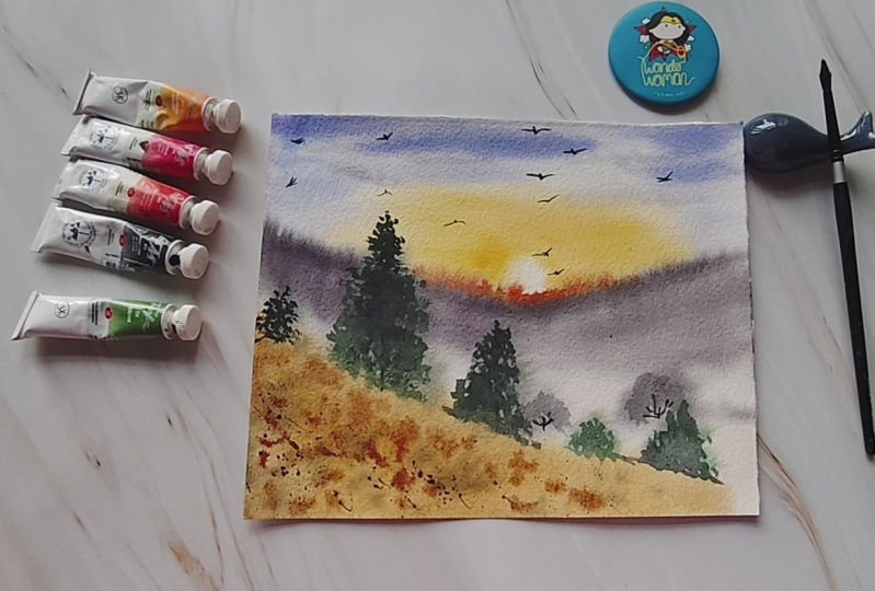
3. Art supplies: Before we dive
into our painting, I'll walk you through supplies that I'll be using and remember, you can always adapt them to
whatever you already have. Let's talk about paper. I'll be using
Chitrfu 100% cotton, 270 GSM, watercolor paper. It has nice textures and it
is ideal for landscapes. You can also use cold
press or hot press paper. Anything available
to you works fine. Next, let us talk
about the brushes. I'll be using these
four brushes. First one is the mob brush. This is for wetting the paper
and for the larger washes. Next, we have round brush. This is size 12 for
bigger brush strokes. This has a pointed tip, which is good for some
control and detailing work. Then we have size
eight round brush. This is for medium
sized brush strokes and size two round brush. This is my detailer brush. You could use any fine liner
brush that you have Okay. Flat brushes are also fine, if that's what you prefer. And moving on, let us
talk about the colors. So I keep my paints stored
in this air tight container. I'll be using a mix
of brands like seno, major lomion, white knights, art philosophico, et cetera. Before each project,
I'll show you the exact colors and swatches. So you don't worry if your
shades look different. What matters the most
is the technique. And white gauche paint for creating the highlights and some opaque touches
in the painting. If you don't have
white gauche paint, you could also use
white watercolor that will also have
some opaqueness to it. Some other tools that we
would need are spray bottle. This is to re wet the paper in certain areas during
the painting process. We would need masking tape and
a clipboard sort of thing. I have this glass sheet for placing my paper like
this using masking tape, and that will help me to keep the paper intact during
the painting process. Next, we would need
some napkins or tissues for lifting the paints
and wiping the brushes. Then we would need pencil
and eraser for sketching. I have this kneading eraser, which will help me to lift off the pencil marks on the drawing. I'll be using two
jars of clean water. One is to take clean
water for the washers, the initial washes,
and the other one is to use it for
cleaning the brushes. The brush gets dirty
during the process. So I'll be sticking to only one jar for
cleaning the colors, and for the clean washes, I'll be using the clean jar. Alright? Yeah,
that's pretty much about the art supplies that I'm going to
use in this class. You can use any similar
supplies that you already have. Let us get started with
the first project.
4. Day #1 Thumbnail and Practice : Hello. Here is the
reference image that I'll be working from today. It is a sunset scene,
as you can see, but instead of using the strong
orange and yellow tones, I have chosen to keep the
palette very soft and muted to create a calm
atmospheric mood. You will notice there are
grasses in the scene. I'll be painting them
in several layers. The mid layer will
stay blurry and muted to suggest a
sense of distance, and the foreground
grasses will be sharper, giving depth and focus. We will also include some
birds in the painting. There are also hints
of wildflowers, which we will suggest with
loose and simple strokes. Before we jump into
the full painting, let's start with a
thumbnail sketch. This helps us quickly
decide composition, placement of elements,
and overall flow. Remember, this is not
about making it perfect. It's just a guide for ourselves. To begin, I'll make a quick thumbnail sketch with pencil to map out these layers. So first, we have the sun and then the blurry wild grasses. So these grasses will be
painted with wet on wet. And then in the foreground, we will have the
sharper wild grasses, which are in focus. A Now I'll make a small colour thumbnail. This is where I test
the muted palette and see how the shade works
together on paper. So I'm going to start
by wetting the paper. So this will set the
base for the painting. I'll paint the sunset
first with yellow color. This is permanent yellow. This yellow will look much
lighter once it dries. Next, I'll take violet
and paint gray. This will create a gray with
the mild violet undertone. Apply this gray around the sun and make sure
to blend it well. We don't want a patchy
appearance around the sun. Next, for the upper
part of the sky, I'll use diluted cerulein bloom. So you can compare
the two skies. I have changed the approach here by adding the
blue color on top. Next, let us paint the
midground wild grasses, which are in the blurry format. So to create the blurry effect, I'm going to use wet on wet and cover the lower
area with the same paints. Once it dries, we will then add the foreground
wild grasses. Now, using darker color, we will paint the grasses in a very sharp and
detailed manner. These are the grasses
closer to the viewpoint. So they appear in focus. So one thing I have observed is that the background grasses, they appear much dull and
do not hold their shape. So we will use
slightly darker color when we are working
on the main painting. That way, it will
dry slightly darker. Next let us have a look at
the colors that will be used. First is cerulean blue. You could use any
other color like cobalt blue or sky blue. A similar color that
you already have, you'll be using mid
tone of this color. Next, we have violet. This is to mix with the
gray color of the sky. Next is burned tamber. I'll be using this
for the grasses, both in the blurry
and sharp format. Next is Payne's gray. This is for the sky as
well as the grasses. Ultramarine blue. I'm planning to use this for the grasses to bring in a sense of variation
in the color. And next is permanent yellow. You could also use cadmium
yellow or any warm yellow. Do not use lemon yellow. That's a cool yellow color. Alright? Then we will also
use white gauge paint. This is for adding some
final white highlights. Okay, that was about the colors. Next, let us practice
the techniques. First, wet the paper. We will practice the wild
grasses in blurry format. Okay. So I've wet the paper. So to achieve the right
amount of blurriness, your paper should
not be very wet. Wait for some time when
you are painting this. Initially, what happens is, if the paper is too wet, the colors will spread out
and not retain its shape. So try to have the moisture
level somewhere 50-60%. Let the paper absorb the water and the
slightly darker color so that even after drying, they hold the shape and still appear like wild grasses
in the background. About the shape, we will have to paint it in a
triangular manner. It's not necessary, but that will appear like grasses
in the background. Also, paint them in
different angles, some of them facing up, some facing right or left,
some facing downwards, so that we will have a mix
of all kind of shapes. If the paper has dried, it will not create
any blurry effect. You will get hard edges. So try to avoid that. And if it is very wet, it will spread out very wildly. We don't want that as well. Find a right balance. Next, let us move on to the focused grasses and let's start practicing the
stems or the branches. Use the tip of the brush for a very gentle and
delicate stems. And for the flower part, we will dab our brush simply to create the
impression like this. Try to approach it in a loose manner because
we can't be sitting and creating all these petals
or leaves one by one. Practice this on a rough paper. If painting loose
feels difficult, then you can draw it one by one. Otherwise, I would
recommend you to go for a loose approach that's quick
and also looks natural, but it requires practice
for this brush effect, we will vary the
pressure on the brush. At some areas we apply
very minimal pressure and some places we apply more to get these
varied brush strokes. Next, let us quickly have a
look at painting the sky. First, we will wet the
paper and I'm going to use yellow leave some white space in the middle to depict the sun. And around this yellow area, we will be painting with gray color for the
natural sky color. You could mix some violet with the gray to have a
violet undertone. And then on the upper area, we will add the blue color. So that's about the techniques and the approach
of the painting. Let us move on to the
painting process.
5. Day #1 Soft Sunset Grasses : Welcome to the class project. I hope you have
already gone through the techniques and
practice chapter and have a better sense of how we will be
approaching this painting. Firstly, let us begin
by securing our paper. I'll use masking
tape on the back of the sheet and stick it
onto this glass board. The paper stays in place and I can still move it around
easily if needed. Note that I'm not taping
down all the edges, so my painting won't
have any border. If you prefer a neat border, you can tape along all the four sides in
the traditional way. Okay, so let's get the paper
ready and start painting. I'll take my mob brush and start applying water on the
surface of the paper. Apply even coat of water
and make sure there are no pool or puddles of water on the surface
of the paper. If there is excess water, then you can lift it
off using a damp brush. Let us start painting. I'll take yellow
on the palette and mix it with about 50% water. Take a napkin and wipe
off all the excess paint. We want only a little amount
of paint in the brush. Imagine a small circular
shape in the center. Apply paints around that
to leave a white space. This will depict the
sun in the painting. Spread the color so that there
is no patchy appearance. We're trying to keep
the colors very minimal and not very flashy. Next, I'll apply slightly
darker tone of yellow. This will prevent it from appearing flat and
have a sense of depth. Next, let us take pains gray and mix it in
mid tone consistency. That is one is to one ratio. You'll apply it about
the yellow part. This was by mistake. My brush fell on
the yellow part, so I had to cover it up. Now, apply the pains above
and below the yellow region. Try to blend it with
clean water as well. I don't want this to form
a patchy appearance. Trying to blend as
well as possible. For blending, you can use clean brush and pull the paints in whichever
direction you like. I'll apply the gray paints in horizontal and slightly
diagonal manner. Leave some parts of
yellow as it is, do not apply any color over. Now for the upper
part of the sky, I'll use diluted cerulean blue, leaving some blank white
spaces for the white, cloudy effect in the sky. I'm trying and painting a
very minimal and simple sky. Nothing too dramatic over here. Take paints gray and apply it on the lower part of
the wild grass area. This will form the base for the grasses that
we are going to paint. It will act as the shadow or the darker section
on the lower ground. Now, move the brush
in upward manner, creating some vertical lines. These lines will
create the illusion of distant stems
or the branches. At this point, I feel
that the yellow part of the sky looks very
light and after drying, it's going to look
even more lighter. So let me apply paint some simple brush strokes over the existing yellow parts. Okay. Now let us
move on to painting the wild grasses in
a blurry format. For that, I'll mix three colors. One is burned tamber, other one is let, and the third color
is paint gray. I'll have these
three colors ready. We will be switching
between these three colors. So I'll take brown first. Now let's paint the
grasses wet on wet. We have wet paint and wet paper, so it is wet on wet technique. You can switch to a
smaller size brush. I'm taking my size
eight round brush. And with this, it is slightly easier to
paint these shapes. I'm painting the grasses
in a loose random way. So you can just touch the
brush lightly to the paper, leaving some small gaps so
that it doesn't feel crowded. Try to keep overall
shape slightly conical, almost like a cluster. Since these are wild
flowers or wild grasses, think of how they
move in the wind. So leaning towards the right, some to the left, and
few standing upright. Wearing their
direction will make the painting look more
natural and organic. I'm using slightly darker
color in some areas because the lighter shades
tend to dry even lighter and can look a bit dull, like we experienced in
the practice session, how the background appeared very light and we decided
to go for darker color. And also, don't forget to
vary the size of the flash. Keep some smaller
and others taller. So that the group has a nice sense of
rhythm and movement. You can even apply some
tiny dots in between as filler elements you need to finish this step while
the paper is still wet. If the paper dries up, you will get hard edges. I'll paint a few grasses
on the upper area as well. Next, take a fine liner brush. I'm using size two round brush. With this fine liner brush, I'm going to paint the
stems of the grasses. A Now, let us splatter the
paint on the lower area. This acts as the filler
element inside this space. There is no fixed
pattern as such. If you observe nature closely, you will see it doesn't allow any fixed
pattern or formula. Its beauty lies in imperfection. It's completely
okay if it doesn't turn out exactly
as you imagined. I'll be adding some
random lines and dots in the lower region so that
it looks fuller and creates a sense of depth in that area. All right. Now let us dry this. I'm using hair dryer to
speed up the drying process. You can let it dry
naturally if you want, or you can use the
hair dryer itself. All right, the paints
have dried completely, and you can see that they
appear slightly dull, which is fine because
we are going to build another layer with
the detailed grasses. All right. So let's paint that. I have mixed two
different colors. One is violet and brown, another one is violet
and paint gray. Okay, let's start. I'll be using size 12 round
brush with pointed tip. The pointed tip
will be helpful for me to paint these tiny dots. And whenever I want
thicker strokes, I'm going to apply
some more pressure on the brush that will create
thicker brush strokes. If you're not comfortable
with a bigger brush, you could use a
fine liner brush. The problem with using a
fine liner brush for this detailing is that it will
yield a specific result, all the grasses are
going to appear uniform or similar
in shape and size, which will in turn result in an unnatural appearance
in the painting. So to avoid that, I
would recommend you to use a bigger brush with pointed tip and try to vary the pressure as you
paint these kind of effects. As you're painting the
stems or the branches, apply very minimal
pressure on the brush tip. This will give us
very thin lines. Next on the lower area, I'll paint some grasses
with varied brush strokes. It's like painting
some wobbly lines. I don't have any fixed
pattern in my mind, just moving my hand and brush by applying more
and less pressure. I'll repeat the
same technique for the upper grasses as well. These are flowers
inside the grasses. Wildflowers, they are very
wild and unpredictable. So we don't have to follow any fixed pattern or shape here. As I paint this, I'll let you watch and
observe the process. Okay. Keep adding these vertical
and diagonal lines as stems and branches. I have already added
a lot of grasses, and I feel there's
something missing in the lower area of the painting. So I've decided to
add darker colors in the lower part so that it adds a sense of depth and shadow
in the lower region. I'll take paints gray and
apply on the lower part. Now to spread this,
I'll use water spray. Spray some water and let it
spread in the lower part. I'll take some brown as well. The paper is slightly damp
now on the lower area. Use the belly of the brush to push the paints
against the paper. Now, in the lower part, we can see a patch
of darker paint, and the upper area is lighter. So to blend them and create
a smoother transition, I'll move my brush in upward direction so that there is a nice gradation
from light to dark. Moving on, I'll paint
some more grasses. You can take any color. I'm taking violet
and paints gray, and now I'm using
fine liner brush. So with this, it is a little difficult to get
thicker brush strokes. But we can manage by
wearing the pressure. You can add as many
grasses you want, but know when to stop,
don't overdo it. Next, let us splatter some paints on the lower
region of the grassy part. I'm splattering darker
and concentrated paints. A more grasses on
the upper part. Sometimes I have this
tendency of jumping from one element to other without
finishing the previous one. I would not follow one
particular order of painting, and I would feel very
ashamed about it earlier. Now I'm learning to embrace
my creative process. That is my way of
painting things. I get excited in the middle
and jump onto other things. But at the end, I somehow managed to gather
all the pieces together. I'm sharing this
because I know some of you might be like me who
jump from one task to other. I just want to say
that I hear you, and it's totally fine. You don't have to
feel bad about it. Let's just embrace imperfection. All right, so you can see, I have added some darker
colors on the lower part, making the area intense. Also, if you observe, I have left a few tiny gaps in between suggesting
the reflected light. Now let us add some birds
freely flying in the sky. And some tiny birds
in the faraway sky. Now take white gauche paint
directly from the tube. You could even use white
gelpin if you have, and I'm going to drop in some white paint
on the darker area. This suggests the
reflected light on the leaves and the flowers, making it look attractive. You could even splatter the
paint in a random manner. Next, I'll apply some thin
lines using fine liner brush. Next, we'll take Gauche paint and mix it with the existing
paint on the palette. It will give us opaque
light gray paint. I'm going to take that
and splatter onto the darker area and some
on the upper area as well. The benefit of using
opaque paint on watercolor is that it will retain the
shape and the color. If you are splattering
the watercolor, that is a transparent color, it will not show after drying. So that is the
reason I have used opaque paints for splattering. Alright, we are done
with this project. I hope you enjoyed
painting this with me and had a fun
learning session. So let's remove the tape
and reveal the final look. Here we go. I really love how this painting
has turned out, soft, subtle, yet so
powerful in its mood. If you enjoyed and
painted along with me, please do share
your class project under the projects gallery. I would love to see
what you have created. All right. I'll see you soon in my next chapter
until then bye bye.
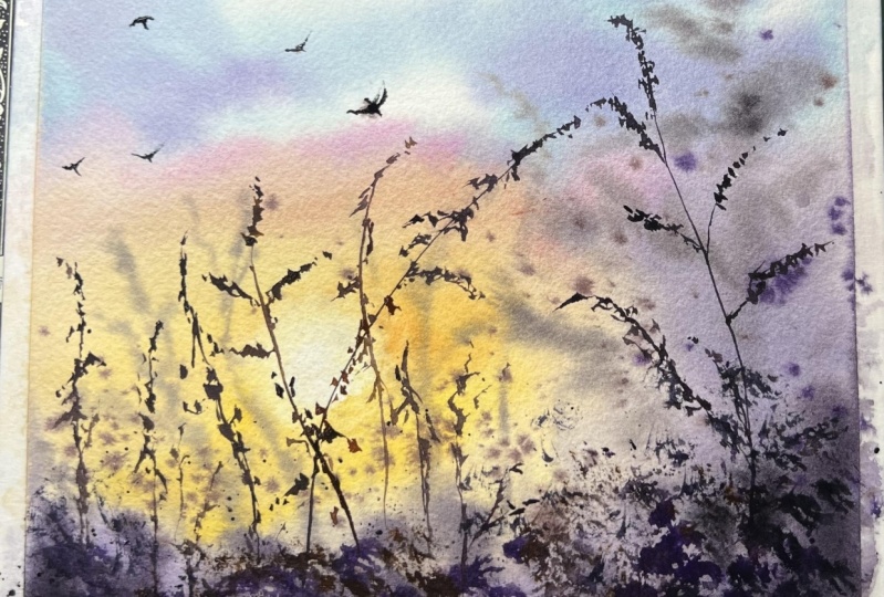
6. Day #2 Thumbnail and Practice : Hello. Today, we are going to use this image as
a reference photo. This is a very soft and
subtle sunrise scene. You can see the mist
around the horizon. Here, we will first paint the sun and then create
the sunlight around it. The same approach we will be applying to the
reflection as well. Next, we will work on the misty area and then add the trees along
the horizon line. Instead of painting
all the trees, we will include only a few to keep the
composition simple. In this section, you
can also see a fence. We will try to add
that at the end maybe. Notice how we can
separate the two layers. The distant one appears
slightly lighter in tone, like light gray color, which makes it
look further away, while the main tree in
the foreground is darker, making it appear closer to
the viewpoint or the viewer. This is how we build
aerial perspective by using various tonal values. Also, the tree has
orange color on the top, suggesting the sunlight effect. Alright. Let's try sketching
a quick thumbnail. I'll divide the area
into two section. So the line will be
in the lower half. The upper will be around 55 and the lower
part around 45%. So here we have
the horizon area. O this line, we will draw the mountain and sun
in the background. So where we have the
sun around that area, we have this sunlit part. We'll try to put our
focus on that area. Similarly in the
reflection part as well. We'll be drawing some trees
around the horizon area. Next, I'll draw another
thumbnail image and see which colors I can use. Sometimes we may not have
the exact same colors. So we can do some
trial and error on this smaller size thumbnail. I'm going to roughly paint
on this thumbnail part. I'll start with the sky and then paint the
other elements. For sky, I'm leaving this
negative space for the sun, which is very bright and paint around that
area using yellow, orange, and some pink. Then I think I'll paint
the reflection of the sky in water so that
it matches the sky next, the background
mountain area. So wherever we paint the
sun right below that, I'm leaving some space and adding brown or
orangish brown color. This is to suggest the
reflected part of the sky. Here I'm painting
it very roughly, but I hope you're getting the idea of what I'm
trying to achieve. Now below that, I'll
use clean water to pull the paints down to
create a misty effect. Now, repeat the same thing for
the water reflection part. You can take this whole exercise as your practice so that you get familiar while we are
painting the main project. Water control is one of the important aspect here because if you apply more water, you will not get
the misty effect. You need to have that balance
where in the mid section, we're applying more water
to get a soft misty effect, whereas on the edges part, the water is less. Then again, around the horizon, we will add a line, creating a separation
between the two areas. Now, while the paper is wet, we will drop in some darker
color to depict the trees. Also, let's not try to copy everything from
the reference image. We will only try to capture
the essence of the image. Now let's dry this area. So far, it was wet
on wet technique. Now, once the paper dries, then we will go with wet on dry. Now I'll paint some
trees using wet on dry. So when wet on dry, we get these sharp
edges in the painting. The element appears very
crisp and detailed. Okay, so this was a rough
depiction of the painting. Now, let's have a look at the colors that
I have used here. You can use any similar
shades that you already own. The first one is
permanent yellow, which I'm going to
use to paint around the sun in a very
diluted manner. Pick a warmer yellow
that you have. Do not use lemon yellow. Okay. The next color is Pyl red. I'll be using this color
in a diluted tone. So you could take any
other red as well. The next color is opera pink. You could also use
crimson rose pink, Cacdon pink or any
pink that you have. Okay, so the next
color is violet. And then pains grey. You could also use indigo if
you do not have pains grey. Next, we would need
burned tamber. You could also take
Bnciana or sepia. Any color that looks
brownish, next, let us try mixing some of
the colors that will be used for painting the mountains and the trees in the background. So when we mix paint
gray and violet, we will get this darker
gray with violet undertone. I'm planning to use this for the gray parts in
the background. The next color mix would
be burnt tamber and let. So this will again give
me a letty brown color. I'm planning to use this
around the transition area. We can mix all three colors
and get a very darker color. That's also one possibility. So yeah, these are
the color mixes. Next, we will practice
the techniques. So first, let's
practice the sky. I have wet this small
rectangle area. And I've taken permanent
yellow and a bit of red to make a warmer
orangy yellow color, leaving some white
space in the center. That white space
will depict the sun. Okay. Now we will apply orange and then pink on
the sides and corners. Creating a nice, beautiful sky. If your colors have spread
inside the white area, you could use a
clean tissue paper and lift off the paints. And let's say your yellow
is not bright enough, then you can add in some
colors and make it slightly vibrant because watercolors tend to appear dull once they dry. Moving on, we will practice the misty sunlit mountain
in the background. So first, let me paint
the sun and the sky. I'm roughly painting
this semicircular area depicting the sun and the sky. Around this area, I'm going to paint the distant mountain line. Now, if you observe
the reference image, on the corners, the
mountains appear grayish, but around the center area
where we have the sun, that area is sunlit, meaning it appears
orangish in color. So we will try to create that. On both the sides, I'm
painting with gray. Of course, it is roughly painted just for
practice purpose. And now in the center area, I'm going to paint it with
the brown and orange color. So once this line is created, we will try to pull
the paints down, creating a soft misty effect. We can wash your
brush so that you have nice and clean effect. Or if you apply more paints, you could take a
clean damp brush and try to lift off the paints. That is also another
possibility. So once we have the
basic shape in place, then we can try
to add more trees or some effects on the mountain. Now, leaving some white space, we will paint some trees. That will be trees
around the horizon area. So this is just a rough
depiction, as I said earlier. In the actual painting, we will take our own time to create all these effects
in the painting. Next, let us see how we
can create sunlit tree. For painting sunlit tree, I'll be painting with the darker color on
one of the sides, we will add some
orangish brown color so that it looks like the tree the parts of tree is
reflecting the light. You could also do
it the other way, which is painting the orange or the brown color first and then
adding the darker colors. That's also possible. So, that was all
about the techniques. Now let us move on to
the class project.
7. Day #2 Misty Sunrise Lake : Welcome to the second project of the seven day Atmospheric
Landscapes Painting Challenge. Today, we are going to
create this artwork. And here is a reference
image for this painting. I hope you have already watched the previous chapter where I have explained all
about thumbnail, coloring and the techniques that will be used
for this chapter. So let's get started. I'm going to apply
the masking tape on the backside of the paper. If you want a border, you could apply on
all the four sides. Once the tape is
applied on the back, I'll gently press the paper
against the glass sheet. Paper is ready to paint. Now I'm going to mark
the rough composition. So somewhere in the lower half, I'll mark the horizon line and then some area
for the ground part, roughly marking the trees. It is just simple
vertical lines. Not drawing the tree
shape as of now. I usually like to create
the elements as I paint because that gives me the freedom to change
the subject as I want. But if I have something
sketched or drawn on the paper, then I'll have to stick to it, which makes it very restrictive. So let's wet the paper. I'm using a mob brush. Apply generous amount of
water throughout the paper. Let the paper soak the moisture. Okay, let us mix the colors. I'll start from the sky. So for sky, we'll
start with yellow. Take permanent yellow in diluted
or mid tone consistency. Now, using size 12 brush, I'm creating a circular shape, leaving white space for the sun. Now spread the colors
around that area. We do not want a patchy
appearance around here. You could also lift the
excess paint around that area by pressing the
brush against the paper. The brush should
be a little damp. Next, I'm mixing yellow and red, creating a nice orange color. Apply the orange color
after the yellow part. For the pink part, I'm going to mix opera pink, a bit of red yellow,
and also let. I don't want very
vibrant pink here. That's why muting it down
by adding a bit of yellow. Apply this pink paint
around the corners. Apply yellow on the area where
you feel it looks lighter. Next, I'll turn around the paper and paint the
reflection of the sky. Next, I'll repeat the process
to create the reflection. We'll have to perform
the same steps that is applying yellow
in a semicircular manner, then adding orange around it. Then you can add the pink color. I have not fully applied
the paints because we are going to have the trees
in the lower section. The reflection doesn't have to be the exact replica of the sky. Now, turning the
board and then giving the circular shape because there was a little bit confused about creating the
circular shape. Now I can clearly understand
where the circle falls. Now, let us start
painting the trees. I have taken paint
gray and bit of volet. This gray color has
volety undertone. Now let's paint the trees. I'm dabbing the brush in
vertical to and fro motion, creating the shape of pine
trees in the background. This is the initial layer. We are going to build
multiple layers like this. So I'll apply the colors as
per the reference image, leaving the gap for
the sunlit part. Once the paints are in place, then we will take a clean brush
and pull the paints down, creating a misty effect. We will keep the area around
the horizon blank as of now. Do not apply any paints there. Next, let us paint
the sunlit area. I'm going to use orangish
brown for that area. So let's take burnt amber, yellow and bit of red. You could mix your
own orangish brown. Now again, I'm simply going to apply to and fro vertical
brushstroke motion. Apply some more
orangish brush strokes around the gray area as well. This will create a
smoother transition rather than having a sharp and
sudden change in color. You can see I'm simply
applying these vertical lines. Nothing complicated as such. Now take a clean brush
and pull the paints down. So this is pulling technique where we pull the paints
down using water. This helps in creating softer atmospheric
and foggy effect in the background areas. I'm lifting up the paints from the border areas so that
it looks clean and neat. Next, I'll take
paints gray and let mix and apply it around
the horizon area. This suggests the ground
part near the horizon. If you want to leave
more white space here for a denser foggy
effect, you can do that. Apply some thicker paints, creating a sense of depth. Then we will push it
upwards using clean brush. Have a tissue paper on napkin handy so that you
can wipe off your brush. Now, to add a sense of
variation in the misty part, I'll add some volety gray
around the mid section. Use a clean and damp brush to lift off the paints,
something like this. Now, let us paint the trees
around this horizon area. I'm using the same
violet gray color. You could also use
plain gray or indigo. It's up to you. I wanted this violet undertone
in my misty area. And darker tone of this gray color along
the horizon line. Now let's go back to the sunlit tree area and using orangish
yellow brown color, I'm going to paint some
trees around this area. This is to define the shape
of that particular area. Ending some trees along
the horizon line. Whatever tree you paint, same thing needs to be painted in the reflection part as well. We will create some sunlit
trees along the Horizon nine. There is no right
or wrong way here. You are just trying
to depict what you're seeing in the
reference image. So feel free to add your own
touches in the painting. Never hesitate to explore and try different
ways of painting. Next with paint
gray and let mix, I'm going to paint some
trees on the corner side. Paint it quickly. Be fast. You don't have to
create perfect shapes. Few quick zigzag lines will do. Don't have to sit and draw each and every
tree individually. Even these vertical
lines will do the job and then you can simply add some
zigzag br strokes. So what happens is, if you're
using 100% cotton paper, the paper will remain
wet for longer duration. But if you're using
a cellulose paper, the paper tends to
dry up very fast. In that case, you get hard edges in different
parts of your painting. For that, I suggest you
to be a little faster, especially with wet
on wet techniques. Adding some more trees
on the right side, on the tip of the misty area. Same thing for the reflection. If you feel there
are hard edges, you can blend it
with your fingertip. I'll introduce some
more new trees. It's okay you don't have to
do it if you don't want to. But I'll add more trees to add a sense of depth that will
make it more interesting. You can keep it minimal as well. You don't have to
worry about that. I personally feel that painting should be relaxing
and therapeutic process and not about rushing and struggling to
figure out things. You can create your own
version and be happy with it. With time, you will
definitely improve. These classes and tutorials
help you understand the painting process
and techniques in a better manner so that you
don't repeat your mistakes. With time, you will surely feel confident with
your painting skills. So don't rush
through the process. Here, I have added these
tiny rock like shapes. Sometimes I just add a few elements and leave it up to the viewer's
interpretation. Now, I'll use the
corresponding colors to create the ripple
effect in the water. You can skip this part as well. It's not mandatory to
create these ripples. We can also create still water sort of effect where we have
no ripples at all. The water is simply
still and calm. But here in this painting, I'm going to create them and add a sense of
movement in the water. Because if we
create still water, the reflection should be
perfect, close to perfect. I don't think I
have achieved that. It's better to cover it
up by adding the ripples. Now, if I observe my
painting closely, I see that it is of same color. So to add a sense of
contrast and depth, I'm adding darker color around the horizon so that we create a nice harmony and balance
effect in the painting. Take a clean brush and try to blend it into
the tree areas. I think I leave it here and not overwork on the wet layers. The paper is about to dry, so it might ruin the painting
if I work more on this. So let's dry the paper and come back and
see what we can do. All right, the paper looks dry. Next, let us move on to
add some detailing work. For details, I'll go with
wet on dry technique. The paper is dry and I'm
going to use wet paints. Okay. Let's start. Let us mix the colors. So I have mixed paint gray, more of pinks gray, and a little bit of
let and burn tumbo. Loading the pains in my
size two round brush, and I've painted the tree shape. Now for the sunlit
effect on the tree, I'll add orangish brown
color on one of the side. That is the left
side of the tree. When painting the tree foliage, leave some tiny gap in between blank spaces that will
create organic looking tree. Paint the trunk
and the branches. Using the fingertip, I'll blend the tree trunk into
the ground area. Next, I'll paint the
reflection part. So for reflection, I'm not
creating perfect tree shape. It will have some
rippled effect. Since I already mentioned, I'm not creating still water, so the reflection
can be distorted. It's totally okay. And around the tree, I'll add some fence like shape. Another fence in the center. A Now, let's add some ripples
using wet on dry. These ripples will appear
sharp and very clear. Choose the
correspondent colours. For gray areas, I'll use darker gray ripples and for
the yellow sunlit part, I'll be using orange ripples. Adding some pine trees
along the horizon line. So there is no fixed
number as such. You can add as many
trees you like. I'll strengthen the separation between the land and water. Adding some darker colors, make sure to add brown
around the mid sunlit part. Now, to soften the hard edges, I'll use clean brush and
blend it into the background. I'll take pink and orange and splatter the paints in
the foreground area. I have no reason for this. I just felt that it
was looking plain. So I thought of
adding the splatters, but I instantly regretted it. So lifted it off
using this napkin. Okay, so we are done with this. Let's clean the table and reveal the final look
of the painting. There you go. This
is how it looks. I love the soft misty effect
with the sunlit part. It turned out really
pretty, right? I hope this was fun and
therapeutic session for you. If you have any doubts, you can reach out to me on
discussion session below. If you have painted
along with me, please share your class project under the project gallery. I would really love
to see your artwork.
8. Day #3 Thumbnail and Practice: Hello, hello. Welcome back to the Atmospheric
painting series. For day three, this is
our reference image, and let's see how
we can simplify it. I'll start off with this
yellow color in the sky, adding some blue and orange
streaks in the lower part. That will be for the sky part. And the trees in the background, I'll try to create a blurry
effect using wet on wet. Then for the next
layer of trees, that is the darker
colored trees, I'll go with the
slightly darker color, maybe mix of wet on wet and wet on dry to show some details. And now for the reflection
of these trees, I'll be painting some distorted, like, simple horizontal lines. So yeah, that's about
the reference image. So let's try to simplify
it as much as possible. If you want, you can use this image and create
the detailed version. But this is how I'll
be painting it. Okay, so let's draw
a simple thumbnail. Marking the horizon
line and this is for the yellow part in the sky and the
reflection as well. Then some orange streaks
in the lower part. In the background, we have
these trees that appear bluish because of the
atmospheric haze. Show aerial perspective, use cooler color
or bluish color. That will depict a sense of
distance in the painting. And for the elements that
are closer to the viewpoint, use warmer or much
sharper details. Now I'm drawing these
midground elements. These are closer to the viewpoint when compared
to the background. So try to make them
little detailed. And in the foreground, I'll be drawing these little grasses. These are not our focus point. Our focus is on the
midground trees, so I'm keeping these
grasses blurry. Next, let us paint a mini
colored version thumbnail. So I'm going to wet
the paper first. Please don't mind
my messy palette. I don't like wasting colors, so I try to use them for muting down some vibrant colors
or sometimes for shadows. I'll first apply yellow, suggesting the sun in the sky and also suggesting the
reflection in the water. Now around this, we will
apply other colors like this orange for the streak in the lower part of the
sky towards the horizon. And in the upper
area of the sky, we can apply cerulean blue or some other blue as
well. Doesn't matter much. Next for the background trees, I'll be mixing ultramarine
blue and paints gray, and to make it opaque, I'll add white gouache paint. You could also add white
watercolor if you want, just in case if you don't
have white gouache. Applying the paints
in vertical manner. This will suggest the
pine tree shapes. Once that shape is painted, you can then go back and add tiny lines suggesting the
tip of the pine trees. Next, let us mix a
darker green color. For that, I'll take pinch
gray and olive green. So with this, we will
add the midground layer. First, paint the ground part
and then add the trees. For the reflection, I'll simply apply some sorry,
horizontal lines. This will suggest a distorted
reflection in the water. In the foreground area, I'll add these grasses. I'm trying to keep it
slightly blurry and out of focus because I want the attention to be
on the pine trees. On these grasses, I've added red color depicting the flowers. Let's see how we can do
it in the painting next. But before that,
let's have a look at the colors that we can
use for the painting. First color that I've
taken is permanent yellow. This is a warm yellow. I'll use this color for suggesting
the sun in the sky. Next for the streak that I
mentioned, I'll use orange. I don't have an orange
in the palette, so I'll mix red and yellow. Next for the sky, I'll take cerulean blue and
ultramarine blue. I'll mix these two colors, and it will also be used
for the distant tree line. Next, we have paints gray. I'll not use this
color directly, but I'll mix it
with other colors. Next is olive green. If you don't have olive green, you can use sap green and mix a bit of red or orange
to it to make it warmer. And for this project, we would need white gauche
paint to mix it with the existing paint and
create an opaque color. Moving on, let us discuss
the color mixing part. I'll be mixing cerulean
blue and ultramarine blue. This will result in
a color like this. I don't know what
this color is called, but it looks
something like this. Our next shade will be a mix of olive green and pinch gray. So when we mix these
two colors together, we get a darker green color. This color, I'll be using to paint the pine trees
in the midground area. Like I said earlier, if you
don't have olive green, you could use sap green and mix a bit of orange or
red or even burnt amber. And then to that warmer
green color mix, you can add pinch gray. It will form a
darker green colour. The next color mix
is ultramarine blue, paints gray and
white gauze paint. Here we are trying to
mix an opaque color. Why opaque color? Because it will cancel out the transparency
property of watercolor. And because of the opaqueness, it holds the shape in
the background area. But if you're using only
transparent watercolor, the trees might end up looking like clouds
in the distant area. Now let us practice
the technique. I'll be going with wet on wet. So first, let's wet the paper. During the painting process, we will already have the sky
layer as our background. Let's mix the color. That is ultramarine blue, paints gray and
white gauge paint. We have opaque color. Now apply this in to and fro vertical bratroke suggesting the distant pine tree shapes. Suppose you paint wet on dry, then this is how it will look. I'll choose wet on wet to
achieve a blurry appearance. That was our first layer. Now we will take a
darker tone and paint some trees you can paint
as many trees you want. There's no restriction on that. Sorry, if there is
any background noise, there is some construction
happening in the neighborhood. Next, let us paint the
midground tree layer. For this layer, let's use
darker almost black color. First, I'll paint the ground
part that touches the water. Then I'll add the trees. So now let's practice
painting some pine trees. I'll show you the easier
way first paint the trunk, then add the branches. Then at the end, you can add the leaves, make it look like conical
shape with irregular foliage. I paint pine trees
in multiple styles. This may not be the same time that I paint in
the class project. So you can follow along with me or you can paint your
own style of pine trees. That's totally up to you. Whichever style you
paint around that area, we will add some filler
elements just to make that area look dense and
build a sense of depth. You can add some lines and smaller sized pine trees
as simple filler elements. We'll keep the
reflection quite simple. Don't have to do any detailing. In the reference image, there is no grasses
in the foreground. But here, I have simply added them as an extra element
in the composition. You can skip it if you want, or you can add them.
It's up to you. Painting these grass
plates are very simple. Apply upward brastrok
in repeated manner. I'll not add much detailing over here because I want my main
focus to be on the trees. Then I'll use red colour
to suggest some flowers. This is optional as
well. All right, let us move on to
our class project.
9. Day #3 Calm Lake: In this project, this is
what we will be creating, and this is a reference
image that we have. I hope you have gone through the previous chapter where we
learn about the thumbnail, colors, and
techniques. All right. Let's begin by taping
down the paper. I'm taping it on
backside of the paper, like you have seen in
the previous chapters. If you want a border, you could tape it down
on all the four sides. All right, the paper is ready. Now, let's get started. Using my mop brush, I'm going to wet the
paper thoroughly. Apply generous amount
of water so that the paper absorbs good
amount of moisture. Next, I'll switch to my
size 12 round brush. Now let's mix the colors. I'll take permanent yellow
in mid tone consistency, and I'll apply it on
the planned areas. Upper one is for the sky. The below yellow area is
for the reflection part. Next around this, let
us paint some blue sky. For the blue sky, I'm going
to make cerulean blue, ultramarine blue and
white gauze paint. Make it diluted consistency and leaving some gap apply on the
top part of the painting. When blue gets
mixed with yellow, there are chances we might see
greenish color in the sky. So to avoid that, I'm leaving
this tiny white spaces. I'll apply second layer of
yellow around the same area. Now, let us mix yellow and
red, creating orange color. I'll apply this around the horizon area to create a
sort of streak in the sky. Now with clean brush, I'm softening the hard edges. Now on the upper
part of the sky, I'll add some grayish blue
color to suggest the clouds. Same goes in the
reflection part. Here's a gentle reminder
that you don't have to get exact same sky as mine. Moving on, let us mix
the colors needed to paint the
background tree line. Here, I'm mixing ultramarine
blue, paints gray, white gauche paint, and maybe
a tiny bit of eludin blue. Now I'll paint a straight line. This is the horizon line. Now press the belly of the
brush against the paper, move the brush into
and fro motion. By doing this, you're creating the reflection
at the same time. That was our base layer. Now let us add multiple layers to add a sense
of depth around this area. Paint the trees in
different sizes, keep some of them
shorter and some taller. When you look at this
tree line as a whole, you should have
different tree sizes. We need to make sure it
doesn't look uniform. Next, let us separate
the land and water. I'll use clean damp brush
and lift off the paints, creating a sense of separation. Use clean damp brush
and a tissue paper, wipe off all the paints that you have in the brush and
repeat the process. Next, we will paint
another set of trees with slightly
darker tonal value. So this time, take less
water and more paints. This is layering where we build multiple layers to
build a sense of depth. If your painting lacks depth, then it looks flat. Okay, so the background
tree line is done. Next, let us move on
to the midground area. I have mixed olive green and paint gray to make
darker green color. Use a tissue, dab off
the excess paints, and only have little
amount of paint so that you get nice control
while painting this. First, let's paint
this smaller patch. Now let's paint the bigger
patch with the pine trees. Here we are painting wet
paints on a damp layer. The background is
still slightly wet. Then add smaller patches
and connect them together. This should depict a partly
submerged area in the water. Let's paint the trees now using the same darker
grayish green color. Before starting the trees, I'll paint the
reflection of this part. Like I said earlier in
the practice chapter, we are going to paint the
reflection in distorted manner, so don't worry about
creating the details. Now, let us start
painting the trees. Here, I've drawn
the trunk first. And then I'm dabbing the
brush, creating the foliage. You could also paint
the trees in other way, the regular method where we draw the tree branches and
then the foliage. Whichever looks easier to you, you can follow that method. Now we will dab the brush, creating smaller brush strokes. This will suggest smaller
leaves and foliage. Now adding the
reflection of the trees. Again, it's simple
horizontal brass strokes. They're not creating
exact shape of the trees. Now I'm adding some lines as filler element makes
the area look fuller. Same lines in the
reflection area as well. Adding tiny dots on
the tip of the tree. This step will make
the tree appear organic and kind of realistic. Adding tiny dots and lines
in the reflection part. Next, I'll add
some ripples using yellow color on the
yellow parts of water. So for blue area, use
lighter blue colour. So here, I'll use very diluted
paints for the blue part. Here the paints have dried around the reflection of trees. I'm going to add some
lighter diluted pains trying to blend
those sharp edges. You can take very diluted paint gray and apply it
around that area. Let's add some boards. So I'll take this
darker color mix and add some darker lines
in the reflection part. All you need to do is paint some horizontal straight
lines and some zigzag lines. This adds a sense of character and movement in the water area. Vary the tonal
value, if possible. Some areas you can apply lighter tone and
some darker tones. So we are almost done. You can stop at this point, or you can follow along and add some grasses
in the foreground. I'm going to paint some
grasses and flowers. I'll take olive green mix and apply it in the
foreground area as the base. Then using upward
brushstroke motion, I'll paint these grass blades. Next take darker tone, probably a darker green color. This should create a
sense of contrast. Now take any flower color of
your choice. I'm taking red. Now drop in the chosen color
suggesting the flowers. Alright, we are done
with this painting. I'll remove the masking tape. There you go. This is
how the painting looks. I hope you enjoyed
painting this with me and had a fun
learning session today. Do share your projects
under the projects gallery. I would love to see how
you have created it. And also, if you
have any doubts, you can ask me under
the discussion session. All right. I'll see you
in the next chapter.
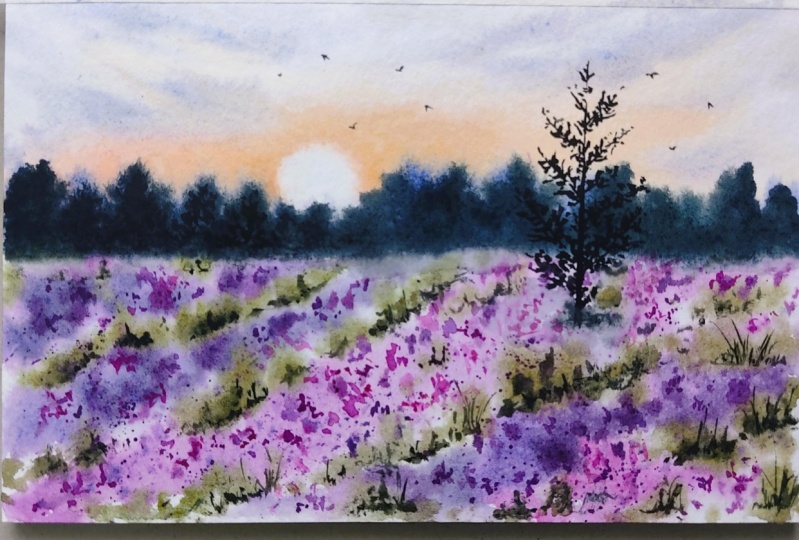
10. Day #4 Thumbnail and Practice: Welcome to day four of the
series Atmospheric Landscapes. So today, we are going
to paint this artwork, and let me show you
the reference image. So this is the reference image, and we will try to simplify
it as much as possible. Around the horizon area, we have orangish
sunset happening, and in the background, we have this misty area with some
trees in the background. Then in the midground, there is some darker volety
color lavender field. And in the foreground, we have this bright lavender field. So the attention goes
to the foreground area. We have tree as well
in the midground. That's about the reference. Now let us draw the thumbnail. Draw a rectangle landscape box. Our previous artworks were
in portrait orientation. This one is landscape
orientation. We will reserve the upper
half of the paper for the sunset and along
the horizon line, we will be painting the trees. In the midground, we will have slightly less saturated
lavender field. Towards the foreground,
we will keep it lighter and very bright so that our attention goes straight to the foreground part and
around the midground, we have this tree. Around the midground, we'll
paint it slightly dull and darker in color and the foreground field
area will be brighter. Now let's paint the color
version of the thumbnail. I'll start off by
wetting the paper. Apply clean water on
this selected area. Now let us mix the colors. We need orange for the sky. I'm mixing red and yellow. You can also take
direct orange color. With this orange,
I'll paint the sky, the sunset hues
around the horizon. For the trees around
the horizon area, I'll use blue and violet. I'll also add this blue colour on the top part of the sky, creating a nice transition
from blue to orange. Next, let's paint the fields. You can leave some
white spaces to suggest a light and
glowing effect. And for the lavender field, I'll use volet, opera
pink, and mauve. These are similar colors, but I'll try to bring in some variation with
these three colors. I'm also dropping
in some olive green for the green leafy color. I hope this turns out well. So now let's add
the tree that is in the midground area and some
trees in the background part. Well, I have not really
liked how this looks. I'm going to paint
another thumbnail and see if that works well. So remember that whenever
you have a reference image, you can try out many versions
of the reference image. Do it as many times you
want as long as you are satisfied with how your
painting is going to look. So here I am trying
another version. Let's see how it goes. Let me wet the paper. I'll use the same technique
for the sky that is painting the orange streak
around the horizon area. This part looked fine for me. But I want to have a small circular shape
depicting the sun. Now, let me paint the
upper part of the sky, that is the blue sky. Next, let me paint the
distant tree line. So in the reference, I see a bluish color. I'm going to paint
that first. For this will depict the hazy and misty environment
in the background. Now let's paint the
lavender field. So as discussed,
the midground area is not very prominent. The foreground area
needs all the highlight. Now, this is just
a rough depiction. I don't want to go for
all the detailed work. Okay, let's go back to the background area
and add the tree line. Now this looks better, right? I'll add some details
on the lavender feed. So tiny dots. Okay, so let's dry this and come
back once it dries. Okay, so the paper is dry. Now let's do the detailing work. I'm going to add the details. In the main painting process, you can either
splatter these dots or you could manually
draw all these details. Remember, the dots
in the foreground needs to be bigger when
compared to the midground dots. These dots depict the
lavender flower in the field. Now, let's add the pine
tree in the midground area. Blend the tree into
the field using clean water and some details on the trees in the background. Next, let us have a look at
all the colors that we need. First is orange. I have mixed red and yellow
to get this color. The next color is
ultramarine blue. Then we have Mauve. This color is similar to purple. You can mix crimson and
violet if you don't have one. Next color is violet. And then we have pains gray. You could also take indigo. Next, we have opera pink. You could take any pink color doesn't necessarily
have to be this color. Next, we need olive green, or you could mix sap green and orange to
achieve this color. This is basically a
warm green color. Next, indigo. This is an optional
color if you don't have paints gray. All right. These are the colors that I'm going to use for
this class project. Now let us have a look
at the techniques. So first, let us practice
painting the lavender field. Now let me wet the area. This is a small square area. For the field, I'll be
using volet, opera pink, and mauve I'll use this color in variation so that we have nice contrasting
effect in the field. We will also use
the white space. Apply few diagonal brushstrokes. Once you have laid
the foundation, you can then splatter the panes, creating these tiny dots. You could also add these
dots manually one by one. Keep in mind the
rule of perspective. The elements in the farther
area appear smaller. So the flowers in the
foreground will appear bigger, and the one in the
midground area will appear smaller and
less saturated. I'm also adding some
greens in between. Now, when I talk about green, let me show you the
color mixing part. So I'll take olive
green and paints gray, creating a darker green mix that will be ideal for adding
the shadows in the field. Suppose you do not have any white space
left in the field. You can use lifting technique by pressing the brush and
lifting off the paint. Use a tissue paper if needed. So you will dry the
base layer using a hair dryer or let it dry naturally for
five, 10 minutes. Now, once the paper is dry, we will splatter again
creating these sharper dots. Now, let us practice
the background area. I'll wet the area first. Now, take orange and paint
something like this, leaving a semicircular shape. Apply some darker
streaks of orange color. You could change the color
of the sky to pink or red, maybe, but I would
stick to orange. Next, around the horizon line, we will add this bluish color suggesting the misty
appearance in the background. Now over this area, we will add these
darker colored trees. During the painting process, maybe we will wait
for some time to add the trees so that it
retains its shape. All right. That's about all the techniques that we are going to use in the
fourth project. Okay, so let us move on
to the painting project.
11. Day #4 Lavender Fields: Welcome to the fourth project. This is the artwork
that we are going to create in today's chapter, and this is the image
that we are referring to. I hope you have gone through the previous thumbnail chapter, where we discuss all
the possibilities, the colors, and techniques. Okay. So now I'm going to ap down
the paper and begin painting. I have put four pieces of masking tape on the
backside of the paper, and now I'll stick it onto the glass sheet,
press it tightly. This way, the paper
will remain intact. Now, if you want boater, you can apply it on
all the four sides. It's totally up to you. All right. Let's begin
by wetting the paper. I'm using my mob brush to
wet the paper thoroughly. Gently apply even
strokes of water. Make sure there are no pool or puddles in the center or
anywhere on the paper. Lift off all the excess water. We need our paper to
absorb good amount of moisture and a a tissue, wipe off all the water
droplets on the sides. Sometimes what happens is if
there are drops of water, it comes back inside
the paper and creates cauliflower
effect on the edges. Now let's mix orange. I'll be mixing permanent
yellow and red to get this nice bright
and vibrant orange. I'll paint the sky
trying to create this small semicircular area for the sun and I'll be applying
the paints around that, leaving some tiny white gaps. So this is the orange streak
around the horizon area. Next, let us paint the blue sky on the
upper part of the paper. For that, I'll mix violet
and ultramarine blue. You could also use
blue directly. There's no restriction on that. Remember not to apply
very bold colors. We are trying to keep it subtle and bring out that soft mood. You can go back and add some more orange strokes
if you would like. We will be imagining this
as our horizon line. Next, let's paint
the background area. So I'm going to mix blue color. You could mix a little
bit of white gauge or white watercolor to make it opaque and apply the paint along the horizon
line, imaginary one. Now, let us paint
the lavender field. So I'm going to mix
the colors first. This is mauve and violet. The mauve color is by
Vincor and Neuter. And the opera pink
is Michelomssion. I'll have two to
three colors ready. One is mauve and violet, other one is mauve
and opera pink. The third may be
directly violet color. Next, in my size 12 round brush, I'll take opera
pink and mauve mix. I'll be applying it something like this in a diagonal manner. Changing the color to let
and leaving some space, I'll apply in the
foreground area. White space is very
important here. Now mixing paints gray with violet for the midground color. Like I mentioned earlier
in the thumbnail chapter, we need to keep the
midground slightly less saturated and dull. I'm applying that
in the midground. Again, leave some
white spaces there. I'm going to mix
the colors again. So take let and move or
purple, whichever you have. Mix it in mid tone consistency. Now before applying,
I'm going to take a little bit of white gauge
and mix it with that. So you can see it has
become slightly opaque. Now I'm going to
manually add these dots. You could also
splatter the paints. If you're splattering, cover the upper part with
a paper or tissue. I forgot to cover mine so you
can see what has happened. Now I'll have to fix that trying to blend it as a
cloud in the sky. Don't do this mistake. Even if you have
done it, it's fine. We can try to cover it up. Next, I'm going to add some
opera pink colored dodge. In the foreground,
we will try to paint bigger dots that
is bigger flowers. And for the background, sorry, midground, we will be
painting smaller dots. However, it's not very easy to control wet on wet
as it might bloom, but try to gently
touch the paper. I'm also adding these
pink dots in the februm. If you feel that your
paper has dried up, then you can use your
fingertip to blend the dodge. We don't want very hard
edges at this point. We will add them later on. The paper is slightly damp, which means about 50% dry. When you add the colors, it will hold the
shape at this point. Now I'm going back to my background area
and adding the trees. While painting the thumbnail, I realized that I need
to make it hold shape. I gave it some time for
the previous layer to dry. Notice how softly the
colors are spreading. The edges are not hard, but we have controlled
blurry effect. I'll try to paint the
trees in different sizes, some shorter and
some taller to bring about an organic look
in the painting. If you have any hard edges, you can use a clean damp brush
to blend it out or maybe your fingertip I Next, I'll use olive green
and paint gray, and I'll be adding it
in the background area, suggesting the green leaves
of the lavender field. Slowly, we are approaching
the foreground area as well. You don't have to completely
fill this area with green. Just some tiny suggestions here and there would be enough. My paper is about to
dry on the sides so I can see some hard edges
around the bottom part. If I see any hard edges, I'll use my fingertip
to blend them out. We will try to create some
diagonal guiding lines. Now, let's paint second
layer of greens. I'm adding some more paints
gray to this olive green mix. Applying second layer of grassy lines on the green
areas that we painted earlier. I have applied a
lot of paints here, I'm going to use tissue paper to dab off the excess paints. Now the paper has almost dried. So I'm going to simply apply
these tiny dots depicting the flowers in the foreground, we will draw bigger dots. And as we move
towards the horizon, we will decrease the
size of these dots. And for the background area, I don't want them to be very
sharp and have hard edges, so I'm blending it
out with my fingertip Now, I'll cover the upper part to splatter on this
lavender field. Okay, so let us
splatter the paint. This splattering will
create tiny dodge. Now, let us paint the birds. I'll paint on these areas
where I have the dotted marks. Easier way to cover up. Using a tissue paper, I'll remove the
darker spots around the horizon because I don't want that area to grab
so much attention. Just some minimal
suggestions would be enough. Next, let us make spains gray
and a little bit of let. We have gray color
with let undertone. Now let's paint the pine tree somewhere in the midground area. We'll start with the trunk. Gently add the branches, try to form a conical
or a triangular shape. Now add the foliage. Try to paint the leaves in
a very irregular manner. We don't want to achieve
uniformity here. Next, let us try to blend this tree where it
touches the field area. So I'm applying some green color around the field and adding some shadow using diluted color. So make the area around
tree slightly darker. So white areas in the
field appear very blank. I'm filling up those areas
with the pink color. Now, let's add some tiny leaves and a sharper tip on the tree. These little details make the
overall appearance organic. Now, let's go back to
the background area and introduce some newer trees. I'm blending the lower
part of the tree into the background
using my fingertip and only keeping the
upper part sharper. Now, I'll add some
brush strokes on the existing tree trying
to define their shape. The lavender field around the midground area
looks a bit more dull. I want some attention
and detail over there. So using diluted purple and applying some wobbly
lines around that area. Okay, so we are done with
this painting. There you go. This is the final
look of the artwork. I hope you enjoyed
painting this with me. Do share your artworks under
the project's gallery, okay? I'll see you soon. Bye.
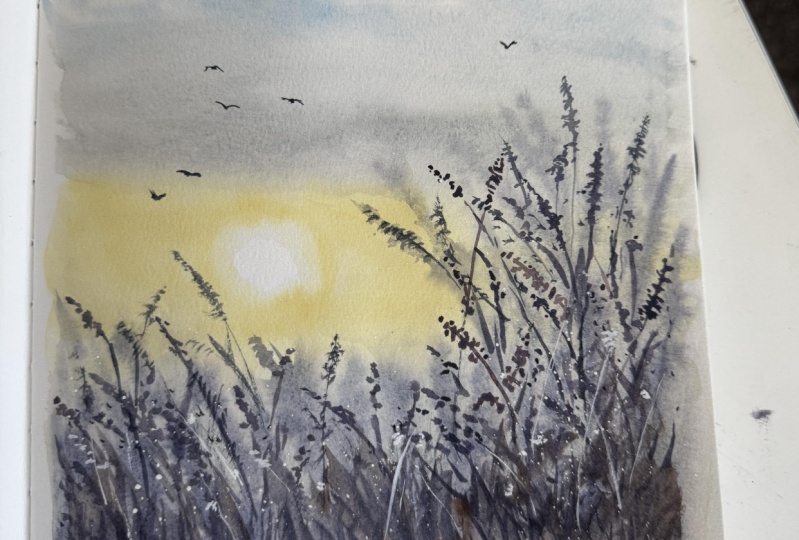
12. Day #5 Thumbnail and Practice: Hello, hello.
Welcome to Day five. Today, we are going to use
this image as a reference. This is a foggy sunrise scene. In the background, there is a beautiful
sunrise happening. We have dense foggy layer
around the horizon. Then there is gentle tree
line in the midground. In the foreground, we
have this slope land with some grasses
and some trees. That's about the
reference image. Now let us draw the thumbnail to understand the composition
in a better manner. Let us draw the
pencil sketch first. So somewhere in the middle area, we have this sunrise. Upper part of that will be
blue and around the horizon, we will paint with
yellow orange, and then we have this
dense foggy layer and a simple midground layer. Then in the foreground, there's a slope land with some grasses. We'll just create
some texture for that and we have the trees. So whenever you see
a reference photo, analyze the darker and lighter areas so that you
can adjust the total values. Next, let us create the colored
version of the thumbnail. So first, wet the paper because I'll be performing
wet on wet initial layers. So let's paint the
sunrise happening. You can also assume
this as sunset. Sometimes I can't understand
if it is sunrise or sunset. So we'll paint the yellow, orange hue in the sky, creating a small semicircular
shape for the sun. Next with the bluish gray color, I'm going to paint the
dense foggy layer. For that, we need to create
a smoother transition suggesting foggy
area around the sun, let's add some brown color, suggesting the sunlight
effect on the mountain. I'm darkening the upper
part of this mountain. Now let's paint the foreground
area with brown color. In this we will be creating some texture in
the main painting. And in the midground, there is another layer of trees, which appears very light. Next, on the left side, we will create some trees. We will create the
trees in two layers. First one is the base layer. Then as this dries, we will add some detailing
using wet on dry. No we can also add some textures
in the foreground area, creating some visual interest. Next, let us have a look at the colors that
we are going to use. First is orange, so mix yellow and red or
take orange directly. Next color is ultramarine blue. Then we would need paint gray. The next color is violet. Indigo. Burnsiana. If you don't have burn siana, you could mix some red with burned tamber or
any brown color. This is basically a brown with reddish,
orangish undertone. Next color is burned tamber. And lastly, we would
need raw umber. This is an optional color. You can still paint
without this color. Now let us practice
the elements. So I'll first wet the
paper using a mob brush. Now, let us practice
the sunrise scene. We will paint a
semicircular shape and paint orange
color around it. This is just a rough depiction. I may or may not add some extra steps in
the painting process. Next, let's take paints
gray and ultramarine blue and apply some paints along this imaginary line of horizon. This is the dense foggy
layer that we are painting, and around the sun, I've left a tiny gap. This gap, I'll use to
paint the sunlit effect. Around that area, I'm
going to add burnt Siana. You can see how naturally
glowing it appears. Try to create a
smoother transition. You can add more
darker colors or use lifting technique to
lift off the paint. So it's basically doing
some trial and error to get the right kind
of foggy effect. Keep the upper part darker and gradually reduce
the tonal value. Next, let us paint the
foreground part. I'll use brown. I will also add bit of Bnciana
with some darker brown, let us platter some
paints, creating texture. So this will add a sense of character or definition
to the foreground area. Since it is closer
to the viewpoint, so we need to add some
detailing work, right? Next, we will mix indigo and Bnciana to make
this greenish color and we'll paint the trees. Next for midground layer, you can use diluted
tone of brown and blue. That will look somewhat grayish. Use that to paint
the midground layer. I'm showing these
elements separately, but we will combine them
in the main painting. All right. Let us move
on to the main project.
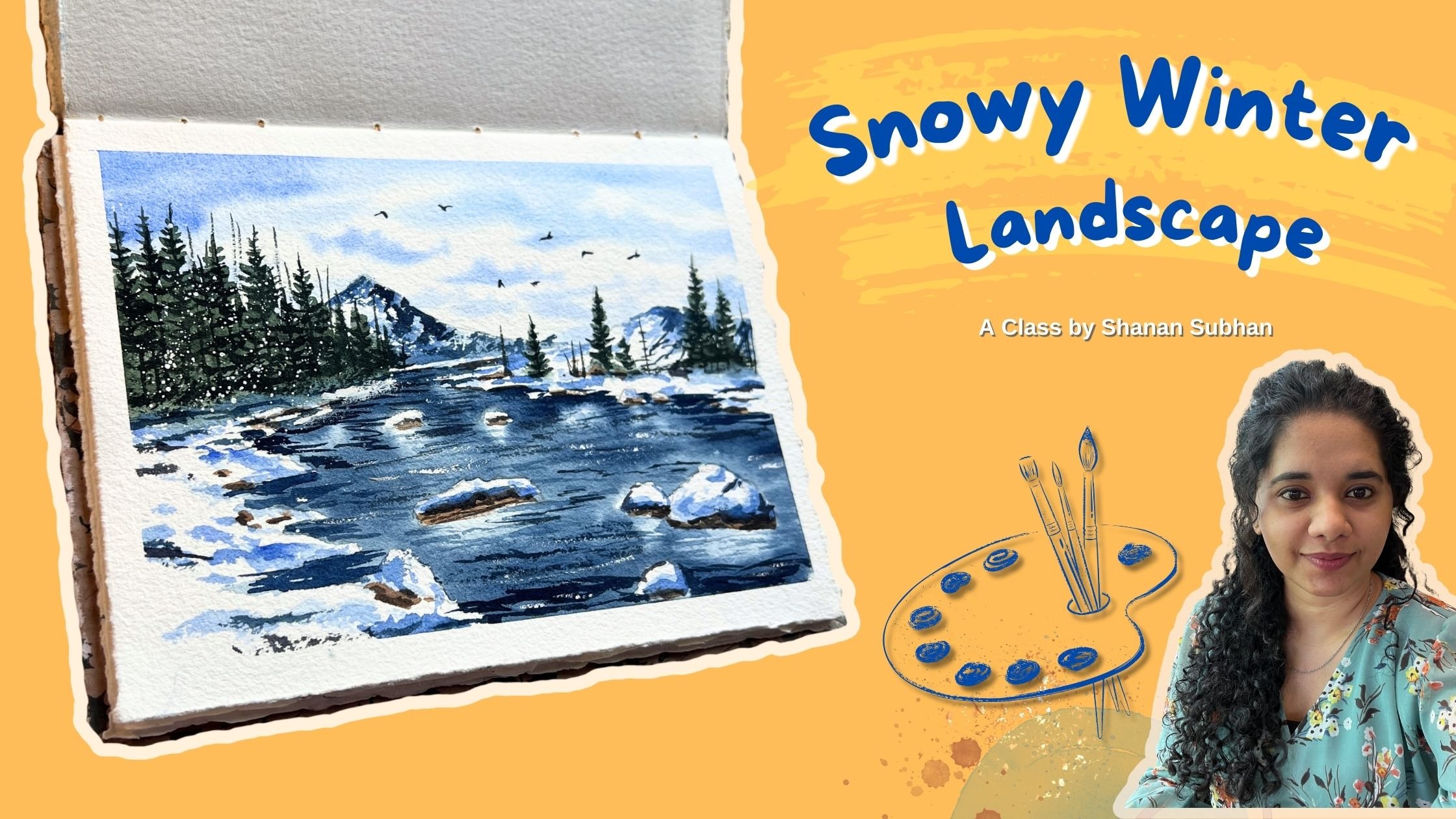
13. Day #5 Foggy Sunrise: This is the painting that we are going to create
in this chapter, and this is the reference image. I hope you have gone through
the techniques chapter. All right. Let's get started. Okay, so let's start. I've already taped
down the paper. Now, let us wet the
surface of the paper. Gently apply water
throughout the surface. Make sure there
are no extra pool or puddles of water
on the paper. Let the paper absorb
good amount of moisture. Next, let us mix the colors. I'm going to use permanent
yellow to paint the sun. Take this in mid
tone consistency, and let's paint a
semicircular shape. Now, around this area, we're going to paint
the same yellow color. This area depicts the sunset
happening in the sky. Next, let us take
ultramarine blue, a little bit of violet and paint the upper
part of the sky. This will suggest the
bluish clouds in the sky. Be careful while blending
the yellow and blue part. You can leave some white
gap and leave it as it is. Don't have to mix them together. It might result in
a greenish color, so better to avoid that. Next, let us mix
the blue colour. I'm taking indigo and
mixing a tiny bit of red. This will cancel out
the warm tone of blue. Now I'm going to apply this as the background misty layer. So around the sun, we will
leave some extra space. This will suggest the sunlit
part in the background area. Like I said earlier,
we can assume this as the background forest
or even mountain. It's up to us how we take it. To give this bright
sunlight effect, I'm adding burnt sienna
around this area. It creates a warm glow
around the mountain. Tried giving shape around
the sun but didn't work out. So I'm gonna lift the
paints using tissue paper. Next, let us try to create
a misty background effect. We're trying to paint misty
mountains in the background. So make sure we are achieving this smoother transition
from darker blue, then mid tone and diluted,
and then white color. So on the top, I'm adding
darker colors to bring a sense of smoother transition
from darker to light. Suppose you're not able to achieve a smoother misty effect, then you can use a clean
damp brush to soften the hard edges or you can
use water spray bottle. Next, we will paint
the foreground area. So I'm mixing burnt
amber, raw umber, and a little bit of burnt siana You could take
any one color as well. That is also perfectly fine. Any brown color that
your palette has, I'll take this color mix
in a mid tone consistency and glide my brush in a diagonal manner
from left to right. Now, fill up this area. This is a slopy land
in the foreground. Next, I'll take brown
and blue color, mix it in diluted form. This will look
like a gray color. Applying this somewhere
in the middle, like a midground layer between the background
and the foreground. This part of the painting
is not very prominent. It is simply there without
seeking much attention. But this needs to be there in order to connect the foreground
with the background. I'll use the back of the brush trying to create
the tree branches. Next, I'm going to splatter the paints in the
foreground area. So for that, cover the upper
part and load your brush with some darker brown paints and splatter it on this area. This will create some nice dots which suggest the texture
in the foreground part. Splattering some
indigo paints as well. Next, I'll mix
indigo and Bnciana. When you mix these
two colors together, it gives a sort of
greenish color. I'll use this color mix
to paint the trees. Dab your brush, creating the impression of
these tiny dots. Collectively, it
will look as a tree. Alternatively, you can paint
any tree of your choice. Two. Slightly increasing
the size of this tree, creating a pointed
tip for this tree. Dabbing in some darker
layer on the trees. Okay. Now, let us dry this area. I'm using my hair dryer to
speed up the drying process. Okay, so the paints look dry. Now let us go with wet on dry. The paper is dry and we
are using wet paints. Moving on, let us add some
details in the midground area. I have mixed Indigo and BonsianaThi will
create a greenish, mild greenish gray color. I'll use that color to add
details in the midground area. This part is equally important because it connects the foreground with
the background part. Gently add these details
by dabbing the brush. A next, let us add some details
in the foreground trees. I'm mixing the same paints in darker version that is
indigo and Bonsiana. It will give us a
darker green color. Now using this color, apply some details on the tree. You just have to apply some repeated brush strokes
in different sizes. Keep some of them smaller, some bigger, so that you
have nice variation. I'll again mix the
same color that is indigo and burnt sienna. If you don't have
these two colors, you can mix your
own similar shade. Now, use the pointed
tip of the brush or a fine liner brush and add the
branches inside this tree. I'll repeat the same steps
for the other trees as well. All you need to do is
create some brush marks and connect them together using branches and simple lines. Okay. Next, let us also create some brush
marks on the brown area. This will form a sense
of connection between the trees and the ground area. Applying some thicker
brush strokes on the bottom part of the tree. Moving on, let us add some details in the
foreground area. I'll be creating simple brush
marks using burnt Siana. These are more like grass blades in the front part
of the painting. These brush marks create a sense of texture in
the foreground area. Now, I'll cover the upper
part of the painting again and splatter some paints. This time, it is wet on dry. The paper is dry, so the colors remain as it
is, creating hard edges. The previous layer
was wet on wet. Now let us paint some birds. I'm painting these
birds on the blue part. These birds are painted
using almost black color. And next, I will be painting
some birds around the sun with a brown color to suggest sunlight effect
on the birds as well. Painting some tiny birds using diluted burnt Siana Alright, we are done with this painting. There you go. This is the
final look of the artwork. It has turned out
beautiful, right? I hope you liked your
painting as well. Please do share it with me under the project's gallery.
I would love to see it.
14. Day #6 Thumbnail and Practice: Welcome to day six of the
series Atmospheric Landscapes. Today we are going to use
this image as our reference. So let's try to simplify it. In the background, we have
this hazy distant mountain, and then there is another
mountain in brownish color. In between, we have
this tiny lake, and in the foreground, we
have a beautiful meadow. This meadow has white
wildflowers in it, but I'm thinking of adding
pink flowers just like that. The sky in this picture
has kind of pastel effect. And overall, if you see, this has a pastel vibe to it. So let's try to
create this painting. First, let us have a look
at the thumbnail sketch. We'll simplify the elements. So this is the distant mountain and another distant mountain. This will be brownish in color, and we'll reserve this
tiny area for the lake. The major part of the paper
will be for the meadow. We have the grass blades and wildflowers This
midground mountain has some detailing in this. Moving on, let us create a
colored version of this. We will have to create
our own pastel colors. Pastel colors are nothing but the colors that has
some white color in it. It's not transparent.
It is opaque. So by adding white gauge
or white watercolor, we can turn any transparent or any watercolor
into opaque color. Okay. In our previous chapters, also, we have used
some opaque colors. Now let's mix the color. So I'll be mixing opera
pink and white to achieve this pastel
baby pink color. So with this, we'll paint
the sky and I'll be using yellow and red for
orangish pastel color. That is for the sky. Next
for the foreground color, I'm going to mix a
pastel greenish color. Here I have mixed olive green, forest green and white. You could use any green colour in your palette and
mix it with white. It's fine if it
differs a little. Next for the mountain, I'm
taking paints gray, let, and a little bit
of gauche colour and paint the distant mountain. In the reference,
it is very light, but I'm trying to make
it slightly darker. And for the bigger
mountain, I use Bnciana If the paper is too wet, you can lift off the
paints and clear the bottom section for the lake. Clean dam brush for lifting of the paints and leaving some
white area for the lake. Now, I'll use darker color. A darker color will do to paint the details
in the brown mountain. First layer will
all be wet on wet. And Next, I'll paint some grass blades
in the foreground area. Here we'll paint all
upward brass strokes to create grass
blade like shapes. Then I'll dab the pink color
depicting the flowers. This is just a paste layer. We will be adding more details later on in the next layer. Now for the lake, I'll
paint cerulean blue. So the boundary along the
meadow and the lake area, we need to create
some darker grasses. This defines the boundary. I will quickly dry this area. Now, we will have to add all the detailing work
using wet on dry. Adding all these grass
blades in upward motion. Then I'll add some pink flash. Lastly, adding some
white highlights using white gauche paint. Next, let us have a look at all the colors that we
need for the class. First is Opera Pink. Next is permanent
yellow and red. I'm mixing this
to create orange. This is only for a
little part in the sky. And next color is violet. Pain grey. Olive green. Forest green. Indigo Bonsiana cerulean blue. White gauze or white
watercolor paint. Now let's practice. I'll wet the area
using more brush. So let's practice the
mountain area using Bnciana. So paint the shape
of the mountain. Now with paints gray
and some green, we will add the trees. And then there is a
distant mountain, which I'll create using
Pains gray and wallet. For painting the foreground meadow, I'll be using a
pastel green colour, which I'll mix
using olive green, forest green and white. Once the base color is laid, we will add all the
darker details. This is the boundary near the
water and the meadow area. For the water, I'll just add
a hint of cerulean blue. The main focus of this
painting is meadow. So we'll be painting
that very carefully. Don't have to achieve
perfection, but, you know, we need to bring out
the essence of the meadow. We'll also use some brown. Now with wet on wet, I'll be adding
some pink flowers. This is just a rough depiction. I might change the
techniques a little bit. Now let us dry the colors, and then in the next layer, we will add the details. So the base layer
was wet on wet. Now let us add the
details using wet on dry. Painting upward
brushstroke motion. You can also splatter some
paints to fill up the area. Next is adding the
flowers using opera pink. Add white highlights to
make the meadows stand out. You can splatter the pines for achieving different
size of dots. Alright, let's move on
to the main project.
15. Day #6 Pastel Meadows: Hello. This is sixth project of the series
Atmospheric Landscapes, and this is the artwork that we are going
to create today. This is a reference
image for the project. I hope you have gone through the previous chapter where
I talk about the thumbnail, color palette, and
the techniques needed to paint this artwork. So let's begin. All right, let's begin our
painting process. I have already tamed down the
paper on this glass sheet. Now let us begin. I'll first wet the
paper using mob brush, apply water
throughout the paper, and make sure it is fully wet. There shouldn't be
any pool or puddle of water anywhere on the paper. Spread it equally
throughout the surface. Okay, the paper is wet. Now let's mix the colors. As you know, today
we are going to paint using pastel colors. Let's mix the colors. So to create pastel colors
using regular watercolor, we would need white
gauze or watercolor. So let's take opera pink. You could also use crimson
or any other pink you have. And I'm going to mix it
with the white gauze. Take a little bit
of white and mix it with the existing
color that is pink. You can see it already
looks kind of pastel. I'll mix an opaque
yellow as well. When I say opaque,
it means pastel. I've taken red and yellow, which looks like orange. Then to that color,
I'll mix white. We have two colors
ready in the palette. Now let's paint the sky. I'll start with the pastel pink. Next, let us take violet and mix it with opera
pink pastel color. It should look like lilac color. Now take this purple
pastel color and apply Now, towards the horizon, I'm going to apply this orange
pastel color. Apply the paint almost towards
the center of the paper. We have achieved a soft
pastel looking sky. Next, let us mix our
pastel green color. For this, I'll take olive
green and forest green, mix it with white colour. It should look
something like this, like a sage or what
color is this called? Not sure what this is called, but it should look
something like this. I hope you'll manage
to get this color. If not, that is
also totally fine. You'll apply this color
on the lower part. This is the base layer of the meadow that we
are going to paint. Next, let us mix slightly
darker version of this color. That is by adding paints gray. So I've got this darker color. I'll apply this on
the bottom part as a shadow for the grassy area. Apply upward brush strokes, creating the brass blade effect. Next, let us paint
the distant mountain. So I'm going to take violet, paints gray and white gauche. Now let's paint a
distant mountain somewhere in the middle. This marks as our horizon
area in the painting. Next, I'll paint another
distant mountain. So take Bnciana and paint
a slopy mountain shape. I'll extend the lower
part of this mountain, bringing it a little forward when compared to
the previous mountain. I Next, I'll add some tiny trees and some grasses on the
brown mountain. So here, I'll take
paints gray and green. This will form a
darker green colour. With this, I'll create
the impression of trees. Adding some brush marks on the background mountain as
well, suggesting the trees. Lift off all the excess paint using a damp brush
and a tissue paper. We want a nice and
sharp border here. The area below this mountain
part is for the lake water. Now let's add some more details. Using darker tonal
value of burned Siana, I'm adding few brass strokes
around this mountain area. This will create
a sense of depth. I leave some gap for the lake. Now let us paint the boundary between the water and
the foreground meadow. I'll take darker
green color and dab the brush creating the
impression of distant grasses. This is the separation between the water and this
grassy meadow part. Next, let us paint
the lake water. I'll first wet that area
below the mountain. Now take diluted erlein blue
and apply on this wet area. This blue region
depicts the lake water. Blend it well with clean water. We want it very subtle
and diluted in color. Next, let us go back to
the foreground area. I'm re wetting the paper
using water spray. Now mix indigo, forest green, and some olive green. We want a darker green color. You could mix any of your
greens and create this green. I'll manually apply tiny dots this will suggest the
leaves inside the meadow. Towards the bottom of the paper, we will apply bigger dots because this area is
closer to the viewpoint. Next, take a fine liner and mix burn tumber
Using brown color. I'll be painting
some grass plates, some simple upward br strokes depicting the grasses and
stems inside the meadow. Next I'll switch to my size 12 round brush with pointed tip. And with this, I'm quickly applying some
upward brush strokes. Be quick and try to
paint it loosely. You don't have to achieve
perfect grass blade. In watercolor, we need
to learn to work faster. Next, we will perform
splattering technique. So cover the upper part and let us platter
some brown paint, suggesting the leaves and other filler elements
inside this meadow. Next, let us paint the flowers. So I'll take opaque opera pink, that is the pastel color
that we created earlier, and let's splatter it. You can see how these
splatters look. Try to achieve similar effect. Now, let's dry this
layer using hair dryer. If you don't want to
use a hair dryer, let it dry naturally
for about 10 minutes, and then we can come back
to paint the next layer. All right. The paper
looks completely dry. And the colors also look
very dull. But that's fine. We are going to add detailing
work in the next layer. Let us mix our greens. I'll be mixing olive green, forest green and white gouache, making this nice opaque mixture. This is the pastel green. Now with this, let us
paint the details. Paint the brush strokes in upward motion towards
the bottom of the paper, we'll paint bigger brush strokes and as we are painting the
mid part of the meadow, we'll use smaller brush strokes. We'll paint all of them
in upward strokes. If you feel it is darker, use a tissue paper to
lift off the paints. Don't leave any
major area empty. Try to have one or two grass
blades in all the places. Next, I'll take more of opera pink than a
little bit of white. I want this bright pink colour. I'll paint some tiny
flowers in the meadow. I'll paint all the
flowers one by one here. Also remember the
rule of perspective. The area closer to the
viewpoint will have bigger flowers and away from the foreground
will have smaller. In this case, the area
near the lake will have smaller flower because these
are away from the viewpoint. I'll let you observe as I
paint all these flowers. Y. Next, I'll gradually make it more opaque. This time it is almost
equal amount of pink and gouache paint because I'm going to paint
this on darker areas. If the color is opaque, it will not show us the
underneath darker green color. O. Now, I'll splatter the paints using my
size 12 round brush. This is to achieve smaller
dots in the meadow. Do cover the upper part. Otherwise, it will
ruin your sky. Now let's paint the birds. Next, I'll take paints gray and give border to the mountain
area in the background. So I'm just defining the boundaries where
it touches the water. Also, to add in some
contrast inside the meadow, I'll mix paints gray and green, creating a darker green mix and we add some grass blades
with darker green color. It is always very important
to have a sense of contrast. Otherwise, the painting
looks very flat. Gently paint the grass blades. Here I'm using my fine
liner size two round brush. Paint the grasses in
upward motion again. You can add some
tiny grass blades in the mid section as well. I. Now, cover the sky and lake part and we will splatter some green
paint in the meadow. You could use different
tonal values of green here just to bring in
a sense of variety. Next with white gauge paint, I'll add some highlights
on the flowers. You could also use
splattering technique, but make sure to use thick
and very concentrated paint so that it retains its shape. Now, with thick
concentrated paint, I'm splattering the
white wash colour. This will create a nice balance between pink and white flowers. Okay, so we are done with
this painting. Here you go. This is the final look
of the sixth project. I hope you enjoyed
painting this with me. If you have any doubts, you can ask me under the discussion section.
I'll be there to help you. And please share your projects.
16. Day #7 Thumbnail and Practice: A for day seven, we have this reference image. I'm going to create this darker background trees
and a sort of misty layer. Then we'll paint the trees in the background and midground. In the foreground, you see these grasses and fallen leaves. We have trees and dry branches. Here we have a sort
of moody atmosphere. Let's try to create that. I'll first go with the pencil sketch to break
down the composition. In the left side, we have dense trees, and on the right side, the area is covered
with fog or mist. Then we have some midground
and background trees. In the foreground. There are some grasses and fallen
leaves on the ground. We have some were trees
of different sizes. Now let's paint the
colored version. First, I'll wet this area. Will perform wet
on wet technique. Painting the sky in a
very delicate manner, leaving empty white spaces. Then for the background trees, I'll mix paints gray and violet. This will form a
violet gray color. For painting the trees, I will dab the brush, creating the impression of the foliage and
some empty spaces. Around the right side, I'll try to create misty effect. Next to suggest mist around the midground area.
I'll leave some gap. I have applied diluted let
below this white part. This is to create a
smoother transition from the mist into
the ground area. Next, I'll paint
with brown color. I think I'll mix burn
tumbo and burn siana I Now with darker gray color, I'll paint the background trees, adding some darker
brown brush strokes to suggest some character or
axture in the ground area. We'll also paint some fallen
leaves on the ground. On the left side, we have
denser forest or trees. So I'll cover that
with some paints. I'll add some more
vertical lines suggesting the trees this
time in darker color. Once this is painted,
we will let it dry. Okay, the paper is dry. Now let's go for wet on dry. The trees will look sharp and focused because we are
painting on a dry surface. Gently paint the trees. We'll paint some trees
thinner and some thicker to bring about
a sense of variation. In the ground area, I add some brush strokes, suggesting the grasses and some fallen leaves
on the ground. I'll also add some tiny
branches on the trees. Next, let us have a look at the colors that I would
use in the painting. First is cerulean blue. This is for the sky
in the background. Then I'll use paints
gray and let. I'll be mixing
these two colors to form a violet gray color. Next color is burned tamber and then burn siana.
This is for the ground. If you don't have burn
siana, that's fine. You can use burned tamber
or any brown color. Next, let us practice
the elements. Let's wet the paper. On wet surface, we will
apply the pains like this for creating
the denser tree like effect in the background. We are just creating the
impression of the trees and you can add lines like this trying to connect
these foliage. Now let's practice
the ground area. On wet surface, we will
paint with brown color. You can mix, burn siana, burn tamber, any brown color. Once you paint the base color, then you can add in some
texture by splattering, or you can manually add the brush marks suggesting the texture or the
fallen leaves. Here, we need to try to depict the mist in the background area. For that, we will use diluted colors to paint
the background trees. This is just a rough
depiction of how tonal values can impact the overall
depiction of mood. Next, we need to paint some
trees in the painting. We will paint with wet on dry, which means sharper
looking trees. So when you're painting trees, paint the bottom part
in a thicker manner. And as you paint the
branches and other details, you will use the pointed tip or a fine liner brush for
crisp and tiny details. Avoid painting the trees
in same thickness. Always maintain
that thicker root and the upper part
should be thinner. That's when it
will look organic. And for painting grass blades, we will move our brush
in upward motion, creating these kind
of brush marks. When you apply these
brush marks repeatedly, it will appear like grasses. You can vary the sizes,
keep some smaller, some bigger, or you could simply splatter the
paints creating textures.
17. Day #7 Moody Forest: Welcome to day seven of the series Atmospheric
Landscapes. This is the painting that we are going to create
in today's class, and this is a reference
image that I'll be using. I hope you have gone through the previous chapter where I explain all about techniques, breaking down the
composition and colors. Let's start. I'll begin by wetting the paper
using a mop brush. Apply generous amount of water
without leaving any pool or puddles of water on the center or anywhere
on the paper. It should be evenly distributed. And you can wipe off all the excess water
that's there on the side. We don't want any
water droplets to go back and create the
cauliflower effect on the edges. Okay, so let's begin
the painting process. I'm going to start off
by painting the sky. So here, I'm taking my
size 12 round brush, and for the sky, I'll paint
with diluted cerulean blue. So we will apply the
paints very randomly, leaving some white spaces. This combination of
white and blue leaves a nice effect of sky
in the background. However, the sky is not
the focus in the painting. Next I'll take Pains
gray and violet. Mix these two colors. We get a violet gray color. Take this color mix and we will start painting the
background trees. We will start painting the
tree from the left side. On the upper part, I'll
apply some tiny brush marks. This will suggest
the distant tree and some gaps in
between the foliage. Let's paint some more trees. Towards the right side, we will paint fewer trees because if you notice
the reference image, it has fewer trees there. Next, I'll slowly blend the
color using clean water, trying to achieve misty effect. Imagine this mid area
as our horizon line. This is where the
sky meets the land, applying some tiny dots,
something like this, creating the foliage
in an organic manner. Use the tip of the brush or
maybe a fine line or brush. Next, I'll switch to
slightly darker tonal value. Wearing the tonal value can add a sense of depth in
whatever you paint. So I have painted these foliage. Now let's try to connect them with some fine
lines in between. Next, I'll add some brush marks using slightly
darker tonal value. Here you will take less
water and more pigments. You can already see two layers. One is lighter
colored tree foliage and another one is
darker colored foliage. Next, let's take violet and mix a little bit of
blue or paints gray. So I have this violet color. And I'll apply this below the white part to create a
smooth or misty transition. Next, I'll take burnt amber, burn siana and the
violet gray mix. Mixing it together, this forms
a very bright brown color. I'll apply this below the purple area that
I have just painted. This creates a nice transition from the mist into
the land part. I didn't want to paint
the brown color directly. Adding some more trees
around the horizon line. Dropping in some tiny dots inside this forest
background area. It will add more depth
around that part. So remember, it doesn't
have to look perfect. Here I'll paint a
tree so that it looks that we have
put some efforts into it and not just
random depiction. In the midground area, I'll paint some grasses. You just have to paint some upward brush strokes repeatedly. And as you reach the right
side will slowly reduce it. Next, let's take the brown color and we will add some brush strokes around
this foreground part. Just apply some zigzag
diagonal strokes to add a sense of texture
around this area. This could look like the
base for the fallen leaves. Next, take let and
paint gray mix. With this, we will be
painting the trees. So I'll start by painting
the straight lines. This will depict our
midground trees. Let the origin point of
trees be different areas. Observe how I start the
root from different areas. Now I'm going to extend some of them and add the branches. This is partially wet on wet. We will get a sort
of blurry effect. We are creating the trees
in multiple layers. So this layer trees
will look blurry. And the ones that
we will paint next, which is the wet on dry one, the hard edges, that will
look very focused and sharp. Towards the left side, I'll paint the trees with
slightly darker color. And for the rest of the trees, I'm adding a sort of
shadow on one side. Next, let us define
the root of the trees. Naturally, if you
observe the trees, they look wide at
the bottom area. So that's what I'm doing here. Now, with pointed
tip of the brush, I'm adding some line
as filler elements. These are not very
focused trees. These are just there to make
the overall scene look good. And let me remind
you again that I'm not entirely following
the reference image. I just want to capture the essence of it and
not every detail. Now let's take darker brown
color by mixing burnt tamber, burnt siana and a little
bit of paint gray. With this, I'll add some brush marks on
the foreground area. This will depict the fallen
leaves on the ground. You just have to apply
repeated brush strokes. No need of achieving perfect
shapes or anything as such. Just keep repeatedly applying. And in the background
around the misty area, apply some diluted
brush strokes. This will suggest a sense
of haze around that area. Adding some branches on
the trees on right side. Now, let's dry this area. I'm using my hair dryer to
speed up the drying process. You could also let
it dry naturally. If you need more time, feel free to pause the video and come back again. All right. The paper has completely dried. Next with paint scray, I'll paint some trees. These trees will
be wet on dry and it will appear sharp and have
some focused effect on it. I'm using size a round brush. A So here, I'll paint the tree trunk
with diluted color, and next, I'll mix burnt umber, paint gray, and burn siano to
make a darker brown color. So in this diluted area, I'll drop in some
brownish color. This will create
a nice transition from brown to misty area. You. Adding a few more trees. You can add as many
trees you want. There's no restriction
on the count. So next I'll switch to
my fine line of brush. This brush will help me create tiny branches
on the trees. Now, if you feel you have painted trees with darker color, you can lift off the
paints using tissue. Or to avoid that, you
can use diluted colours, like very diluted ones. Paint tiny, tiny branches
in upward motion. Next with brown color. I'm applying some brush marks. This is such as the
fallen leaves and grasses in the foreground land. You don't have to
cover the entire part, some random suggestions here
and there on the ground. As you paint the
background area, keep the paints diluted. Now, I'll splatter the
paints on the ground part. I'll cover the upper
area and then splatter. I'm splattering with
a fine liner brush so that it gives me
these tiny dots. If you want bigger dots, you could go with a bigger
brush and more diluted paints. Let's take paints gray and darken some of the
branches on the tree. I'll introduce new
branches as well. Painting some darker grasses
in the foreground area. With these darker grasses, we will create a
sense of transition from darker to lighter
area in the background. Adding some more branches
using the fine line of brush. I'll introduce a
new tree as well. In the upper part, I'll splatter the paints using
diluted paints gray, and to lift off
the darker color, I'll just dab it off with
tissue paper to lift the colours and leave a mild impression of
leaves in the air. Alright, so we are done
with the painting. Now, I'm going to remove
the masking tape. There you go. This is the
final look of the painting. I hope you enjoyed
painting this. If you have painted
along with me, do share your projects
under the project gallery. I would really love
to see your version.
 Shanan Subhan, Watercolor/Gouache | Art Educator