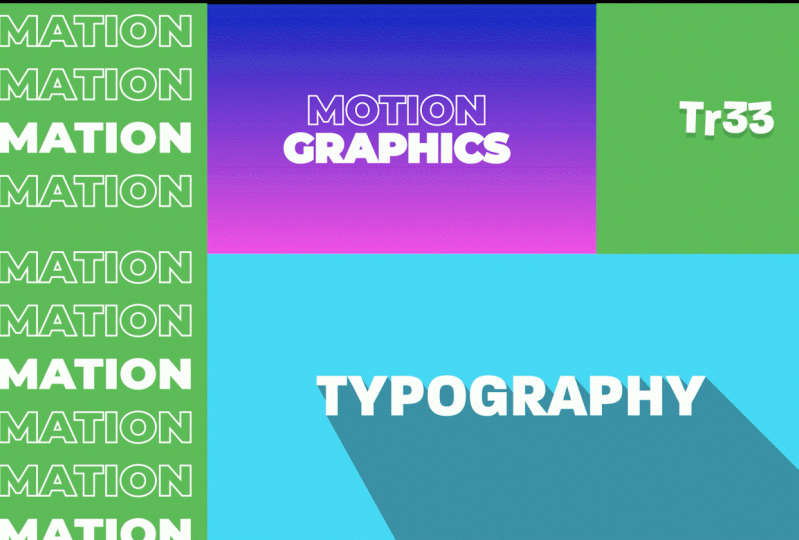
Transcripts
1. Intro: Hi there, my name
is armins Guzman. I am an animator illustrator and script writer
based in Portugal, originally from
Dominican Republic. My team and I have over nine years of
experience producing beautiful animated
explanatory videos for hundreds of
companies worldwide, such as Intel, De Ly, Bayer, Porsche, and many more. In this course, you will
learn to create some of my favorite text animation in a quick and easy way
without using any plugins. After finishing the course, you will be able to
create these for animation projects that you see on the screen
like a professional. First, we'll take a look at
the after effects interface, and I will show you the most
commonly used key shortcuts. Once this is done, the funniest part will begin, bringing our animated
projects to life. You will learn four
different techniques to create amazing text
animations in record time. And of course, you will
be able to download all the projects that we will
create during the course. This course is ideal
for animators, illustrators, graphic
designers, creative artists, and in general, anyone
who wants to create professional text
animations with a leading motion graphic
software on the market. With patience, a
positive attitude and perseverance,
you will succeed. Your time is now join the course and animate
at a professional level.
2. Before to Start: Hi there. I'm so glad you have decided to
take this course. This idea came out thanks
to two of my students, Yanyan and Sophie Lomans, who asked me how to
create a text animation, like the ones I use in my
courses introductions. So I will show you how to create my favorite text animations
in a quick and easy manner. After each lesson, I
will provide guidelines to ensure you achieve
the best results. Therefore, please follow
them and practice. I am excited to see your work, so please upload your protects to the course predicallery. If you have any
comments or questions, feel free to post them
on the discussion board. I can't wait to see
what to come up with. So let's get started.
3. First Steps: O. Hi there. Before we start
animating the project, let's get in touch with the
after effect interface. We are going to work with
the standard work space, but you can choose
your preferred option. The first step is to
create a new composition. So we go to composition
new composition. Open a new 1920 by 1080
composition at 24 frames, give it 5 seconds and name it. Perfect. Now, with the
help of the text tool, we write motion graphics. Let's take a quick look at
the after effects interface. The panel where you see
the text is a viewport. This panel shows the results of our designs and animations. At the bottom, you can
see the timeline panel. This panel is where
we will spend more time creating
our animations. From here, we can easily modify the transformation
properties of the layer. With the new after effects, when selecting a layer, a new panel called properties
automatically appears. I'm going to enlarge it a bit
so you can see it better. This panel allows us to work faster and more intuitively by accessing the different
configurations of the layer from
a single panel. If you have the latest
update installed, and you cannot see this panel, you can open it from windows
properties. But don't worry. You don't need to have this
panel to follow the course. It is just a plugin
that allows you to save a little time,
but nothing more. If we look to the left, we can see the
project panel where all the compositions
we create and all the files we
import will appear. And at the top, we can
find the essential tools. Perfect. Now, we
are going to learn the most know keyboard
harcuts for this course. The charcut refer to the layers properties and
the commonly used tools. Let's see how to open the layer properties
with a single click. Press A for the anchor
point, P for deposition, S for the scale, R for the
rotation and t for capacity. Obviously, if you have the latest version
of after effects, you don't need to use
the charcut as you can directly access the
layer properties from here. Now, let's see how to access the main tools with
the touch of a key. Press v for the selection tool, hold space for the hand tool, W for the rotation tool, y for the pan behind tool, and control T or T on
Mac for the text tool. I am going to delete the text layer that
has been created. At projects and resources, you have a PDF file available for download with the
most helpful shortcuts. See you in the next lesson.
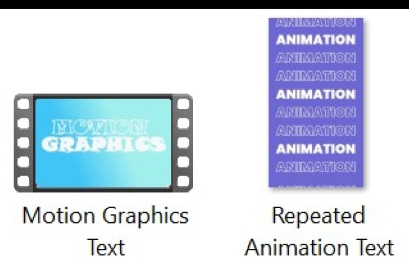
4. Minimalist Text: Hi there. In this lesson, you will create the project you see on the
screen very simply. First, let's create
the background. We go to layer, new, solid. We name the layer
and click on K. And we apply the
effect grading ramp. When applying the effect, a two color gradient is
created automatically. I am going to change the colors
for more attractive ones. From the effect options, we can easily change the
location of the colors. Perfect. We can also choose
the type of gradient. I will leave it at linear ramp. I like it better. We
are going to slightly modify the text that we created
in the previous lesson. We select the text and modify the font from
the character panel. I am going to use the
Poppins black font. From here, we remove the field and color
the stroke white. And from the paragraph
panel, we center the text. We increase its scale and place the text in the
center of the composition. We can also set the
leading so that the texts are not so
separated from each other. To finish configuring the text, I'm going to leave
the stroke with a thickness of two pixels. I take this opportunity
to remind you once again that if you have the
latest after effects update, you can make all these
modifications that we have made from the properties
panel more easily. I know that many of you do
not have this update yet. So I have decided not to
work with this panel. But if you have it, I
encourage you to use it. Okay, I am going to hide
the properties panel of it. And we duplicate the layer with control D or common D on Mac. Next, with the text tool, we select the word
motion and deleted. Once this is done, we select the layer with a
double click and click on the leer arrow too quickly change the stroke for the field. Well, we already have our
text ready to be animated. For now, we're going to turn
off the text layer on top, so it doesn't bother us. Now we're going to convert the text layer to a shape layer. Select the text layer, write, click, create shapes from text. We enter the
configuration options and select Add Trim paths. Trim Paths is an
exciting option of the shape layers that allows us to animate strokes very simply. We click on the stop watch to create a key frame
on the end property, and we set its value to 0%. Next, we move forward 2
seconds and set it to 100%. And we preview. We almost have it. Now we need to smooth
out the acceleration and acceleration of the movement to make the animation smoother. To do this, we select
two keyframes, right, click, keyframe
assistant, ECE. Let's take a look again. Excellent. Now better. We select the layer above. Around second one, we create
a keyframe at opacity 0%. We advanced to the second
two opacity equal to 100%. And bo. Oops, I forgot to
activate the layer. Sorry. Now, yes, we created a wonderful text animation
quickly and easily. See you in the next lesson.
5. Repeated Text: Hi, everyone. In this lesson, we are going to create
the CRs second project. To create a text
for this lesson, we will work with
AdoV Illustrator. We could also do it
with Ado after effects, but Illustrator allow us to design faster and
with more freedom. In Adove Illustrator, we are
going to create a file of 1080 by 1920 pixels in a vertical forma
style for Instagram. We're going to leave the rest of the default values as
you see on the screen, 72 pixels per inch
and RGV color. With the rectangle tool, we create the background. We simply click and drag until
the work area is covered. Once this is done, we color it and
eliminate the stroke. To work more comfortably, we enter the layer in the layers panel and
block the rectangle. Next, we select the text
tool and write animation. With a double click, we select the text and
increase its size. I am going to try 160 pixels, and I am going to place it
inside the composition. Again, I am going to select
the poppings black font. Let's remove the fill and
give it a white stroke. We place the text in the composition and give it a six peak sales
stroke, for example. We are going to duplicate
the text by clicking and dragging while holding down
the old in chieft keys. The old key allows us
to duplicate the text, and the chieft key helps us
to move in a straight line. Perfect. Now, we
press contro several times until the screen
is filled with the text. By doing this, the
text is duplicated, keeping the same distance
between all the texts. Good. And now we select all the texts and adjust their
size to the composition. If we keep the chief key press, we can keep the proportions
of the text intact. Perfect. To finish the design, we select several
of these texts, and by clicking on
this symbol here, we exchange the color of the stroke for the
color of the field. Okay, done, and we save it in the desired place with
the name repeated text. Click on O K in
the pop up window. Okay, now let's import the
design into after effects. We go to file,
Import, import file. We search and select the
file we want to import. Since we have not created
layers in Illustrator, we can import it
directly as footage. Click on O K again in
the pop up window. And we drag the imported
illustration layer on top of this symbol to create a composition with the same size as the file
that we have imported. Now, to create the animation, we are going to apply
a very simple effect. With the text layer selected, we go to effect
this sort of set. From the effect controls, we can configure the effect. If you cannot see this window, you can activate it from
window, effect controls. Okay. Go back to the settings, we create a key frame
at chift center two. Move the end of the
composition and shift it vertically. Let's take a look. Thanks to this effect, we can create a wonderful
repeated tax effect in a very simple way. We can also modify
the duration of the composition from composition
composition settings. I am going to modify the name
of the composition as well. Now to adapt the duration of the layer to the duration
of the composition, we simply zoom out
on the timeline from here and drag the layer to
the end of the composition. With the layer selected, press the U key to reveal the key frames
that we have previously created and drag
the last keyframe to the end of the composition. And ready, now our
animation lasts 10 seconds. See you in the next lesson.
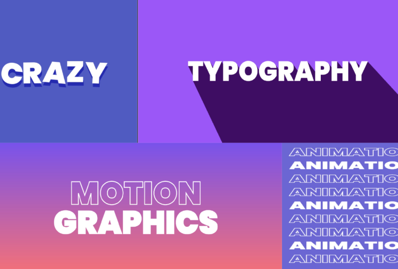
6. Crazy Text: Hi there. In this lesson, we will create the
curs third project. As always, we create
a new composition. In this case, we
are going to create a square format animation
for social media. Create a new 1080 by 1080
composition at 24 frames, give it 10 seconds and name it. If we double click on
the rectangle tool, we can create a shape layer, the size of decomposition. This will work as
the background of our animation, and we color it. Next, we select the
te and write a word. We select the text with a double click and
increase its size. And we place the text in the
center of the work area. We are going to leave
the text as it is now with a white
field and no stroke. Well, we have already
created the text. Now we are going to
create the animation. We enter the text
configuration and select animate all
transform properties. Next, we select at
selector Weekly. Thanks to this option, we can create very
funny random animations automatically without the
need to create key frames. From the wiggle selector option, we can configure our animation. In this case, we want to
animate all the letters separately so we can left the
option based on characters. Next, we go to the
position and give it a value of 12 on the y axis, since we only want the
texts to move vercally, and in the rotation, we give it a value of eight. In this way, we tell it to
move randomly in a range of 12 pixels and to rotate in
a range of eight degrees. Let's take a look
to our animation. Note that the higher
the value you give it, the more exaggerated
the animation will be. For example, if in the rotation
we give it a value of 50, the animation gets much
more out of control. Let's leave it at eight. You can also animate the
rest of the properties. For example, we're going
to animate the scale. We just need to modify its value and it will animate
automatically. But in this case, I just want to animate the
position and rotation. So we're going to
undo the animation. And the same with the rest
of the properties. Great. We can also set the
animation speed per second for the wiggles
second option. I am going to set it to three, so it moves a little faster. I am also going to leave
the correlation with a value of zero so
that the letters move completely
independently of each other and thus give a more fun
and uncontrolled look. As you can see, there
are many more options, but these are the
most important. The truth is that I have never needed to touch
more than these options. To finish, we
duplicate the layer with control D or
command D on mac. With a double click, we select the text layer below
and modify the color. And we shift the
top layer a bit. We are also going to add an entrance animation
in a very quick way. We select the two layers while
holding down the chit key. We go to the effects
and preset s panel. Animation presets,
text, animate in, and we select the slide up by character preset
with a double click. As simple as that. Now, we select both layers and press the U key to
reveal the key frames. If we select the
final key frames, we can modify the duration
of the animation. With right click, we apply EC ease to soften the animation. Most of the animation
prosts are not very useful, but those that start
with the word slide allow you to create
animations that can be useful to you
very, very quickly. Okay, now there is
only one problem. We can see that the texts below move differently than
the texts above, but we want them to move at
the same time at those above. To fix it, we simply
precompose the layer below. We write click precompose. Now, if we take a look,
we already have it. Our lyrics dancing very
gracefully with minimal effort. See you in the next lesson.
7. Dynamic Long Shadow: Hi, everyone. It's time to
work on the CRs last project. As usual, we will begin by
creating a new composition. In this case, we are
going to create a new 1980 by 1080 composition
at 24 frames, give it 5 seconds and name it. We double click on
the rectangle tool to create a shape layer, the size of the composition,
and we color it. Now with the help
of the text tool, we write a text, and we placed it in the center
of the composition. I am going to decrease its size. We are going to leave
the text as it is now, with a phone popping is black, with a white fiel,
and no stroke. To create the animation
of this lesson, it will be very complicated to do it by creating keyframes. For this reason, we
are going to use an alternative method
much faster and easier. We are going to enter the text
configuration options and click on Animate all
transfer properties. From Animator one, we select
at selector expression, and F expression selector one, we open the tab next
to the text amount. Perfect. Now with Control
V or common V on Mac, we paste the expression
that you see on the screen. I am going to open
the expression a bit so you can see it
better. But don't worry. You can find the expression
in projects and resources, so you can quickly
copy and paste it. This expression is nothing more than a Java script code that helps create complex
text animations in a very simple way. Now, it is as
simple as modifying the values of the properties
that we want to animate. If you want to
animate, for example, the scale, we set
its value to 0%. In this way, the
text will begin at 0% scale and end at
its original value, that is at 100%. If we preview Voila, we have made an amazing
animation that will take us a lot of time
to do it manually. We can also modify the value
of the other properties. For example, we are going
to animate the position. We are going to
modify the value of the Y axis so that it
appears from the bottom. If we want a slightly more
exaggerated animation, we can quickly expand the value. But I prefer to leave
it as it was before. I am going to leave it at 50. We are also going to
modify the value of the rotation so that it makes a slight turn
when it appears. Perfect. In our
animation studio, we use this expression constantly to create
text animations. You can also change the values
of the expression easily. You can change the
value of frequency, decay, delay, and duration. However, with the configuration that we have left by default, it works very well. Now, we are going to create
a long shadow effect. For this, we have to duplicate the layer that we have created. Once this is done, we precompose a layer
that remains below, and we name it long shadow. It is necessary to precompose it for the animation
to work correctly. And with the
composition selected, we go to effect, blur and
sharpen TC radio blower. Please do not confuse it
with the radio blur effect. In the type option we
select straight Zoom. We can leave the amount at 40. This option allows us to decide the length
of the long shadow. We can modify it later
if we see it necessary. The center option allows us to decide the direction
of the long shadow. I am going to set -1,000 on the x axis and -2,000
on the y axis. I have already used the
effect other times, and these values work
very well for me. Perfect. Now we are going
to apply the levels effect. The idea here is to drag Alpha input black
and Alpha input white to the start of the histogram to get a
more consistent shadow. To do it quickly, we can lift the values in input black zero, and in input white five. But there is a
problem. Okay, my bag. First of all, you have to
select the Alpha channel. And now, yes, we can set input black to zero
and input it to five. Great. We almost have it, guys. Now, if we modify the values of the CC radial blur effect, we see that we can easily
modify the shadow. With amount, we modify
the length of the shadow. And with center, we
modify its direction. To finish, we are going to modify the color of our shadow. For this, we add
the feel effect. We go to effect, generate, feel, and we choose the
color that we like the most. Our amazing animation is complete and ready to be
shared on social media. On detail. The right edge of the drop shadow is
slightly out of focus. To give it more contrast, we can reduce the value
of Alpha input it to one. Fixed. See you in
the next lesson.
8. Rendering: Hello. Now that we have
our projects ready, we can export them. Keep in mind that
the composition we currently have up and
will be exported. For this, we go to
composition and select add to a
dov median Cotter. Median Cotter help us export
projects more efficiently. First, we choose the codec. In this case, we are
going to use H 264. It's exports the
video in MP four, the most used
format for the web. Regarding the output resolution, we can choose the match source, high or medium V trade
option to avoid mistakes and export it in the same size we
have worked on the project. Finally, we choose a location to explore the video and
give the file a name. To finish, click on
the play bottom here. And with this, everything
will be ready. Once the process has finished, you can open your
video and share it with all of us in the
Cars pred the gallery. I'm looking forward
to seeing your work.
9. Final Thoughts: Congratulations on
completing the course. I'm so happy to have been your guide throughout
this journey. I can't wait to see you put
everything you've learned into action by creating your
animation from scratch. Please don't forget to
share your projects in the project gallery or tag
me in your Instagram posts. I'm super excited to provide feedback to
help you improve. Remember, practice
makes perfect, and making mistakes is
just a part of learning. C heck out my profile
for updates on new classes and other
animation related courses. Your feedback is valuable to me. So please take a moment
to leave a review of the course and share your
experience with others. Thanks for being
part of this class, and I can't wait to see you
in my other courses soon. Keep up the awesome work.
 Carminys Guzmán, Motion grapher