Transcripts
1. Monochromatic Magic with Alcohol Markers (Blue) Intro: Hi, and welcome to another
class in my studio. So today, we are
feeling blue in blue. More like the most beautiful
possible way of using blue. Art. When we think
about blue art, most of you might think about Picasso and his blue period, but this time it's not gonna
be that kind of melancholic, sad blue scenes that Picasso was trying to show
all over Spain. That's my Dag Lana, if you
hear weird noises in the back. And she might start
saying things. So, this time, we actually
gonna be coloring. You see that painting? Did you see that failing
right behind me. Well, I made that
painting last year. Hmm. And now we're gonna
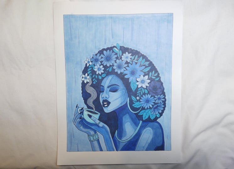
be transforming that into this, all blue. So this is how
we're gonna do it. Whenever you look at that new full package of markers that you just got
and you're so excited about, and there's 80 of them
or sometimes even more, and it's so confusing. Like, What I'm gonna do
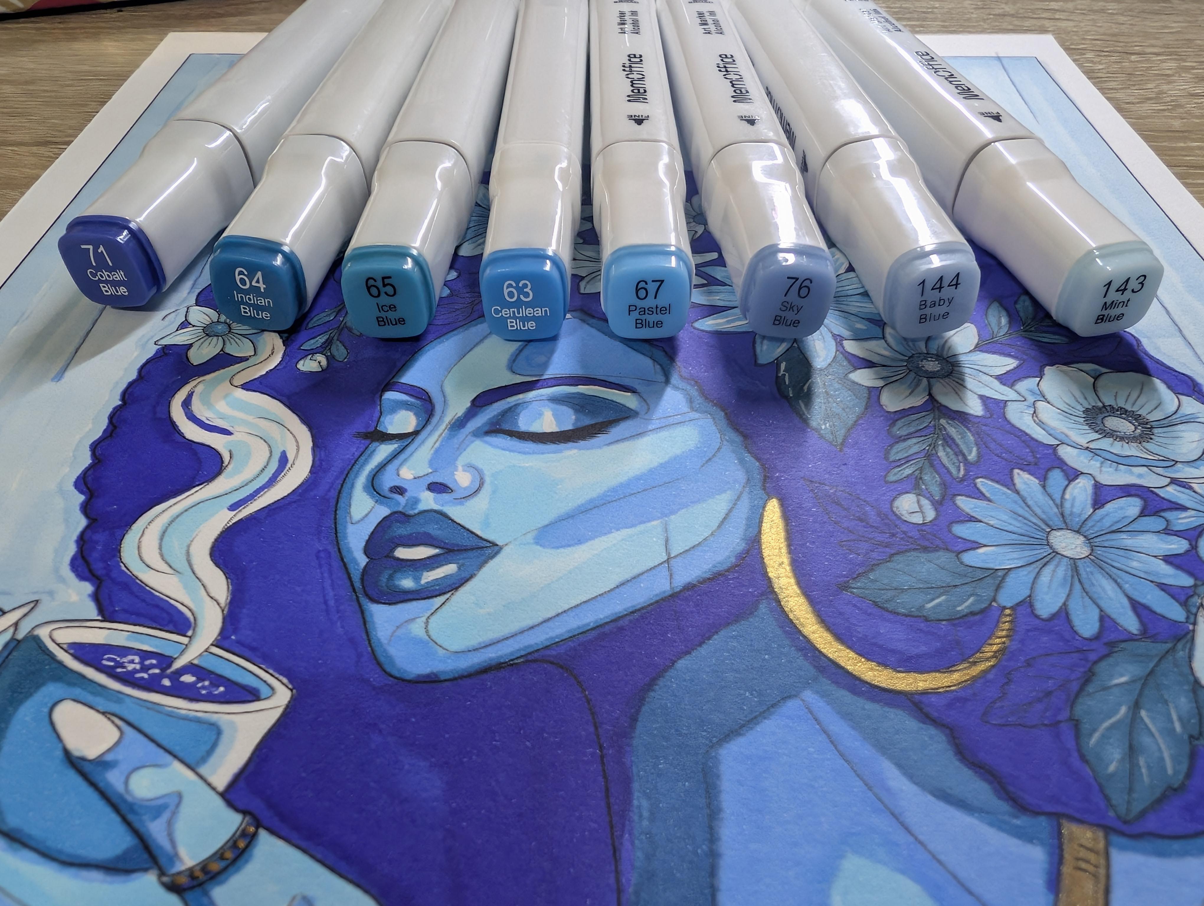
with all of these colors? Well, today we're gonna stick to just one family of color, and it's gonna be Blue. So These are going to be the ones that
we're gonna be using. I would definitely put
it in the description. We're also going to be using
this bad boy right here, which is very helpful. And is like a white gel. Well, we will be using this one, and this is completely optional. I decided to use this. So this is gold ink that you
can use with a thin brush. This is size zero. You can use this to
for details, like, so I wanted to make
her jewelry, gold, like I have it in the original
painting right there. I make I don't know if, you can see that it's gold. So yeah, I made
her jewelry gold. That's completely optional.
You just leave it blue. You don't have to
go the extra mile. Just make sure you get a paper to put underneath
because this is the back. This is the front.
This is the back. So I highly recommend
to put this, so you're gonna have
a mess on your desk. Let's avoid that. Now, this scene, it is inspired in a
morning cafecito, but this time, it's
more like a night moonlight moment why she's drinking coffee at that
time, let her be, you know? She has her own reasons. Now, let's start
and let's have fun.
2. Monochromatic Magic with Alcohol Markers (Blue) Process Class: Oh. After you print your paper, make sure you put another
paper underneath, so it doesn't
bleed-through your desk because alcohol markers
tend to bleed quite a lot. So here I am showing
most of them, and this is one of
the things that I highly recommend is to in another piece of
paper to try every single one of the colors
that you already selected. So that way you
have a better idea how do they look in paper? Because they might
look different in the little lid that they have than how
they actually look. That way you have a
visual idea of how it is. And so I'm going to
put all of the values, and also if you
put them in color, starting from the
lightest to the darker, it will also help you
to have that comparison that visual
comparison of what to get and what to choose for
each part of the body. Once you already have a test in a separate piece of paper
of how your markers look, you have a better
idea of what to use. Now, this is very important because this has to
do with the values, and the values of the colors are super important when it comes
to monochromatic painting. You got to go from
light to dark, so it gives you a better
idea which one to use depending what part of the painting we're
going to be using. For example, the light values are the best one for highlights. Like it's gonna come
the highlights of her skin or the background
or the coffee steam. Now, this part that I'm
showing right here, this is the white gel pen. This is gonna come very
useful at the end. They're actually
very easy to get. And yes, there is we have
over here a little companion. I guess it was a
supervisor that mini fly, you're gonna see
around a little bit around the video just
giving you heads up. So let's start with this one. This is going to
be the mint blue, and we're going to use it for the highlights because this is one of the lightest values. We're gonna use it for the
highlights of her skin. At this point, you
might be thinking it's looking very weird.
Here's the thing. It's definitely gonna
look weird if you use a non natural color for
the skin, like it's blue. Well, it's natural,
I guess in Avatar, but besides that, you
don't see blue people. So, yes, I understand
it's weird. But this is one of those situations that you
have to trust the process. Now we're going to
move to the sky blue, which is going to be more
towards the mid tones of blue. So this is going to be more
for, like, the shading, for the skin, mid tones, and we're gonna use this one. So we can start giving some
dimension to the skin, and it starts looking less odd. So let's continue with this. We're moving to another tone. This is gonna be
the cerulean blue. This is gonna be more toward
the deep kind of tones. So we continue on giving
this shadow to give this idea of dimension so we
don't have a flat painting. We want to make it as appealing, visibly appealing as possible. So here we are This one, we're using it as almost
the darkest tone, but we still one deep tone
away from the really dark one. As you see, this is more
for, like, her lips, the eyeshadows start making her look like she's
wearing that nice makeup. And now we're getting
on the flowers. Yes. The flowers, they might
take you a little bit. So we're going again
with the lightest tone, 'cause we don't want to keep all the flowers
the same color. So you see that we're gonna be playing between some
of the light tones, but still keeping some
kind of difference in between just to make them more distinctive
one from the other. Now, we're going to be using this tone specifically
for the leaves. The leaves are
going to be darker, but not as dark as
the darkest tonee. We're still not there yet. And now tan tan tan
tan, the darkest stone. So this is going
to be number 71, which is the cobbled Blue. This is the one
that we're gonna be using give me a second.
I need to take a zip. Mm hmm. Stay hydrated, my friends, especially
in this weather. Well, right now it's August, so it's pretty hot in here. And yeah, I guess that
explains a little fruit fly. Let's call her Carmelina. Our inspector Carmina.
You will see her around. She definitely was around. So we're gonna be doing with this her hair and her eyebrows. In this specific part.
Then we're gonna, like, keep on using
it in other parts. But for this specifically, yes. So once she has eyebrows, as you see, starts
looking more like a face. It's unbelievable how much of a difference eyebrows can do. So for this one, we're going to go first around the borders. It makes it easier
for me that way. And I have a confession to make. I did not painted
all of the leaves. I didn't feel like it, so I just covered them
with the dark stone, and it's very visible
only if you look. You're very, very, very close. And it's up to you. You can color them all. You are the one in control of your painting,
nobody else but you. But yes, I will start going through all
those little details. Whenever it comes to those
very fine in between petals, don't push too hard the tip
or it's gonna bleed-through, and it's gonna
make it look ugly. So just do it very,
barely pressing, very, very lightly, and it will still get 'cause
this is alcohol marker. If you'll be using
an acrylic marker, it will be definitely finer and it would
not bleed-through. But that's not what
we're using today. We're using the Oh, I
won't say it wrong. We're using the alcohol one. So let's go full speed
it will take a while. And now, it comes the part to shine of
this little white pen. It's perfect to doing
any kind of highlights. So you can barely see
a bed right there. I did some highlight on her lips to make that shine
of the lipstick. And a very useful part of it is any kind of little
bleed-through or little mistake that you have made
with the blue. Guess what? You can fix
it with this little pen. I'm telling you. It's a
lifesaver. I really love it. I didn't know how
important it was until I started doing
marker paintings, and, yeah, they make
such a big difference. You will see. So I recommend
to have one of those handy. It makes it prettier. And we're back to
the lightest value. Now we're going to do, yes, you get the background. Lovely. We're gonna be
using the thick tip because there's a lot of
space that we want to cover. You don't want to take
3 million years trying to cover it with the small tip. I'm doing just straight line. You do it however you want to, but that's how I like to do it. And then I will go
with the small tip. The I change to the small tip, and I went all the way around
the border of the image and went back to the sig tip or
flat tip, I think flat tip. Then I will cover the
little white spots, and boom, we have
our background. Now it comes this optional part. For this, I'm gonna
be using a brush. This is gonna be size zero 'cause we want to go to very small details,
completely up to you. And yes, this is the gold ink. I got in hobby love it. Oh, my God. It's our friend
Carmina. She's back. Oh, wow. Inspecting that I'm using the right markers. Lovely. So, yes, you will need
some water, also, and a little piece of paper towel works
or a rag or whatever, just so you make sure that
you don't get it too wet cause fall drops
on your painting, and it will not be pretty. Now, very, very gently, I'm gonna be painting all
of her jewelry with gold. 'cause it reminds me to
the original painting. That's the only reason.
You could leave it just with blue is
perfectly fine. Now, this part is a small detail that I didn't mention
in the beginning. It's just a regular black pen. I use it to add some details
after I use the gold ink, it kind of lost some
of the black lines, and I just wanted to
enhance it again.
3. Monochromatic Magic with Alcohol Markers Final Thoughts: And that's it. Now you
can say that you have made a beautiful
monochromatic painting with just the color of blue. Now, if you want to
use other colors or you want to make it all red, you can print it again. You can do as many as you want. I'm not gonna limit your
imagination whatsoever. I would love to know how
many colors you use. How long did it took you? You can leave all
of those answers in the review because I love
to see your reviews. And please leave your picture because I really want to
see what you created. You should feel very proud
right now for what you just did with your time
and with your hands. You should also be grateful to yourself that you
took the time to do something artistic and so
mindful, like it is art. In case you didn't know, art
is a kind of meditation, so it's actually very good for all of us to be present and
to get back to ourselves. Well, thank you so much
for staying this far. And please stay
tuned for more of these classes because
I will definitely keep on bringing you
classes like this. Thank you. Bye.
 Lis Carballo, TropiCanvasLis