Transcripts
1. Class 1 Coloring a Mandala Intro (English): Hi, everyone. My name is Liz, and welcome to this class. Today, we're gonna be coloring that's my dog Lana in the back. She might be doing
some complaints, just giving you heads up. She has some comments
to do sometimes. Our class today is
gonna be for coloring a mandalla what we're going to be using is just marker based, alcohol based markers like
this, nothing too complicated. This is very beginner friendly. So if you don't have
any experience, that is not a problem. I'm also going to add the PDF of the mandala in the description so you can download it and
you can print it at home. Now, for the printing, I recommend to use a
specific kind of paper, but it's completely
up to you if what you have at hand is just
the printing paper. That is not an issue. We are here just to
enjoy the process, to go through it and get comfortable because we're about to create something
beautiful together.
2. Class 1 Mandala Coloring Process March 21 2026 (English): And here we go. Here is the coloring page, and as you can see, we're keeping a small
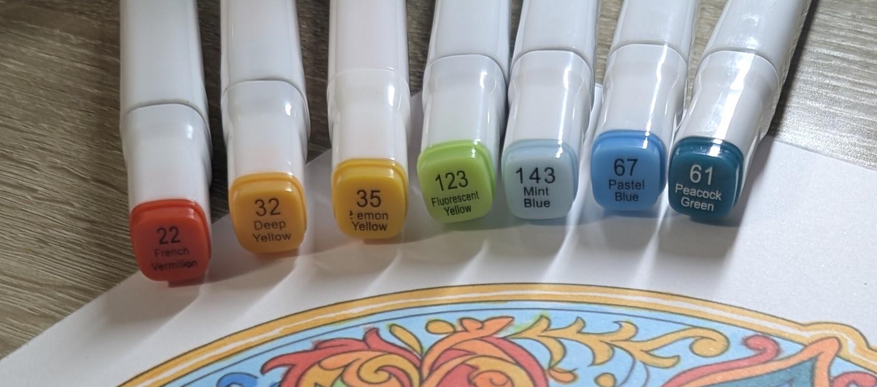
palette of colors. This is just the dual marker. This is the flat square tip. On this side, it's a
little hard to open. Is the fine tip. This is mostly the
one we're going to be using because since
we're going to do very small detail
mandalas style as you can see the design
has a lot of fine lines, it's better to use
the fine tips. So here we go. We're going to start with the fire colors or
the warm colors, whatever you want to call them. And let's start with this amber. We're gonna just do the middle. Simple. Just like a little
circle in the middle. Following the guides, and now we're going to go with
this a little bit of orange to make the color
more towards the red. As you see, I'm being
gentle while I am using it, because it will
bleed if you push too hard the tip and it
will go over the line. So we try to be soft and gentle. There is no time in here that we're trying
to rush or nothing. We're just trying to
enjoy the process. I am using these colors, but it's completely up to you
whichever color you want. I want to use
complimentary colors. So I will also add
in the description, you will find a PDF that it's going to
have the wheel color, so you can also check which ones are the
complimentary colors, or maybe you want to use
just one same color, but different tones of it
is completely up to you. So I'm going to be using again the amber to add a little bit
more contrast with the red. And I recommend to
not close them. Every time I did that mistake, a couple of times you may notice later because it's hard to open. At least these kind are. See, like, just take your time, try to fill the space
in between the lines. If you get out of the lines a
little bit, it's all right. It's just like I said, just to enjoy the
process, go through it. There are no mistakes. It's just part of the way
it's supposed to look like. Now I'm adding a little
bit more red to continue with this from the amber, I could have used
yellow as well, but I wanted to use
the amber to keep it more into the reddish tones. And here we go with
the red again. So you can, notice
that I try to do the exact same kind of design because I always keep the tiny ones and I will
go straight to that. And yes, you will see from once in a while it will bleed a little bit more than it
should because it happens. So don't stress yourself
if it also happens to you. Here I'm iring a little bit of the yellowish the amber one. If you are right handed, I recommend to color
first on the left and then move towards the
right. If you remember. Sometimes I don't remember, and I go straight from
the right to the left, and then it's not
such a big deal. If it will be more with pencil or any kind of
graphite, most likely, it will be more messy than with these markers because since
they are alcohol based, they happen to dry really fast. Okay, so here's a
little bit of time lap so you can see how
am I doing it. I'm going from the amber to orange to red and
continue on doing that. So you keep that
visual gradient look. Now, because of the
green is kind of in between the blue
and the yellow, I am using this
lime green style, and that's the one that I'm
going to be using now to blend from the
yellow to the blue. You can see that I
am being gentle, trying to stay as much as
possible between the lines. Don't put in much pressure. Now, this one, see that
I messed up in there, no problem because this
is a colorless market. That's the one that you
will use in order, like, if you have it to get
out of the to clean, I'm sorry, to clean
a little bit, whatever you went through, and then you let it dry
for a little bit, and you can go over with
the color that you wanted or just in case you get out
of it in the blank spot, you can just leave it like that. You don't have to go
over with any color. You can also use there's
another technique, but I didn't use it
at all in this one. That is with the white yelpen. You can also use it as a corrector for the
markers as well. And here we go. I already
fill up almost all of the green that I was planning
to do in order to show that transition from the
yellow to the upcoming blue. And here are the blues. Here I'm starting with
this turquoise blue, and I am filling it up. Just as I'm going, I am choosing where
do I want it? There is, like I said,
no wrong or right. Just go with what it
feels like to you. If you don't have
these same colors, you can use your own colors. It doesn't matter. So that's
the choice that I took. Now we're going to go with
another tone of blue. Right here. So,
this one is blurry. You can barely see it. Yeah, you can barely see it. But this is a little bit
higher tone of blue, and we're gonna go
after the darker one, which is the darker one. Actually, it is peacock. That's the color. And now we just
gonna repeat and do the exact same
coloring on each one, just like we have been doing
before to keep it symmetric, uniform and easy to follow. Now we will be using a
lighter tone of blue. We use a little bit of green and went back
to the turquoise. Then again, the darker
blue, more green. As you see, I will
continue to use the same colors over and
over and try to mash them. Whenever you put
the green and red, that's you're going to find
a complimentary colors. Like, that one is very common
you won't see on Christmas, so to keep that visual appeal. As you color, just try to move slowly and enjoy the
repetition Mandallas happened to be a
wonderful way to calm the mind because of the symmetry and the rhythm, take your time. There is no rush. Use
whichever colors you wish. Like, if you want to use
the same colors I did, that's perfectly fine, as well. But it's more of the repetition. As you see this class, it doesn't have much of complicated technical
ways to use the markers. It is mostly just
filling up the blank and keeping it with
mostly flat colors. But just keep on changing
the colors if you want, from light to dark and
keeping the same tones. You can even use different
kinds of colors, but as long as you keep
the tones, similar, if you want to create
that dimensional filling, that is perfectly fine. But you don't have to overcomplicate it
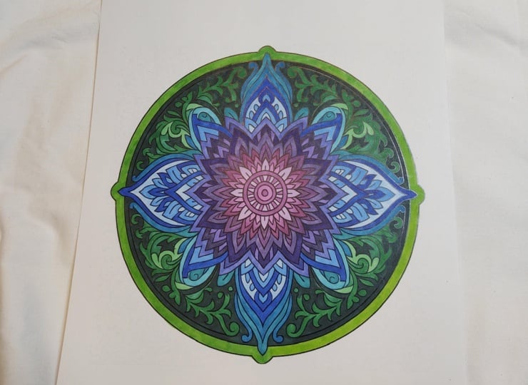
if you don't wish. It's completely up to you. And And here's the final result. I hope you also enjoy
this as much as I did. Now you have a beautiful
mandalla right in front of you. I hope you frame it. Yes. Go ahead, frame it. Take a picture, share it with
me. I would love to see it.
3. Class 1 Mandala Closing March 21 2026 (English): Thank you so much for joining
me today and coloring. I really hope that this
moment brought you some calm and creativity, and you should be very proud of yourself for giving
yourself this time, just to feel the emotions and to put the colors as
they go cause like I said, there is no rule when
it comes to art, at least not on
this. By the way, if you by any chance, like this sign of mandala, this happened to be
one of the pages of a full coloring book that I have available on my EDS store, and I will leave the
link in the description. So if you're curious, you can
always go and check it out. Last thing, please, I would really love for you
to leave your picture of your coloring page
in the comments, so I get to see it because just anytime that I see
art, it inspires me. And I would love to be your art, the one that inspires me. Thank you so much, really, really much from heart, and I hope I see you next time.
 Lis Carballo, TropiCanvasLis