Transcripts
1. Color Point by point Class 2 Intro: Hi, and welcome
to another class. My name is Liz Carvallo, as maybe you have seen
me in another video. So today we're gonna be also
using the alcohol markers, but there is a twist. We're gonna be doing pointism. Yes, yes, it's gonna take you
a while, but that's okay. I'm gonna try to make it
as short as possible this video so you can spend less
time watching me doing it. So this it's what
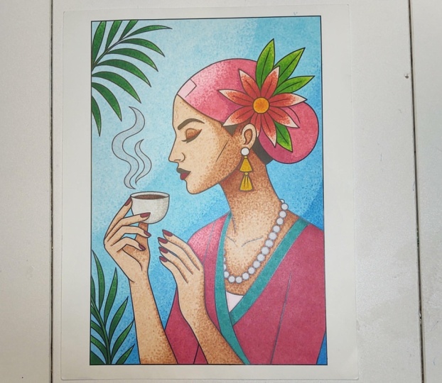
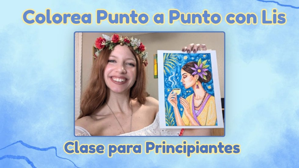
we're gonna be doing. If you see a little closer, you can see all those dots. So pointilism let me
just give you, like, a small history facts. Okay, so the
pointilism started in the 1800s by George Sura French. You might know him from one of his super famous paintings that I will put right
here so you can see. So that painting took
him two years 1884-1886. If I am not wrong, I think so. And whenever he did it,
surprisingly enough, he was actually mocked by most art critics because they
thought that it was a joke. It was a way of impressionism. But they said that it was
like they look like confetti, and it was, like, so ugly. And it was like, why
would you do that? Why would you make
everything out of that? Different times, but
very revolutionary times when it comes pretty much of
everything in every aspect, but also with art. So they actually
it was him and oh, let me check because I
completely forgot the name. Of the other artists because
both of them started it. It was Paul Snook. I'm not very good with French, so I apologize for
my pronunciation. Both of them, they started
with this new art style, and they call it divisionism. That was the name
that they decided. But the art critics,
they started calling it pointism to make fun of it because they were
all little points. And they actually were very cool about it and they
were like, You know what? We like that name better.
We call it like that, which is a great way to deal with criticism because
that was not critique, and that point was
actually criticism. So they become actually
very good at it in a point that they revolutionate,
the impressionism style. So that's what we're
going to be doing today. Now, let's get to the part. So I am using a little bit
thicker than usual, the paper. Then usual, I mean,
compared with the traditional printing papers, which I recommend
to always put one underneath because this
is the back of it. So you don't want to
stay your surface. I like, so I didn't actually get that
many surprisingly enough. 'Cause also it's like
a sticker paper. If you use the regular
printing paper, it's gonna bleed through it. It's not gonna look nice. And if you do a little dt, it's gonna get a lot
bigger than it should, and it might mess up with
your lines and frustrate you. And the point of art is
not to be frustrated, it's to enjoy it and be happy
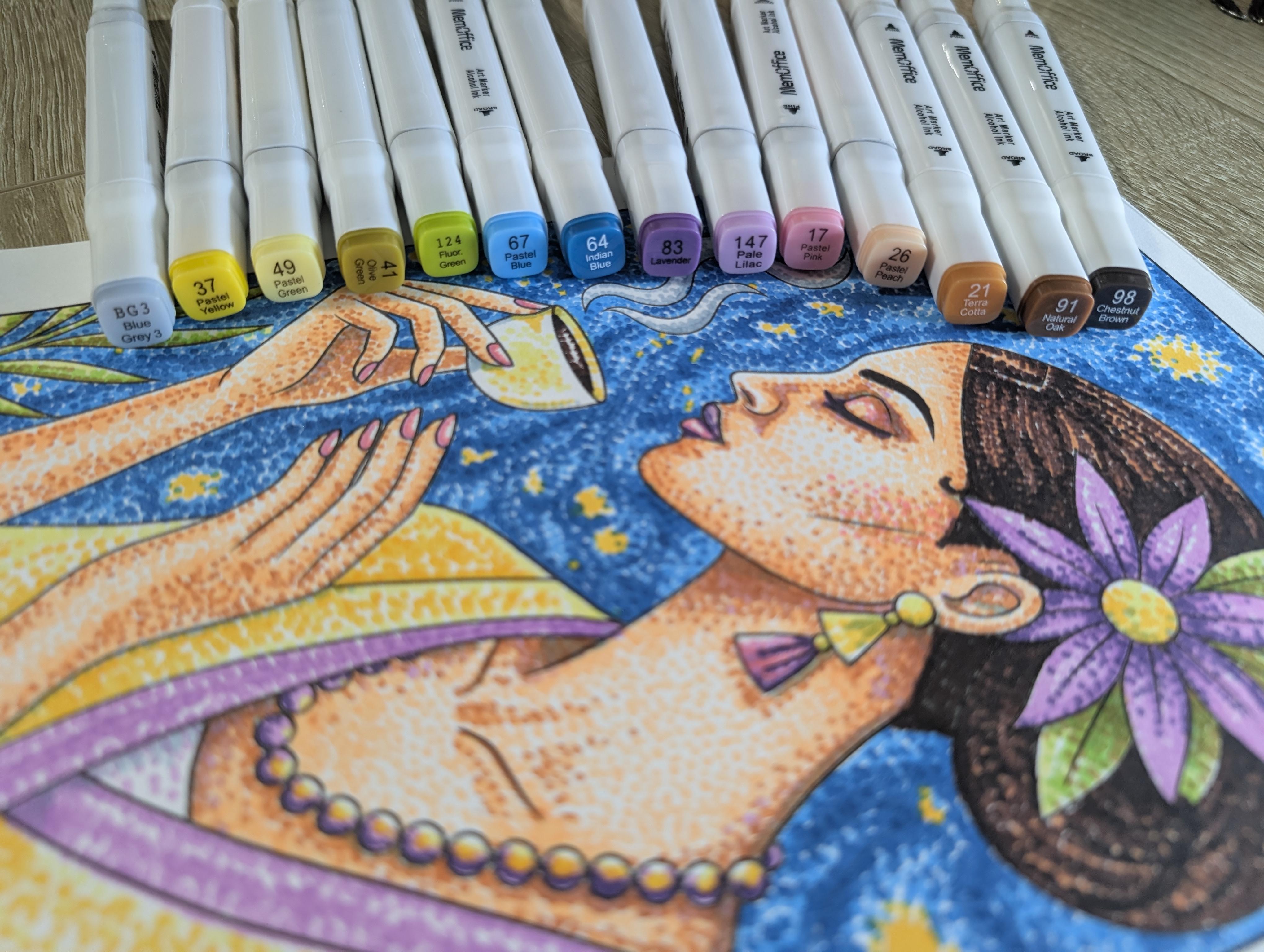
and just go with the flow. And the happy mistakes, that's a good concept. Now, I use 13 different colors. I wanted to keep the
palette smaller. But it didn't truly
happen as I was planning. But you do you, okay? So I used, I don't know if I
can hold them all at once. So this I would put them. No worries. I would put them
in the description of Paya. All of this is what I
used to create this art. So I will teach you, I
would go through it. I will put a lot of
time laps because I will not put 3 hours of that, that that, that that because
I will drive you insane. So I don't want to
drive you insane. I just want you to be happy.
And please, please, please. Whenever you do it, I would love to see it in the comments. Okay, so here we go. By the way, a small
detail that I forgot to mention is
the discoloring page. You're going to find it in the project
description as a PDF, so you can download it and
you can print it at home. That's it. That's
all I needed to mention that I forgot
in the beginning.
2. Color Point by point Class 2 Coloring 15 minutes: All right. So let's
start with the coloring. But before, let's
talk about strategy. Okay, let's look at our
beautiful coffee lover, lady. We're gonna start now with this. This is gonna be number 26, the peach pastel color. So we're gonna be using
this one for her face. Now, let's think about
where the light is hitting. So the light is going to be
hitting her from the front as like the soft morning
sun in Navana. Yes, that sounds good, right? Well, in art, we call the
brightest spot the highlights. So for her, that is the
bridge of her nose, the tops of her check bones, and the center of her forehead. So in pointilism, we don't paint the highlights.
We just save them. So every white space
is gonna be important. It's like a tiny
window of light, if you want to put it
in an artistic way. So my first technique for
you is to map the light. Where do you want the
light to come from? I'm going to put it from there. That doesn't mean that
you have to do the same. It's completely up to you. Just keep in mind about the white spaces because
that's key for pointeism. Okay, so let's talk
now about the touch. This is not a hammer.
It is a feather. If you press too
hard, the alcohol is gonna spread the ink, and you don't want the bleeding. We want to keep, like, the
nice crisp, tiny circles. Okay, so there we go fast, and you can see Now we
bring the dimension. This is the medium tone. So this is how we're going
to create some shadow without just making
it too complicated. Always, keeping those
white dots in between. Yes, this is going fast because I don't want to
keep you here for 3 hours. Now we added some pink. Then we're going to add
some purple because I choose to use some
purple as well, and then you can go over it one more time because
that's a good thing about the ink vase markers that you can go over it with the same color and make
it a little bit darker. Now we move into the
nice and green colors, so we can use some
contrast and keep it interesting and vibrant and tropical like our
lovely lady over here. Okay, so now this part
is completely up to you. I like to overcomplicate
things sometimes, and just the background being flat was not
flying good for me. So I decided to just
add with the pencil a few lines just to
guide myself because I wanted to just add something
else in the background. I really enjoy the combination of blue and white,
sorry, and yellow. It kind of reminds me to
the starry night of Bango. So I tried to mix
it a little bit. And here I'm also using some guidelines for
the hair so I can make the dots in a way that it will go good with the natural
lines of the hair. As you see, I left
some white areas for me to fill up with a
lighter color for her hair to make it more dimensional to help with the
look of the hair so it doesn't look flat because we're only
using points over here. So you want to work with that. And again, you want to
work with the highlights. Now, let's start with
the starry night. Yes. Let's get weird. So I started with the white that so I can work my way around it. And this was the longest part. This took me the longest, okay? So be ready. Do some hand stretches it might take you a
while. But you got this. Now, for the magic, we have our beautiful woman, her coffee, and her tropical
flower, but she's floating. We need to give her a
world to live in, right? So I'm gonna take a page out of our friend Vincent, pins Bago. And we're gonna mimic
the famous sirrynight, but this is gonna be with
my own tropical twist. Instead of those long swirls, we're using flowing
pointlism. Yeah. See, like how I'm placing these darkest blue dots
in the curve lines. I'm not just doting randomly. I am drawing the wind. Imagine the warm breeze
like blowing the scent of that coffee around the
page. Isn't that beautiful? Pontism can be very
static and still. But by placing your
dots in these currents, you give the art
some energies like the ocean or the night sky
or never truly stand still. So we're gonna fill up every single little white
dot with this dark blue. Okay, now we're getting kind of close to the
finishing touches. We're going to be using
this blue gray number three more than anything
for the smoke. Yes, we want to give the
smoke some dimension, but without losing the color because the smoke
tends to be white. So we want to keep
that white highlight, but also the smoke filling. See, I am not connecting
too much the dots. I'm just letting it
breathe through it. Okay. And see? What a mood you can create after thousands of dots. If your hand feels
a little tired, that's actually proof
that you work hard. But I hope your heart feels a little lighter cause art isn't about being
a perfect machine. It's about these tiny
tensional moments that we spend with our markers. So I hope you enjoy this, and I hope you keep on
doing it because it's very satisfying
after you're done. During, I understand that it can be a little tedious because
it takes a long time, but it's so, so
worth it at the end. Thank you so much
for staying with me this far and following
this project. I hope you love it like me.
3. Color Point by point Class 2 End: And guess what?
Jude, just finished. How amazing does that feel. Result, probably your hand, not that amazing.
I bet it hurts. Mine was definitely hurting.
It's to be expected. It's a lot of da da, da, da, da, da, da,
that for a long time. I hope you took yourself
a little breaks and stretch the hand a little
bit. But there you go. Now you can just go ahead, look at it and feel proud of yourself and proud of
what you just created. We just like paper, markers, boom, art isn't it that
beautiful. Thank you so much. So, so much for
sticking around to go through all of this trouble
just for the love of art. Isn't that amazing.
Now, go ahead. Make a capito, just like her. I bet I bet you was also
doing some point ism, and that's why she's
taking a break us she was like,
Oh, my goodness. I bet her hand also hurts.
Well, thank you so much. My name is Liz Carvalho. I hope you enjoyed this and you stick for more
of these classes. I love to have you here
and please please, please show me what you created, 'cause I love to be
inspired by your job. Your word. Thank
you so much. Bye.
 Lis Carballo, TropiCanvasLis