Transcripts
1. Welcome: Do you want to paint
magical and enchanting art? This class is all about
exploring watercolors, perfect for artists
of all levels. You'll be able to
paint along with me. My name is Madu, I'm a professional artist
and a published author, and watercolors is
my favorite medium. I live in Bahrain and I'm
very inspired by colors. I generally start
with colors and let them intuitively guide me. This class is the best place to experience the magic of
watercolor painting. My innovative approach
to art education combines traditional methods
of watercolor painting with latest techniques to
unlock your creativity and inspire you to create
meaningful works of art. Come and join me and discover the joys of watercolor painting. By the end of this class, you will have a stack
of four projects, and we'll have techniques that inspire you to create
your own woodland art. Come join me and let's
begin. Happy painting.
2. Color Mixing: Time to talk about the colors we are going to be
using in this class. We have cadmium, yellow, crimson, red, orange, gray. And if you don't have gray, you can use black
as a substitute. Finally, we have verdan green. Now if you have shades of green
with you, that's perfect. If you don't, we're
going to mix a few. So you have a couple of options starting with
our cadmium yellow. You can see it's
a bright yellow. I like showing out
the colors because different brands name
them differently, which is surprising
to be honest. If it's cadmium yellow, you would expect
it to be the same. But I have noticed other brands
doing a different shade. Just for your information, we've got this bright yellow, We've got this orange. It doesn't have to
be very bright. We want something that's subtle. Indian yellow is a good
substitute as well. The next color that I'm getting
into is the dian green. Now, I personally don't like dian green as a
color on its own. I always like to
mix it up just to give it a difference in shade. You'll see me mix it, always taking a little
bit of that green. If you add in our
bright cadmium yellow, you end up with a
very bright green. It's like a part green. It's a beautiful color that we're going to be
using for our class. I consider this as
a medium green. It's very light, it's not dark. Through our projects,
you will see me refer to it as medium green. The reason I'm going to do
this and not really get into the colors is because it can
get confusing based on the, the set that you're using. Medium Green can be any color of the same shades that are not
too dark, not too light. And I'll show you
what I mean by that. Just keep that in mind as
we go through the class. One of the things I like
doing is simplifying terminologies and making
the class more accessible. I've had a lot of students who come up to me
and they're like, oh, what is wet on wet? Did you use wet on dry? And they get so confused
and bogged down by the terminologies that
they don't really get to learn the paint itself, like learn to understand
the water on its own. In the same way, even colors, people get into warm tones and cool tones and it
can be overwhelming. I'm just simplifying it
as much as possible. Now, if I add more
yellow to this, you can see how the color
becomes even more lighter. This, I would consider
is a lighter green. Do you see the difference
between the two? The one on top would be medium, and the one below that we
just mix is a lighter green. Let's mix some more greens. We're going to do
a forest green. I'm taking the Verdian green and I'm going to mix it
with the orange. That's going to give us a really interesting vintage color that I absolutely love. We're going to use it
a lot for our forest. If you can mix quite a bit, keep it ready in hand. That's going to be brilliant. You can see the color, very pretty, just really
captures the warmth of a forest. Similarly, if we add
more orange to this mix, we'll end up with a
slightly different tone. These two are still
understood as medium greens. They're not very dark, hence the basic name. Now we move into some darker
colors. Darker greens. I'm taking out Vardian
green and I'm going to be mixing it with a
little bit of gray. If you have black again, just a little bit of black. Goes a long way and we're going to end up
with a dark green. And that's what I would refer through our pieces
as a darker color. Adding more gray to the
mix is going to give us even more green, which we're also going to use. You may not need to use
all shades of greens, but just having the options
I think is a great start. If you're confused, you're
wondering what I'm using, just follow along
the basic colors. That's our mix of greens. We're additionally using red
as well for our mushrooms. I hope you have fun with this. We can dive right
into our projects.
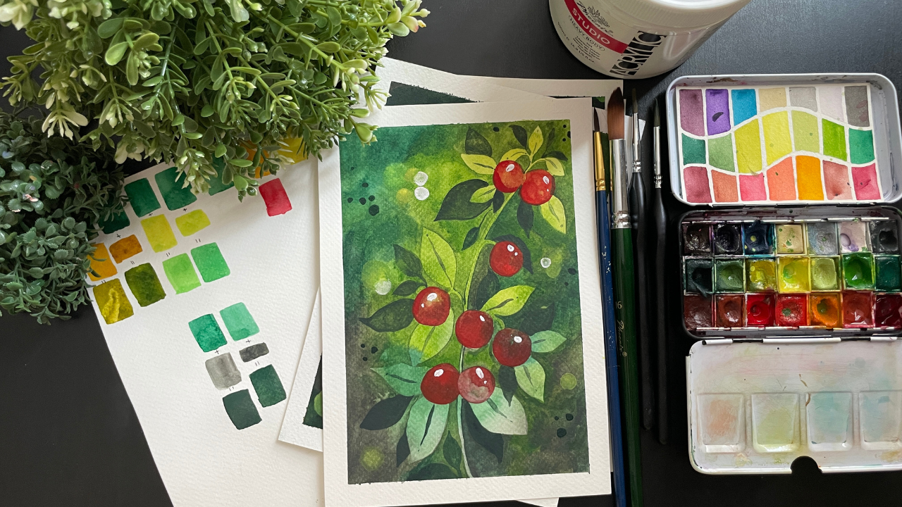
3. Materials: We are going to need some
key materials to begin. The first thing is
water color paper, 300 SM cold press. About five sheets of five size. Next, we would need
a round brush. This is a size six, but I think a size
four will also work depending on
the brand itself. Next we have a size four brush. Again, it could be a size
two depending on the brand. Next, a bigger round
brush of size 16. This is going to be great
for our backgrounds. We will also be using acrylic paints for
some of our work. Accordingly, we need
a small round brush for the same watercolor paints. I'll be talking a
little bit more about this in the
color mixing video. We also would need
a white paint. This is heavy body, you can use anything
that you have at home. Finally, we'd need ear buds and you'll get to know as we
proceed with our projects. Along with this, some of the normal elements
that we always use like water pencil eraser
and masking tape.
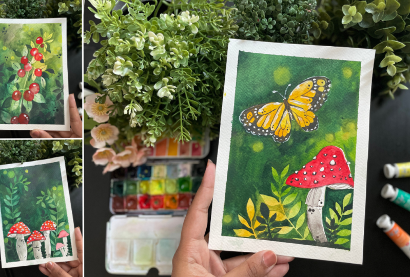
4. Project 1 - Berry Magic: Are you ready to dive into
this incredible project? I have taped down my sheet and I'm directly painting
the background. We're going to keep in mind
where we play certain colors. The bright yellow
goes right on top, and then we can go into
the Indian yellow. Or if you have an
orange that works well, then let's move into some
lighter green colors. If you have mixed your own, you can go ahead and use that. As you can see,
all I'm trying to do is just build up the color. As I move downwards, the bottom of our
painting will be dark. It will be the darkest
green that we can find. Maybe adding in a
little bit of the gray. The top part remains
very light bright. Keep in mind to smooh
around your brush like I'm doing to avoid
any brush marks. This is going to look a
lot nicer and that way we can avoid any lines
in the background. Now I'm adding a little
bit more yellow along the diagonal and using a tissue to lift up some of that paint. This is going to
clear out the way for our painting for today. Now quickly I wanted to
show you what I'm exactly drawing because it's going
to be hard for you to see it on our painting. I'm starting with simple
circles to represent berries. You can see how at the bottom
they were much bigger. And as I move upwards, they are smaller in size. Then you can go ahead
and add some leaves. We're adding just a few, enough to really
fill up the space. As we finish this, we will add
in another layer later on, the stem with three leaves added the DF of this in
the about section. Now that we've practiced this, let's copy out the same
thing into our painting. The layer has completely
dried and with a pencil, I can go ahead and
draw out our cherries. Make sure that you can
see your own drawing, which is very important. When we move into our next step, I'm switching over
to my thinner brush. This is the six, I've taken, the darker green color, and I'm painting around all the elements that
we drew in before. This takes a little
bit of patience, but it results in such
a beautiful painting that this is undeniably
beautiful to create. What we're going to do is start with darker greens
towards the bottom. And as we move upwards where the painting is in the
lighter yellow shade, we're going to also change the greens and use
lighter greens. That way we have a
variety of greens going on and it goes in theme with what we were trying
to do in the beginning. I've added in the sample to the left so you can see
how the final look is. Meanwhile, you can see
me paint layer by layer, just building up the
color as we move upwards. Something that might
happen when you're painting is certain
areas might dry out. Here you can see that the
line is very obvious, that area dried out. If it dries out, all you need to do is paint over
that area again. And this lifts up the paint
and then you can just smush it around and then
that line goes away. This is quite an easy trick to go over areas
that are drying up, so you don't have to
worry too much about that as much as possible. Try to avoid lines
within your piece, but it is natural
that it happens because we are working
in smaller sections, depending on where your based, some layers might just drive very quickly and you
end up with patches, don't worry, because
this is also going to work on our theme, which is the woodlands. It's going to give
you that effect of grass and greenery and
leaves at the background. It doesn't have to be perfect. It doesn't have to be one color. It can have shades,
it can have patches. That's all part of the painting. Now that we are almost
done at the bottom, make sure to use the
darkest color if you can. You can even move into the gray for the bottom to really
deepen out the color as we finish up the area. I'd like to just look
over the piece and see if I missed out any areas or any places that I feel
like there were lines that didn't look that great or
that are very obvious. If that happens, just paint over those areas, that
should help it. But again, as I mentioned, we want the pache look because that's what's
going to look really great. I have managed to paint around our piece completely,
which is great. We now move into our gray to add in
another layer of leaves. These are going to be connected
to what we did before. There are sections
that look quite empty. This is your chance to add in leaves to fill in the space. I like to play around with
small and big leaves to again, give a really nice
dimension to the artwork. We are working our way upwards and maintaining
the sizing, trying to go from big
to small as I move up. Once we've completed
our main plant, let's add in some more leaves along the sides of our piece. All of this is done with gray, and if you don't have gray, you can use black as well. As I mentioned in the
color mixing section, we're now going to
add in some dots. These are basically representing
leaves along the piece. I like to do sets of three. All of this is with a green. Just to show you a little bit more of the
leaves or the background, we switch to red to
go into our cherries in case there are two cherries
right next to each other. What I like to do
is complete one, move into some of the other cherries and then
come back to the second one. What this does is give different layers because
one is a and that way the second one looks
like it's underneath it and it gives the distinction
of two different cherries. But if you do them all together, they merge and doesn't
look as great. Now using a ear bird
with yellow pigment, I'm adding some dots around
the top of our piece. Make sure you pay
attention to that. It's only in the top area
where there's yellow. We're not going to add
them at the bottom. It's not going to look as great. Just keep it upwards. Can add ins to our leaf. And finally, using
white acrylic paint, I'm adding reflections
to the cherries, or you could call them berries. I didn't really have a
specific specific plant in mind when I did this. Just move upwards, slowly
adding in that white, and you can see how this
gives life to the berries. Rowing out our white tape
for our completed piece.
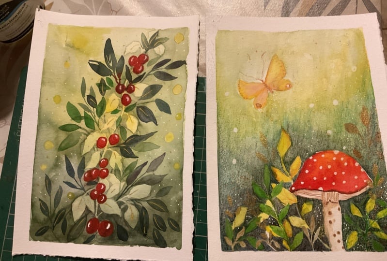
5. Project 2 - Illuminating Deer: So this painting wasn't even
on the list of projects, but I tried it out. I loved it so much that I
had to add it to the class. It was just so mesmerizing and exactly the theme
that I was going for, which was magical woodlands. And again, exploring different
techniques that are very interesting and different from what we normally do
with watercolors. So I had to add it in. I hope you guys enjoy
it. Let's dive right in. We're going to
start with painting our bright yellow in the middle, bottom of the paper. Center it out, and then go
a little bit downwards. And that's why we're going
to place our yellow. Now you can use an
Indian yellow or an orange to continue
with the sheeting. We're creating layers of color. Again, smushing around
your brush so we don't end up with any brush
strokes or any lines that we don't want using the biggest brush. This is great for just covering a larger
portion of the piece. Now we move into our green, adding a light green all the way to the end and just
blending out the layers. I'm making sure I work fairly quickly so it doesn't dry out. Adding the green thing to give an even look as
we move all the way up. I'm going to go with the color. If you can pick a darker green, that would be great, or even the gray,
that's a good idea. But we're going more
deeper in color, away from the center to give a little texture, just out your wet of
paint along the edges. This will blend out completely, but you will end up getting a nice dash of color
in the background. Now we let it dry. I'm going to go into
a rough drawing of the deer that we are drawing. The PDF is below so you can
use it as your reference. I started with the head
or the face of the deer. Now we add in the
horns on either side, the antlers horns, I just
realized, on either side. And then we go into the body. I think the most
important part of the drawing is to get your feet as thin as you can because that makes it
look really realistic. Pay attention to the feet, the front and the back. We want to choose a pose
that's very obvious, that makes it look like a deer. Here, you can see it looks bold. It's a great
representation of a deer. And that's why I decided to
pick this for our piece. Going back to our painting. Make sure your background
is completely dry. I actually like to let it
dry naturally sometimes, just for like 10 minutes, and then use a dryer, because I feel like the layers
settle down a lot better. Like you can see here.
That looks so nice. Compared to if I just use
my dryer immediately. I have noticed that sometimes I just need to
have patience and wait. Having drawn out my dear, we can start with our painting. I'm going in with
the bright orange, or if you have in
yellow, you can use it. I'm going to be painting
around our deer. I've switched into
my thinner brush. This is the size six brush. I think it would be also called a size four depending
on the brand. I'm just gently going
over the entire deer, adding a lot of water so I can blend the remaining
into the background. Once I've done going
around the deer, just take a lot of
water and mix it in and slowly work your
way through the piece. We're going to pay special
attention to the antlers, making sure that we
get paint in between those ridges so it looks very natural and
completes the work. Take your time with it. Don't rush it,
because we want to make sure that it
looks really great. I'm adding a lot of water along the edges to avoid any
lines that are showing up. Completed. All the way
you can see how I've left the area that
is below grass, where the deer is standing. I've left that and now
I'm just going to do the background for the deer. Continuing in with that orange, I've moved into my
bigger brush so I can cover larger portions
of the piece. You might have to go over some of the areas that you painted before to reactivate the
paint in case it dried out. Going into the yellow
and adding that in next, we're then going to go into
green and continue adding in the green and just adding in layer by layer of color till we fill up
the entire background. For the topmost section, we're going to use the
darkest green that we have to build out our color. Again, try to avoid strokes. Smooh around your brush
to avoid any lines. You can see how that looks. May not look the best,
but don't worry, we wanted to have a
very patchy look. Add in color if you feel like
it needs a little bit more. Also notice how I didn't do a proper circle around the deer. It is hapizard and we
want it to look that way. Can again go into the color. I'm adding green
with a little bit of the gray to do the
grass below the deer. I'm still using my
thin brush to add in some strokes for the
edge of the grass. We're going to add
some parallel lines to represent the grass. And these are much more thinner, so you can see how that looks. Give it a more artistic look. Adding in dots to
represent the gross. And you can see how that
just completes that section. Now I'll be going back to my thinner and
filling it up with the golden yellow
and painting in between the feet the
legs of the deer. A piece is coming along. We're going to let
this dry a bit and then we can move into
adding in our trees. For the trees, I'm taking
my big brush just so I can sweep through the paint
through a larger portion, a middle green color. You can see how I do
the trunk of the trees and the branches creating a map, creating just lines
connecting them to a central stem, a central trunk. I'm mixing up my word here, but you get the point of
what I'm trying to do. I think seeing in this case is better
than me explaining it. What's nice is you can
see a little bit of the yellow on the right
side of the tree, which is really interesting. That's because we did a billow previously of the background. I like how this looks overall. Let's add another one to, um, the left side of the piece, again following the same method. Now allow this to dry, then we're going to go in. I think this is our final layer. I am taking the dark color, which was the green
mixed in with the gray. I'm continuing on with the grass and you can see how I've not done it all
the way to the middle. I've left a little bit of gap
where the deer is standing, so you can see that
yellow show through. Then you have the dark
green along the edges. Can add in some strokes
to represent the grass we're now going to
add in our tree. Very similar to
what we did before, but I'm using the thinner
that way I can control it more also because
this is our main, main tree that's
going to be visible, so we want to make sure it looks really great and natural. While this is drying, I'm going to go in and
add in the leaves. For the leaves, all I'm
doing is patches of paint. The trick here is to add
in some smaller dots around these patches also
smooshing around your brush, because that gives it a
better look than trying to paint in the leaves. Those dots you can
see looks really great and looks like some
of the smaller leaves. Go ahead and dab out your
brush for some splatters. Finally, we can add in
some dots using the gray. Now, using our bird with yellow, let's add some dots here. I'm adding them more in the yellow section in case I add them in some
of the darker areas. I'm just lifting
up the paint using the back side or
the other ear bud. You can lighten down the color
or make certain sections thicker or bigger
just by doing that. There we have it. Remove out your tape for our
completed piece.
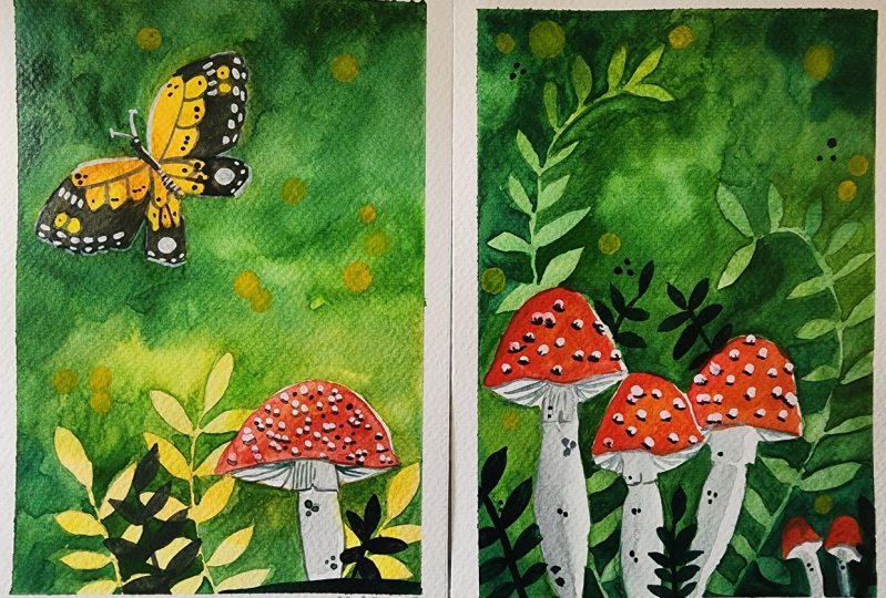
6. Project 3 - Bold Butterfly: We're going to start with
another lovely project. The first step is to
tape down your sheet. This is a five sheet
that's been taped down, leaving maybe a centimeter
along the edges. Now just to rough out and
plan out the elements, starting off with the
mushroom on the right side, this is going to be fairly big. Doesn't have to be too
perfect in terms of the semicircle which is want to get something that looks
like the mushroom. Now let's take a quick
side practice session just to show you the
butterfly we're going to do. It's super simple. We start off with two curves, equidistant from the center, then you have a rounded shape, another one for
the bottom wings. For the inside, you can see
how I'm doing a curve shape. And then three little layers, you have two more splotches. Bottom we have a oval, then a scallop, and then the scallop connects
to the oval shape. This is super simple. It's not the perfect butterfly. But the end result is
so beautiful because we use white and we play around with it that it
looks very realistic. Yeah, I think it
turns out amazing. The PDF of this is below for you to download
as your reference. Now, doing the same
thing on our painting, but I'm making it fairly big. Our butterfly is about, let's say 4 ". It's quite big. It does occupy space. It is the main element
of this piece. I'm not going to do the inside of this because
we're going to start painting the background
and then later on I'll come back
and do the inside. As we move through the piece, I'm taking in my middle brush. You can take your
bigger one if you're comfortable with doing
smaller sections. We're starting off with
bright cadmium yellow along the bottom of the piece, switching to orange
as we move upwards. And then we're going
to add green as we go higher and higher up switching over to the green. Just painting out
the remaining part for the butterfly itself. We're going to be a little bit careful the inside of the
butterfly, where the wings are. We're going to have to
keep the color yellow and orange and surround
it with green. Watch me closely as
I do that section. You can always pause your painting and once
you get a clear idea, you can go ahead and continue. This is exactly what we need to do is paint around the wings, making sure that there's
no green in the middle of the butterfly because that would ruin
the entire effect. What I'm going to
do is I'm going to take bright cadmium yellow, and I'm going to add it to
the wings of the butterfly. Adding an orange, this creates a really nice shade within
the butterfly wings. It gives it a little
bit of variation. When we go into the next steps, it looks a natural compared to just
having one flat color, moving into a little bit
more of cadmium yellow, getting those colors
blended in beautifully. When we're happy with it, we can switch over
to the green and paint the remaining part
all around the butterfly. You can see clearly now that
only the butterfly section is yellow and orange and the
rest of it is still green. If there's too much
color that's come in, just use a tissue and dab out the areas of the
wings so that you don't have too much of
the darker color or darker green entering
into the butterfly. Switching over to
our round brush, we're going to use the
thinner one size six and paint around these leaves
going to be very careful. I'm going to go into
the darker color. For this, remember to
paint around the stems. Very important part. We're now going to
paint on the stem. We're painting around it. I love how that looks. It almost looks like light
was shining at the bottom of the forest floor and just
illuminated the bottom. It's such a magical look. I really love trying
this specific technique. Anytime I want to show light and make it very
interesting and unique, it really makes the
viewer think and stop and watch and wonder
how this was possible. Definitely very fun to
add into your artwork. I've sped up the process, but you can see me just kind
of going through all of it. If you do have sections where you weren't sure you
can see me paint, and that's going
to help you a bit. But I'm just going starting section by
section, going downward, and then slowly working my way to the left
and then upwards. We can go in for darker, towards the left because
that's going to look a nicer. Also, we want to
build up that color, but as we go higher, we can maybe lighten it up. It doesn't have to be
really dark green. It doesn't matter either way. There are no mistakes
in this section. We're going to paint around the butterfly in this
step so you can take your darkest green
color and very carefully paint around
the butterfly wings. I've made sure to
take in the darkest, adding some of the gray to it. Now we're going to add our
gray for the forest floor, trying to avoid
any hash marks or harsh lines using a light water
down mixture of the gray. Let's do the stock
of the mushroom. After it has tried, let's switch into painting
our mushroom cap. And I've taken an orange and then going in
with red painting, the entire section can
keep a little bit of white cap along the outline
towards the right side. While this is trying, we're going to move into
using dark to add in some smaller leaves
to the forest floor. I've switched to my thinners
brush and I'm adding some lines to the stock,
adding those curves. For the bottom of the mushroom, we're going to also add in
some dots to give it texture. Making the dots very, very small so it doesn't
look like polka dots. Super important butterfly is the next step, similar to the drawing
we had done before. So I'm using my pencil to
draw out the same details, the curve shapes and the layers, so I have an idea of how
the butterfly looks. We're going to use a thin, with gray and do the
outlines for the butterfly. If you have black, you can
use the black as it is. Just doing all of those
wines of the wing, painting out the surrounding
for the butterfly, all the way to the
butterfly wing tips. We're going to add dots, just small dots in
between the wing. This is going to give
it a little texture and palance out the piece. We're going to have to
let this whole thing dry. Meanwhile, let's move
back to our mushroom. Take an acrylic paint and
adding in white dots. These don't have to
be perfect dots. As you can see, I'm
just dabbing the paint. You can notice that the
butterfly isn't really standing out in our background. We're going to use
our white to do the antenna for the butterfly. We're going to add in white dots for the
butterfly around the wings. That's why I suggested
using a thinner brush. Make sure you don't
use the same brush that you use for water colors. For acrylic, you
will see your brush getting very ruined fairly
quickly when you use it. For acrylic, it's better to have two different
brushes that you use. For both, I'm adding thin
lines along the edge of the wings and then bigger dots on top of that for the bottom. Again, thin lines
along the edge. You can do the same
for the other side. I feel like the white really
brightens up the butterfly. And naturally this butterfly
also has white spaces. It really lifts
up the butterfly, makes it more realistic, and also makes it show
through our background. Once we've done that, we're going to also add a very
light outline just on top, along the bottom of the wings. You'll see me do this. Right now, just a
very thin line. If you aren't comfortable
using your brush, you can use a white
pen for the same. And you can see
how this now makes the butterfly stand apart
from the background. It gives it a little bit more. I actually don't know
how I would describe it, but basically it
differentiates the two. Realistically, when you
see butterflies in nature, light reflects on the wings and there is a little
bit of shimmer. And that's what we're
trying to create here. Just a few more
steps to our piece. I'm taking my thin brush and
I'm just doing the shadows for the mushroom using just
semicircles at the bottom. Let's take a earbud, wet it, add yellow, and add some spots. Now I'm picking out areas that are much more lighter in color. If there are sections, that's where we want the
yellow to be placed, you can have some
bigger circles. This effect is meant
to give the appearance of light sparkling overall. It gives it a very interesting
finish to the piece. I always dab out the excess paint by
using the dry side of the ear bud to mix in the
colors a little bit more. That way you're not
just ending up with polka dots of yellow paint. You can see me do this,
just switching to the other side and just
lifting up the paint, moving it around, you can see
how the color also becomes a little bit more of a light
green than a bright yellow. I love the piece to completely
dry and we can remove out our tape along the edges to
reveal a final painting.
7. Project 4 - Mystical Mushrooms: This is the longest project in this class. Get comfortable. Set aside some time to
dive into your art. If you want to have a cup of
tea nearby, that's great. I always have my
marcher next to me. It's been my obsession
for the summer. We start with taping
down our paper. As always, this is an five sheet in case you
missed out that information, and I'm starting with
drawing out some mushrooms. This is fairly simple to do. I haven't added the PDF below. You can have a quick look just adding in
those semicircles. It doesn't have to
be really accurate because mushrooms really don't have like the perfect
symmetricity. You just want to
have a nice lump. We have three of them very close together on the left side. And then we can have two
smaller ones on the right. Follow along as I draw the smaller mushrooms
on the right side. Once you're happy with the base, we can begin painting. I'm using the bigger, but if you find it a lot harder, you can use a smaller brush because we're basically going to paint around these
elements, these mushrooms. It could be a little
bit tricky if your round big brush
doesn't have a nice tip. If it doesn't have a
thin tip like mine. If you're struggling,
just go ahead, switch to your thinner brush. You can do the bottom half of the piece with it
and then continue on to your bigger brush as we continue shading
the background. I'm not going into the names of the greens as I had mentioned
in the color mixing, you can see what I'm doing. I just mentioned the lighter green and darker green because, you know, if we go
into the names, it really depends on what
you view specifically. So here at the bottom side, I'm going for the middle green, so not too dark, too light, and we're just
going to paint around. Now that we have completed the bottom section
of the mushrooms, we can switch to our bigger
brush if you haven't, we go into our darker green. I'm not using any yellow
for this background, It's just going to be a play of the greens that either you have already or that
you're mixing and using. I'm bringing it all
the way to the top without actually adding a
section for a darker color. So it's the same mix throughout. I hope that makes it clear, like when you see it,
it's pretty noticeable. I haven't used any dark
grace, nothing like that. I am trying to smoosh around
my paint so that there's no brush marks when the
background dries up. Now, I wanted to show you a quick drawing of the leaf
we're going to do for this, for the background, because when I draw it on the
actual background, you won't be able to see it. Hence, it's fairly simple. You can see how easy that is, just a curve of a stem and then you have leaves on both sides. And then as we move to
end is just on one side, your background is
completely dry. Either let it dry naturally
or you can use a dryer. I like to let it dry
naturally for like five, 10 minutes and then switch on my head dryer and
just let it dry out. Now, with my pencil, I am, I'm drawing out the
leaf on either side. The left is taller and
the right is shorter. Let's switch to
our thinner brush. This is the size six
brush and I'm going to be painting around the
leaf that we just did. Take your time. This is
very tricky because you do need to remember to
not paint the mushroom. So we're avoiding
two different areas. It's okay just go one
section at a time. Don't try to do all of it together can get very confusing. Another thing to note is
I'm using the darker green. For this part, I will be using the darker
green as well as gray. As I move upward to create some
interest in the piece, I always switch
around my colors. You can see how I was using the middle green,
the darker green. And then I was painting, I've switched on to
my lighter green. And then as I continue on, I might switch into the darkest. I just keep doing that. And that's such an easy way of transitioning
between the colors. And they're all green,
which is great, so there's not going
to be too much of blending that
needs to be done. They just would move into each other very easily and
just look really nice, switching the color
again to my dark cream. I find this process very
calming and very meditative because you're just painting each section and letting
your mind wander in a way. I also try to think of
something specific. I generally am
watching something. It's a great way for me to relax into the moment and
just be very present. I'm going to speed up the process so you
can follow along, you know what to do, so
just go through each area. I'm leaving the middle
section just doing the edges. And then I'm going to come to the middle, towards the end. Now for the middle, I'm switching into
my darkest green. I'm also going to start using some gray to add more
depth to this part. One thing to note is
there's no wrong, you can't really make a mistake in terms of the color
for this section. Don't worry about it.
If it's very light, it's okay, because end of the day it's going
to look amazing. Your project is
going to look great. Don't worry too much saying, oh, she used the lighter color
here. I need to follow that. We're almost done
with our background, just adding in
more darker greens to the top part of the piece. You can add in some
dots and this gives the illusion of leaves
just not very obvious, but it adds to the background. Now we're going to go
into our mushrooms. I'm just erasing out any of the pencil marks from the
leaves that I had drawn, but I made sure that my piece is completely dry before I do this. And that way I don't have any pencil marks
on the mushroom. Switch to your thinner
brush and we're going to do the stalk of the mushroom
with a light gray. Just add a lot of
water to the gray. If you don't have gray,
you can use a black. But again, use a lot of water and just paint
out the stock. I am just doing them
on the left side. This shows that the light is
coming from the right side. After we're done, I'm going to take a little bit
more of the gray and we're going to add in the lines for below
the mushroom. These are the flaps. If you look at, look
at any mushroom. The quick curved lines
connecting to the to give the mushroom
more texture. Adding some dots with the gray. These are very tiny dots. We're not doing polka dots. Just a couple of them. And this gives it a little texture. While the gray layer is drying, we're going to add
in some leaves with the gray along the edges of
the bottom of the piece. Now even if you have painted
it really dark, it's okay. It will still be noticed. Even if it isn't
noticed, that's fine. It gives a really nice look
in areas where it is noticed. Just continue adding some
simple rounded leaves. You can pick whichever
type you want. I'm just making it
very simple and adding it to different
areas at the bottom. We have only a couple
of steps left. A big one is the
mushroom itself. So I'm using a combination
of orange and red. The orange lifts
up the color and also gives the mushroom a
little bit of a shading. I really like doing that because the color looks a
lot more vibrant. So I added orange in the middle. And then I'm just
going to paint in the red painting out all
the way to the edges. It's okay if the orange
mixes up with the red. You can see how edges kind of
smosh around. That's fine. But you can still see that
orange through the layers, which is really cool, adding in a little bit
of water to the red. For those smaller mushrooms, we're going to use a
ear bird with yellow. You can wet your ear bird, dip it in yellow paint, and then use that
to add some dots. These are to show your light reflecting through the piece and it gives you a magical look. We're going to do it in
sections which have a, let's say, lighter color. If there isn't a section
that has lighter color, just them along the top of the piece and I'm going to bring them all the
way to the bottom. This just targeting
the top part, you can see how I add in, some of them being
bigger circles, you can play around
with that as well. If it's too bright, just remove a little bit of that paint using the other
side of the ear bud. Now, since the red of the
mushroom has completely dried, I'm going to take in my white
acrylic paint and add in white spots at them randomly. They don't have to
be perfect circles. The small ones, we're not
going to add it to them. Again, letting this
dry completely. When it's dry, we're going
to add some shading. This is using R. Gray can see how I'm just doing a
semicircle at the bottom of these white splotches that gives it shadow so it
looks like an actual mushroom. It looks realistic as well. The painting to
completely dry and then we're going to
remove out our edges, the tape, making sure
we have a crisp edge. This is our final project.
8. Final thoughts and information: I want to thank you for joining my art class using watercolors. We explore the world of colors and created some stunning
artworks together. I hope you had a
great experience and learned some new techniques that you can
continue to develop. Please try the projects and
add them to the project tab. I'd love to see them. It's always such a
great experience seeing how artists
interpret my work. Please take a moment
to leave a review so others can learn
about your experience. Have a great time and looking forward to
seeing you in my next class.
 Femvisionary / Madhu S, Watercolor Artist and Instructor