Transcripts
1. Introduction to Part 2 of Develop Your Artistic Style: Hi everyone. I am Mother, I am an artist. And as you guys know and love teaching. And you can go back to my profile. I have a lot of different courses and classes. This is part two of the Develop your artistic styles series, where we are basically exploring your creativity and your personal choices. So it's about ten paintings or ten step-by-step tutorials. In this series, we're going to be exploring next painting. We are going to be exploring colors. We're gonna be exploring floral. Just really getting you to try different techniques and just gets so excited about all of them. If you haven't watched children. It's a Part one where there are ten paintings in that as well. But they're more at a base level. And some of the paintings in this built off from there. I hope that makes sense and enjoy all of them. So it's 20 paintings in all, all on water colors, all for beginners, or for you to explore your passion for what colors. I am so excited to get started and I can't wait to see your recreations, your projects through reviews, feedback, everything. Thank you so much and happy painting. Let's get started.
2. Painting 11 - Added Layered Depthth: I am so excited to get started with this project. In case you have skipped any of the previous paintings, make sure you go back and watch them because the, this one is a continuation of negative painting that we have been talking about. So this is a really fun project and it actually gives you the, I would say, the experience of trying to build depth with negative painting in your artwork, as well as playing around with different techniques and getting very comfortable with making it your own. And as you've seen through all the paintings, all of the exercises, all of the techniques that you're learning is just a way for you to understand what you personally like. So here we're going to start off with more of a blue, purple and negotiate. So those the color combinations were choosing for this artwork. So generally start off with a lighter shade of colour and then build on it with depth. Going to maybe an indigo or a black samsara over the very nice light layer of purple and pink is a very, very watered-down layer, has you can see me adding a little bit of blue. Again, very, very watching. It's not really deep the column. So just a really nice layer. And as I'd spoken about in the previous paintings, making sure that the tip of my brush extends to the edge. So that way I get a very crisp, neat edge. Now that I've done this, I'm going to let a try using a pencil. I'm going to draw some lines. You can notice the lines that I'm doing. They just rectangle extending from outside, the outside, the so-called towards inside. I'll also be playing with vertical and horizontal to create some fun effect. And once this is done, I'm going to stop being a rounded with a deeper color. Bringing in that negative painting effect. So one trick that I use a lot, and if you've been following my paintings, you will notice it is I generally try to take different sheets of colors on my brush. So I start off with a bank and the next time I pick up a color, it would be a blue, and the next time I pick up It's a pink. So I tried to do this. And when I do this, it actually brings in variety. Instead of picking the same color every single time, then your artwork ends up going into a monotone sheet. So when you're able to do this where you pick a certain color, like if it's blue and then the next time it's a bank and then you blended together. It works really, really well. Now, the law that I've done this layer, I'm gonna let it dry and then again, go on with my pencil to do another set. This one, what I'm going to be doing is underlying them. So they are going to be under the previous rectangles that we did. So kind of creating this jigsaw effect of criss cross lines. So really, really fun. That looks really amazing. And I love the end effect of this project hobby into him. Remember to always do the edges and lines and then fill up the inside that. You can see how I do this continuously. I try not to actually just leave it to dry and I don't have them touch patients. So what I tried to do is generally dry it with a dryer. So you have craft drivers that are available or you can just use a normal hair dryer on. And that books really great as well. Instead of letting it dry outside because then you end up wasting a lot of time while painting. And sometimes you can lose interest as well because the excitement is actually completing the piece before, you know, in a very quick, short amount of time. So using a dryer is really useful. So you can see how I'm doing the next layer. And it's again, kind of crisscross underneath. And I'm playing around with this effect because you can see it's building on, it looks so interesting. All of it is kind of coming together. Using a black pen and selling other trick that I use using a Blackburn just going over the edges to make sure that they're crisp. Especially for the last layer because that way you can make sure any corners, anything that you, maybe with a brush weren't able to do with your black pen. You can just make sure it is crisp and neat and looks really great. Now let's erase that Amy bento box that we had from before. And this is our final. I encourage you to explore this. Try the two overlapping circles, overlapping, not lines, but think of how you can bring this into different pieces. So maybe this technique, you use it in the outline or shadow of some other objects of the same effect you use it on. Let me give you an example like a vase, you use the same effects on a flower. You use the same effect on the outline of a rabbit. Like, I hope you understand what I'm trying to do. Like just using the same technique, but building it forward to different categories, different projects, different topics.
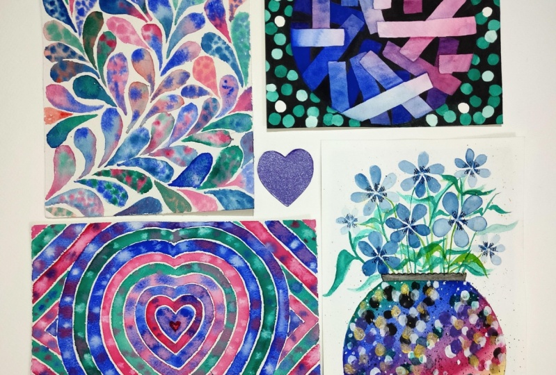
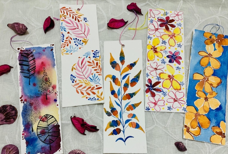
3. Painting 12 - Easy Breezy Loose Florals: I am so excited to get started with this painting. It's going to be a really fun one. If you've seen any of the previous ones, you've seen the kind of the previews, then this is exciting. It's the florets. And these are super-duper simple. Florio's really, really easy, so simple to do. But I'm gonna share with you the technique of how I do it. So the point of this exercise is for you to understand if loose painting, loose floral painting is something that you actually enjoy or you prefer something that's more structured. So while I'm doing the flower, it might look loose. You can make it even more losers. So it really depends on what kind of style you personally like. So notice how I'm doing the petals. I generally do fight battles or more. I've noticed when I do it smaller or lesser quantity of petals, it doesn't look that great. All I've done is this kind of oval shapes for my petals. And one thing I want you to also notice is how some of them have a lot of water where some of them are more translucent. And then I go and with the darkish, bluish green and do the center. Because of this effect of kinda the water down here as well as the thicker layer. You can see how the petals look really, really interesting. The flower looks really interesting compared to having them all very, very similar. You know, if I use the same blue all over without changing the amount of water that I was using. The flower looks really boring because I changed that. I have some of the battled much more water down, some less. The effect is much more interesting. And it also looks at watercolors, right? Otherwise, the whole point of watercolors is kinda goes away if you don't have this play with water. So I'm gonna show you another battle flower. So see how I go about this. Just doing a really nice round. And then I go on with more of the watered-down layer. So one thing I wanted to, I can give you is whenever you are doing the flaws, try not to just for better flowers. It doesn't look that great. I have an actual class also that goes into easy fluorophores. And you, this is the same thing that I repeat, tried to do at least five or six battles. Anything above 54 petals tends to look really, really empty and it looks like kind of the cool things that we used to do it right, where you have full battles when we were like really young. So try to avoid doing that. Having five just looks much more appealing. Don't worry about the leaf structure that I had done before. I'm gonna show you some examples so you're not going to miss out on that. Just focus on the floss for now. I want you to also pay attention to what level of the floods and putting in like some of them are taller, most of them are in the same line. And I'm trying to balance that out by having one that's a little bit more Ohio and one that's a little bit more lower. So this is how I balanced out. If everything was in the same line, again, the look that would come up would be much more simple. But since I have one that's down and one that's up, you can see that now it looks more like a collective. To get really nice stems. Make sure you have a really nice thin brush. Here. I'm not being too much attention to the stem. I want them to be kind of big and clunky and just messy. It's part of the final artwork. But if you want something really, then make sure that you use a really nice round brush that has a good tip. And you can notice a kind of leaf. I'm doing. Along with these laws. They evade droopy very big. It starts with a thin line and then becomes big at the middle. And then again, notice how my brush moves when I'm doing this. What I generally do is at the center going with some small dots, basically representing the flour in the center of the floss. What I noticed is this build up the color a little bit more because it has, you know, with watercolors, whatever you do when it dries, it tends to dull down a bit. So when I do the center of it, when I do these small dots, it livens up the entire Florida. And so just making it, making everything look very washed out. Sorry about that. Ooh. Playing around a little bit more with us. Loose effects. And this is where I want you to test yourself and see what you personally like. So I'm going to be adding the light green. I'm going to add more leaves and just doing them so randomly. So just falling through very all over the place because I'm trying to build up more of a translucency and more of depth to the painting. So this is your call. If you wanna do this or you wanna keep it clean like the before step. Or you want to add some italics because we're going to go in and do that as well from here. Okay. So now I wanted to go in with some metallic. Has I mentioned just to kind of give a little bit of a glitter. Again, very similar structure of this kind of very droopy falling leaves. This also complements the kind of plant that we choose. So it's more of a very lazy, happy looking floss it. So absolutely. I'm adding some spatters in the dark green, blue. And just making the whole thing looks really loose and really fun. I hope you enjoyed this painting and I call wait to see your interpretation of it. Don't forget to add them to the projects. So I can have a look and give my feedback as well. Now let's move on to the next painting.
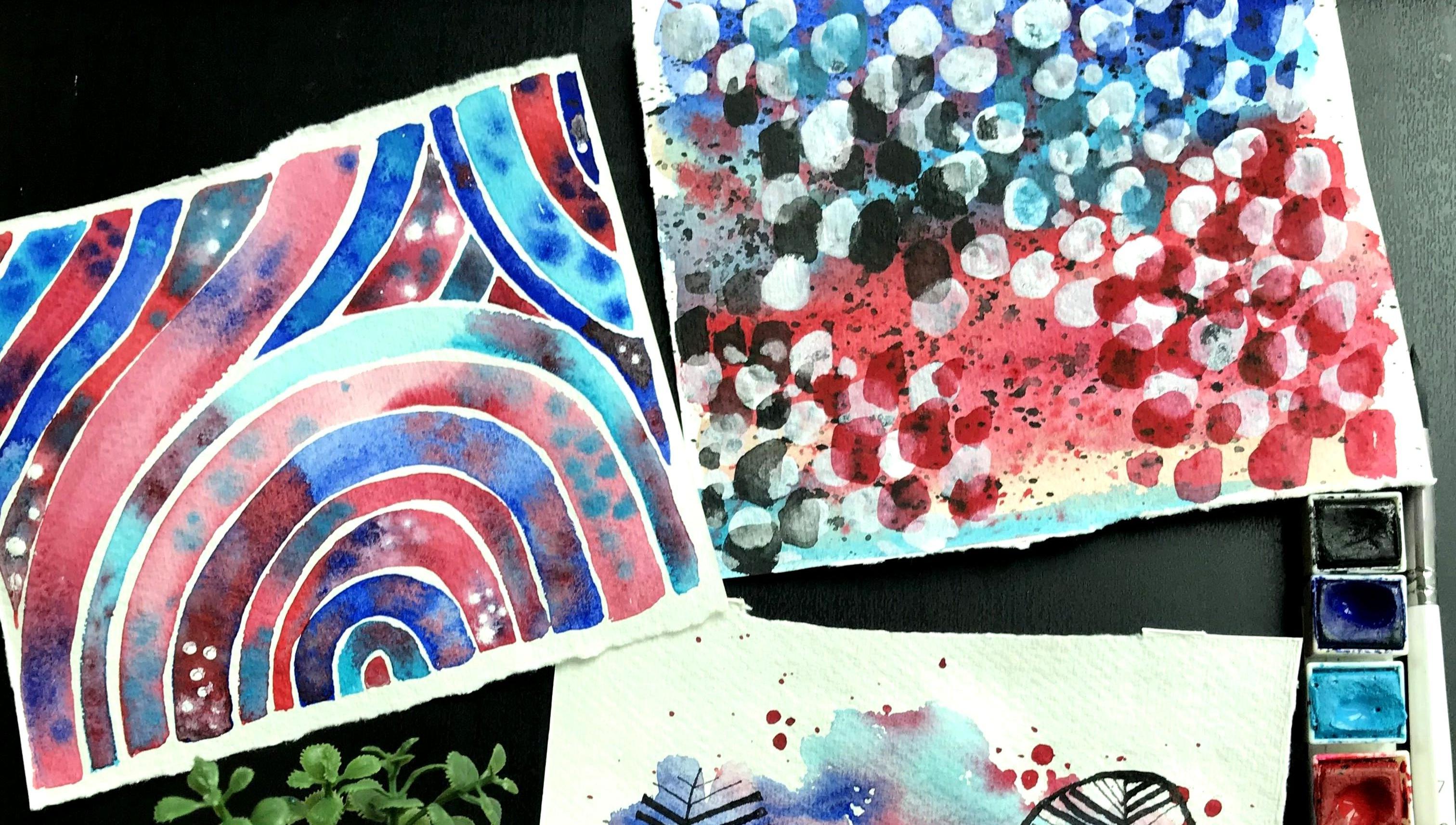
4. Day 13 - Creating Flat Textures: I am so excited about this painting. So if you have noticed till now we've been doing the same combination of blue and red. I wanted to change it up and give you another option of blue and red where I take a different set of blues. Here it is two blue, whereas for the bond color, I have three. So I wanted you guys to see how that slight shift immediately makes the artwork look really different. The shade of blue that I picked has completely changed the artwork and you will see that it looks so interesting, whereas the previous one looked a little bit different. So it's just like this slide shared. Change can completely change your paintings. So we're gonna do kind of lines that are very close to each other. This is one of very good practice for you to get comfortable with leaving gaps in your painting and having a little bit more of brush control. At the same time, we are going to play around with the texturing for this piece. It's a Visa, absolutely love. I was so impressed by how it looks. Once it finished. One trick to remember is to make sure you take carlos that work very well with each other. So if you're taking blues, don't take an orange, cause a blue and an orange when it combines gives a very muddy dotty column. So make sure you pick a color that matches well. So you can see here where I've taken this royal blue and then I've added the light pink, has, the paint is drying and you can see how beautiful and textured it Lux, going in with the red. And if you know, red and low gives you kind of a purplish color. So that's perfect. And you can see how we are adding so much of intrigue and interest to this, right? I love, I love how this turns out. I love the entire effect of it. It's so fun. Next I'm going in with another, the slugger pinkish color, making sure that it's very, very close to the previous layer. Feel free to move around our paper. For me, it's a little bit difficult in some taping it, so I am kind of constricted to painting in one side. So that's why you see like my hand all over the place and sometimes it gets blurry Is because of that. But if you are doing it at home and you don't have to record it, have fun with actually just moving around your paper and getting comfortable with that. You don't have to force yourself to keep your paper flat and just struggle like how I do. So I'm making sure that the layers that are and have a lot of water and the brush and then I collect the war, collect the paint so that way it's still watery. And then when I want to add this texture of a different color, I can do that so easily without any issues. I'm also trying to make sure that there's a gap between every line that I do because that's going to add onto the intrigue of the beating. Since I did the red column, column adding inside is a light blue. What I tried to do is have some of them. And then just in the middle, but mostly concentrated towards the end. Finishes. Mm-hm. Okay. So you can see they can be in different direction. So I can add that I'm gonna lose. I'm just making sure that everything is. Okay. Now, now. Right? You can see painting. It's so interesting, so much of drama, so much of colors, so much of a mixture, so much of interesting things happening. I'm going in with some whites because this is something I just felt like adding a wooden suggest you to add it is not necessary. I just felt like I wanted to. And here I'm using acrylic paint, so it's just white acrylic paint. And I'm using that for some places where it's still wet towards the edges. Not whether it's tried. Just adds a little bit more of
5. Painting 14 - Mixed Media Abstracts: So this painting is very abstract. Ok, so it's surely playing around with acrylic paint, playing around with just layering your water colors. So something truly new. I wouldn't say it's completely watercolors. It would be considered as mixed media. So starting off with the blue layer, do it right on top. This is just a really nice royal blue color. We can see how I'm making sure that it's really watery. So it's not a very dried out layer. And making sure that my brush has unnoticed. Next, I'm gonna go in with the light blue and the bottom. So I'm just basically blending it slowly downward. You can see that I'm now adding the red here. I'm trying to make sure that it's not exactly a straight line. So I'm kind of doing it in such a way that it's a little bit more random than having just straight lines of color. And now the bottom again going to go in maybe with a light blue. So you can see it's just like it's, again, this is not landscape. So as we just really random and I'm just trying to get a really nice base for our painting. Another thing is pure abused, more of blues, sorry, less of blue and the red is water is more prominent. So that entire piece is going to have a more warm sheet to it. So if you want something that has more of a cool shade, you want it to look more like winter than try to use more of the blue and lesser of the read. So I just went over all of it again. So a trident up. As you know, with watercolors, everything just becomes really dial after tries. Just went over everything. I'm going to add a little bit of splatter, just a little bit of texture of the red on top. Now I'm dry the complete artwork. And I'm gonna add some black spot, again, textures for our painting. So it's very abstract and it's very texture based. Now that I've completely dried out what you can see, there's so much of texture, so much going on. It looks so interesting. I'm gonna go in with the white acrylic paint. And this is just normally white acrylic paint. And I'm gonna be doing some circles. You can have fun with it. If you don't wanna do, suppose you can do some designs, whatever it is, maybe watch to the end and see what I can do. And then you can decide what you wanna do for yourself. But basically just adding these bite on top of this layer. So initially I thought I'm doing them more random and not all over the p-n saying, But then as I started doing it, I inject the whole painting with it. Now adding some more smaller. To make it a little bit more interesting that I've done this, I'm going to let it go in with some more paint on top of the actual watercolour paint on top to build on the layers. You can see how I'm doing. So goes just on top of the acrylic slot, right in the middle, but allowing it to be part of the painting. And notice how I'm doing it in the area that has the red beans for the base. So I'm using the same column. I'll be doing this on top as well. And where there's a lighter blue collar, that's where I'm going to do the lighter blue circles, where there's a royal blue, unlimited royal blue there. So basically, keeping in mind the bees and using the same color on top of you can see how this whole thing is bringing a lot of interesting texture to the painting. It's giving very interesting effect that's expected because of the acrylic paint. So added some. In some areas. You can see the whole thing is kind of looking like an animal. So I like how the whole thing turned out. It just looks really interesting. There's just so many elements going on at the same time. It's so beautiful. And this is such an abstract piece to play with where you're playing around with that layer effect. Again, this is something that you can transform two different projects, different topics, different colors. There's so much that you can do, but it's also a way to test if this is something that you actually like. If you are into abstract.
6. Painting 15 - How about a Mosiac Effect?: So this painting is something that I actually did a lot of trial and error on before I perfected it. And now I love it. Obviously, it's so pretty. It's very similar to what we've been doing over the previous projects. But this a little bit different in the sense that it's all about understanding how water actually works with watercolors. So as you can see, I've started off with just a layer of water. I know it looks a little bit pink, but actually is just clear water. I think it's just the lighting. And then I'm going in with colors that I want to add through small dots. So this helps me really understand how much water works well and homo, deeper response to that water. So it's a very good exercise for using a new brand of people or you're not sure about how the weather affects your painting style, how it affects the water control. So this is really creates usually start off with a layer of clear water and then you build on it. And when you see that it dries very quickly, you obviously know that you need to be working faster or doing smaller areas at a time. So it's generally good practice. Excise also helps you know that if you are a person who likes to have more organized, planned artwork, so if you see this one, it's a lot more organized. It's a repetitive pattern. Has we go ahead, you will understand it more. I've chosen this specific shape because it's something that works really well with movement. So the entire artwork has this kind of movement through out. You can choose anything that you prefer. I would suggest going for this because it is really, really great in terms of creating a really nice final effect. So I'm starting off with doing sheets like dots of a specific color. I can do more of Reds if I want the piece to look more warm. And if I want to do with more light, I wanted to look more like a cool wind tree look. I would do more of blue colors. But I'm not stopping there. I'm going to just keep playing around with it by trying to add more in the same. So maybe mixing two of the colors, adding more to the same and see how the entire file moving, movement of colors books. So it's just a really fun project for you to get organized at the same time, have fun with it. You know, it's like your final output is going to look amazing no matter what. So there is guaranteed amazing results. So now it's just how much you want to play around with it. So with the shape you can see it's still flex book because I'm just bringing it throughout the artwork. I don't have to be. But it's so easy because the shape actually fits into wherever I want to use it. It doesn't look like that are empty patches, right? I hope you understand that. If you want, you can use again another shape. You can try it with different techniques. But I want you to use this just because I'd really like the sheep and I was just using this as well. If you come up with anything, why not use this? And here you go. Ok. The up or down. Here we go. Okay. Yeah. Yeah. Okay, so you can see how this whole thing is coming together. And the reason, again, I started with clear water is because I can play with it at the same time. I'm seeing how much water is being used generally, when you start off with watercolors, say take like an opaque, they take a transparent layer of pigment. Whereas here we kind of did something a little bit different, right? Again, it's all about getting comfortable with the medium and exploring your style. And we're gonna go in and add some detailed in black. Again, personal choice if you want, you can do that if you feel like nope, you don't need it. Don't want. I just wanted to add that. I have no idea why. Again, part of my artistic style is adding random detailed in my painting. I've just come to accept it. Otherwise, I feel like the painting is not complete. But use your intuition, use what you feel like doing because it's all about developing your style. So if you feel like this, is it, that's enough, perfect. If you feel like you wanna go ahead and do like a Mondial on top of all of this. Go ahead. So it's just trusting your own style and making into yours.
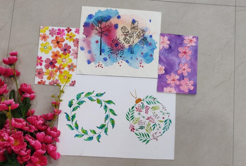
8. Painting 18 - Outline your florals: So similar to our previous painting, this one is going to have a very similar flower. And it's a very loose style, but I'm just changing it up to show you how that small change can change your outlook as well as a gift view. Sorry, as well as give you an idea about developing artistic style, something that is really fun. And maybe you prefer this technique and you want to take this further. So just giving you this option as well. So very similar to the previous one I'm doing just like loosely floral with the base color, which is like a light pink. I am trying to concentrate the floss to one side of the paper. And as I began to understand that, so what I've tried to do is habit and one area and not completely all over the paper. This is not going to be like a repeat battle. And if you don't know how to do these fluorides, please note it is there and one of the previous paintings I covered this, how to do the petals, how to make sure it looks nice, how to make sure it looks professional rather than amature. And I've covered all of that, so please do have a look at that. So you can see how I've kind of done threefold. And then just kind of played around with this. Going on to the next step of adding the red, as well as doing the outline. Outline. Not all of them, not all, but some of the battles. So you can see how the base is still wet. That's why some of it is bleeding through because the base is still wet. Some that is all the dry. There's no issues but some it's bleeding through and that's again, part of the very loose effect we're going for. In terms of flaws, I try to take colors that are complementing, sorry, that are very adjusted to each other. So like a pink and red light blue and dark blue circles that are right next to each other. Instead of taking something really contrast because that's going to take something that's very close to each other, are in similar tonal values. Although we've done this, let's go into the next step, which I think is really, really fun. And go around the background of the floss that I just did. I am tried to leave a little bit of a white piece. Again, this is part of the style that we're talking about. So having a little bit of gap and then filling it up with this beautiful blue. You can see how I do this, especially in some of the tricky areas and how I'm kind of bringing that together. Okay. And So slowly and slowly you can see how the artwork is coming together so beautifully with this blue and this white line gap between the floor and the background. It just looks so interesting. And the effect is beautiful. It's bay by brand, it's eye-catching. So there you go. You can see it all come together. I just have a small but left, but it's all come together. If you want, you can go and with a black pen and add more details. If you want like a watch to get bored with this, you all have done so many projects as of now. So you should be at a point where you are able to try and test and implement things. So maybe you want to add doodled. Maybe you want to add some lighter blue color for the background. Maybe you want to add some metallic. Give you a shot, give yourself a chance to explore at this point and enjoy the project.
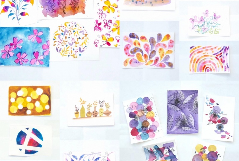
9. Painting 19 - Fun Loose Florals pattern: Hi everyone. Are you ready for another fun project? This one is so fun for anyone who is a perfectionist. This is going to be the opposite of what you could possibly do. It's going to be very tough for you. You're going to find it difficult. And if you're a person who Netflix on your artwork, you're in for a surprise. Because it's all about letting yourself enjoy being Lewis, being light, and just having fun. So it's an interesting painting. So exciting for doing some flaws similar to the project that we had done before. And if you haven't checked it out, it is double up your artistic style one. And sorry, it's developing artistic style to, it's one of the paintings, they're called Loose Florio's. So we started with some basic petals. And I had mentioned this in that one on how to do the battles. So in case you have any questions, do look at that if you've skipped it. And I also talk about how to do your battle. So they look really watercolor based and not just flat and boring. So I'm starting off with this. You can see I'm just doing this royal literally lose really lightly. I don't really have a direction of how I'm doing this. It's going to be a continuous pattern. So I'm very randomly placing the floss. And I'm starting off with a very lightly, not too many of them, but enough of space between them. Now that I've done this, I'm gonna go in with my read and draws some outlines of flaws and you can see how I'm doing this. It's not too specific. And also I'm trying to touch some part of the petal width, our previous layer, and that just lets the color gosh in as well. But it's very loses just outline. And it's so light is just a really loose interpretation of a flour, as well as the inside bud. Just enjoy really loose. You could do this. Instead. I kind of like the idea of doing it with the brush itself because it gives you this really nice effect. Now that I've done this, I'm going to introduce some of the red flags similar to the Florida we did in the big name. Same idea. Just like really soak lower petal Shape, class. Very loose. There are some gaps in between and I'm kind of a loving that to happen. I'm not making it too perfect to fixed. And that's why I said, this is like the toughest thing for a perfectionist to do. But it's good to go this far with your lose fluorophores to know how. Even if you do this, your artwork is still going to look. It helps you build your confidence. I've done this. I'm going to go in and do the outlines for the first layer of flaws that I did. And you can see, I'm not making it. Super-duper power affects some of the petals, do not even have outlined some do. And I'm letting it be part of the effect of what we're going for. Having them. So a whole artwork now is basically coming together. It looks really messy. But let's go on to the next step and that's going to bring everything together. So I'm taking a contrast color like the blue and adding some details, especially the red floors, similar to what we did in the first class, said the pink light pink one. So similarly, I am doing the center part as well as some outline of some of the battle's not all of them, but some of them. And now to bring everything together, I'm just adding some small, nothing too fancy, but just it just picks up the book and it just makes everything look. So as we do this, you can see how a painting has come along. Looks really interesting, right? The effect is really fun. I hope you enjoyed this painting.
11. Final thoughts!: I am so happiness you hear, I'm so happy that you've watched all the ten paintings and I hope you've learned a lot about your artistic style as well as what you personally like. That is part of the, that's actually the main reason for these amazing series that I came up with. And in case you haven't watched part one, just make sure you go back and watch that. If you've washed bought, then congratulations, I'd love to see all of the 20 paintings. Just display it because it's gonna be amazing to have a look at all of them and also see your artistic style come through and show through all the 20 paintings. I am so excited. Please make sure that you leave some reviews, feedback, and love hearing back from you guys and it helps me improve every single time. So thank you so much. Thank you so much for watching and learning and have a good day.
 Femvisionary / Madhu S, Watercolor Artist and Instructor