Transcripts
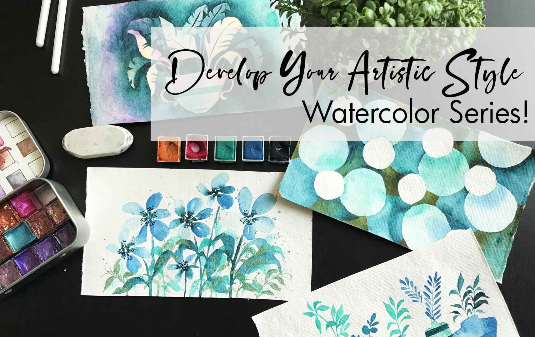
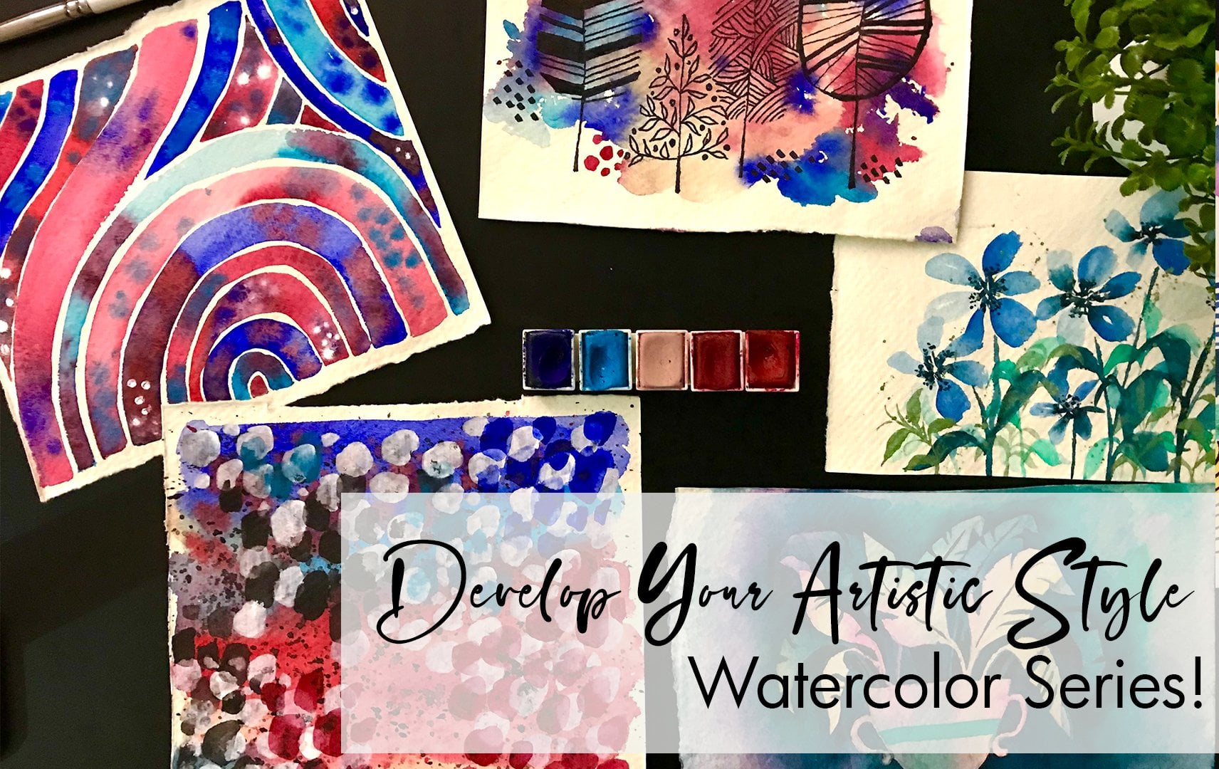
1. Introduction to the series: Hi everyone. I am, though, I am an artist and I'm not teaching has a grace note. If you've seen any of my previous courses, you know, I love teaching and I love kinda experimenting with colors and different techniques and that's kind of my style as well. So I'm so excited about the develop your artistic style series with watercolors. So it's going to be in two parts to this as phi one. And does a bug ten paintings on her journey really easy once it's for beginner level, and it's all about you giving you a chance to try out different techniques as well as figure out what you personally like. That's for me very, very important as an artist for you to grow and also for you to just be so happy with your work knowing that it's yours and not something that you've just done, right? There's a difference. This, so this is pipeline that are going to be ten paintings as also a part two, which would have another ten painting. So all in all it's 20 paintings for you to explore and try. I'm so excited about the series. Let's get started.
2. Materials and Colors Used: As you guys know, materials are super-duper important. So let's discuss materials. I'm basically using a set of pins. These are from Primo watercolors, from art philosophy, I think they call that. Now. I have selected colors that I want to work with for the entire set of plain texts. Some of them might be formed different brands, but mostly I'm trying to stick onto a set of colors that I want to work with. I am also going to be using Kraft Ahmose air addition brushes. They're really amazing. There's a lot of variety. They have flood brushes, round rushes. I love that variety that they provide in that one set. Along with that for the paper, I am using qadi sheets. This is 210 GSM. It's a rough, deeper and a 100% cotton, so it's very easily absorbent. And it's really, really great to work with is not too high price. So it definitely works with a budget. If you are trying to just improve your skills. Along with that, there's going to be additional items. Has with watercolors, you would need some paper towels, paper tissue, some glasses of water. You can have two glass or water. It really depends on how comfortable you are. I generally have one and I just get up and change the water and come back. For me. This really helps because I get to stand up and not just sit in a place for six hours and not move. So I really like that exercise. I also use masking tape and I have a set of metallic called paints. Now this is something I'm going to add and for some of the projects. But again, it just depends on you. If you want, you can use gold band. If you want, you can just keep that entire process. Also, we'll be using some table salt, some additional materials that you probably have around your home. And I'm gonna be using that Just to add an experiment and play around with watercolors. In terms of the actual color selection. This a mix of colors, as I mentioned that I would be taking. What I'm initially trying to do is have two colors that are on the warm side, which means that they are tense and sheets of red, orange, yellow. And then three colors that are more on the cooler side, which is a blue sheet of blues in Diego's purples. So these are your warm and cool colors. For the warm color, I'm using a bright pink and a yellow. This is also going to serve as my highlight or brighter colors. And on the other side of the cool colors, I'm going to be having a teal blue. You can see the shade of blue that I'm using, as well as an indigo. So these are my set of colors. As I paint along, you're going to see what colors I use. Feel free to choose any set of warm and cool colors that you want to try. Or you can play around with a set of five colors. It is up to you. And I would really suggest experimenting. And there's so many different platforms where you can look through color schemes and see colors and select phi colors that you really like and bring them together. You can also make sure that each painting has a different color scheme. So that at the end of the 20 paintings you can see all of them and surely understand which are the ones that you actually enjoyed working with and which other ones that you just absolutely did not like. So that's the whole point of this exercise, is the whole point of this series is to have fun to learn to just play around with it, just have fun with that and not B2, I would say to perfect in the entire process. So yeah, that's all the materials. Now let's move ahead to our paintings.
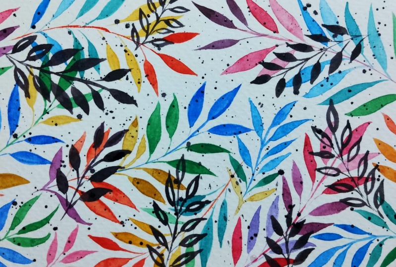
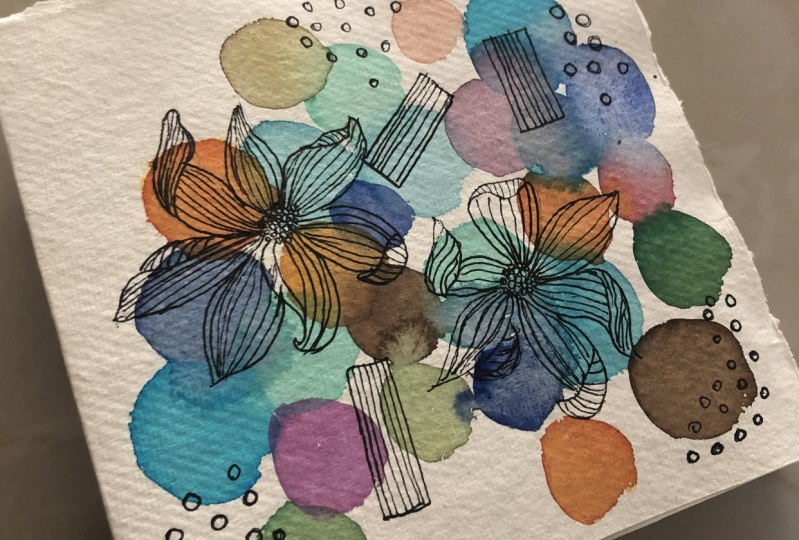
3. Painting 1 - Planning with Circles: I'm so excited to get started with the first project from our explore with watercolors series. There's going to be over 15 projects, has explained in the introduction. So there's going to be quite a lot of information. We're gonna try a lot of different techniques. And you can see some of the images here of different things you're going to learn. And we're gonna start off it's simpler projects and then moving on to more complex projects. So let's start off with our first one. I'm adding in this eco line, blue color. This is liquid water colors. And I really like that color because it's a very bright blue and you'll be able to see it. Has I paint it the color that I found very difficult to find in the market. I was unable to find that she'd in, uh, in the brands that I tested, whether it's Daniel Smith bends on Newton, the bright blue that I was looking for was very difficult and I found them in liquid water colors. So if you like this color, I would really suggest getting eco line. So I'm keeping my brush, load it up with a lot of water. And I'm just painting circuits. This is a very simple project, but it also helps you understand your water control. You get very, very comfortable with mixing around colors, knowing which colors to choose, and also placement. I think that's again, a very important thing is to know where to place what. So you can see this has more thicker. I immediately lighten it up using water. All the circles that I've done right now are very, very liquid. So it's really good. When I go in with a second color or a third color, it's going to be a truly perfect in terms of merging. So you can see how gently touch the previous blue circle with this new blue that I've got. And the color is gently feeding into it. Again, you can see this year just gently touching it. And the color comes through. Really, really light. Again, notice how much pigment I have taken. So in the first one I took less a pigment. In the second one it's more darker. And playing around with this really, really starts building up your water color skill. Keep noticing how has an add each of the colors. I generally start off with. 200 colors first, and then I add in the next set of tonal colors. So that way I can make sure that my cool and warm colors are properly mixed together. I don't want to have one era that just has a lot of blues and one area that just has a lot of reds and it doesn't make sense. So I'm trying to plan it in such a way that it's equally distributed. And again, notice how much water I use to ensure that the Color blend and leads through. Hence as part of the effect that we're going for. Now that I've completed all the cool colors, let's go in with our warm colors, which is going to be mostly red and brown. Now, I'm first step painting over the mistake that I had made previously and you can see how the layers actually dried up. So now when I paint, I'm getting a very translucent layer instead of a blended layer. Hope this is making sense. Again, this comes in with a lot of practice and getting very, very comfortable with watercolors in general. This is such a good practice project to start with. Because it gets you to understand what a control understand to want understand the usage of water. It also helps you understand layering. So rarely, rarely fund project. And you can experiment this with many different colors, sheets, mixtures. These are the ones that I'm using that again, feel free to play around with it. And the more you play around with it, you're gonna get a lot more comfortable with selecting Colors and knowing ward colors and what colors do not work. It's just getting into this process just helps you get more and more comfortable with all of this. So take it slow. And at the same time. Look at what I'm doing and enjoy it. So didn't building and building and building, and now we've kind of cleared up the space. So let's go in with some detailed and doodles to just highlight this artwork. I'm starting with it, something really simple, just some brown circle. Again, this is the point where you can get super-duper creative. If you are a person who loves doodles, go ahead. If you like Mondelez, go ahead, just make it your own. And this is also the part where you start making whatever artwork you do, you're making it your own. And I think for me, that is so important, that's the most important information and knowledge that I could impart to you. Now, I want to go in and add some flags as you guys know, I love plots. If it's the first time you're seeing my work, then welcome to a lot of flaws throughout. And this is just a really simple line drawing flower. But I want you to notice how I am making a three-dimensional by making the petals fall through. And this is so, so important because again, it adds to your final artwork. At final painting, it gives a dimension so you're no more looking at it as just a very fixed and rigid flour, like go forth. Petaflops we used to do when you were in school or when you were like a really, really small. So we're moving on to a lot more precise, lot more fluid flower with petals that are moving, which would probably happen naturally, right? So this really adds on to the effect of movement in the painting. I'm gonna go in and also add more lines. As I said, this is just very, very doodled up. It's now going to be a painting that's just doodles that I'm adding in. Good. Okay. Okay. Okay. So our project is all, most complete. I'm going to just add couple of more details. So you can see that the artwork actually looks almost complete, but I just feel like there's something that's missing. I just feel like it needs a little bit more of lines and a little bit more of structure. You can leave it at this point. What again, I would suggest is to do this exercise multiple times with multiple colors, with multiple doodles. And this will give you an idea of what you personally like. And it'll help you figure out your style. You know, for me I love kind of overworked paintings. Most of my paintings generally have a lot of elements going along and I really like it. I really enjoy that. And always there's something additional that I put on the splat or there's something that I add in. But again, it is your personal choice. So this is going to help you really figure that out. And this is just our first project. We have so many more to go and I'm so happy about that. So how amazing Does this look? So simple, so quick, and it just looks so interesting. And I think the colors look amazing. If you want, you can use the same colors or you can go ahead and try different colors. Playing around with a warm and cool where glue is constant as a cool color and red things are considered as warm colors. That also really brings variety into the artwork. Now let's move on to our next painting.
4. Painting 2 - Texturing with Watercolors: Are you ready for the next painting? The size that I'm using for the paper is about a sixth dimension. You can go bigger or smaller. It really depends on you. And you can see the set of colors that I'm using for this one, which is going to be orange, pink, green, and two shades of blue. So you have a teal blue and a little bit more of a greenish blue. So this is the set of colors that you will notice in most of the artwork that I'm using. So today's painting is going to be a lot more fun. It's simple, but it's all about adding texture to your painting, adding texture to your watercolors. This is something that is really fun and it can really help you bring your artwork to the next level by creating that interest and intrigue. Some study of it is really nice, bright, bold pink color. I'm going to make sure that there's a lot of water, so it's a watery layer. For this painting. Keep some salt in hand because we're going to add some salt to give that textured effect. Similar to our previous painting. And basically drawing, sorry, I'm basically painting circles of different shapes, different colors and blending them across. So this is a really nice watered down layer. Another one. Notice how I'm making them very, very big because I kinda like the pink color, a color that fallen in love with it. So I really want you to show, so whichever color that you want to kind of make it pop out that column, make sure that you make them bright and bold and use them for the bigger circled. The colors that are just additional. You can keep them on the site has smaller circles. Now the next color that I'm adding is the orange. And notice how I'm doing. First epoch color that blends with the pink really well, like oranges or color that mixes with pink and gives a really, really nice Paolo. It's not going to give you like a muddy, boring colors. So that's one thing. And I'm blending them. Saw the minute I touch it with the bank, it blends and leads and Have the color merging. So again, keeping in mind that all these layers still need to be wet for me to do this. If any of them dry, then there will be a big problem for me. So I'm just really keeping in mind to work quickly. As I had mentioned some of my previous classes. If you are in a humid country, you might face this issue where your artwork stats trying really quickly, so this effect doesn't come. So just keep in mind to add a lot more water or walking smaller circles. Now notice how I'm adding the ping to the edge of the orange. Look at how that colleges leads and it just spreads. So, so ideally, I orient them pretty Liza word, but it's Oprah me to check my vocabulary. But yeah, I see the orange stuff is How am intermingling the two colors and just making the whole artwork pride and pop up. And just you guys can see it. It's amazing. Like going in with my next color, which I really love this color actually it's a very hard colour, hard to find. And I'm adding it Q In between areas to bring together this painting. No. What I love about this color is that it makes us with thing to give a purple. So it's still mixes and looks nice. It's now going to give you an ugly color. That generally becomes a big problem if you're using blending and you pick colors that when they mix give you muddy or brownish colors are just ruins the entire artwork. So it's great that this one, the specific teal color, does such a good job. Anyways, we're moving on to assault. My artwork is still wet. So in the areas that still have water, I'm adding the salt. And this is just normal like COMSOL that's slick would you use for cooking table salt? And you can try it with different salts, like if use rock salt, the effect is a lot more prominent. And you can see how it's kind of crystallizing around it. And basically wherever the salt is, there won't be paint in that area or lesser paint. It absorbs the pigment. I think that's, that's how you describe it. So basically absorbs it. So that's spots. Don't have pigment. Anyways, when we dry it, you're going to actually see the effect. So let's go ahead and try this complete painting. I'm using a dryer. Small, much more easier for me if you want. You can have led addressed. If you're in a humid country, you can honestly just keep it outside and it's probably going to do its thing if it's in a hot country. So, so easy. Or you can just use a dryer. It can be a normal hair dryer. Or you can get the specific driers for craft. They called craft trials and they're very, very hot. So they reach higher temperatures and very focused. So as it's drying, let's move, let's add a little bit of platters as it's trying. So I'm taking my pink and I'm gently tapping it as these beans are drying. So they're not completely dry, but they're just about to and look at how the color blends with whatever we have painted. So the orange gets registered spots, the green gets something spots. How amazing this is. Look. This is how you're adding texture to your painting. And I love this, I love this so much. And I wish I could do more paintings items just for no reason at all. But I love how this effect just, it's so beautiful to see what you guys come up with. And now I'm gonna take the dark green and do the same thing. And you'll see again differentiates. But again, I'm trying to add in more textural. So keep in mind if you want a specific area to get more of the splatter, Just move your brush slightly closer to the paper. So it focuses in that area. It takes a little practice, but once you get used to it, it's going to be easy for you to do. It is just taking our wet trash. Now that the artwork is completely dry, I'm just going to add some quick Doodles because as you know with watercolors, whatever you paint has a dries becomes really, really. But it does feel a bit. So it's good to add in some Doodle to something later on just to pop back the collar and let it shine. So I'm just taking a normal black pen. I'm doing some basic circles. You can really play around with this again, it's your choice. But I think the technique looks so beautiful that I didn't want to do something that would take too much out of it. But again, feel free to experiment as much as possible. Okay. So this is our completed, almost completed. I'm just adding some black lines. Again, as I said, just two. Bring out the color, you know, you can notice a difference. The four added the black lines, two, after, you know the black line, what it does is it consolidates the color and just makes the artwork pop out more than than just leaving it as this. So it's good to add. Okay, so this is our completed painting. I know I keep mixing up the word project and painting couple of times. I hope you guys are confused and I am so excited to show you the next one, which is going to be, again, surely really fun and exciting. So let's start with that.
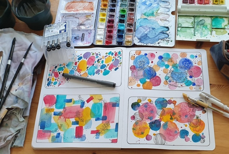
5. Painting 3 - Mosaic Effect: See, this is the third painting of a series. And this one is a lot more simpler than what we've been doing. And it's kinda getting the hang of playing around with colors in a very interesting way, knowing where you need to use certain colors so that your Outlook pops up. This comes with a lot of practice. So that's why I have added in projects that let you explore that. At the same time, they're fun, easy, and you will get good results. That's my other main purpose of this because I don't want you to have been things that you paint every single time and you're just not happy after you finish. And that can be very frustrating as an artist. And especially if you're starting out or you're in their early stages, it can be really, really upsetting when you just see artwork and it's not coming out the way you wanted to. So being able to do simple projects at the same time, guaranteed projects that can improve your skill helps a lot. So notice how I'm adding the orange. So I always do this. And you will notice is with a lot of my paintings, I start off with one color that I want to shine. The color that I feel is really bright. It's a highlight color. That is a color that I start off with and I generally place it wherever I want in my painting. The next color is usually the second highlight colors. So I always start off with the light sheets, light highlight colors, the brighter colors. And then has moved my way. I'll go into the darker, deeper colours. So the dark green is generally like dark, darkish blue green will be the last color that I use along with block. So just have a look at that. So in this one we are kind of focusing on a little bit different layout. So we're going to have in the center, a kind of a diagonal line in the middle is going to have bigger flaws. And then towards the end you're just basically having details. So it's a little different in terms of the general usual structure of placement that we follow. Here I'm using the techniques that I did in the previous paintings, where I'm adding the blending, bringing the colors to kind of touch each other or just playing around with all of that. Again, you can see with the green how the color, my second highlight. And you can see how I'm basically adding it in certain areas, but not too much. And these are the lighter colors, very, very bright, very happy colors. And keep watching. You can do this with me if you want. You can watch the whole thing and then come back to it. That's fine. But just do whatever works for you. Now. Okay. So for this exercise has you can see at a sort of mosaic effect and a very rounded cornered ovals. Rectangles denote triangle, okay, anyways you get the point. So I've cleared, played around with that. You can try to explore this even using triangles, using squares because it's going to also help you understand if you are more a fluid person who likes a lot of fluidity in their artwork? Or are you more structural do like geometry and more fixed shapes. This is a really great exercise where you can actually even do the same thing a second time with more square shaped or more pointed ships and see the same effect as just like you're playing with the colors, but at the same time you're playing around with the sheep itself. So it's a really great exercise for you to know that a lot of artists have a very clear identification if they are more fluid, if they are more geometric. And you can notice that whether it's a favorite artists that you're looking through, any of the old and artists and anything. If you just look at a painting, you should be able to figure out if the artist prefers having movement, prefers having fluidity, or they prefer having more of geometry and more are fixed details. So you can see from my artwork, if you've seen any of my older artwork, if you've seen any of my Instagram or anything a lot. Even my previous classes is very, very fluid. I love the fluidity of the flags, fluidity of the shapes, and I try to bring that in my art work. And so this is a great exercise for you to also figure out what you personally prefer. So you can see how all of it came together, right? So in the center we have the bigger circles and then towards the sides we have the smaller bits of kind of like a mosaic design that goes along. This will take a little bit of practice, but again, draw a really fun thing. Now let's add some floss. I'm doing this process like at realtime. So you can actually see how I pin these flaws. I didn't want to speed it up too much. So you can actually see if you want to learn how to draw these plots, you can do this. I started off with doing some small circles for the mean, but, and then I go in to the petals. Generally what I tried to do is bring the edge of the petal kind of folded in. So it doesn't look like it's all the same. Shape and size are like bringing that folded effect. And you'll see that it always brings in movement and my artwork. Hi. Yeah. Yeah. Laughter. That balance out the big class that we've got, we're doing a smaller one. Notice how I'm highlighting certain areas by going over them, especially in the center. I like doing that highlight part of going over to making it a little bit bolder. And this gives it that depth perception. Also doing the same thing at the edges of the petals. So again, brings that depth perception and it sees small details that drinks the artwork together. Okay? Okay. Okay. Hello. So with this, give yourself the chance to experiment without your, you know, select phi colors that you want to try. And you can notice the colors that I've selected to. Orange, pink. And then I've got three sheets are very similar, Green and lose. So I've got a set of warm color and cool colors. So it's a very fun, bright combination. You can follow the same thing or you can testify colors that you prefer and bringing them together in a really fun artwork. This exercise will help you get very, very comfortable with choosing colors, as well as working with mix colors. So if you loved my artwork and you've been seeing it and you're like, how does she do this? How does he create these colors is generally with exercises like this and some of them do not work out. I'll be very honest. And some of them do and those that work out help you hone into your skills more. Okay, so let's move on to our next painting. And so excited for this one.
6. Painting 4 - Exploring Transparency: So let's go on to our fourth painting. Initially I had planned something else, but with the recording there was some issues. So I switch to this one. So this one is all about layering. And I kind of wanted to show you how you can go about with layering your work. And also understanding how much water to use and how less body to use. So it's really useful in that sense. And I would definitely recommend doing this. Once. For sure. It was an access that really helped me understand the humanity of where I lived. It helped me understand how quickly my paint actually dries on my paper. It also helped me understand how much water to use based on that. So there was just like a lot of things that I learned from this exercise. And I would definitely recommend that it's something that you start off with because different countries have different kind of weather. And that directly affects watercolors. Because with watercolors, it's all about the water at all, about how quickly your work tries. And in case you are in a country that's much more humid, it's much more hot. Your water could get absorbed very quickly, or the paper that you use could be more absorbent, so it absorbs quickly. And all of this will actually affect your final artwork. And doing something so simple, like a very simple exercise to check it is a great way for you to know foreshore and make the adjustments accordingly. So I've started off with a really nice orange layer and then I've gone on to another column and I'm going to keep adding different layers while this is drying. So my orange is definitely drying at this point. When I go in with some of the layers, I will notice that they actually stay flat on top has like a translucent layer that's formed, whereas in some cases that actually blends. And this is great for me to know because then I can understand that, okay, if I keep this design left alone for a couple of seconds, it's going to dry. Whereas if I leave it for a little bit lesser, it's gonna be fine. I can blend it. So kind of understanding that you can see here how I enabled on the orange and actually didn't march around with the orange. The orange layer is still a little bit wet. So now I'm going in with a bank. And you can see how when I go into the bank, the layers that have dried off the cream are going to immediately just stay on flat. It's not gonna blend. Same thing with the next is just you can see the difference and you can use it to your advantage. My camera focus is having a little bit of issues. And that's why I'm actually keeping on the whole video so you can refocus the why. Ok, key. So now that I've filled up the entire space of the painting, I'm gonna go in with some small doodles to add in. As I said, I love adding in the black because it pulls through the colors and it just makes the artwork much more brighter. You can do this with an integral. You can do this with any dark color. I'm just using black for this series. But immediately, as soon as I added the colors from the bees, just highlight the pop-up and they really stand out. Make sure that you have dried the painting before you go about drawing doodles. Because AB is it's just gonna be a myth. Just wanted to make sure you realize that. So this is completely dry and then I'm adding on the doodles. And again, this is your chance to explore what kind of doodles you like, what kind of elements you personally prefer. Maybe you like what I've done, but maybe there's something else that you think is so much more per year to give yourself the chance to explore. So one thing also from this painting that I want you to take into account is how basically form the base. We made them very geometric. It was very fixed, not too much, but it was really square shapes, rectangle shapes bent against X. So it was very structured. And when I added the doodles, when I added these kind of leaves that were bending and moving and falling around, it just started bringing a little bit of movement into the art. And, you know, bringing that fluidity into the painting and the small addition of the leaf immediately makes a difference. And if I had done the same thing, but I decided to go with squares and just drawing squares all around. I would have gotten a more stiff looking fixed painting. And that would be the final, I would say final artistic style as well. I hope that makes sense. I would definitely suggest that you try both. You try it with something that's more fluid like leaves, and then go in with something that is more solid like a square or a shape or specific shape, and see the difference between the two. Now let's move on to our next. Be interning.
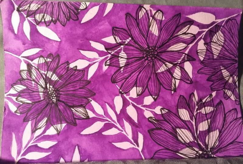
7. Painting 5 - Repeating Pattern: So I wanted to end our week with a really, really fun project. And this one is negative painting. So I'm even more excited. Where basically changing up negative painting. I've got a bunch of classes on it already. If you haven't watched it, definitely go back and watch it. It's really worth it. This is just going to be really, really fun and really quick, and that's just part of your learning processes. And getting comfortable. Some styling for the really nice flat wash of the green for the first two layers. And basically using monotones of the same color. So not really monotones, but basically the same color. So a light green and dark green for example, or a light blue or dark blue, pink and dread. So kind of combinations that are seen on the color wheel naught, a yellow and blue. That's two contrasting. So we're basically working with colors that are on the same space. And basically my processor squared and I've taken the pigment and I'm just going back and forth to make sure that it is small and all around. So I have enough of the pigment. Again, this doesn't have to be really specific because we are any way is going to be painting around it. So it's fine to worry about that. But still I just wanna make sure that there's no lines and it looks really clean and clear. Now, after drying this, I'm going to draw out some leaves. You can have a look at the leaves as just some really nice big leaves and making sure that they don't overlap at the same time, the Occupy enough space. So in case you don't know, negative painting is the technique where you paint around an object. So instead of painting inside the leaves, we're going to be painting I rounded. So it's a little bit different. It's really fun. Again, my other classes have so much more information about it. But this is just a quick overview and it's just gonna be one simple layer. Now that I've drawn this lead score into painting the outer areas, and I'm taking in the dark green though that I have. And you can see how I am. It's around the same shades, right? So it doesn't look to a part. It does look like it's the same thing because I'm actually trying to create this as a background to our final artwork. Okay, so that's, that's the trick. Basically I'm not, this is not going to be the standard base, it's going to be just an overlay background. So I also want you to start thinking about that like when you're creating paintings, to use negative painting just as a background and not the mean. And then you would have something else that is your main focal point or your main artwork. So anyways, painting around it, I love using a brush that has a really nice thin tip. And these ones that I mentioned in the materials craft AML, it's really create. Again, there's so many other brands as so much of the elevator. So I can't say one is better than the other. But from what I've used and ready like those brush and it's rarely grid for the lines are like the set that it came in with a flat brush and round brush and lot of variety. Anyways, I can talk materials all day. So just continue painting this. Take your time with it. Though, making it looks so so property. One rarely good tip while you are doing this is to outline the area that you want to paint. So you can see how I'm doing this. I basically outline it, usually keeping the tip has the edge. Once I outline at then I can go in and fill up that area. This works for two different reasons. First, you have outlined it so you're pretty clear about the edge. And because you're using the tip of the brush, it's going to have a much more crisp line than if you use the side of the brush. The second reason why it's so amazing is because gently at the tip of the brush is where you get a lot of the pigment compared to the other areas of the brush. So tip generally holds a lot more of the pigment. So when you go to the outline, those areas ended up being darker. And you can see that as I'm painting, those areas look much more darker and has you water and blend through the remaining space. The color feed the way. So this also adds to the intrigue of negative painting. So just wanted to quickly add that tip. Can I try to do this with areas that I'm trying to fill out, especially keeping in mind that I want to be darker in those specific outlined spaces. As I mentioned, when you're selecting the colors for the species, try to make sure that they are tonally very, very similar. And this really helps you bring this artwork together. This painting together. Also keep in mind that the pins and the pigments that I have selected are not opaque. And soon other issue that some of the watercolors face when they're buying brands that they haven't actually heard reviews off of the heaven actually tested. They end up buying the paint set. And then realizing that some of the panes are actually very opaque. They almost goulash like, and they're not really very translucent like watercolors. So just keep in mind which have a brand that you're buying or whichever paints that you buy. Just try to have a quick look at reviews of people who have used it to make sure that they are not opaque. Because if you don't like that effect of opaque paints, then you're not going to like your watercolour effect. Let me give you an example to kind of understand this. So when you go to mission my Jell-O and you end up getting a read. Let's just say I think I had gotten Permanent red from them. The color is actually o peak. So when I paint, I don't actually get a very translucent layer like how you can see I'm getting right now, I get a more solid layer. It's almost like painting with acrylic. I mean, not really, but I hope you understand small water down, but it's kind of a very flat layer that comes along. Now this is really great when I'm painting certain things. But if I was trying to do that with this kind of effect where I want the below color to be seen and I didn't want it to be so big and I didn't want it to be so flat, then that would be a wrong pigment for me to buy, the wrong paint tube to me for me to buy. So just make sure that you do look at reviews. If you're only you're starting out, you may not understand this really well, but just make sure every time you buy a paint set, do look at reviews on YouTube. Just check if the colour of the pigment looks exactly the way you wanted to look. I can tell you I made a person mistake with this. When I hit got Daniel Smith. I heard a lot of amazing reviews, so I decided to buy their set of mineral. I think that's the fight tubes. They have five different pigments from mineral colors, beautiful colors. And what ended up happening is that when I got the paints, I realize that their granules meeting, which means that they actually have lot of spots within them. They are not completely trance, parent or transparent like how you can see I'm painting, they have tiny spots within them. And that was very upsetting for me because I did not want paint like that. I didn't like that effect at all. So I basically bought the set. I still have it. I don't use it at all. I use some of the color. I think I used one of the colors from it, but very, very readily because of the fact that it is completely granule eating. So just as a tip, as an advice, I would really suggest, anytime you're buying beans, just make sure you look at proper YouTube or looking at proper reviews from artists that would help you to gain more clarity before buying the beans are the materials. So now that I've done this, I M completely drying this artwork. I know that some of the areas get blurred with my hand and I hope you guys understand because when I'm painting, if I keep moving the position, you're gonna lose out. And that is why I give you the whole painting. I don't really speed it up or I don't really cancel out certain areas because I do want you to see if I miss out in someplace where my hand was covering it, maybe in another place you'll be able to see the detail. So I really hope you guys understand that. Um, I don't wanna change angles. I have seen other artists to that where they change the angles and you actually end up missing out the actual painting. I don't wanna do that, nor do I want to edit out so much that you just miss out a whole floor. So please understand. And yeah, I'm just going in with the floss. So this is going to be again, my main focal point is a little bit different from the flowers that I did before. So I just want you to have a look at that. If you want to learn a little bit of doodling at this point. But also, I wanted you to kind of notice how I made this my focal point and the background is just the negative painting. And I kind of wanted you to get this idea of thinking beyond the box, of just having this as a focal point and playing around with that perspective shift. We've done this. And so excited to go on with the next set of paintings and continue with sketchbook. I hope you guys have enjoyed the five paintings. And I hope you really take this and really test it out, try it out. It's going to be really fun for you to see it all come together and start being very bold. Comfortable with watercolors. I'm really proud of you for getting this far. I'm really proud of you if you've tried out the projects, if you haven't, I'm encouraging you do try it out. It's not as scary as it looks. And the very, very simple. So yeah, happy painting.
8. Painting 6 - Brighten up your Watercolors: So we're going to start off with six projects. So this is basically Week two in case you're following week system. So the project is really simple. But at the same time, I want you to get a little bit of clarity about layering on top of your water colors. This is such a simple exercise, but it's going to start helping you build on color and as well as brighten your artwork if you're noticing that her watercolors looked dull. Generally the secret technique for you to Lear and make it bridle. So we're going to start off with a really nice set of leaves. I love playing around with the shape of my leaves. So making some of them are big, some of them smaller. Role in the home and having them like turned upside down, feast at different directions right-left and just kind of playing with that. So in this case, I'm actually drawing it with a pencil because I want to actually make sure that I get the placement right. I don't want empty spaces in my pH. But when I'm doing the previous exercises, for example, where it's more abstract, I don't really need to draw it out because I'm just kind of playing around with it. There's no specificity that there has to be no gaps. Whereas in this case, because I'm making sure that there are no gaps in my pattern. I am gonna take that additional effort and made sure that I draw it with pencil first and planted out properly. So using my craft more size ten. I don't know why I blanked out about the size, sorry, psi 70 ego, size seven brushes around brush. It has reorganized pointed edge. So it's so good for painting. I'm gonna start drawing some leaves. Painting somebody's having a good approach is also essential in case I have not repeated it enough. I saw massive improvement in my art, massive, just by using a different brush that was good. And I won't say specific to the brand is specific to the shape of the brush itself and the pointed edge. Pointed tip. So pay attention when you're buying and brush. So I'm starting with this beautiful color. I love this color. Again, it's from art, philosophy. It's funded. Woodlands ballot. It's a beautiful color. It's a color that's a little bit difficult to get in other brands. So it's really vibrant. I've looked a lot foreign scholar and when I got it with the woodland said, I was so happy. So I'm starting off with just painting a very nice Beasley of four are leaves. One thing I wanted you to kind of realize when you're doing this exercise is that there are different type of watercolors that's available. Some of them are more opaque and some of them are more transparent. So if you see in this case, the color is more opaque. It kinda lies very flat. And this generally happens for lighter colors of watercolors. So if you're going for a light pink, light green, anything that the light color, because the color or the pigment is made by mixing white or mixing other pigments. That though Lear is much more opaque. Whereas if I took, in this case, I took the ego, that is pure pigment. You would be very easily, you could very easily see the pencil drawing underneath, where since this is more or peak, in some cases you can notice that at visible. I hope this is a little bit more clear. Because I'm just trying to explain like opaque and transparent. And if you start buying watercolors, you're gonna actually start noticing it more often and then you'll get a better idea. So I kind of did this green color in some of the deep, so not all of them. And now I'm going in with this blue to give it a validation because it would be so boring if I did the entire thing with the same Dream is a beautiful color, but I, a full artwork would just, it would be boring. So I'm going in with a little bit, a little bit of a different shade of blue. You can see how the artwork kind of looks a little bit more interesting law that gives that depth to the artwork. So to do that, okay. Okay. Okay. Ten. So now this is done. I'm going to dry the complete artwork. I generally use a blow dryer. You get craft trials as well. Now I'm going to go in with the green. The Leo's completely flat and we're going to paint over it. The thought of tribal design. Again, this is your choice to play around with it. You can do any pattern that you feel like. But the point is for you to start exploring the idea of adding onto your base layer with a darker layer of column. This is such a fun technique and adjust actually goes more into the guage side of like, that's sort of an effect. But imagine if you were going to use this technique for painting. Let's say birds, are you trying to show feathers when you can handle this idea of having a very light base layer and then adding on top of it with a darker pigment. The possibilities become endless. Okay. Okay. Okay. A couple of things I want you to notice while I'm doing this, and I'm doing this slowly because I want you to really pay attention to how I'm going about this. I love making the lines small and big and leaving them as well as bearing the amount of water that I use. If I use too much of water, it becomes much more lighter. Whereas if I use more of the pigment, it becomes darker. Having small thin lines, some of them that are bigger. It just adds on so much to the painting. And I hope you have seen this coming through and it looks so pretty. It looks so vibrant. Began to do this for all green leaves. And then we're going to add in some more tribal image is going to play it on the whole effect. Now because I love polka dots, I'm gonna go in with some really cute polka dots. Also notice how in the leaves when I continue doing them, When I started off with the other side or the left side, right side, whatever the Sida was empty when I started painting over it. What I tried to make sure is that I'm not doing them at the same place that I did the other side. So making sure that the right and left look different. I hope that's clear. I think it should be healthier seeing the painting. So let us and polka dots for the blue one. This is again with the dark green blue pigment. A love how quirky does endowed workers. Again, feel free to explore it. It is all about developing your style. So it's really important that you get more and more and more comfortable with that effect. So this is our final painting. And you can see how it's come together. It looks fun, it's cute, it's vibrant and feel free to explore with this. So maybe you don't wanna do leaves, you wanna do boxes. You want to do squares. Maybe you want to do a cute little rabbit and you just wanna do designs on it. Have this, take this option to, to explore as much as possible.
9. Painting 7 - Errors and Mistakes: So this is one of the fun project that I had posted a while back in one of my groups. But I thought it was such an one project that I had to, had to had to share this as part of this journey that you're on. So this technique of Kinda experimenting with pigments and colors and seeing how they blend together to bring you really vibrant artwork. Some starting off with painting or jolly nice sari withdrawing a really nice circle, I generally just use a masking tape. And what I'm going to be doing is cutting my masking tape into smaller pieces and adding them along the paper. Now, if you don't have masking tapes decisions like white tape that you can try it on. You can try different type of masking tapes. There's also painter's tape that works really well. So definitely kind of experiment with different tips. I would suggest doing a trial tamper first because I've had students who did this before and finish the everyday. And then when they decided they were so unhappy to see that it actually rip the paper. So make sure you tested first maybe a smaller piece before you complete your entire artwork, making it look so pretty, and then seeing it not come out well. Okay, so you can see how I'm really pressing it down to make sure that it is flat and I wanna have it kind of lift up. And also when I'm painting at a will have paint slipping through. This is a technique of resist painting is also correlated with this painting because wherever the masking tape is kept, paint will not enter those areas. So those areas will end up remaining byte, which is really, really cool. It gives you the option T two tries so much using this. Now that I've taped it down, I'm gonna go in with my pins and I'll start painting. Just surely randomly. You can see how I move my brush. You can see how I add the colors and go about this. While I'm adding tape, you can notice how I'm adding some of the tips, just kind of poking through. It's not a full line, but it's just like poking through. Because I really like that effect. Whenever, whenever, sorry, whenever I'm doing the edge of a third, I try to make sure that I keep the tip at that place. So one common mistake that I see beginners or people who are starting off do is that they keep the side of the approach along the edge and that doesn't give you a very nice crisp lines. So make sure that you leave the pointed edge along the edge of the circle so that you get a nice crisp line. Now to brighten the artwork, I'm gonna go over the layer one more time with the colors just to make the whole thing much more bold. Because if I leave it as it is, it's going to become much more lighter. And that's the thing with watercolors, is whatever you see when it dries, it becomes a shade lighter. So it's good to go over the layer one more time just to brighten everything up. Now that I completed this, I'm going to let the whole thing try. And then I'm gonna go in with some really cute doodles. This is your chance to again explore. You can add Mandela's if you like, you can whatever, you want to paint something over it. We've covered so many different topics in the previous set of paintings. So maybe you want to paint leaves or word, it's your choice. But just explore this part. And let yourself just study, have fun with it. And so on. Okay. Two. Now that I've done this and it's dried, I'm going to go and to removing the tape. I'm doing this slowly and making sure everything is dried. The reason I wanted to add this exercises also because I know some of you or some people who are starting off do have the issue of having paint going in areas, but you don't want them to go. And I wanted to kind of give you options on how you can make sure that you get the paper back to white, or how you can kind of fixed your flaws or fixed mistakes that have happened and you're gonna see them heal. I'm sure you've noticed some of them on the edge. But how can you actually fix those mistakes with your watercolors? Good. So, so you can see that I removed, it looks really, really nice, but I do have some places that have those effects now that it has paint in areas that don't, shouldn't have been. So multiple ways you can deal with this situation. The first one is you try to add a little bit water to that area and kind of remove out the pigment. Another option is you use a white pen or white Chopin and paint over that area. That works really, really well. Another option is you can actually use acrylic beans like a white acrylic paint to fix all those issues. And find another option is you can actually scrape the paper. This is something that I prefer not doing, but I know a lot of artists do suggest creeping out the papers. So you'd remove that layer of paint that wasn't supposed to be there. But these are some really good techniques for you to cover up any mistakes or any ideas that kind of got paint where you didn't want them to have paint. Anyways, this is our amazing project. It's so beautiful, it's so foreign. And let's move on to the next one.
10. Painting 8 - Add More: Now let's move on to our next project. This is going to be a low, but I'm crazy. So in this one, we are exploring how crazy or how complex can you make your artwork? How can you make it really full of so many elements? So me designs and see for yourself if this is something you actually enjoy. Each one has their own personal choice. Some artists prefer having really minimal need. Burke, some prefer having really vibrant bold mixes. Some prefer having Lake Raleigh mixed up elemental pieces. So this is your chance to try your hand at something really, really fun. Some starting off with the base layer of DVS. I'm starting over two colors. Actually it would be three colors. So it's the blue, pink, and the orange. Now one thing I like about this is how I'm doing the leaves. So it's such a simple technique where you start off with a pointed tip of the stroke and then gently press your brush down and lifted up again. You're gonna see me do this multiple times. So if you didn't understand in the first time, you're going to have multiple chances for you to have a look. Also notice how I've done the leaves where the first three or the first set of leaves are a certain color and then followed by another set that's a different color, and then finally a different colors. So I'm playing around also with the leaf being multicolored. Very, very simple technique. This is not an intermediate classes is really, really simple for you to get comfortable with just doing beautiful norm. Brushstroke lines. Doing these lines are probably one of the fun aspects of painting. And especially with watercolors, because he can bring this affect together, saw beautifully. So you can see how leaves are kind of coming together and playing around with the sheets of which color comes first, which color comes second? And playing around with that, playing around with the shapes of the leaves. Some of them are longer. Some of them are tiny or just like playing with all of that. Yeah. Why? Hopefully. All right. Hello. Now. Now that you've done this, I'm going to let this completely dry before moving onto another layer. Another layer, I'm gonna go in with some dark green color. And I'm gonna add small elements to my painting. So these are gonna be leaves again, but it's more hollowed out leaves so they're not going to be you're not going to see them overlapping, hollowed-out, kind of drawn drawn out leaves. I'm trying to make them slightly smaller than the previous layer. You can go with the same size, but again, ridges basically trying to get this idea of overlapping, over lapping, multiple designs on the theme. Artwork, creating layers, creating interest and creating intrigue. And that's a lot of eyes. I hope you guys understand what I'm trying to say. Also. Before I forget, like in case you have any questions, feel free to add it to the discussions comment section so I can respond to it. I generally try to respond quick, but this gives me a chance to respond. So sometimes if you leave it in the review session, I won't be able to respond to your questions. That option is not available, so try to add it to the Discussions tab so I can reply. We've done this funky fun, bright, and just filled with elements. So you can see how I'm tapping it. I'm just starting off with a really nice big brush. You can use a smaller brush. It's same effect, taking little bit of water and then adding the pigment and then gently tapping it. This is so fun. I love, I love adding splatter is to all of my art works. And I like the effect that it prints out in the painting. So I wanted to bring everything together with this is just because I love making the artwork brighten up. And the black line work generally does that. And so now that I've done that, this is our final painting. It's so mixed up. It saw on I would see so crazy, right? There's just so many things happening. So hobbled, look, if this is something you personally light, if you love adding multiple textures, or you prefer having something much more mellowed down.
11. Painting 9 - Adding Depth: As you guys know, I love my negative painting and I couldn't leave this week without doing. An active painter excites. The one we're gonna do is a really cool one. I'm going to start off with this really cute, perfectly sized deep, which is going to be used for myself goods. I'm sure you guys have better tools for painting would circles, but this is what I use. I use tips around me. So I'm starting off at some rolling shoot circled, vague, randomly pleased along though, people in case you haven't heard or you haven't done any of my classes or have no idea what negative painting is. Negative painting is the technique of painting around an object instead of painting inside it. So it's really, really cool. And I know we did one excites all ready with it, creating a pattern. But this one is going to be a little bit more in depth and there is a reason behind it. And you will come to know as we finish the project. I'll tell you what the lesson is or what is going to help you define your artistic style from this painting. So I'm starting off with taking Green and I'm just going to be painting around the circle. The only reason I'm using this brush is because I can do the edges really well. So I'm using a flat, it's a dagger brush. Actually, you can use a flat brush or you can go and use your round brush. Is just that with this brush, I can go into the edges and Julie make them very, very sharp and crisp. This is not possible with a round brush. It takes a little bit more effort, but you can see how the dagger brush, I'm able to do it so easily. Now I'm adding a second column. The second column is always a colored that is very in tune with the first one. So I'm not, I'm not going to add an orange because an orange and green is gonna mix into something really weird. And we're going to add up, think, I'm instead adding a blue, which is very much similar to the greenish blue that we just did in the beginning. And in the areas that are in the middle, I go in and add water to just bring in that column. And thank you. And okay. It depends. So I finished during the first layer, just making it really nice and oh, and translucent. Now I'm going to let this completely dry and go in with another layer of so-called This one I'm going to do because how close? I am not doing it on top. Completely overlapping the previous one. They just like slightly overlapping. So that way I can see the circle when I complete the second layer of negative painting. The reason I wanted to add this is because we are going to have a royal, legally fun, intensive painting in the upcoming weeks. So I really wanted you to have a base in case you haven't done my previous classes. And this is a lot more easier compared to my painting leaves tutorial. If you haven't checked that out, definitely do. Kids, it goes completely into like to painting. Now that I've done this, I'm going in with a deeper layer of the greenish blue and I'm going around the goods. The attention to how I hold my brush and the reason for this exercise is for you to get very, very comfortable with doing very crisp edges. At the same time, you're also understanding on new technique and seeing if this is something that you want to bring into your artistic style, creating depth within your artwork. To do that. So now that I've done this, I'm going to completely dry this layer and go in with a final layer. I am going to be using orange just to kind of bring, bring a little bit of color into the painting. And here you can see I'm using the reason for that is because we're going into smaller areas and with my flat brush, I might not be able to do that. So again, something else for you to kind of get used to in practice is to know which crush is suitable for which to get comfortable with selecting your brushes. So this is our final project. I'm just erasing out any pencil marks that I have from previous layers. And you can see how beautiful this is. The effect is so vibrant. And it also gave you a chance to practice with your brushes, get comfortable with crisp lines and all of that. Let's move on to our next painting.
12. Painting 10 - Less is Better?: I am so excited about this project because it's all about leaves. And you guys know, I absolutely loved my leaves. And it's all about the leering which we did in the previous paintings. So this is kind of getting you to try also new type of paintings of the system or minimum, I would say it compared to what you've been doing. So in this week, if you seem you did something that was really crazy and Lord, happening. And then we're moving on to something that's more minimal. And this is again, a way for you to check if, which check which style you prefer. So for me, I generally like adding more and more elements. That's just me. But again, this is the way you kind of figure out. Which do you like more and then you can try it multiple times and see, oh, I like that more. No, I like this more. No. It just helps you understand yourself better. So for the potted plants, I'm starting off with some pause fees, the Sony ways of saying it. I'm just gonna say pots. Thought. That doesn't get annoying. I'm playing around with different shapes of ports. I loved doing both because it just looks so much more better than having one shape of a pot. You know, having this kind of like round and big and some bigger, some mode round or some more taller. Having that read IT, GOD hubs. And I want you to take that effort to pay attention to the proportions and the height and all of that. Now that I've done that, I'm going to start maintaining the entire painting is going to be done in two or three colors. I'm not adding the orange. It's going to be all in the shades of blue. And sorry, with my pot. And I want you to see how I kind of play around adding water while painting. Just to add some that IT and making sure that all the parts that are right next to each other. Because that's again going to get really boring. So if you see in this case I'm adding a different color that is not adjustment to the port with another color. And another thing, another tip that I would give you is to not make it all flat, right? But wash that I'm doing right now. The painting that I'm doing now, I'm adding more water and some places I'm adding more of pigment and some places, so there's a little bit of an effect going on, which is the best part about watercolors. If everything just looks flat, it's going to look more like acrylic painting or goulash. And so you want to avoid that. Try to make sure you have water. Transparency and play around with it. So this is our final part, I'm going to call do the shadows. For the shadows, I'm doing it. It's really, really simple. I am just doing a really thin line, making sure that the tip of my products had pigment. And what I tried to do is imagine whether light sources, if it's on the top, is more to the right side, is more to the left side. So in this case, I'm kind of going for the top left corner. So all my shadows are going to slightly move towards the left side. And also making sure that the shadow is not like a block of shadow. Now let's move on to the leaves. I am doing this process Bay they slowly because I really want you to see how I do my leaves. Some of them are falling down. And it's all the same technique that we actually explored in our previous painting. But with the same technique, you're gonna be able to see how many different radiations with leaves I am doing, which is so-called. And also notice how cool the brushes, how good the brushes. Because if I didn't have a good brush, I wouldn't be able to do this. So just notice how I'm playing around with my placement. Often leaves how I'm playing around with them. Now going to have damage Scott King at this point. But just truly pay attention to all of this. And Okay. I just wanted to also come on and just kind of show you how you can play around with the colors as Belt rate. So again, similar to the ports that are explained where you don't have adjustment ports having the same column. Similarly, even the plants you don't want to have adjacent plant telling the same colour, nor do you want the same pots to have the same colored plots. So basically green where ID in all different ways and playing around with the shapes of the leaf. Some of them rounded, Some of them smaller, some of them beggar, some of them bunched up together. All of that to small, small teeny differences makes them look like completely different plant, right? Which is really cool. I think it's so interesting how that small effect, small change can completely make a difference. Now since my ports are looking a little bit empty, I'm gonna go in with some details. And this is again your chance to play around with how much detail you want to add in. Do you want to have a lot of details? And the minimum, is it more like this, where it's more of lines and very contemporary? Or do you want to go in with something more traditional? Or do you want to do more of Gothic, or you want to do vintage patterns? All of that. I leave it up to you. It is your choice. Have fun with that process of deciding what you wanna do for the ports. So it's really simple like Benno going into an extensive project where you have to decide something meaningful, but you already have it. It looks amazing, not with just your choice on how you want to take it forward. And what do you want to add? You can see how I'm adding in just very, very minimal contemporary designs to the pots. And you can see how the ports are coming together. The whole artwork is looking much more vibrant than if I had just left it clean. Because when you add in a deeper color with watercolors, it lifts up the colors of all the other colors on the sheet. So generally adding a deeper color, especially if you're a person who likes bold colors. If you prefer having washed lighter, don't, then that's fine. Go ahead with that. You can add some gold accents. Play around with it. A lot how this final project has turned out. And I like how is a kind of like a no brainer project, right? That's why I love this entire CDs because they're meant to make paintings so simple for you that you not worried, it's always gonna look good. Because the paintings are done in such a way you can't actually get them wrong. Because it's your artistic style. Whatever you do, it's your choice. Hope you're enjoying all of this. And I'd love to hear from you and see your final projects and paintings.
13. Final thoughts!: Hi everyone. Congratulations for getting through ten different paintings. I am so happy that you've taken a chance and exploited. And if you've recreated that amazing, because you've taken that step to kind of figure out a little bit more about your artistic style. Oh, this is part one. And as I've mentioned in the introduction, there is a part two, which is in the next video. So just make sure you haven't looked at that. And that's again, ten different paintings. So all in all there's 20 paintings for you to explore. Deadlock is to figure out what you like and just get so excited about painting. I'm so happy that you went through this process with me. And I'd love to see your recreations. I'd love to see your views, feedback, anything that you have to share with me. Thank you so much and happy painting.
 Femvisionary / Madhu S, Watercolor Artist and Instructor