Transcripts
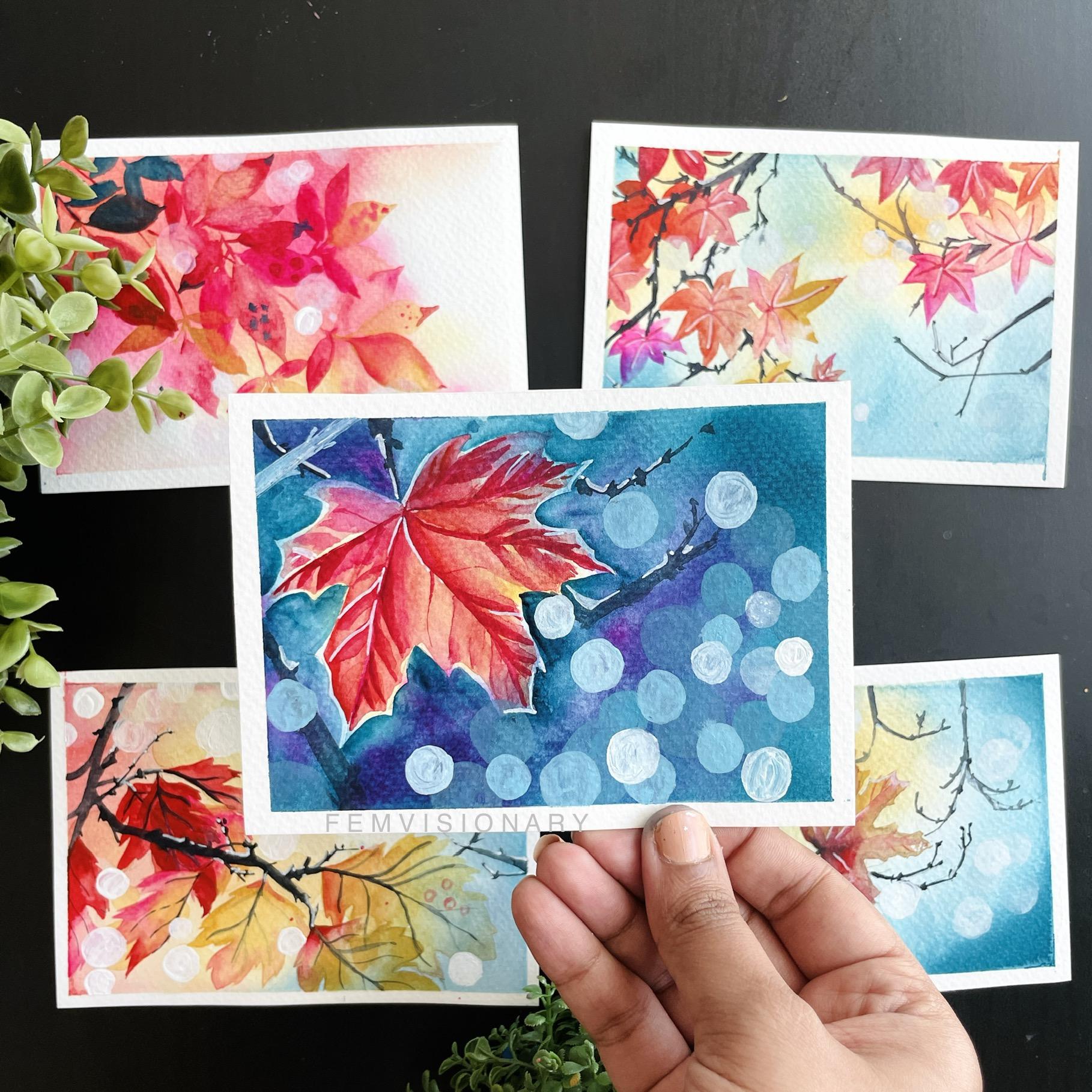
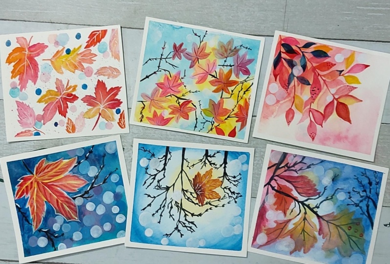
1. Welcome: Welcome to the mesmerizing autumn watercolor class, where we are going to be diving into six stunning projects. The projects include amazing techniques from blended backgrounds to negative painting effects, to poker effect techniques, as well as placements. And so much more. Welcome to the class and I invite you to create and paint your six stunning framework a pieces this month.
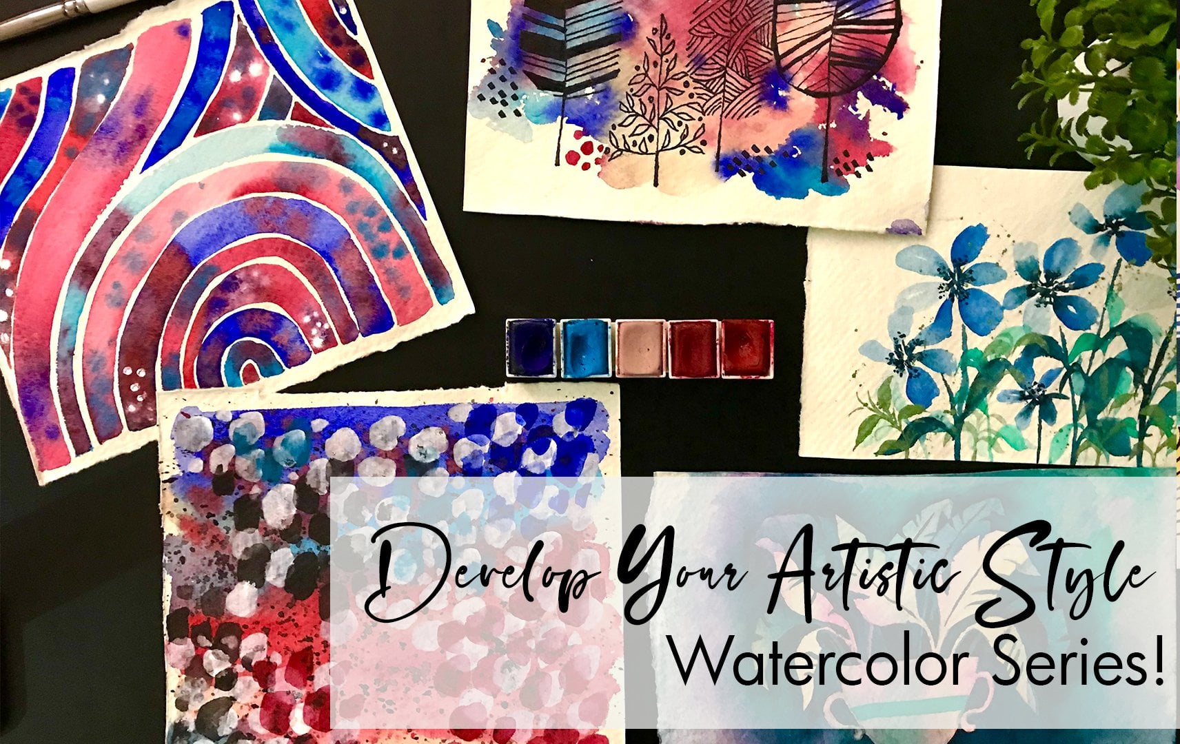
2. Let's Chat materials: Let's talk materials. The first thing we're going to talk about is people. It's super important to pick a very good quality watercolor cold pressed paper that is above 300 GSM with 300 years. And plus, it can fill up enough of it can hold a lot of water. So anything less than 300 GSM is going to shipper or it's going to tear it and it's not gonna give you the effect that you're looking for. The next thing you're going to need is watercolor brush. I'm using craft ammo. You can use any round brush that is a size 4. Or assigned sex. Because our painting is quite big sorts, okay, additionally, the next, we're going to need a mop brush. This is fun art essentials. The list is in the description below for the class, so you can have a look there. Additionally, you will need some watercolor paints. I'll dive a little bit more into what colors a little bit later. The next thing is a postcard marker. These are basically white acrylic markers. They are still create for a lot of the details that we'll be using in this. You can additionally use white acrylic paint as well. And that's just normal white acrylic paint. This is what we're going to use for our effects. Now, as I mentioned, the colors are going to be very autumn inspired. So I'm going to start off with a beautiful and yellow. Next we have an orange. Both of these form. I think white knight he has bought from bipeds. The red is for Michigan, my jello, it is a permanent red for the pink. This beautiful, bright pink. It's an opera pink from Art Philosophy. Next we have this beautiful blue green, which is a turquoise color, form or ignites. And finally a black. And this is from Winsor Newton Cotman series. And these are the colors that we'll be using in our projects. For this class. Let's take materials on hand and dive into our practice exercises.
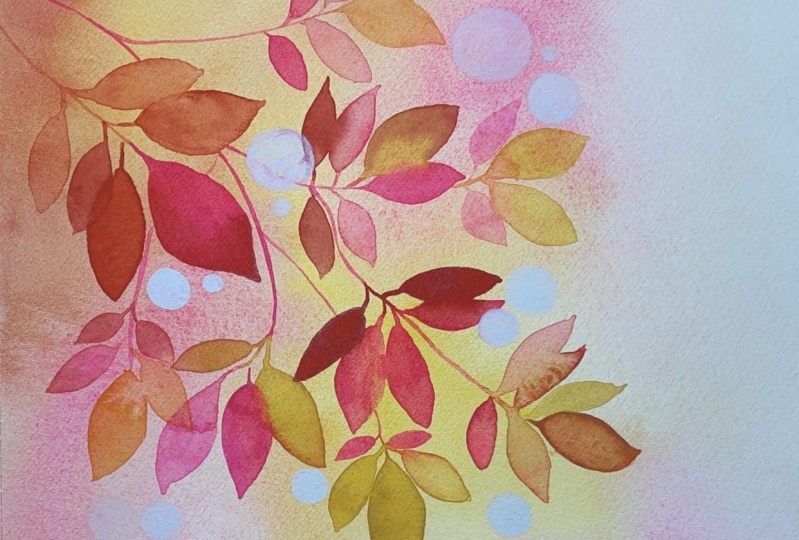
3. Warm up Exercises : Before we dive into these tanning, autumn inspired watercolors, I wanted to do some practice exercises, especially in terms of sketching the different type of leaves. So here you can see I started with a very simple leaf. Each leaves are one of the easiest to draw art. So using a base of teardrop shaped leaf, add some spikes to the edges. Following that, Let's draw horse chestnut leaves, which is basically five leaves attached towards certain point or one fixed point. Keep in mind that we want to follow the direction of the leaves, as well as keep a lookout at the size of the leaves. Here you can see the lower leaves are to the right and the left and are smaller in size compared to the leaves on top. Next, sweet gum leaves, which is basically the teardrop shaped leaves combined at 1. As you can see. Now, unlike the chest not they're all the same size. The next one following that would be the famous maple leaves. Here I'm following exactly what I did for the sweet gum leaves. But in our next step we're going to add the books or the pointed tips. And that is what is going to define the shape of the Maple Leafs. Now that we've got a general idea of the shape, Let's add the spokes. What I like to do is at least three or four in one petal or one. I want to say battle in one shape. To little bit difficult to describe this, but as you can see, my drawing explains a lot more. Now this can be changed into different shapes by basically making one longer, one shorter. And just kind of giving that movement to the Maple Leafs. Following that, let's go ahead and draw some red oak leaves. Notice how the shape of the teardrop changes with this leaf. This is very important. And if you can get this right, it is very easy to draw out the leaves. Once you have the general shape at the spokes like before. And this brings a very pretty looking leaf. And it's that easy. Now let's do also a half leaf. Just so you have an idea, if this is going to be half, how would it look? So when stressed a side view of the leaf. You can see it is as simple as just doing one side of the design. Now there are a lot of different leaves that we can dive into for autism. But for the purpose of our projects, these are going to be just enough. Now the next thing we're going to practice, a little bit of painting are fun leads. What I love doing is blending around colors that are ultimate inspired. While I paint out my leaves, I try to make sure that I add a lot of water. So it is quite easy to blend. As I move on, I add another color and a secondary color to another leaf or another shape in our maple leaf. And that's how I create these multi shaded leaves that we are going to be using in our projects. Now that I've gone through pink and yellow, I can find the ad and orange to the tip of this leaf. I have used a little bit of creative explorations here, where I've used colors that I want you to use for the leaf. However, feel free to use the original autumn inspired colors for the red maple leaf. If you feel like that something that you really love doing. Again, it's really up to you. I like experimenting with my colors and just try to keep the theme of them theme. Now let's paint another leaf. Just wanted to show you how I do this. Notice. One more thing that is super important is the tip of my brush is always to the edge of the leaf. For the pointed strokes. This way I can ensure that I get truly nice, crisp strokes for the edge of my leaves. Always adding a mix of colors. Because that's a beautiful look and it looks really interesting than just having one color across the entire leaf. Now let's allow our leave to completely dry before going in and adding those trucks. For the center. Details of the leaf. I generally like to take a color that I have used within the leaf or a darker shade of the existing color. In this example, I'm using a red that I had already used. In the color scheme. What I like doing to really bring in depth and to bring in more of a design detail. Especially for some of our projects where we're really going to focus on one, people leave. I am going to be adding shade or shading of the thread through one side of individual patterns. But you can see in the image. Now I'll allow for this to dry before moving on and adding the stem lines. Sorry, not the stem, It's the wheels of the leaf to bring it together. But just make sure that it dries completely before attempting to do that. Now that I've dried out my leaf, I'm going to add the wins. Notice how I do the winds more to the tip or the edge of the maple leaf. And not starting from the center. You can look at an actual maple leaf and you will see that's how it looks, especially under the light. With this, it's a little bit tricky because we are going for a loose effect. So it's really difficult to get an all the mini, my new details of the stunning leaves. So we're going to leave some of it as they are and focus on the Chandra sheep. And the general details. Look how styling that says. Let's allow it to dry before going in and adding some white lines to just build up the color and creed interest. This is one of my favorite white bands that I have invested in over the past month. And I think it's definitely a must have. Now that we've practiced leaves, Let's move into bronchioles. I thought this was super important to cover in our practice exercises because branches can be really tricky when it goes into drawing them. So notice the shape of what I am doing differently like U-shapes in a way. I think that's the best way I can describe it, but we kind of want something that is falling down. And then branches. This is the general shape that we're going to be using throughout our projects. And you can see how it looks really interesting. And when we go into painting them with our black paint, we're trying to focus on making sure that the branches look even. And even if they look on even, the mean or the StatCrunch is bigger or thicker than the corresponding cut through branches. So always making sure that the main branch from bear, all these branches come through is a lot bigger in size, lot thicker and sized. This what I mean, then a joining branches that are part of it. Notice how I go through this process and I would suggest for you to pause this video and try to get this the effects. Additionally, because of the trees, they all have these books in them as well. So we're adding the spokes through our branches. Now this is mean of mainly like twigs, they're like very small. But when we go to the big bark of the tree, we are again following the same step. So let me show you an example of that. So you can practice that as well. So that when we go to our final projects, you're confident and feel truly, really comfortable with doing these details. The best way to show the difference in the branch, to show that something is a tree trunk, something is uptake branch is to make sure the width is much more bigger. Also, if you look at a bark of a tree or the mean treats with some of the branches. They don't generally prick into so many, many branches that shouldn't leave a couple of them. But as you go ahead, as you go farther away from the mean bark, the splits get more and more. So just keep that in mind. True or painting, you can notice that I keep the spokes intact. Now, these are our practice projects. I would suggest practicing them as many times as possible so that you're very comfortable. Because when we get to our projects, I want you to really dive in and just be excited about the final outcome instead of being worried about not able, not being able to pin these out. So now let's dive in to our projects.
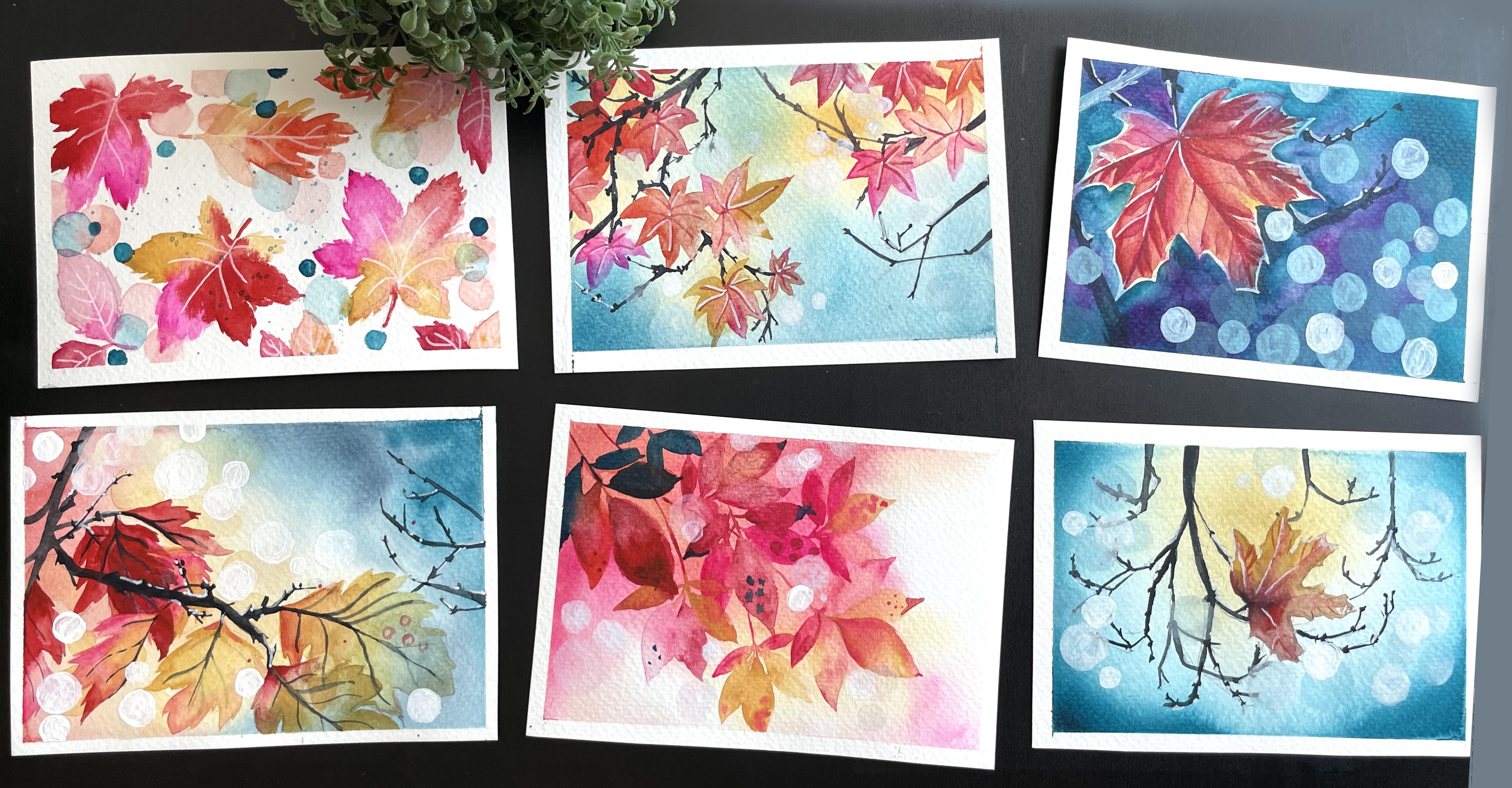
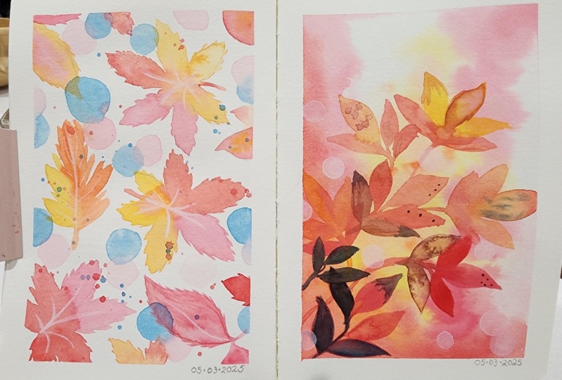
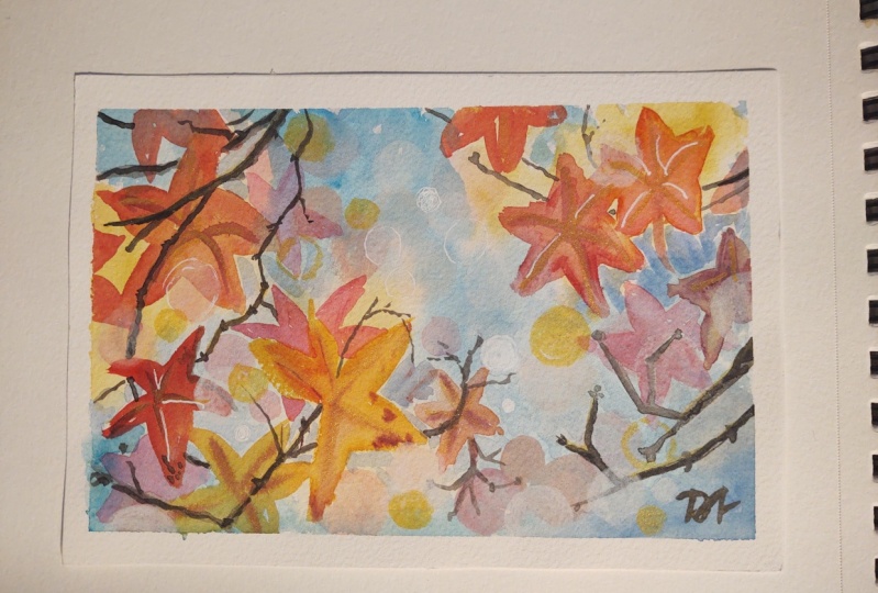
4. 1 - Charming Autumn Breeze: After our fun practice exercises, I am so excited to dive into a very simple pattern. This is going to be a great way for you to dispute tools into autumn leaves and just have fun with the process. So the first thing we're going to do is to draw out our mix of maple leaves, Beach leaves, and red oak leaves. So it's going to be a combination of all three. Now while we're painting this, what I like to keep in mind is NFO, THE gap between the elements, as well as not repeating all of them in all the same direction. Instead, let's have them in different directions. Some of them peeking through, through the edges. And that's what we're creating killer with our pencil sketch. Now one tip to keep in mind is to make the pencil sketch very light in color. Because when we paint, the pencil sketch is going to be seen if it is darker in color. So try to make it has light as possible. While you can still see your leaves. At the same time. They are not making a massive impression on the painting or the pattern, basically. Now we have completed the drawing for the pattern. Let's start with our painting. I'm going to be following the basic colors for autumn leaves. This beautiful, bright opera pink, orange, yellow, and red. These are colors that are going to work really well and come together to inspire us this autumn season. Now, I know this is all that I started with the edge leaves because they're not even the main focus. But actually I loved hearing tab. I love adding, painting out the edge leaves because I get to experience meant more with them. And in case I make a mistake, it's okay because they are in the meeting leaves. Now, while I'm painting, you can notice how I'm adding the spokes for the leaves. Just part of the painting. I didn't want to draw it out completely. If I had drawn drawn it out with the spokes, it would have been so much of information and so much of detail that it was truly seen through my BSW. See you just happen to have a general idea and leave it as it is. Allow yourself to fill in the details when you get into painting. So once we've gone through this painting out some of the birch leaves, beach deep, sorry. And also kind of having fun with the color scheme for the beach leaves. Gently, they are proud. But for the autumn Azure AD order to use more of beings and orange, just make it very happy. Now let's go ahead and paint our main leaves. Maple leaves, right in the center. So I'm picking this bright pink for pretty much most of the leaf, so it's going to be very prominent. And luckily with this color, it is a color that just really stands out. Try to work a little bit quickly so that the layers don't try as you go ahead and add more colors to that. And that's where we go in with yellow for the remaining leaves. And a little bit of red as well. Now that we've gone through the yellow and bright pink, Let's add red to the edge of the leaf. Again, keeping in mind the spokes that come through. Conditionally let that little bit of red to the crossing point of belief. And this is going to bring the def together. Now that we've done this, let's move on to the other leaf right next to it, which is again going to be me belief. For this one, again, starting off with the pride paying, we can go into and just make the leaf focused on the red. So there's going to be a lot of Fred covered and a little bit of yellow along the edges. And this is going to bring everything together. Just like playing around with different colors blended together. Finally, let's go into the last few leaves that we've caught on here. Would be the red oak? No, it go. Yep. That red oak leaf, again play around with the colors. So I'm doing mainly yellow and a little bit of orange. Along the edges. Again, you saw the base dental drawing, which was just the main shapes. But within this, I am able to go ahead and add the details of the spokes. Reason why I wanted to focus on every single landing is for you to see the mix of colors, to see the variation of colors that I am using. Different combinations you can create with the same color schemes. We really want you to enjoy playing around. It doesn't have to be the same color scheme that I choose. Maybe you want to go for different autumn inspired colors. Maybe you want to go for the focused leaves, whatever it is, just have fun with colors put together. Now that I've gone through this, I've noticed that there are a lot of empty spaces and I want to fill them with more of The Beach leaves because there's so many of them. And they're going to just really fit in well with what we've created already. So just towards the edges of the painting because the inner part is pretty fun. I'm going to continue adding each leaves. Now this is where you can get creative if you want, based on how your painting is looking at this point. If you want to add achieves or do you want to add some of the other types? Maybe you just want to add dots or doodles. Whatever the key is. Pick something that You think would suit your work. Now has the painting has dried, we can go ahead with our white pen and add those details for the winds of the DFF. Going ahead and adding any of the detail for the leaf that we weren't able to add. Now, additionally, I wanted to go in and add some circles. Now the fees I want to add this is because it is part of our six projects. It's something that I had made a common element in all of the projects. So that's why I wanted to add this in for this one as well. Liked the look of having a very filled up pattern. That's something I really enjoy. So all I've done is taken thread, added more water and use dark mixture for circles. So it is a very watered-down layer of the red. As you can see, it's very transparent, translucent, and which is going for the treading water outlook. As we fill up the space with this, we can go ahead and also add some light blue green circles. Notice how these are very, very translucent. And that's the look that I am going for. It's not a very deep, strong color. It's a very translucent sheet mixed with a lot of water. And then I want this completely dries. We can go ahead and add some more dots. Elements basically shows the point where we're just having fun with adding different elements. As I mentioned, you can add two dots. Whatever it is you feel works well with the pattern. Along with some green glue dots to also add some splatters. Once the paint is completely dry or are completed project. The first project for this class.
5. 2 - Pink Chestnuts: I love something about the colors for this next project, very inspired by pinks and yellows. So the first thing we wanna do with clear water, I know those layer but low, that's okay. But we want to completely completely paint with clear water all over our people. Make sure that your paper is taped out. And we just want to go over those at least 45 times. So your paper is truly soaked in without water and spray. The quality of paper that you have a whole important. If you aren't getting some beautiful lens, it's because your paper is wet enough. Now I'm going to go in and add some yellow. Now when it comes to the yellow, when I'm adding this, I'm making sure that my brush is not too wet. So it's the opposite of what we did before because the people already is wet enough. All we're doing now is adding the color and that's going to be the focus. Now, we are also making sure that the yellow is runs diagonally across the people. Following that. Let's add orange right on top. I also like to add the splatter effect just by gently tapping my brush. Now that we've caught this orange and yellow, We didn't go ahead and add red again to the edges of the people. Notice how I'm just really making sure that it's in the edge and not over the yellow. Because if I do it over the yellow, then my yellow is going to mix colors and become orange. So just really keep that in mind as we proceed. Finally, I'm going to add some pride bank I love or propping. And that is basically the focus and highlight of all of our projects first time. So using this or propping, let's add it. Some of the areas right next to the red. It doesn't have to be on top of the red part, but just next to it. But notice how I'm not overdoing it. I'm not adding too much, just very lightly. Adding it to some areas will have NF of whitespace around as well for the negative or the negative space within the painting. Now let's allow this to completely dry before we move on to paint our chestnut leaves. So you can see how it's dried up completely. And then we can go ahead and paint our chestnut leaves. Now I'm going in the direction of boredom. Saw the branches for the chestnut are going to come from above. When I go ahead with the chestnut, I'm just trying to make sure that I use a very light water down. Leo. At the same time, I want to make sure that it is still visible. So if I feel like it's really light and I can't see the leaves. Just make sure to go in with a brighter pink color to bring it together. Maybe adding some dots to our leaves, pour some texture. Again, the mean, leave, I feel like those two yellow, such as adding a little bit more of this bright pink to it. And this is how we've caught one set of chestnut leaf. So we can go ahead and do this theme slightly above. And playing around with the same idea of the shape and size of the leaves. The main one being the biggest and the longest, the side ones becoming shorter, and the ones that are right on top becoming the shortest and more 90 degree to the stem. It's really important to keep in mind that the colors need to be seen through this process. So if you pick a color and you feel like it's not seen when you paint out your leaf, make sure to pick a deeper color. Moving on to a deeper so that the colors are. Otherwise what's going to happen is you have this beautiful painting and you can't see any of the leaves because it's all the same color. So you just want to make sure that we keep that in mind as we continue adding more. So keep in mind the placement of these leaves. I am making sure that there's enough of a gap between them at the same time. They're not all pointed in the same direction. It does look like the leaves are moving. They're not all pointing the same direction because that would look really unnatural and really just not normal. So we're just trying to make sure that we release them in different directions. Now, going ahead, we can add more leaves overcrowded, so I don't want to have too many leaves happening that you can't see any of the details, but it should be enough to see that it's all gathered. Does a lot of leaves happening, but not too much? So whenever I'm planning the placement of a leaf set like a chestnut dv. What I try to do is make sure that some of the leaves are in a clear area where there's nothing happening. And maybe the last two leaves, the ones that are right above that are shorter and size, smaller in size. Those are the ones that overlap or under lab, the previous leaves. So that way you can see three leaves very clearly, very prominently in just two are underneath or overlapping. So this gives a very clear idea and you're not losing the shape of the leaves through this process. And you'll notice that as I go along the painting on our different leaves. Again, not doing too. Maybe we're going to basically have a part, six leaf sets. That's it. She's not too much. If you feel like you're painting has too many, or you feel like it all genes so much, stop. You don't have to do six leaves. That's okay. Make sure to show it in your stems so that they're all linked together. So it doesn't look like the leaves are just popping out of nowhere or the very unnatural looking. As you can see, we've already completed six, sorry, five of our leaves to reach us, going to add two more. And these are going to be a v form our existing leaves. So they're just going to kind of bring through the placement of the painting and you can see where I'm placing them. So you have pondered going to be below and 1 third going to be above. Always remember to do around with the colors and to not have just one color all through the work. And very important, so make sure that you keep that in mind as you keep painting your needs. So this is basically our final set of leaves and we're pretty much done. Additionally, what I'm going to do is maybe add some texture like dots to this painting. And so you can see our leaves have kinda God formed a darker color on top to lighter yellow at the bottom. So accordingly, left at some bluish green leaves to the top spot, the colors become even more darker. And you can really see that variation or the change in colors has it moves from up to down. Emphasizing on this. Now to balance out the colors so it doesn't look like there is going to be mainly just random blue, green dried on top. Let's make sure that we have a little bit of that color coming through the other leaves. Pb via towards or just small details along the tip of the leaves. As will allow us to try. Let's move on to a poker effect. Just something really simple. I'm going to be adding white acrylic circles to our painting. Now when make sure when I'm adding the white acrylic circles that I have enough of space between them. It's not overcrowded. At the same time. I'm not using them in areas that are completely white because what's the point and what we wanted to, it's just have them as much as possible to through the existing painting. But the background is stronger. As you can see. Another really creative is to make sure that you have a set of them. So either you have one in a prominent NGO or a set of two or three in a non prominent area. So somewhere close to the edge. And that's the focus, as well as playing around with the size. So having some that are very big, as well as some that are much more smaller. And this difference brings through our painting. Now that this is complete, as you can see, it's already become evening. I'm just control the tip for my painting. And this is our painting project too.
6. 3 - Morning Maples leaves: I really love the morning inspired autumn painting. It's the first thing we want to do is tape up our painting. And this is super important to have these beautiful crisp edges. Now that we've done that, let's move on to sketching of branches. Notice the general direction of the branches that I am painting out or trying out. So I want to have two main branches to the left of my paper and one set of branches that are coming from the right side. And there's going to be in-between empty space. So you have these two opposing punches and nf of space between, because then we are going to add these. Here you can see I'm adding in truly small maple leaves. What I'm trying to make sure is that I don't add too much of detail because I don't want it to be very dark. Because when I go into painting, it's going to be a lot more difficult. So I'm just going to keep it really simple. And very light line with my pencil. Getting the basic gist of where I want to add these leaves. Now, I might remove some of them as I continue drawing on. But I just want to get enough so that it looks quite full on top and much more lesser as we go down. Now that we've completed that process. And I've left a lot of empty spaces. There are a lot more leaves that I'll draw out, but that's okay. Let's completely out. Are these people, as we did before, I'm going through malt both layers of paint, just clear water over and over again, about three to five washes. So there's enough of being on the people. Once. I feel like that's enough speed to the people, they can proceed with the next part of adding yellow. For the yellow. Notice how and where I added. So I'm going to have more of the yellow on the top right, as well as the top left as we go down, which is going to be spots of yellow. In case you feel like there's too much of yellow and it doesn't look enough. Glenn, like more blended. Just make sure that you try out your brush. So just clear your brush, dab it in a towel or a paper tissue, and dab the excess of paint before going on. Now notice how the color automatically spreads very easily because the paper is so wet. Just go over it, make sure everything looks nice. And then in the middle areas, we're going to add our blue green. Notice with the blue screen in the edge, I decided to add a deep blue green. But as I move forward, I'm just adding a very light shade. Remember that approach doesn't have too much of extra water. If it was too much, it would form products. So we just try to add enough color to blend through and look way better. I love the colors to blend. And keep in mind that we don't add it in a place where it mixes with the yellow to form a cream. This is very tricky and very important to remember as you continue with your painting. So we just make sure that we add the blue to the edges of the painting. And in areas where there's no yellow. Very important to keep this in mind. Now that it looks very splotchy. It's okay because as it dries, it's going to be a lot Most model. I'm just going to allow it to dry a little bit. Not too much, but I'm just going to continue adding a little bit blue because I want that color to concentrate and become more Depot. Very important to just allow this to dry naturally. If you're planning to use a trial, keep in mind to not use it very harsh so that the colors don't blend when it's drying. But you can automatically see now that the layer has dried, the colors. Blend so much better than what it was in the previous step where it looks splotchy. This is because the people was so wet that it allows the color to soak in. Now that we've got that going, Let's go ahead. Hands you can see I've already started with a light pink, very watered-down layer for the leaves. Now some of these leaves are true, but a lot of them I didn't draw. And that's okay because now we are going to go and dive into where do we want these leaves to come? What colors? And I'm going to also try to keep in mind that the ones that are higher on top are going to be deeper in color. So they might be mixes of orange and red, pink and red, pink and orange. So deeper colors compared to the leaves that are going to be at the bottom, which are going to be mainly yellow and red, yellow and orange. So you can see how I've just changed the color combination based on the placement. So following this shape for our maple leaves all through the artwork. So let's go ahead and add some of the leaves right, for the left side branches. And just notice the light pink with the yellow mixed up so that you get a lighter shade of colors. As I mentioned, the lower we go more into a lighter shade of yellow. So it just becomes, it just looks much more naive. And it also looks like though sunlight is showing through the leaf. And this is really nice to create. So following this, Let's continue adding leaves at all and speed up the process too much. At the same time, I really want you to understand the placement of the leaves, how I move around the sheets, where I place them, and how many IPAs. So accordingly a greasy me just play out the entire video as I have recorded it. So you don't have to see, you don't have to miss out anything. As you get Couple of the leaves going. This is where I say that you need to step back from your painting and figure it out. If you want to add more. If you add, if you want to add list is like your choice at this point, even if you follow what I'm doing exactly. Maybe they just need more. So this is a judgment call. There might be spaced as you feel like it's too empty. Use that. Use that in your planning. As you can see, what I'm trying to do is things that are right on top. Like there are more leaves on top, It's more full. Compare two leaves that are at the bottom. So you can see that transition just right now without even adding branches. And I'm adding the leaves to the areas of the branches that I had painted before, so I know where they are going to be. Now, let allow our painting to dry before going on and adding the waistline. All through the leaves. I'm just doing this. Now that we have finally completed on leaves. But let's move on to our stems and branches. And remembering what we practiced. Plan out your branches so that they are in those UV shapes. So kind of slouching down with those ridges and spokes on them. We're going to have something that's more prominent at the same time. And also when we're doing this, we can plant some of them that are below the leaves. So you have the branch that is above, really playing around with that. So it looks more natural. Like, as you can see, I've made sure that the branch is coming from above the leaf. And this one product is going to further split into multiple branches. Are two major branches to come together. I would say at this point to step back and see if you feel like there's any empty spaces that you want to add a branch to. Or you're happy with the way things are. I like having my paintings with a lot more going on. So I am going to be adding couple of more just to kind of fill up the space even more. And once I've done that, let's allow us to completely dry. And then we're going to go ahead with white acrylic paint. Now with the white acrylic paint, what I've done is I've added a lot more water to it. So we're going to end up having a much more translucent layer. As you can see, it's not a bright white like an acrylic paint. It's more translucent. And that's what we're going for. The tip for this is to make sure that you don't add too many. And you just added in areas that are more towards the leaves instead of the empty spaces. So really keep in mind where I'm placing this. It's going to be really useful for you. And this layer is more translucent, so we are going to completely let it dry before moving on and adding one more layer of coastal codes. And these ones, you can see it's a lot more prominent. They are much more whiter. And unlike the previous where it was Watertown. Here, it is more Orpheus. And also adding it in places that are touching the leaves or the project. So it's overlapping in those areas. As I mentioned before, beat all have too much going on. At the same time, there are a couple of things to keep in mind. One of it being either you have like a major big prominent circle or you have a set of three for so-called together. And that's how you ensure it works. Well. Finally, as you can see, I added white lines to the leaves to just let the color pop a little bit more. There you go. Let's pull up this painting to completely dry. Remove RT. And we are done with our poet project.
7. 4 - Handing branches in the morning: Are you ready for another bokeh effect, autumn inspired watercolor painting. This one's going to be very fun. It's the solo single, leaf in the middle of autumn. So the first thing we wanna do is add a lot of water to the main sheet. As you guys know, just make sure you do multiple layers so the water really seeks sinks n. Next we are going to go ahead and add this deep blue color around the edges of the painting. But I'm trying to keep in mind is that the center is empty. This is really important because that's the effect you're going for. The sunlight coming through the center of the painting. Meanwhile, gently drag your brush across the sides and edges of the blue to bring out the stunning color. And this is going to be a very fun background. And continue with this leering, gently blending the colors on the light. And really simple. I wanted to continue adding more of the light, blue around in a circle. Just gently and just very lightly. Switching my brush to get the color. And now that we've got this base, Let's add yellow to the center. Remember with drying, with watercolors, the layers are going to try one more shade lighter, even though it looks totally depraved now, it is going to dry lighter. So just keep that in mind as we go through this. So right now you can see the yellow looks, it looks vibrant, but as it dries, it's going to become much more lighter. And that's perfect. Because then when we go ahead with our leaf, it really stands out. I'm not trying to move it around too much because if I mix the yellow and blue, it's going to give me cream. So in order to avoid that, I'm just going to make sure that the blue remains in the edges and the yellow is in the center. Now let's continue allowing the painting to dry. And once it's dry, Let's go ahead and add our drawing for the branches. Notice the shape that I'm following, which is continuing from the mean idea that we went through in the practice session. So you see the difference. And we just basically creating these kind of hanging branches. And this is the effect that we're going for in this painting. Now in the center, we're going to add one light leaf, maple leaf. And I'm just gonna make sure I erase the center out as well as around so that I don't have a very strong pencil line because I really want to make this leaf translucent to Norway with the yellow. Now that I have drawn it out, Let's go ahead with black paint and paint out our branches. This is such a fun exercise for you to practice your branches. It's a great way for you to also look at your work and see how to highlight certain elements in your painting. See at all true together. And know that this is done. Let's focus on our center maple leaf. What I started to wing it with black. The center portion of the leaf couldn't continue with tread because I want to have this deep maroon, red along the maple leaf. Wanted that time. Using light yellow. You can continue and paint out the rest of the leaf. Now let's allow this to dry completely. Meanwhile, we can go ahead with our white pen and add the snow bits or the drill bits. So I'm actually doing to you kind of like the shining water droplets. Edges of the brush. Just in some areas. Focused on is the area around the area around the branches. And that's going to be my main focus with a very watered-down layer of white. And one step completely dries, can go ahead with more opaque layer of white in some areas. Notice how these sports are much more bigger in size. Much more, is much more prominent, allowing them to dry. Let's go ahead and add some opaque, bright white spots with acrylic paint. Here. I've made sure that my acrylic paint is used as it is without any water mixed in. That way, I get a very obese right spot. I'm making sure that the size of these are smaller as well. That's also an important factor. Now, let's go ahead and paint the center. Now, I did it this way. And so my leaf became very realistic in the sense that it lost its transparent and thus John Baron see. So what I would suggest is that you can keep it as it is and maybe add a very light lines. Or you can kind of blend it out like the way I'm doing. Like we practiced. Making sure that 1.5 of the shape is shaded, which makes the two lines for our leaf. And you can see how this is more of an opaque leaf. Will turn, allow it to dry, and then go ahead with white and use it for the beans of the leaves. Now, I love this painting to completely dry. And then you can go ahead and remove the tape so that you get a really nice final painting. Now with all of the paintings, I love doing this because if it's a painting of yours being proud of it, I love adding the teat of when I painted it at the back of the painting are sometimes for edge of it, as well as adding my signature. It's such a cute thing to do. And if you ever look back into your painting, it feels nice to see when you painted it. Sometimes I attached stories to my paintings and that's how my inspiration is. So it's like IP into this, when it puts this month during our term and the story behind it. And it just becomes part of my memory. And so each painting is so special to me because of bad.
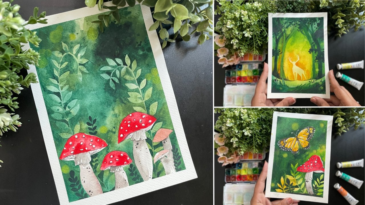
9. 6 - Lovely Autumn leaves: So this is our final project, and I wanted to leave it to the large because it's my favorite. Okay. Wait, I said the previous one was my favorite. So this is my favorite of Philip's point, but it's such a pretty one. And also cuz it's a little bit tricky. So I really wanted to give you guys a time in the first five projects to get used to work before you dive in to this, because it is, it's going to be really interesting. And one thing if you do this and it comes out amazing and you're proud of yourself, pat on the back because you've painted something that is really tough. And yeah, I'm proud of you. So let's go ahead and start with our planning. So the first thing I did is I took my sheet, I taped it down with some white tape. I've mentioned this in my previous classes, but in case you haven't seen it with TPP tested out, see if it holds the paper in case the trips the paper, just try it out before you start with your main, you know, between painting and deciding to take that plunge. Once you've taped a town, let plan are basics. The main thing we have here is a very, very old fears prominent branch. And this branch, because it's not smaller, like what we've done before. It is a branch that is Orpheus. It starts from up and you can see it going all the way to the bottom. And then we have our leaves. So we have a couple of leaves mainly focused on the lower EDO of the painting. We don't want to have leaves on the top area in this painting. With the leaves. We want to try to have different direction leaves, as well as some of them that are behind though main branch, some that are half. And we have gotten through our half leaf that we went through in our basic practices. So just remember how we did that. Leave and then just continue to mining it. Once you've planned your painting, Let's go ahead and add some water for the water, multiple layers. So it really sinks in making sure that the water is on all the corners or the edges because we really want to make sure that it's all round. And that is just not in one area. Now that we've done this, let's start with our painting. I'm starting off with the yellow at the bottom right corner of our painting. So it's mainly focused on yellow. I'm trying to make it a little bit lighter to the edge, but mainly yellow forecast. The next one we have is orange. So that is going to be there in the orange top end. And then finally, read right on top. And this is the mix of colors that we have in the painting. Next, on the other side, the opposing side, we add Pluto's. Now I want you to pay attention to the fact that the colors are not merging. I'm trying to keep them as apart from each other so that they don't blend. And B don't have some mix. Colors that don't look at create a blue and yellow is going to mix up to get clean, which isn't gonna look. So making sure that we continue with that. Commanding a little bit of indigo, more of the green blue, typing into that color, more and more to make it deeper in color. And so you can see that mix of red on one side and blue on the other side. It's okay if things are splotchy that bind, a lot of things to try and it's going to look a lot better. So here equal tried, you can see how it looks. Now let's start with our bokeh effect. So I'm going to start with yellow circles around and the severity transparent layers. So it is very watered down. You can see out of a lot of water, so it's just very light. And I'm mainly focusing it in the ADOS of the branches that I just painted. These can be really big in size. It's okay because we are going to paint over time if needed. The idea is to get that so-called effect. When you can see it on top. Now that we've done this, let's allow it to dry before moving on. Now the next layer of circles is going to be with white. And you can see how I'm adding water to the acrylic layer, a little bit of yellow. And I'm going to use that to add circles for my effect. Once this is done, I'm going to allow it to dry before moving on. A tip to remember, is that with acrylics to not make them really close to the bronchus or the leaves. Because if you paint on them with watercolors, you have not going to get a, you will see the white below. Basically, you can't paint watercolors. And critically or so, we are just adding those yellow so-called VA, form the branches. And since very important speak overhead to each DFF is to try. And then we can go ahead and paint out our leaves. So firstly, is a broad term, and we're going to do it with this beautiful yellow. Hello. I'm going to add a lot of water to this, that it's very transparent and that way you can see the underlying blue showing through. So making sure to be very careful because I don't want too much of yellow. Once that's done, let's go ahead and take my time into it and time to make sure that I get template. Once you've done this one time, it's going to be a lot more easier as you go ahead with other paintings. The second leave following the same steps of very light yellow. Since it is at the bottom. This is going to actually help. Now there are two paths I had mentioned before is to make sure that you have different color. So as you can see with the leaf, just the edge of it, I am adding orange to it so that it comes together. Wanted that time. Let's move on to another leaf. More focused on trade off. Now let's continue with another leaf at the back. So this one is going to be a leaf that we're going to paint the back of the existing leaf that we just painted. So you're going to see the colors are more deeper. And also that I might need to go around the existing def. Take your time to make sure that you build in the colors. We're almost done with our div's, with it. Go ahead and do our planned checks and making sure that my leaves are dry so that when I add the black by branches tone mix with the leaves. Keeping in mind that I had done before, having the fairies for the leaves continue with this. As well as the finishing touches to the branches. You can see how before the stubs branches looked kind of doll. But with it, it looks more natural. And it surely looks like it looks like the originals, like a tree. Once that's done, we're going to allow it to dry. And then we're going to go ahead with white acrylic and just add some kind of snow effect. Basically, it's no training snow. It's kind of the new drops, the water droplets. At this point of time, allow yourself to add more leaves if needed. If you feel like that are things that are missing, you feel like you want to add more leaves in a certain area. Go ahead and just other links. And you can see that with the leaves actually fills up the painting and brings it together. So you just don't have that one or two leaves in the middle of nowhere. Like our previous paintings. As I mentioned, with the weight adding goods dropped or small or HomeAway want to see them, kind of see them as the shine of the tree. So it's a little bit of that water dripping through. Once you've done that, let's go ahead and add some white prominent thought. Unlike before, that light shining through, we're going to use prominent white dots without any water. So just as acrylic paint. And then use that in the painting, moved closer to the leaves. And that can usually help. Once you've completed this, let this completely dry. And then you can promote your team for our final painting of this workshop.
10. Conclusion: I hope you enjoyed all are six projects from the class today. And just really took in the autumn wipes. All the colors were based on things that I personally love about autumn. And I am so excited to see your completed projects. Feel free to share them on social media and tag me in the same. I'm also excited. See all of your reviews and feedbacks and testimonials. As that inspires me to create so much more and so many more classes and workshops.
 Femvisionary / Madhu S, Watercolor Artist and Instructor