Transcripts
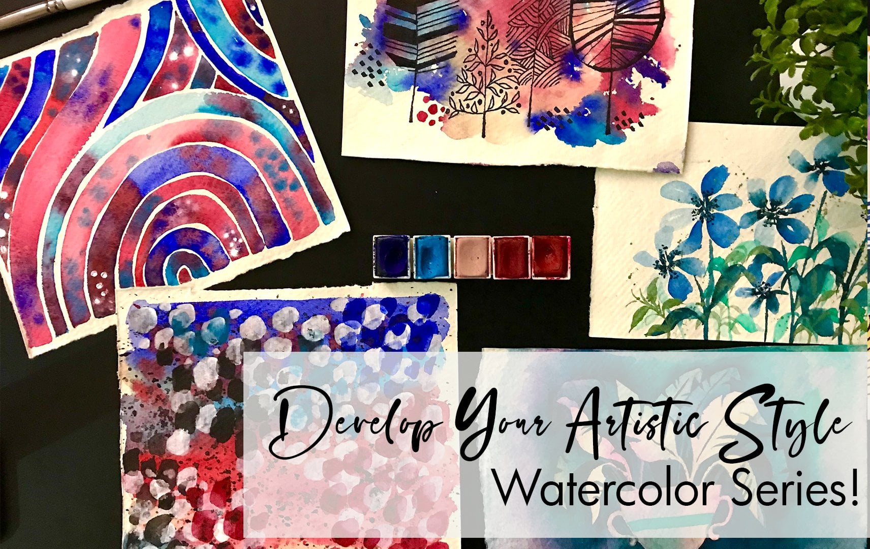
1. Welcome: Hi everyone, Welcome to
modern Gouache techniques. This funder class has
so much to offer. It came up as sort of an inspiration to me and then I started coming
up with more ideas. I really wanted to bring a
fresh perspective to goulash, something that you haven't seen, something that is
gonna be really, really you in this class, we'll, we'd start off with is the materials I go over
how to use gouache and the basic techniques in using this very
interesting medium. Then we go onto some
practice exercises. These practice exercises formed the basis of all
of the projects. They are very simple,
they're really fun. And then we move on
to the projects. The projects are broken down in 15 to 20 minutes so they can
fit into your busy schedule. As we move through the
six different projects, you're going to learn a ton
of different techniques and varieties of using the different tools are the
different aspects of gouache. I am model and I am an artist. I absolutely love a medium
that flows with water. It inspires me and I absolutely just enjoy
experimenting with it. I've been painting
for a very long time, but I started my Instagram
just about 34 years back. And then within a very dove into art as a full-time career. Since then it's been amazing. I've gone on to do
multiple collaborations, gone on to sell my art,
sell my paintings. And now I also have a stationary line
dedicated to my eye. I am so excited about this
session going forward, there's also multiple workshops that I have on Skillshare. So do go ahead and
follow me so that you get updates every time
I launch a class, Let's start with our materials.
2. Materials Needed: Let's talk material. The first thing is we would need watercolor cold press paper, about 200 GSM or 110 LBS, depending on where you are. So a really nice thick
paper that can hold water. As we get into our painting. Next, we would need
a detailed brush. This is specifically for guage, its attack lawn brush. And it's a size 0. And you can see the Bristol, It's very thin and pointed and that's what
we're looking for. The next thing we need
is our gouache paints. I am mainly using about four
colors, sorry, phi colors. The first one being
vermilion or scarlet red. So it's this
beautiful, bright red. Then we have white gouache. And as I go into the mixing, I'll also add in
ultramarine blue, Prussian blue, sap green. With the red, I want to show
you the different mixes or variations of the color
that we'll be using. As you can see,
the red is a very bright, bold, beautiful color. Now to get a slight
shade of pink, I'm going to take
a little bit of the white gouache and mix it. As you can see, the color turns out to be slightly lighter. More like a peach pink. That's the color we'll be
using for some of our details, some of our flowers. Now moving forward at a
little bit more white for a lighter shade to give
you a light baby bank. Now to also show you how
this opaque layer can be made more translucent,
transparent. Just add more water in your brush and paint for a
more watercolor painting, a watercolor look
or watercolor view. Now that we've got these colors, Let's go ahead and darker blues. So we have two blues
that we'll be using, as I mentioned, ultramarine
and Prussian blue. This is the ultramarine blue. Now that we've got this
beautiful opaque blue, Let's add a little bit more
water to the brush so we can get a watercolor,
ultramarine blue. The reason I'm doing this is for you to see the variation of how the color tones for opaque to transparent or translucent. Sorry. Now, let's add a little
bit of white to this blue. To get a beautiful lighter blue. Then we can go ahead and
add more white photo, even more lighter blue. This is the color that
we'll be mainly using. And the reason I liked this is because once I've
added white acrylic, gouache effect is much more opaque and it's
much more thick. So I like adding that white. Now for our Prussian blue. Let's paint out as queer. And then we can add a little bit off white for all lighter shade. It's not too different. But when we are doing some of our leaves and
details like that, that slight difference
in the two blues is going to create a
beautiful effect as well. Also, what I end up
doing is if my leaf is going to be a light
blue when I'm adding textures are used. Ultramarine blue,
IVD between the two. Now using a damp brush to
show you the translucency. Now we're going to
take sap green. We're going to mix the sap
green with the existing blue. This is going to give
us a blue-green color. It's more like a very deep blue, sorry, green if you're
looking at it in other terms. But sometimes it may
be hard to find. So I just wanted to take
a little bit of green that you'll have and mix it with blue for this blue-green color. To lighten up the she'd
use a little bit white. You can see how I'm just adding little portions of everything. Mixing and seeing
if I'm happy with the color and not just
trying to dump in the color. Paint it out. You've got this beautiful
blue-green mixture. Then we're going to use
some water and just get a very translucent layer
of the same color. Additionally, we'll
also be using gold. Now. You can use different
mediums for gold. You can use Acrobat gold. There is post-doc color goal, there is gouache goal like
the one that we're using, or even watercolor gold. That doesn't really matter. And even if you don't have gold, it's not really going to
affect your painting. I'm just adding it because
I liked that metallic look. But it's completely your choice. These are the main colors that
we'll be using for today. Along with this, you
will need a palette. As you can see, I'm using a glass palette because
I find it a lot more easier to wash and rinse than a ceramic palette
that has spools, you know, that has
those little sections. This one is a lot more easier. I can scrape it if I need it, I can just wash
it with water and it's just a lot more easier. The next thing you would
need is a glass of water, some tissues or towel to
wipe auto **** brush. As well as TPP. You'll need masking
tape for making sure that the edges are very
crisp and a pencil eraser. And I think that's about it. Now let's get started with
some practice exercises.
3. Practice Sheets: Before we dive into the
practice exercises, I just wanted to go over gouache and the various qualities of it. We did a little bit of
mixing and things like that. So let's just talk a little bit more because I spoke about
diluting it with water. But what does that
actually mean? In cheese, you take any gouache, paint and add a
little bit of water. And this takes a little bit of practice to know
how much water put what you want to have
is a beautiful lake was caused thick layer. It shouldn't be too thick that the paint doesn't move around, but it should be liquid enough that when
you want to paint, you're able to kind of have the brush applied very smooth. So it is a mix. I wouldn't say it is as
thick as acral lick, nor does it as thin
as watercolors. So it's a mix of board. Now, this layer, if you added
a little bit more water, you will see it becoming
slightly lighter. As we go ahead and add
more and more water, cut off, mix it along. What happens is you will
start seeing this effect of watercolors coming
through and it starts becoming
more translucent. As you can see, this is such a translucent layer and
it's just very, very light. Let's try another color. I'm gonna be using, blue. I've taken the ultramarine blue. I'm adding a little
bit off white. So it's the light color
or the light blue that we had seen in the
materials chapter. Now taking that,
adding that white, making sure I add a little
bit of water as well, and making sure that I
get this very smoothly. I'm painting out a rectangle. You can see how the
color just lays flat. A really nice effect and
it's gonna try matte. Now as I keep adding
water to this layer, you're gonna see it becoming
lighter and lighter. In case you have ever used
paste of watercolors. It has very similar feel. It's very chalky. It doesn't, you know, it has this
kind of solidarity to it. But it's very similar to, I would say, Paste
in watercolors. As you can see, as I add water
and bringing more water, it's becoming more
transparent like watercolors. But what is really
cool is that if you have this transparent layer, you can then go in with the thick viscous liquid
beans and add textures. What happens as you can
see with the Dodds is when I add that second
layer of that Carla, it stays flat, it's, it blooms, but the
color is still there. Let me show you another example. So I've taken a translucent
layer with diluted layer, and now I'm adding pink dots. Notice how some of the
colors are blooming while some are fine because
the paint was still wet. This gives beautiful textures and this is the thing
that we're going to call forward and really bring
into our practice exercises. Now let's dive into some
practice exercises. Still fun thing that
I wonder get into the different shapes
of leaves that we are going to be tackling in
all of our projects. This is something that
I take for granted. But I know as a beginner, it can get confusing, wondering how to just
plan out your leaves. Here is a demonstration. What you start off
with is the stem. Start with the big
leaf at the top. And then as you go
lower and lower, we can do smaller leaves. This is how we plan it out. If you want to do a small to big Option. Another option that we
can use is rounded leaf. You can see it's like a
teardrop that we're trying out. With the rounded leaf again, we can follow something
similar where on the top we have
a lot of leaves, much bigger in size. And as we go lower the stem or along the stem,
it becomes smaller. You can see how
that comes through. And it's just as simple as that. Now to this, we can add a
stem of smaller leaves. Another stem, as you can
see with teardrop leaves. In this case, what
I'm doing with a teardrop leaf is the right and left side meet at the same
point along the stem, forming a V-shape. All
through the stamp. This gives it an
interesting effect. Balances out the big leaves
within the painting. Now another option
for drawing leaves, I'm painting leaves is kind of playing around
with much more smaller. Notice the shape of the
leaf that I'm doing. And I want you guys to practice
this a couple of times. In this case, I'm
branching off my stem. Notice how I'm doing
different branches. And also starting
with a smaller set of leaves on top and making
it bigger at the bottom. This is slightly different
from what we did before where we started with
the big and went to smaller. Now, either case
works fairly well, but I really just
wanted to show you how you can kind of
put this together. Now when we go into
painting the leaf, in some cases along
the projects, I've actually gone
into drawing the leaf. In some cases, I've dad at
least started painting, depending on what
the final project is supposed to look like. In this case, let's
just start painting. I already started with a couple of the leaves that
I already had. And I'm doing it with blue. I'm using a chance patently
up translucent Leo. Basically a layer that is
much more diluted with water for this effect. Because it is lighter
when I go in with a deeper color or like when I go in with
the pink gouache, you can see how the colors are blooming through the color. Surely Julie shows. And that is something that's
so cool about gouache, is that when you
layer the colors, they become part of it because they bloom,
they merge with it. At the same time, the colors
tilde remains opaque. In watercolors, if you had
tried the same technique, all the colors merge together. But in gouache,
you can really see the flat color coming
through as you paint. You're going to see this
and you'll be really appreciative of this aspect of gouache that we're
gonna be exploring. Now since we added in the blue, we can go ahead and add that red for the
remaining leaves. Again, in the red leaves, I like to add some textures
that are in the blue. So this way I bring everything together by mixing and
matching the colors. We can always go ahead and
add some Depot textures to the existing blue
leaf. Blue stem. There you go. Here. The leaf is balanced. It's got multiple colors. It has a beautiful texture. Through it. Edit, all works. Well. I've done some leaves. Let's go into flowers. For Florida, I like to do five
petaled flowers the best. I think it looks really pretty. For that purpose. I like to draw a circle and draw out a white shape or white line. Once I have the wireline, I can plan out the
remaining two petals. How simple was that? Draw the petals and done. Let's do another
one again. The why. Then you have space
for the petal. You can do any better if you
want to do a rounded petals. You can do that
all you wanted to, that kind of inverted
W. That's fine. Either ways it's gonna
work fairly well. Now let's paint these. I'm starting off
with the socket. Then we're gonna take
our brush loaded up with some paint and
paint out a Y shape. Petals. Petals along the Y shape. So see how I'm doing this. I'm just following, just
filling up the space. So there's nothing really like
technical in this is just more of understanding the
shape of the flower itself. Once you've painted the
petals along the y, change the color in the brush to a slightly different
shade of the red. So you can do a
darker red or you can add a little bit white and
make it a lighter red. Just that change
is going to bring radiation to the flower. You can add the remaining
two petals to that simple. Let's practice this again, but you're going to do it
a little bit different. I'm going to keep more
spaces between the flowers. Again, drawing out
the sulcus and then painting petals
along the way. That action. This case, you can see
how I've added the why, but there's a lot of gap
between the top two. I have the bonus optionality
to add another petal. So this becomes a
sixth petal flower. Once that's done,
you can take in your brush loaded with blue
and paint your Poland. Now I've got two lovely flowers. I want to dive into drawing
or painting half-life. The half-life and
draw out your circle. And just paint off. You're just doing full
petals. That's it. We can go ahead and
paint these as well. To paint them, just go ahead and use whichever
color you want to. Use. Paint out each petal at a time. The only difference is here
we are trying to make it half imagining that the flower
is seen at that angle. This always adds very
interesting effects to the painting
because you're not just doing the full flower, which can look a
little bit flat. So this brings things together. There you go. These are our practice
exercises and you are armed and ready to get
started with your projects.
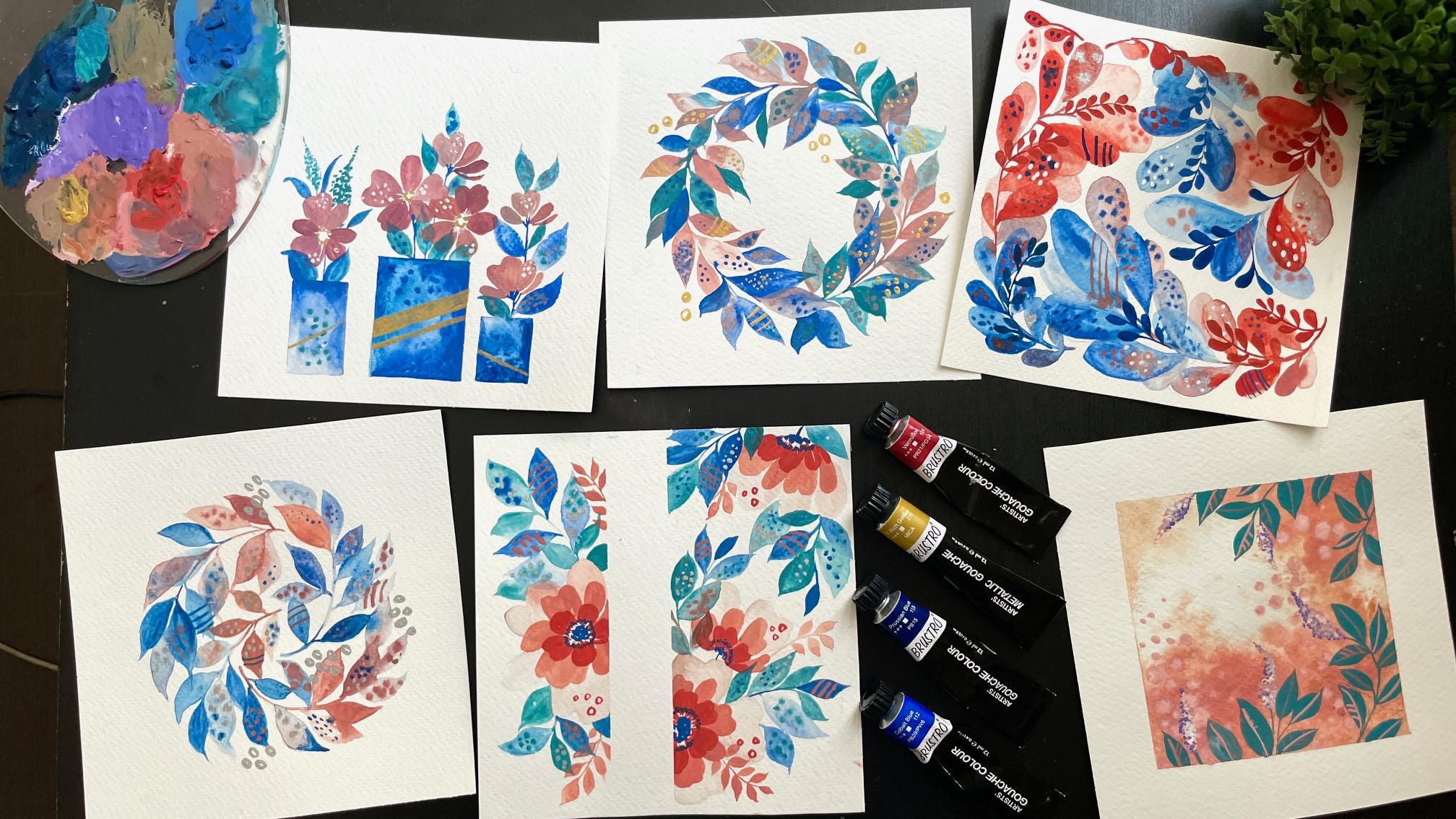
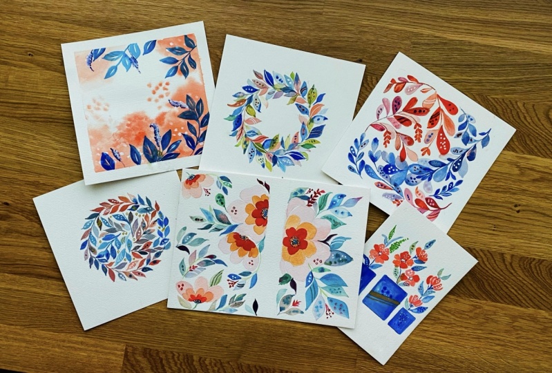
4. Potted Plants: Now let's start with a
fresh, clean people. I am taking a square shape because it's gonna be a lot more easier to plan out my
potted plants in it. The first thing we want to
do is draw out up pots. Now, to keep it very simple, I've just drawn rectangle
pots, nothing fancy. I think it just
quickens the process. We're looking for
quick exercises. And so instead of taking too
much of fluid into the pots, I truly want to concentrate
on the floss then cells and give them more
off a highlight. Keeping it very simple, I'm just going to
draw rectangle pots. There's a couple of
things that I like to keep in mind when
I'm doing this. The first thing is to make sure that the parts are of
different heights. That way it doesn't
look like it's very planned or
they're too similar. The H symmetricity
offered always comes together and just makes
everything look really nice. The next thing to
keep in mind is to space them out unevenly. It doesn't look like there's just an equal space
between them. Again, going for the
asymmetrical look. Thirdly, we are going to
just do basic rectangles. What we can also do is VD, the width of the rectangles. Again, playing around with the, a symmetricity of the painting. Once we have completed that, I like to just draw out my flaws to have an idea of
where I want to please them. On one stem or one port, I'm going to have the
flaws shorter in height, whereas in the other
one it might go longer in height, and so on. Now let's take a beautiful
light pink color that we mixed in material section and start
painting out our petals. This was done in the
practice exercises. So if you're a
little bit confused, you can go ahead and
just refer to it. But as you can see, it's fairly simple
to paint these out. We're just doing these
kind of loop shape. Inverted w's to bring in
a little bit of texture. While the paint is still wet. I went ahead and added
some white dots. This brings a beautiful
texture to the flower. Changing around the
color a little bit. You can see just slightly making it a
little bit more lighter. I'm going ahead and adding
the second set of half flour. It's a semi flower. Again, adding the white
dots for some texture. Couple of things to remember
when it comes to that is I like to add the
dots in a cluster. That way they look like
they're in one area. Next thing is to have
them in just one petal. If you have them all over, it might look like
it's overdone, giving it a polka dot effect. And that's not the look
that we're going for. Thirdly, weeding the
shapes of the circles. As you had seen. Some of them are bigger and
some of them are just spots. Following this. Let's continue drawing, painting out the
remaining flowers. As you can see from the
flower that I'm painting, I'm changing around
the colors as I go ahead and bring them out. Petal. By petal. It's really important to
kind of play around with the shades of pink as we
go from petal, petal. Because it gives it a much
more realistic effect and makes the
painting less flat. I'm using the Surely fun
effect of goulash wet. When you add water, it becomes more translucent and gives you the
watercolor effect. This I'm using for the petals. To give it that translucency. Again, adding in those
white dots for texture. Now notice how for the
first potted plant I had only half flowers. For the second one
I have a base of two big full flowers
and then a half-life. Then for the thawed
potted plant. On the left, we have
a full flower only. Again, playing around with the proportions and placements. Now, let's paint our final flour using the different
shades of pink. Now, as we let us try, let's go ahead and paint
out our potted plant. I'm using are blue
color that we mixed in our materials, exercise
material section. Sorry. We're gonna be using that to paint out a potted plant. One tip that I want to give you is to make sure
that your toner on your paper so that your tip of the brush is towards the
edge that you're painting. This way, you're guaranteed
a very crisp edge, which looks a lot better. So notice every time
I paint out the edge, I make sure that my brush is
perpendicular to the line. Also as we're painting, I'm using this
beautiful effect of guage and adding
clear water and just blending it altogether
so that I get this cloud look blooming through. As it's drying, I can
go ahead and add spots. The deep blue for
textural effects. Now for the next potted plant, similar effect using clear water and just blending two
through that opaque color. Now one thing to
remember is that you can use a thicker brush. You can use a round brush. But I feel like gouache, it's actually nice to use a
thin brush, the smaller one, because you can really go into like the details
and the edge, making sure that the edge of
the poet is truly accurate. If you're using a round brush, you may not get this as much. And you need to switch round brushes a lot
and it gets really, gets a bit tedious. And I don't want like
making things tedious. I like having fun with it. And when you're
trying to just sketch in 20 minutes or 30
minutes of painting, it's hard to get all of your supplies and
everything ready and all your multiple brushes and just get
everything prepared. So I like to do all of it, which is one brush, and that just makes the
process a lot more easier. Now going into the final
potted plant, again, notice how I added those
dots like textures that are blooming and giving
this beautiful effect. If the painting had
dried a little bit more, the potted plant
and dried a little bit more, it wouldn't bloom. And so I'm being very cautious
about it that I added, add the dots are when it's still wet so that it really blooms and becomes
part of the painting. Now let's go ahead and add the leaves and the stem
NP-complete are painting. The reason I did not taped down this specific project is
because I drill you wanted to move it around in the previous
step if you found it a little bit dizzying to see my paper moving around so much. I'm sorry about it, but I really wanted
to show you guys to have that effect
with your paper, you know, to not hold it steady. Sometimes when I
teach my students, I noticed that they just hold onto their paper
and they don't want to move it at all
because they're very scared of doing that. But get over that. And I want you to
really move around your paper and make it
easier as you paint. That you get those
beautiful edges and you can reach those corners
that you are not able to reach that have done
that information. Let's just go back to the painting of what
I've been doing, which is adding the leaves. As you can see, I'm
using two shades of blue and green
for the leaves. Both the colors were covered in our material exercise.
Material section. I'm adding in my dots. I like doing them with a mix, so I could do blue. Instead. I want to use the
pink from the flowers. That way the bank actually looks like it's part of the
leaf and brings it together. It looks sometimes,
or if your leaf is just a random color and has nothing to do with your flower. When you can add these dots are textural effects with
the bank of the flower. It brings the project together. Going a kid and adding the
leaves for the second. Now what I want you to notice is I am making sure to truly keep a different height level for each of these potted plants. The first one from the
right, it was shot. The second one is going to
be maybe slightly taller, whereas the third might
be even more total. It really depends. The whole point is to vary
the height, you know, cause the overall effect is you want the viewer
to kind of dance. Viewers eyes to dance
as they look at it. At this point, I'm going to
go ahead and add some sort of texture for the
final potted plant. As you can see, I'm just
doing a stem of dots. This in a way is to reflect into like a flower that's
more like a lavender effect. So you know, those kind of
long stem bunches just to give that added maybe technique or added
flour to the cluster. Because as you can see right now, everything
looks repetitive. Reviews the same flower across
all of the three in pots. Just this addition of something. So a simple immediately
looks like, okay, there are three
different potted plants. It's not the same one. Just to hint offered
makes a difference. I liked the overall effect. I think it turns out a
lot more better because of that added stem. Now, let's complete some of the key details
of the painting. We are at the finishing
point right now. So we can go ahead and paint out the stamen
are the filaments, the center part of the flower. I keep mistaking what
the name should be. So sometimes I say
it's the filaments and steam in and then sometimes
I'm not really sure. But you guys know what
I'm talking about. Hopefully. Since the part
of the plan are dry, I can go ahead and
add more color. For this step. I'm using golden gouache. You can also use gold acrylic if you're
not able to find it. But right now it's
pretty popular to find metallic gouache as
well in the market. But there are a lot of different out, alternatives out there. You can use metallic
accurate lakes, you can use metallic
watercolors. You can use metallic. I think there's even
metallic poster colors. You can really play
around with it. I found gouache metallics and so that's the one
that I'm using because I wanted to give that touch of gold to the painting.
There you go. This is our completed projects.
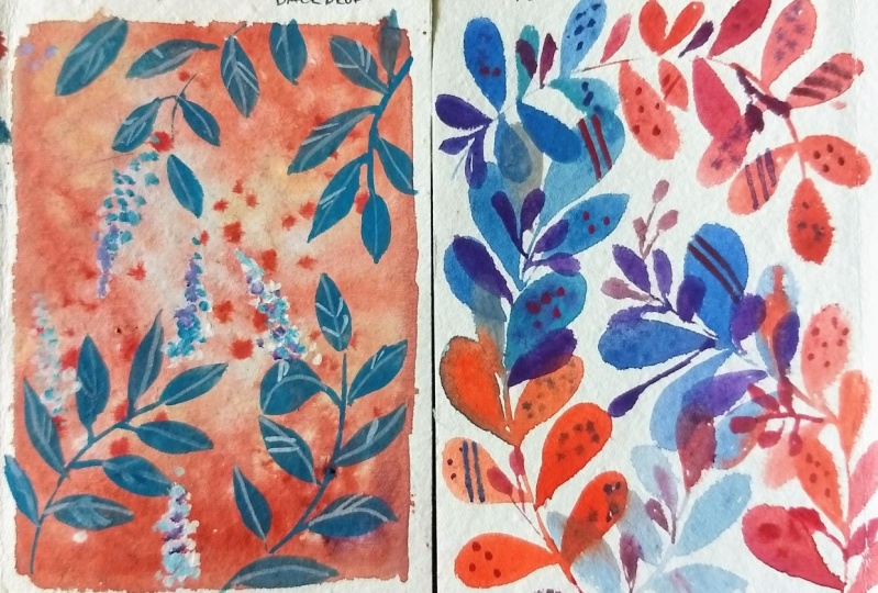
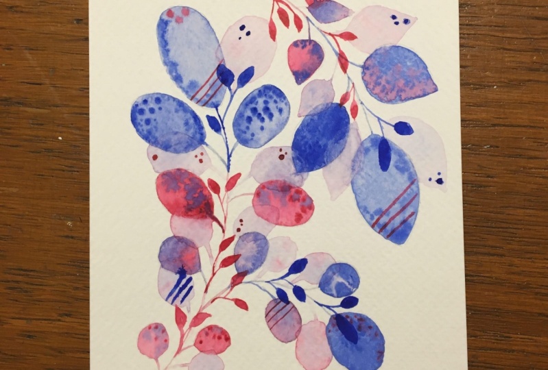
5. Fluid Leaves: Let's dive into our fun project. What I've done is
taped down the ends. I really didn't need to in this case because we really don't have
much purpose of it. But I wanted to tape it down just so I don't really
have a clear idea of the edge of the paper as well as so that the paper doesn't
move around too much. In this case,
especially it would be useful for the paper
to not move about. Now, once that's done, as we've done in our
practice exercise, we are going to be drawing
out some rounded leaves. They're starting form
bigger size leaves. And as they go below, lower to the stem, down the stem, they
become smaller. Now I'm planning this out because it's really
important just so I don't have areas that are
empty around our painting. I want to make sure
I plan this in such a way that all
the rounded leaves end much before the
edge of the deep. I don't want any of the rounded
leaves to go beyond it. We are trying to contain all
of it within that space. When you can draw it out, it's just gonna be
easier for you to plan. Now once that's done, let's start with
our first color. We're gonna be taking
up beautiful blue. You can use either
actually you can use the ultramarine or the crushing. But I'm gonna be just
taking one of them, making sure that it's
a lighter shade. As you can see, it
is watered down and then adding in some
dots to the edge. Now taking a deeper
shade of the color, I'm adding in a secondary leaf. The leaf is done in such a
way that it's so close to the previous one that
you can see that the colors are merging through. Here we are using gouache more like watercolors than opaque. But we're going to
keep playing around with this as we move along. Notice how I'm using a very
light water down Leah. As I proceed with our stem. I'm also making sure to
do one step at a time, one section at a time. Playing around with
transparent and opaque, with a different blue, with two different blues sheets. And you can see that
coming through where the slight difference in the blue really shows
in the painting. Continue. As we move down. What I'm trying to
do is just make it much more clear
water and just very, very translucent as I go ahead so I can start
building up the red. As you can see. With the red, I am just going directly in again using a mix of
transparent layers. Electrons do simply, so
it's not too opaque. Then using the spots to really get the colors
to bloom through. Keep in mind at this point, you can also use some
blue dots as well as blue lines to just bring
the entire painting together. As this process is drying. We're going to add more. In this case, let's use light pink and add some
textures to the blue. Go ahead and use some dots. If the paint is drying, then you will see that it blooms more in case it's
completely dry, you will see the spots just
laying flat on the paper. You can really see the
effects come through. At this point. Let's use just clear water and add some leaves overlapping
our existing ones. Now let's start
with our next leaf. There is a specific reason why I'm using
multiple water down. If you notice in this entire
thing, It's more watercolor. There is a reason for it. So just keep that in mind as we proceed because as
we go to the end, you understand why this was so important for us
to keep in mind. Because I really want
to bring through the colors with
another new technique. Following the same thing that we did before starting off with this light blue color
that is transparent, translucent, and then just
mixing up differentiates of blue as we paint
one leaf at a time. Once you've got a
couple of blues going, we can switch color to the red and then start bringing
the red all the way down. For the dread, you can
use a mix of reds. So it doesn't have to just
be the pride read familiar. You can just mix it
with a little bit of white to get shades of pink
and play around with that. Also at this point, use water to dilute the color a little bit
more and use that. As we go step-by-step. You can have some of the ideas. Just touch each ADL and you will see how the
color just glides through. Or adding spots with
a secondary color. As you can see, I
just did now take King vermilion statically
as spots on the light pink, creating a beautiful effect. All of these textures
that just gonna come together and make
everything look so pretty. Notice along the edge, as I was saying, I hit gland it in such
a way that all of the circles are four
from the rounded leaves. The rounded curve is complete. At no point of time are
they going into the tape ADL that all pleased in such way that you can
literally see each of the curve. This is done for a
specific reason. And you will see this
in the final odd walk. Once you're happy with that. And we've completed
the entire stem, we can move on to the next. For this one, I wanted
to start off with the pinks itself,
Liping the red. And I wanted to use
that for this layer. Notice, as soon as they overlap, the colors spread through
and looks so astonishing. Love and color like
paints do that. This is something that
watercolors and gouache does. And its sole pretty
to just see blend through and the colors
just coming together. Now I skipped ahead
a little bit, completed the entire stem. You guys know what to do. You guys are an expert at this. Now in this case, all I'm doing is continuing with the stem
off to allow for that layer to dry so that light stem has dried before I do this so that there is no
margin of colors. And then I'm going and completing all the
leaves for the stem. Don't forget to add
in the textures. The opposing color, which
is the blue along the leaf. This is great if it's still drying because you can
see the color blue. If not, it's fine. It still gives you
a spotlight effect, giving you a more polka
dot loc either way. So just walks through
all the while. Now. You can use
some clear water, like a damp brush and just add some transparent or
translucent leaves. You can see how these are
just like Julie, Julie light. There's actually no specific
color in mind is just that my brush already
had painting it. That's why it's come through. Now, I want to take
ultramarine just as it is, a very opaque layer mixed
with little bit of water, add in some rounded leaves, is why I mentioned that the bottom layers we were
going for a much more lighter and much more diluted with water because
in this layer we're using a thick,
thick opaque color. You can see how this is just surely brightening
up the painting. Now, I'm using smaller
rounded leaves, just in contrast to the big
leaves that we've been using. I'm adding it to our stem. It's attached to the
stem along the side. Notice how I do that in
a very, very simple way. This has, you can see it's
just really making the art looks so pretty like it's just really making
everything bright. And it's really bringing
through that beautiful blue. This is a trick that I wanted to show you guys
something new that you can actually add into your
painting by layering on top. While added, Let's take some vermilion paint and add in some rounded leaves along
the red areas of the stem. These again continue with smaller rounded leaves compared to what we all didn't painting. Link them up to the stem
so it comes together. Notice how this is
really coming together. We do have that in-between
stem that I still haven't tackled yet. But that's okay. We can just go ahead and just complete
the remaining parts. So we just have this one piece
that's left. That's okay. Sometimes working with gouache, you can really plan out
how you want to do things. So either you do the Bs and
then you overlay layer, or you can do one
element at a time, just so you have a clear idea
of how you want it to look. It really depends. And I think as you
keep painting, you'll get a better idea
of what you want to do. I generally like to work
element by element. But sometimes
especially in a case like this where
layers have dried up, I switched through
different elements. Now as big continuing, I'm going to just paint
out my final element of the final stem using
a very light layer. Blue. Notice how I add in the
Leo's along the ends. How AI brings together the
leaves by making sure that I intermingle the spot
textures along the stem. The way that I do it is just
making sure that the thread is over the blue parts and
the blue is over the red. Needs to get it
all comes through. Once you have completed this, let's step back from our
painting and then just complete areas that
we feel look empty. Like this area, for example, that I felt empty. I've just taken some clear, Like my brush That's
still had a little bit of pink, just painted
translucently. Again. I'm just looking through and
seeing if anything looks empty or I feel like it
needs something there. I'm just adding those leaves. I'll make sure that you add in those opaque blue
leaves. The stem. This is around the leaf. Smaller in size.
Coming together. Notice also the direction of these leaves that I'm adding
in there along the stem. Not from the stem or they're
not just randomly pleased. I tried to make sure that
it's along the stem, so it looks like it's still
part of the same thing, not something randomly added. So in this case you can see
that it's half in through or it's like the stem would just
different things like that. Now once you're happy
with everything, you're finishing
touches, you can remove the tip for your
completed painting.
6. Textured Wreath: I shouldn't be biased, but this is my favorite
project in this entire class. I loved this project so
much and I have daunted with literally any combination
that you can think of, because I love it so much. And I think it's just
such a good exercise when you really don't
know what to paint. And you just want something that's going to turn out good, no matter what this is it, This is the project
that whatever you do is gonna look amazing. So let's get on it. The first thing I've done
is taken as queer people. And I've drawn out a
circle for my wreath. This is gonna be
with leaves, soap. You can draw out the leaves
if you find it easier, or you can just directly
start painting. It's not that complicated, so it's pretty okay to keep
just adding on the leaves. As you can see, I've started
with a light pink color. I'm viewing the amount
of water that I use. It's the first set
of leaves will pick and gouache and very thick. Whereas the second, I added more water to give a
more watercolor look. As this is drying, you can go ahead and
add some blue spots so that those can bloom and
become part of the painting. Let's go ahead and
add those spots around more off the leaves. As we go through this. Let's change the color on our brush from
light pink to blue. Remember to wash
your brush every time that you change colors. Just so you don't
have a mix of colors. Very muddy looking colors. Here you can see
going into the blue, I'm adding a very big bold leaf. Now this can be a
little bit tricky, knowing what size
of leaf to use. What I like to do is has
a start with the stem. I start smaller, and then I move bigger and
bigger and bigger. That's what I do as I
go along the circle. Once I've completed
using the blue leaves, or at least painting three
or four blue leaves. Go ahead, wash the
brush, add some pink, and then add spots to the
leaves to bring index Joe. Now, let's use this with
some clear water to paint out some more leaves and
continue the process. One tip to keep in
mind is to make sure that the leaf is pointed. In this case,
because you can see it's going to give you
a beautiful effect. Even with the blue, I have gone ahead and added a greenish color
to the mixed now. And that's what I'm gonna
go ahead and use for painting the next set of leaves. As we complete our third leaf, you can go ahead and add the
blue to bring in texture. As I mentioned, try
to do 23 leaves and then wash your brush and
add in or change the color. This process is just going to make it a little
bit more easier. So you're not
confused wondering, when do you wash your
brush or what color are you using or just washing
your brush too often. Just make it a kind of a
thought process in your head. Pain, three leaves,
It's wash your brush. Pin three leaves, add texture. Wash your brush. Make sure at this point to add
in the light pink wherever I'm using the blue so that the
color comes through. What I'm using the
green as well when I use light pink, it works well. This kind of contrast
is what matters. And with guage it works really well because as you
add the layers, It's not going to
fade away or blend. It's still going to give
you an opaque look. Use the lovely light thing to
continue adding in leaves. As you can see, some of
the leaves are smaller and bigger and I'm really not
focusing too much on it. If I feel like the
leaf that I can add is going to be
smaller in size. That's okay. I do try to keep in mind that I want to start
small and then go back. But if it doesn't happen, I'm not holding onto it. This is such a great
exercise to let go of any perfectionism that
you're holding onto. As you can see, the technique is all above fluidity and
just really enjoying that. Has you do that process. Makes sure to add in the
textures with the blue. If there's too much of water, it's going to bloom a bit too much and maybe you
don't want that effect. Let it dry before
adding those spots. I like to work layer by layer, like part by part. That way, if I do the whole thing and then
I have to go back to it. It's a bit confusing. When I do the greens, I immediately changed the
brush and add the things. I do it section by
section by section. At this point, I'm
not worrying too much about how the
actual wreath looks. If it is actually proportionate. I'm not worrying about it. I'm just trying to get my leaves gently rotate your
paper as you move along for the ease of movement. As you can see, changing the
colors brings in a lot of contrast and variation
into the painting. Continue step-by-step. Adding leaves. This is the final
set of continue. This is basically the final
point of the wreath as well. So let's just
completed with a bank, and then we can go ahead and do any edits or any protections
that needs to be done. Make sure to use some
clear water and some of the sections and blender and a very light layer
of paint for the leaves. That way you have this
beautiful contrast going from opaque
to transparent. Now that we've
completed our close-up, Let's step out for a bit. So move away from your
painting and look at it as a whole and just see if it
actually looks like a circle. If you notice that some
areas took more empty, this is your chance to add
more leaves in that area. If you feel like an area has too much going on or too much pink, for example, or too much blue. Go ahead and add a
secondary color. This is your chance to really look away from the painting, step back and assess for yourself if you are happy
with the way it is going. I really think this
step is how crucial, because this is where you
can fix any mistake that's dead or anything that
needs to be tweaked. This is where your
perfectionism, perfectionism can come in because this is where you
can step back and see. Does that look right? It does it need more, does it need added
textures or more color? As you can see, you
keeping that in mind. I'm adding more leaves in some areas to balance
out the painting. One tip I'd like to share at this point that I
think is important. I've been painting with that, but I didn't tell you guys. I really wanted to
tell you guys as well. Is that for these layers, because I've already done
so many opaque layers, these ones are much
more translucent, so I've added more water so
I get that watery effect. And then later on, because I've already
done the opaque pot, you can go ahead and just
make them very light. I'm now very happy
with my overall look. I'm going to go ahead and
add some cold details. As mentioned in the
materials section, you can get cold paint
in various mediums. Gold watercolors
called acro legs, cold oil, gold poster colors. There's so many varieties
and there's gold gouache. What I'm using is
called gouache. I'm just adding an int because I liked that literary effect for this set of projects
because it's kind of become an continuous
theme throughout. Just to bring that, I don't want to
bring too much of the goal because it's just
going to look really odd. I'm just adding onto the textures that we
had already done. Adding those spots to the leaves or adding some
lines to the leaves. It doesn't have to be accurate. The whole point is to
just add in that gold. Finally, if you're still
having issues where your wreath is not
looking proportional, go ahead and add
some gold circles to some areas to balance it out. So areas which are empty and you weren't
able to add leaves, but they still look
empty and it's still not making the
circle come through. You can go ahead
and add that gold. That's about it. This is our completed
starting project.
7. Blending Colors: This is a fun little
project that we are going to have some fun with. I think I said fun twice. Forgive me. I don't know why I can't come up with more words to
describe things. But here are fine as the
word that keeps coming up probably cause
also right now, what did I relax? Do things that are fun. So that's the word
that keeps coming up. So I am sorry about that. But yeah. If you can think
of other ways to describe it, do let me know. Anyways, what I've started
doing is drawing out by socle for project. And now I'm drawing
out the leaves. I'm bringing very specific, generally if you
noticed in the past, I do an idea of the leaves. But in this case I'm
actually drawing them out because I do want to make sure that they are
in line with my painting. It is important to take
time with this step. So notice what I've done
is making short that there are leaves that are not it really enclosed
within the circuit, but basically odd in that area. So I don't want to
have any leaf that just looks like it's not
supposed to be there, if that makes sense. But basically filling up the entire space
within the painting. As well as making
sure that the edge of the leaves touch the circle. And overall, all the leaves
together combined for a beautiful, nice,
symmetrical circle. Once you've done that, we can go ahead and
start painting. I'm starting off with the
lightest color that we have, which is the light pink. Now that I have painted
the opaque layer. While it's still wet, I'm going to go ahead and add blue dots to the
leaf for texture. I'm going to go ahead and paint out the remaining leaves off the stem using Watertown layer of blue and a mix of
the opaque layer, but basically the same blue. Once I've done couple of
leaves with the blue, I can go ahead and
change the color to another shade and use that. So that way the stem just
doesn't have one color leaf. There's a combination of
leaves that's happening. That always looks interesting. Now that I've noticed so many
of the cobalt blue leaves, I'm going to add
some ultramarine blue leaves just to balance it out just so it doesn't look
like everything is esteem. Lu. Go ahead and once this is done, add some spots with
this ultramarine blue over the
existing cobalt blue. If you notice in this
case, literally, the light pink is
not used anywhere else on the leaf on the stem. I'm going to use this
light pink to add dots to our existing leaves. This prints the colors together and it
looks like it's not just a mistake that you had one leaf that is a pink color. Now go ahead and rotate
your paper so you can get to the next leaf. For the next set of leaves, I'm going to start
off with the pink. Notice the pink colors seem
to be a little bit muddy, like it's not a bright pink. That's because there was a
little bit blue in my brush. I'm taking advantage of it, so it's not an error. Because when I dip in the color, as you can see with
the bright fresh pink, it looks stunning, so it
gives that variation. It is tiny trick of using unclean brush to kind
of create its own mixes. It's not very great suggestion, I'll be honest, but I think it looks nice and you
don't have to go ahead. Incident struggled
with mixing just using the blue that was
already in the brush, just dipping it in
the bank and you get this mix of colors. As you can see as I move
along the leaf to the bottom, I'm taking clear water
and using some clearer, just very transparent leaves. Now using blue, Let's
add some texture, as you can see with dots and
just the tip of the leaf. Now in this case, we're doing something
really cool. Where the top of
the leaf is pink. You have a middle
portion where the leaf was a mix of pink and blue. And as we go lower and lower, It's getting more blue. This slight variation
of the column moving from pink to blue is going
to give a beautiful effect. Or watch and see, because
you're going to be amazed at how
stunning this looks. Once you are done with the blue as it is gently drying up, use the pink dots to create
texture on the leaf. This also brings together
the entire leaf set. One. At this point I can see some areas where it doesn't have a gentle
curve between the leaves. Hence, I'm gonna take my
brush with damp water, basically a damp brush. And I'm gonna paint out
some transparent leaves. As you can see, using the water. Just keep adding it. And look at how pretty that is. The pink from the leaf
is flooding through. All of this is done as the
leaves are still drying. So I'm working very quickly in a way that I'm not
letting anything dry. Even if it's drying,
it's still okay. You're gonna end up with
a beautiful effect. So don't worry too much. Now rotate your paper and
let's tackle another set. In this case, what I like to do is the other way
round, as you can see, starting with the
pink at the bottom, then moving upward to the blues. And it's the same technique. So you have lot of pink, very crisp, opaque
leaves at the bottom. Then a transduce and layer
off the pink with the blue. And then as we go up and up, it becomes more of the
blue which is opaque. The optionality to add in some translucent leaves to bring in more depth
to the painting. This is why I thought it
was very important to draw out the leaves
because as you can see, if there are areas in between, you can really fill them out
if it's already planned. If it wasn't planned, there is a possible
that you might end up with areas of spaces
that are incomplete. So I really like to draw it out. And now you can see why
this is so important. Now, using clear water, I'm starting off with the blue. I first started with
a translucent layer and then went ahead with opaque blue filled into my
brush and added in some spots. I'm going to continue doing
this as we move down. The don't worry if you're overlapping
with another leaf set. That's fine because
it's not gonna be too noticeable towards the end, because it's going
to all complete and look really pretty together. As we go lower and lower
on the leaf or the stem, I'm moving onto the pink
again, opaque, paint clearer. As we move downward. Make sure to add in
the pink spots to the upper leaves as well as
blue spots to the lower. This way we are
balancing the pink with the blue and the
blue with a bank. Both are going to work well together and combine everything. And there you go. This is our completed painting, but as we've done before
or we will be doing, I want you to step away from
your painting for a bit and just check if everything looks symmetrical within a circle. If at this point you feel
like something looks over or an area around
the circle looks empty. Go ahead and fill in
some transparent leaves. As you can see that
what I'm doing, which is basically just
rotating the paper and just checking if I
need to fix anything. If you're not really
too sure how to do it. What you can also do is take a circular object and place
it over the painting. And just check again
if it's proper, such as making sure that these Conwell and
everything is sorted. Now to add in to our painting, I'm going to add some silver. This silver, I'm going
to use a silver pen. You can use silver acrylics, you can use goulash
silver watercolors. There are lots of
different silver pins that are available. Or you can leave it as it is. Like, I liked the way
how it is anyways. But I went ahead and
added the silver just to follow the theme
that we were going for. But again, not a must. Truthfully, I do wish I
hadn't added the Civil. Not like it makes too
much of a difference, but what happened
with the silver is light enough
things a lot more. While the colors were
very bright and vibrant, the minute I added the silver, it didn't make it slightly dull. I think if I had wanted, I could have actually
tried to gold, which could have brightened
up the colors more. This comes with a little
bit of trial and error. I'm not gonna say it's
just an exact science. Yes, color theory
helps a lot with it. That which is very in
depth, normally required. But a lot of it comes
from testing and trying. As you keep painting, you will notice some
color combinations just work well together. Similarly adding
some silver dots. Again, just some
doodles on designs. If you feel like, if at this point you're
happy with your painting, go ahead and you can let go. Sometimes I do find
it hard to let go. And I add stuff and I'm happy
about it towards the end. But it's a point of
knowing when to stop. This is our completed project.
8. Layered Florals: This project is going
to start off a little bit different where we have taped down the
middle of the paper just randomly as you
can pick wherever. We're just going to tape
it down and we're going to plan off laws based on that. Now for the flaws have gone through them in
the practice exercises, but I'm making it
slightly different. So we're taking it
a step full ago. What I'm doing first is a
transparently or of truly, really big sized flowers
or big size petals. So just try to enlarge them as much as possible
because we're going to overlay an overly an overlap and it's going to
become smaller. So we just want really
like a nice big petal. You can really make
it occupy enough of space within the painting. Once you've added a big flower, Let's do a half-life. Again, exactly like
what we practiced. But just making sure
that we add larger sized and making sure that we're using a
very diluted Leo. Let's add another flower on top. Again, this is going
to be a half-life. Now that that's done
on the other side, I'm going to do a full flower that is kind of peeking through. It's okay if this
layer is really, really light because
that's fine. It's just wanted to
kind of be a chance. Apparently are like, you know, it doesn't need to be
very loud and obvious. Now, once that's dried, we're gonna go in with
a second layer of a light pink and use that around the petals. Now you can see how these are
much more smaller in size. And again, there's still
a bigger because we have another layer that's going
to be even more smaller. But couple of things is first, I have made sure that the
transparent layer has dried up before I
went on to do this. Secondly, I'm using a slightly a more opaque
Leo for this color, as well as I've made sure to mix it with white so
I get a light pink. I'm not just using
Boolean as it is. Is it will move it
on over a million. I'm just going to call it red. One gets upset with the
way I pronounce it. Yeah. Just a light pink. Go ahead and do this
through all of the flaws, the half-life, the full star. At this point you
can also see I did. I added some dots with the
pink on the previous layer, again just for the
colors to come through. Now continue with
our final flour, following the same pattern. Now we're going to
let the layer dry. We're going to go in with the red paint out a
very opaque layer. This is going to be a deep that's going to come in as the final
step in the flour. This is just the full floor. We're going to follow
the same thing for the half floors as well. As I mentioned, we
can use some of that red texture along the
edge of the last layer. This is just step one. Now we're gonna go
into add the leaves. The leaves we're going
to use the combination of blues and the green blue. But before that, let's
complete the center of the pole and the flower, not the polling
filaments of the flower. All I'm doing is taking blue, which is ultramarine blue, and I'm just adding some
dots along the center. I'm going to do this
to all of the flowers. Keep in mind that all of
this is dry before I go ahead and do this so that
there's no blending of colors. Now that we have done this, let's go ahead and
add our leaves. I'm starting off with
the very lightly, very lightly leaf
along the stem, Just making sure it's
a diluted layer. Now I can switch
colors with the green, blue that we had created
in the material section. Again, a likelier. And this may not be as opaque, but as we go higher and higher, we can go more opaque with it. And finally, at the
top of the stem, we can go ahead and
use ultramarine, which is very opaque
and beautiful. As we continue with this, make sure to add in your
textures for your leaves with simple dots or simple lines. Whenever I'm doing the textures, I made sure to use
a contrast color. Whatever color that is opposite. If it's ultramarine
blue leaf are used very dn, green spots. The spots is the leaf
is fer de and green. I use ultramarine spots. That's how we change things. Now let's add more leaves. Another trick that
you're going to see me do is going to come up
in a couple of steps. Make sure to balance
out the colors by switching the paint from one color to another.
As you move along. The same thing, Let's
continue adding more leaves. Our painting. You can easily tell
over your paper just for easy access
through it all. It's gonna be so
much more easier. Instead of trying to
attempt to get your hand to work in odd angles. This way you're guaranteed
to come up with really nice proper details. At this point, just done it
on your paper and you can then go ahead and
paint out your leaves. Now all of this is still wet
and it's still not tried, which is great because
I want to go ahead and add a very light
color to the mixture. The light color, which I might
do in a couple of steps. But if you're seeing that
your painting is drying, you can go ahead and
do that right now. Use white dots or white acrylic
paint and add the dots. What's going to
happen is because of the light color on the paper, it's going to give
a beautiful effect. What we've done
before is just add on similar colors to it. But when you take
something that's a white, it looks like it's the white
of the paper coming through. That always looks
by Interesting. Move step-by-step from
one flower to another, adding in the leaves and
bringing it all together. Now let's use white
or light pink to add textures for the
blue part of the leaves. Can go ahead and add
lines, can add dots. You can add even diamond shapes and different types
of shapes as well. Which might look interesting. That's also really fun to do. Now in our painting
we're almost done. But I wanted to add in some
more, some more details. And it's actually a
very simple detail of a stem of leaves that
are in pink color. You can see how this just like gives perspective
to the painting. All the elements in the painting
right now are very big. They're very bold. Leaves are big, the flower
is big, everything is big. When you add an element
that is smaller, like this leaf set where the
leaves are smaller in size, it gives a different
symmetricity to the painting and
balances everything. If everything is just big, it looks too big and
there's no balance. But when you add in
a small element, then there's contrast
between the two. I like adding that
element to it. Also, the element is generally
attached to the stem, so it's not just a completely different element
that's away from it, but it's more like
it's linked with it. Once that's done, clearer, let it dry and then remove our tape to complete
the painting.
9. Textured Backdrop: Are you ready for a really,
really fun project? Now the first thing I've
done is taped down my paper. I've taped down in
such a way that I have a really nice big border
around the edges. So really pay attention to that because that
is important for you to notice before we
get into the painting. Now, once that is done, once you're happy with that truly nice border that
you've left with tape. Take a clean brush
and dip it with clear water and just paint all over the base of the paper. At this point, I
like to go over it multiple times just
so the water can seep in before I go onto
adding my layers of paint. Now starting with our
small drawn brush, Let's take a little bit of the light pink color
and start painting out. The ends are edges
of the painting. For this step, you can use a slightly bigger
brush if you have one. Otherwise, continue going ahead with what you have already. As you can see, what I'm doing
is really playing around with the combination
of the pinks. I'm trying to make
sure that some areas, especially the edge of the paintings have
more of the pink. And I'm layering it up. There's a very haphazard manner in which I'm adding the paint, as you can see, just gently
tapping it onto the paper. You can just keep doing
that over and over again till you're happy
with the overall look. At this point, I also
like to mix in colors. So if you have a little bit of just a lighter shade of pink, you can go ahead and
play around with that. Then just build it onto
deeper shades of pink, as you can see, which means less white mixed with the vermillion. What I'm trying to do
is making sure that I don't add this all
over the painting. I'm trying to add it at
the top left corner as well as the top as
well as the bottom, suggest really, nor does
that Chuck's up position. I don't think that's
the right word, so let's just say asymmetrical. Look, hope that's better. Now I've added a
little bit more what? White to this light
pink mixture. And I am adding some nice
dots to this existing layer. It's still wet. So when I add these
light pink dots, you can see it bloomed
into the painting. In areas where the painting
has already dried. You can see it's just
maintaining its shape. But in areas where obviously there's still
water on the paper, it blooms through and becomes
part of the painting. What I think is
really fun about this is basically by using
a lighter color. It gives a very unique lock. It looks very interesting
as we complete. Once you are happy with the mix, let's allow it to
completely dry. Now that it's dried, Let's move on to
add some leaves. For the leaves, I'm using the green blue
mixture that we had done in the materials section. And I'm using that exact
color for our leaves, using also a very opaque layer. Notice how there's
not much water. I'm not playing around with the translucency has
I've done before? I'm literally keeping it very
solid and opaque because it forms and surely
good beat, not base. It forms a secondary layer
which is really nice to the background that
we had just created. That's very abstract and very asymmetrical and just
has a lot of textures. This becomes the focal point, it becomes the solid
element in the painting. Go ahead and drop, paint out the leaves. The leaves are done
in such a way that they are half into the painting. You can see some of the leaves
that are midway through. I'm making sure
that the leaves are splitting into
multiple branches. And I'm really
playing around with the size of the leaves, some being bigger,
some being smaller. All form what we had practiced
in our practice exercises. The thing to keep in
mind is we don't want to overload the painting
with too many leaves. I'm making sure
that there's enough of space between them. Some of the other projects, you would have noticed that
there's so much going on. The leaves are overlapping. There's gonna be
a different type of style where we're going
to hold back on that. We're not going to add too much. We're going to let the background
shine with its texture. Also, what I'm going
to do in terms of placement of the leaves
is I'm not going to have it all through all
four corners of the painting. I'm going to have
it just 3 fourth of the way. As I paint. You're going to understand
this a little bit more. Make sure to load up your
brush with paint if you feel like it's becoming very
dry as your paint along, you want to have this
beautiful glide of paint. And that's the gouache
look or Garage field. It has beautiful, gentle vibe. And that's about it. I want to overdo the number of leaves that's on the page too, which is going to keep
it at this point. Now while it's drying, I'm going to go ahead and mix some light pink on my palette. For the light pink, basically we're using
the same mixture that we used for the background
because I really wanted to bring that color
into the leaf as well. Make sure that you start
with the leaves that are dried if it's still wet, give it some time
before painting this, this detail for the leaf. As you can see, go ahead
and add the center line for the leaf with the same thing that we used in our background. To bring in a little
bit of a variation. I use a slightly
lighter pink as well, similar to the pink that we use for the spots
in the background. And use that for some of
the stems and leaf details. Now let's paint in some lab
windows for the lavender. I'm first going to start with
a light pink lavender stem. You can see how I'm doing that. Basically just having dots
are just dabbing my brush in such way to form
a lavender stem. You can see what I'm doing. I'm trying to explain it, but I'm not doing a great job. I think with the video
it's a lot more clear. And don't worry if it's the
same color as the background. We're going to go ahead and
add a little bit of blue to the mix so it just brightens up and then it looks
more like a lavender. We don't want to overdo it. We just want a couple of them. Just keeping it very,
very simple and just adding them in some
of the places. Once that's done, let's
take white and add it to the right side of the
window that we just painted. As you can see with the white. I'm not overdoing it or painting the entire thing because
we just paint to the bank. What I'm doing is just
making sure that it's there on the right side
so it can be seen. Now we need this to
dry before we move ahead and add in the
pulp of the lavender. For the purple, either you can go ahead and
use purple gouache. But in the materials I
hadn't mentioned it, what I've actually
done is used to view with a little bit
of thanks to them, my brush, the blue
and the pink on my brush I've combined
to give you a pulpal. It's that simple. That's why I haven't really mentioned it even
in the material. It's because it just happened
very often unintentionally, but you can just take
your ultramarine blue and mix it with the little bit of pink
that you've already been using to get this book. For the purple, I'm
making sure that it's on the left side of
whatever I've painted. Making sure that it's on the
left side of the flower. You can see how I'm also making sure that I do all the way the edge of the tip
off the lab window. Once this is dry and you're super happy with
the way it looks, you can go ahead and
remove the tape on all four corners
of all four edges. You're left with this
beautiful painting that has a really
nice crisp edge. And it's perfect for framing.
10. Final Thoughts: Congratulations on finishing
this amazing class, and I really hope
you had fun with it. Take your time
with the projects, do it multiple times if you find that you're struggling
with some of it. But the whole point
is to just really enjoy and love Kourosh, the medium to guide you. As we go ahead. What I would love for
you to do is leave a review or a testimonial
on Skillshare. It is completely up to you. I don't really want
to force you guys, but I loved reading your little quirky messages
and it always makes my day. Additionally, if you've
done the projects, I would love to see them. You can go ahead and
share them on Instagram under the hashtag I've
found visionary class. Or if you feel like you
just wanted to tag me, go ahead and do that. I always share them
on my stories. So other people can also be
inspired and it just brings about a beautiful feel
into the community. You can also go ahead and add your projects on
Skillshare Projects tab. This is a great way for
you to get feedback from your fellow
students as well. If you have any questions that you would like
for me to answer, there is a discussion
tab where you can ask your question and I would
be able to reply to it. You would get an email
notification with the response, so you can also
track it all in all. I am so excited that you guys went through this
class and I really hope you also join me for upcoming
classes or go ahead and watch any of my older classes that you are really drawn to. As always, enjoy happy painting and just have a
wonderful weekend.
 Femvisionary, Watercolor Artist and Instructor