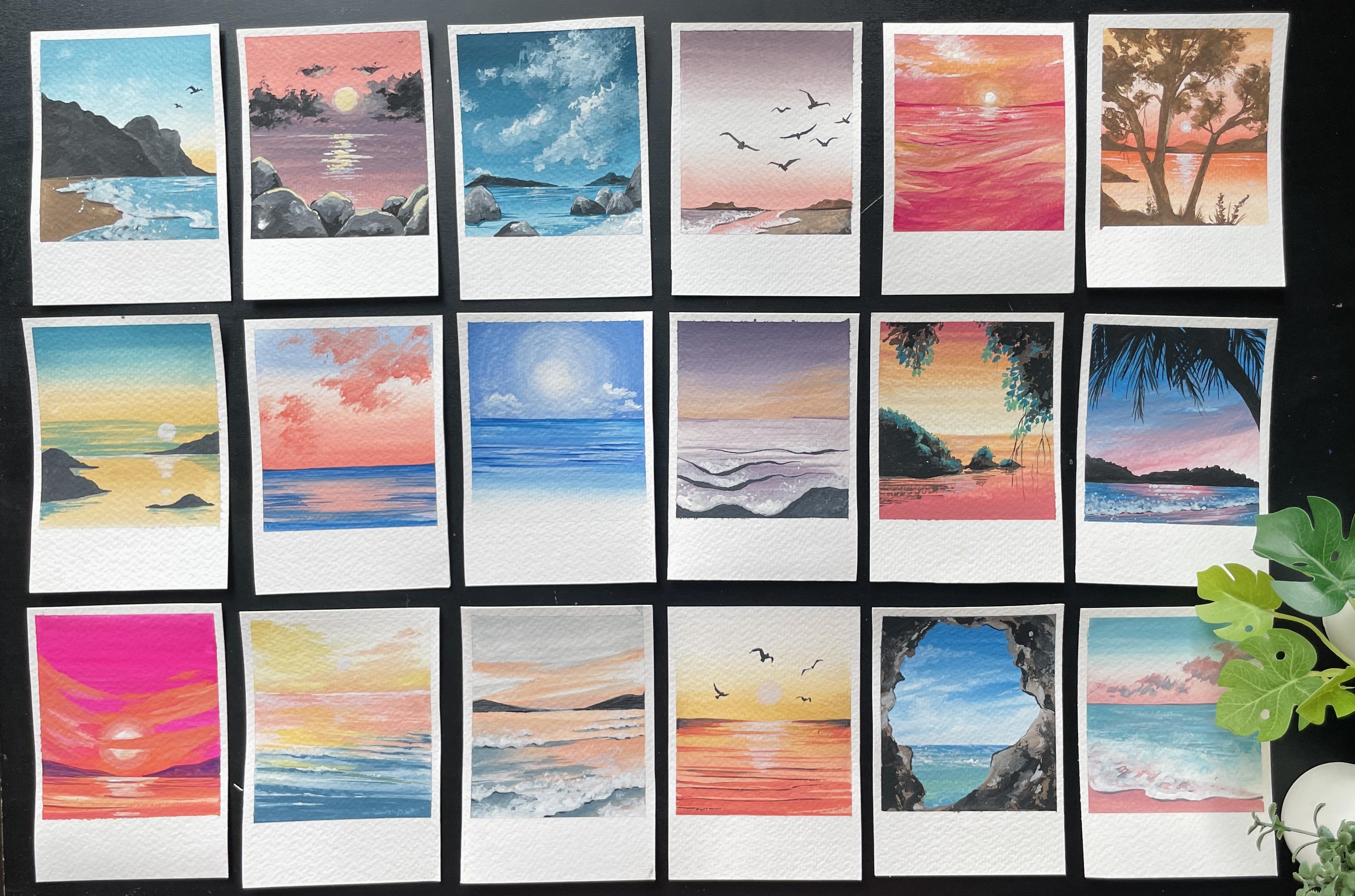
Transcripts
1. Welcome to the Series: Hi everyone, welcome to the
30 day Polaroid series. This is gonna be a very
interesting journey. We have 30 days of paintings. Think B's think we're occasion, think water, thank the
sun, sunrise, sunset. That's what we're painting. We're going to capture
all of this in 30 days. The medium that I've chosen
for this workshop is gouache. If you're new to the medium, welcome to this
class because I'm going to go into the basics. It's meant for everyone
at a beginner level, anyone who's just starting out, the projects are
meant to be super simple and has be progress. The projects we'll get
into more techniques, more unique styles, and
so much more information. Let's talk a little
bit more about what the 30-day challenge
actually means. You can take it as a challenge
where everyday you try to paint for just
ten to 15 minutes. Another option is where you
can paint over the weekends. You can pick six of
the paintings for the week and then paint them
altogether over the weekend. Spend some time with your art, with your art supplies
surrounding you and the pure bliss of having
that brush in your hand. I invite you to go on and show any of painting pride features, both subsets, cool lotions, and calm pistol skies. Let's dive right
into the content.
2. Materials - Everything you need: Now the first thing
I want to talk about the materials
super important. This is what we get started
with, which is paper. I am using watercolor paper and there's a specific reason to it because it soaks in the paint. It's perfect in terms of
using any other medium. And it's a grid. Start with gouache. When you're using gouache. Gouache is also known
as opaque watercolors. Using a watercolor paper
is definitely preferable. For this, I am using 300 GSM. It is a cold press paper and it's quite thick,
which is Create. And we are going for
a specific sites. So we are basically going for an E5 size in terms
of measurement, that would be about 21
centimeters by 15 centimeters. So that's 15 by 21 centimeters. It's an A5 size. So all I did is I did point
A4 sheet and I divide it by half and that's the size
that I got far up Polaroids, we're going to be further
dividing this so that we can fit in for Polaroids
into the sheet. Now this is a BSW level
size that I'm using. You can obviously go for
any size that you prefer. Since there's minimal details, I would suggest not going for
something that's too big, like an F5 or an
A6 or four sides. You could go smaller, basically, you can go for an IV. Six sides, like a postcard
size would work really well. Know how I did this was
basically taking my A5 sheet. I divided it along the width and the length to
get my Polaroid. I really like the
size for a polar. I think it's not too big. At the same time,
it's not too small. So it's really the
perfect in-between sites for our project. Since we have different paintings
over 30 different days, you're gonna need Coty of these. So you can keep them
prepared before or you can cut them up whenever you
need them, has your choice. Now here, I also want to talk about the fact that
for a Polaroid, if you notice, the bottom
part is big on right here. If you measure it out, it comes up to 21
fourth centimeter. And I actually don't really
calculated every time what I did was make sure that I have a tip that I would be
using for the edges. That is this width. So that way it makes my
work a lot more easier. I do not have to
calculate it every time. That is the another
supply that will be that we would need foreshore. Very important, which
is your tip. The tip. I've seen people
using washi tapes somehow that never worked
really well for me. People have used, like some
artists use painter's tape. I think. It all depends on
you testing and checking if the TPP
drips out your paper, if it holds true, if the paint doesn't seep in, to just do a minute
like a small mock trial with your tip before using
it on your final paintings. In my case, I just
use masking tape, which is basically
the white tape over which you can kind
of write out stuff. These are the tips that they use pretty much to label things. So that's the tape I use. It's pretty study. It works really well. I've not had any issues. And as you have seen, it's the size of 21
fourth centimeters. Next, let's talk
about our paints. We are using gouache paints. The first one that
you would need super important is white
gouache standard. I think you should
get a huge tube if you'd really want
to get into collage because white is definitely
something that we use a lot. So try to get a
bigger tube of it because you would
notice that you finish it up fairly quickly. Along with the white, the other colors that
we're going to go into. And I'm going to just
talk about each color. The first one is a red, also known as vermilion. It's beautiful,
bright red color. If you don't have the
exact same column name, you can get a college red, for example, very similar
in color or crimson. Now there are different brands obviously that are available. I've got dollar row
leaf for my rowi Sorry, I have trouble pronouncing
names, excuse me. Bruce. True for anyone who's in
India, it's a really great, I would say, good
material to use. You also have Winsor Newton and there are a
lot of new brands, I think are older
brands who generally do watercolors that are also
now offering gouache. So there is definitely
more brands. I haven't used a lot of them, so I would still go back to a Winsor Newton
or brushstroke. I think those are
two good brands. Now in terms of blue, we're going to use
two different sheets. You don't necessarily
have to buy both of them. If you can just pick
up one, That's fine. I just like having two
different options. One, as you can see, was an ultramarine and the
other one was Prussian blue. There's a slight
difference in the colors of the shade of blue
with these two, which is why I like to
have it as an option, especially when I'm planning to create more monotone Polaroids. The next color we're gonna
be using is a green. This is very dean. I really like this color is definitely one of my
go-to favorite colors. I don't use any of the other greens because
we are going to be going into mixing the colors
that you specifically need. So I'm trying to give
you the base colors that you are going to use and everything else is gonna be a mixture of what
you already have. For yellow, I am
using yellow chrome. You can see it's a beautiful
like rich golden yellow. I try not to use
the bright yellow, the one that you also get
that is yellow ocher. I think. I felt like that's too bright. I like a little bit more of a warm yellow brown
where using burnt umber. And then finally we're
gonna be using black. Now, any color that we're
using in terms of purples, mix of yellow, mixes OFF TO
are all going to be form. These set of colors even
up pings our skin tone. Everything is going
to be from here. So as you see as we proceed, you will be going into each. Now, I should also mention that the mixes I will be doing, I'll be sharing each mix of the color that we're
gonna be using for a specific project
before the project begins so that it's
not too confusing. And you're not mixing colors as you're not going to be using. We're going to do, they're
going to cover a wide range of colors that are
posible from Greece. Two blues, two purples. As I mentioned. Now, the next thing that
we need is our brushes. We're going to be mainly
using a flat brush. This is a size tool. There is no label on it. So I would suggest looking at different sizes and just making sure
something that it isn't, it's not too small
because we want to make sure that we cover
enough of the space. If you're gonna be using
a larger size paper. So you're not going to
be doing polarized. You're maybe doing an
ES6 or a postcard. Make sure that you get
a brush that's slightly bigger so that you can
paint the area faster. Whatever you're
painting is directly proportionate to the brush. So they are very linked. Additionally, we're gonna be
using a thin, round brush. As you can see, it's right, then it's a size 0. It's from the brand tax law. And because I wanted something
that is not too expensive, just to show you guys
it's weight, very sheep. And I would suggest that you
have two of them if you have an old brush as well as
create of that size. Because we're gonna
be using couple of dry brush techniques which
could damage your brush. If you have a slightly more
higher invested brush, something that's a
good quality brand, use them for the details. But when you're going
into dry brush effects, it's better to use an older brush or
something that's not, that's just like
a student grade. That way you're not ruining
your pretty, pretty brushes. But these are the main
brushes that we're gonna be using for painting. Paintings, pretty day paintings. From here. Let us move on to some practice exercises to get a little bit more comfortable
with the medium of guage, understanding, blends
and so much more. A couple of things
that I skipped is make sure that
you have water, super important in
case you forgot. You do need water cups. You can keep two with them if you don't want to get up too often to wash your paints off. I prefer just having one. It's a lot more easier for me
and I just get up that way. I get a little bit of exercise. Otherwise, I just sit
in the same spot. So it's very healthy
for me to keep getting up to fill up my water. The other thing you would
need is a paint palette. This is super important
for us to mix up in. So just make sure
that you have one that has enough space for
you to mix up your colors. You will also need tissues. Again, very useful to dress, dry out any excess
water on your brush. So just keep that in hand. The other thing would be I'm trying to think if
there's anything else, but I think we
covered most of it. Yeah, That's it. That's all we need.
So keep them in hand before we start with
our practice exercises.
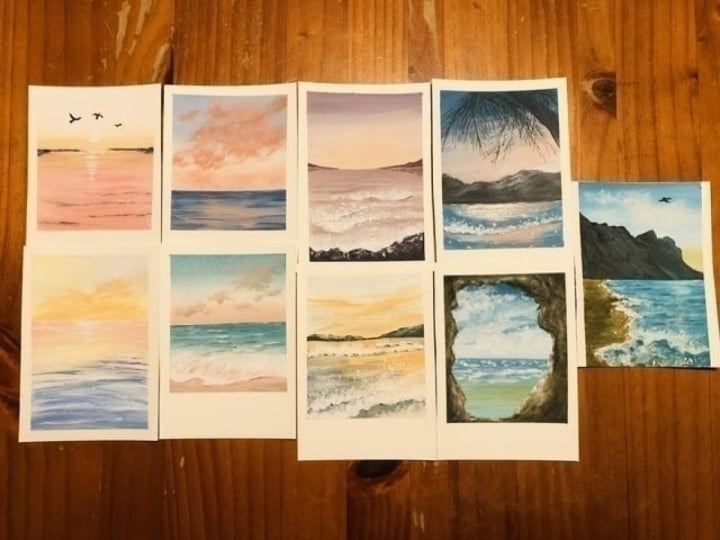
4. Day 1 - Sunrise: This is our first
project from the series. I wanted to pick
one that I love. Obviously also something
that had really cool colors. So that's the one V2. First, start off with
mixing your colors. The first mixed we're gonna
do is like a light yellow. It's like a pale yellow color. So I've taken my yellow Chrome and I'm going to add more white. So we have one portion
of yellow chrome and about three or four of white. If you feel like it's
not light enough, you can always add more white if you feel like it's too light, added a little bit more yellow. Now take a little bit
of water and then just mix them through. You get this really pale
white or pale yellow sheet. That's the color we're
gonna be using. Today. Since our projects are
quite small in size, I would suggest not mixing too much paint because
otherwise you're going to have too many leftovers and gouache paint dries
up after it's used. So you might as well use smaller portions are
mixed smaller amounts, just so you don't end up with
wasting too much of paint. The next color that we're
gonna be using is a beach. It's a light quarter
color is very light. And as you can see, we add a smudge of yellow, one pot thread and
more of the white. Now, if you are going to add
a little bit less of white, if you see the proportions of the red and the
white was similar, and you would end
up with this color. So it's a quarter.
Please forgive me if the names you call
the color is different. These are colors that
I have researched, but I have noticed
that sometimes I get my colors wrong and
apologize for that. But this is the color that
we're gonna be using. So it's like a
reddish orange color. Now, with the same mix
adding more white, you can see I've added
almost two parts of white to that mixture to
get a very light shade. It's a very, very light
color that we're using, almost like a light pink. But because of the yellow tinge, It's a little bit more. I would say warm. This is a coral pink that
we're gonna be using. The final color we're
gonna be using is black. This is right off the tube, so I've taken a little bit
of black adding a little bit off to the mix to get
much more smooth mix. So I get a really
bold black column. The full colors are pale yellow. Cto think quartile, black
and white as always. Let's start with our painting. Take up your Polaroid paper or decides that you've got out. And we're going to
first tape it down. Now I'm using my tape to just get a really nice crisp
edge along the three sides. I keep about half centimeter, like 0.5 centimeters
along the edges. I think that this gives a very nice crisp look to
the painting. At the bottom. I'm going to be doing about
2.5 or 21 fourth centimeter. That I get a Polaroid effect. Make sure to press down
your tape so that it is firmly stuck before
proceeding to paint. Now for the painting, I'm going to start off
with my flat brush. I've loaded my flat brush
with pale yellow color. I'm starting about middle of the painting with this color. I did about two lines with it, maybe a third line as well. You can see how I'm
trying to get it fairly straight, like fairly
perpendicular. Now using the light coral, pink, Let's paint right below
this yellow layer. Bring this light coral
color all the way to the bottom and gently
blend it with the yellow. There's not too much
of a difference between the yellow and the pink. So you can see that it
blends fairly easily. Once that's done. We're going to take white paint and then blend
out the top of the painting. I just take a very
opaque layer of the white and I blend out
the yellow upward. Exactly like we practiced. Just trying to get
a beautiful blend all the way to the top. Now, I love this to dry. And using a scale, keeping it pope and declare
the sheet to the edges, draw out a straight line at
the center of the yellow. This is going to be a division
for the sky and the ocean. Now using our coral, the deepest pink color, Let's start doing some lines. Be attention to how
I do the lines. It's the same effect
that we had done before, just quick movements
from left to right. But what I'm trying to
do is get the null. Watch more lighter lines on top. This is very
important to kind of bring through in the painting. As you can see, I'm
trying to bring in broken lines to give you
the effect of water. So it doesn't have to get like a straight line all
the way through. You're just trying to
get a very broken line. And as you call lower and lower, you're going to make
those lines thicker. We just try to make them look like they're closer and
hence they're thicker. This is the effect that you
can bring to the water lines. As we go. We're getting more of the quarter along the bottom. Once that's done using white
and add thin round brush, Let's do some lines along
the center of the ocean. This is the reflections
from the sun. You can see I'm trying
to get just like quick movements and
very controlled area. Just along the middle. I skip areas where I had all the painted the deep quarter line. Just to kind of
avoid ruining that. I'm trying to paint
little bit below that. You can also see
how I start from bigger incised lines
to smaller as it goes. Once that's done, take
more white and just paint out a circle to
represent the sun. Now using black lead, paint out some birds, I started with a circle for
the body of the bird and then two inverted
triangles for the wings. Let's do the same
on the other side. Inverted triangles
for the wings. This one is going to get a
little bit more obvious. So I'm doing the whole body. But it's the same idea of the inverted triangle
for the wing. Once you've got that, might add another one
just to make it a little bit more interesting. This one I wanted to do it slightly different
so you can see how I just painted it out like a C-shape or like a crescent
moon shape with the body. Then let's do the
edge of the ocean. Getting a little bit
of the black slightly down, not too much. Just gently. Also want to add a
little bit of the black along some of
that quarter lines. You can see where
I'm placing them. Not from the top. I'm just doing the
bottom section. And right above or just like at the edge or the outline of those
quarter lines. Placement is everything when it comes to the sea and the ocean. There you go. This is our completed painting. Feel free to remove the tape and we're done with
our first Polaroid.
5. Day 2 - Cloudy Day: Now let's start with
our next Polaroid. For this one, we are going to be using six different colors. The main color would
be white for sure. Make sure you have that in hand. Along with that,
let's go ahead and mix our next set of colors. Gonna be having two
shades of peach pink. One which is a coral, and then a light color. We mix the same in the
previous tutorial. Start with mixing a
little bit of red. One part read about
one part of white, and a little bit just
a smidge of yellow. This is going to give
us a lovely coral. Next, adding more white to
get a light coral shade. Now for the blues, Let's start off with
ultramarine blue as it is. Next, add in a
little bit of white. This is going to give us,
depending on how much, why do you use about
23 parts of white, you're going to end
up with a baby blue. If you use much lesser, you're going to end
up with cobalt. Now both the shades of
what we're going to use. Just keep them in hand. Again, I had mentioned
this before. If I get the color names different from what
you're used to, don't worry about it, have a look at the
color and use that as your main criteria while selecting your colors are
while mixing your colors. That is your cobalt blue. You can see the
three shades of blue that we're gonna be
using for this exercise. For this painting. Start with our polaroid sheet
and tip down the edges. Make sure to take down
just maybe half centimeter along the edges. And at the bottom, we're going to tip about
to 1 fourth centimeter. Now let's divide our paper
into three equal halves. We're gonna basically taped down the bottom 1 third of the paper. I'm going to just make
sure that it's straight. I don't want to have
a diagonal lines which just make
sure it's proper. And then just gently press it down so that we are gonna start painting the top half
of our painting. Starting with a baby blue, Let's paint the top
part of the sky. I'm going to just
make sure that I get a really nice opaque
baby blue layer on top. Next, using white gouache paint, let's blend out this layer. If you notice something like how I how it just happened to me, where it just looks dry. It's basically you don't
have enough water. So just make sure that you
add more water and come back to the painting. Once you have a really
nice, gentle blend, we're going to add
in the light pink, the light quarter color
from the bottom up. Now notice I've kept a
little bit at the bottom for the light coral
because I'm gonna go in with the deeper
coral afterwards. Let's start with
this layer using white lip blend the top half. So gently blends into
this light coral mix. Make sure to wash your brush. If your brush has paint
and you're trying to go over those white areas. Next, let's take the deep coral and start from the bottom. What I'm going to do is
try to gently bring it up. And how I'm gonna do this is
make sure that my brush is completely washed up and take a little bit of that
light pink light color and then just blend it gently. Now a lot of the layer
to dry before removing a tape separating the
sky and the ocean. We can now start with the
ocean part of the painting. For that purpose, I'm going
to use the cobalt blue. I'm going to paint
all the way through. This is really important to get the edge really nice and crisp. That you have a really
nice ocean line. For the next color,
I'm going to use the light color and
then blend the two together gently all
the way to the top. Now for the last
bit of the ocean, we're going to use BB blue
again for a gentle blend. Just trying to bring in
that color to the bottom. Now I'm going to start off with cobalt blue for the ocean. Starting from the bottom. You can see how I'm
just doing my lines. The way I had discussed them. Just trying to get those quick
lines from right to left. In this case, I'm
trying to focus more to the edge
of the painting. So on the right side
and the left side and keeping the center neutral, naturally painting
over the center bot. Let's take a little bit of
that light coral and just go over that area a little
bit to just soften, soften the lines more. Now for the most important part, Let's paint out the clouds. Now, I'm using a dry brush some, basically the brush is dry and I'm just painting
outdoors shapes. You can use the dry brush, old brush that I had
mentioned before. Just so you don't really ruin any new brush that you've
already invested in. Also, the effect comes better
when the bristles are in so perfect in the dry brush. As you can see, we're
trying to focus on getting the Cloud in a specific area. So just right on top, you can follow exactly the
placement that I am choosing. And also I'm trying to
keep in mind that it's the same color that
we used in the sky. So we can't really get too much going on in that middle portion. So just keeping that in
the back of my mind. Now let's take the deeper CTL. And I'm first going to
start off with just placing it in the areas
that I wanted to, which is basically the below of the clouds or the
bottom of the clouds. Once I've placed it there
with the dry brush, I can continue to just blended so it doesn't look like
it's just been pleased. Just try and get that color. Although the Cloud clouds. Now that this is done, let's get into the finishing
touches of the painting. I'm taking ultramarine blue. I'm just painting the
edge of the ocean. Using the same ultramarine
blue I'm gonna paint along the edges, the right and left
side of the ocean. Deepen the colors. Painting to completely dry
before moving out your TPP. This is a completed project.
6. Day 3 - Purple Oceans: Let's start with our
current painting. I love this color combination, which is why a hat to choose
it as our third day project. The phi colors for this painting
are white, black, lilac. We have a move color or a grip, and then a skin tone color, which is a bill yellow. Let's start with that mixing. For the first mixed, we're
gonna do the lilac or they're very light mauve color. For this, we have to take equal parts of vermilion
and ultramarine. Mix the two with
two parts of white to get a very light
shade of lilac. You can see that
that mix of pink and purple, pink and blue. I know the paper says
purpose, it's OK. Initially I call
the color purple, but then I think. But let's just do generic. The next color that we'll
be using is a great color. For that, Let's
start with mixing equal portions of
red and ultramarine, which is width equal
portion of white. That's gonna be
our first mixing. Let's mix and see how
the colors come through. I need this color to be much more deeper and
much more ritual. Once we mix them, we can add a little bit more of ultramarine to deepen the color, to get a really nice grip color, which will be using
for this project. This is a lovely, vintage color. I think it just looks so nice. Now let's mix our skin tone
or appeal yellow color. For this, I'm taking a dash or just a smidge of
red of the million, in our case, use white
and blend the two. You're going to end up with
a very light pink color. Now form this, we're going
to keep adding yellow ocher bit by bit to
build up that skin tone. If you add too much of yellow
right at the start of it, you might end up with
more of a pale yellow. To avoid that, we first mix these two
together and gather, get a Liping and then go
ahead and add the yellow. I feel like this
just works a lot better for mixing our colors. Once you've happy
with the shade, add little yellow at a time. This is the skin tone color
that we'll be using today. So make sure to keep them in hand along with your
black and white. As we continue
into our painting. To start with our
project for today, take your polaroid sheet and let's start taping
down the edges. I started with taping
down though three sites. And then the bottom
keeping 2.5 to 1 fourth centimeter to
create the Polaroid effect. Now, I also added a tape midway through
the center just to divide our painting so that we can do the sky
first and then the ocean. The first thing I've done
is starting off with this rich group color that
is going right on top. Following that, I'm going
to use white gouache. And starting from bottom up, I'm going to slowly
blend in the colors. Now, what has happened
here is as I blended, the color has started
becoming the same through it. And this might be
something that you face as well as you're
trying to blend. If this happens to you, just go ahead and add the
color again from top. Make sure you wash your brush. And then with a dry brush, gently spread the paint around. You will see that that
gives you a gentle blend. And that's exactly the
look we're going for. We really want to get like a very simple blend all the
way from top to bottom. The next part, I didn't
end up recording. Sorry about that. But basically I went in
with its skin tone and started from down and
blend it upwards. Once it slowly drying, what you can do is go ahead with the skin tone again and just do these quick lines to give that cloud effect all
the way to the top. Just taking that skin tone
directly as it is and just bringing it with
those quick movements using your flat brush. I think this just
fills out the sky a little bit more than just
keeping it as a simple blend. Now, allow it to dry and then
you can drum watch a tape. So we can proceed to paint
the sea or the ocean. The ocean. I am going to start off
with our lilac color. I'm going to just paint
the lilac color from top. Similar to what we
had done before using the white gouache, I'm going to blend upwards
to get a gentle gradient. While it is too wet. Let's go ahead with
a flat brush and add grep lines through the ocean. This is gonna give us
a representation of the weaves and the
movement within the ocean. How I do this is quick
motions from right to left. I tried to concentrate more
of the grip at the bottom. And as I move upwards, you can see how I'm trying
to make it lighter and lighter by lifting up my brush farther away from the paper compared
to at the bottom. This way you get a really
nice differentiation of the water movement. Obviously, when
something is closer, it's going to look bigger
and when something is further away,
it looks smaller. Once that's done, we can
paint out our ocean bed. As you can see, I've taken black and I'm just
doing a curve. We've effect at the bottom. I can then paint the bed
just with this black color. Now that that's done, let's paint our next. We've, I want you to pay attention to how
I paint the wave. What I tried to do is the
area that is right at the bottom on the
left side is thicker. On the right side. I'm trying to give that
differentiation by showing that the shadow is more
intense on the left side. This is what we're
going to kind of follow through as we go along. The next wave. Again, you'll see how I kind of make it a little
bit more thicker on the left side and much
less than R on the right. At this point you
can see I'm not even kind of painting all
the way to the right. To again, give it that surely nice to show how the
waves are moving, making it look more natural. Now using white acrylic paint
and your thin round brush, Let's add those VBS. And the water movement. What I tried to do
is generally get a very rough white gouache
lead at the edge of the curve. As you can see. And generally wherever it dips, you add more compared
to when it's higher up. Wherever you have that you
bend that's going down. Just add more. As we move further
away from that edge, you can see how I'm just doing these curvy scribbly lines to give it that ocean
look where the water is. Forming. This gradation is what we're trying to create
through all of our waves. Doing the same thing
for the next one. You can see at the higher points where the waves are
slightly higher, you don't really need to
add too much of the white. It's just wet, it
dips because that's where the C is coming forward. And that's the effect
we're going for. At this point, what
I also like to do is go ahead and
add another layer of gouache white directly from either the tube or
from the pan palette. Because we tried
to want to try to brighten up that
white even more. Sometimes when you add
in the second layer, I feel like it just
makes it shine out and that's so much better. You don't need to do
the entire thing. We're just trying to get
that edge of where the ocean comes forward by the
waves come towards you. Now that we've completed that, let's allow it to
dry before we remove our tape and get our
Polaroid for the day.
7. Day 4 - Night by the Beach: This is my favorite
project for the week. I absolutely love it. I love the colors, I love the sky, everything. I can't read for
us to get started. The first thing, as usual
is mixing our colors. I've taken a bit of Prussian
blue and more of the white. You can see the
proportions are about, I kind of started with
little bit of white. So we can start off with maybe just equal
portions of both and see how the color works
out because we want to get a really bright color,
not something dull. And that's the shade
we're using for our sky, as well as our C,
actually, to be honest. Now the next color that
we'd be mixing is our pink. The pink I'm taking
vermilion and white. The proportions for this is
one part vermilion and about, I would say two parts of white. You can always start with
a little bit and then just mix and see how
the colors working out. If you're not really
sure and you don't want to risk creating a large amount. Start always minimally
and you can always add more red or more wide as
you go into the mixing. As you can see, I've got
a very bright color and I may not necessarily
want to use something that's that pride. So I can always go in and
add a little bit more white to make it much
more lighter in color. For the painting, we are
going into this pink. It's like a peach pink. If you have them
other shades of red, I would say like a scholar
tread or if you have magenta, you can go ahead and use that combination
with white as well. Now it's starting off
with our painting. We are basically going to need
phi color or four colors. We have our Prussian blue, our pink that we just paint, that we just mixed
black and white. Once you have your paints ready, Let's take our Polaroid, tape it down and get
ready to start painting. Always makes sure to press
down your tape formally that you don't
have paint running through for this painting? I have paint a tape
down just the bottom. I would say 1 fourth of the
painting for the ocean, the sky itself is
gonna take majority of our painting with Prussian
blue LED start right on top. I'm going to do just about maybe 23 lines of
this Prussian blue. Maybe going slightly more lower. Then. Let's wash our brush and take a little bit of white. With the white we start from down and move gently upwards. You can see how I'm trying
to slowly lift my brush so that I don't end up
getting too much off. I don't end up mixing
up too much of that blue because I do want
to have a gentle blend. But as you can see, what I've done is
on the left side, I've brought in that light
blue color downwards, whereas the right side
has remained white. And this is just
a very simple way to bring two colors together. For this guy. Once you're happy with that, you can take the pink and
start from the bottom. Now with a bank, you
can see how I'm just adding it with lines, trying to bring it all
the way to the top. It's all about those
quick wrist movements. Just side-to-side. When you are happy with that, you can go ahead and use white paint to just go over the pink so you end up having just not a
bright shade of pink, but more of a light color, as well as the white, just creates a much
more dynamic sky. I would say. Again, what I tried to do is
just do those quick lines, trying to create
that zigzag shape. This, I feel like it's just
such a vibrant, bright sky. It's just so dynamic. And it was so simple to do in just a couple of
quick movements. Now let's allow this to dry before you can go
ahead and just remove the tape for the bottom so
we can paint our C. The C, I'm starting off again with
the blue, the Prussian blue. Now, let's paint the sea. I'm doing quick motions, but what I'm trying to get is
blue just at the left side, just along the left side. We're going to have a
bold line in the middle, which is gonna be the
shadow for the wave. Just trying to get
that blue along the edges on either side. Now that we've got
it on the left, tried to do it on the
right side as well. You can see the top. I'm trying to make
it more darker. It's truly prominent. Going to do a little
bit at the bottom just gently. Getting that light. Don't worry if you
make a mistake at this point because we are gonna go in with the white and
pink and things like that. So any mistakes can be fixed. It's not a problem. And that's a really great
thing about gouache. Unlike acrylic dries
and it cannot be moved. With gouache, you
can actually move around the paint
even after it dries, because it really acts
like watercolors. Here you can see what I've
done is with the pink. I've basically just
gone around that line. Just below that line. Basically filled in the
center of the ocean. You can now see that
it's in two weaves. You can see the main verb and then you have the bottom one. I'm not really sure
how else to say. Let's say the before we've and the front wave
and the back wave. I think that makes
more sense then up and down because
they're in the same level. Really hard to explain
this when you don't really have a technical terms. And it's all about what you see. Anyways, now that that's done, we're going to allow it to dry. Meanwhile, we can go ahead
and add some mountains. I am just taking black as it
is with obviously water to make it more fluid and just painting out some
really fun mountains. One thing I wanted
to avoid is having the mountain kind of take up so much of space that
you miss out on the sky. So as you can see on the right-sided goes
all the way down. That way you can see that
white peeking through. When you're happy
with the mountain. Let's use the same black
for the shadow of the wave. And you can see how
I'm doing this. I'm trying to just just add
that black for the shadow. Drew Ali really
makes a difference. Now that we've done that, we're going to add a very
prominent palm tree leaves. I started with the branch. And then we can just go ahead and start painting
out our palm tree. Don't worry, I'm
going to explain how to do it and I'm gonna
give you a couple of pointers as well
on how you can do this to suit your painting and give it a more
realistic look. First, start with the
main center of the leaf, and then we can add
in the leaf flats. This is simply just thin
lines joining to the mean. I like to make this
very random and not, as you can see,
it's more broken. It's not just a straight line. I think that makes
it very realistic. If you have just
proper straight lines, it just looks fake. You want to have a bend
a little bit more. When you're doing this. Another option is to
just go over some of the places so you would
just deepen the color. Once you've done that, we're going to add
couple of more of these. Palm leaves. Just
add to the painting. Look at how I add the leaflets. Another tip to keep in mind is a generalise for bond leaves. You start with smaller
at the bottom and then it becomes wider
in, around the middle. That's another thing
to keep in mind. So at the bottom we just want to have it all coming together. And then you do these V
shapes on either side, making them longer, making
these leaflets longer. That proportion truly
makes a difference to the painting and to
the overall look. Keep adding more and
more palm leaves just to fill up the entire top
part of the painting. Now, as I go on top, it's you can't really
just black paint to fill up more of the space. You don't just end up with
empty gaps right on top. Now, once that's done, let's move back to RC. I am starting off with
thin white lines along the middle of our wave. Mult going to do another set of lines from our front wave. You can see how that
immediately brings in so much of life to the painting
that light highlight. Moving from there. We can paint the edge of the
wave with this form white. And I'm just taking
it really easy. Lawmaking too much different to many variations in the size, the width of it in
the previous project, beautifully short
the difference of the distance with that
width of the a form. Here, as you can see, I'm not trying to make
that much of a difference. The line that we're
using as much more smaller compared to what
we had done before. And you can see how that form just makes the
ocean lot more realistic. It makes it look like
it's moving around that so much more just
brings it to life. What I also like
to do is because I want to show that the
water is listening. Adding these small white
dots with your gouache, white can really give that listening effect
instead of just the lines. So these small tweaks. Just short so much brings so much of
life to the painting. Let's gently tap our brush
to get some splatters. Along the ocean. Just gently splatters. Adding more white spots
to just really show that form for the ocean. Once you're happy with
it and it's dried, you can go ahead and remove
the tape on all four sides. This is my favorite painting, I would say for the week or attributes of the four
that we've done to know. I loved the colors, I love the palm. I liked the glistening water. Just everything about
it just reminds me off the ocean and that's
just so relaxing.
8. Day 5 - Vibrant Sea: Today we are going to
be painting something that's a lot more relaxing. I think the vibe of so many
colors is just so pretty. Let's get started with
mixing our colors. The first thing, the first
color that I want to mix would be a pale yellow. To start off with
failure though, I'm gonna be taking
a little bit of yellow ocher and
some white paint. Now the proportions for
the two are about a dash, or let's say one part of yellow and about
two pots of white. You can always start
off with just one part of white and then mix
and see how light the colors and then add
a second pot of white. It's all about playing around with the colors
you get the right mixes. The next color that I'm mixing, a color that we've used before, which is a peach pink. For this, I start off
with the red vermilion. One pot. Just a dash of yellow. It's a very little
yellow just to get that color a
little bit more warm. And then two pots, white. This is going to give us a very nice light pink
color for us to use. The next color that
we're going to mix. This also a color that
reefer mix before. This is skin to one. For this one I'm
taking one part of a million and about two parts. I would say again another one
pot of yellow and one part of white has put
the requirements. You can kind of add in
little bit more white if you need to just make
it more skin tone. If you feel like the
color looks more pink, added a little bit more yellow. Just play around to kind of
get that right mix of color. Now that we've done
the pinks and yellows, Let's move on to the blue. For the blue, I'm using a color
that we had mixed before. It's a cobalt blue. Start with ultramarine,
about one part of ultramarine and a
dash off white. The white needs to
be just very little, so not even one pot, just enough so you
get this deep color. I'm calling it cobalt. That's the color
we're gonna be using for our painting today. The phi colors for our
painting is pale yellow, pink, skin tone,
cobalt and white. Now let's start
with our painting. Take down your polaroid sheet, taped down the three edges
as you've done before, as well as the bottom at
21 fourth centimeter. Now, let's tape down
this center over here. You can see I'm not truly
doing it in the middle point. It's slightly up. So here we're going to do a little bit different
technique where the ocean or the C is going
to have a larger portion. The painting, it's going
to take up more space. Honestly, there's
not much difference between the sky and the sea. So it's great that we have
more to the c and then we can add in more
for the waves and just bring in so much color. To start off, I'm using the light pale yellow
at the bottom. And as we go up, I'm going to try to bring
in different colors. What I wanted to do
initially is to keep the sky more white. So imagine like a
bright morning with a sun has already
come up on the sky. And you just have
this bright white. I'm open sky for that using white from up to down so that the blend is
mainly at the bottom. This pale yellow is just taking up that space at the bottom. Now, instead of just keeping the sky again just
a pale yellow, we'll also be adding the skin tone and this
is going to give it more warmth to a painting. For this purpose, I'm
using the flat brush, keeping it perpendicular and just adding those thin lines. As I go up, I'm
just trying to add lesser and trying to merge
it and blend it more. As you can see,
you've got a triangle happening. From the other end. You can bring it a
little bit more of the PIL yellow and we go down. Just bringing that
yellow packin together, you get a very
dynamic ocean sky. Now let's allow it to dry
and then we can drill more the tip that we can start
painting our ocean. The ocean I'm using
the light pink. Just a line of that light pink. What I'm trying to
do is create again, some dynamic colors in water. For that purpose, I'm using white gouache to just
blend in that thing. Even though this is
just white gouache. Try to paint it all
the way to the bottom. We want to have paint all the way to the end
of the painting. There is a reason for it. When we move on
to the next step, you're going to
understand it better. While the painting is still wet, we're going in with our
cobalt using the flat brush. I'm really adding those
lines for the waves. Because the painting
is still wet. You can see how it's almost blending through and
you don't really have a crisp line which is created for the effect.
We're going for. One thing I'm trying
to do is with the cobalt to just do the edge. So we're trying to create
a triangle effects. So it starts from
bottom and it becomes smaller and smaller
towards the right, all the way to the top. This is going to give it a much, much more interesting effect. Now as the painting is drying, we can go ahead and add
more of the cobalt. And this time it's going to end up becoming much more deeper. Starting from the top, Let's do a thin line. You can see how I'm doing this. You will notice that it's much more spaced out at the top. As I go down, I am reducing the space
between the lines. At the edge. We can go and
directly with the cobalt. Now let's take yellow off. The painting has dried, so make sure it is completely
dry before you add in this yellow, pale yellow, we're going to use again to
just show the reflections of the sky on the C. Instead
of doing the green, the yellow all the way through, we're just doing the
left side of the ocean. This way, you can
really see that the sky is reflected
in that area. One thing is water
is very dynamic. It catches a reflection of
anything that's around it, it shines its pocket. And under the sun it is just swallow pretty and
starting to look at. Because of that, we've just
got this wide range of colors that we're
using for ocean. Now you can see how
with the yellow, I've again done it with lines with my flat brush just
so I can drill the, get those details and show
that effect of the waves. As we paint, if you notice
a lot of empty spaces, Let's just add pink to
cover up those spots. There shouldn't be many, but just in case you're
getting too much of whitespaces just on top. You can just paint over
it again with a pink. This also makes it
look a little bit more natural and stuff just having
the colors plotting on, on either side, that mix of colors just gives it a
much more natural look. Now, using a, the white drawn, the brush, the brush, sorry, with white acrylic paint. Let's paint the edge of where the ocean meets the
sky with a white color. Then we can add in
some spot codes and some ketose to the sea to
show that it's sparkling. For this purpose with the white, I'm going to go ahead and just try to add in
those white lines. You can see how I'm trying
to do this very rapidly. Just getting those
thin lines through. Similarly as we go down, just adding more of the
white to show the forming of the waves. The edge. Finally let go ahead and
add the sun in the middle. Just to wipe dot because
it's super bright. Just bringing in that
freshness to the painting. Now, once you're happy
with everything, just see if you want to add
any additional details. If everything looks fine. And then allow it to
dry before going ahead and removing the TPP
along the edges. There you go. This is
completed Polaroid from T5. The bold colors are
just part of the look. I love how the
shades come through. Now for D6, I again wanted to choose something
truly special. See you tomorrow.
9. Day 6 - Laid back Beach: Another new project. This one is very interesting. It's very pasted, very mellow, and we're going for
the fray for me. See, look. First thing is the colors. The first thing we can do is mix up the main color,
which is black. But black is just one of the
colors we're gonna be using. Two more additional colors, which is great and skin tone, along with white
for this project. For the black, just add a little bit water to make
sure it's a little bit flowy and more usable and kind of activating
that gouache paints, you get this beautiful mix. Now to the black. If you add a little bit, just a dash off white. Very little I would just
not adding too much. You would get gray. Now as you keep mixing, just add a little
bit more white and a little bit more white and
a little bit more way to do get the gray that
we're looking for, which is like a mid gray. It's not too light,
not too dark. Once you have gray. We're going to be
mixing skin tone. Skin tone, use a little bit of vermilion as well
as yellow ocher. I like adding a little bit of yellow alcohol
with white mixing. And then as a girl head, I can add a little bit more of yellow so that I get a
proper skin tone mix. This is very tricky
because we try, we're trying not to go into the peach color shade
where the red is more. We're going into
the yellow shade, whether skin tone,
color comes through. These other three colors, along with white that we'll
be using for this project. Now let's take our
Polaroid paper that we've already cut
up and taper down. We're going to tape
down the three edges and just make sure we taped
down more at the bottom, about to 140 centimeter. Next, let's deep the
middle of the painting so we can paint the sky first
and then move on to the C. Press down your tape gently to make sure it's truly flattened. And that way no paint
sleeps through. The first color
that we're going to start off with is white. What I want to do is
just basically paint that entire space with white. Make sure you cover up
all the whitespace, all the empty spaces
with this white gouache. Next, take skin tone on your pre-lab flag brush
and add your sky details. What I'm trying to do
is following this quick right-to-left
movement for the sky. The previous paintings,
if you noticed, what we tried to do is
create a tapering effect. In this, we're going
to try to concentrate our lines just at the
bottom part of the sky. You notice that
this is truly going to make sure that
we get our details. Just like the sky, that yellow is just
at the bottom. To ensure you get
more soft lines. Clean out your brush completely
and using a dry brush, gently go over the space again along the edges to get
a more soft effect. As you can see, go yellow
is just concentrate in, concentrated at the
bottom for the sky. And it gives a very
dramatic effect. Later on after we
finished the C, we'll add some more
details for the sky. Meanwhile, once it's dried, let's water tip and
start painting the C. The C, I'm going to start off
with our skin tone again. But notice the way that I paint, I'm using my flat brush
because it is a lot more easier to use
your flat brush for. Just painting these areas. I start off with just a very
like a pop into CloudWatch. And now I'm adding
the skin tone. Here. I'm creating a tapering
effect where it's only over the top. Right. Corner. It's just that it's
almost like the bottom C is divided into half diagonally. And then you've got 1.5
That's going to have the skin tone and the other half that's
going to have your query. Keeping that in mind. Let's push our brush
and loaded with gray so that we can
paint the other half. Notice the way that
I hold my brush. I get those thin lines. Let's go over the layer
of skin tool again. Just moving from Midway, not all the way through, but just from the right side. Now let's take now what
we're going to do is we're going to divide the c
into very fixed to waves. We're gonna focus those waves and try to make them
very prominent. You can see how I'm doing this. I do a very like a curved line, so it's not truly not straight. That's very important
to remember. I also, as you can see, I'm adding those
additional green lines along the edge, the left side. As I do that, I am
creating more of those VBS and making them a
little bit more prominent. Now at the bottom and again
do wing making it prominent. What I always like to
do, as you can see, is that over the shadow areas. Once I've done the shadow, it's easier for me to
go back and then add the white for the create
that effect for the sea. Knowledge generally
what happens is whenever the leaves are closer, the shadow tends
to be a little bit longer based on
where the sun is. And as it is further away, the waves tend to be much more
smaller and further away. And not that prominent. Again, all because of all depends on where the sun is
in this painting would have done is made sure that the
areas that are closer to us are and have more shadow. You can see how I've
just made that much more wider and much more prominent. And the places that are away, you can see the
leaves that are a V. They're just didn't
lines and that's it. I am not adding too
much depth to them. Once you're happy with this, Let's start adding our form. Similar to how the shadow
changed the form as well, where change further away, the form would be much more
lessor, not too prominent. And as it is closer, it would be taking
up more space. It's a very similar
concept to the shadow. Here you can see right on top, further away VBS
and making them. I'm dense in terms of the white, again, following the white
in terms of scribbled lines. So not just having the flat, you can see how I'm creating
a more rough effect. For this step, I
would suggest that you follow exactly
what I'm doing. Pleasing where I am adding more white at
the same place and where I'm adding just dry
brush strokes at the same. Please. Just follow along and fill
up the form for the sea. While the bottom C is drying, let's go ahead and add some
more green to the sky. What I'm doing is I'm
using a light layer, which means I've added
more water to the mix. So it's just a gentle
layer that I'm adding in. I didn't want it to be too prominent from our
existing skin tone sky. Next for the mountains, Let's add simple
mountains with black. Here you can see I'm
doing it in gray, but I will be adding black
leader because the color just does look a lot more
deeper if you use black. But what I like to do is keep the center of the painting
empty for the mountains. So you can see the mountain. Peaks are to the
right and the left, but in the middle, it
dips down pretty low. Once you've done the mountains. Let's add the shadow
for the leaves. You can see using the round
brush and black paint. I am just doing the
areas that are up. So the curves that go upward are the ones
that I'm painting now. Because those are the ones
that are gonna be in shadow. It's really important to
do this instead of having a continuous line because then there's no differentiation. Now, because of just adding
black to those places, you can really see the
effect that comes through. Once you're happy
with the painting, allow it to dry before
removing your team. To reveal our
completed painting.
10. Day 7 - Beach Vibes: Today is our seventh project, and that means we have
completed one week, which is pretty amazing. All the lovely paintings
that we now have with us. Are you ready for
today's painting? I think what makes
today's painting special are the colors. The color that we're mixing
today is something that I absolutely love and I
use it all the time. It is a beautiful peacock blue. For the mixing will
be going to do is take an equal portion of green, which is a very deep green, and ultramarine blue and white. The white can also be an equal
portion to the other two. And as we mix, we
can add and change the colors as per requirement. Now when you mix, if you
get a color like this, obviously it looks more blue. So let's go ahead and add
a little bit more varied, a little bit more green to
get that peacock green color. That is the color
that we're going for. If you add too much green, you can always counter
compensated with blue to get the color
that we're looking for. Along with this color, we're gonna be using
a pink for the pink. Just take a little
bit of Berlin. Sorry, Will million. I think I can hit my own word, vermilion and two pots of white, mixed them together for a bank. The third color that we're
gonna me mixing is gray. So let's take a
little bit of black, a portion of white, mixed the two together
to get our gray color. So in total, we need four
colors for this project. Your peacock blue,
pink, gray, and white. With your paints and hat. Let's get started
with our project. First. Let's tape down our paper on all three sides and then
leave more at the bottom. For a Polaroid template. Now let's tape down the center. It's putting it
right in the center. Let's go little bit up. You can see how it's not
exactly in the center. And then just gently
press it down so that we can start
painting our sky first. For this guy, I'm going to do the blending effect that
we practiced before. So first I'm gonna start
off with the peacock blue. That's gonna be from top
all the way to the middle. Then we're gonna add white. And then at the bottom
we're gonna have the pink. We're going to have
all the three colors coming in for the sky. Now start with the
blue right on top. Using white gouache, let's
blend the blues that we get a truly nice even
blend all the way. Next, now that we've
kind of done the white, we can actually do a little
bit more of the white before we continue to paint. To add in the pink. Wash your brush,
loaded up with a pink and start from down and move up again with white dot in
the middle and then move down to get that
three color blend. Now once the sky is dry, remove the tape in the middle. Then we can get to
the C. Right now. With this, see what I'm
gonna do is focus on the blue for the water. And then we're going to have
pink for the beach bed, the sand area. For that purpose. I'm going to first start
off with the blue. You can see how I'm
just doing in line. For this purpose, having
a pope and keeping your brush pop into Cloud is just going to work a lot better. You can really get a very
smooth line when you do that. In case you get this dry, as you can see, dry effect. Make sure to load
up your brush even more and then continue. When I'm adding in the blue, you can see how I've
just done that match. Now I'm going to use
white to blend it. And I'm going to
use the white has a buffer between the
blue and the pink. Why am I doing this in all our other ones I've
just used to directly. This is because if I actually
mix the blue and the pink, I'm gonna get a pulpal. Thus, if I can use
the white in-between, I'm not going to
have that issue. So this is the reason
I've added it. Once you've added enough of the white and how to soft blend, you can add in the pink
for the bed portion. Now let's allow us
seat portion to dry. Meanwhile, we can
go ahead and add some clouds for the top, for the sky area. I'm starting off with the pink. And you can see how
I'm using a dry brush. Keep in mind to use
an older brush for this purpose so you don't damage any new brush
that you've gotten. But with a dry brush, we're trying to get
a tapered effect, almost in the shape of an oval. So you start from
small or a thin line, make it much more rounded in the middle and then again
smaller at the bottom. This gives you the clouded
effect that we're going for. Here. You can see how I'm
trying to get more of them and kind of
overlapping them as well. Once you're happy with the look, we can go ahead
with gray and add in the depth for the clouds. Now there are multiple ways
that you can add depth. And it all depends on the light. Where is the light at
that point of time? Is it above the
cloud is at below. Is it right on top? That will determine where
you're going to add the depth. In our case, if you can
see the white line, which is where the light
would be in the middle. Because of that, our HDRI
shadow is going to come below. You can see how I'm adding the CRI at the bottom
of our clouds. Now let's use green for
the edge of C. Now, let's add in lines for
the leaves of the scene. Just adding very thin
lines with the Cree. You can always use the dry brush effect to
get a more dry look. Instead of having these
very crisp lines. It's also going to get it, make it easier to give
a more natural look. Here you can see, because my brush is dry, I'm able to go right and left
and create those movements. Now that we've added
the grade to the c, we're gonna also added to the sand because we're trying to show that form
coming through the waves. Moving forward. We have to add those grid
lines over there as well. Now, let's use
white gouache paint and start adding that
form for the wave. You can see how I'm doing
a very curved line. So it's not just
a straight line. This is very, very
important to notice. Also what you'll notice
is I'm trying to change around the proportion or the width of where
this form is seen. To the left, it's
much more prominent. It takes up more space, whereas towards the
right you're going to see much lesser of it. This is again to give the effect of distance within our painting. These small details make a huge difference and can truly change how your art looks. Again, in this, I'm
completely using a dry effect to get more
of scratch marks and very dry looking white lines
instead of very crisp lines. Once we've used the white, let's go ahead and add
gray shadows to the waves. Also gone ahead and
added create to the sea again to
give it a texture. Because when we added the white, it became too much. Just to balance it out, I added a little bit
more of the Cree. Now, as you can see with
the shadow of the wave, what I've tried to do is be mindful of where the light is. So in this case, anything that is outward has become darker compared
to anything that was inward. What I'm also done is in the areas in-between
the white lines. I'm adding a little
bit more of Cree to give it a shadow
effect as well. I always like to add a little
bit more of the white at the edge of the waves because that's where
it's the brightest. Our final painting.
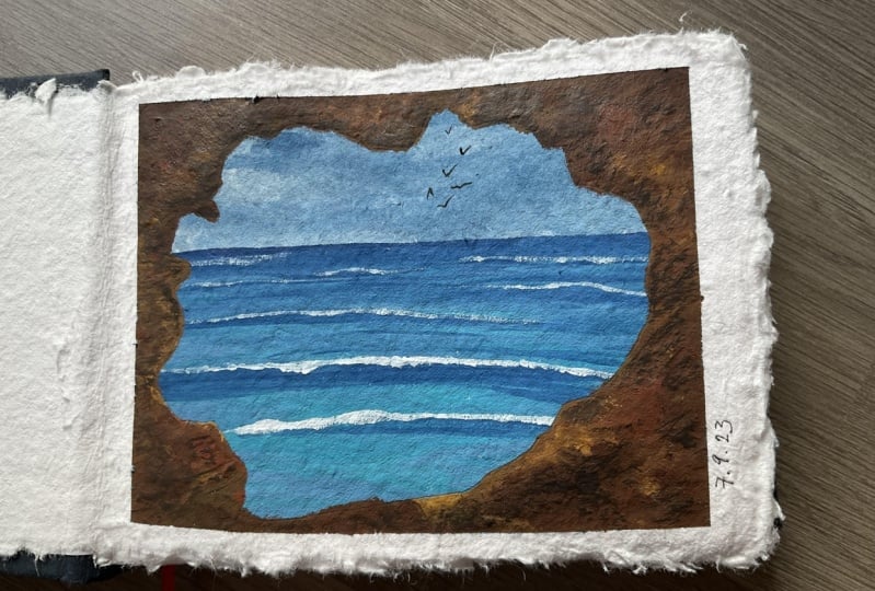
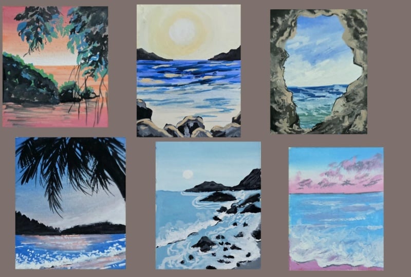
11. Day 8 - Through the Rocks: For day eight, we
are going to be playing with a different
layout, as you can see. Now for the colors
that we're mixing, we are using colors that
we've mixed before. Just an additional two
other colors that are new. So I just wanted to go over them again in case you've missed
any of the previous ones. For the blue, just
take a little bit of ultramarine dash of white
to get a beautiful color. Additionally, we're also going
to be using pale yellow, which is a mix of yellow
ocher with a dash of white. I would say in this
case the proportions would need to be one is to one. And then you can keep
adding white based on how light you want
the shoe to look. After yellow, the next color that we will be
preparing is prone. For Brown would have
done is I've taken Burnt umber in all
the existing Brown. I've added a dash of
blight to make the color a little bit more lighter in sheet to give it a
more paste and look. In case you do not
have burnt umber. You can pick up any
other brown that you already have and then just
add a little bit white. Additionally, you
can also try mixing yellow ocher with a
little bit of black, very little amount, and white to give you
that brown color. Here you go. In total, we're gonna be using five
colors for this project. We have brown, black, white, blue, and pale yellow. As always, take your
polaroid sheet, tape down the three
edges of your paper, as well as the bottom, making sure that the bottom
is much more larger in space. Once you're happy with that, we can get into
taping the middle of the sheet to divide
the sky and the sea. Now in this case, instead of just typing it in the middle, I wanted to get a
little bit lower just so we can concentrate
more on the sky. We want more of that blue to
come through with a very, I would say very dynamic sky. For this guy. I'm
starting off with my flat brush with the
blue color right on top. While the paint is still wet, I'm going to add
white from bottom up to create a gentle blend. At this point, what I'm
also doing is moving around the blue paint just with my
brush with simple strokes. This might take a
little bit of practice, but as you keep getting used to just moving
your flat brush around, you'll see that the
effectually changes. And it's very important that you actually use a flat brush, that you can truly make
use of the entire brush. If you're using a round brush, that effect you get
will not look similar. So just keep that in mind. And now you can see with
that diagonal lines, I've created a
quite dynamic sky. Something's really simple, but something that really
captures your eye. While it's still drying. I like to go, I wanted to go ahead and add some clouds using the
gouache white paint. I'm adding cloud clusters. Noticed how I do this. I first tried to do scribble
lines of just the white, and then I ended
with almost a dash. So that way it looks
like the Cloud is becoming thinner as you move up. As you move towards
the right side. If you've paid attention
to the sky and clouds, you'll notice that
clouds tend to have that proportion of
small to big to small. Again, that's why we are trying to catch it
in the painting. Once we have done that, we can go ahead and quickly
paint a vase simple C, by using the blue
and pale yellow. First start with the blue layer. Now let's add in
the pale yellow. Now what is going
to happen is when you mix pale yellow with blue, you're going to
end up with green, which is also the look that
we're going for in this case. Right at the bottom, we can
go ahead and add blue again. Now, it doesn't really matter
the bottom part because we're anybody is having that rock formation coming through. So it's not going to be seeing, so it's okay if you continue
with the same column. Now using the flat brush, you can see how quickly doing quick lines to just give
the wave effect for the C. Let's load our round brush with white gouache to
give more of those waves. You can see how I'm doing small crinkle lines
right on top. As you can see, I've
made sure to just use that white crinkle
lines right on top. I don't need to actually
cover the entire space. Just giving, giving it
on top is going to give that illusion of light
reflecting on top. Wash your brush completely
and loaded with problem. Let's do the overall shape
for the rock formation. As you can see, I'm giving it
a very more like a curved, very broken line effect. It's not perfect, it's
not a perfect circle. I want to give it that
rock like texture to it. No rocks are generally gonna be multi-colored because
of the reflections and the texture
on their surfaces though light hits them
in different angles. Because of that as we're
filling it up with, I'm gonna keep playing around
with using brown as it is, and then adding a
little bit white as well as we fill up the spaces. Just keep a close eye on what I'm doing and how
I'm going about this. One thing to note while
I'm going about painting the rock formation is that I don't want to take up too
much of space with the rock. It should be just enough that it really shows that there
is a rock formation. At the same time, it
should be enough. It shouldn't be too much
that you cannot see the sea and the sky through it. I've tried to make sure that
I balanced it in such a way that maybe I have the raw protruding more
towards the right side. Whereas the less, whereas towards the left it's
gonna be much more, less so that way it balances out and I get the whole
effect of the sky. You can see all the
clouds peeking through. Then you can see
me filling it up. I'm just filling
up all the spaces. And I keep changing the colors in my brush
to add a little bit more white than I take brown directly than a little
bit more white, and so on and so forth. I get more texture for
the rock formation. It's very important
to make sure that you get the brown color all
the way to the edge. Sometimes what
happens is we end up missing out some of the areas. I'm just really near the tip. And when that happens, when you remove the tape, you would see that white spot. In order to avoid that, just makes sure that you go
over the painting and get drawn all through the
edge of the tape. To add more depth to
the key rock formation. I've taken black
on my round brush. Here. I'm just going over certain areas as you can see
in a very haphazard manner. Just trying to give more
depth to the cave formation. One tip that I can
give you is to play around with dry brush
strokes for this. Just so you get a
more textured log. Once we've added that depth, let's add a little bit
more along the edges of the key of the rock opening. Noticed where I paint the black. It's generally in areas
that are at the downward. Please like areas that are below because that's where
the shadow would come. I'm really trying to
be aware of that. Additionally, we can add in some more highlights
using white. Just to, again create
more texture, more depth, more realism for the rocks. Once we're happy with
the entire thing. Just check if that's
any spaces that you've left that are empty. Just recheck, look at your painting a little
bit further away and then closer to see if you're happy with
the overall look. And then you can
promote your team. This is a lovely painting.
12. Day 9 - Mountain View: For day nine, we're looking
at a beach side view. Let us start with our
colors for this class. Most of the colors
we've mixed before. So I just wanted to
run through them quickly in case you
missed any of them. The first color is
the peacock blue. I've taken equal portions
of ultramarine blue, viridian green, and white. Now as per the look of it, I am adding more viridian green. That it's two parts
of viridian green, one part of ultramarine, and one part of white. But I'm making sure
that I bring it together so that I get that
color of peacock blue. That's gonna be the first color that we're gonna be mainly using for the sky. The seat. Additionally, the next color we'll be using as a pale yellow, which is basically a mix of
yellow, ocher and white. You can start with equal
portions and then keep adding white to
lighten up the color. The next color that we're
gonna be using is black, as well as cree. For black, you can
just use it as it is. Just make sure you add
a little bit water. To get a more smooth blend. Add a dash of white, just a little bit
of white to get creative that we will be
using for the mountains. Now for the brown,
use, the dash. Use a little bit of burnt
umber with a little bit of white and mix them together
to get a light brown color. This is the sandy brown
that we're gonna be using for the beach. In total for this project, we'll be using six colors. Black, white, as well
as peacock blue, pale yellow, and brown. Once you have your colors ready, Let's take a sheet
of your Polaroid, tape down the three edges
as well as the bottom. For this painting, since our focus is going
to be the mountains, we don't need that much
space for the seabed. So just make sure
that you tape down. Much lesser for
that for the sky, we're keeping it really
simple because we already had the mountains that are going
to take up so much of space. So let's start with
our peacock blue. You can start right on top. I'm adding two lines. The next thing I'm going
to take is white and then I'm gonna blend upward
to get a smooth blend. Finally, I'm going to add
yellow at the bottom, that we have a gradual blend from blue to white to yellow. Fill in your white with your flat brush to add a
couple of clouds to sky. Make sure that you
get it more towards the blue portion of the painting so that the
white is actually seen. Also, if you think about the
mountain taking up space, the white needs to be higher so that it's actually
seen through. Now the painting
needs to completely dry before you can add
in your mountain layer. That is when you're
going to have a really nice, clean, smooth mountain. If the painting is still
wet and then you go ahead and add the black and gray. The colors will blend and you're not going to
get that effect. Allow it to dry. Meanwhile, you can take your thin round brush
loaded with gray. Now for the mountain, when I'm drawing it out, what I'm trying to do is
make sure that I bring it all the way to the
bottom of the sea bed. Not t but sorry, until
the ocean touches it. Because I wanted
yellow to be seen. If I'm going to
just paint above, what's going to happen is
that yellow shading that we did will not be visible. Just make sure when you're doing your line to bring
it all the way to the bottom of that sky layer. I'm starting off in
gray so that it shows that the greatest amount
and that was behind. Now that that is done, Let's use black for
mountain. In front. Use the black to
add more texture to the back mountain to
give it more depth. Now the path that I love, which is adding both
cute little birds. As you can see, what
I did is an n Oral downward trying of V-shape line. And then another one. You have two downward V
shapes joined by a line. Then you have a smaller board. And that's enough
features have to, that's gonna be the focus. Now let's get into
painting our weaves. We're going to have
a little bit of that sandy beach
that comes through. And then you're gonna have
the C on the other side. And then the waves. We want to be cautious about
the police moment of both. So the first thing
that I want to do is use our flat brush
loaded with prone. This will be used
along the left side. As you can see. When I'm doing this,
what I'm trying to take up is 1 third of the space. And also notice the
way I'm placing it. It's not just flat. I'm trying to create
a more jagged effect. That way when I go with
the blue for the C, I can really fill up
those spaces in between. And so if you have an
uneven wave happening, which is much more natural. Now that we've
filled in the blue, Let's add the white details. For the C. First, I'm starting off with the form itself,
the tides itself. You can see how I'm kind
of doing that curve shape, giving it the very
uneven finish, the uneven texture of just the dots and
dashes and scribbles. Now this is something
that I had done before in previous chapters, but we did it in a
different angle. So that's why I picked this specific painting
to show you how we can create the same effect
on a different perspective. As we move along, you can see how I'm playing
around with even how much of the form I'm creating
along the lines. There's much more as you
can see as we go lower. Just go over it again to
get a more soft finish. Instead of just
having white patches. Using white, I am adding more of those white lines just at that area where the mountain dipped to show the
sunlight coming through, to show that
reflection of light. Here to give more, for more natural effect. What I like to do is
also add some splatters. First, keep another
sheet of paper covering our protecting
the mountain part. And then just add a
little bit of white, a little bit of water to your
brush and just gently tap it to give those splatters. No, use black to give
the shadow effect. You can see how I'm
creating shadow. Along the bottom. Basically better with the
blue lines were coming. We can create shadows in-between those form even some
of those white lines. You can see that makes
it more realistic. Now let's remove the tip. We can get our
completed painting.
13. Day 10 - Rocks and Pebbles: New day, a new project. For this one, we are playing around with two colors mainly, and then we have an
additional black and white for the two colors. One is going to be
peacock blue, basically, a mixture of ultramarine blue, verity in green and white, adding a little bit
more 30 and green. So you basically get more
of a peacock blue color. The proportions are one pot ultramarine to pods
viridian green, and one pot white. The next color that we're
gonna be using is a yellow. For this one, I didn't want
to put too much off-white. So you will see me use
much lesser white. So you get a much
more bold yellow. It's very it's almost
like the yellow ocher, just that white add just makes it a little
bit more pesto. Now let's keep the
full colors ready, which is your peacock blue, the pale yellow,
black, and white. The first step that
we're going to do is tape down on a sheet as always. And you can see in this case, we have the sky
taking up more space. Accordingly, we're
gonna use our tape in such a way that
we don't centric, but keep it a little
bit lower so we have more space to paint out our sky and keep that
the focal point. Let's start with peacock blue, right on top. For this guy. Now on the other end, using yellow from down to up. Now, let's use white gouache and the middle to just blend out
the colors on either side. Trying to be a little
bit careful so I don't move around
too much paint. Make sure to always wash your brush in-between
the process. Just so you get clear mixes. If your brush already
has an existing color, you're going to end up
with a very muddy mix. On top of it. Remember, blue and yellow can mix together to
give you a screen. And that's not what
we're going for. So we want to be a
little bit more cautious about that as we
blend the colors. Always like to wash out my
brush and then fill it with clean water or
just white gouache to gently create blends. That way you have a free, simple movement of colors. I love this to dry before
moving on to add clouds. For the bottom part of our
painting, for the sky. Here you can see how I do this. Like I'm trying to get just
quick lines with the blue. While this is drying, let's reward our tape and start painting through
the bottom part, the sea. For the C, I'm going
to use the yellow. As you can. Notice, I'm using my flat brush could be a lot more
easier to control it. Then using white gouache paint, just blending
through the colors. Let's focus on the moon. For the sky. Using gouache, I have used the white color to
bring those lines in. Non washed my brush completely just to make it
a little bit more natural. You can see how I'm trying
to create those books. So trying to make it
look like the sky, that hazy effect is
actually on top of our Morning, the moon is below it. This gives it a more natural
feel. Brings it together. Additionally, to continue
the reflection of the moon. Let's add those white lines along the sea floor
that you can see. I start off at a much
larger lines, longer lines. As I go down, I make them much more smaller. Now using black paint
and my thin brush, I'm adding rocks and mountains. The first thing I want to do is actually add rocks to the seas. You can really create a
more interesting look. As you can see, I've
got two mountains. On the left. On the right I have
one small one and then one along the edge of the sea. Now, let's use the
peacock blue to add the reflection of the mountains. As you can see,
what I'm doing is I'm starting off with lines. And I tried to do
it at the length of the mountain and then go
smaller as I move of the let's do the deflection for
the other side mountain. Once the painting is trying
to get our Polaroid.
14. Mini Cloud Practice Exercise: Now before moving on to
the next set of tutorials, I just wanted to
quickly go into clouds. This is something that
we would be using. This information will be using throughout the
upcoming Polaroids. Let's quickly dive into
Hadoop simple clouds. This is a very,
very simple method, um, and it works really well. And just playing around
with the same idea can help you in terms of clouds will be want to go
for is a thin line. And then you can see
how I'm creating a bulge around the middle. And then I make it thin
again towards the end. When you do the down, we're following
the same pattern. So you end up with
a cloud shape. Now this is very
similar to what we painted or drew and
we were really young. But you can see how I've changed it around
because I did not meet the curves very prominent. So they're more like small cubs. And I play around with that. So I start with smaller curves and then I do a bigger curve. The round shapes change. Also. Notice how I play
around with the proportions. At the bottom. I've
done smaller ones. And as I move up,
I'm doing a bigger. This is something you can notice around you if you
look at the sky. Generally there are
differences within the clouds. Not everything is a siem size. We want to capture that
and that's where you start moving into an
artistic perspective. That's when you start
looking at it from that point of view
up until then, the shape of the cloud is
something we've all done. But here, we're going into thinking about it
more realistically. Practice this a
couple of times to get very comfortable
with the shape of the clouds when we go into painting the paint
directly with our brush. If you're not sure
about the shape, it's going to be a little
bit more difficult. So practice drawing it with a pencil and then
moving onto your pins. For the clouds, I always
use a smaller brush. This is a round brush, it is a size 0, and it's also
known as a detailer brush. Now, clouds can be different colors depending
on the light reflection, depending on the density. If they're very heavy, they tend to be
more of white and create if they're
much more lighter, you can actually see through
the sunlight and the sky. In our case, just for us to kind of practice it,
we're gonna do gray. I'm using my round brush. I'm starting off exactly the
shape that we just drew out. I'm following the same thing. Now as I move on
to the bigger one, notice how I have moved my brush so it's
flat on the paper, so the crystals are
flat and so I'm able to move it around to give it
a more dry brush effect. This v, I actually
end up having a much more loose and very, very, I would say textured
edge for the Cloud. So we're not ending up
with like, you know, very nice, neat outline. It's more like a
textured finish. And you can see how
I'm doing that just by keeping my brush flat. I'm using the same color. This again for you
to understand. We loaded up with
secondary colors. But for now just using the middle gray
color for the Cloud. Here you can see just this. With this step, we've already
got a very cloud-like look. It looks exactly the same. It gives you that effect. And it was that simple. Now let's add in some shadows and highlights for
the shadow I'm going in for a slightly
darker black almost. But I want you to notice
where I place it. It's just two at the top. Now this positioning
off the height of the shadow depends on where the sun is or whether
light is coming from. If this side is, let's
say below the clouds, you would have the shadow coming up at the top edge of the cloud. If the sun is above the clouds, you would see the
shadow coming below. It really makes a difference. Based on that heel. You can see how I've
done the black on top and now lock the cloud. You can see how I just make sure that I don't
make it very obvious. So it's not like I've just
done the entire portion black. I've left gaps in-between
going into the second one, again, following the same thing. I am making it very,
very irregular, so it's not a perfect circle that I'm adding or laying out. I'm making sure that it looks
a little bit more texture. To give it a better look. Now we can leave it exactly at this point and it shouldn't
be perfect enough. But what I like to do is go
in and add a lighter shade. This might come useful in
some of our other paintings. For the lighter shade, you can just go in
with a light cream. We stick it into the same color combination for the Cloud, for this purpose, for us to
understand and practice. The light shared, again, fade that can be added. We don't need to add too much. What I'd also like to do is because gouache is quite thick for the lighter shade because
I wanted to blend better. I am adding more water to it, so it gives you more of a
watercolor look than a gouache. You have lighter shade. I haven't added it to the edge of the cloud
because if I added there, then it's gonna become
the white of the paper. You notice that you
wouldn't see a difference. So I'm adding it slightly above. This is our cloud formation. Now I'm going to show you some samples of how
we will be using it. The same technique is
what we are going to be using across
different Polaroids. For example, in this one, you can see I've gone
and from photo a little bit more of
a curved shape. There is no difference in
the up to down sizing, but it's mostly
from left to right. On the left you
have bigger clouds. And on the right side the
clouds have become lesser. Similar in this
painting as well. In this Polaroid, all the
clouds are in the middle. The clouds again pink color, so they are reflecting the
light from the sky directly. You can see through it. And they're all around
the middle area. Just that simple variation
creates a very dynamic sky. This is another one
where you can see how pleased and the sodium V, It's the same idea of having
its small to pick too small. But the policeman of the clouds are different because
we want to have that. Some of the other
paintings we'll also be using white clouds. Instead of Cree. I'll be showing a technique
on how to do that. But it's a very similar idea of the shape of the clouds
that never changes. Here's an example of more, more like popular like
deep purple clouds. And you can see again, it's curved so the clouds
are not just straight, you're putting them
in a curved shape. And again, playing around
with the proportions gently. By just doing this, you're able to create so much
practice clouds a couple of times before you proceed
to the next Polaroids.
15. Day 11 - Bright blue Seas: Today we will be
painting this pride blue, sun-filled beach painting. For the colors we are
going to be using. Ultramarine, just as it is, will also be using
ultramarine with a little bit of white. I would say about a dash of ultramarine and about
one part of white. So it is quite a lot of white so that you get a very
light mixture. This is gonna be our
light, baby blue. We're gonna be
using for the sky. The next color we'll be using
is a mix of Prussian blue. So basically take
a little bit of Prussian blue and
maybe a dash of brushing Prussian blue and
then a little bit of white. And you would get
a very light mix. And this is basically
like a turquoise, so it's a very nice,
beautiful blue color. And that is what we're going to again use for our painting. Now that we have the
two different blues, you can really
bring out a lot of variation in our painting. So even if you don't have
the exact same blue colors, just choose any blue color
that you have and mix it with white so you get a much
more peaceful tone for us to use for the painting. So in total, there are
gonna be four colors, sorry, phi colors that we
use for this painting. Three different types of blues. You have the actual
ultramarine blue, the more baby blue. And then you have the turquoise, the light blue, followed
by black and white. Together we're going
to combine these to get this beautiful painting. Further. First step, as you know, take your polaroid
sheet and tape it down, making sure that you deep
down just about half a centimeter along
the edges and about 2.5 or 2.142.5 centimeters at the bottom to give you a
beautiful Polaroid effect. Now let's place our tip to
divide the sky and the sea. The sky, as you can see, I'm starting off
with white gouache. Paint, a simple
circle, the center. Now once I've done that, I can go in with
the light color, which is a light baby blue, and follow the circle with a
secondary circle around it. Don't worry if you
don't really have any good blend at this point, we can go ahead with
the white as you can see and just fix the
blend so you get a very nice wash. Now
that we've got the blue, Let's add a little bit more of that Prussian blue
light color to the mix. For the final color. For the sky, you can use an
ultramarine along the edges. Now, the colors I've just
placed them as it is. And the next step I
am going to blend them so they give a much
more smooth finish. You nod like this where it's
just all over the place. For that purpose,
just make sure you completely wash out your brush. Which you can do is start
off with a center color. So start off with
your light blue. Then slowly try to
blend it along. You can then again
wash your brush, take the Prussian blue mix, and again, try to bring
the colors together. And we kind of do it that way. So we're going over the colors layer by layer just to make sure that the blend is very smooth and you get a very nice finish. An additional tip is
as you go along this, if you feel like you've
added enough color, but your colors are
becoming lighter, you can go ahead and add
your darker colors again. Another step is to wash
out your brush and then using a clean brush that is dry, slowly try to move
around your paint. Once that's done, let's
start working on our C. The C I'm starting off with. Our blues again to Julie, create a very monotone painting. I start with the Prussian
blue right at the top. Now to blend this out, let's use white gouache and gently paint all the
way to the bottom. This way we can
truly create very, very simple gradient from the blue to white all
the way to the bottom. Now let's add some
ultramarine blue again along the middle and just
go over the layer one more time to make sure
you get a very clean mix. Sorry, I clean gradient
with white gouache. Let's go over the sun again and just make it
a lot more parietal and just use some clean water
to just blend it out. This way, we got a very bright
white center for the sky. Now for the fun part, Let's add some clouds. For the clouds, I
always start off with a thin DOD and then make it
bigger and then thin again. This is a trick to
painting clouds. And we've gone through this in the practice exercises as
well for you to further understand how clouds look at how to just paint
them accordingly. What I'm trying to do is having smaller clouds at the bottom. And as I move up, the clouds are becoming
larger in size. Once you're done
with the clouds, just shift to the
round brush and taking in the ultramarine
blue, the deep color. Let's go ahead and add lines
for the waves of the sea. Now I don't want to add
lines all the way through. I'm just going to
be adding them in some areas. For this effect. I tried to kind of
clear around with thin lines and just
try to keep them very, very smooth all the way through. I'm trying to make sure that
I don't have broken lines. So I'm gliding my
brush all the way from right to left and
then left to right. Now following that,
use white gouache and gently paint some
areas along the sea. This is to show the glistening where the
sun reflection hits, whether sorry, by the sun, the light hits the water. The water almost
pockets at this point and so we're adding that
white to showcase it. Now width, black gouache. Just gently paint
below the white area. The white lines that
we just painted. This is because we're adding
the shadow for those beads. You can see how I'm doing it. I'm not adding it
all the way through. I'm just gently paintings
just below that white. This also highlights
the white more. And so it makes the C looks like it's
sparkling even more. And that's why we add that. Once you're done with this, Let's go ahead and add our
leaves for the painting. For the leaves, I wanted to go for something truly simple. As you can see, I've just
picked out a very simple leaf. What the main focus
for this part is that you need to know
where to place the leaf. We're not gonna be putting
leaves everywhere. It's gonna be too much
and we're not going to add leaves all the way through. The focus is to have it
just along the sites. So pay attention to that. If you are a very comfortable with doing leaves with a brush, go ahead and use a black pen. Because after all the work of creating such a
beautiful Polaroid and beautiful painting
and the leaves are just gonna highlight
that even more. This is the set of leaves that we have
along the right side. It starts from smaller and
goes all the way to the top. Again, look at the proportions
and look at the placement. For the left side leaves. I'm going to start
a little bit lower. So it starting at the
bottom of the Polaroid. Slightly above two
mid-way. That's it. We don't need too
much of these leaves, just enough for it to look interesting and for it to
add onto the painting. But I'm trying to
avoid placing it in key areas like the sun and the clouds in the sky that
we are beautifully painted. I'm trying to avoid to
avoid having them there. Once the painting is
completed and it's dry. And watch your tip
for the lovely, stunning Polaroid for today.
16. Day 12 - In between the rocks: Today we're going to paint this lovely Polaroid
and so forth. The first color that
we're gonna mix is a very pale yellow. This is even more lighter than the combination we used before. So it's very, very light online. It's also known as
a banana yellow. Orange light yellow. For our purpose
for this tutorial, I'm just going to use the name yellow so you understand
what I'm talking about? So I've taken a dash of
yellow ocher and white. What you can do
is start off with a little bit wide
and keep adding white till you get the shade
that we're looking for, which is very pasted, very light and very pretty. Once you're happy with
that combination, you can add a little bit of red. You can see how I've just
added just a smidge of red. That yellow. It's
a little bit more warm and it's not just P0. And that's the color
we're going for. The next color we'll be
using as black, dab, a little bit of black, add a little bit of water
or just use a damp brush. And that's the color we're
gonna be using. Black. This lovely black. Let's add white. Then we're going to get gray. And that's the color
that we're gonna be using for the rocks. The next color that
we're gonna be mixing is the baby blue, which is a little bit of ultramarine blue with
white mixed together. The next color I'll be using
is afraid pill, blue color. For this, I'm taking a
little bit of ultramarine, white gouache, as well
as little bit of black. Which you can do is start
off with lesser white and then keep adding white to look at the color that
you're looking for. The severity, very
light mix and it's almost like I wouldn't
call it pale blue, but it's more like sky blue. You can also call it snow white. Now that we've mixed our colors in total for this painting, we'll be using six colors. We have our black,
gray and white, as well as our Snow White, Ultramarine blue,
and the pale yellow. Having these in hand, but deep down, up. Alright, paper. What I'm first going to do is place a tape in the middle to divide the sky and the ocean. I'm going to place it equi, distance so that it's divided
into two equal parts. We're going to first
start painting the sky. First, let's use our flat brush and white gouache to
paint a center circle. Next with pale yellow. We're going to paint
out most of the sky. Just following the
same curved like strokes drowned that whitespace. While it is still wet. Go ahead with white
gouache and just blend the center that you end up
with a much more even blend. I'm bringing this all the way
to the edge of the paper. Now for the edge will
be using Snow White. Just to give a hint
of that blue color, this is going to
make the painting look a lot more interesting. And B are going
to use this color along the ocean as well. So that way it balances out just a gentle snow
color along the edge. You can always wash your
brush and then using a damp brush going over the layers again to
make sure you have a very simple and
very uniform blend. Always move in a
circular form for this guy because we're
trying to get it around. If you try to do it
flat or perpendicular, you're not gonna get
the same effect. So make sure you move your
brush in a circular movement. Now remember your tape and
let's start with our ocean. For the ocean, I'm
gonna start with ultramarine right on top. So that's gonna be
our first color because it's going to be deep. You can see the blue of
the ocean coming through. As we go down, we're going to change
colors to the pale yellow. So you get that mix of colors. Now let's add the
pale yellow right below, the ultramarine blue. Now let's use the Snow White to just gently blend the
colors all the way down. Make sure the layer
is dry before moving on to adding drops. Using black and the
thin round brush, I'm going to add trucks. Just going to have rocks along the bottom edge of the painting with the same black. Let's add some mountains
along the ocean bed. I'm just doing very small
mountains on either side. Now let's use crave along
the top of the rocks to give it more more of
a realistic look. What I'm doing is I'm
making sure that I cover only the top part of the
rocks with the gray color. Now to show the reflection
of the sun over the rocks, we're gonna be using the
thin line with yellow, the pale yellow around just
the outline of the rocks. Keep in mind to not get it all the way to the edge because then it just covers up the ocean and you can't
really see the difference. So I'm just bringing
it slightly down, just a little bit down from
the outline of the rocks. One tip is to make
it a broken lines. So don't do a thin
continuous lines. Just try to make
dots because that's how the reflection
folds on trucks. Trucks are jagged,
they are drug or they're not smooth surfaces. Accordingly, the lines
need to show that. Next, using odd. We can go ahead and add
lines for our ocean. We're trying to give
it more texture to make it look more realistic. To show those waves. Following exactly what
we've done before, going back and forth
with our lines. Now I'm mainly focusing in the
area that has ultramarine. Right on top. As I call Lua, I'll just reduce the number
of lines drastically. Now following suit with
Appeal, yellow lines, Let's add them to
our ocean as well. You can see how I'm doing this. I start with a thin line
and then I add dots towards the edges to show that the reflection is a
little bit more uneven. Again, when water reflects, the shine is very uneven. It's not very not an align. It gently sparkled. So that's kind of the
look we're going for. When I'm adding the yellow, what I also like to do is
make sure it's more towards the center instead of getting it all the
way to the sites. Another tip is to place it in the area
that has ultramarine. Because as you go lower, as already pale yellow, so pleasing it there you won't be able to see much
of a difference. So try to bring them in areas that have that
ultramarine blue. I love the painting
to dry completely before moving ahead
and removing the TPP. This is our finished Polaroid.
17. Day 13 - Pastel Palm Leaves: Are you ready to start
today's painting? The first thing I want
to do is mix the colors. So our first color is
going to be pale yellow, which is equal to, I
wouldn't say equal, let's say a little
bit of yellow and then you can keep
adding white till you get the intensity of
yellow that we're looking for. So it's quite pasted. So you can see I
add quite a bit of white to get it a
little bit more dull. Next color we are going
to be using is bank, which is a mix of
vermilion and white. The proportions are
just a little bit of vermilion and a lot of white. And you can keep mixing
to look at the colors. Sheath is exactly
what we're going for. So it's quite base till as well. The next color we're
going for is lilac. An equal portion of ultramarine
blue and vermilion width. White. Wood together
form lilac, very light. The phi colors that
we are using is pink, yellow, lilac, black, and white. So keep these colors ready
before we start our painting, just so that it becomes a lot more easier during the process. As always, you can take your polaroid sheet
and tape it down. Always making sure
that the bottom has more space for the
Polaroid template. To start off. Let's tape down the middle to
split the sea and the sky. I've kept slightly below, so it's at 1 third of the
space for the painting. For the C, starting off with a light pink color right on top. Next, let's add yellow
and blend the tube. You can see how I'm doing
broad strokes for the yellow, just trying to get in
the color in that space. Now with white gouache, I'm going to go in
and just go over the areas the white quash is going to do is blend the
two colors together. It also gives you the
dramatic sky effect that we're going for. Now with our pink, Let's add some clouds. You can follow exactly what we had done in our
practice exercises, which is following the small, too big to small proportions. For the clouds. I'm trying to make
sure that they are along the middle
of the painting. I don't want to get them to
opt because then it's gonna touch the area that
already has the pink, just focusing in that white
and pale yellow area. Now that I've kept
the color flat, I just dried out my brush. And then with a dry brush, I am gently spreading
around the paint to give it a more textured look to
replicate the effect of clouds. Now let's remove the tip and
start working on our scene. The first thing
that I'm going to do is with the pale yellow. I'm going to paint the
middle of the scene. This is where the
light is falling. So thought spaces specifically lighter than the
surrounding sea. Once you do that, change the color to pink
and paint around the edges. It's okay if you don't
get a really clean fish. We are going to be adding
couple of steps and elements to just make it a
little bit more subtle. To give a much more
pleasant blend. Go ahead and take yellow again. And as you can see, I'm painting over
the area again. What happens is because
the colors are still wet. They all blend together
and you do end up having a much more calming
blend for the sea. Now without pulpal or lilac
color and a round brush. Let's add, let's paint
the edge of the scene. I like to just paint it on
the right and the left side. And leaving the center
where the yellow was empty. Now using the purple, basically the
lilac, go ahead and add the texture for the water. What I did is I went
over it one more time to just make it a
little bit more soft. Now here you can see me with the lilac Charles bringing
it all the way through. And I am actually
bunching together the lines instead of
painting the entire thing, how we would normally do. I'm just going to have
them in a specific spot. And then another line, you're going to see what I do. So just pay attention
to where I'm placing these lines
for the overall look. You can see how this
really brings together the water effect and just
makes it look so cohesive. Now let's take black paint
and add in our palm leaves. What I like to do
is start off with a thin line and then add in
the leaves on either side. For this, you can also use pen if you find that that's
gonna be a lot more easier. And the point is to just
add one leaf at a time, slowly moving up the branch. You can see how it
just comes together. What a couple of tips that I can give you is what
I'd like to do is make sure that the leaves are basically thicker in the middle and then has they reached
the stem, they become thin. So around that stem area, you need to have much more
thinner lines coming through. Another tip is to play around with the
movement of the leaves sewn, not keeping them all
in a straight line. As you can see, I have
some of them overlapping, kind of coming down and up. And that is what comes together. Another really important tip is if you notice the leaves on top, a much more smaller and shorter compared to the ones that I've done has they are
much more longer. So you can imagine if a leaf is basically following
what would happen is the top edges to adopt
spines would basically fall, whereas the bottom ones would
be longer as per gravity. That's the reason I'm
also making that change. For the pine leaves. Sorry, for the palm leaves. I realized I made a mistake. But there you go. Let's go step-by-step. We'll be adding just two more, just to kind of
bring it together. After adding the two leaves. You can see we've got just one more that I wanted
to add right on top. This is again, very specific. There is a reason behind it to really highlight that right
side of the painting. And to also make
it really natural, which is why we have it
also placed in that way. You have two that are protruding and then one that's
coming from top. Again, following all the
tips that I shared before, making sure that you
go from small to big. Making sure that
you have your areas that touch the stem
much more smaller. Now using a black you can see, let's add some rocks
at the bottom. This is just going to
trim the entire image. Once it is completely dry. Let's remove the tip. For our completed painting.
18. Day 14 - Midnight Magic: So today we're going to paint this really beautiful
moonlight beach feel for it. Let's start off with our mixes. The first one is we kinda
get into an indigo. If you have indigo
as is That's create. Otherwise you can simply
mix ultramarine with a little bit of white and black. Here the proportion of
white is much lesser, as well as the
proportion of black. So you just want
a tinge of black. If you add too much black, your work, you're painting, which is, I mean,
your mix will end up becoming completely black. Just a little bit
goes a long way. And we need more of the
ultramarine blue to come through, mixed them together to
get an indigo color. There'll be big we're gonna
be using in our painting. Next, let's mix our ultramarine
blue with a little bit of white to give us a
bold blue color. Next, let's mix
our Prussian blue with a little bit white
to get a baby blue color. Now for gray mix, a little bit of the
black with white, just a little bit of white
goes a long way to get a gray color that
we're gonna be using for our rocks and mountains. For our painting, we
actually have six colors. Black and white, as well as our midnight blue are
ultramarine blue and baby blue. Now let's tape down up people
that we can start painting. Once you've taped down to
people also make sure to tip down the bottom
portion so that we can paint the sky first
and then get to the C. Let's start by adding the indigo or the deep
blue color right on top. Next, let's paint a layer
of the ultramarine blue, right below our midnight blue. Below our ultramarine blue. Let's add our baby blue color. I'm leaving a little bit of gap. But don't worry, we are
going to blend it all out. Now using white gouache, Let's gently blend
out our colors. You can see how I'm slowly
moving up step-by-step. Once I reach the blue and I
feel like that blend is neat, I can wash my brush. I'm gonna be taking my
ultramarine blue as it is. And then again, going
over that space to make sure that I end up with
a much more smooth blend. Once I'm happy with that, washing the brush again
and going over it with the midnight blue
to create a blend. Now let's allow this
to completely dry. And then using white
mixed with water, we're going to add
in our clouds. Here we are making, we're painting much
more dramatic clouds. So imagine that the promote
proportions are much bigger. In our practice, we're
always done them small. But here you can see the
similar small to big, but then it's at a much
more larger scale. Once you're happy with
that very dull BAs, we can go ahead and add in
some highlights with white. If you're more comfortable, you can go ahead and use
your round brush for this. For the highlights are
making it more down at the bottom of
the clouds because that's where the
lighter shade size, sorry, the lighter
part of the sky is. So paint those spaces
with the white. Let's go ahead and add
another layer of white here. I'm just taking bright
white just as it is fresh from the palette. And I'm going to be adding it to some spaces to again
highlight that white. Once your sky and clouds look exactly like the way
I have painted them, uh, you have those
highlights coming in. Let's add some simple mountains
with our midnight blue. We can then remote our TPP and
start painting the bottom. The bottom. Let's start
with our baby blue color. Next, let's use white gouache
and blend out the colors. Now let's add some
rocks to the sea bed. With the rocks I'm
starting off with black. Then off that I added white to create and create on
the paper directly. This helps bringing in the
texture for the painting. Zooming in so you can see
this much more closer, again, following the same idea of black and then adding a little bit of white to
give you more of texture. What brings, brings together the painting is the reflection. So that's what
we're gonna do now. Using up midnight blue. Let's start with
the reflections in the shadows of these rocks. What I like to do is
paint right below the rock painting
and then as well as adding lines to show the
reflections for the rocks. Similarly, do the same thing for the sea next to the mountains. This step can be easily
done with a round brush. Next, load your
brush with white. Paint, white gouache, and add those white lines for the sea. Now to add the form
for the sea bed, this can be done similar to what we had
done in other projects. Just using white, just paint
out the entire please. Very textural manner,
but basically quickly moving your brush
and stop doing slow strokes. Once the painting
is done and dry, completely remote your tip. For the completed
Polaroid for today.
19. Day 15 - Dramatic Skies: Another dramatic poetry
from our three days. And this one is quite special because you can see it's got a beautiful dramatic sky. And this just so
many elements to it, and I loved the colors as well. I'd, we've got
going on for this. Let's start mixing our colors. The first thing is
getting that yellow, which is basically
a mix of yellow, ocher and white together to
form a pale yellow color. The next color we're
mixing is a pink, which is a mix of woman
Lynn and white with a dash. Very, very small amount of yellow ocher just to
warm it up a bit. The next color that
we're going to be using as black just as it is. As well as Cree who have been mixing this color
couple of times before. So I'm just going to skip
ahead for the great. You're basically taking
more of the black. I would say actually
available amount of black but more of the white to get a
lighter gray color. This is what we're gonna be
using for our mountains. Last color that we're gonna
be mixing is Snow White. Basically a little bit of
ultramarine blue with white. This will give you a very pale white or pale baby blue color. And we're going to
add a hint of black. This is going to make
it a little bit more of a snore color than just blue. That's the color we're
gonna be using for our sky, as well as for us. Thus in total, we're gonna be using six colors
for this project. Black, Snow White,
white, and yellow. Keep your colors of ready. And then you can take
your Polaroid paper, tape it down, and then
we can get started. Now using a tape, Let's divide the space. Bring it slightly lower. So about 1 third of the space
is going to be covered. And we're going to have the
sky on top and the C below. For the sky on top. We also have the
mountain going on, which is why we also need
more space for that area. Let's start off
with our painting. Let's start with our
pale yellow color. Gonna do it more
towards the bottom. So it's not all the way
touching the bottom, but it's just below. Just slightly above it. Once you have that painted out, we can go ahead and
add the peach pink. Let's add the peach pink
right above the yellow. And you can see how I'm
just going over the area. It's okay if it's not
blended perfectly. We're going to do that
in the next step. Wash your brush and take
some white gouache, starting from down
gently move up, spreading around that color
to create a very dynamic sky. At the white, all
the way to the top. Gently blending in the color. Next while it's still wet, add in the Snow White, which is basically a very
light baby blue color. I want to add it at the
bottom as well as on the top. You get that color
shown through. The reason I didn't add it before is because
I wanted to make sure that the blue doesn't mix with the yellow
to give a green. Because I loved it to dry a bit. I was able to add it without any of those
odd colors coming in. And you can just see
this mix that looks so much more pretty and
much more interesting. Now, using green,
Let's add clouds. I'm using my round
brush and I'm adding in clouds for the sky. We're going to do is
add more clouds over the left side and much more smaller ones as
be moved to the right side. Once you have the
overall bigger elements, Let's go ahead and add just some small clouds below to make it a
little bit more natural. Usually when you see the sky, there's always a different
variety of clouds happening. It's not just one Cloud, there's always a bunch of
different size clouds. That's why having those
smaller clouds at the bottom makes
it come together. Let's allow this to dry. And then we can remove the
tape so we can start painting the C. The C, We are going to start off with that white color
right at the bottom. Next, let's add a yellow, blue it then just blend
the two together. Now, the first thing is to paint our mountain using the gray. I'm going to start off
with our mountain. What I'm doing is the mountain
that's going at the back. So making it lighter. The area or at the spot
that it's going to touch the other mountain
that's in front. Once I painted that crea, I can go ahead with
black and continue painting the remaining or
the rest of the mountain. Once the backbones
and it's completed, we can do our front mountain. For the front, I'm doing
black and it's gonna be all throughout the space. One thing is, as you can see, is I'm bringing the
second mountain Lord. What's, what I'm also
doing it this point is trying to create a distance. So basically the
front mountain is closer and then the back
one is further away, which is why you have
different placement of it. This is also going to give it a very interesting perspective. This is done with
our peach pink. Let's go ahead and add the shadow for the
first front mountain. How I do this is
by basically using lines to showcase that shadow. Notice how I'm trying to get it all the way to the bottom. So not almost
touching the bottom, but the equal distance of the equal height of the
mountain is mimicked. Same thing for the other side, following that same idea of
bringing those reflections. To blend it altogether. Let's add more of that
peach pink at the bottom. Now we have the
finishing touches for the painting using
snow blue, Snow White. Let's add more of that. The sea because you have more of that sky reflection
on the water. One thing that's amazing is that water is sort
of reflective. And so you can really see
the colors in the sky, in the land reflected
on the water. That's what we are
trying to capture. Now let's allow everything
to dry before rolling out. For our completed.
20. Day 16 - Morning Boating: Let's dive into
today's painting. This one is going to be really different because we're going
to do a different effect. I'm excited about it. The first thing is
mixing our paints. We're mixing colors
that we've already used before, like
the ultramarine. Another option that
we're gonna be using often is our baby blue, which is a little bit of the ultramarine
mixed with white. The next color we're going
to be mixing is bank, which is 1 million
and white together. Give you that lovely pink. In total, we have five different
colors for the painting. Black, white, ultramarine,
blue, and our pink tape down the Polaroid paper. And we are going to trust the bottom part
of the painting, which is like 1 fourth of it. For the sky, I am painting
pink color right on top. Once I've got two
layers of pink done, I'm going to switch
to the blue color, which is the BB blue color. Now we're going to do a
little bit of a trickier. Let's paint round the
basis of the Cloud. So imagine that
you've got clouds. And we're painting around that
area with the blue color, basically because we are
trying to get white clouds. If you're going to do
it with white gouache, it's not gonna be as bright as you saw in the
previous painting. Hence, you will see a lot
of difference by just painting around that space
and then filling it up. You can follow exactly
the way I am filling up the space that you get the
effect that I'm going for. I have made sure that I have
some areas that are smaller. But the one thing is
I'm trying to keep it very jagged in
terms of the lines. Once it's done, you can go ahead and using the
small round brush. Start painting the coats. You can see how I'm
going slightly around and above the spaces
that we had left. This way you have a little
bit more of a jagged edge. It's a little bit
more undefined. What's happening is because
there was white and the base, you can see that
white surely coming through in all of
our other examples, or sorry, in Olduvai
other paintings, this kind of white wasn't
really seen through. So it's really
important for us to leave that whitespace
and work on it this way. Additionally, use white
clouds on top as well, even though we haven't
lift left TO spaces out, it's okay, it balances together. But the main thing is to go over the areas that we
did leave as well. And just make sure
that the edge looks a little bit more natural. Now let's take an gently add a little bit
more depth to the clouds. You can see how I'm just
adding it in some spaces. And it's truly important
to work while it's still wet and it's not
dried up completely. So we can move around the paint. Once we have this bold,
beautiful, dramatic sky, Let's then we can
proceed to paint. For this. I wanted to follow the same colors that we have for this guy to show that it's
reflected on the sea. Water reflects and that's
why we're capturing that. Start off with right at the top, it's a scene BB, blue color. Next list, sorry. Next, let's add in
the orange layer, like the peach bank
layer right below it. For some reason it looks orange, even though it's
Bank veto does that. So let's just keep it in
mind that we are using pink. Once you have just
a little bit of that using white gouache, we can gently blend upwards and just have that come through. Our main focus was
right on top of that C and then gently
coming down to a white. Also notice the
lines just having very few lines at the bottom, just enough to show that
it's still the sea, but not too much to take
away from the painting. We already have very
dramatic skies. The focus is going
to be just that sky. We're going to add a
board and we're going to complete our
painting with that. For the board, Let's start
with our thin brush. I'm using black to paint out the start off with the
bottom ship deck. Then go on to the Mosque. Once the board is complete, let's add the shadow of
the board on the sea. Using black, we can go
ahead and just add lines. Generally when it is the
reflection of the board. The CEO basically
need to kind of create just loose
lines In the opposite, like a mirror image of the board so you can see
how it's becoming smaller and thinner as we go of
V. Once that's done, we're going to add just
some finishing touches using our ultramarine blue. Ultramarine blue is
going to be used to just highlight and
add more details to the c. The first thing is
to add it to the edge of the sea where it meets the sky to really
show that difference. Then adding some lines
along the white, sorry, along the blue area. Adding a little bit more
of that white below. Just to balance out
the blue on top. Love them painting to
dry out before rolling the tape to reveal our
completed portrait. For the day.
21. Day 17 - Pastel Skies: After our amazing day 16, are you ready for the 17? So for this one, we're kinda, kinda start off with our colors. As always, we're mixing
some really fun colors. The first one being
afraid light blue. We've done this before, which is basically
a lot of water, a little bit of
ultramarine blue, and a dash of black that you get this null blue that
we're gonna be using. The next color that we're gonna
be mixing is pale yellow. So take about two
parts of white, a little bit of yellow. I like to add a little
bit of vermilion as well, just to get a tinge. So this is like a
very pale yellow, but it has a little bit of a skin tone color going onto it. And that's the color we're
going to use for our sky. The next important color
that we're going to be mixing is a coral. So take a little bit of
vermilion and white, mix them together and
you should end up with a very light pink color. This is the color that
we're gonna be using for our painting just to
kinda bring it more depth. Finally, let's mix a
gray which is two parts of white and just a
little bit of black. Black is quite a strong color, so even a tad of black can really bring out
that gray column. And so these are the colors
we're gonna be using. As you can see, we've
got our black and white. Then we have our snow blue
are yellow, pale yellow. I know I haven't
added that swatch. And then we have our peach pink. We have six colors in
total for this painting. Now, let's get started. Tape down your paper as always, and we can tape down
the bottom half of our painting at about 1 third so that we can
really focus on our sky. For this guy, I'm
starting off with our snow blue color
right on top. Next, let's use peach
pink at the bottom. Make sure that your
paints are still wet when you go onto the
next step of blending. For the blending, I'm just using white and just bringing through the colors so that you get a gentle color from blue
all the way to the pH. Now using white, Let's
add a center sun. As you can see, what I like
to do is start off with this very light white, so it's faded in
with the background. And then I add another
layer of white to brighten up to
give a glow effect. Now using Create,
Let's add some clouds. Here. We're going for
a more cloudy effects. So you're going to
add more of the gray just towards the top,
coming slightly downwards. So follow the method
that I'm using, which is the dry brush effect. This is very important to get a more natural look
for the Cloud. Also remember how we created the shape of the cloud
from small to big. And this is the same process I'm using when I paint
out my clouds. Once I feel like I've
had enough of clouds, what I'm gonna do is
darken it up at the bottom so you can see how
I'm building in the color to make it look like. It's just darker, the
shadow is downward, so it makes it also look
like the clouds are much more heavy and they
have a lot of waters, they maybe green clouds, right? So these small details
make a huge difference. So just adding in that
gray at the bottom. And then we can go ahead and add our peach pink along
the other side. So this also shows the
reflection of the clouds. It gives it a more dual effect. Once we're happy
with the clouds, Let's remove our tape and
start working on our ocean. I'm starting off
with that skin tone, a very light color. Now, right at the bottom, I'm going to use snow
blue just to give a slight tinge of that color
along that bottom edge. Using Create, let's
outline our C and then we can also add in
some lines for the waves. Here the trick is to make sure that you add
these dark lines along the edges instead
of along the center because you're going to have
the reflection of that sun. So just making sure
you do the edges. And as you go lower, just giving more space
between these lines. Now with white, Let's
add the reflection. You can see how I'm
doing this with just very thin lines
along the center, along the middle portion. Now with black, let's add a very small mountain
just on one edge. Remember, we're going to add some leaves and plants
and things like that. So I just wanted to
have a little bit of a mountain going. It doesn't need to be very big or bolt to something simple. Now let's start painting
our leaves and plants. So what I've done is
starting off with this very irregular shaped, It's basically a
representation of the tree, of the leaves. So instead of going
into individual leaves, it's better to kind of give a very rough effect like this. So a very broken down
or very small scribbles is a great way to show that. And we want to make it
as uneven as possible. Because if you're
going to make it very circular or you do it that way, it's not going to look natural. So try to make the lines as crooked or as broken
up as possible. And pay attention to the placement of this
because this is important. If we have too much of
this taking up space, we're going to miss out the sky. We do want to have it just
towards the left end, not enough to take away
from the painting. Now, on the other side to
balance out our leaves, we're going to have a branch. We're going to draw
out the tree trunk, some starting off with
a very thin line. You can see how it's crooked. It's not perfect. Straight line. This is what makes it
very natural in nature. You do not see just
stiff looking plants. They gently bend and move
and things like that. So that's the effect
you're going for. So try to get an, a very
broken look for the branch. So again, keep in mind
that we are trying to get this more towards
the right side. So in case you've middle, you painted in the middle. It's going to take away
from our backgrounds, our background, our clouds. It's just going to take
away from so much. So just be mindful of that. Once you've got that, we can continue with the same
effect that we did before, which is a very thin, scribbly lines to
showcase the leaves. I always like to start off with the branches because
it makes it a lot more easier for me to plan where I want to add the leaves. And if you can see
what the branches, what I like to do
is kind of V-shape. I'm branches that are
breaking into two midway. That again gives it
a very natural look. Because if you notice branches, then do tend to branch off. And so as you can see, we've created this
on the right side. We can do the same thing on the left side just
to balance it out. And then we can go ahead and add those leaves just by
using scribble lines. Now that we've
done the the tree, we can do a couple of
more just to balance out the bottom
part of this cube. Polarized painting. Along with this, let's add in some strokes to
represent the cross. Because this is
where the land is, since you do have crossed, that comes through
just these thin lines. And we are done. So let it dry for a bit before removing the tape
from all four sides. And there we have our
stunning D 17 painting.
22. Day 18 - It's a Boat: This one is definitely one of my favorite paintings
for the series. I am so excited to get started. So the first thing is
mixing our colors. These are colors that
we've mixed before. So I'm just going to
click in it up a bit. So we're going to be mixing
our blue green color, which is our peacock blue, which is a beautiful color, equal portions of ultramarine blue and very dn with white. And so you've got this beautiful
blue that comes through. Now, let's add a little bit more white to that
mixture so we get it a little bit lighter so we
can get this beautiful light. She of it, I call it to you, but again, depends on what
you want to call the color. If you've got different
names for it, because it can be
very confusing. But we want this stunning shade
of blue for our painting. And this is just one of the colors that we're
gonna be using. The next color we're
gonna be using for our painting is pale yellow. This is a mix of yellow, chrome along with white. So try to keep a little
bit of the yellow and more of the white so we
get a pale shade. That'll we're going to be
using for our painting. The next color we're
gonna be using is a color that
we've used often. It is slowly turning
into my favorite color, which is a peach pink. So starting off with a little
bit of vermilion and white, mix the two together to get
this very, very light shade. I like to add a little bit
of yellow if required. Otherwise keep it
as it is to get that pink color that we're
gonna be using today. In total for this painting, we're gonna be using phi colors, which is our snow blue are
pale yellow or peach bank, we're gonna be using also
a brown as well as black. Have your paints ready, heavier mixes ready
before we start, just to avoid the pain drying
while you're painting. And let's get started. The first step as always, is to tape down your paper. And I have drawn out a line
three-fourths of the length. So instead of taping
down, as always, I've just drawn out the line, there is a reason for that. We'll get into it as we move along where you
can see I'm painting the sky and C together before
we used to divide the two. Now I'm just painting
them at a time. Okay? So on top you can see
how I just continue the line of this
beautiful peach pink. Not to the bottom completely but a little bit to the bottom. Then we have our yellow
that I'm doing for the sky. As they move up and up, making sure that it blends
very gradually with the pink. Now let's take our snow blue
and start from right on top. Making sure it blends very
evenly with the yellow. We're going to use the
snow blue at the bottom as well to blend
it with the pink. Now, let's start by
drawing out a boat. Just follow as I draw it out, I start with a curved
shape from up to down. This is the base of the boat. Next, IMP, am drawing
out the edges, then the entire
side of the boat. It is a gentle curve upwards. We also have the
back of the board which I just drew right now. We also can do a
little bit of lines to kind of understand how long, because we want to make
sure that there is a reflection for
the board as well. Now that we've done our board, I also want to draw
out some birds just to kind of understand where
I want to please them. Because there's gonna be quite a few of them and
I don't want to start painting it and
then make any mistakes. You can skip this step if
you're very confident, but this is just for you to
also know that you can use pencil and just get clear on your composition
before you paint. And I think that is very
important to keep in mind. We are just starting, we're getting excited
about the medium. So let's relieve some
of the pressure by just drawing out
a composition and getting very clear to ensure we end up with
a stunning Polaroid. Here you can see the
different shapes I'm using for the
birds with the wings, I don't want to use the
same boring shape repeated. So I'm playing around with it. And this is something I want you to look at,
just pay attention. You can repeat this step a couple of times to practice it, or even practice it
on a separate paper before starting off
with your Polaroid. So at times I do the wheat, the two ends are basically like an M shape with a
center for the body. At times, uh, use more of a U-shape or a V-shape
for the wings. And I play around. The thing to remember
is the birds that are closer to the board or more. I would say yeah, like try to play around with
the proportions. So you have 23 birds
that are gonna be bold. They're going to
be bigger in size. And as you move
away from the boat, you can make them
smaller and smaller. This also gives the perspective that we need for our painting. Once you have all of that ready, Let's start by
painting our boat. As you can see, I've started
off with a brown color and I'm just gently painting
the back part of the boat. Now that we've done the front, the back end of the board, Let's paint the front
with black paint. Now let's paint the inside of the boats with the black again. Now using brown, Let's paint the swirls are the ripples
that are created by the boat. So as you can see, I'm painting along the
side on both sides. So I'm making sure
that I paint out a straight line
through the boat. This really shows
where the water is and it shows how the board
is kind of towards us, which gives that perspective. Then slowly having these
lines coming all the way at the bottom along
the front of the boat. Continue with the
brown and add the edge that separates the
sky from the sea. This is really
important because at this point you can't really tell the difference
between the two. So when you do the brown line, it really makes a difference. It kind of clears out
what the painting is. We can add some just gentle
lines of waves along the edge to again show that these are the
waves of the ocean. Keep in mind, I've moved on to my round brush for
these thinner details. I'm using also a black
paint at this point. And I'm adding the
reflection for the boat. Here you can see I'm following
the exact shape that we used on top, downwards. So having that same
V-shape pointed downwards to show the
reflection of the boat. Continue these thin
lines with black along the edge up to a certain point. Now let's start
painting our buds. Now at this point,
looking at my painting, I do feel like I need to
add couple of morbid, so I'm just gonna go
ahead and do that. Now. Let's take us know blue and
we're going to basically add more white to the
top of the SSI. Check to make sure if you like the overall look
of the painting. I love it to dry and
when you're ready, we can remove the tape. And this thus turning
the 18 painting, which is it's just so pretty.
23. Day 19 - Morning Sunrise: So now let's dive into
our 19th painting. The first is mixing colors. So we're going to start off with our turquoise
peacock blue color, which is a mix of Prussian blue, viridian green, and white
in equal proportions. Start with a little white. And then as you go along you can add more white if required. We're going for a
really nice proper, I would say like
a very blue color so we don't want it very dark. So keep that in mind when you start when you start
mixing your color. The next color we're mixing
is yellow. Pale yellow. So take a little
of yellow, ocher, add a little bit of white
and mix it together to get a really nice
light shade of yellow. The next color by
mixing is orange. For orange, take a
little bit of yellow, as well as a drop or just
a dash of vermilion. Now, mix them together
to get a bright orange. Now you can play around with
the mixing a little bit, so you can keep adding
a little bit more yellow if you feel
that it's too red, and if you feel like it's
too yellow, add more red. So play around with it a
little bit so that you get this really nice bright
orange that we're gonna be using for our painting today. So in total for this painting, we're gonna be using six colors, starting with our peacock blue, black, white, sorry, seven colors because I forgot the skin tone which I
haven't added in as swatch. The next three
colors are yellow, ocher, orange, and Vermilion. So having a six colors ready, let's start with our painting. As always taped on your
Polaroid on all four sides. And then had an
additional tip in the middle to separate
your sky and ocean. So as you can see, I've added the tape more towards the bottom
so we can really focus on our sky and
give it a lot of space. Now, what I want
you to do is with your tape cut out a semicircle. What I like to do is not a full time is okay,
but maybe like a 34. So usually get that oval shape happening and this is going
to represent our son. So we're going to do is really fun technique
here where we're going to be painting around
and then go into the sudden, this is going to make
sure that our yellow that we're using for
this sudden remains. Alright. So starting off, let's use our skin tone right
at the bottom. Now let's use white. And we're gonna
basically blend through the skin tone from down to up. If you're not happy
with the blend, just make sure you
go over it a couple of times with a dry brush. Try adding a little
bit of skin tone, just gently moving
upwards to get a very gentle blend through it. Now from upwards began to
use turquoise, peacock blue. So we starting from up and
moving slowly downwards. Now the reason I
added that white in the middle is because if I
make skin tone and blue, I might not get a color
that I'm very happy about. So the white as a buffer
between the two colors. Gently blend your colors. Using white. Add in
some clouds and just basically get the sky to look a lot more dramatic for that. Or you make sure that I use my brush perpendicular
to the paper and just gently adding white
lines along the middle. Now let's allow this to dry. And when it is completely dry, we can do more to tape where we had pasted the semicircle. Now we can go ahead and start
painting the actual sun. For this purpose, I'm using
a thin brush and using yellow ocher to
gently paint the sun. What I'm doing is actually just painting the top half and then I'm going to use white
to blend out the rest. Now, let's balance out our
sky by adding a little bit of orange along the bottom. Here we want to keep in mind that we're
trying to get them to come through the sun. So the sun is basically
at the backdrop. It's just rising and you have these orange clouds that are there, just illuminating light. We're going for this
classic sunrise. Look. As you can see, we have the downward clouds. And what I like to do
is even up just having these thin lines come through for the
tapering of the Cloud. This just makes it
look like the cloud. The sun is basically behind. And just looks really nice. Once you're done with that,
we can start working on our C using a thin brush
loaded with orange. Let's paint just the
top part of the sea. I'm doing it right on top. Now, let's use our yellow ocher directly from the
tube and just paint the ocean C. And we're trying
to also make sure that we paint the area that is going
to reflect the sun light. So instead of painting
it all the way through, I'm going to make sure that we'll be paying just the middle. So right below the sun, we just going to paint that part yellow using a
lovely peacock blue. Let's paint out the edges
or fill up the spaces with the remaining peacock
blue. On either side. To keep in mind, is still, since my painting is still wet, the yellow and the blue are combining to give a
green and that's fine. But if you don't want
that green look, just, I love your painting
to completely dry before you add in the blue. And that way you
do not need these. You won't get these
mixes of colors. Now we are on our
final two steps. Start with black and just paint the line that divides
the sky and the sea. This is really important because otherwise it can
look a little bit confusing and it can
just look unfinished. Now, let's use a
thin brush and start with white for the reflection. I'm just making sure
that I do it along the middle portion of the Sun. Trust below it. If you notice like me or
colors becoming a bit dull, that's okay is because it's
mixing with a yellow and then just giving
that white shade or the pale yellow shade. Instead, if you
want to avoid that, let the painting dry completely and then
layer on the white. So it's all about just making sure you
understand how quickly your painting and drawing
and how to make use of it the best for the team. Using dots and other details. Let's add some glitter to
the see how I do this. It's just making
sure I do more of dotted lines instead of
just straight lines. And I'm not gonna
do it everywhere, just in some areas. Once you're done with that, Let's add some white along
the sea on either side, just small scribble lines. Now let's love the painting
to dry completely before drawing other T for our
completed Polaroid.
24. Day 20 - Lighthouse Magic: Let's start with day 20. We're gonna do a quite
interesting painting. As you can see, it's a
really cute lighthouse. It's the first color
we're going to be needing is our ultramarine blue. It is one of the colors
that we're gonna be using, so make sure you
keep that ready. Next, let's make
some pale yellow, which is yellow chrome with
a little bit of white. So you get a really
nice light, pale shade. The next color is orange, so it's equal parts
yellow and a little bit of vermilion and white. Mix them together, which you can do is start with yellow and white and then add
1 million little by little to get the shade of orange that we're looking for. The next two colors we've
mixed fairly often, which is our black, as well as take your black at
a dash of white for green. These are gonna be used
for the lighthouse. So in total, we have seven
colors for our lighthouse. We have our black,
gray, ultramarine blue. On the other side we have our pale yellow,
orange, and vermilion. So ready to get started. Let's dip down our
people as always, the three edges and
making sure that the bottom is a lot
more about an inch. Then taping a paper
at the bottom half of the Polaroid to make sure we have more space for the sky. Now I'm starting off with pale yellow right at the bottom. Now let's use white as a buffer color to gently
blend out the yellow. Now, let's start
with ultramarine. Try it on top. I'm just
going to do one line. Then I'm going to
use white gouache to just blend through the color
all the way to the bottom. For a gentle blend, feel free to add a
little bit more blue to just get that color fading out. Now, let's use a little
wide circle for the sun. You can see what I'm doing
is I'm starting off with a yellow and then I'm
washing off my brush, taking a dry brush and
gently moving around the paint that it merges
into the backdrop. Now, let's start
painting the clouds. We've done that in the
previous exercise. So just follow the same
step of getting our Cloud. Because of the sudden
being right there, the cloud in that section is going to end up being yellow. So just keep that in mind. You can use skin tone to
just pay in that section, right where the sun is. Now continue to add in
your red orange clouds. Now let's start with our ocean. I start with the orangeish
red right on top. Now for our ocean, just use your pale
yellow right across. We don't need to make
any any design at this point because we are
anyway is going to have the lighthouse and all
those elements coming up. So don't worry too much
about getting any blends in. Here. You can see what I'm
gonna be doing instead, which is with a thin brush
taking our vermilion, I'm gonna be just adding
thin lines right at the top. This gives the ocean a
little bit of a shimmer. It shows that it has waves. Using our black paint. Let's add in some rocks. Now one thing to
remember is I have loved the previous layer to
dry before I do this. Otherwise, the black
and yellow will mix and give a very messy color.
I love it to dry. And then this is gonna be
another layer right on top. So till now you can see
with gouache how we are able to play around
with the layers. Some can be layered on top, while others can be blended in. Add a line of black
ride on top as well. Doesn't need to be
a variable loan, just something simple. Now, let's start
with our lighthouse. I'm using a pencil for this, so I really know
the dimensions and proportions before
I start painting. I'm using a classic
shape for a lighthouse. You can see it's kind
of like a chess piece, be just peace sheep. One tip I can give
here is that instead of having something that
is just one-dimensional, try to add
three-fourths for you. This really makes your
element very interesting and also gives a very artistic look to it than just
doing it as a 1D. So just making it to
d, as you can see, I've added that additional
lines so it looks like a threefold view
of the lighthouse. Now we can start painting our lighthouse
with a thin brush. For this purpose, I am
using black as it is. For the side that is
right next to us. I'm going to just
do the outline. They'll play around with the gray just to give some sheets. If you're struggling
with painting this small area with black, with a round brush, try
to use a pen instead, because that might make the world a little
bit more easier. Use as convenient. Because after painting
this beautiful sky and the rocks and the ocean, we don't want it
to be ruined just because of the lighthouse. Naturally being
thin enough, right? So it's okay if you need to
use a pen at this point, give yourself that permission. Now, as you can see, I'm playing around
with the colors, so I'm adding white at
this point so that it shows that the sun is
reflecting and that space, that wall is lighter in color. It's all about creating shadow. Continue with your
round brush and black and adding those
lines your walls. At the top of the tire. Next, paint, the
V-shape ceiling. Now the next step is important. And again, use a pen if
you're finding it difficult. We want to add the railing
for the lighthouse. Now there's really
needs to be really thin and this is what gives it the look of realism because we're getting
those mini inner details. Using the black. I am just
going over the outline. Starting from down upwards. I'm trying to give this
painting more depth. So I'm going to add
in our windows. So simply just
follow my painting. Feel free to pause
at anytime and rewatch so that you get the
steps a lot more clear. Once that is done, we're going to just
add our reflection of the sun by using our pale yellow or you
can use white instead. We're just doing our quick
lines through the ocean. Here we're going to add
in a little bit of that yellow as it reflects
onto different surfaces. So let's add that yellow to just the edge of our lighthouse. You can see how I'm doing this. Let's add it to the ages of the rocks to again show
that it is reflected. Notice how I'm
keeping a small space between the outline because if I'm just going to paint
it as an outline, we already have the ocean. It's all going to mix
up and usually won't get to see the effect. So just do that again gently showing that the
light is reflecting. And there you go. I love this piece to completely dry and then remove any RT, remove out your tape
to get a date 20
25. Day 21 - Magical Mountains: After 20 days, we are at 21. And if you've gotten this
far, amazing seriously, that is dedication
and I'm super proud of you definitely give
yourself a pat on the back. And I'm sure at this
point you can see your skills and your
artwork massively improve. And you've got these
donning pooled rides that you can stare at. For this painting,
we're gonna be using a lovely combination of
purple and pink for a bank, simply add in white with 1 million to get that light color that
we're gonna be using. Now for our lavender, we're gonna be using equal
proportions of ultramarine blue as well as vermilion
with a little bit of white. So our painting is
going to go in such way that we're going
to start off with a light shade of lilac, so a lot more white. And as we move step-by-step, we're going to make
it darker and darker. As you go ahead, you're going to have to mix. I'm just darker portions, which means less
white to the mixture. But it's the same
color just going from its different shades
and different yeah, it would be different sheets. So we go lighter and then
darker and darker and darker, which can simply be
done by reducing the amount of white
use in the mixture. Now, in total, for
this painting, we are going to be
using six colors. For this guy, we're gonna
be using our lovely bank, as well as yellow for the sun, as well as white
for the mountains. We're going to be
using our lavender going into a darker shade of purple as well as black. The seat will reflect
the same colors to make sure that
the entire painting is much more balanced. Now let's get to painting. The first step is to
tape down your sheet, make sure that you
leave a small gap along the borders
of the painting and a much more wider
gap of about 221 fourth at the bottom
for a Polaroid block. I've additionally added
tape at the bottom to divide the sky
from the ocean. So we can paint one at a time. Now for this guy, Let's start with our pink. So start with a very nice
layer of pink right on top. Next, we're going to
use white and gently blend the color all
the way to the bottom. Now, in this case, because we have mountains
that are happening, we do not need to bring
it all the way down. So we can just get it midway. That is more than enough, but we want to make
sure that there's a really nice blend that comes through because that's exactly what's going to be seen. We're not going to
add any clouds. So it's really important
to get the colors, right. I love this step to dry for
a bit before going with your brush and adding a
yellow circle in the top. Keep in mind we're going
to have mountains. So if it's two at the bottom, your mountains up accordingly
going to be shorter. So make sure you get
it more upwards. What I'm doing is
using a dry brush and just gently trying
to blend in the yellow. Now using white, just gently giving it a glue along the edge. While it's still wet. Let's add white at the middle. Now, in the middle, when
you're adding the white, what's going to happen
is it's going to blend in with the yellow a bit more. So you get a pale
yellow combination. Now using a dry brush, gently blend it through so
it's a little bit more subtle. So it's not a very harsh blend. You can see how this looks compared to what it was before. Now, I love this
to dry for a bit. Just give a couple of
seconds and then go in with another layer
of just pure white. And you can see how you're
now getting a glow effect. Now keep your lavender shade
ready for our mountains. I'm trying to get our
mountains right on top, so I'm trying to get
it closer to our sun. And you can see
how I've just done a thin layer of that
lavender color. Now let's add in
a little bit of a white to that mixture and just add it right below so that we get a much
more light blend. And so we can feed
through this color. Now, it's really
important at this step to make your blends very uneven. Generally, what we've done in the past has been
very, very smooth. It's really nice transition. Here, we're giving
it that patchy look. So you can see how this
just looks like color, it's laying on top
of each other. It does look patchy, but that's the look we're
going for because these are mountains and mountains
generally have a rocky terrain. As we go down, we can then add white
and you can see the way I am blending
the colors through it. Very, very rough. So it's like I'm almost
doing a scribble with my paintbrush and giving
it a very uneven blend. Now, I love this to dry. And then we can
move on to another, to another set of mountains. Meanwhile, notice
that the sun has dried up a little bit
more so we can go in with a final layer of white just to bring in that law that
we were looking for. Since our previous mountain
layer was up to down. Here. We can go from down to up. We don't have to go all the way across the Aldi
painted mountains. So I'm just trying to get
a dry to that same point. For this one, we're
going a bit darker, which means that we're using less white in the
mixture when we're mixing our ultramarine and vermilion can see how this
is a much more darker color. Again, exactly how we did
before we start off with this thin line or thick line, however you want it to be. Here. I've used too
much bone thicker line and then I go in with my white and then I
blend it very uneven, giving it a very rough texture. Again, I love this to dry and we can go in
with another layer. Here it is a very, very darkly or a mix of red and ultramarine,
much more darker. And you can see how I'm
trying to add in peaks so we don't want it to look
very bland like a thin line. You have to bring in
that rough effect, which is what I'm
trying to do here. Now for this, we may not
need to blend too much. I'm just using that dark
color should be good enough that I love this to dry a bit before we can
remove our tape. Once we promote our tape, we can gently paint our ocean. To paint the ocean, I'm using
a reflection of the sky. So I'm using the same thing
that we use for the sky. And it's gonna go down, but not all the way. Because right at the bottom
we're going to use our pulpal and blend
the two together. This point you can see that the two colors for
the C are quite dark. So here I'm adding in white for a much more softer
blend so that we end up having our colors more of a pastry shade than
a bright shade. You can see how that
actually dims it down. It makes it less, I would say, less bold. And that balances
out the painting. So your focus goes back
to your mountains, which is what we want. Using a flat brush
perpendicular. Add in those thin lines for the waves I'm using are purple. Just going back and
forth with these lines. Doesn't have to go all
the way up and down just a little bit on the top and then just
along the sides. And that's more than enough to give you the effect
that we're looking for. Now for the reflection
of the sun. Using white can go ahead
and add in that reflection. Now to increase the contrast
within the painting, and this is very important. You will see a huge difference
when we move to the step. Just use black and add in another range of mountains
right at the bottom. This can be a very small range, but it does make a difference
because it's going to build the contrast within the painting and all the layers
that we just painted are going to look very
bright and very vibrant. For this step, it's really important that your
previous layers have dried completely for it to gently smooth through
this layer of paint. If your paint is still wet, you're going to have
a little bit of a difficulty at this step. It's just give it some time. Then go ahead. As you notice, gouache
tends to dry a bit quicker, so you don't really
have to wait a long time for it to dry. Now, once the painting
is completely dried, just rewatch your tape. I always pull out my tape
in a 45-degree angle. This ensures that it
doesn't drip the people. And once that's done, you have your completed
painting for today.
26. Day 22 - Bright Sun: Today it's going to be a really, really interesting painting. I am so excited about this one. I think favorite of
this week for me. We are in week three, almost towards the end. We just have one more week. And yes, you've got so many paintings
under our belt right now. The first color we're
going to be mixing it up, I think as always, a very lovely color with a little bit of vermilion
and more of white. So we get this light peach color that we're gonna be
using for our painting. The next color we're
going to be mixing a color that we've done
is just add skin tone, which is a little
more formally and more yellow and a
little bit of white. Start with a little bit white and keep adding until you're happy with the mixture you
have for your skin tone. Eliminate the same
spot. It's so funny. I got three all photos
on social media. It's funny I got Tina and breath FaceTime
me really. Yeah. Because they saw that we require for this
color we are going to be mixing dark peacock blue. So it is darker than
what we've used. So for this, let's
take a little bit of ultramarine white and a dash just a little
bit of black. The same need legally
gonna give us an indigo. So it's gonna give
us a dark blue color to the dark blue color. Let's add in viridian, you can add a portion of it, or you can just add a
little bit and keep adding until you're happy with the
mix of colors that you have. And that's the color
we're gonna be using. So it's this beautiful
peacock blue, but it's a little bit darker. So it's really pretty and that's color that I can't get enough. It's very pretty color. We're gonna be using
it for our sky, for our mountains, for
our see's, everything. So intuitive, as you can see, we have six colors that
we're gonna be using. We have our black
or blue and white. Along with that, we have our
skin tone, our peach, pink, and yellow ocher, just
as it is from the tube. You can add a little bit
way to the yellow ocher just to make it a little
bit more smooth to use. Now for our painting, tape down the painting
along the four sides, making sure that you leave
enough at the bottom. Now use your tip at the bottom, just making sure that you
divide the sky and the ocean. Leave enough space. We're not just centering it, but just slightly lower
than the center for the tape for the sky. Start with our
blue right on top. Why this blue layer
is still wet. Add in skin tone just below, and blend the two together. You don't want to make
too obvious of a blend, so don't go too
much up and down. So we're just trying to stay
in that entire section. If required, wash
out your brush and use a dry brush to just
move around the paint. Instead of adding
more paint to it. You can also add more
of the skin tone if you feel like to brighten
up the color as well. This is something
that would come with a little bit of trial error. And as you keep practicing, you're going faster at it. So now that you've
finished these two colors, Let's add our pink
at the bottom. Before that, before it dries, make sure you also blend
through the color right on top. Here, I notice that I've
got too much of skin tone, so I'm adding little bit of
the blue from up to down. So that's going to
help me fix it. In case you're having
too much blue, add a little bit more
of the skin tone in case both are fine, then just go ahead and use a dry brush and just
blend through the colors. So now that that's done, use our pink from
down gently, up. To create a very
dynamics chi lets add up pink also at that intersection between the blue and yellow. You can see how that tinge of being really makes this
guy Very interesting. Now, let's start with our son. So we're going to use our yellow in the
middle for our son. Placement is everything. So do pay attention to how big my proportion of the sun is, as well as where I'm placing it. Now, let's use a dry
brush and just gently blend out the colors a bit more. So you don't really have
the yellow just flat there. It's a little bit more blended
into the cell backdrop. Now for the mountains, what I'm gonna do
is start off with our yellow right below for that middle portion
of the mountain that has the sun touching it, which means the
reflections are there. It's a little bit more
lighter in that section. Along the edge, you can add your blue for the
remainder of the mountain. Gently blend the two. So you get a little bit more of a calm and balanced blend. But you can see how
it's already forming, where just that
portion is yellow. So it looks like the
sun is just shining through and really
brightening up that area. While a mountain is drying. Add white to the
center of the sun. Just pride and all up. At this point, make sure to
use a dry brush and just gently blend out the white so it doesn't look as flat
as it looks right now. Just pressing down
at the edge and just kind of going over
it a couple of times. So it's moods into the backdrop. Let's allow us guy to dry. Meanwhile, let's start
working on our ocean. We're gonna be using the same
colors we used before for this guy to bring the
reflections into the ocean. So starting off with a
yellow right on top, then the skin tone
and then the blue. Now, this is something
I wanted to talk about. Now, in case you are at this
step where you see this, where you're
painting, but you can see the bottom of the paper. It almost looks like you're
working with watercolors. It just means that
you don't have enough blended or enough paint. It has more of water, which is giving it more
of a watercolor look. So just make sure
you quickly go ahead and mix the color so
that you get more of it. Okay, So this is gonna happen and it's
slowly starts losing its gouache effect of over lining that you've
been seeing before. So just keep that in mind. Now. Using a thin brush. Let's add this deep blue lines. Along the ocean. Now here is our chance to
paint the other mountain. Again, we're going to
follow the same step as we did in the previous
one where we start off with yellow in the area that is going to be
reflected by the sun. So just adding a
layer of yellow. Then you can add in blue
and just blend it out. Now, the yellow I'm also
using along the ocean, you can see how I'm doing
this just quick lines. Make sure that your
layer has dried completely before you
attempt to do this. If it hasn't complete your mountain and
then come back to it. So now that I'm happy with the yellow that I
added to the ocean, I'm gonna go ahead and add my blue for the mountain and
just gently blend it out to make sure we bring more
depth to the painting. Add in black along the edge as you can see,
of that mountain. So it looks like it is below the previous mountain
that we just painted. Using black. You can also add it to the other
end of the mountain, just giving it more depth. Good, Make sure it's
a gentle blend. So if you feel like
it's just flat, go ahead and add the blue again and then make
sure you blend the two. This can happen because
the layer has dried. So just make sure
you just go over it. This is the final
step in our painting. Using black, just add thin
lines of shadow below. Our previous waves. Can see how I'm just adding that line and that immediately looks like that as
depth for the waves, the waves are much more larger. So this is a small little trick that just makes it
look really nice. Now I love your painting to dry completely and then you
can remove the tape on all four sides to reveal
your completed painting.
27. Day 23 - Windy Beach: Today we are going to be
painting this lovely artwork. And as always, let's start
with mixing our colors. These are colors that
we've mixed before, but I'm driving through them again in case you've mixed it, miss them or you're
starting from this day, whichever it is, I prefer kind
of going over the colors. So you have it with you. So we're gonna be using
a lavender shade, which is basically a
mix of vermilion and ultramarine blue in
equal proportions with a bit of white. Start with a little quantity of white and then you can
keep adding on as you mix the colors to get the
right shade of lavender. Once you're happy with that, make a good enough
portion so that you can complete today's painting
just a little bit, doesn't go a long way. So what might happen is
while you're painting, you might end up with something very watered down if
you add too much water. So just try to make sure that
you get a good enough mix. Now that we've got our lavender, the next color that
we're going to be mixing is pale yellow, which is a mix of
yellow, ocher and white. So in total for this painting, we have four colors. Lavender, pale yellow,
black, and white. So a very limited color palette, which is perfect because
it's a simple painting, but it's gonna be so
pretty once it's done. The first thing is to tape down your paper and make sure that you add a tape
along the middle. This is to divide the sky and see starting with
lavender right on top. I'm going to gently blend
through the color with white. So the next shade we're
adding in is white, making sure we blend
the two colors. You might have to go over
this a couple of times. If you feel like there's so
much of color on your brush, make sure to just wash
out your brush and take a dry brush and
then continue with this motion to get
a gentle blend. If your color ends
up being more light, add more of the lavender
at along the top side. If the color ends
up being too dark, then add white from the bottom. Once that's done,
go ahead and add yellow along the bottom. Now, if you mix purple, lavender with yellow directly, the color combination
is not really pretty. So because of that, I've actually done
that shaded effect of making sure that
I do lavender to white and then add in
the pale yellow upward. Once you have that, let's do our sun. What I'm doing is just
simply adding white with my thin brush around the center. I love this mixture to dry. Meanwhile, you can
take black with a thin brush to add
in the mountain. One thing you might notice
is if you're painting, your sky is still wet, you might end up getting a very uneven black because
it starts mixing up. So you can allow it to dry before you add that
black mountain. Now that it's dried, remote your tape before we
move on to the next step. Now for the C, we're
going to start off again with the same blending. So starting with our
lavender right on top. Next Latin or, sorry. Let's add in our yellow
ocher from down to up. Now for this, I am mixing it with a little
bit of the purple as I move upward without
adding that white in-between. You can see how immediately
this transforms the look and you end up with
something much more darker. Shades look brighter. So just to make sure that it
blends a little bit better, we kind of make it a
little bit more gradual. Just add white and blend
through all of it. This is another way of blending. It wouldn't really suggested
because in case you go wrong or the color
has already dried up, you may not get
the results you're looking for at the same time, I think in what
we're doing today, it was a perfect way
of blending it out. So adding a little bit of the yellow right on
top just to give it a gradual effect and
to show though beams. Similarly using lavender at
the bottom to again bring, bring through that
wave-like effect. Now, since our sky is dry, we can go ahead and add
in a very bright layer of white for the sun right on top. As well as add the reflection
of the sun on the sea. Once you're happy with
the overall look, make sure everything is dry before you proceed
to the next step. We're gonna be using
black to add in some plants, trees, I mean, branches to the painting
because it's quite simple, but let's add some more
to just brighten it up. I'm starting right on
top and I'm going to be doing these kind
of curved lines. So notice the way I'm
doing these lines, this is gonna be up branches. They are basically how
we know where we are actually going to be placing leaves and where
it's going to come. So what I've tried to do
is on the left making them longer and as it goes to the
right, making it shorter. Once that's done using
the black paint, add in leaf to these stems. As you can see. Now, I tried to make
it very abstract, so I'm not getting
perfect leaves. It's more like lines on
the right and left side. One thing I wanted to
add in here is that generally when you're
doing these leaves, one simple trick can make it look a little
bit more natural. Which is, if you've noticed branches and there's
wind blowing, what tends to happen
is the branch moves to the opposite
side of the wind. So the wind is coming
from the left side. The branch would move
towards the right. Also. The leaves on the branch also move
towards the right. So that's exactly what
we're doing here. So imagining that there's a cool breeze that's coming
on from the left side. The branches have moved
towards the right, so there's a curve
towards the right side, as well as the leaves tend to be more towards
the right side. So this is how you give a more
natural effect and a more, a more natural effect that
also makes it look like that's how the breeze is going and that's why it
looks a certain way. Now that you've
completed the main stem, just make sure you go right
on top and just see if any of the other stems need to be added or more
detailed needs to be added. Just recheck and
check on all of it. What I also like to do
if you're noticing, is making sure that the tip
of the branches are thinner. So just a thin line there makes it look a little
bit more natural. I'm seeing trying to cover more of the
space right on top. So it looks a little
bit more full. It's also a great thing. Remember that once
we remove our tape, you're going to end
up having that sky, the branches looking a
little bit different. Now, we can also add the
same thing at the bottom, we adding some branches. So first I'm starting
off with cross. You can see how I'm
doing these thin lines. What I tried to do is make sure that I start from
down and move up to give it a more
thick to thin look. And you can add in
some wheat details. You can see those stocks. Again adding more details
so that it comes together. After going over the grass. Let's add in some
just add in the BSW. Okay, so for the
base, I'm just doing a very irregular shaped piece. You can see how I'm trying
to give a scribble effect. That way the edges
are rough and it's not a clean, smooth edge. I love how stunning
this looks at. If, again, this is something
I should mention that start, But in case you are struggling
with using a thin brush, go ahead and use a pen or
even more thinner brush. This brush is called mini detail brushes that can make this
process a lot more easier. But it's crucial
because it's going to make sure your
painting looks stunning. So trying to get
those thin lines is part of the technique. Once you're happy
with all of it, a lover to try, very,
very important. And then you can
promote your tip from all four sides to see the
stunning Polaroid for today.
28. Day 24 - Midnight Moon: Of all the paintings for
this week or last week, this is my favorite. I think it's just so pretty. The colors are amazing, the vibe is amazing. It just is really,
really stunning. And I think I would
love to urge you to even try it on a
much larger scale, because I think it's
just going to look absolutely pretty. So. Before I continue talking
about how much I like it, Let's start with
actually painting it. And this is gonna be really, really simple because we are using some base colors
and it's monotone. So that's gonna be super fun
for us to play around with. The first color we're
gonna be using is black. Suggest you a little
bit of black with water to get a
very bright color. The next color is peacock blue, which is equal proportions
of ultramarine blue, viridian Creon, and a little
bit of white or white. So start with a dash of
y, just very little. Mix the colors together, make sure that you get the color shade that we
are looking for. So something's really mid level, so it's not too light
nor is it too dark. And that's the color
we're gonna be using. Now take a little bit
of this mixture on the side and add more white to it and we're going to end
up with a light blue color. This is such a stunning
shade of blue. The next color is pale yellow, yellow ocher with a
little bit of white. Mix the two and
keep adding white till you get the tone
that we're looking for, which is a very, very
light pale color. So in total for this painting, we are going to be using five different colors,
which is black, our peacock blue,
and light blue, as well as white
and a pale yellow. So these five colors
are going to mix and blend and bring together
the entire painting. For the first step
of the painting, as you guys know, taped down your sheet, making sure that the
bottom is larger in size. So about you can
keep a height of about 21 fourth inch or the size of the
tape that you have, as well as make sure
that you tape down the middle of the
paper so that we can start off painting our sky and
then move on to the ocean. Now, let's start by
painting our sky. I've started with light
blue along the bottom edge. Now, let's use black. Right on top. From black, we're going to be
moving to peacock blue. So that's going to
be the next color. This blend can take
a little bit of time because it's
fairly dark, the black. So make sure that you wash
out your brush in-between. Take a dry brush and
try to move around the color than trying to just blend through
the same thing. Once you're happy with that, you can go ahead and bring
it all the way to the bottom and blend through that
peacock blue and light blue. In my case, as you can see, the light blue has
become very small and space like it's not
taking up that much. Some Additionally going to add
a little bit more of light blue at the bottom
and bring it up so that I get more of an
even evenly spaced blend. It is very important
to all of this to dry. Before you proceed
to the step where we adding the pale
yellow for the moon, I'm starting over that pale yellow than allowing it to dry. And then going on top width, all white, just directly with
our own brush using white. Now, what we're gonna do
is we're going to try to create a star light effect. The kind of if you look at some of the
pictures or photographs, you would see the light kind of moving in all
four directions. So that's what we're doing now, as you can see, for this, what I've done is I've dried out my brush completely
and then I'm just pulling out the color
that we just put on top along the along the moon. Now that we've done that, just add a little
bit more white. We'll do one more
layer of pulling, but not right now. Let's just brighten
up the color a bit. Now, let's paint some pays simple pale yellow clouds on the sky just towards the
right and left off the moon. We've learned how to use Cloud, so you guys should be very comfortable at this
point to paint them out. Just make them look
really natural. As you can see, it's
all about placement. I've made sure to not add
a cloud right next to the moon because otherwise
it's going to distract it. So I've made sure
there's enough of spacing between these clouds. Now, we're going to take
yellow with round brush, and we're just going to add
in some additional lines to make it a little bit more
vibrant than how it is. Now. Notice how I do this. I am adding it
actually in between the spaces that I had
done the previous lines. So that way it is not, It's really seen through. The other thing that I'm doing is I'm making sure
that they're much more smaller in height compared to
what we had painted before. It really gives you that star. Star you effect. It's
called something stub burst effect. I'm not sure. But you know what I mean?
As you can see it already. Now, since our sky is dry, we're just going to let it dry, which is going to
allow it to dressed. And we'll continue
with our ocean. We'll go back to
this guy and just fix a little bit as we go ahead. But for now, let's
just do our ocean. The first thing, as
you can see is to get that ocean waves
right to the edge. We're going to have
our beach sand. And then we're also going to
add in those wave details. There's so much that's
going to happen right now. It's going to look stunning. As you can see. I've
just added a very unevenly or at the bottom
for the edge of the wave. Once that's done, you
can take black and just paint out our sandy beach. Now that we've finished this, Let's add a Vive. You can see how I'm
doing this using black. I'm making a wave, so I'm doing rough shapes. And I'm trying to
focus on the movement. So if you see I started with
a straight line and then went up a bit and then
straightened out again. So that's really
important to notice, especially the width of
the line as well changed. These small details that will make a difference
as you move on. So I'm just really being careful you can follow exactly
how I'm doing it. To get a very nice natural
looking ocean bed. Sorry, ocean beach waves. For the edge, you can
see how I'm doing that. I'm going to try to get some
straight lines right on top. I know this looks
a bit scattered, doesn't make much sense. So now we can go ahead and just fill in that
actual wave form. So this is going to give you more and more understanding
towards what we're painting. So don't worry about it
if you're just like, oh, this looks like a
mess, it's fine. In this step, you're
going to make it look more appealing, right? So as you can see, what I'm doing is I
am painting above our black painting that
we had done before. So I'm painting above width. You can use pale yellow. Or in what I'm doing is I'm actually using
pale blue to very, very light blue, The same
that we use for the sky. That's the color I'm
using right on top. Notice how I'm also
doing the V If so, I'm doing it in a curved shape, so it's not just flat there. I'm trying to follow how
we would actually look. Using the same round
brush with pale yellow. You can go ahead and add
those lines of waves. Adding more of those. We've details. Just bringing
everything together. Let's continue with our form. Along the bottom are the
last wave that we have, following the similar
effect with the light blue. With the light blue, don't forget to also
add some dots to show the spray of water. Especially in the
top of those faiths. Don't have to all the
way to the top one. But I think at least the
middle wants to need to be seen because it
might actually be visible. So we're almost done. We have just some
finishing beds. The first thing is our moon. We're going to fix
it because right now it just looks like
it's all over the place. So go ahead with your round
brush and using white, just go over it one more time. The stem, you can
make it slightly bigger than what we
had drawn before. That way you can cover up all those spaces
where we had pulled the pin through and you end up with something
that looks like this. I love that yellow that
has been pulled through. It looks very, very interesting and just really natural as well. Because if you look at the moon, it's not gonna be exactly
the same color that are reflections that come through
that I've seen through. Now with the white. Or we can also additionally do is just add that reflection of the moon, long the ocean. Now one thing that I'm gonna be doing here is I'm switching
it over to yellow, like a pale yellow. Instead of using white. The pale yellow is just going to give a little bit more of a warmer tone than a white. That's just maybe a bit to contrast with the blue
that we already have. So using yellow, just add
in those reflections. You can see how
I'm just trying to curve through in those areas. Just trying to get some of that yellow there to show that. Once you're happy
with the yellow, let's allow this to dry. It's very important at this stage to let
the painting dry. Because the next step
we're going to take white. We're going to use it to just brighten up
the painting and the clouds a bit
more. Without white. Just add in some thin lines
along the middle of the moon. You can see how this is coming along and making sure
that it has white. Just that once you have the white along
the ocean waves, try to also bring it
along the clouds. Here I'm adding
the white more in the areas or the cloud areas
that are towards the moon. Once you completed, I love the painting to fully
dry before removing of the tape on all four sides to reveal
our completed painting.
29. Day 25 - Pastel Rocks: Today we're going to
paint this lovely pistol mountain Polaroid
painting for the colors. Let's start with
our pistil pink. We're gonna be using
vermilion, a little bit of it, more of white mixed together to get this very light
shade of pink. This is a very pretty color. And that's the one we're
gonna be using for our sky. The next color that
we're going to be mixing is pale yellow. We've been mixing it a lot, so I'm just going
to run through it. A little bit of yellow, more of white mixed
together to get a very pale shade of yellow. The next color is our blue. So take a little bit
of ultramarine blue, a little bit of white. Keep adding white until you get a mixture that
you're happy with. We want a mid color, blue, so more of a cobalt blue. We don't want something really dark because we're trying
to go for a very paste, it'll look for this painting. So once you're
happy with the mix, just make sure you swatch
it out to check the color. Before we start
with our painting. Intuitive for our painting, we are going to be using
six different colors. We have are pasted
bank pale yellow, and our cobalt blue
that we just mixed. Along with that
for the mountains, we're gonna be using
black and brown. So here I'm using a burnt
umber color for the brown. And additionally, we'll also use white to just blend
things together. So keep your six colors ready. Make sure you take
Cartier polarized paper, tape it down on all four sides. Also taped down
the bottom half or the bottom part of your paper. So that we start with
painting our sky and then we can move
on to our ocean. And you can notice
how I have divided it almost 1 third is only
going to be for the ocean, and two-thirds is
going for the sky. Now let's start with our sky. Starting with p sub
pink, right on top. Just to a really nice thin line of peaceful thing. I've liked. Kinda paint a straight line
through because it makes the blending a little bit better
in case you try to do it. I'm stopping, like you
keep lifting your brush, you will see lines
coming through. So it's nice if you can
get a complete line, shows all the way through, which is why you'll see
me kind of paint in straight lines and
then blending. I might play around
with it a bit more. The next we're going to use white to just blend
through the colors so you have a nice shade that comes through from the
thing to the white. Along the bottom. Let's add
in yellow, going upwards. Again, make sure that
we blend through the colors so it's a
very nice light shade. The reason I didn't want
to mix pink with a yellow directly is because I want to
avoid that skin tone color. Also, what happens is when
you kinda keep a white base in-between the sky tends to look a little
bit more relaxed. It feels a little bit more open and light because of that
white being in the middle. Now using yellow, which
you can do is just add some thin lines from the
top, just quick lines. My painting, that layer
has already dried. So when I add the lines of
just stays on top flat. It's not blending
in with the pink, which is exactly what we want. Similarly, let's take something
and bring some lines. In the yellow section. Now at this point the
sky looks a little bit. I'm just bland. There's no show of colors, so let's take a little bit
of white and kind of walk through a little bit of white in-between the sky to make
it a bit more dramatic. Now let's use our blue
and add in some clouds. I'm using my thin
brush for this. I've made sure that the
layer has completely dried before I
attempt to do this. So I'm following
exactly what we had done in our session for clouds. The same exact technique where I'm trying to
get a thin line, make it more rounded in
the middle and then again, a thin line as it fades away. Having Cloud next to each
other really brings through. The painting, makes
it more realistic. I'm also makes it look. It gives a direction. So it's very important to
kinda play with that as well. Now that I have some
clouds on the right side, we can just add one in the left to just
balance out the two. Once completed a loved
the painting to dry. What we can do is just
go ahead with brown and add a fun little
mountain in that space. We're going to remove our tape in a little while and we'll add another mountain
right below. Notice with the mountain
how I am basically just making a very
rugged edge for it. And also with the painting, instead of painting
it into strokes, I'm painting, painting
it more flat, so I'm giving it more of a textured effect even
with the painting process. Now remove the tape. And let's get started
on our ocean. The ocean we're gonna be using the same colors we used before. Let's start with blue and
then move on to pink. So starting with it, line of blue, right on top. Once we've covered half
the space with blue, let's take think and just blend the two colors all
the way to the bottom. Now, let the bees dry a
bit more before taking burnt umber with
your round brush and painting out a
second mountain. Now, while the painting
is drawing generally, you don't really need to
wait too long for it to dry. Gouache dries fairly quickly. So even if you just let it just Read for ten seconds. It generally dries off. So that's why it's a
lot more fun to use. It's quicker to use
because of that. So keep that in mind.
You don't really need to wait for a day or two, because obviously then your
painting would never finish. And keep in mind
that this entire all the paintings in
this are in real-time. I just tried to remove
couple of bits if it's low or speed up
couple of things. But most of the
weighting bit odd. It's all in real time. So that's how long it takes
me it for it to dry as well, which is badly a
second or two seconds. Okay. So having said that, let's get into our mountain. As you can see, I am just
making sure that I do a very rugged Bs and
then just fill up the space in a very
haphazard manner. Not just broad strokes, but more of layering the
color on top of each other. Now using yellow, Let's
add some sky waves like reflection of the sky on the waves just
below the mountain. I'm just doing these thin lines. I think my yellow is mixed up
with a little bit of color, so the color is
not coming bright. I'm just going to go over it in a while with a brighter yellow. I'm just mixed with a
little bit of white. Just to get a more
brighter shade. You can see how that
was so light and now it looks a bit more obvious. You can actually
see that yellow. So I'm just doing this
right below the mountain. Again, not too much all around. Just in that space. I like to concentrate in
the middle of the painting using yellow. Let's add a sun reflection
along the mountain. And I'm just doing it with the edge by creating
a very uneven line. Don't forget to paint the
smaller rock as well. As well as paint the other side. Generally, I do only
the top portion. And either side of it, if I'm going to do
the right side, right side, or the
left side? Left side. Um, I don't go all the way to the bottom on both
sides because then that again looks like an
outline and we want to avoid making things
look very symmetrical. Once we're happy with this, wash out your brush
completely and taken black, we're going to add texture
to our mountains and trucks. I don't think these are
constant mountains, so let's call them
rocks instead. I think mountains might
be a bit more bigger. So let's avoid that. These are rocks and we're
just going to use black. I'm trying to see
if you need to add black with a little
bit of white to give a tree Dutch just to bring
through the texture. Now we move on to a very
important part of the painting, which is the reflection
of the mountain, the rocks on the ocean. Very, very important
because otherwise your painting looks
very two-dimensional. So make sure you do
not miss the step. Using black, I'm adding
thin lines in the ocean. And they are at the
same height or same, same height as the rock
and same proportions. You can see it's basically like a mirror image but inline form. So you have that
overall it looks more like the ocean was, sorry, the rock was reflected. Now, once you're happy
with the whole thing, I'm happy with all the details. I loved the painting
to dry for a couple of seconds and then
you can do more to tape to reveal today's
tanning paste oh, painting that I think is just, it's so pretty, it is
framework or the foreshore. You can definitely make it on a larger scale and
frame it in your home. And there you go. I am so excited
about tomorrow's. See you. There.
30. Day 26 - Moody Beachs: Today we're going to paint this turning blue and
orange painting on Android that is just so
pretty vibrant. Sunset. Sunset. So we're going to do that one. Just make sure you keep
your paints ready. And it's gonna be
really, really fun one. It's all about the
colors for this. The first color that we are
going to be mixing is orange. For orange tick equal portions
of yellow and vermilion with a little bit of white mixed until you're happy
with the proportions. If you feel like
it's more orange, feel free to add more of thread. And if you feel
like it's more red, feel free to add more yellow. So as you mix along, you will get the shape
that you're looking for, that we are looking
for, for our painting. The next color we are
going to be mixing is our pale yellow,
which is yellow. Little bit of white. Mix them together and add
more white if needed, for a pale yellow combination. The next color we're going to
be mixing is our snow blue. You can see I took a dash
of ultramarine blue, more of white, and
we're going to take a little bit of black. So it's more like a blue-gray. And that's what we're calling
snow blue for our painting. There you go. Into tools for a painting. We're gonna be
using seven colors. So we have our orange
peel, yellow slope loop, as well as black, viridian, green, and burnt umber
for the mountains. Additionally, we'll also need white for a couple
of other details. And keep your colors ready. Make sure you tape down
your pulled right paper. And let's get started. For this one. I'm not
dividing the two. I'm just going to
paint as it is. I'm starting with snow
blue right on top. Next, let's add yellow, right below the snow blue. Easily blend the two colors. Let's use white in the middle. And this is going to
just make a process of blending alert, but more faster. So with the white, I just spent a little bit down. So now we have that gradual mix. Again, taking white will go up. So then you have an equal
blend from up to down. Now that we've
finished a yellow, we are going to be
adding up bright orange. Now, this may feel a bit
scary because it's orange. It's going to just literally
change our painting. But don't worry, we've
painted so many, so this is going to be simple. So taking our orange, we're going to add a
line through yellow. You can see how I'm doing this. This is the exact same
technique we've used before. So don't worry, but
it's all about just giving yourself that
confidence to add those lines. And just making the sky
even more dramatic, which I think it
just needs it in case you add too much of orange and you're not
happy with the mix. Just use white and
blend it together. That's gonna give
you a different, it's going to just soften
the lines a bit more. It's really important in
this case for you to use gouache beans because
with acrylic, you'll notice that your paints
tend to dry out faster. So this softening of
colors does not happen. Whereas with gouache, since the color can still be lifted, the minute you add white, it lifts up the color and
you end up with a soft. Now, as you saw, I just add a little bit
yellow at the bottom, just to complete our sky. So our sky has taken almost
two-thirds of the painting. We can then use the remaining
space for our ocean. I'm starting off
with our snow blue. Next, use y to blend it out. Finally, we can use yellow from bottom up to blend out our sea. Now, I love the painting
to completely dry. Before going on to
add our mountains. For the mountains, I'm
actually going to be doing it with black paint. I'm using black wash
first and then you will see me add in other colors to just bring more variation. So as you can see when
I'm painting the inside, I'm adding a little
bit more of viridian green as I paint in to get a more green color
through the mountain. Let's add another mini
mountain formation. Along like in the middle. I'm being very careful
about placements because perspective is
everything, if you please. The mountains and rocks in very unconventional means they may not look
aesthetically pleasing. So we do want to be a
bit careful of where we place the elements because these are the highlights
of our painting. As always, you can see what
I did similar to last time, which is fill in the
space with green, viridian green, or brown, and just bringing them together. I'm using a mix of colors. Now for our final mountain, this one is going to be
just on top of, I mean, if you think about it through the photograph just
as a two-body, it's gonna be on top of the
previous mountain in-person. Basically this one that
we're painting is further, it's closer to us. Basically. With this mountain
you can see how I'm bringing it all the
way to the right side. So it's, I've taken that kind of a perspective to the Polaroid. Going all the way to that end. And again, filling
it up with a mix of greens and browns to give
it a very textured look. Now that we've done
our mountains, Let's add our divider
line between the sky and the ocean slightly above
our previous mountain. What I'm also going to do
is take clean off my brush, take a little bit of
a snow blue and just paint the top of the mountain
that is closer to us. The reason I'm doing this
as one because if something is closer generally tends
to be lighter in color. The next is because I want to differentiate differentiate
it from the back mountains. So there has to be a difference. So when you add that blue, it's going to show
that difference. Which is why it's a
very important step. We're almost, almost
done with our painting. We just have couple of very
important things to add in, which are the reflections of
our mountains. And Dropbox. This is such an important
step that if you skip it, it can make your painting
look very two-dimensional. To do the lines,
notice what I'm doing. I'm just basically
following the length of the mountain introverts. So the height of the
mountain and the length, everything just imagining
that it is a mirror image, keeping enough of space between it to just
balance it out. Similarly, let's add
some black lines right on top to show the waves, right where the sky
meets the ocean. Now using white paint, Let's add some highlights
to our painting. Some starting off right on top, neo, those thin lines
that I just added, going to add some of the
white lines below as well, just to highlight the ocean. Now let the painting
dry for a bit. And then you can go ahead
and remove the tip for all four sides to review our completed
Polaroid for today. This is so pretty, I absolutely love
how it turned out. The color of the sky is just
so dramatic and so stunning. There's a favorite, I think
all the paintings with this week are my favorites.
I love all of them. Each one is unique on its own. And I can't wait to see
your creations of these.
31. Day 27 - Mini Rocks: Today, let's paint this
stunning pole droid. I kind of love how
dynamic this painting is, and that's why I chose it. It's truly interesting. We're going to really
play around with blue, which is a favorite
color of mine. So I'm excited to get started. Let's start with our mixing. As always, we're going to mix a color that we've been
using pretty often since I first started
this entire series. It's a color that I love, which is peacock blue. For the peacock blue, take an equal mixture
of viridian green and ultramarine blue with
a little bit of white. Mixed them together and
add more white if needed, to make a middle of this
beautiful peacock blue. The next color that we are
going to be mixing is a snow. Blue is the color that
we've mixed before. So take a little
bit of ultramarine white so you can
see us tad of Chad, blue light blue shade
coming through and then take a little bit of
black, just a little, hardly anything but you
would get this kind of light blue gray mix and that
we're calling snow blue, which we're gonna be
using for our painting. Additionally, we're
going to need black and gray fur create. Just take a little bit of
black with a little bit of white to mix in the gray color. Keep all these mixtures handy before we get
to our painting. So this painting is going
to use five main colors, which is black, gray, white, as well as our snow
blue and peacock blue. In this one, we are going to add our tip right at the top, so we're focusing
more on the leaves. And that's why that is gonna
be what we paint first. So what I've done here
is taped the bottom, sorry, tape the top. Unlike how we've done all
of our other projects. Let's start from the bottom. I'm taking our lovely
peacock blue shade and painting right on top. We're actually going
to paint the entire. See the wave width, this blue. For the ocean wave. Use a very curved
line diagonally from the left bottom to
the right top space. And just fill it with
this peacock blue. I love this blue to dry before
moving on to taking black in with our small round
brush to add our rocks. Now you're going to see me
kind of add and rocks in a little bit of an unusual
way before doing that, to just make it a little
bit more clear to us, let's just paint
out our ocean bed, basically the
waves, just kind of detailing that out so we know exactly where the waves are. And then accordingly we can plan out where we want
to add our rocks. Since the painting is a
limited color painting, we aren't using too many colors. We can go ahead and just use the same black gray mix for the sand part of the painting. So now that we've done that, let's get into our painting. I'm adding lots of rocks. The trick here is to add
bigger rocks towards the Sure, and smaller rocks
as you move away. Obviously, as you move away, the ocean depth increases. And so you're not going to
be able to see big rocks. They might have actually, they might be much more smaller. To just keep that in mind. And notice where I'm
placing the rocks. Notice how I'm
planning them out. What I tried to do
is actually make the base slightly curved. And then the top goes
into a semicircle, a very rough semicircle. So it's not smooth surface. I tried to give it a couple of bumps to give it a
more realistic look. You can have couple of them. It's right next to each other. So like the one that I'm
painting now where it is behind. The first one, which is Create. We're trying to create
a more natural look because in nature, nothing stands symmetrically
apart from each other. There's no equidistant. This a, you will have
overlapping under lapping stones and rocks
and things like that. So try to keep some of them
right next to each other. Some that are on top, sorry, some that are further away, some that are closer. And so and so once you're happy with
the rocks added, and we can go ahead and add
in our form for the waves. So let's start with
this rock that I just baked right
at the bottom. Using my thin brush
and white paint. I'm just adding silk low waves. Notice how I'm not just
doing a full circle, I'm using more of broken lines. This is very important because it needs to
look more natural. Now, similarly, I'm
going to be doing the same effect for
some of the big stones. Maybe for the smallest ones. I don't need to
really show this out, but we want to get some of it. So it does give
you that illusion, that effect of those waves. One really important
tip in this process is to make sure that you're
using a small brush. If you're struggling to
get these thin lines, try to get a brush that is
even more thin out or use a white pen instead to
avoid having thick lines. This is such an
important process and it really can make or
break the painting. If you look at something
unnatural photograph of waves, you will see that the
lines of very small. So if you are
struggling with it, don't worry, just go ahead
and use a white pen. You can get acrylic white pens. You can easily use or
use a thinner brush. So try to find a very
small thin brush. There are many detailer
brush this that are out there that you can
use for this process. Now, as you can see
with the white, what I'm doing is going over that whitespace that I had left between the ocean and
the bed. The seabed. Ocean bed. No,
sorry, beach sand. I'm sorry. The terminologies are getting a little bit mixed up. But you guys know what I'm talking about because
you can see the picture, you can see the painting. So I'm just going over
those pieces again just to again bring in a
little bit of that blue mixed into the white. So it doesn't look like
just flat paint sitting there or flat spaces
bidding sitting there. Notice how I'm just
doing these kind of circular lines all around. Now that we've added
the white lines, let's add another
wave a little bit, keeping a bit of a distance
away from our beach sand. So you have this wave
that's a little bit of a, makes sure that you use
bright white along the edge. And try to add in a
little bit more of a scattered has you can see more rough look along the edges because
we want to show the form and form
as gender the lake. Very thin, rugged lines,
just scribble lines. Basically. Take some
time to add more of the white along the
edges and just go over spaces and see that if
you want to add more white. Generally, it's important
to make sure you have white along the base of the rocks
that you just painted. So keep that in mind. Now what I've done
is I've completely washed out my brush
and with a dry brush, I have taken more
of the paint and then keeping it flat
to the surface. You can see how I'm
bringing more of a textural element
to the painting, especially along the
edges of our lives. Re-check all the
details and make sure you're happy with
the overall look. You can see I've added
more stones and rocks because I wanted to fill up
the space a little bit more. Now the important
step, as you can see, is adding the depth
to the waves. So I've added with a black, black round brush, I'm
adding just the shadows. Notice how I'm just painting
side that is towards us, not the areas that
are perpendicular. So I'm just painting
paddle sections and not the whole wave. Because if I painted
the whole wave below, it looked like an outline. We want to give a shadow
effect that's very important. Now, using gray, Let's make our rocks a bit more
two-dimensional. Once you're happy with
the entire thing, let's reward our tape
and start with our sky. For the sky, Let's use
our snow blue throughout. I'm just going to use
a very simple backdrop because we already have
so much going on at the bottom with the ocean, with the, with the drugs. So let's just keep
the sky very simple. Now, I love this
to dry completely. And then we're going to add
couple of more details. Let's add in our mountain
first, using are black. This is gonna be really nice and kind of bring
together the painting. Make sure that your sky is dry. If isn't dry, you're going to end up having mixes of colors. So just keep that in mind. Are the color might
just try to mix along, may not look that great. Again, you can notice how I'm doing a big mountain
at the back. And then I have a small mountain or small drug in the front. So again, trying to create
that more natural look. Now, let's add white below, right below the
mountains that we just, mountains and rocks we just
painted as well as the waves. We're going to at this point all to take a little bit more bright white and just go over R waves one more time to
just brighten them up. Sometimes when you're painting the first time it
kind of gets mixed in with the colors already existing and might look a
little bit duller. So here we can take that
opportunity to fix that. I'm so excited for
the final review. Let's just add a small
dot for our sky. I would say this
represents the moon. Just like in a very, very early morning when the
sun hasn't risen up properly. Anyways, I love the
painting to dry. You guys know the drill. Wanted to try and watch your tip to reveal your
completed painting. And this one is definitely a sterner love that
it's monotone, loved the colors that
came along with it. I love the movement. Yep. I am so happy that
you went through this. We just few more to go
before we end our series. So see you tomorrow.
32. Day 28 - Pastel Mountains: With just a few days left
for our series to end. Let's tackle this fun painting. In this, we're going
to explore how to build in depth with colors. And we're going to
try to do that with just using a limited palette, which is just yellow
and blue and white. For the yellow, we're
using a pale yellow, which is a mix of the
yellow, chrome and white. So you get this really
nice pale color that we have used before in
our previous projects. The next color we're gonna be using is our ultramarine blue. So squeeze a little bit of the ultramarine blue
to your palette. Add a little bit water or take a damp brush and use that
as our first shade of blue. This is gonna be
the darker shade of blue that we'll be using. Next, let's add a little bit of white to get a slightly
lighter shade. So a cobalt color that
we're gonna be using. These are the two main
tones of blue that we'll be using for
this painting. In general, for the
stunning Polaroid painting, we're gonna be using
just four colors. We have two shades of blue, a pale yellow, and white. And that's all we're
gonna be using to create depth in this. The first thing is as always, to tape down your four sides, making sure that you
leave enough space at the bottom to give you
a Polaroid template. Next to use tape
in the middle to divide your sky and the ocean. In this case, I have made
sure that the sky is slightly lesser in space
compared to the ocean. The first layer is a
layer of pale yellow. Then I'm going to use white to blend this yellow through to get a very subtle sky color. Now, allow this to dry. And meanwhile you
can mix your blue. We're going to start off
with one mountain range. Towards the right side. For this, I'm using the light
shade of blue that I have, so that we get this really
nice color that is just gonna be a nice backdrop for
the remaining Mountains. Notice how I make
the edges jacket, so it's not a smooth line. It does look rough
because that's going to give it a more natural look. Now, I love this layer
to dry for a bit. Before moving on to
another shade of blue. Here you can use the shade
of blue that we had used prayer in our mixing. Color palette, color swatches. So basically a little bit of the ultramarine blue as it is. That's the one that we're
gonna be using now. And you can see how I'm placing it in such a
way that is more flat. I'm just tapping down
my brush so that I get a more textured look
for the mountain. So now that we've done our
second layer of mountains, Let's go ahead and do a third. For this one, we're going
really dark with our blue. It's going to be the darker
shade that we've used to. Now. One of the important things to keep in mind, It's placement. So we want to add in this
final mountain range closer, obviously to the left side, since we have so much of it happening on the
right side already, I've added this peak
to the left side. And it's just gently moving downwards so as to not cover up a previous
mountain ranges. It's really important to do this properly because in
case you cover it up, then there's no point of having mountain ranges at
the back, right? So we want to have
those visible as well. So it gives you that
beautiful illusion of fog. Once you're happy with that, Let's just paint over it again just to make sure it's
running nice and thick. Sometimes it helps to go over
the color a couple of times just to make sure that it is smooth and there's
no gaps with it. I like also making sure that the edges are
kind of broken down. So I don't do circles
for the edges. They're not straight as well. You would see more of a
geometrical shape to them. Once it's dried, let's
promote a tip and start working on our ocean. The ocean, we're going to start
off with our first layer, which is going to be our yellow. Now to blend out a yellow layer, we're going to use
white and gently create a simple blend all the
way from up to down. Right at the bottom. Let's use our blue and
create a blend upwards. This makes it look like our ocean is a blend
of two colors. And that makes it so
much more interesting than just having a
one-color painting. Make sure you have enough
blue when you're mixing this. As you can see, I kind
of ran out of blue, so I just made
sure I mixed again to get a really
nice smooth blend. I didn't want it to
be too translucent. Want it to be more opaque. Once you've done that. Add a layer of white
to blend it together. Always remember that when
you're adding another color, start from a V from
the previous color and then work your
way towards it. You can see what I mean by that, which is FDIC and
white with my brush, I'm starting above the
blue and then I move downwards to the
blue and blend it. If I started at the blue space, immediately, the
blue and the white would mix and I wouldn't
actually get a proper blend. So remember to start a way and then work
your way downward. Now, let's switch
to our thin brush. And I have loaded it
with blue, cobalt blue. And I'm going to add in
some lines for Aviv's. You can see how I'm doing this. They just slight wave lines, not too much, just gentle lines. And these are basically the
reflection of the mountain, which is what I'm trying to do. Similarly, let's add
some blue lines along the bottom just to
represent the waves. So a tip to use over here is
to make sure your bottom is darker compared to
as you move upward. How do I make it darker? It is by going over that space, by adding more lines at the bottom compared
to as I move upward. So you can see how I'm just
making sure that more lines, more closer together so
it gives a darker look. And as I have moved upward,
it's lighter lines. It's more spaced apart. Now that we've
added this effect, we can actually just stop here. But I wanted to add an another
mountain range and we're gonna use our cobalt
blue for that. Notice how I start
that mountain range from in-between the ocean, making sure that the edge of that mountain ridge is more
curved so it's not straight. This is how it looks
naturally because waves tend to be
curved, not straight. So your base would have
that up-down effect. And then just paint out the entire space
for the mountain. Again, been a little bit careful to make
sure that you could still see the back mountains that'd be previously painted. That this layer is
incompletely covering them. Placement and proportions
makes a huge, huge impact on the painting. So just start slowly paying attention to those
small details. When you're happy with
the mountain painting, go ahead and add the
reflection of the mountain. The mirror image on
the opposite side, on the sea with thin lines. Now, let's add
highlights to our ocean. We're going to use white. Using white, Let's add some
thin lines near the mountain. And this is gonna
be our reflection. Reflection. So it's gonna be the highlights. Add white also along the bottom. Just a couple of spots, just to bring a little
bit of highlight, a little bit of color
into the ocean because right now it's just
yellow and blue. So the WIP gives
it an added tinge. We are done with our painting. I love it to dry for a bit. And then you can remote your
tea from all four sides to reveal our starting
painting for today.
33. Day 29 - Red Sunset: Ready for a vibrant
sun rise painting? This is gonna be so stunning. I can't wait to get started. The colors we're going to
be mixing is pale yellow. We've done that so many times you guys would be an
expert at this point, which is yellow and a
little bit of white to give us this
pale yellow color. The next color we're
mixing is orange. So we've got a little
bit of yellow, a little bit of vermilion
and white mixed together. If you feel like your orange is to tread, add more yellow. But if you feel like
your orange is too light and pale
than add more red. So just mixing the two, adding a little bit of white, just a little bit if you
feel like it needs it. I've kind of skipped
the white part. I like the shade. And that's what we're
going to go with. The other two colors by
using is our beach bank, again, a color that
we've mixed often. Million white and a little bit of yellow
for our peach bank, add a little bit
more of white to get a lighter shade
of that pink. Now that you've
mixed these colors, intuitive for this painting, we're gonna be
using seven colors. We've got our pale yellow, orange, light peach, pink. And then you have your caudal, or you can call it light
pink and then peach pink. And then our brown and black, as well as white as
our seventh color. Now, the first thing we're gonna do is taped down up paper. Let's start with our painting. We've taped on all four sides. And instead of dividing
the sky and the sea, which is going to
paint it all at once, starting with a circle. So I'm using a pale yellow color and going more towards
the right side. Just painting out a circle. Once that's there
while it's still wet. Let's go ahead with our
orange and paint around it. Now what I'm gonna do
is take a little bit more of pale yellow just to get a much more smoother blend from the yellow to the orange. Remember to work a bit quickly so that your
paint doesn't dry. Because once it's dry, you're going to not be able
to give a very smooth blend. So try to work a little bit faster in getting that
yellow to blend through. Since there are some
bold lines of yellow, you can use a thin
brush as well to blend through the
colors for this. Now the next color we're
gonna be using is up pink. So we're going to start off with our deeper pink and then we'll
move on to our light pink. So starting with
our deeper pinks, so we have a striation
like a gradient of colors from yellow
to orange to that pink. Notice how I'm painting
around the previous circle. I'm making this layer slightly bigger compared to
the orange layer. Now to make sure that
we have a smooth blend, Let's use our orange in
that same space again, going over it so that it
blends with the pink. Will then take yellow
so that we can again do those layers again just to make sure it blends
with the orange. And we end up with a much more smooth blending all
the way through. It takes a bit of practice. You guys have already
done this before, but it's just more
of going back and forth until you're
happy with the Blend. If you feel like you already
have too much paint in your brush or the colors
or just adding in, just wash out your brush
and using a dry brush, just move around the paint
directly on the paper. Once we've done this, our final color is going to be. Feel bank colors, so it's the lightest shade of
pink that we just mixed. And that's gonna be the
rest of our backdrop. Let's go again with
our orange layer. Oh sorry, our pink layer. To just make sure we have a
much more smoother blend. So you just go over
it one more time. As well as you can go over
with the pink one more time. Wash out your brush. Just making sure that we
have a gradual blend. It doesn't look so sharp
like it does right now. Once you're happy
with those blends, Let's move on to
the center circle, just making it a little
bit more light and shade. Again, using those blends
that we've learned, which is basically
just washing onto your brush and using a dry brush to move
around the paint. Just to have a little bit
more brighter yellow. There you go. Let this
painting dry a bit. Just a couple of seconds, um, so that we can start off with our actual painting
of the elements. So I'm using brown to
add some mountains and also to distinguish between
the sky and the sea. I've taken almost 3
fourth as a point below the sun to show as a
reflection in the water. Once we've got that, let's add in some mountains, we've done this before, but just make sure
you're mountains are a little bit more jacket and that you lay the color just as it is without
really needing that, without really painting it, with just adding the
paint, just flat. So that way you
give a little bit more of texture to the painting. As we complete the mountain, making sure that the Sun is rarely seen through
the mountains. Let's paint our sandy beach
because it's going to be in a much more darker shadows
space because the sun has just risen or set,
I would say sunset. So what we're gonna
do is just add that brown all the
way to the end of the corner, bottom, right. So that it gives you that look. Now using the same brown, Let's add in the
mirror reflection of the mountain on the sea. Add in some additional
lines just to give more movement to the
ocean or the sea. Now, let's add a standing wave. I am just using a very
jagged line, as you can see, I'll be adding more brown along the bottom so that when I
put in the water droplets, it looks a lot more realistic
because it already has shadow is really important
to keep in mind. Now let's use white
to paint in the form. So we're just going
to add white in very rough quick movements. Not any, no long
lines required here, just quick movements of white. For the form of wave. Don't forget to add droplets as well as it moves
away from that edge, just to give it a
little bit more of a natural prey effect. Similarly using white, Let's add the highlight for the seabed. This is just when
the water catches the sun and just
ends up glittering. Once we've, once we've got that, let's continue with
the white and add some more details to the ocean. Now, let's add the
shadow for the waves. So similar to other
pooled rides, we're making sure we add
the shadow will lead to the area that is parallel
to the bottom edge. We're not doing it
all around that way. We avoid mixing up things
and people feel a lot more better when they see the painting because it
looks much more natural. Like the shadow is going in
all different directions. Anyways, adding the shadow for
the waves, for the seabed. As the painting is drying, use black to just add more
depth to the mountains. What I'm doing is
with the black, I'm just going over
the bottom edge of the mountains just to
give it more shadow. Now let us, I love the
painting to dry for a bit. And once you're happy
with everything, just make sure it's wet, dry. And if it's dry, you can
do more to tape from all four sides to reveal
our completed painting. We are so close to the Android
now I can almost feel it. I'm excited for our last
project of this series. It's one of my
favorite, is super fun. Very interesting.
34. Day 30 - Layered Greens: Today is the last
day of our series. And this painting that I've chosen is a really,
really special one. It is so unique and it's a
little bit more advanced. But we've got this. You guys have gone through
so many days of paintings, so you can absolutely handle
this stunning painting. It works really
well as a Polaroid, but also you can
attempt to do this on a bigger scale because it
has so much of detail in it. Now for our color mixing, the first thing let's
mix out are black. Once we have our black ready, the next color we're going to
mix is our turquoise blue. Let's take a little
bit of viridian green, a little bit of ultramarine
blue and white. This is going to give
us a lovely shade of turquoise blue that we're gonna be using for our
leaves in this painting. Along with this
stunning shade of blue, we're also going to be
using a light cream. For light cream, take a
little bit of viridian green. You can take a little bit
of yellow and white to give us a really
nice fun green that we can use for our leaves will additionally be using viridian
green as it is as well, so that we have three shades
of green for our painting. Now, let's move on
to our background. For the background,
we're gonna be using yellow and pink for the bank. Just take a little
bit of million, a little bit of white, mixed them together to get
a shade of light pink. Eye additionally,
add in yellow to get a peach pink and
a light pale pink. So it's a little bit more warm. The tone just suits
and complements the pale yellow that we're gonna be using
for the backdrop. For yellow. We've mixed it often You
guys are good at this. You've got this just
a little bit of yellow or yellow ocher
with a little bit of white mixed together to give us a really pretty pale
yellow for our backdrop. So in total, we've got a couple of
colors we're gonna be using for this painting. We have about eight colors. So there is black, brown. You can use a burnt umber
if you have that or any other brown that you
have, along with white. We next have our peach pink, pale yellow, turquoise, blue, and our full and green. All these combined
is gonna give us a stunning painting that we're
going to jump into today. So as always, take your paper and then
make sure that you have taped down all four sides to
fit the Polaroid template. Template? Yes, it's a template. The template or however
you pronounce it. That's fine. As far as you
understand what I'm saying, which is very important. So I'm going to start with the sky and then
work on the sea. So let's just make sure we taped down the bottom
half of the paper. I'm dividing this by half. Maybe like as you can see, it's like a two-thirds, so
it's a little bit below half. So you have more
space for the sky. Because that's where
we're going to add our hanging leaves. This guy start off with their
peach pink right on top. We're then going to move
into yellow and then white. Now gently add white
foam all the way from the bottom and then
gently moving upwards, blending through the colors. At this point, if you feel that it's not blended properly, as you can see, it's just flat. You can either go over it a couple of times to
make sure it blends through or wash your brush
and take a dry brush. Try to move around the color. As you keep practicing, you will get a little bit more comfortable with
the medium and you will find ways to work around
things that you've faced. This becomes a natural process of learning to use gouache, which after all these practices you guys will be very
comfortable with. Now that we've painted sky, Let's remove our tape
and start painting our C for the CV using a similar color combination
to reflect the sky. Accordingly, Let's
start with pale yellow, right on top, and then
move towards the bank. To blend the two colors. Just wash out your brush
and using a damp brush, gently move around the paint in that section to get
a very soft blend. You can see how I'm
trying to bring a little bit of
the pink upwards, towards the left side. I love the painting
to dry a bit. And then we are going
to add a mountain. So using burnt umber, Let's start with painting
out our mountain. For the mountain, I am
also mixing around. So as I keep painting, you will see me add in a
little bit of black to the mix to give a
more undefined look. So it doesn't look like it's just a flat mountain and we're trying to
bring in texture. I'm going to keep playing
around with the shades of brown and black in that spot. So you will see me
change my paint, add a little bit more brown, then I'll go in and
add a little bit of black and then just kinda
like play around with it. Also notice the edge
is very jagged. It's got a very rough edge. I've not drawn a very
smooth mountain. And I've also added an
additional smaller like mini rock to suit
the perspective. The overall aesthetics
of the painting. Yes, that's the word he sticks. Now, don't forget
to add your mirror, which is basically a
thin lines on the sea, the middle reflection
of our mountain, following the same
height that was on top, following it downward as well. We also tried to get
the shape of it. So just keep that in mind so you can see how I've gone up. Wherever there's a peak, I've just gone up to that much so that it also reflects that. Now using our phone green, Let's add some leaves. Now, I'm doing them randomly. On the top right edge. I know it doesn't
really make sense, but as we layer on, you're going to get
a little bit more clearer on what I'm doing. Also use this green
along the edge of our mountain to get more of that greenery placement
is everything. So you notice how I'm not
doing it in the middle, I'm just doing the edge. Now that we've done this, let's use lines and stems to just bring
all of this together. Now that we've completed this, Let's move on to turquoise blue and add in another
layer of leaves. You can see how I'm
doing the turquoise blue before the viridian green. So they are very green
is towards the outside. Where's this blue is
more towards the inside. This is very, very
important to keep in mind. So just follow
along as I've done so with the entire painting. If you're wondering
how this is happening, a little bit struggling with it, I would I would suggest you watch the entire part and then attempt to paint it because
that might give you a little bit clarity of
what I'm trying to do here, what I'm trying to achieve while adding the turquoise blue, don't forget to also add it
to the edge of the mountain. Because it's again, another
crucial part of our painting. Finally, let's move
on to our, our brown. Then go ahead and just fill up the spaces before
the turquoise. This is the brown that
is going to connect the edge of the paper
to these stems. So you can see how I'm
trying to bring them along all the way to the green, the first layer of green. It's really important
to note that using this brown we're
getting all the way to the edge of the people that usually
get that anti-tax section. There are no gaps
towards the edge. What I'm also doing is using the brown to just make sure that the mountains look a
little bit more texture than having them flat. Finally, to add more
depth to the painting, use black to add
further shadows. Again, notice how
I'm doing this. It is before or on the
layer of the Brown. I am not touching previous
layers of green that I've used before just to not affected. So the black is just coming more to the edge of the people. Uses black along the
edge of the second set of branches and for
the mountain as well. Hello, final step to bring
the painting together is to add branches for our hanging. Leaps. See the way I'm doing this. I'm creating a network of kind of loose stems with our black. If you can't do these thin lines or you're
struggling with it, just go ahead and use
a pen so that you can really make sure you
get those thin lines. I love the painting to dry. And then you can do
them all at the tip to reveal our final
painting of the series. I think this is my favorite off the entire series
because it's beautiful, the colors are stunning. I actually have so
many favorites. And I'd love to
hear from you guys which one really
stood out to you. But this one, this painting definitely took my heart away. I like the color
combination, just so pretty. And I hope you enjoy that one. And let me, let's move on to talking a little bit
of what you can do after you complete the CVs.
 Femvisionary, Watercolor Artist and Instructor