Transcripts
1. Welcome to Floral Bookmarks: Hi everyone. Welcome to another
absolutely stunning class that has been much requested by all of you who
have seen my work. Hi, I model. I am an artist, a
professional artist, and a published
author who absolutely loves florals by page is filled with them and
I can't get enough. I started experimenting with brush pens to create
easy and simple florals. And today I am sharing all of my tips and tricks
so that you can easily paint stunning florals
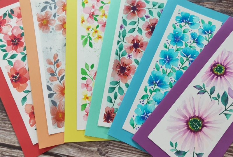
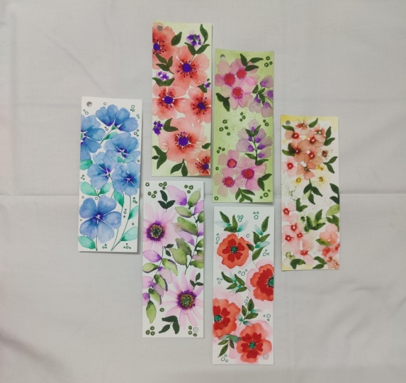
with your brush pens. The project involves six absolutely amazing,
unique bookmarks. If you're someone like
me who enjoys florals and have wished to
create stunning artwork, whether they are bookmarks, are creating cards or just
individual pieces of art. Then this is the class for you. I'm so excited to get started. Let's dive right in
to the materials, followed by some very
fun practice exercises and then tackling R6
stunning projects.
2. Materials Needed: Now let's dive into the
materials for this class. We have quite a small
list of materials, starting with our
Catherine markers. Now, there are
different varieties of brush pen markers that are
available in the market. I personally prefer
the Karen markers. I loved the quality. I liked that they have a
watercolor effect to it. And the pens don't
dry out very quickly, which is so great. You can get the whole box or you can get
individual colors, or a small set of colors
are also available. In this class, I'll be
using certain fixed colors, but feel free to use colors
that you have with you. So for example, I'd be
using an olive black green. Basically it's an
olive green color, but you can use a different
green that you already own. So have fun with that and love yourself to explore
different sheets. You don't have to
follow the exact ones that I have provided. Now the next thing is, Let's talk about people. So we're gonna be using
a watercolor paper, which is very important
because that's when the water can
actually absorb. And you would be able to create this beautiful
watercolor effect. I always use a 300 GSM paper
that is a 100% cotton. By a lot of tests and trial, I realized that
this combination of 300 GSM paper that is a 100% cotton has worked
really well for me, especially when it comes
to light floral paintings. Now for the brands I
generally use ProctorU, it is easily available in
the South Asian continent, but you can also use
Fabriano as an alternative. Both the papers are
easily available and really friendly to use. Now for this, you will
need separate cheese for practice exercises
that depends on you. However, for the bookmarks
will need six pieces, are six cutup sheets of 14.5 centimeter into
six centimeter, which is 14.5 centimeter length
and six centimeter width. So you can go bigger, smaller, that's up to you. But if you want to follow
exactly what I've done, the measurements that I have
taken for my bookmarks. Now, we go into the brushes. We just gonna be
using one brush. It's fairly easily available. It's a round brush, size six. Now, this size might
vary based on brands. So some brands a
size six might look a little bit more bigger words and some brands that
might look smaller. So what we're trying
to do is just get like a medium-size brush, so it's not too big. It's not too small. Because accordingly, we can paint our flowers in that size. In terms of brand, I am using just a very
regular student grade. Student grade. It was just available
in the local market. They're just very
quick use brushes, so I use them and then I
can use them probably for a month and then I'll
have to throw them because they don't
really last long. But I really like
the shape of it, which is why I decided to get it and I was super
happy with it. So this is Phoenix. It is a student grade brands, so don't expect too much. If you're looking for a
little bit more professional, I would say black velvet. Size six or even size
four is beautiful. I love my brush that
I've got from there. As well as you can try the Winsor and Newton Cotman series. Now with brushes, I have tried a lot of different
brands and I've noticed that they don't
sometimes tend to last. And I get very heartbroken when I have to throw
away with brush. So I have now dedicated to
using student grade brushes. Has far as the quality remains. I think the main
thing to remember with your brush is that you have a perfect shaped brush
that is useful to you. And that is what I'm going
to focus on in this section, which is the shape of the brush. So in this brush, if you notice the
tip is very thin. So it starts from a small dip, then it becomes wider. And that is this shape
that we're looking for. If you're going to buy
a brush that does not have this kind of thin tip. It'll be very hard for you to do your florals, your stems. Lot of different elements would be much more harder
for you to tackle. So pay attention to
that tip of the brush. It's very, very important
and you'd be surprised how many brands don't have that or many
brands do have that. So when it comes
to brush purchase, I always suggest
going to the store. You can personally look at the brush rather than
buying it online. I'm Julie makes a
huge difference. If you can see the
brush, feel the brush, feel the softness
and see how thin the tip is and then
accordingly purchase. So this is just a round brush. And yep, that's what we'll
need for this class. Now that we've covered our brush pens are
Brush and people. The next thing we
need is masking tape. This is to make sure that the borders of our
bookmark is taped down so we get a very
crisp looking edge. I generally use just
a white masking tape. You can also look
at washi tapes. What I suggest is to
test, try it first. So try a little piece, see that, see if it's
ripping your paper, see if it is holding steady
or if it's coming out, test it before trying it
on your main projects. So that way you haven't
created a beautiful, stunning project and then had it ruined just
because of the tape. So we try to avoid that. So just trust dried. I have personally been using
just simple white tape, easily available everywhere and it's worked perfectly
well for me. The final thing that we would
need is a cup of water. I generally like to
keep two cups with me so I don't have to
keep getting up. So one cup is also
create and we'll be using that
during our process. Finally, specifically
for our bookmark, you will need some ribbon
for the edge of it. Again, you don't
have to actually use, I would say ribbon. You can use maybe beads or
if you want to use anything or you don't want to use
anything and just keep your bookmark as it
is. That's fine. Just wanted to add that
in the material list. Now that we have our
materials and hand, let's dive right into
our practice exercises.
3. Brush pens and Practice Drills: I am so ready to get
started with this class. The first thing we are going
to start practicing are some exercises to really
understand how brush pens work. Now, one of the things
that we do need to keep in mind is that
there are varying colors. Some of the colors
tend to be much more lighter than the others. Here you can see an
example of a dark purple. And then you can
see a light purple. Now when I take my
clean brush and I swipe Through my darker purple, you can see the color
shade that comes through. It's a beautiful blend. Now, let's try the same
thing with a light purple. You can notice a couple
of things going wrong where the light purple has
dried up fairly quickly, as well as left line
because of that. Additionally, the blend isn't, as I would say, isn't as nice as
the previous one. So this is why for our projects, we're going to be using
the darker colors for most of what we'll be doing. Because those are the ones
that are going to really showcase and really
highlight our bookmark. Now the next thing
to understand about brush pens is transparency. So here I'm going to take a
brush that is quite damp, and I am going to add the
brush pen pigment to it. You can see how I'm getting a very light soft
color of purple. Now this is a very
translucent layer. However, I can go in with more and you can see how I'm really trying to get the
pigment all through my brush. Last time I just
likely pressed it. Now I'm just making
sure I go all around and notice
the difference. Immediately there is
much more pigment and so the color is
much more brighter. This is gonna be very
useful for us to bring in those watercolor effects that
all of us absolutely love. Practice this a
couple of times with different colors
that you have to understand and become very
comfortable with the usage. The next thing to pay attention
to is the drying time. This is a little bit tricky and so it depends
on where you're based and the humidity of
where you are located. So here you can see I've
taken my brush pen and I'm just adding four dashes. Now wait for a
couple of seconds, and then we're gonna
take our brush. Notice when I'm taking my brush, I really wanted to show you
guys how a damp brush is, where I've made sure that I've tapped out excess of water. My brush is not
stemming with water. It's not completely full. It's just damp with it. Using that damp brush, I'm going to paint each
of those rectangles. You will notice that some
of them have already dried. So you can see the line of
that brush pen, sketch. Some of them because there
was less a drying time, it blend a lot more better. So this is where you have to understand when we're
doing our florals, how much drying time is
required for your location? So if your paintings
dry fairly quickly, then you would need to work
faster when you're painting your florals or tried to do
just one or two at a time. However, if it's not too
humid and it's pretty normal, like I think where I'm
located is pretty decent. I don't really have that
many issues in terms of paintings drying
up very quickly. I can really go around
and play with it. But this is a process it
takes time to understand, so just test it out and
have a quick look at the drying time in your
location, at your location. Now we move into blending. For blending, I've
taken into colors. I've got a pauper
and then an orange. And now with my damp brush, I am going and
blending my piece. Whenever I blend, it always
start from out side. So I always start with
my clear damp brush outside and then move
towards the colors. You can then dry out your brush
and then just gently move around the colors so
you get a little bit more of an even blend. This is so pretty, It's so simple and it's
worked really well. This is because I also have
understood the drying time. Now, in case I had let
this day for much longer, I would have just ended
up with lines and not a very simple blend. So just make sure this is why the drying time
also becomes really important so that you have surely nice
colors coming through. Here is a great example where
I use the rectangle from much before and you can see how that line is still there
because it completely dried. Even though the orange blended, it doesn't give you
a beautiful blend has seen in the
previous example. Now we move into
some simple leaves. For simple leaves, Notice
how I do a stem and then basically paint out or draw
out a rectangle shape. Now using a clean, damp brush, I pull the color
to form the leaf. This leads to a dual
color for the leaf, where you have a darker
color at the bottom. And as it moves
away from the stem, it is much more translucent, which I think looks absolutely stunning and gives you that
beautiful watercolor effect. At this point, you
can add in some blue or a contrasting color
while your leaf is too wet. If it is dry, you won't have
these blends coming through. But if it's wet, you can
see how this happens. It's so pretty. It looks really nice and you've got this beautiful blended leaf. Now let's try another leaf. This time I'm using
a different color. Also want you to pay attention
to how I do the stems. So they just start
straight lines. I've called them around as well. Then using a round brush, I'm going to just pull the color that I can
paint out the leap. Now while it's still wet, where I can still see the
glistening of the water. I'm going to add the blue
so that it blends through. Now in keys, as you can
see, it's not dried. Sorry, it's already dried up. You will just have
a line instead of a bleed of color
that comes through. So it's interesting
you can mix and match, but I think it's so important. That's why the drying time has such an important role to play
when it comes to florals. Now that we've
covered the basics, let's also go into some florals and understand how to
easily paint florals. This is a very important
practice drill. So keep added practice multiple times before
moving on to the project. Now there are a couple
of ways of going about the center of a flower. I love doing dots. As you can see, what
I like to do is make sure just the
tip of the brush. Pen is touching the paper so you get these beautiful dots. And I like giving that as
the center for the flower. You can also do a
so-called as it is, and I'll show you the
difference between the two. So then you can decide
which you prefer. Now, once that's done, taking a damp brush, make sure that it's
damp and it's not too wet nor is it to dry. So it needs to have water and it should be damp enough
to pick up the color. Before we start, what
I like to do is just plan out how my petals
are going to actually be. In this case, I'm going
to be focusing more on five petaled
flowers and so forth, that the placement of the
petal is very important. We don't want to
have four petals taking up a lot of space
and not enough for a fifth or two small petals and three bigger ones, just
very disproportionate. So the easiest way to handle
it is to draw out a white. Once you have that Y shape done, the middle areas can be allocated for the
fourth, fifth petal. It's that simple. Now, as you keep practicing, it's gonna be a lot more easier. You don't have to
do a pencil mark. But in the initial stages, I would highly
recommend following the pencil mark and then
using that as your guideline. Now that we know that
that's where a petal is going to go with
a round brush. Let's pick up the
color from the center and then paint out
a beautiful petal, just a very simple, rounded petals, as you can see. Now, let's do the other side, always starting from the
center and then moving outwards in a curved
shape to form the petal. Now the petal at
the bottom, again, starting from the
center and then pulling the paint outwards. You can also see for the edge of the petal instructions
making itself club, you can go for a bump. As I have just done. This is such a simple flower that we have baked
and it's so easy, but it looks so pretty. Now let's try another one. But in this one, we are going to be doing
those circle as I mentioned, as it is, without
the dotted effect. Now following the same pencil
planning of a Y shape. And then the middle to allocate
the fourth, fifth petal. We can take a damp brush
and follow the same steps. Again, pulling in from the
center all the way outward. Another cool trick while you're doing this is to add
some thin lines, sometimes starting
from the center or at least along the
sides of the flower. Always looks very interesting. You can see it all
come together. Now notice the
difference between this one and the previous. So it's subtle, but somehow
I prefer the previous one. If you like the second
one, that's fine. They both are the
same flower idea, but it's just the execution of the center has changed
the look for board. Now another type of
flower that I'd like you guys to practice multiple times is a little bit more of a
long, elongated flower. Kind of like daisies would be
a good reference for this. So start with the center and
then move the brush outward. For a very thin petal. We can do multiple of these petals because
there's no limit, which is trying to make sure
that they are thin and long. I also like to keep
an equally distant, not an equidistant, but some
space between each petal. The reason for this
is if I was putting all of them together, Onward, Matt meshed together,
match together and just blend since the water would
just blend through all of it. So it's very important
because we're using the watercolor effect to
make sure that the space. Now, if you additionally
want two of the petals to be closed after the
first layer dries, you can go ahead and
add a second layer. That's the best way
of going about it. So it's very important you would have noticed in
my previous flower as well that I've kept spaces
between each of the petals. In this example as a practice, all I'm doing is using those central areas just
for outline of petals. So that way it's not disrupting
form our existing petals. So there's not a lot of
water swishing around. It's just simply an
outline which also adds to the illustrative
effect of the flower. Finally, a fourth type of
flower I would suggest that you practice a couple of
times is a dual column. So in this, I'm just showing you a simple exercise of using lipstick red for the center. And then we're going to add the lilac for a couple of areas, are a couple of dots, and then add the petals. What's going to happen because
of this two will color. Our petals are also going
to be D will color. The trick here is to pick
colors that work well together. If you're gonna be
taking, let's say, orange and a blue, the color that might come
out might be like a brown. So if you're okay with
that, that's great. But if you're not happy with it, then that's probably not the color choice that
would work for you. So something like a red, orange works really well. Purple and red, purple and
blue works amazingly well. You can have blue and green. So any of those
combinations that are complimentary
will work well. Anything that is
very opposing each other is not going
to look that great. Now following exactly
what we've done before with the five
petals strategy, I'm gonna go ahead and
paint out my petals. As you can see, when I'm pulling out the
paint from the center, I tried to also make sure that
sometimes I'm pulling from the orange specific section or the purple specific section just to have that mix of color coming through in
the petal or flower. Specifically. These are very simple and
fun practice exercises. I would suggest that you
work on a multiple time. And then we can dive
right into the projects. Are you guys excited? Because I can't wait
to get started.
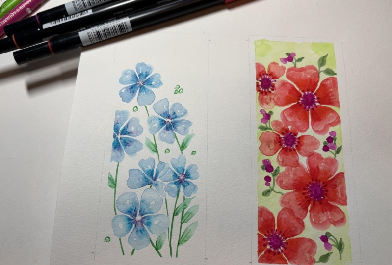
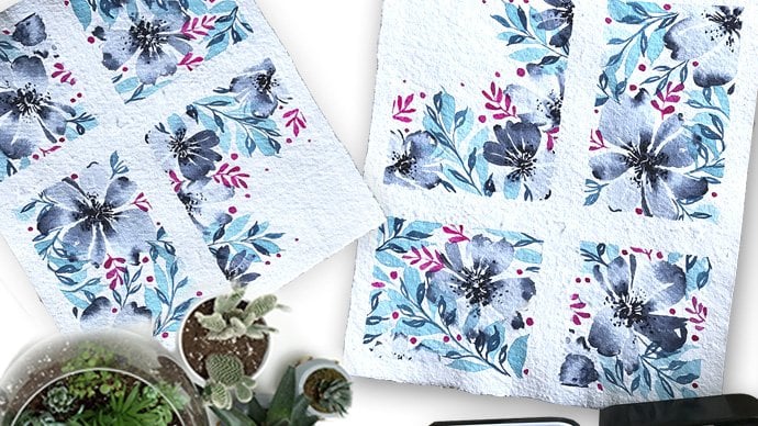
4. Project 1 - Floral Blooms: Are you ready for the first
project in this class? For this project, we're
gonna be using three colors. You can use similar
colors as well. If you don't have the same, we're going in for a sky
blue or violet blue, which is basically a
violet color and then a lush green of viridian
as well would work. But basically this
bright green that ties up these two colors together. Using these three colors, we're going to create
something beautiful. Now, take your bookmark paper. Let's keep it flat. And what I like to
do in this tot is to tape down the
edges of the paper. This way, we are
guaranteed a beautiful, crisp edge all
around our bookmark. Makes the bookmark
look a lot more professional and just
looks so pretty. So I always like to
tape down the edge. As mentioned in the materials, you can use different
types that are available. Always test out your tape to ensure that it's the
perfect one for you. Now, I am taping it down by
about half a centimeter. All true on all four sides. Now let us imagine that there
is a circle in the middle. And what we're gonna do, as you can see, with the blue, we're going
to paint lines around it. Now I've grouped these
lines into five sets. So that way we have five
petals for our florals. Using the YA lit, add small lines in the center of these and you can see how it's already
blending through. This is just the first step. Now using a damp brush, like we went over in
our practice exercises. Let's paint out our petal. Now. For the petal, I'm
just going in with a very simple curve shape. You can also try a little
bit more of a bumpy edge. So more of a m instead of a
curve like I just did right? Now, that looks really
pretty as well. While we're painting,
what generally tends to happen is you're picking
up color from the middle. So that ends up being a mixed of the purple
and blue that comes through and gives you this very vibrant and
stunning double color flower. Always make sure that your brush is damp through this process. And if you're having a
little bit of doubt or uncertainty or not sure how
it's going to turn out. Go through the practice
exercises again to just get a little bit more comfortable
with this process. Now right above, I'm going
to try another flower. The similar technique of the
blue and then the violet, and then using a damp brush
painting out the petals. Now, as we discussed in
the practice exercises, it is important that
you do this tip quickly before your
brush pens dry up. So just make sure you quickly go into painting out your petals. This is also why I like
to do one at a time. In some cases, just so I can take just so I can make sure
that I get these colors. If you are in a hotter climate, what you might have
to do is maybe two petals at a time rather
than the entire flower. Continuing on. Now I'm going to
do a half flower. So instead of doing
the five petals, I'm just going to do four. You can see how I'm
linking it with the violet to a
common central point, which will then be the
base of the flower. Now following the
same steps that we did with our damp brush, I'm going to paint
out the petals. For this process. What I like to ensure is that
the petal right on top is bigger and actually a full-size better compared to
the two on the sides. The side ones generally B, are going to be smaller
because of the angle of the flower right on top. Let's do another one. Same exact process
of adding the blue, just three or four petals
and then adding wireless. Then using a damp brush
to build out our petals. Always make sure that the
petals right on top are bigger. They're full size
compared to the ones that are on the side that
are going to be smaller. This also is following a semicircle shape if
you haven't noticed. And we're trying
to stick to that. Keep adding flowers
based on your sheet. I'm going to add a final
1.51 right on top. This one is going
to be much smaller as well compared to
what we've done before. Which is why I've chosen
to do only three petals. And this is why it is
also right on top. So it's important to keep in mind the placement of flowers. So you have the big flowers, you have some that are half. And generally you place them in that manner of big to small. Also with the flowers, you would have
noticed how some of, most of them are in-between. They touched the
edge of the sheet. This is going to give us a very interesting
effect once we finish our bookmarks
and remove water tape. So try to have these flowers coming from the edge
towards the sheet. Always looks so
pretty in the final. Okay, now that we
have done this, now that we've done the
flowers using our green, Let's add the stems so you can see how I do it for the style
or the half flowers, generally linking them at a central point and
then adding the stem. For the rest. I'm just adding in
the stem all the way to the bottom
of our bookmark. Take your time with the process. We want to make sure that
the stems of very thin. So just pay attention
to that D2. This way. In our final painting, the stems look really nice and the whole painting comes
together. Very well. For the leaves, um, has practiced in our
practice exercises. Let's do the same, reshape. So multiple lines
that are forming a V-shape and then
linking up to the stem. Now, this process, you can do it fast or slow based
on where you're based. In case you are in a hot climate where you're painting
seems to dry quicker. I would suggest doing one or two leaves
at a time maximum. However, if you have
multiple of them, you can kind of go
through with that. If the weather is a
little bit more cooler and you're painting
doesn't seem to dry faster because you will notice your design or your leaf
doesn't spread as much. And we went through
this in the beginning. So just keep that in mind. Now using a damp brush, I'm pulling the color from the bottom of the leaf all
the way up to form the shape. And then you can
see how this very easily and beautifully
blends through to give us a blended leaf that moves from this deep
green, too transparent. During this process,
what I like to do is add multiple leaves. So we're trying to
fill up the spaces. So I do multiple at a time. Just to make sure that our
entire bookmark looks full. There's not too many
white empty spaces. So you can keep
adding and leaves. Keep in mind that your flowers still need to be the focus. But the areas that have
a lot of whitespace, you can go ahead and add leaves. Now that we've done
this using green, I'm going to add some
circular abstract as detailed that are just again, going to make this bookmark a lot more
playful and a lot more fun. I love adding dots, scribbles, small markings because they
really uplift the painting. Now, look at your painting
again and just check.
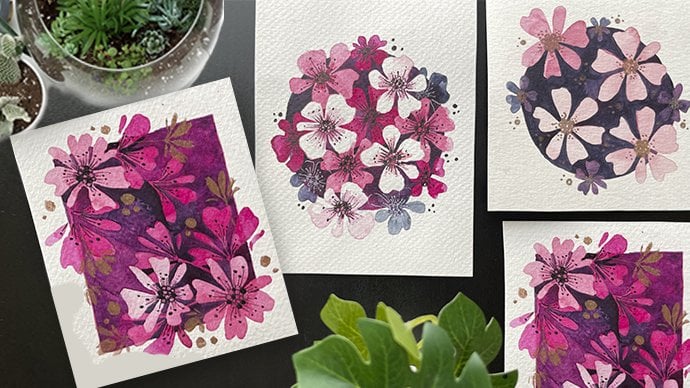
5. Project 2 - Florals and Berries: So in this project we are going to be using four
different colors. We're gonna be using lilac, which is basically
like a magenta color. Then we have lipstick red, so it's a bright red and orange. The orange and red
are gonna be used for the flowers and specific. So we wanna get two
different shades. You can try to pick
even orange and yellow. That works really well. But if you know about
the color wheel, we're picking colors
right next to each other. Finally, we have
an olive green for the leaves as well as the BCE. Now, we are going to be
using this olive color to highlight and bring
through our bookmark. As always, what I like to do is taped down the
edges of the bookmark. You can see I've left about half a centimeter edge all around on all four sides. Now you can take your pens, keep them in hand. So it's easy once we
start with our painting. Now starting with
our olive color. What I'd like you to do is
take your brush and make sure it is a damp brush so
it has little bit of water, It's not too extensive. And you can gently
swipe it around the brush to pick up a little bit of that
olive green color. Now, let's paint the
edges with that color. Here in the middle. I'm just using clear water to gently blend through that olive. So as you see, I start with the olive color. Then I wash out my brush, then use clean
water to blend it. You might need to take a
little bit more of the olive because not too much color might come in the first time around. So you might have to just wipe your swipe your
brush multiple times on that tip to get more
of that olive color. We don't need too much. We just want a gentle color. So once we remove the
edges of the tape, we're left with a
very interesting BCE. Now, I always try to wash
out my brush and then use clear water to blend any sharp
edges that are showing up. Now, I love the painting, the base to dry out completely. And now we can start
with our lilac. And let's start with the
center of our flowers. Here we're doing
something different where we've drawn out the
circle structure. Now you can see how I've tried
to make the edges a little bit more jagged by
adding some spots. Were planning the flowers
out in a very random manner. But what I'm doing is trying to make sure that I
have enough of space between them so that
the petals don't overlap on along each
of those flowers. I'm keeping enough of a gap. I would say a distance
of 1.5 inch should work really well for
our bookmark today. Now the reason I'm doing
this is because I want it to dry completely before we
move on to the next step, which is also why I'm
doing multiple of them. So by the time I finished
the last circle, the first one has already dried. And that way I can
go into painting out our petals very quickly. So this is why I'm just
trying to do all of them. All the centers, all at once. I've planted out in
such a way that I can then go on to the next step, which is using orange. Now you will see me use orange in a very
haphazard manner. So I've done it in four
different sections. Now using red, I'm
going to connect it. So what is happening? Like the previous bookmark where we did different
sections of the blue, phi, different
sections of the blue. I'm doing the same concept here. But instead of just
using one color, I've used two colors. So you still have Fei sections. Of five, we shapes. But they're a mix of colors. Which is why when you
go into painting, the better with a damp brush, you get a mix of colors. So there's a little
bit of orange that's going on and there's
a little bit of red. This is why it looks
very, very interesting. Unlike the blue where we picked
up color from the center. Here the center has
remained steady and we're just using dual colors
for the petals. Only. Notice how the petal on that edge is very small
because there was not too much of a V-shape that was created and that's fine enough. So as far as you get enough
of the petals are obvious, you're good with even
the size of the petals. Sometimes that mix of different sizes looks
interesting as well. Once we've done this, let's go ahead and
tackle the rest of the flowers in our bookmark. Always make sure your brushes damp and not completely wet. That way you pull color but
not too much to leave blobs. So just pulling the color from the center all the
way to the edge. You will see me pulling
color from the center. A way to form our petal shapes. Continue following the
same steps that we've been doing for the rest
of the flowers. Now, you can also vary
the size of the petals. Instead of doing
them the same size, you can alternate between sizes. But here I just wanted
to keep it fixed and follow the same shape and same size and just maintain
that stability throughout. You can see as I keep
building the flowers, it just looks so pretty and
our bookmark looks vibrant. You will notice me
doing these thin lines. Sometimes. They are just basically like small thin lines that help to create a little bit more of a relaxed effect
for our paintings. So they just small details that can make the painting look
a little bit interesting. And you will see me
just doing them along the edges of the
petal in a way to, I would say to shape the petal. Attempt this see how it goes. And just keep practicing for those small little details that bring together
the painting. Now, let's add in some berries. What I like to do
for berries is add in some lilac circles. And I vary the
shape of it because that's what makes it
look very interesting. I'm using the places
that are quite empty and have a
lot of whitespaces. Now that I've got that, I'm going to wash out my brush. Make sure it is a clean brush. And just with water, add an additional circuits. What I'd like to do
is when I'm adding these additional
circles to gently, make sure that they touch the existing
so-called of lilac. This way the color
bleeds through. And you have this bunch of
berries in our painting that looks very interesting and stunning and pretty and unique. Also keep in mind that
you're going to vary those shapes of those circles, the sizes of the circles, so that you have a
mix-and-match and they're not all the same sites. Like to cluster them. That way you have a
mix of them going around in that specific section. Now that we have done that, we can allow our
painting to dry. And meanwhile, we
can use our olive green to add in the leaves. Now using olive,
let's add the leaves. Instead of just
blending it with water, I decided to go through with the actual full drawn out leaf so that you get the full
color coming through. So we have this
beautiful green color, it's not too bright, so I think it won't take
away from our painting. You can also add some green berries to
our existing berries. So that way it looks like
some of them haven't ripened. Add in some small
leaves as well. When you're using the
brush pens as they are, they are a lot more
easier to control. And so this process gets
a lot more simplified. Plus it looks so pretty. So. Go ahead and add more
leaves in between. Our pieces are elements
to bring it all together. Once you've done the
basic step back and see if there's any section
that looks quite empty. Here. I notice that bottom part
looked really empty. So I'm going ahead and adding
a stem of these leaves. You can see how I've also
made sure that some of the leaves are going
towards the taped edge, passive, they have
gone underneath deep. And that we are popping
in through our bookmark. If you remember or if you have already done our
previous projects, you would have noticed that
because of these mid of these cutaway elements are
elements that have been half within the tape area. When you remove your tape, they look absolutely stunning and it looks very,
very interesting. And it just really brings
together the bookmark. So we're following
the same thing, making sure we have some of the leaves just peeking through. Now. All we have completely
dried about painting. And now we can go in and
just add those Poland to the flowers using our lilac. I'm just going to add dots. And then use our
brush tip to add connecting lines from the dots to the center of the flower. You can see how I'm
doing this again. Little bit more clearly. She's doing these
random dots with a pen and then using the tip of the brush to just add thin
lines connecting them. Once you're happy with
the overall painting, I love it to dry. Just make sure that
thing is completely dry. The paper is dry. And then can do more to
tape on all four sides. Without completed bookmark. Go ahead and add the ribbon
on top to finish it all up. And this is our
completed project. You're ready to
tackle another one. I'm super excited because
this is a really fun one.
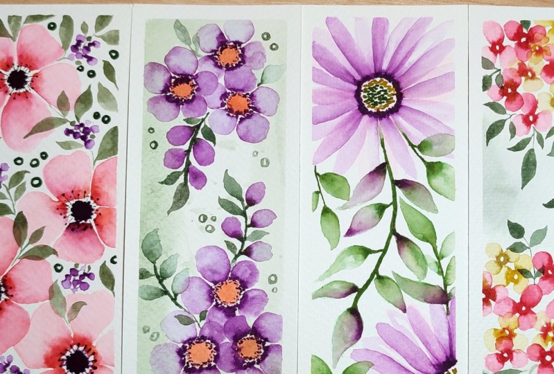
6. Project 3 - Easy Motifs: So let's move on to
another stunning bookmark. For this one, we're using
three different colors. We're going to be using
a soft peach color, the lilac, and olive green. Now you can use variations or shades of these colors
for the projects. I have selected these because I think they work
really well together. As you can see. Now, like the previous
two projects, make sure to tape
down your people. I kept about a 1.5 centimeter
border around the bookmark. Now for this one, we are going to do a slightly
different technique. We're gonna use a
damp brush and then use it to build color
for our bookmark. I'm taking this olive green
and using it just around the edges to get a very
light wash of color. Now, you can also
use your brush pen and paint a little bit or draw a little bit and
then spread it around. Personally, I like the
idea of just using my paintbrush directly
to develop the color. One thing to keep in mind in this process is to
make sure that you get this green color along the
edges of the bookmark page. So what would happen is, as you saw in the
previous project, the minute to remove your tape, you're left with this really very interesting green backdrop, which looks stunning. So just make sure
you just run through your brush along the edges. Off the tape down bookmark. Now, here's where we're
going to add some splatters and textures to this
base that we've painted. What I'll be doing is first just completing the entire beats. Once. I'm happy with that piece using the same damp
brush and green, I'm just going to tap
my brush on the Ben. So notice how I'm doing this. I've just taken the tip
of the nib of the pen. I'm tapping my damp
brush over it. Immediately you will get splatters that come
through your painting. Now you can go as dark
or as light as you want based on the amount
of water that you take in. Also, you can pick
a darker color. So in this case I
stuck to olive green. If you'd like, you can pick up black and then do this
plateau techniques. So it again builds up color, which is truly, really fun. I think it looks so pretty. And overall gives you this
very interesting look. Now, let the entire thing dry completely before moving
on to adding our florals. Now start with the
soft peach and draw out a circle for the
center of our flower. Now, I'm going to do couple
of more of these circles, just three because I
want to cluster them. I've kept about an
inch gap between the circles so that
I can add the petals and there's not too much
of clash that happens. Once you've done this. Let's take our lilac and add some small dots
along and around. These circles,
these are basically the Poland and they are going to contribute to the final luck. Trials rarely fill these spots with a lot of the
pain of the pigment. So make sure it's still wet. It's not just a dry
dot so that we can pull the color when we
go into our patterns. So you will notice as I
go from circle to circle, the lilac doesn't blend that much when I touch it
on the soft peach. This is because the soft
peach has dried up. And so it's not really bringing in those blends, which is fine. That's why we had a lot
of variation going on. Where you have the first circle that had a little
bit of blending, the second one, not that much. And then the final,
hardly anything. It all contributes
to an uneven look, which is what we're going
for because naturally in nature flowers
aren't perfect. Now that we've done this
quickly before it dries, so you need to make sure that
your lilac is still wet. You will be able to see it. Listen, and that's a
very good indication that it's still wet. Use a damp brush
and pull through the color in circular
shapes for the petals. So I'm basically just
pulling the color from the center all the way
around For the petal. If you aren't sure how to
do a five petaled flower. In the practice exercise, I talk about a simple
technique of drawing out a y letter and then adding
in the remaining petals. So you end up with
equi, distant battles. So if you have a little
bit of a struggle, just make sure you go to the
practice exercises and check that out can be a lot more
easier for you to follow. And here you can see, I've just made sure I've used those tips and created
by petal flowers. It is always so fun to look at cluster of flowers because it gives a very
interesting look. In the previous two projects, we followed a full lineup of flowers scattered
throughout the bookmark. But here in this bookmark, we are focusing on
creating motives. So you have one motif
here and then we're going to have another
one right on top. Now, having done that, let's add in a couple of more fun elements to
add to our motive. Here, I'm using a
budding stem detail. You will see what
I mean in a bit. So I've just added
these poeple reshapes. And then I'm pulling
through the paint with a damp brush and creating
these oval shapes. Next, using our olive marco. Let's paint out our stem. By connecting these oval shapes. You can also add in
some additional leaves. Adding more leaves to
complete the motive. Notice with the
previous element, I have bigger leaves
at the bottom. And as I moved upwards, I've gone into smaller leaves. This is really fun tip
that I can give you, which is when you're
painting leaves, alternate the size
of the leaves. As you move a V or
towards something. There's always gives a
very interesting looks, look and brings
together the painting. You will see me do this very
often where I have maybe small to big leaves or
big to small leaves. As I progress. One motive is almost done. What I'm gonna do is take a
little bit more of lilac, basically form the
brush pen and just dip it to those oval shapes
that we had painted. Just to build a little
bit more color. You can see how it beautifully expressed because
it's still wet. And you have this tunneling
effect that is created. Now on the empty side, Let's dive into another motive. I'm going to follow
the same idea of having three main flowers. And then you have
additional elements to tie them all together. I'm following the same steps of using peach and then using the lilac to add those
dots around the pH. Now, if you notice, the reason I wanted to
show you this angle is you can see the
way I hold my pen. This is how I can ensure that I have just dots that
touch the paper. Now, if I was holding
my pen, brush pen, as a normal writing tool, what would happen is I would
get more elongated dots. So this way by holding it just perpendicular to the sheet, I end up with dots instead of
elongated oval shapes or anything like that. And it also makes the
effect a lot more easier. It's quicker to handle. And you can cover up
the distance, Fausto. Now that this is done
while it's still wet, Let's use our round brush
and paint out our petals. Now, let's add our oval element, or basically the line of flop. But for this, I wanted
to choose an angle that would suit our
existing bookmark element. So while the bottom
one has come upwards, or basically let's say
the right side has come up going to the left. We can make our left side
motive move to the right. And so together. It gives a very
interesting look. Now, in case I hit decided
the left motive to have this budding line
go towards the left. It's not going to
look as interesting. You can try it out for yourself. But this is where policeman's
makes a huge difference. And using these tools
are small tricks. You can make sure that you
bookmark always looks amazing. I am so happy to see that this
bookmark is come together. Adding couple of
oval elements are circular elements
just in some of the spaces that look a
little bit more empty. Filling it up and we're done. We have just to remove the tape, add in our ribbon to
complete our bookmark. While removing a tape, instead of pulling it out like this street where there's more likelihood of
your paper tearing. Try to remove it at a
45-degree angle like this. And you will see
that you end up with a much more cleaner edge. And this is our
completed bookmark.
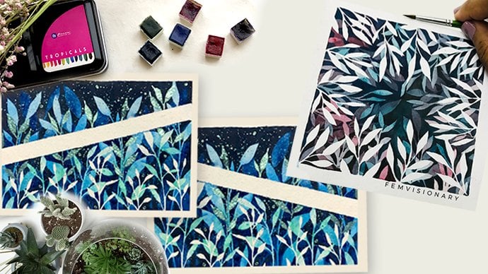
7. Project 4 - Leaf Addict: Now let's dive into
another fun bookmark. I absolutely love the
blended leaves and this one, I had to add it. It is one of my
signature elements that I add to a
lot of my classes. So I had to share it. I love it so much. In this class. We
are going to be, in this project specifically, we're gonna be
using four colors. There is the lilac, read lilac, which is a little
bit more of a pink shade. And then we have curry, which is more a yellow, and then olive black. If you don't have these
colors, do not worry, you can always use
colors that are similar. And that's okay. You will still get
your final look. Now, as always, I have
taped down my people. I'm taking out my
olive green and I am adding some dots for
the center of our flowers. We're going to have
just two flowers because I really want them to be the focus of the bookmark. You have one flower
that is in the middle, more towards the left. And you can see this enough
of space for the full flower. The next one is more
to the right, upwards. So basically a little
bit of the petals are going to go outside
of the bookmark, which is going to give
it a beautiful effect. Now, once we have
done that using our curry or basically
the light yellow color, Let's add more dots around
the previous layer. Now, we're gonna be
using our red lilac. As you can see, it's got a
pink tinge to the color. And all I'm doing is adding these small dashes all
around the circle. Now before it dries immediately, I'm going to take my round brush and I am going to
add in the petals. So go ahead and follow
the same exact method. What I'm doing is
pulling the paint from the center all the way outside. Now this is a very likely
or as you can see, because the pink
is a light color. As we discussed in the
practice exercises, some colors tend to be
much more lighter and will not give you too
much of bleeding. So some colors are much more
brighter, like the lilac, which will enhance and that have a lot of pigment that
you can pull through. So this is just a very light translucent layer that is just going to create a
very interesting base for our next step. I loved this to dry. Meanwhile, let's tackle
the other flower following the exact same steps. Now it is very important
to let this pot dry because we don't want a
mix of colors coming through. So allow it to completely dry. And then let's move on to
another layer of petals. This is why I also kept a
little bit of spacing in my first layer between
each of the petals. They were translucent,
so that was fine. And that's exactly the
look that we're going for. Here. I've taken in my
lilac and I'm gonna be adding petals in
the middle portion. Of our existing petals. Now you can see how
I'm doing this. Just follow along. What I would suggest
is to actually wait, watch me paint a full flower and then go ahead and
try it on your own. Because otherwise it
might get a little bit confusing and you might miss out some important
information that can help you when you start
with your own flower. Now as you can see, what I'm focusing on is just getting the outline
of those petals. I'm not making them too perfect. They're almost just
like outlines. Some of them are
just simple lines. I'm just giving an overall look. This is giving it a more
translucent effect than if I went ahead and wanted
to just make it really, really accurate by really
painting out each petal. So to avoid that, to give it more of
a playful look, I've just added more of
outlines for those petals. And you can see how that comes along and really
completes the flower. Now, let's start
painting our leaves. We've done something similar
in our practice exercises by using a V-shape for the leaves. Now based on where you are, as I repeated during
the practice exercises, you might have to just do two
or three leaves at a time. But if you are in a much
more I would say cooler, but I would say more of less humid place where you're painting doesn't
dry very quickly. You can try to do a
whole stem all together. Now using my damp brush, I'm painting out the leaves. And you can see how it's called this beautiful
translucent effect, which is blending outward. Now, just follow along the stem. Now another thing that
I should add is that if you notice I have gaps between my stem because
I'm going to add some more leaves of
different colors. So just keep that in mind. We don't want to
have a whole stem, just too many leaves and then we don't have enough to add on. Once we've done this, while our leaves are still wet, let's add a little bit of
lilac along the edges. Now, I am adding it specifically in areas
that are still wet. How do I know it's still wet? I can see the glistening
off the water on that area. If there's no
glistening of water, I automatically know
that that is dried. And when I add my paint, it is not going to blend in
such keys like I'm doing. You can take your
damp brush and just go over that area that you are making it a little
bit more water out, which means that it's going to again blend a little bit better. So the damp brush really helps
activate that paint again. Now, let's leave that to dry before moving on to
adding some lilac leaves. Here is where we're
getting very creative and very unique with our leaf set. This is going to
make the bookmark look absolutely unique. Using a damp brush. Just paint out the ease. Now since the previous
layer has dried, you can actually overlap
the leaves as well. Like you can see me do. If you feel like
there are areas where there needs to be more leaves, just go ahead and paint them. Previous to what we did with the green and then adding the lilac. He'll be going the
other way round where we have the
lower leg and adding little bit of green
along the edges. To balance out the big size
leaves that we've got. Let's add some smaller
leaves and I'm just going to beat them or draw them out directly
with the brush band. Just you get that full
effect of the color. Now that we have completed it. I love the painting to
completely dry and then you can promote your tape
from all four sides. Now, this same detailed artwork, you can kind of play
around with it. You don't have to use the
exact same colors may be changed around the
placements of the leaves. Maybe change around the
size of the petals. So here we had quite
long sized petals. You can do the same thing with smaller or shorter
length petals. There's so much that
you can do with just these techniques and
tools and make it your own. And that I think is the really
fun part of this class. Don't forget to add the ribbon for the top of the bookmark for our completed stunning,
vibrant ballpark. Now we have two more projects. Let's dive right in. So much of exciting
information coming right up.
8. Project 5 - Floral Clusters: We now move on to
another fun bookmark. In this bookmark we're gonna
be using three main colors. There is the lipstick,
read, the curry, which is more like a yellow, and then the olive Lack. Just with these three colors, we're going to create
this stunning bookmark. The first thing I'd
like you to do is to tape down your sheet, make sure that you leave just half centimeter
edge for the work. Now, using the lipstick red, Let's now start
painting our florals. What I'd like to do is
taught with a circle. And you can see it's
quite a small circle. And while this is still wet, I'm going to go ahead
and take my brush. Damp brush works really well. And instead of following with our five petaled flower with
just gonna do three petals. Which means we're just
following a Y shape, similar to what we had discussed in our
practice exercises. Now, once you're
happy with that, Let's go ahead and add a little
bit more of that red for it to blend our bleed
through even more. Now we're going to do
clusters of these. So it's the exact same
flower in that area. So let's add more circles of
red and then using a clean, damp brush, paint
out our petals. Now for these new flyers, instead of adding
shred for the center, Let's go ahead, ahead
and add our query. So you have a little bit of that yellow shape
that's coming through. This is then what
we're going to add for the remaining flowers. So the cluster ends up becoming a mix of different colors. And that always looks
very, very interesting. Here we're following the
same steps as before, using our damp round brush to paint out three petal flowers. To live in up the flowers
a little bit more, add red to the center
of some of them. You can see how that color
bleeds through immediately. Gently tapping the Ben
is more than enough. Now that we've got this cluster, Let's see if we need to add any more flowers to just
even the shape of it. Sometimes at this stage, I add in flowers that
are just two petals just to show that they are half-life hours and
there along the edges. So make sure you look at
your painting and just check if you need to add any of those
additional elements. Keep adding flowers until you're happy with the final result. You can see how I keep
intermingling the colors. I start with a yellow and
then add a little bit of red for the, for the center. I start with a dread and then add a little bit of
yellow for the center. This mix and match brings together this
cluster of flowers. So it doesn't look like there's just yellow flowers
and just read Florida. It looks like there's
a combination of both. That's a very fun trick to keep in mind when you're
trying to add multicolored flowers or
multiple different colors of flowers as a cluster. Try to have some of
them as mixes of both to bring it every day
to bring in the painting. Now that we've created this
stunning cluster of flowers, Let's add another
one slightly below. So that way we have two clusters
that are going to surely highlight the bookmark
and just make it look really pretty and
truly interesting. I wanted to mention, now that you've done
that first cluster, you're going to
find it a lot more easier as you move forward. Here you can see how quickly I've just added in the colors, mix and match, and then I've
just started painting them. It was much more fast to do that now that I've
done that first. So it's a similar
experience that I'm sure you guys
are going to phase, where the first one is a
little bit of a trial. The second one gets easier and it's actually
much more faster. And you know exactly what to do. So give yourself that
time to explore. Now when I look at the bookmark, I feel like there's
enough space for third set, Florida clusters. I think it's really going to
tie up the painting and just also make sure that there's
not too many empty spaces. So let's do another small set. So it's not gonna
be a whole circle, is just gonna be a little bit peeking through from the corner. Now that we have a base of
very light colored flowers, Let's add cream to really
brighten the entire piece. For the leaves, I'm
going to use a mix of completely
painted our flowers, as well as some
that are blended. Here you can see I've
started off with just simple leaves directly
using my brush marker. Also going to add some blended
or translucent leaves to, again, just highlight
the bookmark. A really fun trick she
can see I'm doing. If your base is very
light and it's still wet, go ahead and use
your olive along the tip for the color
to blend through. You can then, if you want, use a brush to just blend the color for
a more even shade. Another fun tip that I'd
like to add is if you have a cluster of flowers
that you're working with, add some leaves
in-between the clusters. Now go ahead and complete
the bookmark using the same leaf details
as we've already done. Using the quick trick that we went into from the previous
session of splatters. Let's add couple of splatters of green along the areas
that are more white, where there's not
much going on just to really complete the bookmark. Sometimes when there's
too many whitespaces, the painting looks empty, like it needs some war. However, I would put this
as a personal choice. If you like it the
way it is, go ahead. Leave it as it as it
is to move out to tip. But if you feel like
you would like a little bit more of
color along the edges, you can go ahead and add them. So as you can see of taking the curry or basically
the yellow color and just gently adding it to
the edge of the bookmark. I did want to mention in previous exercises
will be hit done, is added a base and then
added the elements. Here we did the elements first
and then add the yellow. The reason I wanted
to do that is if I have the yellow as
a base existing, whenever I painted the green, we would end up with a
different yellow green, which was a lighter shade. I wanted to avoid that. Hence, after I did the elements, I added in the yellow, just to make sure that the
bookmark looks stunning, the elements have come together and overall look is achieved.
9. Project 6 - Transparency: Are you ready for
our final project? This is super interesting. I can't wait to dive right in. We're going to be
using three colors. Very simple, or olive green color that we've been using
through most of the projects. Then we have lipstick red
and finally an orange. The lipstick red and orange are gonna be used for the
flowers to give a little bit more of a
shaded effect instead of just having a one tonal flower. So the first step
is to tape down your sheet and make
sure that you leave just half a centimeter along
all the edges to ensure that you have a really
nice stunning bottle. Once that is done, we can start with our painting. So let's open up
our orange and red. So we're going to keep
them open and then take our brush that is slightly damp. Now what has happened
is our brush is going to have both the colors. We can accordingly paint
our first set of petals. I'm actually following the
same thing there'll be had done in our
practice exercises. I just haven't drawn it out. Feel free to draw
it out the silica, the Y shape, and then plan
out the remaining patterns. What I wanted to go for
is a much more bigger sized petal because we're going to have multiple
layers of them. So try to keep it as big as possible so that we
have more space. Now as you can see, I keep doing the same thing
of dipping my brush into both the colors and then
painting out my petals. Again from the
practice exercise, we had gone over the water
usage or the water control. So here you can notice that
I've taken more water and hence the mix or the petals
are much more translucent. And we really want to go for a very translucent
layer, very light layer. So make sure that your brush
has an Alpha of water before you fill it up with
the orange and red. In terms of placements, we are going to be following the same thing that we had done in our first two projects. Basically having
these big flowers all throughout the bookmark. There you go. You can see how we've
got that layer down. Big flowers. It might
look a little bit messy at this point,
but that's okay. We are, I'm going to add and fix and just expand on
this even further. I would say if you feel
like adding more, go ahead. But I'm just going to gently add some thin lines to make your work look a little
bit more illustrative. To the petals look a
little bit more unplanned. And very interesting. I love adding these lines
that always makes it look. It just brings
together the flowers. I don't know how I don't
know what exactly it does, But I know it makes
it look very nice. Okay, So make sure that your
layer has completely dried. And then we can go into
a second set of petals. Now with the second
set of petals, notice how I'm making
them a lot more shorter. I'm also making
sure that I didn't add too much of
water to my brush. So that when I went into
filling it up with the pigment, you tend to get a
more darker tone. Exactly how I'd explained
in the practice exercise. This is the effect that
we're going for where the first layer of
is very translucent. A lot of water was there, whereas the second layer has less water and more of
the pigment concentrated. Additionally, you can
see how I'm making sure that I add thin
lines at the edge, at the bottom of the
petals so that they can link to the center
of the flower. Now you guys must be very
comfortable with this. So continue doing this
for all the flyers. So here you go. We've got our second layer and we're
going to allow this to dry. Remember, drying time is also part of the
painting process. So if you don't give something
enough of drying time, you're going to end up with
paintings that look very much mixed up. This way. We are making sure that all
the colors that have been used still maintain
their intensity. Now, once the painting is dry, Let's pick up our red and go ahead and add a final
layer of petals. As you can see, these
petals are going to be much more shorter in length. And instead of adding orange, because orange is a light color, I'm directly going in for the thread and adding
these smaller petals. Now let's add in our green for
the center of the flowers. I always like to add
my green dot as dots instead of just drawing
them, are painting them. I really like the look
of a dotted look. You've seen it in the
practice exercises. So it's up to you. I would allow I think
it's your choice. I personally love the dotted
effect that comes through. Now that we've done this, we are slowly going to move into just completing our
painting by adding some simple leaves and just dying out the
entire bookmark. It looks absolutely stunning. To maintain the intensity
of the painting. Just gonna go ahead and
draw out the leaves. Once you've done this, take a little bit of that
green with a clean damp brush, and add in some smaller
additional leaves. Just to bring out
a little bit of a transparency to
these elements. Now continue doing this
throughout the book block. Once you're done
with your leaves, I like to add an additional step because I feel like it's nice, but I feel like it'll
be good with some dots. So hence, I'm adding
some dots that are connected to our
existing leaf stems. Once you're happy with
the overall look, remote a tip, add in the ribbon for our
completed bookmark. This is the final project. Out of the six that
we walked through. I think this is the most simplest one compared
to the remaining. But also the most
interesting and bright.
10. Conclusion: Now that we're done with
our completed bookmarks, just ensure that you promote your tape and get
your ribbon out. To add that final touch. I just add an s simple loop. Just to complete
the entire look. I've chosen ribbons that
suit the paintings, so it works really well. What I would also suggest
is after you've done this class to try a different
color combinations, there's so much of possibility. Once you know the technique, you can try various combinations
and various styles and mix and match all the elements that we've covered
in the session. If you have any questions, please add them to
the Discussions tab. There's also a Reviews
tab for you to add any of your reviews or testimonials
for this class. There is also a Projects tab. So once you've done
your six bookmarks, you can add them to
the Projects tab so other people can be
inspired as well. If you're putting
it up on Instagram, please feel free to tag
me on femme visionary, as well as using the hashtag
femme visionary inspired. I also have 18 other classes up on Skillshare for
you to watch and learn. So many of my other techniques. I hope you enjoyed this
and have a really, really good, I can't wait to see your reviews and projects.
 Femvisionary, Watercolor Artist and Instructor