Transcripts
1. Introduction : Hi, everyone. I'm mother. I'm a watercolor artists and I've been painting with watercolors for over seven years now. I have been drawing for longer than that because I absolutely not Art have been teaching watercolors and Artkraft for a very long time. Love sharing out. I think it's amazing. It's an amazing medium to express how you feel. Express your day, your emotions, everything on did of today. I'm gonna be teaching you a little bit off advanced technique. Negative watercolors on this is with two or tree friend colors. I had done a previous class before, and you guys can check it out if you haven't already. It's a basic no no tone color scheme. Worst of this, we're gonna play around with the different colors. It does take a lot of patients. I'm going to tell you that right now, but the end result is amazing and it's absolutely stunning. And it's so what? Any I thought that you put in this technique is so Western. You can really play around with it. You can attitude landscapes you can actually poor tragic and attitude abstract painting, and it still creates such a amazing look. And so it's all about how you use it. You can use it in different forms, different styles. So I'm really looking forward to seeing your class projects. I hope you enjoy the class. Please let me know how you feedback your reviews, cause that helped me improve more and more. Thank you so much. Let's get started.
2. Materials : So let's start with materials today. We're gonna be using brush. True watercolor people. I'm using a 300. She s in cold pressed paper. It is 25 person Kortan. The paper is nice and thick and holds a lot of water. I'm using a six inch by five inch paper. If you're a beginner, I would suggest taking a bigger paper and drawing a bigger circle at the centre. Amusing artistic I'll watercolor pains. These things are really pregnant. Um, which is drawing nice thesis from her task. Any set I'll be using The Tuscan sun or love and grease notices things. Three colors are very complimentary to each other. When each mixed with mixes with the other, they form a jury. Nice color. So try to make sure you don't take very random combinations. For example, a yellow, pink and DRI. What would happen is when the pink and green knicks you would end up with a very dirty looking color. I will also be adding an indigo from Benson Newton. They'd shown to increase the debt of the watercolor. Next, I'll be using um, Escada Ultimo. Wanna call a brush? This is a round brush a size six. It's really good, because told a lot of water, you can use any brush. Just make sure that you can do surely thin lines with the brush. We would need something that can be that can hold water for this artwork. Next, I'll be using a normal white razor, nothing fancy as well as a pencil. You will also need a glass of water as well as some paper towels or fabric plot to about any excess of water. You can also use a transparent white T. If you would like to take down your paper to the board or the table. I generally don't use it for this sort of a technique because I like to move around my people. But it's your choice. You can use it. Just make sure that it's not very sticky. Otherwise, you're watercolor neighbor. My trip. When you try to remove the tape, watercolor materials are usually important, and getting the right materials can surely improve your hard work. So just keep that in mind. It doesn't have to be the most expensive materials. They just have to be good for you to practice your skills. Let's get on with some exercises
3. *** Practice Exercise: Now we're gonna do some practice exercises. You can do as many of these as cause for until you're very comfortable with your drawing skills. Before we get started, I'm gonna be doing some basic pencil leads. This is just for you to get an idea off how to draw the leaves, making sure that they're not all pointed in the same direction. And you have some that is on the right. Move into the rights are moving to the left, and that gives it a motion. Here. I'm doing a round leaf and notice how I'm almost doing them together. And this gives a little bit of a different placement and in effect compared to the 1st 1 Next, I'm gonna be doing kind of a rounded pointed leaf and again notice the placement time. Have I have one twig along which there are two leaves and this gives it a little bit more off a fullness as well as more motion. You can select any of thes leaves, but practicing them really helps you try a different types next, but also gonna go into something that's really important in negative painting, which is tools. I've taken a brush that is filled with water, and I've added a little bit of pigment. No, I'm adding more p pigment and you can see it becomes stalker and docker. And this is the tonal in effect that comes with water colors, which is so amazing and negative painting uses the full effect off this tonal effect. Practice things a couple of times for you to get used to the tunes, as well as drawing leaves before we get started with our next step.
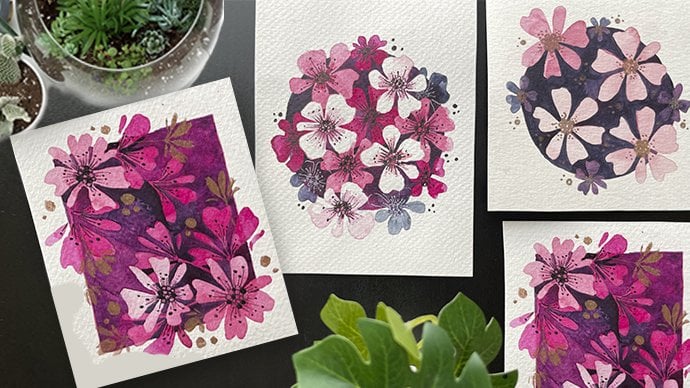
4. Project 1 - 1st Layer: Now let's work on step one. I'm gonna draw leaves along the border off my circle at Donna. Circle off four inch by four inch. You can do a bigger one, especially if you're a big. Nor I would suggest doing one that is maybe six inch and drawing needs that are proportionally bigger. It's gonna be a lot more easier for you to work on. This is the diamond her that I'm talking about, not the radius, the diameter of the circle being six inch notice that I've also added some names that are half way through and not completely in the ball inside the circle. This gives a little bit off a different effect, then having full brunch. Also, I'm making sure that the branches don't come all the week to the sentient off the subtle, because I'm leaving a little bit space for our next leaders. Negative watercolor painting is all about painting underground withdrawn, and so you makes use of the space around it, so it's much different from your usual paintings. From now I'm taking my brush with a lot of water and a little bit of the pigment, and has I mentioned painting around the drawing on leaving space for the stent. A little bit of space making sure that there is a gap between it because this case is Julie really important. This'll effect takes a lot of patients. I know it does take a lot of time. The end result is amazing. So do take some time and make sure that usually fill in all those places, making sure that the stems have a white space in between. Now, notice how I'm actually playing around with the colors. I'm not just taking one feet and then just continuing with that pigment color, I'm playing around with it. I'm adding screen. Then I take my brush, adding a yellow then Isaac blue, and I'm keep changing this around so that I get these multi colors inside. That's how you create this dual or tri shady within negative painting. - I'm going very slowly around the edges off the thief just to make sure that I don't have any that it doesn't cross over that fence in light, so this might take you a little bit more time. If you're you've done a bigger suffer, uh, or if you've done too many bees to try to reduce the number of leaves that you do. If it's your first time, it's just going to make it a lot more easier to do. Now you're gonna let your artwork dry and then we'll go on to the next step.
5. Project 1 - The Next layer: So let's start with Step two. Now, After trying the previous artwork, we're gonna erase out all the pencil marks that we created, making sure that there's no pencil marks left because this can be very, very confusing. Otherwise, now I'm gonna draw some leaves, making sure that the leaves don't start at the same point that the previous leaves did. But they could just be on top of each other and you don't see the effect. Now these lives, I'm actually making it smaller again, as I mentioned as a big, Nor I would suggest to not do too many. Please. If you feel like this is gonna take too much of time, reduce the number of leaves or make them bigger so that you still get the effect. But it's not going to be very time consuming. Also, you need to work with very small spaces, so the smaller than needs it gets tougher to do so again, going around the entire border, drawing on the leaves, making sure that some of the leaves are actually seen through the cracks off the previous lier. What is so amazing with negative watercolors is that you cannot predict how the final artwork. Artwork can actually look. And so it's always surprising and interesting every time, which is what I love about it. No matter very, very small leaves. You don't have to do that. I'm just showing you the extent apart, etc. But you can draw on the do Christmas has many, as you like. No, I'm again going to start painting, making sure it's a little bit. Dakhil does actually much darker tone, and I'm gonna be again doing the same thing. We're mixing the do green, but I'm gonna focus more on the loop just because I feel like that's a really nice color to see compared to the other two, which is which are quite lighter colors, if usually want to understand this and you still finding it a little bit difficult. You can always go to my first class, which was about the basics off negative painting. It was monotone, and that could be easier for you to start off with and then working your way up to dual or tri color. So I'm gonna be doing this really Jodi, slowly making sure that my edges are proper, making sure that I leave that space for the stand Because that really Julie makes a difference when you complete your work, complete the entire painting, just beating the stop. Now that we're finished, we're gonna let this dry, you can use again a dryer, and then we can go on to the next.
6. Project 1 - It's coming together: So let's start with the step tree. After drying your previous artwork, we're gonna first raise out all of the pencil marks from a previous drawing so that there's no confusion. I'm making sure that I raise our everything. There's no pencil knots. You can actually see the really nice yellow color coming through, which is so pretty as well as the green on the blue at the face, which is really, really nice. Now I'm gonna again start drawing the next set of leaves again, making sure that it's in between the previous layers. And it's not exactly starting same point that the previous news. I'm trying to make these a little bit more smaller. I'm not gonna add too many of them just because there's not too much stays. And if I do have to near them, it's not gonna be noticed any. If your orderly, tired and have kind of lost patience. What you can do is you can just add a couple of them mainly at the center off the circle, because that's where it's gonna be noticed more. You're not gonna be able to Julie notice the ones along the border as much, so try to put your leaves to what's the center? Now I'm gonna take my wins and Newton indigo color. So it's a very, very dark color, and that's gonna add so much of death. And the painting is gonna look amazing because of this dark death. I'm making sure that there's more pigment and less off water and the color is really mixed . You can see I'm taking MAWR off the pigment and this is a process. I'm gonna make sure I don't cover the previous leaves as well as I don't cover any of a pencil drawings, so it's gonna take a bit of time. But the end effect is just so worth it, and it's just so stunning. Give yourself time. You can take breaks in between. I tend to actually work on multiple Texas so I don't have to fixate on one which works through the welts. You can do that doing tryto fit everything in and just give yourself a time limit off. One are because you're going to get Julie board as well as this effect is so stunning that it's only at the end of it. You really see the effect. So then you're kind of kept guessing cause you don't know how it's gonna end up working out . You can see it's almost back. The need the indigo. I'm not adding much water. It's very, very dark. - Yes , it looks like really messy. But when we go to the next day, if you're gonna see how amusing it looks I go over just the corners along that Sorry the borders with the indigo again Just to give it more, Doc.
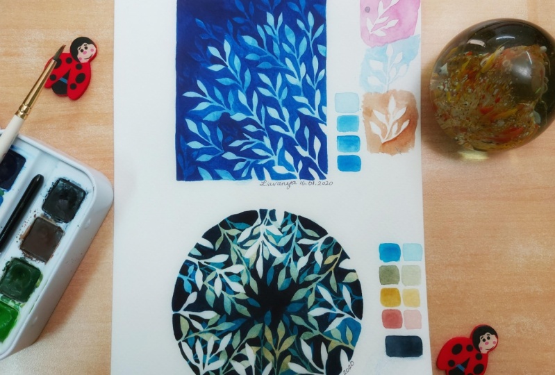
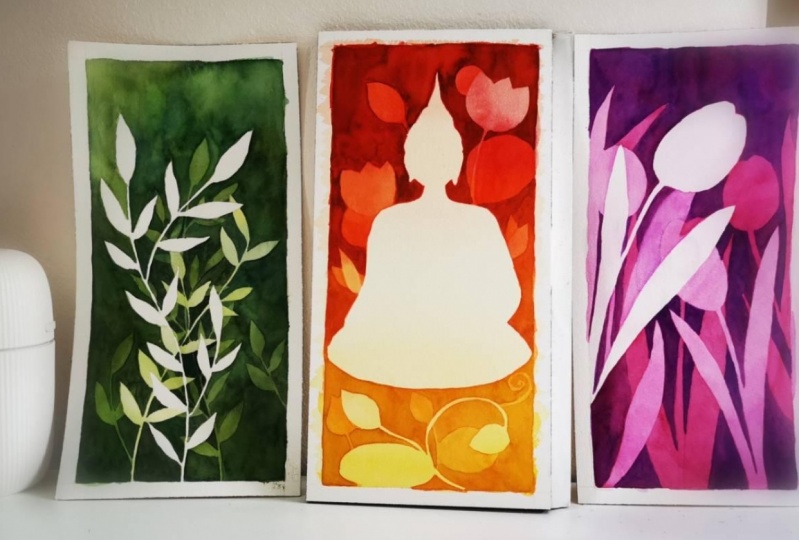
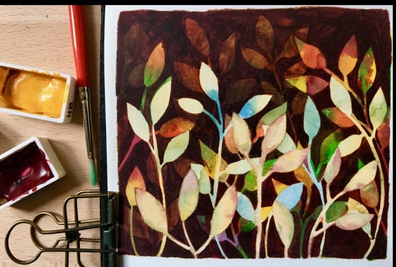
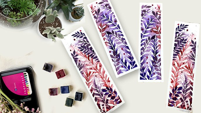
7. Final Edits and thoughts: So this is the fine of step now that the artwork has dried, Andi completed. We're gonna Erie's out all the pencil marks to see the final look, and now it's actually revealed. It looks amazing. The colors are so stunning. What, you couldn't see the call with the pencil mugs or the previous steps. Now you can actually see it. It's the yellow that really shines through as well as the green in a very subtle way. It's really, really pretty Does. If you want, you can either cut it as a circle, so to avoid any of those, maybe edges that did not come properly. Or if you want, you can deep a little bit of a border and then cut it out as self Who you can even put a bunch of whole Keep it as a book mug. You can make it into a bigger piece and actually do it. That's a four sites Artwork. Here are some examples of color skis. So what? You hope you've got a turquoise blue indigo and think this is really nice color combination because the thinking and do combined to give Papa what you can see inside. Then we've got a big purple and maroon, and that's the last layer. We've also got a bubba blue and indigo, also a little bit of varying, shaded effect off yellow, pink, blue and indigo. Another one is the Pablo Think Indigo, which is again one of my favorite combinations. Identity. Use it very often. These are just some condos that you can use The next one actually is done with masking fluid. You can see that the edges are no very clear, and Chris, it does have a little bit off a wonky effect on That's because the masking fluid does tend . It's tough to actually predict how clear it is, especially since we're doing really thin stem lines, and also because masking fluid tends to dry out very, very quickly. So you need to work with a very fast. So that's why it's great to do it by pencil and really just figuring out please leave in your reviews. Think you specifically want to know any specific information I can just had in a clip regarding that into this class, so it's useful to everyone. I'm so looking for what your class projects on actually want to see how you use this technique in your own artwork and really played around with it. Thank you so much for being part of my class. I'm so excited on. I'm looking forward to doing my next class soon and a jury hope you guys are part. If it please follow me on skill show because every time I launch a class, you get updated and you can also see if I'm doing any giveaways, anything that you can participate in and win some goodies or artist collaborations. A lot of different things. Thank you and have a really good day.
8. Project 2 - The Base Layers: Hi everyone. I just wanted to add in another project 2's bookshop. Just because I felt like there's so much more that you can experiment with the same technique. And this is going to be a really fun one. So what I've started off with is taping down the edges of the artwork and then having one masking tape going along the center. And so we're going to try this out. This is going to be super-duper fun. It's gonna be blue color because that's the cut I am picking today. And yeah, so I'm starting off with leaves. As always. At the bottom, I'm starting off it's small leaves. And in this one I'm also going to play around with the size of the leaves. So I'm starting off, it's small and then I'm going to work my way up to bigger and bigger leaves. This is going to make our process of paintings whole much more faster. I wouldn't say it's gonna be really, really fast, but it's definitely going to be faster than if you do everything the same size. So that's a positive. I am also going to be playing around with metallic pins, which I think is so cool. Yes, so there's a lot of fun stuff. So starting off with a set, first set, what I'm doing is I'm trying to keep them not too much. Let's start off with that. I don't want to put too many leaves. I don't want to really struggle at this step because the details are much more smaller. I just want to have a couple of them. You can see how I'm playing around with the branches where I'm not making them all exactly shaped then are in the same spot. I'm playing around with some of them branching into two leaves, some just one, and they're all at the same level. That's the other thing to remember. Because I don't want them to be high, low. Because as I mentioned, while going forward, I'm going to keep adding plants that are going to be taller and taller and taller. So let's start off with our first layer. For the first layer, I am going to be starting off with a really nice light shade of colors, which is going to be a light blue and a light green. I'm going to be combining the colors and blending them through out the first layer. This is very similar to our previous project. But I just want to show you how I'm putting these together. For ease. I'm gonna be starting with GOD, nice round brush. This is a size too. So it's really easy to work with, especially for those smaller areas. As I go further, I'll start using bigger brush. That's going to make my work easier. Don't forget, as we had done previously, you wanna make sure that you leave that little bit of space between the stem. So that, that looks really nice and adds to affect. Take your time with this step is relaxing. Think of it as not waiting for the final result, but just enjoying the process of just painting. Because as you go along, has you add layer by layer. Negative. Negative painting is such a fun technique where only at the end of it can you actually truly see your artwork. Till then, it's a bit of a mystery and enjoy that, enjoy that mystery, mysteriousness. So you can see how alternating between colors. So I take in the blue, then I'd taken Green and I'm just going back and forth. The reason for this is also because at the end of wants some effect of the green to be seen, it's going to be a really nice touch of color. Instead of keeping the entire artwork very, very monotone. So I'm just trying to break it up by adding that beautiful green that I absolutely love. Some speeding up the process. As you guys know this step. It's all about patients, it's all about enjoying the process and it's so much fun. You can always step back, come back to it. And that's again, the fun part about negative painting. So at this point, don't worry about the top of the layer. Just get the bottom, they're done and then we can move on to the top layer. Another tip for you to recognize is whenever I'm doing a specific area, I start off with kind of outlining that area. So you can see here how I'm outlining and then I fill it up. By outlining it, I actually ensured that I had really nice neat edges. And because this is kind of watercolor, that is a lot more, I would save fixed and a lot more organized. Having These are really good. Having that clarity within the artwork by outlining is really great. So I know with the artwork sometimes my hand kind of covers the painting. And I know that can be really annoying, but that's the reason I tried to put across the entire painting. So in case you weren't able to see what I did in a certain spot. You can always look at what I'm painting on another area. So it's a little bit more clear. Now that I have done this, I'm going to go onto our next layer. Remember, I have dried it completely before moving onto this tap. Notice how for this one, I'm going into big leaves, right? They're much more bigger, much most days Stout. And I'm doing them in between our previously or I'm not doing them right on top. I'm doing them in between because that's going to give a nice effect than having them just on top of a layer that we just did. Try to make these big. Now that I'm happy with this, I'm gonna go on to my next layer. For this one, I'm going in with a little bit of a darker blue, just one shade higher than what we've been using now. The water kind of set that I'm using here is from stationary island. It is student grade watercolor set. So you can immediately see how the pins are. Lot more outside chalky. That's the difference between an artist grade and student greed. So what's going to happen is the layers will come right on top of each other. But I'm not going to be able to really explore that Chaucer translucency. And the reason I'm using this is so that you guys can see how you can use the set that you have to your advantage and build from there. And what I mean by that is in case you want to get a darker color, you can just use the color in the set or add black and mix. Generally, this is not suggested by watercolor artist. If you're going into a little bit more professional, but if this is something you're just trying and you're still not ready to make that investment into green beans, then this is the easy walk around for it. So here I'm still using my thin brush just because there are still details that I need to be very, very careful about. And I'm taking lot of time and lots of patients and just really going step-by-step to each and every area to make sure it is completely filled. Now that I've gone over this entire layer, I've also done the top half of it. As you noticed. Because when we go on to the next set of leaves, I want to make sure that they all are the same color. I don't want that to start at a white and you will understand it. Has I complete the artwork? So I'm going to let this completely dry before I move on to the next set of leaves. And also going in at certain areas where maybe I made a mistake or I kind of covered up the stem and I just go in with the deep blue to outline it a little bit more and make it more evident. Now let's move on to our next layer.
9. Project 2 - Mixing it up: Again, so completely dried. Let's start off with our next layer with my pen. I am drawing beeps. These are going to be much, much, much more bigger than our previous set and much more spaced out. As you can see, I'm going more towards the top area. These ones are going to go to the second space that we have that we didn't filter now, so those are going to go all the way up. At the same time. There's no many leaves at the bottom because I don't want to make that process very difficult for me. So I'm just simplifying it by adding more leaves on top, making them draw literally Long. And making the leaves much more Big-O. For this layer, I'm gonna be using a darker blue. So going more darker and building on those layers. Now, letting you know beforehand, this is going to be the tough layer to do. It is going to be a logbook patients. And I know you guys have the patients and it's going to be beautiful once you finish, I can guarantee that the artwork always looks amazing once you finish. So it's just getting through the process and just go slowly step-by-step and enjoy it. Now you can see the color that I've selected here, the blue. The variation between the colors is not that much. And you can see how if I use this, the depth isn't really there. It looks still very bright and flat. So I'm going to be selecting a color that's a little bit more, little bit more deeper, more of an indigo blue or a midnight blue. For this one, I'm using a round brush and this is from Silver brush, well-lit and silver black velvet brush. Because I wanted something that can cover a lot more space. At the same time. I can get the details. So as you see, I've kind of finished that up and you can see how it's still flat. So I'm gonna go in with a deeper indigo and I want to show you that contrast and that's why I selected this color. That's why I just wanted to show you one AD and how it just looks really dull. But you can see the minute I used this blew, the deeper blue, it's really popping. You can see that underneath there, it's all coming. So that's another really cool thing about watercolors. And generally in painting is when you add in depth, when you add in a darker color, the lighter colors start shining. The white of the page starts shining. So if you enjoy what colors are some sought of a meditative quiet process, then let's move on and dig deeper and go onto another layer that's a lot more deeper, darker, and just gives even more depth to our art. If you are kind of done. So skip this, make this blue layer as dark as the layer we're gonna do next. So use that color and set. So next I'll be using blue or sorry, black, which means that right now I have four layers for my art work. The first was the green and blue. Next with the lighter blue. Next, a darker blue and then a black. If you are not ready to go in for all the steps, just Kip, one of them. So you start off with the blue and green mix, then the blue, light blue, and then find the, the black. So you have three layers. I hope that's clear, I hope that makes sense. So now let's move on to the black layer.
10. Project 3 - Metallics: Ok. Completely dried my outbox, completely, completely, completely drawn some Raleigh big leaves. These are big, big leaves. And yes, this process is going to be a little bit more difficult, a little bit more tricky, but it's so beautiful. So at the final effect, so this layer is going to be a black. It has deep and dark as I can go. And so I'm going to pick an up black. So full layers of negative painting. You can actually go more and more and more. I generally do for maximum. I think from a previous project it was three. So yeah, it depends on your patient's level, depends on your comfort, depends on what you like. So I'm going to speed up this process. So you can see how the black is done generally starting with an outline of the area and then filling it up. Now that I have done the black layer, there are some places that I've skipped at the bottom just to speed up the process. Because as far as it looks nice, as far as it looks good, that's enough. And now that I've done that, I'm gonna completely dry the artwork and then move on to some metallic pins. These paints that I'm using are from Indigo, GBM gonna put her detail below in the description. Bureau. Beautiful panes, metallic are stunning. She's got some really stunning colors for metallic beans and I loved them. I use them all the time. So I'm going to be using these, especially a blue metallic to add to our artwork. I don't wanna do a different color. I like the idea of a blue. And I'm doing this in-between layers. I'm doing it in spaces where I feel like this emptiness and those spaces where I'm filling up with metallic, I'm trying not to do it on areas that already have things going on. It's great to do it in places that are much more empty. Also, I'm not bringing these down all the way to the bottom. I'm just doing them midway. So like from half of the painting, these are gonna be bigger than not small leaves. You can go for small leaves, but I really just wanted to do something bigger. And also to play around. Some of them are going to go underneath the layers we created. And you can see how I'm doing that. I'm making it go underneath. Now let's add some platter of metallic. Make the whole thing shine at some circles. At the blue. Let it brightened up the entire artwork. It's the small details that make the artwork come together. Now that it's completely dry and we're gonna be removing my tip. And yes, there might be areas that it comes out in, maybe some places where the paint is still seen because this was a tricky design that we selected. So at those places, just use white acrylic paint and paint over or you can scrape it. Scraped the paint. So yeah, there you go. This is our additional project for Degas painting and you can see how the green is seen through in the first layer and then the black all the way on top. So enjoy this. I hope you have fun with this. And follow my page because I'll be posting more tutorials. As time goes along. Happy painting.
 Femvisionary / Madhu S, Watercolor Artist and Instructor