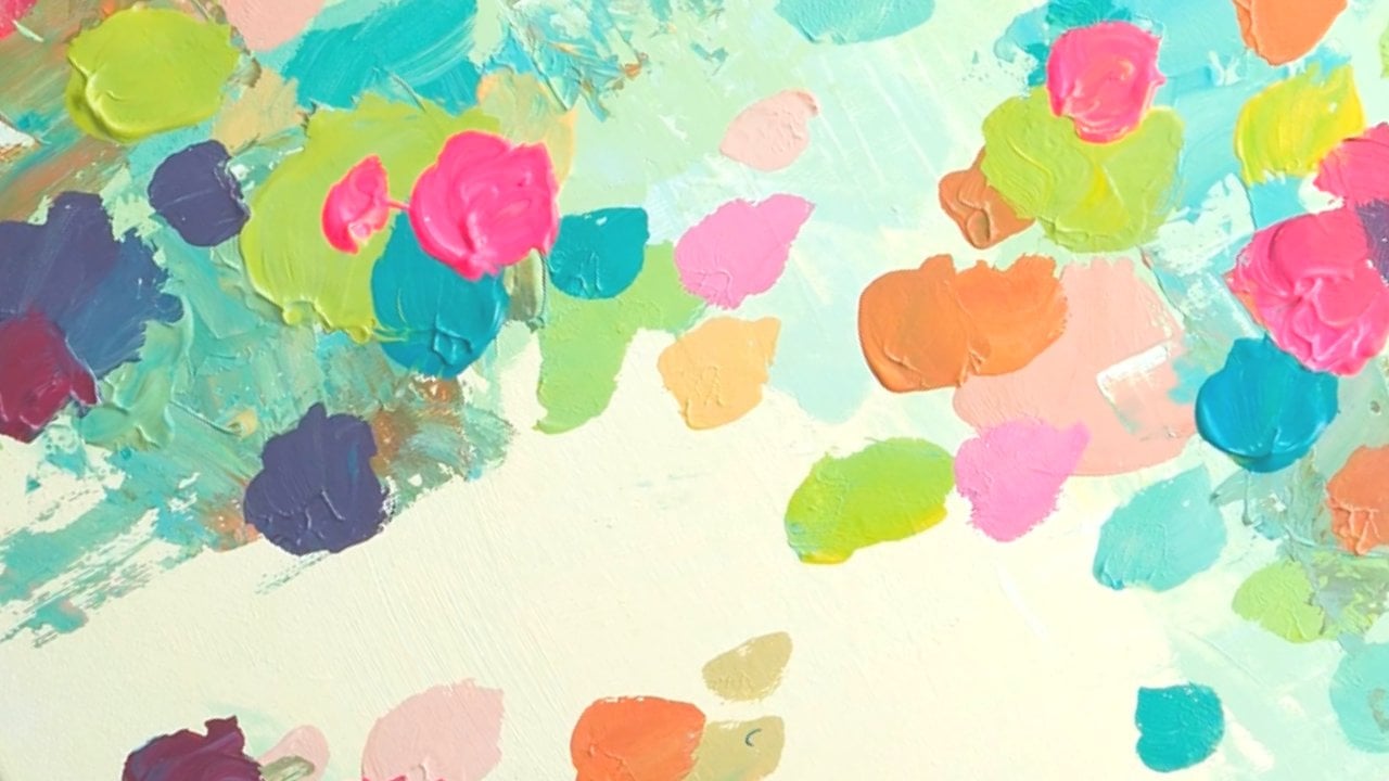
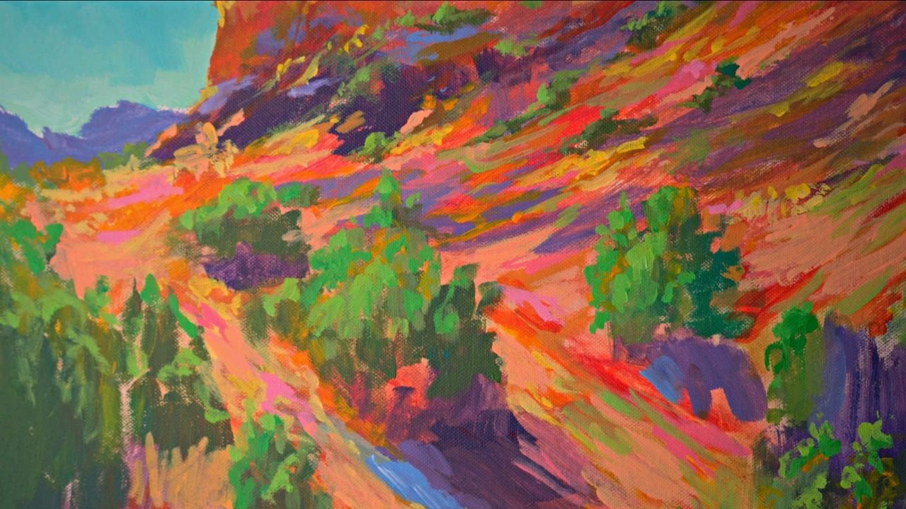
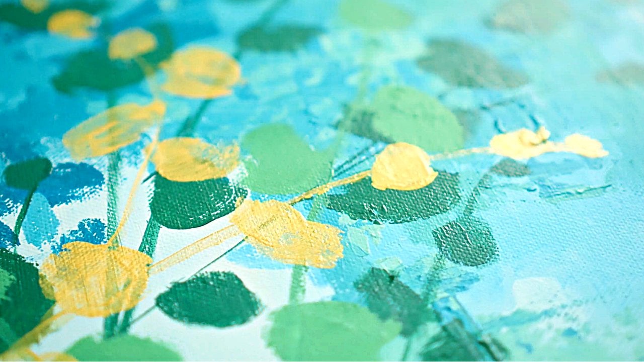
Transcripts
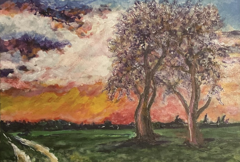
1. Welcome: Hi, my name is George, and in today's course you are going to learn how to make this magical landscape, whether you have painted landscapes before or this is your first time diving into acrylic paints. This is the perfect course for you. Like what all skills in painting, you must have fun and learn a little bit as well in the process. This might look like a complicated painting, but it is not. It's very simple and you will get step-by-step guidance to creating every single detail. If that sounds like something you wanna do, welcome to the course.
2. Materials: For this course, you will need a canvas that is 30 centimeters by four centimeters. You'll also need a cup to play some water and a plate to mix the colors. Speaking of the colors you need some white. This is Amsterdam acrylic paint and some lemon yellow, some sap green. You will also need some carmine red, some brilliant blue, and some turquoise. The trusty, rusty palette knife for the brushes you will need a small flat brush, a big flat brush, medium flat brush, as well as some beautiful paper towels. And that's all you need for this course.
3. Orange wash: Once everything is in place, you have your Canvas, your two colors, yellow and red. At this moment, you can put on the mixing plate some yellow, Be generous and put quite enough and some red, wonderful with a medium flat brush taking some water, taking some red as well as some yellow, adding the little bit more water and a lot more yellow. Since the yellow is quite transparent as an acrylic color, it needs a little bit more in order to make a beautiful orange. Once that is done, you can take it a bit more water and even more and spread the paint around being loose ice. It doesn't matter if at the middle of the brush there is some red and it just spreads around. You can always take some yellow and just make it more orange. The goal of this step is just to have a little bit of fun and cover all the canvas width, this watery orange, just so it kills all the white of the canvas covering every single centimeter of Canvas, just taking a little bit of red just to create some variety and the orange, just so it looks beautiful for video, you can start to see everything is covered and there is no more white on the bottom half of the canvas now going up with water and acrylic, just spreading it around the color, very loose. Just moving the color up and then putting some more paint just to cover the rest of the canvas. Taking some water and dragging the paint brush at the bottom, you can scrape a little bit of the color with the brush and add it to the top so that layer is very, very thin, doesn't need to be very thick. Just a wash of acrylic paint, just so you have something to paint on that it's not white. White does not make for a good color to put paint on because it's way too bright. So it will make your painting be, tend to be a little bit too bright, okay? Once that is done, you can also go from side to side and make the paint a little bit more uniform, a little bit more, looking the same everywhere. As you can see, it just looks a little bit better. And then from top to bottom, doing the same, very easy when it doesn't get too busy once you start to draw and start to put everything together in the painting. Few more strokes from top to bottom, as you can see, no more white. Let's go into the next step.
4. First Layer of the Sky: Now, the wash is dry, perfectly dry. When you put your hand on the canvas, there is no more paint lifting off. Then you know, you can start with the next step, just taking some of this turquoise, some green in case you don't have this sap green, you can always use just a tiny bit of lemon yellow. It will create the same effect and the same color and some white. These three colors will be mixed in order to create a beautiful Emerald, turquoise, blue for the sky, very, very beautiful and lush color. As you can see, the green is a very sap green and very vibrant. And in combination with the turquoise, it will give this beautiful Emerald, turquoise, this beautiful green turquoise, not a lot of green in case you are using lemon yellow, don't put too much yellow, just keep it to until you feel happy with the color. As you can see, you can mix the color width, palette knife until you feel quite happy with it. It needs a little bit more white, so it seems bright. Whenever you add white, keep in mind the colors will get a little bit more desaturated. So that's the vibrancy is lost whenever you add white. That's why it's indicated to keep the colors quite vibrant. If you're going for that kind of a painting, in this case, it will be a very vibrant painting, mixing everything together just so it's a very well mixed color with the same beautiful brush putting the plate on the left side, just so we have a little bit more space to work, starting almost in the same way, just going loosely with the brush over the orange. You might ask, why is that orange over there is just because you can now see exactly how much you've covered. If it was white, it would be very hard to see if you've covered the entire canvas or if the layer is sufficient enough. Orange is a very unforgiving color in that area, going from side to side very fast as you can see, staying in the upper half of the painting. And then of course we're going to go a little bit lower since this landscape will have lower horizon line covering it, just adding the first layer of paint, trying to make it as smooth as possible and covering almost all the orange you can start to see if you move your brush once again over an area that has a little bit of orange, then that will cover as you go down, you can also add a little bit more to occur is just to give some variety to the color. And this will give us the faintest impression of a more detailed look at more worked area. Let's say very, very fast going over it. It doesn't need to be slow and methodical to look good. So you can move around with the brush or you can just take your time and do it as perfect as possible. And there you go with this step as well.
5. Beautiful sky: For the next step, just add some more white to the turquoise color. Keep in mind this is a bit more turquoise then you layered on top of the canvas, on top of the orange, you will start to mix the color with the palette knife, with the turquoise, as shown here. And you can start to mix it very, very well, scraping the color on and then going very thoroughly on the color. It has a little bit of green as well, but as you can see, it's quite a bit more turquoise, needs a little bit more white. So you can start to add that until it's tiny bit brighter than what you see on the Canvas, it starts to feel perfect once it's mixed, scrape the palette knife, just so you don't have a lot of color to wash afterwards, take a good amount and this time add less water onto the canvas. The canvas is not dry completely. It's a little bit sticky. It doesn't matter once you put the layer with just the acrylic paint, as you can see here, it will start to look much, much better and make the gaps where there still some orange showing through, almost completely gone. You can see there is no water onto the brush and just going over, you can still see some orange parts. So whenever you go like that, you could just move your brush or either put more paint so the consistency is quite thick, but at the same time it doesn't make streaks on the Canvas whenever you move your brush. So if you start to see streaks, then it means you're using too much paint. If you're having a hard time getting the paint all over and there is still orange on the Canvas, then it means there's too little paint. You need to put more so we can start to mix even more. Having a lot of fun. You can already see beautiful layer of paint are ones that hair is off the canvas going from side to side to make the paint have a little bit more uniformity. Wonderful. Just going over and over a tiny bit. And there you go with this step as well. Such an amazing step, so easy.
6. Vibrant Sky color: Once the layer is completely dried, you can now go in to the last layer of the sky, a very beautiful turquoise mixed with some green and some white. This will be a little bit more light than the last layer. So it was from dark to medium to now, even lighter. This is done to create a very wonderful effect of layering. It's put on the canvas. You'll see that the friends and you can mix your own quite a bit more light. I'm just going from the middle with loose brushwork, just going and working your way around the canvas, going for the right side. At this moment, knowing a little bit lower, higher end covering all the FV is just going over it. Quiet at a fast pace. Beautiful paintings don't need to be done in a slow manner. They can also be done very, very fast. Of course, this comes with time and experience. You will feel very, very confidence once you just go once or twice over something like this, in your case, you can just go at your own pace however, you feel that it is necessary to create going and creating beautiful layer. Just looking for textures. And if they don't fit, we can just brush them over a very loose way of moving the hand with the brush. A quick tip. If you want to use your brush more loosely, rabbits further away from the tip, closer to DNS, a middle point is good enough for Canvas this size and a brushless size going and taking a little bit more color in case you are at the end, you don't need to mix a lot more color. You can just grab a tiny bit of water and spread that paint around. This will create layering effect and it's much, much more easy to know if it's, the second layer is completed. If there is a small difference in between layers, okay, Just a few more brushstrokes and it is almost completely done. Look how beautiful it looks, how bright and wonderful, and how simple it was to do. Look for some hairs and pick them up if you see them.
7. Trees: For this next step, you will need some red, just putting some red on the mixing plate. Not a lot because red is a very powerful color, some yellow and of course, a little bit of white. Very simple. Just get your palette knife or you can mix wet the brush depending on what utensils you have. In this case, palette knife will be best taking some red on a lot of red because once again, red is very powerful as a color, very vibrant, and it can easily overpower other colors, adding some more white to have a tiny bit more color on the plate, mixing in just a tiny bit more red into it. It can start to see this bank is quite generic. Once you put the yellow in there, you can just see how much more beautiful it looks going in with more red to make it more pink, mixing it very, very well. So it doesn't have any streaks. And starting with the big brush, the big flat brush, and taking some color, the background is completely dry now so you can start putting in a little bit to the right of the middle section of the Canvas, you can start to put a small tower, lean, leaning to one side, taking more color and adding it, being very careful about the edges, the edges need to be a bit tight. They need to be quite sharp. You can achieve that by just going with the flat brush on like a knife. Okay? Once that is done, you can curve the bark of the tree even more. The left, as you can see, and it will start to slightly become a tiny bit less thick. As you can see, it starts thicker at the bottom and it just becomes a thinner as you go up. Wonderful. Okay, now for the next one, going a little bit more onto the right side, perfect, adding and making that edge a little bit more uniform. Once that is done, you can start on the left side, just move it as close as symmetrical as you can make it. But it doesn't need to be symmetrical. It's organic. And you will start to make the second tree focusing again on the edges, making them quite sharp. Since the bark of a tree is very, very dense as not like a cloud, It's not fluffy. It will have a sharp edge going with the second bark of the tree. You can overlap it. At the top, you can start to see the beautiful arc of this second tree. Once that is done, you can grab a beautiful flat brush that is about half or even less than half and start making some beautiful branches on the left side 3, and focusing on those edges to make them quite sharp for the small branches as well, in case you find it difficult to do branches. But with the medium flat brush, you can always use a smaller brush. Just like this. You can go in and add some beautiful, delicate branches. These are very easy to do. You just pick up some color and then you carefully, and the branch, you can start to see those branches are not straight by any means. They are quite curved, but at the same time they also have some straight lines. They're not always curved, they're not curvy. So it's a play between curved branches and straight branches. So it's a little bit more interesting this way, if you always make curve the branches, then your tree will look a little bit fake. So it's very good to have straight edges and curved branches at the same time as you can see, just this branch starts very, very straight, curved one gets out of it and at the end it curves itself just a tiny bit and drawing another one onto the end of this one. Perfect. Once that is done, you have now completed another step of this painting.
8. Tree branches: It can be moving on with some more branches, this time, even smaller and adding even more branches. Okay, Wonderful. Now let's just add a beautiful branch on the right side tree behind this one, taking some more paint and carefully choosing a place to put another big brand, just going behind the tree, just overlaps itself. On the bottom left. Three. Perfect. And just going behind it, continuing the bark at the bottom just a tiny bit, and then moving on to another branch on the left side, a little bit more high, then the one on the right side, adding some more paint to make it part of the three, taking some more paint and adding some small branches this time on the left side, French perfect. And another one just inside that beautiful space has been created, can start to see those branches to a lot for the painting, the tree becomes spacious. It takes more space and becomes something more than just the pillar. A curved pillar now has branches, very organic branches continuing on with the branch just above those ones you just created. And adding some very fine and delicate branches at the top and then in the middle, just creating another one, perfect and dividing it. This is a very relaxing process. You can just Start to do so many branches and lose track of time. Once that is done, you can start to move on to the right side tree just to alternate the space and where you put those branches going on the right side and adding a branch near the bottom of the tree. Once that is done, even more paint and adding another branch at the top just where the two trees meat going and continuing that branch until the Paintbrush has no more paint. And then going, taking some more paint and continuing the beautiful branch with another one, just dividing it beautifully. Once that is done, going over it, once again, being very careful to not make it too thick, adding some more lines, continuing and getting outside of the boundary of the canvas with this beautiful middle brand. Adding another one, Joe's at top of the tree, but this time on the left side and dividing it carefully. Perfect. Taking some more color and adding tiny bit of a branch on the left side and adding another one on the right side of that same branch and one lower, just like this, taking your time and analyzing where it needs to go, thinking where to put the next branch. And this feels like the perfect spot just on the right side. Aj, just over here, there is space for another branch. It fits perfectly, making it longer and adding and not a one just coming out of the one you just painted and going with a third one on the same branch and now a fourth one lower. And coming out onto the top. Perfect super simple, adding a, not a one, act at top. Just mixing those spaces. And there you go with this step as well, super easy to do.
9. Ground: Adding some more white to the pink, salmon pink, just a beautiful white in case you don't have the pink anymore, you can make it by mixing red and white first and then adding a little bit of yellow and mixing that white into the pink until there is a beautiful lighter shade of pink. Cleaning up the brush with a paper towel doesn't need to be perfectly clean. And then taking some of that paint, you can start putting it on the left-hand side, just making a nice diagonal line just like this. Be careful not to touch the sky. This must be a little bit lower, just a tiny bit, taking some more of that pink, darker pink, and adding it to the bottom of the shape and continuing to block in. As you can see, this will make just a little bit of a gradient over the orange. And after that, we can take the beautiful pink and mixing it in once again just a little bit with the palette knife. This time just applying with the palette knife, holding it horizontal on the canvas, you can start to apply some beautiful textures. Just moving the palette knife from side-to-side and then cutting in just a tiny bit of a horizon line. This needs to be almost perfectly horizontal. As you can see, you can already go a little bit over the trees, just a tiny bit to make it seem like it's part of the trees as well. Okay. Going on to the right side on the paint you have applied in the corner and adding some more textures, lightly scraping the texture of the canvas so that it doesn't make a perfect line, but it has beautiful and nice texture. More this time, a little bit darker in case you have that red and putting it, trying to make those textures of little bit more interesting, very simple to do. And then in the middle, that empty space just dragging a little bit of that color as well. And there you go. This was the beautiful step, super easy to do.
10. Gorgeous tree shadows: Adding some blue to them mixing plate and taking the smallest brush mixing in. There's still some red over here and mixing it a little bit with the pink and then taking some blue to make a beautiful purplish brown, this will make for a good color to add some shadows on the trees and don't worry, it looks kinda muddy, but you are going to change it in a few seconds. You can start to put some of this beautiful purplish color onto the bark of the tree. This will be the shadow of the tree that is in front and up. So the one that goes to the right can start to see it. And just over there, adding some red to make a vibrant purple, mixing it on that brownish color just to have it not be so overwhelming. Okay. And putting it chest over there, making a beautiful line, just going like that to the bark of the tree, as well as a shadow onto top side of the tree, just over there. Just imagine into the distance. Then at the top of three imagined some leaves that are casting a shadow onto the tree. And of course, on the right side of the trees there's going to be a little bit of a shadow as well, since the light comes from the left side now onto the right-hand side 3, with some more textures. As you can see, that's basically a shadow from the left-hand side three, just casting a shadow onto the right-hand side one. Okay, very easy. Going down and adding some more textures to the three onto the right side. And it can start to see how much more interesting the trees look. And on the left-hand side tree, you can start to put some more of this shadow color onto the branch that goes behind the tree on the left side, taking some more color and going down and connecting it to the bark and the branch, the middle part of the three, super beautiful and a little bit of contrast to the small branch as well. And then going up on the three, just so it has a shadow onto the right side just following the tiny bit of a curve. It doesn't have to be everywhere. Just in some small parts on the right side of the tree. As you can start to see, there is a little bit of a texture onto the left-hand side as well. And going and adding this cast shadow onto the ground just so the trees now have a grounding and they can now sit onto something. This will give the impression that they grow out of the ground as well as just making it seem like they are far away in the distance. Being such big three's, you can just go horizontally and then go on to the three a little bit from the first one on the left, just continuing with some small touches on the small branches on the right side. Super easy to do. And of course, maybe adding a little bit more of a shadow onto the middle top section. And there you go with this step as well. Super, super fun.
11. Greenery: Now you might want to start with the blue, just putting it onto the mixing plate. Just a tiny bit of blue, some beautiful sap green just over here, okay, and taking the small brush, so we have the green on the plate just like this. And of course, adding just a tiny bit to the top side of the bottom half of the painting and end the distance. We can start to put a little bit of this darker green, just a little bit. Okay. Spreading it around from side-to-side. After that, let's put a little bit more green this time straight from the tube since it has a little bit of a problem being mixed with the black. Remember, clean your palette knife before scooping some paint from the bucket. Okay, once we have the green, you can start to put this lighter green onto the top side of the darker shades of green going on. And that diagonally can start to see how vibrant it looks on top of that beautiful semi pink. Okay, perfect. Spreading it around. And as you go closer to the horizon, the lines become more and more horizontal, is start to see, let's put some behind. Maybe there is some big grassy flatlands in the distance. Okay. And then mixing a little bit over the shadow as well, just cleaning up the brush onto the canvas. Perfect. Taking some more paint and putting it onto the left side as well as the middle, making some more small marks. Once that is done, you can take some white, put it onto the mixing plate, and mix a beautiful light green, taking some white ends, green, and mixing a beautiful light green 104. And you can start to put it onto the lower side and as well as onto the top side of the grass, let's say, making small beautiful marks to add this wonderful light color just on top, making some textures. And of course, this could be easily done with a palette knife. And you can see, let's go a little bit further into the middle and then move towards the right side and the left side inch by inch. Yes. Making those colors look gorgeous, mixing them a little bit onto the canvas. This small little beautiful marks into the middle in between the trees in the distance as well. Just a little bit. Once the left side is done, it can go on to the right side as well, building a little bit of atmospheric perspective, perfect. And over on the left side, it can be continued a little bit lower just to drag it outside of the canvas. So it doesn't seem like it's just in the center of the canvas. Okay. A little bit more paints and little bit more textures onto the left side, small little dots of paint and moving up just a tiny bit more straight, more horizontal as it's closer to the horizon and little bit more in between those pinks and the greens. Perfect. Little bit more onto the left side and onto the right side continuing and going outside of the canvas. Perfect. You can also scrape a little bit with your fingers if you want. If you see that it needs a little bit of liftoff. Wonderful. Once that is done, you can just see how beautiful it looks, kinda looks a little bit too calculated. So you can go over the edges with the brush just to make it more organic. Once that is done, you can also take the palette knife with some sap green and start scraping a bit of this wonderful luscious green on top, just barely touching the paint and leaving behind some of that beautiful green going into the white, mixing a lighter color and placing it on top just as a texture and making it look absolutely gorgeous. The palette knife always creates such sharp lines if you use it only with the edge. Okay? Just like that. And taking some more of that white, just a tiny bit and placing some more lines by dragging to the left and to the right. Okay, building up those textures, playing around and squeezing some of that green onto the middle part. You can mix a little bit more white and put some highlights to just over that green in the middle in case it doesn't look good, you can always scrape it a tiny bit off and put it somewhere else, or pick it up with the brush and play around with it until it feels a beautiful, luscious texture. Okay, some more green on the tip of the palette knife just to add some more color, as well as some white on top. Just to create this wonderful look. Okay, dragging it a little bit down to create a different kind of texture at the bottom. And then for the right side, just putting little bit more paint with the palette knife, grabbing get from the middle. And there you go with the simple step as well.
12. Sky Mountain: What a wonderful way to start. Have some blue and'm mixing palette as well as some white with the small flat brush. Grab a little blue and put it into the white and a tiny bit of green, just to give it that turquoise feeling. Once everything is mixed together, the thoroughly width, the brush, it can start applying it at the bottom of the horizon line a tiny bit and going further onto the right side as well. And in the middle, once again, just small marks. And then you can move up a little bit. The goal of this layer of paint is just to give a little bit of texture in the middle of the landscape, at the bottom of the sky. Just a little bit of a more interesting texture and interesting color variation, as well as to clean the horizon line just that tiny bit, as you can see. You can also clean up the edges of the trees with this. If you went little bit overboard with the edge of the three, you can basically put a little bit of this blue, can even make it a tiny bit darker and add some splotches here and there. As you can see, they stand out quite a bit and a bring together the harmony of this beautiful color. Okay, once that is done, you can also put even more white to play around with the value. Just mix it in the blue, okay, it has a tiny bit more green just from over there, mixing it very good with the brush. And then you can start to put it over the blue vetting get mix with the layer that you have just applied a few seconds ago, you can start to see the interesting textures that it gives. Keep it sparingly. You don't need to go overboard. You don't need to go on the entire sky. Keeping it simple, we'll make for a greater effect, okay, and cleaning up the brush over by mixing it a little bit into the different color. Super simple steps, one after another for a beautiful effect. Okay, once that is done, you can start to put a little bit of red just over here on the mixing plate and then pick it up with the small brush and mix it straight into the first blue you have created. This will give you a beautiful purplish blue. And he can start to go in and create some beautiful areas over the tree. This will make for some good atmospheric perspective onto the tree because everything is so blue around it. It has to have some kind of a resemblance with the sky That's, this guy needs to reflect a little bit into the trees as you can see it. They already feel much more integrated part of the painting. And then you can go on and make some beautiful small little mountains. This is just a beautiful line of mountains. You can go a little bit higher if you want, but keeping them small with will not draw attention to them that much. Picking up a little bit more red and going in over to blend just a tiny bit of the blue that is on the trees, quite a bit more red to give this, these trees a little bit more punch genus, little bit more red in some areas. Okay? And there you go with this step as well. Extremely easy to do.
13. Foliage tips: And now for another beautiful step, you will need to pick up some white as well as some red and of course, some yellow. Once all three colors are on the mixing plate, can pick up the beautiful small brush, very, very small brush, and make a beautiful and wonderful pink, adding a little bit of yellow into it just to make it quite light and rosy and can start to see what a beautiful color it is. Once you have the appropriate color, you can now start to layer onto the light side. Wherever the trees are quite light, you can add this color, but don't forget to leave a little bit of a space where you don't put color so you don't cover everything you already done. That area is done. Moving on to the smaller branches. Those small branches, branches need attention as well. And going in for the lightest areas above the shadow, going over the shadow just a little bit to indicate some foliage that the light is shining through and moving forward up. And then thieving the second branch, being very careful to leave the shadow for the second branch on the right-hand side three, you can already see it. And once that is done, you can also accentuate the differences between those two trees. You can see the branch can easily be seen now going a little bit further, mixing the color a tiny bit more, and then going in for the left-hand side tree with some small and easy steps, just adding this color onto the lightest areas. And since the color has become a little bit lighter, you can also go over the color you have applied on the right side, taking some more of this color and continuing on the branch just going behind. Remember to keep the color closer to the left-hand side, since the light will come from the left top side. And then going in and touching up those beautiful small branches is in this super fun and free flowing. Going over the shadows just a tiny bit to integrate them. But be careful try to keep the shadows quite clean. You don't want to ruin the contrast. Add in some yellow and a touch of red. Maybe a little bit more wonderful. Once that is done, you can add a tiny bit more red until the color is nice and orange. And you can start to layer just above the shadow. You can start to add some of this foliage. You can start to see the pattern that is being used, but the brush, it's trying to mimic some squiggles to give it that beautiful texture. Try to leave some spaces. Basically, don't cover everything and don't make it uniform. It has to have a jaggedy and very complex edge. So it's not just a bubble of leaves, but it's an organic shape. Okay, moving down, trying to keep those shapes smaller. As you can see, the color has become lighter and this is since the foliage over there is much, much more spare. The color of the leaves is more light. And going n for the left-hand side of the tree, as you can see, trying to keep that branch in between in some areas going over it and some areas going behind it. Well, going behind it. And that's very hard to do. But basically you just have to leave it untouched. That means just going very, very close to the edge and then trying to leave it like that. And going for some more foliage, this time a little bit faster, helps a little bit to move a tiny bit faster just to keep it more organic, like you go at your own pace. And for this to be even more interesting, on the top, foliage in the middle, you can start to see at the top there is more light. And as you go to the left-hand side, the light part becomes bigger than the shadow part. This indicates that the light comes from the left top side. Once that is done, of course, adding some more of this color onto the threes will ensure that the 3s become part foliage or the foliage becomes bark of the trees. Some of the colors that you can now find on the tree. Going for the left tree, super easy to make some small shapes, just play around the branches. Don't over-exaggerate, try to keep it very spare. You can always add more leaves later. It's better to have more empty tree then an overly crowded one. Okay, and there you go with this step as well.
14. Foliage highlights: Once the first layer of foliage has dried, you can start putting some white onto the mixing plate. You already have some red and some yellow. If not, you can put even more and then start by making a beautiful pink. Once that is light enough, you can start adding some yellow. Of course, this will be for the highlights of the foliage. Once again, the light comes from the left top side. So the left topside will need to have a little bit more light. As you can see, there is quite a bit of a difference in how light this color is. You can apply it onto the top side and start mixing it, just making some small curly motions with the brush. Remember to leave some spaces not make a perfect edge, tried to make it a little bit broken. Broken edges and painting look amazing. As you can see, adding another layer will make the foliage seem a lot more opaque. The background stands out less in those areas, moving down towards the branch on the left side, as you can see, super simple marks and adding more at the top, you can leave out certain areas with just the first color. This will give a little bit more variation. And of course, if you want, you can also break a little bit of the rules by going in some areas where it's not the top side, because certain leaves might get hit from the light, even though they're not in that specific area, they just twist a certain way or there is the right amount of light touching them and look at, at super beautiful and simple. Just adding a little bit more can start to see it's going outside of the first layer a little bit, just in some areas where it needs more foliage, then it becomes more rich with leaves. And that's why in the last step, you made so few splotches of leaves, a few more dabs, and it's done with this three, taking some more paint and adding the beautiful layer onto the left-hand side. Now, first, mixing a little bit more white to add just a few more touches here and there. And now for the left side, trying to be very deliberate with the marks and keeping it loose at the same time. Remember to be as sparing as possible. It doesn't need to have a lot of foliage to look amazing. The quality of edges is what gives the beautiful design of this three. And you get quality of edges by just trying to have them broken in different spaces. They're not just like a big clump of leaves going and creating some new spaces where there are not any leaves. Adding a few more portions of leaves wherever it needs it, you can start working on the top side as well as on to the left, just making some small getaway parts of the beautiful tree. As you can start to see, it needs a little bit more white just added over the already existing color, mixing it in and you can start to add this beautiful color just a tiny bit to the tree on the left, specificly on the left bark of the tree, since that's where the light comes from, this will make the three and the foliage seem like they are part of the same painting as not only achieved by the fact that they are part of the same painting, but by also having and sharing the same colors in certain parts, harmonizing the picture and doing the same on the right one, just a few splotches of banks. And then moving back, maybe making the left one a little bit more light. When another layer and the back branch that wraps around, as well as the top side of the right one, accentuating the beautiful shadow just over there. And going down, it can start to see how light and beautiful the sun hits and that branch. Now, okay? And the small branches need a little bit of attention as well. Adding a little bit more to the left-hand side, three, just at the top and on the small branches tried to keep it on the lightest side of the tree, dongle into the shadows or keep it at 90 percent into the lightest color you already have down on the 34, this small branch, just to accentuate it. Well, as put some more foliage at the top, just going outside of obtaining. Okay, and there you go with this simple step as well.
15. Bright colors: With the smallest brush and the paint already completely dry, you can now start to take just a tiny amount of white and some yellow to create a very light yellowish white. This will be the final highlight of the foliage. And of course, starting onto the left Barth, of the biggest clumps of leaves, the left top side, as you can see with that squiggly motion just going over the banes to create beautiful highlights. Once that is done, you can start to move on to the left part in the middle of the trees and add some more of this highlight color. Taking some more of this color and going further down in the middle. Now focusing on the left side can also put a little bit more into the middle. Remember to keep loading the brush with paint and you can start to move towards the left, three tiny bits of highlights wherever they fit. The criteria of being on the left side and top, okay, of a small lump of leaves. And remember the rule about the edges. They need to be broken. They need to be a little bit more organic in the sense that they are not just a perfect round and wonderful line, but they are zigzaggy or dots and finishes. Perfect. Once you look back at the painting and evaluate where you need to continue with the highlight. You can also put some of this color, of course, on the tree itself. Remember to keep those layers you have created. So don't cover all the color you have put down on the canvas. You can just about see how the last layer of yellow is still visible in between the brushstrokes of this new layer of whitish yellow color, making some more color just to load up the brush and putting just a tiny bit more on the smaller branches, and then moving higher up to add some of that color on the leaves. Once again, just over, they're mixing the color once again and going and touching up those areas just so they have a little bit more variety in the mark-making. So they're not just a small splotch of banks. They are more than that. They have interesting edges going further, keeping up the base and continuing to add this highlight on almost all the splotches. And going towards the right and finding some new areas that need the highlight, color, mixing some more paint just to load that brush up and moving a little bit lower onto the right side. Adding very, very loosely, some highlights, as long as they are on the top side and on the left side, they can be put as fast as you want, adding some more white to the mixing plate. And then taking some with the small brush, you can mix up another beautiful light color, and this time it has even less yellow. So use this very sparingly. Just touch up a little bit of an area that needs to be touched and needs to be a little bit closer to the where, as long as it already seems like it's closer to the viewer and more light hits it, then it will look quite good. Use this very sparingly and only on top of existing whitish color, existing highlights. Of course, you can just hear in their use it in areas where you don't have the last layer just to create more contrast. Going on to the trees as well, just to incorporate that color onto them. And the small branch just going to this side as well as onto the right-hand side 3, going a little bit onto the other tree as well. Taking some more yellow this time, and the little bit of red, just a tiny bit of red and much more ELL, making a very intense yellow ocher. And just going with some touches over the bottom of the trees, just on the left-hand side, where the light might hit the beautiful grass in a certain beautiful way. Just to incorporate that yellow you find in the trees incorporated into the ground as well. Once that is done, you can start to move with this intense color over in-between the shadows and the highlights on the trees to incorporate some of this beautiful yellow of the foliage, just too, bringing up those beautiful yellow colors once again out as well as going on the smaller branches as well, can start to see how much variation the 3s can have. This will make sure that the colors that are very intense, like the reds and purples of the threes are much more interesting because they have so much variation. Going lighter. Once again, cleaning those edges, trying to find a happy medium in between some rough textures and some finer edges. Moving very close with this light just at the edge of the three. Taking some more of that wide and adding it onto the last few areas that need a little bit of touching. This is just so it's more light in that area. Wonderful. And there you go. This wonderful step is done as well.
16. Sky Textures: For this next step, you will need some turquoise and with the small brush. And you can take that beautiful turquoise and mix it in with the white and just a little bit of yellow. As you can see, the color is very light. So going in between the highlights and the yellow parts of the foliage, you can start to integrate this turquoise white in-between. So it seems like the sky is reflecting on some leaves. It will integrate everything together and bring the whole image harmoniously towards something very beautiful. Just a little bit of a touch here and there. We'll integrate those yellows and feel more at home. Just going around can start to see there is very little difference between the last yellowish white and this one, but it does serve a very specific purpose. And that is to integrate those colors in where they don't and putting in some more white just over here on the mixing plate. This turquoise and the white first, just mixing them together until they create a beautiful based. And with that, a hundredfold paste, you can start with the palette knife. You can also use the brush. Of course, you can use it and to some edge editing on the trees. This will also give a lot more texture to the sky and to demonstrate how it's done with the brush, taking some of that color that has been applied with the palette knife and just dragging it around with the brush, making some more marks around, being very careful at the edges, as well as leaving some spaces. This texture and this color will only be in the middle of the sky at the bottom and first on the left, and then going towards the middle, picking up more color just so there is something over there to be mixed with keeping those colors that are underneath and being very careful not to go over the edges of the trees where it's not needed. Continuing to the right side, adding some of this brighter white bluish color going further to the right and continuing just a tiny bit up, just so it has some interesting textures here and there. But as you can see, they don't feel so intense as at the bottom because the way that it is applied, the paint, it's more light. And there isn't so much paint on the paintbrush, so there is a lot of scraping would a small amount of paint and pushing it around just so it creates a very thin film. And with the palette knife just dragging around the paint just so it creates some bigger, more intense splotches and textures. Once that is done, you can take even more color in case you don't have the palette knife, you can always use the brush, adding more textures and cleaning it off with the brush. The palette knife was too big to fit inside the two trees. So the brush made a beautiful mark just below, taking some beautiful green and with the palette knife, of course, because it has a little bit of black on top from another painting. Get onto the mixing plate. Of course, there isn't enough white nor turquoise. So more white has been added just over here. And mixing it, put the torque coils and the green on the palette knife trying to get a beautiful light color, some more turquoise, mixing it very well to see where the color is. If it needs more turquoise or not. Okay. It seems like it doesn't, it's very light and beautiful. You can start applying it just above the layer you have just created with the light blue. And you can start to see this is a much, much more light green turquoise, trying to build those edges very carefully. You can also use the brush if you want, or the palette knife. The knife is a little bit trickier to use since you have less control, but it creates more organic textures. So the hard thing about the palette knife, it's what makes it such a useful tool. Since you don't have a lot of control, you need to be more loose with it. Continuing on to the right side above and now to the right side, you can start to see how much more of a difference this makes. Being very careful whenever you need to have something very precise with the palette knife, just take your time and place it exactly where it needs. First of all, by taking the paint exactly where he needed. So if you need it on the left side, you put it on the left side of the palette knife. If you need it in a small space, you can put it onto the tip of the palette knife and just push it somewhere. Can also edit a little bit of the edges of the foliage with this, go over the leaves just to create a tiny bit of more of an interesting effect or edge, taking the brush just to brush those colors in-between, this will just make the clouds or the sky a little bit more fluffy. Just playing around with the brush in between being very careful not to do just that. Going over the three for no apparent reason. Moving a little bit up, just to clean the brush on an empty area, and there you go. This step is done as well, such an easy one.
17. Final details. Thank you :): Here you go. The last step, add some white to the mixing plate and grab the flat brush, the big one, add some red to the white, make a beautiful pink, and then mix it well together. Taking your time to mix the colors, add some yellow as well to make a beautiful orange together. And then you can start to add it to the lower half of painting just in a diagonal fashion, just going from the right to the left and back again over the very intense red. You can also add some white glow to it, just so it has a little bit of that sky color into it. As you can see, it's already blended with the orange, but it's still visible. Once that is done, you can also grab the palette knife in case you don't have it. You can always use the brush, adding some more white on top of the color and mixing it straight on the orange to create a beautiful light color of the same shade is like that. A lighter, sandy looking orange and adding get strayed at the middle just to create kind of a road bath where the grass meets this beautiful new roads, color accentuating the edge of this road, and then adding some Ford the middle as well, going over the grass a little bit, taking some more color on the edge of the knife just to create some more texture in the middle over the grass and start to see a small batch as detached from the road, grabbing some more of that paint and reapplying it with the palette knife just to uncover those colors beneath. Just playing around with the edge of the palette knife and putting some more color onto it. Once that is done, just going over and scraping a little bit of the color and reapplying it altogether to make beautiful textures. Finishing the dopends, taking some green this time and mixing it with the yellow, adding it to where the road meets the grass just to accentuate that green beautiful color and make it vibrant over again and make it seem like it stands on top of the beautiful road. And there you go. This beautiful painting is done. Congratulations for making it this far. And hopefully your painting looks absolutely gorgeous. And if you enjoyed the class, a gracious, beautiful review would be much appreciated. Thank you and see you in the next course.
 George-Daniel Tudorache, Together we will create amazing things.