Transcripts
1. Welcome: Painting doesn't need to
be a difficult thing. You can have so much
fun in the process and still have a successful result. This class is like a
warm summer breeze. Complicated
terminology and things are very thoroughly explained. You will create this
very dynamic composition with very few steps. Playing with colors
has never been easier. Hi, my name is
George and I've been a professional artist
for over ten years. In the last six years, I've been teaching both
online and in-person classes with over 10 thousand students, both children and adults. I've developed a very
interesting method of teaching that is easy-going and focuses on making interesting
projects just like this, this landscape might seem intimidating if it's your
first time painting. However, with a little
bit of encouragement and some well-placed
explanations, you will do this
painting in no time. You will not only
understand how to paint this specific landscape, but you will develop
the core principles and skills needed to paint
many, many more landscapes. In this class, you
will get to play with warm and cool shadows
as well as develop your mark making
skills and all of this while learning about
color and perspective, if you're ready for
a wonderful time and a gorgeous painting, Let's go into the class.
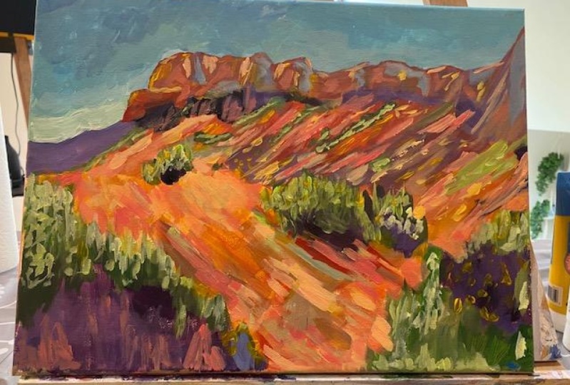
2. Materials : For this painting, you
will need a few materials. You will need a canvas. This is 50 by 50 centimeters. You will need three brushes. A beautiful medium flat brush, a small flat brush, and a big boy brush. The medium flat brush
is used to cover a lot of ground like
the cliffs and the sky. And the small flat brush
is used for details and rotating it to create
these beautiful leaves. The big flat brush is used for washes and covering
a lot of ground. You will need a mixing
plate. For the paints. You will need some
titanium white. This is Amsterdam acrylic
paints, brilliant blue. You will also need some red. This is carmine, red,
some primary yellow. Alongside that, you will
need a cup of water to dab the brushes into it and dab
the paint onto the painting. Of course, you will also
need some paper towels and the reference image from the resources page
of this class. And that's all you
need for this course.
3. Complex skies with minimal effort: In this step, you'll
learn how to make complex skies with
minimum effort. The sky in paintings is usually a gradient of blue or
a different color. And it starts lighter
on the bottom of the sky and it gets
progressively darker. It's important that you have the reference image of the
finished painting so you can have an overall
understanding of the entire composition. You will find that on the resources page of
this beautiful class, some great things to consider when painting a sky is that you don't always have to
paint the clouds at all. What you can do instead is play with the gradient
in a textured way to create some really
nice atmosphere without being too busy. A great rule for textures is to resist the urge
to blend things too much rough transitions
between colors give great complexity to an
artwork without much effort. In this step, you will use titanium white, primary yellow, brilliant blue, and a
touch of carmine red to create a gorgeous
turquoise gradients. This gradient, pastel
turquoise starts lighter at the bottom
and more yellowish. And as it goes up, it gets towards a
deeper shade of blue. And towards the
end of this step, you will add a bit more red
to the blue to intensify it. A key takeaway from this
step is the notice how your colors act when
you mix them together. You might find your acrylics
have a limited color range. This is not a bad thing. Don't worry, if your
colors are not learning, you achieved the same shades
of turquoise and blue. The way you apply
those colors to create the gradient is much more
important because in the end, nuances are just a small part of the process of
making this painting. Now let's get to some painting, grabbing the flat medium brush and putting it on the side. Let's add some white to the
mixing plate quite a bit. Right at the top. Squeeze that white
thoroughly onto the plate. Now adding some brilliant
blue right onto the left side, a bit less. Whoops. It dropped a little
bit onto the Canvas. Don't worry, it will be. And some primary yellow onto
the right side of white. Let's take that blue and put it into the middle of the plate. A good thing to consider when
mixing colors is that you need a dedicated area
to mix them together. Don't go into the actual color, for instance, onto the
white or onto the blue, because that will
make you need to pour even more and more
color all the time. Okay, Let's add some water to this beautiful blue in
the middle of the plate. And grabbing some white, mixing that white
into the blue to create this wonderful
baby blue color. Just a little bit of yellow. We'll create this
wonderful pastel color, pastel, turquoise. Maybe it's a little
bit too much. Let's add some more white. Press harder on the brush. The brush has a lot
of blue into it from the beginning and
mixing with the white. So there is a beautiful
light pastel turquoise. Now, going on to the left side. You should keep in mind
the edge and every mark you make tried to make it
very, very interesting. You can observe how diverse
this beautiful edge is, even though it's just one
brush mark and it's so short. Let's go up and create
the edge of the cliff. Let's add some more
color to the left side. You can be a little
bit more free when applying this left
side touch of color. Let's add some white
at the bottom over it, just to create more
color diversity. The secret sauce of
paintings, colored diversity. Fixing that edge a
little bit more. And let's add some more color. Adding a bit more blue to
this beautiful pastel color to create a more
turquoise, darker shade, just a touch more dark, and going higher to create another patch can start to
see how distinct it is. Don't worry, it will be
a little bit blended. Now let's think of
the end of the cliff, the first side of the cliff, you can start to see
it's the first step. It's like a stepladder
adding some more white and going in-between the first color and the second color
you've applied. And blending that
edge just a tiny bit, just one pass, going a bit higher to blend that color
towards the edge of the cliff. Now going even higher
and towards the right. Indicating the corner
of the second cliff and a bit curved towards
the right and lower. Always thinking of
that beautiful edge, Let's cut a little bit
of the edge and create more interesting patterns
in the wrinkly edge. Let's take a second and notice
how it goes up and down. And it has a lot of
definition going on to the right and creating
more of this edge. Going lower, end a bit
higher with a curve. And let's brush a little bit
of color with some water. So it covers a lot more area. Brushing in some more blue
from the end of the brush. Taking some more from the
plate and covering the edge, the top side edge. And as you go
towards the cliffs, you should be a
bit more present. And notice your movements. Be more conscious of your
movements going towards the left corner and trying to cover the whole top
side of the canvas. Brushing in the last few dabs
of color for the turquoise, It's important that the
painting is still wet when you add the second blue, right? In a few seconds. For that you will need
to add a bit of reds. This is carmine red. It mixes very well with
the brilliant blue, creating a bit of a purple. Now going and adding some red into the blue
just over here, just a touch, and then adding
a bit more with the corner, creating this vivid blue shade. You can see that it has been mixed over the turquoise just so it blends and adds a
bit of color harmony. We will get into that later. And right at the
edge of the canvas, the top edge of the canvas. You can blend this color, take some water and blend it in a bit lower with
the turquoise, you can start to see why the turquoise still
needs to be wet. Now, going on to the right
and onto the corner, let's blend a bit more. Brush, keeps on getting a bit closer and closer
towards turquoise. That's how the process
of blending is. Let's grab some white and
make this blue a bit lighter, just so we get a different
nuance right over here in the middle and
go towards the top, just blending it in a bit more, creating this transitionary
color and color variety, going and blending it even
more into the turquoise. Don't worry, if the turquoise
is not blended thoroughly, you can now add some white, some blue and re-create that
wonderful pastel turquoise. Just blend it together. Press hard on the brush and right next to
the middle cliff. Just add it. Being careful of the edge
blended into the blue. You can start to see how
much more integrated that Blue Fields going on the right side and
blending towards the top. Don't over blend. Going on to the left side
and now into the blue, just creating some
semblance of a Cloud. Now, let's think a
little bit and add some more white to this
turquoise you've just created. And add it towards the
right side of the cliff, creating a little bit more light behind the cliff and
playing with the edge. Once again, redefining it. If you feel like it's
not squiggly enough. And towards the right there
are some patches of white. And there you go. The sky is done. Super simple to do. You might have noticed that a medium brush was used
to create the sky. This was on purpose because
a big brush would not create as much texture and the edges of the cliffs would be
far less complex. So whenever you want to create
a big textured gradient, use a smaller brush. Resist the urge to
over blend things. This will not only look better, but it will save you
on time as well. Now let's go into the next step.
4. Brush direction and color Harmony: Usually people have a hard
time to create color harmony. This problem actually
comes from not knowing in a simple way what color harmony
is at a very basic level. Here comes a simple definition. Color harmony, at the
most basic understanding is blending colors
into each other. Yep, that's it. Super simple, just letting the colors
blend into each other. Very often, people are afraid of a dirty brush and a
messy color palettes when these things
can be the answer to pleasing colors and
harmonious transitions. Of course, there
is an exception to this overly simplistic
definition of color harmony. When you want to create contrast
or very vibrant colors, you need a clean
brush and pallets. Another way to put it is that messy colors can be a
perfect background on top of which you can lay down more and more vibrant colors. In this step, you
will start with a messy brush from
the last step and combine some beautiful
orange brown nuances for the cliffs and the ground. If you clean the brush, just mix a little bit of
that tour coils of the sky. Once again, just to
have it into the brush. You will notice how it
turns the orange brown of the cliffs more
gray at some points. This is great for creating
some atmospheric perspective. Big words. These big words are
very easy to explain. Objects far away tend to
have little color contrast, almost becoming one
and the same nuances. An example would be a
mountain in the distance which is almost always
blue or purple. And as you get closer
and closer to it, it becomes greener or brown depending on if it has
grease on the top, are not. Going further into this step, you'll start to give some
direction to your brush marks, creating a very
dynamic composition. Okay, enough big words. Let's go into the step. Grabbing the messy brush, some yellow and some red,
mixing them together. The blue of the brush
and taking some more, creating this beautiful,
the brownish orange, getting some more
red and some more yellow and a touch of blue, mixing it very well into
the bristles of the brush, taking some water and going
right on the top cliff. Being very careful
not to change too much of the edge
you've just created. You still need to go a
little bit into the blue, just so it doesn't
show the white of the canvas being very conscious
once again, of the edge. You can still refine it
even more if you need to. As you can see just over here, just going into the
blue and here it is, the blue of the brush. Let's take even more to exaggerate the wonderful
color harmony. Let's blend this
beautiful turquoise into the orange mute and get down creating a beautiful gray tone. Let's mix the red, brownish color once again and
go on to the second cliff. This will create
the impression that the bottom cliff just
goes into the other one. And it will make
the top cliff just appear more into the distance. And a little bit of blue just
pressing down on the brush so it squeezes some of that
turquoise onto the cliff. Taking some more color, a bit of water, and going over to the right and creating some more of
this wonderful cliff. Let's clean up the brush onto the canvas just a tiny bit more, squeezing some more of that
blue planning a little bit of the edge of the
cliff from below. Mixing in some more
of this orange. This time a bit more yellow, just to add some variety. Going back into the
edge at the top and closer and closer
towards the right. And you can start
to see there is a fluffy edge right over here. Let's cut it and make
it more angular. Going towards the right, can start to see the
oranges a bit more intense. It needs a little
bit more pressing and blending with the
turquoise of the brush. Let's take some more
of that orange and continue towards the
right of the canvas, creating some more edges. If your color is
too transparent, you might need to get over
the edge a few times, so it looks crisp and nice. Let's get some more color
and finish that edge. Ride by the corner. It doesn't go into the corner. It just goes right next to
it by about a centimeter. Let's clean up the
brush onto the Canvas. Take some blue and
mix it in with the orange of the
wonderful cliffs. Let's take even more turquoise and some water just so it blends even more that turquoise into the orange you are just
creating on the mixing plate. Let's mix some more orange with the watery blue
you have in the brush. And on a diagonal
from right to left, you can start to see that
beautiful brush vibration and brush mark direction. Just going from the left
to the right on an angle, just on the right side. Now let's take some water and accentuate and fill
in that white canvas. Don't worry, this
is just the wash to give the sense
of composition, Let's make some more orange. And when you finish
mixing in that orange, you can go over. And as you go towards the left, just go with the marks
a bit more flat. Let's fill in that
space and blend in those new brush marks into the cliffs so that they connect. Let's create a new brush
mark just over here, indicating a new direction. Just going the opposite
way on an angle. Okay, Let's take some blue
and add it just over here. Just making some
more color variety, taking some water
and some orange and adding a beautiful mark
just in the middle, accentuating that
direction even more. And going higher and higher to create this new patch of color. Tried to work a little bit
in batches just so it takes your brain out of that
linear thinking process. Taking some more
orange and going and making another
beautiful patch. And now let's create
some more on the top, filling in on the right side
and moving towards the left, let's add some more blue. And over here connected the two patches with a
different kind of color, a little bit of gray, now changing it even more. Let's go with some
vertical brush marks. Let's take some yellowish
color this time. Let's change it even
more and create a beautiful patch of yellowish
orange just over here. Taking even more
of this yellow and blending it right next
to the orange patch, you can start to see
how patched it is. They are a bit important the
way the colors are layered, because there will
be a beautiful Bush just over there in
the middle, orange. Let's make another
beautiful orange just over here and blend the faraway
cliff sides a bit more. Cleaning the brush
in the process on the canvas and going in and adding some more of this dry brush and a
wash with the water, taking some water and going
in mixing a little bit. The connection between
the two patches of color. Just a bit more blending. And on the right side just
going and touching it up. It needs a bit of a wash, just so it creates some beautiful contrast
with the next layers. Let's take some more water
and add it into the orange. Speaking of washes,
there's nothing better than a big brush for a big wash. Let's take some orange and go on to the
right with the big brush. It will create much,
much more interesting. And flat brush marks. Going towards the right
and in the middle, just brushing those brushing brushing those brush
marks towards the right. When it comes to the lower
part of the composition, can start to see that the brush, even though it's so big, we still use it onto its side. Going into the left
side and you can go towards the edge and finish
that wash thoroughly. Taking some more of that color and finishing the
right edge as well. Just going with some
light dabs and brushes. Let's fill in a little bit
at the top near the sky. And there you go with
this wonderful step. And look how easy it was. Some more technical
takeaways from this step is to notice how much
color variety was used, even for a simple
background wash from the bottom
side of the canvas, you can find blues,
yellows, oranges. A lot of variety has been used whenever you are creating
an object or a scene, you can easily give
it the illusion of detail just by adding
another color into the mix even better
if that color is part of another object
into the painting. For example, the color of the sky that you add
into the ground, cliffs, and even the
blades of grass. This is also true
about the color of a room while painting a
still life or a portrait. You can add it to harmonize the color to out the painting. Now let's expand your
definition of color harmony a bit on top of just blending
colors into each other. Here is a little bit of a
definition for color harmony. You need a color that is
found in blended throughout the artwork in order to give the sense of integrity
throughout the piece. And of course, there is another more complex
understanding in that you can choose the color that you want to harmonize
the painting two. And now let's not forget about one other thing you've
used in this step. It is one of the most overlooked
things in composition, and that is brush direction. Clearly defining
your brush marks can make the composition looks
so much more interesting. And it doesn't need
to be very complex. You just need to be conscious
of your brush direction. Does it go to the right? Does it go to the left? Does it go from up, down, wherever it goes? And which way will create a
more interesting composition. Now, let's go into
the next step.
5. Cool shadow contrast : It's time for some cool
shadow contrast until now on the ground and
the cliffs you've painted with very warm colors. These beautiful muddy colors are perfect substrate for some
awesome purple blue shadows. It's important to use
the brush marks in the direction you
already established. And when painting a new object, you can break it by going
in a different direction. For instance, using some
vertical marks for a bush, you will see how
much the painting changes once you start adding cool shadows to complement
the worm nuances. Of course, you will
see how easy it is to create warm and cool contrast. Now let's get to painting. Grabbing the medium flood brush. As you can see, the brush
is a bit more clean. Let's add some beautiful
red to some blue and add it to this area of the
plate over the orange. Mix it in very thoroughly. And right in the middle of
the canvas, right over here. Let's add some
shadow for the bush. There will be a bush there. So let's add the shadow for it. It seems like there
is a little bit of a need to mix a bit more color. Let's add some red, take some blue and mix this
wonderful purple once again, so it's more vibrant. Let's take some water
just so it flows easier. You can start to see how
dark this purple is. Okay, let's add a
chest over here and then continue
on to the cliff, just going with
the direction and changing it to a more
vertical stroke. Once you go higher, Let's take some water. Move towards the right, creating some more
interesting shadows at the bottom of the cliff. Now, let's go in and add some more at the
end of the cliff. And right over here, let's add a shadow for
a bush onto the cliffs, you can go with some more
line like brush marks. And you can vary how
thick they are as you go and create new
patches of shadow. Breaking down that edge and making those boulders
seem more interesting. Going on to the left side, you will create a
beautiful patch of purple. And let's vary that color by
just adding some water and keeping some patches more
transparent and some more dark. You can start to
see the direction over here is more vertical. That is because this will be another beautiful Bush
just in the foregrounds. Let's mix in to that
corner some more paint. A beautiful area. You don't have to go
too much into detail. Let's go on to the right side. Weird, another shadowy part
for another beautiful Bush. Chest. Easy. And let's blend it
a little bit just so it seems more fluffy. Let's add some more dark parts just to create some
more diversity. Notice the two brush
marks indicating the brush direction
of this bush. Taking some more purple and going with some
directional brushes, just creating some shadow
onto the left side, just going towards the left. Let's go with some more of
this beautiful vertical ones, creating another bush
chest over here, and indicating the side of this middle bush that
you firstly created. Notice how the shadow of
the middle Bush just go with the direction of the
ground while it sticks out. Let's add some white to this purple and some blue
just to add some of that color variety and mix in some new nuances that are closer in value to the painting. Because those darks
were very, very dark. Now it's time to, with this purple just at the edges and a little
bit over the shadows. Let's extend the bush
on the right and create some more shadows just onto the ground in the middle
of the composition, taking some more water just
so the paint flows better. Now let's keep that directionality
and make a big splash, purple just over here
and onto the cliffs. Let's create some edges just
going towards the right, indicating the top
of the cliffs. Okay, taking some reds, some blue, and some white, creating a much, much
more blue light color. This will be some
reflected light onto the dark parts
of the cliffs. Notice how close it is
to the color of the sky, and yet it has some
purples into it. Let's go and create some of this reflected skylights onto
the beautiful clips. Now some blue and
some white mixing in, going even closer towards the sky color and going even
more onto the cliff sides, adding some more
harmonizing color. You can go right over
here in the middle of the painting with this
chromatic aberration, right where the light meets the shadow onto the
left bottom side. Let's mix in some
more water and add this color just over here
towards the right side, bush. Let's add it into the
shadows of this push, creating some more texture
and color variety. Of course, this
color is perfect for some very distant
mountains or trees. Now let's be conscious of that wonderful edge and create
some beautiful mountains. You can start to see how
much more distant they feel. Let's mix in that color
also onto the ground. And now let's go on to the cliffs as the
Paintbrush has less and less color going and adding some beautiful touches
of blue here and there, don't worry, you will get to add some more oranges later,
fixing the areas. Let's brush into the cliff side some of this blue
with the brush, cleaning a little
bit of the brush, and then taking some
lighter blues and adding them right over
here above the shadow, indicating some sort of cleft that comes
towards the viewer. This is a very interesting
part of painting. Notice that by adding
ambient color, in this case, the color of the sky, you were able to create some wonderful reflections
on the cliffs. Also, this ambient
color is quite useful as a transitionary
color between light and dark as it was used right over here on the
shadow of the middle Bush. This fascinating phenomenon is called chromatic aberration, and it has an amazing
name as well. It comes from photography, but it can be used to represent light in painting as well. Here is an exaggerated
example of the phenomenon on a
beautiful cheetah. Notice the chromatic
aberrations both on the outside and the
inside of the shape. Where light meets
the dark parts of the background or the
dark parts of the shape, in this case the cheetah. They can be very
diverse in color. Teal blue, orange, yellow, purple, all the
beautiful colors. And now you can
use them to create colorful transitions
between the dark parts and the light parts
of your paintings. Here is a great example of using color distortion to
make amazing paintings. This painting is by
Michael do dash. These chromatic aberrations are especially useful
for cast shadows, meaning the shadow that the object projects
on the surface. It sounds on, or in this
case the wall next to it. And let's not forget
about the mountains. Another application of
these beautiful colors is for distant objects, like the faraway mountains on the top left of the painting. And now let's go
into the next step.
6. Playing with big and small shapes to create perspective: Playing with big and small
shapes to create perspective. When it comes to perspective, most people have a few
mistakes that they make. The things that they paint
in the background are too big compared to the
ones in the foreground. In other words, things in
the distance tend to be way, way smaller than we think. Now, it's time to think back when you were a kid
and you covered someone in the distance
with just your thumb, look at how small this
person in the distance is, even though it's about
20 feet from the photo. Of course, people have
become a bit more inventive with
forced perspective, like riding a banana. The main takeaway here
is that things that are distant become way
smaller than you think. For instance, a small
leaf on a bush in the foreground can become an
entire Bush in the distance. And this one over here, notice how small it is compared to the one
that is closer. The greater the distance between foreground elements
and background, the more grand and vast
the landscape seems. Okay enough talking. Let's start painting. Let's grab the medium brush
and clean it a little bit since you will be
using green for this step. Grabbing some blue and mixing it right over
here with some yellow. Maybe a bit more. And a touch of red to cut
down on that beautiful green, making it a little bit earthy or adding some more
blue and mixing a very beautiful and nice dark green with some red and
some yellow to make it much, much closer to the shadow color. Starting on the left side. Notice how dark this green is. And positioning it and painting it with a vertical stroke, just going lower
into the shadow, creating some more depth to
this bush in the foreground. Let's go higher with some dabs, being conscious of the edge, making it very broken and nice. Let's add some more yellow to
create a more joyful Green. Taking the brush and mixing
in some of that yellow to mix and match the color
a bit more light. And yellowy, adding some red
just so it becomes earthy, so it doesn't stand
out too much. Okay. Look at how much more
orange and yellow it looks compared to the other
green vertical strokes continuing lower at
the intersection between the purple and
orange on the left side. And now let's move
towards the top, making some very,
very small bushes. You can start to see how
small and tiny they are. Let's put some on the cliffs. These ones will be even smaller. Going towards the middle and adding some more
just sloping down, of course, following
that beautiful slope of the ground that
you've created. And in the second
step, that direction, Let's move and create some
more brushes just over here, onto the middle of the canvas. Going towards the
left and making some more small bushes just
with the tip of the brush. Now it's time to go
higher on to the cliff. So it's a good thing to add a bit more blue as you
go to the distance. Just so you change that color variety and add
more atmospheric perspective. And as you can see,
the bushes start to look a bit more interesting. Now let's start in this
middle Bush just over here, creating a round fluffy
Bush just over the shadow. Adding some more
yellow and some more red with a tiny bit of blue
to bring back that green. Mixing a lot more color. And going on to the middle Bush, just over here, right where the darkest part
of this bush is. And drawing a bit on the top. Now going on to the left push and making the edge
a bit more fluffy. Taking more paint
and going on to the middle Bush once again, the one right over here. This is a bit smaller than
the one closer to the middle. Let's make it a bit bigger. And going lower, you can start to add another
beautiful Bush just over on the right side near
the edge below the shadow. Makes it in quite
nicely with the shadow. And going over the
shadow just a little bit to create more of this
beautiful foliage. Let's add another
beautiful patch of green just over here. Just going with
vertical strokes, pushing a bit harder on
the brush so it squeezes that green out of it and
then brushing it in. Just so there is a little bit more color
variety going in. And making this bush
a little bit bigger, just so it stands out compared to the ones in the distance. And now creating a
lighter version of this color with some
white and some yellow. Mix it very well together. Maybe add a bit more
yellow and just add it right next to
the purple over here, indicating a little
bit of a highlight. And of course, onto the left side of the
bushes in the middle, you can add some highlights. Notice how it almost perfectly
cuts the bush in half. It's still on over the green, so it blends a little bit and creates much more
interesting textures. Now, mixing a bit more
of the same color, maybe a bit lighter, and going into the
middle of the bush. Keep in mind that light
comes from the left side, as you can see over
here from in-between the cliff and the
side of the canvas. Now, notice the textures
and the space in-between each brush stroke to create
some sort of individual leaf. You're not painting
the leaves per se, but you are indicating them. Let's add some bushes in the
distance just over here, right by the mountains, creating a soft edge in-between the dark mountains
and the ground. Now going into the middle and going with some smaller bushes, with some smaller leaves onto the right side and right where the light orange part of the ground meets the
push on the left. Let's add some more of this
beautiful light green, grabbing some more color and continuing higher and going into the greens a bit to create some more tensions and
more light, more dark. Well, just light. Okay. Going a bit further
onto the right side, creating the definition
of this bush even more. Just this lower side creating some more of that
color. Touch lighter. And going higher right where
the light part of the ground meets the bush and
going a little bit inside where there
is a patch of green. Now for the small pushes the same light just on
the left, this time, even smaller, just indicating the light part that is on
the left side and the top. You can also add standalone
bushes that have no shadow. They have just highlights. The distant bushes
need to have very, very tiny fine points
of light and shadow. And going and making some
lines and some dots. Very fine and small, just here and there. Wherever you see
another bush or you feel like a bush without
a shadow can stand. Maybe it's a patch of grass
going higher and making that beautiful highlight on a
few bushes right over here. Okay, with the tip, maybe this one has a bit
of a bigger Highlight. Look at how this bush in
the dark purple stands out so much. Now going with some lighter
bushes just over here on the cliffs and adding some
more onto the right side. Just creating more variety. Just random, abstract,
brushy, brushy works. Now in the distance, Let's soften up that ground
part with some green, getting even higher and
accentuating that edge, creating it basically by adding a few bushes
that sand on it. Let's accentuate this
edge just over here. Once again, maybe it comes down. Maybe there is a path or some branches or
something green. Perfect. Just softly brushing some green and making some bushes on top of the cliffs as well. Barely, barely
touching the canvas, going in the middle and making another
beautiful like Bush. There you go. What a simple and easy way to make pushes and
create perspective. Speaking of perspective,
you might have noticed that the foreground elements have much more detailed than
the background ones. This seems super intuitive, but it's not specific enough. Details means nothing is
just a placeholder words. A better term is batches
or fragmentations. You choose what term
is best for you. This refers to the number of individual patches that
formed the whole object, in this case the bush. But it can be true about trees, people, mountains, and animals. Notice out in this middle bush, there is a lot of fragmentation
and patches of color. While in the background, there is less and less, the light part becomes one and the dark part
is just one patch. You can also observe what
we talked in the beginning. The fact that this bush is so much bigger than
the one in the back. Now, let's go into
the next step.
7. Intermediary washes can change a painting: Intermediary washes
are a great way to tighten up your paintings. Think of this as a
semi-transparent layer that you put over
certain areas to give more definition and
contrast things without completely covering
what you have already done. They give so much complexity to the artwork without much effort. Just a little bit of a
huge change and the few brushstrokes later you have
a very different picture. And by changing the color a little bit while
you add the wash, you will get color diversity, one of the most important things for interesting paintings. Now let's get into the step. This will be a very easy step. Just grab the flat brush. It has a little bit
of green into it, just a tiny bit. Let's grab some light
yellow and some red. Mix it in quite nicely. This Earth, the Ochre tone, mixing quite a bit
just over here, even though it's a wash, it needs a bit of a paste. Let's start in the
middle just over here, fixing those green areas
you've just created. Just making them more yellowy, creating a bit of a transition between green and the orange of the ground with a
transparent layer just going with the
direction of the brush, just following the ground. Not going overboard. Just creating ride over
here onto the cliff. Adding over the blue, just fixing those areas. Not fixing them,
but bringing them back towards a different hue. Just touching up a few of
the sides of the cliff, just in the left side, right over here by the edge. And you can start to see how much more different
it looks just with a few touches on the side and in the middle creates so
much more diversity. Just one little wash
and going over onto the right side and
brushing in a bit more as you go down and you have less color into the brush, taking more reds,
changing the hue bit more to make it
more red and vibrant. Taking some white and
mixing it in just to cut that orange down and make the color much more
yellow and light. And going into the
middle of the ground, grabbing even more white to create little bit of
a different color. And going higher. Dark purple shadows
onto the clefts. And right over here
next to the Bush, just adding this color over
the purple and going away, maybe up the cliff, just a few dabs lines. Notice the verticality
of the brush strokes. And some lines just over
here, over the cliff. Maybe there are
some boulders and some lighter parts on top of the cliff taking
even more white. This white has a tiny
bit of blue into it. And going on to the cliff and the ground with
the brush stroke, a bit more different
right over here, where it meets the white
and then changing it to a directional brush mark. And going in between
those bushes and creating that diagonal just going from the left to the right and going right
over here by the edge, going a bit over the green and taking some more
water just to bring this wash right by the edge without going
too much into the green, just covering that
area to give it a lot more detail and
interesting shapes and washes. Discovering the lighter parts. And over here onto the right side and
in-between the bushes, just scraping some of that wash. Look at how vibrant
the painting looks. And it has changed a bit
more to the warm side. Once again, as you
saw in the step, brush direction played a big
role in this step as well. In fact, it was always
very important. Clearly defining
your brush marks can make a composition look much more interesting and dynamic. So keep in mind, where do the brush strokes go? Now, let's get into
the next step.
8. Thicker and vibrant paint : Thicker and vibrant paint. Getting vibrant colors can be a little bit difficult sometimes. But this is a very
simple problem to solve. It has three parts. The first part is combining
too many colors together. A good rule of thumb for when you want to get
extremely vibrant color is to use maximum two colors
and use analogous colors. If you need to combine complimentary colors to
get purple, for instance, your results will be much
better if you have a purple and combine it either with red and blue to get
to the desired hue. The next thing to
keep in mind is that thicker paint is much
less transparent. This means that
when you apply it, the color underneath
doesn't show through. If your paint is
still transparent, even if you apply
the thicker layer, for instance, yellow is a
notoriously transparent color. Then you will have to wait a little bit until the paint is dry and apply another code
using the same color. This brings us to
the next point. In order to have vibrant colors, you need to wait for
the paint to completely dry before you add
the next layer. This might seem simple. However, patience is a virtue
that not many possess. You literally have to
watch the paint dry. Fighting the urge
to just touch up a bit more is a
hard thing to do. That's why it's
important to take a little bit of a
break, stretch, drink a cup of tea, or just paint on another
part of the landscape. But remember not to put
the cup of tea next to the paint water brushes are not very happy
when they taste d. Now let's get into the step, getting some primary yellow and adding it to the mixing plate. And some red. Grabbing the E, EBD tiny brush, the flat brush, and some
yellow with a touch of red, creating a very vibrant orange. Let's add some more yellow and
mix it very well together, creating a thick layer of paint. Now, let's focus on the
direction just over here. And paint in some
lights can notice the paint is showing
through a little bit. It doesn't have to be very, very intense, especially on areas that
already have the color. Let's go in the distance and
focus on the direction of the brush just going towards
the left on a slight angle. And at the top just over here, adding some verticality
to the cliffs, slowly dripping down some color, and going a little bit
more towards the right, you can start with some
more horizontal lines, creating a bit of a patch
going in the distance and adding some more
horizontal orange patches. Let's grab some more yellow and make the light over here
on the first batch. Just a bit more intense. Now going lower and adding more vibrancy and going
a bit and changing the direction of the
brush just a tiny bit to create some sort of a
break over the purple. And going even more yellow. And creating this
wonderful patch of light just next to
the Bush as well. And going lower. Grabbing more paint each
time it's very important to have a bit of a thicker
layer of paint. No water is being
used over here. Let's accentuate this shadow by adding some more
light around it. And in the distance over here, you can start to
see the distance. The colors are much more muted. So when you put this
vibrant yellow, it stands out quite a bit, especially on to the purple. Let's brush it in. Mixing just a tiny bit. Grab some more yellow and add some more patches and lines
further in the distance. Some thicker paint has
been applied over there. And now grabbing even more
just to add some more lines and a few patches of this
wonderful vibrant colors. Now going on to the cliffs, notice how it's even more bright because the cliffs
are a touch more dark. Grabbing some red and
mixing in some orange. Just to cut that yellow a bit more and create some
color diversity, it stands out quite a bit, so it needs a few points of very vibrant orange just on
top and towards the right. Slowly inching towards the right and the left with
this vibrant color. Let's add some at the top
with just the orange. Don't add too much
vibrancy everywhere. Just a few brushstrokes
is enough. Let's go further
towards the right end. Fix this edge right
over here and add a patch of orange mixing
in some more yellow, bringing back some
of that yellowy Hugh and going towards the right even more with a few brush strokes. And even more up to the corner. I'm going lower and moving
towards the left once again, just to break that
pattern a bit. And going even lower. Moving in-between
areas will ensure that you don't overwork
a certain part. Let's look and see
what it needs. Let's add some more red and add some vibrancy towards
the red this time. Just over here, a big splotch of paint and another
one going down, you can start to notice how much more different
it looks over the purple lot closer to read than any of the
colors on the canvas. Now going higher and adding this color here and they're
not going overboard just on the cliffs trying to still retain those
beautiful purples, blues and oranges, making an
even more intense orange. Let's add some
more thicker paint onto the edge of the cliff, onto the left side, and on the lower part
where it meets the ground. Grabbing some more
color and adding some lines onto the middle of the canvas and onto the right
of this beautiful Bush, just going with the direction
of the brush on the ground, going into the purples higher
end, adding this color, just adding patches of
vibrancy, just a few, noticing the edge,
creating some sort of a contrast between the
green and the red. Going with smaller
brush marks onto the lower part and even
lower, creating some patches. Notice the bigger and
then the smaller. Then the bigger and the
smaller one just over here. It's a play in between
big and small. Okay, let's add some small
ones just over the blue, right over here, right
next to the blue. And going into the purples, just add some of that heat. Some of that orange, creating more color variety. Which seems like it has a lot of detail and there
is a lot going on, but without much effort, let's mix more yellow
version of this. Orange is very, very yellow. Almost pure yellow. Just makes it very, very well. Thick coat of paint
keeps the doctor away. And going in between and adding some more vibrancy behind the bush and pride
over here on the Hill. Going into the purples in, you might notice
that there is a play between purple and yellow
since they are complimentary. Let's add right here next to the shadows some
really yellow parts. And going higher, just
a few dabs of paint. And it creates so much
beautiful vibrancy. Let's go higher on to the
cliffs and towards the left, just to dabs of yellow indicating
the edge of the cliff. And towards the left, just one small point and going lower into the orange
that is already there. And towards the left, higher on to the cliff, just creating some sides. And even onto the right side, a few dabs of paint. Now lower onto the ground, Let's add some very
abstract shapes indicating some foliage or some ground that is a bit more
rocky and yellow. Let's add some more vibrancy
and some more yellow. Just to add a few textures. Let's roll this beautiful brush onto the purple just over here, the purple blue and
next to the bush. And now it's time to add some of this yellow onto the
green of the bushes. Just a touch of this
vibrant yellow. Cleaning up the brush onto
the left side of the bushes, just adding some
more color variety. Just on the highlight
part of the bushes, grabbing some more
paint and starting in the middle Bush and connecting a little
bit of the bushes, grabbing a bit more paint and integrating this
yellow over onto the left side and everywhere onto the bushes and going overboard just a bit. Rotating the brush,
as you can see, can make some nice and
beautiful brush marks. Just rotate it and create
beautiful textures. Just rotate the brush
and it will create the impression of foliage. Very easy to do. Just trust yourself and
rotate the brush a tiny bit. Don't worry, you will touch
up these areas a bit more with the proper highlights
and in the middle, and let's add a bit more yellow. You can start to see
how it breaks a bit, the contrast, and it
adds more vibrancy. Super easy to do. Let's go to the left and add some of this
yellow into the bush. Not all things in
painting need to be complex topics and ideas. Sometimes it's as
simple as just adding a few splashes of color
to add some vibrancy. Of course, there is a little bit of method to the madness. For instance, it's much easier
to add vibrancy on top of areas that are very close to the color that you are applying. And you should be conscious of rush direction whenever
you paint on an area. Now, let's get into
the next step.
9. Variety of color is the secret sauce : Color variety is
the secret sauce. There seems to be a
theme to this course, doing things in a more
simple way and yet, getting the most out
of the concepts and techniques being
explained and used. For instance, color variety, a subject that can be vast and cumbersome and full of
complicated terminology. And yet in this step, it boils down just
to analogous colors. Just deciding on what color
needs more diversification. In this case, the orange of
the cliffs and the ground. So the base color is orange. The adjacent colors or analogous colors would
be red and yellow. Adding color
varieties super easy. All you would need
to do is add more yellow or red to orange. But another way to make
things more complex with little effort is to add
white into the mix. This way, the orange can become a creamy pastel pink or a
beautiful yellow ocher. This brings much more
different nuances without deviating too much
from the base, orange. Now let's get to painting. Let's add some white
to the mixing plate. Right here on the left. As you can see, there is also yellow and white on the plate. Let's mix some of
that white into the yellow just over here
in the middle of the plate. And add even more white. Grabbing some of the red from the edges with the
small flat brush, you can think of
this layer of paint as the highlights of the ground. Let's add some patches
just over here, creating some more
interesting dynamic, just going a bit vertical
and then following the brush direction
onto the hill. Now going higher with some patches of this
lighter version. Now right over here next to
the right side of the bush, and next to the dark parts onto the clefts just
following that direction. Maybe some of it just in
between the distance. And you can also use the brush, just rotated a little bit
some more of that rotation, creating some different
brush strokes. Getting some more paint and
looking for a right spot to add some lines and some
rotational brush marks. You can start to see
this is some sort of a light shining through, just going down and adding
some of it onto the ground, right in front of the
bush in the middle. Now ride into the transition. We can accentuate some of that light right onto the
orange and next to the blue, grabbing some more yellow, making the highlight
a bit more different. This time, the bid more yellow, just adding some more
vibrancy and some more light. You can still see the white
permeating through the paint. Still much lighter than the
yellows previously applied. Now going higher with this
yellow word color and adding some beautiful
rounded brush marks, organic abstract
shapes and dots. Now going over the purple
with some lines and brushing in and then creating some
more intense color over it. Just a few dabs of paint. To integrate some more lighter
version of these yellows. They just add so much more
dynamic color variety onto the cliffs right
next to the edge, adding some more lights. And at the top, as you can see, they stand very
good onto oranges or onto darker versions
of that yellow. And right next to the edge, accentuating that beautiful
edge going lower. Just to make a little
bit of a transition. And in-between next
to the purple, the dark, beautiful purple, getting more color and
going even yellower, going higher with some round
brush marks and some lines. Now going into the
reds, taking some red. Now it's very important to
mix some of that yellow. You're already having
the brush with some reds and some white. Just mix it very well
together to get the salmon. Pink, this pastel, beautiful
pink, Rosie and wonderful. This will integrate
all the oranges. It's a transitionary color between the orange
and the purple. And going into the Ground, just adding
it towards the purple and also over the orange. Because you start to see how beautiful and
interesting it looks. This color hasn't appeared
anywhere else before, so it kinda gets right in there and becomes part of the
painting quite easily. It was needed for
such a long time. Now it's on the painting now
higher on to the cliffs. You can add it as well. And going towards the
left over the blues, just adding a bit more
of this new found color. Okay, going and adding it right next to
the yellow as well. And in between the
light just over here on the left and lower, just mixing and matching. Some beautiful
transitions ride where the darkest shadow
of the painting is in the middle of the canvas, going onto the ground and adding some more transitionary colors. Look at how complex it is. And adding some more white just to turn this
pink, even lighter. Mixing it very well together. Grabbing some of
that paste and going right onto the lower side, right next to the bush. And on the ground, just rotating that brush. Just a few splotches of paints, getting even more
paint and going over the yellow right over here. Just a few touch ups to give the impression of more
interesting textures. And on the orange right
next to the cliffs, grabbing some more yellow
and adding it to this color. Just so we bring
everything together. Grabbing some more
white to create a lighter version of
this beautiful color. Mixing them all together, creating a different hue. Thoroughly mixing and
spooning the brush. Now going over n
between and adding a transitionary color between the yellow parts
and the pink parts. Just creating some more interesting
lines onto the hillside. Maybe a few more
just standalone. Onto the purple
side of the hill. Top. Just a little light
ray onto the grounds. And right next to the purple, maybe there is a light over
here, a beautiful highlights. Now, okay, Let's see where
this color fits even more. Maybe next to the dark
purple onto the cliff side. Let's grab some more yellow and add even more interesting
colors over there. Grabbing some of
that newfound color and adding it to the middle of the composition
with a few lines. Fixing that edge of this bush. Maybe it's a bit too round. Now going lower and making some more brush direction
onto the right side. Just going higher, following
that path you've laid down from the beginning and going even more in the middle. You can see how it goes and flows towards the
right on the top side. And then it just goes on
towards the right corner, creating a beautiful
composition. Let's accentuate that even
more, just over here. And then going lower with this beautiful color
right next to the bush, adding some more
light behind it. And in front of it, just calming down a
little bit of that color. Now right next to the
left side there is this bush that we need to fix
a little bit of the edges and maybe go into some
darker parts right over here creating a spot
where the light shines through the bush
and you can still see the ground creating and changing a little bit of the composition
with a few simple dabs. And there you go with
this wonderful step. In this composition, pink is a color that brings the orange closer and closer to the
rich purples in the shadows. It acts like a
transition and recolor, making the whole painting
more harmonious. The same is true for
the light yellow ochre. It brings the orange closer and closer towards the
green of the bushes. This is what makes the
painting balanced, even though it has all the
colors of the rainbow, it doesn't feel overwhelming and all the colors flow
nicely into each other. And all of this, without making things overly complicated or impossible
to comprehend. What is the use of information
if it can't be applied? In order for information
to be applied, it needs to stick into
the memory easily. By now, you might not remember what chromatic aberrations are, but yet it's much easier to
remember the cheetah and the Violet's between the light part and the dark part of it's for, and how you've added purples
and blues to the cliffs and the ground to integrate the color of the sky
into the painting. Okay, okay, enough mumbo jumbo. Let's finish this painting
in the next step.
10. Bringing everything together . Thank you: Finally, it's time to
bring everything together. What would be a better way to finish the painting than adding some vibrancy and integrating
some more color variety. All while practicing mark
making and brush direction, the bushes need a little
bit more vibrancy and some more
textured highlights. However, since the green will become intense in the process, you will need to transform it
into a little bit of a wash and integrates into the ground and the color of the cliffs. This will bring together
the landscape even more, making it look much more
detailed and finished. And now let's paint. Finally adding some blue to the mixing plate
onto the right side, grabbing the small flat brush, as you can see, it's clean and some blue right over
here on a clean space. Adding some yellow, creating
this vibrant, rich green. Just adding two colors. And start going onto the
bushes creating some vibrancy. Once again, you can rotate the brush to create
some foliage. Let's add some more
white to the color to create even more of a highlight. Look much better. Let's now create some thick, beautiful round
points and dots right on the left edge of
the beautiful bushes. Remember to rotate just
like this, the brush, so it creates some sort
of a wonderful texture. Let's add also some verticality. Just so they stand out next to the horizontal and diagonal
lines of the ground. Look at how bright and
colorful the bush looks. Now. Now let's go into the middle
one and add the same brush. This is a very simple
and repetitive action. However, you need
to be conscious of the beautiful edges and the
wonderful sides of the bush, you can start to see how
complex and detailed it looks. If you leave the colors from the first layer
is still visible. Going a bit further
into the background on this small little bush and adding some highlights
just to the top. Now onto the left side, right in-between the transition
where the ground meets the bushes and right here into the newly created
patch of light. And going even more towards
the edge of the canvas, creating some more
textures and leaves. Okay, going higher, adding
some more yellow and onto the right side and some white to create even lighter highlights. Straight onto the metal bush, you can start to see the color has become
so much more light. Don't overuse these highlights, just add them just as a special thing over the
color you've just laid in. Just small little
points and dots and going a bit in
different directions. You can start to see
over here there is a small bush in the distance. Let's add some highlight to it. Let's make some more paint
by adding some blue, some yellow, and some white, mixing it well together. Just so we can add some thick
highlights onto the bush, just onto the right side. Some dots, just
stapling it down, just adding different kinds of brush marks by rotating
or by dabbing the brush, or by making some fine
lines and points. Look at how much more
textured it looks. Let's go over here and create some vertical lines and dots
going down into the ground. And adding some more
complexity with just going a bit faster and adding some
more interesting lines going towards the
left and adding at the edge of the bush just
a few more textures. Now, let's move into
the distance and add some highlights to
the distant bushes, to the far away bushes on
the side of the cliff. Look at how they instantly pop. It gives the effect of light. This is because you've
laid down some colors that can stand this light
version of the green. Okay, while still
keeping it simple, Let's go on to the
middle Bush and add some more of this highlights
just by rotating the brush, creating a section of light
and closer to the ground, Let's refine them and make
them a bit more horizontal. There is another patch on this bush as well,
right in the middle, you might notice it's
in the middle of the shape just so it
breaks down that illusion. The edges, the lightest part. Now, the lightest part, it's in the middle of the shape. Now going on to the
left and going into the darker parts and creating some highlights
over there as well. Just simply adding some lines
and some squiggly area's. Now it's time to add some
water to the paint just so you can create a
wash for the ground. Just so we integrate that light green into the ground
and the cliffs. This will make sure
that the painting feels flowing and the colors
just blend together nicely. Look at how nice it just
shines onto the ground. Don't go overboard
with this swash, just a little bit of color just to find it here and there. It doesn't have to be too logical as long as you
keep that direction. And you add just a little
bit of a wash and it doesn't feel too mechanical
then it's just fine. Let's add some more
on this side and on the top of the cliff stands
out quite a bit more, maybe just a touch more. And then we can just add some
more water so we blend it. Maybe there is another
beautiful patch of green over here. And on the right side, just adding a few dabs of paint. Let's look at the painting. Clean out the brush and mix a little bit
of the orange for the cliffs so that they blend
more in the background, the green areas, just going over the green areas
with the salmon, beautiful orange
blending those greens. Now they seem much,
much more integrated, going over them, cutting them, and almost completely
covering them. There you go, the
painting is finished. You've also might have
noticed how much of the painting is still
left undefined, untouched from the first
washes and passes of color. And yet somehow
these rough parts elevate the landscape
beyond logic and reason. These parts are left there
so that the mind can wander and fill them
with detail and logic. This seems like a
good note to end on. Sometimes it's better to
leave a little bit of unrefined parts because that's exactly where the
magic can begin. Thank you once again for taking this class and being
part of this community. Don't forget to leave a review and see you in the next class.
 George-Daniel Tudorache, Together we will create amazing things.