Transcripts
1. Welcome: Hi, my name is George and I've been a professional artists for over ten years with many exhibitions as well
as some solo shows, creating and selling beautiful artworks
and paintings with a background in architecture and university and fine arts
about five years ago, I've stumbled upon teaching by working with both
adults and children. I've developed a very
interesting teaching methods by focusing on building
passion and on the project, and learning in a
very engaging way, you will create this
wonderful abstract painting. Not only that, but you
will finally understand how to keep colors
vibrant and clean. This course focuses more on composition and the shape
dynamic that you can create. Width, beautiful rectangles and squares and simplifying
the process to make it as joyful as possible
and as easy as it can be, if that sounds like
something you want to do, let's go into the course.
2. Materials : For this course, you will
need just a few materials. A canvas that is 50
by 50 centimeters. Small flat brush,
big flat brush, in order to make big, beautiful, bold marks and a palette knife to mix the
colors on a mixing plate. Some paper napkins,
as well as paint. This is Amsterdam acrylic paint. White, Titanium
White, some blue. This is brilliant blue, some yellow, some reds. Those are all the
materials you need. Let's go have some
fun with colors.
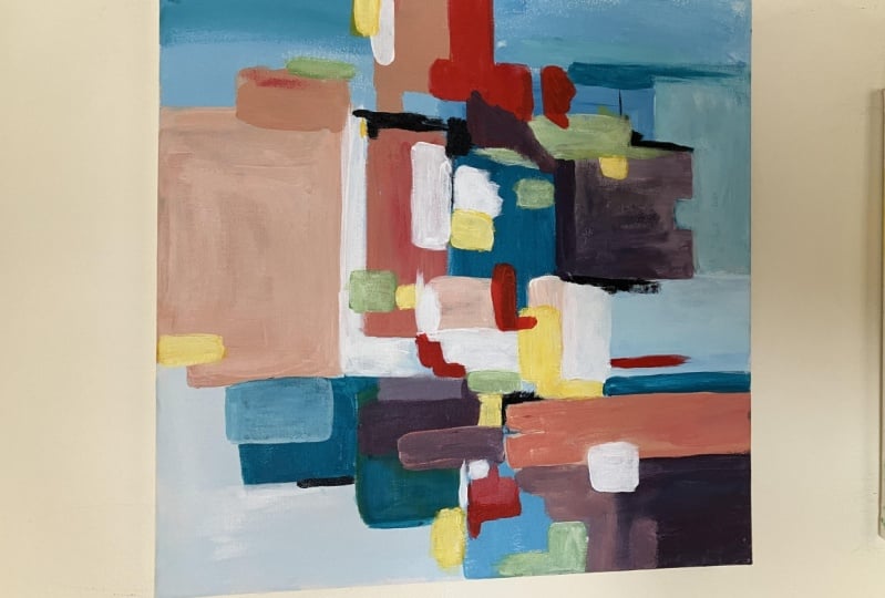
3. The importance of a big bold Background: Welcome to the first step. This is a very simple
one, yet very important. You will be using some
white and some blue to make half of the backgrounds. You will be also learning a
little bit about how to put paint with the big flat
brush and the palette knife. Let's go into it. Let's add some blue
onto the mixing plates. Let's put the blue back, get the black knife, just put it on the
table next to the plate and add some titanium
white to the plate. This time a little bit more, getting some blue and
mixing it into the white to make a beautiful
baby light-blue. Very easily, mixing it together thoroughly until it
looks very beautiful. And light. Pastel blue, mixing
it once again. And then you can put
a beautiful line, just going and cutting
that corner at the top. Getting the big flat brush, loading it up with a lot
of paint and pressing very hard down and making a
beautiful squarish shape. On the right-hand side, top corner, right over here. Don't forget to press down. This is very important to get into all the pores
of the canvas. Once you've done that,
you can move down, take some more color, and move down lower and
make a beautiful line. Like a staircase, go
a little bit lower. Leave a little bit of a gap in-between the two
sections that you've just created and
moving even lower. So you can see the
break right over here. It goes like a
staircase or it has a dip and then a bigger
dip just going down. Now continuing with the
staircase, beautiful shape. This is very simple. You can vary them as
much as you want. You can also make
them very thin, as you can see right over here. You can also vary the
strokes so you can paint them horizontally
or vertically. This changes a little bit as you can see in the video as well, changes the way the
paint is applied. You've already learned
two different ways to vary the stuff. Now going into the
left-hand side corner at the top and making a little
bit of a squarish shape. Well, it's quite round. Let's go into the palette
knife and mix some color in. Mixed some blue into this white. Let's position this
beautiful plate so it doesn't move too much. Let's mix that color
thoroughly and nicely. So it's a tiny bit darker. So we not only
change the shapes, varied the shapes and
the way we applied the color with the brush. But now we change the color
to be a tiny bit darker. Variation is key. Now let's apply with
the palette knife. So we also changed
the textures of the beautiful shape
in the middle, a little bit of a
rectangle just going down. Let's try to make
it a rectangle. Doesn't have to be perfect. And just going down in-between
that beautiful depth, just going GET and
closing that shape down. And then at the top you can make it a little
bit of a rectangle. Okay? Now next to this beautiful
long boy on the left, just making another
line textured at the top and then dragging
the palette knife. You can also make some
squiggles just over here. And let's go at higher spots just on the left side at the top and make another
wonderful rectangle. Lot of rectangles. Let's take some more paint. Thinking of another
spot just over here. Let's see how we
can vary this one. Probably by making
it very, very small. It has a big and a
small next to it. Let's make it quite squarish. But still a little bit textured. And now going widow, Horizontal, making a
beautiful rectangle line. Now let's break this
beautiful rectangle at the top with another
horizontal line. Make it beautiful with
the palette knife. There you go with this step, such an easy and simple step. In this step you've
played around with some nice blue nuances. Not only dad, but
you've made some big, medium and small shapes in order to create a very
dynamic composition, Let's go into the
next exciting step.
4. Introducing complementary color dynamics : This is going to be a
very exciting step. You first played
with some blues. Now you're introducing
the complimentary colors, orange and a little bit
of reds for this step to be successful and the
colors to be very vibrant, you need to wait for the painting to dry,
your mixing plate, your brush and
your palette knife needs to be clean as well. Let's go into the step. As you can see, the mixing
plate and the brush are clean. Let's add some yellow
to the mixing plate. Just a little bit onto the
left side of the plate and some red right over here at
the top. A little bit less. Since red is very, very potent. Some white doll those colors. Once we need to make
them less vibrance. Let's add some of it onto the right side so there is
a little bit of a distance. Let's clean the beautiful table. Just a little bit of that
yellow, a clean surface. Not only looks good, but inspires you to work
more with the palette knife. Let's add some red into
the middle of the plate. Just a tiny bit on the tip. And then drag some
yellow over it. Until you find this
beautiful orange. Let's mix it very well
together until it looks something like this
beautiful, vibrant orange. With the palette knife. You can go in the middle, just over the blue at the top of it and make
a beautiful square. Just going and pressing harder. Let's add some more red and make a beautiful small
square next to it. So it's a small and
the medium going a little bit over it so you can start to see the
shape even better. Let's add some yellow into
this color and make it more yellowish and
also have more color. Let's make it more orange and add a touch
of white as well. Going with the palette knife, in the middle of the canvas, just overlapping this shape. There is also a little bit of variation in color and
a little bit higher. Let's make another beautiful
shape with a lot of base and vary its shape
a tiny bit as well. And now going horizontally
and vertically to make that crispy edge
beautiful rectangle. As you can see,
it's a big shape, medium shape, and a small shape. Okay. This beautiful corner
at the bottom. And then going towards the left, just making it
very, very smooth. Let's take some red and make a little bit of a
shape next to it. With this red just going
down easily making a squarish rectangle with
just some beautiful red. Mistake that yellow and mix
it in with this orange, making a beautiful orange color. Would it add some more texture at the bottom of the rectangle? Taking some more
color and mixing it together in order to make beautiful long rectangle just going down and touching that
blue on the right side. Super easy to do. Just press a little bit harder until the color
sticks to the Canvas. Go over it a few times without
making the shape too big. And another shape just
going onto the right edge. Now going a little bit higher, just to make a little
bit of a sideways t. Going lower onto the left side. Making a beautiful long line. And then write on
the opposite side, just making another half of d. Beautiful, taking some red
and making a little bit of a square right in the corner on the left
side of this shape. Once you've done that, Let's mix the red into the oranges in the middle of the
plate and add some white going even lighter. Making those beautiful
pastel oranges makes it very well together. Add some more yellow
just to bring some vibrancy and make the color a little
bit more buttery. Let's add some red first and some yellow in the
middle of the plate, make it more vibrant. We don't jump completely from very saturated
to pastel colors. Mix it very nicely on the
mixing plate until it looks beautiful and homogeneous. Taking some more red
in order to bring it a little bit
closer to some pink. Perfect. Let's add some more yellow. It looks at tiny bit too. Pink. Colors are playful,
especially if you have just three colors
on the mixing plate. Now that the color is
completely beautiful and flat, it can make a beautiful
mark right next to the orange at the top and
the red just above it, onto the left side, just press and clean that palette knife a little
bit so you can pick up the big flat brush and start making some
big bold statements, some big bold marks
at the top of the canvas filling in
that square shape. Don't worry if you
pick up some orange, this will just bring out
some more nuances in your beautiful pastel
color going and getting some more colors in
order to give with the palette knife some
textures over the flat color. And also take some of this color and put it
onto the right side, next to the orange, upside down T or sideways D. And going with the brush and going outside towards the edge. Horizontal. Matter
than switching to the palette knife to
add some textures and make some variety
in the color. Going and taking
some more color on the big flat brush and thinking where to put a beautiful line. Let's add it in the
middle of the canvas. Present quite hard. Don't worry about
the red mixing. You can take your palette knife and add some texture over it. And it will look even nicer. Now, going down with
the palette knife, to make this square
a tiny bit bigger. Taking some more color
on the palette knife. Making a small little
later on the leaved, beautiful, cute little screen. Thinking of another shape, Let's make a long boy just
going towards the right, above the middle blue shape. Start to see how
they play with each other as long as the
colors are still wet, the oranges, the blues
are completely dry. Now going and adding a beautiful bold rectangle
just going next to the middle. Red, orange. Perfect. Let's think a little bit
about what to do next. Let's take some of this red on the brush and make
a beautiful line. The brush has some red and
some yellow on the corner. And it can make some beautiful
interesting nuances. As you can see like some
sort of a gradient. Don't be afraid of a little
bit of an experimentation. Just this beautiful gradient, we broken down into
a big shape and the small medium shape
actually at the top. And varying the horizontal
and diagonals as well. Let's dance a little bit with the brush and see
what we can do. Let's make a beautiful line
just over here, a small line. Let's take some more
red and make it more visible, more different. Medium, a small test over here. Let's make the medium and
the big shape overall. Making the shapes a little bit more visible as you can see. Let's define those shapes
a little bit more. Can start to see if we move
the brush from side to side, the color becomes
more homogeneous. Just over here. Now there is a big medium
and the small shape, as well as at the top, it breaks down into a big
medium and the small, Let's take the palette knife, get into some yellows. We can vary the
color quite a bit. Let's take this yellow and make just over here
a beautiful line. Just make it a little
bit thicker at the top. This beautiful banana color. Let's add some reds
into width just to vary the color with the
brush since we have some color on the
brush, Let's use it. With this palette knife. Let's make another shape
just on the left top side, next to the orange, just making this beautiful
line and continuing it. This is a big shape. Let's make a smaller shape
by just adding some texture. And at the bottom add
some more texture over the orange that has
been created with the brush. Perfect. Going in closing this gap, just next to the blue. Taking some more color, just to make this square a
little bit more visible, just with the texture. Taking some white, mixing it
in with this banana color. Mixing it thoroughly, grabbing some more inch just
from this corner. It's a little bit
less desaturated. Let's add it just over here, next to the orange shapes
on the rights and connect bridge together those shapes
and close those gaps. And in this corner, over here, this middle corner, we are bridging this beautiful gap
and closing those shapes. So there is no Vera
Canvas still showing. Let's refine some of those
edges in middle shape, the buttery middle shape
a little bit more. So there are no more
gaps at the bottom. Also, focus on the edges. Talking about edges. At the top there is a
little bit of a square. So let's break it
down by making at the edge just another
beautiful rectangle. You can see how on the edge
of a shape, very edges. So it's big, medium, small. Let's make another
small one here. So this is how you
get variety of shapes would only using
rectangles and squares. Let's add another
beautiful yellow Small squared just over here. With a lot of texture. Let's make it a little
bit more smooth. There you go with this
wonderful and sweet step. In this one you've practiced
a little bit more of your analogous contrast
by playing with some red, some oranges, and some yellows. You've also understood
that you can play on the edge of a shape
with big, medium, and small in order to
give a lot of variety, you've also touched
a little bit on the complimentary
contrasts by playing with those oranges
on top of the blues. Let's go into the next step.
5. Stretching out the colors: Sometimes in painting it's all about waiting for paint to dry. I've waited so long
for paint to dry. My hair got very long, so I had to get a haircut as well as the
painting behind me. I've changed since
the painting is at the stage where you've
used some yellows and some oranges naturally you want to use some purples
and some violets, since these are
complimentary colors to balance the color
composition a bit more. Now let's go into the step. In order to make some violets. Of course, you'll
need some rent, some blue, add a
tiny bit of white. First, let's check to
see if the paint is dry. Since it's the next day,
it's completely dry. Let's first add some red to the mixing plate on the
left side, just over here. And let's add some blue as well. Cleaning up the
fingers a little bit. Okay, Let's take that
palette knife and take some of this red and
mix it in the center of the plate and add some of
this wonderful blue to make a vibrant violet that is a little bit
towards the reds, just so it's not
straight on purple. And let's add a beautiful line just over here on
the right side, middle of the canvas. Since this is orange onto
the left and the right, as well as since it
has a lot of red, it goes very well
with the blues. Now let's make it a tiny bit more purple by adding some blue. Once you've done that, you can go ahead and make another beautiful rectangle
just horizontally, straight in the
middle of the canvas, in-between the darker
blue and the orange. Now, this will go
very well together, the blue and the purple, since they are very close on the analogous
color contrast. Now going with some
more purple and making this two shapes connect with
a bigger beautiful square. Going up tiny bit lower and
making a beautiful line. And then another 90
degree at the top of it. Right below the blue, you can start to see
how the blue just brings springs to the front. Once you've added
this dark purple. And going down, and
now over the yellow, you can start to see
the beautiful yellow. We'll contrast very well and compliment the colors just
a little bit of a line. It's the touch. And then going and
making another line on the right side and going with a beautiful rectangle
just in the space that has been created in-between
the blue and the yellow. And moving a little
bit higher towards the left-hand side
corner at the top, making a tiny bit of texture, getting some more
red in order to make some beautiful color. Just over here and add a tiny
bit more blue this time. This will also make the
color more light since the blue is tiny bit lighter than the
reds and the violet. Now going and making
another beautiful line just and'm middle bottom
section, just going down. And let's go up and right
over here, over the orange, let's just make some small
little shapes and textures, just so it adds that beautiful dynamic between
big, medium and small. Just a few touches with
this dark beautiful purple. Let's refine this
shape onto the left. Once you've done that, you can go ahead and add another beautiful
line just over here, right in the middle
of the canvas, next to the orange, and continuing down
a little bit lower. So it overlaps. Adding more red into
the mix and some more blue to make more color. Let's hold this plate and scraping that palette
knife onto the plate, putting it down and
adding some white. It's time for some nice light. Violet purples. Let's mix them together. Look at how gorgeous
that color looks. Just like lilac. Trying to decide which
way to go first. Let's go over top of this shape just over
here in the middle with a smaller rectangle on
the side, just over here. Just making a line
on the right side, adding some more based and
just going over top this undecided shape in the
left-hand side corner. Now it's time to move on to some new smaller shapes just close to the edge
on the left side, just a tiny bit of attach right in-between the blue
and the orange. Trying to decide right over here on the right-hand
side corner, what kind of a shape
you should put. Let's make a beautiful
long rectangle. Don't worry about the textures. You can always cover
them up with some blue or some other color. Let's add some red. Just so we change a
little bit of this color. Let's also add some
white so we can make it nice bank in town. Let's mix it together thoroughly until you see
no more streaks of color. Just so it's completely
flat and nice. Mix those colors well, just so you have beautiful
and decided color, Let's add it straight
onto the middle. Make a big, beautiful rectangle. I think the brush is
much better here, covers much more space
and makes flatter colors. Just pressing down hard, taking some more color. Just going on the left side, just over this violet and
making a beautiful line. Let's continue it until it touches the orange
at the bottom. And then on the right, making some decisive moves, pressing down and making some nice colorful
purplish banks. And right over here in-between
the blue and the yellow, making a bigger one. And going a little bit
higher just to connect those two shapes of
purple together. Now, on the left, you can go a bit faster. Onto the left side, take more color from the
other shapes or the plate and continue and make this shape filling it completely so the
Canvas doesn't show too. But still keeping the yellow
and the orange intact. Going a little bit higher
and making a beautiful line. Now, right above this, we can make another
beautiful square. Another beautiful rectangle was trying to be a
squared rectangle. Going in and making a little bit more adjustments by taking some purple
from over here. Big flat brush is done. Let's make some more
color with some red. Mix it in with some white,
making this beautiful. Think this will integrate
much better with the oranges. It will be a transitionary color between the oranges
and the purple. Since it's much
lighter and more reds. Let's add it over top, this middle purple square. And let's add some texture
on the left side as well. Don't worry if you
touched a little bit of the violet going
up and the left, just adding another
beautiful square, making the composition
more likely. On the right, right next to
the orange little bit of a square Over here, over the two dark
violet and the purple. Just a small square. Going and making this edge on the left side in the middle. Moore decided, you can
start to see the Canvas has little white parts left. Speaking of white parts, Let's cover them just
over here on the left, those two beautiful thoughts and make some textures
in the process as well. Just near the edge. A few more touches
at the bottom, just scraping some of
that color and putting it at the middle
and the top side. There you go with
this step as well. You've come so far
with this composition. You played with so many
contrast and so many colors. Learning about big,
medium, small, as well as the
analogous contrast and the complimentary contrasts. In the next step, you will learn a few more tricks and tips. Let's go in the next one.
6. Depth within layers: This is very interesting
because you will get to play around with the background
over top, the foreground. It's a very interesting
m pivotal step. That's why the left-hand
side corner is still white. Now let's go ahead and cover it with some
beautiful pinks. Painting is completely dry. Let's move this beautiful
plate a little bit lower and add some
red onto width. Just over here at the top, maybe a little bit too much. And some white lower on the
opposite side of the plate, maybe a bit more than the red. Let's take just a tiny
amount of red and mix a lot of white into it to
make a beautiful light. Pastel, pink. Wonderful, makes it
very well together. And making nice and creamy
onces very well mixed. You can add it just over here on the white in-between
the two purples. Let's grab a big brush so we can cover a lot of ground
moving a little bit lower and making a few touches horizontally and vertically and higher next to the orange. And at the top, don't forget to let that blue still visible right over here. As you move around, you will find the
corner and the edge. Then you can move from top to bottom until you
hit the middle. Just over here. You can also go over
the purples a tiny bit. Don't worry if the purple
is a tiny bit wet, still. Just going in, taking more pink. Okay? And adding another beautiful
bold move just over here. Over top the purple. Adding another wonderful shape. Just on top of this orange, can start to see how grey it
looks on top of the orange, right next to this purple
and not a beautiful square. Going back over this
first bank you've laid down in the purples, just in the middle. Just so it contrasts very well
with the very dark purple. Another line on this
side is breaking this orange a little
bit down on the edge. Taking some more white
and mixing it in with some red just to make more color makes it very well together
with the brush this time and adding some
more color on this side. As you can see, the color
is a tiny bit more pink. Just so it adds a
little bit of variety. Let's make another
beautiful line. Just over here on the purple. We connect in some way
the two sides together. On this side, let's make a
little bit of a square just on the blue top side
and a bit lower. Still connecting,
thinking where to connect the two sides and bring this bank into the outer
sides of the painting. Getting more color and working on that
shape in the middle. On the top left-hand side. Getting some more white. Mixing it well with
the color underneath. This time, the color
is even lighter. Thinking of where to put
it right in the middle, making this pink more
lights and the rectangle, Moore decided, just
going in the corner now and adding another beautiful
square, lighter pink square. And taking some more color
in making this one in the middle even lighter
and more rectangle. Over top, this one
just on the right, a smaller one
overlapping the purples. And right in here
thinking a little bit of this staircase effect. As it goes down and
over the purples. Let's decide where we put
our next beautiful square. Let's make this a
little bit more dynamic by adding another square
over top of the first bank. Taking the palette
knife and scraping some of that color just
to make it more flat. Just press gently over top so it creates some
nice textures. Instead of making them
look brushed over. Let's go over top until
it shows some purple. Okay, there you go
with the step as well. You can see how easy it is to play around with the
background and the foreground, as long as you keep some
of the lighter tones for LET and some of the background
to be finished at the end. You've also worked with some more banks
this time lighter, integrating those purples much better into the composition. Now, let's go into
the next step.
7. Special colors: This is where the fun begins. Some nice vibrant yellows
and greens will make this composition
feel so amazing. Of course, try to keep
them to a minimum so they loaned overwhelmed
the composition. Now let's go into the step. Of course, for some
yellows and some greens, you will need some
yellow, some white. Who knew you need
white for greens? Mixed it up a little bit. On my theme. Let's clean it up and
taking the brush, small flat brush and some
yellow and some white making a very light
and beautiful yellow. Very pastel nature. We first need some of this lighter yellows in order to have a base on which to put the other vibrant
colors right in the middle, could start to see how
close it is to the pink. How close in hue
it is that a pink almost just blending with the
bank as if they were one, just going on the left and making another
beautiful rectangle. And then right next to the bank will make this
transition even better towards the beautiful oranges going in making another
beautiful small square just above the first one. Just peacefully and calmly making some beautiful
rectangles, just going a little bit
onto the left side as well. Right over the yellow and
the orange now mixing in that beautiful yellow and adding another small
touch just over here, right next to the
a line of yellow and another rectangle this
time a little bit longer, just going down next to
the opposite side of the yellow and a beautiful
vibrant yellow just next to the violet. So it contrasts so well. And just over here making
this transition in-between the orange and the
beautiful purples, contrasting very well together. Now in this area, right next to the purple, focusing on that
complimentary contrast, just adding another
beautiful shape. You can start to
see how this can make your process so much easier by knowing
a few contrast, what colors go well together, which ones are complimentary, which ones are analogous? You can put them and obtain a very interesting
and nice results. On the left side, going a little bit bigger with another
beautiful rectangle. Learning colored this way so
much easier than just making those squares just going
from a hue to another one. So academic, this
is so much nicer. You get to have a beautiful
result in the end. You're basically doing the
same thing while learning how to use brushes and
the palette knife. Now let's add some blue
and mix it in width, the yellow, creating
this very light orange, this very light green. Right over here
where the oranges, reds are, the green
we'll contrast the most. But first let's create some analogous contrast
right next to the yellows. And then move on
next to the blue and the light pink and create
another beautiful square. You can see how
little blue it has, and still it seems so green. And another smaller
one just over here, right next to the
orange and the purple. Just another beautiful
green square. A small boy in another
small boy just going and making the staircase in the middle of
the composition, right next to this
horizontal one, vertical, one over top of this one, just another small one. Just a few touches
here and there. And it will look amazing. And where this red is, we can cover it and make another L shape just
so it contrasts then has that
complimentary contrast. And on the right, on the side. Now going and adding just
above this beautiful red, this green contrasts very well. Just adding more
color over top it. On the right, right next to
the red part of the squared, just a tiny bit of a line. Of course this purple
has some red as well. We might as well just put a beautiful square
next to width, just to break it
down a little bit. Let's make it longer. Just so it's a little
bit different than all the marks you've made
with the green until now. And make a line just
coming out of it. A little bit more organic. Now getting some white and
mixing this green into it. Just to make some
beautiful, nice colors. Nice green light color. Just to integrate that
back into the composition. Over top, this first green, you can start to see how much
of a transition between the yellow and the green you have now the light yellow
and the green. And it's also very
close to the pink. Still a little bit of
integration right over here. Onto the bottom of the pink, of course, in between
the green and the blue. Over the left side
of the screen. At the bottom middle part. Let's find another area
where it fits nicely. Follow the lines and decide on a beautiful spot just in the
middle over this yellow, creating another
interesting contrast. You can start to see how, because there is a purple
are right next to it, it feels so much more
yellow than green. Over top here on the right
side in the middle part. And going with another
beautiful square connecting the pink and green. There you go with this
fun step as well. This was so interesting. You've laid with some
yellows and some greens and their pastel versions to make some beautiful,
beautiful colors. You've learned that
you can use any color and put white in it to
make it more pastel. You've also brought
some more life to the composition with those
nice yellows and green hues. Now let's go into the next step.
8. Vibrancy. Thank you!: You've done it, you
are at the last step. There is only one more
small thing to do, integrate those beautiful
greens and yellows. You'll be doing that by going
towards the tour coils and the light turquoise
that will blend well together with the baby
blue in the background, thus making the
composition completes. And Gorgias, let's
go into the step. This is very important. Let's clean the beautiful
small flat brush and take some blue and some
yellow and mix them variable together until they create this beautiful turquoise. In case your turquoise
is a little bit darker, you can use some white
delight it in up. Let's start by deciding where
the blue squares are and over the green and
the blue just create a little bit of a
squared just in the middle of the composition. Another blue is at the top. Let's find a square
just to make it nice. Just at the top, making a beautiful
square on its own because this turquoise
goes very well with the oranges and it can bring the beautiful blues into the composition a
little bit more. Over here. It goes very well. Right over the blue and
the pink and the purple. Nice beautiful square. Integrating some
of the greens with the blues of the background. And since it's a
little bit darker, it will integrate with
the purple as well. And as you can see, there is also a big, medium, small dynamic in-between
those shapes. Onto the left where
another green is, where this turquoise, we'll go very well with the
reds and the oranges. Just a small little
square EDP d squared. Moving towards the
left top side. Just bringing this shape and already has beautiful turquoise. So let's find another
beautiful spot. Let's go on the middle
right-hand side and make another small little square
and align just over here, making some sort of flag. An alien flat, purple, yellow, pink, and turquoise. Many colors for a flag. Going over top, the
orange just over here, to create that beautiful
complimentary contrast. As you can see, let's make another beautiful
turquoise just over here. And over the purple, start to see how they have
basically the same hue. If you squint your eyes, almost look the same. And going over the white
and mixing it very well to get this pastel version
of this turquoise, such a beautiful color
reminds me of the sea. Let's squeeze that turquoise onto the white so
it mixes better, so it doesn't get
over top the white. Because start to see the
pastel colors in the middle. Let's add some of
this turquoise just over here to make the
transition between the pink and turquoise
on the left side with this pastel over the blue, of course, at the top, Let's make a big
beautiful rectangle just going down like this
and into the corner. Thinking of those beautiful
big and small dynamic, just breaking that
beautiful corners. So it seems more nice at
the bottom just over here. This purple needs a little
bit of a straighter line. Let's make it more straight. And add some more color and go a little bit higher to make another line just making a big and a medium
shape or a small one. There is another
beautiful spot for the scholar who just above the flag continuing
the alien flag. And of course, another squared Just aching these
beautiful transition, this beautiful details, spots of same size, different colors. Going over top the green, even though it's not yet dry. And adding some
beautiful line just next to this purple over
the turquoise as well. Just finding some small
beautiful spots where it gets very beautiful and nice
to put this pastel color. And this was the last step. Congratulations, you've done it. What a fun journey this was. You've learned so much about
color and composition, and you've made this
beautiful painting. Thank you so much for being
part of this community. And if you are gracious enough, you can leave a review. Thank you once again and
see you in the next course.
 George-Daniel Tudorache, Together we will create amazing things.