Transcripts
1. Introduction: [MUSIC] I love experimenting
with art supplies and figuring out how they work
and how I can push them. That's what this
class is all about. I'm Denise Love and
I'm an artist and photographer out of
Atlanta, Georgia. In this class, I want to pick a supply that
maybe you don't play with as often or maybe
you just use them as mark-making tools and I want
them to become the project. We're going to
figure out what they do and how we can
push their limits. I'm super excited about this because I've had it on
my mind for a while. I use the Neocolor II crayons in probably every art project I ever do but I never
add water to them. Even though they
say water-soluble, how many people
actually play with them in the water soluble way?
That's what we're going to do. We're going to push
these supplies. We're going to do
a whole background in these water soluble items, whether that be the
Neo-Teller II crayons or the charcoal, or you could use soft pastels, or you can use
watercolor pencils, ink tint Derwent pencils. There's all kinds of things out there that's water soluble. Rather than just using
these as mark-making tools, I want to push them to their
limits with the water. We're going to create
the whole background and then we're
going to figure out how we can push that with other marks and supplies on top. We'll start off in
our sketchbook doing some color studies and seeing what is this color if
I add water to it, and then how does that
blend maybe another color that I really like that I
want to experiment with? Then we'll do some larger
color studies to say, okay, here's how these
colors are blending. Then what's the next step
I can do on top of that? How can I use these
for mark-making? Then what else can
I add in there? We do several different
color studies. I hope you do 100 of
these because it's the only way you're
going to figure out how the colors work, what they do with each other, and how they blend, what you like and don't like. I love little color
studies and I'm not really a draw a box and paint
a color study person. I like to mix things up. Then if you find something
that you truly love, mark down the colors
that you use, so you can maybe do this for larger projects. That's
what we're going to do. We're going to take our
favorite color study and then maybe create
our larger project. Look how beautiful this is. I can't wait to
have this framed. Can't you see this in that
frame right there that I'm holding it in front of that blue and green piece is in? Look how beautiful that would
be framed in that frame. Like I can't wait to take
this one to the framework. [LAUGHTER] Then we're
also going to do my very favorite art because
you might see me do this in every class I ever do because I truly love creating
with abandon, not thinking about color and composition and where
I'm putting things and then coming back and cutting
out the amazing parts in there to create a
pretty little series. I get so excited when
I'm painting these, I'm doing just like you
are doubting myself. I'm questioning what
are these colors doing? Do I even like this? I'm I going to find
anything that I like? I don't hide that from you. I'm talking through
in the video, [LAUGHTER] so my doubts on
the different things like, no, I might not find
anything I like. [LAUGHTER] That's true, when I'm doing it, we
need to vote for this. Do you like this
one? I really love. I need to have a vote button. [LAUGHTER] But I
also created some little bitty pieces out of here. When I leave after doing
these cut up pieces, I'm on an art high, and I have the best
rest of the day. It leaves me feeling so good. I love that. I want you to get up from your art table creating something beautiful
that you're like, okay, I love this. Then going away with
the high that you can't wait to come
back and create again. A lot of times too, I've heard people say, well, I've created stuff. I'm not very happy with it. I'm just going to set it down, but then they come back a
week later and they're like, this is so good. I don't know how many
times I've done that. I've created something
and I thought, this is terrible,
I don't like it. I put it in a drawer
and I'll go back to it later and I'm rediscovering
it and I'm like, that looks amazing
and I made it. What was I thinking?
[LAUGHTER] If you're one of those people, set things to the
side and come back to them later with fresh
eyes when you're like, oh, because when you're
in the middle of working and doing,
it's hard work. Sometimes your brain is
tired and then you're like, how to start like this or maybe you're like, I'm
just disappointed. or just feel let down. But if you will come
back to something later after you let it set and
you've let your mind relax, you'll think, oh, if I had two or three
marks here and there. Now it's finished and I love it. I want you to figure out
what's working best for you. I want you to play
with your supplies, try the different projects, and figure out what
is the best thing to keep you coming back and
practicing in your art practice? I love experimenting with different supplies and
pushing how they work. I can't wait to see the projects that you
come up with in class, the color combinations, and the different
pieces that you create. Definitely come
share those with me. I can't wait to get started. I'll see you in class. [MUSIC]
2. Class project: [MUSIC] Your class project is
to come back and share with me some of the projects that you created while you were
doing this class. I want to see possibly
your color ways that you were playing
and experimenting with. I'd love to see what colors you were attracted to and
how they ended up. I'd like to see your
bigger piece if you liked it on the whole
page or if you cut it up. I'd love to see if you did the cut-out piece and what those pieces of art looked like. These truly leave me
on a little art high. If you're like
[LAUGHTER] a runner, and you're doing
all the running, and you're getting that
runner's high they talk about that I've never
personally experienced. [LAUGHTER] I feel
like that's probably the feeling I'm getting when
I make these pieces of art. You hear me go in the videos because I
really am doing that. I get so excited at how just serendipitously these
come out so beautiful, and how they're just magical. I love to see how the water-soluble supplies
react to each other. How they blend, how they
look when they're dry, how it's a little
bit different than watercolor and a little bit
different than acrylic paint. I love seeing those differences
that I really never discovered until I started
playing with the crayons, and spilled something, and thought, oh,
what is that doing? [LAUGHTER] Then I realized that's what water-soluble meant. It was like, oh, I just never played with some of these products in the way that they were meant to expand into. I love doing that. Picking a project saying, okay, today I'm going to play
with these three crayons, this mark-making tool, and
let's see what I can create. It gives you some parameters and some limitations to create. It's so much easier to
do that than to look at all the supplies and
think, crap, I'm stuck. What do I do? I don't
know what color I want. Where do I go? Now, I don't know when I'm just not going
to make anything today. [LAUGHTER] You don't know how
many times I've done that. [LAUGHTER] I want to see
what you're creating. Come back and share some
of that with me in class. So let's get started. [MUSIC]
3. Supplies: Let's take a look at the
supplies for this video. I encourage you to
use what you have, but the purpose of
this video is to experiment with water-soluble
crayons and pencils. I want to do this
because it's fun, and it's a different
type of medium than say, just a regular acrylic paint or watercolor or what have you. One of my very favorite
water-soluble products is the Neocolor II
crayon by Aquarelle. This is the full supply of it. I do like having
the big master box because I feel I
need all the colors, but when it comes
to make an art, you don't need all the colors. You need your favorite colors, the ones that you're
most likely to use, and you'll notice that some of these have
never been used. I don't gravitate towards them. I wouldn't normally buy them. You'll never see me
want a bright yellow something probably that I might never ever reach for that. Having all the colors is not
necessarily a good thing. Before I had all the colors, I had a few colors. These colors tend to be the
ones that I grab a lot. I would recommend if you
have an art store near you to go take a look at the open
stock of the crayon colors and pick a few that
you like because these are good for all
stuff, mark-making. They're good for
color swatching. They're good for adding an
element in there that's different than the other
elements that you've used, and they're one of my favorite
things to do that with. I will be using the Neocolor
II crayons in class, but I won't be using
that great big set. I'll be using just a few colors and I recommend you
grab a few colors. Another water-soluble
product that you might consider is charcoal. This is a set that I
got a long time ago. I spend most of my years
collecting art supplies, collecting and using our two different hobbies. But these are fun. If you do have charcoal, even if it's just the stick of black charcoal or
a black pencil, those are water-soluble, so that's another fun
supply to experiment with. Another thing you could consider,
are watercolor pencils. This is the Darwin
watercolor pencils. I do show you the difference
in the watercolor and the ink tints in
class on a sample. Just so you can get a look at what look you
might be hoping for, but the watercolor
pencils are super fun and they're very light
and translucent, and you can get a lot
of pretty colors and that's a fun
water-soluble option. My favorite water-soluble in the pencil variety
or the ink tints, and these are very vivid, whereas the watercolor pencils are very light and translucent. These are translucent too, but the vividness is just
such so different like it really is a big difference in this pencil
versus that pencil. Doing projects like
this where you're experimenting with supplies that you've never played with before, you really learn how they work, how intense the colors are, what are your favorite
colors in there, and how to maybe incorporate
that into your own work. I'm going to be using a
few ink tints colors, and a few of the neo crayons. Super fun. I do show you some
stuff in my sketchbook, that we do some color swatching, and maybe we start looking at different color palettes
that we want to use. I do move outside my sketchbook because being locked into a sketchbook where
everything's wet, you're trying to
wait for it to dry. We're color swatching,
trying to figure out what color we might want
to do a bigger piece in. I feel like being in a
sec sketchbook slows me down because I can't turn
the page until it's dry. In that case, I just work on little pieces of
watercolor paper, and so you can just take
a great big piece of watercolor paper and cut it up. These are Moleskine books. I like the Moleskine because
of the quality of the paper. Everything that I put
in it tends to look better than the super
cheap sketchbooks. I'll be working in those
Moleskines for a little bit. Then, I just moved to
loose pieces of paper. Cut some of this up instead. For watercolor paper, when I'm doing a bigger project, the better the paper, the better the finished project. That being said,
use what you have if you already have
watercolor paper and you want to experiment
with water-soluble items making a pretty abstract, use what you've got. But the cheaper papers have
more wood pulp in them. The wood pulp just doesn't soak in the color as nicely
as the cotton papers. The nicer the paper, the more the cotton content and you get a better
look when you're done. I've got some Canson
watercolor paper, which I use for a lot of things because I can get
a great big pad for not very much money. Then if I'm really feeling like, I've nailed it, I'm looking for some really nice pieces
that I might want to frame, then I'll move into
like the arches, cold press watercolor paper or the Canson Heritage is a
really nice watercolor paper. Now the biggest difference
in these two is the Canson has a completely different
texture to it than the arches, which you might not care, but the texture on it
is slightly different. I just find that
interesting when you get into the nicer papers and you get into really
honing in your craft. Sometimes those details matter. Use what you've got. I'm going to be using 140 pound cold press
watercolor paper. Probably going to be
using this arches because I liked the arches, and this is pure cotton, so there's no wood pulp in it. It's going to act
a little different than if I were using, say, a student grade paper, which I definitely have
plenty of that too. You want some watercolor paper. You want your water-soluble
crayon or pencils. Then we're also going to be
playing in some acrylic inks. If you don't want
to play in inks, then you'd rather
play in watercolor, you can, but my goal is to
step outside my comfort zone. I do a lot of watercolor classes and play
a lot in my watercolors, but you've probably
never seen me pull the acrylic inks out so
let's play in the inks. Based on my samples and things that I've done, I can narrow down the
colors that I want to play in today for my bigger
piece when we get to that. I'm just going to go ahead
and talk about some of these. This is f and w
white acrylic ink. This is Amsterdam warm gray. This one is Aqua
fine burnt umber, I'm not apparently. I don't love just one
brand apparently, because I also have
Liquitex and gold. You can pick whatever it is
that you feel comfortable in. I certainly have
plenty of the colors that I bought in the F and W because that's what
my local art store happen to have in stock, I've got plenty of fun
colors to experiment with, but after doing some
of my sample pieces, these are the ones that
I truly loved today. Doing our samples is how
you're going to figure out what colors you love
and want to play in. Those are the ones
I'll be playing in. I also got a big
piece of graphite. You can use any pencil is
basically a big pencil. I like a Posca Pen. Got myself cheap paintbrush. Whichever paintbrush
you're comfortable with, once we get to a bigger piece and I know we're adding
water to our crayons and our intense pencils, but once you get
to a bigger piece, I generally for adding
the water and stuff, like to move up to a
bigger paintbrush, like a big mop brush. I probably will be
using something like this Princeton Neptune number 4 to swish water on
the bigger piece. I find working with
a bigger tool on a bigger piece of
paper is easier, and turns out more
size appropriate. I used to try to do
bigger pieces with the same size materials
as the sketchbook, like a little tiny brush, and then I wondered why my piece didn't turn out, how I thought. I think it's because, my tools didn't go up
with my size paper. Just try to keep some
of that in mind. Then I also have some
random mark-making tools. This alike, which is a
Jane Davenport number 12, mark-making tool. It looks like a
little mermaid fin. If you don't have
anything like this, you can certainly use
some palette knives that have a texture to them. You could use a fork. You can use anything really that you come across that's got a little pattern in it because I like dragging this
through the paint, and it made some very
interesting marks and color variations for me when we did our sample pieces. I'm using one of these in class. You can use a fork if
you don't have anything that looks like this or
you don't have access or it's not available
or what have you. Then I just have, of course, some water, a little
cup of water over here. That's basic things that we're going to be using
in class today. You can substitute any of these for something that
you've already got, and colors that you love that are different than
the colors I'll be using. The easiest substitute for
the ink is watercolor, and then you can use
Neocolor crayons or any type of water-soluble
pencil product, whether that'd be
watercolor pencil or ink tints pencil or whatever you happen to have
available or charcoal. Your choice there. This is the time to
experiment and figure out how to play in some of our
water-soluble supplies. That's our supplies that
we'll be going through today. Let's get started.
4. Color Swatching: Let's get started by doing some color swatching and
deciding what colors do we want to play with here in our water-soluble
pigment things. When I say things, lots of things are
water-soluble. Charcoal is water-soluble, graphite can be water-soluble, watercolor pencils
can be water-soluble. These are the Inktense pencils by Derwent, they're
water-soluble. The difference in these and
regular watercolor pencils is they're more vibrant. They're going to give
you a lot more color in that pigment than a
regular watercolor pencil. Then Neocolor II crayons
are water-soluble. What I want to do is experiment with supplies that I
don't normally reach for. To be honest for me, the Derwent Inktense pencils, this set is new to me. I've had them in
the past years ago. My aunt is a very prolific
artist and then she got into colored pencil paintings. I gave her my set because
they live in a little town without the access to the art stores that
I have and I'm like, "You have to try these
amazing Inktense pencils in your pencil art." So I gave her the
collection that I had. Man, did she loved those. But I've recently
gone back to wanting to play in water-soluble things, and I normally play
in the crayons. But I thought I want some
of these Inktense again. I'm really glad that I did
because they're so amazing. What I want you
to do if you have a set of something like this, is I want you to
color swatch them. I want you to go
through and just start out doing the colors
in a row like this. Maybe side-by-side,
if you think there's some colors that
you're going to like. These are out of
order because I was already playing in
these thinking, "What am I going to
want to play with?" I've started moving the ones to the end that were
some of my favorite. I like to start off with
any art supply that I have like this. I want to just figure
out what does it do? What color are these like? This one right here is
what I started with. I was thinking it
was a sienna color, but it's really more
of a brighter ocher. It's how we're going to discover
what colors do we like. If we pick some that we think
we want to blend together, what do they look like
when we blend them? What I like about the Inktense is they activate with water, and then if you let
them sit for a moment, you can go back and then very gently get rid of any
draw marks that we had. They activate and become really beautiful
swatches of color. This might seem tedious, but let me tell you, over the years has
become my go-to for figuring out what is this color and which
ones do I actually like? For some reason, I
always want to like green-gold and I always
want to like it, I think, because it's
called green gold. Yet when I use it, a lot of times I'm like, that wasn't quite
what I thought. How are you going to know
this unless you play and swatch out and maybe blend
some colors and see, what are these going to
do when I get them wet? How bright are they going to be? Do I want more watercolory? Do I want it more intense? I can add more water
to thin them out. What's it going to do when I mix it in a color next to it? These act like watercolors. Once you get them wet, they do have that fun
watercolory look. But look how fun this is. Just figuring out what are the
colors and what do I like? This is how we're
going to figure out what do we want to use. I've also got some Neocolor
crayons over here. Because these seem to be
three that I grab a lot. This is olive, this is raw sienna, and this is [inaudible] green. For some reason, I tend to grab these out of
this box quite a bit. Also, I'm not a purple person, but this rose pink is pretty. I also like this deep one, which is the Payne's gray. Don't we all love Payne's gray? See, now these are going to act completely different
than the Inktense, which is why I'm
showing you both of these with the color swatching. I still want to get them wet. I'm trying to dip my brush in the water in-between each color. I don't want to put one color directly on the next color
while I'm swatching, I actually want
to see what color it is without deliberately mixing into another color with that color
still on my brush. I'm just dipping it in
the water to freshen it up and then just
see what do we get. Then I'm letting them touch. I want to see what these do
if these colors touch each other and how they'll
blend in with each other like watercolor do. Look at all those,
those right there. No wonder I grabbed them all the time. Super fun. I really like the
difference in the two. These are more vibrant. These are more
pastel watercolory. We can come over here and see like if I do a little
bit of graphite, how is that different
than what I just did? You can see it's
water-soluble and at the same time does
not give up its line. That's very interesting. I've got some charcoal. Let me grab my charcoal. I've got a big collection of charcoal, the tinted charcoal, because I thought at one point I wanted to really
experiment with them. Sometimes I do and
sometimes I don't. But it's very interesting
what charcoal does too. I like the colors
that these come in. They're very muted, they're
very rich dark deeper tones. If I come back and put
some water on those, they act really similar
to the crayons. You're still going to see
where you marked the paper, they don't lift as well as the crayons and
the Inktense pencils. So you'll still see an underlay of that
what you scribbled, more so than the crayons, more so than the
Inktense pencils or even the watercolor pencils. These are the
watercolor pencils. These are the Derwent
watercolor pencils. These come in a whole lot
of really pretty colors. I like this sky blue. This one's cobalt blue versus, yeah, that is sky blue. Just to take a look
at the difference in the watercolor
versus the Inktense, let's just go ahead and put
some of these colors down. Because I want to give
you options here. You don't have to have the exact same supplies
that I have in class. You can play with any of
your water-soluble products, anything that you can color on. You can even do
it in watercolor, but I've done several
watercolor classes. I like to experiment with my
supplies and come up with different projects
for myself to create. I like to say, okay, today I'm working with
the Neocolor II crayons. I'm going to see what they do. I'm going to mix them together. I want to see what I can
create and step outside my box and then I might discover something that I never
even knew existed. You can immediately
see the difference in the plain watercolor pencil
versus the Inktense pencil. You can see it's a much lighter,
more transparent color. This is a more intense, a little bit matte in
the way that it looks. I love that that's a matte feel, but it's a much more
intense color that's like, wow, where this is like
very soft and subtle. Depending on what you got, I want you to pick out your
water-soluble whatever, watercolor pencil, Inktense,
the Neocolor crayons. In this class, I'm
going to be working with the Inktense and
maybe the Neocolor. I don't like to have
too many options out. Because too many things, too many options almost causes more of a supply paralysis. I like to do some
color tests and think, here's the little collection of colors I think I'm
going to play with. Then I will put
everything else away. That's not saying
that I won't pull it back out, I certainly could. I just looked over. Let me talk about one more thing that's
water-soluble. But I'm going to pick
out the few colors that I love and I'm saying, here's what we're going for. For these, I actually
am going to go with the five little
Neocolor crayons. I can go through and tell
you what these colors. I've got Shiraz,
iron blue, mustard. It does look like a dirty
mustard, doesn't it? Red violet, sienna gold, felt green, baked
earth, leaf green. As I was making color swatches
thinking, "I like that. " And I would put it to the side. As far as the Neocolors, this one is that
[inaudible] green. I've got raw sienna out. This one is the Payne's gray, olive, and pink. Then I'm just going to
put everything else away. That doesn't mean
I'm not going to pull something else out. But that's the crayons and pencils that are water-soluble that I'm going to
play with today. The other water-soluble thing
that I just looked over, my very favorite item. This is one of my very favorite
items that I own because I just love to look over
here at the colors. It's just like the
prettiest thing. I love to take pictures of it. I love to use the pastels and that's what these
are, soft pastels. These are not the oil pastels, these are the soft
chalk pastels. I like them because they
are also water-soluble. They're super-duper,
heavy pigmented. We can blend and play
with these quite easily. These are super messy so they
will get on your fingers. One of my favorite things
to have in my art room now are these piece of collage, are these microfiber
cleaning cloths because I can just do my fingers like that and they're clean, rather than having to
go wash my hands when I'm right in the middle
of something important. But these, let's just
see how that differs, how intense the color is. It's very chalky in
the way it looks. Smooth and very elegant, just works so nicely. You're not going to
have those draw lines like we had over here
with the charcoal. These are going to blend
right into some type of color with fairly
intense pigment. That's a really nice choice. Also, if you have some
of these pastels, they are beautifully
water-soluble. Let's say I'm not going to use these because I
certainly might pull these back out in the
mark-making part of my project. But for the moment,
they're going to the side. I'm going to play in
this little collection of pencils that I've
pulled to the side, played with over
here and thought, "Yes, I like these." We'll just start there.
5. Color Experiments: [MUSIC] The next thing
that I want to determine is after I get some
colors that I've played with and I like having a piece of graphite handy
that can be a pencil. It can be this great big piece of graphite that I have,
something like that. I only have it because
it came in an art box. [LAUGHTER] The sketch
box subscription that I get stuff
from and I'm like, I like this fun little
piece of graphite, so I do like to use that. I do have some
pencils over here. I've got mechanical
pencil because I like to use graphite and
a lot of stuff. I've got a Posca pen and
I've got some acrylic inks. My goal is to
create a piece with water-soluble something
crayon or ink tints and use some of these fun
acrylic inks to give me a little bit of a difference in texture and the
way the color works, because these will be a
little more opaque than my water-soluble items are and they'll give me some
nice contrast I think and then I also
thought metallic. I'm always thinking metallic. One of my favorite
metallic acrylic paints is this pasty stuff
[LAUGHTER] that I use a lot in some several classes
but I'm going to use this acrylic Liquitex ink. I'm going to be playing with the inks and pencils or crayons. We're just going
to show you what my intention here is as I
move to a bigger project. Let's take a look at this. I'm just going to pick out say, these three and color
on and just play. This is my moment to
decide for a bigger piece. Was this what I had in mind? Is this what I want to try out? I'm going to color
these three on here. This is the way you can
work out before you get into larger pieces and
better-quality papers. I like doing this stuff
in my sketchbook. I'm going to just dip
my brush and activate each color without having
extra color in the brush. I don't want to activate the blue with my brush
full of the green. I'm going to go through
and activate these and then I want some
of it to blend. I want there to be enough
water on here to let them mesh together and then
I'm going to drop some acrylic ink on it
and then see because, in my mind, that's the project I want to
play with and create. Let's just see how
that works out for us. That's what I
want you to do. I want you to pull a
big little collection of your supplies and think. Today I'm going to work
with these crayons, these colors and what, let's see what we can
create and that's the goal. I'm adding a little more
water on some of this. It gives it more of
a translucent color. It's also helping some
of this color blend. One thing I did not mention as we were colors watching
you can use these wet or dry if I
dipped this pencil into water or into
a water spot here, I can now get marks
that are super intense while this is wet, which is pretty cool. Still playing in color here. Thinking and the reason why I'm color swatching a
little bit larger ones, I think, I like these. Because now I want
to do some inks and here and let them
do their thing. They spread out. Maybe they'll blend, maybe I'll come back and
add a drop of water because I really want these
to balloon out nicely with that watercolor and just
see what it's going to do. Look at that. Let's come back. This was warm gray by Amsterdam. This one is antelope
brown by FW. This is a good way too to see, do you even like the
colors that you're planning on doing
a larger piece in? This is burnt umber. Or did you like one color but maybe you didn't like
another color you tried, which one's going to
really work out best? It's come back with
some warm gray. It's a good way to experiment with how much ink and got some white could come back
with some water. These will activate,
move around while they're wet and
then once they're dry, they're pretty set. They're not going to continue to re-wet like the crayons
and stuff will. That, I want to
actually let dry. I could also consider at this
point dragging something through and making
the colors blend. This is just a brush I
got at the art store that has [LAUGHTER] a little
final end on it. I do like looking for different art-making
tools at the art store. It's a good time to experiment here while
these things are wet, just to see what is this going to do if I drag
something through it, look how pretty that is. Then we want to let
that dry and think, did I like everything that did? Do I need to do another
one or something bigger? I can also go ahead and
add in some gold or silver just to let them spread
out and see what they do. Look at that. Then once I'm done with this
larger color swatch of things I've
experimented with, now's the time to let it dry and then look
at it and think, did I like the antelope brown in there or was that
the wrong choice? Then if that was the
wrong choice and the burnt umber then pull
that out like the white, the warm gray, the burnt
umber and the gold. I feel like I'm liking all that. The antelope is questionable. For the next piece that
I do a larger piece or maybe as I continue
this experimenting series, maybe smaller pieces like this. I like to do several different colorways
that are smaller. As I'm doing that then maybe I'm going to
just narrow it down to the colors that I actually loved and maybe do
some mark-making and finishing up
and turning that color swatch into a finished
piece of something. But I feel like this
little mark-making, these three neon
colors, the warm gray, the white, the burnt umber
and the gold is a winner. I'm going to pull
those aside to be a collection for a larger piece. I'm going to go back
and play with some of these other ones that I
have and the ink tints. We'll do some smaller
pieces to narrow down what we want to do
for our larger piece. Experiment a little bit more
with these smaller pieces. But I'm going to work outside of sketchbook because I want
to do several at a time. This one's almost dry. I know that I really
loved the colors in here. Do I love this
pretty blue that is sparkling here on the edge
that's peeking through? I also love this
random heart that has ended up right in the
middle of this and I'm like, the way that it comes
from I love it. [LAUGHTER] What we going to do is work on some other just
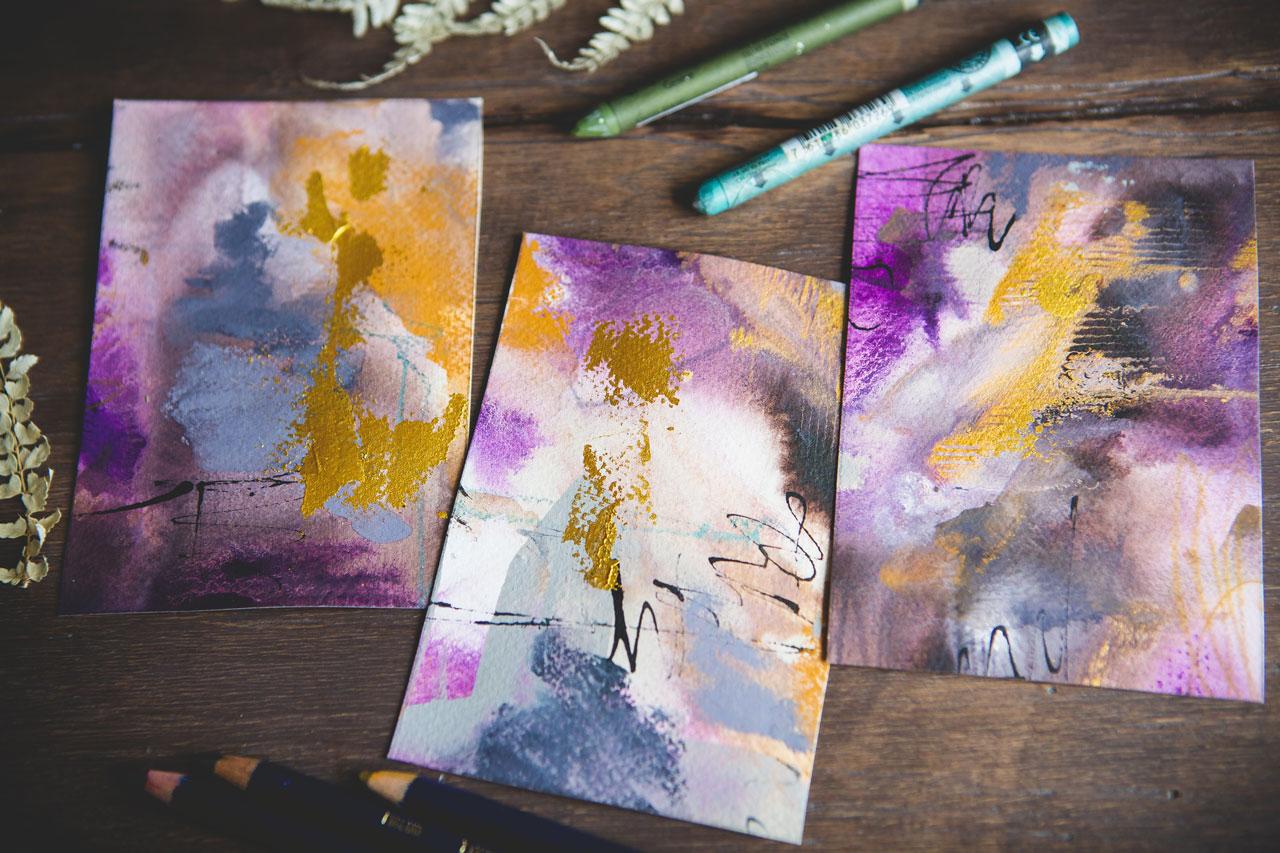
little pieces of paper. These are some random watercolor postcards
that I have that came in my little sketch
box subscription. These are the [inaudible]
105-pound paper. This is a tiny bit
lighter-weight cold press. Then the sketchbook paper. The sketchbook is
cold press 110 pound. When we get to our
larger pieces, we'll be using 140-pound
weight watercolor paper. But I want to be able to
work on several of these and so what you could do if you don't just happen to have random
postcards [LAUGHTER]. I'm using what I have. I'm trying to encourage
you to use what you have. Some of what I have is going
to be randomly strange because I get that
art box subscription. I'm trying to use
the different things that they send and experiment. This came several months ago. If you don't have
random postcards, just cut up a piece
of watercolor paper. Cold press, hundred 110
pounds, 140 pounds, doesn't matter and
just have them so that you can then
do several of these and be able to set one
to the side and let it dry while you're working
on some of the others. If you think that this is going to be a piece
that you're going to dearly love when you're
done then you might, on the side, because I
actually do dearly love this. I'm going to go ahead and do a little color
swatch thing here on the side and just
let myself know. Look, here's the stuff we used in this and once it's dry, I can come back with a
pencil under each one of these and write what it was. I probably should
have put this in that last color swatching
video, but that's okay. Better late than never. Each item that
I've put in there, I've gone ahead and just
done a little color swatch. We'll let that dry and then I
can just come right in here with a pencil and just write underneath
that what that was. I just stuck my finger in that, so be careful not to do that because it's still
slightly wet right there. That's why I want
to work on these. Some of this gets
thick when we add in the acrylic paints. I want to be able to just set that to the
side and let it dry. That's what I'm going to do
if I really truly love it on the back when it's
dry or on the end, we can write down what that was, which is really convenient
in a sketch book. If you have several sketchbooks, work in several at
the same time so you can set them off to
the side and dry. But I want to set these out
of my way as I'm doing them. Let's just pick a few of these. I know one project might be
those neo color crayons, but I want one of
the projects to be some of these
ink tint pencils. Let's go ahead and play
with some of these colors. The way that you draw
this on here it's going to determine how
well these blend. If you're doing it on the
side like cryon and making some scribbles and keeping
your touch fairly light, your lines will
blend really good. If you're coming
down really hard, making really deep
lines on the paper, you're probably going to end up not being able to scrub
those out with any water. I'm just starting out here, ink tents, shiraz, and mustard because I think I'm going to like these
colors based on the little color swatches that I did here on that page before, that's still it's dry but
the one under it's wet. But these first color
swatches that I did, that very top one here, I like those colors. Let's see what we can get
if we go a little larger. I also like in our
sample piece here, the blue that shines outside of the browns and yellows
that we ended up with. I might play with
those colors too. But let's start
with this one and then just see what we
get as we blend them. Again, I'm putting my brush in the water and I'm just going
to activate each color separately and then add some extra water to really
blend it in and let them mix. I've got two things,
a water over here. Let me just pull the clean on out because that one's dirty. See after I've let
that sit for a second, now they really start
to get exciting. I really want to see these blend because that transition between this yummy mustard color and that pretty maroonish color is what I'm hoping to
really get out of that. Now while this is
still good and wet, I'm going to go ahead
and dip some inks in. I want the inks to have as much wet as they
can because then they drop out like dropping
in some watercolor. If you don't want
to use acrylic ink and you'd rather use, say, watercolor, you could drop
in some watercolor here too. Then I'm just going
to spread this a little bit with
some extra water. This is warm gray.
I like warm gray. I've got my paint on my fingers, so I'm just going
to wipe that off. What else might
we want to mix in there just to experiment? I really like the gold, so we might put the gold. I also have tons of colors
over here. Look at this. This is a pretty purple lake. Does this look
great? I don't know. That's why I like
doing these a little bit larger color studies because I don't know what
this is going to end up like. Let's go ahead and just play. I'm not thinking too
hard about composition. I'm trying to just
drop these in. These are going to be wet. They're going to move around. I might even let these swish on my paper and then set them to the side and let
them do their thing. I do like this gold, so I might just swish some
of this gold in there. I liked how it made a heart
on this piece over here. There's no way that I could
have duplicated that again, but it was amazing how it
just naturally did that. I'm just taking a
little bit of water on my brush and letting
that separate out. I'm just going to
have to set that to the side and let it
dry and do its thing. I might just occasionally come and wash these colors and let him just see what
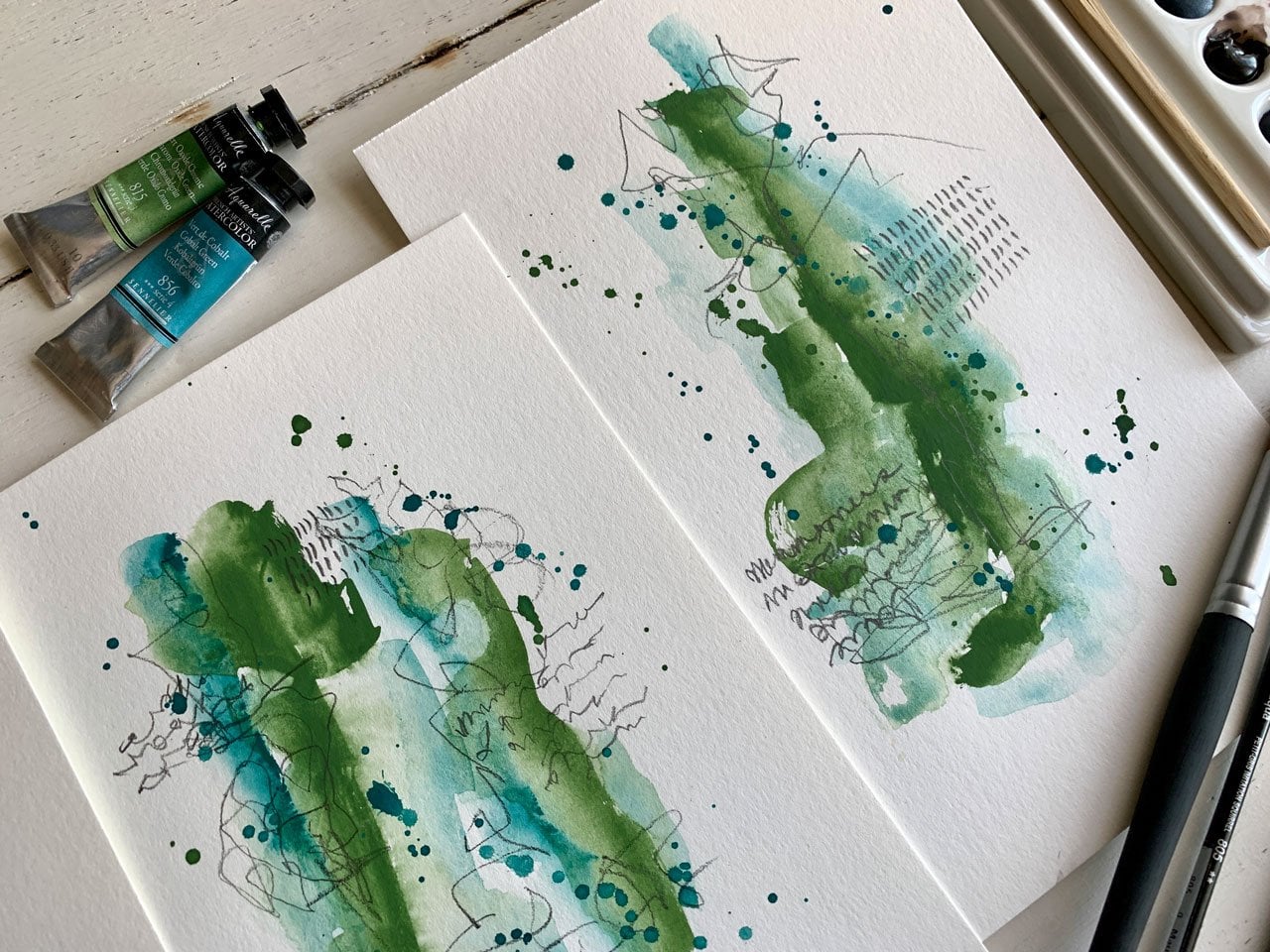
they're going to do. Let's see, let's try these. I don't know if I'm
not, we'll see. Leaf green, iron blue, and some sienna gold. If say for instance, I really loved that blue that's
peeking out on our piece. It's over here. It's sitting
in the corner drying. There's nothing saying
that I can't mix these. If I'm loving, for instance, that touch of blue, so much that we got out of here this fellow silane green, then I can come
back and mix these. There's nothing saying you
got to stick to one type of crayon or pencil in your work. Let me set these right here, so I know what I used. We'll set these over here
and let them do their thing. Let's just see, let's just activate these and
see what we got. I'm just dipping into clean
the brush off a little, and get some fresh water before I dip back
on another color. Blue and green and pink
and orange tend to be some of my favorite
colors that I go to. I'm trying a little bit to step outside my
own comfort zone. But as I'm looking at these and they're mixing, it
looks like blue-green. [LAUGHTER] Let's just dip
some other colors in here. This is all of the green. I don't know if we'll
like it or not, but look at that. That just spread out.
Look what that just did. [LAUGHTER] That just went crazy. [LAUGHTER] Maybe some
warm gray on there just to separate those
out, maybe some silver. Then we'll set this to
the side and let it dry. I really like on
these wet mediums, letting them do what
they're going to do, and just seeing when
you're done what you got. That's pretty fun. I'm going to move this silver a little bit, I don't want it to sit
as a dot quite yet. I just move that
around a little, liking that. Maybe
I'll move this. I don't want just
to be a gigantic dot right here, I don't think. Let's just look at that
with a little bit, look how pretty that is. We're going to set
this one to the side. [MUSIC]
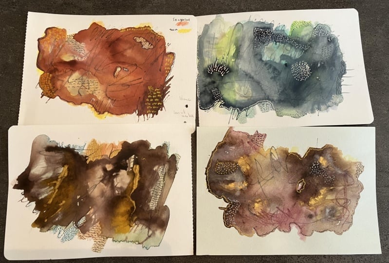
6. A Few More Color Experiments: [MUSIC] You see why this is
super important, which I'm not doing
because I'm filming to stop and say here's the
colors I used in these. Because when we get
to the bigger ones, we're going to think, I
wonder what we used in that. [LAUGHTER] It was
something we really loved. I think that I want to
try pink and orange, which I have not pulled out. So I haven't tried those yet, but I'm going to pull
out some other color here from our little color
palette and just see, I really think I'm going
to like this color. Let's just say we get mixing pink and red and
orange and whatever. Because that is one of
my go-to color palettes and I feel fine, I feel comfortable
in that color range. A lot of times I'm surprised sometimes with
what I end up with, and I'm like, oh, look at this. [LAUGHTER] All right, so let's see what we got here. See how fun these are, just scribbling on here and
then doing their thing. I like doing these
because when it's dry, we can come back and add mark-making and really
make things, "Oh, look at that color." Really make it look
like a piece of art. We've got our mark-making in our little additional things
that we add at the end, that's my favorite part and if you get some of
this on your brush, we can add some splatters. Look at that. Okay, so let this do its thing, I want to move this
one a little bit more. Let's come back in
here. I like the gray. I'm going to use the warm
gray just is what it is. Let's see what we
can get that to do. I like it because it blends in. It's not going to
stand out a whole lot, but it just looks different. All right, let's see what
else we got over here. I want pink and orange, or
red or something like that. Let's see, what is this? This one is crimson,
look at crimson. This is a FW color. Oh, that one had a dropper that dropped right on our piece. This is why we do samples. Because if that were on a great big piece of
art that I just did, I would've been
very, very upset. I'm getting a lot of that off. Glad that did that because
we can talk about it. [LAUGHTER] Let's just
go ahead and blend that in some easy-to-fix, but you want to know what your
supplies are going to do? Woah, way too much. You want to know what your
supplies are going to do before you get to this day, but the stage of your big art. Okay, so FW is have
a dropper in them, and these Liquitex ones don't. We just went insane with
the gray on this dropper, but if we move this
around and we let this dry and we come back and we do some mark-making, I
think we'll be okay. Let's just let
that do its thing. [LAUGHTER] That might be
an oopsies who knows, but this is the time to
discover those oopsies. Let's try this again and see because it looked different
now that hopefully, we don't have a great
big thing like that. You might spread
these out a little. Again, I'm coming
in from the side, I don't want to be super sharp, I don't want it
to be very heavy. I want to be able to
activate it and it do its thing without digging
into the paper really. All right, let's come back in a little swash
some of this color. Let these do some
blending now and just see what are we
going to get here. All right, let's try this again. Can I add a little
water in that? Let it do its thing. Let's try this color
without a big blob. Because I like
that it's a little darker than the
other colors I have on here so it gives it a kind of a chance to be the
contrast maybe. I also like the silver. I guess it does have a stopper. It does work with
the little dropper. I just mind must just
have been frozen up. Let's put some silver on here and let the
silver do its thing. You'll notice I'm being random. I'm not worried about
composition at the moment. These are my play pieces. This is where I'm figuring out what's going to work,
what's not going to work, what's going to do something
so weird that I'm like, oh, I didn't expect that. This is where we're
discovering that. This is my little
mermaid-looking thing I got at the art store. This is by Jane Davenport by the way, and it's a little setup and I
think I got several. This is my favorite one but if you don't have
something like this to do mark-making, you
can use a fork. I want to drag some
of this color while it's still wet because that was really pretty on
my sample piece over here. I might even come back on some of these
that are drying out some and drag the wet
color out into the piece. Because how cool is
that like this one? Dragging that out
into the yellow, really changed some stuff
here. Let's do that. Let's do that over here too. Let's do this green one. I had too much water. Let's go ahead. I like what that's
doing in there. This one, we're going to
have to let this one dry but look what dragging
through does. I like this part right here. [LAUGHTER] You can see
that, but right there, look what that just did. That's really cool. If we did too much, that might be and
once this is dry, there's nothing saying
that we can't come back in and add some color
on top of here. Now that we've got that doing its little spread
out thing there, maybe now, after we've
let that dry a little, this is why we use these to experiment so that we
can say stuff like this, like what can it do if I add a little more color in here or if I do
this or I do that, let that do its thing. I don't have a blue piece here. I mean, I've got
green over here, but I don't know. Do I want to play with
maybe the Payne's gray, you got Payne's gray
Neil color crayon. Maybe play with
this Payne's gray and then maybe pick a blue, like I like this cobalt.
Let's see what these are. I've got peacock blue
and bright blue. Let's try this peacock. I mean, if we're
thinking peacock, I'm thinking blue
and green again, but I'm trying to resist [LAUGHTER] doing everything
in blue and green. But look at this fun color. This is a little bit of a teal. Let me pull this out here. We've got, oh, it is teal green. There we go, so teal
that says peacock. Let's see what we get if
we throw in a little of that and then will
activate these. Again, I'm trying to activate
each color individually, but I did mix these in with each other. We'll just
see what we get. Here, it looks like a
peacock, doesn't it? [LAUGHTER] The Payne's
gray is a bluish color. It's a bluish-gray. That's fun. I think I'm going to go ahead through in some of the gray. I want to use the warm
gray in my pieces, that's why I'm
playing with it more. This has some air bubbles that I want the air
bubbles in there. We might throw in
antelope brown. Let's just throw
in something crazy just to see, [LAUGHTER]
what do we got. light green, which
is a crazy color. Which was also thick, so let's just
spread that around. I need to go through and dip all these out just to
make sure I'm not going to be surprised
on a big piece but again, these
samples are the reason why we're doing this. So that we figure out what are
the supplies do and before we get to something
that's really important. This is really pretty
and I'm thinking silver might be pretty in there, so let's do a couple
of drops of silver, we'll just spread those
out a little bit. I like things that shimmer
when the light hits it. Like just a little unexpected, delightful thing that happens. [MUSIC]
7. Adding Interest With Mark Making: These are pretty dry. I did go back on the really
super thick things as paint, take just a paper towel and dap on there to speed stuff up for myself on color swatches. But if this were a
big piece that I were doing that I wanted to keep and really let its colors do
what they were going to do, I wouldn't do that. I'd go ahead and just walk away, eat dinner, and see what it is
that I want to end up with. I really like the
colors in here. I like these colors. This one is not my favorite. It's the one with the big
splotch of gray on it. I know that if I
overdo the gray, I'm not going to like it. That's a very interesting
experiment with that one. This one, I don't know. It's just not talking
to me with the colors. It is the real pretty
blue and green and we can certainly make
something out of it, but for today's
feeling for myself, I'm not feeling
it, so don't feel like that's going
to be my big piece. I really like these three, and my original sampler over here from our color
swatching section. That's our choices today. Then I want to
experiment with some mark-making just to look
at it and talk about it. I like Posca pens
for mark-making. I like pieces of graphite. I have a mechanical pencil
that I love to mark-make with. You could also use any
kind of colored pencil. You could use your
Inktense pencils, which is the perfect
time to come back in now and really see if you want to use any of these to stand out. You could come back
and add more of a metallic if you think
your metallic got lost, now's the time to add
some metallic in there. We could come back in
here with some black. I like using India
ink for black. It's not water-soluble,
but it is a nice way to at the end to give some
extra oomph to a piece. Let's just start
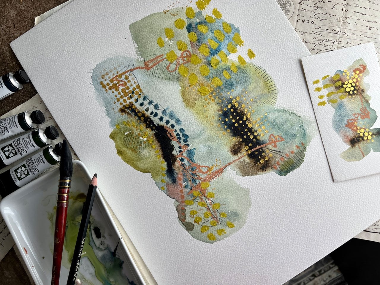
with this first one. I love how the colors came out. I want to come back
in and just start adding some of my
favorite marks and see, what can we end up with? I particularly like dots. I might just come back in
here with some dot details. Then I like lines, so I'll come back in here, maybe with the
Inktense pencil or graphite and put some
lines in here maybe. Some of this maybe
you're not going to see until you get close up
and then you're like, look at that interesting whatever that is that's
going on in there, because this right here,
super-duper interesting. As you get closer, look at those colors
that are in there, that little tinge of
almost that blue look that ended up coming through with
the way the color is mixed? Super beautiful. I can also just
come back in here with one of the colors
that are in here, it don't have to be the
exact one that we use, but it could be something
similar and just do some additional marks or
lines that aren't like white. It's not so contrasty
that you're thinking, but it is a nice little
addition in there that's like, what's that interesting
thing going on in there? Then you come closer for a look. That's not super, it's very subtle, It's
not in your face, but as you get
closer, you're like, look at that. I like that. I can also come back in here
with a blue if I wanted to. This is the peacock blue. If I wanted to just
put some blue in here, I could come back in here
and do a little blue. Keep in mind, these
are water-soluble. If you put the blue in
and you think too much, we can come back in
and soften it with water and really get that
to do some blending. That's what I like about
these water-soluble things. We can come back in and make these do something
a little bit different, you don't have to
stay that line, and really blend that in. If I just wanted a little taste of that color, which I did, I just wanted to taste of it, now I got a little taste
without it being super crazy. We can come back in here with some little dots in this color, dots don't have to
be white and black. They can be the color of that we were using or
something similar. We come back in here, just add some other
little details on top of what we've got. It's really with the success
of little abstracts like this is all about the layers. Now, here, I put into
a little bit of a wet. You can see the difference when I was wet versus
one I was dry. A little bit of difference
there in your mark-making. If I were to wet this pencil, just dip it in your
water and wet it, I'd get a different look
than I get when I get dry. I want you to experiment with
your water-soluble items. Experiment with it being wet, experiment with it being dry. I'm telling you, one of
my very favorite still, I think it's going
to be this one. That might be my big piece, which not every piece of
art I do is successful. Well, most of them
are not successful in my mind. I don't have to be. The reason why you do
something like this is so that you
discover new supplies, you figure out what they do. You just decide, do I like this? Is it working out for me? Do I like the way things blend? This is how you figure out what your favorite supplies
and your favorite marks. It's how you you get
into what is your style, because you've taken
the time to do things like this and create a lot of bad art to the point
where you're like, this is the colors I like, this is the marks that I like, let me narrow this down
to the tools that I love and see what I can create. There's a reason
why I know that I like this big piece of graphite, because I've used it enough to be like, I like that thing. There's a reason why I like little Posca pens because I played with them so
much that I'm like, I love a Posca pen just for
some extra marks at the end. Until you play
with these things, you're not going to
know how they work, how they blend in
with other things, whether you're going to love
it or hate it, or think, what was I thinking.
I don't know, that's pretty cool right there. Look at that one. I'm
liking the green. Even though really be perfect if that didn't
appear on there, and the piece of paint
that I put accidentally, but this right
here, I love that. We also have the pink. Again, I'm just experimenting
with different supplies. I might dip the pink in
the water and see how does that change up my
mark when I mark on there. It's more intense. It's a lot heavier
in the application. As the water wears off, I see how the dry pencil is a lot less heavy handed
as the wet pencil. That's very interesting.
Look at that. I do like playing
with these wet. It's pretty cool. It's like watercolor in
a stick. Look how fine. See if that a lot of
focus on it for us. Look how fine that turned out? I might just come back with this and
make some marks. What does that mark look
like if the pencil is wet? See, they're completely
different look. Look how that changed from
here to here, wet versus dry. Big difference there on how
that pencil operated for us. I love that. There we go. I could come back
in here add some of my little signature
things, maybe some dots. Super fun. I think in the end, now that I have all my stuff
figured out here, this one, I did not add marks and stuff too because
as I was playing, it was still wet, but let's go back to
our original piece and maybe just come in here with a few lines
and dots and see, how does this piece, this might be my
very favorite piece out of the whole class. My little sample is
not dry, that's okay. Let me get where I was
going to write my colors. I didn't realize I
still had that was wet. This over here is
just beautiful. I love this right here. Look at that. I almost wish, I'll probably do, never mind. I'm just thinking a gold pencil, but I don't want to put
any extra gold in there. I like what it's doing. I'm just going to add
a few little marks in here, my graphite. Look how pretty this is? Maybe some lines would be fine. Really subtle, I
don't want it to be in there so much that
you're like, what the heck? Look how pretty that is? Really pretty. Now that we have tried
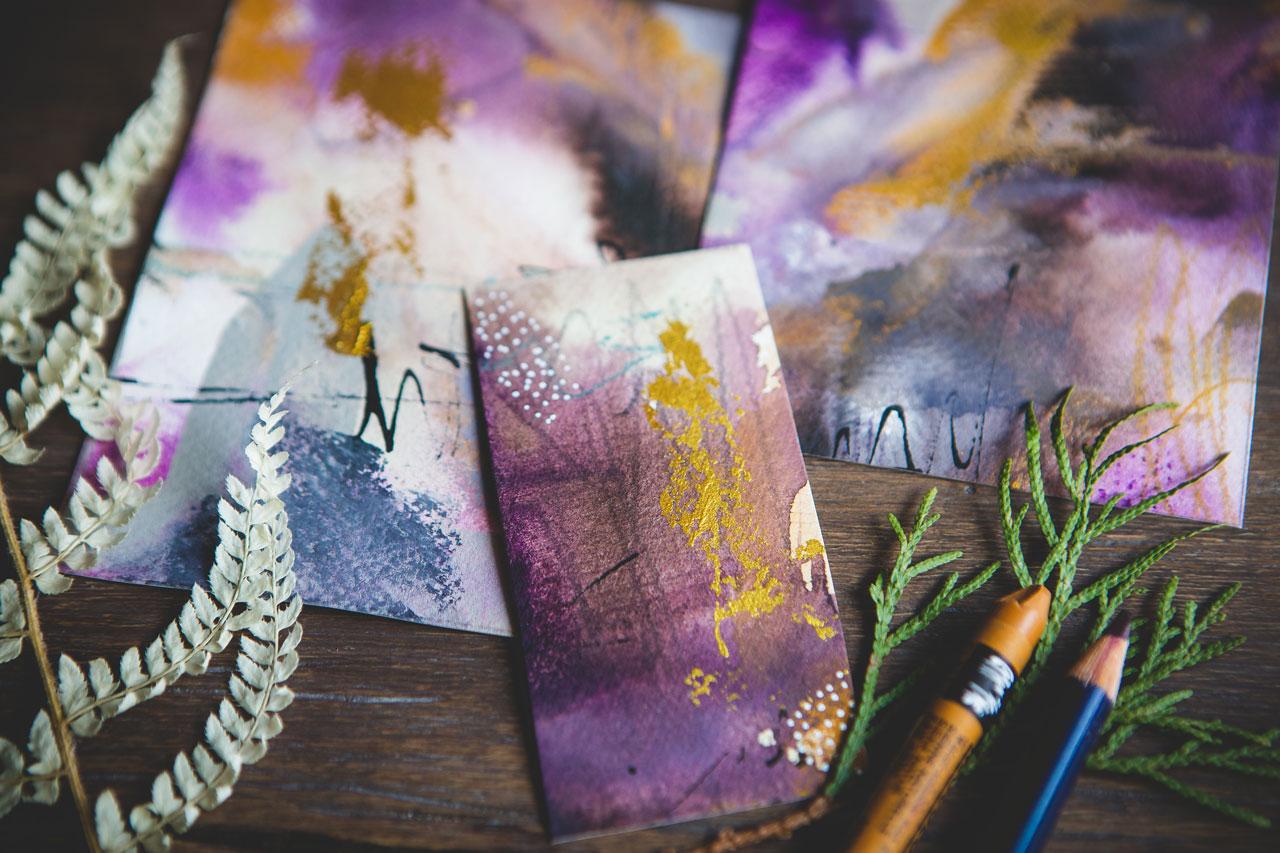
several different colorways, I do love this one. I love this pink and orange. I love this yellow and
burgundy, blue and green. Then this one that's
more neutral, this is the one where I
use these blue and green and gold and some inks. I really think that for today my large project is going
to be this colorway. This is very interesting
because I did a lot of different
colorways here, and I figured out that this
one is not my favorite. If I get too much of
that gray in there, it just ends up blah, like a little piece
of poopie there. Then in this one, the colors
are a little brighter, a little more neon green. On another day that might be
my favorite, but on today, I'm thinking more of
this muted color palette is the right way to go. I wouldn't have known
that if I hadn't done all of these yummy
little samples. I'm going to do the
larger piece, I believe, in these colors with the gray, the burnt umber, I got some white
here if I need it. I could even dab a purple
in there if I wanted, but I really do like
what it's doing. I might stick with those. Then I might use my
Posca pen, my graphite, and maybe an Inktense or two pencil if I want to just come back with some other details
and to add colors in. Then I've got some mark-making
tools and we're ready and set to move on to our
next larger project. I hope you enjoyed a little look at just experimenting
and playing in colors and seeing which one do we like the best and which one
might we now want to do a larger project in
after we have played and experimented and
figured out what our colors do and what's
our favorite ones. All right. Let's go on
to the big project.
8. Creating A Larger Piece: [MUSIC] In this project, we're going to do a larger piece based on our little
color samples. I've got the little samples
that I did yesterday, my color experiments, and
then do these look so good. Now that they're
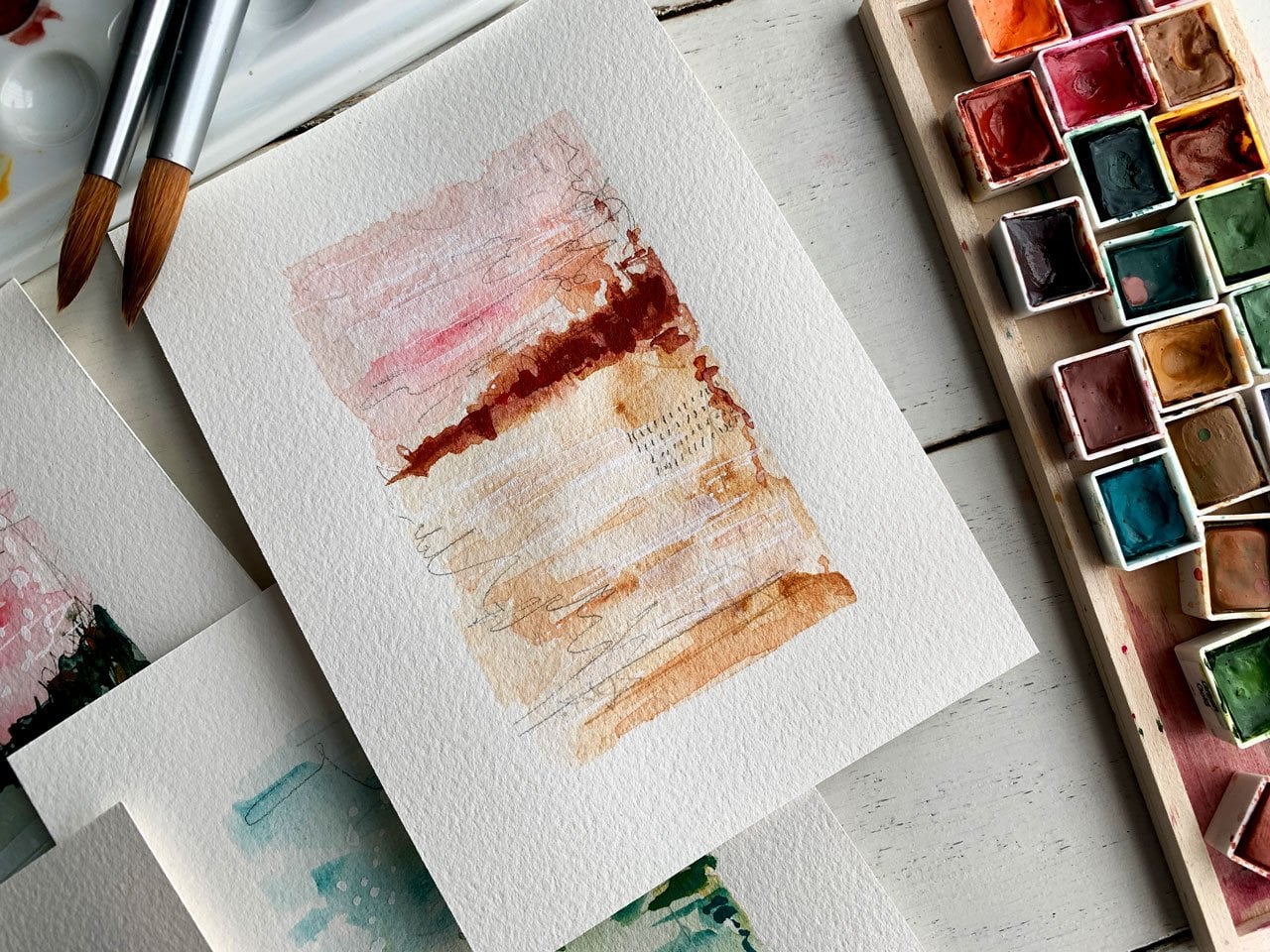
actually dry and you can take in the details. My favorite one is still that first one that I
did in my sketchbook. I'm going to play
with these colors. I believe they were these neo color two crayons and then I had the burnt umber, the white, and the warm
gray in these inks. Then I also had this gold and so we're
going to use those. I've got a little bit bigger
paintbrush that I'm going to be using to do water with and my same mark-making tools that I've used
in these samples. I've got them all sitting
over here to the side. Let's just move this. I'm working on a nine-inch
by 12-inch piece of the watercolor cold press paper. This is the arches paper that I have and I'm just
using it because I like it. I like that it's
100 percent cotton. The materials do work a little different on the
better-quality papers. But practice and play
until you get to the point where you're willing to spend on
the better paper. Start off with student
grade papers and your sketchbook and whatever it is that you happen to have, that's just perfectly fine. I've taped my piece of
paper down to just a piece of cardboard because part of what makes this so beautiful is that we let this
dry naturally. I wasn't applying
a heat gun to it. I was letting all that water
move around and blend and do its thing without forcing it
and when you use a heat gun, I don't know if things are just aren't as pretty,
it goes too fast, you get impatient
and you don't let those colors seep around and
do what they're going to do. I'm going to try my
best to not do that. I think the other color that
I had on that one that I decided wasn't my favorite
was the antelope in that ink. But now I'm looking
at it, thinking maybe I did like that antelope. I might dig the antelope out in my inks from over
here and also have some black India
ink just in case I decide that I want
some black touches. Now we've got our colors. On this piece I am thinking of composition and color and where do I want
the colors to be. I actually want there to be a nice white border around
the finished piece. That's why I taped it down. So I'm looking at my original
piece and I'm thinking, what did I love the
most about this? I really love these blue tinges. Those were a
particular favorite. I like the shiny bits that
I got from the metallic, that was a real favorite. I love this area
right here and how that whatever that toning is, it's just so beautiful. I like how your
eye moves around. We did have like a little
darker focus area in there. I'm just looking, what way do I want to
lay the colors down? How do I want it to
be when I'm done? What did you not like about the piece that you're
starting from? To be honest, I love
everything about this piece. That's why it's my favorite. I like the blue being in this lower area and
I'm going to work with bigger splashes of color and a bigger paintbrush in
my water and that way, I have enlarged the piece
that I'm working from. Just scale-wise to bump
that up and then the green. You can blend these if one of these colors is
not exactly right, and you've got a couple
of crayon colors, you can color one color right on top of the other
color and blend it. I'm putting colors beside
each other because I do like how that turned
out yesterday. But you can put
colors on top of each other just like paint
and blend them. I have this throughout
the center and just see what we get. A piece of crayon flaked
off, let's move that. Let's just start here. We can add more
crayon if we want. I've got a great big paintbrush. I've got my acrylic
inks up here because I like adding the ink on when
it was partially still wet. Just going to go
through here and activate each color separately. I am dipping it in my water, as I'm going to give me
a fresh clean brush. One thing too, about this different paper
than my sketchbook, this paper has more texture. It's cold-pressed steel, but
it's a heavier-weight paper. It has more texture. It will work a little
different than my sketchbook. We'll just know that
right up front, but I'm still going
to just go back, activate the colors,
let them blend the edges and just
see what can we get. I love this big
moppy paintbrush. These Neptune brushes by
Princeton are super nice. This one is a number 4 that I'm using on this larger
piece of paper. [MUSIC] It is quite
a bit of water I've got going on here. It's going to go through
and dip some of my gray while I've got all that water to do its thing and just see. Then I'll go through and move that around
some with my brush. I might add a little white on here because I
remember using a little white here and there. I should look that up. That's the thing with
these acrylic inks, they separate and you need to shake them
when you're starting. What I really love about the
way they start to blend, is they get different
patterns and textures and the paint breaks
up in different ways, in the middle of your piece,
that's very interesting. It adds really just a dynamic that I don't get with a lot of other
different paints. If we look in this piece here, we just get some blending and texture that pretty darn cool. I actually posted my little
sample on Instagram. Just a little video saying, look what I'm
working on today and somebody was like,
that's so beautiful. Was that some of
your own handmade watercolor paints that you used? I was like, looks does people think it looks like beautiful
handmade watercolors? I thought that was
pretty darn cool. I could say, no, it's not. I'm using neo-color
crayons and acrylic ink. It was fun to be able to say it was
something a little different. That is definitely
not what I wanted. That was a whole
lot of brown there. I'm just going to see what we can do to
spread that out some. That's part of the fun
at some of these two, it's very serendipitous what are you going to end up with? [MUSIC] If you get some drips outside, that's okay. You could actually pick
up some of this and do a few drips on
purpose just to see, in the end, did you like that. Maybe you do and
maybe you don't. Part of what I really
loved was running my little textured comb
through part of these. Let's just do that. It moved to the color. It really changed stuff
around when I did that on my original
little piece. Then I also liked
bits of gold in here and then after it's dry, we can come back in with
marks and stuff like that. One of my favorite
bits about the gold in our original inspiration
piece was one of these little bits of
gold made of heart. I was like, it's a little
surprise in there. I loved that. It's like my favorite part
of that whole piece was that yummy little surprise. Just trying to tap in this
a little bit with the brush to make these little bits
of gold do something else. I don't want it to
sit there as a dot. I wanted to be some
movement in there. That's pretty darn cool. Is it going to be our favorite? I don't know. It's at this point that I always
doubt everything. Am I going to love it?
I'm not going to hate it. Is it going to do what I wanted? There's no telling. But that's the magic
bubble in here. That's the magic of
watercolor pieces. Something else we get
a too is take the end of our brush and we could draw through some of our pieces and make a
design, look at that. That's some of the
magic of water , water paints, water-soluble, whatever's is what you're
going to end up when it's dry, it looks nothing at all
like it does when it's wet. I can't wait to see
what this little bunch of paint looks like
because as it's wet, those colors are
really beautiful. At this point, I'm going
to stop because I could keep adding stuff to it
completely in my mind, ruin it and I'm just going to let this sit to
the side and do its thing. You have to resist
overwork in the piece. Add your colors,
set it to the side, pick up another project
and do something else. That way, you can let this stuff do its thing and see
what you get later. We're going to set
it to the side. I'm going to resist heat drying
it and everything and let it do its natural thing and then we'll see
what we got. [MUSIC]
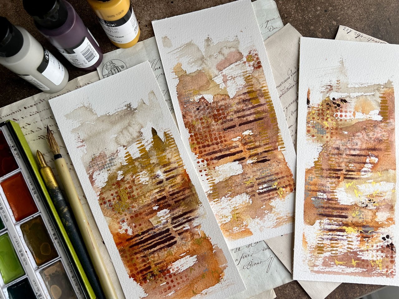
9. Adding Interest And Marks: [MUSIC] This is 98
percent dry I'll call it [LAUGHTER] I went to took a little break and let
it dry and do its thing. Then I will admit that they were just a little puddle of paint that just live there and
because I was filming, I didn't want to wait till tomorrow to come back and
film the next part of what I want to do on this so I took a tissue and very gently took the little edges and just sopped up some of
the extra paint. Because when you put
that much water, it's going to buckle the paper a little bit and then the paint is going to pull on one spot. If you have that happen, just take a tissue and take the edges and just
gently sop up the paint. My goal wasn't to dab
the tissue on the piece, it was just to tap it down a little bit so that
the tissue sop that paint without leaving lots of marks or crinkles or whatever it is
texture on that tissue. Now I did that and then I'll
let it dry a little further. If you end up with
buckled watercolor paper, it's not a big deal. I just pile. I put a piece of wax
paper on top of my art. When it's dry let it sit under some big heavy books
for a couple of days and it flattens back out. Just a little tip on that. Look how pretty this is. This section right here is
so beautiful. I love it. When I'm looking at it,
I'm almost thinking, does it look better one
direction versus the other? I'm almost feeling
this right here. I also in my mind, I don't love the drips so I do leave myself and open
on something like this. I could cut this as a square, maybe even decal the edges so if I get to the
end and I think, yes, let's cut this [LAUGHTER]
then we'll do that. Then we can use it as a floating
piece of art in a frame, which I know I've
showed you this before, but I love art that floats in a frame and that's
what that looks like. I always leave the option
open to cut apart. Even though in our
next project we'll be cutting up a big
piece of art into little pieces also reserve the fact that I might cut
up something like this. Now we just need to decide
what other marks do we want. I'm thinking that maybe
I love it this way, I might go ahead and work
on it this direction. Some of the mark just might be a little graphite,
just some scribbles. Anything that happens to be your favorite
mark-making techniques, maybe I want some dots or some lines or some
extra texture in here. Maybe I want some pastels. This is a chance to come in with some other art supplies
that you may have. Even though I did not mention
these in the supply video, this would be an instance
where you're thinking, what do I have that I can
now put on top of this, or do you love it like it is because
sometimes when you're done, you're going to
love what you got without adding
anything else to it. Don't be afraid to stop. I see so many people think, I'm afraid to go forward because I'm afraid to mess something up. Well, on the reverse
they're afraid to [LAUGHTER] go too far. Afraid they're going
to mess it up. Just look at it and
think, is this finished? Does it need more stuff? I like stuff so let's just
go ahead and keep going. I'm not going to
be afraid of it. I'm not going to stop and think, it just never looks finished
and be unhappy with it. I'm going to go ahead and we'll just add some stuff in here. Because on our little
sample pieces, there's pretty things in as you get closer that
makes it look interesting. Don't be afraid to move forward because you
think you're going to mess it up and don't be afraid to cut stuff up and make it better. It's just art. You can
come back and do it again. If you just can't get
past that paralysis, set the piece to the side, look at it and you'll get to the point one day
where you're thinking, okay, I'm ready to now do the next step on
this piece of art. Not all art is finished
in one session. I tend to like to finish
things in one session because I don't
come back to stuff. But truly things that you
work on and you love, look how pretty that is, and you might want
to take some time, think about things,
let it soak in. You don't have to be in
a hurry with this stuff. The goal was not to sit at
your table and work as fast as you can and then get mad when something
don't workout, which I'm speaking from
my own experience here, I've sat at my art table so many times and gotten
so frustrated and got ****** [LAUGHTER] I'm
mad for the rest of the day. Now, I try to do methods
that don't do that to me. In looking at
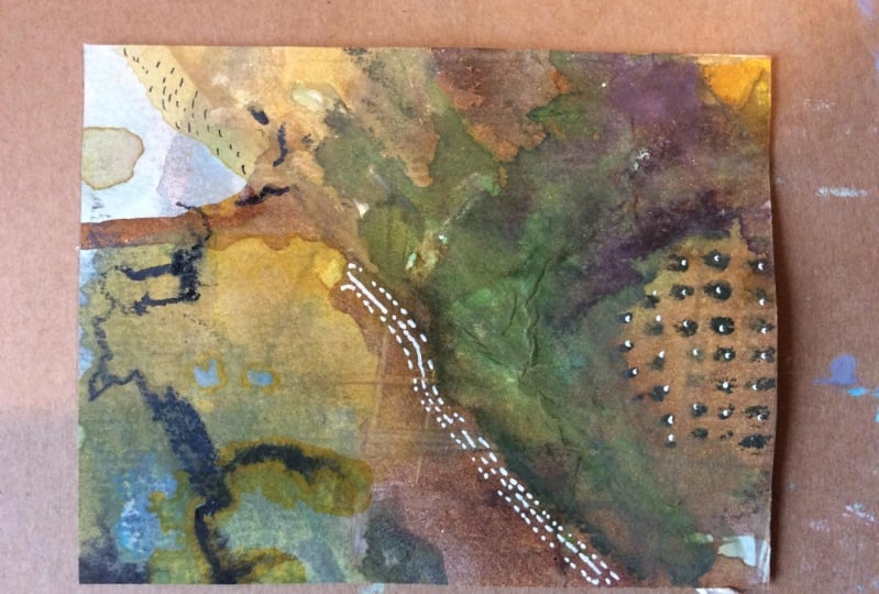
something like this, I'm already thinking in my mind, I feel like I'm
going to cut this up and I don't worry about that. Let's add some crayon in
here and maybe this color, I like these little
white dots though. I'm just adding in details
which maybe you won't see till you get up close like that right there, those lines, you may not see those
until you write up looking at it and you're taking in the details and you're like, look at that little extra whatever right in there
that we just added. It's not something
that's super hop out at you and slap you in the face
but it's very interesting. If you get up and you see that, if you get real close, these are little
surprises that are rewards [LAUGHTER] Like, look at this fun
little thing they left in here for me to find. That's why I like these neon color crayons and the pencils. They are amazing wet. That looks like we played with
custom watercolors almost. Then they're amazing dry. They're like the
most versatile tools that you work with [MUSIC] Now if you're working
with stuff that smears like chalk pastels then be real careful putting your hand on your piece of art and then smearing that pastel. Men, I do that too much
[LAUGHTER] because I like pastels and then I forget
that they're on there or I don't notice where
my hand is sitting. But so far everything on here is not picking up on my hands, so I'm not worried about it [MUSIC] I need a vote. What else does this need? Does this need a pop of black? Maybe this needs a
pop of black like some lines or something to give it some super extra contrast. Look at that. Now see, this is a moment where
you might be thinking, that's scary. It is scary. But at the same time
it wasn't too bad. It gave us a little bit
of something in there. We might ask, don't drop it
[LAUGHTER] Oh my goodness. This is turning out to be my favorite piece and I'm
dropping stuff on it. I do like the little bit of some splatter that I got. There we go. Yes, I like the splatter. It's hard work though, one of the container
here but look at that. See, if I've been
afraid of the black, I wouldn't have got
this pretty splatter. Look how pretty that
splatter is on there, gives us a little tiny
bit of some contrast. It gives our eyes something to think about and move around. Look how pretty that is. Play, play, play. Here's your chance to add color. Here's your chance to
sneak in something that maybe didn't get in
as much as you wanted. Maybe if I didn't get
this blue in enough, I could come back
in and add some in. I do like that, blue peeking out at the
edges. I love that. This is our chance to
really decorate and add but I'm really feeling this right here with that bit of mark-making so I'm going to let
the black ink dry. I don't want to ruin that. Then maybe take the tape
off and I may get a piece of mark board and just mark
this visually and see, do I like it better cropped in? We might, we'll see. Let's let this thing
dry and I'll be back. I've taken my tape off. It is the black is dry. I have a piece of mat
here just in a five by seven size that I got at the
craft store to look and see. I might go and like
that framed up, saying that size is that doing everything that
I'd like it to do. Do I want to cut
this piece up so that it's got the decal
tone edges on it. That would be extremely pretty. This just lets me
take away the white if I don't like the speckles, I'm not sure that I like it
as a circular blob formation. But if I pull that in
to this formation, all of a sudden, it's
really, really beautiful. Now I can see that maybe I
want something right here in the center part and I have this acrylic gold paste and
you can use any gold paint. But I think what I'm going
to do is put some of this gold paste right up here [LAUGHTER] Another
moment when you're like, did I just ruin it [LAUGHTER] I'm going to get
a palette knife. I am going to just do a little
spread here of that gold. I add in with the other gold that we've already got going on. Look how pretty that is. Men, I just love this stuff. It's basically just
a gold acrylic paste I got in my art subscription
box. But look at that. Now, we've got something right there in
the middle that draws the eye that's at the one-third and then
as the light hits it, it gives us a sparkle. You could do that with
cheap acrylic paint. I've certainly got several of those because I like metallics. This is a cheap craft paint and it would do the
exact same thing. I'm just using that because I have it and it's my favorite [LAUGHTER] But look
how beautiful that is. I think I am going
to let this dry and then tackle these
edges and see what that finished piece looks
like because I think as a square that would be really pretty framed like
the piece I showed you. We're going to let that dry
and I'll be back [MUSIC]
10. Adding A Deckled Edge: [MUSIC] This is dry and I'm just eyeballing like
where I really want this. I think what I'm going to do is I'm going to deckle the edges. I've got a metal ruler
here and I want to flip it on the back
to tear because I want it to look like
a natural tear rather than the page looking
torn because, let me grab a piece of paper here just to show
you the difference. If you have a piece
that you're tearing up, like this way, you end up with this
line and the paper torn on the back side of that. Whereas if we had flipped
it over and did that tear, you don't have the line
and the paper now has a more natural edge to it
than it did on this side. I want to tear it
from the back so that the front side looks like this. That's basically how I do it. I put the metal ruler down, I hold really tight, and I pull the half
that I'm throwing away. I pull that half. Then when I flip that over, look how beautiful that edge is. That's what I want. It will have color on it, but that's okay because we can frame it in that
float framey thing. I say color because I'm
not tearing it out here, I'm tearing it into a rectangle
like this right here. I'm just going to eyeball it. It's not a huge
deal if it's exact, but I do want it close
to what I'm thinking. If I measure this, here we go. I'm just going to flip
it and measure it. That's about two and a
quarter from that side. Then I'll put this back
on and measure it again. Let's say two and a quarter. I'm just going to eyeball it. I want it to be
about right here. Really even one line over
because that's like a little, let's just move
that one line over. Because of the word,
that ruler ends there. I even have a bigger ruler
which I might use for this piece of paper because
it's longer than 12 inches. Now I can align the
whole thing up. Then I've also had people
say measure from the front, put a little hole
through the paper. Then you can use that hole as your guide as you're
on the backside. I've done that before too, and that works out
fine. Look at that. See we get that
pretty edge on there. I like that a lot. Let's just go ahead and use
this as our guide again. We are just a hair less
than two and a quarter, so let's just go ahead
and go for that. I'll just mark these again. If it's exact, it's
not a big deal. I do want it to be straight, but it doesn't really matter. I'm not trying to end
up with a specific size piece of art. If I'm a little off, it's not a gigantic deal because when I get it
framed at the framer, she'll center
wherever I want it. There we go. Yeah.
Look how pretty that is turning out. Let's see. I like it right about there. I don't mind if there's
a little white at the bottom because there's
a little white at the top, that'll pull that in. That is just over 3.5, is that 3.5 or how long is it? Sorry, just over two
and three-quarters. See, measure twice, cut once. Even with your art [LAUGHTER]. My goodness. I know
you think I'm crazy. [LAUGHTER] It's okay. Now let's tear this. If we end up with
a piece like that, not a big deal. But I would go to the front
side and tear down so that it matches what you are trying
to do and doesn't look odd. If you tear it up
instead of down, or you tear it
from the backside, you'll end up with a weird spot. Now we've got that in there. Let's see how big this is. We'll cut this fourth side. So right at three inches. Really anywhere right in
here would be pretty, but I'm going to keep
it to a 5 by 7 inch. Here we go. Press down hard so your
ruler doesn't move. Then look how pretty
that turned out. That's exactly what I wanted. Now we have a beautiful
piece of art. We've got a little bit
of some gold that I've put on there that's
our focal point off to the side, so
nothing's centered. I've given it a focal
point in my composition. Just to give you an example, if we float that on
something like that, look how beautiful that is. Now I want to have a
frame just like that. My goodness. I love it when
things turn out beautiful. I hope you enjoy doing
one of these projects. It's fun if you end
up with a piece that you love without cutting it. Then you can frame it in a mat. But if you end up with a
piece where maybe you didn't like the edges or you
didn't like the splatter, like I did not
like the splatter, then don't be afraid
to cut the part you love right out of
the center of that. Maybe do the deckled
edges and know that this is going to be a piece
that you float frame. You could sign it
right down here in pencil or on the back and
look how beautiful that is. Then these leftover pieces, I would save for a piece of collage art and I
wouldn't throw them away. They're still useful
for other art projects. So super fun. I hope
you enjoy this project. I can't wait to see the piece
that you create as a big, single, more purposeful piece. Then whether you cut it out with the deckled edges or not, I'm definitely wanting to
see what you come up with, with water-soluble
crayons and pencils. Let's go on to our
next project [MUSIC].
11. Creating Large With Abandon: In this project, it's a little extra project, but I really love doing cut-up art where you
make just a big piece. You have fine, you just be messy and do everything that you've just imagined that
you might like. We can start off
with the pencils, which is what I want to
play with is the pencils. We can do the neo-color crayons. You can do any of
your water-soluble stuff that you want to do. We can lay the color
down, let it dry, do some mark-making and some extra fun little
bits of whatever. Then we go through and cut
out our favorite part. We can then decide
on composition, color, what stands out at us, what's our favorite thing. I've done lots of little
workshops with this technique. It's definitely not
a new technique, but it is working with
different supplies. I like revisiting techniques
that I feel comfortable with different supplies because I'm going to get different
looks for things. I'm going to learn
how to really work the supplies a whole lot better than maybe I had intended. I've played a little bit with
these ink tents pencils, and I've noticed a few go a little bit
lighter on the paper, you get a lot lighter
look to the watercolor. It's still intense color, but it's not so vivid. You're less likely to have leftover marks and
lines from the pencil. So I am going a little bit
light coming in from the side. I don't want to gouge the paper. I'm just going to play and
see what do I end up with, if anything at all, I may not like it at
all, and that's okay. The cutout pieces are
perfect for collage. So if you are wanting
to do collage or wondering what can you do
with the leftover pieces? Go take a look at the
creative collage workshop, or I then show you what I do with all the
extra leftover bits. I make very pretty collage art. I'm just being real light. I'm not trying to fill the
whole page with one color. I'm not thinking
about composition. I want to have some
room to move this stuff around and just see
what we can get. I did like in my very favorite
piece and the sketchbook, the little bit of blue that
we saw peeking through. I'm just going to add some of this neo-color crayon in that pretty color and just
see, does it peak through? Do we get any surprising
spots by having this in here? We're mixing up our
water-soluble stuff. That's fun. I'm using my larger paintbrush because this is a larger piece. I'm just going to activate
the color separately, add some acrylic ink, and then let it dry, like we're letting our
other pieces dry and then we can add marks and
then see what do we get. What pretty stuff
did we end up with? I am mostly trying to
activate each color separate just so that we don't have a big wash
of mud basically. Then we'll come back
and work on them again. My water is a little bit dirty. If that bothers you, you, go get clean water or have a
couple of sitting over here that you can switch out. So this is an even
more watercolory. Look how pretty that is. Now I'm just going to
go back through and really work the color
in a little more. Make sure I don't have any
mostly no crown lines. I don't want the crayon lines. I want it to look like
swashes of paint and color. Maybe a few marks in there but not so many that it's
like, what was that? I want the colors
to touch and blend. I'm not trying to keep
them all separate. I just wanted to activate
them separately. Now some of these,
you can see there is some mark in here of the
crayon and that's okay, we'll incorporate that as
part of our mark-making. I'm not taping it down
because I want white edges. I'm just taping it down so it's secure and I can
move it around us. We let it dry later. So now, I'm just going
to come back in here on this wet stuff and maybe add some more color,
perhaps some marks. Because it's fun
working wet on wet. It's also fun working on dry. It's interesting to see
how these do a little differently if you're working on wet or you're working on dry. If you're wanting to put an
extra touch a color in here, you could come back and
then switch that around. If you wanted, you could
work that in a little bit. I really like this color and then we can add some ink on top of this and just
see what do we get. I really love this warm gray. It's a mix of a little bit of gray and some burnt
umber mixed together. So if you can't
find the warm gray, which is the Amsterdam brand you can't easily find that
you can always mix your own. That's what I did
before I found that color I just mixed
up some of my own. There we'll go in with a
little burnt umber. Just see, go in with some white. Then once these are Caesar dry, you can always go back
in and add more color, more marks, more whatever, until you've got all the
layers that you want. Because at some point
it's fun to let some of the layers dry and start working in multiple layers while things are doing their
thing as they're drying. Now I'm just pull in
some of this color through because it
does really cool things when you
pull this through. So that's actually
looking really cool. Almost wondering if I wouldn't
want a tad of this purple. Now I'm just making
it up as I go along. There's nothing at all planned about where I want to end up. I just want to
play and maybe add colors that I really
just are going to be a delightful surprise
when we're done. That's looking really
pretty over here. We could also come in
here with some graphite. The graphite is going
to look different on this that we're moving paint around than it will
when it's dry. That's fun. What marks can we get versus dry marks when we've let this sit for a while
and do its thing? Really like and whatever
this right here is doing. I'm going to run some
gold around here, and just see what can
we get that gold to do. I have accidentally spilled a whole thing of paint
on my paintings before. So I'm rolling the brush
through the gold to scatter it without it
actually being like a brush mark. That was pretty. So you might consider different
ways to move the paint, not just dabbing it
like you're painting. Anyway, I've spilled whole
things on my painting, accidentally picking it up, thinking the lid was back
on, and then at one. So maybe just keep that in mind as you're
working with these inks, especially way too
easy to do that. I got a whole area over here where I
really didn't work. That water is good. Let's run that water
out over here. So I think for the moment, I'm going to let this dry and just see what it is that
we're going to end up with. Then we can make marks and add other things on top of it, and then see what
we want to cut up. So I'm going to set
this down to the side, and I will let it dry naturally. Please resist adding lots of heat or trying to draw
this with your heat gun. Just let it do its thing, and see what you end up with. It's so much more fun. The colors blend and change
in ways you didn't expect. I'm not sure I'm going
to like this area, but I'm not going to take it out because what if it's pretty as part of a composition?
So we'll see. I'm definitely going to add some more on top of this piece. It's looking a little crazy. I'm already thinking, am I going to like
anything on this? But if I take a little
piece of mat board, and this is just an example, I'm probably going
to cut these into squares because that
is my favorite. Here's another piece
that I framed. It was one of the cutout
pieces from another class. But look how beautiful things
like this are framed up. I love it. Once we cut a piece out, we can then continue to embellish a piece
if we needed to, if we found like the
perfect little section and it needed one extra thing. Maybe you didn't know
that till we cut it out. But as I'm looking at this, this right here, I'm actually rather loving. So I do think there's going
to be some that I love out of here after we put some
more stuff on top. So let's go ahead
and start adding and just see what we
can end up with. Let me move that
picture out of the way. So now's the time
to play in the inks or we could play
in our metallics, or we could play in
mark-making and pencils, and we could add another layer, water-soluble stuff
on top of this. Keep in mind, if you do that, you're reactivating the stuff. If I just added
this on here and I wanted to have
that blend around, you're reactivating
the multi-layers. You're not just activating
what you just drew on there. Also consider dipping
that in water and then seeing how these
work wet versus dry, you get a different
mark, which is cool. It's way different than
it is when it's dry. I'm thinking, not thinking
of anything other than, let's just draw on here. Do I pick the right color? Am I worried about
the composition? I'm not thinking of any
of that at this point. So I'm just thinking,
let's draw and make interesting stuff and
see what we can get. If anything is wet, we could drag through it, really add some texture to. That gold is still wet. So this was mostly dry, but I guess not completely dry. That was an interesting thing. I'm particularly loving
this one section right here. We get this. This right here, look
how beautiful that is. I want to preserve that. Even if I cover
everything else up, that I want to preserve. Now, what we could do, I've got my palette knife
out from other piece. We could take some
ink way too much. But now, we can add some layers of acrylic
paint if we want. Since I'm already working
with the inks and stuff, might just play in the
inks that I've got out. Maybe some mark-making. You could use stencils. If you've got stencils
and you want to play in the stencils,
you could do that. All kinds of stuff
that you could be adding on top of your pieces. I love working with pastels. We could add pastels, come back in here with
our India ink and maybe do some mark-making
with some black. I like having really dark areas, really light areas, nice little contrast going in
there like that. If you use something like
pastels on top of your pieces, definitely consider
finishing spray. I use like the
Sennelier spray or this workable fixative
before we start cutting up. This was from the craft store, but I also have the Sennelier
from the art store. Because if you don't
settle these down, you'll keep smudging them. They are fun to work
into your pieces. I'm just looking at this
thinking maybe I want to go ahead and add some
of the [inaudible]. This is water-soluble too, which I particularly like. You can smear it
with your fingers. That's another thing I like
with the pastel chalk. So now I've got this in here, I can come back and do
this water on top of it. These things are
particularly beautiful. They're really chalky
when they're done. The eye can actually
like some of this mustard in here. Hang on. They're really chalky
when they're done, they're a matte finish. It's almost like a nice little top-off to the other
things that we were doing with water and the
crayons and the pencils. Because at this point, I'm less likely to reactivate what's under
it because these are so pigmented and soft that they do their own little thing without too much
effort, which I love. Look how pretty these are. So that's a fun way to get
some extra color smudge in here without resorting
to say, full-on paints. I love that gold paste. I use it on that next project, which is basically, it's
like the inks and stuff. I liked those touches
of gold and silver. I've got some silver craft
and gold craft paint. I like some of these a
lot because they just add another dimension
and interests and layer that we're not going
to get without them. Really particularly like
that Blick Matte Acrylic. It's just an acrylic paint
that's matte-colored, so use whatever you've got, whatever your
favorites tend to be. I like white my fingers. I love my little
microfiber cloth as an art cloth
because when you're working with stuff like pastels, it gets all over your fingers. We can get enough
off so that we can look around at stuff like what I'm really loving
that right there. Actually, I like some of these
in here with this black. Like that black really
sets off some of these. So now, I'm wondering, in this right here, do I need more? We can always go back
and add it later. But it is interesting to look at that and
then think okay, this is working and
whatever, this is not. Look at that. That's pretty
right there, actually. So let's just take a look.
Let's just let this dry. I might come in here
with some more. I really love this right here. But colors are
blending together in such a way that it's
like purple fire almost. Let's let this dry, and then we can cut up
the pieces that we like, and then add our
finishing touches. So at this point, I'm going
to let this dry for a moment.
12. Cutting Up And Adding Marks: Our piece is dry and I hold out some just watercolor paper
that I have taped together as a nice way to look around and see is there anything that we're going
to like in this piece. I have some cradled board that I use to cut
around sometimes. I'll have a cutting board and I'll just set that there
and use my Exacto knife to cut around and you can
see I do that a lot because I like these and
it makes it convenient. This is a five by five. Is this just five by five? Yeah, five by five. I got a five-by-five board. This a five by
seven, six by six. I got six-by-six board. This I think is a
four-by-four board. So I like to sometimes cheat when I'm cutting stuff,
but I like to cut stuff out. That one I showed
you that I framed of a different cut-out piece, they look good, cut
straight, but again, I want the edges to
be fairly straight. Or if you left enough room, you could deck all
the edges like we did on our last project. I'm really loving that one. Those colors turned out amazing. But I'm just wanting
to decide now what do I love out of this, and I may not love at
all and the scraps that are leftover will be pieces
that I use in collage art. Definitely check out the creative collage class because that's what
you can do with these little scraps
that you have leftover, which is why I really love
doing stuff like that. If you end up with a
piece and you're thinking that's amazing and you
don't want to cut it up, don't cut it up. But if you end up with a piece
and you're thinking, okay, let's see what I love in here, you're looking around, don't feel like you have
to leave the piece of paper in the direction
that you did it, feel free to like, see here now these things
run down the page. That was like one of
my favorite areas, but do I like it
better this way with those running down? I already see that I'm
going to love this one. Here's the five-by-five square. Let's just take a look at that. What part of that
do we really love, and where do we want that
composition to fall? Do I love it better this way, and do I need to move
these further over? Or once I get it framed
out, do I like it at all? Do I like this better over here? Do I like it or do I like it? Here's where I need
the vote button. We all need to vote. This is really fun right here. Do we like it better this way? That's really fun. I'm really loving
this piece here. Not loving that. Let's see. I'm actually digging this
and I'm just looking at it, thinking, do I like this
dark coming in here, offsetting this dark here? Do I want it without the dark but then this is more centered? I don't have enough room
to really go any further. Also, don't get tied into
a square or a rectangle. If there's a section that
you particularly love, and maybe it's this part, maybe consider odd-shaped art,
or bookmarks, or gift tags. Because I do actually
particularly like this section of that. Now that I have said that, I like that more than
the whole thing. I'm really loving
that right there. If I find something that
I really, really love, then I would go ahead
and draw with a pencil. I will just go ahead
and draw that out and we'll use that as one
of our pieces that we cut out because I love that. I also want to
come back to this. I'm determined I'm going to love this one way or another. I'm actually thinking framed in tighter is the one that I like. We're going to cut this
a tiny bit bigger, and then I'm giving me
something to frame in. I almost didn't expect that. I'm going to go
ahead and cut the pieces out that I
know I really love, and then we'll see what
pieces are leftover. Then you can decide, I love this, does it
need more mark-making? Look how pretty that is. Let me tell you, I'm the
worst about doubting myself from the art thinking. Am I going to like this? Is this not going to turn out? Look at this, it's so
beautiful when you get it cut out and look at the way these colors move
around and mesh. This is so beautiful. I get so excited every time. Every class you take, every time we cut something out, and then I can visually get
rid of all the clutter around it and see how amazing something just turned out when the whole time
I was painting it, I was like, "This
is kind of ugly. I don't think I'm
going to like this." Every time, I'm telling
you, look at that. Oh, that is so pretty. Total joy just happened with those two pieces and
I'm telling you, I almost thought,
is this the one that I'm not going to get
something I love out of? Because I did this and I might want to have
a little set of two, so another one in that size
that I love. Let's just see. But yeah, I mean, it's
at that moment when I finally see, look at that.
I think I like that. When I finally see the
pieces cut out and separated that I can truly think, wow, even better than I hoped. But the whole rest of the time I'm doing it, I'm thinking I don't know if I'm
going to like this. I don't know if it's
going to turn out. This one maybe the ugly one. This may be the time when
I leave my table mad. I just love how beautiful
these colors are smashed together with
the water like that. They're different. They're
different than a watercolor. They're different
than an acrylic ink, just solid painting. They're different than
regular acrylic paint. I can't explain it
until you're sitting here actually looking
at a piece close-up how these colors are just different and
beautiful when they're coming out of these water-soluble
crayons or pencils. Look how pretty that is. Now I have a pretty little
pair. Look at that. I like that they're different, but they're kind of
in the same colorway. Oh, prettier that way. Look at that. Then you just want to see, is there anything left? This one was
particularly beautiful. Any pieces left that
are crazy pretty? This one's pretty here. It was even pretty
as a skinnier piece. See, I don't think I
love that one at all. Just my personal preference. You might be going,
"That's my favorite." At this point, too, we could also just cut
these out as tags. You could cut them
out in squares, cut the little corners so
it's a really pretty tag. Now that's pretty there. Then this would be pretty with some kind of gold
sprinkled up through it. I'm feeling that. Let's go
ahead and draw this one. I'm drawing it a
little bigger so that there's room to matte it
if I want to matte it. See, I'm feeling
that right there. What do you think right there? Then if we do a little smattering
of gold up there, that would be pretty. This piece right here is
particularly beautiful. Now I'm going to regret not going over to
the edge, aren't I? That would be so pretty
in a piece of collage, or as a tag, or as a micro piece of art. I do like making little
micro pieces of art. Look at that, super pretty. That was cool. I love this one. I love this little edge. I love this piece right here. Let's just go ahead. See, I've cut it right there. Let's go ahead and cut it. Look how pretty that is. Look how pretty that is. That's so pretty,
oh my goodness. Let's cut the edge
off this and have a couple of micro pieces. Look how pretty both these are. These would be really pretty
as a little decoration on the front of a card
that you send somebody, and then they've got
their own little piece of micro art that they can. This piece here that I've cut
off the edge that I said, that's actually really pretty, although they're
little micro piece. Then that'll be a pretty tag. I'm not digging this side. So let's just go ahead
and set this to the side. Don't throw away your scraps, use them for collage pieces. Look at all these little
pretty collage pieces. That one right there,
it's going to be beautiful on something
that I collage. Keep all those. Look how pretty
these are cut out. Oh my goodness, so
pretty. Look at all that. Let's just move these
out of the way. Now we can look at
this and think, what else does this need to
give me that extra little? This one I'm actually liking, just like it is, almost. I don't want to add anything
else to it, I don t think. I like the marks coming in. I like the little pops. I like the gold in here. I like this one section that more than anything
I wanted to save. I love that. I'm feeling like this one's
really pretty just like it is, but I might change my mind. This one is so dark. I don't want to do
this pop of gold, and let's just see. Like we did on that first piece, just a little bit
of acrylic paint and my palette
knife and just see, can I give this an
interesting focal point? A little bit of shine. Look at that. I love that. Now I want a little of
that on this one here. But I don't necessarily want
to copy exactly what I did, but look at that
little tiny bit. I'm doing that off center, so I'm still keeping
in mind composition. That ties in with this one. I could put a little more right here in this Z because it is a different shine
than that ink was. Just to tie all three pieces
together, look at that. Those are beautiful
and I will say, purple and purple,
what that ended up, those purply tones, not
my normal color palette. Now, little pieces we
could come back on these. We could add a little bit of
mark-making if we wanted to. We could add some dots. I actually like those, but maybe a tiny bit of gold on this one would finish this one off for
me. Let's just see. That's pretty. Look at that, that's real pretty. I like that. But I'm feeling like that
could use something else. So maybe white Posca pen, maybe some dots or something
as an extra visual, something different. I like
that up there across the top. There we go. That gave me some tiny finishing bits that I think really finished off
that pretty piece of art. This one, I'm loving like it is, but could we use some dots? Maybe some dots. Just because it's one
extra visual element that's interesting, then it really pulled that
one together for me nicely. Look at that, is
these little touches? Look how pretty that is with that extra
little touch there. Then this one, I am
going to leave it like I had it because I do like all of that that I've got going on. These I'm in love with, like insanely in love. Look how beautiful that is. I love all of those. Last project is make
one big piece of paper with a mess and then cut little pieces out of it and
see what you end up with. Even though, just like me, you're going to doubt the
whole time whether you're going to get anything
at all that you love, cut the pieces out
that you like the most and add some finishing touches and see what you can turn out. Because look how
amazing these are, even these micro pieces. I mean, I love this. I can't wait to see
what you create. Definitely come back
and share this with me, and I'll see you back in class.
13. Final Thoughts: [MUSIC] Well, what did you think of these different supplies? Have you ever played with the water soluble
crayons and pencils and added water and thought to make projects like we've done today? If you have, that's awesome. If you haven't, did
you have any yummy, fantastic aha moments? I know I had several
when I was playing and experimenting especially
in this piece right here. The way these colors blended, some of the ones that ended up as the outlying little pops
of color were very exciting. I want to know what
those ahas were for you. Did you have fun playing in the supplies and
adding water and coming up with some
different things that maybe you never
even thought to do? I want to see your color ways. I want to see your projects. I want to see the piece
if you made any and you cut up some
beautiful little pieces. I want to know if you've
ever tried playing in the water soluble products in the way that we were
playing in class. What did you think of it? I would love to know. Come back and share
your projects. I want to see what
you're working on and the colors you
picked and the marks you made and what
fun you were having. I get true joy out of that. I can't wait to see
you in the next class. I'll see you later. [MUSIC]
 DENISE LOVE, Artist & Creative Educator