Mix Different Shades of Greens for Watercolor Landscapes With Primary Colors
 Bianca Luztre, Watercolor, Productivity, Color Mixing
Watch this class and thousands more
Watch this class and thousands more
Lessons in This Class
-
-
1.
Mixing Greens
2:44
-
2.
Yellow / Blue Green
2:10
-
3.
Muted Greens
1:48
-
4.
Light / Dark Green
1:44
-
5.
Landscape Study
4:55
-
6.
What to do Next
1:31
-
-
- --
- Beginner level
- Intermediate level
- Advanced level
- All levels
Community Generated
The level is determined by a majority opinion of students who have reviewed this class. The teacher's recommendation is shown until at least 5 student responses are collected.
73
Students
11
Projects
About This Class
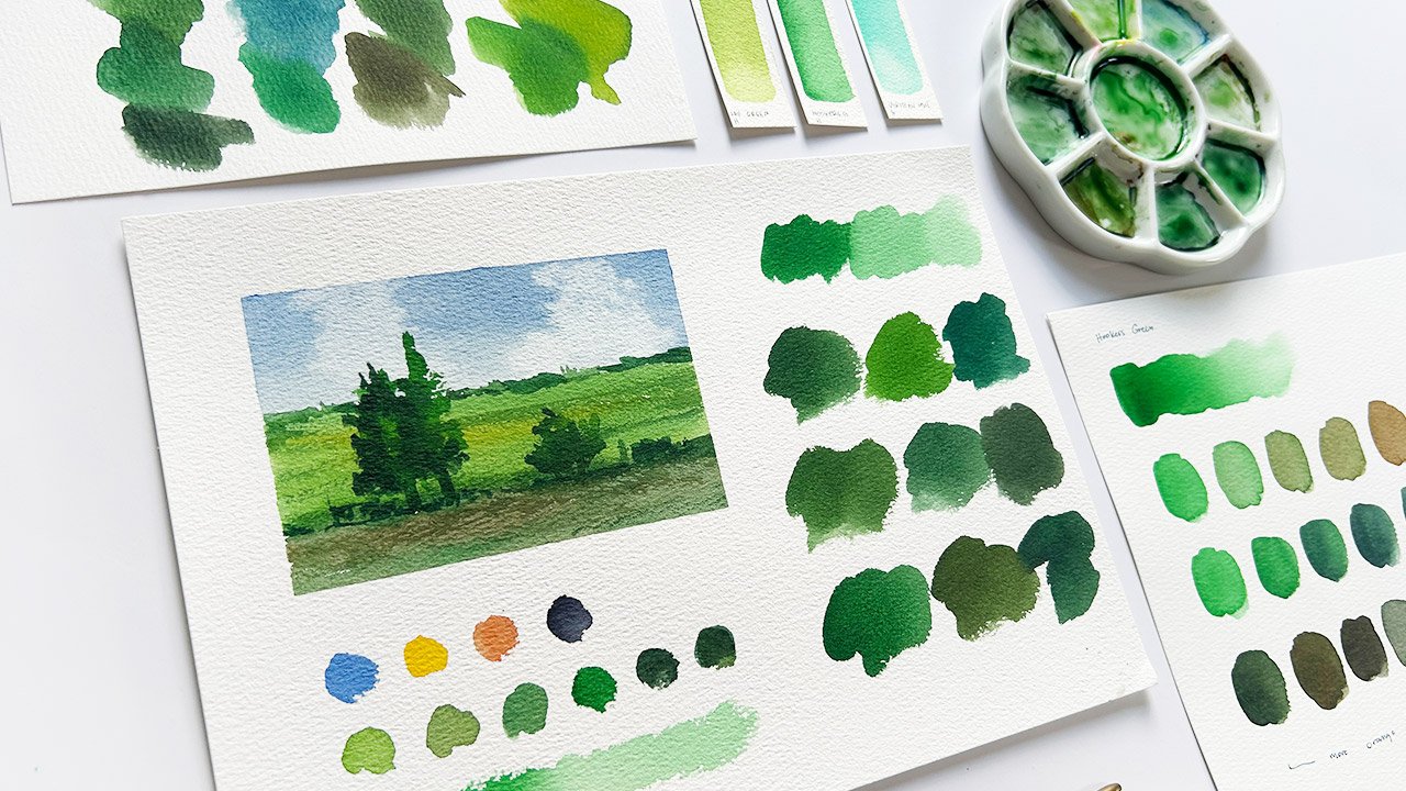
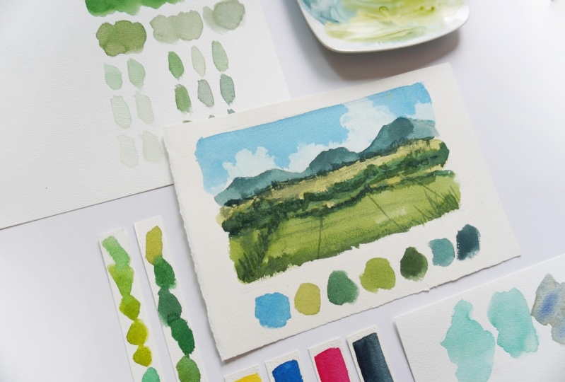
Let’s learn how to mix different shades of green for our watercolor landscapes by applying basic color theories and using a limited palette.
In this lesson, we will focus on using primary colors (red / pink, yellow, blue) and a dark pigment to mix various shades of landscape colors including yellow greens, neutral greens, muted greens, blue greens and dark greens.
We’ll also look into other alternative pigments so you won’t feel constrained with the colors that I will use in the demo videos.
What will we do in this class?
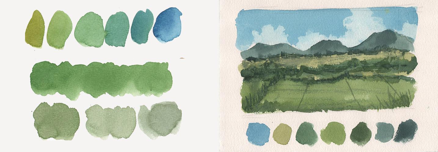
To fully understand how to mix any greens, we will start with the following swatches:
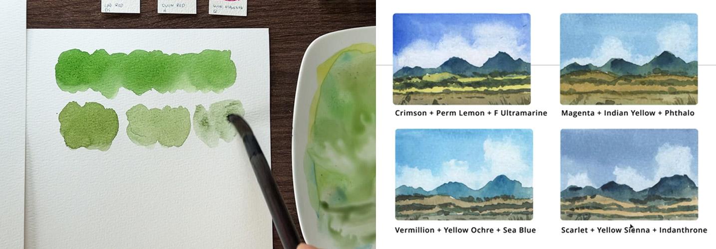
- Yellow and blue combination - mixing the base green color and understanding that using different pigments will yield different results
- Adding its complementary color - could be either red, pink or magenta to desaturate the color; testing how much of the other color will affect the vibrancy of the base color
- Controlling the opacity by adding water and comparing it with its pastel equivalent where white is used alternatively
- Mixing black or other dark neutral colors to change the value of the mixes and achieve shades perfect for shadows
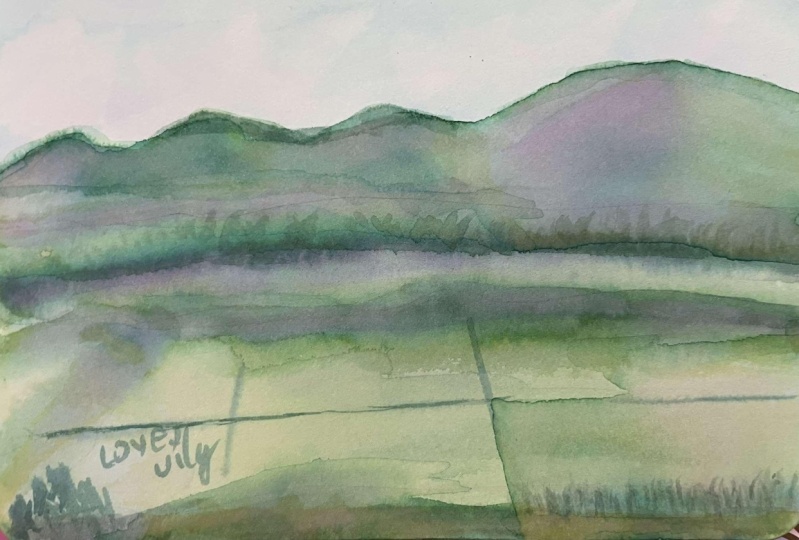
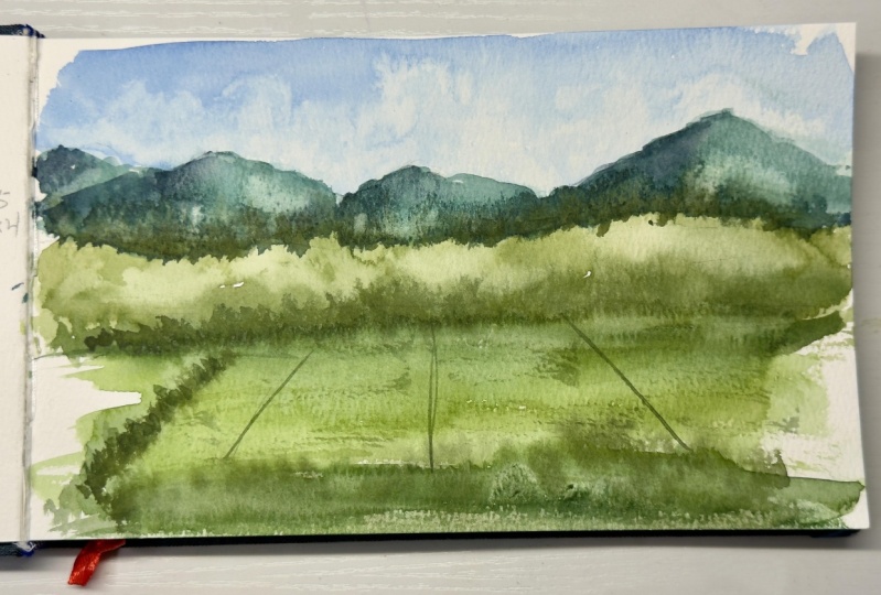
Then, we will analyze the reference photo and mix the various shades of greens we’ll need to portray this scene. Once we’re satisfied with the color combinations, I’ll quickly demonstrate how to put them together and use the different shades to create depth in our landscape paintings.
Who is this class for?
This class is designed to be beginner friendly and welcomes anyone who wants to learn, review and discover how to mix their own greens using 3-4 colors only.
If you feel overwhelmed and think that color mixing is only for the advanced students, I’m here to change that and I will guide you each step of the way.
I was once frustrated with the colors I am mixing and purchased a lot of tubes just to get the perfect shades that I need. But I never got the shade of green that I want for my landscapes. Good thing that I stumbled upon an article saying that I don’t need a lot of pigments, what I need to do is practice color mixing and understand the color theories behind it.
What do we need to get started?
Please prepare the following to enjoy this class:
- Download the Class Guide where all of the relevant information can be found including reference photo, stages of the landscape painting, pigments used, alternative colors and the swatches presented in this class.
- Watercolor materials - paper, brushes, water jar and paper towel. You’ll also need your pen to take down notes.
- Watercolor paint - yellow, blue, red / pink or magenta and black or other dark neutrals.
- Mindset - we’re here to learn not to make masterpieces so let’s embrace the learning process including the failed experiments and fun discoveries.
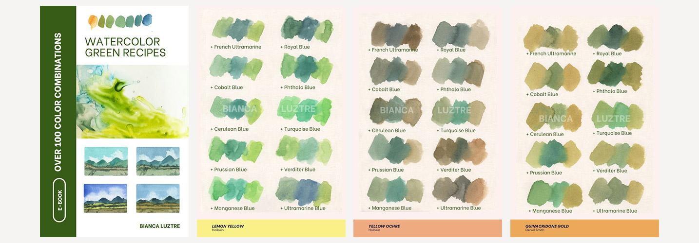
As a reward, anyone who finishes this class will get a free copy of my Watercolor Green Recipes eBook containing over 100 combinations of yellow and blue that you can use as your guide in picking your pigments.

See you in class!
Music: Purple Planet Music
Meet Your Teacher

Hello, I'm Bianca Luztre, an aspiring watercolorist from the Philippines.
I've been painting with watercolors since 2018 and I made it a habit to practice painting every single day (even for just a few minutes).
I'm still a learner but I love painting so I'm happy to share everything I've learned from books, tutorials, workshops, classes, observation and experience.
I look forward to painting with you!
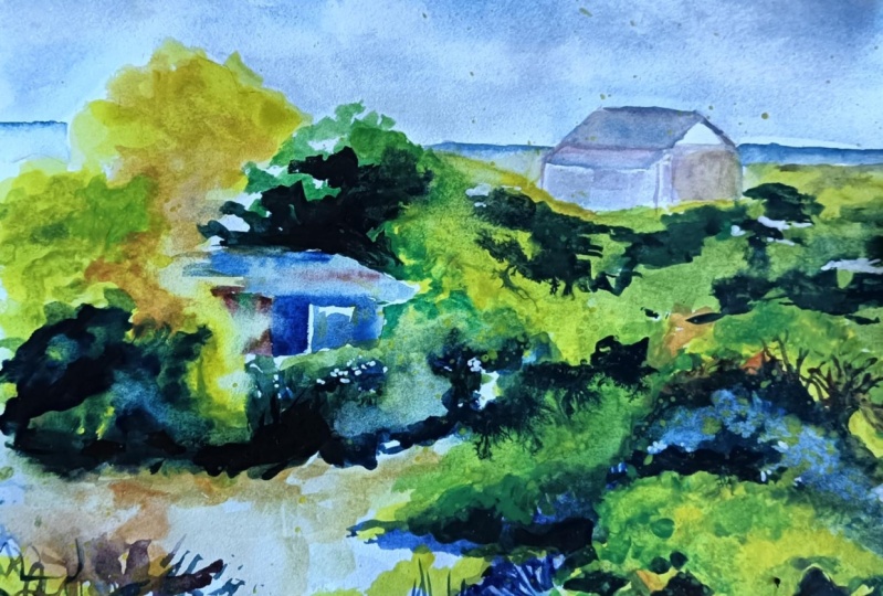
Here are some of my recent paintings. As you can see, I am fond of painting flowers in a loose style. This is the style that I want to develop but I also love painting landscapes and still life (as you see in the classes I offer).
Hands-on Class Project
Create green color swatches with watercolors or go extra and paint this simple landscape with me by following these steps:
- Choose your preferred yellow and blue combination.
- Tone it down as needed by mixing in red, pink or magenta.
- Create darker tones by adding black and lighter ones by adding water.
- Swatch and test the colors and compare them with the reference photo.
- Paint along and apply what you learned by creating a simple landscape painting.
Whether you’re here for the color mixing part, the landscape painting or both, here are your project options.
- Color swatches showing various shades of green
- Landscape painting where the colors were used
- All of the above
To reward your effort, you’ll get a free copy of my Watercolor Green Recipes eBook to help you decide which yellow and blue pigments to choose in mixing watercolor greens.
Download the Class Guide and let’s get started.
Class Ratings
Why Join Skillshare?
Take award-winning Skillshare Original Classes
Each class has short lessons, hands-on projects
Your membership supports Skillshare teachers
Learn From Anywhere
Take classes on the go with the Skillshare app. Stream or download to watch on the plane, the subway, or wherever you learn best.