Transcripts
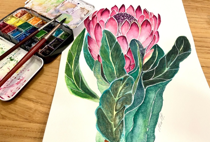
1. Welcome and let's paint a protea using major watercolor techniques: Welcome to minimalistic botany. In this course you will paint
a stunning prettier flower. Actually, I put it up to bold. And you guys decided
on prettier. If you want to weigh in on the next power for
the next course, leave your vote into
discussion on my profile page. But that's not what
the course is about. Here you will focus on mastering one of the most important
watercolors skills. Create an aggravated wash. So many beginners
struggle with pulling the color down smoothly without
sharp connecting lines. It takes time and technique to achieve smooth stretch color. And I doubled it, especially listen
to it to practice, practice, practice
and practice washes. Let's would take it slow. First we will work on achieving transparent
watercolor layer. Then we will go from a concentrated color
to a transparent one, hence a graded wash. And then a bonus desk. Fly one layer over another one and watch how the transparency
works in watercolor. My name is Yana. I'm a professional
watercolor artists with more than ten years of experience and also an
instructor here on Skillshare. My work has received awards
in international competitions and some of them are in private collections
around the world. But my biggest joy is to share my knowledge
with people who are passionate about watercolor and also want to learn more. After hosting live workshops
in Thailand and Vietnam. Check my art and travel
adventures on my Instagram. I've gathered a lot of insight on how to help not
only beginners, but also experienced artists
on their watercolor journey. I take a special care in explaining the techniques
because I believe that understanding the how and why are the key
points in learning painting without relying on a teacher and mastering
transparency, rotation and layering is crucial in the world
of watercolor. Another key point is repetition. That's where a prettier
Flower comes in. You will create a graded
wash more than 30 times because this is how you will paint
brags of prettier. Did you know that
those pink petals are in fact not petals but bracket? I will talk about this
in a separate lesson devoted to the
anatomy of prettier, but not to worry for your comfort and
actually for mine too. I mark every breath as we painted so none of
us can get lost. As we move along, you will
apply your fresh knowledge of layering technique
in painting leaves with those nice shiny edges. And as usual, you can download my outline and trace it directly on your
watercolor paper. Just keep the drawing part and move straight to watercolor in the first course of the series was an
exotic stream Lisa, check it out in my
course library. You will finish this course with a sense of accomplishment, new set of skills, and a beautiful protein, which I'm sure will
end up on the wall. Don't wait any longer and
see you inside the course.
2. Materials to paint a protea: Let's quickly review the
materials that we're going to need to paint
our protein flour today. Of course, we're going
to start with paper, and I'm using Saunders
Waterford paper, high white, which means that the natural color of the
paper is sparkling white. When often you can
see paper that has more of a creamy
tone like over here. My paper doesn't have
much of a texture. It's hot press, which
means that there's almost no visible grain on
the surface of the paper, which is good for botanical art. Because when you work on
those nice and tender petals, you want to make sure
that your paint is flowing smoothly on the paper. And that's why hot
press is pretty good. Cold press can work as well. Just make sure that
the texture is not too visible and doesn't
stand out too much. We're going to need a
pencil and I will use automatic pencil
like this one to make sure that my lines
are nice and thin. When we sketch both Any, it's very important to have your anatomical structure
of the flower are correct. And working in thin
pencil line is going to help us see things clearly on the sketch because sometimes there's a lot of
things going on. And we're gonna see
that in the lesson. Wonderful sketch per TEA. To remove those lines, we will need eraser
and I always recommend using kneadable eraser as
opposed to regular one. I always recommend using
kneadable eraser is it will remove pencil lines without
leaving any dust behind. Your sketch will
remain nice and clean. Also, I will be
using four brushes, but don't be alarmed. You don't really
need all of them. Technically, you can just
work with three and even to, if you don't have the
flat brush like this one, mine is cut an angle which is not the best for this class, but the other version
I have is too large, so it's better if it's
just flat like this. If you have a smaller
one that is going to fit compared to the
size of your paper. It's going to be perfect. We're going to use
this type of brush to do lifting technique. And we're going to
paint quite a lot with middle-sized nature
of brush like this one. And mine is Siberian squirrel. I also have a synthetic brush to work on details if we need to. And a large squirrel natural
brush to do larger washes, which will be very
handy for the leaves of our per TEA and other
large parts of the flower. Of course, you will
need watercolor. And I like to use
my palette where I squeeze all the colors that I need and like to use
in my paintings. Most of them are Rosa,
professional watercolors. And additionally to this, I have some of the pains
from Winsor and Newton. Suddenly Shang Han
and other brands, but the one that I selected specifically for the colors that I liked from those brands. We're going to discuss the
color palette that we will need for the protein flour in the other lesson
in this course. So I'm not going to
talk specifically about the colors
that we will use. You will need a
separate piece of paper where we're going
to do an exercise. So this paper doesn't have to be cotton paper, which
I forgot to mention. That paper that I'm
using is a 100% cotton. And I strongly
suggest you to choose a 100% cotton paper
for your painting. If not, cellulose is going
to work fine as well, but you will definitely feel the difference in your
painting process. If you use a 100% cotton paper. The practice and paper
doesn't need to be fancy, it doesn't need to be
professional quality is just regular cellulose
paper where you can do different exercises and practice your graduated wash Transparency
and layering technique, which you will find
out soon enough. For a special trick. In this painting, I
will use white gel pen and I'll tell you why
they handle this course. Of course, you will
need a jar with clean water and some tissues to pick up some pigment
or fixed mistakes. If we need to. Other than
that, we are ready to go.
3. Anatomy of a protea flower [quick overview]: Before we start
painting our protocol, we need to understand
how it's built. So let's take a look at
my little plan over here. Let's say an atlas
of protein flour. I'm not going to break down the whole flower piece by piece, but I want to note a few very important things
that we need to take into consideration
when we will sketch our flower and eventually
painted in watercolor. When you look at proteins, which you see is not
actually a flower, but a flower head. And it's only this part. So this part inside it's called forehead
and it's technically a group of flowers back together forming this
little bubble inside. And what you see on the outside, those are not petals, they are called brackets. And here you can see the inner and outer bracket when you look at protein
from a different angle. For example here where I
didn't do detailed sketching, but more like a scheme. You can see that every Brecht is kind of
hiding behind the other one. They grow layered like this. The smallest one,
the ultra brags here in the bottom and they are covering a little
bit the place from where the larger
breasts are appearing. And if you appeal for TIA, you'll see that
the large Brecht, they are pretty long like this. And the small ones
which are here, they are pretty short. Breaths serve as a protection
for the flower head. And if you look closer
into the flower head, you'll see tiny, tiny parts, heads of flowers which are bright pink color and those
are pulling representers. So that's where the older
pollination is happening. Each bracket looks
like a teardrop. And depending on the light, you will have different tone
represented on each bracket. So in the proteins that
we're going to paint today, you will see that in the top of the bracket
we have darker tone. And those stones are
going to lighten up and almost disappear into white as we go down the bracket. To do this on watercolor, we're going to use
a graduated wash. I have prepared for you
special exercise where you can practice graduated washes,
transparency, and layering. But first, let's
discuss color palette.
4. Colors you will need to paint a protea: To paint in watercolor, we will really need
only five colors. And three of them
are the main ones. So of course, the main color who will be
some sort of pink? I'm going to use red for
painting each bread. A variation of pink
I'll be using as well will be
hemoglobin only lag. And that will be the
color that I will use for the darker parts of our flower
head over here or here. When you look at the
reference photo, you'll notice that
the flower head has a significantly darker
and denser colors. So that's why I'm
picking quinacridone. If you don't have this color, you can use some purple and make it a little bit darker
in tone for this part. Then of course we
will need green. I'm using emerald green
to paint our leaves. And here I have a little
scheme where I show that pink color plus green color equal
darker tone of green. So how did I get that? If we take a look
at the color wheel, we will see that pink
color is somewhere here, the one that we're using. So the red or in a codon, it's kind of red color with
some bits of violet in it. So it's here. And to make this color
darker and calmer, we need to add the
complimentary color. So when you look down, complimentary color is
the one that is opposite. The coloring question. Here we find green, but it's not pure
green is green that has tiny drop of yellow in it. Speaking of which working
on leaves of our PR there, I will also use yellow. This is going to be the main underpainting.
The main tone. I can say background
tone for the leaf. And on top of which we
will lay on green color. This is going to be the
layer in part of our course, which also we will have a chance to practice
in the next lesson. And let's wrap it up. I will also use burnt sienna for the stem and gamboge yellow for the yellow
that I mentioned earlier, which will be used in our lives. And also here in the baton
when we will work on brags. Some of them have a tiny, tiny undertone of yellow. And I think it will be
nice to also show it in our painting to make it more
interesting and complicated. Alright, so let's move
on to the exercises.
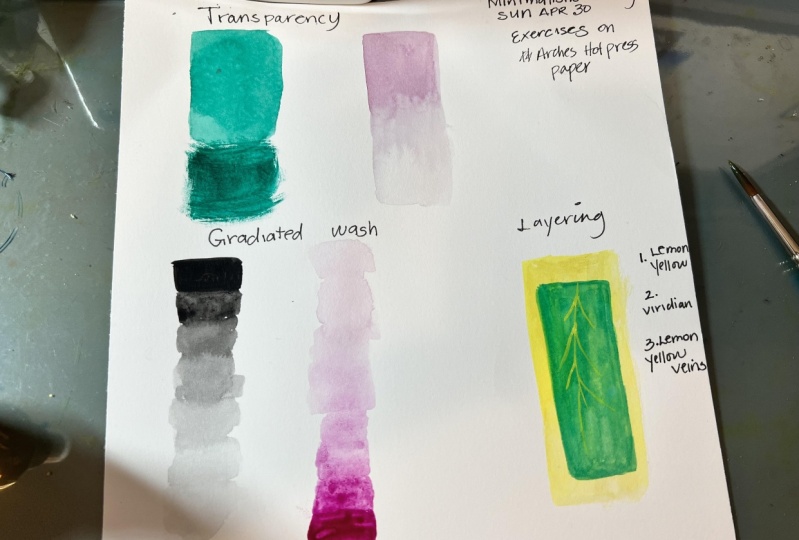
5. Exercise: Transparency in watercolor: Let's start with transparency. Most of beginner
artists really struggle achieving correct
transparency in watercolor, especially if you were working with acrylic or oil before, you might be having some
difficulties creating this particular
layer of watercolor is not gonna be too thick or too light for what
you want to paint. That's why I'm offering you a simple exercise
where you can practice managing your
transparency layers and levels. What I want to do for you is take a piece of
paper where you can practice on and draw
two rectangular. So we will start from
transparency and I prepared the two
rectangles here. The main secret of watercolor
transparency is having water dip the brush into water, then get any color
we want to work on. So for example, bank to see how vibrant and thick of a
color we've got underbrush. We can check it
here on the side. And also to make sure that the paint God everywhere on
the bristles of the brush. So not only on the tip, not only on the side
but everywhere. So we kind of soaking the
brush into this color. Now you can see that the
color is very vibrant, very thick, so to speak. So to make it
transparent and light, we need to add more water. The same brush, dip into water. You can see how it's released in the paint
and check it again. Now we have more watery
pink color over here. And it's a bit lighter than
this one and less than. So. Let's try and see how
it looks like on paper. I'll stop here without covering my whole
rectangular with a paint. And I want you to tension on the pencil line that I
drew before beforehand. Inside of the rectangular, you can see that my paint
is transparent enough so that I can actually see the curvy pencil
line underneath. This means that my, I achieved my goal and my watercolor layer is
translucent enough. For the contrast. I will
take a very thick layer of the same color right
now and cover the rest. So you can see that watercolor
can be really dense and it can really
cover certain areas. I dip my brush into
pigment directly without touching
the water at all. No water straight on the paper. And you can see that first, my brush is barely painting. It's really dry. There's no water
in the baristas. The second layer is very dark. It's a really dark, it's
dense, it's very thick. It is still the same color, the same value, the same hue. But it's very dense. And it absolutely covered my pencil stroke that
I did just before. And you don't see it. Here. You can see a very clear
difference between having a transparent layer
of watercolor, which I diluted
with enough water. And here you can witness
what happens when you do not use enough
water and paint with a very dry brush on top of whatever area you need on top of the
pencil in our case. And it completely covers it. And of course, this depends on opacity of every
pigment in question. So some of the pigments, they are opaque, which means naturally
there will be very, very thickened covering, pencil line or other
layers of watercolor. But the nature of
watercolor is still leaning towards
transparency and most of the pigments are transparent. To figure out if your
paint is opaque or not. First you can look
at the back of your Paint on top of the tube and you can see the sign
from the manufacturer, from the brand that shows if the paint is
how opaque or not. Here for example, I have
a little empty square, which means the color is
translucent and not opaque. Now here I have a
second rectangular, which we will use for
the same exercise. However, the difference is that my pencil stroke here is much lighter than this
one here I make it dark on purpose so that the first attempt to achieve transparent
layer is easier for you. In here, we're going to go to the next level and make
it a little bit harder. So the pencil line
is very light. And now we can try exactly the same thing in
exactly the same order, but with the lighter
pencil line to cover. First, you need to wash your brush to make sure that there's no leftovers
of previous paint. My brushes what? Now? I'm going to pick a different
color just for a change. So let's take blue. Blue over here. It's pretty dry. I need to revive it. So I'm dropping some water right into my paint
over here on the side. I'm checking if the
pigment is watery or not. So if I think that the
pigment is too concentrated, I need to add water. So I put my brush into water. Return and double-check
again here on the side. This seems to me
pretty transparent. And even though on
the plastic palette, it might seem that the color is vibrant and very concentrated. In fact, when you
see that there is a drop of water and you can
literally move it around. This means that you have pretty much enough water in
your consistency over here. Now, I go again, only halfway down and then up. Another thing I want to do
right now is to take my brush, put it into water
just a little bit. And with this wet brush, I will extend the
remaining color down, make it even lighter
than when it was before. Now you said the
difference when I took pretty diluted color with water here in the first
half of my rectangular. And you already can
see the pencil lines. So the task is achieved,
the goal is achieved. And here below, I diluted it even more with water to
make it even lighter. So the secret here is to add enough water to achieve
as lighter tone is you need, the more water you add, the lighter watercolor layer you will have and vice versa. So this leading us to the next exercise where we will be practicing graduated wash.
6. Exercise: Gradated wash in watercolor: If you've watched my previous
course about sterility, you already know what
a wash. A wash is. Literally any layer of watercolor where you
put down on paper. It can be any shape and form, but it's one piece of
layer that you put down. This is a wash, this is a wash. And now we're going to
create another wash. They can be different, mixed, graduated and flat in
through Lisa course, we already mastered mixed wash. Today we're going to
work on graduated wash. The difference is
that in mixed wash, you have different types of colors in one layer in one wash. Today we will try to
achieve a nice grid dated change of tone
from concentrated color, too diluted color
to almost white. And remember what we were discussing about
protease breaks. When we start from the top, the color is very concentrated
and then we will go down, down, down, down the brackets. And in the bottom, the color becomes
almost white and it changes very smoothly,
very gradually. Which means that
graduated wash is perfect tool for us to achieve this effect on
our prototype breadth. It's easier to practice
graduated washes and flat washes using
cotton, 100% cotton paper. But for the sake of the
exercise, of course, it's better to play
with cellulose paper. It's more affordable
and you don't feel that bad from when you're using that many pieces of paper trying to achieve
the desired result. However, I just want to
let you know that if you muster graduated wash
on Enceladus paper, you will definitely
be able to paint amazing graduated or flat
washes on a 100% cotton paper. Just a little note
of encouragement. Alright, so to make
it a bit easier, I will take the paper at
45-degree angle like this, so that the paint has more
freedom to leak down, drop-down, and move
by itself smoothly. Now, I'm going to put
my brush into water, then dip it into my pink paint. The same paint we
used over here. In the beginning. I
will take a lot of it. So it's gonna be very,
very, very thick. I'm dipping my brush a
lot into this paint. It's pretty thick and I'm
starting with a simple stroke. It is best if your stroke finishes with a
little drop of paint. Now, without losing in time, you need to drop your
brush into water, rinse it a little bit and your jar and continue right under. And then again into the water, rains it, and continue the past. If you have this little tiny, tiny drops like this, it's alive, it's moving. Then again, my brush into
the jar and continue. Brush into the jar of water, rains, and pick up the drop that's hanging
there and continue. And again, we do this
every single time, so we have less and less
pigment in the brush. And logically it gives us less
and less pigment on paper. So by the end of
this rectangular, we have almost no color. It's almost white in the end. And here we go. We achieved nice transition from
the top to the bottom, from the concentrated
color to lighter, lighter, lighter
and almost white. Lego confusion with the errors. Dyslexic colored in
this rectangular. We're going to try
to do the same, but from the bottom up, for some artists that
can be more challenging, but who doesn't like the
challenge, Let's try it. So I take a very thick
concentrated pigment. It still has some water. My brush is going to release a nice drop that's
going to hang in there. But still, I am picking
up a lot of pigment. We start very concentrated. Then I cleaned my brush
in the jar with water. I have this nice
drop hanging there. And I continue down. Wash my brush again, rinse it so it doesn't
carry too much water. Because if you have
too much water, the brush is going
to release it here and create a cauliflower effect, which we don't want right now. And again. And now I'm just going to
completely wash the brush so there's nothing left
on it, no pigment. It's a bit wet. I rinsed the excessive
water and finish my graduated wash like this with almost no pigment in it,
almost, almost white. And the final drop, I'll just pick it up with the
brush like so. Here we go. We just did graduated
wash both ways, up and down, which is
pretty pretty difficult. So your cost projects will be to practice graduated
washes and translucency. As much as you
want. You can have the same model as
I'm having here, or you can have more
different shapes. You can do circles and
triangles, whatever you want. And try to first create
transparent layer, layer that is not going to cover the pencil lines so that the pencil shock will
be still visible. And to try to create a nice graduated wash so
that your color moves from concentrated to almost
white smoothly. This is going to be
perfect for our proteome.
7. Bonus exercise: Layering technique: And here we have a final
little exercise with star, which is not mandatory, but I think it's
very useful to do. And this is about layers. Petain proton leaves. We're going to use
layering technique. And we will start with the lightest tone
that is going to be, the background is
going to be yellow. Then we're going to wait
for this layer to dry completely and apply the
next layer of green color. And because watercolor is
transparent and we now know how to achieve transparency
the way we need it. I'll take a bit of
yellow, gamboge, yellow. It's pretty transparent,
pretty light. I have quite a lot of
water in my brush, but I'm also making
sure that I'm not bringing too much water into this layer to
avoid cauliflower. And now we just need
some patience to wait until this layer gets
completely, fully dry. And then we will
apply some green so it's time to get some Coby. My first, a yellow layer
is completely dry. You can test it yourself
by touching it gently with the underside of
your poem. Like so. If it doesn't feel cold and wet, it means it's ready to go. So I get a transparent
layer of green. There's pretty the color
is pretty diluted. There's some water in my brush. Not too much, it's
not dripping wet. And now I'm going to create another rectangular on
top of our yellow one. Here is important to work
fast and not come back into your previous,
previously painted layer. Because you will
dilute it together with the yellow layer. And here we go. We have our green. I've got some cauliflower over here because I got a bit of excessive water from my brush
dropping into my layer. So here you have a little
bit of a shape like this. This happens because we have
too much water on the brush. So it takes practice to achieve the desired amount of paint
and water in your brush. However, this is not a problem
because we're going to paint nature and leaves. So having some textures
there, it's totally fine. We don't need to achieve perfectly smooth
transitions in our lives. We will also have
little veins inside. So to paint the
vein of the leaf, we will need a
concentrated yellow color. And we're going to do
something like this. Nice and concentrated. Now, if you painted over
your layer that is very wet, your yellow stroke will completely dilute
and go everywhere. If you do it on a relatively dry or almost
dry or completely dry layer, your struggle will be
more in control and more thin and specific. So it's not going to
spread everywhere. So here you can see how
transparent layer of green on top of nice
and light yellow color creates this
beautiful combination of green tone where you can
see yellow shining through. To prove the point, I can create just a pure green line over here so that you
can see the difference. So here you can
see that the pure emerald green color,
it looks like this. And when we have a
yellow underpainting, the color changes
significantly and becomes more sparkling and translucent and kind of glow in
the colors globe. And I think that's
the best word. So yeah, this is exactly what
we're going to do painting our leaves of prettier because it has a very
nice yellow glow. If you look at the
reference photo, you'll notice the yellow
thinner than this of course, but yellow glow of each leaf. And this is exactly how
we're going to do it.
8. Your class project: Your class project will
be to do three things. First thing to practice transparency of
watercolor layers. And here we have
two rectangular is where you will need to draw a very dark pencil line or a zigzag or whatever
shape you want inside and a very light one. And the task here
will be to achieve the transparency level
of your watercolor wash, the way that your pencil
line is still visible. And in the second rectangular,
because the line, the pencil line is much lighter, the task is going to be a
little bit more difficult. The task number two is to
practice graduated wash. We also have two
rectangular over here where you can
practice graduated wash. Going from the top to the bottom and reverse
from bottom to the top. For many artists, doing the
reverse is more complicated. So take your time. Maybe do more than two
rectangular is maybe have a bigger sheet of paper and do different shapes
like triangles or circles wherever you
feel works best for you. And the third task,
which is not mandatory, it's a bonus, bonus
dusk, so to speak, is to practice layering. With this task, you will witness the power of translucency
of watercolor, which is very natural
for this medium. And to do so, you're
going to have to apply first yellow layer, nice and transparent,
which you know how to do already and wait for it
to get completely dry. After it's fully dry
and you know it, you'll have to apply a
second transparent layer of green in a bit smaller, rectangular, so you
can see both colors. And then just observe how the first yellow layer is shining through
the second one. And that's your class
project for today. Please share it below
in projects section.
9. Let's sketch our protea: Finally, it's time to
sketch our protein flour. A quick note on how we
approach our sketch. So if you look at the whole protium together with the flower head
and the brackets, the total shape looks
like sort of a cup. So we have oval that has little bit of an
opening and the cup. The more flower looks at us
and the more it's open to us, the bigger will be
the oval opening. And if we look at it straight down like 90 degree,
like a flat lay, obviously this part there
will be a perfect circle because we look at it
from 90-degree angle, we see small opening here. And that's why we also
see a little bit of the flower had not known
the whole, the whole thing. This is going to be helpful. Note for us when we
will sketch detail. So first let's think about the position of
the whole flower. I'll say that the forehead will be somewhere
here is pretty big, but then the leaves
are also very long. So let's mark where
the follower will end. So this is going to
be the very top, the very tip of the
inner brackets. And here will be the bottom. And let's create the circle, oval and the cup. As you can see, my
strokes are very, very, very, very light. You probably don't even see them on the video,
which is good. Because you really want to
keep your sketch very light. The darker your sketch is, the more chances that the
pencil line is going to look is going to be visible, sorry, through the
watercolor layer. Also, it's important to
use your eraser as less as possible to avoid damaging
the texture of the paper. I think this opening
should be enough, maybe even a bit
larger like this. So now we have our cup to make sure that it's
all proportionate. I'll put a line down and compare that the both halves
are kind of same width. So I can go like this and remove the lines that
do not serve me anymore. This is the cup. Now, we're going to have leaves and
on the reference photo, leaves are pretty
long and they kind of cover some of the parts of
the flower here in front. So we have leaf like this, another pretty banded leaf here. It's very schematic. I'm not really showing every single part of detail
of the leaf perfectly. I'm just kind of figuring out the composition
to make sure that my flower is not leaning
towards left or right to match. So it's positioned nicely in the middle of my paper sheet. So now let's figure
out the details. First, we need to mark where the flower head is,
somewhere here. And on the reference we
only see the tip of it. So the rest is kind of
hiding behind the brackets. Now, let's start from the largest Brex
and slowly build up one-by-one going down. The reason we created this cup before is because now
it's gonna be easier for us to kind of place every wrapped into
this sort of frame. So make sure that
your brands do not go out of the frame too much
or they go a little bit, but just in a harmonious way so they don't stick
out too much. And this cup is going to help
us keep the shape intact. So the inner brackets, they're going to go as high up as the altar line of our oval. Some of the Brexit
in front, a larger. So I'm showing it in
my sketch as well. Most of them look
like a teardrop. But extended. And important moment
here to remember that every Brecht is covering the bottom
of the previous prac, so we never see the actual
end of the bracket. Here. I forgot to mark the leaf and the rest of the
Brexit hiding behind it, so I don't really
need to draw them. And the outer Brex are
here in the bottom. We see here the bottom part, the tiny triangle here and
here sticking out on the side. Again, we don't need to fit
perfectly inside the outline of the cup because
then it's going to look to cut out, right? So the tips of each
rack can kind of pop out of our
main comp outline. I don't want you
to end up placing every every single
bracket inside of the cup because then it's
going to look a bit weird. So we need to make sure
that some of the brags, they are sticking out but still
following the main shape. Again. The larger breasts, the inner brags, they
are wider and bigger. And the inner brackets in the
bottom, they are smaller. We need to keep the
proportions right? This large leaf is
kind of sticking out. This one in the back. I can make it even larger. Now this point I have a lot of random lines which I
will need to clean up, of course, before
painting with watercolor. Then this frontal leaf that is bended mark the central line. Some leaves inside stem. And this one, on this side. It's a bit curved. Here's the center. Alright. Here we have some
complimentary leaves that are not very important, but let's just mark them. Alright, so here we
have the main cup. Every Brecht is fitting into
the main shape of the cup, so we keep our pre-tenure
proportionate. There's no part of the
petiole which is wider or larger than the part,
it's pretty symmetric. Now, some of the brackets
are standing out and we can see them a little bit outside of
our main cap line, which is making the
drawing more realistic. And of course, the
front door leaves that are pretty large and wide, which are covering some
of the frontal brackets. And now we need to
remove all the lines that we don't need to be able
to paint with watercolor. And of course, if you're
not feeling comfortable and drove in your own protests sketch, which is totally fine. I attached the trace
downloadable outline of this exact Pretoria sketch, which you can download, trace it on your
watercolor paper or even print if you feel like
it and just coloring, no stress. Let's move on.
10. First layers: yellow on the leaves: I removed my pencil lines
so it's almost invisible. And I hope you don't see it
because that's important. It's important to keep the
sketch very, very light. And now I would like to start
with painting the leaves, which is not usual for me because usually I
prefer to start with the main flower and leaves
are the last thing to go. But today, I would like to start particularly with leaves. That's because I think
that most of the time, especially beginner artists,
they have not much patients. And me as well, I don't really have
a lot of patients to wait for the layer, stick a dry and you remember
that we're going to use a layering technique
for our leaves. How about we start preparing
our underpainting, our first yellow layer
of the leaves before. And while these guys
are getting dry, we will work on the rest. I think it sounds like a plan. So now I'm picking up
my gamboge, yellow. Just making sure
it's transparent. Lightly. Prepare my nice
and yellow underpainting. On each leaf. I'm using a large
wall on really large, but I'm pretty big. Nitro brush. And it allows me to
create bigger washes. I need to be careful
to not go outside of my sketch on side of
my line for each leaf. With a nice light, almost transparent
layer of yellow color. I am covering almost
all my leaves. I think we should not cover
this leaves with the yellow because after this
we're going to start to work on the brakes and
the flower in general. So you don't want to have
something wet here and kind of risk to destroyed and
smudge it with your palm. So let's keep this place free of pain so we can freely paint the rest and prepare only
the left side of our lives. It is better if your yellow
wash is not too concentrated. I mean, it's not gonna be a big problem
because we're going to paint green on
top of it anyway. But you don't want to have
it like super bright yellow, toxic color underneath, you want it a bit more
light and transparent. However, remember
that watercolor, it gets lighter when it dries. So whatever I'm doing here, I know that after
it will get dry, the color will lose
its intensity. Alright, I'm not
going to go more on the right because
I don't want to risk to smudge it with
my my own hand. So I'll keep it as
it is right now. And we can start working on the brackets and
the flower head.
11. Inner bracts: practicing gradated washes: Remember the graduated wash. Now we are going to
use this technique to paint every single practice. We will start from the left
side and move to the right. And from the inner breaks
down to the outer brackets, I switched the brush to
bit smaller ones so it's easier for me to control
the space, the layers. And now I'm going to get
some of the pink paint. Monday read in my case, like we discussed in the
color palette section of the course. I'll start. Now, I want to explain
what I just did. I painted a brag, but I left the
white tiny outline of just pure white papers. So I didn't colored
with anything. Because when we look at the rect and schematic
drawing of it, we can see that yes,
in the top of it, it starts with a dark tone
and then becomes lighter. But if we look at the actual general
outline of the bread, it has a very nice white Oreo like outline of white
shining around it. We have this white outline, which you can see dependent on how this bracket is bended. This one we can see it from, aside from, let's say like this. Not like this, but like this. So that's why the
white out loud line is visible here on the
rib, so to speak. Normally, when we
paid do Brecht. Like this, the frontal view, the white outline
will be o rounded. So it's gonna be
pretty interesting because a lot of the times
we're going to have to leave whitespace
in-between each direct. So since I just
started with this one, I want to leave it to dry and
work on another one that is not touching this one or this one or anything
that is wet around. So how about we paint this one? This Bragg also has a
white, shiny and outline. But I'm not going
to really show it because our background in minimalistic style
will be white. And since the
background is white, you don't really see
the white outline. So it makes our task easier. On the reference photo, the background is black. So that's why the white, shiny and Oreo is
very, very visible. Here. You can see that I started with a concentrated pink
and I move down washing away the intensity of the color using a graded
wash. And in the bottom, it became a bit lighter. This one is going to be
pretty concentrated, so no need to make
it a graded wash. But it goes very close to our
flower head that is here. Then this one, I make
it concentrated. Rinse my brush in a jar of
water and dilute the insight. The next one, I'll start with the concentrated pink color. Wash my brush, rinse it, and the rest, I'll just dilute
with the remaining water. There is in my bristles. And because my paper
is a 100% cotton, it allows me to have nice
and smooth graduated wash going down without
cauliflower or sharp edges. Also say that this
concentrated sort of tip of the bread is extending here on the side and close
to the next Brecht. So I'll just carefully
show it here. And because my layer was wet, the pigment just
sink in and create a nice wash over here. I can dilute it if I want to. Make it even smoother and
move into the next one, I don't want to paint this
one because it's going to touch the one on the left. So I'm moving to
the one that is not directly attached to the
breadth that I just painted. Here. I'll create this white
outline by myself. Because this breakfast
a little bit turned. And with the rinsed brush that almost doesn't
carry any water, just a little bit
of humidity in it. I am diluting the
concentrated color down as we did with
our graduated wash. The next one will be the
tiny one here on the right. It has this wide training
outline which I'm also gonna show. And just leave it be.
12. Continue painting inner bracts: Now I think this side
is getting dry so I can paint the ones that
are next to each other. Here you can see that my layer is not directly
touching the previous brag. I'm leaving tiny white line, strip of white paper to show this shiny white
outline once again. And then, then the
next bracket is going to also leave white outline. Now, it's important that every time you do this, you're white. Area that you leave uncovered. And painting clean from
paint is very thin. If it's gonna be one
centimeter wide, it's going to look really
weird on your painting. So make sure that
every time you create this white tiny Oreo
of shining paper, you leave it on uncovered. We'll leave it clean. It's very, very thin. Otherwise, if you can't
make it stain better, just not do it at all. Here, the bottom
should be very light, almost white and I
put too much pigment. So now I'm kind of lifting it with my brush and removing it. The same time, working on
the texture of the bracket. So now, for example, this one, I start with the very
concentrated color. It almost doesn't even paint. Then I clean my brush, rinse it, and extend
my concentrated color, pull it down and create nice credited wash. Don't take too much time
doing it because otherwise the paint will
get dry pretty fast. And you'll end up having
sharp connecting line between the concentrated
part and the light part. So the process should
be pretty fast. You can also add a
bit of a texture, like a stroke here. If you feel like it's going
to benefit your painting. Now the next one will
be interested in because we will start
not from the very top, but leave some whitespace. For the white Oreo. The angelic shining. Then the concentrated
pigment will be pulled down with a clean brush, carrying just a
tiny bit of water. So it's enough to dilute and create nice graduated wash. Here on top we can
kind of create the texture of our Brecht or diluted to make sure that
our lines are nice and soft. With the concentrated
pigment right up, I can add some of the strokes to show the texture of the Brecht. Here. It looks very much like the petals
of the tulips to me. And remember that we are
going all the way close to our leaf and not touching it right up while the
layer is still wet, we can add some of the more concentrated pigment and allow it to blend naturally, create a nice dextrose that look more like we
can find in nature. This point, every
breath that I paint has exactly the same
chronology of movements. I'm doing the same thing, trying to keep in mind the
white shining outline. And I compare what I do with
the reference photos so that everything is
logical and correct. But other than that, the approach is always same. Graduated wash and
white shining outline of basically white paper
and without any paint.
13. Filling up the bracts in between: Sometimes the
Brexit will overlap and create even darker layer. Which looks nice because
this gives us a feeling of two brackets overlapping and one is visible
through another one, which also is possible. Thanks to the amazing
translucency of watercolor. I'm going all the way
down to the next brac that is hiding over here
without touching it. Because I remember that I have white shiny outline over there which I need to
keep clean and white. Remember, if this
part is still wet, be careful with where
you put your hand. Maybe you want to put your pinky finger
over here to kind of protect the area and do not touch it with your whole hand. This one is the same,
it's kinda behind. So we can overlap the bracket
over here with the frontal one and create this feeling
of translucency of each prac, because you can see one
through another one. When this Brecht, I
remember that I have a tiny white outline here. So I'm painting in very
carefully, keeping that in mind. Washing my brush and
diluting the layer, my wash down as a
graduated wash. The same time, going
very, very close, making sure that my white
outline is very thin. Those white outlines
also gives us an opportunity to kind
of separate sum of the ranks one from another and gives it even
more realistic feeling. There is one more
here in-between. It's overlapping with
the other one here. And a little bit with the
one on the left side. And because our layer so light and we carefully
placed them, watercolor feature
of transparency allows us to achieve
this feeling of one Brecht being visible
through the other one. Just want to make it a little
bit more concentrated so it's more understandable
that it's behind, even made it darker. So I put some green
into my bank. And God myself, pretty
nice, dark, calm down. It's important to
keep it moderate. So do not achieve way
too dark of a tone here. So I'm going to
stand out too much. Then here. I'll want to make my Brecht pretty light
and translucent. So I'm diluting it
with water right away. And at the same time, adding concentrated tone here. Just kinda late, let it flow. So now we have two more
left here in between. I'm not touching them because the other brackets around are still wet so I don't
want them to leak inside. And we can do this one. With this one. I remember that I have
this nice white outline. So I keep white, shiny stroke. Both here on the
left and around.
14. Starting with outer bracts: It is important to dilute your
watch as fast as you can. Otherwise, watercolor
will get dry pretty fast and leave sharp edges
like I have over here, which we still can correct by playing around
with slightly darker, darker, but slightly more
concentrated colors. And kind of masking this
unwanted sharp edge. The same time I'm adding this same concentrated
color on top. And maybe even creating
some sort of texture. By pulling the line down
right in the middle. Again, it kind of looks like
a petal of the tulip flower. In the bottom, I will introduce
a very light yellow tone, which will gently
meet with the very light pink down which
I just pulled down. I carefully leave a tiny
thin white outlined right at the edge over here and dilute. My wash down by creating where they did wash is we're already
know how to do. While your layer is still wet. You can add bits of texture and gently dilute them, dilute the stroke with water
and kind of watery brush. If you feel like the
stroke is way too bright or distracting attention. Now, there's like
recovered all the top line and didn't miss anything
except this one. Over here, a few actually
over here on the right. But since this
layer is still wet, I don't want to risk the paint
bleed into our new layer, so I'll keep it here to drive. I'll leave it here to try and work on the remaining
part over here. All down transparent
light layer. And at the same time I'm
adding a little bit of yellow. But it's important
that the transparency and the thickness of yellow
and pink are the same. So the transition of the
colors look natural. If the thickness of
yellow, for example, is going to be higher, so the yellow is thicker
than the pink, for example. Then you will
definitely see it on paper and it will look cut out. It's going to look
like it's a part of a different leaf of the flower or something
isn't gonna look harmonious. I don't do anything new here
is always the same steps. First. Concentrated pigment on the top, then wash the brush,
rinse the water, and pull the color down until
it becomes transparent. Same thing over and over again. Retainment, metadata,
I would say, but also allows
you time to think. Maybe play around with
different angle or perspective. So we change it here and there. Maybe live in a little bit
of white area in between. But overall, it's always
the same set of action. I think we have too much
whitespace in this area. So I'm going to carefully
fix that by filling out the blank spot
with the pink color. Also over here. I'm going to make the
color a bit more fitting in so that our whitespace
looks like the outline. And not just random white areas. I'm introducing more and
more yellow as we're going down and working our way
to the bottom of Parthia. When you look at here per day, you need to evaluate the
remaining space that we've got here and how to fill it up with our paint accordingly. Because here we have a
lot of blank area and we need to decide
if it's going to be covered with
greenery of the leaves. Or we will carefully add
more of the Bragg's. Also, as we go to the
bottom of prettier, we can see that the altar brags, they look slightly darker
and they are in the shadow. So naturally,
leaves are casting, casting shadow on our brackets. And we also need
to portray that. Here we got a little
bit of a mess, which I'm going to correct
after it's gonna get dry. Because right now, the
more I go in there, the more mass I'm going to make. Another thing I would like
to correct right now is this because I feel it's a bit too thin and it gives too
much space for this one. When you look at the
flower as a whole, there's a lot of empty
space because of it. So I made this one larger and naturally reduce
this whitish area. This over here can be filled
out with yellowish tone. And again, I'm going to correct the mass that is
happening over here.
15. Painting a flowerhead: Now how about we
work on our head? For this, I think I will
use wet on wet technique. So I put some clean water first on the area
of the flower head, carefully avoiding
touching any brackets. And take mechanically
done and just let it go. We're the dog-like moves. I want to make the texture of this flower head less smooth
and more natural-looking. Also, as we look down, or in the middle here, the tone is changing a little bit between
pink and yellow. So I will carefully introduce
some of the yellow. Now with this molar
and pointy brush, I'll get the same
quinacridone luck, but mixed with a tiny
drop of green to get an even darker tone
for the shadows here. And it's the best to
introduce them right now. While the layer is still wet so that our touch is nice and smooth and blends in into this general layer
that we just laid out. Here. We also need to remember to keep the shape of
the Bragg's correct and sort of paint around
it very carefully. Now, I'd like to just leave it be and come back to the bit later when we can work on more specific parts
of our flower head.
16. Applying layering technique in practice: While we're letting the
flower head to dry, I think it's a good
opportunity to finish what we started by covering our lives with the
underpainting of yellow. You already know the drill. Just paint very light. Transparent layer of
yellow on the leaves. I'll take my green,
pretty light layer. So not dense, not thick. Just like we did
in our exercise. And I will start to carefully introduce
it into our lives. The only difference that our green is going to be
slightly darker because I'm going to add our
pink color to it. And at the same time,
I would like to make the edge a bit softer. So that hour outline
doesn't look too sharp so that this shiny yellow part of the leaf is not
standing out too much. While we're here.
I would like to add a little bit of cerebellum. I know we didn't
discuss this color because I would like
to keep it optional. And what basically I just decided right now
that maybe I can use it. A lot of the times
when you paint, a lot of things just happen along the way in
which you didn't plan. But in the process
you realize that that can be beneficial for
you and your painting. Now I thought that having
some parts of nice, cool blue color,
we'll do some good. On the leaves. I also left a little bit of yellow, natural yellow here
shining through. I didn't cover it. Which is going to play role of, um, the vein of the leaf. Here the leaf is a
little bit bended and up naturally
creates more shadow. So I'm adding a bit
of the darker green. The same time marking some
of the textures here. I would like to extend
the leaf that I painted over here with the
cool blue color. In my case, it's cerulean. And it has no problem for me to kind of connect this blue with the yellow
that I did earlier, because yellow is
lighter in tone. The same time, I'd
like to draw up a bit darker tones right away. But I'm not going to
paint this leaf right now because the colors will
bleed into each other. So I'm going to pick
another leaf, for example. Or how about the
big in front one?
17. Layering leaves: So I take my green right up, I will
clean the brush, rinse it in carefully, dilute the edge over here so
it doesn't look that sharp. The same time dropping a bit of darker tone here and there. Just to make the texture of
this leaf look more natural. And write up. Move to the
right side of the leaf. Carefully. Remember to
leave untouched line, very same line in the middle, which is going to be
the vein of the leaf. Gets some darker tones
going right away. And carefully with a wet brush, just diluting this green
edge on the right. Again, mixing darker tone of green and just dropping
here and there. To make the texture of
our leaf more realistic. And interesting. We're moving to the next leaf. It has a lot of
dark tones in it. So I am painting our
normal light green first. Clean and rinse my brush. Dilute the hard edge, and immediately
introduce darker down. As our layer is still wet. It allows us to get this nice and natural
mix without sharp lines. But you can already
see how nicely yellow color is shining
through the green over here. And even here. And later on when we're going to finish
working on this painting, you, we will add. The deepest darkest tones and bring this painting to life. I ended up making the
edges nice and soft. And adding darker tone. Clean the brush, rains. Soften the edge. Repeat darker tone. And here we even can add a
tiny drop of burnt sienna. Just like we see it on
the reference photo. The thick line you've got here, just dilute it with a semi wet brush and get
nice and smooth. Wash.
18. Finish up layering the leaves: The leaf I'm working on right
now has kind of two parts. And because it's a
folded like this, we see the top part
and the bottom and the one that's the bottom
one I'm working on right now has a darker tone because the one that's over it naturally
is dropping shadow. In this leaf. I decided to
add a bit of burnt sienna to have this kind of
staining part that we see on the reference show
on the painting as well. Now there is certain areas in between that also needs
to be taken care of and I'll just fill them in
with a darker tone of green. It's better to not use
black here and try to achieve the darkest tones that you need just by mixing
complimentary colors, just like I'm doing right now
with green mixed with pink. Don't forget that we
have a stem over here, so we need to keep
it to preserve. We're going to paint it later. So just keep the space flight. Those are remaining leaves
that we've got here. Almost done.
19. Veins on the leaves: Now, while we are
in the leafy area, I'd like to point out some of the areas
with the yellow color. So remember how we were discussing in the previous
video that we can literally color over with yellow color to show
the vein of the leaf. So that's what I wanna do now. Not gonna do it
everywhere though, just in certain areas where I
think it's going to fit in. For example, here I think it's going to work
best because I literally forgot to
leave blank area. So I'm going to paint it. I'm going to take a flat brush and go over some of the areas,
lifting the pigment. I'm trying to hit
exactly the same spot where I just painted
with yellow. And it's gonna do the trick of lifting the yellow a little
bit, but not completely, making it more pale and make it fit in into our
leave more organically. I can I like how this
one looks though. So I'm not going to touch it, but this one looks
way too oranges. So I'm going to work on every vein over here. When you're lifting the pigment, makes sure that
your brushes same. So it doesn't remove
too much of the space. Too much of the pigment.
20. Working on textures: Now detained. So let's come back to
our flower head and work on the texture of the
flowers inside there. With a dark tone of hemoglobin. And not like moves just like so. I am creating the texture that looks like there is a billion of those tiny flowers
inside the flower head. Because remember that
the flower head is actually a group of flowers. It's not just one flower where the pollination
is happening. So there's a lot of them there. And to create the illusion, we need to work with shadows. Make sure that your lines
are very nice and thin. And that your touch
is only focused here. But as you go down,
it's a stroke. So we have moles here on top and following
a thin line down. Now we make some
darker tone of pink, the same as we use the
here for the project. But adding a bit of green
to make it slightly darker. In some areas, I would like
to add texture on the bread. It's the same thing. Try to
use very, very thin stroke. And if your brush shock turned out to be thicker
than you want it, you can carefully diluted
with the semi wet brush. For example, right now, my stroke is too
thick to my opinion, so I rinse my brush so it's a little bit
wet but not too wet. And carefully dilute
my thick line. As you can see,
I'm not doing this on every single Brecht. I want to do it selectively so that the painting
doesn't look too heavy. Also remember that here
in the bottom we have the outer Brex that
I didn't finish. So now it's a good
opportunity to do it. And also remember to make the VAX here in the bottom a
bit darker in town because they are hiding behind the leaves which
naturally cast shadow. So the breaks in the bottom would be
slightly darker in town. And here we go, I think now
we should take a step back and evaluate if
anything is missing. Now, the actual flower, the whole, the whole thing. And I think for me, probably in terms of the
textures, it's enough. I would prefer to keep it light rather than
overwhelmed with details. Because remember
with watercolor, you can't really trace
back and remove. I step. You can't really fix
mistake if you did one. It takes time and practice to know how to correct mistakes. And frankly, some of them
are just not doable. But that's a whole, another topic for discussion. Now, we will do the same,
but for the leaves, just add some texture and
darker tones on the leaves. And we'll be done for today.
21. Adding volume to the leaves: So with a darker tone of green, we can start adding some of
the shadows on the leaf. And every time I make a stroke, I dilute the edge
almost immediately. To make it nice and smooth. Rinse my brush. And smooth thin layer. As you probably noticed, every time I'm adding
a darker tone, I'm trying to go in-between
the veins to keep the veins light and not
cover them with the shadow. And at the same time, immediately dilute the
layer that I just put in. Not the whole layer,
but the edges of my stroke to make it fit
organically on the leaf. Working on the shadows like that is also a good opportunity to separate some of the
leaves one from another. If it wasn't clear before. And of course I nearly
forgot to paint a stem. So how about we do it now with nice light brown in
the beginning and then a bit of darker brown, burnt sienna in my case, on a side for a shadow. I also feel like looking
back at this painting, the green leaf is
missing over here. So even though it doesn't
exist on the reference photo, I can still edit.
22. Last sparkling touch: So let's take a step back
and look at our prettier and evaluate if anything is missing or if we
need to add anything. For example, I will go
ahead and add some of them. Nice white sparkling spots on the very top of
the flower head. Using my pen. When you work with Japan, it's very important
that you do not overdo. Because then it's
going to be very noticeable that it's a pen. And it's going to stand out
in the painting to manage. Maybe somewhere on the leaf. You would want to highlight certain areas which you also
should be very careful with. And in case things go wrong, you can always remove or smooth the line that you just did with the pen using your finger? Because before we were literally lifting the pigment, three nab, some whiteness of the paper and very dull,
light yellow tone. Then the whiteness of the
gel pen is not going to look too weird if you
do it moderately. Alright, now, I
think we're done. And I'm very excited to see
your beautiful per TEA. So please don't be
shy in and submit your paintings if you would like to receive feedback from me. And if you have any questions, feel free to ask. I'm here for you to
help you along the way.
 Yana Shvets, Professional watercolor artist