Transcripts
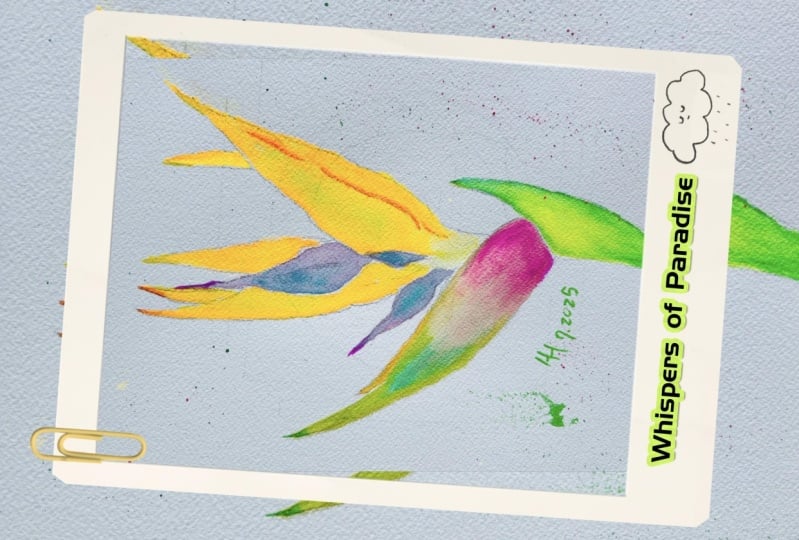
1. Minimalistic strelitzia: what will you learn: I invite you to dive into
the world of botanical art. Colorful, tender,
complicated, and simple. Flowers are always
an inspiring topic to paint in watercolor. Today, we will create a bird of paradise in minimalistic style. Relief, there is a unique flower resembling a bright
burden flight. It is not only exotic and
curious subject for painting, but also very beginner friendly. This means if you're just
starting out with watercolor, this course will
kick-start your journey as it is packed with
watercolor accommodations, practical advice, and even
additional exercises. My name is Yana. I'm a professional watercolor
artists from Ukraine. My work received multiple awards in international
watercolor competitions. Many of the originals are now in private collections
in the USA, Europe, and other countries
around the world. I love sharing my knowledge, which is why together
with my partner, I created a watercolor
painting academy with more than 35 independent
courses for any level. And new course
release every month. Besides hosting physical
workshops helped me to tailor the best program for
watercolor learning and cater to every
person's need. That's why my glass
is always have a strong theoretical
base with folding exercises to consolidate
the knowledge learned in this power
is no exception. I broke down every stage of this painting into
easy to follow steps. You will discover and important
for beginners or wet on dry technique and use it
throughout the whole painting. Every petal, sepal and space will be performed
as a mixed wash. Enter that worry. I
will take a minute to explain all the terms and
anatomy of the flower. While you will take your time
practice and mixed washes with simple exercises that
I've provided for you. And that will be
your class project. Of course, you are welcome
to paint a bonus project. Release a flower itself,
following my guidance. And if you do not feel confident drawing
the pencil sketch, you can download my outline
and simply trace it on paper with this glass and launching a series of botanical courses in
minimalistic style. Our followers will
be eye-catching, simple, quick, and in the
best watercolors traditions. They also look
stylish on the wall. So as I'm releasing the
next exotic flower course, ready to start,
Let's make some art.
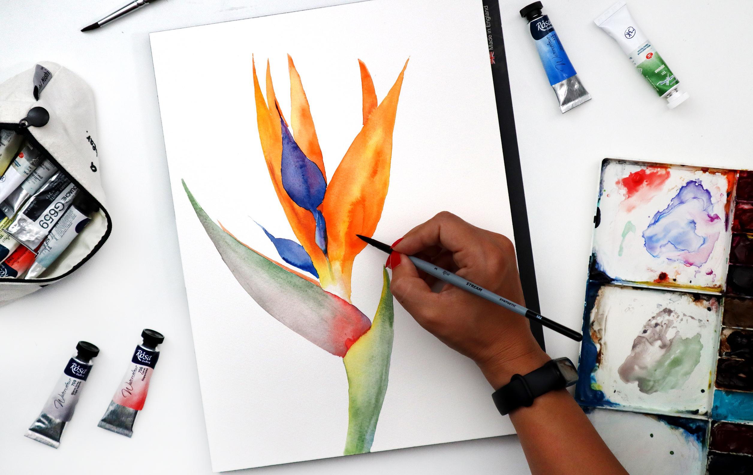
2. Review our art tools: To paint our beautiful
story later today, we will not need
that many tools. However, I would like to discuss
the most important ones, like for example, paper. Today I'm using
Sanders would afford its English brand of
professional watercolor paper. It's a 100% cotton which I prefer to use in my
paintings because it allows me to keep the water
and the paint deepened, sign the layers of
paper and achieve nice and smooth color
transitions without sharp edges. The color particularly of
this paper is high white, which means it's sparkling. White. Doesn't have a creamy tone to
it like here, for example, which will serve me
well because I want to paint this flower in
a minimalistic style, keeping the background
nice and crispy white. And the flower in the center is going to be nice and bright. The texture of the
paper is hot press, which will allow me to achieve smooth transitions of colors. And this is very important
when you paint in, when you paint
botanical illustration, the thickness of the
paper is 300 GSM, which is pretty thick and
will prevent the paper from buckling and
changing its shape. Having it in a block like
here. You can see here. Also helps me to stretch the
paper and keep it nice and straight for the whole time
while I'm painting my flower. If you use a separate sheet
of paper not in a block, you can strap it to
your table directly or to the cardboard
using just the tip. The pencil I will use is
automatic, 0.9 thickness. I will be able to achieve nice and thin lines while
creating my sketch Australasia. And if there are any
mistakes or errors, I will be using
kneadable eraser, which will help me to remove lines without
damaging the paper, and also leave it nice
and clean without any leftovers of regular eraser. However, if you don't
have kneadable eraser, you can use a normal one. That's not a big deal. Just make sure that
you don't use it. Too often. Of course, important
parts is watercolor, but I will talk about the
colors that we will be using, particularly for this painting. In the next lesson. Of course, we will need
just a few brushes here I have a big round brush
with natural hair, natural crystals to work on
large parts of the flower. But I only use it because
the paper is relatively big. So when I will be painting
large petal, for example, it will be easier for me
to create a stroke without spending too much time on
covering the space. I need. Also natural brush, keeps water in it for a long time and
releases a lot of water. When you paint. This synthetic brush
will allow me to work in details and control water. Better. It also round and pointy so I can create nice
and thin strokes. And another nitro brush,
which is smaller size, will help me go into
smaller parts of my flower and also work with wet layers in
an easier fashion. Than synthetic brush. Also will need a bucket of
clean water and a box of paper dishes to control or erase certain elements
if we need to. Always, good to have it handy. And let's talk about the
colors in the next lesson.
3. What colors should we use?: Depends really
tear, we will only need mainly four colors. But the interesting part is
that those colors are mixed. They consist of few different
tones combined together. And now we will discuss
what colors are those. So one of the petals, or in a correct term
to call it space path, the, this part, it has a
nice transition of pink, gray and green tone. Here I have warm gray, which is a color by Rosa. And it will transition
into coral. Nice pink being
peach coral color. And with the green. Another petal. In
particularly we will have a combination of
blue and purple. Or blue. I will use
nice and bright style. And instead of purple, I'll just drop a
little bit of magenta. And by mixing those two, I will achieve purple naturally. So again, here there are two
colors, blue and magenta, or pink, which together give
me nice and purple tone. The next petal, we'll
have a combination of yellow with orange. And finally, the last
part of the flower will have a combination
of, again yellow. In both cases, I'm using cadmium yellow, transitioning
into green. So as you can see here, the colors are
pretty repetitive. We have green that shows
up here and there. We have yellow that shows up
in both cases as well here. Blue, which you can
use as well here, if you don't have gray and bank, because technically this part, these two petals, they come
together, they grow together. And in the next lesson, I will talk a little
bit more about the botany of this flower, the anatomy of this flower. And we will discuss
correct names and terms. But just to make sure
that if you didn't have gray and pink,
not to worry, we can replace them with just more transparent
and green color because this is a
part of the stem.
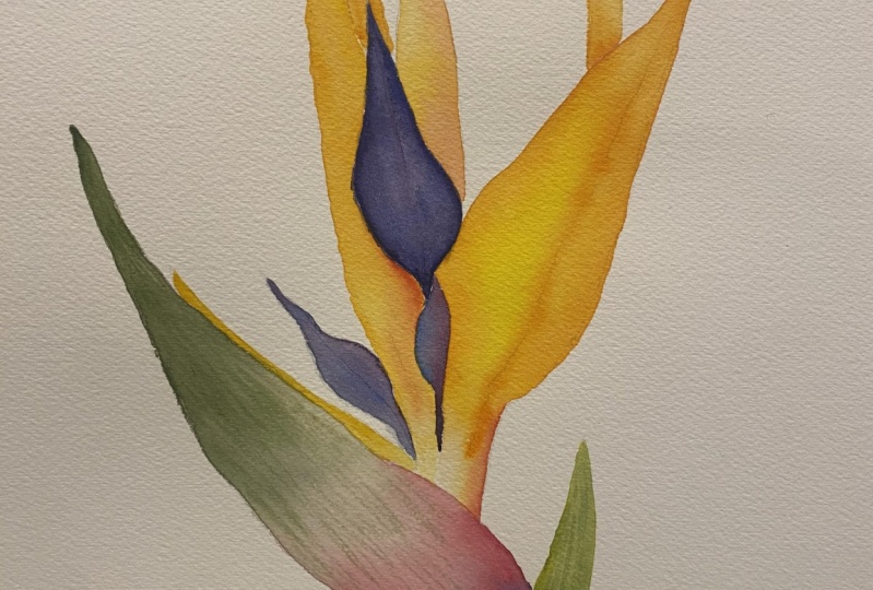
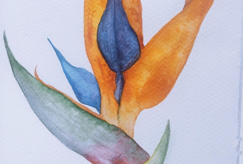
4. Wait, but what is a spathe? Strelitzia anatomy: So let's take a quick look
into anatomy Australasia. I will be using some of
the terms in the future. So I thought it would
be interesting to hear the names of all the
parts of surrealism. So perpendicular to the stem. Over here, you can find
something that's called space. Smith is a hard
beak like sheath, this one and this one from which the flowers
actually emerge. And this is also a place where
the birds, some birds sit. It's very comfortable
here like in a little boat and
pollinate flowers. The flowers emerged
from this space because it's pretty hard and
plays a protective role. For the flowers. The flowers emerge from space, and usually they are orange or other color
depending on the species. And usually you will find three orange petals that
which are called sepals, and the blue bluish, purplish petals over here. These are the petals
that conceal hectare. Also those bluish paddles often look like an
arrow or a spear, which you can see over here. And in total, the
flower resembles an exotic birds hat
or a beak as well. It looks a little bit
like a bird's beak. And that's why the
common name for us to Lisa is also bird of paradise.
5. Exercise: mixed wash. Part 1: Before we start painting, the follower is important to practice the technique
that we will be using to paint it and to paint to
create those color mixes. We will use wet on dry technique and we will create mixed washes. Let's do a few
exercises so you feel confident before we
paint the final piece, wet and dry technique means
that we will take a brush, dip it in water to make
sure it's very wet and loaded with
water and pigment. You can see here that my
pigment is very watery. And if it's not, you can
dip it even more in border again and create the
consistency that you need. You need to make sure that your brush carries lots
of water and water is. Then you just lay down
your stroke on dry paper. Here we go. We have wet on dry. Let's do it again. Water, pigment,
dry paper, stroke. Most of the time
you will even have a little drop in the
end that carries water, which can be helpful if you
want to continue your stroke. And have a nice and
smooth transition because the drop will help you
continue your stroke. Why is it important? Because today we will mostly
use wet and dry technique to create petals and
stamps and space. All the botanical
elements of our flower. But how we're gonna do it, we will create mixed washes. So I will suggest you to take
a piece of paper and just create a few elements like
this that look like a drop, I guess, or just the leaf. So here in the bottom you can
have a pointy end as well. It doesn't really matter because this is
just an exercise. But you can create it
in different shapes. So it can be a bit more
wide or a bit more same. With the cod bottom
or pointing bottom or extended like
this with the sharp. And like so. So create four shapes like this. And they will practice
mix washed together. A wash is basically
just the layer of paint that you lay
down on paper. It can be flat, can be correlated,
and it can be mixed. So today we will
practice mix, wash. And to do so, we will use wet
on dry technique. I will wet my brush, big some pigment,
make sure that it's watery and almost
dripping paint. Put it down on paper inside the shape that I outlined
with the pencil Excel. But I don't cover over it. I just leave a little bit
of space, clean my brush, and then pick a different
color, for example, yellow. Also very watery. And introduce it as well
into the same space. Following the frame
that I outlined with the pencil and mix it up a little with the orange color that
I laid out before. So here you can see
that my first layer, orange layer was wet and
immediately I introduced yellow to allow those two
colors mix and blend together. And because both layers are what the pigment is,
blending in nicely. If you have too much water
on your brush though, you can create an effect that is commonly called a cauliflower. That, for example,
you can see over here because there was a lot of
liquid, a lot of water. And now you have
this kind of blob of dried water that
created a sharp outline. Let's do it again with
a different shape. I'll take pink. And this time I'll
start from the bottom. Then I'll take a bit of green. And I'll continue. And I'll finish with yellow. As you can see, I'm not worried that my colors bleed
into each other. They mix yellow, stop
being pure yellow, and now it's mixed with green. I quite enjoyed that
and I want to use it in my painting because it's
still watercolor painting. And I want to keep
it nice and airy. And I didn't have a goal in mind to create a
photorealistic copy of. One is still to
be. Water gallery.
6. Exercise: mixed wash. Part 2: Let's try again. I load my brush with,
for example, green. And I start from the bottom
carefully moving in. And right away, I
will introduce, for example, orange,
but only in one side. Like so. And the other side
will be, for example, gray. Here we go. Again, I have a nice mix
of three colors over here, which follow the
shape of the leaf. And because I use
wet-on-dry technique, my colors are blending
nicely with each other, doing their own thing, which I don't really control. But they create
nice combinations together which
look very natural, like if you see it
in the wild nature. Finally, let's create final mix. I will use blue. Then I'll take a bit
of pink, magenta. And I'll mix those two colors completely so that
they become purple. Because blue with red or pink. Pink is essentially
called red color. If you look into color theory, you achieve purple tone. And yet in some places
you have a bit of blue striking out and
hearing about them, It's more leaning towards
magenta, towards pink. So it's not a flat purple
color that, for example, you would have achieved
if you mixed it here in a palette, like so. And here you have
pure, clean purple. Which looks a bit boring
if you asked me for, particularly for this
painting from the flower. And I think it's more interesting
to see the transition of 1to1 moving into another
tone within one petal.
7. Your Class Project: For your class project
is to practice creating mixed washes using
wet on dry technique. And just create four petals
that have different shape, different with
different lengths. So they are slightly
different from each other. And fill them up with four
variations of mixed washes. You can choose different colors. You don't need to copy mine. But I would like you to
mix minimum two colors. Obviously, you can
go up for four. Let's do that. Let's have a little
challenge here. Alright, so looking forward
to see your mix washes.
8. Pencil sketch of strelitzia + outline: A space is usually the thickest and the longest
part of Australasia. So it will take the most space, along with a couple of sepals that are going to
go high up over here. So those are two
important elements. The longest ones that I need to consider when I
will draw a sketch. So I need to make sure
that my flower is located right in
the center and that those two longest parts are not going to match on the left
and right or up or down. So first I need to define the location of
those longest parts. For example, I decide that
it's going to be here. Here. With a quick move.
I just outlined the longest elements
and from there I can build up the
rest of the flower. Now, I'll press a pencil a bit harder so you can
actually see my sketch. Also. I will attach it
to the class material. So you can use an outline, the actual outline
of my drawing. If you don't feel like
sketching your own silicium. Here. Interesting moment
that the sepals, they are not growing from here, which would seem logical. They are growing from here
from the space because it's actually where those sepals resides before they emerge out. So they emerge from this
particular part of streets. Also, a good way to double-check yourself is that
this part is Apple. Should not be longer than
the space because it literally needs to be able to
fit in before it comes out. Right? So if you're not sure, you can extend your space
here close to the sample, we can find bluish, purplish puddle that normally
consists of two parts. This is why I
literally draw it with two parts and little
elements below. And right behind them. There will be a couple
of other sepals. The orange petals. You just saw that
I used an eraser, but the eraser didn't
leave any dirt or dust, which is very useful when you draw your sketch for watercolor. I also see another bluish petal hiding behind and kind
of emerging from behind. I will just keep in
mind that it's there. And here it is. Our sketch is ready. You can find it attached
to this course. You can download it
and print the outline of the flower directly
on paper if you want, or you can trace it just to make it more comfortable for you to work with and paint your own watercolor
piece. Let's paint.
9. First watercolor layer. Let's go!: The pencil line is way too dark. So I need to gently go over my sketch to make sure that my lines are much lighter
and possibly invisible. To the eye. Of course, nothing
visible but as light as possible so that it's hard for me to even see it
because I don't want the pencil line
two shine through my watercolor layers
when I will be painting with my nice
transparent watercolor. I think that's good enough. And now we can start painting. I'd like to start with
the largest sample over here, which is orange. Orange mix with yellow. Remember today we are using mixed wash and wet
on dry technique. So a lot of my brush with first cadmium yellow
paint, It's pretty watery. And I'm using a larger brush because the sample is
pretty big and long. And creating my first strokes. Immediately, I am dropping
some of the orange. But I also remember
that over here I have a little tiny puddle, the purple blue petal. So I need to go around it. And here in the bottom, the colors smoothly goes
from orange to almost white. In the place where it disappears
kind of in the space. Okay. I'm extra that the whole basis covered that I switch to
a smaller synthetic brush and kind of dilute
the hard edge here in the bottom because I
want the transition from yellow to white to
be nice and smooth. So I put my water in, I put my brush into water, rinse the brush
so it's semi wet, but not very wet and dilute. It can also even drop
a bit of pinkish tone. Let's all, just to make
it more interesting, I could introduce a
bit more concentrated orange and even maybe
draw a line up there. Just to play with
the texture of I'll call it the petal so
it's more convenient. But the supple. And right away without
waiting it to dry, I'm just adding more
concentrated paint. After it will get
dry, we will see better all the strokes
that we've got here. A little water drop, remove it with a tissue. And moving on to the other three samples
that are on the background.
10. Finishing sepals: The other three
or four actually, I will paint them in
the same fashion. Watery brush. I always start with the
yellow because yellow is lighter compared to orange. Here I remember that I have a little purplish battle here
and here, bluish purplish. So I'm painting around them. And immediately introduce
orange and just let it blend, bleed, mix, and do their thing. Because I didn't mix my
colors on the palette. But I'm kind of mixing
them right on the paper. It allows me to create those unexpected color
transitions that you won't have if you premix your color on the palette than the color will be more flat
and consistent. Here, I'd like to see a bit
more unusual transitions, which I think are
very interesting for the tropical flower. To portray a tropical flower with a bit more
concentrated color, orange, I will maybe
even add a tiny, tiny drop of red so it
stands out even more. The texture stands out a bit more carefully painting
around the blue petal. And right away in the wet space. I, I'm pointing out
some of the textures of this step sample to have
it nice and smooth. So that I don't have to
actually go back here and add any details. Technically, we are working in down technique that is called a prima because we are doing
everything at one attempt. We're not going back to the layer that we
already painted, it's done. And this also allows us to actually finish the
painting pretty fast. Which can be nice as well. If you don't have much patience, you can finish the
painting and just, I don't know, 20 minutes. I find it pretty convenient. A lot of artists prefer
to paint in Alabama. Another technique
worth pointing out is called negative
space technique, which actually we
are using right now. Because while we're
painting those samples, we always have to
keep in mind that there's petal in the middle. And to not accidentally covered, we are literally
painting around it. So by painting around it, we create and outline
for the petal. You'll see what I mean
in, just in a minute. So right here, just because I literally outlined using the
orange color and creating, suppose I outlined
the petal inside. Now you literally can
see the shape of it. You can see the place
that we will cover in later with the blue
and purple colors. That will be our
petal over here. And you can see it because we outline that with
the orange color, which is essentially
the whole point of negative space technique. Here we're child for this sepal. If it's not dry yet
or not dry enough. And you paint this one and
you touch the first one. If it's still wet, the colors might
bleed into each other and it might not look very nice. But in my case, the paper dried pretty fast. And even though I
touch this petal, the sample, the colors didn't
bleed into each other. So all good. But just
for you to know, they might bleed into each other just because
they're not dry yet. The first, the first
sample is not dry yet. So now I will leave this
place to try to make sure that it's going to
bleed anymore anywhere. That's why we're not going
to paint the blue petals. We will now move to the space
and work on these two guys.
11. Painting spathe: To paint the space, I will use wet and dry technique again, but I will start from the
top from the tape over here. And this time I will
use bits of green. Maybe even add a little
bit of yellow because it's nice to have kind of like Sonny, sonny part to our flower. And now I'm switching to a bigger brush
because the area gets wider and I'll use
a watery gray. But if you don't have gray, you can stick to the same
mix of yellow and green. It's not a big deal. In
many easterlies air, you will find that the color is actually rather green than gray. And just in our
particular example, it's kind of leaning
towards gray. And here on the side, I'll carefully introduce
a bit of green. And I'll just let it bleed. And if it doesn't, you can clean your brush, rinse it over the tissue, and help colors blend and
communicate with each other. And then when we reach
the bottom, over here, I'll carefully paint
with my coral. Or you can use just any
sort of pink color. Here in the corner. We even have a little
bit of purplish tone. I'd like to make my painting as interesting and
varied as possible. However, do not stay
here too long so that your layer don't get dry. Your stroke doesn't get dry. And this is the
opportunity to connect gray with pink, just like so. And because we
have enough water, all the colors are mixing
and blending together. I might add a bit more of my coral color over
here in the bottom. Just let it mix. But also, I just wanted
to be a bit more intense. You remember that watercolor, it gets lighter, it loses
its intensity when it dries. So I can go ahead
and just intensify my colors without worrying
that they're gonna look a bit too dark
or too strong. Right away while my
layers are still wet, I'm adding a bit more
concentrated pigment to intensify certain
parts that I think should be a bit more
pronounced, more visible. For example, this green
can be more visible. Also a nice opportunity
to work on the texture. Maybe create a few
strokes here and there. This part still reminds
me more of a stem. So you can have some veins of
that are typical to stamps. We have our space ready.
12. Blue-purple petals: Before I was planning
to paint both parts, the bottom parts together. But now I think I should wait because here I have a
pretty watery drop. Let us go into dry
eventually and I can just wait before it dries to
paint this part, the stamp. But I feel pretty impatient, so I'm going to move on and
paint all the bluish petal. And this part is already dry. It got dry pretty fast. So I can just move on. Now, I'm loading my synthetic
brush because it's just smaller with blue pigment. And I kinda mix it in into the pigment that I already showed you
before over here. I'll start with this
tiny one in the middle. It's pretty watery,
nice and blue. I feel like it's missing the
magenta part, the pink part. So I carefully just
drop a little bit here. Colors mix on their
own naturally. Now, I'll take a bit
more concentrated color, blue, and sort of outline
the shape of our battle. So it's more clear. Then just let it dry. As usual. Here, can maybe even
dilute it a bit more. And also make sure to fill
out all the whitespace. You don't want to leave white paper shine
through because it's going to just
look a bit odd. Now finally, I'll use the last brush that
we agreed on using. Even though I don't
really need it. To be fair, I can continue using the small brush that
I just hold before. But since I have
this one, why not? So the bigger petal, I start with pure blue, bubble blue, and
drop some magenta. Immediately it
turns into purple. Carefully filling out
all the white space. Make sure not to go too far, not go into the orange layer. It's not that they're
going to mix, but they're going to overlap and create another very
good-looking dark layer, which we don't really need
since we are painting nice and sunny
botanical artwork. Now, I'm going to pull
the pigment down here to connect our little battle. It looks like a little stem, as well as dam on its own. Carefully connect them. Now. First, I'll take a
concentrated pigment of magenta and create a stroke
right in the middle. Because remember I told you that this purplish blue
petal has two parts. It's like a closed
closed I don't know, but it has two parts and you can actually see
this side of it, how they're actually connected. So that's what I'm pointing
out right now with concentrated first
magenta and now I'm using double blue
because it's still wet. The line doesn't
look very sharp. It looks rather
natural and organic, but also it stands out. So you can actually see this
connection or separation. However you prefer to call it. Didn't even say a stitch. And here in the bottom the color is a bit
more concentrated. So that's why I'm adding
more of a blue tone. When it's going to dry, it's going to lose
the intensity. So it won't be that like striking and dark
as it looks now. So always keep in mind that your layer that you lie down on paper will eventually get at least half of the
tone, halftone lighter. I'm being careful walking
around the samples. But other than that, the techniques, that
technique remains the same. And now I feel like this part is finally dry so I can
finish painting this time. And we're pretty much done here.
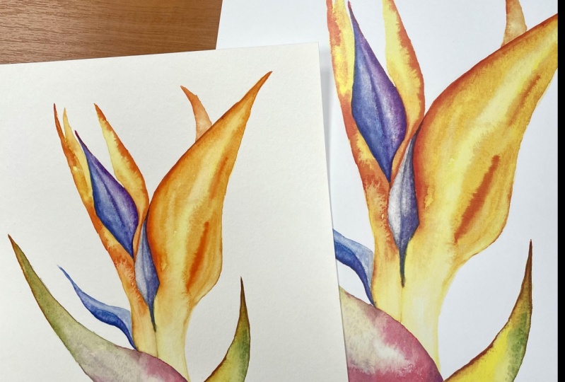
13. Paint a stem and finish!: So we will finish
up the painting. Laying the last mixed
blush for our stem. I'll start with the yellow part of it because it's lighter, so it's going to be easier
to cover with green and red up, picking up some green and carefully mixing it up with the yellow. I might even see some of the bluish sub down
here and on the side. It's going to make our stem even more intriguing,
more interesting. Just remember that
your paint will get lighter after it gets dry. Here as well. I might
help my pigment to mix a bit more so it doesn't
look like a pale yellow, but more of a cooperation
of two colors. And with the more
concentrated the green, I'll just create a
few tiny thin strokes that will resemble
veins of the stem. Typical two plans. And also, I feel like I missed a little part
here. On the side. There is orange. It's kind of sub though.
You don't really see it much, but it's there. So I feel we should
show it as well. Is this part of this space
that we don't see very well. And why our beautiful
Austerlitz is ready. And we painted, painted
it into simple, basic steps using wet
on dry technique, creating mixed washes for literally every single
element of our flower. And finally, we use the
Alla prima technique, which means we painted
everything in one attempt. We didn't go back to
correct anything or add any details because we
added everything at once. And the painting looks
very nice, airy, and in the best
watercolors traditions. So I hope you enjoyed
painting with me and I'm looking forward to
see your exercise. And if you feel like
paintings with me, of course, please do share
your streets here flower and I'll be happy
to give you feedback.
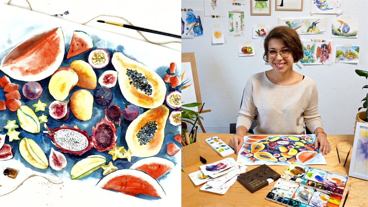
 Yana Shvets, Professional watercolor artist