Transcripts
1. 24 surprises until Christmas: paint and soak in the festive spirit: My name is Hannah. I'm a professional artist
and the painting instructor. And I just found out
about Advent calendar. From Ukraine. It is
an Orthodox country. We celebrate Christmas
on the 7th of January, and we don't do as
confounders this year. I'm staying in France
for Christmas, and streets and
shoves get decorated. I really don't feel
the fastest mode. So I decided to create it. I've got Christmas
decorations, wrapping paper, and other necessary tools for this DRY Christmas project
loaded on Christmas movies. And that's crazy. I think this Christmas
countdown is a beautiful tradition and a perfect way to
create a festive mood. Join me on this
creative 24 day journey filled with beauty, been cuteness, watercolor
tips and tricks. And of course, Christmas spirit. True to add them calendar
every day is a surprise. You will be able to open
only one painter per day. No snake pigs. Come here to check this course everyday to unlock the
painting gift of the day. I can't tell you what's inside because I don't want
to spoil the surprise. But I will tell you
that you will only need 20 min per
day to finish it. And no previous experience
and what eye color? Okay. A snake big. Just for a minute. There will be snowman, caramelized apples, toys else, and so much more. You will learn how to
blend watercolors, mixed colors using
the color wheel. Paint Christmas like sparkles, and create colorful postcards ready to be given to
someone you love. Every day, I will
open a lesson in this course and you will find
out what you are painting. Every day. You will learn something new, create an inspiring
watercolor postcards, and get a Christmas
spirit boost. And most importantly,
every day you will get a little
closer to Christmas. It is a perfect
activity to share with your family and friends,
making art together. The first lesson is open. Go find out what
the surprise is.
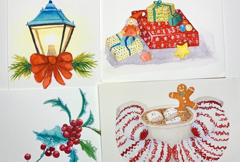
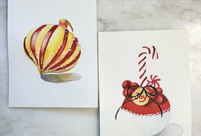
2. Day 1: Christmas toy: We started our admin calendar with a Christmas toy
or Christmas bulb. Horrible. Well, in my case, I would like to show you how to paint a Christmas toy
called Christmas tree toy. That is a little
bit unconventional. So instead of a bulb, I will sketch a toy that is
in a shape of a teardrop. Actually, we used to
have a lot of dose. I'm on the tree
when I was a child. But this one is going to
be shown in perspective. So we make our painting a
little bit more interesting. The toy is lying
down on the side and the nature of shadow
is going to fall this way. Then it has this golden stripes. I'll carefully show
them on my sketch. And the one here on the side. It's all shiny and glittery. And we will demonstrate that
in watercolor in a minute. Because I have so much yellow, which is a very light color. I don't want the pencil line to shine through my watercolors. So I will lightened my sketch
by carefully go in over, over the sketch with
my kneadable eraser, removing the dark lines so
they're almost invisible. So if you don't see them
pretty well on the video, that's perfect. This
is my intention. So I'll start with the lightest colors, which are yellows. And I'll take cadmium yellow, nice warm yellow color. And I'll put it
right where I see my golden strokes, stripes. And because this object
is three-dimensional, it has a highlight and even the light yellow
part has a highlight. That's why I dilute my yellow just a little
bit here on the side. And I keep it nice and
concentrated here in the bottom. And we'll do the same
with the next stripe. I'll make it almost white here on top where
there is a highlight. Because the light is
coming from here. And you can see that I apply nice concentrated
yellow pigment in the area where I want to have a highlighted place highlights. I will dilute my
stroke so it's not sharp with a semi wet brush so it doesn't carry
too much water. I have nice strong
highlight here. But also while I'm moving loan, I would like to add a bit of orange to show the
three-dimensionality of those stripes because they follow the shape
of our toy, right? So I'm ending orange, which in my case, slightly darker
in terms of tone. And I follow the shape of my stripe here on the
right side of it. So I do not touch the left
side, which is highlighted. And here the same, I'm basically following
exactly the same path as I did with the yellow
color, but with orange. And if the outline is too sharp, I clean my brush, rinse it over the tissue
and carefully dilute the sharp edge so that the
highlight is nice and soft. I also do it while my
first layer is what? That allows me to get this
nice soft color transition. On the right side
there's more shadow. And that's why I don't
have a very distinct, noticeable how the highlight. But I also can add more
of my orange down. So when I say orange, the color that I'm specifically using is called
quinacridone gold. It's nice, warm color
is not as vibrant as cadmium orange, e.g. it literally looks like gold. And I think it is
a perfect color to show the three-dimensionality
of our toy here. Working on top of yellows. I think cadmium orange would
be way too bright for this. Also, we need to
point out the hat, like so with a string so
it can hang on the tree. Another way, I picked up some of the hidden cradled
board and show some of the shades on
top of my yellow. Now while all this
is getting dry, I want to mix the color for the shadow that is here under. And the color I want to
use is blue with orange. So I take in then turn blue
and some of the orange in it. And I get nice kind of
brownish mix because those colors are
complimentary and they are right on the opposite
side of the color wheel. And while I'm mixing this, I switched the brush for
a slightly bigger one. And we just clean water. I create this one wet layer, one stroke where my
shadow is going to be. Then with my first brush, I pick up the pigment
and just place it here. Now, I want to add a
little bit more of orange. And there. Then I wash my brush, rinse it over the tissue and sort of dilute with
the same brush. My line under the shadow here. I also want to have a little
bit more of orange here, because our bright
yellow colors are literally reflected
in the shadows. Now, if your shadow misbehaving and coming into their
x and neural want, you always can correct it with a wet brush, but
not dripping wet. It should be just slightly wet. So you can remove the
pigment and you can finish working on it by lifting the remaining pigment
with the tissue. And that's it. Now we have our shadow. I just want to have a slightly darker
color as close as possible to the tip
of the toy over here. The reason to it is
that when you paint three-dimensional objects
that cast shadow, this is called the cast shadow. The shadow is the darkest in the area where it's
touching the object. And as it goes away, it becomes lighter over here. So here it shouldn't be
almost transparent and light. And in the area where it's touching the toy, it
should be the darkest. I'm using, bright red. And then we'll carefully fill in in-between the yellow part. I don't have too much
liquid in my brush, meaning that my brush does not carry water, almost doesn't. And the pigment in my
brush is not watery. It's a pretty dense. Now I created those two lines. Now I'm washing my brush, rinse in it Over the tissue, and with the remaining
liquid in my brush, I'm carefully diluting the red. So it's much lighter, almost transparent to achieve the same feeling of
highlight right there. So the point is, I
want to have nice and concentrated red in the
bottom and on the top, but in the middle here, there will be a
highlight because of the source of light
is coming from the left. The color must be
much, much later. In here, I do the same. I just created the most
concentrated rest strokes. And then wash my brush,
rinse the water, and with the remaining
liquid that I have left. I'm carefully
diluting the edges. Making this part as
transparent as possible, almost lean into white. To create this feeling
of a highlight. And I am moving on. Make sure to have
your red pigment. Nice and thick,
concentrated, thick, not thick like if you would
use gouache or acrylic, but thick in a way that it's
not diluted with water. So you don't need
a chunk of pigment hanging from the tip
of your brush here. But at the same time, the color should be
nice and concentrated. Also, if you notice
here in the bottom, I don't go all the way down
to the tip of the toy. I keep it yellow there. They're just a small detail, but I think it's important. I love this painting to dry literally for like
5 min just to make sure that red is getting dry. And you need to evaluate it by yourself to make sure
that red is completely dry. If not, just leave it for drawing just a
little bit longer. Meanwhile, I'm
mixing a darker tone of red by adding green into it, because green is a
complimentary color, is the color that's going to make red darker, almost less, also less vibrant and calmer. And carefully with this mix, I'm adding a bit
of a shadow here, in the bottom, here on top, and on the side. Just to make those colors pop. Wash my brush, rinse
it over the tissue and carefully dilute the layer. If it feels too
dark or too thick. Then move on. When we paint glass objects
and our toy is made of glass. And I think the
very specific thing about reflections is that
they are dark and sharp. That's why now when I'm marking
my reflection on the toy, I allow it to stay
relatively sharp. My strokes are pretty
dark and defined. Here on the right side. I will make the whole
size slightly darker. So I add my darker mix
almost everywhere, not just where the infection is. To show that this is the side that has less highlighted and this one
is highlighted much more. I'll also add a little bit of blue into orange
to make it darker. Because orange and blue
are complimentary colors, they are in front of each
other on the color wheel. They allow to create
darker and calmer Colors, tones when you mix them. Because I only add a
little bit of blue. I didn't neutralize
those two colors. I just made orange
a little bit calmer and darker so I can show the darker sides because
if we make red darker, we also need to balance with
the orange and orange or yellow or golden side of the toy should also
be slightly darker, as well as the hat. Just like so. In the final part
is the glitter, which I will paint
with white gouache. If you have white watercolors. You can also try to do that. I find gouache nice and thick, which will allow me to
get those bright spots. Just make sure that your
spots are super tiny. They do not leave
a big fat bubble of paint should be very, very small and delicate. And if you have an
actual glitter, you can just do that. Nobody stops us from exploring
all the creative options. Here we go. They
want is complete.
3. Day 2: Caramelized apple: Day two, we paint
caramelized the apple. As usual. I will start
with the quick outline, a quick sketch for the painting. And I will draw a very light circle that
will resemble an apple. Then here, following the curved shape
on an app of an apple, I will create this banded line, which will separate my red part of caramelized apple with
a sugary white part. And from top here I will have a candy cane decane. Just like so. It's calling here from
the center as well. I will have a little kinda like Merry
Christmas sign over here. Another candy, some berries and a nice touch of bow. Like so. And here there will
be some shadow that naturally the apple
cast on the table. I'll start with
applying clean water here on the bottom of the elbow. This is where my sugar, white sugar part is going to be. And to show the
three-dimensionality of this part. Because the light is
coming from left side and naturally the right
side will be more shadowed. I'll put a little bit of a blue pigment here
on the bottom. Because I've put water before. It allows the pigment to
nicely spread all over. So this will account for our shadowed side
of sugary apple. And now I will just
leave it to dry and work on candy cane. It has this red stripes, but the candy itself is white. So I'll do the same
and I'll just create a light shadow with
very light blue color, the same room that
I just used here. And I will show this
shadow part on the side, on top and on the right
side of an actual cane. And I'll leave it to
dry. Later. We will add the red stripes, and this blue part will give us a feeling of three-dimensionality
of the candy itself. So while all this
is getting dry, now we should work
on something that is not directly touching
the wet parts. So if I put red on the apple, I'm afraid is going to leak into this water that I
just applied before. So I will paint the little sign, the little tag with
Merry Christmas. I'll take raw sienna, which is a very nice
light brown color. And create the first
layer with burnt sienna, which is a little bit more vibrant brown
with red tone in it. I'll add some sort of a shadow on that tag and
also leave it to dry. As I'm working on smaller bits and pieces of this painting, I'll switch to a smaller brush, which is also synthetics. So I have more control over the water that I
keep unreleased. I will paint some
of the berries, but I need to be very careful
not to touch the wet parts. So I'll start with this berry. In this one. I don't want to put the berry
here because it's going to touch the wet area of the tag. And now I honestly
don't have a choice But wait for everything
to get fully dry, I think is going
to be maybe ten, 15 min because the
paper is cellulose, so dries much faster, then we can add new layers. I want to actually paint the
white part of an apple here. Actually, I want to paint
the red part of an apple. I'm carefully going around the tag and I'm
using bright red. I'm not a big fan of Gangnam. So bright red is my choice. Here with a slightly darker
tone of red. Right away. Paint the berries. The darker tone of
red is achieved by adding green into your red. Because green is
complimentary color. It allows you to get more
calmer and darker tones. Somewhere up here there
will be another candy. And on this side there
will be more berries. I want to make them slightly darker so they're just easier to identify on the
background here. But not to worry, we are
going to add shadows and that will sort things out. So now I get red and green. Achieved darker tone. And I'll place this darker
tone right under the tab, where it naturally cast shadow. And in-between the berries is also a good opportunity
to outline some of the barriers and just
show their shadows. So I follow the shape
of a bearing and I drop slightly darker tone on them to show that they're
three-dimensional. And because I'm doing this while the whole
thing is still wet, it allows the pigment
to nicely move around and creates soft
color transitions. Now I get some red and I will create stripes on
the candy cane. The task here is to follow the curved shape
of the candy cane. So the stripes, they
cannot be just straight with a nice and
vibrant with color. I'm creating those bended
stripes on the candy gain. And as I go down, they
almost disappear. And we don't see them behind
the rest of the apple. Now, with the same darker
tone that we already mixed, the red plus bits of green. I will carefully
add a little bit of a darker shade just to make our candy cane
even more realistic. So I add this darker
color, not everywhere, but only here at the
beginning of the stroke. And maybe here in the end of it. But just very tiny,
very delicate touch. Actually this other
candy on the side also deserves a little
bit of tone. So. With the gray color, which can be created
by diluting black. But this option, I
don't really like much. I try not to use black. So the other way is to mix complimentary colors in
the most balanced way. In my case, what I did, I just do blue and orange. I mix them equally to get
this sort of gray tone. I got a little bit of red. I touch it by accident
and it leaked into my tone that I'm
working on right now, but it's fine because
it's totally logical that red color will be affecting
the object nearby. So the candy should have some
of the reflection of Fred. So while things are getting
dry and the tag is empty, I can take a very dry, very thick red and just
write something, e.g. Happy Holidays, Merry Christmas, wherever there is
going to fit in there. It's always nice if
your text is following the curve of the tag
because it's rounded. And if you're not sure if you
can fit all of the letters proportionally and
balanced on the tag, you can first write them
with your pencil and then just outline
with the brush. Now, the berries are dry. I would like to get some
darker tone of red and just define the shape of the
berry a little bit more. So it is visually
separated from the rest. Because we have a
lot of red here. Also, I will take a clean brush, get some clean water, and put water at the bottom, where will be my shadow? Then? I'll get the same gray
tone I mentioned before, the same I used for a
little candy over there. It's a mix of blue and orange. Now just edit carefully
where the shadow must be. But remember that the shadow is the darkest where it's
touching the object. So I will mix a darker
shade and just edit here to make the apple stand
out even more. Also with those semi wet brush, I carefully that the bottom to achieve sort of softer
line of the shadow here. You can also pull it a
little bit further under. And now I just need to finish the stripes on the other candy. Also remember to
follow the curve. So your strokes must be bend it and not perfectly straight. And then the last thing that is left to do is to add the bot. And I would also
want to add some of the sugar refill with gouache. But because the paper
is already wet, the area is already
perfectly white. Of course, the white gouache
is not going to be visible, but here in the border
where white meats, red is a perfect
opportunity to add those tiny details and create this sugary feeling
of a caramelized apple. Now, the final touch
will be the bowl, but you need to make sure that everything is perfectly
dry before you add nice and thick black color. I'll carefully add the bowl
with a very dry brush. Barely paints. But this is my whole point. I don't want to have
watery stroke here. I prefer to have a
broken line instead of undefined watery stroke. Here we go. This is the painting for
they do see you tomorrow.
4. Day 3: Christmas bow: Welcome to day three
of Advent calendar. And today we paint a bot, nice and colorful red
bow Christmas book. As usual, I start
with the sketch. And I just want to
mark the sort of main outline of the bot. How big it is, how far
each part goals. Like e.g. here I see that I
could go larger considering the size
of my postcard here. Yes, I think this is fine. Now, I will remove the
lines that I don't need. I use a kneadable
eraser as usual. It carefully removes the lines without leaving any dust behind. And overall it's just a very
gentle to watercolor paper. Now, my bot has stars, so I will mark those stars so I know
where they are because the yellow so that I don't
accidentally paint them with red. Here the tissue is a
little bit bended, so I will see only half
of the star and it will add more of a realistic
feel to our painting. You really want to balance
with big stars and small stars so that the whole pattern looks more
natural and not overloaded. So when I finished
placing all of my styles, I can move on and
start coloring them. I'll get cadmium yellow. And carefully we'll place
the pigment on the stars. But the trick here is to not cover the whole
star completely, but leave some of
the areas untouched, like a broken line. Your layer is not
perfectly even. This will give you
more of a feeling of the tissue that is little bit bended and it's
reflected in various ways. So this will just give us
more of a realistic feel. As I said before, some of the stars are not
visible completely in there perfect shape
because the material banned in certain places. And that also affects the
way we see the stars. My pigment is very
concentrated, very bright. Because I want to have
maximum of color on the bow. I feel like here
it's not enough. So add more stars. So it kind of balance out
the whole bowl, the button. And I'll also add tiny yellow line that is on
top of the bow over here. Just to make it shine even more, but it will be more striking and visible when we will paint red, because red is definitely
a darker in terms of tone. And that's why yellow
is going to shine even brighter when it's
going to have this contrast. Here in the middle. Alright? Because I used a very thick
yellow pigment on my brush, almost didn't carry any water. This was a good
opportunity for me to save time and start painting
with red right away. Because otherwise, if
your stars are wet, they're going to
leak into the red of the bowl of the tissue and it's going to ruin
the shape of the star. So if you use the wet pigment, you want to wait for your
paper to be completely dry. Now, I get nice
and concentrated. Red and I'll start
from the left. I'm right-handed, so it's easier for me to start
from the left and move to the right without
being afraid that my hand will accidentally smudge
whatever I painted before. In basically using
negative space technique. I'm outlining my stars. As I move with my pigment from the
left side to the right. You need to have just enough
water on your brush to make the pigment flows so
it doesn't paint to dry. And as I go close to the yellow outline that
I painted earlier, I tried to keep
this outline clean of red pigment so I don't
accidentally cover it. I also remember to keep
the brush loaded with red in high density because I don't want my red to be too
light and too transparent. Here I want a nice
vibrant colors. For the other side of the bowl, I'll use a darker tone of red by adding a bit
of green into it. And we already know
that those colors work great together because
they're complimentary. They create nice dark tone. Allowing me to create this
feeling of volume on the bow. Since I'm here and the
paint is still wet, I can use this as
an opportunity to create very nice and
soft transition in tone without having to go back there and correct anything with the
wet brush, e.g. this is a good way to create the feeling of a banded tissue. The important part is
not go too crazy and not add the super dark tone. And now we can move to the
other side of the dock. I'm trying to be careful not
to cover my yellow outline. Yellow stroke that
I created earlier. Then also, I want to keep my pigment bright
and concentrated. So I'm making sure to not have too much water in my brush. Here. I love this part not
covered on purpose, because I will do the
same thing I did before. Mix my darker tone of
red by adding green and create the
shadow. Over here. However, as you can see, I'm not really covering
the whole part inside of the bowl. I want to keep some of
the red shining through. Also. It seems like this whole
side is slightly darker. So what I'm doing now
is adding darker tone to portray the contrast
of the light part of the bowl where the tissue
is bended and the shadow. So by creating
contrast like this, I can realistically portray
the way the tissue folds. Because some of the
stars are falling into this darker zone, into the shadow zone. I also want to
make them slightly darker to reflect
the shadow because they're part of the tissue
can be in shadow and do not cover the star
with the shadow as well. While this is getting dry, I'll move to the
one on the left. So now I have my first
layer and write up. I will create the
shadows. The darker tone. I think here the
color is a little bit too light to
dilute it with water. So I can reapply red just to intensify the
color on my end. Without delay, I will move on to the final part of the bow. So after carefully
outlining all of the stars, I'm doing exactly
the same thing. Mixing darker tone of red
and working on the shadows. Since here my shadow is
lightly touching the star, while also making
the star and been darker using darker
tones of orange. Now I think I just need to leave the bot to rest and to dry, and then I can add
the final details. The final touches will be to add some textures to the stars. And I'm using
quinacridone, gold, orange color, that
really looks like gold. It's quite different from
a typical cadmium orange. If you compare the two, you'll notice the difference in color. For this. I'll prefer something
that is warm and not so vibrant as
cadmium orange. So you can also mix
your own orange by combining red
and yellow, e.g. cadmium yellow and cadmium red. And you will get something
that is closer to handle crud on gold rather than to cadmium orange from the tube. So I will suggest you do
that to believe light. Barely noticeable
spots on our stars. And the final, final touch
would be read with some red, with a little bit
of black in it, but just tiny bit. It's dangerous to go
too much with black. And with the most,
the most contrast, the darkest areas of the bot will be
pointed. With that mix. The area where you
have the most shadow, the darker shadow
will be the place. To put this darkest strokes. Also, I'm making
this area slightly darker to resemble the shadow. In here. Just need to be very careful to not add too
much of the dark tone. So be careful with your black. It's always important
to know when to stop, especially when you're
working with dark elements. In watercolor, you cannot
make things lighter. So if you put too
much of a dark tone, you won't be able to remove it. So I pointed out all the
folded areas of the bow. And I think we're done
here. See you tomorrow.
5. Day 4: Snowman: Welcome Today for young today we are painting cute
little snowman. First. I'll just mark where it will
be the head and the body of the snowman so I can visually
understand the location, the composition of my painting. And even though it's just
one little snowman here, I still want it to be central on the paper so it
doesn't lean too much on the left and the
right to the bottom or high up on the paper. So by outlining the
main two circles, it just makes it a
bit easier to see if my snowman is in the center. And I think it's fine. So now I can add the details
and some facial features. The snowman. So here's
the carrot nose, eyes, cute little chicks, smile. Chin, and the hat. Now there will be little buttons and the rest of the body. Alright, I think turn
out pretty well. I remove this couple of
lines that I don't need. And also make sure
that your sketch is very light because the
snowman is mostly white. So you don't want
the pencil line to be visible through
watercolor layers. The secret to achieve in nice
and smooth transitions in our little snowman would be
to use wet on wet technique. And that's why I'll
take my natural brush. And first, just
apply clean water everywhere on the body of the
snowman, except the nodes. Even though those you can
actually cover it with water because we're not going
to work on it right away. So it will eventually get dry
and we will paint it later. What's important
is the whole body. You don't need to touch
the head as well. This can be worked
on separately. Now, I'd like to take nice blue color or
something warm, e.g. with their marine ultramarine
blue or in downtrend loom, I'll go with Indian
trend because this color doesn't granulate. And I would prefer to not have granulation
effect on my snowman. But if you would like it, go ahead and use
ultramarine blue. So now I'm adding this blue color right where the shadows
should be. So e.g. here there will be a
shadow from the hat, which is very natural. Then on the cheeks to show that those chicks are
three-dimensional. And I will wash my
brush, rinse it with, re-instate against the tissue, and carefully smooth out
some of the strokes. If I feel like
they're too sharp. Right the way while
I'm still here, I'll get a little
bit of orange, e.g. cadmium orange is gonna be fine. I'll add a tiny stroke into the cheeks and maybe
into the chin. If it turned out
to be too bright, you can also dilute it
with a semi wet brush and carefully pull the pigment
into a different direction. I'll also add a little
bit of orange here, right into the shadow. Make it smooth so it
doesn't stand out too much. And move on. The bottom of the snowman might be even already dry
because I'm working on a cellulose paper and this
paper gets dry really fast. So I can reapply clean water
once more and do the same. Now add a little bit of blue right on the
side of the hand. And just let it soak. There will be some blue
here on the bottom of the valley and on
the back over here. And of course they'll need
a little bit on both feet. Right away. I'll
add a tiny bit of orange into the same
place where I had blue. The reason I added the
orange color to the snowman, even though it's
not very difficult, is because I want to
create this feeling of a warm light shining onto
the snowman, like e.g. if there is a candle, candlelight or a
warm lamp light, I think this is going to add some cozy feeling
to the painting. But now we need to wait for
it to get completely dry and then we will be able
to and new layers. Well, my layers are
getting fully dry. I can use this moment
to paint the hat. I'm using, right red. But there's no preferences. You can use cadmium red
as well if you want to. And carefully create the hat. And along the way I am marking the strokes that represent
the pattern on the hat. I leave some of the
strokes white or other. I create read strokes and
leave white area in-between. That on its own
represents white stroke. So basically using
negative space technique by outlining the area, I actually create. The white line. Then with the thin brush, I'll just leave super tiny
almost invisible marks on the white areas, The White Stripes of the hat. To just give a
feeling of a pattern. Of course, it is so
small that it is virtually impossible
for human eyes to see. That's why I'm unbothered was showing anything
in particular. I'm just leaving literally dots. But it looks like
there is a button. Where here I'll take
a darker tone of red, which we already
know how to create. By adding grain into red. Or even a tiny touch of black. I am creating the
darker tone on the hat. And at the same time, I want to show the texture
on the hat like it's needed by adding
strokes like so. And those strokes,
those lines they resemble needed material.
Like a sweater. So while I was busy with that, the rest of my painting
gets super dry. So I can be confident that I can move on and work
on the shadows. I will mix blue and orange because those two are
complimentary colors. And I will achieve gray color. With that gray color, I will be able to outline some of the shadows
even more specifically. So e.g. here on the cheek. I can make the shadow
a bit more noticeable. The same time. Show the part
where you see the smile. The same here, I will make the shadow on the cheek a
little bit more noticeable. And also dilute the stroke with a semi wet brush so it
doesn't stand out too much. If it's too sharp. I'm diluting it with
the semi wet brush and also use it
as an opportunity to create a shadow
under the nose. Because the long carrot nose
definitely drops the shadow. I will intensify the
shadow under the hat. Then with the remaining color that I have left on my brush, I'll just carefully outline
the body of our snowman. So e.g. the hands
here, here as well. Bailey in front. The back of the body. Here my my line is pretty sharp, so I'm diluting it with
the similar brush. And I want to mark the buttons. But first, I'll start with the orange color and
then I'll add black. Because it's always
better to go from lightest to darkest tone. And those will be my last steps. So while I'm waiting for the
rest of the body to get dry, I can paint carrot. Somewhere in-between
orange and red. There will be a carrot nose. Here my layer is trying
with a sharp edge, so I'm removing it with the
center with brush carefully. And also while my main parts of the painting is getting dry, I can create the shadow
right under the snowman. I'm aware that it might leak into the feet of the snowman, but I don't think
it's gonna be a catastrophic going
to merge naturally. And I don't think
it's such a bad idea. But here we need to have a very clear distinction
between the tones. So here the tone should
be definitely darker. Show that as a shadow. And then if it's going
up into your snowman, you can just move
your paper like this and to let the pigment
flow down instead. Also, you can correct the tone if you need to with
the semi-log brush removing the color. Just like so. I've got a little cauliflower
happening in the belly. So I am trying to
remove the edges of it with the semi wet brush and it's
working out pretty fine. So while the bottom
is getting dry, I need to make sure that
the face is dry as well before I paint the
eyes and the smile. So now when the painting
is completely dry with the darkest tone to black, I can create the eyes, some of the shadows, the smile, the buttons,
all the details. Your stroke should be
very thin and delicate. And here I'll add
a little bit of a shadow on the inner
side of the hat. And I think that would be it. Our little cute
snowman is ready.
6. Day 5: Christmas socks: Welcome to day five. Again, we are painting
Christmas socks. I'll start with outlining
the area of the blanket. The main line of the
blanket. Like so. And there will be Pete wearing Christmas socks
sticking out of the blanket. One food is done. Here's the other one
that is right under. And pair of socks of the neighbor of another
person. Right here. Here we go. This sketch
is quick and simple, and I'll start probably with
painting the blanket first. It's going to be very light
and watery yellow starts with a watery pigment
of light brown color. Rashi and I in my case, like so. Then I'll take concentrated green and then
blue and then red. And I'll just add some sort of squares right into the blanket
because it's still wet. From my first brown. The color is pretty diluted. It blends into the
background and creates this nice soft color that I think fits
pretty well into this. A plank. From here, I will go with
the nice and bright blue. And then I will
change the strokes, the colors of the strokes. Every time I create a stroke, I touch the other layer a little bit so they have the chance to connect and kind of
bleed into each other. This is a good opportunity
to practice mixing, washes. And I will finish
off with green. I might as well just
take red and sort of continue this stroke like so. I just need to be careful and not make the stroke to straight. It's a blanket, it can
be perfectly straight. And here in the bottom I've got all those
colleague followers. So what I will do, I will
just mix them with the green. And that's it. With a very, very dry black. In my brush. I will mark the area that shows
that the blanket is folded little over here and here. But this part is much lighter
than in the beginning. I don't want to drag too much
attention to this blank. I just want to create
the feeling of. Having a blanket here. Cool. Now, I need to wait for the top part of the
blanket to be fully dry. I can paint this ox. I'll start from
the top with red. Then I'll leave a little
bit of a whitespace because there will be some
sort of a pardon, button. Then I'll take some blue and continue painting the soak
all the way down to the heel. Here I'll add some
red right away. Kind of forgot about it. So it's going to be a
little bit mixed with blue. I'll make the hill red. And also the rest of the
sock will be read as well and go out like this, resembling a pattern. I can finish working
with the blue color. Make sure not to have too much
water in your brush so it doesn't leak into the
red parts of the sock? If it does, I don't
think it's a big problem because well, it's a sock. It can have all sorts
of different colors and patterns on it. So not a big deal. Then I will start painting
the sock over here. And I just need to remember that OK on
the left is still wet. So if I touch it, it's going to bleed into the one that I'm
working on right now. Well, that would
be not very nice. So I'm just mixing up colors. Now. I took a little bit of yellow without really
clean my brush. That's why it has this very light salad
kind of look in color. But this is really just, you just play with
colors, let them bleed. Connect a, and essentially
they'll just look more playful and in the best
watercolour traditions. Then there will be some, another pattern and another. And as I approach the
heel of my sock here, I need to be very careful. Barely touching the one on the left so that they don't
connect with each other. I kinda want to keep
them separated so they don't leak into each other. And mission is
successful so I can continue building up the
patterns of the SOC. Ms one, it looks like an elf. And I think I'll finish
with a red as well. Here we go. The two socks are done. Now. I just need
to make sure that they are completely dry so that the colors don't bleed into the new sock that
I'm going to paint. And after I'm sure that
everything is dry, I will finish. The remaining two. I use the hairdryer to speed
up my train situation here. If you don't have time to wait for the paper
to dry naturally, you can do the same
and use a hairdryer. I do exactly the same thing
as I did with my first soak. With the only difference that
it might be slightly darker than the one on
top because well, it naturally gets
some of the shadow. Oops. Don't leak too much. Yeah. So what I was
saying that and gets some of the shadow
from this sock on top. So it would naturally
be a bit darker, especially as it
concerns the reds. And actually, for red, I'm not even cleaning
my brush. After blue. And I dip my brush
into red right away, which gives me a bit
dirty field of read, more into the purple
side of things. But I think it works
perfectly because it naturally creates
this darker tone. And this is exactly
what I need because this sock is under That's one. The second sock, I start
with a darker tone of green, which I can achieve by
adding red into green. Something that we have
been doing quite a lot in this course of Advent
calendar paintings. So you probably are very familiar with this
already by now. And all this to achieve
slightly darker tones. On the sock that
is hiding behind. Now, I'll get darker red
and then darker green. And the good part is that because those colors
are complimentary, I don't even need
to wash my brush. To paint those. Feet in a sock in the bottom is way easier because you just keep adding tones on
top of each other without really thinking about the transparency or
clarity or whatnot. Just using the colors
that are already in your brush because
we need Darker, muted tones to show that the socks are
covered with shadow. And here we go. We have our Christmas socks
under the blanket, ready.
7. Day 6: Christmas bells: Welcome. Today's six, we are
painting Christmas bells. As usual. When you
start your sketch. Take the moment to think
of the location of your subjects so they don't appear too high up
or on the side, or basically leaning towards
any side of your paper. Because it would be said
to find out that after spending the time
draw in your sketch. You'll see that the subject
is not in the center. This particular
Christmas bells are actually the Christmas tree toys that you can hang up the tree. So that's why they
look a bit flat. And not as a real
three-dimensional bells. But it's not a problem
because there's gonna be an interesting challenge for
us to work on. The colors. Here. The color palette is
going to be limited. And we will work on portraying
this metal texture. Of those bells. Mostly we will use
blue and orange, complimentary colors that are sitting right in
front of each other on the color wheel and create. Perfect. Couple. Of course is usual. Remember when you're
creating your sketch, make sure to keep the line light and almost
invisible for yourself. Because you don't want
the pencil stroke to shine through your
watercolor layer when you will start painting. So here I marked the most
important parts of the bells, and I think I can start
working on the colors. I'll start with the
lightest color, the orange. However, I would also want
to add some of the yellows, cadmium yellow and cadmium
orange. For that matter. To create nice
highlights on the toy. Here, I'm basically balancing
between orange and yellow. Just add in one
color to another. While they're still wet. While the layer is still wet, I will drop some
cold blue that will show the reflection on the
side of the bowl over here. But I need to be very careful that this blue doesn't touch the yellow parts that
I painted because this will turn
yellow into green. If your lines start to
create sharp edges, you can remove them
with the semi wet brush and to make them softer. Meanwhile, I continue creating the bowl and then mix it with some of the yellow. Now, I will take
in the trend blue, or we shouldn't have it, you can get another warm
blue lake, ultramarine. And edit on top of the bowl over here. And here. I wanted to start creating
shadows right away while my layers are still wet so that the colors turn out to be soft. Because most of the pigment
that I used was orange. Combined with blue. It gives me a nice darker tone. Here. I feel like the color
is a bit too pale, so I'm going to re-add some of the orange just to brighten up. And I'll do the same
here as I feel like the color is not vibrant enough. Now, I'll start painting
the ornament of the bell, which is in light yellow
color, almost golden. Now we'll keep it light from
the rest of the painting. However, the parts in-between will be more resembling metal. So I'm not going to paint here right away because
I know that the layer is still wet and I don't want
it to bleed into my bells. I'll start working on this part. I'll take some of the orange. Then I'll get in the intron blue without
doing the cleaning my brush. And immediately create
strokes that are going, of course to leak and
bleed into my orange. But that's exactly
the feeling of the texture of the metal
bell that I want to achieve. I'm doing the same, outlining the ornament that I
painted with yellow before. So that this ornaments
stands out even more. So the whole idea is to balance
between orange and blue. Allowing for the orange to show up a little
bit here and there. After I am adding blue color. So with my blue, I'm not
really covering everything. I just drop it in
certain places and I allow the pigments to flow
because the area is still wet. The colors, the pigments are basically doing the job for me. I'm just watching.
This larger area will be probably a
bit more orange. So generously cover
it with orange first. Then I'll start. And in blue. And just let it flow. When I reach the bottom
with this yellow stroke, I want to show the
texture that looks like a thread by adding orange so that the yellow
is still shining through, but you can recognize the texture of this
ornament as well. And I'll do the same here, that the yellow appears
to have a bit of a shade. Here in the bottom. The opening of the bell. I'll start with orange. And then I will
introduce blue into it. I keep this area
clean for awhile because I will be back
there with lighter tones. And I don't want to touch it yet with the same
very light orange that is not pure orange from the palette
or from the tube. But a little bit muddy because
I touched blue with it. So it's kind of like a calm
down, quiet orange color. I'm showing those textures
on the yellow parts. And I'll finish the bottom and I'll finish
the top over here. The top is pretty dark. So I take a orange with blue, mix them together
and get some sort of muddy brown color where
there's more orange in it. And add it on top. Just like so. So
one bell is ready. And with the same manner I
can work on the second one. I'll add light orange first, and then I'll start
introducing blue. The next section. This is the final section. The blue into my orange. And with the muddy
orange as well, create texture here in the
bottom on the yellow stroke. To create the
feeling of a thread. And now I need to let those bells dry so I
can add some textures. This barn got dry so I
could paint in right now. And now, I'll leave it to dry. The painting on dry, the colors get lighter as it usually happens with watercolor. And now I will do my final step. I'll mix a dark version, very concentrated version
of orange plus blew. My complimentary
colors, my pair. That literally will be the
king of this painting. And with dry pigment on my
brush and barely paints, I'll just outline the
shadows on this toy. Christmas Christmas
bells. At this point, it might even look like black. But it's not. It's a mix of two complimentary
colors that one way or another is going to be visible on paper and look
better than just black. If your stroke turned
out to be too dark. You can always delete it. Here in the places where
the bot is bended. I'm also creating the shadow and diluting it right
away if I need to. If the stroke is too
sharp or too dark. Like e.g. here, I don't
want to leave it like this. So I will smooth out the
edge to make it more natural than shadow
here underneath. This is a good opportunity
for me to separate parts of the bow that are not very clear. Here with a very
concentrated mix. I will create the
texture of the bowel by basically painting
the thin lines down on each section. When it comes to the ornament, I will create darker
shades right under each curved part so that it stands out more
and is more clear. Here is the same. I'm just create in very
thin, delicate, dark strokes and also separate the threads. Here on the bottom. The final part will be
to make the opening of the bell little darker. I'll carefully dilute
the sharp stroke. And if I got some of the
pigment from the bottom, I can just refresh it and add the new orange pigment.
And that's it. And then I'll do the same
with the bell on the right. Remember to keep your
brush stroke very thin and the pigment thick and dry so that you have full control over the
strokes that you're making. And here we go. Our cute little Christmas toy, as in Christmas
bells, is random. Now. See you tomorrow.
8. Day 7: Frozen berries: Welcome to this open. We're painting frosty berries. I'll start with outlining
the stem or the branch. Yeah, it's more like a branch of the tree where
those barriers are. A main leaf. A couple of those leaves, not going to just leave one. So the berries are
going to be here. I'll just mark and main
mass of those barriers. Then there will be a leaf
going away somewhere here. Interesting thing about
those leaves that they have very sharp edges. So they're very
easy to recognize. Also, the challenging part for this painting will be the first, which we will create
using white gouache. And as always, keep
your sketch light. Even though we're going to
work with Britain dark colors. These are going to be
light, light, green tone. So you want to keep your
sketch nice and light. Alright. Yeah, I think
that's enough of the leaves. There's really a lot of leaves. And the point here is
to paint the berries, so I'll keep the
composition sample. We can start painting.
I think I'll start with the leaves and then
I'll add the berries. And interesting thing
about the leaves that in some areas they
are a bit warmer, so it's a lot of yellow. I see a lot of yellow
on those colors. So I'll take a mix of
yellow with emerald green. But there are also some parts of those leaves that are
in colder tones. So e.g. a mix of blue with green. So I'll take cerulean, which is a cold blue color, and I'll add bits
of green into it. So it is still a green color, but it's lenient towards blue. If you have two requests. That could be also a
good color to use here. Also, my layers
are really light. I'm not trying to get the concentrated, dense colors here. And I think that's also
going to play a role for this feeling of a frosty
winter and frozen leaves. So I'm really just mixing here a warm green with cold green. So I mix the colors where green is leaning
towards yellow and another green is
leaning towards blue. With a darker tone of green. I will add detector immediately. Matter, just make
sure that the color, the paint is pretty thick in my brush so that I actually see the stroke
and it doesn't disappear. When I painted. Another warm leave. Here and here. Now add some clearly defined
edges with just pure green. Here the leaf is curled
and bend it a little bit. The part that is banded will
be with the cool blue color. But the live inside
will be warm. So there'll be a lot of
yellow in that green. Then this leaf will be
more cold blue colors. And finally, I will paint
the branch with also first, starting with cold blue. And I'll add a bit
of green into it. So we have this first
under painting, the first layer of
green for the leaves, but I will be back to work on the shades and also
on the frosty part. After waiting for a bit for
my painting to get fully dry. Now when I'm sure that
everything is dry, I can start working on
the berries. First. I will just apply pure red. I use bright red on each berry. And e.g. now, while those
berries are still wet, I'll create a darker tone of red by adding tiny bit of green, as you probably
already know by heart. And create a bit of the shadow. To show that those berries
are three-dimensional. The goal here is also
to separate one from another by creating shadows. All right, once that is done, and move into the next one. When you're working on a big
mass of barriers like this, at some point it will be
difficult to keep track on where one is finished
and the new one starts. Just keep in your mind
that they're all rounded. So when you're going
to add the shadows, they always need to follow
the shape of the sphere. So e.g. right now, if I start creating shadows, I will always follow the
rounded shape of each berry. Some of them are going
to be darker because they're literally deepened side. And some of them are
standing out on top. They have more of the
highlights and shadows. E.g. here, the right side
will be a little bit lighter to show the
highlight of the berry. And now if I start adding
darker tones of red, I'll be able to separate those berries by following
the curve of their shapes. Here we go just by creating
the shadows of each berry. We can show that those are
three-dimensional subjects. However, I will still add
some of the shades in a bit just to intensify this feeling of three-dimensionality
of each berry. Now, I'll use a hairdryer to speed up the drying process
and continue painting. My painting is dry again, and this is the moment
when we work on the darker tones for each
part of the painting, for leaves and for the berries. So essentially it's going to be only two colors, green and red. But the difference will
be for the darker tone of the stem or the branch,
which is green. I will add more of, I will add a bit of red. And to achieve
darker tone of red, I will add just a
little bit of green. So I'll just play between those two colors
and find a balance. To create the
shades that I need. Here, I will just refresh a little bit the
shadows on that leaf. Create a shadow here. Here as well. Also, if
your stroke is too sharp, you can remove it, diluted slightly with
the semi wet brush. But remember to keep just a little bit of
water in your brush. Otherwise, you will drop the
liquid into your painting, into your paper and dilute the layer that
was already there. Below. Like here, I'm carefully diluting
my sharp stroke just to show soft transition of the color from the darkest
one to the lightest one. And here as well. But here I won't
dilute the color. Just show the dome,
the darker tone. Alright, and now I'm
going to do the same, but for the berries. And this time, I'll have
a bit of green in red. If you feel that you can't
reach the darkest tone here, you can add a little bit
of black into your red. Just be very careful not
to use too much black. I'm carefully
outlining each berry so that the shape of each
barrier is more clear. But do, but resist the temptation
to circle every berry. Because that will
look like a cartoon. We're working with shadows. And using shadow, we
create the shapes of the berries. This is it. My final touch would be to add some frost using white gouache. I clean my brush. I don't want anything except
the white on my brush. And now with the dot
like moves, I add tiny, tiny dots of a concentrated
gouache on the leaves, creating this feeling of frost. Just like with
previous paintings, you really want
to make sure that your strokes are very
gentle and very small. Otherwise, otherwise
it's going to look like no, you paint in beatings. You feel like your brush got muddy because of all the
other pigment and the bottom, you can watch it and pick up
some of the fresh gouache. There also can be frost on
the berries themselves. But here be very careful
to not overdo it. So it doesn't look like way
too much of white stuff. On to Paris. It's mostly the leaves
that have the frost. And you want to go all the
way to the edge of the leaf, but still keeps some of the green color of the
leaf shining through. Otherwise, you just
meet the paper with your white gouache and white gouache on white paper is really not going
to do much for you. So you need to allow
some of the green to shine through your gouache. And finally, I'll just
drop a few tiny, tiny, tiny drops on the barriers. But if you feel like you
can't reach the very, very delicate thing, Spot. Better not to do it because
if your spot is going to be thick and rounded or looks, it will look like an
actual brushstroke. It's not going to look very
natural on the painting. And while our our
calendar painting of today is unlocked.
See you tomorrow.
9. Day 8: Coffee and gloves: Welcome to the eighth, and we are painting
a coffee mug, but it's not very
typical coffee mug. Somebody in very cute Christmas
gloves are holding it. I'll start with marking
the opening of the mug. By drawing an oval. I need to show the
width of the ring. And I'm not drawing the
whole mug completely because half of it is hiding behind
or under the gloves. You need to compare
that both curves are the same size,
they're proportionate. The thumbs are also the
same, the same size. Here's the bottom of the mug. And I also will add a
few marshmallows inside. And I think I need to make
this oval a bit larger, a bit more open towards us. So yeah, inside there
will be a marshmallows, just tiny squares and triangles, little cubes of marshmallow. And how about we add
a gingerbread man. He's going to sit on
the side of a mug. Here is going to be his head, little hands, and feet. Alright, so now I need to
evaluate the proportions. That one side is not
bigger than another. And remove the lines
that I don't need. So I can see my sketch clearly. I need to remove the
drawing, the line, the pencil lines so
it's not so visible so that the pencil graphite doesn't shine through my watercolors. First, I start by placing
clean water on my gloves. I want to use wet on wet
technique to first mark the shades of the clubs with
a very light blue color. The gloves will
be white and red. White with red button. But I don't want to leave
with just pure white. I want to show the
three-dimensionality of the glove, which means I need
to show the shades. And the best way to show shades
on white is to use blue. I'm using in downtrend blue. Because it's everything
is what the colors are. Blending and moving
nicely and smoothly. And I can help a little bit
with my brush if I need to direct where I
wanted to float, I'm not covering
the whole glove. Just the area where
the shadow will be, which is the closest part
of the glove to the monk. Okay, If you've
got a sharp edge, you can always diluted by blending it with
the semi wet brush. Touching the edge with
the semi wet brush and pulling it carefully
into the direction you need. Now while it's wet, I will add a tiny bit of orange into my blue to make
it slightly darker. And also I will get
rather gray tone. And with this gray, I will mark the darkest
areas on the glove. And again, if you happen to
have a very sharp stroke, you can dilute it carefully with the semi wet brush by touching the edge
and pulling it away. The darkest area on the
glove will be right under the sun and the area where the
thumb is touching the mug. But that one we will
paint separately. One we will work on the mug. While all this is getting dry. I just wanted to dilute
the sharp edge of blue. Yes. So while this
is cut-and-dried, I will work inside of our coffee mug or
just paint coffee. Basically, I'll take brown. In my case, it's burnt sienna
and start painting inside. Carefully outline
in my marshmallows. I remember that I also have a gingerbread man sitting there. To achieve darker tone of brown, I need to add blue. And this is the
same rule that we use for complimentary colors
when we talk about orange. Because brown doesn't exist in the color wheel
if you look at it. But it's considered to be in the orange scale,
is desaturated. Orange. That's why we
use the same rules, color mixing rules for
creating darker tones. So now I'm just
showing them coffee. The texture of coffee and
separated my marshmallows. Also drop in some little
spots and dots that will resemble maybe
chocolate chocolate powder. And if I mix blue and
brown proportionately, so the same amount of blue
and the same amount of brown, I'll get grade or rather
gray leaning towards brown. I'll add more blue to it. So there's more of a
blue tone in my mix. And with that, I'll show the sides of my marshmallows just to show that they
are three-dimensional. Here, just want to show
the edge of the rim. I'll drop some little dots to resemble the cow or chocolate. Now that I'm done with this, I can paint the mug. And I just made sure that my gloves are dry
so I don't have to worry that the mug color is going to leak into
the glove color. I'll create nice gray color using those
complimentary colors. But here I want to
play with the tones that the colors that
create this gray. So if mixed equally,
it will be great. But if you add a little bit
more of orange into the mix, then you will have
orange standing out. Then you can add a bit of blue. So that blue stands out. And I want to play around with those colors that
create my gray. In the bottom, the microbial, the darkens because
we almost don't see it from the shadow that
the gloss of dropping. And if you have sharp edges, carefully dilute them
with the semi wet brush. With the very light blue, I will just mark the
shadow on the cup Rim, especially under our
gingerbread man. And while I still have a
little bit of blue orange mix, I'll add a bit more
orange into that mix and mark the edges, the edge, the end of the class. Now I want to paint
the gingerbread man. I take Hanukkah and
gold and first, go with, with the gold. You can use cadmium
orange if you want to. Right away, I'll get
some burnt sienna and drop it on the
head and the body. But I will not cover everything. I'll let some of the
orange shine through. I will also drop a
little bit of blue into my very CNL
to make it darker. And mark the shadows. On the gingerbread man. They won't be everywhere, but mostly on the right
side of the body. I'll just let him
write. And while our little gingerbread
man is trying, I will paint the
patterns on our gloves. I'll take bright red and I'll start marking the
patterns on the thumb. And here, it's not really
important what the pattern is. I'm literally just randomly
moving my brush on the paper. But what's important
is to follow the natural curve of the hand. So make sure that your
brushstrokes are not straight. Your vector is not
completely straight. Also at the back,
like further away. The hand in glove that
we see in perspective. I make it a little bit darker by adding grain into my red. And as we move to the front, the colors will be
pure and clean again. Here as we come closer to the
shallow part of our glove, remember the one that
we covered with blue. I also will make it darker. So I'll add a little
bit of green into my red to show the thickness, the side of the glass. Then the patterns in front, again are going to be with
a nice pure red color. I'll add a slightly
darker tone here. Just to show the
three-dimensionality of the thumb. And we'll do the same
for the other hand. As we go further away, the colors are a bit dull. So we add more green to red. Here, following the
curve of the hand. I'm marking more
of the patterns. Make sure you read is nice and vibrant that you don't need to reapply another
layer of red after. And also remember to repeat the same pattern that you
already did on this hand. So it's clear that the pair of gloves are
from the same set. Here in the shadow. Pattern is going to be a bit
darker as well. And this allows us to create this feeling of
three-dimensionality. To make this graph look more complete with a very
transparent blue. I am marking the outline because the background is
white in the conifers wide, so we need to show
the separation here. But do this with a very light blue tone
with white gouache. I'll carefully mark the ice and the smile of our
gingerbread man. Then there can be a couple of
buttons, maybe some decor. Cream. If you don't have
a white gouache, you can use white gel pen.
It's gonna do the job. Now with I'll take blue and
add a little bit of black into it to achieve
pretty dark tone. And with that, I just
want to show the main, the darker shadow here where the thumbs are touching the mug. And carefully delete the edge so it doesn't stand
out too much. It will also visually show
the width of the mark. And maybe here on the side just a little bit of a darker blue. And right under the rim
just to show its edge. And that's it. The painter know today
is Friday and I can't wait to see your postcards.
See you tomorrow.
10. Day 9: Christmas wreath: Welcome to the 09:00 A.M. today's surprise painting
is a Christmas wrath. Of course none of the Christmas is possible without the href, and we need to paint one. To make it simple. Best to just draw two circles. A small one and the bigger one. So it would look something
like a doughnut. Right in the middle
of your postcard. If you're not sure of your
circle drawing skills. You can use some round
objects like a coin or a cup or a candle or whatever you
can put on a and outline. You don't need to worry
about your circles to be perfect because this is a rough. There will be branches
of fine sticking out, pine tree sticking
out everywhere, and it doesn't need to be
perfectly round and polished. I just want to know how
far the branches will go, how big the circle
inside will be, and how wide the actual Ras is. That's why I need to make
those circles for myself. So when the both
circles are ready, I can start placements,
some elements, e.g. little bowl, maybe some berries. We already know how
to paint red berries. This was one of our postcards
of the day earlier. Then technically
everything else, we will just improvise. There can be some little
elements here and there. Some light, maybe
some other berries. But also there will
be lots of lights that we will paint with
watercolor directly. So what I want to
do here is take green and paint
directly wet on dry. I will only leave white areas for the elements that I
mentioned earlier, like berries. But don't worry about
having it perfectly outlined because we will
paint over it anyway. You just need to show approximately where
they're going to be. And everything else will be covered with green as
our first under painting. Now, while it's wet, I'll take very concentrated yellow and I'll start
dropping some yellow. It's also pretty watery, so it will create some
sort of qualify hours, which is what I want. Because this will imitate
the lights on our rest. I'll do the same
with bright red. I'll get darker tone of green, which already know how to do by adding bits of red into it. And with this darker tone drop, I will create the shadows in-between the pines,
the pine branches. In some areas, the needles are going to stick out a little. But mostly for now, I just want to create this balance of lighter
and darker area. In our S. If your paper got dry, you can get more of green and add the liquid that
you're missing here. It's okay if you're
a pigment is watery. This is actually
going to even help you to create the
shadows that we need in-between all
those pine branches. Remember that we'll reserve
some of the areas white. So that will be other
elements of the rest later. Especially under the bowl, there will be more shadow, so the brain is going
to be pretty dark. Now. I will repeat what I
did with my lights. I'll take more
yellow and drop it again because our
paint is wet again. So it gives the
opportunity to have this shiny blobs of yellow. You can also use those
as an opportunity to add some of the needles
sticking out here. And they're going to be a different tone of green because it's going
to have some yellow in it. I also realized that
my bottom is a bit wider than the top. So I am balancing
it out right now. And another, of
course they're not going to be very clear. But in this method doesn't
really need to be perfect. We just need to give the
understanding of what there is. On our href. Instead of
painting every single detail, the postcard is really small. So we need to use more of an impressionistic
approach to painting. So when the general
mass of red is done, I need to get darker tone and show the shades in
between the berries. So it's more understandable.
What they are. These are going
to be pine cones. And I just put a bit of
brown, burnt sienna. I'll add some blue into it
to make this brown darker. And I will create the
texture of the cone. And I will have to be
back to this place to, to make the shadows
a bit more clear. Meanwhile, I can paint the bot. It's going to be red. Now with a darker tone of Fred, I will show some of the shades
on this silky material. Just like we did in
our previous lesson where we learned to paint a bot. The same shadows on this
Strike silky material. I will intensify my
red just a little. And I'll add some of the green around so that I also can show the shapes
bit more clearly. I have this branch with
various sticking out here. I think. I'll add maybe more here on the bottom so it
doesn't look so lonely. Once again, I
marked the shadows. I'll finish detailing
pine cones. They got dry already
so I can just show the texture in dot like moves. And I think my final
touch here will be to get very concentrated yellow once more and
drop some point, some spots with a very
concentrated color. So that actually
covers and paints on top of the dried
watercolor layer. You know what I
think I'll do the same with white gouache. Just a little less. And I'll show the edges of the ball
so it's a bit more clear. Visually separated. Paint a branch on which
the berries are located. I also realized that
my ref is located a little bit too much
high up on my postcard. So I need to fill up this
space and the bottom, I think I'll just add
a couple of bells. So this element is going to balance out the proportions
on my painting. I'll paint them with yellow. Now I want to wait for it to get dry so that I can
add another layer. I'll take some
transparent black and mark the shades on the bell. Also take a dark blue. Glossy subjects always have a very sharp reflections
on their surface. That's why I needed to wait for my layer
to get dry first. That the new layer has
a nice defined stroke. Define the edge with the concentrated
lack of trust to finish. Their reflections on my bells. Sharp and clear. And they need to
hang on the string. So, and the two strings. Now I think the painting
of the day is complete, and I'll see you tomorrow.
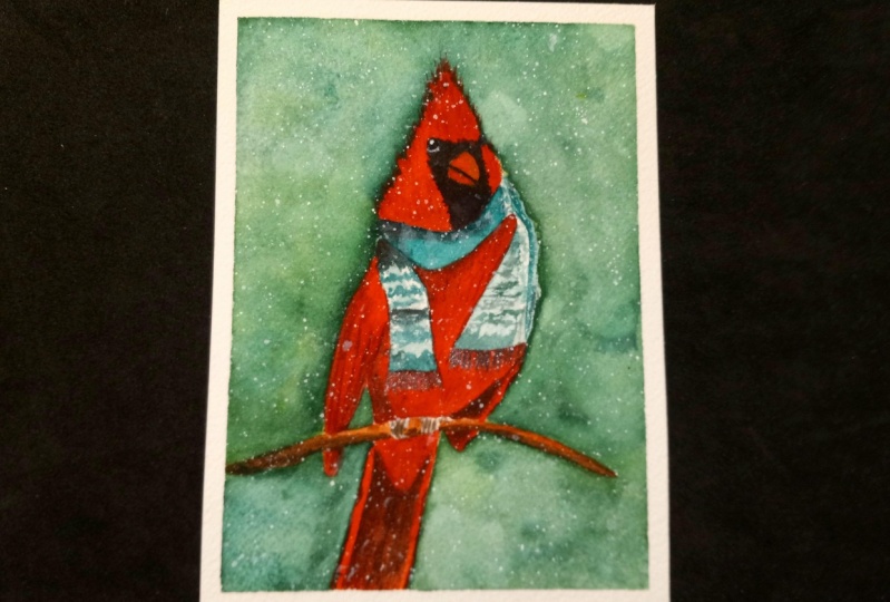
11. Day 10: Red cardinal: Welcome. Today we are
painting now that cardinal, this is the cutest winter birth, and our bird is going to
wear at Christmas sweater. First I want to mark the main two circles of
the body of the bird. So the body of the
head to make sure that the bird is sitting
in the middle of my page. And that it's not that it's
everything is proportionate. So the bird is in the center. Now I can define the outline a bit more
clearly with my pencil. Feet, weighing. And that little link over here. Then a little tail. Now I'm drawing the face. He's got a pretty big beak. Here will be the black part. And I will draw the scarf. Going to cover a
lot of his body. Maybe a little shorter. Alright, so now I need to remove all the unnecessary lines. Don't forget the branch
the bird is sitting on. Alright, I think everything
is proportionate. And I can move to
watercolor part. I will start with a
nice warm red color. Will actually, I'm using
this new color from Rosa, flame red, which
technically is orange. The pigment to pigment inside this paint is a
pigment, orange 73. It looks like red with
some orange tone in it. And if you don't have it,
you can take your red, whatever red you have, and just add orange into
it to mix your own color. So on the left side of the head, I put this flame red. And on the right side, I put bright red. And I mix again
with the flame red. Just to have a nice variety
of warmer and cooler. Right colors. I carefully go around the eye and
also the beak. But the black part. We will be able to paint over the red so I don't
need to worry about it. The top of his head
is really cute. So I mark it with
a thin strokes. Paint around the beak. Right now. I covered the whole area because I
know that later on I will be able to paint
over with black. So I take my flame, flame red again, adding some bright red. Here's the branch,
so I keep it white. And they're tip of the tail
of the wing is over here. I will get some blue and mix it with orange to
get some sort of gray, dark, dark gray tone for
the inner side over here. And I'll add a little
bit on this side. So just to let it
flow into the wing, I work out the details
of this wing later on. I just wanted to put
the first foundation. Right now. Just
remove the dark tone. I think it's taken
too much space. I just want it to
be on the side. Then there is the body. I'm, I remember that I
have this curve over here, so I need to be careful. The feet here inside the color is much darker
because it's in shadow. So I add a little bit of green into my red as its
complimentary color, like you already know. To make the color darker. And with my flame red, I continue covering the
bailee of the bird. Carefully go around this curve. Here right under the scarf. I'll put just a little
bit of a shadow. And I need to finish the tail. But here is the bottom
of the body of the bird. I need to wait for it. You can try so I
can add the tail because it's darker
and I don't want the dark color of the tail
bleed into this light part. We also have a wink, which I will add later. For now, I need four. The bird. To get dry. I'm using black color, but I will leave white highlight to show the three-dimensionality
of the eye. And the overall shape of the
eye is more like a teardrop. I don't want to make the bird
look like an angry bird. So I decided that the
shape will be a bit more rounded rather than a
straight line on top. Right away I'll mark some of the black area around
the beak of the bird. And this is also an
opportunity for me to correct the shape of
the beak if I need to. Carefully go down all the way to where the
scarf will begin. Right away for more
realistic, feel. Our bird, I'll get a
darker tone of red. To paint the shades. Here on top. This weird shade that separates the head here under him, but just a little bit. The same darker tone. I will create the
texture on the wing. I will mark the outer line of
the tail, which is lighter. But the inside will
be in darker tones, which I will paint
a little later. Actually, I think I will
do it a bit differently. I will cover the whole
area with flame red. Drop some bright red as well, and just leave it to dry. And later I will add
darker tone on top of it. Use it and layering technique. I'll also add the
wing over here. Always remember to
continue your line. I'm under the branch because the wing doesn't disappear just because
there is an obstacle there. And with darker tone of red. I'll paint the shadow inside
the wing of the bird. I can also paint
the beak right now. I'll start with a flame red. On top of the beaker. I'll try to leave a
nice light highlight, highlighted area. It's almost white. And then I'll add
red in the bottom. And I'll just let
the colors blend in. A bit more dense shadow
inside of the wing. Over here. The scarf
will be green. I'll mix a darker tone of
green for the shadows. The rest of the scarf
will have patterns. But I'm not going to draw the
actual image on the scarf. I'll just leave some
areas on Blank and with dot like moves, I will create a feeling
of the pattern. Right under where the parts
of the scarf is showing up. There will be a bit darker
shadow, darker green. I'm pointing it out right away. Here on this side, the scarf is a little bandits, so it's gonna be a little
bit more in a grayish tones. There is a shadow on it. So the white color is not pure. And this part of the
scarf is more visible. It's a bit folded. There's some textures,
some patterns on it. Here where we see it folded. I'll add another shadow, and I'll leave
this part too dry. Meanwhile, with brown color, I will paint the branch and with a darker tone of brown. Now I add the shadow immediately while the
branch is still wet. I can also paint the inside
of the tail over here. The book, I will carefully
mark defeat of the bird and also marked a dark area
under the branch once more. While I was doing all that. This curve cut dry
so I can continue working on the patterns. I'll finish in the same way as the part of this
curve here on the left. With white gouache,
I will carefully add patterns here on this curve. Then finally, I will mark the
texture of the tail inside. Also on the beak, I need to separate the
top part and the bottom. Very, very carefully,
making our bird smile. Am, that would be the lesson of the day.
See you tomorrow.
12. Day 11: Lantern: Welcome to day 11. We
are painting a lantern. In this painting,
the tricky part is going to be actually
the drawing part. And make it easier for yourself. You want to imagine this
Lantern as simple form. E.g. the tip of the lantern can be a pyramid without the dip. So if you start building a pyramid and let's
say it goes up, the lines go up and they
meet somewhere here on top. But we didn't finish it. So we just need to make
the roof over here. Here will be the
side of the pyramid. The wall is gonna go up. But for us it's just a line that helps
us to understand it. We're not going to
actually keep it. Then from here, the
size of the Lateran. And here we'll have the bow. He and I will also add some
branch from the pine tree. So now I need to finish the
inside of our left turns. And the inside of it. They're actually going to be
the light, the light bulb. Now I'm just adding the
details of the lantern itself. The tricky part that there
will be darker lines that are outside and more muted colors inside of the lantern
because the light, so we need to account
for all that. One we're going to
paint with watercolor. This time, this painting, I will use wet on wet technique, but I will apply clean water
only where the Lenten is. So I will cover the first half of the sheet may be a
bit more than a half, but I don't really need
to go all the way down. The reason for it is
that I want to create a soft light or that
the lantern is shining. And for that, I need to lay down the first underpainting
for this postcard. And I will use a
nice warm color, cadmium yellow in my case, and apply it in the heart of
the lantern in the center. And create some sort of a
circle going all the way outside of the lantern that
will resemble this shining. The goal here is to achieve this very soft light layer
without hard, sharp edges, which is possible
because of the wet on wet technique, the wet, the wetness of the
paper allows me to have to paint the circle
without the sharp edges, without the outline
of the circle itself. So now that we lay down
the first underpainting, I need to wait for
it to get dry and then continue working
in layering technique. Now that the painting is dry, it got a little bit lighter. And we can see that the
middle of our lantern, the light is very bright
and concentrated. And as it goes outside
of the lantern, is much lighter and diluted. And I want to make sure that
there is no sharp edges. So you don't see the actual
circle that I was painting. And if you do see the edge, you can just remove
it like so with the wet brush and it
should go away easily. So now I want to
paint the top of our lengthen and I will
use two colors for this. Requires is nice blue color with a green undertone or reverse green color with
blue undertone in it. And I think it's a
really nice color. To portray the lantern. On a side, I will rather add
a column called blue color. The frontal part of the tip of our lantern will
also be cerulean. As I'm painting it
over, a yellow. Yellow is shining through
and it also gives us this green tone. I will make a darker tone of my turquoise color
by adding red. And I will create a shadow
over here. On the side. I also got this cauliflower, which I don't really like much, so I will cover it by applying
a fresh layer of glass. But I still need to refresh the shadow that I created
in the beginning. Just like so. Well, this part is getting dry. I want to work on the parts that are
inside of the length and they are yellow because of the older light than
the lender and shines, but it's not a pure yellow
color is rather orange. Orange with a mix of brown even. So, I'll take her hemoglobin, gold and work inside. So here's the inner side
of the lantern shining. And because this is
supposed to be black, I'll add a little bit of brown
texture here and there to make it look like
the darkness of the actual literal color
is shining through. But it seems to be
yellow because, or because of all the light that the lender and produces inside. I'll also paint with. She looked good on gold. And I'll mix it up with
brown, burnt sienna. Right away. I'll add bits of blue into my brown
to make it darker. Following our color
mixing rules. Just make sure that your
colors are not too bright. Because you need to
imagine that this part is behind the glass and
glass of the lantern, so it can be very
crystal-clear and vibrant. Here in the bottom
it's a bit darker, so I'm adding tiny
drop of black into it. While I was working
on this part, the top got dry so I can
continue working on it. I take the same took was switched due to rule
them here on the side. And paint the top. While we're here, I'll get slightly darker tone and drop it in the bottom
of this little dome. Then finally finish
with a string. I also add some elements to
make it look more realistic. With the darker
tone of took was. I want to show the textures. Now we can paint. I'm using bright red and laying down the
first layer of the bot. Remember to keep the color
very concentrated so you don't need to reapply it once more. I can also grab some
yellow and drop it here on top because it's only natural that the lantern is
shiny and the yellow light on our bot with a darker tone
of red mark the shadows. Here to show the realistic
side of the bowl, we need to play
with the contrast between light and shadow. Now on each part of the bow, I will add darker shades of red. Now I need to leave this
bowl to dry before I add the final touch with the darker stone to separate
each part of the bow. Meanwhile, I'll take a very
concentrated black color and I will finally
finish our lantern. It's very delicate work. You want to make sure
your lines are straight. Now things are
coming up together. Make sure that
your black doesn't get to light and to kind of
grayish when it dries up. For this, you need to make
sure that it's a very concentrated when you're
first applying it. And since I already have black, I'll grab a little
bit of red into it. But it's still mostly black. And we'll just separate
certain areas of the bow here. Now, I'll just paint the
branches of pine trees. And we'll be done for today. I start with yellow first. Again to show that the
lantern is dropping light, yellow light and
everything around it. And then I'm switching to green. Alright up our mix, a darker tone of green
and in red to it. And work on the shades. While the first green
layer is still wet. Under the same on the left side. Again and darker tones. And that's it. We
are done for today. See you tomorrow.
13. Day 12: Christmas gifts: Welcome Today 12th, we're
painting Christmas gifts. And the challenge of
today's painting will be to actually work in perspective. And because basically every
gift box is a built-in clock, almost like a building
cubes in geometry lesson. So first, I will mark generally
where each box will be. So I can think of
the composition. Somewhere here. I will place a
little intro. Here. I think I'll have a bigger box and a smaller one
right in front. And to make this a
little bit more festive, I'll also add
Christmas ornament, Christmas tree ornament,
little balls here. And here. Here I can place a little star, maybe one toy over here. And maybe that's enough. So now that I have approximately figure out where each of
the box is going to be. It looks alright. Maybe this box should
be a bit longer. So there's equal distance
between the subjects and between the subject and Yan to the end
of the postcard. And now I will need a
ruler to actually figure out how those boxes
should be built. Every box is located
in different position, which means that we see each
box from a different angle, which also changes the way the box is deformed
because of perspective. So e.g. if the vanishing
point somewhere here, this is the imaginary
horizon line, I'll draw it right on my table. And if this is the
vanishing point, then every line should meet
in that vanishing point. Because every box
has different angle. Each box will have its
own vanishing point. So we can't use the
same vanishing point for each box, unfortunately. But it also makes our painting
much more interesting. So one box is ready. Then let's, let's
draw the small one. E.g. if the bottom like this. And let's say I want these
lines to go away this way. The vanishing point for this
box will be somewhere here. Every line of my books
will meet there. Now, here I have the bigger one. I'll draw the
bottom lines first. The sides connect them. And let's say the
vanishing point for this box somewhere here. So now I need to connect
every corner with it. We have a couple of boxes left. So one is pretty long over here. And I wanted to make it a little bit more
complicated like this. This is going to be the bottom and the vanishing line for this one. It's going to be here. And because of this choice, the side of the box is
pretty much invisible. It's very, very thin over here. This side. Superior thing because
of the perspective. Finally, there will
be a box on top, but I need to clear up
some space for it first. This box is going to be
sticking out somehow this way. And it's going to, yes, I think it's better if
the vanishing point is here. Alright? Maybe this part is going to be a
bit closer because it's touching this box. So I'll make it shorter. So now I need to remove
all these lines. Then. They don't
help me anymore. So somewhere here I will. Potent little angel. Just going to be a little toy. I think it's cute and
it fits the mood. And as I mentioned before, there will be some
other Christmas toys, Christmas tree ornaments, just to create the
ambiance. Alright? And now we can start painting. So the box here on the
left will be golden. You can even extend my
box a little bit further. So it's closer to this big one. Right away. I will add a tiny bit of
blue to make it darker. To show the shades on the side. I can't paint this
box right away because the colors are going
to bleed into each other. So I think I'll
work on this box. I think I need to remove the lines even more because
they're way too dark. And I don't want the
pencil line to be visible through very
light watercolor layers. So this box is going to be
Kraft, Kraft paper books. I will leave some parts. They're a little white to make it look like the
paper is glossy and shiny. I'll grab some burnt sienna. I just used a
Rosanna by the way, and switching to burnt sienna. I remember that I have
this toy over here. So the top undecided
or slightly darker. And there'll be some shade
from the toy as well, right under the toy. Just wanted to show
some textures on this craft paper in
which the boxes wrapped. And while those two
aren't getting dry, we can paint. The angel. Also need to make, make it lighter,
weight too dark. The angel's face is going to be light brown color or
maybe golden even. So I take quinacridone gold, and I also used a little bit of burnt sienna
in the beginning. Then. She's wearing red coat. And right up, I'll get darker tone of red
and create shades. Separate the arm. You know, paint the hat. There should be another
arm here as well. Alright, now I think I'll paint this
little box over here. And eight will be green. The darker tone now add
the shade right away. And moved to painting the star. I'm using cadmium yellow. Cover the whole star first. And then without even
washing my brush, I dip it into quinacridone gold. And just mark the shades on the style to show that
it's three-dimensional. Now, I think my first
box is fully dry, so I can also work on it. And it's going to be green. I'll lift the pigment
to make this glossy. Part. C, effect of the paper
with the darker tone. Show the shades right away. Also must be a shadow
under the angel. While we're here, I can also add some of the
details on the angel. Just separate the arms, the line of the
scarf, and the body. Maybe the head. Of course, paint the face. Remember to keep your read,
write and concentrated. Do not dilute it too
much with water. So you don't have to go back
and we apply more pigment. The front is ready. Now I need to get a slightly
darker tone of red and show this little shade in
the bottom of the box. And actually with the
same darker tone. I will paint the side
of the box here, especially where it's
disappearing at the back. Behind all those other boxes. It should be darker than the
color of the angel so that the colors do not blend. Mixed too much. I started with the light or
with the dark tone first and moved
here to the front. I think it's easier
to work this way. Then we can paint
the top of the box. And I want to leave a super, super thin line between
the top and the bottom just to show this glossiness
of the paper as well. I also remember that I have this Christmas tree
ornament here. So I need to paint around them. Basically using negative
space technique. With a darker tone
is also dollar. I am covering the
back for our box. And that's it. Alright,
so we have a couple of from Christmas ornaments
left to paint. And of course, we'll need
to work on the patterns of the actual gift. The wrapping paper.
Christmas balls are made of glass, so the highlight is very strong. And that's why I'm not worried
about blending the colors. I actually leave a very
bright highlight on purpose. Now this box lost its shadows, so I will refresh them. And I also didn't mark the shadows that
the boxes are dropping. The boxes and the toys are
dropping on each other. So I'm marking bits of
shadows here as well. Now I'm working
on the packaging, mixing different colors so that they are still in the
same color palette. I am painting those stripes. Will also add the buttons
on the paper itself, but a bit later. For now, I just want to finish the general feel of the boxes. The green one will
have the Red Bull. But painting over a dark green
color can be challenging. So I use a very thick red
pigment and the same here. Of course, the color
isn't going to be pure, but it's still very
clear what it is. There's also this guy
that I didn't finish. I'll make him green. There are also golden
tips on each toy that needs to be there to
be able to suspend our toy with a thick
black pigment. I will create the highlights and reflections on the bubbles on those Christmas
tree ornaments. And we know that when
we paint glass objects, the highlights a very strong and the and the reflections
are very sharp. And by accident, I got
a drop of water here, which is now completely
diluted my biggest box. And we need to save it. So I will quickly reapply red, trying to hide the cauliflower that is appearing. Right now. I think I think
I've done it. Okay. I was very close to
ruining the postcard. And yeah, that's a relief. I will mark some of the
patterns on the golden books with blue and with green. I will also create patterns on the box
that is in craft paper. So as you can see,
all the colors are in the same color palette. Very repetitive. And that gives a balanced
feel to your painting. And I'll start
painting the shadow, especially here in
between the boxes. It should be the
darkest, almost black. Then as we go out, it becomes lighter. I agree. This trunk diluted, dilute. Dilute the stroke immediately
and almost completely so we don't see the edge of it. And the final part
is to use gouache to finish the patterns
on the gifts. I finished working
on the patterns. It really can take time to go over each pattern to show it. So if you have the
time, go for it. If not, you can just keep your boxes in without
any patterns. It's fine. And I edit here to
our little angel. And that's pretty
much it for today. So I hope you enjoyed this lesson and I'll
see you tomorrow.
14. Day 13: Christmas cookies: Welcome to the 13 per
painting, Christmas cookies. I will locate three Christmas
cookies on paper. For now. I'm just quickly outline in it to let myself know
where they're going to be. And after that, I will spend more time on defining
the shape of each. This one. I think I can move it a little bit to the right. Yeah, I think this
makes more sense. And now I can spend more time on defining the shape of each. Remember that those are
cookies so they don't need to be in a perfect shape. Make sure to not make anything
sharp in these cookies, there should be no sharp edges. That won't look very
realistic considering we are painting cookies here. Okay? And the stuff inside, I won't be drawing
with the pencil. I don't think it's necessary. I will just leave it like this because the main guest of
today is my skin film. And I will mark all
of the white spots on our cookies with this masking
liquid to protect it. So I don't need to spend
time on painting around of each drop and pattern and whatever button they
will be on the cookie. And I can just safely
paint over it. Now, I will remove the lines. I will make them lighter
so they don't stick out too much through my
watercolors. And we can start. All right, To do this, you will need an old brush
that you don't really use. Another bucket of water, clean water, and that is not the same that you will
use for watercolor. And we can get some of
the mask and film on the brush and mark the areas
that we want to protect. It's safer to wash it every
time before you dip it again. Mass can film, will
destroy your brush. But if you wash it regularly, yeah, it might survive
for a bit longer. This is also why I'm using a separate bucket of
water for this painting. And now I can do them the same, but for other cookies. Alright, so now I
need to leave this to dry and we can
start while covering. The masking liquid is dry. So now let's save to start painting outside from
the one on the left. So it's easier to move
from left to the right. And I'm using burnt sienna. Just covering right
on top of all of the marks and spots that I
created with masking liquid. Here, I know that the cookie is hiding
behind the other ones, so I need to be careful. Maybe make it a little bit
wider over here. Right away. I can mix a darker tone of
brown by adding blue to it. And, and a little bit of
shadow here and there. Just to show the
three-dimensionality of the cookie. So while this little
cookie is getting dry, I can work on the other one so that they don't
touch each other. Even though they're
all the same color. I would prefer if they do not bleed into
each other anyway. I can play around and add different brown,
e.g. raw sienna. And immediately while this
whole thing is still wet, I will add darker tone of brown, just the same as I did
before with the heart. This time I will also drop this darker tone right under the masking
liquid to make look, to make it look like the
cream is three-dimensional. It's standing out and
also cast the shadow. And if some of your
strokes look dry, you can take your brush, wash it, rains that
against the tissue. And while it's
still a little wet, you can dilute the sharp
edges where you need. And now I just need
to wait for this to start to get completely dry so I can finish the
one in the middle. I continue with the same
colors using raw sienna. And right away I get
some burnt sienna. So why do I need to wait for this little star to
get completely dry? I can create some of
the shadows underneath. I'll get blue in the trend, blue at some brown into the same brown that
I was using before. I need to find the
perfect balance so that the color looks gray
and doesn't lead, doesn't lean towards
one or another. And carefully mark. Shadows. Also delete the stroke so it has a softer edge. I feel like this is too much, so I'm removing the pigment. And while it's wet, it's very easy to do. Just pick it up with
your semi wet brush. Here. It looked a little bit
into the star that I don't really worry about it. Maybe a little bit
over here as well. So it doesn't look
like those stars are hanging in the air. And the shadow here can
be a little bit darker. Since those are two cookies that are very close
to each other and the area in between
should be darker. So now I want to leave those
cookies to dry completely so we can remove
our masking liquid. The favorite part of
all of my students. Removing the masking film. Now, I will just finish by
adding the final sheets. So I mix a dark tone of brown. And now I will carefully
underlying every button. Every cream frosting that we painted and show the
shadow underneath. This will give us a feeling
of three-dimensionality. I'm placing those shades
on the right side. Because the light is
coming from the left and naturally drops the cast
shadow on the right. I would also need
to show some of the shapes of the main
star in the center. Maybe dilute some of the
sharp edges if need to. Also take a very, very light diluted blue and carefully drop it as
well on the white area. That we just freed
from the masking liquid to also
portray the shade. And instead of keeping
each creamy part, I want to show the
natural color of it, but portraying the shade side and keeping the
highlights just white, the whiteness of the paper. Well, I have the blue in my brush under the same
for our final star, which I'll not to cover
the whole thing in blue. It's only in the
shade, only a tiny, tiny part that shows
three-dimensionality of the cookie. And again, I'm creating this very thin lines right
under the creamy part. To show that it's
three-dimensional. It cost even a small, but still a shadow. Keep it limited.
Don't overdo it. Don't add too much
of the dark pigment. We still want to keep it light. I feel like this star is
missing a bit of texture. And here we go. We have our cute
Christmas cookies complete for today.
See you tomorrow.
15. Day 14: Elf: Welcome to day 14. We're
painting and its usual, I'll start from marking where my subject is going
to be on paper. And since it's only one else, he's going to be in the center, the main hero of our postcard. So here will be the head, maybe acute head, the body. And I want to make
him really long feet, wearing this very
typical alpha1 shoes. So the feet are going to
be long and that's why the body will be pretty
short, something like that. So now that I know approximately where my hero is
going to be located, I will mark the details. I'll start with the face. Here will be the eyes. Nose, pretty round. Nose in the smile. It's rather cartoonish. Nobody stops us creating
characters the way you want them will be pointy ears. The scar, of course. And long thin legs. I didn't finish this
curve over here. So the scarf of course. Hands, arms, the other arm. The other arm he
is going to hold, let's say a Christmas
tree on a stick. Here we go. Our quick little
sketch is ready. And I didn't really go
into lots of details like patterns on the coals and
stuff like that because all that we will create with
watercolor directly. I just wanted to see where all the main elements
are going to be. Maybe this shou should
be slightly bigger. Alright, now I will go over with the eraser to make the lines lighter because I push
the pencil really hard. So you can see the
sketch on video. And we'll start painting. I'll start with a
very light layer of raw sienna for the skin tone. And I'll apply it using
wet-on-dry technique. So directly with the
watery paint on the paper. On the face of our little elf. Yeah. I think that's
the only place where the actual skin is. And I'll just add golden hair. By the way, just made
it, make it flow. Using quinacridone gold. If it flow too much
into your brown, you can carefully
remove the color. But I kinda like that It's softly entering the area
of the face like so. While we're still here, I might take them a tiny
bit of burnt sienna, which is slightly
darker brown color compared to raw sienna. And I'll just mark the texture, or rather the shape of the ear. And softly separate the
outline of the face from the ears. Like so. And maybe just mark a little bit of the shades on the hair just to
show the texture of the hair very softly. Now, I will paint something that isn't
directly touch interface. So e.g. how about we
do the hat on top? And since it's Christmas hat, it will be, let
it be in stripes. So it's going to be red stripe. Nice concentrated. Red. I use bright red. Then there will be green. Concentrated, emerald green. As you can see, I
do it immediately. So sometimes the color will bleed into each other,
then it's fine. It's going to be the
same effect like we did with the socks when we were
painting Christmas socks. I kinda like that those colors are mixing and bleeding
into each other. In the best
watercolor tradition. Some of the greens I would
intensify right away, so they're nice and bright. My brush also doesn't
carry that much water. That's why the colors don't bleed into each
other like crazy. So there's more control over what's happening on the paper. I think I'll just
finish off this. The tip of the hat with
the grain like so. The front of the hat, I will mark with a little bit of blue on the sides to show
that it's white, but there is some little, a little bit of a shadow on it. So we show that it's
three-dimensional by using a little bit of
blue for the shape. Now I can do the
same with the scarf. For this curve, the
lines are going to be not horizontal, bud vertical. So I'll do red and then green. Then red again. They're part of the scarf that
is lower, like underneath. I will make it slightly darker. So it's going to
be darker shades of red and darker
shades of green. And because those two are
complimentary colors, I'll just one of each a
little bit to make it darker. So bits of red into green to make green darker and then
bits of green to red. To make red darker. This point, you
don't really even need to wash your brush. You can just dip it
into the next color. Changing the
proportions of red or green depending on which color
you need to have darker. Then this tail of the scarf. And I got really bored of
painting those stripes. So I think I'll just
finish the scarf with the larger stripe of green. And that's it. And also, you want
to take care of the shape or fewer scarf, more or less proportionate. And I'll also paint the
pads. There'll be green. Now. I will paint the face. I'll take what I had
and mark the chicks. And I'll also outline the smile. And with blue, I will
outline the shadow on the nose because it's
big and rounded. Then I'll go back to
my burnt sienna and go ahead and mark the
hairs. Once more. The ears, the circle the nose. The ears are even want to
show that they're pointing. Neutral black. I mark the smile and the eyes. I also want to mark
a little shadow that the shadow under the nose. Here on the side of the hat. The same blue. I'll also mark the mittens. And I will paint the
long legs in the socks. Dishonorable, not variety. Green and red because
it's way too long. So it will be just
red and white. Stripes will be
between red and white. Before I go further though, I would like to show the
outline of the legs. I should have done it before. So I'll take blue. And the second leg. I'll show the sort of a shadow. But also it will help me
to show how wide the leg is and give me an outline for the leg
so I can create stripes. So I'll leave it to dry. And while the socks or drying or thiazole,
whatever that is. I'll paint the rest
of his outfit. Here where it's
closer to the scarf, the red is going to be darker. And with the same
darker tone of red, I will show a little bit of
a shadow under the scarf. And here on the side. I wanted to start
to be bright reds, so add more red because I know it's
going to get lighter after it will get dry. So I'll make it concentrated
from the start. And of course I forgot to
add the other arm over here with the gray tone, which I will mix by taking
blue and add in a bit of orange into it to get
some grayish tone. I will mark the shadows
on the mittens. And now it's time to
finish the socks. It reminds me when
we were painting now caramelized Apple
with the candy cane. And we were painting those red strokes following
the shape of the game. So basically that's what
we are doing here as well. When we're following
the shape of the leg and creating
those red stripes. Now I think I'll paint the
Christmas tree out in green. Here I'm carefully outlined
in the ear of our ELF. And finishing the tree. By the way, I'll get
slightly darker tone of green and just mark shades. I'll get very concentrated. Yellow, just like we did
when we were painting wrath. And drop it to imitate
Christmas lights. Right here in the bottom. I will also finish
with the shoes. I want to make the outline of
the nose a bit more clear. Mike, so the same brown, I'll paint the stick. And now I just need to add
some shades on the show. And I think this will be it. And today's painting
is complete. See you tomorrow.
16. Day 15: Oranges and cinnamon: Welcome today, 15:00 A.M. we're painting dry
tangerines and cinema. For me than dreams are the
ultimate symbol of new year. And at home in Ukraine, usually for Christmas
time and new year, the House would always
smell tangerines. And I would always have like a kilogram of those at
home waiting for me. And I didn't know it. Associates with New Year and
Christmas for me personally. So I guess I'm biased. And painting the tangerines and cinnamon brings out some warm
feelings for me for sure. So a marking the
approximate location of my subjects here. There'll be star nice
and tangerine slices. But I think I'll put the
tangerines a little lower there, somewhere here, like so. And here will be
another star unease. Maybe a couple of smaller slices of tangerines and the back and the background, or the background and
here the foreground, just for the sake
of composition. Alright? So when I decided
on the composition, now I can go with the details. I'll mark the main
circle of the country, the main opening of the slice. And the second circle inside will show the skin
of the tangerine. Closer to us, the skin
is going to be a little wider and further away here, it's gonna be a little thinner
to show the perspective. And here will be the center. We're going to see
it pretty clearly because the tangerine
has dried up. And we're going to have this visible sections of
the venture in as well. Then the second slice will
be right here underneath. So I just mark this keen on the second entering and the
last one is on the bottom. We also see the skin of it, but not the actual
sections inside. Like so. And the star needs is going kind of lean on
this pile of tangerines. And well, basically it's a star. And the only
interesting part here is the little section inside
that looks like a boat. And that's what we're going to mark mostly with watercolor. I also mark it with the
best cell just in case. But the main job will be
done with watercolor. Then here on the right, I will mark my cinnamon. There will be another
star, nice on top. Now when I'm painting, when I'm drawing the front
of our cinnamon sticks, there's also some width to it, so I'm showing it
with the pencil. It's important to show
this width because it's going to ultimately show us the three-dimensionality
of it's going to show us the three-dimensionality
of each cinnamon stick. Alright, so each sort of cinnamon sticker is
outlined approximately. I have my approximate outline for the slices of tangerines
over here as well. And on the bag is
gonna be blurred out because it's somewhere
on the background. And I will remove the lines, go over with my kneadable eraser to make the sketch lighter
and start painting. I'll start with tangerines and I'll use hillock
ridden gold, nice warm orange color and applied everywhere
on my tangerines. The right side is
going to be slightly lighter and the left side
will be more concentrated. I'm also actually, I'll apply the same color on my everywhere
on all five tangerines. And this is going to be my
underpainting for tangerines. And I'll leave this to dry. And I'll do the same for
cinnamon with cinema now, also use quinacridone gold. I will apply pretty
translucent color. Pretty diluted with water. Everywhere on my
cinnamon sticks. Here on the side. I went
a little bit too far. And actually as we're here, we can mark the shades. And I'll take orange
and add blue to it to make it darker. To achieve gray tone. Is those two
complimentary colors create gray or brown if mixed
in unbalanced proportions. The closer we are
to the subject, the darker will be our shadow. So I will intensify
it right under the tangerines and then lighten it up as we go away. Immediately I will dilute the hard edge with
a similar brush. Also go between my
star nice and front. As you can see, I'm balancing
between my brown gray tone that is lenient
towards orange and some places or towards blue. So it creates this
intricate change of color. For our cast shadow. While I was working
on those shadows, my oranges then drains and we'll basically my
whole first layer to dry. So I can start working
on the textures. I'll take another
concentrated load of I cannot grade on orange, yellow, green, and gold. Sorry. Mark the insights of country. Work in some sort of triangles. So I mark one triangle, then I take burnt sienna, and I only make a small line on the edge to show the edge
of this specific section. And I'll do the same
for the next section. This way we're going
to demonstrate this very dried out texture
of Howard contraints. The next section I'm painting. I leave a super tiny
thin line in-between the sections that my
first light orangey layer is shining through it. And with concentrated brown. Again, I just show the side. You can also add a
bit of glue into your brown to make it darker, make it more spending out from the other colors
that we're using here. So it's more noticeable Excel. And I keep moving a little bit separated from the previous section
with a thin line. I'm not directly touching
my previous section. And I create again the
shadow with a darker color. It's important to wash
your brush every time you want to pick up
your orange color. Because you don't want to
bring the dirty brown into the first section that you're going to paint
with pure orange. Also, as I come
closer to the front, my section also can have a little bit of a
broken layer, so to speak, so that the first layer or
the whiteness of the paper, the first orange layer
is shining through. I'll also go ahead and finish all the sections with orange. Remember to keep each section separated with the
thin white line. When I say white,
I mean, the first, very first layer that we put with our light
transparent orange color. I'm going to take cadmium orange and outline the skin like so. And then I'll get concentrated. Burnt sienna and go again. If it's so concentrated
that it doesn't paint and it's super dry and it
breaks off. This is perfect. This is gonna give us
even better feeling of a dried out orange skin. Now, I will continue
with the same sections underneath the first slice. Remember to separate
each section with the thing On cupboard
and painted line. And also remember that there is a light skin in
front of us as well. And then I'll take brown, burnt sienna and blue and get it very thick
and concentrated. And I will place this dark color right under our first conjuring
to create the shadow. Now with a very concentrated
brown, burnt sienna, I will outline the skin
again just like we did with the first circle
with the first lies. Then again with the
darker tone of brown. I want to go over the skin
of the circle of the slice. That isn't the
very, very bottom. It's going to be the
dark is because of all the shadow that those
slices are dropping on it. However in-between,
there will be almost black and also very
thick, very dense paint. That's going to show
the shadow between the last two slices
of tangerines. Now I want to leave
those injuries to dry because we will have
to come back and work on the textures to make it look more dried
out and kinda crispy. We only can do that when
the paper is fully dry. We are going to work on the cinnamon envelope,
burnt sienna. I'll start marking
a very bright color of our cinnamon stick. And I'm only mark
in the areas that are the darkest shadows. Also the top line. I want to I want to dilute
it to make it lighter. So it's not very sharp, It's softly transition
into the lighter color. And here at the back is
going to get much darker. So I'm using the same
dark brown here. And then again, I'll take a concentrated burnt sienna and only place it
where the shades are. Inside of this kind
of curled snail looking part of the
cinnamon stick. And again, the
sharp line will be carefully diluted
with a similar brush. Right up. I'll take the
darker tonal ground and the shadows
that we need here. And I'm doing it
immediately so that the color blends and smoothly. This is our technique. We work in layers. First we created
the lightest layer, that was our underpainting. Now we're adding a second
layer that allows us to see a bit of a volume
of our subject. Then we'll be adding the final
layer that will work out the details and also show
us the volume even more. Right away. I'm
adding darker tone. Let the colors blend smoothly. Using this approach,
methodically, we will paint all the rest
of our cinnamon sticks. One of the smaller
parts of cinnamon, you can blur the
right brown color to kinda cover
everything a little bit. Which will also give
us a special effect, special feeling of the texture
of the cinnamon stick. We're going to use it to
our benefit later on. So the idea here is
not to completely cover the first layer of
your pain to the new layer, but allow the first
layer to shine through. Then u1, the feature that
only watercolor can give us. I also want to take
a very light brown, almost transparent
and go carefully touching the lightest
parts of my painting. Specifically here on
the cinnamon side, so that it doesn't look
perfectly like yellow or brown. So the texture is a bit uneven. And now I'll just
keep it to dry. I will leave it to dry. Meanwhile, I will
paint thundering here. I use the same approach, but first I'll quickly mark the sections of the venture
in the narrow banded. I also leave white blank area
in between each section. While my sections are wet. I'm adding bits of burnt sienna. Extra. We also have this other slides of
tangerine and the back. It's going to be kind
of not in the focus. So I'm going to make it very, in a very loose
style, so to speak. Like so. Now the tangerines here got dry. So I can work on the vectors. I'll get very, very dry. Brown. It almost doesn't paint, as you can see here
on my palette. I'll make it slightly
darker blue. Or you can also add a tiny
drop of black if you want. But it's still should be. Brown is dominant. And I'll mark carefully
darkest areas of the slices of the sections which are painted in shapes
of little triangles. And the dryer your strokes are, the more feeling of a dried
tangerine you will get. You can also help
with your finger and just move the dry pigment. It also can stick out
a little bit into the lighter part of the skin to resemble the texture of the tangerine skin more
in a more realistic way. Also in a very hard, there will be a
tiny dip like so. So it looks like a
little volcano crater. Now they kind of ignored
our little star anise. So I will mark the
underpainting with very light grid on gold so
you can use yellow or orange. Another the same for
this little guy. The most important
part is to mark the shades in between
the cinnamon sticks because they are
piled on top of each other and naturally they will drop shadow on top
of each other. Here I also want to show
a little bit of a texture of sort of like, uh, would, would like extra are just a few strokes
and I'll dilute them so they don't
stand out too much. This one, I also
show this lecture, but also following the
curve of the steak. Here we go. The silicone
stakes are ready. Quickly mark triangles of
the tangerine over here. Now we just need to
finish any stars. Stars, the approach will
be the same. I'll mark. Shades with the burnt sienna first and finish
with the details. The shades would be on the side. And inside the little boat. You'll see what I mean when
I'll start outlining them. So first I mark the side and then the
little opening inside, ending up on the side. And like little boat inside. So now it looks like a kind of I'll leave this to
dry and meanwhile, I'll work on the other star. Nice. Here we'll see more of the actual opening
inside of our little boat. Now, I will, again makes a very dry and dark brown just
like we did before. It's a black and just detail. The darkest areas of star anise. So inside the opening, inside our little cannula, I'll quickly mark bit of
a texture for the phone. I'm dried tangerine
because it's in front. We see more of the detail. Then at the back. Here we go, our paint enough
today, it's finished.
17. Day 16: Christmas bunny: Welcome to this 16, and we're painting
at Christmas money. I'll quickly mark the location. A little bunny on the postcard. Binding is going to wear
Christmas hat, of course. And I think it's more or less
central and proportionate. So now I can work out the
details of my drawing. So here will be one
eye and other eye. The eyes are sitting pretty
far from each other. It's not like human eyes. So do not place the eyes
too close to each other. Hi ni knows. I'm also marking the
outline of the face. And even though the
binary is going to be mostly white with some drops of like
brown, orange color. I still want to see the
outline of his head. Here's going to
be the ear, body, too fluffy feet
and the back leg. And now I'll just
remove the lines that I don't need and we can
start painting right away. So I'll start with applied
clean water on my bunny. And I'll get the same orange I have been using
the whole time. She had occurred on gold. And very light, transparent, almost diluted with water, layer, will go
down on the bunny. On top of wet paper. I'm not painting with
yellow everywhere. It's going to be
weird. But I dropped some this orangey yellow
color here and there. Just to show the fluffy. The same time, I'll get
a bit of cerebellum. Also make it pretty transparent. Mark here at the bottom. And maybe the back leg. It's important that
your blue doesn't meet yellow and turn into green because we don't want
to have a green bunny. For that reason, you
can also use e.g. raw sienna instead of
yellow or orange so that the color doesn't contain
yellow in the pigment. There's no pigment yellow
in the actual paint. Now that it's done,
I'll get burnt sienna, but very light and transparent. And I'll drop some of
it here and there. Inside the ear, around the eye, above the eye on the
area of the nose. The cute little cheeks. And then clean the brush, rinse it over the tissue, and carefully soften all of
the strokes that I created to carefully integrate
them into the background, into the whole first layer. At this point, we don't want any sharp lines be visible here. Then again, with the same brown. I will mark a little bit of
I'll put a little bit of a brown layer right under
the head of the bunny. And then here on the
feet, the back leg. And again, everything is very
watery, flowing, make sane. Changing. No sharp lines nowhere. I'll get the darkest brown. And mark here at the bottom the area that
is between the legs. Under the belly. The one that we almost don't see
because of the shadow. Shadow. And also on
the back leg as well. There also will be
a little bit of a shadow here on the side because of the hat. Inside the ear of
the bunny. Outtake. Very transparent,
pink like ketamine or moderate, very diluted. And I'll mark here
inside the ear. And I'll just let it dry. Now, I want the bunny to be completely dry before I
continue working on him. So that's why I will
paint the red hat. I'll take a nice concentrated
red, bright red. Place it on the hat. Remember that red
can get very light, but we want our red to be
nice and concentrated. So make sure you apply a
thick layer of it right away. So you don't need to return
to this place again. Now, our bunny is fluffing. So I rinse my brush, wash it, rains it, and then carefully dilute
the sharp line over here where the hat is meeting
the body of the bunny. The other fluffy areas of
the hat also won't be sharp, so I will dilute them as well. This line where the whiteness of the hat meets the red part. I will make it soft and diluted. And since I'm here, I'll
just put some clean water on the whole area of the
white part of the hat. And then I'll get some cerulean, blue cerulean color
that I had before and just put it on the
head to show shades. And even though
the hat is white, the shades can be
marked as blue. Oh, Grey. Can get
some gray as well. Now you need to make
sure that you're binding is completely dry. And we will continue
working on the details. I'll take burnt sienna, add little bit of blue
into it to make it darker. But I want to make it
more towards gray. And with this darker tone, I will mark the
shadows on our bunny. So here will be a little
bit of a shadow on the ear, on the tip of the ear. And also inside. Then the sharp line that
I've got here on the side. I will dilute with my brush against the
darker brown that I mixed. And again, the darker areas, darker parts that I'm
adding now should be edit selectively,
not everywhere. Otherwise, our white
bunny is going to turn into gray bunny. Also. I'll mark the nose
and the cheeks. Over here. In right away. I'll add a tiny bit of the
same pink color over here. And I go again to mark
the firm. On the money. Here right under the hat is going to be a little
bit darker too, because the head is
dropping a bit of a cast shade on the
head, on the face. And it shouldn't be visible
everywhere under the hat. And with less watery gray color. I'll mark the feet. And with the light brown. Just want to mark the tiny hairs here and
there and everywhere. But by doing so, I'm showing that this money
is fluffy and certain. I'm hairs are more
visible than the others. The cheeks, I make a little bit more orangey
and standing out. Here, I've got cauliflower because I had too much
liquid in my brush. So I'm going to fix it by
carefully removing the pigment, the semi wet brush, and
spread it everywhere. I mean, not everywhere, but in this specific area of our bunny. And the way to work with
cauliflower says that you need to apply more concentrated
and dense pigment. It doesn't have to be dark, it has to be dense. So thick to stick basically on the paper and do not have
too much water in the paper. So that's why it's going to
bleed and flow everywhere. Now if you're sure that the
area around the eyes is dry, you can paint the eyes with
a very dry black pigment. The other, I make sure they
are proportionate. Same size. I'll add a little bit of a brown shade path
in here on the side. And again with the
black pigment, I'll mark the nose
and the mouth. The mouth is barely visible, so I'll do it with
light brown color. So the fluff here under the head is a bit darker and
this is the place, the part that's
going to separate the head from the
rest of the body. So I want to market once more. This way using negative
space technique to help outline the head and separate it from the
fluff of the body. And with a very dark red. I'll mark the shades on the hat. We already know how to create this feeling of folded material. We did that many times.
Paint in the bowl. I got a bit more
red to help dilute this dark tone without
creating cauliflower. Because otherwise, if I
will just use wet brush, there will be water in it and it will create
a cauliflower. And we can avoid that. Now I'm going to take a
rigger brush with a very, very thin, delicate results
and get some black, very dry. And I'll carefully
create the whiskers. And I also get
lighter brown color so that the whiskers
are not so dark. And add some more. So they're not like
super dark black. I also don't like how
here the black is. The black created
a spot like that. And I will carefully remove
it with water and tissue. But it's a dangerous affair. So if you're not sure your brush can create
thin and delicate lines, better not to, but
I'll just skip this step and not
paint the whiskers. I'll also add a few
details on the feet. Just to show that texture. I'll add a couple of
strokes with dark brown to show some hairs again, like I did before. And completely forgot that
other one is flying there. So I'll get dark brown
and create a shadow. Remember that the shadow
is the darkest in the area where it meets the subject. And then gets lighter
as we go away. And now we're done. And
I'll see you tomorrow.
18. Day 17: Christmas candle: Welcome to the 17th, where a painting,
Christmas candle. I want you to think of the
length of your candles. The candle should
start somewhere here. Closer to the top of your paper, of the paper edge. It's going to be pretty small. And then the in the bottom
there will be some decor like raspberries or pine cones, maybe a Christmas tree, needles. So now I will make the
outline a bit more clear. Remove the lines
that I don't need. In this sketch. Here in the center, there will be a candle awake. We already know how to paint soft light that's coming from the lantern
in our previous, one of the previous lessons. And the idea will be pretty much the same for
the candlelight. So now that the elements of my sketch or
pretty much clear, I can start multicolor in, and of course I'll remove the
dark lines before I do so. Just like with the lender and
I will start from placing clean water first in the
area of the candle week. And I'll also cover
our candle just a bit. I don't need to go all the way down or cover the whole paper. And now I want to take a bit
of heterochromatin gold, a color that is in-between
orange and yellow. It's pretty light
and transparent. And first, I'll place
it on the candle. And you see how
transparent the color is. Very light and gentle. I don't want to go outside
of my candle width. And here I will
create a soft circle around our candle week. So in the middle, it will be pure white and only yellow shiny
in spreading outside. I can make this orange color
a bit more concentrated, closer to the candle, week, to the light itself. And as it spreads away, it becomes lighter
and lighter and more transparent and
eventually disappears. So this is one of the
most important parts. It's done and we need to make
sure it's completely dry. Before we continue. I used a hairdryer to speed
up my drying process. Took a couple of minutes, and now I'm ready to continue
with bright red color. So Britain light transparent. I will start applying it. Here on top of my light, he levied on gold. And you see the beauty of
watercolor. In action. You see how light yellow color, orange is shining
through the red. Showing this beauty of
transparency of watercolor. Now the side of the candle
will be more concentrated. Red, less water, less diluted. So feel free to load
your brush with a pretty thick red color. On the left side, my red
will be slightly darker. There'll be a bit of a shadow. So I get a little bit of green into my red
to make it darker. And also dollar, there's also
the beginning of my core. And on the left,
the red is lighter. Fossa here you see that because
the layer was still wet, the color touch the
wet area and bleed. That's not a big problem. We can always smooth out this part with
the soluble brush. I'll also mark the center
from which they can. The weak is burnout with
a bit darker red tone. And I'll show bits of texture
here on top of the candle. Again once more, we need to
wait for the candle to get dry so we can continue working on the rest
of the painting. Alright, I will continue
with painting berries. And I'll use cadmium red
instead of bright red. And you'll also see
the difference in the temperature for
those two red colors. First, I lay down the main, the main first underpainting
for the berries. Now I can make this
red darker and work on the shades in
between the Paris. You need to find a balance that the color is not too dark. It doesn't look like black, but still dark enough to see the separation
between the barriers. Now I want to take a green, I use emerald green and mark the green
parts of our decor. Again, this is just first layer. Of course we're
gonna be back and work on the shades here. I just wanted to mark where those elements are going
to be in the first place. Now, I'll put the base
layer for the pine cones. I'm using raw sienna. And right up, I'll get
some burnt sienna. I'll drop some of the
paint immediately to show the shades and the textures, an even texture of
our pine cones. And the details will
be worked out later in the layering technique
when it's going to be dry. Now it's more clear where
all the elements are. I can finish up with the berries where the darkest
red, I'll add some of the barriers that are less visible and also
darker because of the shadow that's
being cast on them. One more time, we need to
leave this painting to dry completely so we can finish off with the final
shades and details. As you can see, my red
color became pretty dull and not as
bright as it was, which is typical for watercolor and especially
for red paint. So that's why I will refresh my layer and also use
this as an opportunity to underline this edge of the candle and make it
stand out more clearly. So I get a very concentrated
bright red or bright red. And start at the rim of our candle and pull
the color down. Now this also helps me
to create this texture of the candle that is kinda dry. Not perfectly smooth. I got a bit darker tone as well. The most important
part here is that your paint that you are applying now on top of
existing layer is not watery. If it's watery, if there's too
much liquid in your brush, it's going to pick up and
delete the previous layer. So you need to
make sure that you refresh layer is
thick on your brush. The paint is thicker
on your brush. And I'll mark the
center once more. And some of the cracked parts. They can go here in our
flat area on the top. Now I want to take a dark brown, burnt sienna mixed with
blue or even black, and go over the pine cones
to show their texture. I go here is not to
be hyper-realistic. I just want to create this feeling of the subject
that I'm painting so that the person who is looking at the painting can immediately
understand what it is without me having to outline and detail
every little thing. That's why. Working on
shades and shadows. The subject is the way to go. By creating the contrast
between shadows and light. You can create
volume and also make the subject familiar so that the viewer can immediately
recognize what that is. I'll do the same for the
berries, again, darker, darker, red, and create the shadows. Especially in-between the Paris. Now we'll do the same
with the green part and in shades to our branches. And I left it for the end. Because using green, I
can fill out all the gaps and connect all the
elements together. Because in the end of the day, all of them are sort
of hiding and mixed in specifically with the
Christmas tree branch. So grain here is sort of a
uniting color and uniting element for all the
parts of the decor. Here in the bottom, I just want to create a
sort of very light feeling over shadow so that our candle
is not flying in the air. I'm using green for it, which is not typical for my
usual cast shadow color. But I feel it's, it resonates nicely with everything
that we've painted here. And finally, I will add a very, very transparent stroke in
the bottom of the light, diluted so it's
almost invisible. Then you want to give it a
couple of minutes to get dry. And then we will take a very dry black and actually
paint the candle week. And so all the elements
are connected. There's no white blank areas
between the barriers or pine cones or the branches
of the Christmas tree. Everything is united. A. And now, I don't think there's
anything else to add. That's why we are finished with today and
I'll see you tomorrow.
19. Day 18: Hot wine: Welcome Today 18, we
are painting hot wine. This painting is
actually going to include every element we
already painted before, like slices of oranges
and cinnamon stick and start a nice So
we already know how to paint all those
things separately. And today we're
going to unite them in beautiful mug of hot wine. The view is a
little bit unusual. We're going to see
it from the top. So in perspective, that's why the proportions are
slightly distorted. So the opening of a lag, of a cup will be
an distorted oval. The bottom part of the
oval will be a bit more open and the top will be a bit less. Now, the shape of the mug
is pretty interesting. It's wider here, and it becomes more
narrow as we go down. Here. On the side, there will be a handle. Alright, so now let's
fill it up with foods. So there will be a
big orange slice, then another orange slice and cinnamon stick. It also could be some berries or cherries floating in a glass. But the most important
part here is to nail down the proportions
of the cup so that the rim and the both sides
of a mug, our proportionate. Actually it's a glass
cup. It's made of glass. So that's why we
also need to pay attention to the
reflections of the glass. I will mark some of them
with the pencil here. And we'll have a
pretty big fraction here in the bottom as well. And maybe on the rims. Also remember that just
because the elements of our hot wine are
disappearing into the wine, it doesn't mean that
we don't see them were still able to see them
through the glass, but they're just a
little bit distorted. So when you paint your or
draw your orange slice, e.g. it doesn't disappear here in
the rim of the glass tube. It goes further away down. It's just a little bit
deformed because of the perspective and also because of we see it through the glass. And the same goes
for this slice. It still continues
here inside the bug. So now I will remove
my sketch lines so they are much lighter
and start painting. First, I'll start with the
market in the highlights on the gas and the one
that will become refractions later
with a very light, almost transparent blue
color in I'm using sodium here on the handle, here on the side just a bit. And under him, first, I want to put clean
water. Like so. Then I'll get codename yellow. And I'll just put
it on the edge of my orange orange skin. And I'll also go
inside of the glass. Now, I want to dilute some of the edges so that they don't go too far into the
whiteness of the skin. And maybe with some
quinacridone, gold or orange. I will add a little
outline just to show the color better so it's a bit more concentrated and
fits well for this game. The same for the other one. I'll add a bit of more concentrated
orange on the skin and especially in the area
behind our star needs. Because it would naturally
drop shadow on the skin of our orange because
it just behind it. And also continue into the mug. Now I want to paint
some of the sections of our orange the same way we did it when we were painting tangerines in one
of the lessons. So remember that each
section represents triangle. Here. Of course we
don't see the triangle because it's hiding behind. It's too long. And we don't see the
rest of it behind the other slides, but
we know it's there. We also need to
leave a tiny, tiny, tiny white line uncovered with pigment in between
those sections. They're also much wider
than the ones that we usually see in tangerines. Right away. I'll get a bit
of burnt sienna on my brush and put it on the
top of my segments. I'll dilute it so it
doesn't look too sharp. And with the darkest tone. I will show the
shadows here as well. Just as a preparation for the final detail that
we will do later. Here, actually, I'll cover the whole thing with my yellow, cadmium yellow because
it will help me to work on the starter Nice Later. This is the color that's
gonna be my base anyway. So. It will help me along the way. Then again with burnt sienna, I'll just drop a bit of a shadow and marketing
detector of those triangles. While I was working
on this slides. The other one got dry so I
can paint the cinnamon stick. I'll lay down my first
layer with a yellow. And I'll add bits of
shadows with burnt sienna. And of course, the
rest of the shades and details will be done when it's going gonna
be completely dry. Now, I'll take metal
red, pink color, and I'll add bits of green into it to greed,
much darker tone. Following our color mixing rules by adding
complimentary color. And now I achieve nice
and deep Bordeaux color. That will serve
perfectly for us to paint the hotline
inside the cup. However, before I apply
the darkest color, I'll start with pure
red, pure pink. And I'll mark some of the berries here. I'll have them highlights. So I want the ink there. I'll quickly remove it
by diluting it with the brush and picking
it up the tissue. Alright. So the
pink color will be here outside of the rim and we will see some
of the wine as well. Catching the oranges. Then the berries, cherries. I'm gonna be here. Here. Here. I remember that here there's the
rim of the mug is going to be highlighted a lot. So I'm trying not to
cover it with my red. Now, I'll can slowly
introduce my darker mix. For the wine. The
Bordeaux color. So I keep this area without any paint and work under
the reign over here. With light pink, I will cover this slice of the part
of the slice of orange. So you still see the orange, but it's still
shining through them, but it's it's mostly pink. Here around the handle. I also keep some areas white, resembling the
reflection on the glass. And we are using negative
space technique doing so. We could of course, cover
it with masking liquid. That would make that
would make things easier. But there are more ways to paint then just covering
things with Muslim liquid. So sometimes it's
more interesting and challenging to
just paint around. Here also, I'll carefully
show the highlight. But it still will
be much tighter. It will be lenient towards purple because blue
with pink gives you a purple. However, still very light
and transparent like so. Alright, here in the bottom, we also have some reflections on the mug, teacup. I will just mark it with a
very dry dark pink color, leaving white stripes
of paper in-between. And every time I'm drawing two or three lines
strokes with my brush, that is almost not painting
because it's so dry and leaving some
broken line so that the whiteness of
the paper shines through it in this will visually create this feeling of a
reflection on the glass. Now with a very light pink, I will create a soft
line here to show another shining on
our reflected area. Here, I forgot to
smooth out the red, pink color of the wine that
is touching our oranges. And now add a darker
concentrated tone as well to show that the wine
is visible here. And it flows into our oranges, as well as here. In-between the orange slice
and the cinnamon stick. The trick about painting
fractions on the glass is that the reflections
are always sharp. That's why I'm not worried that my edge over here
is pretty sharp. I can smooth it out
so it's more rounded. But other than that, the nature of reflections of
the glass are always sharp. So you don't have to worry about soft lines and
soft connections. Now I get slightly darker tone of brown of our burnt sienna. And I'll just work on their
details and textures. Now with black color. I want to work on the
reflections on our handle. Here is interesting
because it's transparent. We can't just leave it white. We need to show all the
other colors that are actually reflecting that are
reflecting on this handle. That's why I'm using bits of brown that is probably
from the table, e.g. and bits of red that are
reflections of the actual wine. This is the last time we need
to wait for the paint into before we try and finish
with the final details. Now the fun starts
when we are adding the final highlights on our
painting with white gouache. With the rigor brush,
which is very thing. I will mark all the
white highlights on the glass, the glass cup. And it will really
bring it to life. This is the part that
really will make your glass texture stand out. We need to put it on the rim. Then a few highlights
here in the center. Maybe under one of the berries. Then important here
around the handle. Then here bottom of the cup. Also use this
opportunity to mark some of the textures on our orange. Also little highlights
on our starting knees. Not everywhere, just
didn't few places. Now, I dilute my gouache. So simply too watery. And I'm placing a few
spots here and there. But they need to be
a bit more rounded to show that there
are some other barriers inside the cup. We can also use the lifting technique to
literally remove some of the pigment and reveal
lighter color of the paper. The first lighter layers
that we put there. And this will also make
it look like berries. So to recap, painting, reflections on the
glass objects. It's always about
the contrast between a highlight and shadow. Even now, I place
the black paint is trope almost under the white
stroke to white highlight. To show the contrast between white highlight and
this darkest area. Also quickly mark the bottom to show the shape
of the cast shadow. And it will be dark brown color. It will also help you correct. E.g. the shape of a handle. If you need to. I would like to make it
a bit thinner. Like so. By creating the shadow, we have the chance
to fix the mistakes. Basically using
negative space picnic. I'll soften the edge. As we know that the cast shadow, the shadow is the darkest in the area where
it's directly touching the subject and as it goes away from this object,
it becomes lighter. The lesson of today is complete.
20. Day 19: Nutcracker: Welcome to the 19, we're painting and Nutcracker. I sketch his head
somewhere here, considering that he's
going to wear a clown. That's also going to take some space in the top
part of my paper sheet. So I need to account for the
space is going to take away. I don't want my subject
to be too high up on the page or too low. So it's always important to
think about decomposition, where your hero is
going to be located. So I'm briefly marking the face, like the mustache and
the mouth, beard. And then the elements
of his clothing. I think this part
should debit writer. Now I will make my sketch
more defined. I'm unclear. I guess the teeth, the open mouth is the most important part of
the Nutcracker painting. Oh, maybe add some
hair on the side. The rest of the details will
be painted with watercolor. I'll start with placing the
skin color first on the face. I'll use sienna. And I cover the whole
phase of the Nutcracker. Avoid in the eyes and
the teeth obviously. That's the first
layer. I might add. Darker burnt sienna mixed right under the
ground as a shadow. And I'll start painting the crown but from the top so that the face has
the time to dry. The top of the ground does
have golden color in it, so I removed the pencil
line specifically there. I outlined the ground with
the yellow and I'll also add some yellow stripes here
and there on our king. So those places should be
clear from the pencil line. So I'll grab the eraser
and remove it as I go. But it's not really critical. For this painting. There will be some stones here, some precious stones, Ruby
probably, but the red. So it's okay if I cover the whole stripe
with yellow color, because red is going to
work over it anyway. Alright, so I located my cadmium yellow in most of the places
where I think it should be. And now I can
continue working on the crown with the red color. I use bright red as usual. So right away with a
darker tone of red, I'll add some of the shades
on the side to give a feeling of three-dimensionality
to the crown. Especially it would
work well right under the golden stripes and never will amplify
the red once more. While I was working
on the crown, the face got dry so
I can safely proceed with painting the hair e.g. and finishing the face. Uptake Van **** brown. And paint the curls. I can also paint a mustache. The beard. Opening the eyes. First with blue. And later on when blue will
be dry out at like iris. However, I will add the eyebrows and I will proceed with
painting the clothes. For now. I'm just coloring
the whole suit with red, and I'll add darker
tones later on. I run out of bright red, so I had to refuel
it real quick. Now, I will mix a darker tone of Fred working shadows right up. I place a stroke diluted. Also fresh layer of red
because it was too. Now anyway, how do the same shadow on
the right hand? The paint is still fresh there, so the color flows more freely. Now with hemoglobin gold, I'll add some golden touch and work on shades on the
yellow parts of my painting. Just to create textures. I'll add some decoration
on the ground. Because it's so concentrated. It seems rather black. On the painting. The darker brown, I'll add the textures
on the hair. Clarify the curls. No, fill out the
empty space here. So it's not white.
Looks more like. Just a shadow. Also add some shadows on the beard
and mustache off course. Pink color, red in my case. I also paint little circles
resembling the cheeks. Get very thick black pigment. Paint the iris to pain the teeth. More precisely to
create a line that separates the two rows of teeth. Um, I would rather
use a thin brush like a rigger brush to ensure
that lines are thin. Indeed. So refresh the shadows. And the precious stones
here with red color. And as I mentioned before, red is going to paint
or yellow, no problem. The final Dutch would be to get some white gouache
and add highlights. E.g. sparkles home the
precious stones on the ground. Maybe some sparkles on
the actual crown like so. You can also correct
the shape of the eyes. If you need it. Maybe highlights on the curls. And then some
sparkles on the suit. My Ruby's here are not dry yet, so I would need to wait for
them to get dry before I also add some of the
sparkles on them. I felt like the costume could benefit from additional details. With a very concentrated yellow. I will add some
drawings on this suit. But the trick here is to have a very concentrated pigment. Otherwise it's not going
to paint over red color. With the golden color.
Kindergarten Gould. I'll outline or create a shadow under the precious stones to make it look
three-dimensional. Like if they're
standing out a bit. And I might add some details
on the crown as well. One does time I'll get
white and the sparkles. Finally, I'll add some
sparkles here on the tools. Alright? And the painting of
today is finished. I'll see you tomorrow.
21. Day 20: Letter to Santa: Welcome to the 20. We are painting a
letter to sound. We are very close to the hand of this advent calendar,
watercolor calendar. So I hope you have been
enjoying it. I sure did. It was very fun creating
all these postcards. And there's just a
few more left to do. So. The composition for this
painting will be a letter. Then a candy cane that is
lying on top of the ladder. And there will be a couple of
dried slices of tangerine, which we already
know how to paint. There won't be a Christmas
ornament over here. And maybe a bigger
one over here. And a little pike cone, pine cone over here. We see it as a flat
lay 90 degree. That's why it's just the circle because all of the details are going to be inside,
painted with watercolor. And there's really no point
for me to detail all of that. I think for the
composition, It's alright, maybe I'll add a tiny, tiny, tiny Christmas
ornament here as well to kind of balance
out the painting. And maybe I'll make, I'll make the actual
letter larger. Like so. And now I'll
remove my lines, make the sketch lighter
and start painting. For this painting, I will use wet on wet
technique and I'll apply clean water
everywhere on my postcard. After that, I would like to
lay down some light layer of blue as a background, but I need to be careful
for the blue color to not leak into the parts that I want to keep
white or yellow, e.g. the toys there will be yellow, the orange slices
obviously as well. And the letter will be brown. But it's better to keep it clear of the paint, the blue paint. So if you've got
some of the paints leaking into the area you want, you can just remove
it like so with the tissue and help yourself spread the paint. Like so. With the
semi width brush. Now, I need to let the paper
dry, but not completely. Just enough for the paper
to be still a bit wet. But not soaking wet. Which means that now, when I will add a little bit of a darker blue color
to mark the shades. The paint doesn't flow everywhere like insane,
like it just did now. But it will stay on paper
in a more controlled way. And this depends exactly
on how much water there is in the
layers of our paper. So now you can see that I'm
adding the paint and it's not flowing as freely as it
was in the beginning. And I'm washing my brush, rinse in it in carefully,
softening the edges. So that there are not sharp mark just a little bit here. And diluted almost
immediately to keep all of the lines smooth without
any sharp edges. As you can see, all the cast
shadow are on the left side. And this means that the light
is coming from the right. So we need to be
consistent with this, with where the shades are on
for each of our subjects. And now we just need
to let the paper dry. Now we can start laying down first underpainting
for each subject. So first, I will maybe
the first layer. On the pine cone. I use brown, burnt sienna. It's not perfectly rounded. Sometimes the circle, the
parts of the pine cone are showing out outwards. So that's why the circle
is not perfectly rounded. For the candy cane, I will lay, lay down light blue cerebellum and go all the way up. Like so. And under. Then I'll take a
hemoglobin gold. Or you can use yellow or orange, whichever color
you want to paint your Christmas
Christmas ornament. And I will paint the first layer and leave nice bright highlight
in the center. I think with burnt sienna, I'll just drop
shadow right away. In right under the
highlight as well. That's where the shadow
is most visible. Then there will be
another Christmas bow. And finally, the dry
slices of tangerines. I'll outline the skin first and then paint
little triangles. Remember to leave tiny white line
in-between each triangle. And do the same for
the second slice. Now let's think the candy
cane got dry so I can actually paint the craft
paper of our letter. We use raw sienna. This is my opportunity
to create the shape of the candy cane. And maybe I'll take a
bit of burnt sienna and just drop it
here and there to make a feeling that the texture
of the paper isn't even. So this is basically an envelope where the letter is going to be. Now we can go back and do the
same thing in this struggle and work on the textures
of each subject. So e.g. I'll get Van ****, make it slightly darker. I'll start with creating
the shape of the pine cone. So it reminds me of petals. And I'm adding one
petal, one-by-one. And basically go in circle. Every time I'm adding a new
petal in the root of it, the color is darker. And as the pedal goes
away, it becomes lighter. Now, I'll leave this to dry
and work on the candy cane. And we already know
how to paint it. Just follow the curve. Here we go. I also quickly get the darker tone of red too. I'll point out a bit
of shadow on the side. With the darker tone again, I'll mark the shadows. I will also quickly Mark
little thing that helps us do. The Christmas
ornament. Suspend it. Hallmark the shades
are here as well. And this one got out
of control. I guess. I'll just have to make
it larger. Like so. And again, with a sharp, dry stroke of burnt sienna, just like we did before. I'll mark the skin. And also a bit of shadow
here with the dark tone. I'll also take a
concentrated orange, the same I used before,
in a grid on gold, and leave some spots chaotically
to mark the textures on each section of our dry terrain. Now I want to go
back to my code, to my pine cone and finish showing the
textures inside. As I said earlier, we need
to show the contrast between lightest and darkest
areas of your subject. So basically the contrast
between light and shadow. To make it look recognizable. And to paint a
realistic pine cone is going to take
quite a lot of time, I'll say a few hours because of all the details
that you need to account for. That's why focusing on
building shadows will help us create the illusion of a pine cone without
actually going into details of building each as I call it the
petal separately. So to make it look
more realistic, we also need to show
this cast shadow from the candy cane and make it
a bit softer on the edges. I also want to take
a second to show the frost on the Banco. This will give a bit more of a Christmas spirit
to the painting. And at the same
time help us define the texture and the shape of the pine cone.
So it's a win-win. The painting of
today is finished, and I can't wait to
paint with you tomorrow.
22. Day 21: Christmas deer: Welcome to the 21. We're painting a
Christmas, dear. Yes. I'm not planning to leave you without the
Christmas dear postcard. This would be unacceptable. This is gonna be pretty
funny one though. Because here our deer is going to look at us from the back. He turned around and saw us. So we will see his
little cute tail. And on the back of our dear, there will be a Christmas ref, be some details and the bottom. But the point being that here's
the queue tail, the RAF. And there will be the legs
showing here. Right under. Our little deer is going to have a Christmas
worth hanging on the back of his body. And the details of that wrath, I will decide and paint
with watercolor directly. Of course, the antlers will be decorated with
Christmas ornaments, Christmas balls hanging from them in the best
Christmas traditions. And then I will need to lighten my sketch to prepare
it for water coloring. I'll start with applying the first layer of paint,
the underpainting. On my dear. There are some
white areas around the eyes and also
around the nose, which I intend to keep white. By simply outlining
with watercolor using negative space technique or
negative painting technique. And I'll slowly continue
building the body of the deer. Going all the way close
to my ref over here. Here I left a blank spot because this area
is white and I'll just lightly mark the
shades with blue Excel. I'm actually with the
same blue cerulean. I will also mark the
white area on top. I accidentally deleted
my previous layer, but it's okay. I'll
bring it back. And I'll mark the inside of
the ears with blue as well. I'll take diluted black
and just drop it inside to show the shape of the ear
and the shades inside of it. Here's this hanging ornaments. So that's why I didn't finish
the ear. I guess right up. I'll take burnt sienna, make it slightly darker with blue PM to work on the shades. On our dear. Pointed out the inside
of the ear once were. And I think I'll paint
the antlers immediately. Here inside. It's almost white, so I diluted, didn't finish
the line with my brown color. And now I also included it. Then I take one ****
which is a bit darker brown and the darker shade, especially on the
front. Over here. Here I have my hanging
Christmas ornament. That's why the space
is not covered. It's also a bit
lighter on the side, so I carefully
dilute the pigment. Then with the darker brown showing the curve
of each Sattler. Carefully diluting
the white areas so it's a bit softer
around the eyes. And now I will paint
the Christmas breath. We already know how to do this. Just plays green first
as the main base color. Gets darker tone of green. While the layer is still wet, I'll drop very
concentrated yellow and let it bleed and flow. Do the same with red. Since I already have read, I'll paint some
of the ornaments. For a finished painting, the inside, I need to
wait for the main circle. The RAF do get dry. Well, we can paint
something else. I can also carefully
being the eyes with fewer black color,
create little teardrops. Looks like a teardrop actually. Yeah, each eye. I'll mix blue with
my black to paint the nose so that it
doesn't look too flat. I can get darker tone
of brown and mark a bit of lectures of the skin of the four of our dear, no monarch. Shades on our Christmas bubbles. Just a little bit on the
side with a darker tone. And with the black pigment, I'll mark the strings on
which they are hanging in while, while I did that, I think this part is ready to go and I can paint the
rest of the body. I guess it's better if I painted the back before I
actually painted the REF, but well, good thoughts
are always coming late. Introducing a darker
tone of brown. Detail has cute white outline. That's why I didn't
cover it completely. I've finished. On the inside here we'll also see the legs, but they will be in a
grayish, bluish tone. So I mixed a bit of blue, dark blue, to paint flags
that are at the back. And I'm adding it right away even though I
know they're going to blend and bleed
with the current legs. But it's okay because I will later clarify the
details over there. To save the time on drying while this part
needs to get dry, I will work on this part to add white spots
and highlights. So we will need a little
bit of white around the nose, around the eye. Then under the nose
there's this fluffy part. Also show it. Hopes that happens too when you're tired. So you can remove the pigment with the semicolon
brush and the tissue. And here it's not a big
deal, just dilute it. Highlights on the toys. Imitating differ. I also want to correct the shape of the firm
here on the tail. Hey, now there's no other
choice but to wait for this part to be fully
dry so I can finish it. And now I only need
to finish the legs. Make them stand out a bit, separate one from another. What the darkest brown I'm
marking the shades on the leg. Also need to define the shade under the tail just a bit
more so it's more clear. Finally finish. The rest, waste the darkest elements. So we can point
out the textures. Maybe some pine tree the needles are sticking
out on the side. Here are really allow
my brush to go in different directions
without much control. And most importantly,
I want the shape, the outline of the rest do
not look perfectly rounded. I want to see some nibbles of
the pine tree sticking out. And finally, with the
super concentrated yellow, I'm adding the
lights on the left. And this is the postcard for today. I'll
see you tomorrow.
23. Day 22: Christmas car: Welcome to Day 22, and we are painting
a Christmas card. This iconic red car that associates with
Christmas time, I guess. For everybody. As usual, I'm quickly outlining
the main elements and location of the car. There will be, of course, Christmas breath in front. I guess I made it
a bit too narrow. The front window is
gonna be like this, much wider than the Mirrors taken out. You will see a wheel inside Christmas tree
sticking out as well from the passenger seat and
a bunch of Christmas gifts. I guess that was a
pretty quick sketch and I don't really think I need to change anything. So I will remove the unnecessary lines with my kneadable eraser.
I'll start painting. Of course, the iconic
color of the car is red. That I need to lay down
some of the basic layers to help us work out on the reflections and
shiny parts of the car. So I'll put bits of very
transparent blue lights as well. And on basically every part
that's supposed to be white. Also the main frontal window. And this will be something
that's going to shine through our next red layer and help us create more realistic
view of the painting. While my basic first
layer is drying, I will just paint
the boxes so that we save some time on drying. Don't have to wait for
everything to get dry. So I'll just make them
all different colors. But the right between
the three colors, green, red, and yellow. For this batch of gifts, I'm not going to create lines and look
for vanishing points. This is useless. This would be more of
illustration style postcard, where things don't
have to be perfect. In measured, rather
playful and funky. So if the colors bleed
into each other. Now, this happening
with my books. That's fine. Let them flow and next and play. So while those colors are mixing up perfectly
with each other, maybe I'll just
intensified the green. I think I can start
working on the actual car. Here we reach the point where
I first created my blue. So with the transparent red, I will go over it. I forgot there is my wrath
here, but that's okay. We'll paint it over here. The color should be
way more intense. Then here, the contrast between the very
intense red and then a bit more lighter and lighter and diluted red
over here will be something that will give us a feeling
of glossiness of the car. I am carefully painting
around the lights. My blue wasn't dry
completely there and also I want to have
the outline white here in front. The color is going to be a bit darker because of the rest, that's gonna drop shadow. But I will lay down this
darker tone immediately, so we are ready. And here again, I am carefully
painting around lights. We need a little bit darker tone here to connect our gifts with the roof. Darker red. Helping us with this. Then with diluted black
color mixed with blue, I will show the kind of shining reflection here. And we know that the paint
reflections on glossy objects, they can be pretty sharp
and we don't necessarily need to always delete them. When the same color
I will paint inside the lights showing the shades. Now, I need to wait for the paper to get fully
dry before I continue. Now, I'll get a slightly
darker tone of Fred and I'll go around over actually. My red car and marking the areas that
are a little bit darker. That will help me to make the highlights then
denied even more. Underlying light. Actually, this area
in front can be employed more intense
in terms of color. And this area here. Can he do to it? I'll paint the wheels. I'll mix brown with black. Something like doesn't look too flat when it will dry out. Then with darker tones, I'll add some shades
on the gifts. Just to bring a bit of three-dimensionality
to those boxes. Then I'll mark the
Christmas tree that is sticking out from
the passenger seat. Then I'll get black,
neutral black. And carefully, I'll
find this part. And also mark the wheel inside. Doesn't have to be that. It can be a different color
as well, like brown, e.g. doesn't necessarily
have to be black. Also, I will need to show some of the highlights
on the lights again, what the sharp black color, just to show the
glossiness of the surface. Completely forgot to paint the bottom of the car
with the darker red. I will edit. Now. I shouldn't be much darker because
we almost don't see it. It's covered with the shadow. Now, take a flat
brush like this. And using lifting technique, remove some of the pigment, making the surface of
the car shine even more in the middle as well. Now I need to wait
for their painting to be fully dry so that
I can paint the ref. And the final touches. Oh, finished working
on the gifts. Just add a few
balls and strikes. Finished the packaging. Just to make this painting
look a bit more complete. And final touches, we'll be
done with white gouache. And painting out
today is complete. I'll see you tomorrow.
24. Day 23: Christmas tree: Welcome to the 20:00 A.M. today we're painting
at Christmas tree. Did you really think
I will leave you without a Christmas
Tree postcard? Well, I kept it until the end. So the last two classes are the most Christmas Eve
and most festive ones. As usual. As you already know, I just mark the area where
my tree is going to be. I draw the main line, like a central line. And from it, I can imagine two equal parts of the
tree, like two triangles. So I know how far
it's going to go. And I don't really need
to draw anything because everything is going to be done
directly with watercolor. Without further ado. I will use our special guest
again on the masking liquid. And I will mark the decor
on our Christmas tree. I want to preserve it white so it's going to
be nice and clean. And I'll just mark
the area where the Christmas Christmas
ornament is going to be. So basically, I'll just put
bunch of bubbles on the tree. Also, maybe both,
both will be red. And I want it to be pure red. So we need to preserve
the space to make sure that our red color will
be nice and clear. Some circles, the
bubbles are going to be larger and some
others smaller. So we have interesting
variety of things. Right? I wash my brush. Remember that you want to use an old brush that
you don't care about because at some point
you're going to have to throw it
away because masking liquid will damage your
brush pretty badly. And now we just need to
wait for our masking liquid to get dry and paint over. Alright, so the
masking liquid is dry. We can start painting
over it with green color. I'll take a emerald green, the usual color I use, and make it slightly darker, adding a little bit
of actually black. But of course, the best is to use complimentary color
to make it darker. And while I'm here and there, I add bits of cold
blue theorem in my case and cover
the whole tree. Now, just like we did with
painting the Christmas wrath, I'm going to get
much darker tone of green and work on the sheets. I will also allow my dark color to get outside
of the frame, so to speak. The tree, to imitate all those. Needles that are sticking
out from our tree. The more chaotic your moves are, the more realistic those sticking out needles
are going to look like. So relax your wrist and just
let your hand do the job. Also, I'll grab a bit
of brown, burnt sienna. And I'll add the box on
which the tree's installed. Of course, the colors are
going to bleed a little bit. That's right. I also want to mix
a darker tone of blue and drop a bit of a shade right under. I mixed my darker tone with
the same brown, burnt sienna. So all the colors are harmonious and in the
same color palette. So of course, all this part is blurry and mixed
up, but it's okay. We're going to add the
details a bit later. For now. I just wanted to mark the
floor on which the trees standing and also give the time for the actual
tree to get a bit drier. So I can add the darker
shades once more. The color I'm using is a mix of green with a
little bit of black. And now we need to
give it a rest and wait for the whole
postcard to be fully dry. Our paper is dry and the
colors are nice and deep. And now it's time to
remove the masking liquid. Now that the area is free
of our masking liquid, I can feel it out. Ways to paint. With Constable be two
colors, yellow and red. And selectively, our first, apply bright yellow
here and there. The bows are also
going to be red. As you can see how
uncovering not all of the bubbles with red. Because maybe I will
come back and fill out the remaining ones with the yellow because
there's a lot of red. So to balance it out, I'll go back to yellow again. Now for the shades, I'll get a mix of
orange with yellow. So you get something in-between. You and I'll add tiny bits
of orange mix on the side. And then a darker tone of red on the bus to just
point out the texture. And of course, on the ornaments. While it's getting dry, I will refresh the box. Then I'll make some
darker green once more. To go over with the
texture of the pine tree. And add tiny strokes here and there in a very chaotic
fashion to make it look like the
needles of the tree are just sticking out in
different directions. Sometimes they are
covering our ornaments. Just to make it look
more realistic, the more we have the contrast between light and between the
highlights and the shadow, the more realistically, our
painting is going to look. Just make sure not to create
too much of a dark area. Now, once more we wait for it to dry and then finish up
with the highlights. With white gouache. I will mark highlights,
not everywhere, but on some of the
Christmas ornaments. Just to lighten them up. Just to make this texture
of the wooden box little highlight on the ball. Alright. Should we add some sparkles
on the tree itself? Alright. That's it. The postcard oxidase
finished in tomorrow is the last day of
watercolor and calendar. And I can't wait
to see you there.
25. Day 24: Santa Claus: Welcome today 24, and this is the final day of our watercolor
and vent the calendar. I can't believe we did all that. 24 postcards. That's that's a lot. But it has been really fun
and challenging at times. And definitely very Christmases. I hope you enjoyed
painting along with me. And I'm really happy for those of you who shared
their creations. It was very exciting to
see what you've done, or the paintings or the
postcards that you've created, they all look amazing. And I hope those of you
who were not posting, you will you have, please don't be shy.
Share your postcards. And today, the last
day of the calendar, we're painting Santa Claus. So I'm quickly
outlining the face. I did like a little
circle for the face. Put a hat over here. Here's going to be a beard. And the beard is going to go
all the way down and kind of disappear into
his cool thing. Here is going to
be a little belt. And of course, Christmas
gifts in a sac. So he's gonna hold big sack of gifts here
on the left side. And we'll have some toys and all the possible
things for kids. And and his father
hand he'll be holding. Let's take what can stake. Okay. Why not? We already had an L who is holding
a Christmas tree. So Santa Claus is going to
just hold a walking stick. Alright. So approximately, I've outlined the details for the
hour Santa Claus. So now I will make some of the
elements a bit more clear, like the eyes, nose, big, fluffy beard is
gonna go down here. A lot of this painting
is going to be white. So we will use, we will use
our blue to create shades. Big, boom, boom. Alright. Everything else will be
painted with watercolor. I want to start working
on our Santa Claus by first painting the background
like a starry night. And we're going to use mostly loose style
for this painting. I don't want to spend 3 h
painting this postcard. So I'll get blue. I'll drop some of the
darker blue tones like Indian trend mixed
with fallow blue. So we have a bit more
variety in the sky. Carefully, I go around
our Santa Claus. Here's the Watkins
tick and the arm. It got covered a little bit, but it's not a problem. I do want to make the
edges soft though. The fluffy part of his suit. It's going to be white.
So white and fluffy. So I want it to be softer and then dilute the edges
with a semi wet brush. Now that we have the
first layer on the sky, I'll drop a bit of
ultramarine here and there. And I'll get water
in my brush and just create coli flowers on purpose. I'll also take concentrated yellow and drop it
on the background. Let it flow a and push
the background colors. Same with red. And finally the same with white gouache. Now of course, we need to wait
for our backgrounds to get fully dry so we can
paint the center class. Alright, so now I will
start with painting the face of our Santa Claus. I'll get raw sienna paint around the eyebrows because
those are gonna be white and around the
mustache as well. Then I'll grab some cadmium
red and mark the cheeks. I lightly mixed the same red
and brown together to put the mouth for the cheeks and
want them to be rounded. So I am diluting my stroke and also correcting
the shape of the cheeks. And with Burnt Sienna, I will add some shades in
the area where we have the eyes to prepare this place for more details
that will come later. Also a little bit on the nose. Again, this is not
painting the eyes yet. This is just placing
the first layer, the underpainting, the
preparing the shades. That will help us create this feeling of
three-dimensionality later on. Alright, so the phase needs
to dry, and meanwhile, I'll get a bit of inventory
and blue and mark the shades on the white areas of our
cloth of Santa Claus. So here on the pump, the paint that into
my white areas. So I am diluting the
pigment and lifting it with the tissue and trying
to revive this bubble. Bubble looking space. Click. So right now, I will continue and I'll put just a little bit
on the mustache. Just a tiny bit. And on the beard, but
beard first output water. And then I will
add the shades to ensure that the color flows smoothly and we
don't have sharp lines. And I don't need to
correct anything. Make sure your beard doesn't
turn completely blue. Remove the pigment
if you need it. Alright, and I think I
need to remove some of the pencil line because
it's pretty dark and it's going to be visible. It's important to do
it before you get the paint on water. Alright. Now, I will put some
blue on the gloves. On the cloth again. He's got some fluff here
that comes from the beard. That plays can also be somewhere
between blue and brown. Yellow. Better not to use yellow because you're
gonna get green. So better do some of the earthy colors like
burnt sienna or raw sienna. Orange. Something that
doesn't contain yellow in it, doesn't contain your hole in it. And of course here in
the bottom of his coat, can also add some of
the yellowish tone. So we can differentiate
the cloth from e.g. a. Beard and the gloves. So those will be purely white. Maybe a tiny, tiny
shade on the eyebrows. And I can paint the hat to cadmium red. It's very opaque, so it covers even the blue background
that I created before. Now while it's still wet, I want to dilute the edge
and make make it softer. So it looks like the white part of the head is really fluffy. Just like so. We'll get a
bit of a darker tone of red and mark the shades on
the material of our head. And also grab some
darker stone, e.g. black mixed with brown or blue. But it should look
like blacking the end. And I'll finish with the mouth and make our sample smile. I'll get a little bit of gray tone and put
it under his lips. And kind of create a
bit of a texture for the beard to point out
some of the hairs. Then here on the side, there will be also
some of his hair with a dark blue
mark, the shades with diluted black. I'll just add again a little bit of feeling of the
texture of the hair. Strokes. Now with darker tone of brown, which is brown mixed with blue. I will add the
details on the face. So I'll mark the eyes,
maybe some wrinkles. The painting is really
small so you don't really have much of a
space to deal that, but I want to show the nose. The shadow on the nose, at least nostrils, wrinkles
because he's smiling. Shadow under the hat and
under the eyebrows. A little. While I was doing that. Everything else got dry. I can paint this suit coat. I forgot to put the
belt so quickly market with brown sienna, but I'll do the details later
when it's gonna get dry. For now, I just want to
mark that it's there. So I will immediately dilute the edges to make it look like
the white part is fluffy. Here, the white part,
I forgot about it. We need to put some blue shades right away. I can get darker tone
to show the shades. E.g. here under the Belt and
also between the arm here. Here I will mark the tail of the bag that he's
holding, the gift bag. And to make it
slightly different, I'll make it brown. So it doesn't blend with all the red colors
that we have here. On the other hand, the other arm that is
holding the gifts is here. I'll quickly dilute this line. The sooner you do it, the easier it's going
to be too diluted, as opposed to waiting
for it to get dry. And I'll get darker tone
and add some of the shades above the belt, under the belt, and in the area where
we see the hand, the arm bended
with the gift bag. Also, I'll get darker tone of brown and market shadow
here inside this leaf. And dilute. Might even add a bit of blue. Can then dilute this blue here as well. I'll get some darker blue. For the another, another
arm. For another hand. With some blue. I'll add the Shades once
more to just kinda revive them and intensify. Somewhere in some
areas like e.g. here where it's
in-between the sleeve, it's going to be darker. Like so in here, in the area where I
forgot to put it, especially closer to the belt, can be a little darker. And now we just need to
paint the bag of gifts. That's also going to be red. I'll get darker tone of
Fred and edit immediately. Here at the back. Here in-between, where the bag is directly
touching the body. Also to be able to separate e.g. the arm and smooth it out once more. All right. While all
this is getting dry, I can paint the stick. I'll get dark brown. Also. I'll get very dry. Black and paint the eyes
because he's smiling. Eyes won't be there
will be barely open. More like just a line. And those trails, we don't really need to go into super detail to
paint those gifts. It's more it's more symbolic just to make it look like there
are gifts in there, but it doesn't have to be super detailed is
the more of a fantasy of the viewer that is going to
complete this bag of gifts and make it understandable
for themselves. Also, if you do have the time, you can spend a minute and make those gifts look
more detailed and realistic. And as I said, if you have the time, please do. Enjoy painting the details of the gifts in a bag
or make the Sunda more, more clear and add the details
that you see fit here. I will stop here. I feel like there's
been a lot of time that I spent working
on this postcard. And I would love to wish you happy holidays
and Merry Christmas. Tomorrow there will be
no postcards to paint. It's time to enjoy the
day with your family. And I truly hope you enjoyed sharing those creative
minutes every day with me. I'm looking forward to
see your postcards and I wish you all the best in
this upcoming New Year.
 Yana Shvets, Professional watercolor artist