Transcripts
1. Welcome to my course. Painting star fruit: Hi and welcome to my
watercolor topical series. In this episode, we are painting a star fruit or carambola. [MUSIC] We will go over
materials for this painting, figuring out the structure of the fruit and how to
draw the shapes of it. You will learn how to
select a few colors for your limited palette to portray
a realistic star fruit. After a light pencil sketch, we will start painting
with watercolor. The most exciting part. You will use
wet-on-dry technique to paint little star fruits, create volume, adding shadows, and using wet-on-dry technique, which are most important
watercolor techniques any artist should know. You will have a chance
to practice them all, as well as using special
tricks like masking fluid. Even though this course is
a bit more complicated than the previous courses from
the tropical fruit series, a complete beginner can still join and paint their own cute, fruity postcard simply
following my steps. I'm there for you
to help you out and answer any question
you might have. Every course from
tropical fruit series is structured in the
same fashion so you can feel confident in the layout of each class and focus on
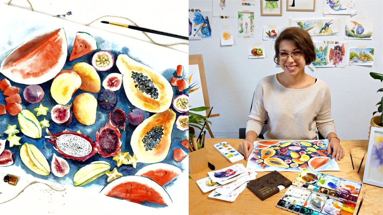
learning techniques. This course is Number 8
in the tropical series. We already painted
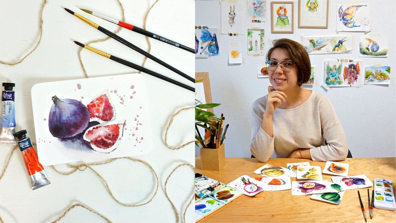
watermelon, papaya, dragon fruit, figs, mango, guava, and passion fruit. Every course reveals a
little bit more knowledge about watercolor techniques
and some useful tricks. If you follow the series
in a chronological order, you will not only build up
your skills gradually but also end up with a lovely,
fruity postcard collection. That's not it. After you
complete the series, total of nine different fruits, I will present to
you the final course where you will consolidate
the knowledge learned. We will paint a masterpiece with all tropical fruits in
one single artwork. About me. I'm Yana. I'm a professional watercolor
artist from Ukraine, and I'm here for you to help you master your watercolor skills. I've been painting with watercolor for more
than ten years. I sell my original work
as well as prints. My original paintings are now in private collections in the
United States of America, Australia, the UK, and other
countries around the world. [MUSIC] My work received multiple awards in international
watercolor competitions. During the past
five or six years, I have been sharing my
knowledge online and offline. When I was traveling the world, I had a chance to host watercolor workshops
in different cities. I have been regularly
teaching classes in Thailand, Vietnam, and hosting
various art events in cities I travel to. Working with students
face-to-face gave me an insight into what
they actually need, what difficulties with
watercolor they have. Now, I know how to
help them best. This is exactly what I
want to do with you. Are you ready to paint these cute star fruits
with me? Let's start.
2. Art supplies to paint star fruit: As we move on in our
tropical fruit series, our topics and subjects become a little bit
more complicated. Today we are painting gameboy, which will require a new
guest in our materials. I'll start from this. We will need masking form to cover some parts in the painting that we want
to preserve and keep white. This is not mandatory. You can still achieve the same or similar
effect just using a watercolor technique and outlining the part you
want to keep white, but it's going to be a
little bit more complicated, long, and also require some
patience on your side. If you have masking liquid, I'll suggest you to have it in your arsenal for
today's painting. Then moving on to the
usual set of materials. Paper, postcard size is all our paintings in this
series are the same, so we keep the tradition going and have
postcard size paper. You can have two options, you can use professional
grade paper. In my case, it's
SM-LT brand with 100 percent cotton
paper in content. It's 300 GSM, so it's
pretty thick and durable. It won't buckle up when you will paint with wet techniques. Overall, just a very
high-quality paper. If you don't have
access to cotton paper, you can use cellulose
paper, for example, Canson. It's also very good
student quality paper that will give you
great results as well, so do not worry if you do
not have cotton paper. The important here is probably to have the
right thickness, so 300 GSM, and also to choose nice
smooth texture so it can be a hot press or cold
press texture of the paper, so that you achieve
nice and smooth full coverage conditions without the paper texture showing
through too much. Avoid rough [inaudible] paper. Watercolors I'm using today is different brands that
I have in my palette, they're all squeezed here. They all are actually
different brands from professional Rosa
watercolor brand, local from Ukraine,
to French brands, American brands like
[inaudible] or Daniel Smith, ShinHan, and Winsor & Newton. You do not have to use professional-grade
watercolors in this course or any other course of
this tropical series. Student create
quality watercolors would be totally fine, so do not stress about that. The colors we're going to use in this painting will be
discussed in the next lesson. The brush I used for this
artwork is a very thin, small synthetic brush
with a pointy end. It's really good
for details and as well to paint the actual washes, the layers right away. You can use a bigger
brush if you want, especially if you use
bigger size paper, you might want to go for a bit bigger size
like this or like this. But if you use
postcard size paper, synthetic small brush like this one will be just
perfect for you. Then pencils that
I need for today. Well, I like to use automatic
pencil because it's thin, you have a nice sharp line. If you don't have
automatic pencil, you can go with the regular one. Just pick hard instead of soft. When you're drawing your sketch, you might need to correct
it or erase some lines. You can use kneadable
eraser which I really recommend you to use, because it's very
loyal to paper. It doesn't damage it as much
as the regular eraser does. But if you have just simple one, try not to use it
too often and do not scratch your paper too
much from moving the pencil. Then what else? [inaudible] tissues, bucket of water, and
good mood. Let's go.
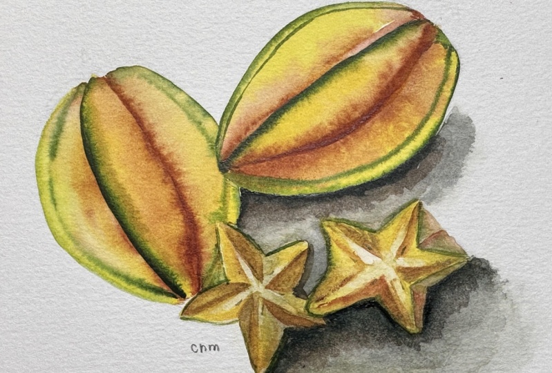
3. How to draw shapes of star fruit: As we're moving
towards the end of our tropical fruit
series in this course, we're going to paint carambola, and the shape of it is
pretty interesting. Let's discuss how we're
going to draw it. If we simplify [LAUGHTER]
carambola, technically, it's something like a drop, let's say, or
something like this, where this is going
to be the tip of a carambola and
this is the bottom. However, the fruit
itself has sides. Let's say if a fruit
could have had ribs, that would be the
ribs of the fruit. The challenging part is
actually to draw them. If we take a look at
our reference photo, we can see that
depending on the angle, the fruit has different shape. If we look at the
one, for example, on the side that I will
probably draw in this artwork, it is going to be
something like this. Let's draw a drop first, and then modify the shape. Here on top it has
some hard shape. Then here in the middle
there's this rib, [LAUGHTER] the side
that's coming out, but coming a little bit
more so you see it here. If I draw it once more, it would be the heart, and then this side that's
coming up here and also comes out from the area where I just drew
the heart here. When we will paint
with watercolor, we will also pay attention
to the edge of those side. Here, the edge is green, and the same is here, it's green, and here. When you're breaking
down this way, it's not that painful. [LAUGHTER] Another
interesting side of this fruit to paint is
actually the slice of it. It looks clearly like a star. To simplify a star is
something like this, but in our case, we need to add another
layer of skin. Technically, that's it. We have our carambola slice, where this is white, and everything else
will be yellow. To repeat it, you can actually also have a different
approach, for example, painted like a flower, petal by petal,
[LAUGHTER] like so. Where as well, here the strokes will be white, the center is also white, and the petals [LAUGHTER] of our carambola slice
will be yellow. I think I'll go with a
couple of slices of caramel, and the caramel that
I see on the side, the big one, in this angle. I'll draw it on my paper sheet.
4. Sketching with pencil: I think the best
would be to also use landscape form mode [LAUGHTER], the same as I did with my previous painting in the previous course where
we did passion fruit. I'll start with
the big carambola. For my personal preference, I will start from the side. Not exactly the same
way I showed to you, but you can draw your sketch the way there
is most convenient for you. You can follow my technique. You can follow the advice I gave you in the
previous lesson, or you can have your own
way [LAUGHTER] to draw it. I was trying to break
it down for you so it's more convenient and simple,
but everybody's different. If you have your
own way of drawing, just follow the way that's
most convenient for you. I would like to actually
draw the star [LAUGHTER], the side of it. The slice of the carambola, the one that kind of leaning
on our big carambola. I'll start from the central
skeleton of the slice, and then I will draw the skin. Their interesting part is that because we see
it at the angle, so it's not lying flat like this but it's like
this on the side, we actually can see the
width of this slice. I will show it once
again just in case. Because the slice
is on the side. Here is, let's say
our white lines, the one that are in the center. Here's our skin. But then because it's
lying down on the side, we can actually see how wide the slice is because
of this part. By drawing the side here and
at the bottom over here, we can actually see how
thick the slice is and show that its
three-dimensional [NOISE]. I'm going to do the same. When you're sketching, please, do not pressure your
pencil [LAUGHTER]. I keep repeating this
from course to course, because it's really
important that your line is thin and doesn't
stand out too much. Because the darker your
pencil line is the most difficult it is for
you to cover it with watercolor because
watercolor is transparent, and you will inevitably see all your pencil line
under the layer of paint. Unless it is your artistic
approach to the painting, you don't really want
to have it visible. Here is how I drew my
slice that is on the side, and I will have to erase
those lines later on. That's why I'm showing
it to you right now. Then the other slice is here
right next to this one. I think the final one will be somewhere
here in the bottom. It's going out of
frame on purpose. I think it's more interesting to have a different
composition than usual. It's not exactly in the center, but that's like
moving in a circle. When people look
at this painting, their gaze will
move in a circle. Voila, this is my sketch. Now I'm going to
remove older sharp, dark lines to make my drawing very light
and almost invisible, so you won't see it
on the video anymore. But I hope this
is enough for you to have it as a guide [LAUGHTER]
to draw your own sketch.
5. Color palette for your painting: We'll use just a
couple of colors in this painting and, of course, it will be yellow
and in my case, I am using cadmium yellow
from Winsor & Newton. To play with the tones,
I probably will mix it up with cadmium lemon, which is colder yellow color. I think it'll be interesting, especially for the slices to show a colder tone
in the painting and I will sometimes
add probably a tiny drop of red
to get orange tone. I'm not going to
use pre-made orange on purpose, I do have it, but I'm not going to
use it, because I want the colors to be more balanced. If I start with cadmium yellow, to get my orange, I will base it on exactly the same cadmium
yellow and add a tiny drop of cadmium red to
get an orange tone. Because it's based
on the same yellow, they look very
harmonious together. If I take orange from the tube, it's going to look quite different and
stand out way too much, and I want my colors
to be harmonized. Then lemon yellow
will look a bit colder like so and I probably will use it
to paint the slices. But the most interesting
part for me is the green part because
with the green part, I most probably will
use Aureolin green, which is interesting
special color, which contains two pigments, yellow and green
obviously [LAUGHTER] to achieve this very
interesting tone. [NOISE] As you see, it looks very close to what
we have on the reference, and I will balance
it out between emerald green that I have in my palette and Aureolin green. If you don't have emerald green or Aureolin
green like in my case, you can take your
cadmium lemon and mix it with blue to achieve a vibrant
green that you want. For example, mixing it with
Phthalo blue will give you vibrant green color or, of course, you can test
by yourself and mix it with other blue that you
have in your palate. Can be cobalt or [inaudible] [NOISE] and
see how it looks like. Some of them will be calmer, some of them will be
brighter and more juicy. It's up to you,
test your colors, and find vibrant green, warm yellow and cold
yellow for our painting.
6. How to apply masking fluid: Exciting guest of this
class is Masking Film. I want to use it to apply in
the center of our slices to protect them from my
paint leaking inside. Of course, you can always paint around with your brush if you don't have
the masking liquid, you can carefully paint around the center to leave white lines, but it's going to be time consuming and a
little bit annoying. [LAUGHTER] If you do have the masking liquid it's going to help
you in the process. Now, you need a brush that
you don't really care about, it's old and cheap and you're not going to use it for
watercolor painting, to use with their masking
film because it's definitely going to
affect the quality of your brush and quite
frankly destroyed it. Also, I removed the sketch lines so you can see that it's almost invisible, very light and especially
pay attention to the center. You remove all the
pencil line that was inside because
inside where we were drawing the skeleton
[LAUGHTER] now we're going to place masking liquid
and you don't want to put it on
top of your pencil. Let's do it. First, you need to dip your
brush into water, otherwise, it will be impossible to remove masking
liquid from your brush. Then you dip it and [NOISE] carefully
apply in the center, and basically just
paint with it like you would paint with watercolor. Make sure that your
lines are thin, you don't want to
have thick lines because when you will
remove this masking liquid, this is exactly the white shape you'll get and if
it's too thick, its not going to look very
nice on your painting to have a super noticeable
thick white outline. Now, when you use
masking liquid, you better have a separate
vessel with water so that you clean your brush in a different water that you are going to use for watercolor. That's it. While you
are leaving it to dry, you can go change
your water and wait until our masking liquid is absolutely
completely [NOISE] dry.
7. First layers on the tiny stars: I'm excited. Now, that the masking liquid is dry, I can start working. [NOISE] I will start right
away with my slices. I'll take a cadmium lemon, squeeze it on my palette. I'll work in wet
on dry technique, which means I will
only have water on my brush but the paper is dry. Confidently, [LAUGHTER] I will apply watercolor right
over the masking liquid. Now, as I said before, I'll take a cadmium
yellow, the warm one, and a tiny drop of red
to achieve orangey tone. Also, very light and transparent
to work on this side. One-half is more lemony and other half is in the
shadow, light and dark. I don't really like my
orange as way too bright, so I will add a little bit
of brown into this mix. With the brown, I'll
mark the shadows, especially with this
part of our star that goes close to the next slice. Now, what I want to do, I want to make it
slightly calmer. I'll take a blue and brown, and I'll achieve some gray tone. I'm deciding it on a spot. You don't have to do
exactly the same. You can just leave it
orange, if you prefer. But I would like to have
shadows a little bit calmer, not so bright as orange
color can be made. That's why I decided to
create this gray tone. Now, you see I applied
a very rough layer. Now, I want to smooth it out. For that, I am
rinsing my brush over the tissue and carefully
dilute the edges. Important nuance is that
here I want this side, this half, to be
really lemon yellow. I intensify the color because my shadow leaks into it before. Now, I am taking it back. I will work on this one. Because if I work on this slice, the layer I'm going
to apply will bleed into my nearby star, and I don't want that to happen. I'll just leave it to dry. Meanwhile, we can work on a
slice that's in the bottom. Same approach, I'm
mixing orange, adding red to my yellow, just to paint the shadows. This bottom slice
has more shadows. The color is not so
lemony as this one. But you also can see that
when I paint the shadow, I'm not covering the whole, let's call it petal. [LAUGHTER] But leave an
outline a little bit. Here, you still see
the lemon yellow edge. The shadow is inside. I'll also add brown to my
mix and blue to get calmer, almost grayish tone [NOISE] for shadows. Don't forget to rinse
your brush so that it doesn't drain too much
water into your painting. If there is a lot of water, it's going to dilute
and move your layers. At this point, we don't
really need that. [NOISE] Using button right technique, we are managing our first
layer here on our slices. Later on, we will
come back to add the details and shadows the
way we need them to be, and use layering
technique for that. Meanwhile, I can move to
painting the third slice, which is in my opinion
is the lightest one. That will be more of a lemon
color and less of brown, except the very bottom
where we see the thickness. I add a tiny drop
of orange here, a tiny drop here, here as well. The side will carry more
of a brown tone in it. It's in the shadow, so we
don't see it that much. [NOISE] There's also an interesting
nuance to all of the slices. It's that some of
them on the edges actually have a
tiny drop of green. I would like to also paint that. I added right into the wet layer so that
the pigment flows freely and mixes
the way it wants. [NOISE] Well, I need to wait for this to be completely
dry before I'll start correcting
[LAUGHTER] the shapes and shadows the way
I want them to be. I resist the temptation
to do it now, and I'll wait until
it's completely dry. Then do all the detailing.
8. Painting main star fruit: You need to wait for this half to be completely dry
because now we're going to work on this carbon and
we want to make sure that this layer here is not going
to bleed into our fruit. The same approach,
I start painting, carambole side-by-side, piece-by-piece with
wet on dry technique. So I did not apply any water on the fruit first like we did with watermelons and mangoes and other fruits that we were
painting in this series. Just try now different
techniques and approaches. Just drop a little bit of orange here very
close to my side. While I'm there, I will take
a drop of orlean green. Remember the yellow
that contains green, just drop it here
at the edge and let the color sink in
and bleed naturally. Also this part, I leave
blank, almost blank. I almost don't cover
it with paint at all on purpose because we see
that it's a highlighted area. It has a lot of lights
and highlighted spots. I don't know what other
word to use there. I leave it almost untouched. Also, I'd like to make
some darker tone of green, so I will take green
and add a little bit of red to make it darker. We know red is complementary
color That's why it works. Just to make this edge tiny
bit darker than it is. I will let the colors sink in. Meanwhile, I can start
working on the next side. Actually, I'll do this one. Because if I start
the middle one, those two layers can touch
and bleed into each other. That's not exactly
what I would like to have in this painting, so I will work on the
part that doesn't connect with my
previously working layer. With a much more
noticeable orange, I want to create this
shadow of a carambole here. It almost looks like
brown so maybe you want to even add some burnt sienna here, just a little bit. I know we didn't discuss
it in our color palette, but it's really optional. Only if you want to, if you have this color
doesn't have to be there. Now, I'm going for orlean
green for the edge here. Then adding emerald green here at the very, very edge. You see that colors are bleeding and that's exactly
what I was looking for. I like that these colors have the freedom to move and create the shapes that
they want by themselves. It looks much more natural
than if I will try to navigate that paint and achieve a natural
looking colors in there. At the same time you can
see on the reference that this side has two lines, so add another green
line right next to it. Of course, it's going
to bleed and it's fine and doesn't have
to be super sharp. Since we're doing double lines, I will mark one here as well, but just a little bit, just a hint on it. Also I would like to make
this part slightly darker, so I'll take brown with a tiny drop of blue
so it calms down my brown and apply some shadow here. Now it's very, very brown. I rinse my brush over the tissue and dilute this paint
that I just applied, making it lighter avoiding
all the sharp edges and making it bleed into
our already existing layer. Now I wanted to wait for
this to get dry and then we can finish up the carambole
with this inside part.
9. Finishing the middle part of star fruit: The final side. The same approach. Start with yellow. My whole painting is dry, so I'm not worried that
the pigment from here or from there will leak
into my current layer. [NOISE] While I'm working on this, I also pay attention to
the highlights and I keep this part light for the same
reason as here and there, just to show how the sun [LAUGHTER] reflects
on the skin of our carambola. Then mix orange with exactly
the same colors as before. Oops, so it turned out
to be a bit dirty. At the bottom here I'm creating
this more firm shadow. In the area where our side
is touching this side, I make it much more darker by adding
exactly the same tone. We are in the same
color, orange. Nothing new in terms of
color and finishing up with drop of olive green and emerald green. I don't really like the way how this
pigment is drying up so I'm removing it with
an almost dry brush. I'm removing this edge. We can smooth again, and carefully with a very, very thin brushstroke, I work on the edge of our carambola here and
even more on the bottom. Also need to mix a darker
tone of green the same way, add in some red to my
green to make it darker, following all the
rules of color mixing. [LAUGHTER] Now all of a sudden, this whole slice starts to make sense and looks
three-dimensional. Now it's time to get back
to our stars and add up some details and shadows to make it look even
more three-dimensional.
10. Adding volumes to stars: Let's not lose time
[LAUGHTER] again to work on our slices over here. What I really want to do is not that many things actually. I just want to separate our, as I already call it, petals, one from another
with a very thin brush. However, my color is
a bit too bright, so I add tiny drop of
blue into my brown. It's calm and lenient
towards gray, and separating one
petal from another. Every time I do so, I also make sure to
smooth out my strokes so that they don't look like I cut them out
from the coloring book. They look more natural. [NOISE] No need to obsess over
those slices for too long. I just want to make
sure that they are bright and yet we work on all the shadows and make
each petal separated. Of course, it's not
better. I just know how to color more slice and wing. [LAUGHTER] If you need to intensify some of the yellows because this
color ball is really bright, you can add more yellow. But other than that,
do not need to spend too much time on trying to repeat everything
you see on the photo. I'm going to work
the shadows a little more with this little guy. As you can see, my
layers are very light, not concentrated at all. I don't want to overdo it. I still want to keep
it nice and sunny, and at the same time
clearly separate one wing [LAUGHTER] of the color
ball from another. I'm also using the
same lemon yellow that I used before to just intensify the color because we know that when
watercolor gets dry, it loses some of the
intensity, the brightness. I want to divide it, so I add more yellow. Our the final slice over here, I just want to add those
clear separations. Every single time I dip
my brush into water, I always rinse it
against my tissue here. I always try to not bring
water into my painting. When we work on details, we need to keep the
brush drier than usual, not absolutely dry because then the stroke will look very sharp. You need to find your balance. That's it. Now we can add some shadow so that our fruits do not fly [LAUGHTER]
in the air.
11. Creating shadows: If the light is
coming from the top, then truly the
shadow will go down, and this is how I'm
going to show it. As usual, I add just
clean water for my shadows and only then
I paint the shadow. For the shadow I take red with
the green to make it dark. [NOISE] Also add some blue and we can start from this. [NOISE] I am carefully adding the shadow right
under my slices over here and just let it sink. I Clean my brush, rinse it over the tissue, and carefully dilute the bottom allowing our shadow to just flow into directions it points. From the front of it, I just added a tiny drop
of yellow into the shadow. It makes sense because all
the fruits are yellow, so they might reflect with the same yellow color in
the bottom in a shadow. Using the moment I'm separating those two both slices with the shadow color
in-between to show that they are two
separate slices [LAUGHTER] and continue
working on the shadow. Remember that shadow
is always the darkest in the area where
it touches the object, and then as it goes away from the object, it becomes lighter. Here in the place where I connect the shadow to my slice, the shadows will be
absolutely dark and the darkest compared to the
rest of the shadow. Put some over here. For the fun just add in
some touches of yellow. [NOISE] Our shadows are ready. The final part is
in the next lesson.
12. Finishing with background and splashes: The most favorite part
of all of my students, removing the masking fall. Before you do that,
you need to be absolutely sure that
everything here is dry. The whole paper, the
whole painting is dry. I use the hairdryer to
speed up this process. You can [LAUGHTER]
take a break and go, take some coffee or tea or
just relax a little bit. Or you can use hair the same I did and speed
up the whole thing. To remove the masking liquid, you can use a regular
eraser, a coin, credit card anything
[LAUGHTER] that can roll this muscular
liquid round. Can also do it with your finger. [NOISE] Now that our [NOISE] masking liquid is
completely removed. I like to remove
the leftovers with the brush because fingers leave oily marks on the paper and it's not very good
for the paintings, so I prefer to touch it
as less as possible. To not basically make
the paper dirty. Now, remember I
told you that the thicker your line is when you
apply the masking liquid, the thicker will
be the white area, and it indeed looks
a little cut-out. Now we're going to do
very careful work. To smoothen out all these lines. I just put my brush into water, rinse it over the tissue. With this semi wet brush, I am diluting the edges
[NOISE] of my white area. Naturally, some of the
paint will flow inside. That's totally
fine. It will make our painting look more natural. [NOISE] Now by doing this I carefully smooth
out those edges. Now this white strokes, they look much more organic, natural like they were
meant to be there. [LAUGHTER] Some areas
and really come to much. Some areas I leave
completely blank. White. Some areas I cover
more with the pigment. Let the pigment flow. Now we will add the
final elements. In some places I want to
define those white elements. [NOISE] In those strokes that we were applying for to separate
our so-called petals, I am doing that again. But just now over a
white area that we just freed up [LAUGHTER]
from the masking liquid. [NOISE] Sometimes you need a bit more time to
correct the shape. Like here I want to correct this middle shape of our petal. This particular slides
has like a little texture inside in the shape of
little, I don't know. It looks like a crack. I'II just point it out like
it's a crack in the texture. The same way as other slices. [NOISE] I'm just amplifying
some of the shadows. Once more, just a tiny bit, and showing those separations
between our petals. [NOISE] Again, if don't
have masking liquid, you just paint around, and you will achieve
very similar effect. Maybe your white lines
wouldn't be that clear. Not always noticeable because it's quite difficult to
paint around when it's such a thin line that
you need to keep clean. [LAUGHTER] But, of course, you can try and I'm sure
it's going to work out fine. [NOISE] I'm adding some details
here and there. Like for example, green
part on the skin, maybe intensifying some yellows. I decided on a spot with
watercolor it's really difficult to plan
everything ahead of time. This material really
has a mind of its own. Sometimes you think you're
going to do one thing and then the painting just
lead you somewhere else. You know what is
great to just let it do the magic, follow it, and just try to paint
[NOISE] around the edge, just walk around it, make the result worked for you. Even if the paint doesn't behave exactly
the way you want in it. It's always manageable. [NOISE] We almost finished we're bawl the painting. The final touch as
always, Some splashes. [NOISE]
13. Your class project: Hey guys, so how did you
like painting color ball? It was a bit different from our previous courses
from previous fruits, but that's the whole
point with this series, to make you grow and
improve your skills. So I hope you really liked painting color ball
because I definitely did. The class project
for you would be to choose any color ball
from the reference, can be just one slice, one star, or the whole fruit, or the composition I decided
to paint in this course, or all of the color
balls [LAUGHTER] in the photo reference,
whatever you prefer. Please share it with me, I'll be very happy to
give you feedback, or answer a question, or help you out if
you have any trouble. And stay tuned for
the next course, almost the last
one in this series where we will be painting durum. [LAUGHTER]
 Yana Shvets, Professional watercolor artist