Transcripts
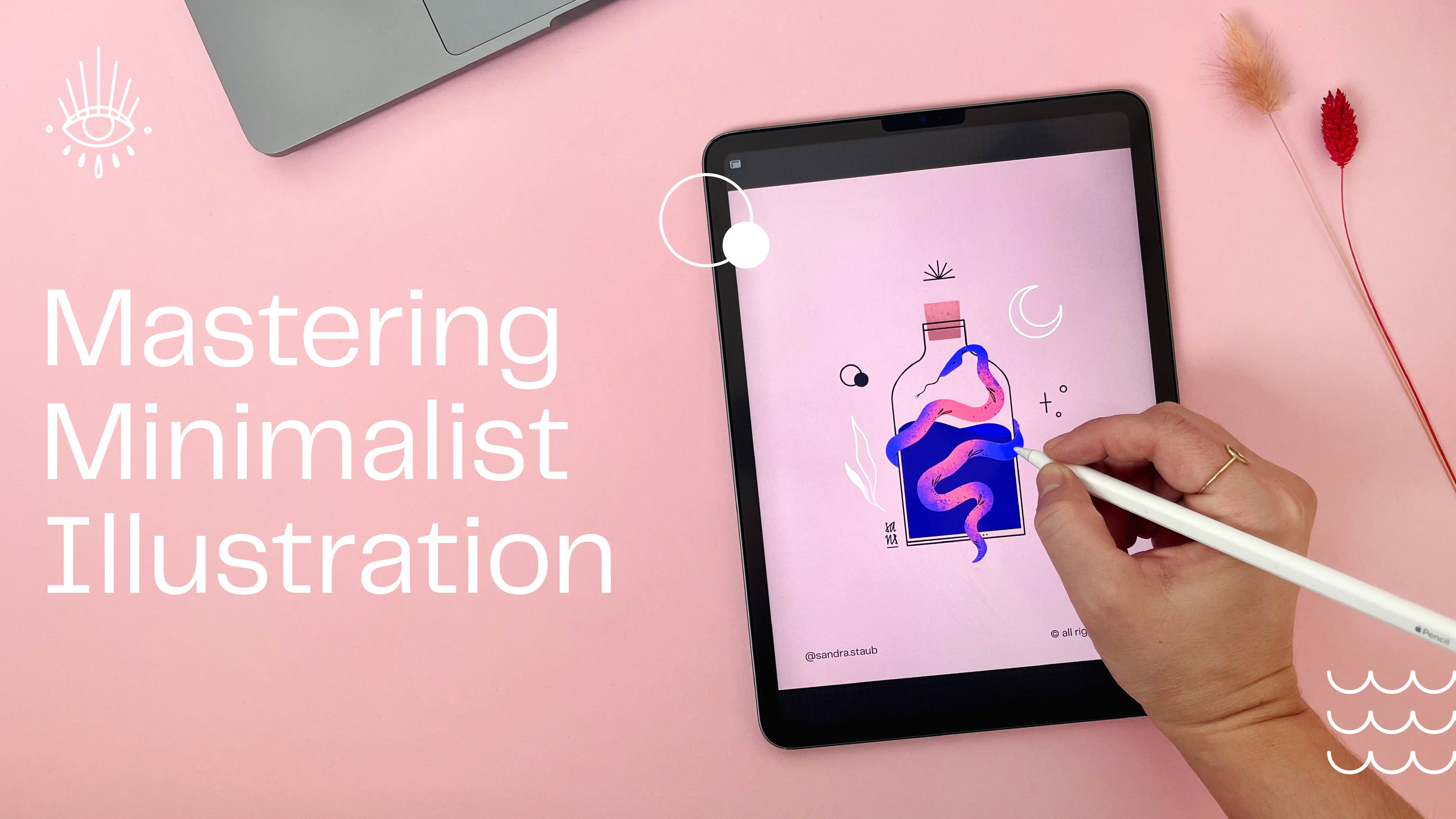
1. Setting the Stage: Class Breakdown & Project: Are you in the mood for creating a beautiful minimals
illustration in less than 30 minutes? Do you feel like
getting creative, but without overthinking it, join me in the snack sized
Minimal in Minutes session. And let's create this floral
illustration together. Hello and welcome everyone to this first class of this
brand new monthly miniseries. After publishing three very successful classes
here on Skillshare, I felt like trying
something different, and I hope you're up for it. The purpose of these
minimal and minute sessions is to offer you a
series of short, easy, and fun hands on sessions
where every month you get to create your own
minimalist illustration in less than 30 minutes. So if you feel like taking a break while doing
something creative, then this class is for you. After the first lesson,
you will already have created a beautiful sketch that might look
something like this. Feel free to share your sketch in the class project with us. I would love to see it, and I'm sure so would your
fellow students. In the second lesson, we
will focus on finalizing and coloring our illustration
before we wrap it up. I filmed this class
using Procreate, but if you feel more comfortable working in a different program, you can obviously do so. Before we start, here's a
little bit about myself. My name is Sandra Staub
and I'm an illustrator, graphic designer, muralist,
but also a beer smolt. The latter isn't too
relevant for you, but it explains why
you will see me occasionally drawing some
beer related things. Don't worry. You can always draw something
different, obviously. Worked over ten years in
the industry for clients from all over the world
and of all kinds of types. I'm also a rising teacher
right here on Skillshare. Now instead of listing
all my clients here, I would rather jump right into the creation part
and start sketching. So join me in the next lesson.
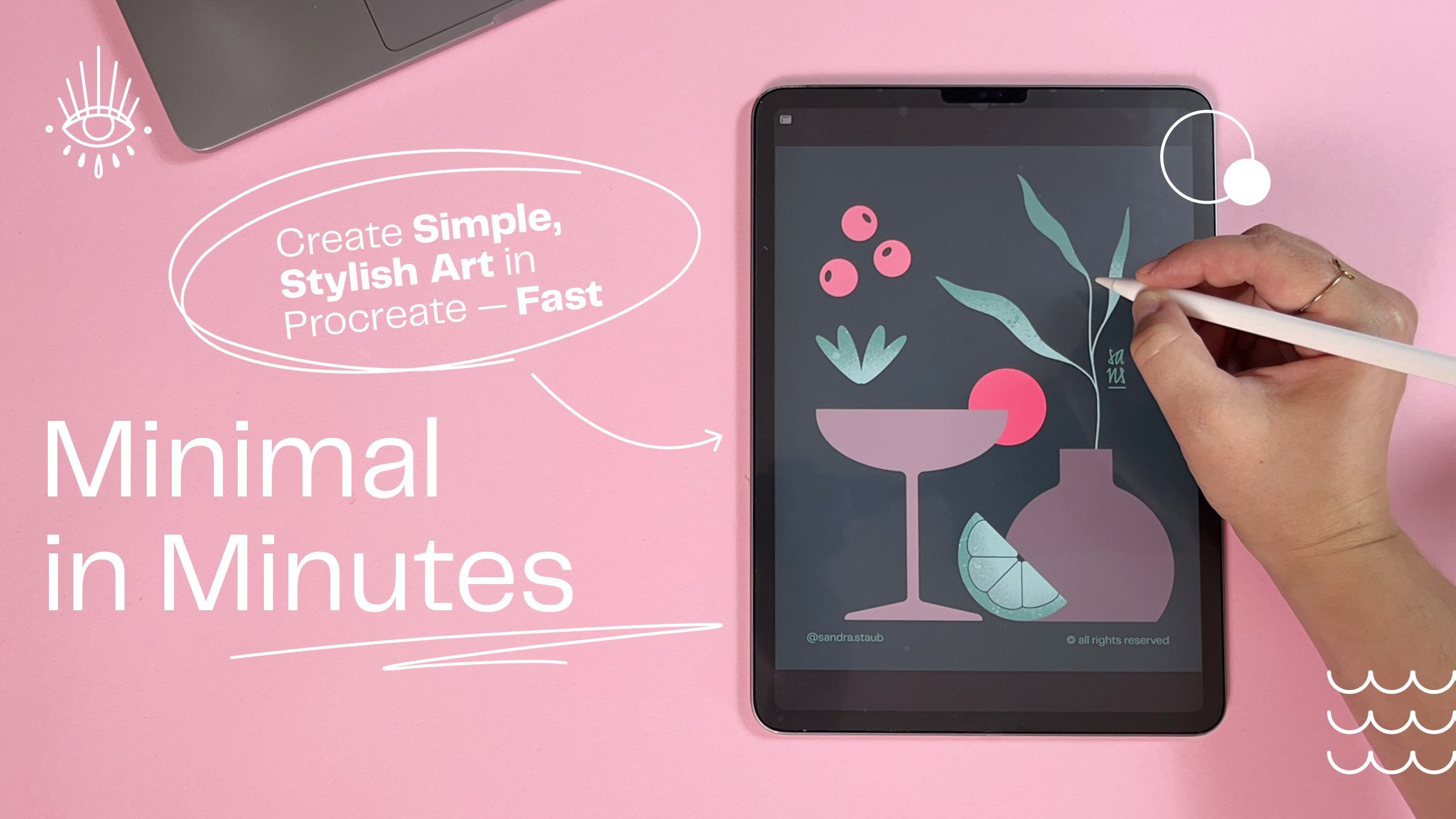
2. From Idea to Sketch: Create Your Minimalist Design — Fast & Easy: I will start with the guides. I add the drawing guides, and then instead of using
the checkerboard or, like, the squares, which I never really
use, to be honest. I just start with the symmetry. Maybe if the background
is a little bit dark, maybe I want it to be the color that I can see a
little bit better, but still fades into
the background. Maybe that's okay, actually. Yep. Alright. And
I went to CB Big. So I was thinking of, like, maybe, like, something
like this, okay? So this is, you know,
not very pretty. Maybe a little bit smaller, but that's kind of like
my starting point because then I can scale it down
a little bit easier. Yeah, that's kind of like
what I'm envisioning. And then, you know, I can,
like, add all the flowers. Probably not
symmetrical, though. Anyway, just to give
you a rough idea. So I will actually clear this again because that
was not very pretty. Um, yeah, so you already
saw me doing that. I usually start with
the bottom line just to get a line on the canvas can
be very helpful sometimes. I think I might want to go with a similar shape than before. Maybe. I like the bottom part. I don't really like
the top part yet. And if I draw a line and
then I just hold it, Procreate will actually
straighten this out, and you can even edit
the arc if you want to, which is quite useful
if you look at this. So maybe something like this. This is too high for my taste. I don't want the bottleneck
to be this high up. And maybe I'm
actually also giving a little bit of an angle. And round this part out. Since I'm a perfectionist and
I already mentioned that, I like to take away, like, all the debris that
the eraser lift around. You don't have to
do that, obviously. That's just my workflow. And then I center it with
the guide that's procreate provides me because
especially when I work with the the symmetry tool, this is super helpful to have. So I'm using a
separate layer because I'm thinking of maybe
adding a quirk to this. And if I don't like
it, I can just toggle it off the
visibility of the layer, and then I didn't really lose any of my progress and don't really have to redraw anything. I'm going to actually center
all of this again now, together with the cork. And I will make another layer. I like to add some
asymmetry into my symmetrical and minimalist drawings because it just usually makes everything a little bit more interesting to
the eye of the viewer. I think I'm going to start
with big leaves or something, maybe something like that. I already takes up
a lot of space. Quite nice. And then
maybe I have to think about what to do with the stem, which could be
something like this. That could be possible. Yeah, why not? I think I'm
going to do something similar, but smaller than
on the other side. I'm not too worried about
the shape just yet, but if it's that wonky, then maybe I'm gonna
edit it a little bit. But maybe something like this. Now, it's not wonky
enough, to be honest. I would want it a little
bit wonkier, but, um, let's not get held up
with details too much. Well, that's even
worse. Uh Yeah, but see, you see me struggling, which I guess can be quite fun. I really like
really the dynamic. I was kind of like
going over there, and I think I'm going to do something with that by adding, like, a plant or something here. And I have no idea what kind
of flower I'm gonna make. I could use, like,
a similar shape to the leaves. Something like this. That looks quite flowery. So why not? However, I want to try
something different, just to see what it looks like. So I'm going to
duplicate this layer and I'm going to toggle off the
visibility of the one below. And I can start from scratch
again with the flour, but I won't lose progress
on what I already made. So I just, yeah, I use this, selection
tool that you just saw. It's here in the
selection Upsi up here. And then I like
the free hand one. The other one is really
useful sometimes too. But I like the free hand
one because then I can just go around all this. I select it and then with
three fingers swiping down, it doesn't matter if
it moves or something, I just cut it and it's gone. Now I can start from scratch
again with this flower. I can see if maybe a more
delicate flower or like a more polished eaf shape
could also work here. Yeah, let's just go
with this. And then with this freehand
selection tool, I can actually also move this around a little
bit further down. You can just experiment
with other shapes, which is obviously super
cool because you can start to develop a little bit
more your personal style. You don't have to
copy what I'm doing, and just kind of, like, bring your own flare into all of this. Now I just need some
additional things to fill all the space up, and I'm actually going
to do a new layer for that just so I can move them
around as well if I want to. Um, maybe more
something like this. So maybe if I'm making these smaller and then just
overlap ever so slightly. Maybe there is one that is
kind of like over here. And I guess I'll add some of these leaves
over here as well. I don't like it, to be honest. I'm not sure if this is going where I want
this to go so far, but let's just let's just
keep trusting the process. I like the part over here, but I'm not very sure
about this part, so I think I'm just gonna I'm just gonna take all of this out. So yeah, these leaves have
a little bit more of, like, a polished shape to them, much similar to the flour, which I like because I can reintroduce this flower shape
to the entire composition. I just add a couple
of little leaves. Could be leaves,
could be flowers. It doesn't matter. And yeah, again, you can just introduce your own shape or, like, can even add a second one and then it looks almost like flour oh, I
like this, actually. I'm just going to
leave this like that. So I actually think
what I don't like is these shapes now. And then I can just introduce something like what
I've been doing before. And now I kind of like
need something down here, which I have absolutely no clue what to do there, but
we'll figure it out. Maybe I'm going to Make one side a little bit smoother and just the
other side wonky. Oh, yeah. Look what
happened here. Yeah. Okay. Yeah, this is pretty cool. I
like the dynamics. It's kind of like going
all into that direction. And the other side, it's
kind of, like, evening out. Okay. I like this part, but I want to bring it
in a little bit more. And I will actually combine
these two layers now. It's gonna be easier for
me to move them around. I'm going to bring this
into a little bit, but I kind of want one of
these leaves to be out there. So I like actually
these smaller leaves. I think I could try to do that
that have the same shape, but then will blend in nicely with the shapes
that we already have. That's quite nice. So here we go with the
perfectionism already. But I like to get a good sense of what the shapes are
going to look like. So I'll figure out how they
work in a composition. And now to see what
it looks like, I can either erase
these lines here, or what I really like to
do sometimes as well. So I won't lose anything
that I drew before, and I don't have to
redraw it later, is to create with two fingers
swiping to your right, create an Alpha lock. You can also create that by just tapping here and
select Alpha lock. Then pick the same color
from the background, and then on this layer
that I just isolated, I can draw over these lines, and they seemingly disappear, but they're still here because if I quickly change
the background color, you can see that
they're now green, and now I can't
see them anymore, and I get a preview what the composition will look like
with all my little leaves, but I don't lose any
of the progress. You also need something
more for here. Maybe I could add some
more of these leaves here. Like some of these are not too big and only
wonky on one side, or maybe not even Ooh. That looks nice. So yeah,
as you can see, like, I'm experimenting quite a
bit with different shapes, and I would encourage
you to do the same, especially if you're copying the exact leaf shapes
that I'm doing. I mean, you're not
gonna copy them anyway, because this is obviously it's your hand, it's your style. You will always draw
things differently. So experiment
around a little bit with how you want to lay out these leaves and maybe also check for some inspiration. Online. And look at leaf
shapes that you like. So you can kind
of, like, already start getting more
of a sense of, like, your personal style or use leaves that you've used in
previous illustrations, bring them in, and
then, you know, you will start making
your own thing here, which is pretty cool, I think. I think I want some of
these leaves here, as well. So I'm just going to
create another layer. You're gonna be like,
Wow, that's a layers. But I think I'm actually going
to make them a little bit darker so they can go
into the background. They will camouflage a
little bit like I did with the other illustration
where I made them white on gray background. And I think I'm just going
to make them dark green. So there's just gonna
be style element. And then I also want a little
bit more space up here. So that's why I like
having everything in a quick outline because
then I can see, like, where it gets really busy. So I want there to be a little bit more space so it can breathe a little bit more. So I guess I'm just going to do something like that. Yeah. Having these loose leaves makes it feel a little bit more free, right? A little bit. Everything is floating
around a little bit, and it's kind of cute, and Yeah. For the resin I'm
just gonna add some more of these loose leaves. Give it this spring vibe. Everything is blooming and for you who have
allergies out there, I do, and it's not so fun. Nonetheless, it looks pretty.
So let's just do that. You can also
experiment, of course, if you want to add one of these wonkier leaves to kind of, like, pick them up
again in composition. Or what I also love
to do just, you know, little circles and maybe, like, even a little cross or something, it
looks like a star. That's actually very cute. But I think I'm actually
going to place this a little bit bigger over here, so it looks like the
bottles look shiny. And I'm just going
to add a couple of more things that are
starting to make me feel flared up already as a person who has
an allergy to pollen, but it looks cute, so I'll
just stick with that. Alright, so my sketch is ready. And now we're going to move
on to the coloring part, so I'll see you over there.
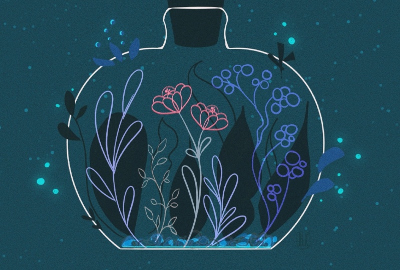
3. From Sketch to Artwork: Polishing Your Minimalist Design: Hello, and welcome back to the making of of
this illustration. I hope you had fun
in the first part, and the sketching part, and now we shall add some
color to it, will we? Alright, let's get started. So I just went to get
a glass of water, and I actually walked by these
dried flowers that I have. And I thought maybe some
of these could also give some inspiration for what else to use to fill the space
here a little bit. I have a very cute shape, and so let's keep that in mind. I'll move on to the coloring. I like to just put
everything into one folder. That's going to be my sketch. And then I can toggle off and on everything at the same time,
which is quite useful. I know that I want my bottle to be white, so I'm
going to draw this. And I name every layer, which might be a
little bit much work, but it saves me so
much time later. I put this quickly
into transparency. And then I use the studio pen, as I showed you
previously, it has, like, a very clear line.
So I like this. I also made sure that
the bottle is also like the layer of the bottle is also using the
drawing assistant, and then I just quickly
redraw the bottle. Then I like to retouch
these little corners a bit. And I will actually put the
cork on a separate layer. I'm pretty sure I want
both to be white. It could be that due to the composition and once
I'm bringing in the colors, I will change my mind. So that's why I'm separating
these two layers. And then everything is going
to be covered by the bottle. So the bottle is basically
going to be the top layer, and then that's going to be
leaves. Very generic name. And I want some of the leaves that I mentioned
before like these. I want them to be dark green, so they blend into the
background like it did with the previous
illustration that I made, and I will actually also like, correct this tip a little bit, which is another
styling element that I can use in my art. And then here we'll
have the second one. This top part is, like, the trickiest for
me because you kind of have to get into the flow. And as soon as you don't know we think it
anymore, it works. And then I can start
actually filling this up. You can see that I'm not
following exactly the lines of my sketch because sometimes in this step I keep making
some adjustments to shapes. I just figured that I actually
want another leaf here, a big one in the background, but I only want this
one to be in outline. So it's going to
have a little bit more of a subtle component. And then I probably
want this element, the outline leaf repeated
over here as well. So we'll fill up some of this empty space that I have
here in this background. Draw something like this. Yeah, that's nice. Okay, here. Um, yeah. So, the other
thing that I'm very, very sure about how I want this to look like is the flower. Maybe pick something that
is vibrant for the flour, and the background is,
like, more tone down. Let's pick white for now. It might clash a bit too much, though, with the bottle, so I might change my mind
about that later on. And I want these to be white, too, so I'm just
adding a new layer. This is gonna work.
This is gonna be fine. It looks really nice. It
kind of picks up this shape, but it's not as bright and attention seeking
than the flower, which I want to be the
center of attention. I'm going to add
a new layer that I'm going to call decoration. And then, for
example, here, where there's not so much going on, that would be a
good spot probably to add some more of these. And then it will again
give this kind of, like, blooming and vibrant impression. I think next I'm going to
do these white flowers, and I will toggle off the leaves again because they're solid and I don't really
see that much. And let's give them, like, a nice dynamic stem, as well. Done is better than perfect,
so keep that in mind. I don't like that
this kind of, like, hiding behind this, so I will place it a little
bit differently, like, so I'm thinking
of leaving this one out because it might be too
busy with what's going on. I can always come back to it
later and then just add it. Okay. Now let me toggle
back on the darker leaves. I will toggle off the
sketch to get an idea of, like, how my composition
is coming along. And so what I'm going
to do here as well, is I duplicate this layer because that way I
have them in outline. So I'm actually going
to pick a darker green just so I can
see better afterwards. And I might even
end up liking it. These are pretty much all the elements that I
want to have in here. Except for this, you might have noticed that I actually
didn't include this one. It felt like it
didn't really fit. I'm going to actually take
these leaves way to the back, and I think the same
goes for this one. And maybe this one
will have fill. Or maybe this one. Um, yeah. Well, I think I'm going to tuck the flower
underneath these leaves, so you won't see
this line anymore. Just like this. And then tuck this darker leaf underneath
this lighter leaf. And that already generates
a more calm feeling. I'm going to do the same thing
probably with the bottle. So there is that. So because this white line
kind of clashed with the leaf, so that's why I want to dig on. It definitely needs
something over here, but maybe it's gonna be
enough with just like some flying loose
petals over there. And I'm going to tuck this
leaf underneath this leaf. And it's starting to calm
everything down a little bit, and that's basically
what I want. And now I can do the same
thing also for these leaves. I'm just going to
erase this one, too. Same for here and this. And now I will just add some of these decorative elements
that I have in here, which I'm going to
call decoration. Okay, so I've basically copied everything
from my sketch layer, and so that's the time when I just toggle off the sketch and review if the composition is working or if I need maybe
some other elements. Maybe here, I could add some
more of these white leaves, right? You see the difference? Maybe one of these. These could be really cute if they were also in the
same electric coral. So in this case, I just drag and drop them
not here, but actually here. Um, I don't know
what I like better. Maybe this. And see now this
is the moment where I'm not so sure if I want to
change the cork color. So I can just swipe it with two fingers
layer to the right. I can pick a different
color, for example, the pink, and then
tap the layer. And with it being a little bit less of a contrasting
color than the bottle, it already takes it a little
bit, like, to the back. I want this underneath
the bottle though, and I could even
try what happens if this is, for
example, in blue. So now it's not enough contrast. You see what I mean? Like, now it's kind of like too subtle. What I could do is I could
actually fill this layer, and then it could be just right or make it a
little bit darker. And I think I like this. So it balances out the colors,
and that's what I wanted. It's not too noticeable. So if you remember maybe
how it was before, like, it's such a stronger
contrast and it's kind of almost
a little bit boring. Now it's too subtle. This
is a little bit better. It kind of, like,
balances out the darks from the bottom with
the darks from the top. But now it's like a highlight, even though it's quite subtle. I mean, I actually kind
of like both of these. Maybe Maybe I'm going
to stick with this one, though. So there is that. I'm going to add my signature, so I can upload this
to my Instagram. And I hope you enjoyed this. I'll see you next time. Bye.
4. Course Recap: Wrapping Up Your Minimal in Minutes Experience: Alright, it's a wrap. We finished our first
minimalist illustration in less than 30
minutes together. I hope you had fun,
learn new tricks, and feel relaxed, inspired
or any other great feeling. Before we wrap it up today, I would love for you to share your sketch and final
artwork in a class project. Make sure to add your signature. If you like this session, you can get early access to
the next ones on my Patron, where you also find
the wallpaper pack of this illustration and, of course, more goodies
and exclusive content. You want to learn more about
minimalist illustration, make sure to check out my other classes here on Skillshare and follow me so you won't
miss out on new releases. I hope you join me next
month for another session. Let me know in the
comments below what you would want
me to draw then. Thank you so much for joining. I'll see you next month. Bye.
 Sandra Staub, illustration & design