Minimal in Minutes: Create Three Different Colour Moods in Procreate — Fast & Easy. | Sandra Staub | Skillshare

Playback Speed


1.0x


  • 0.5x
  • 0.75x
  • 1x (Normal)
  • 1.25x
  • 1.5x
  • 1.75x
  • 2x

Minimal in Minutes: Create Three Different Colour Moods in Procreate — Fast & Easy.

teacher avatar Sandra Staub, illustration & design

Watch this class and thousands more

Get unlimited access to every class
Taught by industry leaders & working professionals
Topics include illustration, design, photography, and more

Watch this class and thousands more

Get unlimited access to every class
Taught by industry leaders & working professionals
Topics include illustration, design, photography, and more

Lessons in This Class

    • 1.

      Setting the Stage: Class Breakdown & Project

      1:34

    • 2.

      Foundations in Minutes: Building Shapes for Color Testing — Fast & Easy

      1:42

    • 3.

      Color Exploration: Developing and Applying Three Color Moods

      5:43

    • 4.

      Course Recap: Wrapping Up Your Minimal in Minutes Experience

      0:55

  • --
  • Beginner level
  • Intermediate level
  • Advanced level
  • All levels

Community Generated

The level is determined by a majority opinion of students who have reviewed this class. The teacher's recommendation is shown until at least 5 student responses are collected.

53

Students

3

Projects

About This Class

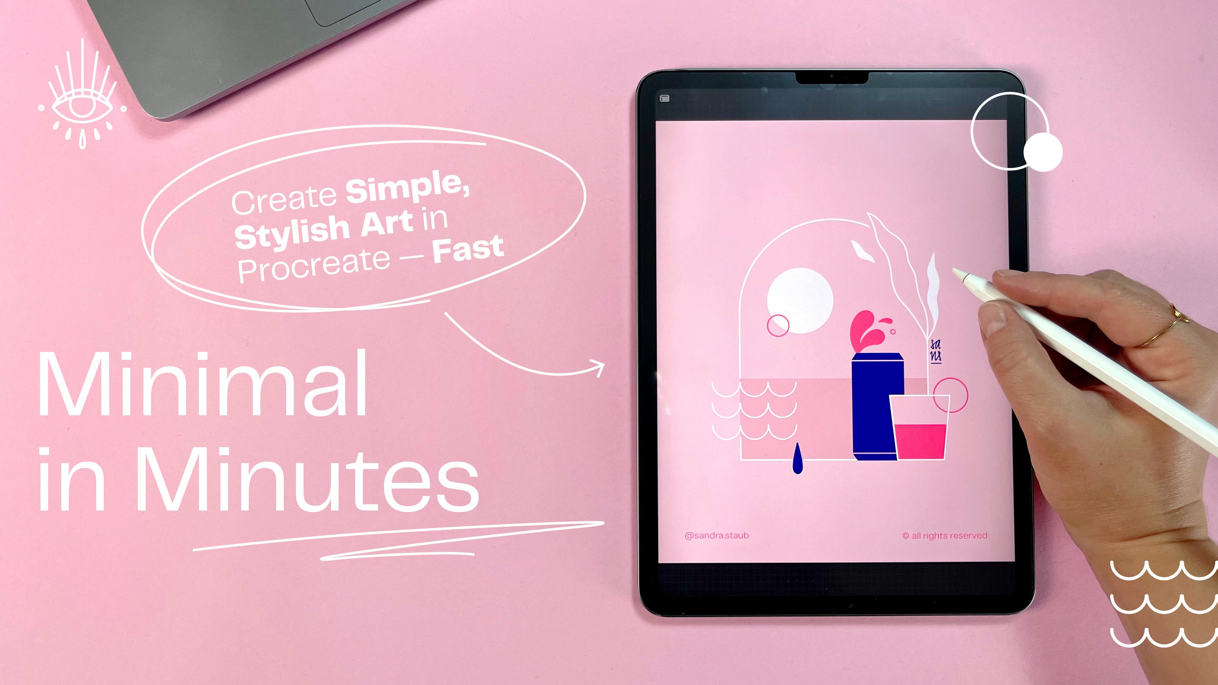
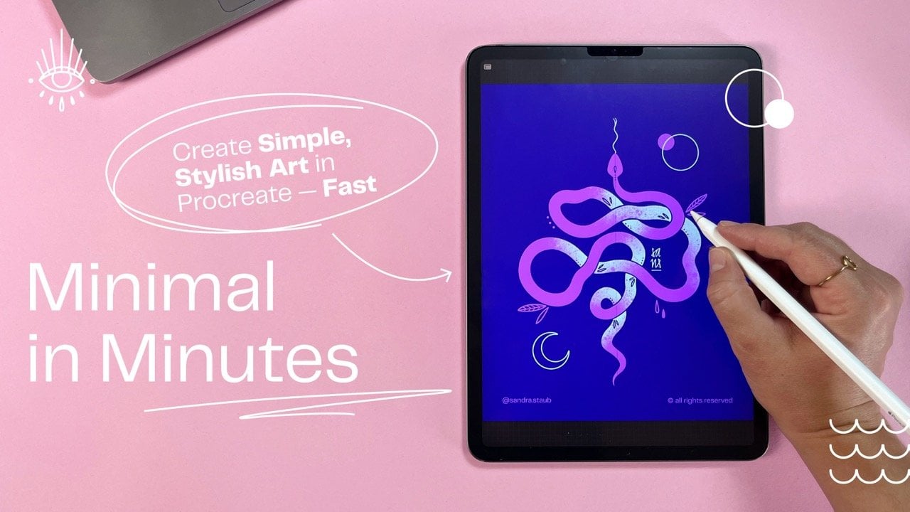
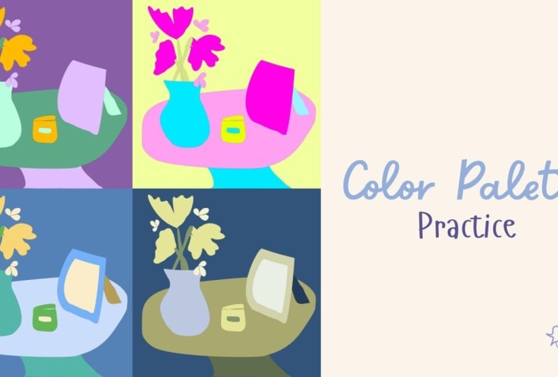
If you thought making colour palettes was hard, let me show you how to make it simple. In this snack-sized drawing session we’ll create three different colour palettes in less than 30 minutes and give them a test run to see if they actually work.

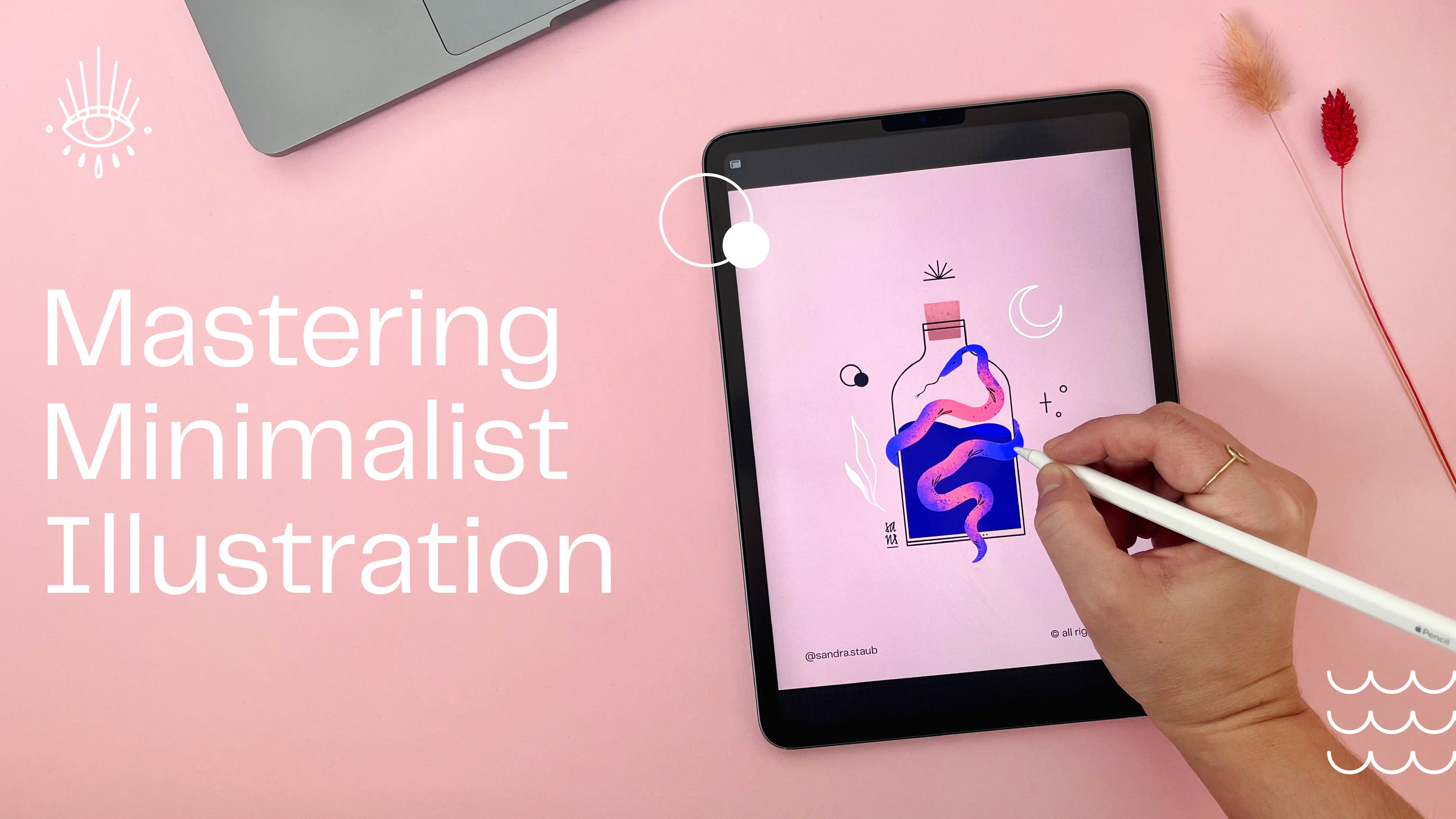
Minimal in Minutes is a series of hands-on mini-classes designed to help you unwind through creativity while learning practical techniques for minimalist illustration in Procreate — think Bob Ross meets YouTube.

In under 30 minutes, you’ll create a quick sketch and develop three minimalist colour palettes, then test them directly in your artwork. You’ll get a behind-the-scenes look at my workflow for building simple, effective colour combinations, refine your minimalist illustration skills, discover new Procreate tricks, and — most importantly — enjoy the process of creating.

In this class you will learn...

  • ...how to get out of your head and start creating with ease

  • ...how to define and simplify the key elements of your artwork

  • ...how to style your elements consistently for a cohesive look

  • ...how to translate a concept or mood into intentional colour choices

  • ...how to create, test, and refine multiple minimalist colour palettes

  • ...how to work quickly and efficiently in Procreate using a repeatable workflow
  • ...how a simple, focused drawing practice can boost confidence and creative momentum

This class is for you if you're tired of overthinking and simply want to draw, if you are looking for an active and creative way to spend your free time, and want to effortlessly gain deeper insight into minimalist illustration and working in Procreate.

✏️ If you needed a sign to pick up your iPad and draw: this is it!
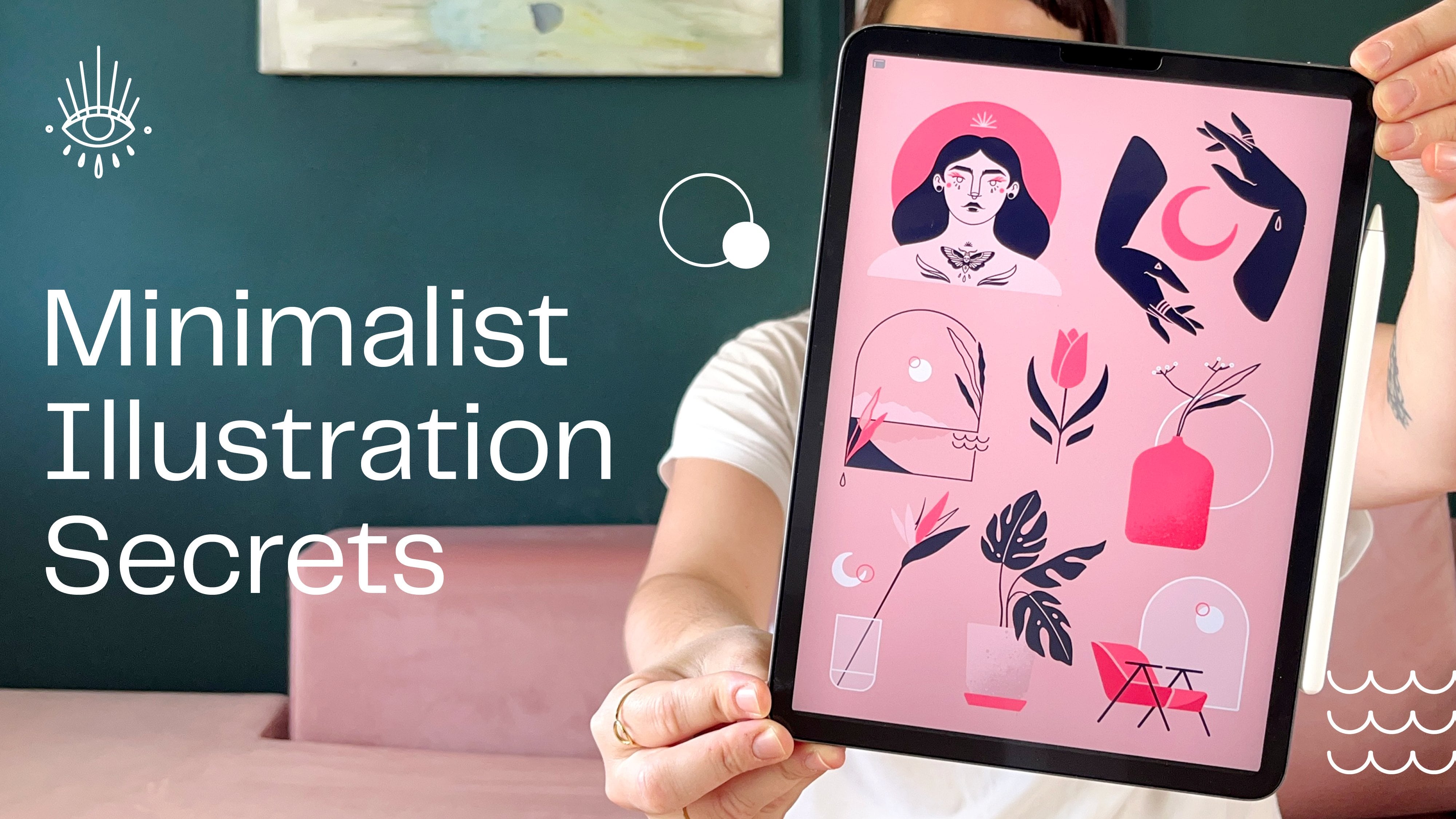
Meet Your Teacher

Teacher Profile Image

Sandra Staub

illustration & design

Teacher

I am an Illustrator, Graphic Designer, Muralist and Beer Sommeliere with a Swiss-Colombian background -- and a tendency to turn my passions into my profession...

I've been working over 10 years in the creative industry, collaborating with amazing companies such as Penguin Random House, Pela Case, Packhelp, UBS, SWICA, Rasa, Linearity, and many more.

My designs aim to convey stories of empowerment, finding inspiration in womanhood, nature and all things magical. I strive to inspire people to discover their true self and live it fearlessly.

I'm a design minimalist and like to combine clean shapes with organic textures, fine-lined details and bold, yet limited colour palettes. I confidently work with both digital and analogue media, creating digital illustrations one d... See full profile

Level: Intermediate

Class Ratings

Expectations Met?
    Exceeded!
  • 0%
  • Yes
  • 0%
  • Somewhat
  • 0%
  • Not really
  • 0%

Why Join Skillshare?

Take award-winning Skillshare Original Classes

Each class has short lessons, hands-on projects

Your membership supports Skillshare teachers

Learn From Anywhere

Take classes on the go with the Skillshare app. Stream or download to watch on the plane, the subway, or wherever you learn best.

Transcripts

1. Setting the Stage: Class Breakdown & Project: You asked me for it, and I was happy to deliver. In this snack size drawing session, we will create three different colour palettes in less than 30 minutes and apply them to our previously created sketch. Uh, might look something like this. If you've thought making color palettes was hard, let me show you how to make it simple. Hello and welcome everyone to my monthly series Minimal in Minutes. In these sessions we'll always create some cool and simple minimalist artwork together. And you even get to vote what we'll do next. Simply let me know and comments. These sessions are no longer than 30 minutes, and after the first one, you'll already have a lovely sketch. In this particular session, I focused on the creation of color palettes. So we'll actually create three different color palettes together, which then we'll apply to our sketch. You can get my color palettes in the class resources if you prefer to work with them. But if you prefer to create your own color palettes, I'll walk you through the process. Always, I work in Procreate, but you can use a different program if you prefer to do so. Now, let me say a few words about myself before we get started. My name is Sandra Staub, and I'm an illustrator, graphic designer, and muralist with over ten years of experience working with clients of all sorts from multinational companies to small and local businesses. I'm also rising teacher right here on Skillshare, and I turned another passion of mine into my side hostel by becoming a beer smeler. So you'll sometimes see me draw a lot of beer related things, but not today. I intentionally keep this part short and simple so we can jump right into the creative part of this class. Join me in the next lesson for the creation of our sketch. I'll see you there. 2. Foundations in Minutes: Building Shapes for Color Testing — Fast & Easy: For this session, I thought we could do something a little bit different. So I created a couple of different color palettes that we will apply to this illustration. If you want to use the same color palettes that I used here, you can download them in the class resources. Now, let's get started by picking a theme and starting to create a couple of objects that we can apply or color palettes to. I simply get started by drawing a couple of elements that feel like summer. Then I will rearrange them in my canvas and then we will experiment with a couple of different colors. Here, I was obviously thinking cocktail glass and I personally really like these white ones. You can draw any object that you want. You can pick a theme that speaks to you or you can just draw a different version of the objects that I'm making. Maybe here I'll have something like this leaf and maybe we'll have something like a vase. Maybe some berries or some fruits over here. Maybe we also draw a little shell, and, for example, a lime wedge. I simply created this with the radial symmetry, and now I will remove half of it and, of course, close this part of some final details and done. If you like flowers, you can add a little flour, as well. Just give them any shape you want. Now I have a couple of interesting elements and shapes. I will simply assign them color as well, and then we will start experiment with different color palettes. 3. Color Exploration: Developing and Applying Three Color Moods: We have our objects ready, we can move on and create a couple of different color palettes. I want my first palette to be super vibrant. I was thinking of starting it off with an intense purple, maybe something like this. I prepared the template of four circles I can simply drag and drop my colors into. Now I thought to combine this purple with an orange. And last but not least, let's add a pink. The fourth color is the color of my background. I simply left this circle empty. Now, I'm not quite happy with the orange just yet, so I will adjust it a little bit. Let's try these three colors and see what happens. And this is what my objects look like with these colors applied. Now, I usually like to have a darker and a lighter version of my main colors. This will add more contrast and a little bit more of neutrality to some of the colors. The way I do that usually is by lowering the brightness. And now it almost feels like I have an additional color. I can do the opposite thing by rising the brightness, and usually I like to lower the saturation also a little bit to create a bit more of a pastel version. For example, I can use that in the flower. Now I'll simply create a little bit of a less saturated version of this orange. And another darker version of the purple. And here we go. I already feels quite different than the previous version. The different tints and shades simply add complexity and a little bit of depth. Last but not least, I'm going to have a little bit of fun by adding a bit of texture to these leaves. Maybe also some to this flower. Next, I want to use the same color palette, but in a different way. I now use the purple for a background, and the previous background color, this dusty pink, for the leaves, the flower, and the glass. Now, of course, I can play around here as well with some tints and shades and here is the result. Again, working with lighter or darker versions of the same colors from the color palette created a little bit more of depth. Now for the next color palette, I want to work with something way softer and natural. I'm starting with this light green, I would like to add another green, but I want it to be a bit more in the bluish family. So I'm pulling this down here and this kind of down here. Now, as you can see, this color is not a shade of this color, so it's not simply just darker version of this one, but they still work together really well because they're close to each other on the color wheel. And last but not least, I would like to have something kind of fresh and sesty maybe just one color that is a little bit more warmer than the other ones. I'm using gray as a background now so we can see the colors a little bit better. Let's jump back to our objects and have some fun with our new colors. But Now, this could be one version of how to apply my color palette to my objects. Let's explore another option with a dark background. And this is what my artwork could look like, or maybe like this. And as always, now you can play around with some darker and lighter versions of your colors. So for the glass, I would actually like to have a lighter version of the background color. So it seems kind of like transparent. So I'll do that by simply raising the brightness and lowering the saturation. But now it feels like it's almost a bit too blue. So I'll correct that in order to make it blend in a bit better. I'll simply move the hue slider and see what happens. Of course, I can also create a lighter version of this green, so I have a bit of a contrast here. And here we go. And maybe I want more of a vibrant version of this orange just to give it a pop of color. So I'll raise the saturation and I pop it in there. And now we have another artwork consisting of the same color palette. Last but not least, I would like to create a color palette that is a little bit more neutral. I want to start with a gray, so I simply slide down this brightness slider from white. Maybe it can be even a bit darker. Now let's add a bit of color to this. For that, I will move around this slider and pick a blue. And then adjust this slider just ever so slightly. Just to add a little bit of color into the gray. For the second color, I would like it to be a bit more vibrant, sort of like an accent color. I was thinking of pink, maybe something like this. Let's also add a lighter gray. Now, also enrich this a little bit with some color. And last but not least, I would like to have a bit more of a saturated version of this one. So something that goes between a grey and a blue. Let's take this color palette out to play. And here we have one possible version of this color palette in action. And this could be an alternative use of the very same color palette. Of course, here as well, you can use lighter and darker versions of your very same colors and create a bit more depth. And, of course, you can add a bit of texture again if you feel like it. So here's my last version of the third color palette, and of course, you can experiment as much as you want. I hope you had fun today and you learned a lot. Have a wonderful rest of the day and see you next time. Bye. 4. Course Recap: Wrapping Up Your Minimal in Minutes Experience: Welcome to the wrap up. Congrats for making it here. I hope you not only had fun but also feel like a pro now when it comes to creating color palettes. Before we end the class, make sure to add your signature to your sketch and to your artwork and share it with me and your fellow classmates by uploading it to the class project. I can't wait to see your creations. If you want more of these sessions, you can join my Patrion for Early Access or follow me here on Skillshare, so you'll always be notified when a new session is published. If you want to learn more about minimalist illustration, make sure to check out my other classes here on Skillshare. I also created a wallpaper pack of today's illustration, which you can also get on my patron. Of course, you can find more goodies and exclusive content there. I hope you'll join me next month for another minimal in minutes, and let me know in the comments what you want me to draw next time. Thank you so much for creating with me today. I'll see you next time. Bye.