Transcripts
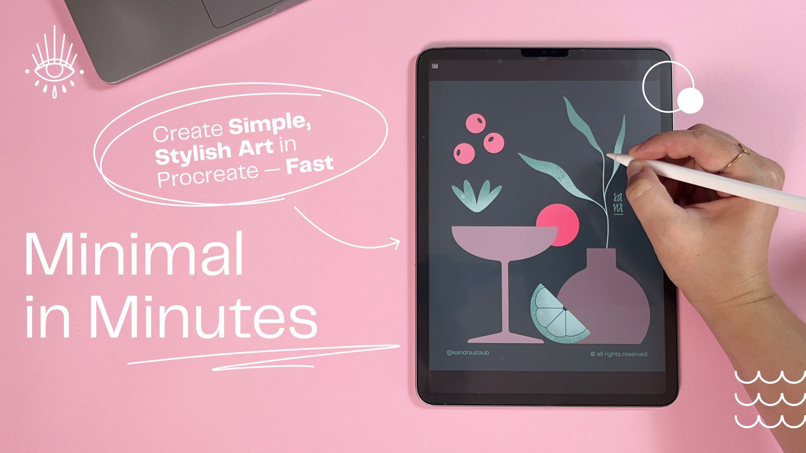
1. Setting the Stage: Class Breakdown & Project: Creative is not just fun. I
find it also very relaxing, but sometimes you just
don't know where to start. If you can relate, how
about a snack sized session where we will create a minimalist
illustration together? Join me for this
short, fun and easy, minimal in minutes
session where we will create this summer themed
illustration together. Hello and welcome everyone
to the second class of my brand new monthly
Minimal and minutes series. Every month I publish
a new, short, easy, and fun hands on session
where you get to create your own minimalist illustration
in less than 30 minutes. The goal is to have fun and enjoy creating
without overthinking. If you don't want to
miss them, follow me here on Skillshare. After the first lesson, you
will already have created a sketch that might look
something like this. The second session
is designed to finalize your artwork
and add some color. This class is filmed
in Procreate, but if you prefer a
different program, feel free to use that. Now, before we get started, let me tell you a little
bit about myself. My name is Sandra Staub, and I'm an illustrator, graphic designer, and muralist with over ten years
of experience. I recently turned my
other passion beer and to my profession by
becoming a beer semier. That's why you occasionally
see me beer inspired items, like today, for example. But don't worry.
You can always draw something different should
you prefer to do so. I'm also a rising
teacher here on Skillshare if I'm not working
on client commissions. But before we get lost
in my impressive CV, let's get started with our
summer themes illustration. I'll see you in the next lesson.
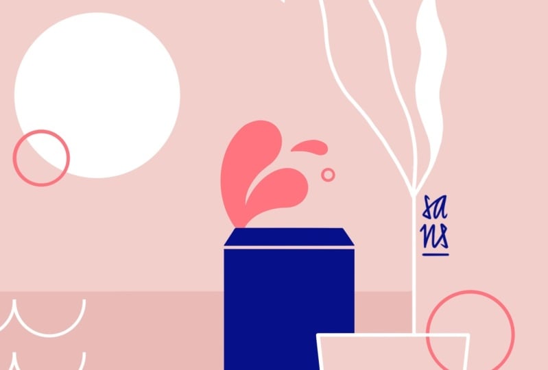
2. From Idea to Sketch: Create Your Minimalist Design — Fast & Easy: We will start with a
four by five canvas because this is very easy
to post on Instagram. Now with the new format, it will just cut a little
bit on the sides. So that's basically
the reasoning behind. The measurements of this
canvas are actually 440 millimeters by
550 millimeters. That's basically because
it is very scalable. So if I want to blow
this illustration up and create some
art prints of it, I am very free to do. Probably notice that the
background is already light pink and that's
because it's easier to film. It creates less contrast with my hands and it's just a nicer lighting
for the entire video. You can use any color you want. You can just sketch
on white, of course, and then just add the colors
later in the process. I just like to start with
light pink in general. That's just a
personal preference. I like to do my sketches
with the six B pencil. You will find that in if I'm not mistaken,
in the sketching, maybe in the drawing
in the sketching preset of Procreate. It's right here. You can
pick anywhere you want. I just like to use
this one because it helps me in the sketching
process a little bit. I'm a little bit less fussy about already making
perfect lines. And as you already
know, probably I'm a bit of a perfectionist. So, let's get started with our minimalist summer
themed illustration. I will use dark blue from
my signature color palette. Again, you can use
any color you want. It doesn't really
matter just now. Just make sure
that it has enough contrast with the background. I thought today we're going to frame our illustration
a little bit. And if you've been
following my video so far, you know that I like to create
these half arches that I'm going to do now Procreate is giving me
these little guides. I know when it's
placed in the center, I just started with the circle, placed it in the
center, basically, and then here on my
sketching layer, I will just toggle
on here in Canvas, the drawing guide to symmetry. Done, and then I get to draw
the sides of my half arch. By tapping one finger
on the canvas, I'm making sure that the lines are snapping to a certain angle, and I want them straight. So that's what I want here. And then I'll just close
the half arch like this. And with the eraser and
the symmetry tool on, I can just erase this. You can also use the
select tool if you prefer. Sometimes I'm just
doing it that way. Now I'm going to
center this again in the center of my canvas. Just because I like that. You don't have to do that. It's just a personal preference. Now, let me add a
second layer for our other elements
because then I can move them around
without affecting the rest. Of course, the symmetry is now off so if you're drawing
on the same layer, then just make sure that you
talk off symmetry first. But I would recommend actually to just create a new layer, and that way, we're just more flexible with
what you want to do. So I imagine there would
be something like a sun. Let me add a beer can maybe or cocktail because
that's just something really nice to enjoy
during summer. I'm not sure yet
what it's gonna be. We'll just figure that
out, and I will actually toggle on the drawing
assist for this one, too, because then it helps
me creating really, really quickly a super nice
can without much effort. See? Yeah, super nice. Alright, let's place
this maybe here. Let's do a glass. Again, with the drawing assist, I personally really
like these kind of, like, wider and lower glasses. They're called tumblo glasses. They are, however, a
little bit harder to recognize as a glass sometimes. So they're not always
the best choice. You can just go for
a different glass or different elements, basically, whatever
you feel like it. And then I want to place this probably over here
because I want to disrupt this frame a little bit just to
keep it interesting. I actually want
these two elements to be a little bit bigger. That's nice. Now we can add to the glass. I'm going to start
naming these layers because this is getting
a little bit confusing. That's actually why I
always name my layers. I know it's a little
bit of extra work, but it's just really helpful to know where
you're actually at. Now, I've actually been
envisioning this with a little like a lemon thing slice or something like that here. I don't really know why
because it's not very typical for beer to
have a lemon slice. I mean, you can do
that, of course, but I guess it's like
for the summer vibes. So let me just place
it here and then see if it works. Maybe
I'll move it over there. We'll see. I actually want the can a little bit over here. Maybe one of these
two elements could have a little splash
or something, which is something
that I like to add to my beer themed illustrations. I'm fixing this
just a little bit, so I'll have a bit more of a clear idea later on what
shape this should be. But I'm trying to
really not be too perfectionist about all of this, which is a bit of a task
for me, to be honest. And here we go already
with the perfectionism. Okay, maybe just
making this one a little bit thinner,
and then that's it. I can always make slight
adjustments later as well. So I really don't need to
fuss too much just now. I think it's okay. I just want to rotate it
a little bit, though, because I feel I could use a
little bit more of an angle. That seems pretty nice. Maybe just a little bit
more of an angle because it feels a little bit
too static for me. Just giving a bit more
dynamic into this one, and then I hope this is going to look nice.
Yeah, this works. Just some slight adjustments
because it looks cooler if these parts are a
little bit thicker. Then this, just like the
drop over here, basically. And then we should have a
nice and dynamic splash. This is cool. I like it. I'm going to size
it up a little bit, as well. And that's why I like having
things on different layers. I can size every
individual part up. I can swap them around and
just see how it works in the composition before I commit to creating the
final illustration. We definitely need something
over here as well. And I was thinking of maybe
having a little bit of, like, a plant thing hanging in here. So we get these nice summer
vibes. Let me do that. I've been thinking
something like this that follows the
line of the arch, and then I will just delete
the arch underneath. I kind of like this. So
let's roll with this. Let's add a smaller
one over here. Of course, these lines
are a little wonky still, but you get the idea. I hope maybe another
one just here. Maybe if it's coming
out of this one, no, I don't like it either. I want something over here, but I don't know
let's leave this for now. We'll come back to it. I'll move the sun around
just a little bit. Seems more harmonious
to me, so that's why. And now I just need to come up with something for this part. Or I could, of course, just move all these
elements over here. No, I kind of like them
over here, I think. I kind of like that
it's getting busy over here and then just
something small here. So what could that be?
Let me think quickly. So I will try with
another leaf set here. Maybe these are more like this. And what I also like to add
is water, little waves. I feel like that could give
some nice summer feel. And I start with basically
just drawing a circle. And I'll actually toggle
off the visibility of everything else because it's
distracting me a little bit. So basically, I just start
with a little circle. I cut off the top
with the rectangle. So pretty much up until the
middle, just like that. And then I just copy this and place it next to
it one more time. And let's see how we like it
or if we need another one. Let's group this for now, so it's just easier to handle and to place with
the rest of it. And if we like it, we can
just put it all on one layer. Maybe here. I don't know. I'm not sure about
the leaves now. Let me toggle these
off quickly and see if the water might
already be enough. Yeah, I like this. It's a little bit
simpler, but in the end, we are creating a
minimalist illustration, so it makes sense. Let me put all these
in one layer like this because then I can just
duplicate it and place it here, and then maybe one more time. I am really digging this. I'm really getting
summer vibes here, and I think it really
works overall. Let's add a cool little drop. I will toggle on the drawing
assistant for this one. And I'm going to make it kind of big because I want
it to be placed, like, right under
here, but actually disrupting the frame
a little bit more. Do I like it better over here? Definitely not.
Let's just do this. It's a little bit
unconventional. It's like, something
a little bit different from what
I'm usually doing, but I kind of like it. I'm rolling with this. Now I want the glass to
be a little bit bigger. Oh, yeah, that's
better. And the sun could go a little
bit further down, or it could have another circle, kind of like a light dot, if you want, maybe like this, just so it fills up the space a little bit and let it come
down here a little bit, so it feels like maybe an
afternoon or sunset situation. So I'm pretty happy
with my sketch. I'll just make some
really tiny adjustments. For example, I want the drop
to be a little bit smaller. It's a bit too dominant for me. I want the splash
to be even bigger. Let me see how it
looks by zooming out. When I zoom out, I usually
can see a little bit better, like how everything behaves, how everything fits together. Now, just to get a little bit of a better feel for
the composition, I will actually color
all these parts that are overlapping in pink, so
in the background color. The reason behind
that is because then I can still use the shape
and I don't delete parts. So let's say, I could delete this part or I could
just color it in pink, and then it still
remains intact. So if I change my mind about
the position of this drop, for example, I can just recolor the line underneath it and
I don't have to redraw it. It's basically just
a lazy trick of how to make life
easier for myself. So I'm going to do
that, everything that is underneath something. I will just color
in pink and don't forget to toggle off
the drawing assistant. Here we go. And then let's
just make this pink. Same goes over here. I want these two to
overlap, so that's fine. I'm going to leave it like that. I'm not sure about the glass. I might just add a little
bit of a transparency in the back or I
might actually cover this part of the can
Yeah, I like it better. It's cleaner. It's a little bit easier to understand
what is what. And so I'm going to leave
that. I also don't need this. And I'll actually break up the entire half arch until
here where my leaf starts. Now, let me make some
minor adjustments to the shape of the leaf. So just so I can
get a better feel of what it should look like. That's why I'm using
the six B pencil because I just leave some parts not so
polished, let's say. I want this leave to be a
little bit closer, I think. So I'm just selecting this and then just pushing
it over here. Maybe it should also be
a little bit bigger. What do you think? I
like it. I like it. I feel like it really helps. And then just delete this make the shape a
little bit prettier. Okay, so my sketch
is pretty much done. I know where I want
everything placed. So I hope you also found your elements that you wanted to add to your illustration. Maybe you drew the same ones. Maybe you drew different
ones. That's perfectly fine. I will quickly pop
in my signature, and then I will see you
in the coloring part.
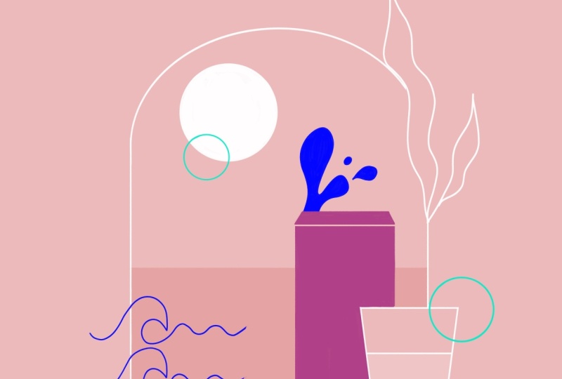
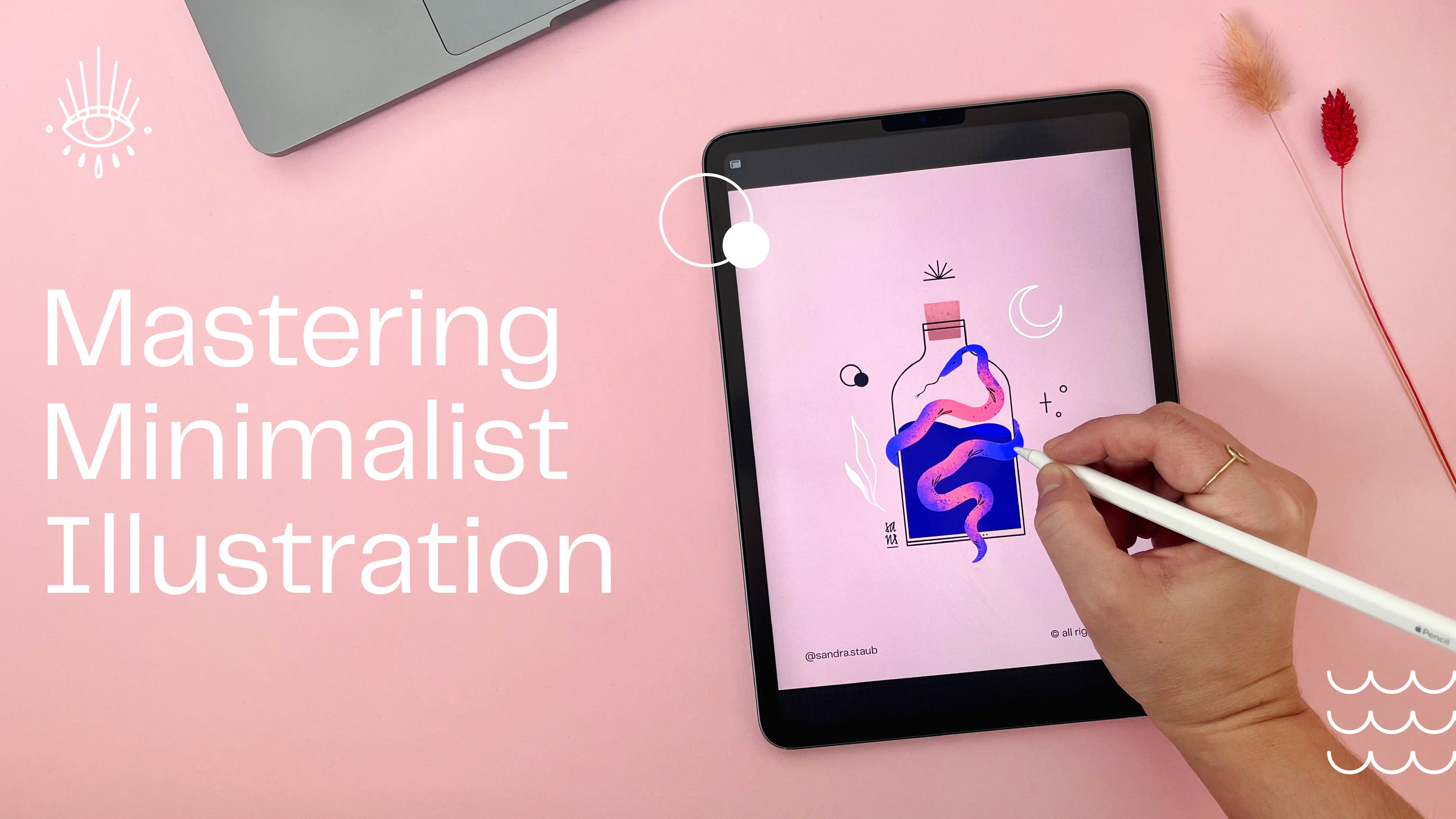
3. 03 short: Welcome back to the
coloring part of this lovely summer themed
minimalist illustration. I quickly popped all
the different elements into one folder or in one group here in Procreate called sketch because that way, I can just toggle it off and on, and I can just redraw the
elements on top of it. For the final artwork, I will use a different brush
that is the studio pen. It's here in my favorites, but you will find it. I haven't been doing this in
a while. I think in inking. Yeah, here it is. In the inking, that's a preset
procreate brush set. This one, the studio pen. If you want some texture
or anything else, you can use something
different, for example, I don't know, ink
bleed or whatever. Then you will get some
nice little textures. That gives a different feel to the brush quality, which
you can totally do. I personally prefer
to have very, very clean edges, so that's
why I'm using the studio pen, but feel free to
experiment and choose your As a minimalist
illustrator, I'm also very minimalist
when it comes to brushes. So you basically see my
favorite three brushes here, and that's pretty
much all I use. So again, I'm starting
with a circle. I'll toggle along
the drawing assist, and I'll just create
these lines here on the side and on the
bottom and drag and drop. It's blue now, and I actually don't think
I'm going to use that. It's a little bit too
harsh of a contrast. I've been thinking of making the background actually
in a dustier pink, a little bit darker. And then make the arch,
maybe light pink. And then it feels kind
of like a window, maybe. I can also do it the
other way around, maybe. Oh, I kind of really like this. And I actually placed this down here so I can see
the sketch on top of it. Now, for the leaves, I was thinking white. As an eraser, I also
use the studio pen, so I get these nice
and crisp lines. Now I'll continue with the sun, and I'm thinking of
actually making it the same color than the background in the slightly more brighter pink. And that way, I don't use that many colors in my
color palette because, again, this is a
minimalist illustration. We want to keep it light. And for this little
circle on top of it, I've been thinking of using this electric which
is my accent color, and I use my accent colors sparsely because the name
already says it all. They are very, very vibrant. That's basically the
idea of an accent color just to add a little bit
more of wow to everything. I'm keeping it all in outline
for now because I'm going to figure out later how it's
going to work together. I think I'm going to do
this in coral, as well. Then I have a little
bit of, like, an accent here and here. For your accent color, you
can pick something that is kind of like a derived
version of your neutral color. So for the background,
you can see I used the somewhat
of a neutral color. I use the signature color,
which is this pink, and then the accent
color is just, like, a more saturated
version of that. Or you can also use
a contrast color. So basically, that will
be a contrast color to your signature color. But I want to keep
it simple today. Now, let me redraw the glass. And then I mentioned
before that I was thinking of
either leaving this just an outline or maybe add a little
bit of transparency. And what I meant by that is basically I will copy the shape, I will pop in white, and I will just lower the
transparency with the outline on top of it to give
you kind of like this glass feeling,
which I quite like. I'm going to create
the waves now. I call them water
in this sketch, but don't worry about that. So just like before
I draw a circle, and then select the half of it. And then swiping down
with three fingers, it gives me this little pop up where I can just cut, copy, copy all, duplicate,
cut and paste, or just paste, which
is super helpful. I will just cut it
saves me some time. And then just like before, I'll duplicate this shape
and place it over the rest. And I'm actually going to toggle off the sketch very quickly, so it lets me see if
it's aligned or not. There we go, see. This one. Now I'm just going
to pinch these together to create one layer, toggle back on my sketch. Then duplicate this Broker gives you these super
nice guides that help you place it exactly underneath the other wave. Now
I have my waves. I'm also going to
pinching them together. Now I create the drop. Then again, I'm usually
fixing some little details. And last but not
least, let's create the can I don't know which
color I want the can to be, but just for the
sake of contrast, I'm going to make
it electric coral. And now here I'm using the
arch settings by Procreate. So if I draw an arch or, like, a curve, then Procreate
will fix it for me. So I close the shape here so I can drag and
drop the color in here. So, this yellow actually
doesn't work for me. It's way too bright. And I'm just going
to tone it down a little bit here in the values by desaturating it a little bit and then
see how it behaves. This is already much friendlier, but I'll desaturate
it even more. And now it blends
in together because the saturation of
several colors here, except for the accent
color are similar, and so it gives it kind of like this more harmonious feel. I'm kind of undecided
on the leaves if I should actually make
them a darker color. It's kind of cool, isn't it? So now I can pull this down. I only going to pull it
to here because I don't want it to disturb
the glass too much. For the can, I've been
thinking maybe gray to bring in a little bit
more neutral tones again. I was thinking of doing
a fill for the sun, as well, and then that
would be this color. Oh, that's too subtle, isn't it? So I quickly redrew this arch, but just the outline in order to see if I can do something
different about that. I kind of liked it
as a background, but it seemed weird
with the leaves. Let's see what we can
do with the coloring. So let's make the wave
and blue because now it needs contrast and
see how it pulls out kind of like
the view down here, which is what I wanted. Same goes for the drop. Now the leaves could be white, but I need the sun to be white. So if the sun is white, then it needs a little
bit more focus here, especially if the leaves are
white and the sun is white, which is why I colored this can in this vibrant blue or purple. But I think what
we could do here is we could actually use
the outline version. And that's why I keep it handy because then it immediately feels much, much, much lighter. And I do like it. I do want to see, though, what the sun looks
like just in outlines. Okay, now it definitely
needs more weight down here, but maybe it should be a
little bit less vibrant, so it blends a little bit more into the
background and doesn't get that much attention
because I want these pink parts or the electric coral
parts to be the focus, basic so I also have this dark blue or
dark purple how Perkri calls it in my
signature color palette. And it's also on the
opposite direction or basically more a tertiary
contrasting color of my signature color, which is the dusty pink. You can actually go in the
harmony tab and pick triadic. And then you get a
lighter version, obviously, of my pink. And if I would pick this
and just make it darker. I may be a little
bit more saturated. That's pretty much
how I create most of my color palettes by picking either contrasting or
tertiary colors of my colors I'm already using and then adjusting the
saturation and the hue. So with that, I
already got like, 80% of the coloring work done. So little tip for you there. So what happens if I'm
actually gonna color this? Because it's less vibrant
and immediately kind of, like, goes into more
into the background. I just had the
idea of how about. If I added sort of like a
square here in the background. Oh, I like this idea. Keep the waves in white, but I will keep the drop in this electric purple or maybe
even in this dark blue, so it blends a little bit nicer. I kind of liked it better
before. What about the can? So I switched these
two elements, the drop and the can to a slightly less vibrant version
of that electric purple. Now it's more like
an electric blue. It's not as dark as the dark
blue that I used before. And so it still
adds a little bit of vibrance to everything, but it does disappear a little bit more
into the background. I'm quickly removing this. Maybe even the can. I like this. What I'm going to do, though, is actually I'm keeping this fill of the
glass, basically, but I'm going to
make it shorter, and it's gonna be pink, like this electric coral here. Now I really like it. To these leaves up here, we can add some
colors as well or, like, some solid fill. But I'm gonna fill the smaller leaves and not the big one, so it will be a
little bit lighter. And then, of course, I
will remove this as well. If I work with, like,
a frame or something, I like to break them up,
so that's basically why. I might color the drop as well. So I picked this darker blue. Boom. And last but not least, I'm thinking of
making this here. Also like, not just outline. 'cause I think the sun works. The sun is kind of
weird if it's fill. Well, now, it kind of
works. Well, never mind. So, this is the
final illustration. I quickly toggled off the drawing guide so you can
see the full illustration. Thank you for taking part today, and I see you next time. Bye.
4. Course Recap: Wrapping Up Your Minimal in Minutes Experience: Well done. You made
it to the end. I hope you enjoyed creating
this summer themed illustration with me and you
also learned something new. Please share your sketch
and final artwork in the class project so we can all see what you created in
less than 30 minutes. Also, don't forget to
add your signature. If you like this
session and want to watch more of
Minimal in minutes, join my Patroon to
get early access. There you can also find the wallpaper pack of the illustration that
we created today, as well as other goodies
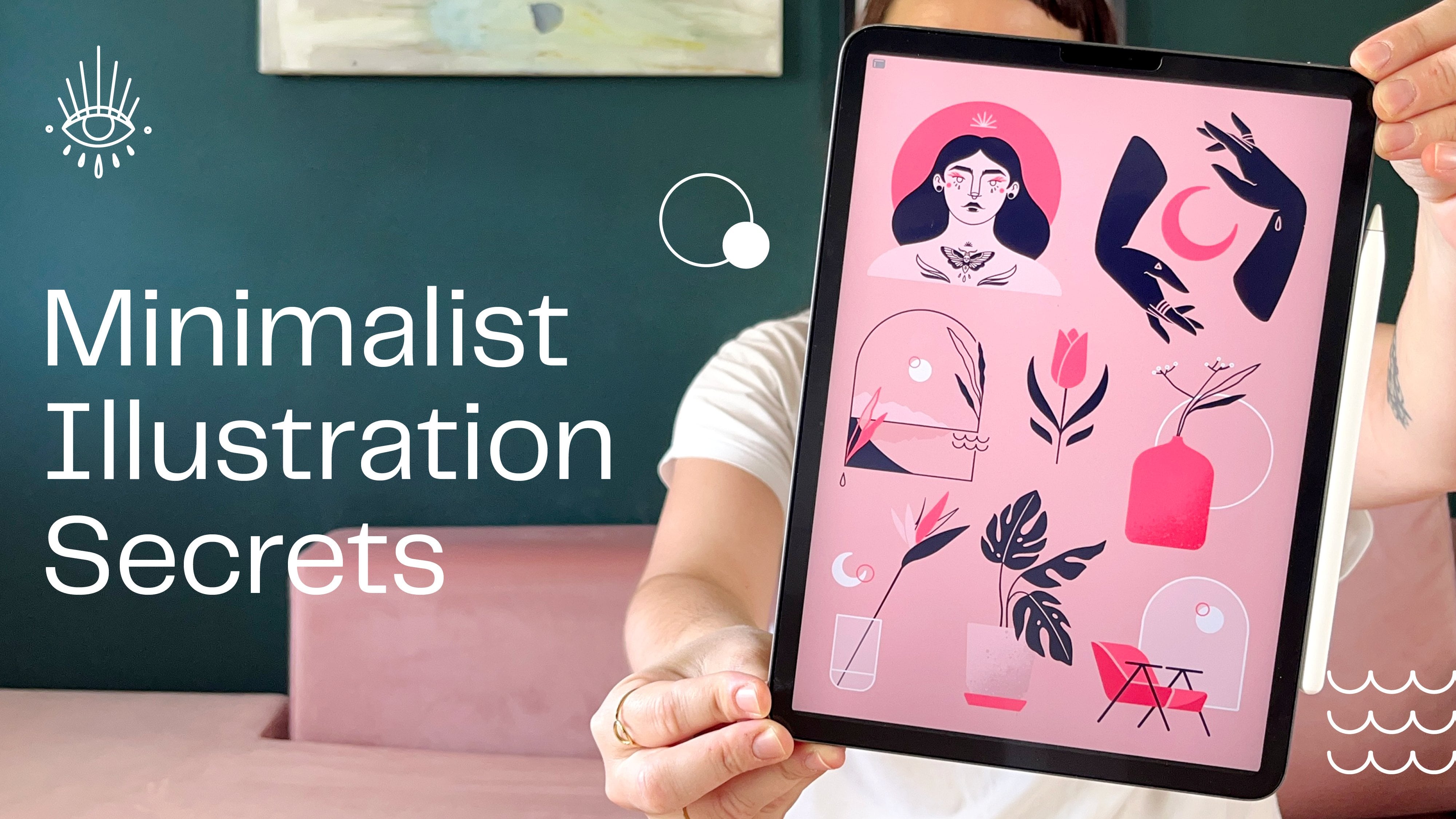
and exclusive content. Make sure to check out
my other classes here on Skillshare if you want to learn more about minimalist
illustration. You hit the follow
button on my profile, you will never miss out
on my newest classes. Thank you so much for watching and creating with me today. I hope you'll join me next
month for another session. Let me also know in the comments what you would like
me to draw next. Have a great rest of your day and see you next month. Bye.
 Sandra Staub, illustration & design