Transcripts
1. Introduction: Welcome to the World of Colour: Colors are a
fascinating universe, and skillful intentional use of color elevate any artwork
to the next level, especially in
minimalist designs that are already reduced
to the essentials. But how do professional
illustrators keep their color palettes fresh yet instantly recognizable
in their personal work, or how do they master to
adapt their distinct style to client commissions in order to create something truly
unique for them? If you've always wondered
at and are ready to elevate your work as an
illustrator and designer, then this class is for you. Hello, hello and welcome to this brand new
class that is going to be all about the
exciting world of colors. Many of you have
expressed wanting and needing a class of mine
about color palettes, and I'm more than
happy to deliver. So this class is possible
thanks to all of you. For those of you who
are new to my classes, my name is Sandra Staub,
and I'm an illustrator, graphic designer, a muralist and a beer Semerl and I'm based
in Zurich, Switzerland. I'm also proud and honored to be a skill share
rising teacher. Even though this is only my
third class on this platform, I've studied graphic
design and worked for over eight years in
studios, agencies, and self employed
before refocusing my career on Illustration
five years ago. During the entirety
of my career, I worked on many different
projects of all sizes with exciting brands and
inspiring colleagues from all over the world. Every project provided a
new opportunity for growth, and I'm thankful and
excited to have worked with big renowned names such
as Penguin Random House, UBS, Sica Pea case, Raza linearity, and PAC
help to just name a few. Was, however, most
often the work that I developed alongside
local business owners, community project
leaders, or freelancers that sharpened my branding
and color skills the most. In my design studio, which I co own with my
amazing business partner, we co created a myriad
of branding projects, and after the first few
successful projects, it became more and
more clear that I had a knack and a
passion for color. As it usually is, I'm not always an expert on
knowing what I'm best at. So getting this feedback
from my business partner, my community, and my
clients meant a lot. I took a more objective look
at my work, my strengths, and what I seem to have sort of always naturally researched, and I finally saw what my surroundings had
known all along. Color was always an
essential ingredient to my most successful project, and it was my superpower. In this class, we will approach the topic of color
in illustration and design in depth in
a way that you can employ what you learned
over and over again, either for your personal work
or for client commissions. I pack this class full of practical and theoretical
knowledge that I've picked up during my career with
the goal to make this class everything you
hoped it would be and more. You've been wanting to
deepen your coloring game, then this is your sign. Let's take a deep dive together into the
fascinating world of colors and become a pro at using color strategically
in your designs. Using color intentionally will not only elevate your artwork, it will strengthen
your own brand, as well as the design that
you develop for clients. Alright, once you're ready, join in the next class, and let's elevate your skills.
2. Class Overview: Structure & Project Breakdown: Hello, and welcome to discourse, where we will create not one but several unique and stunning color palettes for your artwork. I'm happy you made it
to the second lesson, and I'm excited that you
chose to learn with me. Due to my background, I can't
help but always bringing my experience as a
graphic designer into my work as an illustrator, which is why it always felt very natural for me to
create art with a limited color
palette of three to maybe six or so colors and a
couple of tints or shades. Also happens to
tie perfectly with my positioning as a
minimalist illustrator, which is also deeply connected to my background
in graphic design. When I first
conceptualized this class, I knew that creating a
minimalist color palette of two to four colors would be the cornerstone of
our class project. But it wouldn't be
me if I wouldn't take this one or
two steps further because I want you to learn
the most from all my classes. I came up with the
idea to design this class as sort
of a dry run of a **** project with the
goal to provide you with ample opportunities to create
not just one color palette, but several tailored to a fictional client and
their business needs. We will first do what
you're all best at, create two design proposals
in form of sketches, based on a client brief that you'll find in the
class resources. The purpose of this
illustration is to be used on merge or more precisely
a tot bag and a shirt. That's what our fictional
client hired us to do, and we shall deliver. Once we get our
stunning sketch ready, we'll get to why
you're all here. The coloring part.
In the first part, besides learning how to use correctly all the color
terminology out there, you'll learn how to use color intentionally and how
color influences emotions, moods, and perceptions in
order to make you a color pro. So you'll get to see a bit more of me during this
theoretical part, which will prepare
you for the hands on lessons where I
take you step by step through my workflow
and will develop several different
minimalist color palettes for your class project. Be working in Procreate in order to create this
illustrated design for our fictional clients that highlights their product,
vibe and positioning. As always, this class
should be useful to you if you choose to work
in a different software. You'll simply see me
occasionally going into Procreate specific
tools and terminology. At the end of this class,
you'll have developed several minimalist color
palettes based on brand values and have learned
how to work with project restrictions due to branding guidelines,
material, or budget. Basically, you'll be ready to tackle any commission heading your way or take
your personal work to the next level with
unique color palettes. Some stuff in this class might be complex to
grasp right now, my experience has shown that some things I've
learned only started to make sense after a while after I had gathered
some more practice. But the seed was already
planted in my head, and I could easily access and use what I had
learned before. So if you're just
starting out as an artist or
illustrator, tag along. I'm sure you'll learn a ton, and you can always
come back later and re watch some
lessons of this class. Also, don't miss out
on the opportunity to ask your questions in
the class discussions. If you have more in
depth questions, I'm always here for one on one sessions in order to
quench your creative thirst. Now, get your iPad out, grab a glass of water, get comfee and meet me
in the next lesson.
3. Client Backstory & Brief: Setting the Context: Hello and welcome
back. I'm excited you decided to be part of this
learning experience together. As you already know,
I built this class as sort of a dry run for
working with a client. I'll take you through
the steps of my workflow so you will learn how I
approach a client project. In this lesson, we will
establish the context of the class project by
creating a fictional client. They provided us with
a design brief that will set the framework
for our class project, and it is packed
full of information about the client and the
industry they work in, as well as their motivation and expectations of
working with you. In other words,
client briefs are an amazing tool to get on the
same page with your client. I always ask for one, and I keep it at hand
when explaining my design proposals to
my clients and showing them how I translated
their words into graphics. Let's start with the creation of our fictional client first. As you might know, I am
also a beer semeler, which means that beer and
especially craft beer is a topic close to my heart. That's why I thought
it would be fun if our fictional client
would be a craft brewery. It's a growing market, and many craft brewers
have understood how design makes them stand out and strengthen their
brand and image. So it's a fun industry to
have our pretend client from. Let's check out a few
examples of great label and merge design to get an idea of the industry and
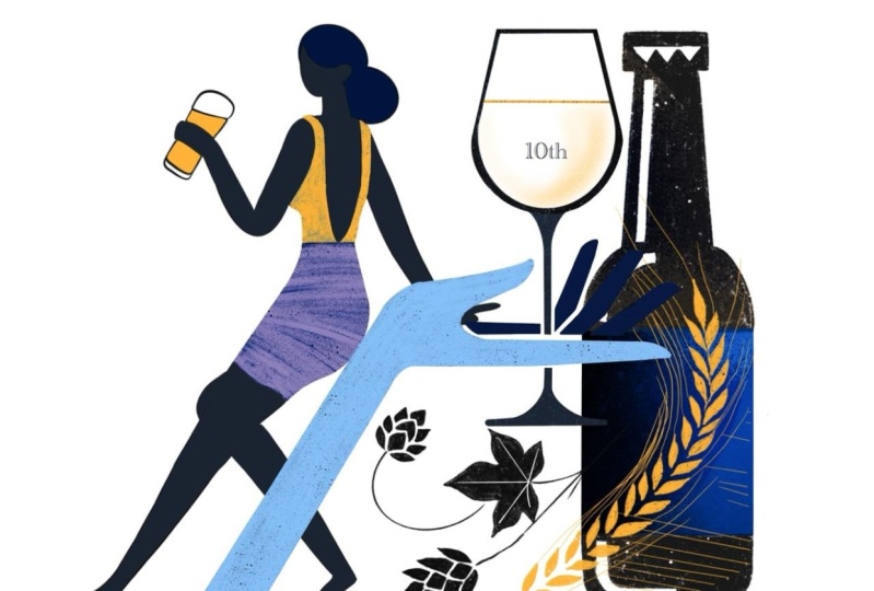
the competition. Our fictional client is named the Artisan Brewing Company, and they have been in the
industry for ten years, making craft beer with lots
of passion and inspiration. They always push the
boundaries of what was expected by adding creative
new twists to their brews. They hired you to create a
minimalist illustration, celebrating their
anniversary by creating a limited series of merchandise consisting of tote
bags and t shirts. I included a complete brief
in the class resources, so click on the Download
button and give it a good read before we move on
to the next lesson. Proteb after reading the client brief, research the industry
and the competition by looking up label designs
and illustrated merge of other craft beer breweries
in order to understand your client and the industry's
visual environment better. We aim to both blend into the
industry's visual universe, yet still set the client
apart from the masses. I usually do my
research on Pinterest and I save the pins that
inspire me on a new board. Feel free to create your own fictional client if you feel more
inspired by that. I created mine with
Jach PT to make it more realistic as I didn't control the parameters nor
the backstory. If you write your own brief, please make sure to share it in your class project so we can
appreciate your workflow. Include the company name
of your fictional client, how long they've been
in the industry, what product they sell, the use of your illustration
you'll create for them, their positioning
and brand values, plus a short backstory. If you want to make
this client commission dry run a bit more fun, use this community of
your fellow students and your social media
community for feedback. So please make sure you upload your deliverables
after every lesson to your class project and
invite your peers and your social media community
to provide you with feedback. A great tool for that is the
Pol sticker in Instagram, but we'll get to
that later again. Now, head over to
the class resources, read the complete client brief, do some visual research,
gather some ideas. I like to create new
Pintersbard for that purpose and share your
client brief if you choose to think of your
own fictional client. I'll see you soon
in the next lesson where we'll quickly
learn how to best set up your canvas to ensure ideal printing results before
moving on to the sketching.
4. Canvas Setup: Preparing for a Seamless Workflow: Hello, and welcome back to this quick lesson where
you will learn how to set up your canvas
in Procreate in order to ensure perfect
printing quality. If you're already very
familiar with Canvas setup, feel free to skip this lesson and head right over to
the sketching lesson. However, there could be one or two things you
didn't know before. Let's create a canvas of 450 millimeters by
450 millimeters or 18 " by 18 " in RGB
display P three on your iPad, which is 1.5 times the printable area the clad
specified in the brief. If you use a different tablet, pick any other RGB profile. Set the DPI to 300 and then tab create Pro tip I always
set up the canvas bigger than the printable area the client provided
in a brief because it's not uncommon that the design is later used
for a different purpose, but in a larger size. An example could
be that the client wants to use the
illustration for a poster, which would require the
illustration to be scaled. Pixel based artwork can only be scaled slightly without
risking pixelation. So if you set up your canvas larger than the printable area, you can save a lot of time
otherwise wasted on resizing or even redrawing should the client want to use
your design further. Don't forget to charge extra for additional uses that were not agreed upon in the client brief. Prefer to work in RGB
because it covers a wide range of hues than CMYK. RGB are screen colors
or light colors, while CMYK are in colors. Screens have a wide range
of color reproduction than ink unless you
use special inks, which is usually more costly. Using an RGB profile
allows me to create artwork with
more vibrant colors, which is definitely what I want. If done right, these
vibrant colors can even be reproduced in print. But if you work from
the start in CMYK, which is the standard
color profile for print, the color palette is
immediately limited to more dull hues both
for screen and print. After I finish my illustration, I can always convert
the artwork to a CMYK profile should the
client or the printer insist. Another limitation
we have that I find worth mentioning here
is that Procreate, unfortunately, still
limits the amount of layers we have available
based on the canvas size. As you can see here, we have 33 available layers compared to 79 available layers if we set up the canvas for the original
size from the client brief. Of 300 millimeters by 300
millimeters or 12 " by 12 ". I personally, am not
very bothered by this, as I like to keep my
illustration minimalistic, meaning that I don't
need too many layers for shadows or textures, and I usually only have a handful of objects
I like to keep on separate layers in
order to be able to move them freely around
in my composition. Okay, so go ahead and
set up your canvas to 450 millimeters by
450 millimeters for 18 " by 18 " in RGB display P three,
let's get started. I'll see you in the next lesson.
5. Let’s Sketch: Creating Strong Design Proposals: Hi again. Good to see you back here in the first hands
on lesson of this course. In this lesson, we will create two different sketches
based on the client brief. At the end of the
lesson, we pretend to deliver the sketches to
the client so they can pick their favorite
proposal we will then continue to work on
over the next lessons. Let's get started by
gathering some ideas first. For every new project I set
up in Mu Bourg on Pinterest, where I save any references
that inspire me. That might be inspiration for the composition of the artwork, inspiration for
the color palette, the objects in the artwork, or even the illustration style. I highly recommend to always do some research
first before starting a new project
because it helps you understand your client and
their industry much better. After you've gathered your
inspiration and references, let's think of which
elements represent the client's message best and sketch them in various ways, as many as you can think of
to give you options later on. Draw as many elements
as possible. So you'll have a reference
for later if you need to add an element to your composition in order
to balance it. After having gathered
our elements in our visual brainstorm, we start by sketching some quick and dirty possible compositions and combining different objects. Create as many possible
compositions you can think of. More is more in this case. Pro tip, take your
time for this step. Maybe even take a break by engaging in a different
activity in a while. One of my go tos is to go outside or make a
coffee because it relaxes me and provides my mind with more space to come
up with new ideas. Don't forget to track all your
ideas with a quick sketch. When you have gathered a good amount of different sketches, pick the two options you believe to have the most potential. Possible criteria you can
use for the selections are, do the elements in
the illustration represent the work and
product of the client? Is the composition
balanced yet intriguing? Is the message clear
and easy to understand? If this illustration will be printed on a shirt or toad back, will people want to buy it, et cetera, et cetera. Get it. After picking your
favorite sketches, we create a more polished
version of both of them. Your client will get
a first understanding of what the final
product will look like. Make the sketch as close to the final version as possible, but don't use colors yet. In this step, we focus on
providing the client with two design approaches we believe will work
for the project, but do not spend valuable time yet on polishing every detail. It's okay if the sketch
doesn't look finished yet, but all the elements should
already be in their place and have the same shape they'll have later
in the process. You're happy with your sketches, you're ready to present them to your client in order
for them to pick their favorite and potentially provide you with
some adjustments. Pro tip, get the mockups from the class resources and place your sketch on both the
shirt and the toad back. This helps a client
to understand what the final product
will look like, which makes it easier
for them to evaluate which design works best
for the intended purpose. I got these mockups
from Mr. Mockup, a great website for lots
of quality mockups. Have a vast selection
of free mockups, as well as sophisticated
mockup bundles and scene creators
for affordable rates. Now upload your mockups
to your class project so we can appreciate what
you've created. Don't worry. You can keep coming back
to your class project and update it with the deliverables
for the next lessons. Since you're doing a dry
run of a client commission, I encourage you again to ask your fellow students
of this class to comment on your
project and picking the sketch they want to see
as your final class project. So dome miss out on
the opportunity to ask your social media community by posting your sketches and
mock ups on your socials. On Instagram, you can post a story and include
a poll sticker, so your followers can easily vote for their favorite design. Let's have a little
fun with this. When you're ready, head
over to the next lesson, and we'll get started with the color palettes.
I'll see you soon.
6. Colour Theory Basics: Understanding Hues, Tints & Shades: Hi, and welcome back to a quick
intro lesson about color. Since this is a more
theoretical lesson, I thought I'd show
my face again. In order to use
color efficiently, both in your work and
for our class project, I will give you an overview of the terms I will use
in this class and give you a few insights into color theory and
color psychology. Let's start with the basics. The purpose of more
efficient communication, during this class, I will refer often to color simply as color. But there are
different terms that refer to different
aspects of color. Color is simply put an umbrella
term that includes hues, tints, tones and shades. The term hue describes a specific color
family like yellow, orange, purple, red, et cetera. To understand the difference, it helps me imagine
an artist using pigments to use their paints from scratch. Let's try this. Imagine Bob Ross' color
palette in his iconic show. Now, when Bob Ross adds white to that pigment,
it's called a tint. If he adds black to it,
it's called a shade. And if he mixes
white and black to create a gray and then
mixes it with the pigment, it's called a tone. In order to create
successful color palettes, I often use a tint, a tone or a shade of an already existing
color in my palette, thus ensuring they
harmonize well. I can always add a
little bit more yellow, for example, to make the
combination more interesting. Now, this process
is a great segue to our next term monochromatic. A monochromatic color
palette consists of tints, tones and shades
of one single hue. Say Bob Ross paints
the sky by day. He uses sky blue for the sky, then adds a lot of white to the same blue to paint
some happy little clouds and maybe adds a
little bit black to add a bit of texture to
them so they look fluffy. Would Bob Ross paint
an evening sky, he would likely use an
analogous color palette, which is our next term
we'll cover in this lesson. If you ever watch the sunset, you know an evening
sky is yellow, orange, red, maybe a
little bit pink or lilac. These hues are next to each
other on the color wheel, which makes this an
analogous color palette. As the sunset progresses, some darker hues like purple and blue might be
visible in the sky. Hues that are opposite
to each other on the color wheel are
called contrast colors. Using contrast colors in a color palette makes
for vibrant artwork, but they are harder
to combine than a monochromatic or
analogous color scheme. But that's what
we're here to learn. Are two more automated preset in the harmony tap in Procreate
called triadic and Tetratic. Simply by looking at them, you can already see
what they mean. The triadic preset picks
up two other colors that are equidistant to your current color
on the color wheel. In other words, imagine a triangle being placed
over the color wheel, and the Tetratic preset does
the same but with a square, which shows you three additional
color options. Protip in design, we usually don't combine too many
hues in one design, just like we don't use more
than two or three fonts in one design because it looks busy or worst case
scenario cluttered, and the viewer doesn't
quite know what to look at first because all
the different colors are demanding attention. So combine contrast
colors with tints, tones, shades or analogous hue to create more
harmonious designs. Those color palettes
are called compound. Got it. Then I'll see
you in the next lesson.
7. Colour Symbolism & Psychology: Creating Meaningful Palettes: Alright. Now that we got
the basic terminology down, let's move on to
color symbolism. This refers to colors
being associated with a symbolic meaning like
red symbolizing love, power, passion, but
also fear or danger. Green symbolizes anything
natural and fresh, whereas purple is
symbolic for elegance, wisdom, mystery, and
even spirituality. Each culture assigns different symbolic
meanings to colors. An example is that in
many Western countries, black is a color of
mourning and death. Whereas in East Asia, it's white, and in
Iran, it's blue. But color symbolism doesn't just change for
different cultures. It can also change over time. A few centuries back,
certain pigments were very rare and
therefore expensive, which is why those
pigments were only used for the most important or
holy people in a painting. If you ever see
someone in a purple or a scarlet robe in a
Renaissance painting, it was probably a very
important person. Color also has
psychological effects. Red, for example, has shown
to stimulate appetite, which is why many fast food
chains use red in their logo. Blue has shown to inspire
trust and tradition. So it's a go to color for
banks and insurances. Was light pink was found
to have a calming effect. So in an experiment, some prison cells were painted pink in order to calm
down aggressive inmates. You're probably already applying color symbolism and color
psychology intuitively. For example, you
probably would color a nature themed illustration
green and brown. Or you would pick yellow for your class project because
beer is in most cases, yellow. But it never hurts to learn more about what colors symbolize and what psychological
effect they have on us in order to step up
your game as an artist. Pro tip, use color symbolism and psychology in your work
by picking colors based on objectives the client used to describe themselves
in a brief in emails or in meetings or according to the purpose
and message of the design. Our pretend client uses
the words vibrant, bold and experimental,
and we're creating an illustration to celebrate
their ten year anniversary. Research which colors are
symbolic for our purpose and wow your client by explaining to them how your color
palette reflects them, their business, and the occasion because everyone
loves to feel seen. Now that you're all
experts in color theory, let's go back to our
hands on lessons and create some mind blowing color
palettes for your artwork. I'll see you in the next lesson.
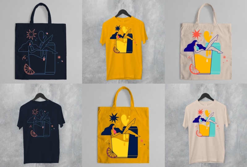
8. Designing Your Colour Palettes: Three Approaches for Brand Illustration: Welcome to this
lesson on creating your color palettes for
your class project. I'm happy to see you
made it this far. This lesson is all about
minimalist color palettes because we'll create
three different reduced color palettes for your class project in order
to provide the client with various design options for
different printing budgets. You'll also learn how to use
the color of the material. Three different versions the
client wants us to create. One, the client provides
you with the base color of the material your
illustrations will be printed on, and you have to add two matching colors that highlight your design
and their brand best. The artwork will be
displayed as line art only. The second color
is used to create highlights and complexity
in the design. Two, the client
provides you with two brand colors they
wish to be included, and you pick two
additional colors. One of the full colors
is the background color, respectively, the base
color of the material. And three, you have complete freedom to create a color palette
for this project. It must consist of
three to four colors, where one of them is
the background color, respectively, the base
color of the material. This lesson, you will
pick the sketch that your community chose as
the winning design of your social media
poll and create the final design proposals
for your client, each one using a
different color palette that the client asked
for in the design brief. Let's get warmed up by first redrawing your
sketch at Line art. This will be the step
where you would also incorporate changes the
client wished for, like, for example, to swap
out an object for an or make another object
bigger or smaller. If that were the case, I
would always send the client the sketch again
for their approval before creating
the final design. My personal favorite brush is the studio pen from
Procreate Inking set, but you can use any other
brushes for your outlines. Now, go ahead and redraw
your sketch Outlines only. I put every element
on a separate layer, so I could still make some
adjustments to them later on. Once the outline is finished, I create a backup copy of my design by duplicating
the artboard, and I continue working on
the duplicated artboard, where I can combine layers
for easier workflow without losing having all my objects on a separate layer in
a different file. Virgin line art
and accent color. In this scenario, the
climb provided you with the base color of the product,
which is a navy blue. The artwork is outline
only, also called line art, but you will get to highlight
certain elements and add complexity to the design by adding an accent
color to the palette. The base color of our
material provides us with the starting point
for this color palette. Use that color as
the background color of your canvas and add
it to your palette. Then pick a color for the
outlines of your artwork. If I'm drawing a blank, I
look for inspiration for color palettes on Pinterest by searching for color
palettes of the base color. You can add a palette you
think will work well for your design as a reference
to your Procreate artboard. Then tap long on the color you like and give it a
try in your design. If you have all
elements on one layer, swipe left with two
fingers on the layer, select the color you
choose for your lines, and then double tap on the
layer and select fill layer. Another great tool for creating color palettes is Adobe color. If you have an
Adobe subscription, you can add the base color
to your palette and then add two more swatches to play
around with different hues, tints and shades to
complement them. There are also presets here at the top left that
help you get started. Procreate has a similar
function here in the color tap. Tap harmony and select different harmony options that combine well with
your base color. A third option is to pick
colors from artwork you like, for example, from an artist you admire or from a photo
where you like the color. Usually use the colors
from Pintres palettes, Adobe color or reference images only as a starting point and
then adjust the colors to the needs of my design
in order to make it both unique and fitting to the
brands need of my client. For this project, I want the line art to contrast
with the background color. So I'll pick a bright color.
Now comes the fun part. We're not just going to
make the outlines white, but we'll add a
splash of color so it fits with the client's
business and positioning. In this case, our client is a young company creating
innovative craft beers, so the colors should feel
bold, vibrant and adventurous. Values that were provided
in the client brief. Create that by using a mix of pastels and vibrant
colors for your palette. Colors with less
brown or gray feel fresher and more
contemporary than earthy, subtle or pale colors. So that's what we're aiming for. I will use sky blue, which is a tint of
the background color, so it creates a nice,
vibrant contrast, but it is still
subtle enough to not compete too much
with the axin color. For the axin color,
I'll use tangerine. I want the axin color
to stand out and create bold highlights in the
design. Now it's your turn. Pick a few colors
for your lines and your accents and create
different combinations. Then pick the two
colors that look best together and finish
your first color proposal. Always keep in mind the
values and positioning of the client to ensure a successful
color palette proposal. Now that you've mastered to create your first
minimalist color palette, consisting of three colors, we'll level up by moving on
to a more complex scenario. Create a color palette
of four colors based on two brand colors given
to you by the client. Brand colors are
royal blue and gold. You're free to add any
colors that harmonize with those two colors and represent the client's business
and positioning. Feel free to go back to your safe color palettes from the research
we did earlier in this lesson or use
adobe color or the harmony tab in Procreate
to find a starting point. You can later fine tune once you apply them to your illustration. You can also use one of the colors from the
previous exercise, but it's more fun to try
something completely new. Use any of the four colors as the color of your material
or the background color. I used one of the brand colors, gold as the base of
the background color. But you can use it
anyway you want. In this exercise, you can also fill areas of your artwork, so it's not just a line
art design anymore. By doing so, you balance
your composition and add more importance to some objects while making others fade
more into the background. Order for your composition
to feel balanced, I would opt for one or two monochromatic or
analogous colors, meaning one of the
colors is a tint or a shade of another
color of your palette. Respectively, the colors are in close proximity of the
color wheels to each other, thus ensuring that
the elements in your illustration don't compete
for attention too much. In this example, I pick two vibrant colors to
complement the brand colors, both of different hues
than the other two colors. But as you can see,
the design feels very busy and it's hard to
focus on one thing alone. But here, I use a tint
of the background color, one of the brand colors, and my design immediately
feels more balanced. Darker colors are
generally ideal for lines, but I removed some for the
proposal for my client, for example, the
ones on the glass and the beer to make
the design less busy. In case of the beer can, I
swapped the line color to the background colors so that the can can still
be distinguished, but it blends in nicely
with the background. Version three, custom
color palette. If I get to create a color palette for a client commission, I usually approach the coloring process a bit differently. I start by creating squares
of different colors. In this case, three
to four to see how the colors interact with each other before applying
them to the artwork. My goal here is to create a vibe that represents the
brand and the values of my client by picking
colors based on color symbolism
and color psychology. If I use Pinterest, I search for colors or color palettes based on
adjective rather than colors. An example could be
vibrant color palette. Since our pretend client
is a craft beer brewery, I want one of the colors to be yellow representing
their product. Which is, of course, beer. I also want to represent
the values of bold, vibrant and adventures
stated in the brief, which is why I opt for
contrasting saturated colors. But in this case, I want to tone it down a bit and add some pastel
colors in order to provide the client
with a wide variety of options when handing in the
color palette proposals. I complemented the yellow
with a vibrant blue, which is its contrast color and thus generates a bold combo. Then for my third color, I tone down the blue by lowering
the hue and saturation, and I added a bit of
yellow to make it stand out while adding
complexity to the palette. In order to add a
tad of freshness, I picked orange as
a fourth color, which is an analogue
color of yellow. Last but not least, I
want the lstran to shine. So I pick a neutral
color for the material like sand, natural or ash. Neutral colors are always
great options to add to a color palette as they
are very easy to combine. Just for fun, I also
experimented with a light pink for the
background and simply adjusted the orange slightly and replaced the mint color for
a tint of the vibrant blue. I encourage you to
also experiment with different color combinations and observe how they
work in your design. For this slightly darker
background color, for example, I slightly adjusted the
mint color to a teal, so it would generate
more contrast with the color of the material. I also created some
monochromatic versions just to see what would happen. Of course, the beer
now looks like milk, so I wouldn't send this
proposal to the client, but I encourage you strongly
to experiment a lot for this color proposal as you are completely free to create
any palette you want, and it's a perfect exercise to recap what you've
learned in this course. Pro tip. I usually know a color palette works
when I can create a few other versions of the design using the same
colors for different elements. Play around with
your color palette and see how it harmonizes with the elements when you use it on larger or smaller
objects in your design. You can even wow your
client by presenting them several options using
the same color palette. Sometimes I feel it's
necessary to adjust the color slightly so everything
feels balanced again. Doing that is
especially beneficial when creating a custom
color palette for a brand. So you ensure in this step that the color palette is versatile and functional for
your client's needs. Now go ahead and place
your color proposals on your mockups and upload
them to your class project. I changed the color of
the shirt and the toad back by adding a layer
that I set to multiply. From there, I pick the
color of the material and redraw the shape
of the product with a brush with clean edges like the studio pen from the
preset Procreate inking set. Don't forget to use
this opportunity to show off your new learn
skills on Instagram, LinkedIn or other social media and ask your followers to vote for their
favorite version. Include your community
in this process and let them vote using the pulls
sticker in an Instagram story. Once you're ready, head
over to the next lesson.
9. Prepping for Print: Ensuring Perfect Colour Output: Hello, again, let's jump right into the last hand on
lesson of this course. If the client doesn't
provide me with any specifications to which file formats they
want the artwork, I prepare them as a
PDF commonly used for print and a
PNG just in case. Don't forget to
remove the background as it's not needed
for this project. The material of the
toad bag, respectively, the shirt is determining
the background color, so you simply toggle
off the visibility of the background layer,
and you're all set. However, during the
design process, it helps both you and the client imagine how the artwork will
look on the final product. Now, get your design that your community picked
as the winner and simply export it once as
a PDF and once as a PNG. Those are the files
you will then send to your clients in order
to wrap up the project. Pro tip, don't deliver original
file formats such as PSD, AI or EPS, if not specifically
agreed upon previously. This way, you
ensure your designs will not be edited
without your permission. You own your rights
to your designs, and if a client wants
to edit your artwork, it requires your approval, and a different fee for
the editable files is due. Now all there is left to do is to upload your final artwork to your class project
so we all get to celebrate your
accomplishment. Well done. Take a moment to
celebrate yourself, and meet me in the next lesson
for the course wrap up. Thank you for being
part of this course. I'm thrilled you
made it to the end.
10. Course Recap: Wrapping Up Your Colour Journey: Alright, it's time
for a round of applause because you made it
to the end of this class. I hope you had fun and learned everything you always
wondered about how to create custom color
palettes that make your artwork shine
in any opportunity. Hopefully, this class was an inspiration to experiment
a lot with color. Now you can obviously use your amazing class project
to create your own merge. Feel free to print shirts or tote bags or
any other product. I'm sure they'd look stunning. Also, don't forget to upload your final artwork to
your class project, so we can all admire
your great work. I can't wait to see all
your amazing creations. Please add your Instagram or social handle to
your class project, so I can share them as well. In this class, you've learned all the necessary terminology
when it comes to color. You learned about
color symbolism and color psychology and can now use these tools in order to create stunning custom
color palettes, depending on the mood and message you'd like to
transmit with your artwork. Is not just useful for any client commission that comes your way
because you can also apply everything you learned
to your personal artwork and thus elevate your brand
and recognition as an artist. If you'd like to learn
more about how to build your signature style with your
own custom color palette, I recorded a hands on session
on how to exactly do that. Check it out here on
skill share or on To Tap. Hopefully, what you
learned will keep you intrigued with colors in
illustration and design. I wish you a lot of fun on further exploring
what you learned. If you did enjoy this
class, leave it a review. This helps other people
discover this class, and it helps me as an
independent creator. Thank you for supporting me
doing what I love by sharing what I learned
during my practice as an illustrator and designer. If you have any questions, drop them in the class
discussion or reach out to me. I would genuinely love
to hear from you. I'm also here if you'd like to learn more about color palettes, or for one on one feedback
on color palettes, minimalist
illustration, and more. I offer one on one sessions
where I can give you personalized feedback for
your specific questions. Just book a session
and let's chat. Are also two more
classes of mine available right here
on Skill Share, where I teach you how to find your style as an
illustrator and how to create successful
minimalist illustrations like a P. Check them
out on my profile. Thank you for watching my class. I hope I was able to teach you everything you
wanted to learn. If you like my work,
follow me on Instagram at Sandra Stout and
here on Skill Share, so you won't miss
out on more classes about minimalist
illustration and design. Take care and keep
creating Bye, everybody.
 Sandra Staub, illustration & design