Transcripts
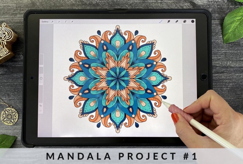
1. Introduction: Over the last few years, I've discovered the amazing art therapy of mindful Mandalas. There is something just so relaxing about the act of repetition and mark-making that becomes almost meditative and Procreate on the iPad have given us tools that make this so accessible and easy. Even if you only have 15 minutes a day, you can create something beautiful, melt away your stress, and enjoy the process. Hi, I'm Laura Lee Griffin, an artist, surface designer, and podcaster in Dallas, Texas. I had been teaching live Mandala and Copic coloring workshops for the last 11 years and I have a passion for sharing my knowledge with you. I've recently brought my love of color and geometric design to the iPad. I can't wait to share the personal techniques that I've developed to create eye-catching Mandalas in Procreate. This class is perfect for absolute beginners or those that are further along in their art journey. All you need is an iPad and Apple Pencil or compatible stylus, the Procreate app, and your imagination. In this class, we'll start off by introducing you to what a mandala is and the practice of mindfulness. Drawing inspiration from nature and architecture will complete our mark-making worksheet together, create it from my favorite Mandala shapes. We'll discuss procreates latest brush stabilization features which are perfect for getting a smooth line in your work. I'll show you how to import a special custom Mandala's color palette, along with three Mandala frameworks that I've made just for you. I'll take you step-by-step through the mandala creation process. We'll start off by creating a black ink outline using the radial symmetry tool, which I have to warn you is very addictive. We'll discuss the number one most important thing to creating colorful designs that pop off the page. I'll show you the best ways to choose and add color to your mandalas and how to easily create amazing texture and three-dimensional shading using layers and clipping masks. You'll learn several ways how to recolor your artwork in seconds. After completing your first Mandala, we'll move on to a second-star framework, where I'll show you several additional ways to add detail and texture to your work and how you can unify your colors for a more cohesive look. I'll show you how to export your Mandala and all the different ways that you can use your finished artwork. As a special bonus along with your free color palette practice worksheet and Mandala frameworks, I've included three extra bonus lessons just for fun, where I'll show you how to create this animated GIF file. How to organize your files in Procreate, and how to use a different coloring method to create a stained glass window Mandala. By the end of this class, you'll have completed a colorful medulla that you can use to create things like greeting cards, wall art, and more. Or you can just use this process for your own personal enjoyment and wellness. Once you get started, I don't think you'll be able to stop. I'm so excited that you're here and I can't wait to see what you create. Ready for some fun? Let's get started.
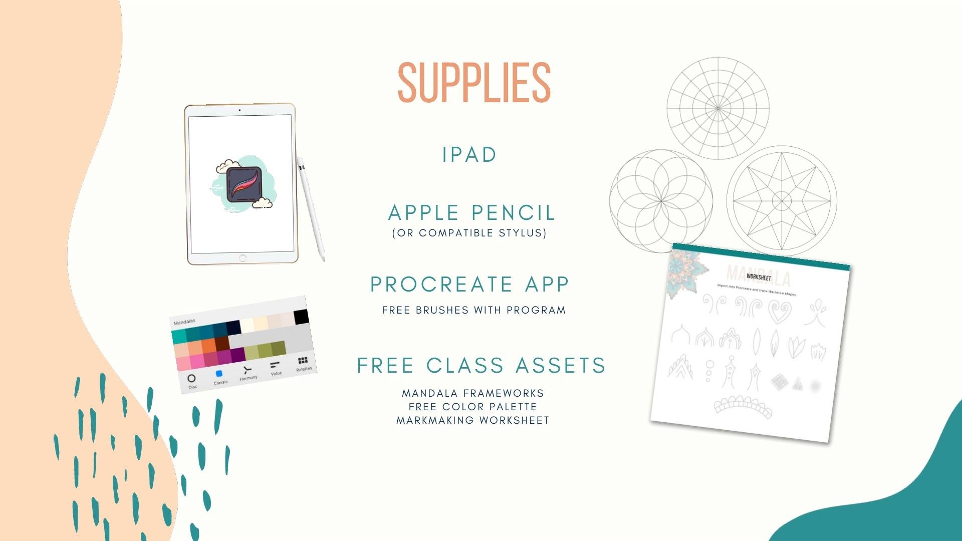
2. Supplies & Class Project: In today's class, the main supplies you need are an iPad and Apple pencil or compatible stylus and the procreate app. All the procreate brushes we're using in this class come completely free when you purchase the app. We'll cover those in detail later. In addition, I've created some special class assets for you to make the process easy and fun. I've made three different Mandala frameworks in PNG format that you can download and use as guidelines while you create your artwork. I'm also providing a downloadable Procreate color palette that I'll be using throughout the projects in the class. I also created a Mandala shape worksheet JPEG file that we'll import into Procreate and use to practice our mark-making. Now let's talk about where you can find your class assets. They're located in the project and resources section of the class. But if you have trouble accessing them, I've also included a link in the class description, where you can unlock access to a Dropbox folder containing all of the files. If you're doing all this directly from your iPad, you should be able to save the image files to your camera roll for easy access later, or you can save the files to your favorite Cloud server. As we go through the lessons, I'll show you how to import the images as well as the color swatches into Procreate for use in class. Your class project is to create a colorful dimensional Mandala and procreate using all of the techniques you've learned. You can follow along step-by-step or create something that is uniquely you. I would love to see what you've created. For easy sharing, make sure that you are in a browser and not the app. Find the Create Project button on the Project and Resources tab. You can add a description and upload images to the project, as well as upload a cover picture at the top to show off your work. In addition to your Mandala, you can feel free to post an animated GIF file, which you'll learn how to create in a bonus lesson. Now before we dive into Procreate, let's talk first about what a Mandala actually is, and how it is tied to mindfulness.
3. Mandalas & mindfulness: [MUSIC] What is a mandala? The word mandala is Sanskrit, and the direct translation is circle or center. It's often associated with a circular design of repeating shapes and geometric patterns. The way mandalas are created is usually from the center working outwards, and as they expand, there are endless possibilities of patterns and shapes that could be added to each ring. I remember being introduced to mandalas through a group of Tibetan monks that came to a local museum here in Dallas, Texas. They spent about a week creating this meticulous mandala design with grains of colored sand, which they ultimately dumped into a river. They believed the act of creating the mandala was far more important than the end result. It was all about mindfulness and focusing your energy on each mark that you make, or in their case, in each grain of sand that was put into place. But Mandalas aren't really specific to one religion or culture, they can be found in places all over the world and in much of nature. Just think about stained glass rose windows in cathedrals, colorful kaleidoscopes, Celtic spirals and symbols, Moroccan tiles and architecture. There are so many mandalas in nature, like the leaves of a succulent plant radiating out from the center, or the petals of a blooming flower as they expand from a tight bud into a beautiful bloom. We can use these shapes as inspiration for our own pattern-making in mandala designs. I'll be sharing some of my favorite shapes with you today. Keep in mind that creating mandalas has a ton of benefits. It can help improve focus and concentration in a world where our attention is often scattered, it can reduce anxiety and relieve stress, while also activating that creative part of the brain. I'm really excited to share the process with you. Remember, the definition of mindfulness is paying attention in a particular way on purpose, in the present moment, without judgment. Now that's a mouthful, but really it's all about allowing yourself to play and just let your intuition lead the way. Don't judge the marks you make, relax and enjoy the process. Procreate has an undo button after all, and I know you're going to end up with some amazing results in no time at all. Let's get started setting up our first canvas in Procreate.
4. Creating your canvas: [MUSIC] The first thing we want to do is open up, Procreate. From here it'll take you to the gallery view. You can see quite a few of the Mandalas that I've created here. To get started, we want to create a new canvas by hitting this plus sign on the top right. Then the plus sign on the little black folders underneath it. That takes us to a window where we can add our dimensions for our canvas. Instead of pixels, I'm going to use inches. You could also use centimeters or millimeters, but I'm going to use a canvas that is 10 inches by 10 inches. I want 300 dots per inch so that it's high resolution, and it will print out without being pixelated if I did print to the full size. Now the maximum layers that I get with this combination is 55. That means that that's the maximum number in this particular project that I would be able to create with. We don't need that many for this project we're doing today. But just know that if I were to make this, let's say a 12-inch by 12-inch canvas, all of a sudden my layers dropped to 37 instead of 55. That's just something to be aware of if you ever need more layers, or you're working on something that's a bit larger. Change that back to 10 by 10 inches. I'm going to go over here to the color profile. Now there are two color profiles in Procreate, RGB and CMYK. What you need to know is that RGB is meant for screens typically. The colors are quite bright and vivid. You can get beautiful fluorescence and really bright magentas, for example. Whereas CMYK stands for cyan magenta, yellow, and black. Those are the typical inks used by traditional printers. If you were using this to print at home, or perhaps a local printer, you might want to use CMYK. Those colors tend to be a little bit more muted in certain tones. It is helpful to know what the final product will look like. If you want to work in CMYK for something you would be printing. But just know that RGB doesn't mean it can't be printed. There are actually print-on-demand sites like Spoonflower and Society 6 that actually require you to upload your artwork with RGB. Let's use RGB today. I'm just going to use this second option here and hit Create. Now I have my 10 by 10-inch canvas. We'll get started next with looking at the brushes we're going to use today.
5. Setting up your brushes: Now that we've created our Canvas, it's time for us to look at the brushes we're going to use today. If you come up here to the brush icon and click on it, it takes you to the Procreate brush library. Here on the left-hand side you'll see a lot of unique icons and each of these represents a brush set. These all come completely free with Procreate when you download the app, and the brushes we're going to use on our projects today come from these brush sets. Just know you don't need to purchase or create any custom brushes, use what's available to you. That being said, you'll see I own quite a few or I've created my own brushes and that's a lot of fun to play with, but it's completely unnecessary for today's projects. There are two ways to organize your brushes in Procreate. One of them is to create a custom brush set of free brushes that you would normally or frequently use. In today's case we're going to be using fiber six brushes that are spread across a whole bunch of these categories. Rather than having to go look for them in the different brush sets, it's convenient if we can put them all in one. To do that, I'm going to come up here on the left-hand side and click on the blue plus button. That creates an untitled brush set that I can click on and call Mandalas. I'll hit return, and if I click on this, there's nothing there yet because I haven't added any brushes into the folder. I can go to Inking and I can go grab this Thylacine brush and go up to Mandalas until it turns gray, go to the right and drop it in, just like dragging and dropping into a folder. I'll go back to Inking and grab the Technical Pen, go up to Mandalas, drag and drop it in. Next, I'll go to Calligraphy and grab the Monoline brush. This is my favorite brush for Mandalas. I use this for all of my outlines. It is a fixed width brush, so it doesn't matter how much you press on it, it will stay the same width. Next, I'm going to go into Painting and grab the Dry Brush texture brush. This one is really fun for textures. Wait until it highlights it gray, and drag and drop it in. Next, I'll go to Airbrushing and grab the Soft Brush at the top. Again, go to Mandalas, drag and drop it in, and then lastly, I'm going to go to Vintage and grab this Newsprint which is a really fun texture, and drag that one in. I think those are the six brushes that we'll be playing with on our main projects as well as our practice sheet and bonus projects today. That is method one for getting organized, but the brand new version of Procreate has another functionality that they have introduced and that's called the Recent brush set. What this does is it takes any brushes that you've used recently and pops them into this folder, into this brush set folder. You have an option here if you don't want this brush there you just swipe to the left and you have three options: there's Find, Pin, and Clear. If I Clear it'll just take it off of the list. This is in another folder, so it's not deleting it, it's just clearing it from my recent list. If I go to the Technical Pen and decide that's one I want to use frequently, I can create it almost like a favorite and pin it to this list so it will always be there and it'll create a little star at the top. If I want to unpin that, I no longer have it on the list, I just swipe left and I click on Unpin. Let's pretend I'm at the Soft Brush and I can't remember what brush set it came from. I can swipe left and hit "Find," and it'll tell me that came from the Airbrushing set. It's a very convenient way to find brushes sometimes when you can't remember where they originally came from. Going back to Recent, I can get rid of this by clearing. This way, you could technically add all of your Mandala brushes and you could just pin them so that you have them available for as long as you wanted and then unpin them. That's a really great method for organizing that is brand new and a fun functionality. We've got our brushes together and if you have any other favorite texture brushes you can use those as well, but these are the ones I'm playing with today. Next up, let's talk about importing your color palette.
6. Importing your color palette: Now it's time to import your free Color Swatch panel in to Procreate. To do that, we're going to click up here on this top right color swatch, and that's going to take us to the color menus. There are quite a few options here. You'll see disc, classic, where you can control the lightness or darkness, the harmony, where you can choose colors that go nicely together, value, where you could put a hexadecimal code if you had a very specific RGB or HEX code, and then there's the palettes. In order to get the palette imported into your program, you'll want to hit the plus sign at the top. From there you have several different options. You can create palettes from scratch. You can create palettes from a photo on your camera roll, but we're going to create one that's new from file. Now here you want to go to the folder where you've saved the class assets. I'm going to grab and just click on this Mandalas swatches. It automatically imports it straight there into the file so it's ready to use. It has a little blue check mark next to it, which means it's set as default. That's great because when we go through these other panels, it will always show the Mandalas at the bottom section as a default on each of the different views. The other thing that's great about the new version of Procreate is that it has a tab here called cards. These swatches tend to be quite small, and if you would like to see them larger, you can click on Cards. It will show them in a much larger size that you can select, but it also lists the closest color that it believes is accurate to the color that's in your palette. You can see that something is a dark cyan blue for example, or a red orange, or a black. In this case, I think this is more of a teal color, and I even have the opportunity to click on it. I can rename that teal, click on Done, and I'm able to rename my colors to whatever I want. Now that we have our colors ready to go, let's start working on our mark-making by importing our mandala worksheet.
7. Mandala practice worksheet: Now, it's time to practice our mark-making. So the first step is to import our practice worksheet and to do that, we'll come up here to the wrench, click on the Add section, and then you can either insert a file or a photo depending on where you've saved your class assets. I'm going to click on Insert a photo because I have it on my camera roll. From there, I'll grab the image from the camera roll, and it'll import it right into a layer in Procreate. I can click on Fit to Canvas and click on the arrow, and it is now fully there ready to go. Now before I start drawing on this though, I want to make sure that I'm drawing on a separate layer. So I'm going to hit the plus sign and add a layer right on top, and then I can even rename this layer and call it practice. That way I can use it over and over again and won't ever destroy or have to re-import that worksheet that's on that first original imported layer. I'm going to go ahead and choose a black swatch here, on the far right of my Mandalas, and make sure that I'm on my monoline brush. I want to use about a medium size here on the slider and full opacity. I'm going to blow this worksheet up so you can see exactly what I'm doing, and I'm going to come in here first with these vine shapes and just trace right on top of these gray lines. So I want you to notice sometimes my hand might be shaky. So how do we address that in Procreate? If you have a situation where it's not completely smooth, you can always go backwards. The trick there is you can use two fingers, hit the screen, and that's undo. Three fingers hitting the screen is redo. There are also buttons here on the bottom left for undo and redo that allow you to do that as well. That being said, there's actually some really great tools available for you in Procreate to smooth out the brushstrokes that you make on the screen. So let's look at how those work. If you come up here to the brush and click on the monoline brush itself, it takes you to something called brush studio. Now there are a lot of different options here, but the one that we're focused on is the brand new one called stabilization. Now stabilization has a lot of options here, and you can play around with them on the drawing pad to the right to see what works best for your own hand. Now, if I sit here and add a line at 57 percent streamline, I'd like to take out some of the bumps and make it smoother. So if I bring that up to about 83 percent or so, I find it's much easier for me to get a shape that I'm happy with, that smoother. The pressure here only applies for a variable width brush, which the monoline brush is not. So we don't have to worry about it today, but if you press really hard and get a thick line and you press just a little bit and get a thin line, that will help the transition be smoother between those two things. Stabilization is a way to, again, streamline, if I increase it, notice how this turns into almost a straight line, and it's no longer a heart shape because it thinks that I'm trying to make a really straight line. So if your hands are very shaky, this could be really useful for you to get a smoother line, and stabilizations also based on how quickly you make a stroke. So if I go really fast, like that, even though it was shaking my hand, it thinks I'm trying to do a straight line, and if I go really slow, it'll let me make loops. So that can be useful, but I really like the motion filtering as well, that's built-in, and the motion filtering works very similarly to stabilization, but the speed at which you work doesn't matter. So you'll notice that everything kind of goes straight regardless if I was going slow or if I was going fast when I put down the ink to the screen. Then expression allows you to have a little bit more movement, so rather than just a straight line, if I increase that, it's showing that I want a little more expression of my stroke. So just know this is brand new, it's available and can be really fun to play with to see if you can get a smoother line. So I'm going to hit Done. I'm going to come back here, and let's try the next one, and automatically I'm seeing how much easier it is to get a really smooth line. I'm going to come over here to the next shape, which is building upon the other, and this one is an enclosed heart shape, and enclosed shapes are great in Procreate because you can fill them with color, which I'll show you all the different ways you can fill it with color later. The other thing to note is that sometimes you might go inside of a line or in a place that you don't want, and in Procreate, you can fix that just by holding down on the eraser and that will make the eraser the same brush as I'm using, and you can come in here and just erase those lines and clean up those areas so that the ink is exactly where you want it to be. I'm going to bring down the width of this brush just a little bit. Those are quite thick lines and show you how you can create a snapping function. So I've created an arched line here, and when I stop at the top, it snaps into place, into a perfect curve, and that's really nice as well in Mandalas if you want to get a nice geometric line. It works with straight lines, as well as curved lines, and even things like circles and ellipses. I can come up here and add a teardrop shape, which is very common for Mandalas. I can come down here and add this lovely pointed petal shape, and then build upon that as we go. I like to add veins to the insides of my petals, just for added interest. Then you can even build upon that further by adding some additional detail like little circles. Or in this case, I love to add scallops to the outside. For this part and the interior, again, you can snap that line into shape by holding it at the end. So you hold your pencil at the end and it will snap into a perfect line, and then for the circle, I'm just going to make a rough circle shape and then touch my finger to the screen, and when I do that, it creates a perfect little circle. If I want to clean things up, I can always go in with the eraser again and clean up any edges that I might want to. Then let's build upon the arc and add a petal shape here, a long, tall petal shape, and I'll just connect these by holding at the very end and letting that snap into place. This can be very meditative, especially when you repeat these over and over. But I'm going to show you some great ways to speed up that process. Now here you'll notice, I didn't let it snap into shapes, so it's a little bit rougher of a line. Again, I can always go back if I want to and add that again. Now here's an example where I'm going to add two of these shapes together, and then I'm going to add one in the back. So I've created what looks like a flower now, and this doesn't extend all the way down because that petal is in the back of the flower. You can also have petals that are wavy with some veins on the inside of them. Now, we can use the snapping function again on this bottom section by holding at the end, it snaps it into a perfect line, and come down into this triangle shape, and add some v's to the interior for added interest. Just a nice little details and these types of things look really great in a finished Mandala, and then just add some scallops on the outside. Let's practice some circles again by making a rough circle. Placing our finger on the screen and seeing it pop right into a perfect shape. One more time. So again, it's like an ellipse and then you put your finger to the screen and it turns into a circle. Now let's create some art shapes that create an inverse pointed shape, and then we can add a circle to the top of that, and then circles to the inside. Now you can always create these with copy-paste functions and other things in Procreate, some shortcuts. But I really love the mindfulness of repeating shapes and being very intentional about it, and I find that that's really meditative. You can add diamonds on the inside of your shapes, and then this bottom shape, I'll blow up for you. This could be the outside of the Mandala. Again, holding it in place, we'll let it snap into a curve. You can add stripes, and you want to have those stripes connect as much as you can to either side so you don't have gaps, that way you can fill them with color. These aren't perfectly spaced, but that's totally fine, and we're going to play with the symmetry tool that's going to help us with some of that. But to be honest, I really like it this way because it shows it's hand-drawn, and we don't want them to be absolutely perfectly symmetrical. We want them to be perfectly imperfect. Lastly, I want to show you how you can create some textures. So let's try to utilize some of the other brushes here. This thylacine brush makes a really cool crosshatch. So if I come up here and bring it down a little bit and add some strokes that way and then come in the opposite direction, that creates a nice shaded crosshatch and texture effect, and we'll play with that in our bonus lesson today. You can also create something called stippling. You can use the monoline brush for that by coming in and adding lots of dark thick lines on the bottom, and then let's reduce the brush size a little bit, and go up towards the top, and then reduce our opacity so that you want to have a thickness at the bottom of stippling and then for it to phase out towards the tip, and that can be a really interesting effect, and I'll show you some examples of this later. Then lastly, let's work on the soft brush here, which is a lovely airbrush. This one is fairly pressure-sensitive, and so if I press really hard, see how I get a hard line on the screen, I'm going to go backwards here. The key to using this brush is having a soft touch and then getting softer as you go towards the outer edges of it. So that it creates really like a glow, and that'll look really lovely in different colors. You can also do a similar thing with the newsprint brush, and you can come in with that with a little more pressure in the center and then lighter pressure towards the outer edges, and you'll get a nice subtle glow, but a glow that has some texture behind it with the dots as well. We're done with our shape worksheet, let's move on to the radial symmetry tool and get started creating our first Mandala.
8. The radial symmetry tool: Now we're going to go back to our gallery view and we want to create a new canvas. To do this, I'm going to hit the plus sign. I'm going to go ahead and use the 10 by 10 sRGB, which is a similar canvas to what we created previously. Now it's time to set up our radial symmetry tool. To do that, we're going to come up here to the wrench and click on Canvas, Drawing guide, Edit drawing guide. Here we're going to click on symmetry and they're going to be a lot of options here when we click on options, you can have vertical symmetry. Imagine making a butterfly with something like that. Horizontal quadrant and radial. We want the radial selection. There's also an option for rotational symmetry that you can turn off and on. Now, what that means is that when it's off, these sections are going to mirror each other and if it's rotational, they'll all go in the same direction. For this first Mandala we're going to have the rotational symmetry toggled off and for the next one will turn that on so you can see the difference between the two. I can change the opacity of these lines, these guidelines that I'll be seeing as I work, I like to keep those at about 60 percent. Then the thickness, you can make that really thick or you can make it really thin. I want it at about 50-ish percent. I also have the ability to change the color of the line. If I want them to be pink, for example, then they will be distinguishable and easier to see from my black lines. I'm going to go ahead and hit "Done". Now my canvas is set up. These lines will not show up in the final work. They're just truly guidelines that are going to enable me to work in these different eight sections. The way it works, I'm going to go back to my monoline and just show you how I can create beautiful symmetry just by doodling. It's pretty amazing what this tool will allow you to do. What we want to do next, I'm going to hit "Undo, ".and we want to go ahead and have some additional guidelines that will help us, and we call these a framework. I've created frameworks for you that I've built in Illustrator and we're going to import those images in. So they were in your free class resources. I'm going to go to Insert a photo, and I'm going to select this guideline here. Now you can make this image go all the way to the edges if you want. But I like to have a bit of whitespace on the sides, so I'm going to keep it here and just click on that arrow button there. Now, if I go to my Layers, I can see this imported layer. It's really quite black, and I want to tone that down a little bit and make it more transparent. I'm going to click here on this end, on the layer and I'm going to pull down the opacity and make that a opacity only about 25 percent or so, and then click out of the layers. Now, this gives me some nice circles and some additional incremental lines in between the other guidelines that Procreate already gave me and that's going to make it much easier for me to create symmetrical designs and have them all the petals the same length, for example, going all the way around. Now that we've imported the framework, let's get started with inking.
9. Drawing your mandala outline: It's now time to ink your first mandala. Just remember, this is all about play and experimenting with different marks. You really can't get this wrong so enjoy the process and I know you're going to fall in love with the radial symmetry tool and Procreate drawing assist. Let's get started. Now we're ready to ink our mandala and I don't actually go in with a pencil first, I actually go in directly with ink. The reason for that is I have these beautiful guidelines to help me make my marks on the page. I also have that radial symmetry tool which will make everything look beautiful and symmetrical. I also have the ability to hit undo or use the eraser in Procreate so that if there is something I'm not crazy about, I can get rid of it very easily. I also find it very much and meditative and mindful practice just to add ink to the page and if there's a mark that might be unusual, maybe building off of that and creating something I would never have anticipated or a really unique design. I don't think I've ever made the same mandala twice. This is a really interesting process and very forgiving as you explore the marks that you make on the screen. I wanted to mention up here under the wrench that in the video menu, there is an option where you can toggle time-lapse recording on or off, and if you toggle that on, it just means that Procreate is going to record the screen and all of the marks that you make and it will create a video at the end if you would like to download one that you can share on social media or you can share with family and friends. It's a cool functionality, but you do have to have it toggled on before you get started in order for that to record all of those actions. The next step we're going to do is add a layer. I want to add a layer on top of the original framework layer and I want to use a dark color. In my color palette, I'm going to click on the dark black on the right side and I'm going to use the monoline brush. Now, you could also use the technical pen if you like to have variable width, where the line can be thick and thin depending on the pressure of the pencil on the screen. I actually like the monoline, which is as a static brush that's the same width when I make my mandala so that's what I'm going to be using today. I'm going to have the width at about seven or eight percent and full opacity. If I come in here, the first thing you're going to notice is that when I make this first mark, it's not making it around the circle, the radial symmetry isn't working. The reason for that is that if you go to the layer panel, notice it doesn't say assisted beneath it. Let's go ahead and turn that drawing assist on. Now you'll notice it says assisted and Procreate is smart enough to know exactly what type of assistance we had on another layer and it will just add it to the current layer. I want to get rid of that mark I made and I'm just going to click on the layer and hit "Clear." It was the only thing on that layer so I just can start over from scratch now. Now, I'm going to start from the center and I'm going to add an arched shape just to that first innermost circle. Remember you can let it snap into shape if you want it to snap into a little more symmetrical shape and I've created what looks like a flower just in two simple motions. Now what I want to do is add a roughly petaled flower or petal in between. I'm just going to add three little waves and come down and connect these other petals. Now what I might do is connect some other points. I think I'm going to use one of these pretty Moroccan shapes, and these are shapes we practiced in our practice worksheet but you can also make others if you'd like. Now what was interesting is because I held that down at the very end if thought I wanted to make a star and I actually really like the look of that so I'm going to keep that star there right now. I'll add my Moroccan shapes later on one of the outer layers. I'm going to come in here and add some scallops to that star. I love the way that looks. This really becomes meditative. There is no right or wrong answer on the types of marks you should make on your mandala as you're connecting the pieces together. I'm just growing from the center outwards and I think what I'll do now is take a curved line from the top here into the center of the star shape. I'll do the same thing here and then let me go backwards because I crossed the line a little bit. Great. Now I can create pointed area here, almost looks like a snowflake now with a little round circle. I remember we stick our finger to the screen and it turns into a perfect circle. Next, let's connect these circles with, let's have them come down into a rounded V shape like that. Now I think what we can do is, why don't we add the Moroccan shape here to the outer points like that and then we can add perhaps some circles inside of that or let's try a teardrop. We add some teardrop shapes and then perhaps we can add some vine shapes coming in like that. Now notice, I want to come in here and clean this up a little bit. I can grab my eraser and clean up those lines. If there's any other areas where I see that I can clean those up as well. I think there's just one more thing I'll add, and that is going to be, I think, some double lines in a few places. I'm going to come in here and for this star shape, I'm going to add a double line. Also on this shape, I'll add a double line. That'll give me more areas to add contrasting color, which will look really cool later. I think I can also come in here and add a teardrop shape. I can come in from these edges like that and just continue making marks until you get to the place that you're really satisfied with the end result. I think I can add just a few more scallops. Let me do that here, and let's add another teardrop here. Perfect. I'm done inking my mandala. I could probably do this for another two hours. It's very meditative and really fun, but I'm going to stop here and now I'm going to start adding color. Before I do that, I'm going to give you my secret to getting amazing color that pops off of the screen.
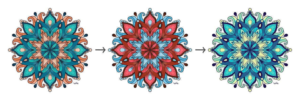
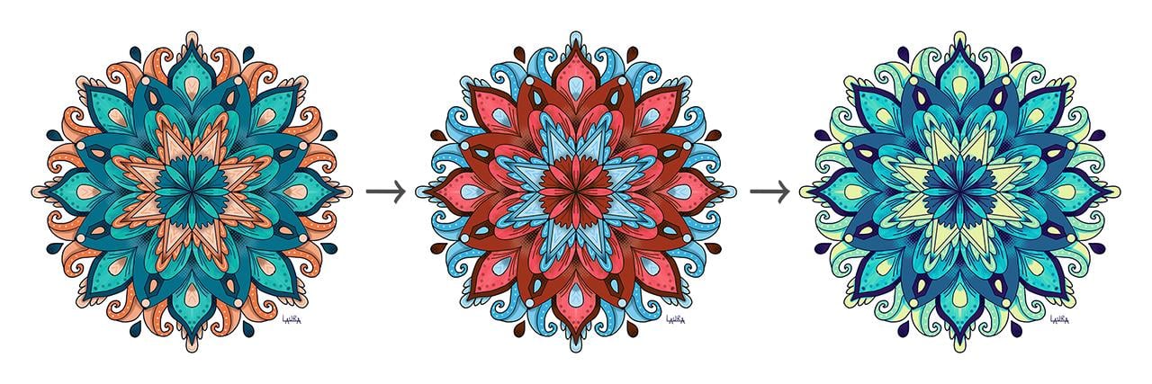
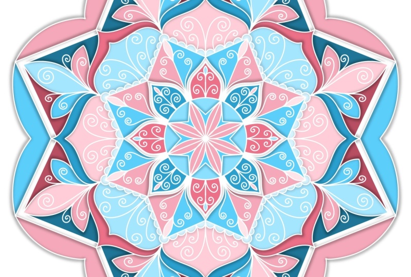
10. Let's talk about contrast: [MUSIC] The secret to having amazing color that pops off of the screen is contrast. Now there are two types of contrast I want to talk to you about today. The first is value contrast, and that is light versus dark. You'll see a light green on the left and a dark green on the right. There are essentially a similar hue, but there's a light color versus a dark color. The second type of contrast is color contrast, and that is warm versus cool colors. Let's dive into these both. Value contrast can be demonstrated here. If you look at the medulla on the left, there are a lot of what I call midtones. Midtones means they're all in the middle range. I don't see a lot of light lights or dark darks that even though the colors are different colors, they're all in that mid level. Now, if you look at the exact same medulla on the right, I've replaced some of the mid oranges with some really light orange tones. Then I've changed the hue of the blue and added texture and depth and shading around that inner star to really make it pop. You'll notice what a huge difference that value contrast can make by adding in the light lights and dark darks. Now if we turn this into a gray scale view and make it black and white, it becomes even more obvious where you can see it's bland on the left, everything blends together a bit. Then you go to the right and you can really see how it pops. Now, the second type of contrast I mentioned was color contrast, which is cool and warm colors. Cool colors are colors that reminds you of Winter like blues and purples and greens as well, are cool colors. Warm colors, think of sunshine like yellows and oranges and reds and browns. When you put those two types of color next to each other, a cool color next to a warm color, it really pops off of the screen. If you look at the example on the iPad to the left, you'll notice that that orange against that blue has a nice color contrast to it. It also has value contrasts because you can see that really dark blue against the lighter blue, which also helps add that nice pop off of the screen. We're not going to go into a lot of color theory in this class, but color harmony is when two colors work well together and look nice together. Complimentary colors are opposite each other on the color wheel, and those will always pop and work well when placed next to each other. Some common examples of that are orange and blue, which we're going to be using throughout this class. Red and green, violet and yellow, and pink and yellow green. I've also included the pink and yellow green in your color palette, so you can play with those colors as well. Now, color placement becomes important as well. In this example, the outline of the medulla is identical. The difference here is the color placement and a few details. The medulla on the left has a lot of blue and then just a few accents of a lighter orange. Your eye is drawn to that outer part of the inner flower that is a light orange with the dark brown curved stripes on it. The outer circle where you see the orange striped edge. Whereas the one on the right, I'm drawn to that center flower that's light orange, and then those big spikes that are orange coming out from the center. Now, if you look to the left, I don't even notice the spikes because they are blending in with the other blues. That is the difference that color placement can make depending on where you put that color when you're choosing to add it to your medulla. Just know that you can get a lot of interesting results just by shifting those color placement. Color shading is also really interesting. In these examples, both of them have some color shading. Again, it's the exact same medulla outline. But on the left you'll see a lot more light accents and details and not as deep of a shading. On the example to the right you'll see that dark shading in the center that leads your eye into the center. Then, these nice burnt orange and dark brown accents on the vines that are coming up on the outside edges that really add a little bit of depth to it. Exact same medulla, but because of those details in the shading, it makes it look quite different. Texture can also be really important. Here's an example on the left. Again, both of these are the identical medulla, but they have different color placement and different texture. The one on the left has a little bit of newsprint texture right around that central flower. But other than that there's a little bit of soft shading and that's about it. The one on the right, you'll notice has stippling around the center. Lots of little dots. It's gotten veins throughout all of the petals. The inner flower actually looks like feathers because of the veins that are shown there. Having and adding all of that detail and that texture creates an extra level of depth and dimension, an interest in the end design. Lastly, I'm going to show you the importance of hue. This is the exact same medulla from left to right. This is the first project we'll be completing in this class together. I'll actually be showing you how to change it from the colors on the left, to the hues on the right with a hue color shift in literally seconds. Up next, let's color your base layer of your first medulla.
11. Coloring your base layer: [MUSIC] Now you know the secret to having a color pop off of the page is contrast, both value and color contrast. We're going to keep that in mind as we add color to the base layer of this mandala. To get started, we're going to go to the Layers panel and we're going to duplicate this layer that has our inked mandala on it. I'm going to swipe to the left, hit Duplicate, and then I'm going to go down to the original and rename it. I'm going to call this one original. I'm going to toggle off the view on this and this one I'm just going to save and not use. The reason for that is if I ever have to go back, I want to know that I can start with that original one if I ever accidentally make any changes to another layer that I don't like. I'm going to toggle off this Layer 1, which was our guideline because we no longer need that. Now I'm going to go back to Layer 2 and I'm going to do something called make it a reference layer. I'm going to click on it and I'm going to go down to reference and click on Reference. Now what this means is that procreate is using all of these outlines as a reference so that when we go to fill a shape with color, it's going to know which layer has those shapes on it. Let's get started by adding another plus sign here and add a new layer of color. Let's start out with our first color. I'm going to go up here to my panel and I'm going to grab this light teal color. I want that to be my first color that I use. Now, I also want to remember to add drawing assist to it. That way it's going to know to fill all the panels at once instead of just one. I'm going to come here and I'm going to go back to that color and I'm going to drag and drop it into the petal shapes. Now I'm going to go in and grab it and drag it into the second grouping of petals. Now I have this teal flower in the center. Now next to this, I want to put a little bit darker blue color. To do that, I will want to do that on a separate layer. We want each color to be on its own layer. The reason for that is it's going to let us change colors later very easily if we'd like to. Let's go back to the second layer and I'm going to choose this. I think I'm going to choose this middle blue color here. I'm going to drag and drop that in. Now notice it only did one line. The reason for that is that I don't have that drawing assist on it. I went ahead and added the drawing assist. I'm going to blow this up so you can see what we're doing. Drag and drop that in. Now notice there's a little bit of white halo in the center there. I haven't lifted my pencil up yet. If I drag it to the right, notice how that halo goes down. Basically, that's called your color threshold. Let me go back. We'll go back and empty these again and let's add our drawing assist of that layer. Here I'm going to drag this in, hold, move it to the right. Notice how those little white spots are no longer there. If I kept moving this to the right, eventually, it could fill the entire space with blue because it thinks that we're trying to fill more of the shapes with the blue. But you can play around with that slider to get it to the point where it's just filling the shape that you want it to fill. Let's pinch this down and take a look. I'm going to go back to this teal color. I'm just going to add teal to several different areas of the mandala. I want them spaced out because I want to have that color contrast so that there are warm colors next to the cool colors. I'm not going to add blue to this because we already have these two blues here and that will likely be oranges. But I can come in and add this to some other places. Think I can add it maybe here and to the other side. I think I can add it to maybe these shapes here. I think that's enough of the teal color. Let's go back to that blue color, that middle blue, and let's add it in a few places too. Now let's go in with some orange. I'm going to add Layer 6. This one, I'm going to select a really light orange. Again, I'm going to add my drawing assist. I think I will add that here inside of these star shapes and inside of these teardrops. I think that's good for the light orange. Let's go in with a slightly darker orange. Now you can always rename these. Sometimes it's hard to see what's on the layer. You could rename it light orange. I'm not doing it for my own purposes, but that is something that you can do if you would like. Let's go ahead and select Drawing Assist, and I'm going to go one shade darker. I'm going to add that there. I think I'll add some here to these shapes and I think we need some in the teardrops. Nice. Now let's add one more layer and let's do our dark orange. Now, remember we need to add drawing assist to it so that it will actually go in all of the shapes. It's easier to blow it up sometimes to make sure that you're dragging into those orange shapes with a white where you want it. Great. Let's add some as well. I think out here on the outside of these shapes. I think that's good. I want to go back in and add a little bit of a darker blue. I'm going to add one more layer, make it drawing assist, and I'm going to pull in a slightly darker blue. I'm going to add that too around those teardrop shapes. I'm also going to add it into these shapes. That's giving us some color contrast or some value contrast by having the dark against the medium tones. We're going to go in and add some shading, which is also going to darken a bit of some of these medium tones so that they pop a little bit more. I think we can also add them to these teardrops. Now, I think for this outside, I'd like that to be a lighter orange. I'm going to go back to my light orange layer and I'm going to grab this light orange and drag that in and add it up here as well. Then all we have left are these little dots here. I'm going to go back to my teal layer and drop those in. Again, not an exact science, but this is just fun and play. I might look at that and go, "That's a lot of teal next to each other. I want a little more contrast." I can go backwards and maybe I can just add light orange to it. Go to my light orange layer and drop that in. Now our base layer is done. The next step is going to be showing you a shortcut to check your values in Procreate and make sure that the color balances well.
12. Adjusting your color values: I told you I'd share a secret tip with you, and that is how to look at your value contrast and make sure that you have all the lights and the darks popping against each other. To do that, I'm going to go to my layers panel. It might be nice at this stage to start grouping the mandala shapes together. I'm going to group the layers by swiping to the right, so that they're all going to be blue. I'm going to keep that original separate out of the group, and I'm just going to click on "Group". Now I can collapse this and I can rename this mandala 1 and hit "Return". Now I'm going to add a new layer on top. I'm going to go back really quickly to the mandala layer and go down to this one one assisted reference. I want to take the reference off, in order to do the next step. Then I'm going to go back to that top layer and I'm going to go select the black from my palette. I'm just going to drop it right on top of everything, so the entire screen is turning black. Now what we're going to do, is play with a blending mode called hue. We're going to click on the N, which is the normal blending mode. Then we're going to scroll down to the one called hue, and then tap out of our layers. This gives you a gray scale view of exactly what your colors are. If you completely desaturated them, this is the black and white version of the colors that we laid into the base layer. Now, I can just toggle this off and on, so that we didn't change a single thing with the layers underneath. It just gives us a nice view of what they look like in terms of our color contrast. I see some darkness here, I see some midtones, and then I see some light colors. We have the light popping against the midtones and the darks, which is nice. I think this is fairly balanced. But if we wanted to change something, if we thought a couple of tones were a little bit too close together, we would have the ability to do that now. I'm going to toggle this off, so that it's out of view. If we wanted something to be a different color, let's say, we wanted these two tones pretty close together and we wanted those to look differently, we have the ability to change these colors now. I'm going to show you how you could do that. Let's pretend that we decided we wanted the dark orange actually to be a pink color instead, and we want it to be a dark pink value. I could go in here and go to my orange layer, and I'm going to click on it and click on "Alpha Lock". When I do that, you're going to see these little transparent boxes come over this, that shows that you're in Alpha Lock mode. When I'm in Alpha lock, there's also another secret way to do that. You can take two fingers and you can swipe to the right, and that will take Alpha Lock off and on. When I'm in Alpha Lock, now I can change the color of that entire layer. Let's say, instead of the orange, I wanted it to be this really dark pink. I could go in here now and say, "Fill layer," and it's only going to fill the area where I already have color. If I hit "Fill Layer", you'll notice now that all of the dark orange turned into a really dark pink, a darker value than what was there before. Now if I turn the hue back on, I'm going to see a little bit more contrast in those areas of the darks versus the midtones. That just helps you understand the value and some of the changes you might want to make. Now, I liked the original orange tone, so I'm going to go back and change that back to the orange by going in here and saying, "Fill layer." If my Alpha Lock was not on, let's turn that off, and I said, "Fill layer," it's going to fill that entire layer with orange. I'm going to tap with two fingers to go backwards and undo that, but just know that that is how the Alpha Lock works. That is the secret tip for being able to look at your values and how you can change them using Alpha Lock. Next up, let's add some shading and texture with clipping masks.
13. Adding shading: We have some nice base color now laid down. We like the value and the color contrast that's shown, but it lacks a little oomph. It doesn't have any texture or any shading to it that makes it pop. That is the next step that we want to do is we want to add some shading and some texture to the different layers of your mandala, and that's the reason why we did these in different layers, is because it's going to give us the ability to adjust them one color at a time which is really helpful. To create a clipping mask, let's just start with this teal layer. To create a clipping mask, we're going to add a layer on top and then we're going to click on the "Layer" and click on "Clipping Mask". We also want to go to drawing assist, because remember we want to make a change in one area and have it make it throughout the whole Mandala at the same time. Now that I've created this, what it means is I can only make marks on top of the teal colored areas. For example, I'm going to come in with a dark blue color and I'm going to use the soft brush, which is a nice airbrush, adjust the size and the opacity. I'm just going to come here into the center, blow this up and very gently make a circular motion to add some shading there. This is creating shading just where the blue area is. If I come over here and I add shading, nothing happens on the screen because I can only make marks where the light blue where the light teal is located. I'm going to go backwards, I actually want to tone this down and do one step lighter, I think on the blue. Yeah, that's nice. I can also add some texture down here to these other areas, of just a little bit of shadow. I'm going to decrease the size of my brush. It's just a hint of shadow that makes it appear that one level is underneath the other level. One level of your Mandala shapes. For example, if I came here and I just add a little bit to the sides, it makes it appear that the orange is on top and then that teal next layer is beneath it casting a shadow. Let's do something similar now with the light orange. I'm going to go to my light orange layer. again, I'm going to add a clipping mask. I'm also going to add drawing assist on a layer that's right above it. The little arrow points down and shows me that it's attached to this layer. I'm going to go grab this darker brown, reddish brown color. I'm going to drop the opacity down and the brush size down. I'm going to come in here and just touch it lightly to the screen and it creates this nice shadow on that orange so that the blue looks like it's sitting on top of that orange. Can also come down here and add some to the inside of my teardrop shapes, and I can also add some here. This shading is what truly makes things appear to pop up off of the page. The next step is let's see where else we might want some shading. I think we can add some to the mid orange tones as well. Let's go to our mid orange, and I'm going to add a layer on top of it, add a clipping mask and add drawing assist. Using this same brown color, I can come in and add some shading there, and perhaps at the the base of the points of the star, I add some shading. Actually, I think I like it, let's try something else. Let's try it at the tips. That's interesting to add a little bit to the tips. That's given us some shading and now it's really starting to look three dimensional. Another thing you can do is add some texture. We talked about texture in a couple of ways. You can use stippling. You could use the newsprint brush instead of utilizing the airbrush, and that'll give you some natural dotted textures. You can use a dry brush. Let's go in on top of our teal and add a new clipping mask layer, with drawing assist. One of the things you can do procreate is just press down on the screen on a color and that will change it to that color, so instead of just always going to the palette, you can do that as well, but I could go in here and go to classic and I could maybe bring this color up a little bit lighter. I could play with the dry brush, just adding some lines with this dry brush to give it texture. Remember when it's assisted, it'll actually do all of them at once, so you don't have to go around to each petal, but this can brighten things up a little bit and creates some interesting little lines in the background. You could do this on the blue as well. If I go to this blue and I lighten that up a little bit, you can also do a darker texture, it just depends on what you like. I'm going to go here, add a clipping mask, add draw assist, and just add a little texture to it. That just gives me some visual interest, but it's up to you whether or not you like that specific look. If you like the flatter look with just the shading, you can leave it with that, or you can add some shading with, like I said, the newsprint brush is really pretty interesting. I've added a lighter tone and then I can even go in and add a little bit darker tone right in the corner, which will really make that pop. I think I'd also like to add some here, nice. That's given me just some really nice subtle texture and some darkness that makes this teal color pop. In our next video, Let's go ahead and add some final details.
14. Adding details: [MUSIC] Now that we have these gorgeous textures happening and we have beautiful value contrast, it's time to add a few details. I like to go in and add these on clipping masks as well. But you can do whatever you like. You can put them all on one layer if you'd like. What I'm going to start off with, I think I'm going to add some details to this dark orange. I'm going to go to my dark orange layer, and I'm going to add a clipping mask layer and a drawing assist on top of it. Then I'm going to come in with my light orange and my monoline brush. I'm going to bump up the size a little bit, and I'm just going to come in here and drop down the opacity a little. Maybe make it slightly smaller and just add some dots. Let's see, are there any other areas with dark orange where I might want to add something? I think we can drop down the size, and we could even add some accents inside of the scallops. Just some little shapes inside of the scallop shapes. Let's move on to the light orange color. I'm going to add another layer on top. It's already saying it's a clipping mask. I'm just going to add in a drawing assist, and I'm going to go back to this brownish color. In here, I'm just going to add some couple of V shapes here. This is helpful to blow it up so you can really see what you're doing, and you can let it snap if you hold it at the end to get a really nice shape. I think I'm going to add some little V shapes inside of the teardrops and maybe some little shapes inside of the scallops as well. Now this is a little bit too dark and what I want to show you is you can use blending modes so I can go into this layer and I can hit on the n, which is the normal blending mode, and I can start filtering through some of these to see what they look like and how the colors change. Screen is one that turns everything really light. Color dodge also is fairly light. That's actually cool to see the color go from that dark brown to almost a white color. Overlay is a really nice subtle colors, so it's knocked down that bright or that boldness of the brown. I think I'm going to keep that one, I really like the way that that looks. Now I want to add a little bit of detail on top of the teal. I'm going to go back down to my teal layer, and I'm going to add a layer on top. I'm just going to go choose a dark blue. I'm going to bring that down to a small monoline brush. You could also use your technical pen for this. I'm going to come in and make sure that I have drawing assist on and add a bump up the opacity. Now this looks like it's not quite opaque because it's underneath some of these other layers. If I were to pop this up to the top of those layers, you'll see it turns dark again. I'm just going to add some petal shapes to either side. I'm also going to come here in the center and add some petal shapes or some veins coming into the center of the petals there. Then I want to add some, I think here as well. A couple of curved lines. We might also want to add something to the tip here. You can add shapes like that, or you could add dots. Let's go in and increase this and drop down the opacity. You could add some dots here. I like the way that that looks. As you can see, you can just go on and on. There's so much fun that you can have with blending modes, with adding little details here and there. I do want to add a little bit of some details on these other petals here in the blue. I'm going to go back to those. Just going to add a layer on top. Drop down my brush size, and want to make sure that I have this on Drawing Assist. Just added a little couple of veins there to add a little bit of detail. In our next lesson, I'm going to show you how to take this beautiful mandala and create completely different color ways that you can use very, very easily without having to actually recolor each of the layers.
15. Simple ways to recolor your artwork: Now it's time to recolor your Mandala. You already have learned how you can change the color of different layers using the alpha lock tool. But now I'm going to show you some ways that you can use adjustment tools to change the entire color scheme of your Mandala in seconds. It's super fun and a little bit addictive. Let's get started. If you come up here to your layers panel, we don't need this dark value layer anymore, so we can swipe left and hit 'Delete'. I usually like to keep my original Mandala layers there, just in case I ever want to return to them and change them later. Depending on the size of your iPad and your memory, you may have limits to the number of layers that are available to you. If you try to duplicate this layer, it may or may not let you do that at this stage. To fix that, the easiest solution is to go back to the gallery view, hit "Select", select your project, and hit "Duplicate". What that does is, it makes an exact copy which you can X out of that of your original project. I'm going to go into the copy now, and I can make any modifications to this file that I want, and I know that I can always go back to that original file. Here, I'm going to go back to my layers, and I'm going to go ahead and merge these down. To do that, you can go in here and individually pinch them together, like the clipping mass with the layer beneath them. But the easiest way to do this is just to click on it and click on the word, "Flatten". Now that I've flattened this, it's literally created all of it on a single layer. Now, I'm going to duplicate this and I'm going to go ahead and take off that assisted reference because we don't need that anymore. I'm going to toggle that off, so my top layer is the one layer that we're working on now. I'm going to show you a few different ways that you can change the colors of this particular layer all at once. The first thing you can do is come up here to the Magic Wand, which is your adjustments section, and these top four sections are the ones that control your color. We'll start off with hue, saturation, and brightness. Now, when I come here, it's going to take me immediately to a layer adjustment. You can also click on this arrow in the new version of Procreate and click on "Pencil" or "Layer". The difference between the two is that right now if I make adjustments down here, it will make it to everything on the entire layer. If I click on "Pencil", I could literally make an adjustment to the hue, for example, of just one section. I could use a brush in here and come in and change the hue. Brush that in and adjust the hue of just the part that I've painted in. It's applying to the whole thing because I do have drawing assist on that layer. That's fun, but I prefer to have color harmony because I've already worked so hard to get those colors looking beautiful together. I'm just going to go backwards, and now I have the opportunity to go back to that hue saturation level. Makes sure that I'm selected on layer and I can change all the colors at once. They'll look pretty good together because the hues are all shifting at the same time. You could have a green and red version, a bluish brown, as we go to the right, we have purple and green and then this nice red and blue, which I quite like. Then you can adjust the saturation level and make it brighter or more saturated, or a little grayer and desaturated. You can adjust the brightness by going up really bright or really dark, I normally keep that about 50 percent. Then once you like the way that looks, you can go back up to this wand and that will finish that change. Now, if you want to keep a version of this, you can just duplicate that layer again, and now I'm starting with something new. I will come back to this and go to our next option, which is color balance. Now in color balance, it's going to take the whole layer and apply a cyan to it, that's a pop of blue, or you can make it all more red. I like a bit of that blue in there. The magenta or green, you can shift those tones a little bit. You can make it warmer or you can add a little more blue, which is a little psychedelic. That's kind of fun, but let's pull that back a little bit. Then we can also go to the next one, which is curves. Now, curves works very similarly to a photoshop-type program, where you go into the curves and you click on a section. If I select Gamma, for example, I can go up or down, so it increases the Gamma or deepens that. I can also add a second dot and create somewhat of an S-curve to add a little pop of contrast there. Then I could go into red, green, and blue and adjust each of these levels, so it's just literally playing around until you find something that you really like. Then the last choice here is the Gradient Map. In Gradient Map, you can cycle through all these different options. Some of them are quite muted, some of them look really interesting, that's actually quite a pretty earth tone combination. You can go through and see which ones you like. I'm going to go back to this breeze version and I'm going to click on it. Here, I can control the amount of each color that's included, so I can lessen the dark blue and add more of the mid-tone blue, I can add a little bit more of this cyan or this teal color and even more of this yellow for some pop. Then I can click 'Done', and if I want to, I can go back and again adjust the curves again. If I want to have those pop a little bit more on the blue, perhaps. There's a lot of different things that are just really fun to play with, so just experiment and see what you like. We started off with this Mandala, and just by applying those adjustments on those four options in the adjustments menu, we turned it into a red and blue Mandala, and then that one turned into our ocean-themed Mandala. All of those steps could be done very quickly, and they make it look like an entirely new piece of artwork. Have fun and experiment, and I can't wait to see what you come up with. Next up, I'm going to show you how to use the rotational symmetry tool in a different framework to create your second Mandala.
16. Intro to your star mandala: [MUSIC] Now that we've completed our first mandala, you're getting the hang of this process. I'm going to show you a second mandala now using a completely different framework with rotational symmetry instead of reflective symmetry. We'll dive into some different texture and details, and I'll show you how to make your artwork pop off the screen. Along with a great way to unify all of your colors together before exporting your artwork. Let's dive in.
17. Inking your star mandala: We're going to try another Mandala Framework, so I'm going to hit the plus sign and create a 10 by 10 RGB Canvas. I'm going to go ahead and click on the wrench and go to "Add", "Insert a photo", and I'm going to grab this framework here. I'm going to go ahead and bring the opacity down. Add a layer on top, that'll be my drawing layer, and I want to add the drawing assist to it. I'm going to go here to Canvas, "Drawing Guide", "Edit Drawing Guide", "Symmetry", "Options", "Radial", and then I'm going to toggle this rotational symmetry on. That is not something that we used in the last example, so I'll show you how that works. I'll bring the opacity up and I'm going to make my drawing guides pink so they stand out and hit "Done." I'm ready to begin my Mandala. I'm going to use black again, and I want to go to my monoline brush. I'm going to start with a floral shape. That's a little bit thick, so I'm going to go bring that down. I'm going to add, I think ruffles there. It's just about play. Now remember, this isn't about perfection or exact even spacing. I actually like when it's not that way because it shows it's been hand-drawn, and because of that symmetry tool, it'll be perfectly imperfect and every section of your Mandala. Now there are ways you can actually copy these shapes as well in Procreate, but a big part of Mandalas is the mindfulness of it. I find the act of intentional repetition can be very therapeutic. I'm done now with the inking, so let's go add some color.
18. Coloring your star mandala: All right, we're done with inking and we're ready to move on to our base layer of color. Now you can always go in and clean up the inking a little bit if you need to in spots. That can be helpful when you're going through this process before you add the color. But it's not essential. You'll have a chance to clean it up later if you need to. I'm going to go ahead and make a duplicate of this. This is going to be my original. I can always rename that or just leave it untouched. I'm going to go ahead and make this a reference layer. I'm going to start adding color. I'll start again with my teal and I want to create a drawing assist layer. I want to be on my monoline brush, which is a nice smooth brush. I'm just going to pull in color and start filling in these shapes. Here's an example where not all the shapes were together. I'm going to hit "Undo" and play with my color threshold. As shift to the left, you're going to see how now it's only filling the shapes that I want, which is perfect. I think I'll add a little more. That's quite a bit. I think I'm going to go back to my reference inked layer and just add a little bit more to this so that it's not all one color. Let's come here and add this. Add a line to here. We can break up those blocks of color. Now I'm going to go back to my teal layer and let's drop in the teal there. That's nice. Now I want to go in and add a layer of some blue. I'm going to pull in this medium tone blue. I'm going to add it with Drawing Assist. I'll add some there. I think I'll add it there. I think I might include it in these spots in between the circles. Now, you have to be careful and blow it up when you're adding in these tight spaces. It's helpful to bring your threshold sometimes to the right to fill in so you don't have any little tiny gaps of color. I think we've got one other little spot right here. Now we have that nice blue in there. We can also add it to the scallops, perhaps. I'm not sure yet. I think we might go in and try adding in a different color, like perhaps a green to the mix. Let me try this dark green on a new layer with Drawing Assist. Let's see what happens. That looks pretty cool. I think this would also look good to have some green in the dots going around the edge and the border, since we have some orange next to it, green and orange are complimentary colors and they look nice together. Perhaps it would be good to have this. You can play with it and see if you like it in a lighter green. I could go to my lighter green, go on this layer and hit "Alpha Lock," and then just fill the layer with the light green. I actually like the light green because I can add some shading to it and deepen some of the areas. All right, we've a few little circles and some teardrops that we can add some additional color too. I'm going to go ahead and do that now and speed up the video. I did want to mention when something is on Alpha Lock, you are unable to drag and drop color into it. You can change the fill layer, but you can't drag and drop the color in. You'll want to take it off of Alpha Lock. Our base color is now done at this Mandela. Now we're ready to add texture and details.
19. Adding texture & details: Now, it's time to add texture and details to this Mandala. I'm going to go ahead and take out the background framework that we no longer need, and just toggle that off. Then it's sometimes helpful to group our layers together. Now, I want to start by adding in, some depth into these blues. I'm going to go into the blue area and I'm going to add a Clipping Mask, and I'm going to go in with some texture. Let's decide what kind of texture we can use. This old brush might be interesting. I want to use a really dark blue here. Let's make sure that we have Drawing Assist selected. Very cool. That gives us a streaky texture. I'm coming out from the center outwards, radiating outwards. Now, what we can do is add some texture to the teal areas, so I'm going to add a Clipping Mask, add Drawing Assist, and come in with this not quite as dark of a blue, and I think I'll use a soft brush for this. Come around the outside of those petals so that they really pop up off of the page. Add a little bit to the center there, and add some around these scallops, just touching the pencil very lightly to the screen. I think it'd be really great to add some stripes to this star shape in the orange. So I'm going to go to the middle toned orange shape, and I'm going to add in a Clipping Mask layer with Drawing Assist, and I think I might want that to decide on the color. I want that to be an orange, I'm going to go to my monoline brush and pump up the size of that and see. That looks really interesting, so adding those stripes. Then I can also go out to this outer area and add perhaps some dots. If you want to vary the size of those, you can have them bigger around there and then bring down the size a little bit, and have them smaller, trailing off to the side, which I quite like. We can also add some dots to the lighter orange, so I'm going to add a layer above that with a Clipping Mask and the Drawing Assist and let's come in and add some dots there as well. I also want to go in with that nice brown tone and bring down the opacity and put on the soft brush. I really love the shadow that this provides, and we can add some to make sure we have Clipping Mask on, there was no Clipping Mask. There we go, now it's not going outside the lines, and we want to make sure it also has Drawing Assist on it. Then on the inside of these petals as well, we can also add it to the base there, and just a hint of it to the base of those as well. We've got some nice shading going on, we've added a little bit of texture, I think we can add a little bit of shading to the green here. I'm going to go to the green layer where we have our scallops. I'm going to add a layer on top of it with the Drawing Assist and the Clipping Mask. Let's choose a dark green with the soft brush, and just come on the inside of that and add a hint of shading so that the edge is still light green, but the inside of it is dark, which makes it appear dimensional. Now, I noticed the technical brush is really helpful for this. I noticed there's a little spot here that got missed. I'm going to go ahead and hold my finger to the screen and grab that blue, and I'm going to go to the technical pen and then drop that down a size really small, and I'm going to go find my blue panel and just come in here and fill that in. That's now filled in that spot all the way across the stars. Now, we could add a little bit more detail with a few lines, so I'm just going to come in with, I think on top of my light orange layer, I'm just going to grab this brown. I'm going to grab, a technical pen is fine, I can keep it on that, and just add in, ensuring that I have the symmetry on, I don't have the symmetry on, so let's make it a Drawing Assist layer, and let's add in some veins here. We can also add in some veins, I think, along the blue flower in the center. Let's go to our teal layer and right above it add a Clipping Mask layer with Drawing Assist, and maybe we'll grab a dark blue for that, then come in here and add some veins to that. Which looks really nice. Now, since you are on that teal layer already, you can add some other elements. You could come in here and add some outlines here, and I think we're pretty good. Once we're done, you can always make the changes that we've already discussed on how you can condense all these down, play with the hue, create different colorways. One of the things I do like to do is to sign your work or I suggest you do is sign your work. To do that, you can add a layer, and then you can come down here and just sign your work. Now, this piece is ready to either be printed or to be able to export it. I'm going to go ahead here to the wrench and I'm going to turn off my drawing guides so that this piece is ready.
20. Making your artwork pop: [MUSIC] I've gone back in and added a little bit more detail and depth to this mandala. I've added some dark blue on this mid-tone blue layer that we earlier had added texture on. I also added a little bit of darkness and shading here around the edges. Also some dark blue around about half of the background of the border with the circles. Let me expand this so you can see There's little shading here, some shading around here, and some shading around here. Now, adding that just really gets it that final pop that makes it look even more dimensional and pop off that page. Again, it's all about contrast and making sure that we add the darkest darks and the lightest lights along with the mid-tones through our whole mandala design.
21. A quick tool to unify your colors: Now, another way that you can unify your colors, which I didn't show you in an earlier section, was to utilize and layer on top to unify these colors. You can go up here to your layers. You can add a layer on top. We'll go ahead and pull in one of these lighter colors up here. I like this sort color. Before I do that, I want to make sure I don't have that reference layer. Anything showing as an assisted reference. I'm going to go turn that off, turn off the reference layer. The reason for that is, if I left it on and I dragged and dropped the color over, it wouldn't color the whole thing. It would only do the outside areas, which is not what we want. I'm going to come here, grab this yellow/cream color. Now notice, I accidentally hit here on a blank area and it added a color swatch. If I don't want that there and I do that by accident, just hold down on it, and you can delete the swatch very simply. We're going to go back to this cream color, drop it in, and it covers everything just like when we did the hue value exercise. I'm going to come up here to N, go up to Multiply and bring down my opacity. What this has done is it is unifying all of these colors underneath by adding just a hint of this cream/yellow color to all the colors beneath it. Because of that, that will make it really look consistent and beautiful. It works great for just about every color combination. Now that I've done this, I'm ready to do the next step, which will be to export.
22. Exporting images and time-lapse video: [MUSIC] We're ready to save our file. We can export it by going up here to the wrench, and we're going to go to the "Share" menu. Here you have all these different ways that you can save the file, and I typically suggest using JPEG or PNG files. If I click on "JPEG", it'll say it's exporting, and I can click on "Save Image". It'll tell me that it's successful, and then I will find that image in my camera roll. It'll just save it right there for me. You can also save it to Dropbox or another Cloud server if that's what you utilize. But just know it's very simple to go ahead and save that on your camera roll, and then you can upload it to social media. The other thing that's really cool you can do in Procreate that I mentioned at the beginning of one of our other projects, is that you can save a time-lapse recording. I just click on "Export Time-lapse Video", and it'll ask me if I want the full length, or if I want it condensed to 30 seconds. I'm not sure of the exact time-wise it is, but I think it's about a second per minute that you spend. If you spent an hour on something, it might condense it down to a 30 second video. But if I click on "30 Seconds" or "Full Length", then it will export that. Again, I can "Save Video", and that's going to save that video down to my camera roll. Then I'll be able to go to my camera roll, and see it, and play that video, and upload it as well to any social media platform that I might want, or just to have on hand for myself. Here I've gone to my photos, I can see the video and click on it. This is going to show me exactly how I created that mandala. Very high-speed, [LAUGHTER] but pretty darn cool. It's adding color, it's adding texture, it's adding all of the details. There'll be a signature in here pretty soon. There you go, it's done. That's a great way for you to document your work, and it doesn't require any extra work on your part, except for hitting that toggle button over at the beginning of your project. Up next, let's talk about how you can use your finished artwork.
23. Ways to use your finished artwork: [MUSIC] How can you use your mandala artwork? As I said at the beginning, the process of making mandalas is far more important than the end result. But know that you can use the final artwork you've created in a number of different ways. You can create coloring pages from your inked outlines and print them out and color them in with traditional media, like with my favorite Copic markers or with watercolor or colored pencils. These are all designs that I've created and done that with previously. You can print out your colored mandalas and create wall art out of them. You can print a smaller version out onto greeting cards and add a sentiment with the font of your choice using a program like Microsoft Word, Adobe Photoshop, or Illustrator. If you enjoy surface design, you can turn your mandalas into a repeat pattern, like the one I created on this tote bag to the left. If you've created your own original design in this class, you can upload it to a print-on-demand site to be printed and sold and all types of products like mugs, T-shirts, or shower curtains. You can share your artwork process through time-lapse videos like I showed you in the last lesson. Or you can choose to just make this your own art therapy practice and draw colorful mandalas at the end of a stressful day. The opportunities are truly endless. Up next, in a special bonus lesson, I'm going to show you how to create an animated GIF file from your mandala.
24. Bonus #1: Creating an animated GIF: [MUSIC] Now let's talk about how you can create an animated image that you'll be able to use for social media, or for a newsletter, or for anything that you'd like. To do that, to show basically the progression of your Mandala as you've made it. You'll want to take your original group here of all the different layers and make a copy of that. Then once you've made a copy of that, you can toggle off all of the detail and shading layers so that all that you have left is the base color of your Mandala. Then what you'll do is click on this and click "Flatten". That's going to take all of those layers and merge them down together. Now that these layers are flattened, I also can create another copy of this entire group with everything visible and flatten that, which I've actually done here. This is my final Mandala layer. I think I'm going to pinch the signature there together so I have that as well. Now what I have is, I'm going to take this layer off and toggle these on. I have my original layer, then I have the second layer which is going to be the drawing itself. The third layer is going to be the color, and it looks like there might be a little bit of the color missing but that's fine. Then the fourth layer will be the finished piece. Those are the ones that I have selected right now. I'm going to come up here to my Actions menu, and I'm going to click on Share. Down here I'm going to select the animated piece, the Animated GIF file, or GIF file. When I click on that it's going to show me the layers that are visible. It's a little bit too much right now so let's bring down the frames per second. If I show one frame per second, then that's going to show the blank framework and building upon that until it turns into the final piece. It's very cool. You can create a transparent background for it if you'd like, or you can have a white background, or whatever background you've utilized in your work. Then when you're done, you just hit "Export". That's going to save that again into your folder of your choice. If I say Save image that's just going to go straight to my camera raw. This is what I have sitting in my camera raw, and here's my animated GIF file that has four different layers to it to show how the progression went to get to the final image. It's a really cool way to show people your process. I can't wait to see the ones that you create.
25. Bonus #2: Stained glass mandala: [MUSIC] Now I want to show you how you can create a spring-themed mandala using an alternate coloring method in a special texture technique that will make your finished mandala look like a stained glass window. It's pretty cool. Let's jump in. [MUSIC] Here's an example of mandala that I've inked with a spring theme. It's got two lips all over it. I created this using the circular framework that's in your free resources. I wanted to show you an alternative to coloring your mandalas is to actually do it by hand with a textured brush underneath your outline layer. Here I've added a layer in-between the framework and the top outline layer. I'm going to select a brush called Freycinet. It is in the drawing brush set for Procreate, it comes free with the program. I'm just going to grab some of these pink colors to utilize those from our palette. I'm going to make sure that this has the drawing assist on it. I'm going to come in here and add some pink to this. It'll look actually hand-colored. I'm going to blow this up, so you can see the texture that's there. I went outside of the lines. You can just come back in with an eraser and just clean up any of those lines that you may have gone outside of. Then I can go in with a darker color and do the next level. Why don't I go in here with a deeper magenta? Again, I want to add another layer, add drawing assist to it, and come in and fill this layer in. Now, I've gone out of the lines, that's totally fine. [MUSIC] I've added another layer here that's assisted, and I'm going to add some green to this. [MUSIC] Just clean up a few of these spots. Add this dark green in, I'm going to take that a little bit darker. I need to go ahead and make that a very small brush size. [MUSIC] Now, I'm going to come in with a large brush and just fill that in. [MUSIC] Now that has given me a mandala. This is really dark, we want some contrast. I'm going to come in here and grab a lighter color, go to Alpha Lock and fill the layer. Now that's a little bit bright. Let me see what happens if I come up here. That's pretty interesting. I think I'd like to add actually a clipping mask to this area here and add some shading. I'm going to come in here with something a little darker and go back to one of these brushes. Now, I can come in and take all of these and blend them together. Go in here and change my hue and color saturation. Come into my curves. Now I have a brand new mandala that I have created that is hand-drawn from the bottom. I take off the framework, you'll see this looks like marker. [LAUGHTER] If I add that back on, you can see the total picture. This very much looks like traditional artwork when you utilize brushes in this way. Just know that is also an option to you. That is the more traditional way of coloring, like a coloring book. Now there's one final thing I wanted to show you, and that was the Thylacine brush that we added to our mandala pack. We didn't actually use it on the other two examples, just on our practice worksheet. I wanted to show you how that can look here. What I'll do is add a layer on top of my colored panel, but underneath the outline. I'm going to come in with a really light brush. This is almost a white, but it's a light blue, and I want my brush to be somewhere around 10ish percent or so. I'm going to come in with some really long strokes all the way across my mandala. They don't have to be perfectly straight, that's totally fine. This is just playing. I'm going to come back and crosshatch in the opposite direction. Again, all the way across, just a repetitive movement. We've lost a lot of that color, so to bring that back, we're going to go into this layer, click on the N, and go down to overlay. Then I'm going to go from max and bring that opacity down, all the way down to about 40ish percent. When I do that, I'm left with this beautiful subtle texture. Let me see if I can blow that up for you. This beautiful texture in the background on top of everything. It makes it almost look like stained glass, but it has an amazing effect, and it's just another fun tool in your toolkit to play with. I can't wait to see what you do with it.
26. Bonus #3: Procreate file organization: [MUSIC] In Procreate, you also have the ability to name your files. We can go back here to gallery, and I can go down here to the framework and actually name this my tulip mandala. I also can merge this with a different mandala. For example, here's another one that is the same shapes, but it's been done in the original method that I taught you. If I want these to be together, I can group them in stacks by taking one and placing it on top of the other and releasing. It creates a stack, and then I can name the stack. If I want to add something else to a stack that already exists, the best way to do that is to take a mandala, put it on top of another one, create that stack, and then drag the stack on top of another image, and it will create a stack then with all three of your images inside of it. Procreate makes it really easy to stay organized. I love it for that.
27. Final thoughts: [MUSIC] Congratulations, you did it. Thank you so much for spending time creating mandalas with me today. Here's a quick glance at everything that you've learned. [MUSIC]. I hope you had fun creating, but more importantly, I hope that you now have the knowledge to take what you've learned about drawing and coloring mindful mandalas, and infuse it into your own art practice. Feel free to drop any questions that you might have for me in the discussion section of this class. It's time to show your project. I would love to see what you've made. Feel free to upload it to the student gallery in the project and resources section. This is the group gallery for the class, so you can share your own work and leave some kind words for your fellow students on theirs. If you share your project on Instagram, be sure to tag me @lauraleegriffin, so that I can see it and share your work. You can also use the #mindfulmandalaswithlaura. If you've enjoyed this class, it would mean so much to me if you would leave a review and hit "Follow" up top so you can be the first to know as soon as I publish my next class. If you enjoy coloring, you can also check out my copic marker essentials class here on Skillshare, where I teach you all the basics on getting started coloring with alcohol markers. If you'd like more regular and casual updates from me, you can follow me on Instagram @lauraleegriffin, and if you don't want to miss the important stuff, you can join my monthly newsletter at lauraleelriffin.com where you can get the latest info on my artwork, classes, and my Startist Society podcast. Thanks so much for watching and I'll see you next time.
 Laura Lee Griffin, Artist | Illustrator | Podcaster