Transcripts
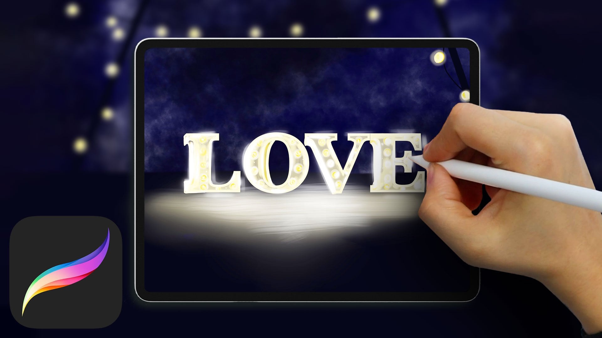
1. Procreate: All you need to know from beginner to advanced: Welcome to procreate. All you need to know from
beginner to advanced. Procreate is one of the most popular
applications for drawing on iPad and has been at the top of the bestselling apps since
it has been introduced. Do you want to draw
with Procreate, but you are unsure
where to start. This is why in this
course I have gathered the most useful
information and design the best tutorials
so you can create confidently on completion
of this course. There are plenty
of tutorials out there showing you
specific tools. But what makes this course
different is that we explained all the main
tools, how to use them. And most importantly,
when we should use them. You will learn while drawing, which is why this course
is all you need to know from beginner to advanced level. You will begin with
an introduction into the program with a detailed
overview of the workspace. We will then go
through the basics, like various brushes and what different
brushes can be used to explore layers and how they should be used for clean workspace and
to enhance your art. Learn how to create
your own warm, cool, neutral color
palette so you have a bank of colors ready
for future artworks. Learn where to find
complimentary colors based on the colors
you are using. Understand how layer filters and blur modes can
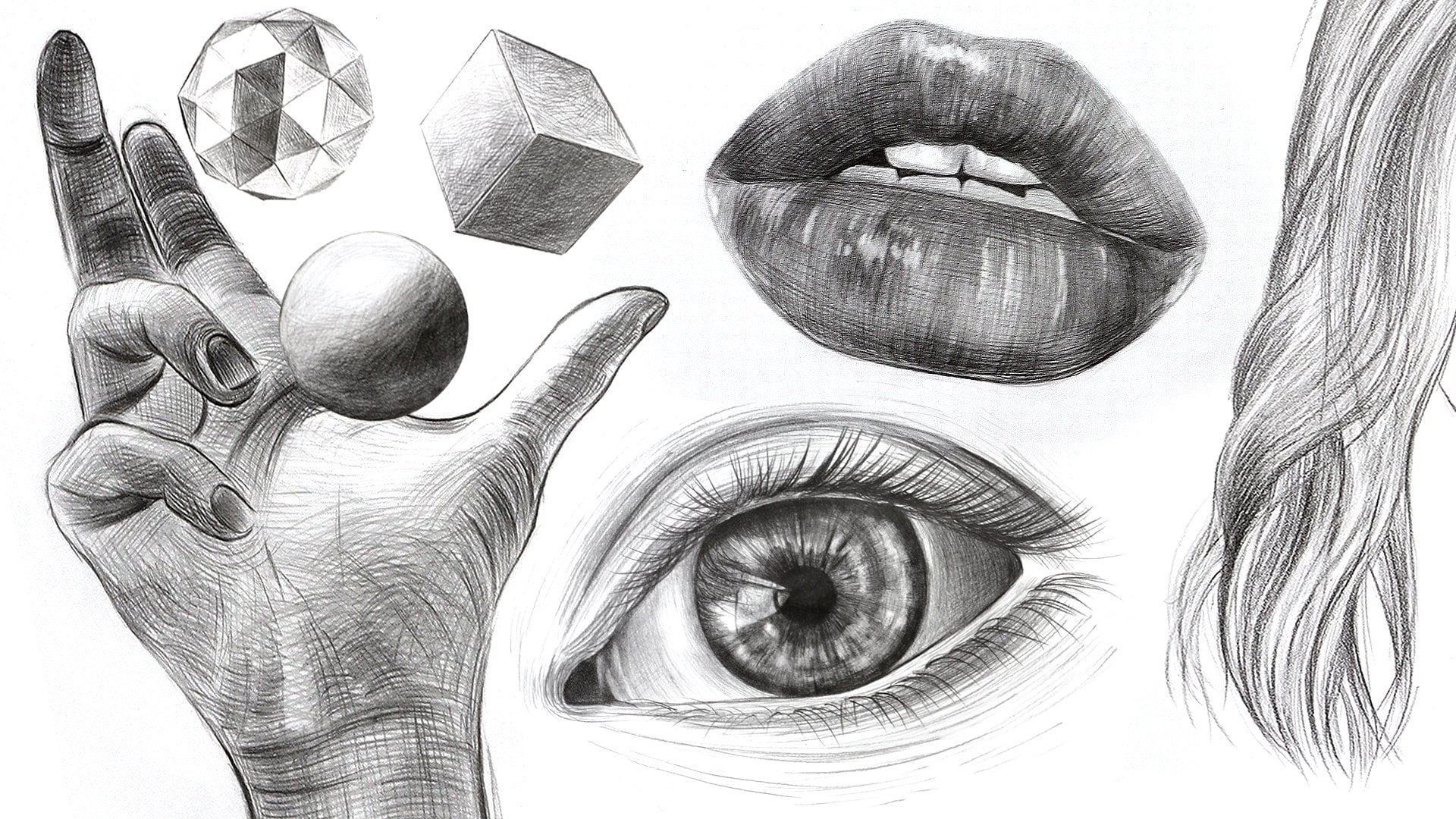
improve your work and how to use your pen to create different textures to add
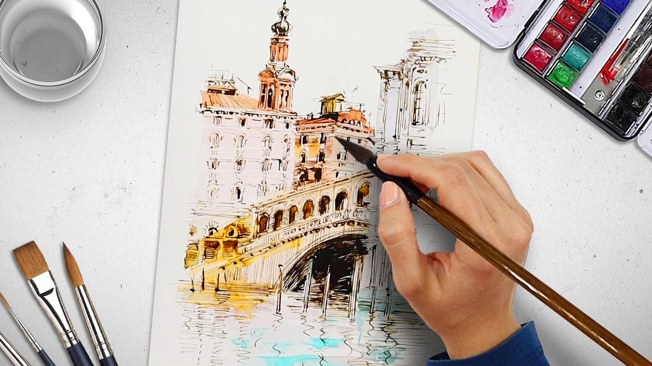
dimension to your drawings. Recreate physical artwork
techniques such as watercolor, colored pencil and pen
with different brushes. We will learn about the
different adjustment layers and which ones are
actually useful, and how layer masks
can be used to target specific parts
of your artwork. Throughout the course,
we will refer it to tips and shortcuts. Using everything
we have learned, we will work together to create complete artworks
from start to finish. Enroll now, and join
me on the first video to learn how to create
exciting RDDs Procreate. Procreate is an amazing
and flexible program with endless possibilities.
2. How to set up a procreate workspace effectively: Hi there. Welcome to a new course. Today we're gonna be
learning about Procreate. Procreate is an
application which is available on App Store
and you can download it, but it's for iOS system. You can also install a mobile version on
your mobile phone. Of course, it's better to
download it on your iPhone or iPad as you have enough
space for illustration. This iPad which we're working
with is iPad for year 2020. And we can download
procreate version 2018 and upper versions
and work with it. Let's open this program
and get familiar with it. This is the gallery file. We can save all our works
here in the gallery, so we can easily
have access to them. See, we can double-click
and see and check our works with two fingers. We can magnify them and
swipe and see them. Try it yourself. Again by closing your fingers, you can make them
smaller. Try swiping. For opening each single work. We touch it by one finger, then can zoom in and
out and edit it. Again, we can go back to the gallery with one
finger click on a file. What we need now is to open a new canvas in Procreate
so that we can draw, illustrate, or write on it, and then edit it if necessary. With the tip of our
pen or our finger. We touch this plus
sign on the top right. In this app, we can work with either our finger or our pen, but it is preferred to work with the pen of the iPad itself. Here we can see the list of the brushes are
pencils and etc, which we downloaded before. By default we can, we can use this app and see how it has some sizes
of pen and brushes. But we can add our
own desirable sizes. For adding other sizes, we go to this bar
and touch plus. And then a window opens, which we can give
different resolution. We choose dpi 300, which gives the highest
quality to our work. But the more the DPI is, the less maximum
layers we will be depending on the RAM
of different iPads. Dpi 300 is suitable and
has a high-quality, but we only have 15 layers. E.g. if we choose DPI 140, 40 Canvas, then it
gives us 250 layers. But if we choose a dpi 300, it gives us 26 layers
for this size. So in this part we choose our canvas size either in millimeter centimeter
pixel or inch. And we touch done, and it gives us
our selected size. We usually use a square canvas. This part is color profile, which we can select the
colors we want to work with. From. Here, we can choose the material of our canvas and the background of our
work by putting a tick, we can choose hidden,
for instance. We choose, and now we
have a 40 by 40 Canvas. By two fingers like this. We can make it smaller, rotate it, or make it bigger. And we can do other
things as well. This app has some shortcuts
which later we're going to explain and
try out ourselves. E.g. by our two fingers, we can undo or redo our Canvas. So far we've learned about size, resolution, number of
layers, and other details. On top of our page we have a
toolbar including brushes, different tools, layers,
color and eraser. We're going to learn
how to work with. Take your time to
familiarize yourself and repeat the video as
many times as you need. Also, you can see a
vertical bar here, which you can put
it on the left or the right depending on
your hand orientation. On the left if
you're left-handed and on the right if
you're right-handed. Now we want to choose our brush, which we click on it
with a tip of our pen. The app has default
brushes, e.g. for sketching, we have
different kinds of brushes are for inking,
drawing, and painting. So you can make your
selection accordingly. We even have brushes which
create different textures. So take your time to explore
these and go over them. Just to get to know more about your tool for drawing
in different techniques like watercolor or
coal or oil painting. We have, they're
suitable brushes. E.g. we want to choose our
brush here in this bar. We can change the size
of our brush by rolling it up or down with
this lever here, with the upper box and
with the lower box, we can change its opacity or the light and
shadow of our work. Give it a try. We can draw a
heart like this and painted. If we painted again, it will be darker, so going over it
makes it darker. Now, let's test another
brush and texture. Test all kinds of brushes
and see how they work, what effect do they give you? We even have calligraphy, pens, pencils, or brushes. Learning more about
your own tool helps you understand what
effects it can give you. Calligraphy brushes are good for both writing and drawing. A point about the shortcuts
which Procreate provides. If we tap our work
once with two fingers, it goes one level back. If we want to undo, we tap the screen once with
three fingers. Give it a try. With two fingers, we go back. And with three fingers we undo. If we keep our three fingers
still for a little while, all the things we
omitted appear at once. We delete them, we keep our three fingers still and
they appear on the screen. Sometimes. If we rub our
three fingers on the screen, we can emit our drawings. Now as mentioned earlier, a matter of testing the different brushes
and these shortcuts. E.g. with calligraphy brushes, you can create boulder
or darker parts, as well as lighter parts. And you can use them for
both drawing and writing. So the idea is to test them out, test all the brushes, see whether they can achieve
you different effects. And as you're drawing and you
want to see more texture, you can zoom in and out
to look at the details. Now, we go to air brushes
which are suitable for the air brush technique or aesthetic like shading a
face or a part of a shape. It fills all parts of what
we want to shade today. Remember, we can also change
the color of our brush, especially when we want to use other layers of
colors on our work. We can select and move the brushes we've used
more to a folder so that we have access to
them easily so they're saved as the brushes
that we have used. This saves us time instead of searching for the
brushes every time. Now we select a
and push the plus, and then it goes
to its settings. And here we can decide
what resolution, density, or thickness we can have are
options like streamlines, fallout for changing the
light and shadow and etc. By choosing each option you can make change to your brush, e.g. in options stroke pen, you can make changes
you want like fading. After changing based on the setting we can
press Done and create. If not, we press Cancel and
go click back to our screen. As we said, this
is the folder for all brushes we mostly use. Next brush is texture. Procreate is a program
which we can even create our own brush based on
our needs and tastes. Of course, we can
search and purchase some brushes which make
our work much easier, like a brush with which
draws a whole eye or brush designed for
drawing hair, eyelashes. E.g. here we have a selection of brushes
which apply texture. So you can test the different effects of
applying pressure and what, what kind of intensity any one given texture
can give you. Take a moment to think about a certain thing
you would like to test. I'm choosing the
Victorian texture here. I created a new layer. I've increased my brushstroke.
There we have it. Let's change the texture
into natural wood. You can hide your layer
and on a new layer, create your width texture. I'm going to select
a different color. And as we practiced before by holding two fingers
on the screen, we undo the blank sheet. Here we're testing the
different pressures, heavier pressure and
lighter pressure using the wood texture. This is another
sample of texture. Keep referring to your
library of brushes. It makes it easier to
make your selections of your favorite brushes are needed brushes for
different artworks. What's important is to keep
practicing and keep testing those different brushstrokes
and the different brushes in order to understand what
you can achieve with them. What is suitable for
different techniques. Keep in mind that you
could increase our lesson, the opacity of the
texture of your brush. Here I'm using a grid texture. Lowering the opacity helps us
do our work layer by layer. Especially if we're shading and building shading,
shading layers. We have a lot of brushes
here in default, which it's better to
test each one and see what we can do with them. Your hand pressure
plays a role as well. So even if you've
decreased opacity, you can increase your hand
pressure at certain points. So all of these
options are there. It's enjoyable to test
all the brushes and their effects and using different colors and
building layers. The more you practice, the more of these
decisions will come to you depending on what it is
you're trying to achieve. This next brush uses several
colors from your palette. It seems like a suitable
brush for background. Now we choose a brush
that's like cotton. Let's try adding a
brush to our folder. Just for practice. Just have fun playing
around and discovering more about, about the tool, the Procreate program, the different tools
and your own style, your own imagination with it. There are some brushes
which gives us the base of different
types of hair. Let's take a look here. This is the cotton brush. We have a variety of
textures which we find in nature and they
really practical. So sometimes if you're drawing a specific kind of
plant or flower, some brushstrokes will give you the necessary
texture easily. We're just going to continue
testing some brushes, adding them to our folders. I'm creating a thin
line drawing here. We lessen the opacity. We can choose different
types of lines. Now I want to fill my shape here with the iPad pen. We need to practice how
much pressure to put on it, how to use it, how to get comfortable with it. So coloring or shading as well. I'm using different
textures here, changing the thickness
of my brushstroke, the opacity of it. The idea in this first lesson
is to look at the options, try them out, and get a
feel for the application. Just to start getting
comfortable with it. You have some brushes which
have a watercolor effect. The idea of these
brushes is that they, that they make digital painting faster or more instantaneous. Painting in itself. The original painting is the
medium is quite enjoyable. It has its own set of positives, is just digital
painting is trying to provide more options. And on a smaller timeframe. I'm trying to choose another
texture to apply on top. And you can do another
texture on a new layer. That way it doesn't affect
your primary layer. Remember here we're
playing around. Remember to use your
eraser in order to remove any extra marks that are beyond the outline or the
base sketch you've created. Just to clean up our drawing. The idea is to learn together
and enjoy the process. Keep practicing and testing different brushes and
different colors and also combinations of
different textures. All of this is just to get
more familiar with the tool. So it increases our confidence, increases the more we're
comfortable with our art form. Hope you've enjoyed this
tutorial and thank you for joining me and see
you in the next one.
3. How to put procreate tools into practise: Hi there. Welcome to
another Procreate tutorial. After we've worked
on different brushes of Procreate and became
familiar with them. We're going to work
on the layers. If we press this icon
on the top right, that looks like two squares
on top of one another are different layers that we
have worked on up until now. Open up. We can work on any of
these layers that we want. By default, we have
this background color right down here as
the first layer. We can take it off
and remove it. If we take this layer
on, it remains here. One of the points we need
to consider is to do each part of the work
on a separate layer. In this way, we can erase
and edit different details on different layers without damaging the work we have done. To add more layers, we
tap on the plus sign here and easily like
this, add another layer. If we want to remove a layer, we swipe the layer like this
and then tap on delete. We can also have two
versions of the same layer. We swipe it and
tap on Duplicate. If we want to hide the layer, we take it off like this, so we won't see it anymore. This hidden layer
easily comes back when we tap on the tick
bar once more. Try it Yourself. If we tap
on the N side right here, we can see the settings
for the layers. By this bar, we can change
the opacity of the layer and the rest are the
different filters we can apply on our layer. To see the settings, tap on
the N next to the layer. Take your time to explore the application and learn a
bit more about your options. Explore the different filters. Now, we go back to
the previous part and remove this layer
easily like this. It is better not to work on
the background and only on the background at it is good to work on the different layers. Another tip is when we tap on
the layer itself like this, and a bar appears. Among these options
we have copy, clear mask and many more that we are going to learn
while working with them. Select the layer
above background. We're now going to
draw something on the next layer after
our background. Go to the Brush section
and choose a brush for sketching as we're
going to draw a cloud. Take your time to explore
the different brushstrokes. When you practice
after the tutorial. Choose the brush
that you most like. I'm using the color blue here. We select another brush and
also a lighter color tone, and start adding different
types of shadows to it. The more you practice
and play around, the more you'll discover. In this way. We add dimension to adhere to the Cloud and our colors won't be flat by using
different tones. I'm using different blue tones. Again, to add even more details, we open the layer section, tap on the plus sign
and open another layer. Then after selecting
the right brush, we start adding more details in the form of these raindrops. I'm using a light blue here. If we work on different layers, our initial layer and what
we have done on it won't be damaged when we start erasing
what we draw on this layer. If we had worked on one layer
by erasing these raindrops, all that we have
drawn underneath it would also be erased. Now I'm using a black color. Now I'm using a red color. Spectra. We have drawn this cloud
on different layers. Another thing we can do with different layers
as masking them, open a new layer. For instance, we're going to add more details to this layer. So we open another layer as we want to add a shadow
behind our cloud. I'm going to use a light blue. If we do it on this layer, it would look like this. To prevent this from happening. Hold the tip of our pen
on the layer and drag it down underneath the
previous layer like this. Another point is that we can bring all our layers
into one layer by pressing our fingers like this and bringing
our layers together. And we can easily
tap on the screen in this way so that we
undo what we have done. So if we want to apply any kind of change on the lower layers, we should be careful about where the layer is actually located. In this way, the shadow that we add actually goes
underneath the cloud, beneath the previous layer. I'm using a darker blue now, another point we're
going to work on should be done on another work. So we close these
layers, an open-end U1, hide the layers. I'm going to use a red color. We're going to work
on a new sample. So we select the right brush in this way and
easily like this, we start drawing an apple. Next, we're going to
use a green color. We draw a leaf for the apple, we add another layer
and draw the leaf. However, we do not want the
leaf to be on the apple, so we easily bring the
layer down like this. Now it's showing
behind the Apple because I placed the
layer underneath. And now we're going
to add some lights and shadows on the apple, we tap on the layer and select
the clipping mask option. By tapping on flipping mask, the shadow that we add on our drawing only applies
on that layer. I'm using a darker red here. So what happens if we do not
tap on the flipping mask? And like this, the shadow is
applied on all the Canvas. But with activating
clipping mask, it would be applied only
on the layer that we want. So we're going back to the layer and activating
clipping mask. And now all the
changes that we are, we apply our only applied
to the final layer. For instance, if we're going to apply some changes to the leaf, we should go to its layer, activate clipping mask and
start applying the details. And easily like this, we have added shading
layers on the leaf. We go back to the layer
we're going to work on. And after choosing the
right color tones, start adding the shading
layers on the Apple. Add shading to the apple by
using different red tones. The brush we have chosen actually has some
kind of texture. It could have also been done with a simpler brush as well. We're going to add a
background for the Apple. It's important to do it on
a separate layer before the layer on which we
have worked on the apple. We choose the color gray. And after choosing
the airbrush medium and bringing the opacity down and add the shadow for the Apple right
behind it like this. This is a soft blend. Hope you're enjoying
testing all these options. So we go through all the details about the
layers once more together. The two squares sign on top right of our screen
includes the layer. By tapping on the plus sign, we can add more
layers and each layer is removed if we take it off. And this is how we can easily erase our layers if you want to. Keep practicing. The more you practice, the more you'll remember
all these options. There's a circle sine here
on the top right corner. If we tap on it, we will
have the color palettes. When we open it and tap on the desk on the bottom
left of the window, we will have this color
disk on which we can select the different colors that
we want easily like this. We have the color itself on the round bar around it
and on the disk itself, we will have the
different tonalities of that color and how much of the gray color we want to add our main color that
we have chosen. For instance, if we have
chosen the color yellow, we can easily choose
its brightness or the amount of the
gray color in it. The smaller disk. It's important to open a
new layer and work on it. If we do not as we have
hidden the previous layers, the application won't
allow us to work. Now I'm using a Salamanca color. If the layer is ticked off, we won't be able to work on it. So we open a new layer and
after selecting a brush to start our practice
on different colors. Another thing we can do on
procreate that may come in handy is when we have
drawn a circle like this, and now we want to color it. We can hold our pen on the
color circle on the top right and dragging it down on the part we want to
fill with a color. It looks like there are
some edges and lines on the surface as if
it is not smooth. We hold on the color circle, drag it on the part, and then by moving it like this, the opacity of the different
layers is all gone. As it is clear on
the top of the page, we can see the opacity and
its level being written. Tried several times. By moving the pen on the
smaller disk like this, we can choose different
tonalities of the same color and start applying different
lights and shadows. On this bar down here we can see the history of the colors
we have used up until now. If we tap on the
classic section down here on which we can
use these bars to choose different color
tonality is the level of brightness and all the
colors that we have. And we might want to use. The next option we
have down here is harmony when we tap on
it and for instance, choose the color
green like this. It shows us the
colors with which our green color has
the most harmony. In this way, we will have the harmonic colors
automatically, a green and a purple, e.g. we can use this
shade of green and purple to have harmony
with this degree. And as we keep on adding the colors on top
of one another, they become darker and darker. Just like this, we
fade them together. This is for harmony. On the next part value, we can create our own
colors like this. We can even give
the exact number to have the color that we want. This option is
really good for when we want to print out our work. We can choose the
exact numbers for all the different
features after we add the numbers on the
boxes right here. Pause the video
if you need to go over some of the details
we're going through. The next part is color palette. Here we can add and create
our own color palette. E.g. if we are going to work on a portrait by
using this option, we do not need to choose
each color every time. We can add them on
our palate and easily select them whenever we
are going to use them. Look at all the colors
and tonalities you might need an add
them to your palate. We easily go to our palette, select the color we
want and add it to the screen by dragging it there. I'm drawing a
closed circle here. Because if we do not
have that closed line on our screen than
the color would be added to the whole screen. So we need to have
a closed line. Try it yourself. Then we
drag the color into it. We can create our own palette
on this part as well. To do so, we need to tap on the plus and then
create a new pallet. And then we can
add any color that we want to our palette. We can hold this square on the middle of
the bar like this, and then tap on the color
that we want with our Pen. Unlike this color is created. Then we can add it
to the palette. This way we have all the
color to analyses that we want and we can use them
easily whenever we choose to. Keep adding the colors that
you want to your palate. Practicing these different
shortcuts helps a lot. This is the palette
that we have over here. And if we want to
remove this palette, we swipe it and
then choose Delete. In this way, we can create
different palettes. If you're uncertain
at any point in time, just follow my lead. We need to make sure here
that the closed line we have, for instance, in the
form of a circle, does not have a low opacity. If it does, then
the color we add would be added to the whole
screen like it did before. But when we have the closed
line with a high opacity, then we can add the
color specifically to that part to go over it. Once more, we draw
a shape like this, and now we want to
add color to it. We hold our pen on the color like this and drag
it to the shape and easily the whole shape would take the color that
we add in this way. This is a good way for
coloring large spaces. Try it several times and play around with
the application. It helps us use our tool better. This is how we work
with the color section. Now that we're on
the color palette, we hold the square on the bar, tap on the color and add the chosen color to
our color palette. Just like that. The next option that
we have up here is this icon with fingers. It's called smudge, which
is used for mixing colors. When we tap on it,
we see that it has different forms that show us how we can mix the colors
and we can choose from them. I'm choosing a yellow color. We start drawing something,
add a color to it. And then right beside it, we're going to draw
another shape with a different color
that we choose. And now we're going
to use the smudge to mix the colors on
these two circles. We reduce the size of our smudge and apply
it on this part. Smudge works just like
our finger when we have two colors beside
one another and we start blending them
with our fingers. Smudge also gives us
the middle color, which is a combination of the two colors next
to one another. And we can select another
type of brush for it and start blending and
mixing the colors together. You can also use a hand brush. We may want to keep this color. We hold the square on
the middle of the bar. As we did before. Like this. Tap on the color and then
add it to the palette in this way so that we have
access to it whenever we want. The next option we have on
the upper bar is the erasers. Just like the brushes, we have different types and kinds for the erasers so that we can use them as a technique
and our work, we can erase
different parts with the special texture
that our eraser has. Unlike this, we erase the color and add the
texture that we want. So we can use it as a
technique just like you'd use brushes for
certain aesthetics. There are a lot of things
we can do with erasers. We can even apply
them like this with our fingers and erase
the whole screen. We can add different kinds
of textures to the surface. For instance, we choose
cotton and then this is the texture we get when we
erase the surface with it. If we select studio pen, than we would erase
the surface like this in the form of lines. There are a lot of things
we can do with eraser is also exactly like the pen
and the brushes that we use. We can address the erasers with a bar we have here
on the corner, the opacity and the
size of it can change. And if we want to
remove smooth layers of color from our surface, we can bring down the
opacity and start working. If we have the highest
opacity than the surface would be completely
erased when we use it. This is a soft blend. This is a rough skin. The eraser can be used as a
technique and an aesthetic in itself and help us apply
different textures, e.g. we can choose the leather
option and this is what we get. And this is how our
four options on the upper bar of
the program work. Thank you so much
for joining me. Hope you enjoyed this tutorial and see you in the next one.
4. Beginner Flower Illustration: Hi there. Welcome to another tutorial. We're going to use
some of the tools we've learned so far. First of all, we should open
a new page in our gallery. We can use the drafts too. But let's select an A4 canvas. Then we can enlarge or
not with our fingers. Then we should open the layer
and choose a desired pen. And then we start sketching. Take your time to
make your selection. I'm using a studio pen. We're going to start
by sketching a flower and then add more
details to our flower. Remember to make use of your
downloadable resources. They have all the information for each tutorial you follow. I'm just outlining
my flower here. Even the outline that
we're creating now is available on your
downloadable resources. Take your time to
complete your sketch. Okay, This is the first
sketch of the flower. If we want to lower the opacity, you should tap on the
layer with two fingers. Like this. We lower the opacity in order to add more details on our work. We open another layer and start to edit our
sketch carefully. In order to have
the final sketch. We want to add more
details to our work. And we want to
create a clean and a better sketch in comparison
to our last sketch. Let's refine the sketch
that we have drawn so far. We're going to work
on the outlines. One of the good features of Procreate is that you
can have straight lines. If our line is not straight, we can hold our pen for 1 s, then it makes this line straight
automatically. Observe. This feature works for
squares and circles as well. And you can rotate it. You hold your pen at the
end just for a second. And then it straightens
your lines for you. Take a moment to practice. Play with your tool. I'm completing my sketch now. Now our sketch is complete. We don't need our
underlying previous sketch, so we remove it. We select the previous
layer and delete it. And we choose the other
above layers to color. We want to make sure that all of our lines are
connected and closed. I'm creating a new layer because I want to
color in these spaces. Now. We choose the colors and
brush and start coloring. Now we're going to
shade on this layer. We want to keep this
texture because we don't want to
shade all parts. I'm going over all areas. Now we choose the next
color for the next layer. This color is a little darker. I create a new layer, and we drag the color and fill this space so we
can color a surface quickly. Take your time. If
you need to pause the video and then play again when you're ready, go for it. We can add some shades here. I'm using a magenta color. If you're uncertain
of any next step, just follow my lead. This tutorial is to
learn more about this application and to enjoy the process of testing
all these techniques. If we want to save the
color in our palette, we should go to our palette and choose our color
and add it there. We color flowers step-by-step. I'm adding one more color
to my palette here, just because it makes it easier
for me to reuse it again. The green as well. Now I'm using a
different tone of green to fill in the leaves. Move your image around
just like I did in order to color it
in more comfortably. I'm using a darker green
here to go over the details. We color every
part in one layer. It helps us for
editing easily later. If there are lots
of layers and it doesn't allow to
open a new layer. We can merge the
layers together. Now I'm using a lighter green to add texture to my leaves. Now we can merge these layers by pinching them
together like this. You can do that in
the layers panel. Now we're choosing
a light pink color. I'm selecting it from
the below layer. Then we can start
coloring. The next part. One of the good features of Procreate is that we
can choose the color that we worked on
or used previously. We don't need to find
the color in waste time. Now we color this part in a lighter color and
in a layer below. Now I'm choosing a tone that's a little bit
lighter for this part. The more you use Procreate, the easier they'll come to you. Will start easily knowing
where the tools are, what are the shortcuts. It'll all come easier to you. I'm adding some tonalities here. And now we start adding
more smaller details. I'm using a dark green. We're going to color this
part here with purple. The next part and we should
try brushes, textures, and etc in order to see
their effects on our work. If you're worried about
ruining any anything, you can create a
new layer and test, tests the brushes
and textures on it. I'm using a magenta tone. Textures give us
different effects. So it's good to try them out. The colors that we use
are saved in our history. We can easily go back
and select them again. We can keep our colors too, so hold it and add
it in this part. We can have a pallet here under the history to keep the
colors that we want. So you don't have to
be limited to only using specific colors
for a specific picture. You can save them as
colors that you like and use and other pictures
or other drawings. Now I'm using a darker green. We can mask it in
order to speed up our performance so it's applied within the space
that we have marked. These are different
shortcuts that we use and we practice
using them because that's the only way to kind of memorize them or refer to
them and use them easily. Or creating a new layer here. We choose a simple eraser
to remove this extra line. We select the layer that it's on and remove it. Now I've created a
new layer to color in this pink or this space. Now, we choose a thinner brush in order to add more details. Now at this point we don't
need our base sketch. So we go to the lower
layer and we remove it. We remove this base sketch. We've used all the tools that
we had and tried before. We can add details or remove
some details as well. All of these are all of these options
are possible depending on what you want and how you want to work and how you
want your drawing to show. Finishing a drawing really
depends on each one of you. Because you might want to add more details or
refined more lines. You might want to test the
textures of different brushes. All choices are good choices. Just keep practicing. Our flower is now complete. Thank you so much
for joining me. Hope you enjoyed
today's tutorial and see you in the next one.
5. Adding adjustments to your artwork: Hi there. Welcome to a new tutorial. Today we're going
to learn some of the other tools available
to us on Procreate. First tool is the
selection tool. When we tap on the Selection, we get a drop-down menu. We can apply changes
according to our layer. This will automatically
select our layer. If we select any one of the layers and then
select selection tool, it allows us to highlight
or move around our layer, make it bigger or smaller. You can drag to move it. Play around with this
option for a moment. This is kind of like Photoshop. You can select any layer
and then adjust its size, its placement, it's perspective. It's really up to you. But you can play around with
the perspective like this. Take your time to play around
with your tool and you're drawing at different
layers, of course. Now, when we choose reset, it goes to first position, which means the
drawing goes back to how you've put it
together initially. Although it's
always good to have some depth and
dimension to our work. So move around the layers
have different tonalities. Fit to screen
increases are selected artwork to the size
of the screen. So it makes it just
fill the entire space. Rotate helps us
to move or rotate the selected part in 45 degrees. Flip vertical helps us to
invert the selected part. Horizontal is for
horizontal movements. With advanced mesh, we can
change the dots in our shape. We can use undo to go back
to the original drawing. We can use these dots
to stretch it in such a way or
exaggerate something. Take a moment to practice
or use every tool. When we use Alpha, our shape, we'll move on its axis so the form of our shape
will not change. Almost locks it within
those dimensions. It maintains the same
proportions no matter how enlarged or
smaller we make it. If you unselect this option, then you can stretch these
dimensions of that layer. However you want. Pulling on either
corner or any dot. Take a moment to
play around with the different tools and
options we've explored so far. Our next option is
to select manually. It helps us to
apply some changes. When we choose this option in this layer, then
choose automatic. So it helps us to apply
changes only in this part. Observed my steps. Freehand selection allows us
to select a specific part of our drawing and we move
and resize it accordingly. I'm choosing another layer. Automatic selection
allows you to select the entirety of a layer. What do we use freehand? We select a part manually and
change the position of it. E.g. we select this part
manually for coloring. We replace this part
with manual selection. We can separate
every part we want. We can remove the lips e.g. and place them somewhere else or remove part of the cloud. The important thing about Procreate is to play
around with the options. That's the only way
to know how to, what they can offer you, how to manipulate them. You can also have your shape, your selection
shaped, not organic. It can be a rectangle
or a triangle. Rectangle selection like this. I'm creating a new layer, filling it with green. You can do the same
with any shape, color, the selected part. Remember to make use of your
downloadable resources. They have all the information necessary for every
tutorial you follow. It has the outlines for the
drawings that we create, the color palette, and any
information you might need. And also feel free to send
me your final drawings. I'm more than happy to
share some feedback. Now we are going to draw
a new shape in our layer. We use freehand. We fill in our shape. We create a freehand selection. We separate a layer
around the line. So we've created that
shape separately and now we're separating a layer
from inside the flower. Just like that. It's a
way to make duplicates, but also maybe create negative space is
in a beautiful way. Just drawing and coloring
in a bit of the stem. Now we select this
part and replace it. Make it bigger, move it around. This selection option gives you the freedom to move a certain part of
your drawing around. Now I've created a
layer and duplicate it. You can minimize it to have smaller flowers around
the big flowers. The next tool is adjustment. We can change our color in the first part and other
parts we can blur it. Adjustment is one of those
really helpful tools in Procreate. Very useful. The different options that Adjustment can give you such as color correction or editing or adding blur effects
or artistic fillers. These are different options
which we will explore. But for now we're
going to choose another image from our
gallery and work on it. Just to test these
adjustment options. So tap adjustments in
our colored layer. Select the layer and
adjustments panel. You can increase
the saturation at the bottom or the
brightness and whatnot. So these are the tabs
that come on below. And you will choose a pencil. It will apply the things
that you select my pencil. But we're working on
layers and changes will apply according to layers. The first option has
brightness that we can apply. The color changes like
from dark or light. We can undo it by
tapping two fingers on the screen, as
mentioned earlier. The next option is
like Photoshop. When we apply changes on
the portrayal of an image. This specific option is
very much like Photoshop. Take your time to
test it around. It controls the brightness
and darkness as well, whether you can make
something darker or lighter in different
hues and tonalities. Below we have a gradient library for black and white as well. Now the next option is blur. The blur effect. We can blur everything
that we want. We can decide how
much to blur as well. The kind of fades out, the colors that you've
applied and you can choose to fade them out only
to a certain degree. It's also very useful to use this option if
you're trying to create a very dreamy
background, very cloudy. It's useful for that aesthetic. Keep exploring and testing
the different options. Now, let's work on another
image from our library. Let's try a another option. This is called Liquify. See how by using this option, moving either our pencil or
our fingers on the screen, we can apply changes on the characters and
shapes we have drawn. By selecting the next option. And using the circular
movement of the pencil, the shapes merge
into one another. We can play around with these options to
know how they work. This option allows us to crystallize the form,
make it cleaner. And on the toolbar down
here we have more options. We can adjust the size and all the other options
you see down here can easily be adjusted. All these icons, you have more adjustable
settings down here. It's just a matter of
playing around with them. This last option is
really useful when we're going to work on the
texture of the glass. Based on what we are working on, we can apply different changes to the work with these options. Test them for yourself. And remember if we tap reset, we move back to
the first version. If we use pinch, it will go inwards, the image will
move inwards, e.g. this option is useful for editing photos as
we can use it to reduce the size of a
specific part easily. We can also adjust the level
and the size of the pinch so we can go outwards and
control these changes. If we do outwards, we magnify our image
and we expand it, which is exactly the opposite
of pinching inwards, it makes a selected part larger. These are very useful
for caricatures and deforming or adding dimension. Now the next option is setting. Here we have some toolboxes. The next option we're going
to use this animation assist, which can be used to
animate different drawings. If we select the Drawing Guide, a full grid will be
added on the work, which can be used as a
background to help us draw. If we tap on Edit, we can apply changes
to the grid. And simply like this, we can change the
type of the grid. Selecting, Edit, Drawing Guide, and tap on the last option
and select symmetry. The work is then
divided into two. Then we open a new
layer and whatever we draw on this part is going
to be drawn symmetrically. Simply like this. This is an efficient tool
in designing a logo. As you can see, there is perfect symmetry
in what we draw. Going back to that part, these options are for opacity. We can choose them to be
vertical or horizontal. We can decide what kind
of lines we are going to draw and how our
divisions look. Going through the options again, just like what we
did up until now, we keep on drawing. With the Flip
horizontal or vertical. We can apply changes
to the canvas. And the last option is
Canvas information by which we can see the
information of the canvas. We can apply changes to the Canvas from
this part as well. We can change all
these options here. Just like the size. The next option is shared. It helps us to share, send, Save As in the
format that we want, JPEG, PNG or tiff and more. If we select the
format this page opens up and we can select
Save Image and send. We can choose the
format we want and easily save it or
send it from here. When we choose video, we can see our process or work from the
beginning to the end. If we choose
inactive time-lapse, it will not record our work. We can export our video
and we can choose whether we want the full
version or just 30 s of it. This video will be exported in the format that we want and
we can save it like this. The next option is called prefs, gives different options
for our pen and page. By choosing light interface, we can have black or
white background. With the right-hand interface, we can change the placement of this toolbox to
the left or right. The brush cursor is for applying
changes to the brushes. Project canvas allows us to
apply changes to the canvas. All these options help us adjust the workplace
for ourselves. With this option
gesture control, you can select and apply
some changes to the pencil, the touchpad, and set
these changes as default. By activating any
of these options, some changes will
apply for us, e.g. we can activate this
option in order to use fingers for drawing. We can apply every change for our pen, brush, page, touch. We can apply changes to every
tool such as the erase tab, the smudge, and many more options that
you can see right here. Any changes can be
applied and adjusted on different tools and options of the applications from this part. Now we almost learn the
usages of toolboxes, tools, brushes and
etc. From a to Z. In the future, we
will learn how to perform these things
that we learned. Now we are going to
open a new page and create a new illustration
in the next tutorial. Thank you so much for
joining me today and keep exploring all these
options that you have. The more we practice, the more we are comfortable and confident with our new medium. See you in the next tutorial.
6. Draw and color a cartoon cat Family : Hi there. Welcome to a new tutorial. We're going to apply all
the different tools that we have used on Procreate
on a single work. The first step is to
open a new canvas. We're going to
choose a 50 by 50. However, any size can
be chosen based on our preferences so that
we can start the work. If we tap with our four fingers at the same time on our screen, we can start working
on the full screen. Give it a try. And again, if we tap on the top-right corner
of our screen, the icons, we'll be
back on our screen. The first thing we need
to do is choose a layer. We do have a background layer by default that we can
remove if we want to. We can also choose if we want to have the white
background or not. It's completely up to you. Now, we open a new
layer to start the work for every
illustration that we do, one of our main initial
steps is to do a sketch. Make sure to make use of
your downloadable resources. They have all the information
necessary for the tutorial, including the outline for the base sketch that
will be creating. We can do this sketch with
any color that we want. For instance, we're
going to choose gray. And now we start
doing the sketch. We need a thinner
tip for our brush. We make our adjustment and we start doing
our initial sketch. We're going to illustrate
some cats next to each other, like a little family. We're going to use lines to show the general form of what
we are going to do. We're also going
to determine where every character is placed on this layer. Follow my lead. I'm going at my
drawing very freely. Moving on to the next layer, we reduce the opacity of
this layer so that we can start adding more
details to our sketch. Now that we are going to add
more layers or more details, we choose the right brush
and start working on the previous lines we
had more delicately. We're creating more
intentional lines here. They are neater outlines. We create light sketching
lines in the first layer, and now they are more
definitive lines. As mentioned earlier,
in procreate, we can draw perfect shapes
such as circles. In this way. We draw the shapes and
holding the pen for a little second at the end, the program changes
it to a perfect line. We can even make them larger
or smaller in this way. We keep on working on our initial sketch to the point that we have our initial
drawing draft ready. We draw the hair for
our cat character, and also we start adding more details to it to
create a unique character. We are drawing this
character from imagination and
without any reference, pictures or samples. However, we could have
used a picture reference. To do so. We should tap on the Add
button, on the actions, then tap on the
Insert photo and add a picture that we have already saved in our gallery
to our Canvas. Like this. We can also add a
reference to do so we tap on Canvas and also
the reference been. This way we will have this
new window on which we can import the picture we want
to use as the reference. In this way, we can
have our reference on the screen and keep
working on our sketch. We can also make this reference
window smaller or larger so that we can work
in the way that we want or habit out of the way. So we can easily bring a
picture of a cat here and create our character from
a realistic photograph. If we do not need it, we can close it
easily like this, so it is removed from
our screen entirely. We continue working on
our sketch and towards finalizing our work from the lines that we
have already drawn. We can keep on working
like this with our lines still visible
from our base sketch. And we can also keep them, especially when we're
working on children's work. We can also work on different
layers and surfaces. Erase the initial
lines we had for our sketch and illustrate
our characters in that way. However, both of
these methods can also be done at the same time. The latter style of work that was discussed
means that we will work only with textures and
using different colors. We keep on adding
details more and more as we move along from one part
of the drawing to the next. We've included the bird. If you want to work on the clothing as well,
that's an option. Filling in the eyes. The pause. Now we start working on
another character of these cat characters that
we have created here. We're not going to
change our brush as we are working on
this layer still. And adding more details. Later on when one we
are adding colors, we can choose different
brushes and pencils to work with depending on
what we want to achieve. We pay attention to
all the details that we have added on
our initial sketch. Like the gaze of this
character which is looking up. And also all the other details that follow this
facial expression, like the smaller forehead and
larger chin and jaw line. We hold our pen on the
circle that we draw. And as it was mentioned earlier, it will be adjusted easily. So any line you create, if you hold it for a
split second in the end, it just softens and
becomes straighter. It's something that the
program does for you. You can also choose
not to do that and use your organic lines. When we tap with our
fingertips on the screen, the part we have just
worked on will be erased. And if we tap with three
fingertips at once, all the work that we
have done would be gone. Now we start working
on this cat here. All these lines, and thus these characters
with all their details come out from those
initial lines and sketches that we are
doing on our first layer. With a simple sketch
determining what we're going to do and where all the
different characters would be located. We take a step
forward in our work. We can determine our
placements, details, lights, and shadows, all from the initial sketch
that we're doing. So take your time to
create this base sketch. Digital illustration
will help us a lot to progress and easily create
different characters as we can redo all the
different parts as many times as we like and keep
practicing on our craft. Just like this, we have our
initial sketch completed so we can remove the layer which had our sketching lines on it. And then we open
another layer and start adding more
details to our work. We've hit our base
sketching lines. We're going to apply
some changes and add more details on this sketch. We are still working
on the same layer we were working on, so that we can erase some of
the lines we do not need or not good enough and apply any
needed adjustments as well. We are adding the details for their clothes at this stage. We're also going to apply some changes to
the foot as well. So we erase these parts
and work on them. Again. Don't worry about the amount of times you
need to make adjustments. That's the only way to practice. And we draw shoes for this
character in this way. For this other
character as well, we're going to draw the dress and add the necessary details. And we keep on adding details like the pattern of the dress. This is the simplest way of character design
and illustration, illustrating different parts and features such as the hair, the face of different
characters, or any accessories
they might be wearing. All of these can be
totally added and adjusted in different ways. Easily like this, we've
added the texture to this cat character on the body. And we change some details. As we keep on working with changing the nose. And just like this,
we've added more details to the work and edited
the different parts. It's important to have clear and clean lines would
that when we are working, especially when we're illustrating
different characters. For children's books or
educational curricula. Are lines exist on this
layer and we're going to add more details and colors
on the lower layers. Take your time to complete
your value lines here. These are the parts on
which we are going to add the colors on our cats and
create their textures. We work on the tail of
the mother cat character. Now, we draw the dress for this cat character here. We can easily apply some
changes on different parts like this when our two
lines cross one another. We're going to draw this
part one more time. Use my eraser. And I go over it. We work on its
hair on this part. Take your time to observe any additions you might want
to make to your characters. We're going to add
different types of texture on this
cat character. They have a button down shirt. Also on this part, we are going to apply some
changes on the whiskers. So we easily erased
it with our pencil and now we're going
to draw them again. It feels like we need to
draw a larger body for this character so
we easily erase the line and work on it. Again. Filling in the eyes and
taking a moment to look at my drawing and decide
what to add next. It feels like we need to draw a larger body for
this character. So we easily erase the line. And work on it again. As we have drawn all of
these lines on one layer, we can choose the Select option. Like this, enlarge the
picture or make it smaller. Use the selection tool
to resize your drawing. If we press this, store it, we can
change it in this way. We can also apply changes
to the size of it by our hands as well and place it in the
middle of our screen. If we're going to work on the background or other
parts of the work, we can add a layer underneath
this one and work on that. Take a moment to make the
adjustments necessary. Or just to try this feature. Well, this is our
initial sketch and now we're going to start
coloring our characters. We're going to continue working with keeping the line
layers in place. If we were going to
work on a portrait or use a different style
in our illustration, we could have removed
the line layers as well. So we need to work
on another layer. So we go back to the lower layer and add
a new one above it. We press the plus sign. We start adding colors. We go to the color selection
and start thinking about, and then choosing
the colors we're going to use on our characters. We choose this orange tone from our color wheel in this way, also choosing a different brush. First, we are going to consider which texture we want
to add our characters. We can test the different
brushes as well. I'm using a pale orange. And the next step is reducing
the size of the brush. And then we start adding
the color on our character. This color layer becomes darker and darker
as we keep coming back to it and add one more layer on top
of, on top of it. We can use this
technique to make some parts darker if we want to. It is better to work
layer by layer. When we start adding the colors, we add the first
color layer and then on the layers that
come on top of it, we can add more and more details because we have already saved the lines in the
previous layers, they won't be damaged. But if we want to
also apply changes to our lines so we can move
this layer higher like this. In this way, we can cover the lines when we add
the color layers. Give it a try. Now we need a slightly
darker color. We choose it in this
way and then start applying it on the parts
that need to become darker. We keep on adding more
and more colored layers and details in this way. For instance, on the
area around the eyes, we're going to add this
darker color layer and also on these parts on
the corners of the face. The darker color must be
added on the area that comes underneath the hair
and also on this part. Now we choose a warmer color in this way to work on
these parts of the chin. The different colors
that we're using on the different parts have the same color
contrasts and tones. Also the brush that
we have chosen has created this
texture as well. To show the texture
of the cat's skin. We're going to add this darker and warmer color on the cheeks of our
character as well. We continue working on the nose of the
character and again, choosing a darker color tone and applying it
here on the nose. It is good to
consider a source of light for our work,
for instance, from here and then
apply the lights and shadows accordingly
based on that, take your time to test it and see the differences and
what works for you. So we start applying
lighter and darker parts, considering the point that
was mentioned just now, we chose a darker color in this way and start
applying it on these parts that need a smooth
shading layer like this. We choose the right
color for the hair and start applying it
on our character. Working with Procreate
enables us to work realistically on the hair, the skin, and the, and to create different
textures using the different brushes it has and applying different
brushstrokes. But right now as we are doing a simple character
design and illustration, we're using the simplest
ways and methods to be able to learn the
basics better as well. And to practice. For the smaller parts, we reduce the size of the
brush that we are using. We choose the right color and
start working on the eyes. We can also use the special
gloves while working on our tablets so that we do not damage the screen while working. We constantly add lights and shadows on every color
layer that we add. We also keep on
adding more details. For instance, these small
dots that we add to create a different texture
on this part of the face. We add a bit of a
darker color layer on the area around the
eyes one more time. We can always add more
and more details to it. E.g. we can add the
texture of the hair by either choosing a
different brush that easily creates that
texture for us, or by reducing the size
of the brush we're using at the moment and
applying them like this. Take your time. These small lines help us create the pattern
we're looking for. It all depends on
how many details we intend to add to our work. However, it is better to add more details on
different layers. We can go back to
the previous layers as much as we want by tapping on the screen with
two fingers at the same time. We continue working on the
other parts of the hair. We can change the place
of this bar easily like this and place it where it
is more comfortable for us. Now, we want to make
sure that we are using the exact same color that
we had on this other part. So we hold this part
of the bar with our finger like this and
choose the color that we want. Then we start applying it on
the other parts of the work. We choose the right brush
and keep on working. We choose the color we added
on the skin like this. And we start applying
it on the ears. And we choose a different color, this time a darker
color to add on the area inside
the ears and also. On some parts of the skin, it is good to apply the color
layers one layer at a time. It's not satisfying to
just have one layer. It gives a depth of
perception here. So we try to have
a color palette with different
color tones on it. For instance, different
turns of ocher, orange, brown and so on, so that we have a more
developed final result. We choose another brush and
also a different color to work on the bow tie on the
head of our character. The brush that we're using
right now has a shorter tip, like the airbrush and helps us create the texture that
we're looking for. Remember to erase any extra
or an unnecessary parts. We open another layer
to continue working. Right now we're going to work on the body of the same character. So we choose the color like this and also choosing
the other brush we were using for the skin texture and we start working on it. Keep in mind that
we can easily save the brushes we are working
with on our folder in this way so that
we do not look for them whenever we want
to change the brush. As we have worked on
different layers, we can easily erase the parts
that we want without being worried about the work and
the lines being damaged. And we add the spots on
the body of our cat. And this way, the application saves some of the colors we
have used on its history, such that we can go
back if we want it to and save them in case we haven't saved
things, saved them. If you need to rewind some parts and watch
them again, go ahead. And if you're uncertain
of any next step, just follow my lead. Remember that you can share
with me your final drawings. I'm more than happy to
give you some feedback, maybe some guiding pointers. This line has been drawn
on the previous layers. And in order to erase it, we need to go back to that layer and delete it from the work. As we want to create some
textures on our CAT scan, we add colors in this way in
the form of colors stains. These methods of
adding colors can differ from one
work to the next. E.g. when we are
working on a portrait, we're going to need
a softer texture. Adding colors can also
be different when we, when we are working on different textiles
or cloth materials. Now, we continue working on different parts of
this CAD character. Take a few moments to
look at your drawing. Now we're going to start
working on the dress. It depends on each one of
us and our preferences to choose the different colors for the dress and other parts. Here we've chosen
this pink color as this is the mother
cat character. Choosing the right colors for
our works can also go back to the color psychology and
what each color has to say. For instance, if we
wanted to convey the feelings of
depression and sadness, we could have chosen
gray color tones and to show happiness, we could have used sharper
puppy tones are poppy colors. To show that the
character is feeling ill, we can use colors that have
blue or green tonalities. These are all among
the points that go back to the feelings
and expression one wants to convey with their color palette and they're
illustrated characters. We can also change the
texture by changing the brush that we're
using in this way. I've reduced my brushstroke just to fill in these smaller spaces. I'm going over all parts. I'm using a different
tonality of pink, using a darker color tone to add the shading layers on
different parts of the dress, like the area beneath the hands. Just to show a little
bit of shadow. We continue adding details
to the work as such. Now we're going to add some
patterns to the dress. After we have added the color layers in
the way that we want, we can add different
textures to the fabric. We are now working
on this part of the neck that was left out. And now we start adding the
texture to the dress in this way by simply
adding dots to it. It's completely up to you and your own preferences to add different details to the dress. Or choose whatever style
of texture to add. This is it for the
details of the dress. Now to work on? The chick the mama cat
is holding in her hands. We're going to
open another layer and start working
on it after we have chosen the right
color and the right. Rush. We should not work
with only one color. Instead, we tried to create different color tones and
layers on our work by choosing a slightly
darker or lighter tone of the same color that we've
started working with. You're also adding
small patterns and textures to the work. We can choose a different
color for that. We add the first layer
of color like this, and then we add details. And now we start working
on our next character. We add the first layer
of color like this. Then we add more details
as we move along. Make sure you don't
fill in the eyes. Now, we choose a slightly
darker color tone and we start adding
more shadows. It's good not to use only
one color on our work and apply different tones to
add depth to our work. If we are working on
educational books in which usually flat
colors are used, using only one color
would be good. If the latter is the case, we can select the work using the appropriate buttons and add the colors to it from
our color palettes. We're going to change
our brush and start adding more details
with different colors. Take your time to use
your tool and practice. It gives you a better sense
of what it can offer you. The color spots are going
to be added like this. When the colors pass
the lines like here, we can easily erase
them like this. We go back to the
previous color we were using to add more details. We erase all the extra parts, anything out of line. And now we start adding
some lights and shadows on the texture we have created
in our final layer. And this part is
going to be lighter. And we keep adding more
details like this. Using a brown for the eyes, making sure they're
similar in size. Adding highlights
inside the eye. Now we start coloring the hands and the feet
of our character. But first, we need to change
the brush that we're using. Then we choose a darker tone and then a little bit
of a warmer tone, and we add the
appropriate color layers. We also add the
appropriate colors on the spots we have already drawn on its skin right here. And just like this, we keep working on
its body and applying the colors for the parts that we want to make
it a bit darker. We use the back-and-forth
movement of our brush and also increase the hand pressure so
that more color is applied on the texture
of our canvas. We adjust our lines by
erasing these parts. Here. We choose the orange
color and start adding it on the spots on the
cat character's body. We go back to our palette
history to choose the right color
as we want to add the necessary colors
for this part. Layer by layer, the work shows
itself better and better. It starts to pop. We are working with
different tools and all the options
procreate gives us on a single work to see how
they work and how we can use them for character
design and illustration. We first sketched our work and then we started
adding color to it. As we want it to save our lines, we added the colors
on the layer that we added underneath
that line layer. Something we won't do
when we are working on a realistic portrait,
for instance. In that case, we would work
on that first sketching layers so that we have
a smoother final work. We choose the
appropriate brush based on the texture we want
to add to the work. Now, the back-and-forth movement of our brush results in
darker layers of our color. And the lower hand
pressure results in a lighter color layer because your iPad can
detect the pressure. The smaller brush tip. If you change your
brush a smaller tip, it gives us a smaller patterns and textures and thinner lines. Whilst the larger brush tip
results in larger textures. Feel free to send me
your final drawings. I'm more than happy
to share with you some feedback, some
guiding pointers. Now, we want this
character to have a slightly darker
color compared to the other ones so that we
have more color contrasts. So our selection changes. It also gives us a chance to try different brush strokes and
textures on each character. Now we're going to
use a smaller tip for our brush to be able to
work on these parts. Just to be able to be exact and apply our color to
smaller spaces. Now, we want these spots to be darker than
the previous ones. So I'm going over it
a little bit more. Going back to this layer that
we had here above this one, and start adding
more details to it. I'm catching some
missing details as as I work on my drawing. So you can add these along the way if you've missed
them like I have. And adding the highlights
to the eyes here, which adds beauty and
detail to our work. And we start working
on the hair of our cat character and we adjust its different parts
as we move on. I'm using my eraser here. Just to adjust these lines. We start adding more details, choosing the right
color and also a smaller tip for our brush. If at any point in time you're uncertain as to what
the next step is, just follow my lead. You can also rewind
the tutorial, rewind the video, and
re-watch some parts. Then play again
when you're ready. Observe the very
slight difference in tonality in the
hair when I added those strokes and also the nose putting some
red on top of the brown. Because when we apply our
colors in a lower opacity, they translate into each other. So keep that in mind. Now, we choose a
different color for this, for this character. Remember how this cat has a little bit of
a brown or tonality. We're using a darker tone. I'm going over all the edges using a second tone. Then going over the other paw. Use the same colors
for both of them. Now, we choose the
color that we want to add to the papa cat, the papa cats clothes. And after choosing the brush to give us a different texture, we start applying the color on the shirt the
character is wearing. Take your time to
apply your color. Zoom in to make it a little
bit easier or exact. Again, we apply the first layer smoothly on all the
different parts and then we start adding details and different
layers of color, lights and shadows on top of it. I reduce my brush stroke. Remember we easily erase
different parts that go beyond our sketching lines or our drawings are based
drawing or coloring. We choose a slightly
darker color tone and we start adding it on the
lower parts of the work. And also those areas underneath
the pause or hands of our character so that we
have applied the shadows and added the dimensional
value as well. We add some darker parts
and then some lighter ones to create that contrast
or that aesthetic. For instance, on this part
of the hand or the arm. And now we choose
the Brown we were using alongside
the previous brush to work more on the pause. Right here. We continue working on this part
of the clothing. Notice how placing the
lighter tones where the highlights are and the darker tones where
the shadows are, just gives more dimension
to the clothing. And the drawing in general. We add a slightly darker
color tone on these parts, like this, like
underneath the chin part. We are going to add a lighter layer on the
cheeks of our character. And then we're going
to start adding color to all the other
parts of the body. The remaining parts. We first add the darker
layer on these parts. This is the, this is the
pulpal character and we don't want it to be as soft as the rest
of the characters. We want to create that color
contrast and our work so we can easily rotate
our canvas in this way to work on different
parts more comfortably. Saving colors on
your color palette, just how to easily
select your colors. We start adding
these black spots on the final layer of our work. And now we go back to
the previous layer and we keep working
in this manner. Now we're going to add more
details and textures to the dress of this
character here. So we choose a
different color and also a different brush. And we start adding
the texture on the clothing in this way. But on another layer. I think I want to go
for a brighter color. I went for a bright orange. Now I'm going over that texture. Just trying to select the right
layer to erase that spot. But I'll get back to it. I'm going to continue
adding the texture to the papa cat shirt. Now I'm changing my brush, chose a pale orange, and I'm starting to work
on the next character. And I intend to use brighter colors for
this baby character. Too bright orange. Exactly like this, we start applying the
lighter tonality of color. We can also change
the size of the tip of our brush to
fill all the parts. Take your time. I hope
your confidence has grown with using this tool in this art form because it gives you leeway to make changes, but it also, we need to add so much texture and
detail and colors. Okay, we're going to add a slightly different color
tone around the eyes. Just by making these
slight difference in tonality selection, we add lights and shadows
to our character. We do not work with
only one color. Instead, we're choosing
different tones of that color. That adds to the
depth of the work. It gives it character, it gives it texture, and it looks richer.
By the end of it. We work on the hands
of our character to the different colored
spots on its body. Now we choose a slightly darker color tone and we add it to the lower parts like
this so that we have a different colored tonality on different parts of the work. This is slightly darker as well. Just to give some shadows. We go back to the face to
add more details on it. But also the bottom here. We started with the
nose and then we erase the parts that are not neat
or clean with our eraser. Then we add these small dots on the baby CAT scan to show a different kind of texture
and also the whiskers. We add a blue color here
on these parts of the eye. Now the only thing
remaining is the clothing. And just like this, we start adding more details
in the form of another bird on top of the head of the
mama cat character. So we need to go to
the appropriate layer. You can hide and unhide parts
of your layers just to see. But let's start by drawing
the outline here of the bird little chick. Then we go back
to the layer that we were on and we start working on the on the clothing
of the other characters. Choosing the right brush and the right colors. There we go. This is almost
like a lime green. We add the color to the
whole surface of the shirt. And then because of the
patterns that it already has, we choose a slightly
darker tonality. And we apply it on some parts, an alternating squares. Now we go back to the tail of our baby cat and we start adding a
slightly darker color tone on it. Just like this. And now we're going
to start coloring in the clothing of this other baby cat
character on the right. I'm using an orange
or an orange red. We continue coloring
in this way. And just like that, we have finished this
character design and illustration of
the family of cats, in which we have used all
the essential tools and materials and shortcuts that
you can use on procreate. Take your time to
complete your drawing. The most important
thing is to practice and enjoy using this tool. Hope you've enjoyed
today's tutorial. Thank you so much for joining me and see you in the next one.
7. Creating a background for your characters: Hi there, Welcome to
another Procreate tutorial. We learned all the
essentials to start creating our own cartoon
and comic characters on Procreate all the shortcuts and reviews the tools
of the program. Now we're continuing our drawing from last time
of the family of cats. We're adding more
and more details. And all the details in the color selections are
as per your preference. On this layer here
that we're working on, there's a blue part
we need to erase. So we go back to the
layer that this color was added, erase it, and then come back to the
last layer we were working on and continue adding
more details on the bird. We're adding a darker
tonality under the eye. The wing, and the hair is
a little bit more orange, so that's a red, orange and a bright red for the beak. We add the darker layers wherever it is
necessary to show to the different tonalities are the different layers
here. On our work. We also add these dots
by tapping our pen on the surface just like
this to create texture. At this stage we're almost
done with this work. We just go to different
layers and we start adding more and more
details on those layers. For instance, we
want this color to cover this part completely. So we choose it like this, and we start adding it on this layer, covering more parts. Although I like that texture, but just in case you do want
to fill in that texture. We can see the white color of the canvas and some parts and we are going over them to cover them up a little bit more. We repeat the same
process on the ears. We can go back to previous
layers and work more on them, be at this cat or any of the other characters
in our drawing. We're going to modify
the color layers we have added on these
parts as well. Going back to the
original layer. In this way, we adjust the
color on the different parts. And it's a way to let you
know more about Procreate and the tools you can use to
go back and make changes. Because once you
take a break from looking at something
you've been drawing are working on a long time
and you come back and you look at it differently,
make adjustments. At this stage, we're
adding the final touches, an additional details
where we are also going to work more on the
background of our work. Take your time to make these
changes or adjustments. You zoom out of your drawing just to look
at it at a distance. That's how you get
a better sense. Should you add more detail? Maybe work on different layers, maybe work on some
highlights or shadows. But the characters are,
characters are nearly done. Now we want to start
working on the background. As it is the background, we need to work on it
on the lowest layer. Here. Before starting to work
on the background, we want to bring
all these layers on which we have worked
together into one. So we pinch them
with two fingers. And all the color layers
are all in one layer. Now, we go back to the lower layer and start
working on the background. We are going to draw a
house in the background. Let's start with a basic sketch. So we're going to do the
basic sketch, which is there. And then analyze it
to see what suits our sketch and the
whole work better. This is the process of hiding different
layers just to see. We remove this layer like this, then bring all of our layers together and also fix the frame so that it remains
in the same place when we start working on it. Now we go back to
the lower layer. We make sure that we're on the right layer so that
we do not see an error. We opened the layer and we
start doing our sketch. We are now going to work on the space around
the work as well. Just to add a little bit more on beyond to the whole drawing. So I've added some
grass on the side. Now that we're done
with this sketch, we open another
layer to strengthen our lines using the color black. We reduce the opacity on
our previous layer so that it is lighter and we start
working on our new layer. Remember to create smoother
lines at the end of each line that you
create or shape. Hold your pen on the screen for a split second and the
program smoothens it out. Now, these are the
different parts that we're going
to be working on. Just adding these
lines to our roof. Now we raise the previous layer, go back to the layer we
were working on and add another layer underneath
it to keep on working. We're going to work
on the clouds, so we choose the right
colors and the right brush, and we start the work. We're adding more than
one tonality here. We use our eraser to make some corrections
or adjustments if the color is outside our line, our cloud is blushing. We also work on the unnecessary
lines and we erase them. But we continue adding our
details just in that way. Repeating the process
on this cloud here. We erase any extra lines. We had a brush that had
a texture of the woods, so we selected and we start
working on the house with it. It's better to be done on
a separate layer so that we can easily erase the
different parts of it. Rigorous testing, which brush, brush stroke is best. There we go. The
terracotta color is an orange brown, earthy tone. Now I'm using my eraser to adjust the colors and the lines just to have a cleaner
look more neater drawing. Going around where I
colored outside the lines. You can zoom into some parts
if it makes it easier. But this is how colors and
lines would be modified. We can also select
the mask option on the layer and easily
keep working on it. Now we change the
brush that we're using to start working on the lower parts of the
background with a grayish color. We apply it like this. We want to add it in
a smooth tonality, this color to the internal
parts of the house. To work on the grass
outside the house, we change the brush we're
using and also the color. And we apply it accordingly. Just filling in the
foreground space. Now, if we want to be more accurate and work specifically
on the background, we need to consider
the perspective and the point of view
as well to have a better result with more
details based on our story. Now we start adding
a darker tone here. Remember how we talked about different tonalities
of the same color, bring out those details and
heightened the contrast. So that's what we're doing. At this point. We start adding in the
shadows and the highlights. And on the lower layer
we change the brush and the color to add this
texture to the work. I'm erasing this inner, inner layer that I have
created for inside the house. We're going to place
it on its own layer and do it again
with another brush. Going back to the lower layer, we choose a different color to add on the internal
part of the house. And we choose another brush
I'm using the noise brush. Change my color to gray. You can play around with the choices of color you
have, the techniques, the brushstrokes, just depends on what image you're trying to
achieve in the end. Now I'm adding a, another tonality
to the background, just to give it a little
bit more character. And we've changed our eraser as well to apply these
final touches. Adding some texture to my grass. This work is done at
this stage in which we've learned how we can
use the different tools and we've used the shortcuts of Procreate to illustrate
different characters. We could have kept on
working as much as we want it on these
different parts as well. It's completely up to you how much further
you want to go. And using this tool, we can see how our work looks like in these different layers. It's like an image reveal. Thank you so much for
joining me today. Hope you've enjoyed
this tutorial and you got to try the different tools and maybe got a
chance to learn more about your own techniques
and preferences. Take your time to practice. The more you practice, the more confident you
are in this application. See you again in
the next tutorial.
8. Advanced Prince Drawing: Creating your outline: Hi there. Welcome
to a new tutorial. Today we're going
to learn how to create shade and dimension in Procreate on a
more complex image. We're going to open a new
page and open our layers. First of all, we have to sketch. We can stretch our
page to full screen with two fingers or
reduce it as such. So have it to what is
more comfortable for you. Now we're going to sketch
the little prince. And we're also maybe
going to apply some shading and highlights
or indicate where they are. We've chosen our brush. We consider this for the
moon or the circular shape. We lower the opacity and change the sketch
in the next layer. What I mean by that is that once we've done our
rough sketch here, we lower the opacity so
it becomes really light. And then we create a new layer which will have more
definitive lines. There we go. We add details in different layers
and we do it step-by-step. First sketch with lines to
have the entire base sketch of our character and the moon or the sphere He's standing on. Then we add layers in the next, like details in the next layer. Remember to make use of your
downloadable resources. They have all the
information necessary for every tutorial
that you follow, including the outlines to create your base sketch as
we are doing here. The color palette. Again, we add a new layer
and we lower the opacity. We want to create as many
details as possible. We select a darker color. And we add details such as the hair of The Little
Prince and the clothing. As we've learned
throughout the course, having different layers
allows you to make changes on separate layers without affecting the layers
underneath or above. So it gives independence and
more chances to changes, to make changes and adjustments. Zoom in as much
as you need to in order to be able to draw in the little details or to be more exact
with certain lines. Now we add another
layer for his flower. We draw a perfect
circle by holding the pen down at the
end of our stroke, dressed for a second. And the program smoothens
that line or gives you a more perfect line
form of Drawing Assist. Notice how I'm using my
base sketch as a way to reference what adjustments
and edits to make. As I'm applying value
lines which are darker lines, more
definitive lines. I'm erasing any extra
detail or mistakes. We do that with a simple eraser. And it's important to
keep in mind as you're working which layer
you're working on. So we've hid the
sketching layer. Now we're creating
some holes that are inwards or outwards
on our planet. I'm erasing any
unnecessary lines. We want to work on the
shape of the globe here. Now this is our
primary base sketch. Then we create shades in layers. We use a brown color. For this planet that the
little prince is standing on. We create shade in the edges
and dark central parts, or maybe some parts of it. You can achieve these
different tonalities with your hand pressure or changing the size or
opacity of your brush. But we do want to
have some texture. I'm reducing my hand
pressure on the edges. It also increasing
it to continue. I want to choose
a dark background or a darker background. I've applied a purple color. And we're outlining the globe. It's a way to begin
shading the edges. The center of our
sphere should be dark and the edges
should be lighter. It's just a way to work
on showing a bit more of the curvature of this little
planet or moon or sphere. I'm keeping the
motion of my brush, the movement of my
brush circular. Just as a way to mimic
the shape of the globe. You can shade in any technique that you find
as more suitable for you. I continue to blend a little bit more between these tonalities using bit of a different brush, but also a reddish brown. When the edges are lighter
and our center is darker, we're adding some dimension
to our globe as if there's some light shining
from the other side. Take your time to
achieve the tonality and the texture that you're
most happy with. I'm using a warm brown here. We apply some colors
to our globe, especially lighter colors,
with a lower opacity. So we can have those dark, darker tonality is
translating through. So they, they almost communicate with each
other all these colors. I'm using a medium brush now. And I created a new layer. I'm reducing the size of
my brush just to be able to fill in some of
those smaller details. I'm using different tonalities
here because it adds like a depth to our
work, some richness. It appears less flat. You're drawing appears a
lot less flat when you use more tonality is especially
of the same color. Just gives it dimension. Our globe here should not
be smooth and polished. It should have texture. We should show these little, little textures here and there. So we keep building on that. We want to show these holds
that appear on the globe, either in convex shapes
or concave shapes. Adding details requires
us to zoom in. But every couple of minutes, take a moment and zoom out and look at what
you've created. It keeps us in check as to whether we've
missed something, whether we need to apply
some more highlights. We continue keeping
the highlights on the edges of the globe. We're also creating these
shadows around the holes. If you're uncertain as to what next step to take
at any point in time, just follow my lead. We fade the edges with a brush, which is like an airbrush, or even lighter in
terms of texture. Feel free to send me
any questions you might have at any point in time, or even share with me your
final drawings or sketches. And I'm more than happy to
share with you some pointers, some feedback, some guidelines. I'm rotating my image in a position that's always
comfortable for me to draw in the details. Now we're going to
add some highlights. On the globe itself. I'm just cleaning
up the edges here. We hide and unhide different
layers just to see, to see the effects and
see what's happening, what needs to be done. And also what's more
comfortable for our eyes. Now it's time to add
details with darker colors. I've reduced the size
of my brush stroke. I'm using another color just
to add some texture here. We're working on fading the light parts with
some light colors. And if you find that some
parts are a bit too bright, you can go back and reduce that. Are shaded differently. Take your time to achieve
the textures that you want. Procreate gives you
all these options. So sometimes we might end up feeling not sure
as to what to use. But with practice
and now that we have practiced on several tutorials, but we can still, there's still room to
explore and find out more. I need to work more on
my highlights and the details and the texture
of the globe here. Now we're going to work
on the background. We need to build it up. We want to create some shade. So I go to the right layer. I select another color
and the tonality that around the tonality of the background that
I've selected here. And of course, choose
the brushstroke that is more suitable. Creating a bit of a
halo around my globe. I'm using a medium nozzle here, going over the corners. That's also a kind of halo
around the entire image. Now I'm using a light indigo or in a lilac. Remember different tonalities. Make your image look richer and hand increases the depth
of perception of it. Now on a new layer, I've chosen another brush. Just to apply this texture here. Almost looks a bit
like the stars. I've created a new layer. And now we're going to
work on our flower. We should show the
glass material and the shape of the glass. Make sure you're in
the right layer. We've created a new layer, so it's neither the sketch, neither the background,
not the globe. We zoom into it. We want to create a
three-dimensional shapes, so we have to
include shading and the highlights in
a very clear way. Now with a light gray going over the inside of my
of my glass globe. I've created the highlights
on the glass globe here. And now I'm using a green
to go over the leaves, reduce your brush stroke
or the size of it. Just to be able to
color in those details. Using a different tonality. By going over the highlights and the lighter shades and the darker shades and
creating those contrasts. We, we add dimension
to our work. It takes it away from
being flat, flat image. We use the same colors
which we can find in our history to continue coloring in the flower or other
parts of the flower. Adding this darker
shade of green just to add some shadow. Now we start coloring
in the flower stem. It can take time to make some selections so
it's completely okay. I was adding some highlights to the leaves and just deciding
on every next thing. We're building up on the
highlights and the shadows here. I'm using a warm brown
for the flower stem. I'm using a red pink for
the flower petals here. We're using a thinner
brush and we're drawing linear shadows because we
want to keep that texture. I'm using a purple just to show some shadows
on the petals here. Just follow my lead. Remember you can
move layers around. So the shadows we've created for the globe, the glass globe, we've moved it behind
our flower layer, our flower color coloring layer. I'm trying to go for a
darker tonality here just to add a bit more shadow. Using a lighter hue for
a bit of highlight here. A light pink. Again working on the shadows and the highlights like this
with different tonalities implies as well the curvature or the shape of the object
that you're working on. Zoom out just to take
a look at what you've created and what it looks like. Now we want to shade this part underneath the glass globe. I want to make it
a bit brighter. Again, remember, we can keep going back and forth
in our options are brushstrokes or colors
or tonalities and make these choices as we
work on our drawing, we can keep erasing and
adjusting right from the start. And it's completely
normal and fine. Thank you for joining
me for this tutorial. I hope you've enjoyed completing these two
parts of our drawing. We've done the background, the brown globe, the glass
globe with a flower. And in the next tutorial, we're going to complete
this drawing fully. And we're going to work on
the little prince himself. Take your time to
complete the details. Hope you're enjoying
the process as we go along and see you again
in the next tutorial.
9. Adding Color: Advanced prince drawing: Hi there. Welcome to
another tutorial. Today we're going to complete our drawing of the
little prince. We color the face of little
prints in a separate layer. And in this tutorial, we're not going to
need to work on the base sketch drawing because
we've already done that. We just need to use
the appropriate brush and color and we start coloring the little
prince's face. We lighten some part and
darken some parts in order to show the different features, different tonalities
of the same color. Now we're going into
color his hair. Maybe use a different
brush stroke. Reducing the size of my
brushstroke just so I can apply it within the right space. I'm doing you get into
these circular motions to achieve the curly hair. Giving a texture. I'm switching between
tonalities that are more orange or more yellow. Find it quite enjoyable to
create textures of hair. Now applying different
tones here because the light is hitting,
remember from behind. So there is some light on the left side of the hair as
0s in profile, side profile. And there's some
shadow on the back of the head and this
side of the head. So we're using more
browns and oranges here. Different brush, smaller stroke. Now we're adding the
facial features, eyes with a little
bit of eyelashes, the Libs. We've added a tiny shadow for the
cheek and a bit of the nostril on the ear. And zooming out just to take a look at what I've
created so far. Now I'm changing
colors and brush, adjusting my brush size using magenta for the
little prince's scarf. Now a different tone of pink. This adding some details
to the scarf here. I'm using a dark
magenta and also a cotton brush for coloring
the clothing in general. Now I'm adding the
details of pattern of their clothing or on
the scarf specifically. The larger the size
of our brush stroke, the more textured our stroke is. Now when you reduce it,
you are able to achieve layered a little
lines like this. Back with a dark magenta just
to make an adjustment here. Now I changed layers. You always wanna make sure
you're in the right layer. And changing my brush
using a light blue, trying to cover the entire area. We have different textures. We have the cotton
brush stroke for the, for the top, and a different
brush for the scarf. And we could use a different
brush for the trousers. The idea is to maintain texture. We can use brushes that
give you that texture. They help the, help in
creating that texture. Just adding some details
with a lighter blue here. In trying to choose a
color for the trousers. So bright red here. Using a medium soft brush. Make sure you're in
the right layer. Now I'm using a different
tonality of the color, which is closer to Cornell. Now we're coloring in his shoes. We keep zooming out to see our image in general like altogether with everything
that we've created, we get a better sense
of whether we've missed any highlights or any shadows. Now I'm going over
the hands here. If you want, you can go
back in your color history and choose the colors
which you have used for the skin
tone on the face. You can go backwards just
like I did by tapping your screen and doing it again. Going over the other arm here. Now I'm going to
add some texture to the edges of his clothes. Just trying to work
on those highlights like the lightest parts. I'm changing my brush and I've selected a color from
my palette here. I'm creating a shadow
for the prints here. Just like we've created
a shadow for the globe. The glass globe with a flower. Zoom out of your image and take a look at what you've
created so far, it gives you a better
sense of what's missing, what needs to be added, what you might like more. Now, let's create a new
layer to draw some stars. Now I've used color fill
to color in my star. Trying to use a different
tonality on the star here. I'm using a gleaming brush. Just to go over those edges. Take your time to perfect this first star that
we're working on here. Now we want to create
a duplicate of it. So we've created one
duplicate and we can stretch it and make
it smaller or bigger. The idea here is to
create many duplicates. Once you've created a few, you go into your layers
and you pinch them together to make
them into one layer and then you
duplicate that layer. So you have multiple
stars and you can resize it smaller or bigger. And you place them all
around your drawing. We keep repeating that process. You can reverse them as well by dragging your pen across
to the other side. You can duplicate several times. Play around. Now we want to add
some stars like dots, so we create a new
layer, new brush. We select a new brush. We go in. We add those details. It's like a shooting star. We can add our dots all around. This gives us a depth
of perception that some stars are further
and some are closer. That's it for our drawing. It's complete. But don't forget
to save your work. To save your artwork, go to settings and then share. And you can choose from a range of different file formats. Select your file format, and then you export
it and it's saved. Thank you so much for
joining me for this course. I hope you've enjoyed
the tutorials and see you in the next course.
 Ava Moradi, Art and Design Instructor