Transcripts
1. Color Pencil Drawing: Beginner to Advanced: Hello, my name is Ava Mardi and welcome to my introduction to color pencil and
drawing course. This is the course
that you will learn all the basics and techniques of color
pencil drawings, which doesn't need
to be as low medium. You will let all about color wheel
and color combination. And then I will take you through all the color pencil
techniques such as layering, blending, fading,
burnishing, and many more. You will also learn how
to draw with pencils to create different textures with
any brands as you wish. You don't need to
look any further. This course will take
you through all the do's and don'ts of
color pencil drawing. Then you will learn how to draw many different examples of realistic hair in
different colors, Learn from anywhere at
your own pace and place. Let's unlock the secret
of how to create these beautiful
different skin tones and pencil combination
for your portraits. Learn all facial features
such as eyes, nose, lips, and complete
portrait drawings and colorings from the
beginning to the end. This course is for
everyone who wants to learn freehand
drawing without tracing, want to learn how
to draw freehand, then this is the course for you. I will tell you all
the colored pencil you need to use for
an easy follow along experience is important to understand difference
between color pencil brands, where to use them,
and how to use them. All lessons' projects include
free outlines and resources to assist your learning and push your further
with your practices. Let's learn how to properly color and blend the skin around facial features and complete
portrait to look realistic, but in your own style. You will also learn
from beginners' portraits, working
your way through to drawing and coloring advanced portrait with
your new gain confidence, please remember that you can use any kind of
brand that you want to learn now and improve
your colored pencils skills. What are you waiting for? Come join us now and let's learn more about color pencil
drawing together.
2. Introduction to Color Pencil Techniques: Hello and welcome to
the very first lesson. In this course, we're going to cover all the
techniques that you need to create beautiful
artworks with your own style. So this is just the beginning and we have so many
lessons to go through. So follow along and
all of us share your practices and
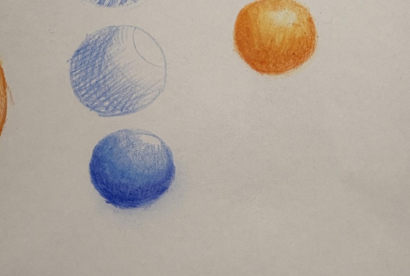
questions. Now let's start. So as you can see, we are going to start
with the first sphere. You always have to follow my hand movements and
see how you're doing. And also at the same
time, please practice. So here we are drawing very plain hatching lines
for the very first sphere. You can see if you're
dividing it and also various gonna be more
highlights or less highlights. So please follow
the hand movement. Pick up your pencil. Any brand would do. You don't have to
be worried that I have this pencil or I
don't have that pencil. Now you can see we start at
the very, very first line. We're drawing very
plain hatching lines actually here using cobalt blue. So as you saw going to start from the very first hatching techniques
in this lesson, hatching usually can get
divided into three versions. Now we're going to look at
all the free models together. In each hemisphere. We're going to do
different techniques, actually, different
hatching techniques. It just fear has a top line
above and front each line, as you can see, my hand moving, it gets darker and darker
going towards the end. For this sphere that I'm
drawing, the hatching lines, we draw from light to dark
with equal lines as the OC, the light should be
drawn from bottom and goes up as it feels like you're throwing your lines up just to see how you're doing, just throw it up and you
have to keep layering up. The first layer should
not be so dark guys, make sure that you start
drawing very subtle way. And then you add layers
either as shading, hatching, or actual
drawing it on your model. So we are adding more layers of lines to make it
stand out more and work under root line Motown's part a little more and
make it more obvious. As you can see, the amount, number of layers you create
depends on you actually, but don't get rid of all the whiteness of
the paper, please. As you can't bring back the white highlights or draw them with white pencils later. So the second one,
crosshatching. And again, we are using
our cobalt blue ones. You can see on the screen
what is crosshatching? Please always
follow the writings that appear on the screen. Those are there for you
to teach you more about, like the definition of
everything we're using. In the next technique,
we are going through some crosshatching,
as I mentioned. So what is cross
hatching technique? There are a combination of up and cross lines together
crossing each other. So again, we follow the same technique as we did previously in the
previous sphere. Please look how the lines are
so equal from each other. Now, this part, again, the lines are equal. We kept my hand movements. Follow along. Drawing circles is quite easy. You can do it with a coin, freehand with other tools. So don't let anything like
prevents you from practicing. Guys, these are actually
very important practices, so don't ignore them and start practicing because later on, in later lessons we're going to do some very
advanced portrait. You will need all these
techniques in order to do a dose. So it's good that you understand the definition of
what is hatching, crosshatching, and so on. You can see we are
layer up here. Keep repeating. Repetition
either in practice, in life, in everything is good. Well in some water, some
stuff, maybe it's not good, but mainly repeating stuff and practicing is
very, very important. So we're repeating the
same pattern to give more layers is more
feel like a 3D feeling. So please follow
the handle band. You can see if we add more
layers to the previous sphere, becomes like we're giving
more shade onto it. Just feels more real. We keep repeating it. Even though we keep going
around from different angles. We're still careful
not to overdo it. Not to give too
much shade or less. Just all of them
to feel the same. So if you feel that you need to erase something drove at it, as I mentioned, repeating
the same pattern to give more layers creates
a Friday feeling. So if you just let
go with the first, second layer, well, that's good, but it's not good enough. So you need to be patient, especially with colored pencils. However, I have to mention in this course what
we are technique, the color pick
thinks you're using. It's a little different
from other courses. I can say without
a doubt that you have luck came across or seen before because we want you to complete your artworks faster
and create your own style. So this is a little away from traditional techniques that
you have learned before, as you will see in the
next lessons as well. You can see I keep going back. If I say that something
needs to be add-on, I kept doing it. The pressure that I
bring onto the paper is not a lot guys
extremely careful with it. So the next one we are doing, we are still using cobalt blue. I have to say blue is
my favorite color. Maybe that's one of the
reasons I'm mainly using it, but we will change the color in the next
few spheres as well. So this is style is
pointillism hatching actually. As I mentioned, we
call it pointillism. It takes a really long time
to do it To be honest video. But the end result can
be very interesting. When we go up to this, we're, the dots should get reduced. This technique is
great for details and textures that required like
this kind of technique. I have to mention For sure the places you
need to show more, use more points or
dots, I have to say. And don't forget not to lose the highlights
parts of the paper. I mean, the whiteness of the
paper when it's three cars, because if you fill up, everything is going to be really hard to get
the whiteness bag. So you can see we are keep pointing and put
dots on our paper. Yeah, it's kinda takes
a really long time and I barely use these
techniques myself, but you need to do it at
least once to have a feeling. Do you do I like this
or I don't like this? Keep looking at my hand rules. Have a piece of paper
and follow along. When it comes to the papers. Of course, when I buy one, I tried not to really
go with a good brands. Because when you are doing your main artworks,
really worse, you're, at least you choose a
good paper which you have it on your downloadable
resources on these scores. Make sure that you go through
them and download them and see what are the good brands that we
have introduced to you. You can see the top part
has more highlights on it. So we leave it, leave it empty. And keep the paper as whiteness. Look at the hand woven
and keep repeating the process, adding more layers. You can see we keep adding
more dots the same places, just erasing the line, the guideline line as I draw at the very
beginning of the circle. If after a few times
practice you don't even have to draw
the guideline lines. You can just straight away
go on your model and dry it. As I mentioned,
adding more layers, guys means a more realistic
feeling. For this. You don't need to have
a very sharp pencil, but try not to damage the paper with the tip of the
pencil as well. Not to put too much pressure
and take your time. You're does try to
M2 looks like That's because at some point you
get really tired and I say, Okay, let me just leave it. If you don't add more layers, is not really going to look
like a realistic look how, how much we add more
layers on top of the other dots is kinda
feels more 3D version. Keep repeating, keep adding. Careful to make sure the
highlights gonna be intact. Moderate your layer because when it goes up,
reduced the dots, as you can see, like give more
gaps as you can see again. The paper I'm using actually is a paper that it is suitable for. For this kind of drawing. The brand is called Cass Art. Actually I bought it in London. So however, we do have a lot of different papers brands that you can use instead of this one, all of them have been introduced in your downloadable resources. Do go through your projects
and also assignments. Don't forget to read them
carefully and follow along because that those can help you to get better
and better at this. We are almost at the
end, so no worries. It's gonna be finished soon. Well, it is a very, very
different technique. It takes a really long
time to do it at. Sometimes it's really worth it. Good things comes when
you have patients. Hopefully. So now we feel,
yeah, Almost done. All three of them done different
versions of techniques. I'm quite happy with it, so I think I will leave
it as it is and move on. Start moving onto the next one. In this sphere, there are two parts that light
shines on them. Again, I'm going to
divide it as you can see. We're still using
the same color. I promise I'm going to
change this into next one. As you can see on the
screen, delight, natural, it should be white, the
white of the paper. This is fear is one of the important ones
as this technique, we're going to use a lot in our color pencil examples
in the future ones. Please follow the hand woven and makes sure of
your hand pressure. Depends on pressure
and high pressure. Gas is very, very important. Don't think like, okay, Any kind of hand pressure and pencil pressure would be okay. After a while, after a
few few Thomas practice, you will get a handle of it. But you have to be careful of your hand movement
and pencil pressure. The cat they hammer when it's circular motion is
circular movement. We're going to use
this a lot, a lot. I can say without a doubt on 90% of the lessons
that we're doing. Even though this is
not really realistic, it looks like very stylish your own style and
near realistic style. But it's not realistic because
in realistic color pencil, you need to like add lots of layers with a
really sharp pencils. So this is actually
called blending. Blending is layering
color or colors together on the
surface and keep. As you can see, you have
to add layers, It's on it. Then again, here we should
care about the divisions and how we should move across the sphere in circular array VV, the white part, leave it alone. Don't touch it if
it's not needed. Because how much you try, it would be really hard to bring back that whiteness
of the paper. You can see where I
stopped my pencil and not really go entirely on
to the main highlights. That top part is just saw adding more layers with minimal,
minimal light pressure. Now, we're almost like starting
to do the second layer. I have to say we have
like added other parts, like kept going on it. But this is actual
domain layers. The layers we are doing. They got the hand move and put. This time we're going to
put a little more pressure. The first layer should be
like minimum pressure, but in the second layer, you can add more pressure. So everything has
its own formula. Life, try not to really make sense to give a love
of pressure of, at the very beginning, you have to moderate and see where it's
required to do that. Again, in circular motion, we are giving more pressure. Round, CV, keep going
back and forth. I don't just let go of
one part here mainly, or Hamilton's very important. So don't forget to do
circular movements. Keep repeating. Repeating and practicing. If I let go here, it's kinda feels like, Okay, it's not done properly. So we have to keep practicing. If you have to keep
layering here. When you have a pencil
and a piece of paper, when you start doing it,
it's very enjoyable. It's like an art. Art is art photography as well. It doesn't have to
necessarily like, makes you like, okay,
I need to create a perfect like artwork. It gives you a very good feeling when you started doing this. This is almost a third
layer because you can see the first layer was
like minimum pressure, the Second World War. And now this is
almost a third one. I'm adding more and more. And when I add more layers is almost near the bottom parts
rather than the top part. You can see, again, we are adding more
pressure, circular motion. Usually in realistic drawings you should not have graininess, white graininess of the paper. So make sure that you live it. Keep repeating. C, opt on this, going back and forth
several times. I just have to wait
to see that. Okay. How much is needed, how much we don't need, like, and keep doing it. And of course put your phones away while drawing mode like me. Now, I'm going almost
general parts is like not details but mostly like repeating the same
pattern as you can see. But more in general
way going around. It's not. Now more details. I will just say for
realistic drawings, make sure the graininess
of the paper goes away. But we don't mind for this
technique, for this course. We keep them intact.
We still have them. It's kind of a beauty part of our discourse
because you will see different refresh technique that may be other instructors
don't advise it to you. And of course you can finish your dry
faster with this one. Each part has a certain degree, like very dark and medium. The mid tones should be done precisely and it goes
towards the highlight. So this is our white
Fulbright Council. It's another technique
of burnishing. As you can see, look how the color is going
to be different. Because we're going to learn this color pencil techniques
with using white paper. You can see how the
colors changing fabric, castle white pen pals don't have much burnishing power onto them, but have a look how they will look like still
as good enough. If you have this brand, you don't really need to
go to buy another brand. One thing I should have
mentioned, very beginning. Don't think like, okay, I have this brand. Do I need any brand? Do I need expensive brands? Anything you have, any kind
of color pencils you have, please keep using those. If you want to keep
practicing it. And this is a courier, like a path, you want
to keep doing it. I would have y, z, or maybe get a 24 or 36 set of
our castle pencil. It's really worth it
because you can use it for a long time and
they are good-quality. One of the best
qualities out there. So you don't have to
go for other pencils. So even though in this course I'm going to teach
you different brands, but it's still just choose one. Don't spend too much and
get the right top on. If your brand doesn't
have cobalt blue, just use normal blue, then. As you saw, we burnish through
it using the white color, which makes the work really
looks richer and softer. Also, it will show
this paper graininess. Why using the white one? Now in order to make
our bright parts of we use some arrays
are before we go, before we go to the next sphere
as we're about to start. So we're going to use
purple, violet, and magenta. Again, maybe you're set
doesn't have these to use. Red and purple are
pinkish purple, like the two colors
that really matches. So here we are
going to teach you how to blend two colors
onto each other. As you can see if you move to the next sphere and techniques, we are going to
use two pencils I mentioned to shade them
and also teach you how to mix them and blend them perfectly with the
same technique we are, the circular motion. I mean, that we have
learned previous sphere. We are going to start
off this as well. Very lightly, you can see no pressure like
the previous one. You are going to move the
pencil from dark to light. One thing I have to match
it if you feel that. So, you know, all
these techniques, you can always escape or
make it go a little faster. But there are some of
your friends out there. This is the first time they're going through this technique. So you can go to more advanced
lesson of this course. So don't pressure
yourself if you know all this techniques to keep watching it or
practicing, I add, wants you to do it
because even teachers, instructors need to warm up their hands before
starting the model. So be patient and
practice these ones. Is it worth it? But again, if you feel like, I don't want to watch
the introduction, you can always
fast-forward or go to the next lessons which
are not the techniques. From here. Look at the hand movement
and try to follow along. Make sure your pencils, this part are sharp
because we are using two pencils, colored
pencil here. So we don't really need to
go into hyper-realistic. So that's why the pencils
are not extremely sharp. We have covered almost as most of the sphere now
with airfares pencil, this is the second
one which is magenta. Use a pink again. If you don't have,
you know, guys, you need to experience your
colors and the color harmony. Learn about it.
It's not just about your instructor gives you all the information
which we will, however, you need to
experience yourself as well. Experience and experiments. It's very important because
we are mixing two colors. We're going to try
not to use lots of pencil like here and keeps some room for
the second pencil, which now we are using. My apology for the, sometimes the head shows
because we need to focus and see what's
going on on your PayPal. If you use too much color
at the very beginning of the paper will
lose this face. And also we called it
tooth of the paper. That will be gone if you
use lots of pressure. So it's hard to bring more color onto it
if you have used. Now you can see I'm just
putting the colors on the side after the second
layer with the first one. So we going to include
the second pencil, magenta, as you saw, and also the third layer. We eat the same
format we did before. Step-by-step. You're
going to go through this sphere and add
more pressure from the very beginning and release the pressure of
enriching to the top. You can see we have layer
and we have some sections. They're not going to stay dark this because when
we keep adding layers, they're gonna go away. I'm careful not to
go to the highlight. Keep repeating going through. I know I've mentioned before, but if you feel like a lesson, it's Alison slow for you. I need to show it in real time, which I think is the best one. I personally, I don't
like moving fast forward. Most of the times
we will do that in some parts of the drawing,
even in this course. But it is really recommend
that you watch it real time because you always have
the option to go faster. Again, I'm just putting the colors name on
screen so you can, you will know which one we are using if you missed
it previously. Adding more layers. Now, we're going to
add more purple, violet on the bottom part of
the sphere is start to add more pressure and go in
with Circa or muffins. Now, you can see actually
adding more pressure. It's very obvious when
you start doing it. Slowly, adding more pressure. Take my time and do it going slowly towards
the top parts. So now that we have added this, maybe you start using
the other color. Just make sure you're satisfied with everything you're using. Now if you're going to add more magenta at the
second pencil, more. And from the very beginning, we have to make sure they
blend well together, cause that's very,
very important. And mix them equally. The top part should be seen only as magenta and not purple one, or in different cases, the darker pencil you're using. So be careful of to
colored pencil you use to. Rpa is the darker one
and magenta is C, like lighter color here. So take a darker color should
be seeing the bottom part and lighter one's a little
more towards top part. So you can see the two colors
really go well together, in which you will
learn more about colors and color wheel
in the next lesson. So don't worry about that. We have your back and teach you everything you
need to create really beautiful artworks
in the future lessons. This is the very
beginning lesson. So always make sure that you're going to keep your spirits
up and keep practicing. Also, it's never too late. This is just the
very first practice. If you feel after
first practice, I'm going to give
up. That's not good. So I really recommend, at least for this course life, we go through all the lessons. You will enjoy it and
you will come up with a personal style that
you haven't seen before. Now, we are even adding more
magenta onto the purple and around from the very
beginning event, we have to make sure that
they are blending well. From here is mainly
reputation and how much more layers you
need or want to add. This is very important
technique as you, if you learn how to mix these two colors,
mixing well together, it will become much easier
in the next few lessons, color I'm mixing is
very enjoyable guys, and it should give an
accomplished feeling when you compete. Complete and color of white
paper, I have to say. Now, here let's show you an example later on where you're going to learn
and practice from. Next lessons are
delicious cherries. As you can see here, this is the same technique
that you just learn. And you can see
where we have used the same technique and
near the two lines. And some have been mix the
techniques we have used. Some parts has more color, more layer, and some parts
lists just exactly how we use. Also on the leaf of the chair, you can see the lines
between light and dark and some places you must leave
the two colors apart. And some parts you have
to mix them together. And you just, just saw
where and which part of the sphere we have combined
are kept them separate. The highlights of
the four can be varied from very
bright to less bright. You have to make sure to show the absolute
whiteness and create those highlights according to your environment
light, I have to say. Now here you can add more
magenta and also purple, violet to give mixed feeling
or leave it as one color. From this left part is your personal choice to
add more colors or not, we decide that you
are learning with promised a very beautiful
new color pencil techniques that you won't feel like
it's too much imitation. And you will come up
with your own start and finish your artwork
faster than ever. Of course, we are talking about color from
some medium only. So just choosing the next sphere and the techniques we're
going to use on it. You're going through
the last one. In this example, you
will learn to combine all the colored
pencils techniques together that you will
need for this course, we are going to use to
colored pencil here. Again, we chose sphere, this one because
first it's simple. It's a simple example, but contains all the methods you need to learn and continue. You saw that charities
that you just saw on the screen had
the same technique. A lot of the artworks that
you need to create records. This one's now we
have to do the light. And first, we cannot determine where is the
light here, which is here. I realize where they place and understand the
shading and texture. We're going to use
light yellow glaze. Or if you don't have it, use just a bright color. A bright yellow would be enough. For the other ones. We're going to use
dark cadmium orange, which they complement each
other in very amazing way. Of course, we are going
to learn how to draw shadows and create everyday
feeling on this one as well. Here, start following the
color and the hand movement. Again, you can see any
color and any brand with same technique
that we will use, different brands and
discourse, as I mentioned, to show you how to
use other brands, go around smoothly
and very lightly, going around the surface and adding more layers
without any pressure. You have to complete
the first layer in circular movements occur motion. Make sure all the
parse our cover, do not use a lot of
pressure, please. Like you have it's like you have to manage your
pencil pressure. It is very important and
I cannot emphasize more. Almost done with
the first layer. Now, we're going to go
through the second layer of cadmium orange, dark
cadmium orange. And starting from the very
bottom part and gradually go up as we learned
previously in other spheres. If you don't have
these two colors, or even if you don't
like these two colors, you can use other ones
that you feel like, okay, these colors
really excites me. I want to use them or even experiment how the
other colors used. Like, kinda look like. And I look forward to actually
receive in your works. And I could, I could see comment and like accompany you
through your journey. And I have to be honest,
nothing makes me happier than receiving your projects and assignments and see
you have done more. It makes me very
proud and happy. One of the best feelings in
the world, to be honest. Slowly, we're going through it. It's exactly the same
technique we use previous CVD. Other two colors are purple, which was violet, and magenta. Keep adding layers. Each layer we add more pressure. Instead of just sudden pressure, we keep adding layers to
create that pressure. Repeating the process. Fizz like almost a third layer, but you still have the
second layer pressure. That's why I don't call it
a first layer is still. Now I can call it
for layer because now let's say the pressure
I'm going to use here. Here we repeat the process and add more
pressure on the pen. Both paper and pencil, go round through movements and cover all the needed areas. Now, we call this pressure. Please follow the screen
and the hand and practice while you're watching
is the best. Because if you're just watching, you might forget
what we have done. But if you have your mediums
like in front of you, it's going to be amazing. Follow along. You have done two things at the
same time you have learned and also practice. And also you can send
your practices to me, cover all the areas that they
need to be covered around. You can see in the mid part, we are reducing the pressure. However, we still covering it. Now with D are yellow color. Again. We go and add more
pencil pressure on it. I tried to cover
most of the sphere. The middle part of
the yellow pencil should add more and
create more layers. And since we go up, the color, pressure
reduces as well. And they are handled by output, we should put less
pressure onto it. As I mentioned, even though these practices seems very easy. But it requires a
lot of practice, guys with different
colored pencils and different colored
pencil combination. I would really
appreciate if you do more spheres, more circles, and with different colors
and then like practice. Now adding the
orange cadmium again starting from the bottom
part, adding more pressure. We're going to cover the
yellow one that we draw. So it's like blending
the two colors together. I get the hand movement
slowly going around. To cover is getting
even livelier. When you add more color, you can see how
lively it became. From here, our
orange is going to get mixed well with yellow. And I have to say
more in the middle and use less pressure
to blend two colors. Well, as you can see, we can keep adding as
many layers as you want. There is no specific
numbers is all about your hand pressure and how much more realistic
you want it to get. We are using the
orange puzzle more and more and add more layers. Add more yellow color. Make sure our lines are neat. So they don't feel
like too shaky. Just minimal pressure here because we don't
want to really get away the yellow color that
we have drawn. Be careful. Like minimal pressure. These are the last touches
that you tried to fix. Everything that
needed to be fixed, such as the outlines
of the sphere to look finer or add more
layers of color. These details makes your
work look much better. Don't let your layers feel
separated from each other. So wide-field cell, another technique that we
just saw on the next sphere, the blue one that you
can see on the screen. We didn't use it on
the previous one. We use only pressure
on the previous one. Now, we're going
to blend two mics. Are we call this burnishing. To make our colors look richer. We don't really need to. Add white pencil to
blend or burnished. This is called
medium burnishing. Start from the highlight and gradually go down and
go through the layers. Using white pencil can be personal choice guys and a
style and your own style. Your own and start
to use it or not. Some people really don't like it overall are in this course. It all depends if you
want to keep using. So you do have that personal
choice to get rid of those textures or get rid
of those graininess or not. Now, this is another
pencil that we are using. The light is coming
from this side. And you can see why it is, because the highlights is there. And now on the screen you can
see different spheres and how the highlights can look like and where
are they placed. So as you saw, we show you, show you over the
sun comes in and from which direction in order to create the shadow
underneath our sphere. From the top right
side of the paper, the lights comes in. So naturally we have the
shading here as you can see, which would be the darkest
part, that very deadline. As after we draw the black
line with our black pencil, we can start adding more, less minimum pressure
and add more dark color. I recommend like more dark
gray rather than black. But if you don't have it, that's why we are using
black so you know that you still can use
this color as well. Again here the darker
places of our drawing. And you can add
lots of pressure at the very beginning
to the main line, the outline, and gradually reduce the pressure
from the line onwards. You can use a combination
of warm gray number six, combine it with black
if you need to. You'll also need to use a
second color pencil sometimes, or just do it with
your hand pressure. So keep watching and
repeating place after that. Make sure to leave
the highlights and the shadows as well. And don't go all black. A lot of students they
do it is staging. Okay, let's finish
it. Everything. The same pressure, just black. It's not good. It's not
natural, it's not realistic. So don't do that please. Slowly from this side. Make sure it's harmonize. Is done from dark to light. Keep adding layers
even for the shading, even for the shadow
parts of this area. Here I'm going to
show you how to use real blender after this. Because as I promised, we have to use a lot of
different techniques. So let me just make sure
we have all the layers. And then I'm going to show
you what is a blender, which usually you
can find it if it Karen dash like brand. They have like real
blender that you can buy. I want to use it in this course. It just for you
to look at if you want to use it in
the future or not, is a personal choice. Now, this is what it's
called and it looks like those the same thing
that white pencil does, but it doesn't add that
whiteness onto it. It just blend the colors and
get the graininess away. This is only mainly to show
you how it looks like. And you can either use a
combination of two pencils. It's called, one of the
techniques is called combination of two pencils
together and blend them well. Or the other one is called
one fell swoop pressure feeling or white
pencil combination. And this one, it's with Blender. So again, looking
at our cherries, all the parses, her mind
vertebrata, which layer? Each part has its own texture, such as the leaf and the stem part that have
more pressure onto them. This example is a perfect
example of how to use the techniques we
just learned on the sphere and use it here. Guys, as you can
see this example, we're also done with
our main examples. So look at this cherries, see which techniques
has been done on it. I'm just going to point at
them and you have to guess. And also, I hope you
enjoyed this lesson. The next lessons very important. Either right now
or have a wrist. Let's go onto the next
lesson and keep practicing. So I still hope you enjoyed this part is all
these techniques. Please do send them to me
and I can correct anything, any parts that needs to be
corrected or event just vx change our artworks so we could see your progress
at the same time. I hope you enjoyed it. See you in the next course, see you in the next
lesson. Bye, bye. Now.
3. Creating a Color Wheel: Hi everyone. We're going to start with
our color pencils and textured or non textures
papers and how to combine them and learn
more about color wheels. In this course, as you can see, we have a paper in front of us. And also we are going to learn about breach paper is going
to be suitable for us. Continuing it. I'm going to tell you more about the brands and the nerves
of the papers later. But as you can see, if you're using fabric
castle a full set, you don't have to have it, even though we are
using full set, you don't need to have
a complete 120th sets. You only need 24 or four to six would do as good and
they can compete. Or our color pencil
courses and lessons, either this with one of
them or the other one. Don't worry about
the brand as well. Any brand would be
good to practice with. Now we're going to show you what other materials you
need in this lesson. Again, you don't need
to have to buy them, but you can watch and
learn the techniques and decide which one of them
you want to obtain later. This would be one
piece of paper won Burn tool and von white pencil. Usually we don't
use that blender, it burnish and purposes so
you really don't need it. Now we're going to learn how to combine the colors
together as now, you know the materials
we're using. So let's look at
the color wheel and to explain more about
it on the screen, we're going to show you how the colors we have and how
they should be combined. You have colors that are
combined from our tree, main colors, red,
yellow, and blue. From using these three colors, we can create more and more
wide dry and color layers. So as you can see, red plus yellow,
you'll create orange, red plus blue, purple, and blue plus yellow. Yellow. You need to apply minimum pressure
guys in order to create these and
combine them perfectly. So blending two colors
require minimum pressure and good layering in order to go through these colors that
I'm pointing out right now. I just mentioned the six colors. By knowing color knowledge, your drawing and speed would be very different and
you can create better and more
creative artworks in the future and progress
through the lessons quicker. Practices in this lesson
is essential for everyone. It might sound very beginner, but it will help
you tremendously. After knowing the main colors and how they're mixed together, they next step is your
head pressure and how much pressure and how
many colors layer you'd draw. Determine your next color. Look at the screen and you will see the
colors we're going to use. We're going to use few colors. Start by using the Halloween. Reddish color is a
blue and a blue. We'll do guys again, I don't want you to really limit yourself because
of the colors. If that makes sense. We are starting with
the first blue layer, slowly fill up the whole square. Makes sure what you
do when coloring their sukha base and you move your hand in a circle
way, circular motion. Don't use any force, any pressure at this stage, especially the first layer. You learned this in
the previous lesson, how we do this stuff, because this color's
need to mesh together. Even though any color pencil, paper due, but I suggest
don't use A4 guys. The texture is not sorts of overall color parser and
or really cheap papers. You spend a little more, get the right pepper. As you can see, your
color won't suit on the paper or blend
with Chipera paper. I have to say I will suggest using a texture
paper for this lesson. Non-textual. One's a Strathmore
Bristol vellum paper. Interestingly enough, even
though it says vellum, but it's, the paper are
soft and non textures. And when the brand says soft for a Strathmore or they can
be sometimes not software, extremely careful, but it is
a good brand to start with. Or event Cass Art
brands is good. You have all the names on
your downloadable resources. You can go through them and get one of those that
is suitable for you. So we finished the first
layer, as you saw. Now you see the yellowish
color we are using. After you finish the first
layer of the square, we're going to start
with a yellow square, same technique next to it. And then when it
combines in the middle, you'll see the green
color comes out. Have the same hand pressure and dry practice obscures a lot. Maybe be different colors and the main colors we just
saw on the screen. My apology for the head, because sometimes you really
need what your drawings, so I want to be precise. So sometimes the head shows and we continue doing
this going through. So this is blue plus
yellow equals green. You can see the green
part is getting created. Now just have a moment, make sure your pressure, the pressure is the same. The color green really
is a messaging already. Now if you use lighter blue, the green we'll become
lighter as well. So the color tone is
important to note as well. So if I use here
a darker blue and a darker yellow decline
bill become darker as well. It just is normal how this
would be this green part? These two colors
on the size will affect the middle color. Now if you're going to do our second try with
lighter colors. In this section, we are going to use Barbara Castle lite, cobalt, turquoise, and phosphoric acid, light yellow glaze here. There are much lighter colors, so you just see how these two
can be combined together. Continue the same pencil
drawing and pencil pressure. Just to show any blue
and yellow pencil will give you the same effect. I'm going to let
you have a loop. Same hand pressure are going
to finish the first layer. Circular motion. Try to cover all. Don't leave any part side and take your time while
you're doing it. Go around. Make sure your outlines being
done in a neat way. Don't go out off the lines. That's what I mean. Now if we'd lighter yellow, Let's give it a try and
see if you're using a lighter blue and
lighter yellow. What's the difference? What's how the green is
going to be different? It's called light yellow glaze. Any lighter color would do if you don't have
this once it's okay, you can't just watch and learn. Going to do the same technique, slowly creating the middle part. The green parts. Have a look, We're
continuing doing it. As you see, the color
green is different from previous practice version. Now going to draw a second
layer to see the effect, the green is more visible now, the more you combine your
current and give layers, the more softer ending
color, you get. Same pressure. Sometimes with a second layer, you can add more
pressure and actually, and go around the green and compare it with the
left one that we just drew. Understanding color reveals is very important when it comes to just your own style and further lessons
here in this course. This one's going to
help you really a lot. As you can see, the
paper of whiteness still there at paper
green in there. So you can add more
layers to make the color more pigment
darker and brighter. That's why I'm adding more to get rid of some of the white, green and S. However,
with our style, it means that we don't have
to get rid of it that much. Just enough. That is more
towards realistic style. We are seeing the effect. Going through that arrest. You see the green event became like even though his
darker but it's brighter. Use the same pencil
pressure and sacrum motion to build the color up. You don't need to use different or pencils or white pencil just
with the same pencil, you can blend well. It's, your hand
pressure is important. You're using more blue since you can't see the white
and software paper he uses same hand pressure,
circular movement. Now you can't see the difference between birth greens here. The colors we used, your practice and the
assignments start here. Any color per se you have
regardless of the color, try and combine them together, like these are squares and see the mirror color and what
color is coming out. And then submit
assignments so we can see each other's corner creation you're at the other
students can see and we can come in and go through
your practice against. The second practice,
absolute your colors. Mixed experimental practice is to actually practice
the color wheel. So we are going
through the rest of the pencils using medium, the middle cadmium,
yellow or red, actually also combining
the Chrome green. Later are you always get the colors name and the
number online on the screen. So don't worry about not hearing Advil or you just miss it. The colors, numbers, and
names always there for you. Go through the 1 third of the coloring to have
a soft layer drawn. Gonna continue, gonna make
sure we have our pencils. Kind of like sharp, using a little more pressure, circular motion going around. Keep adding the
layers step-by-step. Don't rush yourself. Now, we're going to add more
pressure and cube the SEMMA, some level of pressure. Now, even more pressure. Gradually do displays
not at once. Now it's all about following the hand movements and
practice at the same time. If you have done this part, you have practice and
you feel like you're very professional in this part, I suggest you escape and go through more advanced
lesson of this course, which would be not in this part, mod mostly in the latter ones. Now it's almost the
ultimate pressure here. Make sure off the your outlines. We're almost done
with the first layer. Now, after this, when the
first layer finished, we have to go through a complete or full
burnishing technique in order not to see any
wideness of the paper. And you can see
what is burnishing. Burnish is fair, so many layers or colors
like when combined. No white graininess will
stay on your paper. You can see the lawyer part. The end parlance does complete
red, no whiteness, lift. We had the most pressure. That means burning
machine, the lowest part. That's called like
ultimate burnishing, because when you do this, you cannot add more color
onto it and not more colors won't have an effect on it if you're using other
colored pencils. We're, we do this because of those paper
graininess as I mentioned. And to get rid of them
with minimal pressure, we have to know
that cutter plaza requires a lethal beforehand thinking and analyzing what
we want to do in each step. Note that gradually how
to work on each part. You can see burnishing just
not to burnish at once, but you have to keep
layering as well. There are some
borders in-between because this almost half
free colors version of one litre, like at the very top, you can see the light
color and then the median, the middle part is just a medium red and the lower one is
absolute burnishing technique. The ultimate color red
that we could have. Here. We can't see through different color levels that
I just mentioned to you. Different hand
pressure Ve created these very important in
practice because you will have dad on
portrait drawings on a still-life drying area thing that you will face
in this course or even when you're
practicing on your own. This is the blender that
we are going to use. You have seen in
the previous lesson how the blender looks like. Now we are using the
next color, green one. The Chrome green and green
color would do guys, again, please don't limit yourself or discourage yourself. If you don't have all
the colors in a 120, said, we don't need it. A lot of the colors. 120 said, I don't have a use it and it's
useless actually. Like how many times I'm going
to use the gold or silver. So we really don't need it. If there's a color
2424 or 36 would do. But if you read in it
a color outside dose, you can even purchase
them separately. Just one-by-one will
inherit your pocket. For the square from more pressure to less
pressure and leave a white highlight at the end to give proportional feeling to it. Practice while watching
with any color you prefer. This is a little different from the previous one
that we layered. You can see from various started using pressure is a different
angle and direction. And the half actually
a white highlight that we didn't have in
the previous example. So previous lesson, during
those sphere like practices, we had a lot of light. The light's coming from and where the highlights
should stay. This is almost the same but in different versions
with different colors. Now you're going to start
with burnishing tool. It's usually better to start from light to dark because they don't mix well together. That I'll mix more
and that they should. Some cases, if needed to
blend more than it needs. So all the stuff from
the light part and then gradually go to the darker pods. Look at the helm moment, try to not to put too much
pressure going through. Keep moving around. The same technique,
circular motion, the cigar hand movement
in a very harmonic way. Please do this. Now we are
adding a little more pressure. So layer by layer, we do this. Look at the difference between
these and few seconds ago, how the color looks like without this part
and the lower part. Quite different. It's a little softer. Even though in this one, you see different color layers from darker green
to lighter green. It's not just in the
previous example with color, but even here in different
angle and direction, we have the same format. Tried to live the white
highlight of the paper out. Now in the next step we're
going to use a red wire. Let's color any red and a dark red would do well here
as well. This is a square. We're going to use another
color pencil technique, which would be the white pencil, which would be
using white pencil. Both blending and
burnishing technique. Why there's usually be
used for making our colors lighter as making dumb lives
and blend well together. Also, it will take the
graininess of the paper, as I mentioned to
you for your time, is also another feature
that white pencil has is that we can
create really feeling. The paper on our drive subjects. On this part, we are going
to elicit a speedup. So because you have seen it. Now, let's just watch
and follow along. Now since we are
going full speed, your cilia is in
the same technique. So you can see the layers
we keep adding and we are careful to go around is exactly the same thing we
did for the green part. Now we're going to see how whiteness will affect our work. Here you can see the
colors fading after that. So this is done like coloring. Using our white pencil
and use a technique, the blending and burnishing. The color is changing. Even the, the colors become
paler when white is added. Just fade away some of the
colors and merged together. And colors get combined. It has a different feeling. Again. Let's look at the
screen and repeat after we're gonna speed a little up because it's the
same technique. Let us follow along. The whiteness really gives
a very interesting texture. To be honest with you, you'll have to do this very slowly event of rehab
hospitals up this one. But yours should be done
with more patients. I hope you have followed so far. If you notice the
colors became mildly, have two kind of
different parts. You're almost done
with this part and this trial blending
two colors after this VT. The walls you can see on the screen almost
the same color tone. A little dark lane and
little light sap green. And yet or you can use
a lighter blue and darker blue or red or yellow. Anything you'll
want would be fine. You're mixing the two
colors right now. You won't often is
called light green and the other one is called
dark Fazlollah green. Lighter and darker as
I mentioned, would do. So. Don't limit yourself drawing another square version
and start drawing the same way you
have learned so far. City and harmonious with
the same level of pressure. When you chose your colors. When you choose any
colors, please, which here we are using green, use the same color
and go next to it. Much less pressure. Look around. You see the middle
part is as more and the two sides porous
like less color. Follow the screen and
hand movement, please. Adding more layers
slowly and gradually. Now we're going to choose
the lighter ones that we showed you previously,
called light green. Combining them to make them
look smiler and smoother. This is another version and not our technique
of Qatar pencil. Because instead of using two
different colors to blend them or using burnishing tool-like such as white
pencil or actually blender, or even put too much
pressure on your pencil. You can use two
different colors, but the same tone. Now you are learning
about these two colors on pressure, the
Catholic combination, how and how their mics and
the tone, the green tone. The result is a lighter green. Now, after mixing
these two colors, forget the next level results. Blending technique
here would need more time comparing to the
other color techniques. Keeping, adding
different layers. Look at the middle part
and how they're different. The border lies in between, they should vanish away. You cannot leave
an obvious border lies between the
free, the free parts. You have to keep
blending and layering in order to get rid
of those borderlines. Keep your pace and move a slowly and then mix them
perfectly together. You should not see any
line created in-between, as I mentioned, using it
a little darker color, see how it's going to be. Any darker you have would do
That's why I keep insisting. We can't see the colors should smoothly transitioning
into another one. If you see the free pencil
lines created here, it means you didn't
do right job. If we can see the lives, either the technique
with an applied properly and didn't work. Your work wouldn't be
considered a professional work if you can't see
a non good blending, even in water-like,
like careers, we see the same friends or
if you're doing makeup. In makeup lessons, if the colors didn't blend
well on the face, is exactly the same. So you need to blend
perfectly different layers of makeup in order to create a good and professional result. We need this technique for
any color of pencil art. For art, we rarely have simple and non mixed
colors in a chair. Most of the colors are
mixed and bias in nature, all colors are mixed and
you can see it's hard to find pencils that
have the color we want. Layering and keep layering
is very important. So have a look around
as a homework, practice and start playing attention to the
colors around you. And you will mostly, you will see most
of the objects are created from dark,
midtone, light tone. The highlights. You can see
more layers withdrawal, smoother each layer it gets. By adding more layers, you get a smoother layer
using lighter green. Now, now we are actually using more towards not just blending
burnishing technique. Let's speed up a little here. Look at the hand pressure. Again. Just because we
are going faster. You should do this very slowly. As you sell. Like we added very dark colors
from both sides. And now we are going to combine all the colors
for the next technique. Look at the left
and the right side. How they have blended all
so it's more feels natural. Currently. The more you combine them
and use more hand movers, the better the
blending we look like. We have ultimate like darker
color on the left side. So now let's look at
different papers. How different they
are from each other. We have texture papers
underneath as well. Using novae are going to use another version which
is called daily or Roni. This move calculations,
sketchbook and use our pink pencil on one as
Cass Art wanted daily. Roni, I've just mentioned. This one is texture, so this one is smooth
using texture paper or kind of sometimes better for this course and this
started we're using, but not necessarily
so it yourself, any paper you have if as
long as it's not a4 is good, just make sure you read on you read what it
says before buying. And they should say
that it's suitable for colored pencil
or a pencil drawing. Now let's look at the textured. While this one is Cass Art, you can see more
graininess on it. So obvious that it has way more. And look at the same, it's
the same head pressure, same hand band, same color, look at the difference. So it does make difference
to paper that you use. This is very important to see. Sometimes I can see the texture paper is easier
accepting the cutter because it has still whiteness left and it feels livelier. When using and creating
more unique texture. The right side, in my opinion, feels livelier, feel like
more fresh, fresh air. But comparing to the left
one has a different feeling. Look at the, uh, using a yellow pencil and how
they gonna look like. We have to do the same on both. Obviously it's your style and
your decision at the end. What paper you use. As long as you follow the chorus and the recommended
materials DL, you will get the hang of it. Which one is the most
suitable for you? We are trying to same
color on the smooth paper. And you can't see the difference between the left
and the right side, which is right side
is a texture one. Again, it's a personal
decision that after a while you get to
the point which one is closer to your style. The two colors are quite
different and I'm really happy you're worse until now and you saw the
difference between two. We are almost done
with this lesson. You'll learn more
about the techniques. We're almost ready
to say goodbye. Just look at the
difference between them. How the tones different and how the texture on
these daily Corona and cows aren't
made a difference. I hope you enjoyed. See you in the next lesson and buh-bye.
4. How to Draw Cherries with Color Pencils: Hello everyone and welcome
back to another lesson. We're going to
draw charis today. As you can see, the
outlines of the chairs have been drawn before
and the sketch, they are available as always
as a downloadable resources, either a separate sketch
or on great version. In the previous two lessons, we'll learn how to draw a
sphere and how to color them. We also learned color
pencil techniques and apply them different spheres. Now it's time to go
through real example, and this is the beginning
of our art journey to create beautiful artworks
by the end of the course. So have a low carb with
different pencils. We are going to go through the outlines and make them more obvious so we could see more precisely do not put
any pressure onto it, especially under main outlines. The minimum pressure, the best because we don't want our
main outliers to show. At the beginning
of each work dead, you start when you're
doing the sketch, we should first focus on the main outlines rather
than the details. Don't let details to prevent you from drying and
take your time. Because if you take your time, you create more precise outline and your artwork will
become more realistic. In this example, we're
going to teach you how to apply everything you have now
so far onto this cherries. But also we're going to go through different color pencils. Drawing the tells us, well, if you ever needed to pause, draw and follow at the same time plays
deaths very important. We're going to draw non
organized as strokes on the leaf and they should
not alter. Look the same. Try to follow the
sketch and go through the drawings at the same
time while you're watching. If it's slow for you speed up the process with the time icon, dabbled speed, I have to say, if it's too speedy for you, you can pause, draw,
and then resume. Look at the outline,
is now as time to draw the main parse as well. We call it layering. So you always find a name of the colors that I
use on the screen. You're going to learn different red colors being
mixed and blend here. We should start thereby
dethrone mining or deciding where all the highlights
are before coloring it, as it's important
not to go through those parts with
dark color pencils. You can see just
focusing on today are outlining them without
any pressure. This far. Look at your model a few times, makes sure that any
model that you choose, either this one or
anything from online, if you want to choose a good
website to get them from, maybe Unsplash would be a good website or
pixels or Pixabay, I believe, are good
website to go through. Gets a Royal Free pictures
if you need them to, or even take your phone and take a picture of the
things you want to draw. This is the first layer
that we are started. As I mentioned, we
are starting coloring the first layer now
with our red pencil. Any pencil will do, don't limit yourself
to your colors. Or if you don't have them, you can use something
else and not our color. I mean, there are some parts of the drawing
that there are lighter. So we're going to
start from there. As you can see, the texture
should be very soft, glow around sucrase
OR pencil movement. Also go around the highlights. It's circular motion. You can see the
important applause being written on the screen. So follow down. I hope you're actually following
along as the same time. Let's focus and see it more. When we have focused
on the screen. Bigger. So we can zoom in. You can see better details. We are continuing the work draws smoothly without pressure. We are going to complete
the first layer. Leave the white. Please. Just make sure that you
don't go on to them. Later on we will add white
pencil or even leave them. So you have to make sure
these parts are left out. Have a look. We are going to
change our panel cell to a darker pencil, darker red. This is the another layer of it, more pressure near the
lines, usually the They have more color. This is almost a
role that apply in a lot of media is not just this. If we go through our
charcoal and pencil courses, you'll see the same results
that they are near the lives. We do have the same effect. We tried to places that
it actually highlights. Not gonna move our
pencils onto them. Start using, after I
started using the dark red, we make sure the
pencil is sharp. You shouldn't need
to use darker colors again, near the lines. Determined darker parse with a dark pencil before starting. So you know where you're
actually applying them. Just not just fidelity
thinking we start doing it. Usually if you
analyze your model, you'll get a better results. Now we're going to move
our hand faster as I know the color pencils
very slow technique, but in this course
you will learn how to finish your work faster. And they will look great. Use more hand and
pencil pressure. It go around this. When we try to get closer to the main color of our subject, we tried to use
the right colors. So you'll see the names
of them on the screen. This focus, Let's
zoom in a little. Look at the pencil
pressure movement and how the colors look
together go wrong with the same synchro movement and
practice using the lighter red and Read that you feel
is closer to your color. You can use it. It
doesn't need to be this brand or a specific
brand you can use. For here, medium, medial cadmium red
and deep scarlet red would be really good
if you have them, if you don't have them
still find depending on what you have
and it lighter red and a little dark alert
would be do I just pointed out on which areas needs to
have darker and lighters. We pointed out the highlights. Make sure you want to create obvious outlines
around the highlights. You need to go around them. That's what we're
doing and faith the obvious line,
obvious borderline. Now it's more of like shows the difference between a
light red and darker red. Again, make sure you go
into the white highlights. I cannot emphasize
more than various. Go around. Sorry,
sometimes the head shows because we really need to focus and saver you're doing. If you draw, you'll
see that you can sometimes get really
immersed onto your drawings. It's very enjoyable
when you start drawing, get on the paper and create something from the
whiteness of the paper. Still, you're using minimum hand pressure
and pencil pressure. Some of the students actually asked me what's the difference, will always see sometimes
we have less hand pressure, what fit more pencil pressure, but they have to
go well together. Now, look at this when we are saying we are
using red violet, which is a very, very dark red. That's excellent. When it comes to
the borderlines, went with the main outlines. You are going to draw the
much darker parts for it, as you can see with
this technique, the main shape of the work, they'll come out and stands out. More. Novae are going to move to the top part of the cherry as well
and then go around. Please have a look at the
screen and keep practicing. Make sure your lines are correct and they don't
go out of the lives. So always you can correct them. Some of the main
points here, it just, the very initial sketch
is very important guys. If you don't, just draw the initial sketch
in a correct way, every two even you use absolute, perfect like techniques
and color pencils. You're not going
to come out nice. So make sure from the very beginning you're
building something, you are drawing something from the very first steps
are correct steps. This applies to
all rule of life. Again, have a look. We are applying our
dark red color around. Make sure the blend and fade
the absolute borderlines. Always as I mentioned
like on the screen, pay attention to the
details of your model. And very pushy should
put certain colors, because we don't have only
one color on every subject, we have different ones. Now we are using a
different red color here, a lighter red, almost a second layer, even though we add so
many like medium layers, but minimum pressure, now we
are adding more pressure. You might ask me, why not this pressure
from the beginning, you have to build
up to this layer. Because if you have
different colored layers, the after, after a while, when you decided to go through
the branch and technique, the cutters gonna come together, blend well together and
gives you a perfect color. Keep practicing here please. Circular motion. You can see even
self-doubt contemplate which area should
have what color. I don't rush. I try not to rush and
look at the model, analyze it, and going to decide, OK here I'm going
to put this color, I'm not going to
put this gutter. So now you're using
deep scarlet red. Using this is another technique using a lighter color
on a dark color. Perfectly blend them together. So it's a very important
technique that you have a darker surface and then you bring a lighter color
health paraphrase Dan, smoothly blend onto each other. Now, again, using a
darker one. Go around. Now we are using
purple while it, you might say, oh, this is
Richard is white, this white. This is to give the feeling to your subject by using Purple, mainly using around
the main outlines and a very unit to
give more shadow. So you don't have to
actually applied all over and create a complete
purple luxurious, but it gives that apps the
right highlight, the innate. Look, how reshared the
colors are getting. Go around smoothly,
circular motion, minimum pressure, follow wrong. I cannot wait to
get your practices and continue practicing together Navarre using a lighter
red again here around. As we're going around the
chair of one more time to hand bovine serum motions
again is important. From here as we are
using a mixture of pencils and you should
already know the colors, either their names and
how the color looks like. We keep peeking off the
same ones and using the same colors and
the same brand. It's the same parallel. Now, after some speedy part, we are going to use another lighter red again, mixing them. Now this is green olive,
permanent green olive. Again starts with the outlines. Now going through the green
parts and the leaves. We're going to, as I mentioned, we are going to use
permanent green olive versus starting with the main
outlines and darkening them. Don't use just one
color is not gonna come out natural and more real. I have to say it in
a realistic way. Darker color. The beginning and the
end part of both area, and then a lighter one. The details that you
see is quite important. So it's not only about
like green colors, but we do have other colors
that we need to add, which is called raw umber. After we continue lighter green and we've been through it, keep mixing the lighter
and darker ones. You can see the main
model on the screen, how it should look like. Always, I changed
some of the subjects. It doesn't have to be exactly
the same for you as well. The near the outlines darker, but the middle parts,
more highlights. This goes both around. Both the leaves. Darker green. The raw umber that we used
gave a deeper look onto it. No subject has one
layer of one color. It's always a mix. So you need to look at the main, the main picture
that you just saw, and give yourself a few seconds, analyze the colors for yourself. See what colors are there. Only green. Where are
the darker green? Is there any other color that the obvious colors
meet the eyes? Then after a while, just by practicing cutter
analysis, you'll become pro. And our artworks become
better and better. In terms of color, as I just mentioned, we have courses specifically
focusing on knowing colors. If you need to learn
more about them, check out the courses out too. As you can see, we
have added on slide the lighter green and also the
darker ones onto the leaf. Please know shaky lines. And then we are going
to keep applying the darker green in-between
and create textures. After you've created
the line strokes and gradually added
colors there. Don't push, just
don't press too hard. Cap day how shaky, how different textures
we are creating. Especially this part,
needs to have more color. Not the middle part, but just the beginning parts. Using a different green,
Juniper green here. And also a permanent green
olive would be perfect. After this. You should shade the
whole thing with the same pressure or
shade the area in one go. Each subject will have different areas that
are darker or lighter. As you can see, we
are determining where are they with this color. Now the same area at
the second layer. Not much pressure. Just enough to keep more color. To create more color,
I have to say. Now after this we have to use
a lighter green compared to the previous one in
which I mentioned permanent green olive
with three perfect. And then after that we're
gonna use a lighter green, maybe 171 fabric acid ones. This means we should analyze
the mixed color before. And our leaf gonna come out from rawness is not going to stay
at RA with one single color. Continue with the
light green until we reach to the point before it, starting with our darker green. Have a look how we go round. Not in all areas we are
giving the same color. Go around. Now using
the darker ones. Started using the darker
green mentioned previously, you darker green
can be different from what we are using here. So don't limit yourself. You're going to draw faster, but you can't take your time for the layers stopped the
screen if you need to, and draw it and then continue. Now it's time to create some
details with more pressure. Have a look at the screen
and followed hand movements. That was coming out.
Really this part, when you're actually
see your artwork loose, more real is very enjoyable. Make sure that the
part of the leaf, the colors are different. Severe. Keep adding more layers and make sure redraw the put the
colors rife places. From here. Let's
watch the screen and keep using color pencils. Make sure even here you don't go to the highlight
of the left part. The same goes for the
cherries are here for any, any model that you choose. This is the same vein. We are adding lighter green
as an additional layer, however, is not sufficient. We need to even add more around how we are going
to complete this. It's a very nice way to actually practice this
and we are speeding up. Again, careful not to go to
the court highlights layer, dark hair color, darker
green with lighter green. Keep adding different layers
and building up our colors. The way we want to. Never limit yourself. If he wanted to change
the color of your model, you still can do it
if you don't want to go into hyper-realistic
like drawing, which we are not doing that in this course, still does okay. With darker green, we
go through the outline and create and give
more pressure. You can even do this part, this shaking this like
a little slower to make sure that your satisfy
with your drawing. But never rush yourself. When you draw the outliers
go next to them and give one layer so they just don't
stand out to stand there. Unlike on their own. Create more. There's even
underlies, refresh the strokes, the places that they need to be refreshed because of the layers, the Conners fates, Sometimes
you need to keep adding. Have a look here, spinning up in the cell. I hope you followed so far. We went Alyssa
faster than usual. Now we are adding the details. Look at the screen. You're adding this detail of it. Read while at actually
not with brown. If you don't have it, you can't use any brown
color for this area and then use a mixture of red and
also green for the area. Make sure you put
the the main lines and then use the
cadmium yellow for it? Any Redwood, any
yellow would be okay. Sometimes give the hilus around where where we see it's needed. Yellow, any kind
of lighter colors. Obviously here was
very bright yellow. We can create light
highlights with it. Now we are adding darker
greens in-between two delights to stands out more. Follow the screenplays Android, you can learn how to deal with these details now,
especially this forest. So please flora thoroughly adding darker colors
in the end part. Not all of it. You
can see some parts of these areas are
just left it out. Before going, moving
on to the second leaf. Now, we just added
the first layer because you have seen it on the left side, left side leaf. So we can move a little faster
for this one. Go around. Again, the same technique
that you use, different ways. Even though you feel like I'm
adding a lot of pressure, but this one's not a lot. We just need them
to stand out more. Here. I do add a
leaf of pressure, but it's not a lot, so it's too obvious. Mouth feels this stand out more. Some of the strokes as well. Because when you
keep adding layers, some of the outlines that you
intended at the beginning, they go away so you can always refresh them with
a darker color, like how we're doing. But again, don't live them raw. Sometimes go on down with the
color and blend them well. You know all the colors
that we have yours, we are not changing
the green colors. They're all the same, the light green
now we are using. Even though if you
use a lot which views Chrome green, light green, permanent green,
permanent green, olive drawn, a pair of green
and light cadmium yellow. Again, just have one light
green, one darker green, and one yellow would be enough. Tried to complete. This area before moving
onto the next leaf. Even for the next loop, we have added the sound parts
of the very initial layer. However, we have to
completely satisfy about the dark hair
and lighter green that we add onto the surface. Again, darker red for the details and event
for the outlines, gave more natural feeling
on today, green areas. Green areas always have some brown and there's some
Britishness onto them. Not only green, it has
brown, red, umber. You can use these colors and combine them if
you don't have them, any of the colors, for instance, this
one is raw umber, and the OFDM that you
want add onto it. And you'll see even the yellow. You will see that your model you're at the subjects
feels more natural. Now we're going on to the
second leaf with the lighter green and mix it to maybe
different, darker green. You know the colors names. That's why I keep saying
lighter or darker. Because I don't want
you to feel pressure. Exactly. These needs to be the exact color
pencils that I have no one light green color and
one darker would be enough. We are going through
the main outliers, refresh down one more time, as I mentioned before, one more time or even twice. When you keep layering some of the initial outlines
that you like. At the very beginning, they
go away, they fade away. So you need to refresh
them. If needed. Some people prefer
lactate gets faded away. But we do want to, for this subject day,
who Sarah phase. Always go around the lives
and create additional layers. Don't leave it alone. Minimum pressure, even though we're going elicit SVD here, but it's still forgive
minimum pressure. Adding more layers. Let's watch and practice
at the same time. Same outer outlines with
these for the previous one. The same technique. Well done so far, even though it was
a little speedy, we follow the line and
fruit or the leaf. Now we are done with this
area of all our green parts. We can add later on, but it's good that we assert going from our second Cherry. Cherry, you can use
red color pencils and this swatch with the
real-time and practice after, you're going to start using dark red for the first layer and go through the whole surface
except the white highlights. Here we needed to be in the
cell dark hair. These parts. This is exactly the
same technique. The same the year placement we did for
the left side, cherry. Go around. Same hand pressure, circular motion, create layers. Pay attention to
the layers here. And as we are using
the same technique you learned in the
previous lesson. And we use on facial features that we're going to learn
in the next few lessons. There are almost the
same techniques. So it's important
from the very first, these ones, these lessons
until portrait drawings. You've practiced his subjects and get used to color mixing. So even on that one, you saw that we use
different kind of branding. This is one of the
portraits we are going to learn in this lesson
in this course. Exactly the same techniques. So if you practice these Cherie, you can easily practice that portrait with
the same technique, same cada and layers, and same blending
technique. As we have. Continuous first layer of a seeker handball
boundless focus on the layers and our
hand pressure. We're going to put more
person unless you can see some areas
exactly have more. And some areas has list. These far as we have more. And leave some areas completely
like with less color. Now if you're going to
use more hand pressure, let's speed up a little here. As you can see, we
are going through this surface and make sure the lines are there
and more neatly done. Make sure you just continue and repeat as we did the
previous Cherry. Now this go through the parse that in these more
layer, the darker red. Now going to use
a lighter color. Latter, 142, any
cutter would redo. It doesn't have to
have certain name. You can choose the color, red color you have from your 24 or 36 pencil set that you have or
any other brand? Again, the same thing. We are just creating a
certain color that we'd like and go around and create
different color pencil layers. After this week,
scientists start mixing the red color with an
outer layer of peripheral. Here we are using
purple Wireless. Have a look how we
are using the purple. Any peripheral would do mainly near the
outlines and the areas that needs to have darker shadows and
feeling onto the surface. Even we are going
to study here is still the same technique
that we have used so far, but you can always pause and then practice and resume after you have done
your practice. Almost the last layer
that we keep working, I know I keep going back
and forth on both cherries, but the rights are cherry, it was almost the last layer. So this part going to have more hand hand pencil pressure lies unless look
actually at it closer. So you could see
how it looks like we still have some
grandness is okay. Because you don't need to ever, it looks really realistic. Just have to have your own
style and give yourself, just give yourself more courage. Any parcel with any
white greenness, if still they exist
on your paper, you still can complete
your artwork. Let's look at it now,
even more closer. Using lighter red
for blending more, which is kind of goes
towards burnishing level. Now, go around. These two cherries
are perfect practice, as I always mention, everyone say why we
have to always do one. Fruit, like fruit practice
or like simple shapes because you always
have to start with simpler shapes and subject, then go towards portrait. Obviously in the next lesson, we had to have do's
and don'ts is quite exciting because you'd learn what you should do and
what you shouldn't. You will learn about while we're having the
ice cream subject, which again, maybe it's a little more
complicated than this, but still very easy subject. As you saw on the screen, we just drew the
outline for the shadow, wherever shade, and also use the eraser where we want
to have more highlights. Sometimes you need
to use eraser again to bring back the highlights
that you have created. Give that shiny feeling onto it. So then again, darker color as you go on it
and create fluid, fill up the surface. B are going to continue
the layers with darker reds and go
around the cherries. It's quite important
that we keep using these different layers to
make it more realistic. You're just halfway through. So if we need more layers
to create a better piece, put Elisa more
pressure here guys. Now we are almost
towards burnishing level pencil technique here. So you need to pay
attention not to overdo it. At the same time,
they hand movements, how we keep with
the same level of pressure at the color we need to go around. This is the utmost
pencil pressure I could bring onto my paper. This is the detail you have to be absolutely careful about. Take care of the
borderlines, go around it. The same thing on the
right side as well. So don't forget to add more details and pressure
followed the screen and the handlebar so you can find more examples to practice
from your assignments. So please don't forget to
check your assignments out. Now, you might think why
we're using a lighter blue. Blame me some time
for the highlights. You need it in order to get
rid of those borderlines. Maybe it's not a necessary step, but it would be a
nice step to learn. Just going around if
you don't have it. Thus, no problem,
just don't use it. You don't have to go round. Just leave it out. This area. That's why it's just
the light-blue. It gives a richer feeling
onto the highlights. Didn't stay really. In a wrong way. To say it's like cooking
a meal by kooky. Your curriculum materials here, keep using the same
one on the leaf as well for the highlight parts. Going around. Now when it comes to the
shadow of the subject, you don't have to use
these colors to be honest, either black or gray or other dark colors would be
sufficient for this area. So don't even think, just make sure you get
rid of the outline. I just wanted to see where
it should be, so erase it. So it doesn't get to, we don't want it
to look unnatural after drawing the first layer. As I mentioned on the screen, all this gets paid off. Your obvious beginning drawing
outlines with an eraser. And then started first layer. After this, we're going to
use a light purple pink. How slowly we go round. I mentioned is the
light purple, pink. Pink would do if we
don't have paint, just use your we wanted to give some brighter shadow here, but you can obviously use even your dark
reds would be fine with some brown and brown color. Or you could use black
with some gray colors. Mixing the two colors
together here. Again, purple. Continue blending them. Go round the highlights. This part D pink part
is not necessary. So you don't have to do it. The reason why we have
speed up this area, it just, you have
learned how to mix them. We're just giving more layers, creating more layers around and go through the
whole surface. After this, I'm going
to use the techniques, the blending and burned
should technique of white pencil for
the highlights. So you can leave it
out what we have, or you can go on it
with a white pencil. Let's first make sure we have enough layers before
using our white pencil. Make sure to outlines
are correct. Going faster, still even
if it goes fastest, circular handball bans and same hand, minimum
hand pressure. Now, the exciting part when I use like different
techniques for you guys is quite excited
about for myself. If you don't have white, just leave your
whiteness of the paper. If you have it a study using
and see how it's gonna go. Don't be afraid to use
it and experiment. See how the colors
blend together. We are continuing going around. I'm not even per day does
bring in too much pressure. Even go round the whole surface, the whole cherry surface. Let's create a smoother texture. So it has less white greenness
and feels richer in color. Going to use a little
darker for the outline, darker red for the outlines, and then use white on it. Blends that dark color. Looks less than unnatural. Blending tool. Let's see if we use it on
the shadow parts. How the color is
gonna be different. Blending tool from
Karen dash pencils. If you don't have
it, please don't think that you need to buy
it, you don't need to. It's not really a tool that you are going to use a
lot on discourse or ever. Personally, it's not
really my favorite wine. Usually I prefer like to use a technique with
the same pencil to create the different color, layers and burnish
and technique. Sometimes using the white color. You can't see the screen
that the cherries might look different at any details
you want onto it. We have added an extra
leaf to be more creative. For the last. Unlike touches, we're going to add little
details with darker pencils. Darker pencil color,
either dark red or black or dark brown
would be okay. Have a look. We can work much
more on the shadow part, but this is not the time. For the better shadow. You can go to the
previous lesson and see how the shadows
on the sphere, one less than one, how
shadows are being created? We are almost towards
the end of the lesson. In the next lesson, we're
going to do something even more exciting step-by-step. We're getting close. We're getting closer to learn more techniques to practice them and start drawing portraits. I hope you practice your blending and branching techniques using
different colors. Mix them together
in order to prepare yourself for more etwas lessons. You can't see the
events sometimes use until the very end. Use lighter colors to create that Ritchie, Ritchie texture. I hope you enjoyed this lesson. And let's go ahead this go to the next lesson
when you have time, and I hope you enjoyed
again, Bye-bye.
5. Learn the Do's and Don'ts of Color Pencil Drawing: Hello everyone and welcome
back to another lesson. In this lesson we are going
to learn do's and don'ts of color pencils and how
to draw same subject. But what we should do, right? And what are the veins that we shouldn't actually do in color? When it comes to color
pencil techniques, variously, we are going to
start sketching our drawings. You can find the
sketching outlines as downloadable resources
and draw from them, as you can see on the
screen on the left side. Who can find these
resources on your project, on your assignments
and download them, either the sketch
or decreed version. So as you can see, if
we first need to sketch the bowls with the same
color that we're using. We're using light
cobalt terracotta. And then with different corners, It's exactly, it doesn't
have to be colors. These are the walls that
are models actually show. But you can use different
ones if you have a certain number of colored
pencils with yourself. Don't be afraid to do
free hand drawings, guys, in this course, we will teach you
all about how to do a freehand drawing and
how to use techniques you have learned so far
in the previous lessons and apply them on any
subject or models. You need to, either on this
was or a portrait and etc. This warm gray number one
that we started using, these are this one, this model has free scopes, ice cream and this Ryan. So let's draw them
on both sides. The outlines are completed. If I couldn't see it
because of the live, we had to admit
some of the parts, but you do have access to all the outlines as a
downloadable resources. We are still using
the gray pencil here. And then we're going to start adding the details
and draw them. So starting with the
don't part the left side. As you can see, sharp pencils
are good for details. Use that for the
places you need to have a lot of detailed
color pencil. Here we are using a non sharp
pencil for a detailed area which needs to have more
layers and be more precise. However, since we are
not doing is wrong, you should not do that. And you should add layer. The layer is building
up the layers is very important and I just
let go of that area. However, just don't forget, this is not a
hyper-realistic course and you get to have a certain, a different style here. Sometimes we use this kind
of a non sharp pencils, but this one is
completely wrong. So as I mentioned, we don't need our counselors
to be so sharp all the time, but not like this as well. Going through the don'ts first in this part you will
learn that you should have color all the parts in one
layer as I'm doing right now, just going through
all of it at once. No carrying, just trying to
fill up the whole space. We'd one layer. And I always compare to eating raw ingredients
without cocaine bell, this is how it feels
like just leave it raw. So if you're hasty
your artwork one come out as expected
or even nice. Pay attention and
keep adding layers. Trying to be nicer
to this don't parts. So adding more layers, going through the areas even though this can come
up sometimes, correct. But here, I'm not taking
my time just going around adding details
like without noticing, bro day should be without
analyzing the color. The same goes for like
the ice cream parts, even though we are trying
to create texture, but we are doing it incorrectly. Slower hand movements using smaller hand motions and
pencil circular motions. This is very big circular
motions that I use. Look at the second one
that we are using. As I mentioned,
the issue here is the incorrect pencil moment of encountering the first layer. We need to move a slower colors gradually all the parts without
missing much white areas. The areas that if there
are some whiteness, those myths absolute highlight. But since we don't have it here, why we are living so much granting us on the
screen, the paper, I have to say, even
though we are having white grandness of the paper
on the first layer years, this kind of learning
is incorrect. Both are scripts
like are done in a wrong way now and
later it will be hard to get rid of those layers if the initial
layer is done wrong. So even though you
do a good job at a second layer over the first
step is very important. Have a look please
and follow Noam. It's better to say
not follow this one. Again, don't draw
from memory as well. Always if you have a reference, look at it, especially
at the beginning. Later on, after you have
completed this course, obviously you can draw from
memory and imagination, but now it's better to follow up and follow your reference. Creating details are important. I'm trying to create
these holes here, but I'm really doing a
bad job to be honest. Now in this part
the DSS or wrong, just as without even
looking at the reference, following the reference
is very important. We're going to
speed up a little. Since we don't want to
learn actually distinct. And if you don't want to
look at the don'ts in order to not not to be
confused as okay, as well. But it's good to see what
are the wrong greetings. My God, this one is the very
bad job fear doing here, just leaving those things in a very giving lots of pressure. Wrong hand movements are, have to be carefully done. This wrong hand movers are bats, so it looks messy. And look at the circular motion. There are so big they're done. They're not done
in a detailed way. Now again, we are drawing in
a hasty, with hasty details. You're either using
wrong colors here. So another point, you have
to analyze your model and use the right
color combination. If you're using
wrong combination, the layers that you blend them, Charter, they gonna
come out wrong. I'm putting into my
southern pressure, which can destroy the texture of the paper and it's
hard to fix it later. Now, it seems very guy for the second layer we have the are not really doing a good job. The same mistake as
being done like as the first one is
not done correctly. The second layer even correct hand and pencil
pressure as well, and we're missing
the highlights. There is absolutely not
how last year they're all blend with the
same pressure. What does that even? You will learn how to
do this correctly. It's good that you
actually receive you're going much faster, which I don't want you to
actually learn these mistakes. Just want you to know
what you shouldn't do. So far, you can see
the second layer, the third layer, no highlights, they're all done wrong. The hand pressure,
the hand movements. All of them. Even the color combination
here of why I'm just blending with this
color is not correct. Now we know what
we shouldn't do. It's time to start drawing the correct version
of our subject with the correct color
pencil techniques and also a color combinations. Much slower. I'm just trying to make sure
there are the highlights. And also slowly and gradually
go through the outlines and know where I'm
putting more pressure and less pressure using a
combination of colors. Now, you see I
absolutely did they use a darker blue before? Now I'm using it. Going next to the outlines
was in darker color. In the previous lessons
I mentioned near the outlier issue, be darker. On the left side you
can see the color tone, they're all the same. Even hesitate here to see and contemplate if
I'm doing a ride, if the colors are
being done correctly. We shouldn't draw into our white highlights as nothing can replace the whiteness. The highlights of the paper. Always use a combination of different sensors to
achieve correct shading. The shape of a shared
needs to be correct. So for example, I'm using
darker blue with a mixture of lighter blue chip
emit blue version. You can use any kind of value. So here we use bluish turquoise patiently
color around my subject. Then gradually filled area adds a difference
between the right one, the right side,
and the left side. This means we are doing more correct version of the left one left subject
that we just drew. We are trying to blend it. Looked at the circular
head movement and pencil movement is smaller. Now we are going through it. The risks. Gradually add more layers, changing the color, adding
correct corner combination. That's why some students
say why we cannot do one layer at once and
add the risk disease. The answer to your
questions, guys. The hand moment,
please follow along. In this one, you
can actually start practicing. It'd be great. You have your paper,
your texture paper, write paper, which we
are using Cass Art here. At your cutter. Qatar pencil said. Combining the colors steel, we are not going onto that
highlight in the middle. Going back and forth
from the light-dark, from dark to light and
careful not to get it off the the main highlight. As you can see, we are
using a third color. If you have a more complete set, you can always use more colors and create a richer texture. We are adding more
pressure here. Looks more realistic. At the beginning. Do not
put too much pressure on your pencil in
order to be able to keep creating multiple
color layers. Because if the very beginning, you add lots of pressure and you applied to burnish and technique from the
very beginning. You cannot actually add more color layer steel. Again, analyzing my colors for they should be dark hair where
there should be lighter. You see, you have to wait some seconds and
look at your model. See what pencils suitable
and then carry on. I could fasten like
speed up this air, this part. But why? So let's move to the
details of our ice cream. So we did the same thing
for the left side. Now, we are taking our
time to do this one. As you can see the
name of the colors on the screen to see what we have. So we're going to use
these few colors, which would be raw, umber, warm grade number
one or beige red. Railroads is one of
my favorite colors for blending guys is quite subtle and it has this very soft
reaching us onto it that it gives you the blending
effect that you need. If you play it back and go. When we were doing the
the daunt version, you'll see how fast we did
this area without actually wants to give more layers. We just use one color. Novae are using raw umber
here and little for the very initial part. And now we're using beige red that I mentioned is
one of my favorite color. You can see how it looks
like on the screen. Would be the combination
of these three colors. Now next to the red, you can use more raw umber. Follow along and do the same. Complete another layer
with our raw umber. Changing it to a darker one. Next to the lines. I'm trying to actually create more pressure. That's going to give the
effect that we need. Mortar layer. The
better the more the merrier applies onto your color pencil tick
electrons as well. Really try to imagine this one which we are looking
and see if we've, we're not adding
this much details like how we did, the left side. Looks the same. So that's why we need to take our time to add more colors and make sure
that combination really fits. Repeating the process. It depends on you if you
need to create more layers. But whenever you got the results you always
wanted, You can stop there. Sometimes overdoing it
is not good as well. Just bear that in mind. So again, this one for you
started the the first scope, like raw umber, we did it on the don't part as wool,
the first score. But this time you see
we took our time. You're taking the
time and add in the details where we
are having the details, where should be the highlights, and how our circuit, this sphere should look like. Because the very first lesson, you remember we did the spheres. So just imagine that one. Now we'd more
detailed detection. It has a certain texture. With warm gray, they go and
give some layers onto it. Number one, this is a technique that
you have to keep, continue doing it in order to
understand how many layers unit the textures
that I created, I'm going one more and
give more color onto them. You see near the lives,
the Bulls outlines. I give more color here. You do the same. Please
keep practicing. And even this part's a
little add more pressure. The highlights, there are some certain highlights
still out there. I'm not going to touch
them are granted to them without like
analyzer if I need to. Now it's good to enter the next scope is all
the same process, this one, and even
the third one. So now with a different color, let's repeat what we did with
the previous scope. Screen. Circular hand lotions, and
then determining the texture, feelings and even adding more. Always I mentioned like drawing can be
considered as a therapy. That's why we call it
art therapy venue. Actually draw something
on a whitepaper. It gives a very nice
satisfaction feeling. It's very satisfying feeling, I have to say so try to
actually draw sometimes, even if this is a
hobby for people, this is actually your
career and you want to continue this or
learn a new medial. This is great. But even if he's not as a career or something that you want
to continue for years. Still good to do
with your families, France or alone, because sometimes you want
to draw and be alone. So this is a perfect
thing to do. Instead of like I was
watching TV or Netflix. Adding more details here. One suggestion that I have always keep your very
first practices. I had some students that
some of this, they do this. They tried to like fruit, obey their first practices because there are
like next practice, they're amazing after
a while you're like, all our works looks so good, so we don't want to
keep our previous ones is always to keep them. You always can go back and see what you have
achieved and how much the practice makes
you to come all this way and create
amazing artworks. If you practice along this
course or a promise your, your world gets a very
certain beautiful style and you will learn
how to draw with color pencil or
immoral, easier way. This even before
the third scope, we added the texture. You're going to go
through the first layer, go around the surface
before add in the second or third
layer if needed. Even, even so far you
can see the difference. We didn't honestly too
much effort onto it. I have to be honest. It just is such a normal. A dues dues version, but the don't version was
like absolutely no patients, one layer, a lot of runners, no certain lacked texture. But here now we have even
started the first layer. We even have highlights. Look at the two brown scope and you can actually
compare them. They are not really comparable, but still if you need
to compare them, we are adding a fourth layer if animal going to complete the surveys. I hope you enjoyed
the process so far. I'm practice at the same time. Don't forget to check
out your assignments. As you can see here. After I created a few layers, we need to go through creating
more depth near the lives. We are going to draw with darker pencil colors and go
around for each ice cream, we need to use the
correct color. For example, if the main
layers are red using dark red for the outlines areas. I personally don't
such as black. However, if you have it and
if you don't have a lot of brown or lots of correct gray, because gray and brown is
great for creating those diet, creates dimension, but
if you don't have it, black would do as well. So it's still okay. Now using the lighter
color, always, the lighter colors
on your bid in your set is perfect for our
blending that last part. For the last part, we keep going back and forth, adding even additional layers
around Soviet raw umber. We're going to continue
and add more layer, especially next to the outliers. The middle part needs to
be to have the highlight, circle or hand motion. Let's go round. If you feel it's
lethal to phosphor, you always can pause the screen, but this is the real speed
actually we are doing. So since it's the real sweet, try to see if you can
follow with the same speed. So even though it
might be challenging, like while washing and drying, of course you can pause it, but it will be a
challenge to actually, while looking and actually
drawing at the same time. With gray. We are going to, I have to say now is called
burnishing because it's like giving a blending or more and more we
are going for Spanish, even though it's not
complete burnishing. But it's going towards it. Either with beige, red
or warm gray number one, or like lighter colors. You always can blend the last
layers and banish through. White also works as well as you have learned
in the previous lessons. Give him our additional
colors because after you draw utter sections
of your drawing, you always can know better. That's why I don't complete
one section in a complete way and give yourself like a lethal
time so you could go by, I say, Okay, I added
this amount of color. Now I can add more. But if you have
added too much and you cannot really
Command Z and go back. Try to actually go
through it step-by-step. Keep repeating the layers until we are happy with the results. Steal the highlights intact. The darker blue.
Let's go around. When at some point you see
that your drawing is becoming, it's gonna look like
your model or subject. You will feel while I did it. It's like your pass your driving test. It's
the same feeling. Sometimes fall, I did it. Now you have to
always think before actually start drawing and see where you're gonna
put your layers. I'm even more excited
than you guys maybe to go through
the Porsche's. So to see how you guys gonna apply all these techniques
on different portraits. Experimented with
creating the highlights. You can do this by either eraser or different techniques by still the wideness of
the paper is the best. Correct? Any part
that you feel needs to be corrected or
as you can see now, we are actually giving what
we wrote on the screen. Now we're applying it here, creating
additional highlights. Since we are paying
attention to the highlights, let's talk about it
a little more first, we shouldn't get rid of
the white highlights of the paper completely. And also we can create
highlights with eraser. So this means if you
have done burnish and technique really fast
at the very beginning, we won't be able to do this. So be careful. Be keep going. Back to the other areas. It's good not to always
look at the same area and complete it because your
eyes gets really used to it. So you don't see the
mistakes that you're doing. You feel always correct
so you keep doing it. And at the end would be
at Blizzard to later Correct down or it will be
really hard to correct them. Let's go for the don'ts
parcel is Laszlo. See if we can add more layers. How they're going to look like, even though you're
adding layers, you're adding in an
incorrect way what we are trying to make it look
a little more decent. Still, if you think that this kind of layering
is going to turn out, well, well, the answer is no. Now it's time to go actually
food the shadow part. Let's see if we can even do a wrong version of
shadow. Yes, we can do. So. This is the wrong version. You can see on the screen. Again, very fast. Without thinking. Recreated the shadow. Drawing correct shadows will create a sense of liveliness. It's better to
follow this practice is quite important
step I actually, now with the same gray, Let's start doing it and see what's the difference and how
it's going to be different. We have divided it
onto a to section. Again, your stuff
started the first layer. And obviously as you are, hopefully you have guessed, you're going to add maybe
different pencils on it to create different genus. Even with the same pencil, you, you can't see that it's
different from the left side. Now we are adding a little blue because the shadow
minutes comes to drawing. It's nice to have a
little color of the ball. For instance, here is blue to have the same color and it'll Aeneid makes it look
more realistic. Again. Giving correct
colors for the shadow. It can be very important. Adding different blue here. By just choosing the right
colors for the shadow. The creators better
dues for this area. So comparing it to the previous one then the one on the left, we just chose one
color and thus wrong. Look at the difference, much different as you can see. So we're still not
done with this part, but we're going to
add more layers. However, at the same time, we're going to work
a little more under don'ts part as well to give more color on quiz so we don't leave it out
like this completely. But at the same
time because we're repeating what we
have done so far, solve life to actually go
through some points of don'ts and dues for the part. One, no hasty layering
and blending. Please do not do that. If you do a lot of hasty layering and blending
the colors not come out, gonna come out correctly. So number two is. If you don't have any correct
varnish and technique. So it means like at
the very beginning, you solemnly burnish
the whole paper out, and sorry, you cannot
do anything after that. Number free. It's very
important but have a hat Bupa. So it means like if when you
start having a bad habit, you have to correct either
your colored pencil, how you hold the
pencil, your habit, or if you just have started, That's good because you have to start learning the
correct way of holding it and hand movement
and pencil pressure. Number four, not correct
pencil pressure on paper, which means like
sometimes you add too much to less and none
of them correct. The next point, which would
be no circular motion, means like he just do it
with maybe incorrect ones. When you don't have
the sacral or emotion, the graininess of the
paper's gonna stay there and you won't be
able to get rid of it. So that's incorrect. Incorrect. The next part is actually
called incorrect shading. It combines a lot of the
things that we just mentioned. The next point is when you
don't have any layerings, are there you use the
same color over and over, or you just after one layer, you'll say, okay, I'm done. Thus court not correct. The next one is when you
don't have any detail drawn. That's not correct. You can see on the screen we're using adding a lot of
details right now. This is the correct way
comparing to the left font. If you don't add these
colors at this date. Details that I'm
adding right now. That's not going to give you the result that you want
to add. At the end. It's been the shadow
is drawn wrongly, which was the last part
that we did recently. And you can see the difference
on the screen and how they're how they're
different from each other. Let's go through some
of the points for the dues which we are
working on it right now. Of course it will be
correct layering. Start with first layer and
move to the second layer. The next point is correct
hand and pencil pressure. Also relevant burnishing areas like you have to know
where you're burnishing, very acute your highlights. And then you're
adding more pencil and burnish outdoor area. Next point, use right
color and different pens with different pencils using
right colors right now, you can't see on darker brown, I'm using raw umber. So it's quite important like you're correct pencil
and combine them. Blending color pencil
layer is the next point. Then highlights are as
important as cornering. If you don't have highlights, how are you going to actually create the effect that you want to start gonna be an IPO
and actually access. Another point that
you should actually have these doors at the
very beginning it is caught color analysis and see what color it goes
well with another, especially for that object that you are doing
or for your model. Spend enough time on color and layering guys, don't be hasty. Create textures as creating
textures are very important, which is our next point. Then the next point
is importance of giving more colors
near the outlines. It's not just coloring. You have to have darker colors of fluorescent, darker brown, or any colors or you're
using and go to the next, the outline just right
now and add more layers. Of course, the last point is to know the value of color values. Always go through
the color wheel, try experiment and
add different colors, different layers onto each
other and see if they go well together and how it
was gonna be at the end. I really hope you enjoyed
these do's and don'ts lesson. I enjoyed drawing it for you guys and I hope
you'll learn a lot. Now. I see you in the next lesson. We are, have a lot to learn
and a lot of practice. So good luck and see you soon.
6. Drawing Blonde Hair with Color Pencil: Hi everyone and welcome back. In the next few lessons we're going to learn about
different hairstyles, how to draw them, and
how to color down. This is our style
is more towards straight hairstyle with
a hint of baby feeling. And the color is brown,
blonde, and grayish. This lesson doesn't have
a photo reference to be drawn from as it
is from imagination. And after you have learned
this lesson and practice, you can draw it in
different ways and experiment different colors
with different colors. So don't worry about it. Look at the handbook bears and how we draw the main outlines. You have to make sure you also, you go through the
assignments and your downloadable resources
because we do have oldest sketches of
these hair drawing and the outlines ready for
you to be downloaded. Now as we have already
sorted for the hairdryer, you don't need to have
a certain line is stroke in mind as hair can be, feel very free to be honest. Therefore, look at the
handbook baths and how we draw this STI
and follow along. As you can see, if you have done the drawing part is already done and we are
adding more pressure. Some of the outlines, they're actually shows
more, more obvious. Make sure they feel loose
and in a non organized way. That's quite important. 1, you should pay more
attention is very should be darker and there should
be issues have highlights. We are not going to go towards
the highlight even with the brown color
that we're using, which is burnt umber is a
great pens are for outlines, even for blonde color hairstyle. So here you started
walnut brown. Again, another perfect
color for this one. Make sure you determine where would be the highlights
again and the dark areas don't darken too much
when it's called for the first layer and
it might be hard to correct a blending parts to add correct blending later
after say. All this. Makes sure venue's starting giving a darker color
during the first layer, and then gradually began
to add lighter ones. Now you can't see
the tip of the parts that we have drawn
a little darker. Just because of the
first layer line drying the hair started
to feel much real. Still using the walnut brown. They move your hand a little bit slower and make sure the colors, you're applying the cards
in different areas. Again, warm gray color is an amazing color to
blend the layers. For instance, if you round, it gives you mix the color, the previous surface
and lethal richer. In order to continue
the grayish color, this would do a very
good job on yours. Be patient and don't
hasten the color layering. You keep changing the
colors from brown to gray. Since we used a brown which
keep blending it and fade the colors are lethal so
they don't look too obvious. Especially be patient guys. Continuing later. We'll want after we have
done the main outlines, we're going to start
using light yellow ocher. Just to emphasize, hairdryer
is very, very easy. Lots of my students, I say hairdryers is one of the hard ones that
they tried to do, but it's actually
very easy to do. If you follow this and practice, it will be okay. You will be okay
and you will learn so many different hairstyles
in the next few lessons. If you don't have the
same color pencils, that's still okay as well. When drawing, you can just use one yellow color
for gold hair in this darker base layer
as we have done and more highlights being drawn
before actual yellow color. So as you can see
and learn so far. After we have used these cutter, if you're gonna use
OneNote Brown against. So you will see
how it looks like, even though we're
using a lot of brown, still feels like a blond hair. When we are talking about
blond her it doesn't mean it's all yellow color has
been used all the time. It has lots of like deeper,
richer, darker colors. See how we keep adding layers
in the previous lessons, you have learned this. Now it's time to apply to
more livelier hairstyles. We do have a lot of examples and assignments in your course, in your projects and assignments being available
for you to download. You have to start gradually put more pressure on pencil in order for the lights
to stand out more. Like here you can see
adding more pressure. The strokes looks more visible. The hair should feel like loose. Don't make all the
lines fill the same. Just move your hand. The different hand pressure, pencil pressure, go around. Look how much other like different hair
strokes we are adding. It's all about these cells and mixing slash
blending the colors. You can start give more yellow
hint around the layers. So gradually actually
start adding them. Make sure you analyze,
you've failed, even though we don't
have a model here, you can look at any value. You can look at a hairstyle
before starting, say, near the lines, you can see
the near the baby of place. Various should add more layers where it needs to be darker. And Vera in this to
have highlights. We keep adding layers gradually
and with gray number one, with farm gray, we're
going to elite the land. It's going towards
burnishing now because with our
awareness and technique, we really don't get rid of all the white grant graininess. However, it's going to
give a very rich feeling. These places that
we are borrowing, just determined where are
the highlights should be. So makes sure leave
those places out. Guys. Again, do not please please do not go into the white highlights of
their favor and make sure we keep them intact so
they feel more real. Now make the hair
more realistic. We need to add few
extra her strokes around in different
direction. Like here. Repeat the process,
keep repeating the process and
create more layers. Make sure you watch and draw at the same
time if possible, have the piece of paper
we are using Cass Art is cartridge paper of
which has texture. And again, to use your ocher is a brilliant color
for so many real, you can use it for so many different
subjects and for skiing, for a lot of
hairstyles is a very, very nice color to use. We keep adding layers at once. Don't add all the layers
in the previous lesson, we suppose our do's and don'ts. You realize if you add
sudden layer without like using different pencil
combination of pencil, how bad is gonna realize? So please don't repeat
the Don't parts. As you can see here, we're going to add more hair strokes. Have a look here because the brownish parts
was illiterate to March, we are adding unlike
the lighter color to blend that area, all of those you can use
lighter colors to get rid of those graininess and also blend. Using lighter color on
darker color instead of using a white or a blender
is the key, is to miss. The important technique that we have learned in the
past few lessons. You're almost done
now it's time for the last layer using
both are yellow colors. Using lighter color. Now, which is Naples yellow. To give the absolute
highlights that we need using lighter yellow for the yellow highlights
is amazing. If you use this color too much, however, the color will
look a little unnatural. So make sure and be
careful for the last part, we must give some
darker lines and very front parts of the hair to create what was for the base. From the base color. We are almost done. So I hope you
enjoyed this lesson. And in the next
lesson, hair drawing, again, we are going to learn
a brunette hair style. So keep practicing. And I hope you
enjoyed this lesson. Bye bye. Now.
7. Drawing Brunette Hair with Color Pencil: Hello and welcome back to
another hairdryer tutorial. In the previous lesson, you'll learn about drawing
a blonde hair style. Now starting with burnt
sienna for the base, we are going to learn
about a brunette one. As always. As we learned in the
previous lesson, we are going to draw and start
with a baseline drawings. Drawing her savvy, the
looser hair strokes, Catholic Karina's and how
you're going through. Please have your paper and
pencil ready and follow along. This care of this curves are the most important
part of this lessons. Because the cutter
pencil techniques all so it's almost similar
as the previous one. How are we going to dry this carefree feeling
is important here. As always, the
first drying parts of very important and give you the right discipline when you become accurate from
the very beginning. Also, if you draw
more accurately, you have drawn the right
foundation which will become more beautiful and we'll look more natural athletic
coloring layers. Now it's time for details. We have the main foundations. It's right time even with
the same pen itself, to go through the details, to know where we're going to add darker or lighter colors. You can see some hair
strokes that are more visible so you put
more pressure on them. Slowly follow the drawing and practice while going
through this tutorial. You can see here we're
adding more pencil pressure. These two strokes. Not picking up the next color, which should be a darker one
because this a brunette, unlike the previous one, it should give us a
darker layer feeling. And we should have kind of a black color tend to see here. So we are using our
Fulbright council pluck. We're just using the blacker for interconnection points and
some unorganized hair strokes. Some instructors,
they're really advice, do not use black color. If you feel like you need
to use them, It's okay. Sometimes it's
otherwise only use darker colors,
darker brown colors, or something that
is closer to black, but not black itself
because it's so dark and it gives a
very unnatural feeling. But since we're not using it
a lot and just giving some, some hint, your drawing where it should be
very dark, It's okay. Now you can see the
hairstyle is coming out more now with second layer. As I mentioned, make
sure the color black is not used a lot is only
for the base color, but don't use black
pencil as much as it will look unnatural. It's usually advise to
use darker browns guys. So make sure you
follow this advice. This is only to
understand where are the zoom in and zoom
out of your subject. After this week on a study using burnt umber for the next layer. In different layers
is very important. It's very important to
follow and not just use one color event with your
limited colors would be okay. Having a limitation when
it comes to color pencil, that makes actually combining
different colors even more important because you have to create the color that you want. We'd creating a
lot of color base. Try not to go on
the highlights of what wideness of the
paper you can't see which areas we are
really not touching. Which would be the top
bars and annexed to the lines more darker like here. Especially the corner bones. This is burnt umber via using is a brilliant color
for darker wall, so it's a good
color if you don't want to use black at all, such as this one to you. Try to draw some freest
strokes like here. You can see this hair
strokes that I'm drawing. It just met gonna mix your
drawing feels more natural. Just don't overdo. It will look
unnatural actually if you overdo the lose her strokes. Now after this we have to
at a little burnt sienna, we're going to use
a lighter brown, which lighter than the
previous color that we use. We go around and add
the brown color. Now you can see if you
add even lighter color, lighter brown here
on darker parts, it will make those
areas like the lighter. So this is called like
adding different layers, blending them gives a richer color, gives a better feeling
of your drawings. You can see how easily we
are adding the colors. Hair drawing is very easy
and it's not hard at all. It just have to ask you watch this lesson because it's
just an eight minute lesson. And practice pure tires, different colors, maybe
just try different colors. Drawer fewest, few of these curvy parts of the hair and just use an experiment
different colors on it. There's no, nothing
wrong with that. Adding, keep adding
the different layers. What's the difference between color highlight and
whitepaper or highlight. Whitepaper highlights come from the original whiteness
of the paper. And we try not to
go into them with our colored pencil
and leave them white. We can add white colored
pencil onto them later. The color highlights in color pencil drawing
technique is when you use lighter colors that match the dark colors of
your previous layers. Why dry, for instance, here if you're adding, as you can see, the
same thing I said. I'm going to put it on screen. If we put a here, it
just makes sure that ignore what colors
you're using and the combination of colors you
have tried them before. It's obvious circular motion
go around adding more layer. You're almost done
with this material. And in the next
year, arterioles, we're going to go through a
very interesting hairstyle and the colors for it. So anyone interested
in the red color, even if you're not interested, is good to learn actually how to do it for different subjects. Hope you actually
enjoyed this lesson. After we have done this, we're going to only
add burnt ocher. And then we're done.
This almost gift. A sustained faint that we just mentioned is
a color highlight. We are adding. Our color highlight doesn't
mean issue be so bright, but it can be a bright version of the dark colors
that you're using. So hope you enjoyed and followed along in
the next lesson, as I mentioned,
you're going to go through another
hairstyle and color. Don't forget to add
several layers. We are almost done. I hope you enjoyed it again and see you in the next
lesson. Bye bye. Now.
8. Drawing Red Hair with Color Pencil: Hello again and welcome to another hairdryer and
lessons with color pencils. This time we're going to
start our cutoff pencil, terracotta. For the outlines. Terracotta is one of the
colors we gonna use a lot in this course is something
between red and brown. And it's a perfect color
for either hairdryers, skin tones, and a lot of
other subjects out there. Please pay attention to the drawing parts and
follow the outlines. You can always
find this outlines in your download
of our resources, either as a freehand
outline or on a great. As you can see, end
of the hair needs to have a NOT and to be drawn
with different liners, strokes, which should be
indifferent direction. We're going towards
the end of head. In the previous two lessons, you saw that we did a different hairstyles with different colors like
blonde, brunette. We are drying get horizontal
strokes right now. The top partners to look fuller comparing to the rest
which go down slowly. While we are making sure all
the hair strokes are there, we're going to start
like deter mining, where each part should be. Please follow along,
have your paper, either you can have a Cass Art, Strathmore or daily Roni. Any of them would be a fine
depending on your taste. I have put What are my favorite like papers on your
downloadable resources, also on your assignments and projects which you
can find it there, download and go through
all these details. The end part of the
hair you just saw, it became much finer
and also more color. We are almost done with the main outline of
the hair drawing. And so we can go
through the color in parts slowly and gradually, please, for the drawing part B, patient makes sure
everything's in the right position direction and everything's done
before hastily, like going to the next part, which should be
the coloring part. As this part of the hair
has more reddish color, we can use variety of
red color that you have. We always emphasize, don't limit yourself with a colored
pencil that you have, but use the ones that
already you have, you have already bought. You don't have to
buy a full set. Just go with the ones
that you already have. So this one is called
orange glaze, is very, orange is one of the evildoers
called orange glaze, but one of the very
orangey colors you can find in any set. So please have a look. Rich areas we are
using this color, usually next to the knots. And it becomes more carefree. We are not going to
speed up this area because I want you to have
a look and follow along. After we finished the first
layer with the orange base. Before moving on, we add more details onto the end
parts of each hair connection, which I'm going to show you two. After the first layer is done. Can see I'm taking my time
going through the whole area, making sure I'm not there's
no place that I have missed. See how easily that I'm putting all the colors were
there should be a place. As I mentioned, the dark
areas here and here, they should actually
be much darker. Now, since we are done with
the orange base layer, we're going to use combination between burnt ocher and
burnt sienna for this area. Here, a darker color. We're going to mix these
two colors together, which this one has a tendency
towards darker brown. It has some really
niche in it as well. Please follow along until we're done with
the second layer, which I consider that one days. And we have to determine
where we should add all the dark bars with this
pencil or pen or pencil. And very we should not actually
touched the highlights. Again, like the
previous lessons. We have determined where
the highlights and we make sure that the whiteness of
the paper to stay intact. Slowly going through
the same areas as we did with the orange layer. Even though we have used orange, we have to use a lot
of dark hair brown. If the only US actually orange, it's not gonna come out nice. So it's gonna look
like very raw and unfinished and more unnatural. I have to say going around. Make sure all the lines
there, all the layers. Even though layers here
are quite different from previous lessons that
we learned because these are more diverse stroke. So if we go back to
the first lesson, you should remember that we did hatching and crosshatching. Again. Are attracted
to our color, which is closer to orange. We're going to start going
through another layer, giving more orange but
darker orange base. And also combining it. More darker color, darker brown. Combination of burns, sienna
and ocher, also terracotta. All these colors
coming together, especially with the
orange glaze be used, gonna give us the color
really like for a red hair. However, if you
don't have any of these darker brown
and orange color with some actual red color will give you a defect
that you are looking for. You just have to make sure that you combine yellow, orange, and red well together
to get through, to get to the colors
you exactly once. So adding more pencil
pressure here, we have to be more precise, as I mentioned on the screen, that we are, we have to start the main
collagen layer stone. These are all, I have
to call base layers, even though we have
applied so many of them. There is still very basic. Now with ease, we can add our main orange color
on the surface. After this. You can see we're getting closer
to the colors would like that orange red color. We need a to be the
blonde hair color. You saw that how much darker
color reuse the amount of the yellow ocher reuse on it was much less than the standard darker
color we use for it. Again, we're going to
start with terracotta. And go ahead. I did. Sometimes I'm making
mistakes with the spelling of this one
and the pronunciation, but it's my favorite color. So my apologies, Sometimes
I call it terracotta. Terracotta or different ways. If you know the
right pronunciation, do let me know in the
comments section. And then you got actually submitted your assignments
for me to look at them. As you can see, we
are going through the layers with our
lovely terracotta. I can't even call it a
darker orange if it helps. Completing the
areas that needed. Yeah, the lines should
always be darker and make the hair stands
out even more. This doesn't just
apply for here, even in the previous lessons, you saw how much we paid attention when it's
caused near the outlines. How much black, more shadows
like shading, blending, staffing needs to
create their days. I'm going to show you that. Again. We're going
to use orange glass, which is a lighter version. So the technique that I have told you several times
in the previous lessons, to use lighter colors on darker colors for blending
techniques instead of white. Going to use a darker
lights of my topology, a lighter version of that color, and blend them together. Instead of using a blender
or actually white. This way you will have
a much richer texture, much richer like feeling onto anything that
you are drawing, instead of just using
a blender or wide, or even burnishing
out completely. This way. It's quite unique,
is very enjoyable. It's fast, and also
it gives you a very, very nice feeling. You're going to complete
the rest of the surface. Near the knots. Everywhere we see that
hasn't been done. We're going to add
our orange glaze. If you don't have the
name orange blaze, please pick up and light
orange from your set. And if you don't have it
combined your darker orange, or even if you have
red with yellow, that will give you orange. For instance, if
you want to create a light orange and you
only have red and yellow, use more yellow and no threat and create
that color combination. Take your time, go around and be careful of
the highlights. He's still you can't see that. Extremly careful when it
comes to those areas. After this layer, you can save. It picks up our burnt ocher
number of 1 eighth 7. Again, going to add more layer onto the orange
glaze that we just did. We're doing more blending
technique towards mild burnishing to reduce
the visible lies and to create a
smoother texture. After that, the areas
with more orange colors we can use a little
darker brown later. So just bear in
mind, maybe you can, if you have burnt sienna, that would be lovely. If you don't, you can use a nod or brownish color
for that error for those areas became my hand movements. How I go around, observed all the areas, and then now I picked off the burnt sienna,
as I mentioned, to reduce the orange genus and spill and create
more texture. More visible lines gives some really obvious,
like hair strokes. It'll add more pressure
onto your pencil and also have the create those because whenever you
add a lot of layers, these kind of lines, they can get created
a little harder, especially if it's
full burnished, you will not be able to do it. But since we'd never do full
burnish on this course, we do have courses Actually, we do realistic and
hyper-realistic drawings, colored pencil drawings. But this is not completely
hyper-realistic. And it teaches you a very
unique certain aside, which is fast and
very easy to do. We're almost done.
For the last touches, we can add some
additional hair strokes. After that, we can use
really dark brown color. It's not necessarily step, but we can add more
details with it. Also. I hope you really
enjoyed this lesson. While we are continuing
going through the details with the
additional or her strokes, please do practice after wars. And also while watching it be different corners, different
color, combination. It's very important
you understand your cutter pencils so
it gets the fear out of you and makes you
love your pencils more and experiment
with them even more. In the next lesson, we are
going to draw a white hair, which has been requested
from me so many times. Those, that's one
of the lessons I'm really looking forward to
introduce to you guys. The last such as with
our burnt sienna or a darker brown, if you have. You can see my head barely
touches the surface. It is very unusual
sometimes using black, specially on red or
orange hairstyles, but we are doing is
minimum pressure. It just event if
you don't add it, it's not gonna make
any difference. That's okay if you don't use it. So these are the last part. Again, we are using terracotta. Terracotta. Can see it's almost done. Just making sure I'm not
going onto the highlights, but actually blending the
colors that I have and give some more details
onto the surface. I use the colors that
I have already used. Just don't forget adding
more details, more layers, and blend more colors can make
your work more desirable. And I hope you enjoyed
this lesson and buh-bye.
9. Drawing White Hair with Color Pencil: Hello and welcome back
to another Hair drying, which is the last lesson of all this hair
drawings lessons. We are going to
draw the last one, which is a white hair
and also color it. We're mainly going to use warm and cold gray from
fabric castle for this one. So start in V8 gray, number six. Cold gray. It's very
important to know the difference between
cold and gray ones. Cold and warm gray
ones are different. So this one goes support cold. It has some bluish in it. Instead of like more brown. That's why we are calling
it cold gray number six. This is a natural straight
hairstyle that we are drawing. The lines are kind of strange. They're comparing to the
previous hairstyles that we did. Like previous examples,
we might have a lighter and a darker
version of our HER. You see there are the highlights
and where we are adding more hair strokes and how
we are mixing it together. Some parts are darker, bit more hand pressure
and movements and some parts drawn lighter
with less hand pressure. First we started
using lighter color. Then with warm gray. Number two, you can see
actually when we called warm, it's the color is different and it goes towards warm air freely. Don't make our work to a dark
from the very beginning. That's why we are
using this one. Number two, when it
slightly less number like gray want to free, they have different versions. This is lighter than the
previous one. Obviously. Please follow along while
watching and start drawing it. If you don't have this
color still, okay. Give me one or two
of these warm grace. You still can't do this. This is the parse that you see, the top part and NPR's darkest
part of our hair drawing the rest of the hair
layers are supposed to have a combination of others. 100 diners cutter more area with a warm gray number
of free actually, but you can use previous
warm gray color as well so you don't have
to buy a lot of this. Within this course,
you will see colors that we really need
throughout the whole thing. Because these, all these lessons cannot teach you from
the introduction, the ones, the hairstyles
cut our skin. And also you're going to go
through portrait drawing. You have to see what
colors you need, what colors you
want to use a lot. Because for instance,
if you want to practice more like Conor tones, you have to understand them, like how you can see on the screen the gray
colors and everything. Please pause all the time, read everything on
screen, and then resume. So as I've mentioned it, you have to understand
the cutters, which one you want
to go through more. Is it like fruits? Or is it like certain subjects
that you want to draw, or is it just Portrait? You will learn all
about different colors. And then you can decide to set the color set
that you can't buy. Their wants to be
still have use. Those weren't so far. Because we talked
about the gray corner. I'm just going to go
through it one more time. Great color is commonly associated with coal and
cooler and cold cloudy days, but they are different. Called glaze and grace
have more blue undertones, while warm grays are grounded
in yellow and brown, a combination of gray and beige. Re-started using a
combination between cold gray number two and
cold gray number six. Making sure we still have
our white highlights around. Try now we're really trying to, we're going to mix our gray colors for a better
texture and highlights. Keep adding layers
is very important. You keep adding layers
with the colors you have. Not even blend more and
color within the lines. Still the highlight is there. That's what actually makes your drawing looks more natural. Now let's use cold
gray number six, a little darker ones. Again, if you use this
at the very beginning. So that was for under
very, very base layer. Now again, after
adding lots of layer, we can go on him, but written in randomly. Just draw some Herat strokes. You can see how freely
we use our hands. Go around. Make
sure this is kind of read a warm up your
hands for a future lessons, especially when it comes
to portrait drawings. Of course, in the
next lesson we're going to learn all
about color, skin tone. It's a very, very
important lesson, so I advice you to,
after this lesson. Go ahead, go to the next lesson, learned all about
color, skin tone, that you need to know how we, what are they and how to combine them and learn a lot from it. Because the colors
that we have used, there are lots of
Potter tones that you need to know for
future references. We have combined a lot of grays. So you're almost done. I hope you enjoyed this lesson. Don't forget, again, go
through your assignments, combine your kinetic
grades for this one. Also, just to mention
one more point here. We just didn't learn about how to combine different gray colors but hand movements and how we draw this drug's hair strokes
and how we combine them. The lighter and cold air and warmer color was
very important here. Again, I hope you enjoyed it. See you in the next
lesson and take care.
10. Skin Tones and Colors with Faber Castell: Hi everyone. Today we're going
to start learning about color tones in
a comprehensive way. The first color scheme that
we are going to learn has three different colors and it's more towards sienna color tone. As you just saw on the screen. We had number 132472 or five. Starting with light yellow ocher is started the first layer. Going to go through
the whole sphere. You'd learn about how to
draw spheres in the very, very first lesson on
there's a number one. Now, this is one step forward and mainly
towards skin tones. And how you can apply
this combination of colors onto any color scheme, any models that you need to it just if you
have this reference, it's quite important guys, I have to be frank because just create this
module for yourself. Make sure you have this as
a sample in front of you. It's going to mix your reader, your drawing much easier because you have just to
have this reference, you will refer to
it and you know, this is the right one for me. This is the one I
have to go through. Now, maybe some of you
say is impossible. We go with blue here, but it is the underlayer. For this second layer, we have to use it. After that, you're actually
going to use a dark red. These all colors, if we
recreate from fabric castle, you learn more about them. We do have the color tones
from Karen dash as well. In the next few lessons, you will learn about
those as well. So slowly go around. Do not add any pressure
that the minimum pressure. We are going to use
all this knowledge in the next tutorials and apply them on different
facial features. As mentioned, we are going
to start with dark red. Again, you have
already learned in the previous tutorials
how to do first or multiple color layers and blend the colors
together will. This is almost the same. Always use circular and
handprints cell motion. After using the blue, we're using the darker red. Even if you don't have
this certain blue or red, US choose the one that
are closer to this. So if we do the job for
you, it's usually harder. Use darker colors
on brighter color. So you need to reduce your
hand pressure even more. We just need a hint
of blue and red to give more natural
feeling to the scheme. Again, we're using a
light yellow ocher. After we can say this
is the first layer. Again, go around. The blue and red gave
a brownish tone. If you have a notice, you can see a brownish under layer and then we
are using occur. So the color is becoming
brighter for us. You're building up the color
of skin more overs, right? Read the references and the coroner numbers
that we put on. We're using the technique, the blending burnishing
technique with white pencil. We're almost done this one. And moving to the next one. For the very first layer started cadmium yellow color tone. This skin has more pink, yellow, and orange
pigments on it. So start using, as I mentioned, cadmium yellow for
the first layer, then for the second layer, and later on we keep
using cadmium yellow to keep more mature
color onto the paper. You can't see it.
We go around a bit. Circular motion. Slowly take your time, even though sometimes we
speed up doesn't mean that you'll have to speed
up on your side as well. You can take more time. You have seen in the previous
lesson how slowly we work. Now starting using raw
umber for different layer. This is skin tone is more
towards the dimension, pinky rows, beige, color tone. Again, you need to be careful using dark avocados on brighter. And it's caused when you have a brighter color of
as your first layer. Usually, usually it's,
it's much easier to have darker color and then use
a brighter color on them. But this one, you
cannot go around. So make sure you actually
follow this formula here. Therefore, you have to reduce your head pressure
slowly at the layers. After this, we
have to use coral, which is a very pinky
color, one-off. I have few favorite
colors, actually, one of them is terracotta, one of them is
coral and beef red. I have to say some of my very favorite colors on this set. Really great ones for blending. I do have more favorite bumps, whether you're half
to see which one dose while watching
the next lessons. Slowly we're going through
this layer as well. Even though it has some
pinky pink pigments onto it, but it's not too bright. It tests that subtle, very nice feeling onto it. Now after this, we
have to start using cadmium orange going
through another layer. And after that, we are done
with this one as well. Have a look how much
layer we are going to create compared with
the one next to it, and how the color is different. This is much brighter. You do have that
pinky niche on it. On the screen. You can't see
the colors we are using. Gonna start with beige. Read one of my favorite colors in order to achieve a
different color of skin tone, different from the
previous ones with more pink, pink pigments. We have to start with
a base red actually for the underlayer before
moving to the next layer. This is great color
as it has some, it has cold pink color onto it. Going around a circular
handbook movement. And finish this layer we
have zoomed in so you can see the colors a little
more reasonable. I have to say, even
though sometimes it drops the quality
of the video, but it's good that
we zoom in and you see which one we are using. Now for this one we're gonna use India read an acid
that cinnamon, Cinnamon after India
reds we're using, I'll show it to your
sentiment is one-off. Another color that
I really like. Complete. Choosing a darker one. Comparing to the base
rate that we just used. Slowly go around
the whole surface, even though we have
to speed it up, please do it slowly. Circled are hand movement
and same hand pressure. You can see we added 234 layers. So it's not just onetime
going around and that's done. Instead of adding dorsal
pressure with one layer at maybe four layers,
much less pressure. Now if this is
cinema, you can't see cinnamon and beige, red, and also the other
colors that I mentioned, they're almost belong to
the same house of color. So they're very subtle and great for burnishing and
lending colors together. We're going to use
the gold version, call it green gold. You're using degree in gold
to make this scale films warmer as it's a warmer color to the previous versions
that the arcsine. Obviously it has some
very obvious red onto it. This is skin color that we have done had more red tendency and it's darker competent the previous skin cutter
that we went through. We are using more India red
color tone on it again. For the last layer, we are going to use cinnamon one more time. For the next one, which we are almost
done with this one, we're going to use
three different colors. You can see on the screen. We're going to start use raw, umber, India, red, and cinnamon. See the combination of
these colors we have except a raw umber we have
used in the unread and cinema. Let's see when we
change one cutter, how it's going to be there. How it's going to like, feels like as well. This is a much
darker tone because of the Romberg
that we are using. So it doesn't have any reddish
feeling onto the skin. Secret or hand
movement going around. We have done this second and the third layer of
withdrawal ombre. After we are satisfied
with this color, use cinnamon several times. And add enough layer. You can't see if you're
actually add in Cinema, which is a lighter car
comparing to the previous one. It's the day Connor actually is. Becoming bolder, richer. Go around, make sure you have the same hand
pressures, pencil pressure. Also on all of them. You can see the
highlights in intact. So we're not going
onto the highlights. Always stop. At some point. Keep using it. So after we use a lot of
different layers with cinnamon, with minimum pressure,
we're going to start using a india
red on this color. We'd cinema, you can see even though it was
the same cutter, use, only abuse several times, maybe even ten to 15 times
to create the layers. Not just once freed
a lot of pressure. So hopefully, I assume that you do the same
while practicing. When I see our practices
can be very obvious, which has students actually
have the patience and have done a lot of layers and who just wanted to finish fast? So please take your time
and create enough layers. So moving on to the next one. We're going to start
with raw, umber. This one, even though
we're just using Romberg, we're gonna use burnt
umber Roosevelt and also a light yellow ocher. Let's see how it looks like. And also a little beige red. This is our fifth example of cascade with raw amber
color for the first layer, go around in circular hand
woven in various move Bay. Try to actually doing it. Again. I cannot emphasize
even more just slowly. After day sphere
going to need to use light yellow ocher
for the second layer. Even though we have add maybe
several layers right now. But may our main second layer is going to be with
light yellow ocher. After this, maybe we have
used 45 or even seven times. Let's see if after a view, This Connor, how the color
tones got to change. Students really amazing. You can see so many
different color tools, almost with the same
color as we keep using, but because we are adding
them in different layers, sometimes more underlayer,
sometimes on top of the other layers that are gonna make a lot of difference. Just making one, I'm like having one different color in a different way can completely
change the color tone. Now after dot v. Also use
going to use burnt umber. Mix it with the previous
raw umber color. Since this is a very dark color, actually, we have to, going on a light color
makes sure you reduce your pencil pressure
and won't create too much additional lines on it. While I'm moving the pencil, we only need to go around maybe four times fitted. Have a look. Just barely touching
it just gives a feeling of this
color onto your skin. The paper, of course. Now,
I didn't the pink color, which is beige red, that should be very mild. Major, it is a very wild color, which is a great one of the
base color for the skin. This is skin as we
can see now it's going towards brown, Dan, Pink. Now combining the colors
that we have with our ocher, also almost done with this one. Now moving to the
next color tone, we're going to use
only three colors. I'm hoping that I'm using and
pronouncing it correctly, which we are going
to use sanguine, cinnamon, and again, terracotta. We started with sanguine
color, more reddish. If you don't have it, please do use a red color, the red color that you see on your set that is closer to this. Also, usually make sure when you need to create
additional color layer, you start from the main line and not from the middle parts. You still on this screen where the arrow
actually pointed up. That was one of
their main outline. Instead, we have
to start numbering starts from the middle
one's immediate apart. I have to say after this, after we feel we have added enough layers
with this corner, you're going to
start using cinema. It will give a feeling of a dark hair pink onto
the screen wide. Practicing. These two colors can complete each other
than they are blended. Going to continue doing
this and add more layers. So far we try to speed up a little and use enough cinnamon
layers as we need it. Now, again, VT, terracotta, we are going around and add even more layers
onto the previous ones. We're done with this
color skin tilt. We are going to move
on to the next one. It different colors,
some of them you are already very familiar. Using raw umber for
the first layer, create around four layers with it and blend them to
evade each other. As we are using raw umber, we are beginning keep using it. So it's okay weakening
to speed up a little. Let's watch together. After this lesson, I really expect that all of you practice it and go and experiment with different colors and
send me your assignments. It's going to be font. And don't worry
about the results. Now, after we use
enough raw umber, It's all with your experience and how much you have practice. You will know that you
have done enough layers. You're going to start
going to another layer, which would be with scarlet. Red, uses color,
not a loss place. Just go around maybe
three or four layers without any pencil pressure. If you give too
much of this color, your skin is gonna
feel a little nach, unnatural. Have to say. After a few layers, we're going to go through
light yellow ocher, which actually got to give more natural color tone
onto the skin tone. Now started using it. Going around. It is not a color
layer we're using, but it is our first color
that we have started using. The hand movement in Syria
are a synchro hand motion. We're going around. We don't have much
pencil pressure. After using light yellow ocher. Now, we are going to change it more towards cadmium orange. This is the color
scheme used when there is sunlight on the skin. Actually, it's ten and there's something going on so you
can fit it onto the skin. So now we are done
with this one as well. Next color tone, It's going
to have Ron bare coral, beige, red and sound on. We have used all three of
them except the salmon color, which again is another
pinkish color. Let's see, just using
one different color, how our skin tones is
gonna be looked like. It looks like more towards
felt is a question mark. You have to watch
The until the end. This is the escape that we
have started with raw umber. Then required to add Scotland. Look at the pencil on how
the Simon color looks like is a lighter color
on a darker base. Of course, after Asylum, we have to use beige, red, compliment each other. This is the bedroom.
It's going to blend the previous
two layers perfectly. Is that amazing, Qatar guys, even if you don't have
this color on your set, I recommend some of
the really pencils. If your brand is fabric castle, if something else we need
to go through those brands. But if his father Castle, like to recommend terracotta, like beige, red, cinnamon, raw umber and brand Sienna. These are the corners
of UVA really need. If you've coral
after we're going to go through the next layer. Combination of them. Now with the last color tone, this go with only three colors. We're going to use green, gold, cramp and raw umber. We have used green
gold and Romberg, what we have in us cream. And you haven't seen
how cream looks like. We are going to use raw umber
for the first few layers. Since we need to use
this color a few times, at least five to ten
times for the layer. We're going to speed up
the process a little. Now after that, we're
gonna use cream, looks like a Mello
Yello, actually. That is why it's
suitable for here. We continue with this
color until we need to. Now I'm happy with the layers. Feed our cream cone, our tone. You have done enough. So we're gonna go
through the next color. For last, actually
last color we need a darker tone compared to
the previous ones using phosphoric acid
268 green gold for about five to six
times layers would be enough to blend all. And since it's looks like
it has been sphere using a darker tone on
a lighter while. So please be careful. Since we are almost
done with this scheme, we have seen all of them. I hope you really enjoyed
this tutorial and learn all the formula on
so many different colors, skin tones, and colors. Now A-star will
learn how to draw facial features and how to
apply these colors onto them. So see you in the
next few tutorials which we are going to
start learning about. How to draw them in
freehand style and also how to color them
with all these techniques. For now, bye bye and see
you in the next lesson.
11. Skin Tones with Luminance: Hello and welcome
to another lesson. Today we're going to go through different skin tone
colors and learn a lot about our
brand, Karen dash. So let's start with one of
the colors that actually, it's only one color
we're going to draw. And it's very warm, light color, which is 832. And on its own, it can be considered
a skin tone color. Let's have a look
how it looks like, how it feels like,
because we are going to use it a lot on this course. And I would appreciate you start actually somehow memorize
them in the future. It's going to make it so easy for those who wants
to use this brand. So now I'm moving
on to the next one. We are using the same pencil, however, with less pressure. So make sure that the
pressure that you apply, it's much less, but the ones that you go
on it, it's more. So we're going to darken it by going and blend the previous, previous one and
changes color, tone. And it's gonna have like
list degree unless pressure. So have a look at
my hand movements. And if you have this color pencils sets,
please following along. If you don't have, you can
completely skip this tutorial, this lesson, and go
to the next one. But still it's good that
as someone who wants to learn a lot about
color principle, principle techniques to know about every brand that you want, the good brands
that are out there. The next one, let's
I believe this is 037 and it's a darker color. You can see that
it was actually 0, F3, seven on its own,
how it looks like. Next one we are going to use, we're going to go with a
little pink hair color. And let's have a look
how our pinky color going to feel like and looks
like on its own again, it can be considered skin tone. Have a look. If you have the brand, please create this
reference for yourself. If you don't have it. Create any other I can't say any other
brand that you have. You need to have the set
tone reference for yourself. So it means that
you have to apply all those pencils on paper so you understand
what color they are. The ones you actually see. The pencil wouldn't
justify the color itself. So now what I'm
using for this one, it's even pink here
with the same color, but with less pressure.
Let's use it. So we're going to
use the same corner, pink hair color
with less pressure. So then use another one that
is going to be less pink. We have to use less pressure so it won't be too
much on our color. Let's have a look at
my hand movement. I'm not really try
to do it faster. However, this time we
have to go back to our first color and actually blend the
previous two layers. We do this a lot in
this course is one of our main formula for everything that we do to create a very beautiful skin tones
or even beautiful layers. So 872 and also 862 is one of our colors that we have
used for the air three times. Now let's move on
to the next one. So far our next color, we are going to look at 876832. How we're going to mix them. You'd need to actually
lay down the darker, more tan color tone and then the previous colors
that'd be used Go on it and blended and creative, such a beautiful skin tone. We're going to write
down what they are made up and then
go through them. So the first one was 876, which was the darker
172, I'm sorry. And then plus we're
going to do it too, which is the lighter one. After that, we're going
to use three colors. Actually use a non
bright pink here, which is very important. Then for a darker color for
in order to make it darker, we're going to use
NADH or a skin tone. So we read like
86286 and the 571, which use a pinky color to give that kind of blush
onto the skin. And then with the
previous quarter, you have to go with
a brighter one. You'd need to go and blend the previous two to three
layers that we have done. This way. If you don't do it, it's not
going to come out, right? So have a look how we
are going to put them together and move
on to the next one. For this one, we are
going to use 866832. Let's have a look how a color
between brown and purple, which they have created a
perfect skin tone in paradise. You are going to use them. Plus the previous one. It was actually one of
my favorite colors. I know during this course I mentioned I do have
lots of favorite ones. But we'll need to tell you which are really
good and which ones like mediocre and which ones like you don't really need them. Some of these you
really need and you can understand them from this
lesson, from this tutorial, you see going to
repeat them so many times and those are the colors will actually have
to go with them. So after this, I'm
gonna write down the color numbers and
move on to the next one, which I believe we
are going to use a much darker red
color skin tone, which would be 872 plus 85585, I believe we are going to use. So make sure you go around, fill up the whole
sphere, your circle. And then with a lighter
color, this go on it. Then we're going to create blend the previous
one in order to get, take all the whiteness dose, whiteness texture
of the paper away. After that, we're gonna move to the next one as well with 842. And also after that we're
going to apply this. You can see even
it's on its own, really, really close
to the skin tone. Just you can't see my skin
tone under the camera. And then comparing it
with one of these, you can see they're matching. If you match some of these, blend, some of these together. We would imagine skin of my
color down under the camera. And then plus 836, we're going to blend
the previous layer, go into the next one. Then we are going to
write down the numbers, which would be 842037. First the layer, make sure you're going to go ahead
and write it down a little darker than the
previous one you can see. And then you have to, with a lighter color, go on it and blend it. Look how we're doing it, and then we're almost done. One more time. You go as effort layer. It is recommended
to actually do it one more time and then go on
it with the same color tone. But it's okay if
you don't do it. So let me write down
the color names. You can actually read them and follow these ones if you can. If you're using an
older brand still does. Okay. Please make sure that you can find closer color tones studies. Now as you can see, we
started next color, which we're going to use
much darker brown tone. Use 7077 and a brighter color, which we are going to
blend it with and make it a little both Matt and
also less and dark hair. And then with 832, we can go on it few times
and as much as you want, don't overdo it in order to damage the texture of the paper. But you can actually do
more than what I'm doing here and get rid of all the
whiteness of the paper. So bear that in mind. Now going to the next one, we're going to start with
our pink hair color. Use a light pink, I have less pressure. Don't do not please do not
add a lot of pressure here. With 571871, we're going to
create another math color. So have a look how they
are going to look like when on such a bright
and light pink, when we add a lighter color
is going to get much darker. That's very interesting. And death, sometimes it
happens on different colors. I'm going to write down
which colors you use. My apologies. We use
872 and also 571. And then you can
actually corrected, go around and make sure you're
happy with your circle. The next one, we are going to use even a lighter color
than the previous one. A lighter pink I mean,
a pink hair color. Then previous one,
which would be 571. And also we're going to add 801 onto it as the second
layer and blending it. This is really close to white and you can
actually replace it. Use this one. If you don't want your
color to lose. Two white. Of course there are some other like colors that you
can replace it with, such as for inserting
fabric castle, you can use ivory
instead of white. For the last one. Let's use actually free colors. You're going to create
a lighter skin tone, actually be brown tone color. And then add a
very reddish color onto them as another layer, which would be 866585
and also 832 colors. Have a look how we're doing it. Now we're gonna move our
hand around and make sure the blender previous one. Then go on it again with
more reddish color. Have a look. We are almost done
with this tutorial. Again. You can use these
colors many times in order to create a perfect
surface for them. They won't have any whiteness and no whiteness of the
paper would stay on it. If you want to create these
colors with any address, brand brand set, still, you still can't do it. I helped you with both fabric
castle and also Karen dash. So from now on, other things you want to learn
and if you really needed, let me know and I can send you more tutorials and lesson
in order to create those. So I'm really happy you
joined me on this lesson. See you in the next one. We have a long way to go
and use all the colors, skin tones that you learned
previously and apply them. Bye-bye.
12. Drawing a Blue Eye with Color Pencils: Hello everyone and welcome
to another tutorial. In this lesson, we are
going to learn how to draw. I free Hannah Spier as
this is a blue eye color, but also in the next tutorial, three different icon
arrays and how to color them with different
color skin tone, as we have done in
the previous lessons. As you can see, we
have started with our favorites cutter terracotta. For domain I dry outlines. It's better not to
use HB pencil or for colored pencil
outlines at adverbial, really hard not
to make stem with color pencils and David always show on their NIF Qatar layers. So starting from the
left corner of the eye, if you cannot see the
outlines now on the screen, you can always download
the resources and get help from the already
drawn outlines. The screen and how
we're measuring. And also as we're
completing the main form of the eye and how it should be done drying the upper eyelid, and also make sure you've
read the size on the screen. This part actually we are going through repeated line
underneath the eye. After that, I will look
at the handler band we're going to place
and draw the eyebrows. Den of their wars. Eyebrows should be
done in a certain way. Look at the screen and
the end of the lesson, we're going to practice
eyebrows even more. Now it's time to draw the iris and the
pupils inside the eye here we're going to place them where it
should be followed. The hand movement, Navi, I have determined where
the iris should be. The highlight of the eye, the hand movement and
helping move the pencil. It's very important.
The eyebrows, her strokes needs to feel
like they're being thrown. Rather than drawing
straight lines. And do just saw the
direction on the screen. Lots of our students
make this mistake to place the eye boroughs
with incorrect line dry. So it's important from
now on your practice in the correct way to determine the line between
the eyes and the nose here. Then make sure your
first outlines are not too much pressure and to visible as you might need to correct them
later with the eraser. So it would be really
hard or ask them if they've drawn like family. Now from here, the
corner of the eye, that eye, eyelashes growth. We are going to draw that
part of the eyelashes. And you can see the
direction we're using it. Also outside that B going
to change the color. Gonna start using burnt
umber after these for drawing the eyelashes and
show a little darker color. So let's have a look how
we are going to do this. This is one of the model
drawings in the next I tutorial, you will actually learn different ways to draw an
eye with different features. Now if you're going just to go through the
outlines first, when it comes to darker
brown and eyelashes, take your time and
don't rush it at all. You can see how slowly we are going to show you to
draw them in later. More curvy would be better
for now because this is the very first example
we are doing is okay, just to drive simpler. Going to go through
the outlines. Again. This is terracotta. Again, go through
the upper eyelid and make the lines more visible. And also this small wrinkles, very important, that
should be under the eyes. Most of the people they have this wrinkled if
and young people. So make sure you don't
leave these details out. Again with the burnt umber. We go through the
upper eyelid as well. Nava terracotta. Again, we can go
through the I rows. This time we can see the hair strokes
that they are curvy, different direction and
how they should be drawn. Please don't do it. Don't draw all the lines in a very
neatly in one direction. As death, they will
look very artificial. This is a very first
layer off the eyebrows. We'll keep adding onto it as you have learned even
in the hair section, however you're doing it. It's the same style,
same technique. If you're just started
building the layers. Gradually we will use darker
colors on it and blend them together with feasible and sometimes with beautiful
strokes, hair strokes. You can see how we
take our time to draw this and slowly
go through the lives. Slowly complete the eyebrows, hers and add the small
hairs onto them. You're finished the
first layer of the iris. Now it's time for
some skin coloring. Still use the entire occur TO is one of my favorites called, as I have mentioned a few
times in the previous lessons, with a mixture of cinnamon. Again, I'm not off my phone off my favorite colors as
the Gaussian the screen. This is perfect skin
tone color and a slowly without pencil oppression with circular hand move
and go around. You saw the points we
added on the screen. Slowly nopales or pressure
sacra ahead and paracetamol. Ben, always remember these rules and follow up everything
that you are drawing. Growing around. As we
are using our Cinnamon, we're going to keep adding
more layers around here. After days. For
the second layer, we still going to use cinema. We can go around
and add more layer, which we have to call
it for this area. So I can layer after a day's, I'm going to put at a few areas that are usually darker
in all drawings. Let's see what are
these areas are. This area should be
always darker and the middle part always lighter. Now, we're going to
start using india red. You can see the model
under his reign. As you can see, pay attention how it looks like, how she or her eyes. Going to have to analyze
the color scheme. I mean, and make sure that you realize what our
details and you have learned in the previous lesson about all the color skin tones. You have to choose the
ones that are closer to this one and try those
colors onto this. We have to try to
achieve this tale. Please pay attention to
where are the highlights, shadows care Venus and wrinkles. Slowly without any, not really. Try to be hasty. Go round. With India, read. You keep adding more
color onto the outlines. Even on our model, you can see why you're using more red
color onto those areas. If you've pay attention
to the model, those areas as later reddish onto it and is more
obvious to outlines. Obviously. You can't see with using india read Laura in different areas
that should be darker. You have already used it. Go around event. Go on to the color scheme. Please follow along
and try to go through this color
pencil technique. I think we got a
rehab to look at the model for a long time, so hopefully we remember it. You still can find his mother on your downloadable
resources. Don't Dory. All the original pieces are available or your assignments, the freehand outlines
and also degreed. These outliers exist
on the grid as well, so you could draw them. They all exist on your
download or resource systems, so don't forget to
go through them. I have to mention
it's very easy to get discouraged at the very
beginning of any dry, especially first few layers. But be sure you're
taking your time and using the right guidance here to achieve the best
results at the end. Now if we are using Delft blue, there are some parts
of the eye that are darker and fuels they are
more towards bruised ice. So we need to use dark colors. So this is what I meant by the assignments that
you can download. You can find these resources
and go through with them. Before explaining this area, you can use any dark
blue or purple van be used Delft blue. If the colors are close, Dev will be enough. Whenever you need to
color layer the eyes, you need to analyze
the colors before I start drawing and also get the help from the skin to the
arterioles of the course. We just pointed at where
are the mixed layers? Get yourself familiar
with colors and what are their names and
start a membrane them. Then the hardship
of how to do cut our scale the topic
on really quickly. Pay attention to the handler
ran and follow along. Listen when it comes
to the skin tutorials, quite important that Sam, Let's go through them and try to remember which color being used and what are their names. Can see the places we have
color before we're going them as a second layer and
to do blending technique. And later on we
will color them by Neil colors as these ones
you can see on the screen. Quite raw and nice to apply
more layers onto them. Go around slowly, moving on. With the same pencil pressure. Keep layering and
blend the colors. Place. The places we'd colored with cold color pencils
such as dark blue, then warm colors are going
to cover them, both. Those on those areas. After this, we're going to move towards other
parts of the eye, skin and make sure we go through the
outlines, blend them. The outliers doesn't
stay too obvious. Asset this, we're going to use a matter of one of
my favorite colors. We should, beige, red. These are the areas
where we need to put pink colors every time a color are being used
and a layer adult, please pause the video
maybe if you need to and analyze and AP
practice after that, or if you think you can follow along with the same
speed, please do so. I will try not to
speed the video. So you can see vitriol. Real time, can see a contemplate thinking
about it there I should keep using the
beige red measure. It is a perfect,
subtle pink color that blend the colors perfectly and give a natural
feeling onto them. Please have a look
at the anatomy of the eye where
everything should be. You can again find this on
your downloadable resources. Even though we might think
these areas that are white. But none of the
areas on the eye, even the wideness of the eye, there is no single area that can stay complete white while dry hemifacial features and
portrait even the eyeballs. So you have to, as I showed you on the screen, to know the anatomy is easier to draw and make sure you
know what the colors. Using coal grain number five for the corner of the iris part and start keeping gray
colors onto it. You should have this area is
more towards black color, but when there is like kind
of outside lights on the eye, this area of iris
will be more looked like gray rather than black. Especially when the
eye color is bright, which here is kind of
blue, very light blue. After this, this one is black. You are going to use
phosphoric acid black for the pupil area. Please don't use just black on the highlights as it's
impossible to erase it later. Just leave that part empty. Even if you have like electric
eraser or pencil eraser is not gonna help if you have drawn on it to be the
absolute like black color. Just give some color tone
onto the eyelashes here. You can see we're going around. Gradually adding colors
are very important. So that's why we go
around and see which area needs that certain Qatar pencil. And we added onto those parts. Continuing with the
pupils with black. When it comes to
the second layer, down, we will go through
the lawyer eyelashes, smaller lines and hair strokes. The cow, they look like
they're become lovelier. Desert the lower
eyelashes we are actually adding the smaller lines
I mentioned previously. Look at the curviness, how they go into each other. Make sure to look
at your eyelashes. Sometimes look into the mirror and see how they look like. That's the best practice. Now if it's color of blue, we start from the iris and use this dark blue
with minimum pressure. And suitable our hand movement. How we are actually giving
direction on the screen. Starting from the lies and give some additional lines on it. Move as very important, that's why I keep saying an
each lesson actually as it shows where we should
start drawing the lines, even those ones are important
when it comes to drying. Take your time with the layers, do not add heavy layers. Very beginning. Started giving more blue color with circular or pencil mobile. So going through for
a second layer should continue until the
middle part of the iris. Don't get rid of the highlight
of the iris as well. After this, we're gonna
use another blue-collar. How they upload reddish. Here. This is the same technique you can see on the screen, guys. If you remember, this is a
very first lessons learned. Now we are actually applying it. Here. You can see how important it is to go
through introduction of them if you just past and maybe
I don't need to learn it. It's okay by the AICPA, really lovely now and
then to practice it, now we're going to
use a mixture of dark cadmium yellow and
also cadmium orange. Replace a very quick yellow, not just a lot, just a hint, so it won't be mixed later using orange as outer alliance. Now, we're going to
use a bright blue, which is the light
cobalt, turquoise. You can see at home, hope I'm pronouncing
it correctly. You can see it's been years. I'm pronouncing like this
and it's hard to change. Pancreatitis have been using it the same name,
pronounciation. I mean, you can't see if you're still using
this technique, the hatching line drying. The same one that we just
showed you on the screen. And not circular movement. Same lesser, same technique you learned during the hair
drawings wants as well. Just need to keep
the eye textures. Show that I textures more amine. Then you are mixing, give
you a darker color here. Also making sure everyone go inside the highlight of the eye. And we keep the
whiteness of the paper. Using a razor to even create
more highlights around. Better to use
pencil eraser since we have a normal
areas their hand, That's why we are using it. Using a lighter blue. Again, you have to keep
layering just fewer times. Go around. By using
a lighter blue, understand the dark bars and the lower parts
of the iris more. Now using gray color
again for an outer line. Don't overdo this part plays. Just make sure in
circular movement and more subtle way you go around this bar at the top part of the array
because of the eyelashes. And there are eyelashes
shadows always darker, and you can show this
Vedic gray color here. That's why we added more green
gray color onto this area. And recall route, as I
mentioned previously, D, we don't have really
just white color. Some like blue and gray would do great
always for this part. So bearing in mind venerated comes to the wideness
of the eyeballs. Like you need to have some
gray or bluish on it. Using the same color for all
around these areas as well. Going through dividers. The part, it can be a mixture, as I mentioned, gray,
blue, and pink. You can see it's slowly getting more dimensional. I would say. Give me more depth onto it. After this, we're going to
start using Delft blue. Have a look how we're
adding another darker blue. We're going to use more
lined pressure so it aligns. More obvious. Now the hatching lines are
more visible. You can see. Then we're going to add
yellow color onto them again. This is the same yellow
color we decided to just slowly like a little
at, at the beginning. Now we're adding a little more, but don't overdo it. Black pens of RCA
around the pupil and see if the lines are shaky, the outline or if it needs to done more perfectly,
they go through them. Just a hint of flip black lines around as well. Don't overdo it. I have to mention we are adding some black
life in-between. Create some black layers. After the black color, we're going to use the light cobalt
turquoise. Here again. You have seen how
this blue color feels like before and
you have uses so far. Let's use it one
more time and go. You can see how the
iris coming out, the richness of the blue. So we added a few
different layers. Gradually added them with a little orange Hello
in-between and a little gray black for
the very dark areas. Now is becoming a beautiful
if you do this at once with just one layer is not
going to look like this. So it's better if
practice you're layering. Go round, blend and burnish
more onto the iris. After this, the live cobalt, we're gonna start using
some darker blue again. After we made sure
that this is enough. Now let's add more richness onto the iris with line
drawing technique. Steal the highlight is intact. We haven't ever use
white color on it. And you can't see it
like the highlight, the whiteness of the paper is the best way to
create this effect. So again, using light cobalt, turquoise on the whiteness
of the eye as well. Please follow a lock
and you can see it's a light-blue is covering
the gray areas, even around the eyes. Has his team blue, as you can see,
we're showing it. So going around, really
compliment because I as blue, using the lighter blue for the whiteness really complement
each other and goes well. Keep continuing it. I'm not really
speeding up this part because I really believe
for the very first lesson, you need to look at it. It's real-time speed to get used to it and practice
at the same time. Literally using red
here you can use India red or lighter
ones if you have pay attention to the
details going around. Because this part,
this has muscles, the color of the muscles
that are pink or reddish. So you have to be
careful of those areas. The media parts. You're going to
use our red color, India red or any
other richer color, richer red color that you have, that there are not too bright. There are towards more brownish you can use for this area. I'm going to go through
all the lines to outliers that they need to have
this color tone on them. Again, these are really
important cornerstones that you need to add. Kathy, these are the
wrinkles that we had to add. Even with two lines that
we just drew right here, you can see the eye
getting more natural. It's becoming livelier. All these details
are very important. If you just let go
off these details, your drawings gonna look
a little unnatural. I have to say shadowing now the areas that needs to be done and go around
this circular motion, the areas we play
some are important, so please pay attention and put more cutters onto those
same areas later. Now we are going to use a dark
orange color. Terracotta. And I did a proof
S1 or this one. We can use these two
for these areas. Go around another layer. You see very VC them. It's not all the places at once. We look at the model, we analyze and we see how
and where we are using them. I suggest you actually analyze this lesson,
write it down, slow down, pause screen, use your colors, experiment
and then keep going back. Now we are using
light yellow ocher. The highlights that we use. I believe it needs to be a
little more for this area below the eyebrows and next to the corner of
the eye, the tear duct. We needed more highlights. Then again, we'd
light yellow ocher. We're going to add more layers
around minimum pressure. You can see like how, how the tip of the pencil
creating more layers. Now we are actually
going to do the rest of the eye layering around
the eyes with this. Let's have a look. Slowly. I go around
with the same color. When you have the
pencil in your hand, it will be very
excited to use them. Now that we are going through old around the eye in
determining where they are, it makes more sense. After these few
darker red or brown, we will go through
the eyebrows again. Now we are adding in practice these fonts maybe few times before actually
going onto the models. Warm up your hand for the hair strokes that you're
about to draw. Don't be afraid to throw
the lines for this area. Now we terracotta, we're
going to combine it again. This is because I rose, this differentiating as well, so it doesn't feel very
flat when looking at them. Evenly, few different colors
just we haven't created yet. It feels more natural now. As mentioned, the very
beginning of the lesson, make sure the strokes, the hair parts, they are not really done in the
same direction. And also you give more
different feelings onto them. Then I should keep changing
different direction. Now we're using black. Just a hint of it. So don't overdo
black on any area. Just make sure we
have done enough. So again, either with indigo, red, India red and we're
going to go around. You can use to add
her CO2 as well. Depends which one you have. Then with our favorite color, we're going to go
on to the scheme. Blend the colors always
with lighter colors, blend the darker walls. You got to use obviously
if white as well, but it's better to use more
natural skin tone color and follow the previous
lessons. The color tone. Listen and follow along. Here we are using cadmium
orange guys for our work. To look not all the same, we need to use
differentiating such as cadmium orange here using
get under dark area to give more 3-dimensional
feeling to it and gets receive a richer texture. Wherever we put this, cadmium orange is
quite important. Do not overdo it because your skin tones gonna look like it's unhealthy
and you don't want. You don't want it
to look like that. Go around and make
sure you place them in the right direction
with minimum pressure, even though the
artist, sometimes we just see, okay, Nancy, it's gonna go onto
it or are inside the eyebrows or even next
to the corner of the eye, just everywhere you see appropriate places,
start using it. This color. We are
going to use it on the eyebrows even more. Gonna go on it and
shade because it's a lighter color and
it matches the skin, so it's great for the undertone. I'm going to go around, make sure we analyze and then keep adding it on
different areas. Now after we're done
with our orange color, we are going to use
burnt sienna and later we're going to combine
it with walnut brown. They're almost in
the same range of colors, more brownish nowadays, the darker shadows with a mixture of like
India read later, or any brown corner you have. Well here, depending if you
have practice well with them. And the combination
really works for you. Add in different
color pencil here, as I mentioned, we
use burnt sienna. Sometimes we can use India red with walnut brown
or Van **** brown. Van **** brown, brown is an excellent color for darker
place as you don't run, you don't want to use black. Walnut brown is almost
like a little lighter, but Van **** is a
very brilliant color. Before we start using
a pinky cutter list, make sure that you're happy with all the details we
have created so far. Like go through
the main outlines and create the feeling again. Now after we have created, given more the eyelashes with our favorite cinnamon
color of pink hair cutter, we're going to go through this areas that has
less light on them. That's why we are using
a brighter color. Go around, shade the area. Give its first layer
with this color. Be careful of your
hand movements. Keep a steady hands
and movements. Circular hand motions, and see where we need these colors
and go around and add them. You can see the more
you create layers, the better it gets. Now if it's salmon color. Going to start, this area
is the closest color to a certain parts of the
eye, the muscle parts. And it's very close to it sometimes doesn't
even need to be mixed, is an amazing color
for those areas. So if you really want to
keep drawing portraits, facial features, I suggest you actually get this color
for your drawings. Using terracotta. Again, you can't
see each coloring, each layering and blending
the eyes becoming more alive. Going round. The previous Sit
down color that we added around the eyebrows
and also corner of the eye. This area is always going to be darker comprehensive
RRR areas, areas. You have mentioned that before. Adding darker brown,
either you can use Van **** brown
or walnut brown. Go around the eyebrows this far and also the
corner of the eye, there are always darker. A different color, skin
tone steel is going to have the same way of drawing
and adding layers. So it's only the color pens
is going to be different, but the drawing
part, all this way. You have your kept adding more
details little by little. Take our tiles to realize
those literals rather than just once at the very
beginning at adding them. Look forever,
you're adding them. I really try not to speed
up any of the areas. This is the first I drying arc and I coloring
that we are doing. So it is very, very important that you see the speed that I
use on disperse. You can repeat the same
because if I speed it up, you feel like it's actual
speed is to be that fast and you won't have the
patients actually to do it. This is actually took
almost one hour and a 1.5 hour and 20 minutes
to draw and color this. I will be able to take the
CEO of ink because you're just actually watching
it and try to be events lower and analyze
the colors for you guys. But since you're everything has been analyzed for you,
you know the colors, you don't have to
actually guess it is a perfect practice for you
to know it and follow-up. As you just saw on the
screen after the terracotta. Again, it has a lighter layer. We added it after Brown
because that's what's necessarily make sure you keep the white highlights again, even underneath the eye, you can see that we have created those highlights
next to the lines. There are some parts and really
try not to go on to them. Circle, circular motion
and keep adding layers. Going around with
our terracotta. I have to say keep having
pronounciation problem repeats, going around and see how we keep adding
layers little by little. If we go back like 20 minutes before we
started like this sparse, you see the difference. You can see like while
adding different layers, how different it can be. Even though we are just
drawing facial features and the purchase all the
drawing part not together, the facial features
not together. Later on, in later lessons, we are going to teach
you how actually in freehand style to draw
and color in a portrait. For these areas, you are
going to use our dark blue, either depth blue or any other
dark blue that you have. Using a colder color
for dark areas. We're not using black
but bluish because we have that color tone
of blue on our skin. All of us, we do have it. So for darker areas, we are using the dark lord. You can also use
purple to create cold shadows and to make the eye looks more realistic in
terms of color tones. See how that more
natural it looks like. Bringing around the
dark areas mentioned next to the area top of D, both corner side of the
eye and also this areas. You need to keep adding your blue minimum
pressure, please guys. You have to really practice on your pencil pressure
on this course. And it's going to help
you read any course, even when it's costal
pencil drawing and truck or drawing or painting. Handling your hand
pressure or even brush. Pressure is very important. With our brown color, either Van **** or voila. We're going to go through
the eyelashes and make sure the walls that faded
away, they're still there. You might think, what is this, this actually current dash
black I'm using here. Because the black color with fabric castle sometimes really don't go well
with some areas. So try to see if this
is better because the textures much different
than former castle. It sat down there very well. The lower eyelashes,
how they look like now, even if you use brown
color would be enough. So do experiments which
cutter goes well. And try dose. Adding more color
onto the line of the eyelash and make it
more visible or Faker. Here. Just see how the black line became
from us a very thin line. It became a thicker line. Now if it gray, dark gray color here, mix it onto the eyelash
line, both sides. So far you shop in familiar, gotten familiar with
the skin color tones of this example and
what we're using. Here we are going to add a lighter brown
burnt sienna is not just brand sienna is a lighter brown burnt sienna using it. Be honest, any light brown that you have would
be okay for this area. Just make sure the
colors goes for the gold wealth.
Read each other. So far, assuming you have been familiar with the colors
that we are familiar with, I'll let you to
watch and guests, the colors on the screen sometimes are just
don't name them because we have been using
it so many times is good. That actually go
back and realize, okay, this cutter was
this one. And I know it. I don't even have to hear it in order to know which
color is this one. But just looking
at the color tone, you will get it
and thus perfect. That's what we really want. For these areas, are making sure we're keeping
the highlights. The highlights next
to the wrinkle parts. And keep using some
terracotta here. Going to add a
little more pressure onto it for the upper eyelid lives as you can see and
grounded in circular motion. We're going to keep
adding more pressure. We have created a
lot of enough layer in order to curiosity
permission to add more pressure onto it and starts going towards burnishing rather than just blending. Here, give more color around
with the same hand pressure. Sometimes just
refresh the lines. It's very important to refresh your domain outlines.
But not too much. If they're really too bold, it's not going to look nice. Using a more reddish color. Sometimes mixed just Terracotta, burnt sienna, which is
very important to know. The mixture of these two pencils can be very good
for Qatar scheme. After this, we're going to
start adding some details. For the detailed parts. We are going to go through
their wrinkles and adds. Just build up. Make sure we're ready to
add those details here. Still. Building up the layers before starting going
through the details. Javier using Indian red
or either terracotta for this areas and go around
and add enough layers. Make sure I go around the main outlines and create the color that
you see on your model. Some of the types
that I do hesitate. It means we are looking at
the model and make sure we are adding the right color
onto the right spot. This is what you expect
that you do it as saying, Please don't create
any ruler line. This ruler lines may assist in that expression
that we use venue, use obvious lines on your surface and won't
blended or faded away, and it stays really obvious. You need to actually take away those ruler lines away
with certain colors. Just adding different layers. When you have drawn
a certain outline like the wrinkles here, you can see that we are using
the orange after we use some orange colors and
created that color highlight. Rather than only using
white highlight, we're going to use our
current dash black. If needed, is a personal
choice to use it or not. Have a look how we are using it. Refreshing the eyelashes
in a more carefree way. Go into different in different
direction and draw them. Make the line and lethal free
care of with the same black and maybe paint off the same color onto the
top of the arteries. So we understand the eyelashes have that shadow and
we can't see that. Like feeling onto
the iris as well. Which despite all of us, the top part of the
iris, they are dark. They are much darker
than the risks. And this is an absolute rule. It exits on all eyes with any media we do
either oil painting, acrylic, pencil, charcoal,
color pencil as we are doing. This, part of the iris will be much darker
comparing to the rest. Now we're going through these smaller eyelashes,
just refreshing them. After we have used
some black color, we're going to use more
pinky colors that we have, either salmonella
or any other color that is closer to this one. Start going through the areas that needs even the voice parts. We have used gray, hint of blue, and also we are going to use a little silane
pinky niche on it. Just hint without any pressure you can see depends on TPP. The tip-off depends up barely
touches the paper here. Randomly on this
area, the eyelashes, we're going to draw
a few black fibers, strokes, but not a lot. Just don't overdo it. You can see we changed the
direction even more disparate. Some of them their
career towards like going down and
not towards up. Now this one is more towards up parts of us start the
faker and then it goes towards the top part of
the strokes it because they're now let's fill up the eyebrows area with more her strokes and add more
different colors onto it. You can see how it looks
more natural. Now. Continue this libro
dry ink and go around. Sometimes with more pressure, sometimes with less pressure. Just make sure
you've actually do days now pay attention
to the strokes direction and try to practice
this before applying it onto the main subject may be
on a separate like paper. Because now the direction is completely like from
the top bars to actually it goes down
like a cross hatching, I have to say, but randomly. Now with our another
pencil color, we add the more
base, orangey base. And then NIF the eyebrows. This is two from the
eyebrows to form the iris. We are going to shade the
area of with the same cutter. That's that light shows which here should be more
towards dark orange. You can't see that's why we
are using a dark orange. And it's really
goes for all of it. Our skin color tone. Continuing with circular motion, go around and see which
other areas needs to add. This color onto the skin. Even do as few seconds with minimal pressure is still
going to mix difference. Now again, with a little darker, maybe India red
began to go around the same areas we just did
with the previous one. At additional layers. If we didn't know
if we would have said we are not adding, we're not even
drawing here because the pressure that it
feels we are watching, there's actually not a lot. Adding more, a lighter
pink to the areas that needs that the
muscle really shows those areas that even when
you look at our own eyes, we can see in natural
color of pink on podo. With darker gray, we're
going to go inside the eye. Take away the, the whiteness. We have. Use a lighter green, blue, pink, and now
a darker green. You can see how many times step-by-step you're adding them. We are going to still use
our gray colors and more. Feeling onto the skin part. From here, you need to make sure that the colors
that you're layering is more accurate because you have already approved
a certain underlayer. Different layers and if
sudden you decide, okay, I'm going to use another color that's not gonna really go. Well. All the things that you
have built up so far, make sure you actually
know and follow along. Deciding with the next layer which would be using cinnamon. Going around. If you continue this layer. And we will have
more color scheme. But since we are just going
through the dry parts, we don't need to add
more skin color around, so this is sufficient
for this area. In the next few lessons, we'll go through
different I drives with different Eichler and
also, for instance, brown. You're going to learn
more about Karen dash, pencil brand as well. So you can actually compare the fabric castle laws and
that brand already charter. Then we are going to
use more reddish color. Go route. Make sure the parse
that it needs to refresh. We have them there. This is mainly for
details, not much more. See the areas that I'm
using is minimum pressure. Going around the outlines,
our main outlines, the upper eyelid, the corner of the detour
dock, of course we did. And the wrinkles on the eye. Now we're completing this color. Going around. Also use burnt ocher
here if you need to. Make sure of when
you're leveling up, you're adding more layers. Uses almost the same
colors that you have use. Set that like previously, but is quite important
to remember. Either using burnt ocher here, adding more cinnamon for like the pinkish area
is quite important. After a few times practice, you will get the hang of it. So don't worry,
just follow along. Try to use either same colors
or similar colors to it. If you have the same
colors That's brilliant, then start using exactly
the same colors we are using and be the same hand
movement and hand pressure, you will achieve the same
results as you can see. And if you don't, of course, just be patient and
not in a hasty way, try to finish it.
13. Drawing a Brown Eye with Color Pencils: Hi everyone and welcome back to another lesson of I
drawing and coloring. Today we're going to start
the outlines with Karen dash, actually French gray number ten, which is called 10%. However, at the same time, let's go through difference
between Karen dash, luminance pencils and also
Fabric ASA, polychrome, most. These two colors set, they are almost very different. And so far in the previous lessons we have used for a castle polychrome us, but now from this point we are going to use a lot of
care and dash luminaires. You can see how use while using a Rackspace color pencils, what are the difference between fabric castle
or Porter comas, which they are oil-based. You can see the
differences on the screen. So I would like you
to go through them. If you cannot go read the whole thing on the
screen, please pause it. Have a loop. See what are the differences. Make your mind which one
you go you want to go with? And after the few lessons
and you finish this course, you can make up your
mind by their father, casts upon the chromosome, is good for you or
can dash luminous, which I'm going to
recommend both, however, at the same time, if you're a beginner or if
you're wants to use a lot of details and use your pencils, which is good for
someone just starting over Fabric calcium protocol
most is recommended. However, the good
thing is that in this course we are going
to learn all about it. So don't worry, you will
actually learn about the colors, how to combine them. Luminous color
pencil set as well. Now, at the same time, I would say, let's go through the course itself, revolves, see how we are using the
luminous color set in this one and the difference
between this color, drying, I drank and coloring with the previous lesson
that we did with fabric castle polychrome was going through these
different areas. We already talked about amine, like I mentioned in the
previous tutorials, it's better not to use any
HB pencils for outlines dry, and combining it with color
pencils because you will, at the end you will see some of those traces, pencil traces. Its better. Actually start drawing it with
your color pencil. This time we will learn about a different skin color tone, which is a brown iris, using this reference that
you saw on the screen. Continuing the parallel line
between the upper eyelids. So important that you make
sure your lines not too shaky. Take your time while drawing it. If you draw an, a hasty way, they might not come out
in a very accurate way. As you can see,
we're going through the the corner of the eye. More, makes sure the
details are there. I'm not speeding up
this area at this part. If you feel like this part is maybe you kind of
spit up is better, you do it on your screen. But for a lot of students, they want to actually
see the speed and see how they should do it while
watching in real-time. We are doing the second
parallel line for this one. This is the color
should be very, going to be very pinky. Later, you will see
what color we are going to use between the lines because it's the
color of muscle and the those areas that
should be pink, the eyelashes actually grow. Now going through the
eye a little more, you can see via barely
touching the surface, making sure we are a 100% sure of the area that we are
putting the how's lives. Why sometimes I had stayed
is because looking at the model and then looking at dinner with friends
I have to mention. And then drawing it, it needs some, you need to analyze it before
actually applying it. So you split a UKIP, have a heavier eyes on
your reference may be printed out and
have it next few, keep looking at it is quite important
part, the iris part. It's quite important. We do have lessons that
actually is for pencil drawings and charcoal and teaches you all about like such a simple way, a standard way of
how to draw eyes, nose, any kind of
facial features. So if you would like, checkout those courses as well. Just going to add a
few more details. The curviness of the wideness
of the eye novae are just making sure
everything is done correctly, analyzing
our reference. Then this is the reason I mentioned if you feel
it should be done. In a very, you should not put any
pressure on your pencil. This is the reason
because you can correct it really easily. For people, for the art lovers, they have used colored
pencils before. They know how hard it is
actually to erase color pencils. So if you actually not put too much pressure
on your pencil, it can be a race really easily. Either the previous color
that we mentioned to you or you can use sepia 50 person. The color names in Karen dash, illuminance is very different from fabric castle
polar chromosomes. They're completely
different because sepia, 50% is completely a different
color from the sepia, which is a dark brown you
can find in polychromy. Just making, creating the
details, the highlight. If you don't have highlights on the ies, mainly most stuff, the ivory friends or they do
have actually highlights on the iris and the main
place for the pupils. Make sure that you actually
place them and not get rid of the whiteness of the paper on those highlights and
keep them intact. Now we're just going
through the last details we are done with the main outlines. After that, we can gradually
start coloring it. Keep correcting the places. Just take your time when
it comes to the outline. Sometimes even if you use it takes more time
to create outlines. It's worse it, because
later on you will see that how important it was to actually build up
the foundation in the correct way rather
than just in a rush way, just go through it. If you're using black
or dark brown, please. Really extremely careful
and use minimum pressure. Only use it that you
know that you're going to draw on it more with
the same pencil out. Our voice is better to use the accurate the colored pencil that you will have later on. Look at the curviness of the direction of the
eyelashes on how we do it. That's the important part. Not if you go back to the reference and see how
the reference looks like. If you pay attention, you can see that they outline almost similar. It's very good. It's like how we are showing
it on the device side. They were friends even
though it's on the screen, you have it printed out. So while you're drawing it, you can keep understanding the sizes and
everything should be. We started with the black
pencil to go through the iris. Even though the
iris parts should be should have the
ultimate black. Results, however, use minimal pressure because
you don't want to damage the texture of the
paper and a booby hard to erase any part
that you need to later. If you want to use French Gray Friday person off at the estab would
be a great color. We are going through
the outline. The iris makes your store the colors not coming
out like hatching lines, but blend in well with
circular movements. Unlike the previous
lesson and how we use hatching technique
for the iris. Now we're using
mainly and lots of circular motion
and shading style. This iris part. Just to introduce to you the main colors that
we are going to use. Basically we are
going to use a lot of burnt sienna, burnt ocher, 10%, bent or care 50%, and also bear CNR 50%. We do have a burnt ocher that
doesn't have any percent. Actually, rasa is one of my favorite colors
that we have here, burnt sienna, 10%
and also Castle. We're going to use, going to tell you which one of these colors you're
going to use rare. So don't worry about that. Just follow along and
you'll see all the details, the numbers and everything
should be used. So far, we have done the
outlines of the iris. Going through the wrist. We'll try to put
all the names on the screen so you have
access to all the names. If you want to pause or write them down and analyzed later. You can use burnt ocher here. And then determine
where everything is. So we can move to darker
area with darker pencil. Just have to make sure the
ones that have shadows, we don't miss those parts. Using Canada burnt
sienna after this. Since this area that
we are going to start drawing has more
red tone onto them, especially for the
corner of the eyes. So Karen Lash, 069, which is called burnt
sienna, just mentioned, has dispersed brown and red
gradients and on the paper, on the pencil have
a locale looks like is an amazing color
for her skin tone. Between burnt sienna and also
Rosset that we keep using. Rosset again, it's kind of red to use for the
red parts of the eye, especially around the tear
duct, would be excellent. Because we have looked
at the reference, we know the red
parts of the eye. There are dei Verbum should have put actually red or brown. We just did the upper, upper eyelid and
all the areas have certain red and brown
color we just did. But don't forget
with multiple layers to create a better color skin, don't go all at once. You have learned this in
the previous lesson and how important these facts. We have already added
the wrinkles on the eye and also the
the detail lines, the areas that needs to be read. We have already done
some of the areas. Moving on. We're going to
continue with our raw setColor. Slowly go around the eye and keep adding
this color onto it. Have a look in circular motion. We go around, make sure slowly
add pressure rather than just forcing yourself to
finish all the layer. Just gradually go
through it like this. You're going to complete
the upper eyelid until the eyebrows. However, don't forget
about the highlights. You can see I'm
just making sure to highlight of this part
that right now we are working on is going to have less color
or comparing to the middle part above the iris and the pupil
usually they are, they have more color. This color amine. And then when it goes to the left side and also
the corner of the eye, they will have more color. While adding different
pressure and different handball ban
on different areas, you will create a
better textures. Make sure you're drawing
in a subtle way. Continue with circular
hand movement. You can see we are
using a pencil. We finished the corner of
the eye, just withdraws, advent onto the corner
of the eye because previously we have
used a darker color. We can see it more in
a more visible way. After this, we're going to
start using burnt ocher. Here. The color is quite
similar to the process, but more towards brownie, brownish feeling
rather than read. This follow along and how
much we are going to use this color until going
through all the details. Cube looking at the reference before actually
applying each color. If some of the names on the
screen are not correct, I'm going to tell you
the correct versions. However, it's means
you can replace down. Still using circular and
open and making sure not going onto the white
highlights of the areas. Still using the red pencil, you can use any darker
pencil you have here. It will be a great
practice actually, if you have only four Cal cell polychromy
and you don't have this brand US Steel
CD color the color reference and go back to the
lesson that we taught you how to create color skin tones
and see which one match, which one could match
onto this one and replace the pencil set. Now we are using burnt ocher. Haven't noticed the color
and the difference between this one and the rasa that we just use because
we're going through, we're drawing another layer
onto the previous one. It's creating a better, more natural skin tone feeling. We're using dispenser for the upper eyelid parts since it has some
yellow peakness in it. But we should not use this
pencil for the highlights or the lighter areas at its
field gets really dark. Only for the dark areas. Use it, especially since we keep layering going around. It has some brown and
yellow pigments on it. You can see this area next
to the corner of the eye and also the lives
underneath the eye. They need to be darker. So this is a perfect
pencil for those areas. Changing the pencil here. This one is actually sepia. Ignore the burnt ocher one
which was the previous. Either you can use sepia or any dark brown brown
ocher if he can find. That would be really
good for these areas, especially for the upper eyelid. Instead of using
black, of course, we are using again, dark sepia, CPR 50%. You're using it to give
darker color to the outlines, especially the eyelid area. Make sure video shading
not to create lines. Too much like obvious lines, a bit slowly blend
the colors with each other and create a
nice and soft texture. Try to move your hand
delicately on those areas. That's why it's better
not to use black ones. Even the obvious lines withdraw. We won't put too
much force on them. Still, we are using
sepia 50 person. We're going to start
using it in order to draw eyebrows fitted
makes sharing, making sure the eyebrows we have practiced before applying
it in the previous lesson, we went through the
eyebrows, drying, we did it on the model as well as just on
the side as well. The first lines, this hair strokes we just
we are drawing there. They're only in order to create the form and the
shape of the eyebrow. After that, we have to choose
the next that we have, which we are going
to start using brown ocher 50% to go inside the
eyebrows and color it. Look at the hand. Lovell's makes sure the brown
ocher 50% of we are using be placed in
the correct area. Going to shade this one layer. Making sure to bring minimum
pressure in order not to fade all the hair strokes
we just drew a previously. In circular hand movement. We go around slowly. You're still using
the same color. Going around. It would be amazing
if you could find out the equivalent color pencils up these walls and the
brand that you have. If you're still
contemplating which color, pencil brown you should
buy, such as slag. Go with polychrome most
for the beginners. And if you've won, if you have more budget, you can go for the Qur'an
dash wounds as well. However, you will learn
both of them here. I'm just using it exactly the
places that we should use. The areas it doesn't
need this color. We are not using it. Still using circular
hand movement. After going around
with this principle, we have given some color
to the lives as well, so they become more natural. Look how we're going
to go through them. Also, the eyelashes line needs a hint of
this color as well. However, despite
the ad needs to be more towards pink
rather than brown. That's why we're going to
start using burnt sienna 10%. It says does pink
niche that we need. It's kind of equivalent of the cinnamon between the beige, red based or the pinky colors we use in
the previous lesson. The really good
color for blending, because I always advise
use a lighter color for blending that are similar to the previous
layers that you have drawn. This color has more tendency
towards pink pigments. Also suitable for lighter areas. If you, if you don't
want to use white. Just blending the colors later and with a start
using the NesC color, which is burnt ocher
for the iris part. We have previously used
black on the outlines. Now let us see how in circular motion we're
going to go through. If we lovely, You could
one more time compared these I drawing with the
previous lesson as well. And keep practicing. Even if you don't want sometimes
to draw the whole line, it will be great. You practice only
the artist part. C, If you're going
around the outlines, how the black pencil, or even if you put dark brown
colors onto the outlines, how they look like, they are becoming more real. Slowly. We are adding the layers, going to start using
the services Rosset. You remember, this color has
more red pigments inside it, so we don't need it that
much here, to be honest, I only needed to use
a little without much pressure at all and put it into place that
has more light. That is, this was just enough. If you have a darker red, if we haven't graded darker red, that is kind of towards brown. Now if you're using brown
or care for the areas to complete the previous one, previous layers you have done. Just take your time. Use the same color
tone for this part, either it's dark red
or more towards brown. Makes sure you don't
change it for awhile. We are going to give a
little more pressure on to the areas that you
have already layered. Before. See how slowly we are doing it. Mind start using Castle, which is zeros 46. Again, it's another
version of dark brown, so very dark brown. Closer to sepia minutes
caused polychromy. You have just make sure
you know the colors and what are the similar ones
between the two breaths. If you want to use all the lessons and go through all the practice
with the same brand. It's a good, actually a
practice for you guys. So we're just going to
go around the iris as this corner is dark but
not as harsh as black. First, the place
that we have height, wildlife rights, the
white highlights. We're going to find them and
trace them with this color. Then after that, we've all
colored area of the iris, specially the top
part of the circle as it should be darker because of the shadow
of the eyelashes. Hand movement is
very important here. Using Nelson black color here, and go around the
outlines of the iris, giving more pressure
for the pupil parts. Previously we didn't put this much pressure,
we did not add. This is almost a second layer. We can give ourselves permission to actually start
pressing the pencil, but not too much. So you could damage the paper
and it looks too shiny. We don't want that. You can say even those
small highlights, how it makes a difference. Makes such a difference. If feels shiny, it
feels more real. Giving more black color in
these areas coming out. And I'm quite happy
with the process. There are places that
has more shadows, so redraw their details as well. You can see on the screen, take your time
with darker colors as if they are drawn harshly. It's really hard to
collect them later. Now it's all about the black
color that you're using. You can use a darker brown if you're not really
confident using black color. Continuing, go
through the outliers. Follow the hand movements. Just forgetting the
upper eyelid area and give some shadows over there from the line gradually
when you go forward, for us I you go up or down. You have to reduce
the pencil pressure. More pressure near
the line as less for sure when you go
away from the line. Look how we are giving the same putter pencil
but in different areas. So it's not all the same. You should do the
same thing as well. We're going to use a
combination of burnt ocher, 50% on brown or care 50%. It's actually very
good that you can see, even though they
have the same name, just the burnt ocher and brown or care of what
are the differences? Which they're very
mild color and very suitable for what
we are doing here. This is a good way to
blend a darker color and go on those areas
with burnt ocher, 50%, as we are doing. Give me more codas onto the lines with this
lighter color now. Really taking my time when I go onto the lives and
blend those areas, especially if any, views
lighter color on darker colors. We have to make sure you're using the right
colors on each area. And they actually go
well with each other. Burnt sienna going great
to use a 10-person one. This is event a milder color
and one of my favorites for blending perfect to
shade the lighter area. Just going to look at
the reference few times. Then we have circular
hand movement going around the wideness of the I create that Karina's actually
read it just few touches. Now using rasa, again, the Karina's around the
wideness is quite important. So x represents that
the flesh color, either a combination
of pink and red, would be good for this part. Actually a darker red. So that's why we are using
a raw set for this areas. Even barely it touches
the paper, the pencil. But still it's going to create
the effect that we need. Follow in what areas we are actually
adding the color now. Wherever we may be even
draw it the muscles, the skin color it
shows his chef. And they've, those areas
will feel more natural. Tried to shade and give more colored this way that they don't feel raw anymore and the
colors will feel richer. After we have done, we have created enough
reddish layers. We're going to start using a more yellow slash brown color, which would be brown or car 10%. This is such a lighter color
event is called brown ocher. The combination is more
towards the cream color that we use in the previous lesson, which was more towards
the yellowish for loom, for polychromy is what this
one is more towards cream and it's excellent for
blending the colors. Have a look together, how this color looks like, and I'll move faster, go around. Still. We are touching the
areas, minimum pressure. And we're almost done. Going through the iris
part and alphabet, we need to start using sepia
50% for the eyelashes. I think we have
done enough here. See how we have to create curvy lashes from
the very left side, slowly go onto this direction. You can see on the screen, first lift up and
to the right side. C, I have, I am very
patient while drawing them. Now, adding more diverse her
strokes for the eyelashes. Such a difference
it makes when you start drawing on
ashes and validate. Even though we're going
to go on at a few time, is good that we know
where their place. This really needs a
lot of practice, guys. Not just once or twice, you need to do it so many times. In order to understand, the best way is to look at your reference
and also look at your own eyelashes
to understand how they looks like and how we
should draw them later. One more thing about
the eyelashes. The after knowing the
main direction of them. We can even add more. Now we have moved to the iris. However, minutes comes to
drawing eyebrows and eyelashes, hair strokes, they
should not be organized. And make sure the hair
drawing looks stay natural. It's quite important, especially if it
goes to the lawyer. Eyelashes. Also don't overdo been your drawing eyelashes because they are
not fake eyelashes. They are quite natural. When it's cost to
a fake eyelashes. Of course we can overdo it if our mother
reference has it, but so far this model doesn't. So make sure you don't
overdo, draw it to him. Too many of them. Since
we are using Castle F, give more color today, Iris and around it. Just compliments from the artist pores
going underneath it. Especially for the lawyer islet. This bars has more shadows. That's why we are using
such a dark pencil for it. Give dark shadows on the lines and go
through the wideness, the eyes as well. Slowly, not too much. In the previous lessons
with polychrome most for use gray, blue, pink. But since this is more
towards a brown iris, we have to use the colors
really match the reference. Just barely touching the surface footed because even you
use minimum pressure, you can see the effect
that these brownish castle f has on the layers that
we have drawn before. Going through the upper eyelid. Have a look at the
lines we have drawn before and see where else we can add the
same color onto them. Little by little r, i's
becoming more beautiful. More and more patients keep
layering the whole surface. Now after we have
used our castle, which is if you have any
dark brown would do the job. We are going to start
using burnt sienna. It has a mixture of
brown and red inside it. Another amazing
color for her skin. Honestly, luminous. Karen dash luminous. They are really good
when it's caused to have a lot of ready-made
color pencils. After we have used burnt sienna, which was a mixture
of brown and red, we're going to use
raw sets which are more towards actually read. It has obvious peak
and red pigments. So also we can see
that on our work. So we are going to use
this font for more layers. If you follow exactly
how we are doing, a guarantee that your worst
kind of looks the same. It just if you take your
time, for instance, this lesson might takes 1.5
hour for you to draw the eye. And if you sometimes you pause. So maybe once a week, twice a week you say, okay, I'm going to
finish this lesson, practices and send my practices. You need to have a
deadline for yourself, even if it's drying for
everything, it's greater. Create deadlines for
yourself and say, okay, this week I'm going to
plan to study these lessons. I'm going to actually
practice them. So please do that. After watching pause, practice, and also go through
your assignments. You will find out lots of more information there that
help you for this course. To go through this course. After we have used this color to connect a few areas together. Now we're going to
use another color, which would be brown ocher, 50% we have already uses. So now, slowly step-by-step, you're getting familiar
with the colors. This is a great way to start and understand the colors
of luminous brand. Blend and fade the
colors onto each other. I really don't advice to mix different color
parenthesis together. However, it is possible. I have seen a lot of
amazing instructors. They use a mixture of fabric, castle and the polychrome
most luminous, and also different brands. And it turns out very well. So don't think that you
cannot use a vaccine based, oil-based, read each other. You just need to understand the per share and the
levels and which one should come first
layer as a first layer and which 1 second and
which one, the final layer. In order to create the best version of
what you need to do. If we continue drawing
different facial features, we really need to have
different colors. You will then full
color face drawing. Later on, we have created
Dose Reference event for the this luminous brand, which you can find it at the
very end of this course. Here we go into the dark areas. You can use. Lighter
red or burnt ocher. Give most shadows with
correct half bulbous around. Hand movement. I meant. Because this area
had less layers, It's really needs some
red and brown pigments on it to yellowish. Now, since we have use
my dark color before, mentioned some places here has more shadows and some less. So you can only say
that by analyzing your picture and how
you're controlling your principal pressure
to create those areas, as you can see even above the eyebrows
wherever you put it. And later on we will create more layers on it for it
to look more natural. Some areas that
doesn't have color yet in-between the lines so we
can add more onto them. As mentioned before, there are some areas with
different shading. We have to understand
that dark parts, the highlights and
the dark parts again. And this is a standard way of drying what just
use saw on screen. When we say this is dark,
highlight and dark, this film never change because most stuff the eye formats,
they are the same. Then as if for instance, you look at different
references are models, you will see the same result. Don't ever forget
the formula of dark. More highlights, which
is more towards like white color or any lighter
color that you use. An again dark color on both
corner side of the eye. Going to start using burnt
ocher or 50 person for this areas around the parts
that are really nice. So this is area I
mentioned to you, it has more yellow pigments on 8th and we just
drew one layer. Now, you can see slowly and
gradually we're gonna keep adding the colors that are
suitable for those areas. Go around in circular
head woven hands. Please do not drive it out. Line movement. It just will look more hatching style rather than actually realistic style. Continuing using burnt
ocher and brown or care for different areas here. Basically, these are
the only pencils we are going to use. Now it's time to go through the eyebrows area and
****, shade those. The whole surface
of the eyebrows. Event though we have drone so much and so many
different hair strokes, they don't have been faded away, they have been disappeared. So that's why we have to
create them one more time. This is sepia that we are using. You're going to go through the hair strokes and bring
back the obvious ones. Have a look at the
screen and what kind of different eyebrows
styles that we have. It is quite important to look
at different references and understand the direction
of the eyebrows. Keep using sepia,
which is darker. You can use black to if needed. Now if we are giving more
colors to the Harris strokes, shaded further, now it's time to give more layers to
the eyebrows area. Because we don't want
the hair strokes to stay there alone. They're not gonna look
natural when it comes to dry. And obviously it's
a style that we're doing with another cutter that's similar to
the previous one. The previous one was darker, like something like sepia. But these fun more
towards brown slash red. After we finished
the previous areas, we're going to add
even more strokes, more layers on the
eyebrow apart. Let's have a look together. The direction we use, how we go around it. We make sure we are putting, drawing old the Harris
strokes in a correct way. Now, previous times, we're
going to shade the area. It's very important
to understand how many different pencil drawing direction and
also colors we have used in order to keep
a natural effect. You are now give more events, more cutter to the eyebrows
and share a shaded. How slowly we are going
through, give more. Going through some of
the same hair strokes we have drawn and even some new ones in different
directions, of course. Sometimes add more pressure
on some of the lines, but not on all of them. In order for them not
to look on natural. Give some smaller lies to
give a better effect and add some red color of the
brighter highlight under them. After this, we should not forget about the
dark parts as well. Not just adding less
pressure helps you to create better and richer
different layers. However, at the same
time because you haven't burnish your paper out, you have the ability to go
around and fix the mistakes. For instance, if you have
created too much color too, erase those areas and fix them. For instance, we believe the eyebrows a little too
close to the upper eyelid, comparing to what we
see for the model. So just pick up your eraser, go around and give
more highlights. We just took away
a few of the lies, her strokes that we just drove. Now even more here. And maybe we will do
some correction for the upper part of
the eyebrows later. This all come together and make you on the
stem or after you have layered out
most of the areas. Minimum pressure. You can't see me
the same pencil. Sometimes we go around. We need to do more coercion
event for the upper part. Little, make the
eyebrows thinner. It was edited to fake. Now, you have to go onto it with the same color that we
have done previously and fill out the area
that needs to be colored again using a pink hair color now and blend those areas that we just erased
together one more time. Using it in circular
hand movement. Making sure we're going next to the outlines in order
to fight the obvious. The lines that shouldn't
be there and make them lower to look more natural. Now it's time to
start using burnt ocher 50% to complete
the eyebrows. We're going to go
through it slowly. Starts with the areas
that needs maybe the upper eyelid and
then go to the eyebrows. You give a harmony, a balanced color
between all the parts. Look how sharp the
pencil looks like here, it's very important
while using black areas, especially when it
comes to the eyelashes. Your pencil sphere sharp, starting from inside
the the curviness of the eyelashes is fields. They're going into the eye and some goes out, use
thinner lines. And please again,
don't overdo it. Because the pencil being
sharpen just recently, it's much more suitable than the previous black
pencil that we use. Create more her strokes here. Just as reminding where
else we have to do. And a little girl for the
lower eyelashes as well. Please pay attention where
we put them and rare. We reduced the eyelashes. So the direction of
them credit important. And even though I've mentioned a few times
in this lesson, and you might say,
oh, now we know it, you don't have to
keep repeating, but practice the eyelashes
maybe separately before drawing it does with
really help a lot. I still done on this
area a little more so you could look
at the eyelashes. More focus and how we are going to add a thicker line onto
different areas of it, especially the upper eyelid. So don't be afraid to always go back to your lives
and refresh them. Now it's time to start using a little different
colors for these areas. Maybe a light blue, steel gray, which would be
really great for these areas. You're going to going
through the wideness of the eyeballs area
you have learned in the previous lesson
that you should not leave. The white areas, just white
except the highlights. The risks needs to
have few layers, even though if
they're very light. For instance, here
using steel gray, gray, you'll have to use them. See how slowly we
are going around. Make sure draw the outline. It's optional which one of these views and which
one of them we have. If you have any other colors
suitable for this area, even gray light
grays, light-blue. I don't want to say pink is pink doesn't read a goal well
for this area at that much, unless you have a
certain layers, such as very light
yellow slash brown for the white parts, it's still much
better than pink. Now we wish the area that can be lighter as we have placed
the darker personnel, we can use, the silver gray, go through the areas
that are lighter. It's a very useful color guys, drawing when you don't want
to go to do overdo it. However, blue color
would be useful as well, using right now,
like cobalt blue. Just use it moderately and slowly covering the gray areas. Brilliant colors for blending
the previous layers. After you have looked
at your reference more, we decided that these areas, especially next
to the tear dock, the corner of the eye, and next to the RAS
outlines these areas. It will need more of this
light blue, light cobalt blue. You can also use French
gray for the person after days to give more colors
to the eyes and from the, from the eyes better after this. This is French Gray Friday
of our Sun looks like. Instead of using darker color, you can use this
form more subtle. Now with a darker brown
maybe sepia 50 person, very good color
for the outlines. Please have a look where we are going to use it and texture. And add texture
more color of it. It even this amount that barely touches the surface going to make a
lot of difference. Is a difference between a good drawing and
more natural drawing. Little details for
the hair strokes and going around the tear doc. For this part we are
adding Rosset color. You can see how important
it is to keep adding layers and more
textures repeatedly. To make it look natural, we are going to use
this red shading in the areas we need. So please have a look
and follow along. We can see which
areas we are adding. We have already done
these areas before. Just going on to them one more time with the exact
same pressure. That's why we are moving a
little fast forward here. You can always pause anytime
you feel this too fast for you and also practice. Then resume the video. Now after we have used our Rosa, maybe we'll use brown ocher. 50 person reaches a lighter
color and blend the darker with this lighter color with each other to
make the skin more, to have a better
looking at skin, especially using get
near the arrows. The areas that
have less clutter, we have to add this specific
brown or care of 50% on it. And then after
14. Front View Nose Drawing with Faber Castell: Hello everyone and welcome
back to another tutorial. We're going to start
drawing a front. We're knows first how to have
to learn how to draw it, then how to color it with
fabric castle polychrome OS. Starting with the
outlines fifth, burnt ocher, draw
two parallel lines. You're going to continue, draw a curvy line, then draw the
corner of the nose. In order to complete nose dry, you can visit our other courses, courses focusing on portrait drawing and
anatomic drawing. But however, you will
learn all of them here in freehand style and also on your downloadable resources
which you can download. You will have all the grades, the references, and also the outlines in order to
print and practice on them. Since we are done with the
main shape of the nose, you can see how easy it was. We need to make the nose
to look more natural. Terracotta, one of my favorite
pencils that we have, petite chromosome, Let's
shade near the lines. All the other lines are darkest. I have said this so many times
in the previous lessons. I'm going to point
it out one more time here you can see
even this lesson. The first thing we have started doing after drawing
demand outlines, we are going to shade
near the outlines to make sure we know the
shape is correct. Before adding the second layer. Correcting all the outlines that needs to be corrected
and go around. Circular hand movement. Keep using the same pencil. It's an amazing pencil for the color of skin
tone that we use, especially for these
colors skin tones. Now we have almost
started the second layer. These sport is quite
important because at the tip of the nose has this kind of circle
feeling that you have to create it at the very
beginning of nose drawing. Make sure you draw
according to what you see on the screen and
place them correctly. Either be outlines
are actually shading. You'll have to determine
the under layers, what we are using and
how we should shade which area you add
more pencil pressure, on which area you're
add less pressure. Make sure you don't go
onto the highlights. Again, I'm going to show it
to the highlights that I would be very careful
in this lesson. We don't color them and keep
the whiteness of the paper. This part and this forward, we have to make sure
the stay intact. So please do as we have
shown need to you. Now let us start using
burnt umber, darker color. Or if you don't have
this kind of Sets, which would be
polychromy said maybe you have another brand. You can use a darker
brown for this areas, especially for the nostrils
and the sides of the nose. Please do pay attention
of very-very using darker brown colors on
how you're using them. We're not rushing it. I've seen a lot of my students
exists in students they keep adding too
much or less color for the nostrils
or the outliers. Next today knows beings. At this point you should
not add any pressure on your pencil or even hand
drawing. Hand pressure. Still using a terracotta. Keep looking and have your paper and color
pencil sets ready. So while we are
actually drawing, you could practice
at the same time. It will be a great practice
because your memory is fresh, your sink, the areas we are doing so you can't
repeat afterwards. It is very important
to practice like this. As we have determined
the dark parts, like shadows of the nose, we are going to start
adding more colors. In some places you need to change the hand
direction as well as you can see that we
did in few seconds ago. Also add, try to give
equal or simple coloring, the very beginning and shading. But sometimes we need to change the line direction.
How you're doing. Sometimes it goes from like horizontal way,
sometimes vertical way. We have started hearing more
and more and try to blend the previous colors
and Orden not leave the line traces behind. Especially the one that had been created around the
tip of the nose. Keep going around with
the same terracotta. Slowly going around
the highlight. Still continue layering
more and more. Now you should know
this as a fact, as a rule for a lot
of the lessons, not just the scores, that while you're layering, you should not add
all the layers. One go and actually
give a chance. So you could build up
that layer is like create a when you're going through a building
and building it up, you just don't go on foot
everything together at once. So you have to build
the foundation and slowly go through it. Otherwise, it would be
shaky and we don't want our colors to look unnatural. Start layering
near the nostrils. Used light yellow ocher here. This will create a
natural color tone here. Look the difference between the left side and
the right side. We just added a little of this light yellow ocher
on to the previous layer, and the color is,
looks quite different. We're still going to
watch it in real time. So you get familiar
with the nose maybe in the next few lessons
we can speed up a little. But when it comes to the
very beginner's level and your first time you have
started is better you watch which will tell us so you
understand the speed, the actual speed we used
for different layers. Still using light
yellow ocher around the second layer after
using terracotta matching. Now, I'm happy with it. After this we have to again use circuit one more time on it. You might ask, why not
just use terracotta at the beginning and then
light Yorker next? And that's it, of course
that we cannot do that. It's not going to have
the richness of the color we want at the end. Please shut near
the lines and make the work look more natural
and more reusable. Knows ranks, lags,
needs to show better. That's why we keep going
around them right now. Again, please do not
go to the highlights of the tape tip of the nose. Keep using the same pencil. Usually it is advised
to use sharp pencils. But since this is not a
realistic drawing and coloring, it is okay not to do it. However, if you use
a sharp pencil, most of the graininess
of the paper, they're gonna go away that
still exists on our model. But since this is a certain
style of you are looking for even on our future
advanced portrait drawing and coloring. You're still going to
have this style and going to leave some
of the whiteness of the paper and keep it. So it gives a little
fantasy feeling slash realistic to our models. Of course, you are going
to see them in the future. A portrait drawings
such as here. Now we can start using dark sepia in order to give darker shadows
for it. Whereas needed. After that we can
use a little black maybe for the nostrils port. Let's go round and make sure
we have enough dark color. This is a black color, polychrome as black that we are using for the
nostrils parts here. Previously we used dark sepia, now use a little black for them going on both
of them right now. Give me a little obvious
dark lines on the sides. On both sides. Keep layering it using dark
circular one more time. If we mix these two
colors together. For this part is good to
start using brown ocher. This is almost, I can say
effort layer because for us to use terracotta for
the reddish base, then we use another color, and now we can use
brown or care for it. The previous layers admin, we use this color for
blending purposes. Of course, of the
last two color layers that you have just mentioned and try to blend them
well with each other. Yusuke, or have movement, the areas that needs more color. You see how much more
we need this color. And then IPv6,
good idea to start using the light yellow
ocher one more time. The second color that we
use for the second layer. Let's see, because we created
the same color pattern, you have to keep using
the same colors. Please do pay attention to the pencil pressure that
we are having here. Going next to the line
to blend the outlines around so they don't
stand out too obvious. Little color around it as well. Not just the lines, but go around it. Almost happy with this part. Now we're going to use
terracotta one more time. After you've got this pencil
and mix it with watercolor, I hope that it becomes your
favorite color as well. Since I use it a lot
for this course. Next tip that I could give you, our shoulder would be
the tip of the nose. So you have to go around
like this and makes sure the tip of the nose
comes out like a sphere. Like how you learn in the first lesson how we
created those spheres with different layers and made sure our highlight stays intact. This is the same thing. The only difference is
that the highlight is in the middle instead of to
be on the corner site. In order to make this happen, we go around the tip of the nose without going onto the
highlight and create more extra shading cube using the same pencil
for most softly areas. It will be consistent. Please follow along and have
a look how we are doing it. Even though we are showing
gets realist slowly. You can fast forward if needed. If you think no,
it is a good speed and this is speed that
you need to follow along, then please do so. We have use light
yellow ocher to times this is the third time
you're actually using it. So we are almost
done with that nose. Few more layers and
people were done. It was much easier than
the previous lesson. I can say nose drawing. It's not really hard to do. Just since this is a beginner
nose drawing and coloring, we just want to take it easy, but we do have other nose
drawing formats and coloring. Both polychrome most
and also Karen dash. It's all about layering, choosing the right colors
and correct blending. And of course, pay attention to your speed and
pencil pressure. Adding more shadows
onto the nostrils. After this, we can use walnut brown or
sepia for this one. Let's black would be
better for this part. Even for sight lines. Outlines for the nose winks this at a little more
because the colors, the lines can fade away
after creating few layers. So we just bring them back. You can see we're
continuing going around sacra hand movement. This part of the nose always, always the darkest, not
just on this example below. Part of TBL often knows
because of the shadow because it's goes towards
down instead of going up. So this part is always
have the most shadows. Finance at AB should use. The darker layers that we
use for entire surface food go for this part and also
on the little under sites, but not too much. We are using either
you can use sepia, Van **** brown or any
darker brown that you have. And mixing with terracotta. These are, they're really add, these are the last layers. That's why we are
using terracotta that we use at the
very beginning. So it goes back to where we actually started mixing
with light yellow ocher. The formula of the colors, it's the same, it just been, you realize what colors your reference,
your reference has. You can keep mixing
them, create layers. And obviously it
creates a better, more natural skin tone. Steel. We don't go
to the highlights. Please pay attention
to the hand movement and the pencil pressure. We can stop here or use a little more colors such as
beige red maybe afterwards. If you use beige Earth
because he's fair SAL, light color is an amazing color to blend the previous layers. So this is beige, red. You can use any kind
of lighter pink, but you don't have to if you
don't have those pencils. Sorry, I hope you have
enjoyed this tutorial so far. Notice drawing and
quartering, very easy. You just have, you just have
to follow the TR lessons and the colors and mix the layers well
together and blend down. See you in the next two,
arterioles and buh bye. Now.
15. Drawing Front View Lips with Color Pencil: Hello everyone and welcome
back to another tutorial. In this lesson, we're
going to go through lips drawing and
coloring in a very, very simple way for
you as a beginner or someone who just started
drying different lifestyle. So we're going to start our lips outlines, middle cadmium red. If you don't have the middle
one on your set is limited. You can use any kind
of cadmium red or actually red colors that
are closer to this. To dispense a color pencil, we do have another
loop drawing tutorial that is thought with
another color pencil brand. It would be current
dash, luminance. Here, follow the screen and the hand drawing and start your lives drawing
on your paper. The papers that you can use, it will be recommended to use a texture once or a
non texture ones, but the ones that are suitable
for cutoff pencils brands. You can also download the
outlines of this libs drying or it's great version from
your downloadable resources. So first we need to draw the middle line of
the lips as we did. It's very easy to draw lips from the places that we created. We made sure to follow
the hand moments. Please make sure you follow all the mobiles to
draw these leaves. Dave shifts, as I mentioned, they're very simple and easy. Don't take it really hard. I cannot do this. If you can write your name, you can draw as well. It is very simple. Now when it comes to the
coloring of any leaves, if you don't give enough
textures and color onto it in my stay very flat and
it won't feel carefree. So today we are going to
learn after drawing the lips, which is done right now, how to shade and color
it with two colors. We're going to create different
versions of colors just because we are
going to layer them and use them in different areas. So we're going to only use
to cut our pencils to me, the line is always
darker than the rest. So please pay attention. Those outlines for
the middle line of the leaves would be darker. And also the ADA outlines, the top part and also
the bottom part, but the middle part
of the darkest. Never forget to use the
wrinkles and draw the wrinkles of the leaves because we do
have the leaves are no frat. They all have different
textures on it. Make sure we have started
coloring next to the lines. Creating rare detector
should be and A-star shading onto
different places, the corner of the mouth and the middle line and also
in circular hand movement. Should be circles
here while dry. So I'm going to
point it out for you very about here and here. And also this area. These are the areas
that looks like circle. And even though if you
cannot draw freehand, this is how you can actually draw your guidance at the
very beginning to do. But this course really trying to tell you how
to do free-hand drawing. Unlike other courses
that they don't do this because they
prefer that he do either trace it or they have
already drawn it for you. So this is the course that
really wants to you to start leaving yourself Android
because it is very easy. Now with sickle red color, which is a lighter color
of you are going to distinguish these two
layers from each other. This is scarlet red using
the shading of a layoffs. Rocks like this have
a look on the screen, how they look like. As we talked and showed you
on screen about issued, be there our lives darker areas and how
we should draw it. Now we're going back to
their lives drying and actually see if you are
doing the right thing. And exactly following
the standard format of the highlights that dark
parts and the shading areas. We should keep
gonorrhea. Please follow along and don't rush. You're layering completely
all the outlines with the same color. Or if you don't have the same
color as similar wounds, please make sure you're drawing, especially the line blending. Blending drawing has a direction and is from top to bottom parts. After that, we have to give
more color in this areas, especially the middle part
that we mentioned before. The middle line, which is becoming more
obvious right now. Listen, adding more pressure. Then when we add the line, we have to go around it
and shade more like this. Even now from the,
from this format, I'm very satisfied with the beginners SQL structure
of our coloring format. We are giving more color
on the lower left part. And also the corner
off the lips. Should be colored middle
red color pencils, but we will need more
darker colors to create the effects of
the highlight later on. Let's continue watching and practicing afterwards
if you need, we are showing this
to you in real time. But if you really need to pause, continue drawing and practicing afterwards or if you feel
it's a little slow for you, you can fast-forward as well. However, make sure you follow exactly the
same hand movement. And also keep the white
highlights around. Even though we're going through facial features separately, we're going to
start going through portrait drawings in
different direction as well. How to do it? Like sideview, profile or profile as well. The friend colored
pencil brands. You can use burnt
umber for the lines. You don't have to use actual
really dark red because sometimes you need
a brownish color or red to create that feeling. Create and going on the
wrinkles of even more. Now, you have to understand the moderate
layering as well, not excitation or events
sufficient version of it. Because if it's too little or too much,
none of them as good. You have to understand
the middle part. How much you have to apply
color pencil onto your models. We're going to keep using the bright color like
scarlet, red and apply. Since we applied earlier. But read more pressure design cad the difference
from the first layer now this is almost a third
layer of Uruk going through more per share. It's circular hand
pencil movement. Gradually go through all
the layers that we have done and complete this layer. It all depends on your
hand pressure now. And steal, Be careful
off the lips highlights. Start giving more color near
the middle line. The leaves. Then go around the outline. Moriah, apply the burden. The better it looks like. After days. I always mentioned you need
a brighter color in order to blend the previous darker
colors, which here we are. Maybe cinnamon, pink hair color. And if you don't have
it, that's okay. Anything that
similar of these and you have tried it and
blend well would be okay. Even white but white scan to mix your work really
not shiny anymore. It's going to take away
that real feeling from it. So at twice U2 use and not a brighter color instead
of white and use it. As you can see here
with our main bread, which would be called
medium cadmium red that we appear
previously used. We are going to continue
going through the corners of the Leap using pencil
in different direction, makes sure the wrinkles
previously we created, we are still going around them. This part of the lab, which would be the outlines, always put more
pressure onto it. You can even stop here. You don't have to
add more layers onto it is almost a Danville. As far as I see, it's however, you still can go on
and add more layers, such as, for instance,
brown ocher. The reason we're doing this, we want to create
a little skin tone around it for you to see, even for you guys to get ready, when we start going through the facial features really soon. And put all, all of
them together for a complete portrait
drawing and coloring. Have a look how we are
using the brown ocher. If you have noticed
the previous lesson, the tutorial video,
which is the nose above, you can't use the same color of skin tone for this one as well. So that would be actually a great practice and
assignments for you guys. You do have other assignments
ready for you to download. However, if we read lovely, you put these two are facial features
together and practice. You're using burnt ocher. Just going to add a second layer to the brown or care of you
just did previously. I'm always excited
to try new things. I hope you feel the
same thing when you start a new lessons, when you go through
different colors. Even though if you don't
have those color pencils, you have to experiment and understand the colored
pencils and how to make cell. Thus another excitement that we can have and looking
forward to it. Cube using burnt
ocher for around. Continue. Then makes sure Vigo actually next to
the outflows as well. It's very important
to blend outlines. The main outline of
the leaves are there, the upper part or
the lower part? Now we're adding some scarlet
red onto the skin pores. It just see the basic, the shadow of the
lips onto the skin. From here just cut
her reputation. See how easily we created the color of skin
tone around it. And it's some highlights. Keep coloring with a darker red. After this, we will make the
lines a little more obvious. As I mentioned like
a few seconds ago, you really don't
need to continue. It's almost the main color
layers, they are done. You're just going to make the outline stand
out a little more. Like how you see going
around the middle line, which we mentioned, it needs to be the darker ones around here. To blend the colors
better with each other. We're going to do it
with lighter pink, which would be the cinnamon. As you can see. One out. I believe that email so far that's this color is one
of my favorite ones. For blending. It is a must in
order to have it. So if you don't have
it on your pencil set, if you feel it's useful, maybe get one of these. Still, not just for blending, we're going to go around
the skin and blend the previous color layers
with the previous colors. Let's continue with
the skin part. You can see the
corner of the lips. Usually they should feel like a Mohr circle and more a darker color compared
to the rest of the leaves. We're going to go
a little faster. The rest of the colors
you already know, and you know how to use hand movements and
hand pressure it just to give additional layers with exactly the same colors
that we have used so far. Using more black ones around using against cinnamon. For the leafs part.
We can see some of the highlights of the main parts of the Laura lived there, gone later on at the very end. Last stage, we are going to bring them
back with our eraser. But now I just want to
complete all the surface with the color pencils
that we have used, a combination of all the color skin tone
that you have learned in the previous lesson and
also the tutorial that was about colored pencil skin tones. And you'll learn all of them are applied onto
this one as well. These are all just
the last part novel. We're going to look at it
with real-time and use the eraser in order to create the effect
that we want more. Since we haven't done
lots of blending. That's why we still
can have this much highlights on our lives
trying and quartering. I hope you enjoyed
this tutorial guys. It was very fun to do it and see you in the next
tutorial. Bye bye.
16. Front View Nose Drawing with Caran d'Ache: Hello and welcome back
to another tutorial. In this tutorial, we
are going to start using neutral colors such
as brown or care of 50%, which would be karen
dash luminous, and start drawing
another nose version. In the previous tutorials, we have learned how to
draw nose and Qatar down. However, decided we are going to learn how to do it with
another pencil brands. This time, the
outline we're going to start drawing
would be brown or care of 50% would advice you do not do your
draw your outlines, defer to the beginning
outlines with HB pencil because it will be really hard
to get rid of them. So now let's just
remember you do have all the outlines and also the grid version within your
downloadable resources. And you can easily go to do is resources and download
them and start practicing. However, here we all start
drawing free hand style. Please. Every time we do this, have your paper and pencil
color pencils ready. The ones that are the color pencils that are similar to the ones
we usually use. And start drawing the outlines. Now slowly, we are
going to complete the the main
outlines of the nose and the same color we are going to go through and
shade the first layer. We need to differentiate which areas darker
and which areas brighter actually go through
the shading area now. And these are myVar, the where are where
they should be placed. It is a very good color
for the for layering, especially the first layer brown ocher because
it's very bright. Also, it is an
excellent color when it comes to burnishing, because you can
replace it with white. Now after this, we're
going to start using brown ocher because
it has more color. Using this clutter
to make the dora for the darker area that
we need to shade federal. More obvious way I have to say, especially near the nostrils
and also dark parts. If we compared this nose with the previous nodes that
we have drawn and color, the format of the nose
different as well. So we just sharpen
our pencils and then continue going through
the the wings side. See how careful we are with the main outlines
we are drawing. This would be the blue parts
before going onto the skin. Slowly start shading the
outlines because we don't want to have actually
obvious outliers. We always fight those lines with different color pencils
or even with the same color. Now let me on the screen, you'll see which
area should be dark. Let's make sure you remember
this formula and continue. And all of us, the tip of the nose would be the highlight. This goes for most stuff,
the drawing parts. Now we are continuing
with our current dash, burnt ocher, to place all the colors for a day should
be and create more depth. Now here we're going
to start using burnt sienna, a darker color. In order to darken the nostrils. Please practice and
follow at the same time. Go around the lines, make sure they're
done in a neat way. And you have paid attention
where we are putting the dark parts in the
previous nose drawing, material, nose
drawing and coloring. You saw that we use a little brown black for
the nostrils part. You can see it's not
always like that. And you can use
life burnt sienna or if you don't have it. They're brown that are
close to skin tone, darkening the nose
wings as well. We have put them and then go
around the tip of the nose and goes towards
the different areas with the same burnt sienna. After this, we are, we need to start
using burnt ocher. You're only going to use it for the areas that has more
red pigments on it. Later on we're going
to change burnt ocher. Since these have lots of red pigments audit and
also red slash brown, we can use event brown ocher
50% instead of this one. Now using brown ocher 50%, as I mentioned, even though
it's a very bright color. But because if you have colored a much darker layer for
the first few layers, after you apply a
lighter color on them, develop, become much darker. Actually. That's a formula
that you need to remember. We're going to go around, fade the outliers, especially next to the nose.
Then those things. Sometimes when you
feel like you need to use erasers, that's okay. We can go around and face or even create
highlights with them. It is good to have
a normal arrows there or pencil or is there even electric razors
good? To purchase them? Create the highlights that
we needed under no sides. The nose, we add the SE, both sides of the
nose, the nose wings. If you have highlighted
without a doubt, make sure you actually bear
that in mind and always keep those highlights intact
or create them afterwards. Later on, you can mix these two colors that I mentioned
on the screen together. Perfect color tone for this area's going around
the tip of the nose. These areas, even in
the previous lesson, when we were doing
the nose covering a measured this
part always darker because it's towards down and
it doesn't see the light. Disperse always
have shadows on it. Make sure it's the darkest
part of the nose coloring. Continue going around. Now you should be
familiar with pencils. These are the nodes
that we're going to learn and you should
be familiar to all, have the same technique and the highlights
the same places. Later on we can use darker colors such as brown
ocher or burnt ocher. Depending on the shadows. It's important how to
mix the colors together. How much, how many
times I go onto the layers that we have colored before and add the
layers onto them. Because this is
much smaller than the previous one that you
have drawn and colored. Make sure that
your color pencils are sharper than
the previous ones. Steel mixing the same color tells the color pencils
with each other. This paper, as you can
see on the right side, we have drawn side profile. You will learn this later
in later lessons, however, it's always good to know the facial features
and then go onto them. So if you look at
on the right side, you'll see there are the
highlights of the nose, even though it's a side profile. We still have them exactly the same place as we're
having them on this one. Now we're going to start
using brown or carer 50%. Blend the previous colors
that we have layered already. Continuing, be have done most
stuff, the coloring parts. I'm quite happy
with this so far. You're just going to add a few more layers and
then we are done with it. You can see how easy it is. We didn't spend much time on a nose maybe like between
ten to 15 minutes max. You can do the same thing. Doesn't always do
not have the excuse. We don't have time for practice. It's not gonna take
that much time, even 15 minutes to one hour, daily or every other day, or even once a week, would be sufficient for
this course practice. So it's important to do
this and go around and make sure you watch them and
then practice afterwards. Only to the last two
colors with values would be CPR 50% that we are using. And then Bert, Oh, care at 10%. To blend the final layer. We are almost done. We have few more facial
features to go study, learn how to draw in a
freehand style and color them. Learn all about how to mix different colors
with each other. And then we're going to start learn how to draw a portrait in, again in a freestyle hand. And you do have their outlines
ready for you to download. But now this is almost the
end part of this tutorial. I hope you enjoyed
it as much as I did. And we are almost done with it. It just mixing few more colors. And that's it. So I hope you enjoyed it. Please do practice and
send me your assignments. And for now, Bye bye.
17. Drawing Pouting Lips with Color Pencil: Hello everyone and
welcome back to another tutorial today first, we're going to start with
our main outlines of this libs trying with also
skin color tones around it. As always, we're going to
start drawing the middle line. Both sides should be curvy. Maybe using brown
or 50 person would be lovely here if you have
any other colored pencil that matches this color
and you know that the equivalent of this a color pencils from
Karen dash brown, ocher, 50%, that will
be okay as well. So, so far we have started doing the outlines in
the previous lessons, you have seen that we have
drawn the eyes, the nose, and also later on, I'm going to teach you
how to draw the sides, face profile and also how to bring all their
facial features that you have learned so far, and also color AND gates. For now we're going to spend our time drawing this
powdered leaves. You can see the inside
of the thieves as well. We are going to emphasize
on the middle line, we have almost to a middle line. We have to be careful to
make sure those parts are done a little darker than the rest of
the ellipse drawing. Also, since we are using Qur'an dash luminance
pencil here, I would like to tell you a
little difference between Karen Lash luminous and former
council polychrome most, even though I have
thoroughly touchy about date within written roars
in previous tutorials. However, let's go through the
actually the color pencils this time that the colored
pencil variety, for instance, the red and the pink pigments, are much less and limited in can dash luminous
comparing to others. You should build it up yourself and building
off the colors. Very easy. So don't be
afraid of doing that. Just combining darker and
lighter colors and you can come up with beautiful
colors at the same time. So to emphasize again, the colors existing in
the brand is not as much as the fabric castle when
it comes to Karen dash, but the set is very complete
when it comes to skin tones. Now, we're using burnt
ocher here, 50%. Please have a look at
the very first layer calling how we're
going to start. Obviously we're
going to start with the outline because those
priors are the darkest, not just in lips
dry either nose, eyes, or even the first dry. If you look at the right
side of this screen, you will see the outlines
are much darker. I did the smile line, the leaves, the nose, and even the lines of
the upper eyelid of our portrait on the right
side can be seen as much. It has much more colors. Now obviously we are determining dark and light
spots on the leaves. Make sure you are using a
circular hand movements. No pencil per share. And standard dark and light understanding and the light areas obviously
of the lips. Now using current dash 077, which is called burnt ocher, is a darker color comparing
to the previous pencil, we are going to work on the middle line of the
lips a little more. Please don't rush,
especially when it comes to the outline and the very
first layer coloring. This work on the main
parts of the leaves by determining the
main lines on it. The wrinkles and the
textures for They can't be. Their previous lives that
we drew with fabric. Asa polychromy was a little too red and
had lots of makeup, like writhes lipstick
makeup on it. This one is more subtle. So you can also see
the difference between two different color
version of lifts arrived, even though they belong to
different pencil branding. Around our labs, we're going to make sure they are darker. However, you have to use
circular hand motion. The movement that
we're going around, starting from the corner
site and slowly go around. Going to continue. The same movements on
the lower lip part. Make sure you keep
moving your hands around and understand
the color tone. Because if you give a good
level on all the parts, you understand each area you need to add more amperage area, you need to add less colors. After this we're going to
use and lighter pink color, which is quite hard to
pronounce some going just to say it's 571 and it's pink. So we're going to start
drawing and give more pinkish. Color tone onto the lips. And since we are at the
beginning of cornering, if you use a darker
color for this layer, the whole color will change. So make sure you understand the levels and which colors
should come first, second. Sometimes obviously
unlike the nose, we add a darker
layer and then we're going to add a
lighter one on it. And the whole color become dot. Here. We are almost doing
the same by some parts, especially the DR site of their lives fear are
using lighter colors. Kept going through the lines. Pay attention to the
hand movement and have your piece of paper and your own set of
color pencil around. This has started going
through the whole thing. Now if you need a
darker color again, maybe burnt sienna 50
person to create dark, to create for dark parts and
the shadows of the leaves. We're going to cover
this a little faster. This is only the texture
parse the wrinkles, steel we're going through with circular movements and
adding the darker color. So please follow. After we are done with the
textures, the wrinkles, we are going to pickup a very dark pencil
such as CPR 50%, and create a very dark
area in-between the lines, between the lips lines and
go through everything. We can actually draw it here, but the picture and their
reference that we're using, it's not showing it. So we are going to make sure we are using the
right color of each CPO. Believe CPR 50% would
be good for this one rather than life because
our Kotter Christ, quite subtle, especially
the pink colors and the, the first layers that are used. We need to make sure we don't overdo the later
colors onto them. The corner parts both right side and left side needs this. Again, we're going
to use the same pink 571 here and go near the lives to shade it
with circular hand movement. Make sure you go
around the outlines. And also fade the
absolute darkness. So this way, it
feels like we are building up the colors
onto each other. Now have a look at how you're
dealing with the texture. From here, we are going to use rudder pencil such
as burnt ocher, 50%. Going to go onto PQ
layer that we have already drawn and
colored before. And you can see going
onto the same areas. Start with the same direction. Color around, and start
creating more layers. Be careful off your
white highlights. Even though we can create
later as with eraser, but it's still as good
free keeps some of the natural whiteness of
our paper as highlights. As we are speeding
up around here. Please follow along. It's almost the same hand
movements we are using the pink color one more
time and go layer it up. Here. After using a little
pink for the previous layer, we have to make sure the lives, they don't get the
superior because every time we add a color layer, the lines, they fade away. So we have to
actually go on them and make them resurface
one more time. And they look a little more visible than
previously. Like here. Just don't overdo
it, enough wrinkles. But even if you don't
create these textures, It's your drive not
going to look natural. Using burnt sienna at 10%, this is another pinkish color
that we have used so far, girl on the leaves. And this actually
darkens the area. It doesn't mean just
because it's light color, because we already applied torque error surface
darker layers. This is going to
go on it and make our lives to come out
looks more beautiful. You're adding more pressure on the left sided
leave the lips. This is because the notion of the sun when
it's coming from, is it from the right
side or left side? So adding more towards the
left is more important here. And now we are going to
keep using our pink color. Go around, make sure we go
next to the lines and create the pinkish layer with more pencil pressure. Darker color. Either you can use burnt sienna, sometimes bent,
burnt ocher, 10%. You can see how simply
we are creating layers, like blending the colors. Burnt ocher, 10% before I start using burnt
sienna one more time. Doing it very slowly, no rush. Some of the shading. I'm not just doing with
circular motion like here. However, sometimes you can't
do it with just a line drawing because we do
have some pictures, line textures,
in-between the wrinkles. You're going to use burnt
sienna here, a darker color. Going through next two lines. See how much more the
more you colored layers, the better it looks like. Every time. This applies, not only for this
example and trying, but throughout all the materials that you have been through. Again, in a careful way
around with our burnt sienna. Create the dimension
that our lives requires. Even the wrinkles. For the texture parse, just make sure the
highlights still there. Again, speeding,
speeding up this part. I have mentioned a few times that all those things
are lighter or darker. That's what we are doing. Again. This is all about now layering and keep adding the right color. Here we are going to
use a more red color, which would be scarlet 070. Gonna go through the
same layers that we. More brownish colors. Again, the left side has more layers comparing to the
right side of the leaves. Still, I always start
from the main outline, the middle line,
and then go around. Sacral are hand movement. Keep doing it and
practice more after this. Creating enough
red colors around. This is a very important step in order just to create them
and also not overdo it. Now, we can go back to
more natural colors. Adding more layers. Then you can start adding
more reddish color. It's coming to live. The more layer VI start
coloring, the better. Looks like. Even though you think you have
done enough layering, it's even good to try more. At some point after lots
of practice, obviously, which we have put a lot
of practice both on these Creoles and also
on your assignments. You will understand that how
you should do those stuff. Very should color. You're almost done. I'm just making sure there's Qataris has
been done enough. We're going to go
around the lips now to create some skin tone. The same way we did for the previous ellipse
drawing and coloring. Even if you don't want, you just want to practice
lifts, drawing and coloring. This would be almost end of it, even though we are
going to keep adding onto the leaves with
different pencils. However, this is, I
believe, sufficient enough. Gradually add the
skin tone color. Since in the previous
tutorials you have followed and practice. These leaves drawing
with different brand. We're going to
speed up this area. We are using a pink
color and also the same colors we have used so far for the skin and ground. The same handbook. In order not to get rid of the
darkest on the corner, we should use Karen dash
the burnt sienna of 50%. After we used burnt sienna, we are going to continue the
skin color and go around. Now for the remaining part
of our skin tone parts, it will be lovely
to use brown ocher, edit a darker to the walls. Comparing to the walls we
have already used. Create AD. This will give us a
dark shadow around the lips that we require here. Here we need to put
more pressure onto this part to make it looks
like it goes inside. It says more
dimensional onto it. And go around the edges for steadily add
outline of the lips. The either side. Keep doing. I keep going around a
circular hand movement. I didn't more color onto this part to make
it stand out more. Going to use burnt ocher around. So far we have been using burnt ocher and
burnt ocher at 10%. Last few colors
we're going to use, it's not just burnt ocher, but we're going to
use burnt sienna, 50 person burnt
ocher, tan, brown. Okay. Then percent combined our four-day color of skin tone. Going around. Don't forget for the last part, use pinkish color
onto the Spark. Then haven't look how
it looks like when you add the hint of
darker skin tone. It's more visible and become, it becomes more natural. Keep adding it and keep
adding different layers. These are only the
last suggest as far as we're going to speed
up a little here. This time, use, as I mentioned, using brown ocher, 10%, Luke, how bright and light areas is an excellent color pencil
for burnishing as well. And it will fade away all the outliers
when you'd need to. I hope you enjoyed
this tutorial guys. I'll see you in the next lesson. For now. Buh-bye.
18. Drawing Two Eyes with Color Pencil: Hi everyone and welcome
back to another tutorial. Will done so far. We learned a lot together and practice a lot
as fall together. Your practices and projects
have been great and all showed how much
follows through so far. In this tutorial, we're
going to go through drawing to drawing our eyes. But this time, let's see how the two eyes going
to come together. And we have leveled
up how to draw them in a way they can all be
symmetrical and match. Then as always, we will
learn how to apply color pencils lactase,
on today's drawings. The amazing thing about this
tutorial is that we are going to learn skin
matching between the eyes. And that means one
step ahead to get closer to a full
portrait, the arteriole. Now as you can see
on the screen, we have started drawing
the eyes and bird. They should be practice these
freehand drawing and also don't forget to practice your sketching with our
downloadable resources. All the details
and resources are available there and you will
be able to access to it. Take your time
under drying parts, comparing two coloring
parts as if he gets some event a little of
the distance by mistake, you're drawing won't come up as beautiful as it should be. We drop of ice right now. At the same time, there
are differences for V2 much you can see we are
going through the iris. It's very important
you understand how these two eyes should be
symmetrical and practices, even at the beginning, it doesn't look nice
or didn't like, really match is okay. Everything come like. You will achieve
this by practicing. Everything is above practices. However, at the
same time the Iggy, their friends and the
grid is available. So you could actually get help from that at the
beginning, but later on, these free hand style
is very important for us and how we do and continue. We're going to put a little
more pressure onto it. You can see we
have already drawn both the iris and
also the pupils. And now emphasizing on
the corner of the sides. I'm going to take my time for for awhile because if
the foundation is wrong, the whole thing's not gonna look as similar as it should be. So later on I will
show you to you how the main model looks like. So you can compare
it with our drawing. Even one millimeter. Can BD difference
between how it looks so realistic and unrealistic won't thing about this
course as a really, really want you guys to focus on would be the skin
in-between the eyes. A lot of the instructor, even my instructor
friends that I know they decide to teach but not to teach in-between
the color of skin. So they only draw both
eyes next to each other, but not the narrowest part. I thought maybe ABB grid. In order to prepare you guys. We go through those
colors, skin tones, in-between the eyes as well
and the eyebrows off course. Now if you're going
through the upper eyelid, as you can see, the eyelashes
in different direction. Now, I'm pretty sure you have practice a lot of
eyelashes because I've received a lot of luck of
your assignments so far. Any of you, you'll have
incentive, please do so. It's very important
you do that. So far. We are taking our
time again to make sure the alphas are correct. I have said that few times
in the previous tutorials, all the lessons every time
I mentioned this that instead of HB or any other
pencils, it's better. You draw with color pencils
and follow those outlines. You can see the reference
on the left side. You can compare if they
are similar or not. Now if you are going
through the eyebrows, such a beautiful eyebrows. So we have to make sure we achieve the same
result as well. For now, just make sure that I breastfeed and look
like this picture. The model shows the
eyebrows are very visible and the outlines, the hair strokes,
needs to be more visible to comprehend to the previous lessons
that we had to get her. This is only beginning for our eyebrows
drawing and we will work more on these
fe, fe more later. So drawing the eyelids
around this area. After that, we
have to go through the outlines of the eyes, more. Going to start using
black as well. This just makes sure the parts that has
highlighted to have to be spot on more
before going into. The dark to go in
with dark pencils. Therefore, there won't be able to look like
highlights anymore. Determine where are
the highlights. And before actually
coloring good. After that, we can use
actually burnt ocher 50%, replace it with
the black pencil. You can use both. Lots of instructors. They advise you
not to use black. That's completely okay
if we don't want to. Instead, you can use a darker color pencil
WEBO, right as well. After we know most of the placement of the
eyes, dark outlines. After we have drawn all of them, then we should go move
to Varsity skin pattern. Now is to early. Going through the upper eyelid
brand, all care of 50%. Please have a look how
slowly even I move around. I'm just reminding
the highlights and the dark parts going to
be even circling around. I'm more oval-shaped
rather than a circle. Most EHR both eyes almost
symmetrical event this part. Later on you will see
how these walls slash circle they're going to look like and how we're
going to color down. Even from the very beginning, we have to be careful about
the initial color layers. Starting with this
sprint or care of 50%. This is very close color
to skin color tone. Make sure your pencil
movements are harmonized, same pressure and consistent. Leave the highlighted parts
above the eyelid empty place. As you can see, especially
in the middle part. And this is universal. So it's not only hear it. Obviously some references
would be different. And you might say, send
me the references, say, is this the same or is not. Know, they can be different, but most of the tiles in the middle part
above the eyelid, upper eyelid would be have
the white highlights. Now using changing
to burnt ocher. Going on to the outline. Just go around the eyes. Please. Make sure you know
which color you're using. But also you should understand the parse
should be covered from the very beginning and
which parts should have less and which forms
should have more. Analyze your motor from
the very beginning. When it comes to the dark area, especially around the eye, we can use burnt
ocher, as you can see. Since this is a darker color, try to gradually colored
area and not too sudden. It hasty hand movements. Because if it's too much, it will be hard
really to correct it. Under the eyes. The color is darker compared to what we
have colors so far. So we're going to
use burnt ocher for the main eyelid line for now. And then we can add more
darker colors around. See, especially these ****, the corner side of the eyes
you should adult occur. Also the corner side of the, the right side of the eye, much darker as well. To show that it has
some dimension onto it. We have to go on
to the lines again because after we keep layering, adding layers, the
lines might disappear. One advise, usually when you're doing one eye, some people, some students, they
prefer to finish one eye and then go
to the other ones. I suggest you do both of
them at the same time. So you understand the level, which cutter layer you have used at the beginning
and the second one. Because at the beginning
of your tea arterioles, you might get confused. As you can see at the same time, we have started coloring
the left eye as well. So we have this
symmetrical feeling, dizzy, mythical feeling
would stay intact. Since this side has more
orange pigment, actually, we can use this color that we are using
more and then bring in another color layer above it to add additional layer
color with us what I mean. The shape of the eye should
continue to look the same, but the coloring
can be different, as you can see on the screen
and how the white highlights have been identified
in different places. While we start
using burnt sienna. This brand sienna, which is a darker color comparing
to the previous one, can be considered very
important for these areas, especially going to
bursty knows the data, we can add some
burnt ocher onto it. Have a look how you're actually going through the nose part. This is very important. Do not be discouraged at
the very beginning because it doesn't look very good. You think it's, your
scale is not know. Every medium was like this
when you start drawing, oil painting or even
cut out just pencil, HB pencils, everything
that first layer, secondary of one as good as
of course, the last layer. So be patient, keep
coloring and keep layering. After that is using
your burnt ocher, going around the dark area that we drew previously
and connect them. This connection is
very important. That's why a lot
of the instructor prefer not to go into
this because it's, it might be hard for our
students at the very beginning, but eventually you need to learn how to connect the
scans together. Otherwise, there's no reason
to your cube learning just separate facial features and no skin tone,
color, air connection. We are here to learn
all the details older techniques and
gets better and better. This means you
have to go through your assignments tab of a
really appreciate that. And we put in too much effort, a lot of effort onto them. Create all the outlines,
all the grades, and also give you lots
of direction of how to practice IBA with gray to receive your practices at the same time so I
could comment on them. As we're going through
the importance of understanding how to connect the two eyes from the skin wise. The most requests
tutorial we have actually received would be this. We have to understand
how perfectly to blend the skills together in-between the two eyes which we are doing. Do you remember at
the very beginning we draw the circle in-between. Now you understand why the
circles have been drawn. That was a circle, a, guidance for myself and
for you, of course. Event B or you're
using powerful color, never use them to
match and blend at once given space and let us different layers
preferably seat together. Now we are using
paint gray 60 person. It has this gray color, has a lot of bluish in it. It's one of my favorite
colors when it comes to a little cold blue
eyes out of them, very warm blue eyes. Starting from the darker area of the iris outline
and gradually go around the inside
towards their pupil. The only add in the
dark parts onto this. Just now if he compared
the first iris that are at the right side
are areas to the left part. Even, just minimum,
like adding colors, it looks much better. Now let us use a much lighter gray
color, live cobalt blue, which would be this one. You can see how these slides, cobalt book and I'll create a perfect balance between the
previous fun and depends, great 60% and this one. We'll keep going to start using the same format of the iris drying on the
left side as well. With the same
Payne's gray is 60%. Iris drawing can be very easy. It just if you apply
right layering. The most important part
of the eyes can be the iris sparse because all
the emotions, all the beauty, this distinct points will
come from these two iris and how have you placed the pupils would be
another important part. So paint really attention
is not just only drawing incorrectly after
drying the outliers correctly, the iris would be the next important part
of our eye drawings. I really take my
time to go around. Make sure I keep the white
highlights empty. If needed. You can use a little
black color goo around only the
outlines of the iris, not more than that. And also of course, the pupil. You have learned in
the previous tutorials that every now and then you have to refresh the
pupil with black hair color. Since we keep adding
lighter blue colors, the even the black
Horace might fade away so they need to be
refreshed at some point. Adding some smaller line
inside the RAS as well to create the texture enough
texture that we need. So far you have learned
hatching, line drying, iris format, and also just be circular motion wants
the previous tutorials. You can either use
those techniques, are actually combine them. Keep taking our time,
slowly going around. I prefer you watch his real time rather than speed up
this area and this part. Because if it's like
very slow for you, obviously you can
speed it up yourself, but better for, for you to actually watch it with real-time and follow
along at the same time. Using the same gray and
blue light, cobalt blue. At the same time, we keep using it above right side
and left side. Again after this, lists
add a little Payne's gray, but decipher the person. If we compare for the person
as 60 person, of course, 60% is darker compared to these, but they have the same
range of color, tone. They just complete each other and create more harmonious,
beautiful blue color. In the last few minutes, maybe five minutes that we
have spent on the iris. You can see what a
difference it made. This is a 60%. Maybe go, sometimes go a little back
onto the video that you're watching and see and compare the colors
is very important. As mentioned on the screen, hopefully you are
practicing while watching. When I say a phrase that
practice while watching, sometimes you say impossible. What do you say?
We do it this way. You create the outlines
before it starts. Going more further
into the video. And you draw the
outline, take your time, and then keep watching it
and how to color the areas. Don't forget to use proper paper that is
suitable for colored pencil. It's better not to use
really cheap papers. Even though I'm not saying
go the most expensive one, but just a pay period that
is good enough for drawing. Because suddenly if
you use just A4, Obviously it's not
gonna come out nice. A4 is not even suitable and a lot of students
sometimes use it. And they save why our drives. The pencil doesn't go
well with each other. Since we are adding
more black pencil. Going to continue
for the artist part, only on the outlines and
maybe some textures. I've mentioned this before, but if this is the first time you're watching one-off the arterioles
just be a very dead. The top part of the
areas always needs to be darker because of the
shadow of the eyelashes. So if you compare the top part right now
to the bottom part, you will see the difference. This is again
universal and it won't change because most of us, we all have eyelashes and those shadows feel reflect
on the top of the ice. Now, going towards the skin, start using brown
or care of 50%. Using before the
area that we have previously drawn.
Colored before. I mean, some areas
that you can see. I'm actually not using the
brown ocher 50 person on them. Just because it doesn't need
to discover on those areas. That's why you need
to follow realm. Might use it later. But right now, those
areas becoming darker. Even so far you can see the main shape of
the face coming out. Never forget the
circular motion. This is actually the line under nafta wrinkle
on their NIF the eye. That's why the, it has
a certain direction. Keep coloring the area
with the same color. Just analyzing their reference. Sometimes you see
I'm hesitating is, it means that I'm looking
at the reference even though like it's been so
many years of your practice, steel, we have to look at
the reference and make sure you're coloring
it in right places. If you don't look at it
and think that we're only looking at only buy once, you know where exactly
each color should be. That's not correct either. Always looking at it
from these tutorial, you have to keep watching
and apply the same time. Or if it's only a
certain reference, you have to one eye on your reference and
one eye on your drawing. Slash coloring. So after this, maybe we'll
use a little burnt sienna. Let's see what's the difference and how the outlines
canal looks. Much better not to use brown, dark brown or black for
this areas right now, all this started lighter color, will, of course,
comprehensive brown. Burnt sienna is lighter
color and it can be corrected later and almost
also it fades easier. One coloring on it. We are going to use it on
main outlines such as eyelid, upper eyelid, the
corner of the eye, and the wrinkles around. We have already
layer the direction. We just have to add them. The main shape of the eyes
coming out. Getting shaped. One important point is that where we have
white highlights, meaning the light
has been radiated. We should remember to have the darker ones and the most lighter was
next to each other. Keep continued even after
redraw the certain lines. But we still circular movement going around them to
blend the colors. So the color is, doesn't
stand out just on its own. They feel more after use his theorem cooked
rather than a raw. Give me more shadows
onto the upper eyelid. Actually eyelashes growth. After these. Adding
enough shadows. A pencil that has
similar color to the skin or muscle areas. We've just going to determine
where are the tier dog. Maybe after that, we're gonna
use a little burnt ocher. Here. Let's use burnt
ocher and go around. It has some orange
genus, honest. Because maybe in few seconds
is good that he asserted using some Africa because
it's a very orangey color. Now while completing this area, have a look police
and follow along. See how it minimal pressure, you start doing it. Now this is what Africa
041, color looks like. It is very bright, and if you overdo it, the whole color
scheme is kinda looks too orangey and it goes towards like very
unnatural highlights. So we just have to make
sure it's going to the degree of using
it is very moderate. Because if it's too much, it's not just going to
add any value to it, but it's going to ruin
the whole color scheme. Make sure no hand pressure. Just create highlights with it. Bright highlights
obviously. Just use it. We'd be von, use
this color a lot. But only some debt has this shading actually,
not all over. Make sure that you understand
the places that you're actually using it and how we're going to
go around with it. Blended well before
actually moving on, since we are moving to the
parent or carer pencil, you should have learned
that the previous color, african orangey color. Very good. So always
finish blending previous level layers before
moving to the next color. Going to mix this
pencil more even. Start doing the same
thing for the right side. I have used Ross said before a lot in
the previous tutorial, so I'm pretty sure you are. I'm very familiar
with the color and how what an amazing pigment, red pigments it has in it. It's not too much, is not really either dark
or too bright as a threat. So it's very good for
color, skin tone. At the same time, don't
overdo this cutter. It might overwhelm the whole
years if it's too much. We prefer to gradually add it to make sure if
we could control it. Still analyzing various should be obviously the darker
areas on the sides. We'll need this color more. Now we're going to
use burnt ocher, 50% and lighter one to blend the previous layers
over those who use the lighter color on darker level layers
in order to blend them and fade any
parts that we need to. Since we are using this color, it will be interesting
to tell you how some of my students think. It's like they don't
believe that sometimes red, brown or certain even
orange that we use, or even really darker colors
can create color skin tone. So not just anything weird, you just have to know that how the colors go
well with each other. And when we add layer
on top of layers, what color is gonna get created? That's very important. So don't be surprised if
enemies suddenly add red, or even sometimes
we add blue onto the color of skin to
create that pair police. Really natural color, skin tone. So anything possible when
it's caused to color skin. And you need to experiment
on your own as well. You need to get a lot
of references and see if we can figure out
the color of skin tone. If you could please do
experience and then send me a sock with help you out more with your references. Now if you're going to use
burnt ocher at 10%, a little. Taking away, going back because we had a lot
of highlights here. But sometimes it goes away. Sometimes we figured
out it needs even more. There is nothing wrong
with Verizon and correcting the places that
needs to be corrected. This burnt ocher to the person, it's great for blending
the darker colors. Replace our white pencil. Just mentioned about the eraser. It's okay if you ever
want to erase them and at other colors. So you can easily to
take off from the paper with Santa Rosa and make it
look whiter or brighter. This is very close to white
color, as I mentioned. If you don't want to
use that technique, blend the colors with white
because it's going to create a very non
shiny surface for you. And honestly personally,
I don't like that. I prefer to understand
the colors, analyze them and see which
color goes well with theatre. And when we have chose a certain dark-haired
decree colors, we know the lighter, lighter degree wants as well. And then when you use
the darker layers, we know that it's time to
use the lighter ones on it. Here we have zoomed in a little so you could
see more India cells are usually don't zoom in onto the camera because the
quality will be dropped. So you could see which
areas has more. What color. Now look at the screen
and different clothes I highlighted Open AI
and also sideview. All have different
eyelashes versions, different version of eyelashes. So please pause at some point, analyze them, and then
resume the video. For now, please pay attention
to the eyelashes and the direction and the
how curvy redraw them. First, we make sure that we know each one of them
via their place. And then we go and add more. We will later at the same unnatural onto the
left side after we finish the the lawyer. Smaller eyelashes here. We have done few ice so far. So SEM you're more familiar
with this area of drying? I can't save. We'd experienced that one-off the power
set of the students. They struggle, the struggle
because it's not hard to do. It just didn't practice enough. Unfortunately, sometimes
you don't pay attention. You just wants to, in a very quick way to finish
the drawing and move on. Desk Reagan, not a good approach
to be honest video guys. What I really suggest you wait, you'll see how I'm going in
and caregiver way drawing down and then follow along rather than just
quickly you want to finish. Take to take your time with every Harris stroke
that you are doing. You're not really in rush
unless you want to go out and eat something or
watch TV on this. If you don't have
those plans, maybe. Just have some time for your
drawings and say, Okay, I'm going to be
patient and follow the instructors and
apply the same thing. Apply what she or he is doing. Now moving on. Going through more
details on the side. Burnt sienna, 10%. An excellent, This
is an amazing, amazing color for skin tones. Even from the, I say how you
have hold it and you can see the color tone on top of
the part of the pencil. This is very good. Very light pink. I'm just wondering
how much more of this burnt sienna
10-person we are going to use the amazing corner,
as I mentioned, for going around the wideness, like for an SSD eyeballs or the highlights that we don't want it to be
completely white. We cannot apply this color, paint off this color onto it. Not a lot for it to look. Really natural. Event though these
areas might seem white, but don't leave them out
without color and get, now, we're going to
start using Payne's gray for the person we
have already used it. So a combination of their brand, the previous color
would just use burnt sienna, a 10-person, and Payne's gray for
the white parts. Going to create the
effect we are looking for just now compared to the
left on with the right one, the left side right
eyes looks much more mature and more natural
when it comes to coloring. We have to do is the same
thing for this one as well. Going around, circled
are hand movement. Create enough layers. We have to completely go
over a bit. The speed. That's why I'm not
really speeding up this area because
it's actually good. You see how much
patient it needs to use for drawing
and quartering. Keep using the same color
as we have used previously. Maybe sepia, 50% mixture of red to go
around corner of the eye. Both inside and also
outside to see occur are hand movement at
some brow shadows and I'm mixing a
bit dark writhes. And then keep using sepia, which is another dark brown. If you have another dark
brown and you don't have CPR 50%, that's still okay. We have to do the same thing
on the right side I as well. Always when you applied the same amount of
color on one side, do the same thing for the other. Combination of brown and red. Even though it's still
gonna be reddish brown, it will be much richer color comparing four down
to me just alone. Just apply one-off them. This doesn't mean it's really necessary to we and
the iris who just try sometimes to create
the RM to make the lives into more into
unless shaky outline. Using black pencil
more on the iris. After we have
completed this part is time to go through
the eyebrows. Dark brown would do as goods, maybe be able to
pick up sepia 50%. Let's see if you're satisfied with all the black
parts, the eyelashes. We will apply more later. But not suddenly. It's good that we take our time. We can the eyelashes line the upper eyelid, slowly around. Circular hand movement. A little more, eyelashes in the
correct direction. So far, whenever be
applied on one IV, applied it on the
other side as well. Steal I, keep looking
at the reference. Now the eyelashes line, it looks much thicker,
which you should be the same color, CBF 50%. Just apply the hair strokes for the very first
software to eyebrows. On both sides. We have practiced
is several times. However, if you remember, recall at the beginning
of this tutorial, we showed you that France, how their friends,
eyebrows looks like. They're very visible. So if you have to be
more careful this time, because unlike the
other tutorials that be happier through, this one is a little different. Keep adding. Even the line drawing can have several layers. So don't do it at once. Go through the same
phase for the left side. Burnt sienna and lighter, stronger color matches
the clitoris skin. We're going to go through
the eyebrows one more time. The reason I hesitate
is because we need to look at the reference few times. Keep going back to the Scipio
50% and also brand sienna. This is how it should be done. Please follow along
and practice. We're going to do this
for a few minutes. I will like not to speed up. So let's have a look together. The top part of the eyebrows
are always thinner. Comprehensive lawyer part starts from fake and then
goes to morphine. Line. You're throwing up the eyebrow, eyebrows,
hair strokes. I would like to see your
practice these eyebrows separately and send
me your practices. Maybe not even applied
on your model for a stress practice separately
and submit your assignments. Slowly. Keep layering
instead of like adding ink. Shading layers like
we shade the US, we use to shade the surface. Most oftentimes in
previous tutorial, if you're just doing it to
get like hatching style. Now, how different it looks like from
the very beginning that we are started
the eyebrows. Now this is called shading. Just fear doing the same pencil but not too much.
Don't overdo it. Please. Make sure you look at your reference
every now and then. From dark and it goes lighter
towards the top part. Slowly with minimum
pressure, we do this. Now we have shaped
the IRA is built from color layer and
the Herat strokes. We should go through
the white areas of the eyebrows as well. And I will tell you
how we should do it. Practice right now. Both shading and also line
drawing at the same time. We have an a startup
brown ocher yet this one is a brown ocher, 50% going around the scheme to make the skin area more
to look more natural. Now, we have to use more, use more at red color
for the next layer. Now you should be familiar
with the colors. By now. Circular hand movement. Speed up this area. We're not adding too
much red because it's already added apricots on those areas that
we are applying. This just makes the
color to come out more records was
the orange color at the beginning we applied. This model has a very
beautiful skin tone. So practicing good, It's very important to understand
the more tan, more towards brownish
color caught on layering. Now as a combination
going to be from burnt ocher and brown
or care of 50% later. Most of the techniques we use, they are sacred our movement. If you do it in another way, you are not going to blend
well with each other. Combine it with a brown ocher, 50% that has more brown
and also red onto it. It will create more tan
feeling onto our skin, onto our models
scale, of course. Little more Brock, to understand wherever
our lines before. And bring them out
again one more time. Please. No pressure at all. This is like a hint of pressure. Even on the eyelashes. We are almost towards
the end of the tutorial. I hope you have practice
at the same time. If not, watch it one more time. Have your references, analyze, download your resources,
practice from them. Read more. Understand the color tones. Every time before we're
starting going through each criteria is good to
go for the skin tone. Connors study that tutorial, which is a very important
to the arteriole. It's a burnt ocher just to blend the previous layers
because we have applied in dark, dark walls. So we need to go through them. Just in-between day
eyelashes, please. Since we have already
done the eyebrows, we don't want them to fade away. We don't want to apply
them one more time. Great job so far following. At the same time. Really happy. Taught you how to do the middle part of the skin
on how to connect them. It says extremely important
for the next few, the arterioles that
we are entering, how to draw a portrait
and coloring it. Your very first practice not
gonna come out like this. So don't be discouraged. Every first step is hard. It's all comes with practice. I'm always here to
guide you online. I will answer all
your questions so you just have to practice
and send them to me so I can follow
along and help you out. These are the very, very
last touches we are doing. Since eyelashes makes every human
individual more beautiful. That's why we are
emphasizing 12, loads a more color onto them. For the very last step. Patiently, I draw to
the last eyelashes. What we would do the same thing. Going from the iris
one more time. We're almost done. Don't forget to apply it on both sides. Guys. I hope you enjoy so far. It has a very enjoyable
tool I drawings, especially with beautiful
colors that we have used. I see you in the
next tutorial and let's go through a
portrait drawing. Ba bye.
19. How to Draw an Advanced Side Profile Portrait with Color Pencil: Hello and welcome back
to another dietary us. So far we have
learned a lot about different facial
features separately. And now this time we're going to start drawing a
side view portrait. We need to draw the
faiths sketches first before making
the lives to bolt. As always. It's important to
understand the full image. Therefore, make sure you analyze and see each part of
the outline should be. As always, we are going through the outliers in a
free hand style. Please watch the screen
and follow along. You do have all
these outliers as your downloadable resources and also your reference on a grid. You could download them, print them, and
practice on them. As you can see, we are going through slowly going
through the lips. And the third, please
follow and practice. Slowly. We are going to go
through the lower leap. Then the chain part afterwards. This is, as I mentioned, is the side view portrait. So far since we have learned all the other facial features, this is going to be
a little different. We are going to practice this facial feature with
Karen dash luminance. Before via start coloring, we have to be
absolutely sure about all the outlines placement. It is very important to have the correct foundation
for everything. Makes sure all the
lives that they see on your reference therapy
and correctly drawn here. Now this go through
the parts and dry cow. We are placing it on the screen. Now. It's all about correction. So we're slowly going
through the nose, the side of your nose and
make it more visible lives, please don't make it doable because you won't be
able to correct it. And also do not practice
with HP pencils because they trace of an
HP appeal solve which stay underneath your
color pencil drawing. And that's not really good. The details of the eye, you're going to go through
them and eyelashes. Slowly draw the later
details of the upper eyelid. You can see I keep
going back and forth in order to correct the outlines. Freehand drawings is not that hard as long as you
practice enough. Watch precisely and follow
what we are saying. And before actually
starting freehand style, you go through all
your resources and practice those outlines. This is going to be fine. The eyes should look
like a triangular shaped to draw a slice. In that sense, draw the
wrinkles, the eye wrinkles. It doesn't mean you're
just old or have lots of brain tells each I feel half dose details and
that's what makes a drawing beautiful because of
all the details around it. There. All the wrinkles next to the leaves would be the
laughing expression. Because after laughing
expression, that is portraits. Since we are going
through the lips. Please look how your
drawing correct. The dorsal lip trying lives going immoral towards OPE rather than a straight line. Make sure of that,
of the curviness. We don't want it to come
out to flat drawing part, but in a very subtle way
and don't do it too much, don't put too much pressure. I mean, as we don't
want this part to show, lot is not our main focus. That's what I mean. Later
we have to go after this to go through
the cheek part and determine various
head should be here. As I'm just circling. Circling around. This part would be
the neck that we are drawing slowly going through. Even if neonate is just
a few minutes drawing and the drawing parts of
each lesson of arterioles. Arterioles only takes
a few, few minutes. Maximum five to ten minutes. Maybe watch a few types, understand the drawing
and understand how we do free-hand style
sizes between the eyes, nose, and lips, and how
we draw them together. We have to correct some
parts of the jaw line. To make it looks more like
our reference and more carefree rather than
to non-carriers. I have to say areas that I'm just putting some lines on are the areas
that we have lights on it. And they should be
lighter than the otters. Almost close to start. The coloring part. You can see the the dry part only took six minutes so far. So it will be amazing. Your practice is six minutes
and watch it a few times. It's not going to take a lot of your time with the same pencil. We are good to start
drawing one more time. Beat up brown or care 50%. Starting with a forehead. Areas, we are going
through more shading. We start going through
them even more right now. These should have
minimum pressure. For the very first layer. Make sure you draw with the same hand brushes and don't add any sudden both hand
and pencil operation onto your surface. People continue with
the same pencil that we have used for the outline. That's why a venue choosing what color for the
outline you're using. Maybe choose the outline
that you're going to start drawing
the first layer. You can see the colors, make sure you understand them, and see, and analyze
the color pencils. Study hard, even if you
don't have this one. That's correct. That's
that's that's fine. Just combine these
different cutter princess in order for you to create the color with the color
pencils that you don't have. After that, we have to
study using burnt sienna, brown ocher sappy of 50% and a combination of these
ones we are going to use mostly for this tutorial. Of course, we are going to
start using burnt sienna, which is a darker color, and we'll mix it with brown, ocher and sepia 50% later. Now, let's start using and determine where the dark parts
are using CPR five-person. Your time when it
comes to this parse and make sure your
princess very sharp, especially for the
details outlined, especially the nostrils area. My hand movements,
how I'm creating the lines and after the
lines I'd go around. Meaning won't pressure
real-time speed. So you understand your own
speed at the same time as full that you need to apply
for your drawing practice. Now, we're going to do the middle line of the
leaves with the same CPR, 50%, still using the same color. Slowly going through the the
line for the laughing line. Still I'm making sure
the pencil is sharp. Event we are using
for the outlines. These outlines not
going to stand out too much for our drawing. Two, looks fake or unrealistic. Using the same pencil and go
through the eye and making the island are more obvious and also do wrinkles around it. See how slowly going through it. When it comes to any other
medium you're going to do the same thing is either
oil painting, either. Did you sell art? All often will have this step-by-step progress that you do a very light sketch. You then slowly and gradually
go through those sketches and give more colors
and bring them to life. That's the beauty of it. Now if you're done
with the iris, please pay attention to
the hand direction and how we draw the hair strokes. They can't take care
of it and vary. Each one stands. This is we are only
doing as main shape. We are not going to
go into more details. If you feel looking
at your real friends, if you feel it's been done in incorrectly praise
correctly, right away. Because of the shadow on the
picture that VFB could see, you can download your
reference and located as well this area of the nose
actually as dark as well. I'm looking to see where else
I can use this sepia color. On the forehead. We still need to use the
same pencil to draw the the other side of the eyebrow even
though it's a little, but we should not ignore it. You end up this is a
side view, your profile. We still can't see some add the other side
of the eyebrows, so definitely dry it
and don't leave it out. Now we have to make sure the
shadow parts are all done. You can see how Lisa pressure will be brought onto the paper. So far. Just quickly
few hair strands. To make our models more. The sense. Because the line has been
drawn in a subtle way, we can erase it and go
on it one more time. We are doing brown ocher. 50% started using
our brown ocher. Going around these areas, even though discover is an amazing skin tone color
that matches our reference. However, we have to be careful how you're using it
because it's C underlayer. Any Verdi used, because
utter layer is going to come onto that is kinda
gets much darker. So the areas that we don't use it and other layer
is going to come, they're going to
be much brighter. Even be used. Another
light camera on these areas is going
to become really dark. So bear that in mind, please. We are just raising some parts because the nose
has lots of highlight. That is the reason we
have to correct it. Make sure the shape of the
highlights still there, which I'm pointing
at them right now. Also we changed the shape, denotes shape editor
made it's sharper, both to highlight
and a nose shape. Now it's correct. So far we have been
coloring around. Now I'm going to go through
the second layer and shaped the face more
with our color pencils. Look how event of you're using circular movement
with our pencil. Steal the direction of hand
movement is quite important. So we're not going flat. Analyze the reference and
then use it on our model. Fidelity pressure,
very delicate. Just add the lines. We are adding more
purchase so you have to understand each part and
when is the right time, okay, I'm going to add a little more pressure
with the same pencil. Nassim proton to keep
more colors onto the right places using sepia. Interestingly, the eye of our model is not actually close, is a little open. So if you have to
consider that as well. And this line, the second line, vitro, shows that the
eyes slightly open. You can't see, we're going
to start using brown ocher. Shade, this area, the
nose between the eyes, the eyebrows and forehead. You go around all start
from the outline and go in, in the middle diverse start exactly from the middle
part because you might create more pressure area
and it looks like a scar. Circular head movement
we go around. The shading should be very soft and all the same pressure. You can see all these light
and darker parts mixing together are creating depth and may shape of the portrait. Going to keep using the same pencil and go
around the upper eyelid. And all the areas
needs to be done. Make sure to highlight, don't go away because there is a curviness in the middle of
the eye that you can see. Look at the reference
on the left side. Please keep comparing what we are doing and how
you are doing it. Gradually adding the
line on the left, I, putting the reference
on the left side, you can understand why we
are doing such a bank. So everything we
see, we draw them. That's called having
a realistic style. Even though, Because we are
not doing hyperreality, we still have that
fantasy feeling that live a little
wideness of the paper. Still is much easier
than realists say what Venice comes to
hyperreality dry. You need to be a
more thorough with this shaving stuff and had more events and off
course color placements. Since we are using
brown ocher again, if you notice for
gradually layer each section without a rush, making a lot of corrections
before a fair during. Look at the picture a
little closer. Look. Now if you are
going to make sure all the corners are being done correctly,
placed correctly. I mean, using brown or care 50%. Now with lighter color, we can blend the area more
and then go around it again. Now, we're going to
fill up the forehead. You're using bigger
circular motion. Emphasizing lines to outlines, have to nose one more time. Slowly adding the pressure from the line gradually grew up. When I say gradually go up or go down from client-based line has more color on today onto it. And then gradually
you've reduced the pressure so the
color gets less. Sepia correctly. No sphincter. Then
blend the outline, the sepia outline,
a lighter color, and continue to live
part the upper part of the Leap in-between, of course, didn't
nose and the lips. Since we are
creating more layers now, while you're drawing, you need to analyze which
areas should have myelin, model their tone
and reach one more. Usually, I explained to my students about like the
black from black shadows, mid tones and
highlights and whites. Harvard, this color
tone that we are using instead of life
from black to white. And what are the
mid-tones in-between? I would like to explain
to you from brown ocher, 50% burnt sienna brown
ocher itself on Scipio, 50% are the main colors
that you're using. How they look like
on this Porsche's. I'm going to explain
to you very soon. As you can see on the left
side before we going. Trudy colors, towns
have a locale. Our model looks like you
can actually have, do, you do have access through these tonal ranges and all
this downloadable resources. Later on as well, when you download
your assignments. It's always good to understand
each area should be darker and which areas
have more highlights. This is actually
happens when you make your output your
photo on a Photoshop. Or you understand
the, the tones, like the very dark ones to mild and the absolute
highlight better. However, after a while, you would need to
have actually notice. You will, your eyes will teach you until you what are the right things and
how you should color. So now let's actually
go through the next. Before we go through
the tonal range, we have started
using burnt ocher. On the left side of the account. See the from very dark to light. This is exactly the same
thing you have to understand. We didn't actually all
your colored pencils, what are the most
absolute dark bonds? And a friend, it goes towards
highlights and wideness, that is reduced the pressure. What are the colors? If we know it and yeah,
practice disciplines, your drawings going
to be much easier for you to continue and progress. So always make sure
that you practice your pencils from very dark to light and understand
the tonal range. While Lucan, since we
went through the cut, our tonal range, we
have to always to analyze what each part of the portrait have
more redness on it. So we have to use maybe burnt
ocher on the upper eyelid and for the area machine
with burnt ocher. Now, after a while using ocher, 50% create more skin
tone and making sure the skin looks much
better. Much better. It also, so far because we haven't even added the
official second layer. In order to create more
lines with our Sophia, Sophia color, we're going
to go onto the lines. See how gradually via add more
pressure onto the pencil. Unless blend above the eye. Going on today lies Ivy draw as well to blend
those outliers. Now going through
the cheek part, when it comes to coloring, actually the cheek parts. It's a little different from the Risk software dry because you actually have to start from
the middle of the skin, which I usually recommend
we should not do it. And if you didn't have
coloring practice before, make sure that this part does. One create additional line. And also to watch pressure on some part that it feels that
the skin has some scars. The half to actually come
together and get connected. You're using burnt ocher, 50% very soft area. If drawn too fast, you won't have correct layer afterwards when we want to add. So make sure they're
not too obvious. Circular motion, hand
movement, blend well. Now using burnt ocher because we need to
have more red pigments on the cheek part. Look at the second layer
and how it looks different. Slowly, we are adding the
second layer on this part. After if it's on the SPD timing, we've watched those areas. We're going to go with brown
ocher, 50 person around. And also later we
will connective, it's just brown or care as well. 50% and the one that
doesn't have 50% there, they even have
different numbers. So careful which one to choose. You're going to continue
with our run or carer pencil and
complete the skin tone. Skin areas. For all these areas
except the highlights, highlight ones that
need to stay white. We can use the same color. Now stopped to use a more
pinky color for some areas. To create a very faint layer. The lips error and lifts part. Still with the same speed. Go around and create the
first layer on the part. For the middle line,
for the leaves, the leaves middle line, we have to use burnt CNF, 50% dark tone that is
closed for the skin, would really match this area. And then slowly going
through the details, but it contained in a very slow way in order. You could analyze and then graduated from the line,
reduce the pressure. Now with burnt sienna, 10%, you're gonna go around live sport and continue because
we use burnt sienna 50%. Now the 10-person be a
good combination on it. Now we are using
crimson to give it a darker layer and start shading slowly the areas we
didn't shade before. We discard it. We can continue for as another layer
on the lips area. Let's have a look together. See how much of a scarlet colored pencil
we're going to use here. So only use this color for the dark areas on the left
part, not the highlights. Be careful you keep
da the whiteness of the highlights and then they UPS intact so they stay there. A little less, add
more pressure on our red pencil for the line to come out a little
more visible. You are doing. We are creating
this line, burnt sienna, 50 person, not on
its own as well. Look how much we are adding pressure is minimal both still, it creates loss of
color on the lips part. Since we don't want
only to use layout, red color on the ellipse area. We have to use some pink
payments on it as well, like here and blend
the previous Gunnar. Just be careful
because this is the, this is a lighter color, doesn't mean it's
going to be bright because we are using it
on a darker surface. It goes dead. It's very good to combine them to get a better Cutter
from these two, the scholar than the pink one. Later we have to
use the same color for the smile line
and gradually grew around. Such as here. Slowly we are getting
the shape of the face. With our initial cutter pencil. We continue this skin tone. We use enough of
this color for now. We're gonna study using
sepia fifth person to create more color on the
nose and the cheek areas. So as I mentioned, we're
going to give more colors to the nose and check parts, but this shading
should be feel look like that they will distinguish between the light parts
and the dark areas. With any caught our
principle that you have that feels like a darker brown. Go for this area but
you can't see it. There was a line outside now, I'm going to raise his for a second to make sure our
or our lines are neat. Done neatly. So
Stoli going and give more shade onto the
onto different areas. Gradually adding it
around the edges. Using sepia or any
darker brown that you have on the nose areas as well. Even though we barely
avid minimum pressure, we are using this pencil. It's still make a
lot of difference. While we're using it. Slightly, we are going to use sepia and the
lips area as well. But not just too much. Only we could shake out
the lips a little better. And then continue
to the chin area and towards the jaw lines. See how little by little. And slowly we go around. We don't give the whole
face its color at once. Despite it because it
has a lot of shadows. It is okay to start with
a dark tone for day. For the neck part. This makes sure because
you're using such bold lines, you have to be
careful how you draw them and you're sure
about their placements. And then later you have to blend those colors and fade them. Lighter ones. With lighter brown,
you're going to go around this focus on the eye and see how much
we can complete it. The important key factor here, it just keeps going around and
not just stay in one area. This figure understand
which place needs more shading and
which place needs less. Because they have been
done all at same time. You're using burnt ocher 50%. We do need to create a
circle on the eye area with shading or more
towards overall shade. I'm an oval shape. You can see it above the eye. This area doesn't
have much shadow, so we can create more layers
with the same pressure. The highlight PAR summit. Slowly at the her strokes. Burnt sienna. We can use it for the lighter part of the eyebrows and create more
natural feeling onto it. Another layer of shading
on today, I both parts. Then again, I mean our brand, okay, 50%. We go around. The iras, blend the color more with each,
beat, each other. Keep going around.
You can see the, all the hair strokes that
we draw at the beginning. Add a hint of them. Remains dura stuff done. They Derek gun. If you want the hair strokes to be
distinguish one more time, you have to go on it to caddy
eyelashes we are drawing. As I mentioned at the
beginning of this lesson, this tutorial, the
eye of this layer of our model is
almost a little open. Going through the shadows
of the eyelashes. Above the eyelashes. Now slowly going to
start around the to add more layers around
the corner of the eye. Now again, with the same
pencil we're going to go throughout the ages, the outline of the rest
of the both sides. So ADSR both I sides and also
the outline of the nose. Try slowly to give more color. Here, you're using
a combination of. Burnt ocher 50% and
of course burnt ocher 10% and brown or care 50%. Slowly. Beat same pressure of ham and move and go
around their forehead. A slowly move it towards
the cheek parts. Now we're going to start
using parent, okay, 10%. Since it's a lighter color. We're going to add more layer on the previous colors as
we have done before. With the same, okay, 10% steel. We're going around
the chin area and also underneath the lips
and around the outlines. Slowly adding the colors brown or care 50% or
any darker color, brown color that you have. Start going around
the head area, the jaw line, and also
the shadows of the neck. You can apply the same pencil. Going to slowly add
more color under previous been burnt
ocher, 10-person. See how slowly we add details on different
facial features. We can use burnt sienna, 50%, closer to red and
brown colored ink. Moral onto the leaves. Circle around starting using 571
or pink color. To blend on faith this area, especially on the lips parts. You see how many
different colors with minimum pressure we add in order to create the
counter tone that we want. Now going to start
using parent, okay, 10% in one more time, using a lighter color
on the dark runs. This technique. I'll be
using it a lot so far. You have learned it before. For this drive, we are
not going to shape the whole face and completed,
but this tutorial, how to bring different
facial features together, how to draw complete portrait, and how to shade those facial
features together as well. In the next tutorial, we will go through
accommodate faced drawing and shading and also in
different direction. Right now, we have learned
how exactly they should be. The facial fishers,
tissues come together, we have drawn it and
also colored it. Continuing with our
brand, okay, 10%. Look how we're moving our hand. Now we're going to
use another technique which using white pencil
blending technique, especially on the
highlights discipline and techniques that
you learned before. You're using it, mixing
it with burnt ocher 10%, which is close to white and pink and continue shading the rest
of Admit with this pencil. Let's have a loop
while we are lethal going to speed up the process. We can start, you're saying
burnt ocher, 50% as well. This is all about layering. Now, we're going to speed up from here. Let's have a look together
how we are going to use parasol for more
details, detail area. You have learned
the techniques for this portrait drawing and how to conduct their
facial features. Have a loop and follow up. Slowly add all the
colors for DE needed. Now read this collared
more reddish color. We're going to go
on the lips part and add the last layer. Just the area that needed
that it needs this scholar, please do not add it
on all the areas. Using a lighter color
to blend the lips. So far added a lot of details. Now it's time to slowly
going towards the hair area. Let's go through the
rest of the hair drawing and add the hair
strokes around here. But the sample cell, we're going to add
more shading towards the next part and more outlines, especially around the nose as
you can see on the screen. However, it really
careful this area. I would like a twice you if this is the first time you're
using a darker color, make sure you use it in the right areas
with more patients. Or even practice before actually applying it on your main model. The tip of the nose needs
to be completely corrected. And also have a little highlight on exactly the tip, Bart. Obviously, if you have done anything that you need to erase, please do it like
above the lips here and a little around
the cheek parts. Going to add the eraser
next two lips part as well. The ellipse area
makes the re-size, the lower lip more
highlights and you can see the edge products
or leaves fee, erase the color and added
less color actually onto it compared to what
it was there before. Now it looks less flat
and more realistic. Going on and get
our lighter color and blend the red parts. The MOD are going to use scarlet
here and your red color. It doesn't have to be Scholar. That's why I know so far you know the
colors name, however, you might not have
all the pencils, so I might not call out some of the pencils
that we are using. So you could actually find the similar ones and
use it accordingly. Try to use more
color, skin tone. And if you don't have them, create them for access
more cream and Brown. Lot of recombination between
red, yellow, and blue. These colors can give you
the result that you need. You need not just a hand movement
ahead pressure, you have to be careful, but also to hand
move and how you're actually going to
move your hand and create some specific outlines
like here, the cheek parts. You have to see
how you're moving the pencil on certain areas. These are completed the last such as that's where we're
going a little speedy. Going to complete and give a light color
for the cheek area. Near the cheek as well. Are more brownish
color, darkened edges. The jaw line. Then make sure that you
use the same color. Same ML DOF colors
obviously around it. Don't leave out the other areas. Using a lighter color. On the white areas. Don't leave it except the heart. An absolute highlights
for the iris that it has the actually the
example the left side. But dependent clause study
parse that they are whites, maybe use very light color, such as blue ones that
we're using here. Blue, green, gray Amin can see if
you're adding ink. Very cold color
onto the scheme to make it more realistic feeling. I'm going to go around applied most of the on
most of the areas. But please do not put
any pressure onto it. You can obviously use previous pencil and
make sure the bluish, grayish color,
just as an estate, they're blended
very well with it. We are almost done with RF. This portrait drawing. I really hope you have followed and you have analyze
how it should be done. It is quite easy
after you watch, you have the right guidance. You know, all the techniques and the bright colors
that you have to use. Therefore, it's not
something really hard. Then after a few times practice, you will be able to draw
event freehand as well. The highlight on the nose, that cheek parts and near the
jaw line, they stay there. I hope you enjoyed
this tutorial. I cannot wait to receive
your practices and for now, bye bye and see you
in the next lesson.
20. How to Draw an Advanced Front View Portrait with Color Pencil: Hello everyone and welcome
back to another tutorial. Today, as always, are two theories are divided into two parts, drawing and coloring. You can always skip through the drawing parts and go
through the coloring. But don't forget that the most of the classes you take the mostly skipped the drawing and only show you the techniques
and cutting parts. So if you want to land a free
hand drawing techniques, this is the course for you. And this is start going
through the drawing parts. The ADA started
with our polychrome most on 80, the raw umber. Also, again, as always, you can find the
downloadable features, resources and get access
to this portrait outline to practice from the hand. And very few are actually
pointing at all. The fisher, fishers should
be positioned right now. Obviously for a species, draw the main shape of
the face with our pencil. This is a portrait
that has angle, so we need to determine fair, and that is how our lines
are should be placed. To subvert the ice will be you have already completed the nose, the eyes. Now work on the hair lines. From here we're going to start drawing the hair
a little because one of the important
aspects that feature of these character
drawing and coloring would be her hair. The important thing
we are doing. We always try to have our own style and
go through with it. Have a look heavier
moving our pencil. If you look at the reference, which it is available for you on your
downloadable resources, you will be able to compare how our main model looks
like and how we're going to color it in a very more
stylish morgue, unique way. Make sure that the
very foundation of your drawing being
done correctly. That's why we spend
some time and I don't want to go through
this fits more speed. Real-time. We are almost done with this part. Just more. May inherit main
outlines of the hair strokes. Obviously after the hair, we need to work on
the facial features. Make sure to have been
drawn really precisely. Because a little
different from our model. Even though you're not doing a realistic,
hyper-realistic drawing. However, as a realistic drawing, you need to make sure all your, all the facial features are being placed in the correct way. Until they're dabbing corrected. B cannot move on to
the coloring part. And you have to make that a rule for yourself. In the future. Whenever you start something, you give yourself enough
time to start coloring, but it with our
cinema and color. If you have watched the
previous tutorials, you know, cinema is one of my
favorite colors is perfect, either for first
layer or blending. See how we are going to
correct the face muted. Why we like using cinema
and color so much because he's an
amazing cutter you can use instead of pink color. And also it goes way better. Withdraw ombre, a great
combination with each other. The meantime, you can see our reference on the
left side, how the nose. In which we're
working right now, it looks like the cat. Circle wise, we are going to draw the tip of the
nose didn't livings. Then slowly, I have sized up the rest of the
part of the nose, the bone size for you. Now we're going
through the lips. Again. You need to
keep looking at your reference is very
important to note it. Details where everything
exactly should be placed. Keep comparing the drawing
Beta picture if you need to, and pause the screen whenever you need to look
at rate or France more. So continuing with, if
they've drawing here, it is very important
to go back and forth within your outlines and
make sure they are accurate. Before moving on. What we're working on the lips, I need to make sure
that you understand the nose shape that
needed to be towards up. And also going through the labs. I'll take my time to look at all the outlines and the sizes. After that digital
drawing details. You're going to draw
more details here. Raw umber. As I mentioned, we're going to mix raw
umber and cinnamon for now. For the eye dry and paint. I believe it's good to
look at the reference again to do more comparison. Since we are looking at the
model on the left side. This habit, let's keep
it there so we can compare the drawing parts and also dereference
every now and then. It is always okay and Arieti erase and redraw
as much as you need. There is no saying
we shouldn't do it. So be confident and make sure your drawings,
they're all correct. Even if you must do redo it
as many times as you need to. We have finished the eyes
details such as the iris, the pupil, the highlights, going through the eyebrows. Very important to make
sure if there are domain outlines on the portrait. Because later on when you shade, if the outliers is incorrect, even if your color techniques, they are perfect,
your drawings not gonna come out as
as you hope for. We keep correcting the outlines. Getting close to the drawing. Our friends. The main
outline, I mean, looking at the reference one more to make sure
everything's okay. Again, I'm not speeding up
because it's very important. You see how I correct
the brawn outlines. How many times I go back
and first and then see, do I need to correct them again? You am using cinnamon. If you have noticed, go back and forth from
these two colors. Making sure all the
outliers, stabbing, drawn and delicate
and less visible way. In order to start
the coloring part. We are almost done. As I mentioned, we are almost done with this area as well. Just editor texture
there when calls off the leaves and go around it. And B are done. After that, Let's use
our black pencil, polychrome as black pencil. After we completed
the lips part, we're going to go through the eye the basic
colors with black. You can see on the left side on our reference model how
the eyes looks like. It has eyelashes, lines
completely black. When it comes to realistic, hyper-realistic drawing, we'd never use black
at the very beginning. However, if you want to go into, Whereas slower, slower techniques and more
hyper-realistic. We do have courses for dose, especially in color. Techniques. Duo check our
courses out please. To see if any of those techniques matches
your preference. This is why our drives
needs to be incompletely accurate because if you draw
the iris with black ABB, extremely hard to go
back and erase it. It is possible but the black trace feels
stay on your paper. Now the eyelashes curviness and the direction of the
eyelashes very important. Have prepared the pencils that
I'm going to use for days. Model. However, the amount of some of the
colors is too many. There are too many of them. It doesn't mean you don't
have to have all of them. You can draw the hair of it only want to maximum free colors. But since we are doing a very
different style of drawing, and I'm adding a lot
of colors to the hair. So it is okay that you use the amount of colors that
you have and you want to, there is no definite saying this amount of
colors you need to use, the certain colors
that you will need. I will tell you for answers, cinnamon or any colors that
close to cinema and the raw embed that we use. Instead of black, you can
use a dark brown as well. Going through the outline of the iris and make sure
the outline stands out. Either use brown ocher, raw umber for this area. This is olive green,
yellowish color. Again, you can use
raw amber or brown or care for here and
container using it and the combining good
fit. Another green. It doesn't have to be
exactly the screen. So don't limit yourself to, if you didn't have
enough colors, don't, please do not
limit yourself and keep drawing and coloring and
practice your techniques. Of course, don't forget to
send me your practices. To explain moral little y we use green if you're using
a greenish color because it will go
well with ocher and creates a really good
contrast with black as well. Going to use the stroke
color 179, the arrows. If you don't have it, you can use. Another
brownish color. Combination of luck Ron bare and burnt umber
would be okay as well. Or any light and
darker brown colors. Still never forget to use
circular hand movements. And the very first
initial layer should be, should be done lightly. Even though this
is a Venetian red, you can use a scholar or
any other more normal red. In the next tutorial, we are going through another
complete portrait drawing. However, this one is a challenge one because I want you to get to your creativity involved and see what colors has been mixed. 3d shutter, the walls that
have been introduced to you, you create the first
layer. In a while. I'm just going to skip apart and ask you if you
could come up with those layers and
send me and whoever actually does the
best creative parts. Of course, there
will be a price and more free coupons for
our next courses. So don't forget to
send your challenges. And actually I say this
was done for the challenge of this lesson and
named Alice and place. Of course, when you're sending
your challenges practice. We have drawn the cheek parts
with the same red color going around the nose and the first layer going
to create the under, the underlayer which
are red color. The nostrils and also around the domain
outlines of the nose. Until both coolness of the eye. Please follow my hand moment. You do not need to use red here. You can use a more skin
tone color that we used for the previous tutorial as well. You have learned facial features separately and together so far. So you can combine all those techniques and color you have learned
for this challenge, and not exactly using
the same colors. However, the way we are placing each part is very important and that's
going to help you. These are the
outlines that I made. It made them want to
be more distinguished. So using burnt umber, much darker for the dark areas. So burnt umber as another cell, you can replace it with the black ones if
you don't want to use black burnt ocher. We're almost close, near
out challenging time. I'm going to skip
through some of the skin tones that I used. And I will wait for
your practices to see how actually and
which color you have. Mics, please send them to me. Even they can be crazy
colors like blue, green, or certain colors that we never used
for the scheme. It's all comes within, like with your creativity. That's what I want you to do. Not to limit yourself
with certain colors, to go for it and create
more artistic practices. Now it's time to
start at challenge. You can't see all the pencils
that have been using. So use your imagination and the techniques from
discourse and draw from it. So far you can't see what
colors have been used. A dark red, blue, yellow, green. Almost a lot of the colors that we have in our
color pencil said, I won't have a lot of points to mention here because I want these
to be your challenge. However, I will tell you a few points in order to remind you the main
techniques that we have used, the heavy use, a
lot of layering, especially the right places, like around the cheek ones. These few times. Eyelashes and refresh them because every time we
go on the eyelashes and the upper eyelid and lowered the lines they get disappear. So you have to refresh
them for their lips. You have to make sure the middle line and the other outline
around the lips theorem much deeper color comparing the middle part because middle part of the leaves, it has. Itself highlights
and don't forget to keep the whiteness
of the paper for, for your highlights on this one, on their day, eyes, around the mouth and also on the forehead,
the middle part, and in the middle of the nose to the middle part of the nose, you can see we have kept our the whiteness and we're
not gonna touch it that much. Steel. We're gonna use a lots
of different raw amber, different burnt ocher, and also different blue
Vaughan's study you have. So if you have any normal set, even if it's not
polychrome most this is a perfect practice for you. It would really help you to understand where you have
to put more pressure. For instance, this area that I'm actually working right now, you can see Venus comes to
a specific curve in this. And the knots of the hair. You have to add more pressure, more color in order to create that dimension that you need. Every time there is
certain curviness, please add more colors. At the beginning of the roots. Quickly. We are going to
use a lot of black colors. Please have a look where
we are actually using it. Next to the outlines. Again, I'm going to emphasize the only reason we use
black because this is not hyper-realistic or towards
realistic skin tone color. That's why we can
use a lot of lag, but usually we do not use
this amount of black. Now using lighter color.
And we go around. These are the areas
that you need to add. More shading in order to create that curvy
results for the hair. Have a look at the
hand movement. Here. You don't have to use
any of these colors. You can use maybe a blue or red. It depends on the design
that you're going with. I'm actually really,
really looking forward to your challenges and see what
colors you're going to use. Again, there will be a
price for you. I didn't. So you will do this
and you will get more free coupon for our
other courses coming up, which we do have like
pencil, charcoal, watercolor, colored
pencil techniques, courses, fine lines
and even Procreate. So you can use the EOQ POV
for any of those courses. Again, we're going to go
through our black pencil. After that, we can use a
darker blue on black swans. David, really cool,
well together. We keep using same different
colors, same areas. The hairdryers going to take
our most of our time for this drawing because
we don't want to add loss of skin
color onto it. For the skin tone,
maybe we add from one to four layer maximum. If you wanted to do
more realistic food, I will spend more time on it. Beauty of the eyes highlight our eyes colors are mainly towards the highlight
that we didn't touch. So pay attention to those details while
practicing this model. Look at the hand direction, the line direction that we are doing is very, very important. This areas is not flat, it's not normal lines, it should be carefree, hatching w are doing. You'll have learned all of these at the beginning
of this course. Look at the difference between the left side of the
hair and the right side. Now we'll be adding
more pressure onto the areas they need to
show the curviness. We're going to speed
up this part a little since the way that we draw the hair and
the caregiver lines, they are almost similar. We're just have to ask, uh, keep adding layers. But the only difference is
that instead of shading, we are adding lines as our
shading colors, as our layers. It feels like more towards
line drying and crosshatching, hatching and
crosshatching, drawing. A combination of
the face is shading only and the hair is
more towards line, is a perfect practice
after you have done a lot of the
tutorials of this course. Again, moving our hands
and they're faster. Adding every client that
fulfill large tube. Now after this,
we're gonna work on the highlight of the hair, which we are gonna do it
with our yellow color, very light ones in the air
closer to lemon color. And then after that is
we're going to spend more time going through the facial color ink to
add more layers onto it. I see even be added few. Yellow color looks much
brighter and more beautiful. More black to the eye lines, the lines from the
outlines of the eye. The smaller eyelashes. Continuing with the eyebrows. Add few more hair
strokes on them. Go around the iris. Outlines. With our green olive. Can add more colors
onto the eyes. However, don't forget that
we really need to make sure the whiteness of the eyeballs of whiteness inside
the ice stay down, stay really wide,
except the highlights. The rest of the
rest of them nice, at least off your layers. Blending the black
colors with red. You can use any other
colors you'd prefer. Barely. I'm adding pressure
but very still blending the upper eyelids and
the lower eyelids, the wrinkles, the line below the eyes of its
direct that we used. Have a look at this girl is faster for the hair
drawing parts. Make sure to outlines, more visible, darker, brown. You can use the same
yellowish that we have, but it's better to use more orange towards
the cheek parts. This is for the
highlight instead of the white or like cream, we are using more
towards orange. In order to create
the highlights. We have done this in the
previous tutorials as well. When we eliminate a
part with eraser, we have to go through that part. I'm correct. The layers. Just go through the
outlines and corrected. You can take your time
through the correction so you know where everything is and then you can
add more colors. These pores of these details are quite important
for the lips area. Adding more color.
Study. Live sports. It can be scolded
or venetian red. More solid color. Again, the lips, a little more. Attention that I'm
making sure to highlight the wideness
of the highlight some parts of the
ellipse still there. Mora at layers onto the lives. The more beautiful it becomes. You can use the same
cutter around day for the blush of the reference. Exact date I've make
up and you'll have a certain color on your face
when you are doing makeup, you need to have
that color overall. So think of it like if you have seen around you people doing makeup or you usually
do make up yourself. Maybe you can't pay more
attention this time to see how it's usually been done. Adding at least dark tones to some of the areas and
almost in-between there. Don't overdo it.
Otherwise it's going to look very unnatural. See how slowly we move around. Still adding additional,
additional color onto the lips. Make sure which other
area we can use. Cinnamon color. Very important. Any pencil, colored pencil
you're using for this ones, please follow my hand movements and how I go through them. The pencils, the color
pencils can change, but very VR actually
place a shading, the hatching and
colors won't change. Follow this, however, use your creativity and
send me what you can. Even though we have use
lots of color on the hair. But the the amount of you have used on the
face, they are limited. You find what colors
really suits. You cut our pencil suit you, then you use the same. Again, we are using
cinema for this part. Circular hand movement,
minimum hand pressure. Keep using the same pencil or Alden neck and the chest part. The hand woven
into on how I move the pencil on the skin area. Blending parts. We can go a little faster
because, you know, it has to be circular. Circular hand movements. Don't forget that the top
part of the iris needs to be darker because of the
shadows of the eyelashes. When it comes to details, how sharp our pencil
is, right though. We are adding the yellow, the lemon color for the,
for the highlights, see the brightness
actually the yellow will bring to our skin tone. It's using lighter brown. I do. You're using ombre or sienna or any brown
color that you have. Make sure you
analyze your colors, what you want to use, and then keep applying them. Bringing more highlights
with our eraser. If you do too much because you haven't
actually apparent niche, the area you can erase your mistakes are when
you change your mind. This is shading before we bring more strokes on, are this part which areas you're
actually placing the maybe when it comes
to your time, you want to do it blue or pink. Or red, that would
be okay as well. Still using very sharp
black to make sure the outlines around the portrait actually shows like this. We have added a little
more pressure than the previous layer and reduce
the pressure of an Hugo. Go from the top of the head, you go down, you have
to reduce the pressure. Your line at the end becomes very thin rather
than vague color. The colors really
go well together. A dark red, blue, some umber and sienna, and also black
in-between for the, for the dark highlights. This part, the RD most
important sections right now, currently, because
if you don't add those shading areas to Herod
is not going to look scary. Really happy with the color. Color so far gives a very fresh and new touch
to a portrait drawing, rather than all
the old-fashioned, just exactly what you see
and what you apply a style using a lethal darker brown. Here you can even use
Van **** if you have one or any darker brown
would do as well. If you believe some of the
areas too fast for you, just suppose the screen
follow and then go ahead. Circular hand movement. It's really good to use a lighter color instead
of like white to once you usually use for
blending and the walls I have mentioned to you
before during this course. To use them on the dark hair layers in order
to blend them very well. For the last touches. We can even say
it's a done deal, but it is okay. We go around and add more
details if we need to. I advice you, you don't do this. Such a big eraser for beginners or even not
beginners for any level, you need to have a
more delicate pencil arise there in order to do this, mono erasers are really good. So having one, you can
use it for a long time. And you can create a great highlighted it or
electric eraser. If you do have that one
is can even be replaced. For your pencil
eraser, mono erasers. And even for really dark areas, you've had to create
better highlights because obviously it's electric, so it has more power onto it. Look at the
highlights. We create. A combination of orange
and the previous yellow. The compliment each other. Same areas. Even though we are
doing it faster, but it's always
been fought before. Where and what should
be placed in each area. I assume you do the same thing. You look at the color and
you look at your model. You know, watercolor pencils
you want to use throughout a whole tutorial or the
lesson that you are watching, even though it's not this for, all of them are mentioning the same thing. Black color. It can add some more
obvious her stroke. Refresh some of the lines. The reason that we are
using blue for this area, you can use other
colors as well. However, move on to
the eyes because we use too, too much black. You need to strong color
to balance the eyes, fatigue, color, skin tone. Again, we're using the
mnemonic cutter or to refresh the highlight
feeling of the hair. These are oral reputation
of the previous layers. You can keep adding and complete the whiteness area or you
can leave it as a race. We're going to leave
it as it is because I like to see some of the
wideness of the paper. It's gifts that freshness
onto your portrait. Look at the harm mobiles
from the edge of the carry. You go slant slightly go towards the typology of the
care, haircare. We are almost done already. This portrait, again, I will
vote for your challenges. There will be a
prize at the end. For some, for the
students they try their best and send me their best
practices for this one. The next tutorial, we
are going to learn a complete faced
drawing and coloring. For now, you're done
with this portrait, so I hope you enjoyed it again. I see you in the next tutorial. For now. Bye bye.
21. Final Advanced Portrait Drawing with Your Own Style: Hello everyone and welcome back. Finally, we are reaching
our final lesson. In our final tutorial. In this tutorial, we are hoping to go through
everything you have learned so far and apply here to refresh your memory. Even though this is
the last tutorial, this is the beginning of your color printers
are learning path. Now as you can see in this part, we are going through
the drawing part, a free hand style as always. Again, as always
practices drawing a few times while watching
and then also get help from degrades and the
outlines that had been prepared for you from the
downloadable resources. So far we have been using for breakout fossil, coral pencil. We are drawing this
part of the portrait. This is one of my favorite
portraits that I have done. It's very bright, very nice. And also the elements that
are used for this one comparing to the
reference that you do have access in order
to print it out. It is a little different. You know, we are teaching you all the colored pencil
techniques, however, all the time we go through a fantasy feeling and
also our own style. You can get familiar with different styles
in-between learning all the colored
pencil techniques. Have a look how we are going
through the chain part and also there are self,
the facial features. Keep drawing approximately
where our facial, facial features can be. In a second, I'm
going to show you our main reference photo. However I want you to try
and guess what we are doing. And when I'm actually drawing
them in a free hand way. If you could look at
the repress and try to follow my hands and
practice at the same time. I'm using Cass Art paper, a very textured and
also heavy paper. So we do have difference between 300 GSM or 250 or event 200. If you choose any
list and 200 GSM, paper thickness is not going to be that good
to be honest with you, I prefer my students who
use from two hundred, two fifty GSM thickness
for their papers. Slowly go into complete
the rest of the outliers. Make sure around the lips
you do have all the details. Even though I mentioned that so many times before, however, we have to remember that taking your time and putting a
little more effort onto your drawing part before
coloring is very important because you need
to make sure that all the outlines to have
been correctly done. And then they are not really
any mistakes have been done. So if there is any
mistake, please erase it, go through them even five times, ten times, 20 times. It doesn't really matter how
many times you go with it. As long as you know
that you're drawing all the outlines
your accurate and you're using correct measuring, even though there you're looking at it with your eye reference, you're looking at,
then do a freehand. Still make sure that as
much as possible they're correct placement because Venice comes to coloring
if they are wrong, your drawings not gonna
come out really nice. You're gonna say, why
am I drawing is not, for instance, as good as this. Why I couldn't do it,
so I cannot do this. They're all day go all back
to your practice and effort because a lot of my students,
even though we come, we go around the
easiest like I drives or those drawings and
they have old outlines. Still wants to finish so fast that this is
actually not right. They have to put more
effort and take time, at least maybe spend a few
hours practicing that model, that subject I've
chosen already. It is quite obvious for your instructor when you
send your practices that you didn't put that much time into the drawing and
we only spent time, for instance, ten
minutes on shading. That's not really
a good practice. So I assume that
you're offering says, if this is a two-hour
course tutorial, you need to actually
put two hours for this. Watch it at the same
time, keep drawing it. And if you think
the drawing part is hard at the beginning, make sure that you are. Go through the outlines before or even I don't
recommend tracing, especially in the scores. I did all of the outlines for you in a free hand style because there was so much requests from you guys that you want
to learn how to draw. And a lot of instructors, they don't go through the
whole drawing process for you. Now this is your chance you have all the free hand
drawings you have, the outlines are prepared for
you or even their grades. Now there is no excuse you
actually don't go through the drawing parts and put
more effort and time for it. Min you actually send
me your practices. I can see, for instance, yes. She put more than ten
minutes for this. I'm not saying put
a lot of time. I'm not saying do
not spend time. Like for instance, we
drove family going out or like watching Netflix. I'm done saying, Please put a little more effort onto the course that
you have purchase, you put money onto it. You can actually get
the best out of it. And I'm always there to
help you out with anything, any question that I have so I can guide you
better through this. This is not the end of the
lesson of this course. This is just the
beginning, as I mentioned, this is the beginning
of your go back. Practice your skills. Watch again, practice
again, practice again. And I'm gonna say
again, practice again. So as you can see, we are going through
the haem carrier style, the hairstyle of our pink lady, very short, curly hairs. So we have to make sure that both sides have
been done even to our slides for the hurt is
nice to have them more slowly. Let's look at it
from more distance to see how everything is going. Now after the first outline, I'm more like I'm sure some
of them they are correct. I can put more pencil pressure
on some of the parts, Continuing the
pupils of the eyes. Then after replaced them. You have to consider whereabout. Which other places we need to
make sure they're correct. You can see how I'm on. Try to make sure the lines
being done correctly. Just too much, but
a little from here. Let us start at a vein,
put more pressure. You just have to believe in your practice and
your handwriting. Still think it's too hard
because when I started, it didn't mean like I
could draw like this. So it all came. It goes it all go to your
practice at the end. Then almost you're done with
the curviness of the hairs. Just a few more details. Then after that with black, I'm going to start working
on the eyes parts. Just fewer lines. Now, our black pencil
that I mentioned. Let's just start going
through the pupil was look at it from a
closure closer shot. You can't see that I'm silts their money if it's been
done correctly or not, make sure it's correct. Also, if you look, there's small highlight above the pupil wants and also below it to make it more stylish and more
towards fantasy railing. Going through the upper eyelid. You have to make sure
you decide where are the highlights so we want
to shade those areas. Lawyer eyelid then. Minimum pressure guys because
if it's done incorrectly, I can go back to it and actually corrected the outline
for the iris parts. Now you can get this shot, you can see more closer so it's easier to
see the details. For this, the arterioles
at some point I'm going to let you actually watch the whole
thing rather than me speaking all the time. So you can actually find out the techniques
had been used. The pencil or all of the pencils I've been written on
the screen for you. With our cinnamon color. As you nervous, one of
my favorite colors, using it for darker areas and it had like pink pigment in it and color those dark
areas with it going around the nose and the
corner of the eyes. And even though it's such
a bright color, however, when you bring a second
layer or a third layer, either read the same
color or watercolor, is going to become very, very dark, moderate, moderately. Use it. Make sure you
circle or hand movements. Around. From here, you
can see which areas require to use this pencil or any pencil equivalent
to this color. You can use that. So make sure you pick up the right ones and
then keep using them. Like around the forehead, especially the edge parts, not just for insight
in the middle. Suddenly there's no
need to do that because usually the meat off
part of the forehead, it should be shinier or
brighter with highlights. Even with makeups, usually
this part they put more whiteness on it or brighter or stuff like
I'm not really good, I'll make up so I
know what to say. However, when it
comes to pencil, we should keep it
like clean air, less colored in
the middle of it. So going around the outline
of the portrait, again, circular hand movements, making sure they're
all done correctly. Please, as I mentioned, any pencil you use, it is correct. It is fine. However, please do check your the lesson that
tutorial on these pencils that taught you how to use it on different color tones
and Connor skin tones. First, go through that
one and then second, any of them that you want
to apply this even if it's brown or black scheme or a little yellowish
skin or whiter skin. Anything you want to do is okay, as long as you
choose right colors, pick ones, the one that
you really desire, your, your models skin tone
to how actually I really look forward to see what
color skin tones you're going to use and how you're going to combine your pencils. Anything would be
fine as long as you follow where I'm putting the
highlights and the shadows. That's very important. Like vera about on
their nails part or the lips part or
the edges of the face. Please follow this hand moments
and practice after that. So again, we're going to keep using the same
pencil going around. Gwen is almost if you don't
have this color is angry, is okay because you can use a color closer
to red and orange. If you don't have
appropriate red and orange, you can always combine them. So it means you need to
properly lay down a few layers. First, I will make sure that the orange layer comes
in in a very subtle way. Then you gradually
add your red on it. However, this means your color and it's gonna take
a little more time. We are going through the
below the tip of the nose, but they will apart that we
always have shadows on it. Because usually it doesn't
delight as I go around the Make sure what the
outlines more visible. Not just the drawing part, even the shading parts and
the cutter imparts you're doing if you believe it
needs to be corrected. Since we haven't non
burnishing and damage the texture of the paper. We don't have that much color. We still can erase and
correct the color parts. You can't see that
gradually we are getting the shape into the
shape of our drawing. Mainly going undo the
areas that we have used with our cinema and color. And caught are
those areas again, the speed of my
hand movements and the pencil pressure almost also. Suffers if sanguine,
this color is for the dark areas for
the second layer, which would be nice. We might use it on the hair, shadows and around the portraits
for the main outlines. Didn't. It would be great to use another lighter color and blend these two layers together. Because when you have done two layers and they are
not the same color, it's really good to use a color
such as beige. Read that. It's very bright. It's the color not white. Was close to that, that you can blend the colors underneath. They look more
mature, your colors. Of course, the
areas that I'm not touching are the areas
we're going to use. Watercolors. Look how just slowly ongoing to enter the
same areas, the same layers. How much darker it
gets even though it's bright and light.
Colored pencil. Steal the circular motion. You can see that I never give off with this kind
of hand movements. Make it your habit. Make it as a habit to
how to move your pencil, how much pressure
you cannot bring on, onto different layers. And also another habits like layering and blending
is very important. Guys don't let it stay raw. And with 12 layers, just finish your work. Slowly going around the chain. Then around the main
outlines of the arm parts. The shoulder part's going to start burnt ocher. Going to start this pencil because it has some
orange pigments. And in it, as you have seen on the reference,
our main model. Even though it's such
and such darker color. However, most of the
color pencils that we are using the same range of colors. We don't go out of that range. Kip color in this area. After that, we're
going to use a little black on the area that we need to keep total darkness. If not black, you still
can use dark brown or any even dark gray. I don't recommend dark gray. I recommend either
black, not even black. And lots of instructions
that don't use black, but it's okay for here. But two minutes
Congress, do you see how the eyes looks like and also the makeup is quite
different from a normal makeup. To be honest video, we
need to actually use less normal pencils that a lot of professional
instructors use. They don't recommend
using black. But this model has lots of, I can't say black lines and also black makeup a
half to say around. For here we are using
a darker brown. You can use, we're
using nuggets. I'm hope I'm pronouncing
it correctly. However, it is a brown Between I have to get burned between burnt ocher
and Van ****, dark Van ****. So it is a good one for
if you don't want to use such a dark brown
or such a luck. Bright brown is a good
brown color to use. You can see the eyes has lots of bluish minus inside with the blue is blue and
gray almost like I say, if he really focused
on the eyes, they have even brown in it. They have white
highlights of depends of the paper that we're
gonna leave it alone. And also, you have
to always go around the edges of the iris. And Connor though, we
are using Skype blue in order to achieve that gray
bluish because it is not, it is not that crazy blue, but also it has some gray
and gray pigments in it. I was about to say ingredient
that were figure I talked about fruit and compare
art, fruit a lot. Lots of times I
said don't leave it raw, cook the crooked. We'd like spin tie and make
sure you have so many, so many different layers on it. We're going to continue
again using black color. And now you, after seeing
the model much closely, you know that we have lots
of black on this model. I'm going to continue coloring around and use
different pencils. As I mentioned, all the
pencils being mentioned on the screen for you guys. So let's watch together, and I let you enjoy watching it with some
nice music in-between. Whenever there is a actual little harder
technique that may be, it was mentioned
before a little less. I will come back and
let you know however, most of the staff that you have, you're watching, you
have learned before. Before we actually going through the whole thing
and watch it together. I will mentioned few
important things. Again, you know all of them
and be washed together. When it comes to the
carrier part of the hair, make sure you use certain colors
in-between the lines that are going to
show the curviness. You learn different hair
drawings and versions. Now this is a good time
you apply those things. Then for the eyebrows that
we are going through, make sure the shading
and the hair lines, they go well with each other. That's very important. Also, when it comes
to the nostrils, the dark part of the nose. We have to choose a pencil
and where we are actually putting the shadows that
will be correct accordingly. And then when it comes
to the lips, again, it's very important
the middle line always darker comparing to
the between the lips, especially the between
both sides of the lips. And when it goes
towards the outlines, I have to say it gets different. I just showed you the
eyebrows on that part. You saw how the
eyebrows looks like. For now. Let's watch
together more techniques. I hope you have
enjoyed software. We listened to some very, very lovely, uplifting music. There are some of my favorites. However, in the meantime, we saw that we completed
the eyebrows and we went onto the eyes coloring a little and how we colored
the eyes and around it. For sure we're going to
add even more colors. In the meantime, since we
are going through the hairs, Hair drawing and coloring, you have to be extremely careful where that
you are going to put, add more colors and bearer
you're reducing the pressure. For instance, when you added black or brownish
color in-between, especially decide
the near the roots. It needs to be a little
darker and when it's come a goes down near the curves. The bottom part of the
curves, the end parts, I mean, they should become much faster and much lighter
colors as you can see. So make sure any
color that you pick, you follow this this method. Now, you have to keep adding
different Harris strands. Do not limit yourself with view and then just
shade the area. Like coloring good. But we call this
technique like hatching. Hatching parts is more towards line drawings rather than just food circular
motion and hand movement. You go around and
fill out the gaps, the area of the spaces. You can see that the
hand is a free air. Not really strict. My hand bulbous. Now, even though we use a
certain color of the pink, but you don't need to
have all those colors, maybe a pinkish color and read a combination
of these two, you can create a lot of different pink colors
and also white. White and red gives you lots of different
pink, pink beds. I'm going forward about
the ice that we have a uncompleted make
sure they make up comes it comes closer
to what you have, what we have color so far. You can see via using so many
different colored pencil. I just do, I just
want to emphasize you don't need this amount of
light color pencils for sure. Don't think just
because I'm using different versions for you to see the color difference and for you to understand what colors fabric castle
a complete set has, it doesn't mean you
need those ones. Just so make sure that
you're really not limited, limiting yourself to
these corners and even want to pink pencils
and few red orange, for instance, instead
of this color, you can easily use
darker orange as well. So have a look at
the hand movements, how extra hair around? We draw the ones that
they are freer around. More loose. I have to say
more loose. Hair strokes. Keep adding layers, but line layers rather than
just normal shading. First year as a very,
very nice color. However, it lacks
a very normal pink comparing to this one
that is like darker. Now, if you see adding a little more
pressure around here and with different direction
because you need to create that dimension until
the top part of the head. So make sure that you
know where you are actually shady and when
you're doing line drawings. Keep going around. While we are watching this word. I don't want to
speed up this part. So we're going back to play some really nice music or not. Some of my favorites for dues. For those of you who think that you have learned
the hair on the, on one side and you want
to move a little faster, you can skip the hair
part and go forward. And then I'll come
back to you with more skin color drawing. Again, I hope you enjoyed
the music as much as I did. We are back with the colors for this gain and how
we're going to add more skin cut our town with
comparable and we have to compare the hairdryer
and how much cutter we have
added to that one. And then we have a
better understanding. How much cutter
you have to add to this cone to the skin
part? I don't know. Maybe I wanted to
have some scone for the lizard that but
going back to the The edges. Make sure, if you recall at the
very beginning of our color color drawing
of this tutorial, you saw that on these areas we have added lots of
different layers, may be around two to
four different layers with subtle colors that they
are really close to skin. We are going to continue. However, it will be really lovely to have
some colors there. They're close to
the hair or hair so they are not to
distinguish and to different. So it doesn't feel weird
when you're looking at it. Keep continue. Go around and make sure you keep using your
circular hand movement. Then, you know, we mentioned
that around the nose and these areas always
darker so you're adding more color onto that. Which is, I would really appreciate your followers how these kind of
hand movements, and make sure your play, your, the color of
your colored pencil. The same areas I'm
teaching you here. Going around the cheek
part. It's more color. Adding more. Move faster on this area. Moving towards his skin a
little faster with Nogot. We're going to combine it
with the little lighter, such as burnt ocher pencil. Really, really perfect colors
for color, skin tones. More pressure for the, for some special lines. The neck and the jaw lines. I haven't really not
happy with the nose, not really looking
like our model. Maybe we needed to do
some crochet and this is perfect because it
doesn't mean all the time we do really correct
drawing and coloring. At some point, we
really need to correct that with your
eraser, Don't worry, It's okay that you
actually correct your drawings and
go and change it. As long as you haven't damaged the texture of the
pencil, the paper. With your pencil, you can
go ahead and correct it. So have a look how
we are going to change the the outlines. Then with more
symmetrical nose wings, we are going to
start drawing it. We could have skipped
this part, but again, it's an excellent opportunity. We look that even
if it erase it, we can completely bring back the layout that
we have already. Not there anymore. So
a bit burnt umber, we're gonna go through the
nostrils and bear this time, do a better drawing
and quartering. Make sure the details
has been done. These are more, better. Go around the nose,
winks outline. You can use the same color
on the sides of the nose and gradually go down until the nose wings to make sure
the color is almost the same. It's been shaded with
the same brownish color. You can choose like no God or hope I'm pronouncing
it correctly. Going around and
make sure you have the same color
pattern, symmetrical. Once on both sides. See how slowly I'm
moving my hand and go around and make sure all the colors blend
well together. I do more color tone. Now we are going to study
with me my favorite color, cinnamon on our forehead. We have used these few
times on this area, so you can see it when
we are using it again, it's like you have to layer, you put a draw, create lots of different
layers for your drawings. Going around the nose. Even though we clear this
area and did it again. So you have to bring that
cut our pigments on it. However, the nose
drawing and shading, the standard way
of doing it won't change it just to
make it looks better. Going around the arm
and the shoulder. We haven't started the lips
Steel BSL creating the lips, the shape of our
model will come out. Come on, come out finally, and we see it properly. Keep shading with
our cinnamon color. After this, we can
move a little faster going around and color more
with our salmon color. Really salmonella in
cinema really go well together these two
color pencils. The same areas that we use
for the when we use cinnamon, the same areas we are
going to still keep using SAT are Sandman there, especially on the cheek parts. More realistic feeling
on our skin color tab. You can see we're going around
exactly the same areas. Now using beige
red just to blend the previous one so you can see the formula,
it doesn't change. We are using the
colors which says, which says cinnamon
and also Salomon. And now with bay phrase, which she's closer to white, that burnishing and blending technique that we
have learned at the very beginning
of this course. We go on it and blend the previous two colors
very well together. Now look at the burnt umber
or any brown that you have. How we're going to
add more outline around the same areas. We are just adding more pressure and this
alveolar using a little black to make sure the skin tone understand we
want it to be very dark. We made it Understood. Now grant through the wrist, we'd send them in exactly. We went around the same
areas behalf done so far before we start the
lips with our burnt umber, which here I did too much, so we have to add a little
eliminate the chin part. It shows more. However, we'd sentiment
the week on to blend the burnt umber line
that we previously drew here underneath
the lower lip. Now, gradually start drawing
the outline of the leaves. Again, even on this deuterium or mentioned that
these two lines, and right now we're
just going through, they should be darker than the highlights in the
middle of the lips. Sorry, I hope you enjoyed
the music so far. Going back to the lips, we use few very pinkish, very girly and beautiful colors. We're going to still
continue working on it. But the reason I wanted to
mention a few things here, even though we have talked
about this so many times. Looking at it with
a closer shot, you can see like how we
are using a darker brown. I always suggest
instead of black, It's better to use a brown colors even though
I use a lot of black, it doesn't mean that
you should as well. If you don't want
to, you want to create a subtle feeling. You still can use
brownish color, even though these
are called purple. Pink is still very
pinkish color. I mentioned before
that you don't need to have a lot
of pink colors. However, what I wanted
to talk to us about the wrinkles and the
textures on their lips. Never underestimate
like having textures around your drawings and
always make sure you add them. But one thing I have seen that a lot of my
students they do, and when I say a lot, I mean, a lot of them, unfortunately, how
much I tell you guys. Please do not put a lot of pressure on your pencil
minute comes to the texture. You have to blend their lines. When it comes to lines, there's this thing
that I keep saying. Please blend it. You cannot keep them
as as how they are. You need to go on them and
make sure those lines, they don't stay Raul. And you can create
that dimension, that liveliness onto that, rather than just very separate lines somewhere
sitting there doing nothing. So it's better like your reader, exactly with beige red. You go on it and you blend
everything that you have done. Make sure you follow that. You will see that the
red lips actually looks much more. It's alive. It feels more real
rather than before. I'm using ivory color here. However, I'm using ivory, it's close to white. I'm still not using white. List. Not let, let's not leave the whole ice with,
without any color. It's better always
to go around it and give those colors
that are needed. And what's important,
you can see that I'm actually creating
different feelings. More layers around the leaves is because it needs to just
don't leave it out to dry. Go around circular motion, circular hand movement,
Enough pressure, not too much, not too less. And created practice
these areas and make sure that you follow what I'm actually trying to
say. So many times. You can see the outline around the portrait
that we are creating. It's not a lot, but it's creating
that enough for whiteness that are portrayed
in these two going around. And we'd certain lines
with darker brown. We created a line
right now, but again, went on it and make sure
that we blend that cutter. That's what's important. And then from the line go inside and gradually
reduced the pressure. Always from the line, more color next to the line, and then slowly, gradually
go away from the line. Maybe you're next
to the line and then gradually we go towards the cheek parts and
then towards the face. And reducing the
the hand pressure and the pencil pressure. You can see you're
going around with the same cutter and
add more layers. So far, Let's watch
the wrist and how we progress and follow
and practice along. Again, I hope you enjoyed a long time listening
to music so far. Now we have created
a lot of textures, a lot of layers on our model. These are the few last
touches I'm going through. So I wanted to talk
to you about what we have done and what
we've been through. Make sure when you
look at your model, you create enough layers, especially for this one. They care Venus around the areas that we are
working right now. It's very important
how you do it. Go around and make sure you have your line
drawings all over. Now since we have what, a lot of these hair drawing
or would like to move a little forward, then go speedy. We can watch the rest
with each other. Going around two layers. These are the final touches, as I mentioned, with
the same pencils, we just kinda give some blush to the under the cheeks and
around the forehead. Make sure you use the
same similar color tones when it comes to the head
and also the checks. If for instance you're using, let us say green head, like not have green hair,
drawing and coloring. Maybe use some of that onto
the eyes, the eyebrows. Not so much under the skin but a little maybe the olive version of it because green
olive is very nice. You get the point like
how you're saying. Use same color tone
onto the skin and the hair because it will
look more beautiful. As you can see. We're
going to add more layers. The more you add,
the more beautiful, more beautiful it gets. So make sure you go
around. Not all the time. You don't have to do line
drawings on the hair. Of course, you can do some shadings to
create more dimension. We'd cinnamon color, we're
going around the skin to create more skin tone. Look at this beautiful color. It's amazing how it matches the skin tone without
adding anything onto it. Really recommend on one of
the colors that you get. This one, beige, red, not really ivory, but I've
already is a good color. Substitute of white. Still not recommended.
That much. Burnt ocher is a
must you need to have for your color scheme
is very hard to create it. Occur and sienna, one
of those colors that you really need to have in
order to create good colors. And this one is beige, red. As I mentioned to
you, that you go with it on different
layers and blended, blended previous layers
is a brilliant color. Still a little silhouette. Let's go around. Don't forget the speed that you
need to practice. Even if I showed a little
speedy time of this tutorial, but it doesn't mean you
have to do so fast. This is the real speed. We have to practice
slowly around. This is the end of our lesson, end of our course. I really hope you
enjoyed so far. I would really appreciate if you could leave some
positive comments. Leave some suitable comments. If you feel like
after the course, you'll see and go ahead and say, Okay, I liked the course. Create more courses, or love
to do that for you guys. Kidding aside, if you
have any questions and you want a certain
radio to be created, a certain subject to be
created for you guys. Of course I will do that. You just have a few pupil
needs to tell me We need this. So I'm going to
sort like creating those courses for you or
lessons to add to the course. Don't forget to leave a message. There are places on
the website that you could go and everyone can
see your actual practices. We can comment and like
each other our work. And of course, for me I'm going to
leave comments that say, what is good, what is maybe
not good about some parts of your drawings and what you can improve to get
better and better. For others. They can see
your practices and get motivated to do better later on. So that's very important guys. I want all my students
to get the better, the best quality out of all the courses I
created for you guys. Um, I have, hopefully I
have tried my best so far. Again. Whoever watch until here. Really congratulations. And I'm saying, I couldn't I couldn't be happier
and more proud of you. Again, I cannot wait to
receive your practices. Please do send me
makes me the happiest, not just I can see
your practices, but I can comment on them. So go ahead, watch more
lessons. And good luck. Looking forward to
see you also on this course and other courses. Bye bye.
 Ava Moradi, Art and Design Instructor