Transcripts
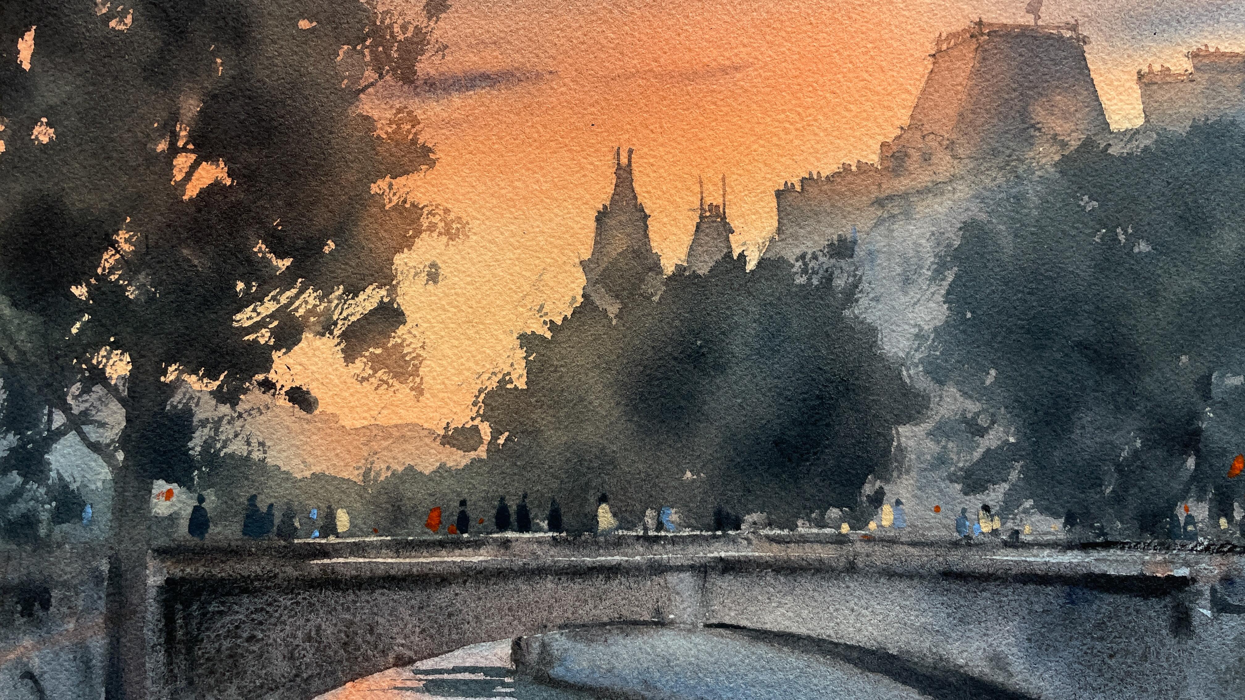
1. What this class is about ?: A scene for watercolor practice can catch your eye
at any moment, whether during an
evening stroll through the city or in a
new video tutorial. Hi, I'm Maria, a watercolor
artist, and instructor. In this class, I've chosen a project that will
offer plenty of practice for those already familiar with
watercolor techniques. But don't worry, this complex
process is broken down into manageable steps with clear explanations
for each part. We'll cover a range of aspects like a detailed
preparatory drawing. Painting a sunset sky with
wet on wet technique, and exploring
brushwork variations for different shapes
and textures. I'll also share my
favorite technique that keeps the paper wet longer, giving us more time to
refine details and create those soft color
transitions that awk a warm evening atmosphere. By the end of this tutorial, you will be able to create a
stunning sunset city scape, confidently combining various
watercolor techniques. Join the class and
enjoy watercolors.
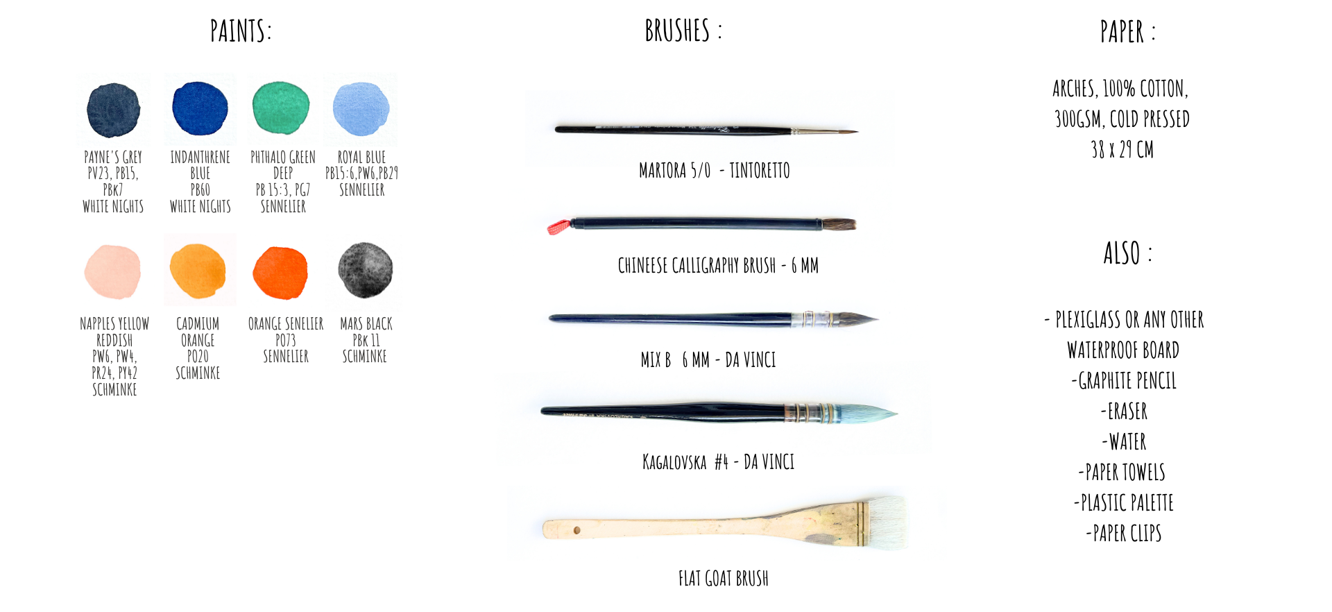
2. Materials overview: Let's start with
a brief overview of the materials I'll be
using for this project. First, of course, we need paper. I'll be using cold
pressed arches paper, and I will be painting on
its more textured side. For the technique, I'll be
demonstrating in this class, it's important to have
a waterproof board. I'm using a piece of plexi glass that is slightly
larger than the paper. For painting, I'll
use water colors in tubes squeezed onto
a plastic palette. The list of specific colors
I chose is on the screen. You can use similar colors
from your palette, of course. There's no need to use exactly the same brands and colors. The key is to make sure that
they blend well together. And please pay
particular attention to the shades of yellow, orange and blue that you will
choose for your painting. To avoid a green tint
in their mixture, I chose a yellow and orange
with a reddish tone and a blue that leans towards purple rather than
a primary blue. This will give a more neutral
mix instead of greens. I selected Mars Black for this work because of
its granulation effect, which will be useful for
painting the bridge. However, you can skip it if you prefer or if you
don't have this color. Colors that I don't usually use, they go in the corner
of the palette. As for brushes, we need
a brush for wetting the paper and round brushes in different sizes for
wash and details. I'll be using this set. It also includes a
Chinese categraphy brush, which I'll use for
painting trees. If you don't have this brush, a soft squirrel brush will work as a good alternative
for this task. Don't forget to
prepare a pencil and eraser for preliminary
sketching, a glass of water,
and paper towels. Finally, we'll also need paper clips to attach the
paper while it dries. You'll also find a
complete list of materials in the project
section below the video. Once everything's ready,
let's get started.
3. Background sketch: To start, as with most of
my watercolor paintings, I'll begin by sketching
with a pencil. I've printed out
the reference photo and my paper size is
proportional to it. The format is relatively large. It's a quarter of a
full watercolor sheet. But you can use a smaller
one if you prefer. Just keep in mind
that smaller painting will have fewer details. This time, I felt like doing a more ambitious project compared to my
previous classes here, which is why I
chose this format. This composition will
have three main parts. We have the sky, the
distant background with trees and buildings, and the foreground
with a bridge, a river, and a tree. I don't plan to draw
too many details. The outlines of the buildings, the placement of the tree, and the shape of the bridge are the most important
elements to me. And I will add other details later directly with the brush. I'll set the reference
image aside of camera, but you'll see the
photo on your screen. I'm not attaching the
paper because I plan to use this wet on both
sides technique. For the drawing, I will
need a medium soft pencil. I'm using a B pencil here. I also have a regular eraser and a soft needed eraser for
removing excess graphite. I begin by finding this line and determining where it will
be in the composition. I check how high it will sit. The center of the
sheet is roughly here, and the line is a bit
below the middle. If the center is about here, then my breach will be located
somewhere around here. I'm starting the sketch
with light soft lines. The bridge will take
up roughly this area. If you're working
on a smaller paper similar to the size
of the printed image, you could use a light table or simply trace the
outlines from the photo, or you could make a
preliminary drawing on regular drawing
paper first and then transfer it to your
watercolor paper. But I usually don't miss an opportunity to
practice drawing skills, so this time is no exception. I'm not trying to capture the proportions and
shapes perfectly. Here will be roughly
the center of the bridge and down here, the outline of the water. Right now, I'm focusing on the placement of the main lines. Here's the bridge. And this small part is
what we see from below. I'll draw it a bit wider
than I initially planned. I'm estimating the
width of the river in this section and also checking where this part will be in
relation to the bridge. Have plenty of chances
to adjust things later. And as you can see, I'm starting with very,
very light lines. And this line is
slightly angled. Here, I chose a rather
cropped composition because I wanted to keep a vertical format
for my painting. But in the class materials, I'll include another
photograph if you prefer a horizontal
landscape format, that one will have more details. Somewhere around here
behind the bridge, you can see the
lines of the stairs. M. Mm Here is the shore. And I won't add too
many details just yet. You see the bridge structure
is pretty complex. I'll place a tree here. So I roughly positioned the bridge and some
details will go here. I need to make the
angle of this line a bit more noticeable, I think. I continue refining
the lines slightly, making them a bit
darker, as I go. And now, let's move on to the next element
of the drawing.
4. Bridge outline: Now let's continue with the
buildings in the background. Notice how this line is
tilted because of course, the rules of linear
perspective are at play here. You can lightly sketch
this line here. Here I'm focusing on the
outlines and the shapes. For example, I'm interested in this corner and this one here, along with some small details. The roof will be
somewhere around here. Followed by two chimneys. And then the roof
slopes down again. For now, I'm keeping it
simple without details. Next, I'm drawing the line slightly like this
almost horizontally. And here we have two towers. The focus is on positioning these buildings correctly first. I'm checking the level seeing where it is relation
to these roofs. There will be trees here. These are trees and here
the facade of a building. Now here I can add a
bit of perspective. I've slightly adjusted
the angle on this side. Here we have some tower. And here it's just a
simple straight roof. The drawing is little by
little coming together. This area will have trees. You can even use a
ruler if you want. Next, we have the background. This part could be
slightly lower. We can start adding some architectural
elements to the outline. Little details like this one. Overall, you see
that I'm not too concerned with all these
details on the buildings. I'm not going to draw them. Next, what we can do is flip the paper over
and look at it from a different angle and compare to the reference
with fresh eyes. I'm fairly satisfied with
how these angles turned out. Though I might tilt
this line a bit more. You see this method always helps me see things
more clearly. On the left, we also have a
low outline of something. I can add that here as well. Take your time here, draw everything calmly and then let's move on to
the final element.
5. Tree contours: Now, we finally can add
some more details here. This will be the
line of the bridge and it's going to be
a fairly dark area. I want to darken this
line slightly right away. This part is a bit
unclear to me. And when I draw these elements, I pay attention not only
to how the line is placed, but also to the outer
counter it creates. Maybe I should even raise the
bridge slightly like this. This will be our dark area. The shadow on the bridge
will appear here. And now we just need
to draw the tree here. I roughly sketch its conto
showing where it will be, but no details, no
particular elements. This helps me to visualize
where it will be. Then I also can
figure out the trunk. There might even be
another tree next to it. In reality, there
were two trees here, and I cropped the
photo in this part. For those of you who check the additional photo
in the class materials, you will see that there were actually two trees
standing close together. In this area, the embedment wall widens as it comes closer to us. Don't hesitate to use an eraser to make erections like this. There's some decoration
on the bridge here and some steps start to appear. Of course, I won't draw
them in much detail. I've just sit down because I
was while standing before. And now I want to refine
and darken the outlines. Because here we'll have
the sky with a wet brush, and it might blur the
pencil little bit, and I want these lines to remain visible even after the
first layer of the sky. I'm not going to draw
windows or balconies. It will be dark anyway, and I'll just add a few
spots with paint later. Notice that there are two
lines on the bridge here. This line is at ngo. We could of course, talk about the rules
of perspective here. If you look closely,
you'll see the lines converging towards the horizon, and the horizon is
somewhere here, even though we can see it. And as you may know, it's the
eye level of the observer. It's no coincidence,
then the people heads on the bridge will
be roughly at this level, since they were about
the same height as me when I took the photo, and there were, of
course, many people. This is the center of
Ferris, close to Notredam. So there are always many
people and tourists here. This is approximately where
the horizon line runs. So we could talk
about perspective, but as you can see
from this drawing, you can achieve it by just carefully transferring
the angles and distances between lines onto the paper without any specific
construction. You can also plan out where the shadows and reflections
will be if you want. But I think I will paint them later with
just with a brush. Well, I hope everything
is clear to you so far. You can either
skip this part and simply transfer
the outlines from the printed photo using a window or light table
or with graffit paper, if you want, or of co, like me, you can draw
the sketch by hand. After this step, we
can start preparing the paper and water
color for painting. E.
6. Paper preparation: When the drawing is ready, I prepare the paper. Today, we're using the method of wetting the paper
from the back side. Therefore, I turn the paper over and use a large brush
to wet its back side. I apply water in the
usual amount as if I were going to normally
work wet on wet. So there shouldn't be any
paddles or excess water. But the paper shouldn't
be dry either. It's especially important to
do this around the edges, since the paper dries faster
there than in other areas. Now you can wait a bit for
the water to be absorbed. It is possible that
at this stage, the paper will start
to get slightly. This is normal. You can keep retting it to ensure the
surface stays even moist. Here is how the paper
surface looks in my case. I continue maintaining the
surface of the paper in this wet state until it
straightens out again. The surface should always
be a little bit glistening. Sometimes. Of, it takes quite a bit of time for the
paper to absorb enough water. Once it's flat again, I carefully flip the sheet over and remove the excess
water from the edges. If you've done
everything correctly, the paper will
stick to the board. At this point, you can
already start painting, especially if you
are planning to paint objects with
defined edges. But I'll start with the sky, which of course will
be done wet and wet. Now I'll moisten the top part of the paper where
the sky will be. And here, by the way, I think I can also wet the
bottom part as well. Why not? Let's moisten the entire paper, or you can just
wet the top of it. It doesn't really
matter at this stage. And I will keep this
bottom part shiny by occasionally going over it with a dump brush if needed. Just like the back
side of the paper, I've wet the front side
to the same state. Now, while the water
is still absorbing, I can spend my time preparing
the pains for work.
7. Pre-sky setup: In the sky at the bottom, we have some slightly
creamy shades. Then here, there are a
bright vibrant orange, a bit of purple, dense
and darker in tom. And a bit of blue. These colors are reflected in
the water as well, so it makes sense to paint the sky and a bit of
the light on the water. You can see that in
the water there are dark shadows and
light reflections. The shadows on the waves
appear as sharp strokes, so I'll paint those
on dry paper. That means that there will be two different layers
of paint on the water. I begin by preparing the paints with this
mixed hair brush, and for the creamy sky colors, I will take Napples yellow
with a slightly reddish tint. Next. There's also going to be a large section of the
sky down in orange. Of course, I always have
a paper towel in hand. I'll be working while
standing as it's more convenient since the
format is quite large. So I think we can start, and I'm not going to focus
on the bottom for right now. What's important is
everything up to the horizon, including the area where
the background will be. There's no point in outlining
the buildings, was the sky. That's also why we wet this
entire part of the sheet. And now we finally can begin.
8. Sunset sky: Of course, you
could make the sky a brighter yellow color here, but I'll begin with this
more gentle creamy color. My paint has a reddish tint to it and you also can change
its shade to your liking, for example, by adding this orange or even a bit of
yellow from your palette. I've made sure that
the paper surface is evenly shiny and I'm
starting to paint. Notice that I'll be using quite a saturated
paint with a lot of pigment because anything
painted using this technique, we lose a of it intensity
and tone while drying. I'm starting with
this light layer, and I'm painting right over the buildings that will
appear here later. Not going around
their conters, see. Next, for the clouds, you can add a bit more
of this thicker paint. You can make the color even brighter if you're inspired by the bright orange that
we can see in the photo. I'll also had a bit of cadmium perhaps for a more
carrot like color. If the paint spreads too much, don't forget you can
control it with a tissue. Actually, if you don't
have much experience working with such sky painting. Maybe this class is not
suitable for you yet. To learn the basics, you can start by watching my basic lesson on
painting skies, where I explain in detail
about paint consistency and control and many other things that will help you to
understand the process better. So don't hesitate
to check it out before starting this class
if you're just the beginner. Next, I'll take a larger brush and create this bright
orange section. I'll probably mix the orange with cadmium orange
once again as well. Here, the area is large and the cloud shapes are soft
without any details, so I'm using a bigger brush
to speed up the process. It may look bright now, but it will fade a
lot once it dries. There isn't enough
pigment here, I think. I want to have it more intense. In this technique, once again, you usually have to add quite a lot of pigment
because the paper is wet, and the format is quite large. So don't hesitate to add more paint if you want a
rich ski color in the end. Now I'll clean my brush
from the orange paint. And I will take now royal
blue with a touch of indent trim blue for
this part of the sky. And here I think I can even
dilute the paint a bit more, so it flows and spreads better. And with the same brush, I'm blending the boundary
between these two colors. And you see I'm getting
these cloud like effects. Since my orange has a
noticeable reddish stint and the blues are quite far
from being primary blue. I don't get any green at the boundary between the
orange and the blue areas. Hopefully, you can see it. Now I'm taking more dark blue, and I'm adding more shadow here. See the paper still
wet because we moistened it on both sides. I have plenty of time
to mix the colors and then calmly add
different elements. I'm adding royal blue here to make the mixture
dense and thick, but at the same time, not too dark because I want this area to
have a dense cloud, so the orange will appear even more glowing
comparing to it. Such shapes of the
clouds I usually create with the
side of the bruh. Here, you actually can
change it a bit to take a smaller brush and see
what you like better. And it's important
that I'm not trying to replicate the composition
from the photo exactly. I'm just focusing on
the main elements that catch my attention, things I like from it. Here you see, it's funny. The brush picks up a bit of orange from the lower
part each time, and then I just kind of
transfer it to the blue, which allows me to paint these kind of clouds
in this part. Here, I also want the sky to be a bit darker in this corner. You can slightly mute
the color if you want a less saturated blue by
adding some reddish tones. This time, I've added
cadmium orange. And we get an nice contrast. Well, that's it. And now we can slowly move
down to the lower part. Here, I'd like to start by just applying some
color in this part. My goal is to avoid leaving any white paper after
this first layer. I'm using this leftover paint. I'm doing it with a
not too wet brush because if the paint
is too liquid, it will flow upward. In this part, you can also
start adding some paint. It seems more like
bluish color to me. The upper part of
the breach as well. This isn't the final color yet. It's just the lightest
part of this construction. Well, in the end, the paint is spreading
slightly in the sky, and I will take this fluffy brush and gently
correct this spreads, swiping it a little
bit like that. I could also slightly
tilt the board, so the paint flows downward. But at the same time, I don't want to do this because I'm afraid the paint will
flow from this side as well. So I use the brush. Anyway, actually, there
will be a tree here, so it's not a very big deal. You can add a few clouds while
the paper is still shiny. And I'm doing it with
this thick paint. Finally, now we can continue with the lower
part in the water. A.
9. Light on water: Now let's continue with
the light on the water. The paper surface has
already dried here. I can tell because the
edges of the strokes are sharp and the paint
isn't spreading. But I want the transition
to be a bit smoother and that the paint stay
wet a little longer. I lightly go over the surface
with a slightly damp brush. However, avoid using too much
water during this process. I'm mixing two shades of orange for the
lights on the water. I want to create this
glowing effect in this area. I'm focusing on the light right now, ignoring the shadows. There is a light blue
and orange here, and I started with orange because there is simply
less of it here. The color on the foreground appears more yellow to me here. So I added Naples
yellow for this. And now I'm switching to blue. As you can see, you could
actually complete this step first and then take a break and afterward, work
on the lower part. Just remember to lightly with the surface of the paper
here before starting. This is clearly the reflection
of the sky in the water, so I'm using the same colors. I made the orange
highlights more like vertical with a
few horizontal strokes. And now I'm working more with the tip of the brush and
making horizontal strokes, already trying to create the effect of ripples
on the water. Oh. The idea now is to make sure that there's
no white paper left, as I said before, because
this is a sunset landscape, and we can't see the
source of light, the sun, which could be white. But everything else in such lighting will
have some sort of a t. For now, I'll cover this area with blue. I will add some later. You can try to work on
texture somewhere. Why not? Immediately add some warm
color details like this. Let's take a smaller brush now. I'll use a bit of blue
paint, not too watery, and add some details to the water carefully with
the tip of the brush, and the brush is almost. With this motion,
I slightly move the paint from blue to orange, from orange to blue. And I get this light
ripples on the water. This transition zone
between blue and orange is what interests
me the most here. We could also darken
the foreground a bit. You see, I'm not touching
the sky anymore. I just let it dry. Although the paper here
still has a bit of a shine. This is my first layer. I've covered all the elements
with the light toone, and now I could try adding some warm
details here and there. I'm not sure if they'll be visible under
the future layers, but why not give it a try. We'll see what comes next. Generally, since the
paper hasn't dried yet, you could try adding
various elements such as shadows and reflections
just right away. But since I've decided
that I want to have sharp contras on the water, like in the photograph, I need to wait until
this first layer dries. There will also be a
shadow here later. Oh. That's it. I'll stop here. Next, I'll move on
to the background. But before that, I need
the top layer to dry, so it stops shining and
feels d to the Dutch. At the same time, the
paper should still be stuck to the
board, meaning it's. We'll talk about that
in the next video.
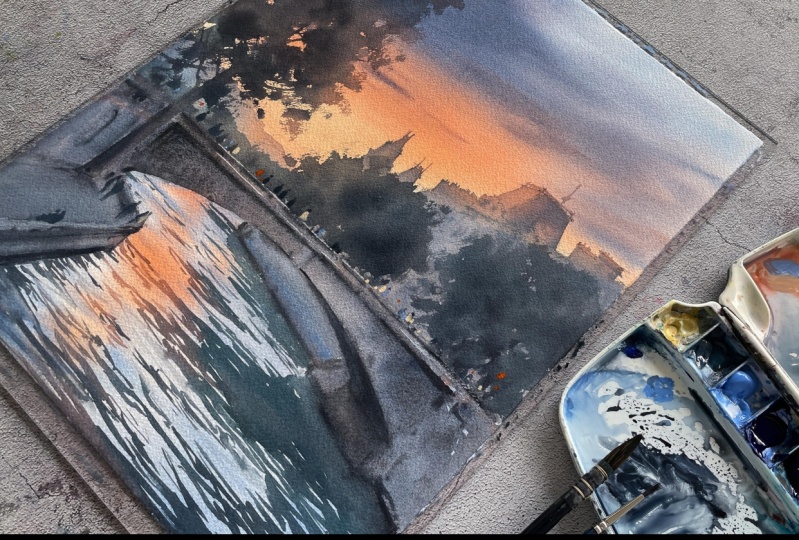
10. City silhouette: The next step is to add
buildings in the background. I waited until the surface of the paper dried, as you can see, it's no longer shiny, but the sheet is still glued to the board and feels
cool to the touch. This means that there is still
moisture inside the paper. I will now use these two brushes to create this background. I'll use the same colors, but in slightly
different proportions, I'll begin with the
buildings in the background. In the protos the darkness
and hue of the paint. And I think it can be a
little bit darker here. Well, maybe not so
dark, after all, I turned out to be a very intense blue because I didn't mix the paint
well on the palette. By the way, you can
use a small brush here to slightly work on the
outlines if you want. To create the city scape
feeling in the distance. In general, it looks nice if we slightly change
the shades of color. Here I'll make the
color a bit warmer. Since the paper
inside is still wet, even though I'm painting
on dry surface, the paint remains
wet for a long time. I can freely adjust these shades without worrying
that it will dry and need. Here I'm going to
slightly blur the edge. I'd probably like to add a bit more of the cool tone here. O I think I can also start adding some
gray paint at this stage. It will be darker and more
neutral shade. Why not? There will be trees
on top, of course, I'm not too concerned
about it right now. You can also slightly
blur the lower edge here. Now let's move on
to this part. Y.
11. Buildings: Now, let's add the buildings
on the right side. I'm using the same
colors as before, but I will also take
a smaller brush now. I'm mixing such a neutral color with a slightly warm tone in it. Now I'm painting while sitting, so I can rest my hand on the table and better control
the brush movements. The color can be
slightly adjusted here. The main thing is for it to be a bit darker than the
sky in this part. Oh. I'm carefully observing the
contents of the towers, trying to replicate
their shapes. But for the lower part, you can just imagine it as
some shadow, and that's it. Here I don't know actually how the building continues
on this side. On the photo, it just
covered by trees here. Here's another tower. I make these small spires
a little bit more orange. And I'll continue
in the same manner. The paper is dry enough now, so I can comfortably
rest my wrist here. You can even add a bit
of orange to the tops. And closer to the bottom, I use blue and to make it
easier I'm switching brushes. I'll do the same here. The paper at the
bottom is still wet, so the color in this area
remains moist, as well. You can still make
various adjusts it. Now I'll take a bit of gray. And the making the roof element
here lighter and warmer. I'm doing this to
create the impression of warm light on the roof. Vertical lines help to create
the impression of falls. It's also important
to pay attention to the direction of the
brush when you do this. I'll also add more orange here. I'm adding vertical lines here
and some horizontal lines. They need to be drawn carefully
considering perspective. They won't be horizontal, but add an angle, as we noted during the drawing
stage, if you remember. Yeah, there is a big
temptation to add details like balconies here in the place when we can see the
building through the trees. Here, this will be just the background
for the future tree. I don't really care about
details in this part. D That's it. I don't want to add
anything more here. Otherwise, I'd have to add many details everywhere
to make it cohesive, which I don't really want. I just want to create a slight impression
of architecture here.
12. Bridge: Now it's time to
paint the bridge. What I want to do now is
refine the edge a bit here. The exact color
doesn't really matter. I just want the lines of
the bridge to be neat. After that, I'll start
on the bridge itself. I'm going to use a
bit of mars black as it adds a little bit
of granulation texture. I also pick up a
little bit of orange. And let's add a touch of our
blue color here as well. This will create a muddy color. And I'll begin with
this line here. I want to leave a bit
of a gap in this place. It's easier to do it with
a small brush as I do. M It's not necessary to do
everything the same way. So here, I just put the
color just like that. Where the tree will be, you can paint over it as well since the tree
will be darker anyway. Now I'm mixing the paint
really well again, so the pigment is
evenly distributed. I want the granulation effect
to appear on the paper, so the paint should
be que liquid, allowing the pigment to move. I'll gently soften
the lower edge with a clean brush here. Tell that this area is
already by the sharp edges. Right now, I'm mixing
a blend of orange, black, and ind blue
on the palette. This mix will settle and
create a beautiful texture. I might darken this
corner a bit more, adding black and mixing
it to deepen the tone. To bring out the
granulation effect, you need to use plenty of water. But keep in mind, this often makes
the paints appear lighter on the paper
as the pigment pulls. To darken the area, you can add more transparent dark
paints into the bland. In my case, it's dark blue. Here we can see some of the
bridges structural elements. They add some texture. The mix of black and blue
creates shadow here. In fact, we can start to merge
these areas here, I think. With clean water, I
will soften this edge to the shadow blends smoothly
into the water like that. Right now, my goal
is to create a bit of visual sort of noise. So I'm switching to a smaller brush and
we'll add some details. Again, blue plus black. I'll deepen the
shadows where needed. And probably you can see
how the earlier sections have lightened the
bit after some time. I like how it looks. There are actually different ways
to show texture here. I'm using the granulation. It may seem quite
dark at this stage, but later, we might need
to darken it even more. I might actually do that now in somes using this thick
gray paint on wet paper. I'll keep it like this for now, and maybe later, I will
really emphasize the shadow.
13. Waterfronts and details: Here you can see that I
made this distant part of the embankments a bit more blue than
the bridge itself, it helps to distinguish
them by color. Let's go ahead and add a darker shadow
here at the bottom. As you watch you see this dark spot grad
lighten more and more. This is a characteristic of granulation paints as
I mentioned before. We can always add more
shadows as needed. I really like how
this turned out. I'll keep going with
the same approach. Soon, I'll be starting
on the water. But first, I need to darken
the embankment a bit more. There will be people here, so we can even start
painting them right away. Some paint has flowed upward
here, but that's okay. It ended up creating a
nice effect like trees. This paint gave the bridge
an interesting texture. Once it, we can
add some details. I'm even thinking of
adding a bit more blue here to further split this
area from the bridge. Next, we'll work on the water
and then the upper parts.
14. Ripples and reflections: Now it's time for shadows
and reflections on the water without waiting
for the top part to dry, I'll just start working
on the water since the paper in the river
area is already dry. I'll first clean up
the excess paint on the palette and mix the
color for the water. I'm going to use a
base of gray with a little intrin blue and
a touch of emerald green. The color should
be more neutral, not overly green or turquis, but slightly greener
than the gray background around it. This is important. Now, I'll use this color
to start adding shadows. The walls of the
embankment are still wet since I just recently
applied paint here. This will allow to get a smooth transition between
the water and the shore. I'm working with the tip of the brush using
horizontal strokes. I actually could even use a smaller brush for
the distant areas. Why not? I'm just drawing
such simple horizontal lines. And changing the color depending on the background,
as you may see. Remember, we were planning
to add a shadow here. For this, I will switch
to a bigger brush again. To create thinner lines, I work with the tip of the brush and hold it almost vertically. Like that, I make a smooth side to side motion, like that. I'm not painting here yet. Because I want to change the
shadow color a little bit. I pay attention to
the background color. So where it's orange, I plan to use warmer
tone for the shadows. And making the waves on the
foreground a bit larger, and of course, not copying
the photograph exactly, just the general shape. Here, of course,
you can darken a bit more while the
paint is still wet. T Now I will add a bit orange to it to change the color
a little bit here. Same goes here where the background on
the water is orange. And now I'm switching
back to a smaller brush. And here, I will add
small with a lighter, more like transparent paint. Aging I'm drawing everything with
horizontal strokes. Even along the edge, I try to maintain the
shape and the direction of the waves to keep the consistency the same
shape all the time. I can also add a few
more lines here. Well, let's add a few more
semi transparent waves here. And then I think we
can call it down. Maybe just a touch of
a darker color here. The advantage of this
method with moistening the paper from the back is that my paper is still wet inside. If you're not working with
the pre moistened paper or if your paper has dried, it will be difficult to achieve the same effects where
the individual waves and ripples blend into a
single uniform area with a complex as I have here. I'll soften this
sera bit to reduce the contrast maybe like that. All right. I'll
leave it as it is. Let's wait a bit for it to dry, and then I'll start working
on the trees in this area, followed by the large
tree, of course. But before we can paint here, we need to wait for
the paper to dry. Next, I'll darken this area and then move to the trees
in the background. By the way, I think
we can already start working on them since the
background here is almost.
15. Distant trees: You It's finally time for
the background trees. To work on the trees, I'll be using a Chinese
calligraphy brush. However, you can also use regular soft round squel brush or even a synthetic
one if you prefer. For the trees, I will
take the same gray, add a touch of
emerald green to it, and perhaps a bit
more blue and gray. The goal is to mix a dark grayish tone,
something almost neutral. I'll use this color to paint
the trees in the distance, making them slightly more
light and transparent. Oh. Once this dries, it will appear
even much lighter. You can even add a bit of
orange to the mix here. These trees will hide
the towers behind them. I'm doing the same here, putting the brush on
its side to create these rough torn
edges for the tree. I'm leaving some
gaps here and there. To add depth. I'm applying
some darker paint. And I'm doing the same here, always starting with a
slightly drier brush. I feel like adding a
cooler color in this area. And then I let a slightly darker shade
to these trees as well. And keep in mind that once these areas,
they will lighten up. Here, I also want to fill some of the empty spaces on the side. If there is too much paint, you can even remove it with
a tissue very very gently. I'm just really
barely touching it. And that's all for
the distant trees.
16. Foreground tree: In this step, we'll draw the last major
element of the sin. Now that we've warmed up by painting the trees
in the background, we can move on to the
large tree on the left. The technique and the brush
movements will be the same, but this tree will be
bigger and more detailed. I will also change the color and tone of the paint as I go. Using warmer shades
along the edges, especially where the tree overlaps the orange
part of the sky. Unfortunately, after
painting the sky, I can barely see the
pencil outlines anymore. So I'm painting mainly with the side of the
brush here again. In the middle part of the tree, I am pressing harder on the brush to create
broader strokes. There's a deep shadow
under this branch. So we have light coming and
then a bit of shadow inside. Here, let's take a smaller
brush to add a few branches. I'm using paints gray here to make the process
easier and quicker. I think you can
understand why I'm painting on the texture
side of the paper now. It helps to create the interesting brush
strokes for our trees, and also it helps for the
granulation to appear. Now, we smoothly transition
to the tree trunk. Yeah, I feel like adding a few more branches
extending from here. You can see how the trees in the background are
gradually becoming lighter. But now I feel like adding
some shadows to the path and then moving on to
the final details. A.
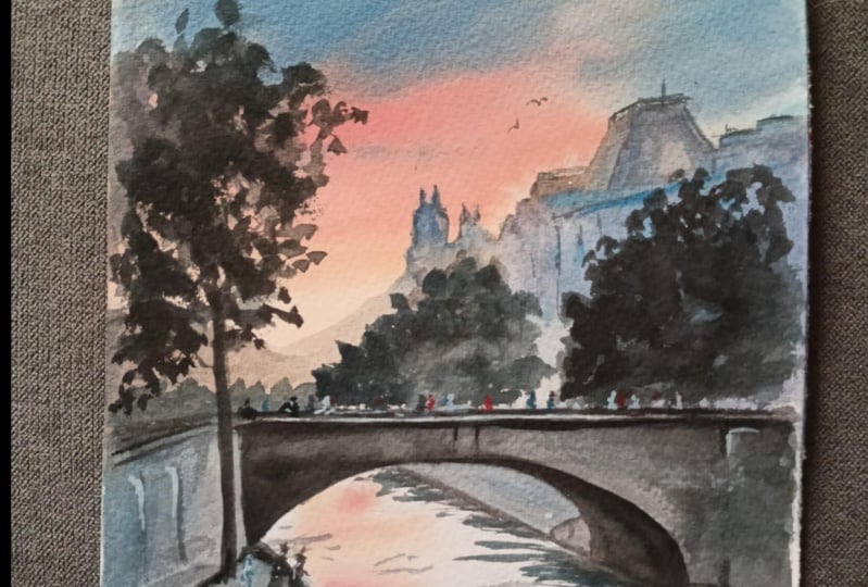
17. Final touches: Here we are moving on
to the final stage, adding small dark details. After introducing darker
elements to the painting, it's clear to me that this
part looks too light. I'll create a shadow with
a slightly bluish tint. I think that the tone should
match the surrounding area. And it will help
also to emphasize this sort of railing or wall. I also want to darken this area to match the
shadows in the trees. I am adding a few more
details here and there, working still with
the paints gray. Noice how the sky starts to glow as soon as we add
these dark details. I just increases the
contrast and helps a lot. I'm using thick paint, and this creates some
brush effects in places, giving
additional textures. O 00. And you can draw the brash just by touching the
napkin like that. Let's even slightly
blur this section. And I want to darken and
blur this area as well. You see how the small, seemingly minor details have really enhanced the
contrast in the painting. The foreground now
looks more detailed. It takes more attention and
really for me, feels closer. I might add just a few
more small strokes here and there, a little bit. Well, we're always
done. The only thing left is to add people's
figures to the sin.
18. Figures: Now it's time to add
some final details and bring the city to life
by adding people there. I think Rad blue will
work well for this. These are small figures
of people on the bridge, and I could paint them
using an open color. They will be lighter
than the background, but not white as these figures
are also in the shade. There are many people, of co. Here, we also have some people. I'll draw them using darker mix, simple sites like that. And these figures closer, I don't really
want to draw them. O Naturally, these figures are slightly larger than those on the bridge. I'm drawing them very simply, just a brush stroke like this, and then a small
dot for the head. Plus, you can add a few more
dots just for extra details. This might represent
someone's shirt or something similar. You can also add a few
details with orange paint, maybe a traffic light or a sign, or just something to add
color variety to this place. And I think it creates
an interesting effect. Oh. We could try adding something else
in a lighter color. Let's take our naples yellow, and I'm applying it thickly. It's quite light on its own. Let's work with it a bit more. You can also take
white and mix it with some other color for
more or less the same effect. This will add some variety
to displace or figures. And just a few final
touchs here and there. And that sits done.
19. Conclusion: Here it is the final result. I hope you're as pleased
with your painting as I am with guiding you
through this process. Once your artwork is complete, it's a good idea to secure the steel wet paper on a
board using some clips. This little trick will help
your painting dry evenly and stay flat, avoiding
unwanted warping. I truly hope you
found this step by step tutorial both
enjoyable and informative. Please don't hesitate to
leave a comment below to share what was new
in this class for you, or if you have any questions
about the techniques, materials, or anything else
we covered in this class. In the project section,
you will find a full list of the materials used
in the reference photo. Please use them for your
independent practice. I can wait to see your
sunset City s Caves. Don't forget to share them here. And if you're posting
on Instagram, please use this hashtag so I can check out your amazing work. Thank you so much for watching. I'm looking forward to creating more inspiring projects with
you in the next lesson. Until then, Happy
painting. Bye bye.
 Maria Smirnova, Watercolor artist and author