Transcripts
1. Introduction: Unlock the secrets
of drawing life like textures in this exclusive
pencil drawing class, captivated by the
softness of fabric, the intricate veins of a leaf, or the reflective
surfaces of metal. This class is the gateway to mastering the art of texture. Using only HB on basic
pencils dealt deep into the techniques
of shading and cross hatching to bring
drawings to life. L earn the essentials
of creating realistic textures and debate the subtle nuance of various materials with
precision and confidence. In this course, learn
the fundamentals of texture creation for
different materials. Master essential
shading techniques to our depth and dimension. With expert guidance and
personalized feedback, build a strong foundation
on refiner skills. Transform simple pencil sketches into stoning texture
masterpieces.
2. Starting Fabric Drawing: Hello, and welcome to the second chapter or
sketching drawing to Ty my. Today we are all going
to learn together, how we can texturize
something. What does it mean? It means that in this chapter, we are going to learn
how we can create different textures for
objects like glass texture, mat tool texture, or anything else like
a fabric or cloth. I'm going to start
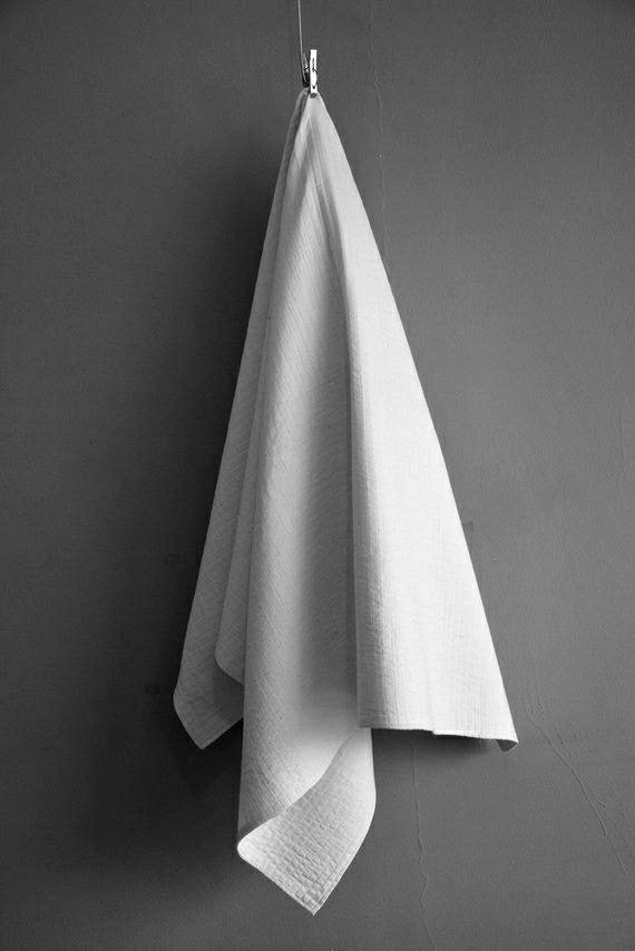
with mat objects. The first object that I want to work on is a fabric texture, which is a t texture. It's not shiny. That's what I mean.
First of all, I've got to create a
primary sketch for my work, that later I can actually
shade it and texturize it. T that I'm going to create
is a piece of cloth, which is hanging down of
a table or something. First, I'm just going to
create the cloth from here. I come down and complete it. Just make sure that your
primary scat should be definitely lighter or
very light basically. It should be even lighter that
the one I'm creating here. I'm just making it
a bit darker so you can see better in the video. I want it to be more
visible to you. Otherwise, you should try to make it as light as possible. Then from here, I
come out a little. Place it maybe on the ground
or something and he surface it even bring it in in
the straight liner. Then from here on the same line, on the same level. I go all the way
up and back again. Then over here, I try to
have another line there. So for the last part of my work, I stop from the
beginning from the top. I come down in straight
lines, again, from here. I've got a shape of a triangle
at the end of y week. After you make sure that your first and primary sketch is done correctly and
you've done your edits, and if your primary
sketch is two d, the first thing that you
should do is to lighten it, then after you've
lightened that, first, you start with your HB pencil in order to give it a
very general shade. Then With your basic pencil, you start applying to darkness. So I've lightened
my primary sketch. Now I want to start with my
HB pencil to start shading. Now. In all of the textures, we do not use our basi pencil right in the beginning
in any sketches. It's better that
first you start with your lighter pencils in order to give a general
shape to the whole thing. Then for some parts, which you've got
strong darkness, you can work with basic pencil
from the beginning too, but it's not recommended, you know, Let's work on
the background color. The background color is the primary general shade that I give to the whole
area and the whole object. That's what we call
a background color. So using my HB pencil, Because I want my cloth or my fabric to be a bit
different from the background. I'm using even an 11
color palette for this. In some parts I'm
getting darker, but at least everywhere have got an 11 color
palette in themselves. Then I also faded
into the light. In this model, the light
source is placed over here. This side would be
the light parts, these parts would
be the light parts, and these inner parts would be the darker parts of my work. Now, again, I start
shading from here. Very slowly. I go up and then I fade
my shadings there. I continue the same way. Then because this part of
the fabric is just folded doesn't get any and be part of my because it's folded
and it's not getting. What's home doing it. Again, I start applying more
darkness into this area, and I would also spread
it at the same time. I consider a darker
shade for this part because it need a stronger
darkness for over here. I've got to add more layers
of still with my HB pencil. Can still work on it with that. This part of my work
is more prominent. I just leave this area and
with a bit of distance, again, I start
applying the darkness. You see that is a little
space, a little distance, between two dark parts
which shod be shaded. Again from here, I start
applying my darker cos. On this area is
also more prominent, so it would be
lighter and I try to fade in white darkness
into the lighter areas. These parts are the
prominent parts that I've just
determined for you. From the darkness, as I
move toward these parts, I should make sure that my
shade would be lighter. Of course, the shadow my
first area is placed on here, again, this area would be
darker because it's also got the shadow of the
first part over it. And as I move up, I continue my shades. Thanks. Now, considering this
area for the light, I would apply darkness
into this pt. I would also have
more shades over here to show that this
part is more curved in then I continue the same way to
the lowest parts. Sage. I'm shading the whole area. But I'm just keeping in mind that wherever I can
see more curved in parts or the parts which are folded underneath
some other parts should be and the more prominent
parts be shaded lighter. This would be the focus of work. Here it is Now, in your shadings,
you shouldn't have any sodden drops or
any separations. All of the shadings, light and dark should just blend together and be
faded into one another.
3. Finishing Fabric Drawing: We've got to make
this part lighter. Let's leave it light. Then the darkness would be
exactly on the contrary, starting from this
lower part, right the because this area has
got getting some light, but b lighter, then this part has got the
shadow of this part above it. That's why it's a bit. The part would be
comparing two side parts. It's just so easy you've got to see which parts of got delight, they would be lighter, and they are more prominent, and which parts are darker. I should just definitely
fade this line over here, so my work would not
turn into a surface. That's one of the
most important things as I've told you so
many times before. Let's work on this
upper part as well. We do not want to
forget about that. I'm just trying to up
more details here. In this way. Let's move on to work
on the next part. Again, I've got a
very strong darkness here because of the shadow of the previous part a ping here. But I'm just trying to
get this darkness as much as I can with this
normal pencil of mine. I'm just trying to add more darkness there
to make it better. Now, the shadow of this
part of my fabric is placed on the last part
of my cloth of fabric. This part would be definitely
dark because it consists of the shadow of
the previous part. So it be definitely darker. Then again, try to
show some depth in here or some prominent
parts over here. I've got some prominent
parts and some deep areas. Pitting them next to
each other is what makes my whole volume of
this piece of cloth. Okay. Again, I wa comme
to darkness again. I recharge it, but
to say we are. Now I want to switch to my basic pencil in order
to work in the parts, which are definitely darker
and they need more darkness. So I also want to apply some darkness
in the background so I can actually separate my
work from the background. So from up to down, I've got this line
of the fabric, in order to separate
this part of my work, from the background. I do my shadings in
this direction because the cloth is coming from the upper part to
these down parts. The direction of my shadings to separate it from the background should be in this direction. Of course, these shadings on the edges should be
darker than our cloth. They would not get
mistaken together, and I can create a contrast
here to separate this area. From the whole background just with creating
enough contrast that. Here we are. You should not leave any
kind of lines in your work, and you should fade all of the lines into the shades and into the rest
of your colors. And in general,
your who work sh be cohesive and we blended. Just like that. No. I also add more darkness to some parts like
this inner parts. And over here, I've also got a very strong darkness
into the background for separating this part of cloth
from the background and also the shadow of my cloth
on the surface behind it. Look at this. Se now you can understand
the volume much better. Here we go. Get more separated
from the background. Now, I'll do the exact
same thing for this area. I work with a strong darkness I bringing the darkness
in the right direction. Over here, I should
have got a very, very dark background in order to separate this part of the
cloth from the background, and also fade this
line perfectly. I've got a dark background. Also because the shadow of the whole cloth has been
dragged to this side. So I've got a dark area
there that's the shadow of the whole cloth on
the surface or on the wall that it's placed on. You can clearly see that Just as easy as that. I could actually create several lines there and
several lights and shades, whereever I needed them. In just a bit of touch. Now, I'm just going to do some last last edits for
my fat breaking cloth, that would be the end
of this e tutorial. I hope you've enjoyed it. And you've learned what to do. Basically, we have
shaded areas which were more deeper or where folded or
contained any shadows. These parts should be
colored and shaded darker. For the more prominent parts or the parts more in
front of the light, we would definitely
need lighter shades. So I hope you can practice on it and follow us
in the next parts.
4. Initial Leaf Sketch: Hello again, I'm welcome to a new part of to tell
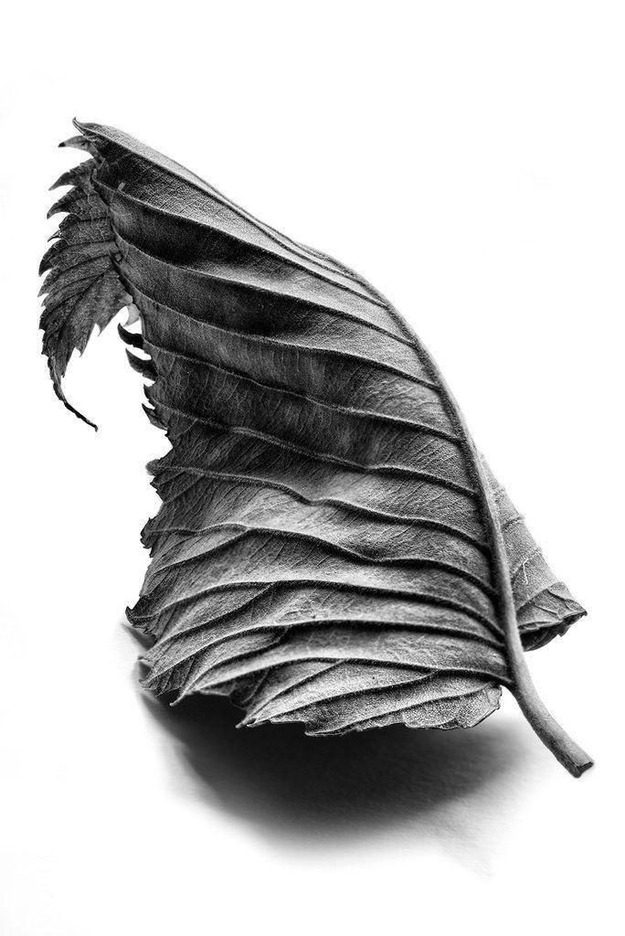
you what may write. This time, we are going to work on another mat texture together. This time, we are going to work on the textures or a leaf. As you know, most of the
leaves have a mat texture. First of all, I'm
just going to work on my primary sketch, my reference. Then I want to just get a quick primary
sketch of my model. It's going to be a bit
curved coming in again. You can use any other different references
that you've got. Can even take a leave, put it in front of
you and create it. Also from here, I just come
down or bring it down. And just like that, I've got the ending,
bringing it back. Again, very thin, I come down. I connected to this part, creating a thin area, and then I'll continue the
rest of my leaf for this side. Then again, like the fabric, I come up again. It's also got a bit
of folded shape here on the end and the sharp end of my
leaf. We just go there. Now, I just want to apply
more details to my leaf. Now, with a bit of space. I try to shape this
area a bit better. I want these edges to be sharp. That's when I'm adding this design or better
say shapes on the edge. It's got sharp edges. So it would be continuous until we've reached
the end of it. We go, then I would
come down again. As you can see, I can even
add some lines in order to create those vine
shapes inside of leaves. You pay attention. If you
look at a leaf closely, you can clearly see these
vine shapes from just going to show an illustrate
with these lines here. All right. Let's just completed on adding more details to make it look
better and more realistic. Than from here or do
the same thing here. Do the exact same thing, but on smaller scale. Again, I would actually like to remind you that
your primary sketch definitely be getting darker over so it would be
more visible to you. Otherwise, it beer Okay. I'm just going to go up to here. Here we go. As easy we've created and made
our primary sketch. Now we can easily
to do the shading. All right. So we've got a very neat
and clean primary sketch, very important to the
rest of your work. So right from the beginning, I'm going to still use my
normal pencil or HB pencil, in other words, I'll
start shading with that. So Right in the beginning, I'm just going to give it a background collar as I've
already told you about, it means I give it a generally light shape
to the whole thing. Then I can later de craze
or craze some parts of it. Just giving a background collar, to separate it from
the background. My hatches are long, but they're still
close together. Really close together,
and they make a very light shade for
me til I get to here, I've got to change the
direction of my shading, moving to the opposite side. Well, in the next step, you say my dear friends, mates. Might sons here is coming
from this side this side. The light is shining there. This part would be
the darkest part. Actually, underneath
each of these vines, I would have darkness
strong darkness. These vines are prominent, so they would beer, but below them, would
be strong darkness. I start right from the bottom, and then I start darkening right beneath and
below these vines. Not the vines themselves, but the area beneath them. Then I start dragging and fading the darkness
I've got here do. They should be faded downward. I would also add some
more darkness for the edges of my
leaf surroundings and the edges of my leaf. Again separate it better
from the background. I come inside. There we go. Bring some darkness
from below this wines. Then I bring them down
and at the same time, I tried to fade them into the light or better
taught the light. Here we are. Then for the upper areas, I'm going to just repeat
the same process there. Just going to follow
the same routine. I'm just going to do them
for each one of these. Also, going alongside
this stem of going. Again, with a bit of
space and distance, I would be this area. Working on these fines we've got here. Here we are. All right. Now, as
I'm applying it, as I get to these bigger parts, I tried to create smaller
vines and smaller details for these big areas where
my just like that. So easily.
5. Leaf Shading: Then I would move to
work on this upper area. But again, I'm doing
the same thing. Here we go and
then in this area, I'd be completing
this darkness here. I work on these ending
parts of the leaf, which also is not really neat, and it's a bit messy. It's a bit disorganized. As I told you, I tried to create some smaller vines in the
bigger areas with my shades, not creating any specific lines. As I've told you so
many times before. Moving up to the next one. Here we are doing get
again. Just like that. Light, I'll just try to
increase the darkness here. I can show that the sleeve is turning a bit towards inside. Now, I just tried to work
on some small veins, again with the shades, and then of, I'm moving
to the next one, starting the shading
underneath the wind. And continue that
also to the edges. He we've got it. Just like that. Now, I come up for
the next part. Again, I tried to
work on the curves, I tried to keep the curves, Dt want to just shade straight, doesn't make any sense. Whatever I can see, my leaf is prominent, obviously, the darkness
would be decreased. Here, I've got more
of it. Here it goes. Extending the side as well. Don't forget about that. The Stem The stem's
edge also be darkened. Now, for the rest, I just tried to repeat
the same thing. Just remember, it's
very important to control your hard pressure. Also get your hutches
done perfect. Man they should be to create
a soft and smooth shade. All right. Here we go. Also in here, we are
going to do the same. As you can see, Of course, for the last part, I'm going to just
shade very lightly. Now I want to work on very general shades
here, for example, I want to have some
darkness here, or I want to have some
compli dark shade, I want the darkness
to be in this area. Right, then I will
start working on here. Now I will switch to my basic pencil in order
to get darker shades. First of all I'm going to
work on these edges of my, which, as I told you
before are all sharp. See completing it and
over here as well. Again, sharp edges
for the other side. And now, I tried to
work on the vines for this folded and bent
area again so easily. They should be this organized. They shouldn't be too
neat or too organized. It's a bit messy and chaotic maybe because that's the
way the nature works. Right also over here, I walk to out more
darkness into the stem, and then fall here. I tried to even
use more darkness. I would also work on
the stem of my leaf. Now I want to work on the
second half of my leaf that it's definitely twisted and
also got folded or bent. I'm going to use twist because
it also has turned a bit. So I'm going to
create the vines, and at the same time, I'm just shading
underneath them. Here we go. As easy as that. Don't miss any of the wines or any of these parts, please. Now, I'm going to use
my t the ted rubber. Then with my tted rubber, I'm just trying to apply some very light some
very strong lights, better say these parts, as you can see, my lights are being created as
the shape of lines. So With these
straight light lines, I can show the prominence of these vines and side of my leaf. I'm using my etic
rubber in order to show the prominent parts by
creating these it lines. In addition to that, I should add to the
darkness for this part. Let's follow for the
rest of this tutorial.
6. Completing Leaf Drawing: Hello to all of my dear friends. Welcome to the rest of the storal My on the
ending part of it. Now, in this part,
my dear mates, I take my basic
pencil on my hand, switch to my basics, and now I'm going to work on
strong darkness on my work. For example, these parts, especially on the
bottom of my leaf, I've got a stronger darkness. I'm going to use my basics
wherever I need them. Okay. For these big
wines I've got here, I need more darkness
underneath them. Also, pay attention. If you just use the light in no darkness, not
enough darkness, it's not going to make enough contrast and it's not going to show the prominent parts
as much as they sh. Always remember if you want to show some place is prominent, just adding light to
that is not enough. You should darken its
surrounding to show that it's more prominent compared
to its surroundings. That's why we usually create
this contrast in our work. Here we go. Now, you say my dear friends, that how contrast
will actually make your work more
attractive and more realistic and also um Also going some lines out of the darkness that
I've created here. I had created here. Again, for this upper part, I do the same thing. Goo to cate the harmony and cohesiveness of
this whole thing. I want it to be cohesive. The darkness of f is much
more because this part is actually curved in and it cannot get too
much of the light. When I add the darkness to this area to the amount
that I want it to be, can clearly see the d to curved in port while the leaf
is being twisted. Also in here. Going to
add some more darkness. Just enough of it. Don't
forget about these parts. Now, let's work on these
ending parts of my leaf there. Now over here. I also got another dark
shade in this shape. It's got a bit of special shape. I'm just going to
follow it through. Following this following
the shapes, moving on. Again, I work on the winds. Here we go. Now, for this part, we try to just add
more darkness in order to get a better volume here on the fact that it's been
twisted in and it cannot get. Much light. So here. And we are going to
be done. Then Jeffy Don't worry about it. You shouldn't just
rush through it. Please don't just do it. You should enjoy it, and you should also be
careful working on it, especially if this
is the first time or the beginning of your
sketching or drawing. I've just sharpened
the edge of my rubber. I just need some more
light lines over here. I'm just going to do it quickly. We can also use a cutter to create these small vines, so we can actually use a cutter to get a layer of shades of our. It to say several
layers with a cutter. Then we can work on it more
and gather even more details. Here we are. I also need some lights. Not too, but I need them. Over here, I need strong and more lights
comparing to other parts. All right. Now, my
leave is Don Opa here. Now, the only thing left for
my leave obviously would be These shades on the edges. Now, from here, I start applying a very strong darkness right t on the corner and
right from the edges. Then I try to spread it
just a little and fade it in order to create
the shadow of my leaf. I continue with my order pencil, B six, getting
stronger darkness, and as I'm moving out, I'm just trying to spread the darkness and
making it lighter. Here we go. Then I
switch to my HB pencil. And with that, I tried
to make better fates. I mean, I tried to fight them better on blender darkness
on the light together, even softer and smoother. We've got here a noice
shadow for our noice leaf. We also tried to create some, some sharp edges
even in the shadow to express the shape of
my leaf in its shadow. We also tried to fight
these areas as well. Just a t of shade would be enough for some
places. The stem. Can I switch to another pencil, shading these parts
one more time. These are the last
touchs of our work because we are
practically done with it. Easily we could create a beautiful leaf on its shadow textures I
hope you enjoyed it, I practice it, see you later.
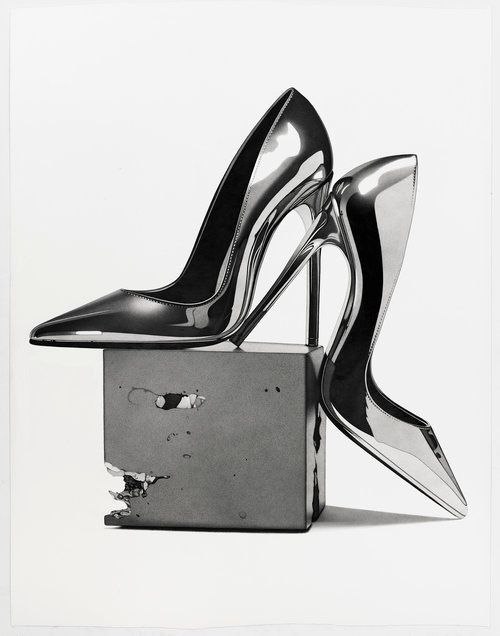
7. Initial Sketch of Shiny Metal Shoe: Hello to every one of
you, my dear friends. Welcome to another
tutorial with my. This time, I'm going to
show you how you can create shiny textures
or metallic textures. Glasses or actual metals, which we call metallic, or also water glass or all of
the things that are shiny. Let's start together. The first sketch I'm
going to work for you is actually about shoes. Want to create a glazed ny shoe. First of all, we've got to
create a primary sketch, and then later when we
want to shake this thing, I'll tell you about the
principles for shiny texture. First of all, I create the set, which I have my sheet on it, it would be a square cube. Here, I've got a square cube. Very easily. I create that. I've got lots of practice on it. I've got my squared, then I transfer these side lines in order to create
the cube part of it, and transfer actually
transform it into a cube. Now I'm going to place the
shoes on this thing here. Right over here, I've got
the front of the shoe. Again, I come from here, I go to the left side a bit. I try to make my line
st not c. From here, now, I've got to have a c
so my line is coming up. On then with a very
beautiful vermin shape, it goes up very
nicely beautifully. Then I extend it still going up. Now, the ending part of
the shoe would be here. I'm sure you are guessing now
that this is a high heel. This would be the
bottom of the hel here. I take it up to attach
it to my actual shoe. And I'm just going to
complete the hell area. My heels all getting completed. From here, I come up again. And this be the
thickness of my as well. I've got to be curve here. I just want to edit it a bit. Now, right from here, It will also get just
a bit of curve in order to contain
your foots hell. It will be curved a little
coming all the way up. Then from here, I will
sharply come down. It will drop sharply.
Then from here. When I get to the toe area, it will be broken
again and going down with a curve coming
up with another one. Goes up. And then from here, I attach it to the
tip of my shoe. The sharp tip of my shoe, actually. So that's it. That's my high heel shoe. I'm just going to edit
the shape of my shoe, but you can do the same thing. So pay lots of attention to your primary sketch and before you start shading, try to edit wherever it needs. Should also work on this
other side of the shoe. I should show that the shoe has got a volume of some kind. I'm just getting the
other side of it, to show it has a depth. It has a pot between it. And it's got volume. The rest of the volume
would come with the shades. Don't worry. I got it. I be bringing this down, also working on this
cube a little bit. Don't be afraid to
use your rubber, whatever you need it. So I just clean it. I clean my sketch. And I finish the hill area. I just edit it a bit. Just like that. Here we go. Almost. So just skip up. Then it goes down all the
way down right to here. Now I want to do
the second shoe. This would be under my first shoe. I'm just trying to
get two ses in here. On this would be the hill of my second shoe
underneath my first shoe. And the crossing
each other somehow. Then from here, I've got the top of the hill starting off
the back of the shoe. Then over here, I've got the exact same opposite
shape of the curve. It goes to the exact
opposite side and direction, just goes in the curve
part is facing down. Then again, I finished the area. Well, what I'm trying
to do here is basically recreating the first shoe
just in another direction, just in another position. See? Try to create them
as identical as you can, that are part of a pair. I get this beautiful
calve over here. It should be a little
bit higher than this. Let me try that again. I bring it a little bit more in, and then I come back
again to outside. Then over here, I've got my straight line moving
toward the tip of the shoe. Now let's work on the
next part of the shoe. Try me over here. Separating the two
parts of the shoe, hill on the rest. I've got the hill
shape out of it, so not worried
about that anymore. Now I've got to create the
upper part of my shoe. Again, it comes with
a drastic drop here, coming down little smooth curve, and from here with a sharp
point, the sharp tip. I'm going back to the cave. So the bottom of your shoe should be totally
straight on that area. Don't forget it. And over here, I come toward inside. And here it will be I work on the inside of
the shoe right there. We can see less of its
inside because it's more tanned comparing to the first
shoe that we've worked on, we only create the part that we can see on the other side, which is mostly on the toe area. Or better say the
front of the shoe. So here you've got it. Now I've got the
primary sketch of my whole drawing of the shoes. I'm just going to use my rubber and edit my work a
little making it, you know, whatever I
needed, it needs that. You know, point to it. Don't be afraid to edit your work all the way
through till the end. But it's better if you get it really right in
your primary sketch, so you wouldn't have to edit it. W shading just gives you a
head start and better outcome. Even can work on the
previous, the first little. As you can see, again, I tried to work them as
identical as I could. As much as your first
and primary sketch is nice and clean, and the shading step and the
shading part of your work, it will be easier for you, faster for you and you would
face less problems there. Just hard a bit of problem
for this smart of the hill. So I do it again. As I told you many times, just be super sensitive about your primary
sketch. Don't rush it. Just take your time with
that, and be patient. Should work slowly, but softly,
smoothly, and carefully. Do not just let your mistakes move through the next stages. Do not slip it. Don't slip and sk on your
mistakes, edit them. The minute you see them. Makes you a better artist. All right. We almost don't
even with the editing. So that will be it for
our primary sketch. Don't forget all the tips
I've mentioned to you. So we are going to continue
working all this in the next part by
shading it and giving a noice texture so follow
us in the next part.
8. Shading the First Shoe: Hello again, and welcome to the rest of this
tutorial, what may. Let's work on the shading
of this beautiful drawing. Well, my dear friends, because the texture that I'm
going to create is shiny. So first of all, I'm going to determine
the parts of my work that has
very strong light. For example, over here, I've got a very strong light. I got a heavy strong light, and so I should separate it and determine it that I would be careful while
shading that I keep this light and I do not
shade over it too dark. Another strong
light that I've got here would be in this area. All right. So I should also pay
attention to this part. So I'd be shading carefully
and not darken it. I call it too much. I have to make it smaller. Now it was too big. We come to here, just like that. Now, what I've got here over
here is f of strong light. I sh also determine
some areas for that. We've got it there. And
all the way to here. These are all the light areas Now I've got to start
working on the shades. First of all, I'm going to
start with my basic pencil, and over here, I've got absolute darkness,
strong darkness. Trust with an easy heard, I use my basic pencil to create that absolute darkness
in this area. Right. Just like that. And of
course, while you're working, if you've seen that anywhere in your primary sketch,
you've got problems, you should edit it
like this part that I've edited and it should
have been more curved. Even while you're shading, you should also pay attention to your primary sketch
if it's good enough. Or if it's got any problems, they actually would show
themselves more shaded. Yes. All right then. We are moving on this. Now I just use a bit
to distance here, a space, and again, I'll start through here. Now, again, I start working on the surroundings of my work, and I start applying strong darkness that I can
show the depth of this area. All right. Here we go. Then also from here. I'll just do the same thing. Then I also apply
some dots and spots there so I can show that
this part of the s was s. Now I've got my HB pencil, and then my HB pencil, I start shading the shoe itself, the outer part of the shoe. But I also can use my basic pencil in order
to create a strong. When I got to the lighter parts, I can use my HB. These parts are
totally dark again. Again, I'm using my basics. As I'm getting
towards the light, I try to light to it a little. Who we are. And up to this point
end of the shape. Now, one thing that you
should consider while shading the shiny objects is that you are going to set very dark palettes right
next to very light palettes. This strong and contrast
will make your shiny. So I all of the shiny
textures and shiny objects, we've got very strong contrast. See this difference. Here, I've got a very
very dark palette, a very dark shade right
next to a very strong lot. Again, I say, this kind of contrast will make
your work look shiny. So if you want into
getting that texture, this is what you got to do. This is what you have got to do. So, I'm just going to
talk in this area. Here we go. I've been shading it. And over here, I've got
the bottom of the shoe, which got to absolute darkness. What? Here, we've got it. That's it. It's only took before you should be careful in keeping
that area light. But it should be a
little bit highlighted. It shouldn't be
left white, though. So try to take it. All right. Then I use
my basic pencil in order to create even darker
shades to some part of here. Hey, we are. That's
how it's done. Now, for this upper part, I'm going to use some
lines and the only place, the only exception
that we've got in sketching and
shading is this shy the only place that we
can use specific lines like a framework is our texture. But be careful of that too, you should not just
destroy your volume. The lines go into
the shadings and creating our contrasts for s. That's why we could use them. From here, I go up
and I continue. Now, between these scratches
that I've created here. Again, I tried to highlight, so I've got the
shine even better. So right over here, I've got absolute darkness, and I'm raising it up, taking it to the side,
right over there. Then well, I shouldn't have that much of
darkness anymore. I just faded very
slowly, very smoothly. Then I should have got some strong and absolute
darkness over there as well. Then I also get it f here. Alright. Who we are. This part of the light
will be left alone, and F here again, I start applying my shades. It needs some darkness
and some lights. That I'm just going to create the w that you
are watching right now. So just follow my lead and
go into places that I go. You'll get the M.
9. Shading the Second Shoe: Then I just consider a very
loight shade for this area. As I said you don't want
to leave it white there, but it would be very light. Then for the hill area, again, I did the darkness as I see them in their own
right placement there. And also, over there, I'm coming down to
complete the hell no Now, with my normal pencil in order to control
the darkness better, I work on these parts a bit because they
are not too dark, so I prefer to go at it with my normal pencil
that would do the job. All right. Then I also want to create some strong lights in
my work with my rubber. So moving on this area. Then it looks good. At All right. Over here, I've just got to do a
very light shading, and then also create the shadow of my hill
on this coupe set. You should not forget
about these shadows. Even my cube can be shy, you know, this upper part would be aca. This would be the placement
of my order hill. So I just tried to
work on a bit too. Again, it can be even
and be placed here. That will look better. Also from here
basically the hill, we've got some shadow on
our square cube there. Now I've got to apply a very general shade
for my square cube. Then as you can see, I'm doing it by creating es Here we've got them. I'll continue and in several
different directions, I just keeping I
keep and until I get the darkness that I desire for this place for this area. I got to do that. Here we are, and
we are getting it. Don't over than much over. Not over this part. Just do it over and over again until you get the cool
that you would like that. All right over here, I've got even more
darkness right there. And right over here. I've got some fractures on
this cube that I want to show, and I can show it like that. It's cracked or broke. So here we are then. Moving on. Even emphasizing on
this crack a bit. Then I erase this area. After cleaning it. I use my basic again, and I try to fade the darkness toward
the rest of the work. Spreading that dark shades
through the rest of the area. Can also apply another st
darkness right over here. That's it. And justice Easily, we are done with this part and the first
part of the show shading. I hope you've
enjoyed it to here, and let's continue with the rest of this tu
in the next chapter.
10. Completion of Shoe Drawing: Hello again, and welcome to the rest of this tutorial
what may. All right. Now let's work on the
other pair of our shoe so we can work on it
and finish our shading. In the beginning, just like
the first pair of the shoe, the first part of the shoe. I'm just going to determine
the placement of the light, so I would not lose
them in any case. So very easily, I just
put them in their places. All right. And also very easily, I'm going to keep
them because now I know where they go
and where they are. Here we are. Also, these parts have got a very thin area, and also, obviously,
and here I've got more. These are the placement
of my light areas. Come all the way up
to here over here on the tip of the
shoe on the toe area. We've also got some light. And again, from here, I go to the bottom on the
very tip of the shoe. All right. Here we are now, with my bas six pencil, I'd be starting with creating
strong darkness here. See. Over here, I've got
absolute darkness so with a very easy heart
and comfortable hand, I'd be placing absolute darkness in this area with
my B six pencil. Also, I try to get this shapes over here in order
to show that sewing line, beautiful, sewing
line on the shoe. I need these patterns.
And again here. I can see some
more lights there. And if I want to start from
the tip of this show on here. I've got a bit more shade. The very pointy end of the shoe. Very pointy tip. All right. Now, let's get
back to work on this area. I'm just trying to follow
the lines beautifully. I just go on them whereever
they take a turn or do two, and I curve them enough to get a beautiful shape with my shade. That's very important. Right. I also drag it up to here getting this part. This area is the darkest part
of my shoe right over here. Except inside of it, this area is the darkest
part of my shoe, so I easily use my basic pencil in order
to get this darkness here. A just like that to here very easily. I've got to light to that, and I'll take it to here. Now, from here, in
the back of my shoe, I add more darkness right there Just like that.
I've got it over. So I get to this part
right above the hill. These parts are going to be
done beautifully. Trust me. Whenever you feel like you
need to sharpen your pencil, just do it just as
I did right now. Now I've got two parallel
lines over here, and I keep one part light and I apply darkness to
this thin area. Then I bring it to the bottom of the shoe right all the way here. See, I can get darker. Also in here. Got it. I also have a very light
shade in this part. Not too dark. Keep in mind that your pencil
should be sharp enough, especially if you are working
in the thinner areas. I've also got some
mid shades here. I mean they are
not too too light. That's what I call
the mid shades. A medium shades. More comfortable
with it. Here we go. U on the hill. This is where I've
got lots of darkness, especially on the bottom of
the hill, specifically there. I tried to take it
all the way down. Then I finish it the
ending part of the hill. Like this. As you can see, I've got a big chunk
of light here. This is what I'm talking about. I'm just going to cover
parts of it with my shades, but not all of it still live some light that
because in our ill, we need this contrast too. We need it to show that shiny tee as we've
talked about before. All right So easily, you've got to be beautiful
shoes or a pair on a box. Now, let's work on this
area of the cube as well. I'm just giving it a
very general shape now. Then I can even work on
this side again one more time to keep it to make it. I just felt that this part needs more darkening and also in here. I've got some lines going up on the come down beau, Amazing. And also the shadow of the
shoe itself on the box. You don't forget
about that, though. It's very important
part of you shading. The shadows are also
very important. We've got another one here from the shoe this time
on the ground. I'm just going to shade
it beautifully as well. Ok. Again, I'm working on the bottom
of the shoe one more time. Then I also give a very light shade to
this part of my work. Just a layer of very light
shade in order to not leave it white because that would be just not working, not natural. When you give it a
very light color, just a t, it would look
beautiful and very nicely done. We are also finished
with this tutorial. I hope you've enjoyed
it, my difference, and It was somewhat
useful to you, so just practice a lot, do it over and over again. Don't give up and see you in the next chapters with other sketches. Keep
up the good work.
 Mila Keller, Drawing Artist and Cartoonist