Transcripts
1. Introduction: Welcome to the vibrant world
of watercolor painting. Now, whether you're
a beginner or an experienced artist looking
to enhance your skills, mastering loose yet precise
watercolor techniques can be both thrilling
and challenging. So where should you start and what techniques
should you focus on? How can you bring your creative
vision to life on paper? Snow scenes provide a dynamic
range of subjects from the uniquely stark contrast and the snow covered trees,
mountains, and buildings. In mastering snowy
landscapes in watercolor, you'll discover the
essential techniques and processes needed to transform any snow scene into a captivating and
expressive painting. With my guidance,
you'll learn to create masterpieces that not only capture the essence
of the scene, but also reflect your
unique artistic style. I'll guide you through my
entire process in real time, from the initial drawing
and scene composition to the delicate layering
of light shadows, and finally, the
intricate addition of details and highlights. Join me on this exciting journey into the world of watercolors. You will learn how
to create stunning, snowy landscape paintings with
confidence and precision. Whether you're an experienced
artist or curious beginner, this class will equip
you with the tools and techniques needed to unlock
your full creative potential. I can't wait to get started. Let's unleash your
inner artists together.
2. Materials Required: All right, so I want to talk a bit about the materials
you're going to be using in this class or
the materials you should try to get
before you start. So paper is probably the most important one
to sort of start with. Now, I'm using
100% cotton paper. If you have this
where you're from, I really would suggest
it because it just is superior for any kind of wet and wet effects which are
used a lot in this class. So there's many
different brands, and this one here is in cold
press as well as rough. So if you've got some textured, you know, textured
cotton watercolor paper, that's going to be great. Now, if you can't get
that where you're from, you can always just use
normal cellulose paper or other types of paper that's
labeled as watercolor paper. The issue with those papers
sometimes is that they can often be difficult
to layer on top of. So they will kind of rub
out and they will dry. So you have to be extra
careful not to go into previous regions
too many times over. But yeah, you can do
this pretty often with cotton watercolor paper. And you can see, as well, there is a texture to the paper, which
is really important. The texture is going to allow this nice kind
of granulation effect, as well as allow a lot of this wet and wet work to be painted a lot more
a lot more easily. It implies some details and textures that you would
otherwise need to paint in. So that's those are
my tips for paper. Now, in terms of colors, I have quite a few colors here, but you're not going to
need all of these colors. Now, essentially, if
you have yourself blue, so an ultramarine blue here, you've got yourself a red. I've got a permanent red or
piral red, and also a yellow. This is a Hanze yellow. These three colors
are going to be absolutely fine to get
started with, okay? There's, of course, some brownie sort of colors. So
earth and colors. I've got burnt sienna and also
raw umber or burnt umber. Those are really good to
create brown sort of tones, but you can sort
of mix up one of those kind of
grayish, a grayish, kind of reddish tone, so warm gray kind of tone by mixing all your three
primaries together. Is just a little bit of
a red and a yellow bias. Okay, it's not perfect,
but that's still going to get you something at least slightly close to
that kind of browny color. And there are a few different colors
I have in here as well. So this other one here
is cerulean blue, great for painting skies. But if you have ultramin blue, you can just dilute
that down and then use that also to paint skies. It's going to give you a
nice light blue color. But yeah, I do like
cerulean blue. Personally, it's just one of
my favorite sky blue colors. I've got a few
different yellows here. This here is Indian yellow,
and I've got yellow ochre. Yellow Ochre is great for
a kind of subdued yellow. I've got a piral orange, and I've got a granulating
orange here that I don't really use all that much. It's, it's basically
a bonus color. And over here, I have a
couple of colors that I don't use is
turquoise and lilac. Okay, so you won't need those
for this particular course. All along the side here, basically just some
convenience colors. Apart from the burnt sienna and raw or burnt umber,
I've got a green here. I got a couple of greens here just sort of leftover
on the palette. The rest of these are
basically purple, and in here should be
neutral tint or pains gray, but I have run out. So I often use a lot
of these purples and the gray to mix
up a real dark value, as you see here on the base. But actually, you know, I've
used mostly purple, blue, and a bit of brown
mixed together to get these really nice dark
areas at the base. But, yeah, pain's gray, neutral tint, any kind of pre mixed gray is just
a convenience color. So you notice on the
palettes as well, I've got pretty
large mixing wells, two large mixing wells. It's just going to make it a lot easier to mix up large washes. So if I want to
mix up, you know, an area for, like, these this sky, let
me have a look here. Maybe all this color here. This is a ton of color
that I had to use, okay? It just makes it easier to
just mix a big section of it, so I don't have to continue
remixing again and again and risk not being able to get
the exact same quantity, the exact same mix, which is pretty much impossible
in watercolors. You can get it close, but
you can't get it 100%. So that makes it really easy. If you've got smaller
wells, it's not a big deal, especially if you paint smaller, but that is something
to definitely keep in mind if you're looking
to buy yourself a palette. And here on the right, I have myself a few
other little materials. So this is the board, a bit of plastic board that I sticky
tape the paper onto. I use masking tape over here, and I just will masking
tape the edges, okay? That just when I
pull off the tape, it creates this really nice
crisp crisp sort of border, which I like with watercolors. And also this towel I use to dry off the brush
during painting. You're going to need
some water, obviously. But yeah, the towel
is good because it helps you control the amount
of moisture on the brush, which is very important, especially if you're
doing, you know, bit of wet and wet
sort of work, okay? So let's have a look at some of the brushes
that I have on here, and you're not going
to need all of these. You're only going to
need a few of them. I just got a few different
sizes, essentially. So here, I've got a
bunch of round brushes. These are synthetic round
brushes, great for detailing. And yeah, I use those a lot
in this particular scene. And we've got also, I'm just going to go through
the important ones first. A couple of watercolor
mop brushes. Now, these are really
important brushes because they hold
a lot of water. If you look at the
belly of the brushes, they hold a ton of water, but they also have a sharp tip, and this sharp tip allows you to cut around different objects. So really important
to have that. These are like, your
quinsential kind of brushes, watercolor mop plus, maybe, you know, a couple of round brushes. You
can get by on that. These are some new brushes
that I got recently, and they're basically
rigor brushes, but they have a larger paint
reservoir around them. So you can have a look there. But basically, if
you've got some kind of thinner rigor brush, that's going to do the
trick, as well, okay? Here, yeah, well, basically, these are for little details. So things like, for example, this power line cables, tiny, tiny, little details. Let's see if I can find some other example trees you know, these tiny little, you
know, trees like that. The rigor brush is so helpful. And these are some
miscellaneous kind of brushes. I have some flat brushes. So three different
sized flat brushes. These are really good
when you're doing things like the mountains like here, and you get a nice sharp, crisp line where the
mountains meet with the sky. The flat brush does
a fantastic job with that and there's, you know, different
sizes of them. I also use a flat
brush at times, like a smaller flat brush to imply windows because they're kind of a
squarish shape. I've got this brush here, which is a fill bit brush, and it's basically just a
brush that you used to scrub at the paint to
remove paint and then lift out with a piece
of tissue paper. I use this technique a
little bit in the end to bring back parts
of the original wash, bring back a bit of
light to the scene. This brush here is
called a fan brush, and it's these sort of
flayed tips like that, and it's really this one I need to actually
get a new one. But basically, this is great because it allows you
to get in things like, you know, small
indications of grass. Let me see if I can find an example here in the
foreground, you know, little you know, little sort of bits of grass and
stuff like that. Especially if you've got lots of tufts of grass, you know, this just saves you a ton
of time. Not necessarily. I mean, if you've got
a small round brush, a small rigor brush, you know, you're going
to be able to get by. With that, it's going to
take a bit more time.
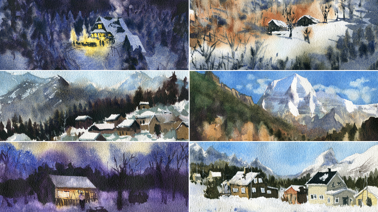
3. Aurora Drawing: Let's get started
with the drawing. And really for this scene here, we want to make sure
that we've got a bit of this snow down at the base. We've got a little
house here as well. But I just want to get in this sort of area of
snow down the bottom. This is going to be a little
bit lighter than the sky. I look here? A little
bit lighter. Yeah. And we will put in
the house here. So we've got the sort of
back end of the house, and it's like a triangular
sort of roof coming out here, then running down here. Let's put in the length
of the house now. There's also this sort
of that comes down. And the house actually has a fair bit of sort
of snow on top. I think I might take
advantage of that and really exaggerate
that amount of snow there that it's sort of similar to what's on
the ground, perhaps. But yeah, we'll see. We
might change it later. Who knows? That's a little
chimney there on top. And you can't really see all that much going on in the house, especially on the
left hand side there, but you certainly
can see the details here on the right hand side, the front of the house, really. And you've got these bits of fence as well here
out in the front, and looks like you may even
have a couple of people there just managed to that looks like they were doing
maybe a long exposure shot, and there's a couple of people, maybe someone hanging around here in the front of the scene. Who knows? But it's just a lot of light on the
front of that building, which we would definitely
want to get in. And underneath here, we've got, I think, a couple of snow sleds. Going to zoom in to get in
the little details of them. It's not really much and
at the end of the day, at the end of the day,
they could be anything. They could be just general lumps of wood or what have you there. I'm not fussed about
the details of them, so I'm just going to
put that in like that. The one here in the right in the front is sort of
similar sort of shape. Again, I'm not too fuss
about the details. And, of course, we've
got some trees. So these trees as well, we are going to
simplify them down. I'm just going to make a layer of trees down at
the back like this. Okay. And a layer of trees maybe
run down the back there. And then also you've got
these sort of branches, larger trees going upwards. You do have a few here as well, including this tree here. So we're going to get
that in afterwards once everything's dried just over
the top of the entire scene. But I think for now, that
should be good for the drawing.
4. Aurora Painting Light: Alright, so for the
start of this painting, what we're going to do is get in the whole aurora
down at the back. I'm going to change the
colors up a little bit. They do look sort of
purplish, bluish, maybe, but I want to add
in a little bit of green as well in there. So firstly, I've got a bit of purple already sort of mixed up on the on this here. So premixed purple. I'll just add in a lot of water. Now, what you
really want to make sure is you just get in as
light of a wash as possible. There's almost no yeah, there's almost no
paint running through here and running it's
just a lot of water. I'm going to carry this all the way throughout the back, okay? A bit of a purplish color. I might grab my blue out
and just dilute this down. So I've got a little blue
as well in some areas. Uh, yeah. Keep it really light. Keep
it very light and look at how I'm sort of moving some
of the color around as well, maybe adding a bit around
to the right hand side. Okay, anywhere that you want to imply this tus sort of
part of the aurora. You got a bit here behind
the house, as well, which I'm going to get in
and also emphasize the, I'm going to actually
emphasize the coolness of the on top of the
house, as well. Okay. All right. Now, there we have
a bit of color. I think I will grab some green, so I've just got a bit
of darker green here, but I'm going to mix
it with some yellow, create myself a really vibrant, hopefully vibrant looking
green because I want to drop some of that in maybe in
areas like here, perhaps. Okay? So we've kind of
got a bit of a mixture. It's not just um, the same old, there's a bit of different color
running through as well. So it's kind of
like a greenish and then a bit of purple color. Okay. And I've extended out over to the left hand side
as well just to make it more visually appealing,
more interesting. Okay, so here comes
the fun part. We're going to mix up
a lot of dark color. I've got some ultramarine
blue here, mixing up. Lots of ultramarine blue, and I will also add in purple. I've got a little bit of purple
left here on the palette, but I do have some more
That was mixed up, just sort of left here as well. Just dried up a bit, but I want to mix this up
and create a nice thick, sort of purplish color. Now, I'm going to drop this in Durora and I'm going to slant my my board upwards like that so that hopefully we
can get this mixing nicely. Okay? Just get rid of, you know, all this white spots. And it works only
really work with your using this sort of paper, this kind of really
textured paper, cold press will
work as well, okay? More blue, more purple. And the darker you
make this around, the more prominent,
it will look, okay? This aurora effect will look. The light will just
really come out. So don't be afraid. Okay? Now here I'm just
starting to add in a bit of color through the
center of this part, okay? Like that again, it's just that same bluish value
with purple mixed together to really create a sense of darkness
running through the scene. So maybe mix in a bit
of brown, why not? This is just a mop brush, okay? And look at that. Drop that in, and this is
how you have to do it so that it just mixes
and does its thing. Okay? I'm going to put
a bit here as well. Now, if you get any spots that have dried off too quickly, use a little spray
bottle like this, and you can just
rewet some areas of the painting because it is a little bit
tricky in some parts. Okay. Mot brush again. Let's drop this in here. And any time you feel
maybe there's not enough. Color up the top or something, make sure you just add more of that darker value in because this is the
only time you can do it. Once we add any other color in later, it's not
going to work. I'm using a darker
purple now to go over the top because
I've realized that it needs to have a little bit more a little bit more contrast. Here. Underneath as well here, there we go, a bit
moving around. The top section is a little tricky because it's already
starting to dry off. But we've still got time. We've still got time. Just trying to get
rid of some of these white specks
running through. It's just paint that
hasn't settled in quite well to the paper
just yet. Okay. So at the moment, that
looks quite okay. Tilt the paper a bit to encourage some of these
colors to run upwards. Well, Again, you only
get one shot at this. You got to be pretty
pretty quick with it. Okay, moving some of
this purple down now. Yep, moving this down a
bit of purple and blue. And, down in the ground, I'm going to just start to
grosly cut around this house. I still needs to be pretty dark. But the House itself. I'm thinking of actually just thinking of just making the
top of it a bit lighter. Look like it's covered in snow. I still undecided exactly
how I'm going to do this. I think I'll go
through and put in some lighter wash afterwards. But we'll bring it down. And while I can, as well, I'm going to grab another brush, and we're going to just
put in some warmer values. So I've just got some kind
of reddish brown color. This is burnt sienna.
Gonna drop that in here. Really light values,
maybe some orange, yellowy color here as well. Okay? That's just gonna
hopefully just seep through, blend nicely like this. Good. It's kind of like a
warm some warm areas of the painting which
are sorely needed. Okay. Now, just go to bring this
all down to the base, this same wash all the way down after doing a bit of cutting around
of the buildings. Okay, a bit like that. Do some purple here. Darken a bit more at the base. Good. It's just lots of
purples, really. Uh, okay. We've got that sled there, which I'm probably just lost out. There's no chance of it,
like, showing through now. I'll have to just paint
it on afterwards. But, you know, for
the time being, I think we've got a pretty
good little indication, yeah, pretty good little
indication of this house. Most importantly,
we've got the aurora in there, that back area. Um, maybe I can drop in some
more paint in some parts. Like I can ship some
paint around, perhaps. I think this area of
the sky could do with a little bit of darkening here. Other than that, I think the
rest of it looks quite okay. Um, maybe up the top, I could darken a touch, as well. You know, there's always
something that you can do and you've got
to at some point, say to yourself, Hey, I'm
just gonna kind of leave it. Move this down a little bit. Yeah. Okay. These darker purples really
just help to bring it out. Better. Just a bit of it's kind of just a bit
of layering over the top. And while the paper
is still wet, you've really got the best
opportunity to do this. Once it's dried, that's it. It's done. Some more darkness, maybe
now down the front this to help increase that sense of depth through the
back of the scene. Okay, good. I think I
will actually Yeah, I think I'll actually
dry this one off. Just feather this bit here. It just looks a bit funny. Yep, let's give it
a quick little dry
5. Aurora Painting Darks: Okay, so we've got the aurora in now through the background. I will start putting on some of that bluish value
for the rooftop. It just needs to be
a little darker. Um, yeah, at this
sort of consistency. And, I reckon I'll just
go over that. Yeah. Oops. The bring this down to the edge
of the roof below. Good. Kate. Great. I just want to rub out
a bit of this color with lift off for touch. This should be brighter. Just using a little
filbert brush. You can use any sort
of brush to scrub away at the paint to do this. And yeah, it creates sort
of a bit of softer areas. I want to see if I can
get it a bit lighter. Yep. Good. Okay, let's put in some of these trees and bits and
pieces here in the background. So I'm going to use a fan brush for this to
make it easier for me. Gonna use purple and a bit of brown mixed together to
create a really dark, really, really dark
sort of value. We know that we kind of got
to start off right here. Okay. There. I might
actually just wet down this paper first because I
want it to spread a little. It looks too. It just needs
to spread a little bit. So that would be here. Just make it easier to
paint, if it's a bit wet some little trees going behind. Sometimes if you
have a small brush, small rigor brush, this will help as well to just
indicate these details. I really like using rigger
brushes for this reason. Subtly indicate some
details back there. But, yeah, you only
want some of it to be some of it to be soft and the rest of
it to just be a bit sharper. So I'm trying to make sure I've got both
elements in here. Me purple. It's kind of, like, purple
and brown. It's really dark. A off in the distance. Here we go. Hopefully,
that's also going to make the sky pop out more. You just have to go darker
with these little areas. Yep. And you can see here, of course, leaves some
trees going upwards. I'm using really dark paint. It's the same stuff, really, purple plus, purple plus, a brown These trees
actually coming from here, further down the page there. Yep, let's just show where
they're coming from first. And maybe here. I don't want to make
them go too high. It just starts to disrupt
the shape of the aurora. There is a tree here, like a larger tree. Just put that in. This one goes up a bit
further, but, again, I don't want it to really
take up too much real estate. Um, leave I want to leave the top as
unencumbered as possible. There you go. Just like another tree there, another tree there, some
smaller ones back here. Just some bird calls
really going upwards. Like that. So trees.
There's some more here. Look, just, you'll be just
putting these up at same time. I reckon I'm gonna
need to actually darken the foreground
a little bit, as well. It's not dark enough. It needs
to be a little bit more. And again, this sort of
section to the left, I don't want it to
go too far up and disrupt the detail up the top. Okay. Me brown and
purple together. And I'm gonna get in
the side of this house. If it mixes a bit, I'm not fast. Alight. Good. And yeah, like I said before, I think this bottom
part does need to be darkened. A good amount. I'm going to grab some
ultramarine blue. We'll actually give
this a quick dry first.
6. Aurora Finishing: Flat brush and ultramarine blue. And I'm going to go across this base with this blue and maybe a bit
of purple mixed in here to roughly get it to the same color as
the sky, hopefully. Same value as the sky, I mean. Yep. I'm putting
more saturated sort of blue values in here as well. Okay? Just enough to just get
rid of some of that light. Okay, good. This sort of goes on to the
building here now. I don't need to
really do too much. I'm just going to start
darkening behind a bit again. Realize this area
behind the house really needs to I really think that
just needs to pop more. I've not gotten much of that indication sort of
area in dark enough, so this might help Okay. Kind of like a secondary
layer, I guess. This sort of makes the roof the color of the roof
pop out a little bit more. Um, yeah, this area on the
right, it's pretty dark. I don't feel there's much
else I need to do there. But yeah, just mixing more of this really dark paint cause I think this area here
could do with an extra, you know, touch of color. Okay, good. And I reckon I can
start putting in some small details
of the fence here. Little indications of the fence. Cross like this. There's some details
on like the doors. Like there's a door here
that looks pretty dark. You color that part
in. Okay, like that. You get bit of maybe shadow underneath the
rooftop like this. It's just a bit of the
white exposed in areas. I don't get rid of that. Normally, I wouldn't mind that, but it stands out so
much in this scene. Um, here it's this whole
what you may call it, this, sled below, but I'm just putting in some tiny details
again on the house. Okay. I might go in with some
guash for that one, but, yeah. Uh yep. It's we can maybe put in
a person here. Why not? Just sort of standing
the front of the house. And here is what you call it, this sled, which I will indicate
in a very rough manner. There's this tree again that kind of got
raised a bit before, so I can go back in,
pop it back in there. There's a lot of paint,
really sort of dark paint this whole area. That's another
indication of that sled. Back there, you know, you
probably got a few more, you know, verticals
running through like that. Good top part. It What's this side? There's some little
I don't know, little details I can
just indicate there. Rooftop. I've forgotten to
get in the chimney there. It doesn't matter.
Might just add in a bit more darkness here on
the left side of the house. I feel like its needs a bit more a little bit
more darkness there. Scratch out a window
or something. Some more branches
coming through. Quick dry. Alright, a
little bit of water, and I'm just going to use a little brush here
to rub off and lift some areas to maybe bring back some small contrasts in
the snow so that we've got, I guess, some lighter
bits running through. Okay. I don't have to do this, but I think it's a good
little finishing touch. Oh, let me just get
this back area in. There's just some areas that are actually a little lighter, so it helps to use this
lifting off technique, especially maybe here on
the edges of the house. You know, you'll
get a bit of snow build up perhaps there. Um, on the roof, can we sort of
indicate something maybe a little bit Lighter bits throughout the bottom
of the scene as well, to kind of balance it out there, now that we have some
lighter bits up there, just a touchdown below
can kind of help. All right. I'm going
to put some of those little slate patterns, not slate patterns, but
the little wood patterns wooden board patterns across
here, let's see how we do. There we go. That looks
a little bit better. Um, the left side of the house here probably could do
with a bit more um, no, like a bit more contrast
around the outer edges, just to bring it out more. Just going to outline that
edge a bit like that. Hopefully, it just makes
it come out a little bit more from the
darkness back there. And same sort of deal, I might just pick up some paint, see if I can get in a few kind of marks just running through. That. Okay. I almost can't tell
that there's a figure there just indicate a
bit better like that. Legs. Maybe arms,
the head as well. There. Right off. Right, so some
finishing touches, we want to get some, I
guess, of those stars in. And I'm gonna pick
up a smaller brush and also some guash. So I've just got a
little round brush, a bit of white guash here. Okay? I want to put enough
water to activate it. Okay? And what we want to do is just kind of tap
the brush like this. And this will create these sort of starry sort of effects. Okay. In parts of the painting. And I'm trying to just cover up parts of the
bottom as well so that it doesn't move
around too much, and also so that none
of these sort of stars, the sort of starry
like effect starts to start to affect anything
further down below. Okay. Right. And we are finished. H. I'm just going to lift off a bit of paint here near the fence to
hopefully maybe show the light maybe seeping
through some areas here. Um, it's not a big deal, but just something
something there. Okay. A little bit of white gouache again to just indicate some
details on the house. These little frames of
things here as well. C just see running through. Um you don't have to overdo
it. Just a little bit. This just get the windows in. Fish.
7. Mountain Road Drawing: Right, so what we're
going to do first is I want to just get in this kind of mountain coming in from the side of the scene, coming down here into the end, maybe the end of
the road and then disappearing a little bit
further to the right like that. Now, on top of the
mountain, there are these sort of ridges kind of see just lots of these
little interesting ridges, and they form, some of them almost look a bit
blocky or squarish, but yeah, they curve down
downwards like that. Okay. And, of course,
here in the back, we also have we also have
these snowy mountains. These are the
interesting mountains that I really want to get in. So let's put these in, okay? I'm going to make it go up. There's not much
of the sky here. I'm just really trying to get the main details
of this mountain. And there's actually a fair
bit of the mountain that's obscured on the right hand side here with these clouds, okay? And whether I'm going to
put those clouds in or not, we will see for later. But we can put in a bit of the detail of the
actual mountain itself. So here you can see
kind of on the left, we've got these
white spots here, and I'm going to
just create a bit of a little kind of drawing
on there for the white spots. Okay? This is, like,
a bit of the snow. You want to get in as well. And here's the interesting
part because as you move further down the
mountain as well, it just starts to change to
a kind of a warmer color. Okay, half the mountain,
if you look at it, there are these striations
running through the mountain and sort of halfway through
almost like this. A lot of that will be
getting in with yeah, a lot of that will
be getting in with a second wash afterwards. Let's get this part
in here to the right, bit of light there as well. A lot of this stuff
I'm really going to just get in afterwards. I don't want to
spend too much time. Yeah, I don't want to spend
too much time drawing this in because it's actually
so much detail in here. There's a ridge here and then kind of all this
darkness there to the left. Some more ridges here. A lot of the snow capped
areas are on top. Okay, so a little bit
of a sketch like that. Now time to get in this road. I can see it sort of this winding road comes
all the way through there, and then it just dips
a bit and then just disappears off into the distance to the right a little bit. Okay? Let's do the
same thing here. And then it sort of just juts
off to the right like this. Probably more like
that, actually. So we've got the road in. Now all we need to do is put
in some of these outlines, I guess, for the trees,
some of the trees here. There's so many of them
varying in size as well, and shape, and sort of
smaller ones out the back. Can paint a lot of this
wet into wet. Okay. Okay. That should be it. So we can get started
now on the painting.
8. Mountain Road Painting Light: Okay, so the first thing
I want to do is get in these back mountains, and I'm going to use some
Cerulian blue for this, just make sure I wet
up a nice mixture of this cerulian blue. And I'm using maybe about 15% paint and
the rest of it water. So let's go in there.
Okay, looking good. Now, I have kind
of outlined parts of it that I've left white, so just kind of make sure you cut around some of
those white areas, but I'm mainly just looking
at the reference, okay. And looking at where the
areas that are not white, where they lie and essentially
painting those bits in. Okay. Leaving a bit of
white showing through. It does work a lot easily, a lot more easier if you use sort of rough textured paper. Yeah, leaving little bits
of white here and there. You know, here's another
sort of bit there as well. Let's have a look
coming down here. There. Good running
down the page. Okay. Just going to cut around this bit there,
that little ridge. Moving this further down. Now, as we get further
down around here, this is where the light actually starts turning a bit more warm because the rocks have that kind of
warm quality to them. But there are still some bits of blue that I need to get
in, for example, here, this ridge there, you know, there's a bit of
shadow coming here. You know, this whole section
actually is kind of bluish, so color this part in there. I want to do this fairly
quickly so I can blend it down below as well. More blue in parts. And this whole section
here is going to be also like this cerulean
blue value Um, Yep, it's kind of the left
hand side of the mountain. And then the right
hand side here is just pretty much white, okay, with a bit of blue maybe coming through in
some areas like that. Okay. Just having a
very close look to see. Um, yeah, just really
have a close look to see if there's any
other points of shadow, obvious points of shadow
that I want to put in up the top kind of ice
capped area of the mountains. Um, it's looking quite. It's looking quite
okay, actually. So what I will do now is let's just bring
this further down. I'm going to mix up some
yellow oca, maybe some brown. This is just a bit
of burnt sienna. And I'll see if I
can just drop in a little bit of this yellow oca burnt sienna mix
further down, okay? And I'm just going to blend
this on nicely with the um, with the blue up
on top. All right. There you can see it. Just
the whole section here is, you know, there's a more
warmer tinge to everything, so we really want to
make that clear that it just blends in nicely
to that area, okay? Uh, Good. It doesn't look like
much at the moment. Once we put in some more details and the striations
running through there, it's gonna look
better, maybe a bit of darker brown here as well. Um, Great, great.
Let's have a look, sort of sit back and have a
quick look at everything. Maybe some more here. It actually runs into the blue, a little bit more to
the left like that. Yep, that left hand side anyway. And go. Bit there, a bit here, maybe. Yeah, just letting it
kind of run a little bit through and mix with the blue. Alright? Okay, so let's move down
into the rest of this scene, and I'm going to pick up some brownie kind of color again. This is, again, burnt sienna. But I might dull it down with
a bit of blue just to yeah, sort of gray this whole. Section down a little bit. And strop that in.
That's too light. I'm going to add some
more water. Okay, good. It's just this kind
of ridge up here, and it's actually
darker than the sky. But it's, there's still a
fair bit of light in there, so we don't want to
eliminate all that light. I'm going to use some more
yellow ochre in here. Maybe add in a bit
of blue as well. Okay? Just the
kind of ridge that runs up maybe around
this mountain. I'm going to get it to kind of overlap a little
bit, as well here. It's no big deal.
I might have to re emphasize that
afterwards, though. And this becomes
darker, as well. So definitely keep in mind that you're mixing more water more
paint into this mix. And I've got some other greens some darker greens that
I'm going to be adding in as we move down the
page here as well. Still in this part of
the scene, there are, you know, a good amount
of sort of bluish value. So I'm going to add in a little more cerulean
through here, even. Even though it's like, you know, there's areas that
are slightly warm. I think a little bit of
cerulian in there just go to help to balance it more. And, of course, down
the base, as well, we've got a lot of little, you know, warmer colors. We've got some Oops. I shouldn't be
that sort of warm, but maybe a bit of
color for these trees. Kate, really, I want to
make that a lot darker, lighter, sorry, a lot lighter. So some orange maybe in there. Let's just continue on. Adding. Some of these, like,
autumn colors. You get some here as well. And all this stuff, you
really want to just imply a quick few
little brush strokes, really, more yellow ochre. I don't want it to
be too vibrant. The trap here is to really
just go through and overdo it. But yeah, I don't
want that at all. Here down the side,
I'm grabbing some brown and a bit
of green as well. Here, maybe a bit more
green. There we go. And let's just blend
that through like this. Now, what am I doing
with this road? I'm just put in some
more orange here. Some of this other
stuff I'm gonna have to add more details
in afterwards. Let's I've got a bit of
stuff going into the sky. You can also dab off areas
of paint that you feel have, maybe just added just
spread up a bit too far, can do that with a
bit of tissue paper. Great. Right. Now, more of this orange sort of stuff going on
here, bits and pieces. But really, for the most
part, we've actually got a lot of darker greens, but for the time being, I'm going to just get
in a really light wash of darker green, but just diluted down because I think for
the second wash, we really can get into details with that
and the darkness. For this wash, I
want to emphasize that light, strong light. Great. So now I'm
going to put in a bit of the road,
a bit of white guh. And just mixing it with the leftover remains
on the palate. And this is going
to create some kind of this grayish color. Let's put that through there, keeping it really light. Okay? It's difficult these roads because you don't want to
make them stick out too much, but you still need to make them look like
they exist, at least. Okay? Some of the paint will run down. That's no big deal. Alright? Bit of that road heading out the back
there into the scene. I'll just lift off a
little bit of paint, as well to make it
really pop a bit more. Okay. And, you know,
we can make it pop out also by adding some darkness
in the front of the scene. So yeah, look, it's
not a big deal. And over here, I'm
going to start adding in some green,
some darker green. A few darker greens here.
Let's drop that in. This whole area should kind of be nicely blended in
to the rest of this. So, of course, you're
going to get a bit of, you know, a bit of
sharper edges here. For some of the
trees, that's fine. So I'm just going to cut around
parts of them like that. Come down. This is kind of
darker green paint, of course. And you can see here how the mountains,
well, not mountains, but this hill area just goes up and comes down right at the back
there, the front there. Let's just add
some more green to the top left hand corner
again, like that. Good, good. So I think what I'm going to do is
let this dry a little bit. We'll come back to
it in a moment. This area is kind of a bit gonna be this furry
stuff happening in the back. Doesn't matter. You know, let's just leave it
for the time being. We'll get in the rest
of it in a moment. Sort of looking to see
how the mountains look. I think that's fine. I like to also use a small round brush to put
in details of trees, okay? So some darker green again and maybe mix it in with some purple just to get it pretty dark. And it's almost no
paint, no water. It's just paint. So
here, look at this. I can add in a few
little wet and wet trees existing on the edges of
this scene here, okay? So parts here. I think it's best to do this
while the paint is wet. Otherwise, it's
going to look too, it's just these trees are
just going to stick out too much and not be the best. Okay, so here, there,
you know, as well, you can sort of see little ones, you know, little points
of darkness, I guess, running through here and
just some of these most, it's not lions, but you can see areas of growth, I suppose. Okay. But, you know, at the moment, all we're doing is just
indicating some details. That's all we want to
that's all we want to imply with this
sort of stuff here. Okay. All right. And, you know, we've also got the light running
left from right to left. So some of these trees are
going to obviously cast a shadow to the left and we want to imply that
kind of on the road. So firstly, I'm just going to add in a
few of these other trees surrounding the sunlit areas
of the trees, I guess. Okay, e Great. I will also add in maybe a
bit of ultramarine blue here. I've got some purple. I
got some purple as well. That's going to look nice. To create a bit of a softness and might
just spray this area a little so that I've got a
softer shadow running through. Just coming through
that sort of section. Okay, good. Okay
9. Mountain Road Painting Darks: And you can see some
dark shadows on the road right in
the back there. Lift off a bit of
paint, but you can see these shadows kind of run
across the road like this. There's some little bit closer to the front of
the scene like here. Like that just sort of joining
up maybe with some trees, some larger ones here, and then of course, you've got this really dark region
here in the front, which I want to get
in and of course, get it to spread a little
bit to the left as well. Yep. Of course, we don't want to get rid of all this beautiful
beautiful color. So I'm just trying to use this. It's like a rigor brush, really, it's a rigor brush with a
larger kind of belly, okay, just to sort of scumble
this brush across, move that upward so that
we've still got some yep, some darkness in here, but at the same time, you know, we've got a lot of that nice amazing sort
of darkness, as well. And, of course, the light
light of um, those purples. Now, another thing we want to do is try to use complimentares. So you can see here I'm
using a lot of purples, and that's going to
compliment with the um, yeah, with all this
orange in here. So, you know, I'm
trying to add in some other trees and
things here in the back. Maybe I'll get one running
through here like that. Let's have a look
some more green. Let's add in a bit of green
for this part here, perhaps. Um, you can add stuff in and
then lift it out quickly, as well if you want
it to be lighter. I just want to create areas
of contrast in some points. I'm not obsessed with this, but just you want it to
look a bit more inviting. And also some of
these, like, trees, you'll notice some of
them are still warm, but they're a little
darker than the others. So, you know, you can add
in a bit of contrast there. You can even add in a bit of subdued green for some of them, you know, running through. And, of course, down the base, there might be some
bits of green here. Well, near the road. Okay. There's actually a
lot of little trees here, small round brush and
a bit of this color. I'm just going to add
a bit of this in just here just a few
little maybe marks, I guess, before this orange these orange trees
kind of start off, Kay. I want to move that shadow a little bit to
the left, as well. Yep. Good. So darker trees in areas here and
there, out the back. You really have some
quite dark trees in some parts,
especially out here. So I'm really
trying to add these in without much sort of
fiddling around at all. Okay. And some of these I can
bring back a bit later with some scrubbing out work. But for the time being,
this looks pretty good. All right, great. So I've
got a little flat brush here and Okay, great. So I've got a little
flat brush here. All right, so I've got a
little flat brush here, and I'm going to mix up a
bit of this purplish value, purplish color that I
have on the palette. It doesn't really matter
what color it is, as long as it's a darker
kind of color for this. And I want to maybe put in a bit of
blue, little bit of blue. I really want to just put in these little striations and
details on the mountain. So you can see here just this little little area like that. There's a little ridge
that runs across down the white area there,
down like that. You're really just picking
out some spots to do this. Um, and if you dry if you do
a bit of dry brush as well, it makes this actually
a lot easier in parts because it sort of skips
over the paper touch. So that's a little bit there. You know, here, there's actually some little striations
running through, and they run horizontally. So this flat brush
does a great job at implying this detail
because you only need to kind of run it
through once, really. You can use the edge of the
brush like that as well. Okay. I want to make this
really kind of subdued. I don't want to spend
too much time on this, but it is important
to, of course, take enough care to indicate these little darker
parts in the mountains, because that's what at
the end of the day, makes them look like mountains. So over here, you know,
even some of these, they probably should be darker. Let me grab a smaller
smaller flat brush. I think this is just
going to work with a smaller flat brush. Yep. Good. M. Some spots here that
are going to be darker, of course, you've got
these little, you know, these little dry marks that
run through like that. What else have we got? Um, it's these little strations that run through that are
important to imply, like that. Dry the brush, continue on. And they continue on further
down, as you can see here, these ones just pretty detailed. And as you move further down, you start to see things
like these ridges. Like, they are these
smaller kind of ridges, and they leave behind a bit of the yellow
on the mountains. So my goal is not to get
rid of all the yellow, but just to kind of cut
around it a bit, okay? Like this might blend
with this wash below. That's no big deal.
Let's just go with it. Um, There's a large shadow kind of running here from this sort of point of
the mountain there, running down to the left. It's just blue. Bit
of ultramarine, really, for that
should do the trick. And again, yeah, you
don't have to make this look exactly
like the reference. I'm just using it to get in
an indication of everything, but, you know, there's a reason why they
call the reference. There look some more
bits and pieces. You're just kind of cutting
around in some spots and leaving other spots
to show through. All right. I can simplify these mountains down a few little brushstrokes. That's going to be the best
case scenario, really. And, of course, you know, put in some darker bits
as well, running through. So we've got some areas that just look a bit
more convincing. Darken parts again. You just have to
sometimes go through and touch up here and
there, which is, uh, ridges running through
this one as well? I mean, they all
just sort of run downwards, to be honest. Then here it's dark. Again, you know, at some point, you stop looking at
the reference and just go with the flow,
I suppose, you can say. Okay. Good. Alrighty. So now with the sky, I'm going to put in a
bit of cerulean blue to just just bring everything
out of the mountains. Okay? Really, I'm using quite a dark wash of cerulan for this. Start
right at the top. This and I'm going to just
cut around everything, like the mountains, this is important as well with
the mountains that you want to make sure you
leave some white in areas. These ridges, for example, they're going to have
a bit of white there. Because you only get one chance
to do this to cut around. Flat brushes work incredibly don't worry about the clouds. We can get some in afterwards. Just to create the shape
of these mountains because we've we have to get these in sharper mountains
anyway like that. Great. Just with a flat brush. Left hand side, let's get
some of this stuff in. I might I don't know,
I'm just thinking of leaving a bit
of white in areas. Just have a look to see what it appears like for a
second. Look a bit funny. Yeah, I think it's probably not fitting these bits of white. Um, Look we can leave some
parts on maybe have a look. Let's just get rid
of them. Why not? I can bring some back with
some guash if I need to, but it just looks a bit out
of place at the moment. And also would be
good to have a bit of blue running
through, I don't know, just some ridges or whatever, maybe running
through here just to indicate because it
doesn't quite look like it looks a little
bit bare in this spot. But those are also mountains. Good, good. All right, so let's
leave this all to dry and we will come back to it.
10. Mountain Road Finishing: Alright, some final finishing
touches now on this scene, and we're going to add in
a few more dark areas, perhaps, do some lifting out. It's mostly done, but there's just a few little things
that I want to do. So firstly, let's have
a look at these trees. Now, first, you got to look
and see, does it kind of, you know, Ali is this area dark enough?
And I don't think so. I think we can certainly put
in a little bit more color, a little bit more darkness. I'm going to pick
up some purple, a bit of green and
purple mixed together. And perhaps, I
might actually wet this area a little so that I can get this painting without
it moving around too much. Okay, there we go. Just
a bit of purple here, and this hopefully
will kind of line the road a bit in areas. Yep. Create a bit more contrast, another layer of paint, another layer of darkness here. And it will also allow me to maybe get in a bit more
indication of these shadows. Now, the shadows can't be as
dark as this layer of paint, so it just has to be a little
bit more subdued like that. Yeah, I just want to darken
some of these touch, but still indicate
that side of the road. Obviously, here, again,
this is another element. I just want to indicate more, more blue, more purple here, just for this shadow here, running behind and going
to the edges of the scene. This is really going to help Definitely really
going to help it look more three dimensional. Yep. I might drop in a bit of paint
underneath as well here. There we are. More brown. A little bit more brown up in the edges, okay? Good. Good. These areas in
the back I don't mind. They're looking quite fine, but you can sort of outline
in some parts again. All right. And I've
got a fillet brush, which is good for lifting. Darken this part a bit here near the foreground. Need that. Filled with brush
and a bit of tissue. Here, I can just kind
of lift some paint, bit of water, just rub on
to the scene, lift off. So maybe I want to create
a lighter looking tree here, scrub, lift off. Outline this one a bit more. We'll make this
one more obvious. Scrub lift off. Maybe here, we can get in
an edge of another tree. There'll be going lift
off there as well. You always have to
remember to have other tree sort of coming
in between them, as well. I think otherwise,
it looks too. Yep. That's better. Change the
shape of some of them. Yep. It dry brush, little bits of dry brush
work. Does the trick. Kind of just bringing out
some details of the trees. So sharper details, I suppose,
which might be helpful. At the back. It does help to have a
brush that looks a bit like a tree in the first place.
Just a round brush. Tap on a few of those like that. The gonna create some shadows running to the left
again, or not. Good. A little bit more lifting
off work in this area to create more
shapes or I guess, the feeling of softness, leaves, that kind of thing. So it is just a bit
of water and lifting off work and supplementing in places with extra
green and parts. You know, you've just got
to have that combination of soft and sharper
sort of shapes. And together, they look more convincing. Yes sir. Bit more up in the
corner here as well, these help to frame
the scene when you've got some trees
in the corners. That's why I normally
put them in. I try to put some trees in
the edges of scenes at times. I want to just lift off
color in areas of the road, maybe outlining the road. That's not what I want. Just color that
back in a second. Maybe out in the back would be a good place to start before. I'll let all this stuff in the foreground finish
drying off first because there's too much at
the moment going on in here. But out here, I can pick
up a filbert brush. Kind of wipe on to this
sort of section like that. Lift off, and then it creates a bit of a road that
maybe ends here. Lift off there. Okay. So it looks a little bit more
like a road, I guess. Running into the
distance, of course, I'll need to put on
maybe some shadows, quick little shadows
running across as well. Some little trees maybe there. It's just a way to, I guess, bring out the areas of the road, make it look more um, road like, I suppose, the pathway to the road anyway. Okay, I just need to do it in
some parts here and there, break up this all this color. More brown maybe
in here, as well. Yep. Do you have a little pocket knife, and that can help
greatly, as well. One thing I've forgotten to
do is maybe get in a bit of color up to the top
this whole section. These little striations or whatever near the
tops of these rocks. Yeah. Maybe better just to kind
of leave it leave it as is. Um Let me see if I can get in this ridge
better with a bit of green. Maybe this running down here. There, yep. Soften this
a bit off. Move it down. Just so that it creates a little bit of
darkness up there, but also soft and make a nice little ridge which then I can go in with some
bluish paint, maybe. I think what's going
to work best is if I use a flat brush or this in parts here and there. No fussed about the details, little bits here and there. They sort of look
like they're catching the light as it hits. You can also just, you know, outline some other
little details that might have been lost
out in the first wash, like the sort of
sharper edges of the mountains here in the back, you can just indicate a little bit more
something in parts. You still got these
very light striations running across the mountains
that you got to preserve. And I'm going to just also use the filbet brush to lift
off a bit of paint here. Scrub to create this
smoky effect that you see just scrub on
lift off like that. And you can just
quite easily create that same sort of effect that
you see in the reference. You don't have to do this, but I think it's going
to look nicer. We kind of create a bit
of something in the sky. It's tricky. It's easy to overdo it as well
if you're not careful. I almost tempted to put a
bit over this side as well, just to even the
whole thing out. Yep. Well, it dry. I'll lift off a touch of paint here in the foreground, as well, just for this road
that comes in, I guess, the edge of
the road, like that. Okay, so that it just
sort of looks like it's it's an actual road, of course, there's another bit of something running
through here. That don't even
need to lift off, but that it shows up. You know, you have
parts of the road or that just sort of come through these
markings on the road. Um, yeah, you've just got to indicate them in a very sort
of subtle way. Extra little extra darkness
in some parts here. But apart from that, it's looking pretty
decent. Okay. I just outlining the
edge of the road a little bit again to
try to bring it out. You just have to really be quite sparing with
how you do it. Final bit of lifting out work. And all this stuff is
just bonus work, really. Soften this down. Not all of it. So sharpness will be good, too. All right, and we're finished.
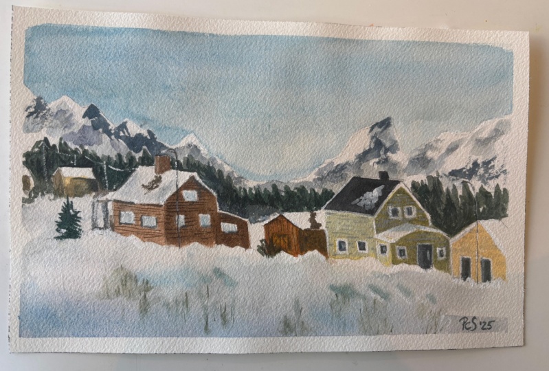
11. Mountain Town Drawing: Righty, let's go ahead and
get started with the drawing. And what I'm going to
do first is I'm going to get in this general sort of area of snow
here in the front, and I actually want to
maybe raise it up just a little bit rather than it being all the way
down the front so there's kind of a big mound
of snow here at the front. Okay, to the left hand side.
I'm going really light, as well, just to make sure. Yeah, just to make sure that, uh, it doesn't look too
obvious where I've drawn in. So it sort of goes up here, then it goes all the way across, maybe up to the
back, disappears, maybe a little bit further
past the center of the page. But in the reference photo, it's actually in the
center of the page, but I just want to
make it actually go up a bit further than that, just so that I've
got more foreground. Now, let's have a look we'd have to get in all
these little houses, and I know there's one here, so I think I'll draw in
this one first, okay? That's sort of like the rooftop, and then the bottom
of the house here. There's a couple of
windows, one here, one there, one sort of
window here to the left. And then you've got kind of, like, a little bit of
that detail on top. A lot of these
houses, you can see, they sort of just
overlap with each other. So you want to make
sure that they are yeah, that you're
conveying that. And here is this
sort of larger one. You can see the bottom
of the roof sort of, you know, it's this
trapezoidal shape that comes downwards like this. And there's this kind
of triangular rooftop, again, as usual,
coming down here. There's on the bottom there, there's all this sort of snow, and there's a tree
here as well, okay? And we're kind of
having a look at where, you know, roughly where the
light source is coming from. It's almost like it's
coming from the you know, the top left hand
corner of the scene. So we're going to have to
preserve a fair bit of this light on the buildings. Here's another building here, just behind. I'm
going to get that in. It's actually got, that's
probably a bit better. This another
honestly, it doesn't really matter exactly
where the buildings are. But, of course, you want to pay enough attention
so that we've got enough room for all of
these little houses, okay? So that's kind of
like the bottom part of one of those houses. That's like the front of it actually here.
Triangular sort of bit. And I know the top of this
house sort of starts here. There we go, like that.
There, there we go. That's another sort
of one like this. Okay? Another house. There's another one
here kind of going up on the hill just behind it, so I'll get that one
in there as well. That's it's the great thing about all these houses
that they just overlap, so you don't have to
you don't have to kind of draw the entire shape
of all of them in. You kind of just overlap them. And that's just a triangle
there as well, like that. And then underneath again,
there's another house, and it's kind of like, again, sort of triangular part there, and the side of it
here, like that. Then the bottom of
the house here, there is also this
part of the roof there and it kind of
comes across like that, that right hand
side of the house. Just sometimes I've got to straighten out
these lines a bit, like this. There we go. But, you know, let's not get too obsessed over all the tiny
little details, okay? There is this kind of,
I don't know, like, a little shade here underneath
this part of the building. So just kind of draw that in. That's in front
of the house. It kind of goes down a
bit further like that. And then there's just
sort of snow covering it and some trees here. Okay? Something here in the front.
I don't know what that is. I reckon I'll just leave it. We've got still that
amount of snow. There's other sort of
little blocky bits of snow, a bit of darker bit of
snow there as well. Behind here, there's
an interesting looking little shack
I want to put in. So let's get this in. It's a rooftop like
that. There we go. I guess it might just overlap a bit more with this building. That's fine. I'm not fussed. Okay, there we go. That's
the sort of rooftop of it. Either right hand side. Yep. This is all going to be, pretty much it, I think
for the buildings. I don't have anything quite really anything else
to put in there. Now, here in the background, we've got quite a bit going on. We've first got all
these mountains, so let's draw them in. I'm going to just use edge
my pencil like this and just get in this first layer
kind of mountains here. Okay, I want to make them
maybe a little bit taller than they are higher than
they are in the reference. Again, it's just
it's a preference, and sort of change
things around, if you will. There's
another shack here. I almost missed it. I might
just get in the rooftop, something like that so
that it looks like there's something here in
the distance. Okay? While we're at it.
Let's put in some of these other pine
trees or whatever. Yet pointed looking trees, Christmasy Christmasy
sort of trees going in like that. Okay? That sort of that layer, and
you can see them all kind of form a bit of
this break here, and this is going to be great afterwards as a bit of a guide
for our pencil work, okay? So see them kind of come down, and there's a shrub here as well coming into the foreground. Yeah. But these little trees are going to help to
indicate a sort of, it's going to indicate
the snow a bit better because it's
going to be a bit of, like, negative painting. Let's have a look what's going on here in the background now. We do have another layer of mountains here
in the distance. I'm going to put that in a
little bit of something here. No big deal, something
comes forward here. There's a peak,
mountain peak here. Comes down, sort of,
there's shadow there. There's a bit of something here, and then goes up again. There's a peak here, mountain peak coming down, and then you've
got these sort of, you know, bits that just
run to the right as well. And these peaks,
you can see here, they kind of got a bit of
detail in them, as well. So just kind of color in
a bit here and there, but it's not a big deal. The background mountains,
you always have to remember mountains in
the background are going to be darker
than lighter than the ones here in the
front and the sky and the snow are pretty
much gonna be the lightest elements
in this scene.
12. Mountain Town Painting: Alright, let's start
with the first wash, and I'm going to use
some really light paint, some cerulan blue,
almost diluted down to nothing about
1%, maybe cerulean blue. The rest of it is just water. And I'm going to carry this
wash all the way down. Right. Carry this wash
all the way down. And we're going to
go over the top of some of these
mountains, as well. Let's just do a bit of cutting
around work like this. Okay. Now, these mountains in the back are actually
a little bit lighter, a little bit darker
than the sky. So we can indicate
that afterwards. But for the time
being, I will just do a bit of sort of cutting
around work, okay, like that. This is just cerulean blue. I find that's a great
way to indicate some of this snow and it reflects the blue light that's not able to
be absorbed, okay? I'm going to go to go
over this again a second round afterwards to make it,
you know, properly dark. But this is going
to do just fine. For now, yeah, just so that this wash goes all the
way through, essentially. Okay, you leave bits of white running through
as well. That helps. And we've got this
sort of second layer of mountains directly below. So again, I'm just going to
flood that with some blue, you know, a bit of
blue and we'll leave some white of the paper
as well in there, okay? Moving all the way
down the page. Alright. And let's have a look. Now, we're getting into this
sort of snowy region, okay? This snowy kind of region. Um, and what I will do is start putting on this area sort of
dry a tiny bit first. But just in the snow, I think what would be
nice is if I just start putting on a little bit
of this grayish value. Okay? I've already got
some pre mixed gray on the leftover from
my previous wash, but just any kind of grays fine. Mix your three primaries
together, okay? And you can see
here in the snow, there's just some gray, you
know, bits here and there. It's kind of like a
slightly cooler gray, but it's just mix a bit of ultramarine into this gray to
just cool it down a touch. Okay, there we go. Yeah.
Yeah, there we go. This is a little mound of snow
as you can see here that I can just paint in
bit bit by bit. Keep it really light. You can see here in
the ground as well. You've got some other
sort of bits of snow, darker parts here and there. This is really your
chance to just get indication of some of
this at these troughs, peaks and troughs running
through the snow, okay? Um, yeah, keep it so light. I mean, I'm just
using a tiny bit of a tiny bit of
paint. That's it. Just a tiny little bit of paint. You know, there's a bit sort
of running in here as well, underneath this house
there, um, like that. Underneath here as well. Okay? Do you notice bit of it underneath
areas of the house, like here as well? Um Yep. And I might put in
just for the sake of this painting so
that it looks a bit more so that there's a bit
more color down at the base. I'm just adding a little
bit of cerulean blue, very, very light wash of it. It's almost nothing, okay? Just a little bit
of something there. You've even got these
little sort of, you know, little footprints running
through the scene, all the way running through
to the back like this. Like that kind of
leading into the scene. That really does help,
maybe a little kind of other this trail running over there that I want to sort of
wet this part of it as well, just to yeah create
some softness. There should be
some softer edges around these bits of snow, some parts of it anywhere. I just want to soften that
down a touch because parts of it look a little too
harsh at the moment. There we go. Just soften some of
this stuff down. I can go back into
it afterwards. Anyway. Um, Yeah. But I like these kind of
little little footprints that you can just
sort of put in here. It could be a sled or
something as well. You can just see some
marks running there. It's just indicative
kind of work, and you're not really too focused on making
sure it's like 100%, you know, accurate,
just enough us enough to imply
what's happening. In there, this maybe should
be a bit darker here. Yep. There we go. More blue there a
little bit more blue. Okay. There's even
some darker bits of snow here in the background. You can see just
these little bits, peaks and troughs here
running through the back. Okay. But you want to leave
enough white back there, as well, because when we
start putting in these trees, it's going to make more sense. The light's going to start
coming out from the snow. So I've got a larger but
maybe not such a large one, maybe a medium
sized round brush. I'm gonna mix up some green. I've got a whole bunch of
green on my palette anyway, but all you need to do
is just mix up maybe a bit of blue bit of yellow
to get yourself a dark green. And if you mix more blue
in that you're going to get definitely gonna get more of a darker
sort of green color. I like to mix a
little purple in it sometimes as well. Yeah. But I've got a few different, you know, sort of
greenish values here. Now, let's go and drop this
in. Let's have a look here. There we go. Now, it's kind of it's almost it's almost
black in some parts. I want to just make sure
I've got some blue in there as well to really darken this off. There we go. That's better. And you can see here I'm
just sort of feathering this brush in to
the previous wash, which is still wet. Right? And then I'm
also cutting around this little building
underneath that. Okay. Very sort of light indications of what
is happening back there. And really kind of goes
all the way down here, to be honest, like,
just behind this part. The snow. Let's keep going. And
this is pretty dark. I mean, it's mostly
paint in here. It's mostly paint. Some purple and green 'cause I just
want to darken down that. Yeah, I just want to darken down the um the green a bit more. Drop in little
kind of, you know, sideward parts, there you go cut around this
sort of mound. Snow here, this is a lot of dry brush work now because all this area is
pretty much dried. I need to mix up
more of this paint. There's not enough in
here. It looks too. There we go. That's better. Just cut around this, um, sort of mound of snow. Near the base of some of these, I just really want to make sure I'm darkening
enough because, yes, some of them just do not look dark enough to my liking. Here we go. Nice, sharp border
where it hits the snow. Cut around this building. Yep, there we go, just really nice and dark behind
that building. You can leave some looking
a bit lighter as well. They don't have
to be super dark, but I find that if
you make them darker, the contrasts really, really
start to pop out more. Okay, I'm going to go down here. Now, in this area,
there's actually, I should have put a house closer up here, but it doesn't matter. More green, a little
bit more green now, it's kind of a bit too purple. But it doesn't matter
as long as you got a dark value in there,
you'll be fine. It's cut around that rooftop. Yeah, there we go. And I like to do this
all in one go because, you know, it's gonna look
better, in my opinion. Okay, that sort of
house there that was on the hill the back. I'm going to bring
that out of touch. You do have permission
to change things a bit and exaggerate
with watercolors. Don't want to make
everything look too picture perfect exactly
like the reference. Sometimes the reference
needs a bit of work itself. So this tree here has kind
of got way more detail. Let me see if I can
imply some more of this goes up all
the way to here. There we go. Let's just
try to imply some of that. Yep. K. There you are. So we've got that
sort of tree line there in the background. This roof is looking
a bit wonky. I'll just fix this up. It's looks a bit better now. Well, maybe just
straighten up this area. Yep, angle it off.
Okay. Great. All right. So now we've got
definitely, like, a much more, you know, strong indication of snow. Down here, I've
noticed there is, like, a lighter shrub. I mix a bit of yellow
into it as well, so that it's kind of like more
of a more contrast in it. Something here, just, you know, some something growing, maybe. I don't want to overdo it as well because there's
actually not much. There's almost nothing coming through here in the first place, little sticks,
really, dead sticks. But, uh, look,
probably more brown, as you can see, I've added in. There's this tree here that's, like, really dark, as well. I'm gonna get that one in right in front of this building there. Do we have any more? Do we
have any other buildings? Not quite. No, not quite. All right. I'm going to put in a little bit of color for some
of these rooftops. Some of them are a bit
more kind of grayish. For example, this one here, I'll just add in a
little touch of gray so light running through
that right hand side, because the actual
light is coming from the top left hand corner. So you're going to get
more light running through the left
sides of the roofs. But, you know, again, it's something it's something that you might not want to
bother too much emphasizing. You can leave them all
white if you want. That's going to do
the trick, as well. But yeah, this is
technically going to be a little more accurate. Let's just do it here. Yeah. So you got kind of variation. Some of the roofs are a little bit darker and some of them it's can have more
light showing through. Okay. I'm just gonna
try to make sure I cut around this block of snow better. All right. These trees here have kind of disappeared a bit, fortunately. Alright, let's put
in a bit of color and stuff into the
house to the houses. I've got some yellowy value. Now, these are just the
darker colors that we really need to add in
to finish it off, okay? A bit of yellow and
a bit of purple. Okay? These are
complimentary colors. And when you mix
them together, it just sort of dulls
them both down. So that way you
can get a kind of hopefully a yellowish color that just looks very dull.
You know, here we go. So this one here, let's get this sort of front part
of the house here. There's just
something like that. Um, yeah. There's a house
behind this one here. And underneath as well, maybe a bit of darkness. And there behind as well. Yep. Good. You got some of these houses
here that have more of a certainly more of
a darker value here, like in the front of them. So I'm just going to
darken here. All right. That's just going to indicate the light source
coming from behind. There's also going
to be some darkness underneath the houses like there maybe a touch of yellowish
value right at the base. Okay. Okay. Just trying to find ways to simplify this really
simplify this down. Um, good. Yep. Ways to kind of join up
all these shapes as well. It's this house, yeah, we've
got that house in there. There's a bit of this kind of house there in the
background, actually. Can try to get some
color like that there, but I'll leave you know, this could be another
something here as well. A little building in the
back little building here. The background. If you get it to mix in
with the rest of the stuff, it actually looks much better. I've got brown,
some darker brown. Let me just grab some
of that burnt tumber, mix it with some purple, burnt tumber and purple. Let's see if we can get
a really dark value. Again, here for this
side of the building. We do both at the
same time, actually. That There we have it. Sort of goes right
to the ground. That here maybe a
bit of darkness underneath the building
and right here as well. And, you know, you've
got this rooftop, this stark sort of rooftop here in the
front of this building. So again, you're kind of doing
the same thing just, like, cutting around the rest of the buildings and
letting areas join. See, I'm just letting
some parts of it join. I'm not really worrying
too much sometimes. That's going to help
it actually look more as one, you know. Sometimes you have everything that's all the houses
are too separated, and then it just suddenly doesn't really make
sense anymore. So I really think I need to
just add some more here, yep, there underneath to help this house to come out more
in the background like that. Right. Take a look further down. You know, we've got
this sort of rooftop. There's a bit of
darkness in here. A bit of darkness here. Let's just color this
biting. Yeah, we have it. Remember this is sort
of creating a bit of sharpness on the rooftop
of the building below. Okay. So more here. Bottom part
of that building behind. You also kind of covered in
snow. What else do we have? Should be something
here. I don't know what that is,
but there is, like, a some shape there. And of course, this one here, I'm going to pick up more
warm paint now, warm this up. There cut around this
little thing that. There more yellow.
Where's the yellow. Just make this a little
warmer. Okay, good. To warm back again. Just has to be darker
than the roof. Nice sharp edge there. Good. You got that sort of snow. Running underneath like that. Um Alright, good, good. So we've got, you know, the basic details of
these buildings in now. Let's give it a quick dry, and I'm going to put in the
mountains in the background.
13. Mountain Town Finishing: Okay, let's go ahead and paint these mountains
here in the background, what I'm going to do just spray the bottom of this
scene a little bit. That way, once I put in some
of the paint it's going to hopefully spread and not go
too much into these trees. So yeah, let's give this a go. I've got a large round brush. And these sort of ones in the back are going
to be a little bit easier. I'm just going to pick up some
blue higher concentration. Let's just get this
going through. Now, of course, the
temptation is to really over you know,
overthink this, all we have to do is just
put in a darker wash of paint so that it comes out
of the sky, essentially. So we just got a bit
of mountain there. I'm trying to go over
some of that lead pencil, as well, by the way. There we go. Sort of cut around that larger
mountain beneath. Here. What else do we have? This one here, maybe. And you've got a bit
of darkness here. Let's just drop some of that in a bit of shadow
running to the right. A lot of this going
to try to keep soft and not too detailed to just let the paint
do its thing. Okay. I can exaggerate
some parts as well. You can put in a bit more
white in some areas if you think that's
going to look better. Okay. Just as long as these
mountains at the back come forwards a little bit more, I think I'm happy with
how that appears. They also run to the right, so I'm going to just make sure I'm putting in
more blue here as well. Right hand side. There we go. And as you can see, sort of blends a little
bit into the trees. That's no big deal. That's what we want in the first place. And we've got this big mountain
here in the foreground. Midground, sorry. And I'm going to mix some
blue with green, a bit of ultramarine blue
with a bit of green. Uh, yeah, that's
maybe going to make just a dark sort of teal
color. Alright, let's go. Let's just go for it here. So this is the sort of edge. We've got some of
these trees there, and interesting because
you've got, like, some bits of light
running through as well. So I'm just trying to
drag my brush across some parts to indicate
some of that light. But then also making sure I make it a little darker
on the right hand side, too, because we do need
these mountains to pop out a bit more oh, that's
too much blue. That's right. Mop
that up a little bit. Uh, yep. You get too excited,
that's what happens. And I'll just put in a little
bit more green in there, maybe. Doesn't matter, kay? As long as this comes
forwards a bit, a bit more of that purple, bit more of that bluish
value here comes down, goes to the right,
comes down here. Sort of like a little wash
of color in the background. Just as long as it's nice
and soft, I'm not fussed. Okay? And of course,
we've got all these, you know, trees
here in the front. I'm really thinking
I'm going to have to re jig some of these, make them, a touch darker. So yeah, I'm probably going
to have to make them a touch darker again because we've got all this extra stuff I've added in here
in the background. Let's just go and do this. I've got some darker
paint, blue and brown. Just mix those together, ultramarine blue
and a bit of brown, and I can now just
drop this in and make these trees stick out a bit
more. Yeah, it's difficult. Once you re wet the paper, a lot of these trees then
just start to disappear. So you can bring that back. Like this. So they
just pop through more. I probably won't
mess too much with it further down the page because a lot of this stuff it's going to
dry the same value anyway. But yeah, these trees really
need to just come forwards. And the only way to do that is essentially darkening them, adding a bit more brown and
blue and a bit of green, any sort of dark value to tip this back
tip this forwards, I mean, And if anything, it might help just create
this sense of layering with the trees some might
look further back, some might kind of
come forwards as well. So Yep. One bit here. I want to
make this come back come forward a little bit to help
shape the building if I can. Sometimes I just look at
ways to take advantage of this negative painting
effect as much as I can. Okay. It's not going
to be perfect, but you're gonna get
something decent from this. I do like some of the trees, how they're sharper
on that side as well. Okay? Good. So I think
those mountains actually look quite quite okay
there in the distance. Might want to do something like, just tap off a bit of paint these ones in the
background to lighten them a bit. Really not a big deal.
I think they look fine. Little details. So I've got a small round brush here and I'm going to pick up whatever
paint I've got left, and we're going to put in
some final finishing touches just darken some areas
like the rooftops, you know, this here,
especially this is sort of, you know, this area of the roof. For some reason,
it's darker on top, and then on the bottom, it's,
you know, it's lighter. It's just the design of
the building, I guess. So, you know, I'm going
to imply that there's also some windows here on
the side of this building. We can just pop those in, you know, door or something
like that there there, you can really take full
advantage of this these darks blue ultramarine blue and a
bit of this burnt umber does it makes a great
dark value as well. Oops. A little round brush. That's
all you need for this. Okay, let's have a look.
Maybe work on this part here. Okay. Something here as well. These couple of houses and the windows there maybe
something back here as well. That sort of house there, maybe a bit of darkness
under the roof like that. Here, again, sort of emphasizing that dark darkness
underneath the roof area. This kind of needs to be
darkened a bit as well here. You know, we have to cross
to the right hand side. It's just a bit of final
sort of finishing touches, really, to bring
it all together. Even this little shrub, I could just darken
that down a bit, add some more green
in it like that. So it would look good. This little shack. You know, the funny thing about
these kind of some of them have these sort of you can just see the wood woodwork. So I can just emphasize
a bit of that on there. Let's have a look at
this one, you know, maybe some downward sort
of brushstrokes again. This one here, just some more
little details like that. The underneath this rooftop, bit of darkness here. Okay. Great. I think what I'll do is now just add in a little bit of, I guess, a snow effect further
down the page. So picking up some
grayish paint, and you can just see areas that you could bit
more blue in there, kind of like a blue gray
color, cooler gray color. Seeing some areas where
you've got some bits of snow like darker snow
running through in spots. And you can just indicate like this just little little
changes the snow. That that You can even use it to sort of cut around some
of the buildings. Some of this area here
in the back, I think, I need to just fiddle
around with this a bit. Well, this is going to
help to just bring out the rooftops of some of the houses out in the
distance like there. Okay? This is going to be a bit darker here as well. There's sort of mound there. There's a sort of mound
of snow here as well. Let's have a look where else little little areas that might. There could be the shadow
of a tree or something more here, a bit more here. Let's get some
more blue in here. You're leaving a lot
of white on there, though. Just remember that. Eating a lot of white on there. I feel like this needs
to be darkened a bit of mound of snow,
something there. Yep. So you got maybe some little footprints that
I can just quickly get in running through the scene. There's a little shadow
shadowed parts on the rooftops, like, for example, here, that's going to be a little bit of shadow there and there. Just drop some colouring. Yep. Yep. Yep, yep. So you're just
outlining parts a bit. Oh. Thing was finished.
14. Nocturne Drawing: All right, let's work on
the drawing for this scene. And of course, all the way
here in the background, roughly about, yeah,
I'd say in the middle, slightly right of the
center of the reference, you can see this house, and that's probably the
most important shape that we need to place in here. There's actually a smaller
looks like a hut or something, smaller sort of air on
the right hand side, which I'll draw in as well.
Do that first, actually. It's just like this
triangular shape like this. And you've got kind of the
side of it like this as well. Now, this is actually behind
a a bunch of trees here. So I think I'm going to shift
these trees a little bit. Let's just shift the
general location of them. And I'm just going to put
them in with this very, very very, very light
sort of marks here. They're just triangles, really, because that's what
these trees represent. I mean, they look
almost like triangles. So we can get them in like this, perhaps perhaps a bit
larger, as well. Yep. Um, maybe I'll put in one more here on
the right hand side. There, let's get a drawing of this house here in
the background now. Okay? So it's actually sort
of overlaps with this one. So you kind of got
the back end of the house running like there. And then it runs all
across like this. And then you've got this sort of triangular triangular
sort of shape. Probably doesn't run
that far, actually. Little bit less.
About here maybe. Okay. Triangle but then there's actually little
elements inside. You can see the sort
of little areas inside that are a bit lighter. Darkness there.
Let's have a look the second little floor
or whatever you call it. There's actually a window.
Right in the back there. It's like a lot of yellow
light coming out of. I'm going to really take
advantage of that yellow light. Let's see further down, you've kind of got this again, these sort of this sort of
white bit of area here. Draw that across like that. And the bottom part just kind of just
comes out like this. And, you know, there's a lot
of stuff here in the front. I don't even know what this is, but I think they're sleds, snow sleds, who knows? But there are some windows that have some light
coming out from them, like these here, just
a couple of windows. Let's put them down the bottom. This part of the house
comes out like this, and then sort of it's a
bit running to the right. And it's quite difficult to see roughly where it ends because there's
just so much snow here. I think these are like logs or something here on
the right hand side, and then it just
basically becomes snow. But the base of the house here does have some
snow around there, a bit of snow here. Go. That's basically it. I mean, I think there might be a person. You might just put in
a quick indication of a person maybe standing here. Okay. Why don't we put them
in afterwards? We'll see. On the side of the building, there are also some little
little kind of marks, details there that are
just not covered in snow. So you got this sort of part of the building there, the house. Then you got a bit running
towards the back like that. And we've got, like I don't
know what this is a chimney. Maybe it's a chimney.
Yep. We can get that in. It's not covered in snow. It's just, like,
a little darker. And then there's something here, another sort of structure, which I'm not really
familiar with, but again, I'm just going to
draw it in like this it could be a window or something in the
attic area of the house. It's gonna be dark, and you can see it's sort
of covered in snow as well. But except for a few parts. So I think that
looks pretty decent. Let's just connect
this up a little more. Um, yep. This whole areas, pretty
much in the dark there. And here as well.
There's another window to the left as well there. Good. What else do we have? There's like some snow sleds. I think those that's
what they are. These little snow sleds. Let's see if I can get a
little indication of them in. Yeah. Whether I want to put
them in afterwards, we will have to see. There are some little poles
or something there as well. Like I was drawing
them in before. I only that, you do
get some smaller sort of power poles running
there, as well. This is going to be interesting. Whether I want to put
them in afterwards again. That's another something
we have to see for later. This structure to the right, I can't really see it properly, so I'm just drawing it in in a very basic sort of manner,
a bit of shading there. Little figures in
here might just help. I don't know whether we want to emphasize this or too much, but just some people perhaps standing by in the snow to just give it a
little bit of life. Okay, I stand back and just
have a quick look again, and we want these, like, trees here to have a bit of um, you know, create this
sort of negative shape with the snow covered
areas in the front. So the trees actually just sort of line the
path, if you look at them. Some of them are smaller,
some of them are bigger. And, you know, as you look
at how I'm drawing these, I'm just making them this
triangular sort of shape. Okay? Nothing more, nothing
less for the time being. When we actually get in
with the watercolors, we can detail them
a little bit more. There is some larger
ones here just behind the the houses there, there's, like, quite
a large one here, actually. It's really big. Um, they create a bit of this opening in the
center of the scene, and you can use these trees
to frame everything as well. And notice how they
go a bit higher on the left hand side. So yeah, just make those
a little bit higher, and then you can see them sort
of come down here and they form like a bit of a
path in the center. Okay? So this is just a
little a little indication. I think this is
going to be good. Maybe put another one in front. So it sort of leads the
viewer through here. Okay. You might
have some just by themselves, hanging
around themselves. The other ones. Okay. But I think this would
be a pretty good drawing for us to get started now.
15. Nocturne Painting Light: Alright, so analyzing
this entire scene, the most important
thing we need to do to begin with is to
preserve the light. And we can see, of course, on part
of the building, so we can see on the you know, the windows, we've got a lot of yellow light coming through. The ground also has a ton of this sort of what
would you call it, like warmer light hitting
the ground, okay? So I want to make it actually
a little bit warmer, yeah, the same sort of
color temperature as the sort of yellowish, you know, yellowish sort
of color coming through. So I want to do that in wet, which means I'm going
to have to wait a little bit to do that first. But for the other parts
like the little windows, I'm going to grab
a bit of yellow. This is just a little
bit of Indian yellow, and I'm going to
drop that straight in to the window here, and I'm just going to color that straight in
because there's not really anything else in there
besides the yellow, okay? Nice. Like that there. We can put a bit there as well. You know, let's just bring that across a little
like that, as well. There's even some
little bits here, bits of light for
some other windows in the the side area like that. Okay. Great. Maybe a
little bit here. Okay? Louison I sort of add in all this stuff now is
because afterwards, it's all gonna just
be so difficult to get in any of that light. So if we do it now, you're
gonna save a lot of hassle for yourself later. Okay. So always
remember as well, these trees we
look at the scene, the trees are gonna be
darker than the actual snow. And the sky, generally speaking, is going to be a little
bit darker than the trees, most of the trees anyway,
except for some of these ones, they're in the back. So let's go ahead and
get in. The details. So I just want to spray down
this area here so that I can get in a bit of that
yellow into the ground. But I'll cover this yellow
bit up the top first, give it a spray, okay? Like, I really just want to Keep it really wet.
Well as I can, really. Okay, I pretty must use the
whole bottle up for that, and I have a flat brush. I can just drop this flat brush through and mix the water, encourage the water to move around as well and
soak into the paper. Right. Don't worry about any other
details except just cutting around the yellowish parts. Don't want any of that
yellow to sort of yeah, to lose any of that light there. So I can cut around it like
that with the flat brush. Let's go further up. That as well if you get a bit of that washing the sky,
that's not a big deal. Okay. I want this to be
pretty wet. Okay, good. Let's have a look now. I will drop in some a little
bit of yellow here, the same yellow that I've
used or the windows, just a little bit
of yellow here. Alright, just to kind
of indicate that the light from the house is like emanating
outwards a touch. Okay. Really warm sort of light. I'll make it go
down a little bit more because it's tricky. You can often find
that it will just disappear once you put
in all the other colors. Um, I do notice a little bit, as well on some of the trees, like on the right
hand side of some of these trees because, yeah, you do get that with the
light near to other objects. Maybe a bit on this bit
of snow as well there. Yep. Better to have maybe a
bit bit more than necessary. Okay. Let's get going
and I'm going to mix up a nice wash of ultramarine blue, and
a touch of purple. I've already got some
purple here on my palette. Okay. There's a little
bit of purple that I have left over here, anyway. So I'll just mix all this up together because I think the ultramarine
blue is just going to look a bit too sort of
stark on its own, too bluish. So I want to make it a
little more purple. Okay. I want to mix up a lot
of this stuff as well. Okay. Let's drop some
of it here down below. It's looking all
right. All right. Good. Let's move
our way upwards. I'm really just wary not to let it go too far
into the yellow, but some parts of it
will mix, which is fine. That's what we want.
We want it to have a soft sort of mix as well. Okay? I'm going into
the trees as well. Into the distant trees and
even in the ones close by. And, you know, remembering
that the rooftops are also the same value, right? So I'm going to drop in some
of this into the rooftop, a bit more blue, tiny bit
more ultramarine blue. This again, cutting around
these windows and things. I don't want that to
go into the building. Okay, good. This will
mix a touch in there. And let's continue to
paint through here. It's got also this sort of at the back with these trees again, gonna tap in some
more of that paint, go around the side off the
left side of the building. And some of these other like trees here are just going
to drop in some color. And this is not the final color of these
trees, by the way. This is just the
base color. Okay? I'm going to move
that down a bit. It's gone too high. Yeah, let's just bring this
in the left hand side. And remember, the sky is
also going to be darker. I'm not bothered too much at the moment to
put all the sky in. You can put a very light sort
of wash maybe up the top. Okay. Good. Now, we're going to let
this dry a little bit. And because if we go in
now and start putting in all these, you know, trees, it's going to look it's
going to just be way too wet and everything will just
run all over the place. So we'll give it a little
bit of time to dry. And in the meanwhile,
I'm going to look at some brushes that
I'll potentially use. I think I'll use this brush, like a medium sized round brush. Some areas of these roofs are also the same color
that you see here. That's the same kind
of bluish value, which I'll pick up. Here as well. All right. It doesn't
look like much just yet, but we carry on and
we'll see how we go
16. Nocturne Painting Darks: Okay, so the paper
is mostly dried, and what I will do now is mix up a really dark wash of
blue and purple together. Well, a slightly
darker wash anyway. And I'm going to
just drop this in to create these little trees, shapes of the trees, okay, with a few little brush
strokes like this. Okay, and hopefully this
will sort of blend nicely, but also create enough of a sharp contrast
on the ground, okay? Because we've let everything
dry off slightly, right? So I'm just going to
go around and let's just paint in these trees. I think I made some
of them come down further, like you know, that drawing didn't really
too much use actually until just for the I mean, just for the actual
house itself. I think that was useful,
but apart from that, a lot of it was sort of, unfortunately,
covered completely. Okay? So let's just
continue on anyhow, and we'll get this
sort of roll of trees in running all
the way to the back. Okay, triangles, these
triangular shapes. I'm making some of them
go up really high, maybe even out of
the scene like that. This is just using it to cut around cut around
these buildings a bit. Rooftop here. Yep.
Want to preserve that. Okay. Going to add a few
more trees maybe to this side of the scene. That we'll get some more
triangular sort of shapes. I think the flatbush could
help a bit with this. Yeah, perhaps better. Makes
it a little bit easier, actually, to get in these
sort of triangular shapes. Maybe I'll put one here as well. Just have a couple that
are more by themselves. I just want that to spread
through and actually look more interesting in this scene because we've got a lot of yeah, we've got a lot of
stuff going on in here. But we don't have
just some areas that might help fill
this space further. Okay. Okay. I'm going to
drop in a little bit of purple purple and brown into the trees to try to
create a sense of darkness in some of the
some parts of it like that. So that it's not just
the same old, same old. The bases of the trees as well, you'll see that
there's actually a bit of shadow right at the base. So if I can join that
up nicely, again, just creating this Perfect. I have actually gone
over the top of the little hut anyway. But yeah, as you can
see, it sort of just brings out the detail, I guess on these trees a
bit more because there are some wet and wet details
that you can add in here. And you have to use
paint that's very thick as well for this, okay? It's just brown and purple
at the moment that I'm using for this
darker sort of mix. There's a base the base here. Base is here again. Put in a few of these little
branches and things again. It just makes them look a
bit more believable with this second second wet and
wet wash going through. Okay. I think there's some really dark
parts in areas as well that I can just
try to emphasize. Ah. Yeah, some really dark spots
in areas like here, even. You can just put in
a bit of darkness there to really
hope to bring out the building better maybe
behind it here as well. Okay? All these tree
shapes, some parts. Okay, I think I'm
going to go and work on the building a bit. I really want to bring the
details of the building out. I use a smaller round
brush for this. I'm going to mix myself
up a really dark color. So this is brown and a
bit of ultramarine blue. Okay, there we go. Got a really, really dark value here. And we really have to indicate some of this stuff properly.
Let's have a look. I'll start maybe on the rooftop. Here, there is a
little area like that. Yep. Just around the yellow, cutting around it
a bit like that. Okay, let's bring this
down to maybe here. Bit be touch and go happening. And underneath this part needs to be darker around the windows. Now, you see the importance of putting in all
that yellow before because it's just impossible
to get it in at this stage. I got some of these
sleds, let's put them in. I'll zoom into the reference
a little to see if I can, just get some little indications of the structure of them. They may not look
exactly like sleds, but, something like that
should be enough. Maybe some people, a
little figure here. Difficult to paint them in
at the size that they are. There. Great. Great. Let's have a look. The rooftop. But let's do this one first. This little building needs some darkness here.
That's all you need. There's some little something open on the side of
it doesn't matter. Okay. And on the sides
of the roof again, there's sort of parts
like I mentioned, sort of drew them in before, but thinking whether I want to actually imply them or not here, where there's actually some
darker spots on the roof, just where the snow hasn't
quite hit there and there um, this little chimney or whatever. Then there's this
other structure, which I'm not really
quite sure of, again, what exactly it is, but we'll put it in anyway. Side of the roof. And again, some little details
of its presence. It's kind of the
snow that hasn't quite completely
covered it just yet. I was all those wooden
planks or whatever that I thought I saw on the
right hand side there. Let's have a look
at the windows, maybe just detailing for them. Got a person here.
Let's try maybe. There we go. Got a person
there on the left, as well. So three people in there. I think what I need
to do is just darken this first wash a
little bit more. So I'm gonna go
ahead and do that. With a large lat brush. I'm going to put in just this same ultramarine
blue, purple mix. Okay? I don't want it to
be as dark as the trees, but just a little a
little bit darker, like one little wash. Hopefully, that will just because I think it's just a little
bit too much light or the appearance of light
anyway on the buildings. So if I do this, it might help. Though I might actually leave the top of the building.
We'll see how we go. Because that first
wash is mostly dried, we shouldn't have much
of a problem doing this. Um, where we might run into troubles is just around there, where we've got some
of that yellow, and I don't want to rid
myself of that yellow. So let's just darken this
part to the left first. We'll figure that bit out first, and then we'll do
the rest of it. Okay, good. That's
looking right. Do notice there's
some little, like, soft shadows underneath
these trees as well. I'm going to just imply
some of that here. There's even a little bit of shadow almost running to
the left of those ones. Um, yeah, it's not just completely the same wash all the
way through there, so this is going to
help actually a lot. And also, maybe in the front, I will try to add
some extra strength, a little bit of extra purple or something in there or blue. There we go, just to help
create depth in this scene. This part, again, we're going
to spray it down, I think, with some water to encourage
this area to blend better. But I don't want to I don't want to completely eliminate all this
beautiful yellow light. So that's what the
spray bottles for. Good. Good. So it kind of looks I think
it looks a bit better. This um, darken down that part
there in the corner. That looks too much,
a bit too much. Don't be afraid to lift
off paint in areas if you think it's kind
of overdoing it. And also, we can lift off right at the end of
the scene as well. So don't too much. Um, good. Good, good, good. Good. I think I'll work a
little bit more on these trees because they kind
of have disappeared a bit. So some more purple
and some more brown. And I'm going to just drop in a little more
something in there. Okay? Just some little
little dark bits, I suppose, in areas. Here, let's just
spray in some parts. I guess the sharper
brushstrokes, as you might say, kind of help to more contrast. I've got to be careful
as well, I tend to be impatient when I'm painting
things like this, okay? But I don't want to get rid of all that previous
wash because there's some very nice colors and effects in there that
we want to retain. Okay. Here, this other tree here, I want to also kind of
maybe darken a bit here. And when you got all these
trees in the foreground, it does help to just darken
them down a little bit. The ones in the background, I can sort of get away
with it and add in some sort of sharper
parts here and there, but it's not a deal breaker.
17. Nocturne Finishing: Okay, while I'm waiting
for this to dry, I'm going to put
in the background, and really it's
just a dark wash. I'm going to mix of purple
and ultramarine blue, a bit of brown in there to really get in the
darkness of the sky. I want to make it
a lot darker than the actual trees at
the back, anyway. So let's do this. Here we go. It's almost like
a bit of negative painting. Yep. M. To really bring home the idea that this is, um, the middle of the night. Okay. And it's
still a little wet, if you notice these trees, so they will they might blend
a bit into the background, into the sky, I mean,
but it's not a big deal. In fact, it's nice
if some of it does. Or brown. So more outlines of the
bottom of these trees. I need to kind of make sure
that they are separated. O. Maybe some little trails
or whatever going in. You can see some soft
wet and wet trails. You know, people snow
sleds, that kind of thing. You can see them just
sort of probably a smaller brush will do much
better. Quick with this. I've got a rigor brush, little ig of brush that will help a lot with this sort of miniature tiny little details. Oops. Yep. It looks like the sleds have just arrived or
whatever, come back there. Oh, I didn't want
that. That's right. Maybe some sled patterns
also running here. You can see actually
some running like here, and running across to the
right hand side as well. It's all wet and wet,
so it actually looks a lot lot better this way rather than Really
overdone and overworked. Yeah, just kind of
light brushstrokes. Okay. So Tony finishing touches now. I'm gonna pick up
some a little bit of guash here on the palette, but I'll mix it in with some blue to create a kind
of cooler highlight. I guess you could call it And let's have a look. What can we do? I think
we can probably put in a bit here on the
sides of the building, like a little Let's try that. Yep. Just some parts of the building, you'll notice that we have a little more
contrast like here, for instance, yeah, it helps to bring
out the shape of the building because we've lost. Sometimes it's difficult to tell where it starts
and where it ends. Kate, maybe here. Really light touch. I
don't want to overdo this Okay, let's give
this a quick dry. Alright, I'm going to put in a couple of these power lines, and you can see them just at the front of the
scene like here. Seeds, like, a couple of
couple of them just here. 12. Um, now, with the
actual lines themselves, I'm going to use a
rigor to do this. Try to keep it pretty quick. Um, yet, maybe this
one goes up here, like, into that building. That these power lines
help to just again, indicate that sense of
where the buildings are. And, you know, some
of this stuff is, it's just going to disappear
off here, for example, um, and we might have let
me be one running across here into
the building there. That you see these
little tiny little sort of things here and there
we can just indicate. I don't know, areas that might increase a sense of complexity, create a sense of complexity. Um, Okay. Extra darkness and spots. Really just detailing. Okay. And I will also use Bilbt brush, any type of brush to
sort of scrub out paint. You can use a round
brush for this. And I've got a issue tissue
paper here on the side, and I'm just going
to sort of scrub away at some parts
of the paper that I want to bring back and soften the
edges of that tree here. I just really want to
soften some parts of it. So just scrub out
with the brush, lift off like that. Even some of this
light you might want to potentially, you know, exaggerate and bring back out because there is some
other paint sitting on top. But you got to be
careful with this because it can also ruin the vibrancy of the paint. I think this should
be okay. Yep. Sort of nice, almost like blurry effect through the
back of the scene there. Can even create a little bit
of smoke, perhaps up here. This is just the last
quick little idea I had maybe coming out from this chimney to make it look kind of more cozy have that girl the
way up into the sky. It helps to break up that
sky a little bit as well. Yep. Parts that you just
feel look a bit harsh, you can just sort of
lift off with the brush. There's just so little
detail in here besides those besides the house. I just got to be careful. Okay Back to the filet brush again. Perfect for just bringing back a bit of that
light. Mm hmm. Kind of looking
like the light is of bouncing off
onto those trees. I'm just trying to see here. I'm just trying to just
disturb this a little bit so that it doesn't look like the same color
all the way through. I mean, there's even
another window there, but I can't really
indicate that. Now, um, I think I'll call
that one finished. You do the same thing on some
of the trees again just to bring back maybe a
bit of the light, the lighter sort of
parts on the tree. Some of the trees anyway. Don't overdo it. You.
18. Town Drawing: Okay, so we've got this
interesting scene here, and you can see, kind
of in the foreground, well, I guess in the midground, I do think I want to extend the foreground just
a little bit further down the front so we
can get some yeah, just a bit more feeling of
depth because at the moment, I think the sky just occupies a bit too much of
this composition. So if I shift it upwards, I actually think it's going to look a bit better
and more balanced. But yeah, just sort of
analyzing the photo, you can see the house right
in the center of the page. There, you've got the light
source coming from the left, kind of like the
back left almost, and you get the shadows cast on the right hand
side of the building. So keep that in mind when you're drawing this
and also painting. There's also some soft
shadows you can see on the house in the
center of the scene, and the roofs white. Believe it's just painted white, plus there's some snow on top, as well, or maybe it's
not painted white. But anyway, let's go ahead
and start with the drawing. So I think what
we will do Again, is shift up this horizon line. So you want to look where those mountains in the background end. And at the moment,
the mountains end, it's hard to say, on one side, it kind of goes through nearly the halfway point
and then slopes down. So I just want to
move that up a little bit so that the the line is roughly in the center
of the page. Okay? So let's just draw a little line running through the center
of the page like that, and then sloping
a bit downwards, you can see, there's a bit
of decline at the end, and that's going
to be important. If you keep the
line too straight, it just looks too
picture perfect. And of course, you get some
of those scenes in nature, but this is not one of them. Okay? So where this line
that you've drawn is basically the area where the mountains touch
the snow or the earth. So what we'll do
now is let's just get in a little indication of those mountains
in the background. So I'm going to use hold my pencil right at
the end like this, and I'm going to just draw
in some of these mountains, the silhouette of the
mountains in the background. And let's not take too
much time doing this. Now, of course, you know, wherever this is, and I'm pretty sure this is
somewhere in Norway. Someone might, of course,
recognize this location, but for the most part, you don't have to make it to
picture perfect. Just try to follow
the outline of those mountains in
the back, okay? And you can see it
sort of go down here. Now, this group of mountains
to the left ends just before it ends just before the center of
the page here, okay? If we want to get precise, in the center, there's
some more mountains. And on the right, we have other mountains
that kind of go up. There's another layer
here that goes up, it's important to put this
section in because this is an area that we're going to leave white till the very end. So got that in. There's also another
mountain here to the right, like, a very interesting peak. I think this is one that
we really have to get in. So let's just put
that in as well, roughly about here and bring
that downwards like that. Okay. And a little bit of detail in the
mountains as well. So you can see with this kind of peak of the mountain,
there's, like, a a bit of a ridge to the right hand side and
the right hand side of the mountain is a little
bit darker like this. And don't worry too
much about getting in all of these silhouettes exact. Afterwards, with
the watercolors, you can still cut around
and shape these mountains. So we'll go down
the page like this. Now, this mountain here on the right it's interesting because it's actually
there's more light on it, but it's actually
further in front. These mountains in the back are very bluish, if
you look at them. They're kind of bluish,
and there's also little ridges and bits of, these darker rocks that haven't 100% been
covered with snow. And those are just
important to kind of outline a little
bit, and here. There's a little bit of this
rock sticking out here. I'm going to color that in, and then you've got a
bit of white there. You know, I'm just
sort of putting in a little bit of
detail in here, okay? And more just to
remind myself to go in afterwards with a flat brush and get in some of those
little ridges, okay? So we've got those mountains
in the background. Let's go and put in. It's gonna be
interesting. Let's go to put in a bit of
a tree line here. In the back. And before
I do that, actually, where the trees sort of finish, which is a little
bit further down, I'm going to start putting
in some of these houses. Now, in the back,
I'm pretty sure. I'm pretty sure on the back
there, that's like some snow. So I'm not going to bother
too much with that, but I will put in
a few indications of some trees to the left. There's a tiny little house
here as well in the back. But I think what we
want to focus on is let's get these two well, not two, yeah, I
guess, two or two plus three buildings
here in the foreground. Now, we want to kind of find out where
is the center part. So if we have a
look right in the center of the reference photo, draw a line from the center
of the reference photo going up and cutting
the photo in half, you can see the center
point is roughly where this I think it's
a reddish house. Yeah, I guess this
reddish house to the left the larger house
to the left here starts. So therefore, we want to
just make sure that we have enough room when we're
drawing this in so that, yeah, basically, there's room for these other
houses to the right. So I always like to make sure that I'm kind of
marking this out a bit, and I can go in a little bit
kind of loosely as well. Now, the rooftops are
just this triangle shape. So we have to do is just
draw that triangle shape in, okay? Let's see how far we can
get this up, as well. Yeah, that's a little
triangle shape for that rooftop there that
comes across like that. The base is just
like a rectangular. You're looking at the shapes
and not thinking of it too much as a house or anything, you know,
got a triangle. You've got this line
running across here. It looks like I
think this must be a garage or a little shed
or something out the back. And, of course,
the shadow running across the right hand
side, of the building. And this one's interesting
because you've got some darkness and
snow on the roof. So yeah, mainly just put in this indication of the
little house there. So that's right in the center. Now I'm going to work on
this other house here, the main one here to the left. So you've got this sort
of side bit like this, a bit of white on top, and you've got the top
part of the house, just this triangular bit
runs just like this up, and then it comes down
here, a yo like that. There we go. And then I'm
going to move this down, and it's got sort of
like the snow just underneath the house
there, like that. Might look at this house a
little bit further back. Doesn't matter. Move
that across like this, and then you've basically gotten most of the
rooftop in now. Join that up. Okay. And we'll just get the sides a bit in. I think I've not left in just enough room
here to the left, but there's enough,
there's enough there still to put in some
bits and pieces. Let's have a look. The
back of the house, there's another sort
of triangular shape connecting onto the rooftop, and this is like a patio area or just a back area,
I suppose, there. Okay? And then, of course, you've still got that snow
that comes through the front. Let's put in some windows, and these windows are just
squares or rectangles. It's all you need to
look at them it's just a little rectangular shape. Okay, like that. On the rooftop, I've noticed there's
a little chimney. Let's just put draw this
chimney in, right there. There we go, and make it a little bit more
three dimensional. Okay? It doesn't have to be
perfect. Something like that. That's a chimney. And it's gonna overlap with all these trees
and stuff in the background. I'm not too fussed about that. The rooftop, you
know, there's, like, a bit of, you know, of the
actual roof showing through. Most of it's just snow, but I'm going to leave
it all with snow. Anyway, and let's have a look at this right hand side of
the house. It's darker here. It's a lot darker. So let's put in
these four windows. You've got two windows
here, one, two. And, this is the side
of the house there, and then you got another
bit here like that. Oops, let's bring this
down, more there. Then you've got a couple
smaller windows up here, and I mean, aren't they just incredible just the look of the buildings
and the windows. They look so cozy
really just so cozy. The frames are really important with these Scandinavian houses. The window frames, they just
always have these white, very, very precise, white
looking frames in there. So as long as you
can preserve some of those white frames into the very end and whether that be adding some guash or
whether that be just, you know, not
painting over them, that's really going to add to the location of
this particular scene. Now, again, keeping in mind the right hand
side of this building, dog gonna be pretty
much in darkness, okay? I don't you think
this Let me just get this part of the
chimney in. There we go. This part of the
chimneys actually dark, and the front there is
going to be lighter, okay? Get that in. Sometimes I might add a bit of pencil
in the wrong place. I'll just mop up, get rid of those pencil marks a remember this
white of the paper here is going to be preserved white right
to the very end. So yeah, we just want to
make sure that's in okay. Okay, so we've got that little
outouse or whatever it is. Then we've got this building
here to the very right, and I'm going to put this in let's have a
look roughly here. Okay. And let's put
this in it's kind of Large sort of building
runs right next to this kind of mountain. In fact, I probably should have put it in a bit
more to the right, but it's no big deal. Put it here next to the
mountain, bring the roof up. The roof goes all
the way up into these mountains like
that. Go like that. Then it comes down like here. Okay? It's like this
triangular sort of shape. There's a nice little
chimney here on top, so let's put that in
little chimney there. And then we're going to put in this mini kind of roof here. I don't know what this
is, the other part of the house there. And let's bring this across and also goes down to the right
hand side like that. Good. Okay. And let's just start putting in
the rest of the house, like the bottom part
of the house there. Let's let me grab my eraser. I've put a bit of pencil
here that I want to add in. Okay, so here, let's
put in some window, a door here, another
window here. And remember, just keep
them pretty basic. Yeah. Don't worry too much
about the details of them just yet. Alright. One thing always also to
remember is when you look at these buildings
on the rooftops, there's a kind of white area underneath the parts of
the roof, like here. There's also a bit of
white here, as well, like the frames, whatever
you would call them. Like that. Okay. And yeah,
here comes the windows. Add in a few more windows, just a rectangle there. We've got another rectangle
to the right here. This window, there's a
couple of windows here. Let's just put
those in like this. Just rectangular sort of shapes. There's another window here. Interesting looking
house. It's almost it's like the house has
got a front section. And then it joins onto
the back section of the house, just zoom
into the photo. See what is going on here? Okay, yeah, it is one
whole one whole structure. I was thinking to myself, is there a line here or
not, but there's not. It's actually an
entire structure. So, that's fine. That's fine. So this whole area remember is going to be dark on
the right hand side. So you can either color
that in or just, you know, leave it until later
on and figure it out just as long as
you don't forget. And this building here
to the right hand side, it's completely in the light. I'm going to draw this in, and I can actually get in a bit more of this building due to the space that I've sort of left on the right
hand side of the scene. So I'm going to just do
that. It's just get that in. Rooftop, it comes
down like this. There is I don't
know what this is sort of like empty space there, maybe a door here or
something like that. But the rest of it, there's just snow in front
of this building. There's not really much.
I mean, you can see here just in front of all these
buildings, there's snow. So a lot of this stuff
we're going to have to just leave yeah, leave until later. So we've got the main
sort of buildings in. Now, another thing
you can do is maybe put in some of these
buildings to the back. I noticed there is some
kind of building here. I'm just going to get in a quick little sketch of
that back there. Okay? Not too much going on, an indication of a house
there in the background. And then, of course, there is also maybe a smaller
one here in front. I can just get in to
okay, little house here. And that helps with
this feeling of depth, you know, moving
through the scene. Now, another thing here
is that there is a tree just running kind of
through this section there. So I'm going to put a tree here. That's going to help break
the scene up a little bit. And, of course, this whole
tree line here in the back, I can put in some of those. Now, this is really important. Now, why is this important? Because this is going to
bring out all that snow that's coming out on the
rooftops of these buildings. So I might actually
exaggerate this tree line a little bit there in
the background. Okay? In the front, we've got, I don't know, some tracks. We don't need to really draw
anything in the foreground. We can get that all in
later with some brushwork. Of course, there's some
little windows and things on these houses out
there in the back. There's another couple
of trees there. But for the most part, I
think we should be good to go with the painting.
19. Town Painting Light: Let's grab out a small mop
brush or a mop brush that's, I guess, large enough
to paint this scene. And let's work. I think probably what
we want to do first. I thought about this, but
getting all these sort of lighter values onto
the houses first, these warm values
because we're going to put in some blues and
stuff like that later. But yeah, let's do this.
How about we do this first? Let's put in these warm colors. Now, this house here to
the left it's kind of got a bit of this
reddish brown color. So if you can mix
a bit of red and a bit of brown
together, that works. They often, you know, a bit of burnt sienna often
works quite well. Keep it very light,
about 10% paint. The rest of it is just
water. And let's go in here. Now, you can, of
course, cut around these frames or if
you're like me, I don't sometimes I don't really bother
that much and just let it you kind of let it do
its thing until later. In fact, like, it's quite warm
on this side of the house. It's almost like there's
some yellows here as well, so I can drop in a little bit of yellow, something like that. But for the base color, mainly just, you know, that burnt sienna color. These little warm colors
are real important. They will kind of contrast against all the
coolness of this scene. Take a lot of care and use
the point of your brush to cut around and leave
the whites of the scene. So don't go into the roof just yet. Okay, let's just go on. I'm just putting a bit of paint here on the right hand
side of the house. Let's just see how quickly
we can do this now. Remember, the right
hand side of the house is going to be a lot darker anyway once we
get in the dark values. So don't worry about the exact value of the
right hand side, but we just want to put
in a bit of bit of color. The rooftop, as well,
it's sort of brownish, not the rooftop,
but the chimney. It's a little bit of
brownish value up there. So I might just work a bit on this and put in a bit of
brownish on the right hand side, just to indicate the shadow on that right side
of the rooftop. These nice little these
nice little round brushes are so useful. I find that they are I find that they just allow you to cut around a lot of detail. Okay, a bit of lighting on the left hand side
of that chimney. Like that. Um, good.
Let's have a look. What else do we
have? Yeah, there's this porch here almost forgot, but the bottom of it, it's got this brownish tinge
there as well. That's part of the
that's part of it. I might sort of get in a
bit of this here as well. There, this right hand side. I've almost forgot about
this side of the house. It's kind of like
brown, as well. So we'll get that in
keeping in mind, you know, leaving that nice uh, white section there
on the roof, okay? It's often just leaving out the things that
you don't want to paint in, especially with snow. This building in the
center is more reddish, so I'm going to pick up
some red and mix that into my brown and it can
be any sort of red. It can even be some orange. You know, I'll
probably mix tiny bit of orange here and
make it look a kind of rusty sort of color.
And let's get this in. Again, it has to
be really light, so drop this in. And, you know, a
lot of these houses also they come in various
different colors, so you don't have to
necessarily get in the exact color that you
see here on the reference. But yeah, just something
like this will do well, it actually becomes a bit more orangy or yellowish
further down here, kind of like this garage shed. Okay? Not not a big
deal. Not a big deal. Remember that
afterwards, anyway, we can get in a little
bit more detail. All right, so just
a little bit of that. That's going
to be house here. Now, this house
here on the right, we want to make this
really, really light. I'm going to mix a bit
of white paint with a yellow to get this kind
of milky yellow color. Okay, let's try that
out. That's good. It's kind of like a milky
yellow color for this house. It's almost I mean, it's almost white, but we can't Yeah, well, guess
you could put it. You could just leave
it white if you want, but I think it's going to look better if
we add in a bit of that. I value this sort of
milky white color. I mean, it's just
the same color all across the sides of
the building, as well. We can get in some
darker bits afterwards. That's fine. Yeah,
for the shadow, but just a nice little
wash. And this is, again, really light a
really light value just running through the
whole building like that. Same thing here for this
building here to the right. In fact, the building
here the right maybe has a little bit more yellow in it, a bit more vibrancy, so I'm just going to add in a
tiny bit more yellow. Make this one look a
bit different from the other one like that. Okay. Good. Ah, ruddy. So. Now we've just got a few
more out the back here, like these small houses, I'm just going to put a
little bit of yellow onto them onto the left hand side, on the right hand
side of the house, and leaving the rooftops
white, as well. Again, just to
emphasize that snow. Good. So look, we have got in basically a lot of
the warm colors, okay. This is going to dry.
We want to let it dry and do its thing because by the time we finish
with the background, this should be done. But this is the point where I like to pick up a
small flat brush. So a little flat
brush like this and basically just work
on some uh yeah, basically just
work on getting in a light kind of bluish value. So here I've got a bit
of ultramarine blue. It's a very light blue, but I'm going to dull that
down with a bit of gray. And I just want this to be enough to coat these
mountains up in the back. Right? Very light washes, probably about five
to 10% paint, okay? There are parts of the
mountains that you can see that are sort of white, so I sort of scumble my brush
over the back like this and let the brush sort of
skip through in areas. Okay, so just sort of go through 'cause this
whole area is actually, um, you know, it's
actually quite blue. And it's almost one big shape. But the left hand side of
the mountains, you can see, there are some little type, sort of snow capped areas, so you want to leave that in. Don't try to paint all
that stuff in just scumble the brush across and make sure this is a very
light wash as well. Don't um, make it too dark in those mountains because that's going to help to
push these mountains back. If you make this wash too dark, mountains are going
to come forward, and it's going to look at it's gonna look
a bit strange. So let's move this across. And, of course,
these mountains that I've joined in are not really in the same position as they are in the reference photo.
It doesn't matter. Let's bring this
down here, here. And then as we get down to
the right hand side here, this sort of mountain here
on the right, you can see, it's actually so you
can see, it's actually, um, actually darker
some parts of it. So I'm going to just go in with this flat brush,
same sort of deal. Let's just get a few
little quick sporadic kind of marks on this mountain, but leaving a lot of
it white as well. Okay? Just cutting
around the rooftop here like that. Trying
to blend that in. There, let's put
in a bit more of this blue up the top here for
this side of the mountain, this right hand side
of the mountain here. Okay, that's got to be darker. Bit more blue. It's kind
of turn a bit greenish, but it doesn't matter. There. And again, more of this sort of dry brush stuff here on the right hand
side of this mountain. You know, a lot of a
lot of this area is just going to be yeah, a lot of this area is just
going to be not much in there. It's going to be kind of the
white of the paper anyway, but some of this light work is going to definitely help,
especially, you know, going around the sides of the house there as
well kind helps to bring helps to bring out
the white of the rooftops. Okay. That's about it. Fantastic. Just kind of having a quick
look to see how I'm going. Okay. Okay. Great. So I'm going to just do this
really really quickly now. Let's bring out some more. I'm gonna use my uh I'm
gonna use my main mop brush. I should be able to actually do this really quickly
mop brush and a little Just a little
round brush first. So there's a tree line here. So I'm going to
drop this tree line in right there underneath. Underneath the mountains
so that I can get this to sort of blend in
a little bit with the background mountains and
cut around these houses, the rooftops and
leave the rooftops. Remember, don't try to paint in all the
everything in watercolors. Leave some bits and pieces. I'm just going to drop
that into the background. It's kind of like
a greenish value, but I can drop in
other values as well here, just around there. Let's just see how we go. In fact, there is another
I had almost forgotten, but there's actually another
building right here. I've forgotten to put
in. You know what? I'm just going to just go to
pretend that it's not there. Let's just go around
it like that. Okay, so we've got the kind of rooftop of that building here. I'm going to go around. Let's
just I'm going to extend this tree line all across. Check this out. It's kind of more exaggerated than the
actual reference itself, just to make sure
I can get really that white effect of the
rooftop coming through, okay? Go with a soft touch and
every kind of brushstroke, just get that to indicate
a tree, basically. All right. Again, cutting around this rooftop here of this
building to the right. There, there. And you'll notice everything is sort of a bit wet
in the background, which will make this sort
of, blend in better. Here. There we have this
other house to the right. Bring that down a bit here. The Woops. I've got a bit of
paint on that house. It doesn't matter.
Yeah, no big deal. Okay. Same sort of deal up here. Let's just bring in some more of these trees and things
on the right hand side. Let's cut through that. There
around this rooftop. Yeah. The Okay, so we've got some like this tree line
there in the background. Fantastic. Now,
here's the fun part. Let's paint all the snow. Let's paint all the snow here
as we move down the page. And all we need for the snow is just a light wash of
ultramarine blue. Extremely light. I mean, I'm talking about
one to 5% paint. And often let's see. There we go. Some of this
stuff might run a little bit. I might make it just
a touch darker here. Yeah, a little bit
darker there in the background with the blue. Okay, there we go. Just dropping that in a bit of that blue in the background. There, not too blue. Now, the reason why
snow is blue is that it basically is not
very good at absorbing. All these blue wavelengths. That's why we see
it often as blue. So the trick is to add in
a touch of that coolness, but not to the point where it just becomes overwhelming, okay? So as we come to the
foreground, check this out. I'm just, again, really
light wash of blue. If you can't control
this as well, you can try to use something
like cerulean blue, which is very, very
light, as well. Alright. But through all this,
always make sure to leave in some actual
white of the paper. That's the trick. You don't want to leave all of it white, but you want to
leave enough of it white to kind of make this
snow look more interesting. So bring this all
across like that. Very light. This is
only not even 5%, 1%. Of this cooler sort of paint. And look here how I've just left out some white
of the paper. Okay, let's move
the wrestlers down. Let's have a look how that
appears. Good, good, good. Good. Another thing you can do is you can also add in a shadow
coming in from the left. Now, I just want to do
this for the sake of it, but I'm going to just move like, make it look like
there's a shadow coming in from the
left like this. Okay? It could be another
house. It could be anything. But in these sort of scenes, I find a bit of contrast
a bit of contrast, especially in the foreground, really helps to bring out
all the the other lights, the lighter sort of snow and
bits and pieces later on. Okay. At the moment, it doesn't really
look like anything, which is absolutely
fine because remember, we're not really trying
to get in any details. We're just trying to
get in that first wash, first kind of lighter wash. I mean, of course, these trees here in the
background are a little bit darker, but yeah, I'm actually going
to go over them again a second time later, I think, to just
darken them a touch. Let's have a look.
I have a look, what else do we want to do? I'll just slant the
paper down a little bit. Sometimes that helps to
encourage the paint to move down so it doesn't
sort of travel up too much, okay? Good. A little fan brush is also very helpful or just a
smaller brush to pick up some little bits of green paint because you
can see actually in here, there are some
tiny little shrubs and bits of grass and things. So I'm going to drop
in a little bit of green paint in areas like this to just
indicate some of these, you know, bits of grass or whatever running
through in areas. Not much, but just
here and there, especially in the
foreground, like that. And let's have a look
what else we can do. Some darker bits of blue, maybe, or some mounds of snow
like that running through the scene just creating a bit of
inconsistency in here. Kind of overdone it a bit with
this area, but it's okay. It might be a larger kind of
mound of snow, for example, and just showing that
there's a bit of shadow maybe running to
the right hand side there. Good. Okay. So I think with the foreground,
that's looking okay. I don't want to overdo it. I want to keep it pretty light. And looking back into the mountains and stuff
here in the distance, as well, this is where
we want to again, just pick up a flat brush, a small flat brush. And what I'm going to do is pick up a little bit
darker sort of blue paint. And you can see those
mountains in the background. There is there are some tiny little striations running through the mountains, so I'm going to
just add them in. And they're kind of like a
bluish, grayish blue color. You know, I'm kind of
just adding them in. Dry brush this in on top of that wash that
you've done before. And this is going to make them stick out a little bit more, make them look a little bit like these rocks and things
running through. Don't focus too much
on getting them in exactly or making them look exactly like rocks
and things like that. Just kind of, in fact, keep them a bit more
sporadic and randomized. And they'll start
looking a lot more like, uh yeah, I'll start looking a lot more
like rocks running through. Let's have a look
here. Yeah, there's some of these rocks
on that mountain, and then it runs down
there, like that. This one here, I've already
sort of played around that. There's not much else I want to do there. I'll leave that. I'll leave that
anyway. Yeah, remember to keep the brush really dry when you're doing this, as well. Okay. Keep it pretty dry and just sort of pick
out tiny little details in the mountains that you want
to imply, make a little bit. It just adds more details
onto those mountains. Okay? Good. Alright, so I'm going to start working on
these buildings now. I'm going to pick up a
smaller round brush, and this round brush
is going to be used. Yeah, we're going to
basically just put on the shadows of all
these buildings, which I think is going to make
everything come together. Now, we talked about these shadows here on the
rooftop of this building. They're soft kind of shadows. I'm going to use this
spray bottle to just spray on top of this
rooftop here a little bit. So like that. Alright. And that's just
going to help me to get in some softer sort of
shadows on the rooftop. So, I will pick up a small
round brush. Let's do this. And the shadows are kind
of like this bluish color. So small little
round brush here. While the paper is wet,
I'm going to paint in a few little indications
of these shadows. Look at that. It's
kind of a tree that's running in maybe
from the background. You know, some of
these shadows look a little bit softer and
some of them look a bit more darker.
It doesn't matter. You can see the shadows
also running through the left hand side of the scene of the
house here as well. So I can just sort of add in a little bit of
that there, too, a bit more gray actually onto the left side
of the building. Soften that. I don't I don't want to
make it too obvious, especially on the left side of the building because basically, we've got a lot of the light
running through the scene, so we want to just keep
things nice and light. So yeah, but there are some
little dark spots here, just a bit of softer
dark shadows. Okay? Good, good, good. So yeah, we've got some
bits and pieces here.
20. Town Painting Darks: Hand side of these buildings, they have a lot of
darkness back there. So I've accidentally just wet this right side
of the building, so I can just lift off a
little bit here just to yeah, make it easier for me
to paint that section. But I'm going to mix up
a really dark color. Can't be any dark
color. I've just got some gray bit of pains gray. And then I like to add in
a bit of the base color. So a bit of the brown that
we'd mixed up before, so a bit of burnt
sienna, really dark, 'cause we look at that right hand side of the
building, it's pretty dark. Let's go in. It's pretty
dark, isn't it? Yep. So we can just kind of
cut around the rooftop, around these frames and
bits and pieces here. And this is my absolute
most favorite part of watercolors when you put in these shadows and make
everything start to come alive. Okay, I'm still leaving these
windows more or less white. I go add some colours and
details into it later. But the main thing is just
yeah getting a nice kind of sharp contrast here. I'll have to bring back
a bit of that white of the roof on the right hand
side later with some guash. This will do for now down. Yeah. Great. And you can see it just ends at this right
sharply with the snow. So I'm going to cut
around that snow, leave that edge really sharp
and crisp on the snow. And then you've got this
other building here, part of the building on
the right hand side. We're going to connect that
on in the same fashion. Leaving the roof.
Good. It looks decent. Okay, so we've got
that sort of shadow. Underneath the
rooftops, as well, you can actually see some
little shadows underneath here. I think I will put
some of those in, but anywhere on the right
hand side of the buildings, like here on the rooftop,
you've got a bit of darkness on the right
side of the chimney. Let's put that in bit
of that darkness. A little round brush
like this is so useful. You know, there we
go. That's chimney. That's a chimney. That's
all you need in there. Oops. Sort of spread a
little bit. Doesn't matter. I'll move this a little
bit to the left. I think this needs to
be more like that. Good. Yeah, and of course,
sort of these little bits of darkness
underneath the rooftop, I might just quickly drop in some of that
darker paint there. But I'm certain I'm gonna have to go
through and just re emphasize that afterwards. Anyhow, we'll see how we go. Because part of this scene part of these buildings
are still wet, so it's very difficult to imply the sharpness
running through there. Okay, let's have a look at this building here to the right. We've got, like, yeah, we've got a bit of it
here that's darker. These I don't know what they are sort of garage
doors or something, and maybe a shadow here running across or something like that. And the right hand side of it is pretty much the same
color. It's really dark. I'm just gonna get this all
in in one wash like that. In the foreground, I'll just leave something there because
that's actually going to I reckon I'll just use
some guash and bring back some color there. Or maybe not. Let's Let's just bring it
down, like all the way, like that. Good. Ah, right. Okay. And I really want to
make this line quite sharp. Oh, too much here. Yeah, just so that
the building on the right really
looks like it's, you know, nice and
bright, I suppose. Alrighty. So this building on the rights kind
of interesting. The rooftops darker and it's
more of a cooler darkness. I'm going to go in
there with a bit of this um, darker paint. Okay. Maybe a bit of
snow there on the roof. I don't know if I
want to apply that. Let's just see. Probably not. Maybe a little specs. Now, the roof is darker
than the background, so we just have to
keep that in mind. But you do again, have this
white ridge near the edge of the roof like that
that you want to leave out your rooftop there, the chimney, I'm going to paint
that in at the same time. Okay. I reckon if I want to
put in some snow afterwards, I'll just add in
some with guash. C. Rooftop. I bring this down, put more on the right hand side. And then I'm going to mix
this paint up with some, the same kind of yellowish
color that I had before. It's sort of like a grayish, warm gray color on the right
hand side of this building. So let's just get that in here. Here we are. This part of the paper is actually
still a little bit wet, but we can get away with
it. Yeah. There we go. There again, I'm
just sort of cutting around this white
of the rooftop. There's actually a shadow
running across the roof. I'm not going to
bother with that yet. I'll wait for that
area to dry so that it doesn't run too
far downwards. This part is going to be, you know, also darker
on the right side. That's good. There and then we've got these little arts
underneath the rooftop, like here, that have a
little shadow like that. Be a little bit shadow somewhere here as well.
Let's just get that in. Good. Okay. Bit of blue for this shadow here
on this white roof there. Good. Okay. Good, good, good. So we have most of the little details of
these houses in now. I think while I wait
for all this stuff to dry off a little bit, I'm going to work on these, you know, there's
this little tree, so there's a tree here. Kind of I'm just gonna put
it in with some green paint. I kind of got a point up there, and then the rest of
it's just you know, like like Christmasy
Christmas looking tree. There you go. Hits the ground. Pretty simple kind of tree and keep it sharp where it hits the ground,
keep it nice and sharp. This is going to be
a really dark color as well for these trees because they are if you look
at the rest of the scene, they're pretty much the darkest, one of the darkest elements
in this entire scene. So you want to keep
it pretty dark. There's even, you know, a tree here, you know,
next to this house. I'm going to put it
in quickly like that, a little tree, something here. Um, and I'm also going to add in a secondary layer of trees here. Now, I want to leave in that first row of trees
that we'd put in initially, because that's going
to create a nice kind of um contrast and softness
there in the background. But this second row of trees
is going to add detail, go to add complexity. I know it's not
in the reference, but I just want to do
it because I think it's going to look it's going to make everything
look a bit better. Also for this house here on the right hand side, you know, a little bit extra
contrast, you know, for the rooftop
definitely can help. Try not to go too much
onto that rooftop. Yep. There we are. Maybe some more here. So we've got those softer
trees in the background, and now we've got
this sharper kind of layer of trees coming
through in the front. Same here, I think, just to make that chimney
pop out a touch more. This is a little technique
that I always use when I'm painting around
lighter areas, okay? And also, you know, it
makes these trees look more Believable, because you know, when you look at trees,
there's gonna be some that are darker, some
that are lighter. So you want to really make
sure you're indicating this, the complexity of shapes and
the full range of tones. Okay. So more here is
going to be also good. We're mixing a bit of something here on the right
hand side, another layer. Why not just around
these houses. And, you know, you can see
I'm just using, you know, just the rooftops here, just cutting around
the whites. Okay. Now, having a look
through the scene, I mean, it looks pretty decent. Now, to me, I think we've got, like, the main elements in. You can always do these sort of things as well here
in the foreground. You know, there's actually
some sharper kind of bits of grass
running through. So I'm going to add in
a few little bits of grass here, just verticals. And this kind of helps to make the scene kind of lead the viewer into
the scene, as well. So if you got some kind of a patch of grass here
and they're like, you know, bit longer
here in the front, and then they start getting
smaller and going up here, it's sort of creates the impression of some sort
of path, which there is. There is a little path
actually running through here. Okay, I might get that in later. I'll just scrub off
with some paint. Um, good, good. So while this is all drying, I'm going to take the
opportunity to get in the sky. And this is a really fun part. I love doing this
part of a scene because I think this is what makes all the
mountains sort of pop out. And I actually want to make
the sky a little bit darker. And in the reference,
you can see the sky is actually a bit lighter than
the mountains at the back. But let's just give this
let's just give this a go, and I'll pick up some
cerulan blue, actually. Yep, just some curlean blue. And start off right
on top like this. It's just going to be
a really dark blue. You can't really get cerulean
blue that dark anyway. So this down. And what we can do here is just bring this
wash down the page, add more water as you
move down the page. Okay? But keep it
nice and smooth. The top of the page, I
sometimes like to add in a little bit more darker
blue like this, you know, a little bit of
this ultramarine, get the top a little darker, and then the rest of
it, I'll feather down. Now, here is where you
kind of got to be careful. Just want to cut around
everything using the flat brush. Okay. Like that. So now I've got that kind of mountain in. Let's
get in this one. The flat brushes just
they work perfectly for this to cut around shapes. Okay. And, I think I would just want to darken
a little bit more around a little bit more around
there. Come around here. I can also create just bits of white running through
some of the areas to help draw contrast to these
mountains as well, like this. Yep, there we go. That's a peak. Then we're going to go down, cut around these ones
here to the right. Okay. Might get rid of
some of this snow effect. So now, we have some
kind of indication of those mountains all the way back, you know,
in the background. And I think later I might
redo those mountains, might make them a
little bit darker. But for now, that should be okay. I think that
should be enough. I. And really, the
rest of this scene, it is just it comes
down to detailing now. Really just comes
down to detailing. So most of it is
kind of dried off. Yeah, most of it is
kind of dried off. So let's see what we can do.
Let's see what we can do. Let's get in some
blue in the windows. You know, it's just detailing. Really, you can
take your time now. There's no rush, but
a little bit of blue, a little bit of color through
some of these windows, I think will be good, like that. You don't have to kind
of leave the frames. But if you get rid
of the frames, that's no big deal as well, because you can
always just paint them back in afterwards. But I think some of
this blue is good. It helps to, I guess, show the reflections
from the sky. Right? This kind of one
is, like, a bit darker. These windows here to the right, so I can just kind of add in a bit of something like that. There, you know, there's
another window here. These frames I like to just
bring out with some guash afterwards if I've lost out
on a bit of that detail. But here, you know, you've got this darker sort of doorway. I can just paint
that in like that. A bit of that
window. You're just kind of detailing, really, finding ways to create some extra darkness
through this whole area. Even there's a separation here between this
part of the building. I can just imply that like this. Yep. What else do we have? This even a little
You can just make out some tiny little
shadows like here. Subtle little
shadow just running across underneath that
rooftop like this. There's a shadow here as well. Little shadow there. I actually joins on to the right
hand side, like that. Okay. Uh yeah, I really
put in this shadow. That's fine. What
else do we have? That shadow I'd put in. There's some sharper
sort of shadows here. Let's do that. Let's
put in a bit of darker paint in areas like here. It's quite stark, this shadow. It's very these little
shadows underneath. I'm just gonna mimic that
kind of effect there. Bit of darkness underneath
the window sills, as well in areas, okay? Here. Like that.
No, there we go. Look, it's not completely
straight, but I don't care. Uh, take a look, there's, like, some more darkness underneath this part of the scene,
this right hand side, or left hand side, where
you've got all those, like, little walkway areas
in the back of the house. Um, it's just kind
of dry brush sort of stuff going on
here. Good, good. There we go. Just outline that
part of the house better. Good. Um, yeah, I kind of it's kind of bit
annoys me a little bit, actually, this back end area. I kind of want to break this
up a little bit like that. Yeah, 'cause that
should actually be another house or something
running back in the distance, but I hadn't put that in
before, so that's fine. Underneath some parts here, you sometimes get
a bit of darkness, just fixing and tweaking
little bits and pieces. Uh, this area in the back is not exactly white,
actually, this rooftop, but it is more kind of
like a bluish value. I get that in a little
bit of this color. Lift off with a
tissue. There we go. That looks a bit better. That looks a little bit better. Okay, let's have a look. What else do we have? What else do we want to sort
of put in here? So just, you know, taking your time to
refine the dark spots. You know, and adjust
if you're not sure whether a certain area
should be dark or not, you just go a
little bit lighter, and then you can always re adjust it and add
more darkness on later. All right. These sort of
areas here should maybe have a bit of this house, for example, should have some darkness underneath it here. Forgotten to get it in before there and maybe
this side of the house there. It's mainly the light hitting the left hand
side of the buildings. But again, remember,
it's not the end of the world if you don't
get it in First. Okay, here, I'm going
to just feather in a few more trees and
stuff through there, this sort of area
in the background. It's convenient for me to do
this right now, actually, because um, it's gonna just drain this
whole section up better. Ah. Good. Good, good, good. Um, let's have a look.
What else do we have? To put in on this building, I'm just looking
maybe if there's any darker sections
that I could emphasize. I think what's really important for some
of these buildings as well is to put on these, like, indications of the wood. And a lot of these
houses are made of planks of planks of wood. So I like to just get in
maybe a bit of brown paint. I'll dilute this down, add in a little bit
of, like, gray.
21. Town Finishing: And then, you know, dry the brush off a little bit, and let's just indicate on
this house some of these these little like wooden boards
running across the house. If you've got a
little rigor brush, this helps a lot to do this. Otherwise, just use
whatever you've got. There we go. No.
That first stroke was not the best,
but, that's right. At least you got a darker, sort of slightly
darker value of gray, and you can see
here I'm just sort of drawing in these
little painting on these little lines running through the building
there to the left. You also get some
of them running through the building's
right hand side. I do need to make this
a little darker here, so you can see this like, I'm just going to do this here. You're probably not going
to be able to see this so well in the final product, but let's just see what happens. Like that, you know, just creating that same sort
of wooden plank effect. You know, you've got some here
on this building as well, which is kind of like
a reddish, you know, just bring a few of these vertical lines running
down the page there. And what else do we have
here? Some of these lines. This part is not such
a big deal, really, just something like that. Good. And also, it's the same deal
with these white buildings. There's like little
kind of, you know, lines running across
the building, like, to indicate the
little wooden planks. So, you know, keep this
really really light. Don't try to make it
too perfect, as well. It's like that. And yeah, this one's kind of got it
as well. Let's just do it. Let's just get this done. There we go. There. Let's put in some more here on the front of
the buildings here. And then they're very subtle. Okay. Looking good. On the rooftops of some
of these buildings, you've got, like,
some darker sections. So I'm kind of thinking
whether I want to do that, kind of put in any of those
darker sections or not. I'm thinking probably
just a little bit, maybe a little bit.
It's gonna be dark. Yeah, let's just try
this. Let's just do it. There's actually a bit
of a darker section here going through the sort of snow covered area all the
way to the back like that, coming down, joining up there. Bit of that snow showing
through in a part like that. Okay. That looks alright. That looks alright.
I don't know whether I want to do it here
or not, though, we can try maybe some
little dry brush marks and keeping it quite randomized, as well, you know, just to show that maybe
parts of the roof are not covered has not been
covered completely in snow. And I'm kind of trying to use this to
my advantage as well, to cut around this
part of the chimney so it looks more Yeah, so that it just looks a
little bit more sharper. Okay. Outline the
chimney a bit better. That Rooftops underneath anyway here. What around the windows, they're just gonna dark darken around some of
these window frames. The frames are not
done yet, by the way, I'm going to get in some
guash to bring them out. But a little kind of work like that just to help them come
out more would be nice. What else? Here, here. Um. Okay. And these two buildings
to the right kind of got a bit of darkness running
through them like that as well. One thing I've noticed
is that this rooftop does need to be darkened
a little bit more. It's too light still. So back to the drawing board, a bit of ultramarine
blue and a bit of gray. I really needs to be darker, not gray, but brown
and ultramarine blue. And I'm just going to
darken this rooftop another shade to really make it properly properly dark. You know, I was thinking to use this flat brush to
make it easier, but it's actually quite a
little bit tricky to gain control here because
everything is so small. I'm painting on a fairly
small bit of paper, so, but we'll make
it work anyway. Alright, so that rooftops
a little bit darker. I think that's the right value. I'm looking for. We'll
let that sort of dry off. While that's happening, I'm going to just start
playing around with some a little bit of guash, a little bit of white quash, to get in bits and pieces. I mean, here's a
funny thing as well. You know, you got these street lamps running through here. Like, I can just indicate some with this
smaller round brush. You know, you've got maybe one running through here like that. You know, another I mean, this one's kind of like on
a funny angle like that. And then you've got the
light coming out like that. That's all you need a little. It looks like it's been
blown over by something. You know, you've also
got this one here running through the rooftop. Like just see how we can
get that in. There we go. That can be another
little you know, something there, and
I will actually get on a bit more detail afterwards. Here you can see there's
also some little shrubs, like just around the
base of this building. So I'm just going to
put in a bit of that, some little shrubs there. Okay, so like I
was saying before, I want to darken down some of these mountains here on the
back end of the painting. So some ultramarine blue
I'm going to use for this. And I just want
to make it, yeah, just dark enough so that it
stands out from the sky. Let's try this again. Let's try this again, go
around these bits here. Yeah, I just want to
make it a little bit darker than the sky. Good. And we can also use this to
our advantage to leave out some of the previous wash. Okay, running through
running down like this. Oh. That's right. God. Ah, sort of cutting
around that chimney. Here, let's just
do this mountain, this peak of the mountain again. And here, like I
said, you'd sort of just leave part of that
previous wash as well, bring this down here. 'Cause this part of
the mountains there to the left that actually that really has to be a bit darker. And then we can see
it start end here. These distant mountains
ends roughly about here. And then this is where
the other ones start. Feather this off down like this, so it's not all,
just a sharp finish. Suppose Yep, maybe a bit more here. Okay. Good. Good. Alright, so let's
get some white guash out, and this is a great
opportunity if you have maybe added in too much paint over
the top of the snow. So this is really the
I think anywhere, one of the best ways
to just finish off the painting and squeeze off
a little bit of guash here. And then we're going to
bring back some highlights. So let's firstly um, yeah. I'll just quickly do something. I've realized here this part of the building should
be a bit bluish, this part of the rooftop. Sometimes you notice
these little things as you go by even here, this should be a little
bit more bluish, this area of the roof. That's actually white here, too. That's already the right
value. That's fine. Um, Yeah, that's right. So I will get that guash, and I'll add a little bit
of water to it just to activate the guash so
that it runs a bit, but it's still going to be nice and thick when
you put it on and also going to look nice
and kind of sharp. And we're going to find
areas to draw out contra. So for example, this
area of the roof, I just want to fix that
up, make it sharper. This kind of little pole
here that's got you know, maybe a bit of white running
to the left hand side for the light hitting it. There, there, you might
have a bit of snow that you've it's landed on the rooftop here or just
hasn't melted off completely. You can just sort
of imply a bit of that snow on the
rooftop like that. See, it's pretty basic. And even sometimes you might
get, you know, for example, a little section that's Ops, just go to make
sure I get this in a little bit more convincingly. But here, for example,
there's little bits sort of snow or icicles or things just sort of hanging
downwards as well. Um off areas. You can just imply
bits and pieces. Um here. The frames of these
windows are so important. So just draw a little
just paint a little, you know, those frames in
using the tip of the brush. And this will kind of make
them really come out more. And the guash is great,
again for this because it's opaque and we'll
go over the rest, everything else that's in there. Don't have to make it
too obvious as well. Okay. This frame
here, you know, look, let's just paint it in frame. More frames. The left
side of the building. You might have errors that you just want to recover some white. This is the perfect
time to do it. And I don't use masking fluid. I just normally use guash
because as you can see, it's so much easier like that. Anywhere on the left side of the building that you want
to imply a bit of light, this is your opportunity to
just add in a little bit of that to finish it off in places. You'll be surprised at
how effective this is. And this pole is
well up the top. It kind of comes down like here. It's just ended off like that.
And what else do we have? So like another pole or
something out there, and there's what's
it something here? You know, there's
actually some power lines and things just running
across in distance. So this kind of helps to imply that going along out
in the distance. I also see some power
lines and things just running across the scene, which I'm not really too
fussed about, to be honest. Uh Yep. And kind of the edges
of the buildings here, you can sort of just bring
back a little bit of the snow where it hits the buildings like
here on the ground, just in parts, just
bring a bit of it back near the base of
some of these buildings. That's quite important to create a bit of sharpness where the buildings
hit the ground. And then you got all
the snow gathered up. Yep. Et's have a look here. Sometimes I'll pick
up another brush and just sort of scrub
away a little bit. I've got this filbt brush, and, you know, here, I've noticed there's a
bit of a rough edge, a hard edge where
this snow starts. This sort of darker snow starts. I'm going to try to rub
off a bit of this edge, lift off to just
soften this touch. Yeah, you don't want to do
this to the whole area, but just sometimes
some spots like that, it will help to just
blend together areas that look a bit too harsh like that. Here in the foreground,
there's a bit of harshness. Just lift off some of
this stuff as well. Sort of scrub away, lift
off with a bit of tissue. And some finishing touches, I think I'll just again, redo some of these mountains, these little striations on the mountains that
were lost out in the first while I was trying to darken those
mountains again, like that. Just a little bit of that here. You know, bit of this
is just a bit of dry brush work back there. Yep, yep. But Okay. Back to the guash again, and I do think maybe some little white
highlight here as well on this side of the left side of some of these buildings
is gonna be good like that. Oops. Here. Whoops. I should be There we go. That's better. Maybe here on the left side or this side of the building
or something here. And again, just
kind of building up that sort of snow further down, bringing that around feathering
a bit of this downwards. The gouache is
really a lifesaver with this with some of
this stuff because, yeah, it really brings back the white of the paper
in certain areas. Yeah, I'm not quite sure
about the rooftop there. I don't think I did that
bit of snow so well. Maybe I'll remove it afterwards, but let's see, a bit of yellow, maybe for these houses here. The distance, like the left
sides of these houses. They do need to be maybe
a bit lighter like that. It's a bit yellowish
paint there. All right, and we're finished.
22. Two Shacks Drawing: All right let's go ahead and get started with the drawing. And what I'm going to do
is just put this kind of inclining area of the snow
where the houses are, okay? So just where the houses, I guess, touch the snow. And you've got, I
guess, a bit that goes straight across here. Ends near maybe a third of the way through
the page up the top. So it starts about maybe a third of the way down the bottom, ends about a third
away from the top. And yeah, then you've got another sort of kill over there. But right in the
center of the scene, we have a bunch of different
a couple houses here. I'm just going to move
the houses a little bit more so that I
perhaps have yeah, they're kind of a bit to
the right of the scene. Let's get this one in, okay? Just get in the rooftop. And there's really not all
that much to put into here, just the triangular
shape of the house. And inside, there's, you know, bits and pieces here and there, but really there's
not a whole lot to imply the roof of the house. Maybe I'm going to
just make that a bit more three dimensional
like this, perhaps. Okay. I kind of looks like it's
just covered in snow though Baria. There
could be snow. Behind it is I don't
know what that is. It looks like maybe
some logs or something. We can put that in after.
That's no big deal. Now, I want to shift
this tree a little bit just down here
so that it doesn't cover the yeah the entire
house to the right. Okay, so I'm just going to shift that tree somewhere here. I'm also paying attention to the shadows and direction
that they're running. Were going towards the left. Essentially, you know, there's
another sort of tree here further down that also has the same sort of shadow,
some other trees. These appear to just be kind of birch sort of birch trees. A lot of these trees
we can get in with watercolors afterwards and a bit of brush detailed brushwork. Okay we don't need to really put any of it in at the moment. I'd suggest, yeah, not
doing that, actually. The second house here, let's put this second house. I'm thinking whether I want
to put it next to it or not, directly in the middle. I think it'd be
better if it was here even though it is sort of
in the middle of the scene, uh, yep, maybe place
it right here. Again, this sort of rooftop
is sort of like this. Back end of it there. There comes down. And the front of it here. There we go. That's all. That's basically all
for this sort of snowy area of the rooftop. Just to raise this bit, join it up, better Okay. I mean, apart from
that, we've, of course, got a whole bunch
of different shapes and things running
in the background. We've got more, you
know, there's, like, another ridge here
that goes behind. There's another
separation ridge here. There's a trough here. Looks like there's some
trees growing through here. Some of these vertical
shapes, okay? But apart from that, I think we should be
good for the painting.
23. Two Shacks Painting: First thing I want
to do before we get started is I've got to spray down the paper. Okay? I'm going to cover the rooftops of
these houses just a little bit so it doesn't go
directly onto the roofs. But I want there to be
just a decent amount of water on the
surface of the paper. And this is going to really
help create this sort of wet and wet effect and make it easier to paint
these areas of snow. Okay, have a look. You know, having a look at how the water is
sitting on the paper. Sometimes what I like to do
is also just grab a brush out and distribute
some of this better. You can, of course, just use the brush in the first instance. But I'm going to let
this all kind of sit in, soak into the paper, and it's a little bit tricky. But this is a great way to start these sort
of snow scenes. Really just wet this
down and make sure that it's evenly
wet across as well. The first wash is going to
be really important to get in all the different colors. And the paper does soak
up a lot of water, too. Great. Alrighty. So let's
get started on the painting. And the first thing I want
to do is maybe add in some little regions of orange of this orangy
color for the trees. And I guess it's an
orange mixed with maybe brown I've got burnt sienna and a little
bit of orange here. The burnt sienna
will just dull it down a little bit so
it's not too vibrant. I'm just going to pick
up roughly where I can see some of these details are of these trees there and
I'm going to place them in. Look, they're just all around. I mean, you can see them behind the the house as well here. And the great thing is because you haven't painted
the house in, you've just left the
white on the rooftop, you can actually just cut around them very
easily like this. Okay, drop that in. And this will pretty much be, I guess, the warmth
in your scene. And I really like how it's gonna it contrasts in the
reference photo with all the coolness. So yeah, let's just keep mixing more
of this stuff together, get ourselves in a really
nice really nice sort of mixture of all these oranges and kind of like
an orangy brown, I suppose, up here as well. These trees get
really quite like, thick up here, so I'm going to just drop in more of
that orange paint. And they're also
being careful not to get rid of the light, well, not the light,
but the snow, sort of white of the snow. Further down, there's not
really much to put in there. I mean, I could add in that part maybe of a tree,
maybe some here. You know, they're not really
there, but I thought, why not? Let's just do it. Um, going around the
rooftop here as well. I can actually yeah, just darken this bit a little bit more near the
roofs of the buildings. This is going to help
hopefully help to make the rooftops come out
better in some parts. Okay. And, of course, you
know, with the trees, you see there are some darker
bits on the trees as well. So sort of drop in
a little bit of this darker paint sometimes
on the lower part, the lower left hand side, because that's really
if you think about it, that's where the light source to the right is going
to be casting a shadow. So a little bit of
this stuff here. Great, great, great. Now, I'm going to move my
way down to the bottom of the page and put in
some really dark, kind of bluish value
that might pick up I could use the
mop brush here. Just the mop brush,
I think, should do. The trick. Okay, a
little mop brush. And I'm going to
pick up, of course, checking the I want to check here as well to make sure
that it's still wet. Tricky. Hopefully this will still kind of lend you
now if it doesn't. If you find that you can always You can also re wet
areas just by spring. I think this is important because we're going
to also get in these bluish shadows which are going to play an important role. Yep, just like that. Now I'm going to just use
ultramarine blue. I already have some other
value here on the palette, kind of, like, grayish paint. I'm going to just drop that in and see what
it looks like, yeah, 'cause the ultramarine
blue looks a little bit too much at the moment, but it does need to be
fairly dark at the base. I just don't want it
to be completely blue, so some kind of purplish color in there would be good as well. Okay. Uh, this large sort of area down the bottom that's
just covered in darkness. And not only that, it moves all the way up kind of here as well to getting near to
the top of the scene. Okay, more ultramarine blue, kind of just mixed mix in
as appropriate and get it. See how I'm just getting it to converge a little bit, as well. With the rest of the yeah, these little trees here
on the right hand side. And, you know, through the
middle of these trees as well, you notice there are
little sort of shadows. I might just pick up
a smaller round brush for this so that I can
get a bit more control. Okay, you sort of
running through there. These shadows are
kind of just like the cast by a lot of
these larger shapes, these other trees and things. So, yep, just trying
to indicate that. And also here,
there's going to be, you know, some shadows,
that kind of thing. And we can get more of this
in afterwards as well, which I'm definitely
going to do, but this is just kind of
the first wash to get in, I think, which is kind of important to make sure
that there is some sort of background wash
of all this area. This area has kind
of gone a bit funny. I'm going to just mop
up a bit of this paint. Here. Good. You know, these bits of orangy parts actually should probably
go down a bit more. See how we can do this. Just
bring that down maybe here. Yep. As anyway. Okay. Good, good, good. Some more darker
blue through here, it's dark not quite
dark enough in spots. This combination of this
amazing kind of coolness and the warmth is going to
look good together, okay? Around this time, you know, we should notice a bit
of kind of drying, I suppose, in areas
of the scene. Drying ins. So we can now start to
slowly add in some details. I have myself a
large rigor brush, and I'm going to go through and add in some of these
trees down the base. And for that, I'm
going to need a really thick wash of paint. So I've got myself a
bit of burnt umber. Burnt tumba and a bit
of ultramarine blue, just really picking up as
much of that paint as I can and only mixing a little bit of water in in
order to activate the paint. And this is so this
is so we can get in these really stark
looking trees down here. I mean, they're all
over the scene, to be honest, but yeah,
let's have a look. So this is pretty dark, and here there's
like a rock there, so I can just sort of
put in some indications of that rock like this. There could be another
kind of rock here. You know, you just
need to indicate. That's all. Little
indications, let it sit in. Now, this paint, like I said,
needs to be very thick, so don't hesitate at all in using almost no
water through this. But I do have a bit more brown running through the
paint than blue. Okay? Another kind
of rock, whatever. Here, here. Well, there we go. Does look a bit like
a rock, doesn't it? Okay. Another rock
here, maybe, yep. Just a few little light touches. While the paint is still wet, it just makes it incredible. You can do this stuff and not
have to worry much at all. I do have a small brush here. This is a This is
just a fan brush. Okay, I'm going to drop in some shapes of these trees using the fan brush
because I think it just will make a better shape for some of these trees
rather than using the rigor. The rig is a bit better for
pointy sort of shapes, okay? And I'm just dropping
this paint straight in. You know, there's
another one here. It's kind of like the
general shape of the tree, but I'm not really so
fuss about how they look, as long as there's clumps
of them here and there, I'll use the rigor
for those lone ones and branches that look a little
bit more detailed, okay? Let's have a look up here. There's probably,
there's little bits of darkness in here as well. I'm just going to
grab the rigor, and you can see, it's basically just rocks
running through the snow. So I can just indicate as well, a bit of detail running
through this whole area. Spots here and there.
Great. You might have some verticals as
well just running through. Some of these verticals
are really light, and some of them are darker. So you just kind of
have to play it by ear and do the
darker ones first, because the lighter
ones I can actually get in by scratching out some
paint, but we have to wait. We have to wait first, just so that the paint dries a touch. But all this stuff, you can see, it's like, you know, it's melting in a little more. I can sort of spray the
page a bit as well. To make it kind of
move around a bit yet. But there's another one. There's another one
just verticals, really. Okay. What else do we have? There's some little
verticals here. Look, there's some
little trees here. Let's just paint them in. You can see they
just sort of hit the snow in areas there. I Yep. Get this tree here. Again, the rigor brush
helps with this. You can just really
so you can see just detail without
much effort at all. I put the little branches and
things going off like that. Little details like this really help with these sort of
scenes because often, you've got a lot of these abstract shapes
running everywhere. So often the only
point of reference for what you're actually looking at comes from
these small details.
24. Two Shacks Finishing: Bluish shadow. Light blue sort of
shadow maybe running here. Connecting that up. That bit of blue shadow behind this house as well. You can see it's kind of like casting some shadow, more blue. At this is just ultramarine
blue, by the way. Uh, maybe, I don't know. I thought I could have some
running through here as well. Just something like that. Doesn't have to be
too sharp, though. Yep. Good. More blue up here, running through this sort
of background area. Um, again, it's
kind of like this bit of casting
shadows, I suppose. Um, I've lost some of the
white, but that's alright. We can, um, deal with that. But, yeah, you can see a
lot of this sort of stuff, a cooler color just running through back end of the scene. I like how the
bottoms turned out. That's nice and sort of this nice sort of
cooler color there. I think what I'm going
to do is maybe add in a bit more darker brown areas for these trees because they're just some of them are
just not coming out much. Maybe just at the
base of them here and there and some spots. There are some
other trees here as well in this sort of section that I painted
a little bit in before. But, um you can tail. A little extra here and
there, maybe like that. Good to have some spaces where
there's nothing as well. Okay. There we go. This could be another tree down the base. Gonna grab a small rigor brush again and just mix myself up a really dark mixture of
this brown bluish paint. And here I can, of course, get in this
indication of a tree, take a bit of time with some of the trees in the foreground. They kind of again, just make the scene
look more believable. That kind of around
this rock as well, it would be good
to just have a bit of something, like that. More verticals and they come
upwards, as you can see, and just form a bit of a connection with
everything up the top. So all this is pretty much
painted wet into wet, so, yep, there's a lot of sort of
darker spots that would be better indicated with
this smaller brush. Okay, more of twigs
running upwards like that. All right. I might just work on this
house quickly while we can. Brown. Oh, the right
hand side of the house, I might actually add in with some kind of lighter
brown color. So look, mix double that
down a little bit here. Left side, just a
lot of darker round. This Okay. So wind this up a bit
better like that. And the left, sorry, the right house here,
same sort of deal, just a bit of darkness
underneath the roof top, and it really just goes
all the way down to here. We're going to imply the whole
house is sort of covered. I don't know if it's
ours. It's more like a shack or something, isn't it? Covered. Like that. There we go. Just sort of covered in snow. And I like to sort of do
this sort of thing as well. We can pick up a bit of
kind of bluish paint, and I'm going to
just really dilute this blue down as much as I can. Um, get a really light blue, sort of shadow kind of color. Okay, cooler shadow. And we can just sort of put
in this indication of, like, tree branches on the building this running across
the top of it. From this tree, of
course, as well. Oh, that might be better if I actually have a tree that looks like it's casting
a shadow on it. I think what I would
do is maybe add in a secondary tree so that this
makes sense of in front. This one here kind of
looks like it's there. It makes more sense because the shadow is actually going
in the direction. Okay. So if I Maybe put in another
tree here behind it. Okay. Indication of
another tree anyway, that that's gonna make
a bit more sense. There we go. I want to add more darkness
in some parts in there, create a bit of extra
contrast and cut around these some of these
trees as well. Like there. I might actually just darken this whole area up on the top, cut around some of these trees might emphasize the
light a bit more. Um, yeah, that's okay. Cut around that sort of
orangy looking tree. Yep. Be tricky to imply some
of this detail in here, but it works if you are patient. Just spray this
top section down. I want to get some more kind of cooler color also
running through the top part more sort of in the edges,
I guess, like there. And this kind of helps to
frame the scene a bit, if you look at it carefully, it does help a bit. Some more of these sort of shadows being cast by the trees. These ones as well.
I just thought I would indicate some kind of shadows also running
to the left hand side. You've got these ones here
as well in the mid ground. Okay. Trying to create this sort of ridge like effect, as you can see here, just
to cut around some of the the snow helped maybe frame this better. Have a look. Here, maybe this bridge just bring
that in a bit better. But I think the trees down
the bottom look good. I like the style of a lot of
these trees down the base. Um, might bring out a
bit of scratching out, a little scratching out work.
Let's see how this goes. If this doesn't work, I
think, yeah, it will work, but it actually looks might
look a bit better if I use some guash to finish it off, actually, just to bring back a touch of opaque
quality to all this. So I mix up a bit white. I've already got a bit of
white guash on the page, and I've got some orange paint, really just some, you know, orange but warmer colored paint. And we can kind of just pick some places to
touch on, you know, like this, a vertical here or something like
that, more white. Yeah, there we go. Some of
these maybe just a bit of vertical activity in
the background there. It scratching out work. And It's just a little
little pocket knife that I can use to just bring out some vertical marks
on the scene. It may or may not
look like trees, some sort of distant trees
here in the background. That looks better, actually, some of that stuff in parts. Maybe some detail on the house. This can actually
sort of help with the sort of indication
of the wooden slats. But let's just do this quickly. Some verticals, I guess, which may work in some
 Watercolour Mentor (Darren Yeo Artist), Art Classes, Mentoring & Inspiration!