Transcripts
1. Introduction: Welcome to an exhilarating
journey into the world of watercolor painting where every brushstroke tells a story, and every scene captures a
piece of the Nordic magic. Have you ever gazed at a breathtaking
nordic landscape and dreamed of recreating its
enchanting beauty on paper? So whether you're just beginning your artistic adventure or maybe looking to expand your
creative horizons, this course is your
invitation to transform those dreams into vivid,
impressionistic masterpieces. Over the course
of our adventure, you'll be exploring 30
mesmerizing nordic scenes. Together, we'll journey
through step by step from the initial sketch and
thoughtful composition to the artful dance
of light and shadow, culminating in those delicate, final details that make your
painting truly come alive. With each lesson, you'll
discover techniques that empower you to turn a simple
photograph into a living, breathing work of art that reflects your unique,
creative spirit. In this course, you'll be learning a variety
of techniques. I'll be talking about
wet and wet techniques. We'll also go through
wet and dry techniques. We'll talk about
light and shadow, how to paint and imply
very realistic shadows. We're also going to talk about painting different elements. So painting nature,
painting leaves, trees, painting buildings,
as well as people, making every scene
vibrant and relatable. Later on, we will be going
through the hands on demonstrations where
I'll guide you through all 30 step by step projects. Each of these designed to build your skills and boost
your confidence. You experience my creative
process in real time, gaining insights
that will take you through any scene with
ease and precision. Each lesson is a
stepping stone towards unlocking your full
artistic potential, whether you're a seasoned
artist or just starting out. This course is packed
with tools, techniques, and inspiration to
help you create awe inspiring nordic landscapes that resonate with life and emotion. So are you ready to
unleash your in artist and dive into the captivating
world of watercolors? Let's embark on this
creative adventure together. I can't wait to see the
masterpieces you create.
2. Materials Required: All right, so I
want to talk about the materials that I'm going
to be using in this course, and it's going to
help you to decide, especially if you're out
there buying some materials, thinking of what kind of
paper and stuff to get, I'm going to go through
that right now with you. So as you can see, there are
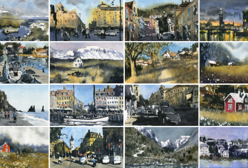
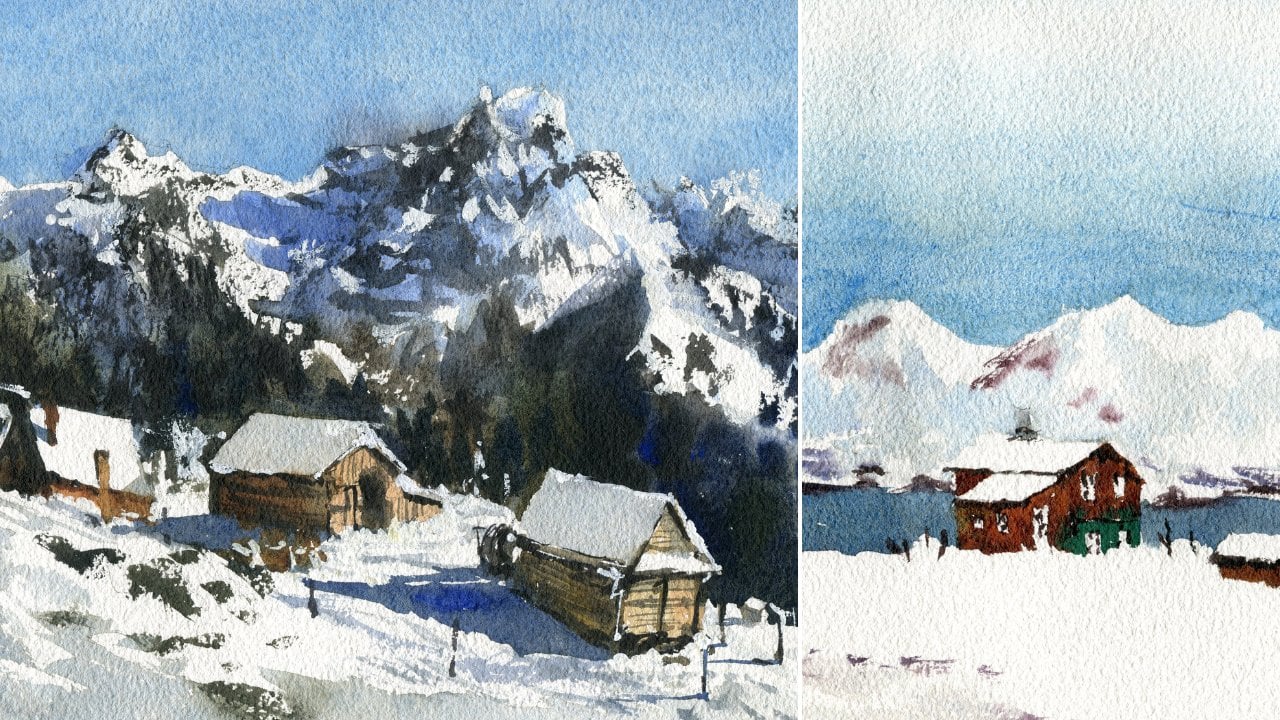
a bunch of paintings here on the left that I've taken
out from this course. And essentially, you've
got this paper here, which you can see has a bit
of a texture to it, okay? Now, the difference
between textured paper or basically cold press or rough
paper, and paper like this, which is hot press or paper
that's basically smooth, is that you just get a
much more sharper contrast if you're using hot press paper, whereas with this kind of
textured paper with, you know, coal press or rough
sort of texture, you get a lot more blending,
get more granulation, where the paint separates
out into different colors. You can see here even in the landscape area where
the grass is, you know, there are some patchy
sort of areas that makes it actually
look more realistic. And if you're painting wet into wet like these mountains
in the background, I find this paper to really be superior to hot press paper. Now, you're not going to be
able to get as, you know, sharp contrasts and of
course, with hot press paper, another thing to
mention is that it does produce much more vibrant
colors at the end. Okay? You're not
going to get as much of that, but in turn, you're going to be able to get these beautiful soft gradations, which are perfect for a
lot of these landscapes. I find that once you get a
bit better with watercolors, the hot press paper is great. But if you've only
got this stuff, you know, just use it anyway. But, you know, keep in mind
that it is going to be difficult at times to get
an even wash in the sky. Sometimes you get blotchy
bits as the paint will pull in certain areas rather
than disperse around. So there are a few others. I'm just trying to see if I
can find one. There we go. So this is a cold
press piece of paper, so cold press is somewhere
in the middle of hot press and rough
here on the right. So I'd recommend this if you're probably getting started
rather than the rough paper, but rough is still pretty good. That's my favorite sort of
paper to use at the moment. So let's put that away. And do keep in mind, of course, that, you know, this is
all 100% cotton paper. If you don't have cotton paper where you are,
that's no big deal. As well, just use
some cellulose. So I've got some
cellulose paper, which often comes as, you know, it doesn't say essentially on they will say something like, eh, go cellulose, 100%, okay? That's your next best bet. It's fairly affordable. Fairly affordable, as well, but it does dry quickly, and the paint lifts
off as well if you're not careful with two
different washers. Now, this is another
sketchbook that I have. Only 160 GSM. This is going to do you okay
as well, but, you know, just keep in mind if you
don't have 100% cotton paper, you're not going to be able
to well it's going to be harder anyway to get in
a lot of these effects. As you become more
skilled as an artist, using other types of quick kind of materials
tends to be easier. But, you know, keep in mind.
At the end of the day, the practice is more important. So make sure you make
a start no matter what sort of materials
that you have. And, you know,
sometimes I even use these sketchbooks which have cotton watercolor
paper in there. And, you know, this makes it easy for me to kind
of carry around, bring the you know, bring my brushes
and things with me. So practice different
compositions. A lot of them don't work
out, but it doesn't matter. You know, it's all a bit of fun and all a
bit of practice. So that's all I want to talk
about in terms of paper. Now, when we move over
into the palette here, you can see, there's
a whole bunch of colors on my palette. You're not going to need
all of these colors now. For a starter, all you
need is basically a blue, preferably a dark blue like
ultramarine blue here. You've also got a yellow. So a hansa yellow is good
and some type of red. So I've got a
permanent red here. Okay? If you've got
those three colors, you can pretty much paint almost anything in this scene, okay? If you mix your red and maybe a bit of blue
together, as well, you do get kind
of like a purply, nice purple mix that you can
use as a shadow color, okay. And yeah, essentially, there are a few other colors that I use,
and I'll go through them. So this is Indian yellow, creates some more kind of sunset golden type of look
here. This is yellow ochre. Creates a very kind
of subdued yellow, pyl orange, and this is a granulating orange in
their Cronacodon orange. Not really necessary.
I have that because it's just
yeah, my preference. I like using granulating colors, permanent or red or pyral
red that I have here. This is cerulean blue, and I really recommend getting some cerulean
blue, as well. They're just fantastic
for painting skies. These ones here basically
bit of lilac and teal. Again, not necessary. I don't use them
really in this course. Up here, I've got a
couple of browns. So I've got a bit of burnt sienna and also a bit of burnt umber up the top there. So two browns, one
light, one darker. And the lighter
brown has a kind of, you know, the burnt sienna just has a bit of reddish tint to it, which makes it a really good
color to use for buildings, you know, the
rooftops, especially. And I do have a green here. This is called undersea green. It's basically
just a dark green. If you've got any kind of
dark green, that's fine. You can always mix up
your own green as well. You've got your blue
and your yellow, mix that up to
different proportions, and you can get lighter
or darker sort of greens. Here on the left, I've got a few other
kind of colors that, again, are just, you know, you know, convenience colors. So I got purple here, three different purples, because I really
like that color. And I've got some
Panes gray here. So Pains gray is just a
convenience color again. If you mix your three
primaries together, blue, yellow and red,
you're going to be able to mix up a nice
gray color anyway. Another thing you can do is mix ultramarine blue with a bit
of a darker brown color, and that will also
create a nice gray. And depending on the proportions
that you use as well, you can get a more cooler
gray or a warmer gray. So yeah, the palette
that I'm using as well, as you can see,
it's quite large, and I do recommend
using a larger palette. This gives you much
more space to mix up. Your colours, actually
see what you're mixing, and then you can mix up a
larger proportion so you don't have to keep going
back and trying to get that same mix again. Really important. So but again, if you've only got a smaller palette,
that's fine, as well. I use them all the time.
But for beginners, I find, you know, this is just fantastic. So moving on to
some of my brushes. And, boy, there's a lot
of brushes in here, and you're not going to
need all of these brushes, but I'm going to go through
what I use most of them for. So over here, I've
got a couple of mop brushes, watercolor
mop brushes. Now, these are so important because they have a large belly, they hold a ton of paint. So you're going to
need this when you're painting kind of sky washers, for example, you know, this painting here,
just these clouds and the mountains
in the background. Really important because you don't have to keep going
back and refilling. This is like your quincential
sort of brush, okay? If you can only have one brush, you know, a couple
of these, you know, one or two of these all
that you need really to sort of get a basic indication
of what you want, okay? So really important. These are some
synthetic brushes, and as you can see, they're
basically all flat brushes. This is a filbt brush, which is a brush that's
used for scrubbing, okay? So at the end of a painting, sometimes I'll scrub away paint. Lift off with the tissue and basically get in
the previous wash or remove that first
wash of paint. Sometimes you want to do
that to create some sort of misty effects or reveal the
background color, okay? But yeah, these flat brushes
are really good because they allow me to sort of paint
buildings quite easily, sometimes large shadows
across the ground. Usually, if we're looking at man made objects like
rooftops and things, these are pretty easy to use
to sort of imply them, okay? So I always keep some nice
flat brushes with me. Okay, coming up next, I have these interesting
brushes here. And basically, these are
just rigger brushes. Okay, you don't need these
particular ones I have. This is just provided
to me by a company. And essentially their rigor brush, they're rigger brushes, which have a really fine point, allowing you to detail, get
in nice little branches. And but except these have a large reservoir at the bottom. So it just means I don't have
to keep having to go back. I've got four of them,
but you only need one, really, if any, if any. Now, here to the bottom, I've got a bunch
of round brushes, and round brushes are
essential for detailing, painting in larger shapes, getting in a bit more control. And it's kind of like, you know, I often swap between my mop brushes and
the round brushes. The mop brushes get
in large areas, and I can cut around
using the tips. But there's a point
where, you know, that tip is just not
going to cut it anymore, and there's too much
paint in the belly, which can cause a bit of
mess on the paper sometimes. That's when you go for these
round brushes, detailing, so painting some people,
painting a rooftop, a small rooftop,
painting a door, you know, some grass, you know, some bushes,
things like that. These are going to be great for that. So always have that. If you can only
have two brushes, you know, have a couple of round brushes and one mop brush. That'll do you fine
for the entire course. This is a little a special
brush that I have. It's called a fan brush, and, you know, as you can see, it kind of looks like a
fan, and essentially, this is a brush I use to
pick up some, you know, bits of paint and imply, like, grass, you know, lots of little strands of grass
running in the same direction. Just says me times I don't
have to keep on, you know, pick up a smaller brush
like this and drawing each individual blade of grass. So that's it for the brushes, and, you know, you'll notice that I've got
a cloth here as well. The cloth is used to control how much
water is on your brush. So sometimes you'll pick
up too much water or you want to dry brush, you know, pick up the paint and
dry the brush off, and then use that to drag across the surface of the paper. The towel is really important. Just use an old tea towel. If you've got disposable towels, that's going to
be fine, as well. And, of course, a little
container of water.
3. Watercolour Techniques: This video, I'm
going to be showing you two watercolor techniques, and this is all you need
essentially with watercolors, wet in wet and wet on dry. So essentially with wet on dry, and I don't even
need to use pencil here to demonstrate to sort
of drawing the borders. But wet on dry is as
it really sounds. So we've got some
dry paper here. Let's say I pick up a bit of green or whatever I
have here on the page. So we've got some we've got
a brush. The brush is wet. And when you apply the paint to the paper, check that out. You have sharp
defined edges, okay? Sharp defined edges. So the paint doesn't
move around. You know, you can get in
quite a lot of detail. Without paint moving over
into different areas, okay? So as you can see, this is just a very loose branch or tree or something that
I'm painting in here. Of course, you can
go over parts again. This now becomes wet
and wet when you start going over other
parts like that. Okay. Now, let's try wet in wet. So I'm going to mix up
a bit of paint here, just a bit of it
doesn't really matter. A sort of paint that I
have on the pages could just be some green to get rid of the tint the
white of the paper, just to show you
where I've gone over. So there's a bit of green here. Now, this bit of
paper is now wet. So if I pick up a bit
of green or whatever, paint here on the side,
and I drop that in, Okay, look what happens. The paint spreads, and you know, it's not as defined as that
tree here to the right. Okay? So there's a lot of
uncontrolled sort of effects. I mean, you still get
the basic gist of what you're painting,
but it's more abstract. So this technique is more
for things like mountains. So if you're doing some
mountains, for example, you know, you might start off
with some blue like this. You just get a bit of blue for the sky and carry this down. And then I might go back and
pick up some darker blue, maybe a bit of brown
mixed in there, okay? And then what we
can do is just drop this straight in here. And then you have some kind of mountain there
in the distance, not the best mountain, but, you know, you get the idea. So the edges are kind of softer and also depends
on whether you want, you know, a more
defined mountain. If you do, you can
sort of, you know, do without the wait until the paints dried
in the background. And you can see here
you get more of this sharper sort of effect. Okay. Now, there's another
thing that you can also do. You can do something
called dry brushing. This is basically a
wet on dry technique. So you're picking up a lot of
paint here on the palette. Alright, picking up
some of this pale. I'm drying off the brush
on a bit of towel, and now I'm going to just drag the brush over the
surface of the paper. And can you see because
the brush is kind of dry, you get these kind of
broken lines, broken edges. You know, you can
sort of do it just picking up your dry paint there. Okay? So it's not like a nice, even full bodied brush
stroke like that. It's just these sort of
sporadic kind of lines. And these are good
for, you know, putting in indications of maybe some branches that are coming off the side
or something like that, you know, up here, for
example, through the side. Anything that you don't want
to look too obvious, okay? You can also pick up some
really dark paint and just sort of put in some trees
running through like that. So then it doesn't look,
again, too obvious. Um, you know, I even use
this technique on buildings. You can sort of put in, like, little windows of the buildings, just touch like
that as well, okay? And this just keeps
it pretty, you know, pretty low key so you don't have a big old mark in the
center of your scene. So yeah, just a more subtle
sort of brushstrokes. Now, let's go a little bit deeper into this wet
and wet technique, okay? 'cause this is the start. But with wet and wet, you will need to practice
this a little bit, okay? Because, essentially,
with wet and wet, there are different times
that you want to go in in the second wash depending
on what you want to do. Okay? So first, I'm going to just
wet all these areas, okay? Just go to wet these four areas with copious amounts
of water, okay? And you kind of got to look
at the paper from an angle to see where you've gone
with the water sometimes. Okay? So those are the
four panels. Okay. Now, you can already
see the paper is slowly starting to dry in areas. But we can go into
this first one. Let's say I pick
up a bit of again, just a bit of leftover
paint here on the palette, drop that in, and, you know, this can be some
clouds maybe up the top. See how they sort of just move
around and you can create this really sporadic sort
of shapes, abstract shapes. They blend. You know, I can mix in some
green here down at the base. You know, this could be some uh, I don't know, it could be a sunset or something like that. I don't know. But the good
thing is that you can see it. All just blend nicely
with each other, okay? But you're not really gonna
get any defined shapes. Now, while I've been doing this, the second panel has started
to dry a little bit, okay? I won't go into it just yet. But the point I'm
trying to highlight here is that the
longer you wait, the more defined
these brushstrokes start to become, okay? And normally, I'll give
it a little bit of time to sort of the water
to go into the paper, and you can see
from the angle here the sheen of the paper, okay? And this paper is not
drying so evenly, so it's difficult to do this. But let's say I pick
up another paint now, another sort of darker
paint here on the side. Let's go through
here. We're still getting that similar effect, but that's more so at the base because there's more
water polled at the base. Now, if we go up to
the top, now you can see these lines,
they still spread. They still spread,
but you're not getting that kind of effect
there where it's just completely just turns into into this kind of blended mess. Okay. So get a bit more detail, as you can see, a
little bit more detail. So why is this important? Because you might
want to go in at this point to get some
background trees in. So you want to wait a little bit till that sheen slowly starts to dry off and not
going straight away. Otherwise, all these branches that you're painting in are
going to go everywhere, and it's just going to
cause a complete mess. Now, we can do the same with these other two panels, okay? And again, the water
is pooling in areas, which makes it a little
bit tricky to do this. In fact, the panel
there to the left, funny enough, is
actually more dry. So I might leave that for
the last panel to do. So this can be the sort
of second last panel. So we go in here, and again, you are getting sharper
sort of shapes, okay? And parts, actually, the
paper has already dried. So you're getting much more sharper shapes on the
right hand side there. Here. I'm not even sure
what color this is. Okay? But you're going to need
to experiment around with this a fair bit, okay? That way, you're going
to have a better idea of how the paper you're
using reacts and the timing to make sure you
go in at the right time. Now, this last sort
of panel here, let's go ahead and do this one. Check this out.
It's almost dried, except on the right hand side. So you can see this is
creating some very funny, well, funny, but sharp shapes. The right hand side
hasn't quite dried, so I don't need to
do much with that. Okay. Even in the flat brush, you can see, it's that
same dryness on the page. So yeah, but you still get a
little bit of furry edges, so you can create some more kind of abstract looking shapes, but still, you know, keep the overall integrity of the thing you're
trying to paint. So it really just depends
on what you're painting. If you're painting
clouds, backgrounds, wet into wet is fantastic, okay? If you're painting
sharper shapes that you want to preserve, okay, and make it really stick
out with more contrast, and you don't want the edges to disappear and just
blend into the water. You want to wait for a
bit longer like this. And some people
ask, why don't you just wait for the paper
to completely dry? Well, the reason why I don't do that is because you
can get some of the most amazing
effects wet into wet that only you can
do in watercolor. So it's a stressful
technique, I think, sometimes for beginners, but it's the one for me
that's paid off the most. So practice this
four panel exercise that we've done here,
try different things. You could try, like, a mountain in each one, the same thing, just to get the hang of how your paper reacts to
paint in water, okay? Another thing, when you're
dropping paint in to an area of wetness already, you want to avoid putting
too much water in there. Now, let's just show you here. So if I put in some water, too much water, look
what can happen. You're going to
get these blooms, these sort of bloom effects. Okay. Unless you're looking
for that effect, okay? It's not a good idea. You want to make sure the
paint that you're picking up is thicker, and
has less water. That way, as you can see, it does not disrupt
the previous wash. Whereas these ones,
you can see, it's creating some interesting
kind of bloom effects.
4. Stockholm Sketch Practice: Is a nice little scene, a nice little street scene
we can practice with. And let's practice getting
in some buildings, maybe a car or two,
some people, and, of course, this sort of light and shadow
sort of patterns. So coming in from the
top of the scene, we've got some
buildings like this. I'm going to just draw this
silhouette of the building. And here you've kind of got the edge of the building
showing through, but most of it's just yeah, most of it's kind of
just concealed, okay? Coming down here, then you've got basically the footpath
that runs like this. And then you've got the car. Again, in the car,
you want to just draw in the top of a car first, the windscreen I
like to draw in. Then I like to maybe get in some of the lights just quickly, the bonnet, and then the
base of the car here. Now, underneath the car, there's going to be a couple
of wheels there. So you just want to
mark out the wheels to the side and then draw a
little shadow underneath. Sort of color that shadow in
underneath the car, okay? There's also these mirrors. Maybe you can pop
those in like that. Uh Yep. Okay. So now we've got, you know, a basic
sort of car here. Now, what else do we want to do? I think we want to
put in a person. Let's put in a figure
here in front. Maybe just walking into the
scene just quickly first. And, you know, again, the head, I always like to get that head of the
person in first. That way we can
draw the body in. The body is kind of like a
like an oblong shape or, I guess, a rectangular
shape at times. All right. And one thing I've noticed
is that the shadow pattern, you can see is
coming in from here. Oops whereas it's
here, maybe here, might change it just so that
it sort of leaves a bit of the car exposed to light. And then it comes off onto this building here
in the background. Let's draw some of these
buildings in first. So we've got this
kind of larger well, building in the back, and then there's another
building in front of it. I can't see too much of it, but it doesn't matter.
Something like that. That's another building there in the background with
shadows across it. Then you've got this
large building here. I think this is
actually a church, and that's put in. Now, because this is a sketch, I don't want to spend
all day doing this. But yeah, you've got
these domes here. Okay. I'm separating out these little
features within the dome. You know, these tiny
little For example, the side of this dome is
kind of like a you can see the walls of it. It's almost like a
hexagonal shape, okay? Can't see too much of it anyway. And this part it's almost like
a rectangular like shape, and then there's another
dome like shape on top. Okay? The only way
you can get better at drawing these things
is to just practice. There. The rest of this, I mean, it's pretty complicated, but the roof comes off like
that goes up and then flat, a few more lines. There's another sort of
roof or whatever here. Quite difficult to actually see. The proper structure of it. I'm not fuss. Here, you've got just a door
window like that. Alright? To me, I
don't really care. Okay, you've got the
general shape of that in, there's some kind of windows, portholes or whatever here. And then you've got this amazing
beautiful shadow pattern that just runs
across the building. Okay, we're gonna have to decide what to do with
this shadow, as well, but I do think I want to leave, I want to leave a
good amount of it in just to sort of come off on this angle to cut over the car. So I have a bit bit of the
light still on the car. Okay? These buildings
to the left, there's actually so many
little details in there. You can spend all day drawing all these in if you want to. But I find the easiest way is when you got this sort of
shadowy building like this, work with these
perspective lines, these sort of see where the windows sort of follow a certain pattern
running downwards. Just draw those windows in real basically
like that, okay? And we should have a nice
little scene here to work with. So I reckon what I'm
going to do first is get in some color
for the buildings, a little bit of color, especially for this one here, I'm going to pick up red, just as red as I can get it, really. Okay. And probably 50% red. The rest of it is just water. And I'm going to paint
this building, right? Now, the top of it isn't
red, just the edges. And then you've got a
bit kind of running across here, you know, bit coming across there and
underneath as well here. Alright. This is
yeah, like I said, I'm pretty sure this is a
church, and we can cut around. Actually, this door will get that in a bit darker
afterwards, anyway. But carry this down all
the way around the figure. I'm going to cut
around the figure, and I'm going to stop here. Okay, go to stop there. Now, this is going
to do its thing. I'm going to just we want to put in real light
colors here now. In the background, this is
just a bit of burnt sienna for the rooftop of this
one building back there. It's kind of like a
brownish red color. And here, there is some
type of grayish building. The rooftops grayish anyway, so I'm just dropping a
bit of gray in there. I'm always finding ways to get this stuff to join on
to each other, okay, so that it's not
just one, you know, gigantic losses of red. I kind of just shifts through
the rest of the scene. Um, a bit of yellowy value
down below like this, just for the base
of those buildings. Okay, good. And these
buildings here to the left, I'm going to just pop in again a little bit of yellowy color. Just a warm color is fine. Okay. This is a bit
of Indian yellow. I'm just going to drop that in so that there's some
warmth in there. This car is actually
white cotely white, but I can pop in a bit of blue a little bit
of cerulean on it, just to make it a little bit cooler
because we've got all the warm colors, all these warm colors
running through here. Now, moving down to the base, I'm going to pick up some gray, whatever gray I have left on the palettes basically just all the colors mixed together. That should create me a
really basic gray color. And it needs to be pretty
watered down, as well. So it's almost Yeah, it's almost the
white of the paper. Just to get rid of a
bit of that color. Okay, let's move this
down. Okay, good. Now, working our way up to
the top of this building, you're gonna have to play
around with some of this stuff. I've got a bit of brown here. Let's just drop in some of
this brown for this area of the roof of this tower. So there's something here, see? So a little bit of that there. What else do we have? I mean, the rest of it is just not much. I don't have to do
too much, really. Maybe a little shadow
here and there, and some line work running
through the building. You know, I'm going
to put in a bit of wet and wet work here, just dropping in for
this window here. Alright. I'm gonna probably just leave the rest of that
white, actually. Maybe not. Maybe not.
Let's put in a touch of gray in here. Looks too stark to
leave just white. Okay. Great. So this is all going to dry off. And while that happens, we're going to put in the sky, good old skywah and
I'm going to use some I'm going to
be using some blue, but actually one thing I've forgotten to do is maybe
to get in these flags. You get a flag running here. This is the Danish,
it's the Danish flag. You just get a bit of
that coming in there, then you've kind
of got the cross running through the
center and then you got the European Union
flag in the back. You just make out the stars. Okay. Running through the
back there like that. I almost forgot about
that. Got so close. But good thing to remember. Yeah. So let's firstly, I'm gonna get in
some of that red. Let's just go ahead
and color this in. Just got some red here. Really dark. Lots of lots of color in there. Yep. So neutral tint or some gray for the top of the flag because over
here it's kind of darker. I'm just going to
let this melt in. I don't want to I don't want to bother too much with the
details of the flag, okay? Just enough. You know, there's actually kind
of a grayish color to the top part
of the flag here. Like, it just comes down
a little bit like that. But further on, we've got
the European Union flag. I'm going to grab the
blue ultramarine blue, and I'm just going to Again, really basically add that in. The stars are a yellowish color, which I'm going to need
to maybe add in later. It's not a big deal.
Let's try some of this. I've got a bit of yellow
leftover on the palette. See if I can just drop in a
bit of that to indicate that. There Okay. I might just rub off a bit
of this red there. Okay. Now, the background, what
we were doing initially, I'm going to pick up
some of this blue, bit of cerulean blue. And I'm going to just drop
that straight into the sky, cutting around the
flag, details there. Oops, some of that's already
gone in. That's right. We can lift off, lift off a bit of paint
there, continue on. Um, you might have to reshape some of those
flags a bit later. If you leave a bit of
white around the flags, it won't run like that. Okay? Let's just
keep on going. Okay? You can see sort of goes all the way around
the base here of the buildings and bring all that blue to the
right hand side. There we have it. So
we've got a nice, you know, wash there for the
sky, which is what we want. Can also use a
tissue to lift off certain areas as well
for clouds. Okay? Or just in areas that you think
has a bit too much paint, if you want to encourage
it to dry faster. Okay? Fantastic. So we've got all the lights in. What we have to do now is
get all the dark values in. And I'm going to pick up just a basic wash of purple
and brown mixed together. Okay, got like a purplish brown to create this kind of gray. You can also use
ultramarine plus burnt tumber to create this
general looking shadow. And we're going to go in.
Let's just do this so that, you know, the shadow. Okay. There's also a bit here. Leave in that little slither
of light on that building, bits and pieces here and there, a little bit of that light
there, as you can see. For the rest of it, I'm
just going to go through all the way like that. I want to get this a
bit darker, as well. Actually, more blue
and more brown mixed together to just give it
more volume, more darkness. And of course, you
know, here you've got the building and
the shadow running across the ground here and
going on top of this car, maybe, like, here, leaving
maybe a bit of it. Yep. And this all comes across. That can be the bottom of
the car and the Yep, there. Goes all across here, you know, you can see also
on the buildings, there are some shadows. So we can sort of
put in a bit of those kind of shadow pattern on those buildings like that. But here is the larger sort of shadow on this red building. So I'm going to go and just
trying to get in a few of those marks mimic those
marks that you see in the reference photo
running across like this. Running across the building, you've got a darker
one here as well. Really needs to be quite dark. I'm picking up as much darker
paint as I can for this. And you can see here, it sort of just forms
a really sharp, dark shape the right
side of the building, and then just abruptly
finishes here. Great. But yeah, you can see I've
just kind of gotten in this entire shadow with
one swoop, really. And you can drop in some little things
like these, you know, darker bits for the windows, perhaps, in here,
that kind of thing. Maybe you can just leave
that a bit later as well. Another thing I want
to do is maybe get in another shadow running
across here at the front, just so that I've got more of a I just want to get more of a sort of strip of light
running down the center. Got the figure here so I can
put in legs of the figure. Otherwise I probably leave them that color or I'll pick up like a bit of
blue and drop that in here, make it look like they're wearing a shirt or
something in there. Redo some of this flag, bit more red in it. Okay. I'm going to just pick
up darker paint now. Really just some
purple and brown maybe mixed together and start implying some of these little details
on the buildings. So here, you know,
these little portholes, parts of the building
that just have some extra little details
on them, you know, like That can even exaggerate some
parts as well. Yep. This window here, just again, I'm exaggerating that a bit. And maybe putting
some little details, like for the window like that. You're really just picking
up the darkest bits of paint that you
have and you're using that to imply details of some of these older buildings and things here in the back. Look just a few little
marks like that. I can indicate some
windows already pretty basic stuff on the rooftop
as well of those buildings. You know, here we go, some
more this sort of work on this sort of side
of the building here. This building here
in the foreground, we got balconies and
all kinds of stuff. So just like I said, you're just implying details. I'm not wanting to
spend too long in here and just enough to show that
there's something there. This car as well, I kind of got to bring it
out a bit more, at least get the windscreen
in so that it looks darker. Okay? Doesn't even really look
like a car there anymore, but you can sort of see you can sort of see a car or
something like that there, this person and maybe
the shadow to the right. This car should also
have a bit of a shadow, maybe to the right there, but I can't really see the top of it. Another thing you do is
bring it back with a touch of guash, as well. Okay. Let's put in
this flag there. Really, the finishing touch here is just a
little bit of guash. I thought I'll get in a bit of this perspective as well
for the sidewalk here. U. A little bit of white guash. This just helps to bring back
all the highlights some of the highlights
anyway that you want to imply. Just having a look. We might give it a quick dryer. Okay, a little bit
of white gouache to bring back some highlights. So firstly, probably
on this figure, I might put in a bit here on the head of the figure
and the shoulders, mainly on the left
side of the figure, given that the light source
is coming from the left. Uh, like that. We've got the car here as well, which is kind of lost. So I can see if I can bring
a bit of it back like that, just with a bit of light
there on the left side of it. It looks a little better. You know, here on this building as well, let's have a look. What else can we kind of do? Um, straighten up this
little dome shape there. Okay. More white running
through some of these parts of the red Yep. Get in a bit of white
on the left side of this as well here just to really emphasize that light from the
left side of the scene. Um, Good. The flag and Henig flag, I've lost the cross, so here I'm just bringing
it back a little like that. Plus the flag pole
is also white. There's this sort of bit
of guash up the top there. Well, the one at the back is just make that up and
put that in anyway. Okay. Some of this stuff here, this top part of the tower should I'm stick out a bit more. So I'm going to just
as you can see, just brought it out a bit
more with that guash. Um, some of these
sometimes you can just sort of drop in a bit of guash in the buildings as well, maybe up the top to just
emphasize some light. Even back in here, you can sort of play around with a bit
of some little highlights, you know, that
could be, you know, a street pole or
something here like that. But other than that,
we are finished.
5. Bergen Sketch Practice: This video, I'm going
to show you how to paint light and shadows. So let's have a look at
the reference photo first. Now, you can see there is this house right in the
center and also some houses on the right
hand side that have pretty much
100% illumination, just completely white, okay? Apart from the windows,
that kind of thing. But here in the
foreground, you know, you've got a lot of darkness. So I think this is a really
good reference photo to show you how to paint
light and dark and just illustrate this effect more sort of in a
stark kind of manner. So let's first get
the drawing in. Now, I know there is a building here to
the left hand side. I'm just going to draw
this in. There's also a balcony it looks like kind
of coming off like that. Doesn't matter. Okay.
Let's get in this house. Now, I'd say it's roughly, it's just a triangle like that little triangle for the rooftop, and then
we're going to go down. For the purpose
of this exercise, I'm not going to go for
100% accuracy here. I'm just going to
try to put in what I can to illustrate this concepts. So here in the front, it's pretty much just a whole
bunch of darkness, okay? And you've got everything
here in the front just dark. And you've got this kind of pole that is almost off off
center. That's unusual. Yeah. Everything's usually so
picture perfect in Norway. So there's a little
kind of as you can see this pole that's sort
of off center kind of looks makes it looks
more interesting, actually. So there we go. And, you know,
you've also got some of these like, you know, what you call them,
railing areas like that. Okay? The top of the
building is, you know, you've got this red sort of roof area and then some
details up there as well. Okay? You've got
this one window. It's just a rectangular
sort of thing there. Then you've got, one, two, three, yep, three more windows. So let's just put
these in. So they're just rectangles like this. Straight tangles, and then
another three further down, like, here, so one, two, three. So, this entire house is
pretty much in the light. And, um, well, not entirely. There's actually some shadow
here to the left of it. So soft shadows on
the white as well. So we'll try to get
that in. We'll try to get that in as well later on. There are some kind of railing fence here as well in front. But over here in the back is where you start getting
a bunch of the shadows. So you've got this chimney
coming up like that. Then there's a house
in the back there that you got part of it
in the light outside, other part in the darkness. You've got another
sort of rooftop here. Okay. Just placing these
in as generic shapes. By the way, I'm not fussed
about the exact details. Okay, bit of darkness
there. Look at that. It's just a box. If
you think about it, that's just a box with
some shadows, okay? A bit of light just cast in
the center of that building, and then the back of it
there is colored in. And let's have a look. This is actually a
really large sort of house you can see here. It's just all It's just
all in darkness here. Alright. Like that. Okay. Now we can really
get into the details, the nitty gritty with
all this sort of stuff, but that's all we kind
of need to imply. I mean, this looks like almost like a staircase or
something going up. I don't know. It
doesn't matter, okay? Now, running to the
right hand side, this is where we
got some other sort of sides of the buildings
like that building there, another sort of rooftop
here like that. Another chimney
or something here that's kind of in the light,
another chimney here. Same deal in the light, but with the right hand side
kind of coloured in a bit. The light source is coming from the left side of the scene. So we really got to
make sure that we have enough light running through. What else do we have? We've got this larger
building here. I'm just going to
draw this in kind of comes off like that. And then it just runs down. It's kind of the front
side of a building. You can just see it sort of hit the base here where it's
kind of all darkness, okay? So in this type of scenes, I always like to put a figure or maybe a couple of people
just walking into the scene. And this is going to help, again, amplify that light, that effective light and dark, light and shadow, I mean,
because then we can get in a bit a bit of the shadow
of these figures as well, running maybe towards the
front like that, as well. It's kind of coming in. It's
a bit tricky, isn't it? Like, I might have to just simplify the
shadow and make it run more so to the
right rather than a, so this some bits
of shadow here. Okay. Always make
the shadow kind of run in the same sort
of direction, see? This pole here, shadow
running in that direction, and the same with the
figures like that. And these buildings, you know, you're going to get
some shadow here. Yep. So, let's give this a go, and the first thing
I want to do is put on some of the lighter value. So the rooftop, as you can see, is kind of like this, It's really just a bit of
this burnt sienna. I'm going to drop that in. It's kind of like a
reddish brown color. Really light value, only 5%
paint, if anything at all. Most of it is just
water. All right. The building to the left has a little bit of warmth in it. I'm going to also just use
that same burnt sienna so that I don't overpower
everything like this, a bit of burnt sienna. Nothing too nothing too
interesting there, Kate. Really, I mean, a lot
of these buildings, I don't need to do much a
thankfully they are all, they're all the same color. Okay? And I'm leaving out this white on the
side of the building, and this is just so the shadows can really
pop through afterwards. Okay. So in terms
of the shadows, I'm going to go and firstly, get in little bits of little tiny bits
of detail in areas. So we can start working
on the shadow now, and I like to blend in these sort of
little sketches like this, blend the then the details, little sharper details of the
building onto the shadow. So for example, here on
this side of the building, you've got some of these
little marks like that. That's just running across. I mean, just some of these even go up to the
top of the building, like here and down, and then running across
like that, okay? Let's get this one here a little bit,
something like that. Okay? You've got some of these windows as
well, so I can just, again, simplify, get in some of these little windows in there. I mean, there's just
a touch of darkness. Okay? It's really if you
look at these windows, the darkness inside
those windows are pretty much the darkest part
of this painting. So I'm just trying to get in some of that detail in there. It's not a huge deal, but just enough to imply
there are those windows. And of course, sometimes you can just sort of indicate
the frames as well, because you tend to lose out on these details if
you're not careful. So yeah, there's little
frames on them as well. It's only little frames. I'm just going to paint them in. Really, I'm drawing them in with the brush, if you
think about it. Here, it just adds some
more darkness in there. I find it helps when
I just break apart the lines a bit so that it doesn't look
like it's stuck on. You notice some
other areas might need to be darker as well. Okay? All right. So I'm going to start
putting in this shadow. And for the shadow,
I'm going to mix up ultramarine blue
with some brown. Okay. Just some Burn tumba, really. So we
got this here on this side, this larger sort of
darker building. And it does have some bits
that stick out here and there, look, no big deal,
something like that. It could be a
balcony or whatever, like that part there,
comes down here. It's a little bit
lighter as we move down. And it actually casts
a little shadow here on the side of this
building. You just see it. Cast that shadow. So
just go over the side of that building like that or have to bring back some of those
bit of the line work. Another thing I
like to do as well is if you want to make
some soft shadows, so you can see those
sort of almost like tree bent shapes, just spray into an
area like that, pick up some paint, and just sort of drop it in like this and
then you can create some softer kind of shadows that may not have look right before. Okay? So that just sort of softens
those out a little bit. Good. And I'm going to carry this downwards and
here at the base. Again, I'm going to have to
mix up more of this color. Here at the base, we've
got just darkness, okay? And we've got, basically
a lot of those. Um, a lot of these, like, poles and everything,
but I'll just put in a little bit of
the ground first. This is going to have to
do just a little bit of this grayish value for
the ground that they're, you know, walking through here. Right. It's easier,
it looks better. Okay? And let's work
on this shadow. It's just a shape. Now, I'm always looking at the reference photo and
thinking, How dark is this? Is this? Does it
need to be darker? Okay, this is basically the darkest section of
the painting, okay? So we got to go pretty dark. You certainly got to go
pretty dark in here, and also some of these little details we can
get in afterwards as well. But really, it's just
all across here. Moving across to the right
hand side onto this building. You've got some shadowy shapes just running through
like this, as well. Great. And I'm going to keep on
working on this shadow here, as you can see here
in the background. It's just a bit of darkness
running through the back. Okay, like that. Then
we've got this rooftop, which I'm going to
paint in again. And this chimney,
we can paint this in small little chimney. And continue on. Let's really make this
shadow quite dark. There you go, just leaving
some white on the page, but cutting around this
building as well here. That looks okay. And then
kind of some shadow in there. Picking out some little
pieces of detail. And you have to just
leave the white in there. You have to really have some self control and leave
out some of that white. Otherwise, it's
all just going to look dark in that section. Same sort of effect here. I'm just going to
spray this building. That way, I can drop
in some softer sort of shadow bits here for
this tree or whatever. That's outside of the scene. It's kind of actually also in that side of the
building like that. This whole area needs to be
darkened a bit down the base. Yep. Essentially this shadow, we need to get darker than
the pavement itself here, so why I'm making sure this
is definitely dark enough. Um, that's looking good.
That's looking good. Now, I will pick up some of
this other paint on the page, just a leftover gray paint. And now we can
kind of imply some of these details on, you know, here you can see,
like this house has some of these markings. It's just from the and it's
the same here, as well. Little kind of new little marks for the wooden flanks
that run through it. Yeah. Yeah. Just a
little bit of detail. That's all we're
doing detailing here. Um, let's over here.
That building there. The bit of that top part of this building that's kind of got that tree shadow running
into it as well. Some extra darkness, I think down the base would
be good here as well. I've kind of lost a bit
of that. There we go. Don't be afraid to go
over an area again if you feel like it's
not dark enough. I certainly think
this could be darker and uh I don't want to just
destroy all that light, though, at the same time, being a bit careful with that. Good. And I also will
grab this smaller brush, and here we can start putting in these details of
the railing here, just a bit of the railing. Plus, we have this
pole here that I of painted and drew in before and we can
paint it in here. Okay. Really quick
little indication of it. It doesn't look like
much, but there we are. There's the pole.
There's the pole. And, of course, this railing going to use more brown here
to get this railing in. Now, there's also a tree here. You can just see it
really in the darkness. You can barely make it out, but there's something
here you can see, it's like a tree of some sort. So just a bit of color
there will be good. Um, a touch of color
now for the figures. These figures I
want to make dark. Well, darker anyway, so that they sort of stand
out of this light. And I'll bring out some
guash, as well afterwards. But you can even leave one,
just standing like this with a bit of light coming off. Again, getting those
shadows all coming in in the same direction so
important to do this, some more of these
little details, the fence area. The Okay. And of course, you know, you might have lost out
on some details, so this is a great
time to do it. I've got a rigger brush that accomplishes this job
much better, actually. Just bring out the rigor. And let's see. There we go. It sort of like a liner at the end of the
day, lining stuff. We need to have enough water
in there first. Here we go. Notice, there's some darker shadows running
in there as well. So I'm trying to
imply some of those. You're always just looking at the shadows and
seeing how you can even within the shadows distinguish some
darker ones as well. Because shadows are
not just one value. They often have multiple
kind of values in there. This is a little house here. Let's just put in
some details there. Again, some verticals
running through the back. And, of course, you
know, with these houses, you've got some little
architectural details that signify what's going on. But there we go.
That's another house. Plus here, there's
something as well, there's little details. They really do count, especially when
you're subtracting so much else from this area. There's something here. I
don't know what this is. It's some type of object
that I'm going to put in. But can you see how we've
preserved all the light coming in from the
left hand side and putting real dark values
right next to the white so that it will come
through better. This white really will
just show through stronger if we place it
next to really dark values. I think these
windows really just make or break this building, these sort of buildings at times they don't look like
much without some of this lime work. Okay. Time to put in the sky wash. I'm just gonna pick up
some cerulean blue. Let's just drop
that cerulean blue straight in. It's fairly thick. And I want to get in a nice sort of wash of this blue running
through the whole area. And I want to also use it to
cut around the buildings, especially these ones here. So see just cut around a bit. Um, Little chimneys, as well. Little chimneys, just cut around that little chimney.
This one, as well. The details like this just really make a difference
in the end product. Can I just remove
this bit as well? Okay. Fantastic. Let's give this a little dry. Okay, final finishing
touches now. I'm going to pick up
some white paint. This is white guash, and this is going to allow me to get in the final
finishing touches, basically, of this scene. Just want to make sure I've
got really There we go. Pick some of that up.
Take a look a little bit of light up
there. Maybe here. You can bring back
little bits of light. You might actually
squeeze up squeeze off some fresher stuff. With squash. I mean, it just if you're not careful, it just turns to gray so easily. Um. Let's do this. There we go. A little bit here. Sort of bring back
bits of the detail. Um, you know, on
top of the roof, a little bit of
something there, maybe. And the window frames, I think some of this could be this could be good to bring
some of it back like that. This little lamppost and maybe some of these
bits of railing, the figures here as well, bit of the head and the shoulder
there to kind of make it look more like, yep. Let's have a look. Maybe bring a bit more of that white running through here as well, and parts. Of this building that's actually sticking
out more like that. I'll get that in. A great thing with gouache. You can just bring back a little bit of that
light right at the very end. There's another, you know,
these little windows down the bottom
that I've lost out. I can just bring a bit of that
back again with the guash. Light on the chimneys, edges of the roof and
buildings here as well. I don't know what
this is, but this could be catching
also a bit of light. I'm finding every excuse to
just put some guash in places to emphasize some
little variations. Maybe some lines, just some little
perspective lines as well. There we go. I don't know if it helps to finish
it off a little bit. Soften this off a bit not too just create a bit of
texture in some areas. Fantastic. And we are finished.
6. Iceland Beach Drawing: Let's go ahead with the
drawing for this scene. And first thing
we're going to do is put in the horizon line, which is just underneath the
halfway point of the page. So roughly about here, we want to leave enough space at the bottom so that we can
draw the paint the beach in. Okay, around near
the wardrom paying a bit more attention to make
this line straight Good. Okay, so next thing I want
to do is start putting in this area that runs in around about like the middle of the page here of the water. So we've got some
water coming in. I might even just increase
it a bit like this, and I'm just going
to drag my pencil around like this. Oops. Let me just redo this part here. I always got to remember the you've got to keep
them varied enough. Otherwise, they start
looking too put together, and yep, there we go. This, then you can see the water sort of retreat
back here like that. There's something here, and
then kind of exits out here. Now you can, of course, change this water line if you want, but I'm going to leave it
this way just to try to make it more representation of
this particular scene. Okay, the next thing we're going to do is we're
going to put in this large this large
headland at the back. And this is actually one of the most dangerous
beaches in Iceland. And it looks
absolutely beautiful, but there's warning
signs all over the place telling you not
to go near to the water. And let's go ahead
and put these in. And yeah, this large mass
we want to do is just get the general shape of it in first, and
where does it finish? Roughly about here, yes. I'm going to mark that out. There's a few bits in the water. And the reason why this beach is actually quite
dangerous is because it has these sort of waves that drag you out to the ocean, apparently, sneaker waves. So I stayed pretty far
away from the water. But you see tourists
often just going along and Yeah,
pretty dangerous. So, look, top of this top of it, I'm just trying to get in, get in a more kind
of There we go. Maybe something like
that. I've gone up a little bit too high, but, it should be fine. Uh, Okay. Now, let's get in this dark sort of shadow on the left
side of the rock. That and we actually zoomed quite far out of this
particular scene. But over here, there's all these really interesting
looking rocks. They look like these
kind of columns of rock that just stretch
directly upwards. And we're not going to
try to put those in, but mainly just look at
the darker shapes in here. So we've got this kind
of darker section here. Okay. A lot of this stuff we're going to be able to just get in with the watercolors after. But I do want to try to maybe mark out some
areas where I might have extra darkness so that I don't forget to
add them in afterwards. Like here, that's another bit. As well, yep. There we go. Just some of these
rocks on the water. On the left side
of this rock, too, there's part of it that's in
light, like, for example, this section here, this sort of and this is actually
a cave, mind you. Here, there's like a little cave here that you can
actually sit inside. But apart from that,
everything else is more or less in darkness. I just quickly shade
some of these in to just remind myself to leave that out, paint that in afterwards. I mean, and we've
got a shadow here. These shadows are so
important in watercolors. They help create
this sense of light. So, just a quick little
shading in here. There we have it.
We've got a indication of all this light. And there's people walking all around in the front of the
beach as well, so great. And now let's get in a few of these rocks here in the water. And I presume these
used to be part of the larger mass over here, but over time, it's eroded away. So let's get this one in. This one's got, like,
a couple of peaks. Like this. Okay? Just a
little outline of it. And then we've got this
one here on the right, kind of alone by itself, and we'll go up like this. Fantastic. And there we have it. We have the land masses in. We've got a bit of the rocks. We've got the water line. Now, what I want
to just quickly do is mark out roughly where the blue of the
water kind of well, the darker blue of
the water anyway, finishes off, roughly
about here maybe. Then we can just the rest of it, I can figure that out as we go. A lot of this, I
think I'll be doing kind of wet into wet. Okay. Now, some figures. This is super important and some little rocks
and things as well. I think this is I just
really helps to bring out this sort of the
depth of the scene. And I know there's lots
little rocks here now. This whole beach is filled, completely filled with
all these basalt rocks, and they're all over the place. So we can get that in later
with the watercolors. I just want to put
in some figures, and I'll make some up here because the figures in the background are just a
little bit too far off. So we can put in a figure there sort of
walking to the distance. That 1 ft forward,
1 ft the back. We can have another person maybe here next to this figure. You know, maybe they're just both walking into the distance. The head and this
one's a bit large. I can just reduce
that like this. Arms like this. We might have some people like some other people kind
of walking around in the distance as you see
in this scene, you know? So a little bit there, it maybe some figures here. They're not going
to be playing in the water, that's for sure, but it's too dangerous, but, you know, just
maybe walking around. When I was there, there
was just a ton of tourists all over the place. So, you know, I actually
had to go out a little bit further to get a bit of peace
and quiet out where I was. So I could take a
photograph there. And I'm just thinking, what else do I want to do I
want to put another person closer up or not? It's always tempting to put a
figure closer in the scene. And I think I might actually
do this because it helps to increase this sense
of depth in the scene. So I might have someone
just walking here. Yeah. Walking into the
front of the scene perhaps. That way I can get a bit of
a shadow also running across the left us that light source is definitely coming from
the right hand side. So, it's definitely coming
from the right hand side. Alrighty. So that's about
it for the drawing. I just put in a bit of detail for this person's
arms like that. You know, if you really want, you can put in details
of the clothing and, like, you know, sometimes
maybe a backpack, someone holding onto a backpack, but normally, something
like this is fine.
7. Iceland Beach Painting: Okay, let's go ahead and get
started with this painting. And for the sky, I'm going to start
off with a light wash of cerulean blue, right? I sort of a light wash
of cerulean blue, and it was a very nice day. You know, I think we got
lucky on that day, actually, considering that it does
usually rain around August. And this is about 5% about
a 5% mix of cerulean blue, and the rest of it is water. I want to make this pretty
consistent across, okay? But as we move down the page, this is where I just
add in some more water. And the reason I do that is
just to lighten this wash, create a bit more of this
lighter color down at the base. And I can also I don't
mind just going over the top of those because
they're going to be quite dark. Anyway, we can cover
up that blue after. So if we can get a
nice wash like that, that's going to be
definitely a lot better. So let's see if I can just kind of brush
up some of the sky a bit, just create more of a
blend in this part. Creating a creating
a nice gradation is quite tricky at times
to get this part of the center there to
blend seamlessly. Does take a bit of work, but it's definitely worth it. You can do this mostly while
the paint is still wet. If you go and try to do this afterwards, it's
not going to work. You have to do this at this
point where everything is still nice and damp. Okay. Fantastic. Might just
leave that sky as is. And we'll move down into
this water here, okay? Is water. And I'm
going to pick up some darker ultramarine blue, and I'm going to mix it with
my cerulean blue, okay? Because it's roughly it
is darker than the sky, definitely darker than the sky, but it's not too much
darker, actually. But it does need to be
darker than the sky. So this is why I'm going
to emphasize this. Okay, now, this whole area
is going to be darker. Okay. Good. Now, you'll notice some
of it may blend upwards. It's not a huge deal. I can actually just feather that around a little like this. Um, as long as this
water is darker, that's what I kind of want
just out the back there. And also, you can skip that brush over the
paper a little bit from time to time to just get a bit of the white
on the paper like this. Okay? I'm going to pick
up my flat brush now. This is a great little brush
to help get in some waves, believe it or not, okay? But firstly, I'm going
to go into this area. Okay. And just this is too dark. I'm going to lighten it
a bit more like this. And keeping in mind, it
will lighten up more. This is a really light
wash of cerulian, really light wash of cerulean. It's almost like
nothing in there. Okay. You can see it kind of come in to the shore like that. Eats a bit more of that
bluish tint to it. You almost just want
it to be white, okay? Then you've got that wave
there in the center. That's really quite
stark and white. So I'm going to leave that
there for the time being. But what you can do as well
is pick up more of that blue, a little bit more of that blue, and add in some see, there's some darker
parts of the of this part of the water here
because it's still wet. This is the best time to do it. The only time really to do
it before everything dries. And funny enough, it's also the time to
just play with those, get some of these
waves in here as well. So I'm just going to indicate
something here, okay? So waves there in the distance. All wet and wet kind of work. I'm not bothering too much
with the details at all. And in the background, you know, little kind of darker
spots there as well. Actually a little bit darker
than the water itself. You can just drop in
tiny little marks there that will eventually disappear, but create a nice soft
feeling through the water. And Yep. Now, over here, you do notice underneath where the
wave sort of breaks, there is a little
bit of darker color. So again, just picking up that brush and trying to indicate this underneath
some of these waves, you know, to see it, these
sort of where it breaks. There's some touch of color,
touch of darkness there. Okay? That's it. I don't think I want
to touch that any further for a simple
representation like that, it's looking decent. Now, for this kind of mountain. What we want to do is basically start adding in different
greens, some different browns. I think I'll start off with
more the greens first. Got some darker
undersea green here, but I will mix that with
a bit of ronacrid gold. Here. Just to make
this approximate that nice goldeny green color that you see in the reference.
Coming around here. It's just essentially
some light in the scene. I'm going to put a bit in
here as well up the top. The great about this
great thing about watercolors is that you
just can layer over the top of every single
every single wash to create more detail. So even if it looks a bit washed out or not detailed enough or too light, it doesn't matter. All you have to do
is just simply leave it and go over it again
in a second round. I'm just lightening
this area a bit more so that it matches the
right hand side better. I just made it a bit
too dark before. That Good. Yeah, it's just these sort of greenish parts that you see, I guess, on the rock, but I'm also just emphasizing
more of that light. The flat brush is just
fantastic for rocks. Abstract shapes like this, but still be able to get in a nice sharp marks on the scene. This side of the scene, it's probably more kind of favorable if I just went
in with some darker color. So I've got some brown here. This is just a bit
of burnt tumber. Let's drop that in and
see how that looks. Maybe with some burnt
sienna, as well. A lot of this stuff has
not quite dried yet, but we can create maybe a nice softer edge on some parts and sharper
parts in other areas. So yeah, leaving a
bit of white there. If you can see here just how I've got some little
white sections, that kind of stops the
wet paint sometimes from running into the other sections. Okay. Just checking
what we've got here. Yep, this should just
kind of come down like around there, maybe. Yep. Here cut around this bit of light
the bottom part. You kind of only got one
chance to do this before it dries off. But Okay. And if it's not dark enough, feel free to pick up a bit of neutral tint in some
parts like this to really get in that
darkness through here. This area should actually have some lighter kind of grayish
color for this rock, so I'll just put some
of that in quickly and also in here we've got a lot of
greenish sort of colors, but not much of this sort of grayish value which we
will have to work on more. This area right in here is pretty dark and not only that has a sort of
cave area in there, which we'll have to
get in afterwards. Yep, so let's just
cut around some more. Okay. Now, I'm going to dry
off this brush a little bit, and I'll pick up some
of that pains gray, mix that in as well. Yeah. I'm gonna go in this
top section and put in some of this sort
of rocky detailing, okay, up the top. And among this sort of
rocky area here as well, just trying to keep
just making sure that this is also Yeah. Yeah. Nice and sharp
at the edges. Okay? This is the way sometimes
you just really got to go in there and just add in
a brush stroke like that. When you fiddle around with the colors and
everything too much, it just starts
looking overworked. You know, this area here, I'm going to just drop in some darker values a bit here for this darker part of
the rock. Okay, like that. I think what I can do is
also put in a bit of green, darker green as well for
this part of the rock here. Dilute that down a bit, another quick little
wash into some parts. I think it just looks a bit too have too much light in
there for the time being. So at the moment, so I just want to
oil it down a bit. And then, of course, some
more of this gray there. Okay. And like I said, keep in mind, we still can go back in
there and add more details afterwards, which I'm
probably going to do. But I think this is a
good sort of good sort of start to indicate
all that complexity of detail back there.
It's a tricky job. Okay. And also to kind of get
the get everything in, like all these
different variations of values is very tricky
in just one wash. So you can only do what
you can do and work on the basically work on the main shapes and
the obvious stuff, and then later go back
in Even back here, we can just start to, I can already see
just start to work on this edge of the
mountain so that it's got a bit more
contrast against the sky. Needs that. This is just pains gray that I'm using for
this whole section. And you can see it
just sort of runs into the water where
we've got, like, some rocks back there. This part is way too. It's got way too much color
in it, lighting it, as well. So I'll just dull that down. Touch There's just a more darker value
back there as well. I'm also using this darker
value here to kind of draw out the figures
here in the foreground, make them kind of
come out better. Okay. Put in some of
these rocks here. And, of course, we've got
these ones to the right. This is going to be easy
all I have to do is just color them in
with the brush. You know, a bit of
brown in there might also just make it
look more varied. That this one as well. Okay. Now, this is all starting to dry off a little bit up the top, so I'm going to just
continue to work on this now and add in more texture, more color, especially
on that left side of the rock to darken
it down further. So parts may be really dark
compared to others as well. I put in more kind of contrast Okay
8. Iceland Beach Finishing: Right? So I'm going to leave
that for a bit to dry. I'll come back to
it in a moment, but I'm going to work
now on the ground. Now, this is kind
of a grayish color. And it's not going to
be as dark as the sky. Nowhere near as
dark, not the sky, but this rock here
in the background. So around this sort
of consistency. Always important to look
at what you're painting and compare it to everything
else in terms of the tone. Is it light or dark
compared to the sky? Is it light or dark compared to those rocks in
the background? You know, the ground
is fairly light. It's like a grayish light color. So we want to make sure
that that shows through. Otherwise, we're going
to have a big problem in terms of getting in
this illusion of light. So look at that. It's just a grayish color, which is it's still fairly dark. It's darker than the water, definitely darker
than the water, but it is not nearly as dark as those rocks
in the background, nowhere near as dark. So we need them to
be just dark enough so you can do this kind
of thing and cut around. And you see this, you're
cutting around the water. Here. And that's going
to create this sort of illusion of the light
on the water, okay? But cutting around the water. So important to get
this step right, make it dark dark enough,
but not too dark. Carry this wash
all the way down, running out of paint, but I think we should
be able to make it. Just means I've got less
to mop up, I guess. Okay. I reckon what I'll
do is just add in another bit of just add in a little bit more darkness,
especially here in the front, but also throughout
the entire area of the water because
not the water, the sand, because it's
just I realize now it's just a little touch to light. So just something like that. But at the front of the
scene, I always like to just create a bit more darkness here. It helps with the contrast, overall contrast of the scene. You've got rocks and things
running in there as well, which we can also scratch
out a little bit later. But with these rocks
here in the background, I'm going to wait for
this to dry a little bit. Then we're going to
work on the foreground. So we can just play around
with these rocks still, and especially work on contrast, just touching up
bits and pieces, creating that sort of
feeling of texture, which can be quite tricky
in a scene like this. So sharper marks are a must
for some of this stuff. These little sharper
sort of marks here. I really want to create more darkness to
the left hand side. It's just tricky to
get my watercolors. I'll be enough to have
just enough that colour. This, it's not 'cause it's
not reading like I want it to just with the more
the larger kind of shadow here
running to the left. That looks better. That
looks much better. You know, it's so important
to get these values correct. 'Cause it is quite dark
there on the left. Maybe some purple
in there as well. Does look like it's just looming over the entire
scene now, isn't it? Huge amounts of contrast. Okay, I'm going to leave
that area in the back. And I want to work on some of this
stuff in the foreground. I'm going to pick up
just some darker paint on my brush and do this kind of thing where I
just flick the paint into the ground, okay? And what this is doing is that
it's just creating, like, some little
impressions of rocks, 'cause I don't want to
paint all this stuff. So little impressions
of these rocks are what you really what
you really want. It's just simplifies everything down to the point where you, um, you know, you've
got an idea of what every of the whole scene, but you don't have to paint
in each individual rock. I mean, you can, of course, go in and focus
on a few bits and pieces here and there,
tidy things up. Okay. But, um, Yep, like that. Now, the figures, all
the people in here, I just want to add in some
more color and detail on them. So the round brush
helps for this. And I think I'll
go with a bit of blue cerulean blue
for this fella here. Just put the shirt there in the kind of want to darken
this behind him there. Yeah, that's better. Um, yeah, just so that he stands out more. Okay. And a couple back there. Let's pick some other colors. What's going to go with this? Maybe like a bit of red, like a dull down red color. This one here doesn't look red, but that's more kind of a
warmer gray, I suppose. Let's put more kind of reddish value onto
this one. That's good. Um, Yep, something onto these other
ones as well here in the back to bring them out. I can probably just
do that afterwards, actually, once it's
all all sort of dried. But, yeah, the Yeah, I'll give it a quick little dry so then I can get the
shadows of the figures. We're going to put
in the legs of these figures now and the
shadow running to the left. So I'd like to just get them
in pretty quick like this, just a couple of little
marks like that on the page. Now, that should be
enough like that. The legs. And we've
got this one here. Well, these two here, just
some quick indications of the legs. This one here. This really helps to
ground these figures, make them actually
look like people. The ones in the background, they're not hugely important. It's more so just to indicate
depth in this scene. People standing around See, I like to just darken a little bit around the
heads in the background, especially 'cause we've
got those rocks sitting there in the
background that really gives an excuse to do this. But it helps to bring out the details of these figures
a little bit better. Yeah. Good. And now boot of shadow on the ground
running to the left hand side. Let's just simplify
this here, like that. Something simple.
There a bit here. There there. You can
spend all day doing this, but just a little something is enough really to indicate
the light source. But always try to make sure the actual legs are
darker than the shadow. So that's why I'm just
sort of going back onto this one, especially, uh, Yep. That looks better. And of course, we
have some rocks and things that we
can imply shadow, so I can grab, like, a little flat brush somewhere. Start putting on some
shadows on the left side of a bunch of these
rocks, right? I mean, it's not like a big
deal, but just some of them, you want to imply perhaps
that they are also casting a shadow to
the left, like that. At this point, a
lot of these are just kind of abstract shapes, so there's not really that
much that you need to do. Um, Yep. These little ones here
in the white can help. Um, There's some larger
rocks perhaps here. They're not in the scene, but
I just want to put them in. There were actually a lot of larger rocks near the
back side of the beach, so Yeah, we can just do that. Again, it suggests more detail, leads the viewer into the scene. I'll also put in a
little bit of red for the faces some of the
figures like this one here in the front bit of reddish color here as
well for the heads, something quick
whoops, like that. Perhaps some hair too
a bit of I don't know. Just some darkness
on the head I think might kind of bring out
those figures better. Yep. Fantastic. Alright,
a little dry off. So some finishing touches. I've got a bit of white
watercolor paint here. It's just some titanium white. You can use white
guash, as well. That's what I usually use,
but I'm out at the moment, but a bit of white paint. And this is a bit of white watercolor paint
or white gouache here. And what I'm going to do
is just basically add on some final little finishing
touches on this scene. I just want to really get
into that proper like that. Okay. And let's start off
with the head of this figure. Let's put on a bit
of white there. And we've got, obviously, the light source coming
from the right hand side. So here I can just sort of drag the brush down
the right side of the figure and parts of
the figure's clothes, you know, even the
leg like that, and just indicate the light
source coming from the right. Okay. This one here, again, just with the head,
pick up a bit more paint. And I'm doing this sort of
like dry brushing as well. So it's not all just, you know, leaving it to completely
slapping on that paint. You're just making it
almost as natural as not, you know, very
natural as possible. Even these figures here
in the background, there's some there here. Um, not only that, you might get some also. I'm just thinking, I was gonna put some
in the background, but I think we should be okay. I've got a little
fill bit brush here, and I'm just going to use this to try to blend some sections. I've got a tissue as well. I just want to use this to
create some different kind of textures and variations, I guess, in the paint parts where I feel like
it's a bit too harsh. We can just tap on like this, lift off a bit of
paint to create a little little variation. But you don't want to do
this with all of the paint. You just want to do it in
some areas to lift off maybe create this little bit
it's almost like the bit of ocean spray effect back here, you can see that a little bit
of that ocean spray effect. You just rub that over. If you don't have
a Philbert brush, just use any kind of brush
really to just scrub away in areas and lift off. It's just a nice little
finishing touch. I think that would be
good for this scene. As much as some
of this sharpness is great in terms of
creating contrast, also, I think we
need to balance it. And yeah, I do like this sort of spray effect from the water.
It takes a little while. You got to rub away
at it, lift off, get some more water repeat a few times before you kind of get the
effect that you want. Sometimes you've even
got to apply more paint. But this is kind of
helping to blend the background in a bit. This rock so that it just
blends a little bit more with the ground in parts anyway. It's a softening
technique really. Oh, bits of maybe highlights on some of these
rocks, but big deal. Okay, and we are finished.
9. Vaxholm Drawing: Alright, we're going
to get started with the drawing for this one, and it's quite a
complex looking scene, but we're going to simplify it down to just some main shapes. And this is an area called
Bachholm in Sweden, area with lots of kind of water, part of the archipelago area, and people who own boats, the live by the water. So down here, I'm
just separating out. I want to make a little line in where the houses
hit the water, roughly where they
hit the water. I think it's around about here, so not in the middle, but just slightly above the
center part of the page. Alright, so let's start
on some of these houses. And we've got some kind of
grassy area here that runs roughly into not
the halfway point, but just before the
halfway point about here. Okay, so I know
that around here, I need to start drawing in these two kind of houses, okay? And there's a triangular
bit there for this house. Just a triangular
kind of rooftop. Looks like this. That side of the roof coming down. There, then of course, you have this roof area of the main house just hitting the side of the
scene like that. That. Okay. Good. And then you've got the
base of the house here. Of course. I actually
comes down more like here. An angle like that,
doesn't matter. That's going to all
be in darkness there. And then, of course,
we've got this house here that's going to
be facing the light. So we're going to
get a lot of light hitting the front of this house. There's even something here, like a shade or something underneath just casting
bit of a shadow there. But apart from that, don't have all too much
going on in there. Okay? So yeah, I've kind of separate that out
just to make sure I've got enough space. If I've kind of overshot, it doesn't quite matter as well. I just want to make sure
that we've got some houses, some little bits of
detail back there. The center of this scene
is quite important. I'm going to just
make sure I've got the rooftop of this building in. So that's like a
triangular thing up there. That comes a little bit further down to around here like that. That side the house,
this boat house. And it sort of
sits on the water, and there's a bit of wood
there and bits sort of stilts, I guess, allowing this house to sit a little bit
more on the water. And we've also got this rooftop here of this other house going down further like that, again, something
here in front of it. And, of course, we've
got some trees, and behind the trees, we've actually got another house that's just peeking out there, which I really want to get in. It's nice looking red or
orange kind of rooftop there, and simplifying this
down, of course, I'm not bothered with all
the detail at all, okay? A lot of this is just
going to be covered by the trees like that simplified kind of house
back in the distance. Okay? We get this side
of this house in. There's also a shadow that just casts round about here as well. You're always kind of looking, especially when
you're taking photos, to make sure you got a
nice, decent light source. Otherwise, it can be difficult. So you can see, got a pretty clear light source running through
that back region. Of course, we've got another
tree here, more trees. And these houses,
we don't need to do too much really to them. Yeah, it's kind of a lot
of them are in darkness. But what we can do is
emphasize some as well. So let me just get in this. There's a little
rooftop I see here peeking through the trees. So I can get in just a little
bit of that rooftop there. Okay. A lot of it, they're
just shrubs and things. There's a boat here as well, so I can just get in
indication of this boat, the front of it like that, and then sitting on
the water like that. Yeah. Okay. A very simplified sort of
boat, but it does the trick. And a little mass going up like that as
well. And here we go. These houses a little tricky. I might work on
simplifying there. Is it something behind there, maybe with a roof like that? And then also another
house behind there, which is kind of going
downwards as well. So that's going to
be in the darkness. Um, So is this part of the rooftop of this
house next to it? And maybe I'll just make this up that we've got maybe put
in some of these windows. Let's try some of those windows, another kind of triangular shape for the roof of this
house there, like that. Okay. Good. And I've got these trees running around in the
background as well. There is actually some
sort of tower here. I can just make it out. I'm not gonna bother
too much with that, but something there
to indicate it. Okay. Fantastic. And let's go ahead and
put in this bridge. So this bridge sort
of coming in from the side here like that. And, uh, going back out. It's kind of like a jetty here. That. I'd be a bit wider. Yep. Something in the water
there. And we've got this boat, as well. But I think what might
be easier if I just sort of work on
this other part of the jetty here coming all
the way out the scene, and then we'll work
on this one, as well. That. That sort of runs into this sort of stilt that's in the water, the side as well of the
wooden plank there. And then you've got some
of these wooden stilts there that are in the water. Of course, you've
got ones here as well and on the other side of this one there maybe and let me just work on
this one a bit more. I've got one here, one
here and one here. This will cast a
shadow to the right. Same with these ones, one, two, and three, like that. Some little reflections that we'll be able to
get in afterwards. Okay, now this boat is
going to be tricky. The top of it is
kind of transparent. You've got these sort
of covers and one, two, three. Then what
else do we have? One, two, three, there This sort of
inner part of the boat. But it's like a D
shape like this. Um, it's kind of darker
in here, as well. The main part of the boat
sort of circles around that. Okay, goes all the way back. Oops. We're back over there
where it kind of disappears. And then we have the bottom
part of the boat which sits on the water. Like that. Just trying to make sure I got the shape of it in Alright. You don't have to be
perfect with this. Okay? These sort of bollards or whatever
hanging off the boat. And there's little details
inside here as well. But again, you don't need
to fuss around too much. Alright. Just trying to get in a real basic representation
of this boat. Okay. Fantastic. Something here. You know, you may even want
to put in, like, I'm just thinking I'll
put in another boat over here just for the sake of it. You know, keep it. Keep it more balanced because on the left hand side,
you've got a boat there. Just yeah, having
a third will help. Okay. Great. That's a
decent sort of drawing. We can go ahead and get
started on the painting now.
10. Vaxholm Painting: Okay, first things first a
bit of blue, bit of cerulean. Let's get that into
the sky like this. A bit of cerulean blue. Uh stick. I like to keep the top a little bit darker as well
and just get it to fade down to a
more lighter blue. So yeah, let's just do that. And then as you go down, I'm just going to add
more water, okay? And at the same time, cutting around these rooftops because we need to get in warmer colors
for a lot of these rooftops, so we don't want to go over that with all blue and muck it up. So let's go ahead and do this. But a few little brush strokes, it should be you'd
be able to imply that cut around this rooftop. The rooftops and the areas of light are so important
to preserve here. Because they're the
actual thing that makes the houses almost
look like houses. So yeah, that's a nice sort
of blue looking good, okay? So let's have a think.
What do we want to do? Now, I think we can actually, we can probably start
putting in some of the some of the
colors for the roofs. The light on the roofs and
the sides of the buildings. And I'm going to keep
this pretty simple, got a bit of orangy color here. There's one back there that
just looks kind of quite orangy, warm, back here. So really doll down this paint and water
it down, I mean, Okay. Let's see if I can
just get that in. Just a quick little
brush stroke like that. Not too much paint, lift off. Okay, it does sort of
look a bit too reddish, but put in a bit
more of that orange. That looks better. It's like a real vibrant sort
of orange, isn't it? Are there any other roofs
like that? It's not. So this one here, I think we could go in with
a bit of burnt sienna, tiny bit of burnt sienna
for this rooftop. You might notice it spread
a little bit into the sky. Don't stress yourself with that. Just keep it going. Okay. And the sides
of these buildings, I noticed they kind
of have a milky sort of yellowish color, which I want to portray a
bit more yellow in there. So just a bit of
yellow with guash. Not white quash,
but a little bit of yellow with titanium white. So, um, yep. So the buildings
kind of this yeah, definitely have this kind
of yellowish color to them. Okay. Sometimes the paint will spread if you've gone a
bit quick like I have. So, you know, a little bit of dabbing around
like this will help to, um, shift shift that color back. Um, yeah, just kept dropping on dropping a little bit more of that orange
color back there. Okay. So more of this yellow. It's like a nacrodon cinacrodon sort of yellow color mixing in here so that I can get in a bit of lighter values
and warmer values, especially for the
front of these houses. I want to keep it nice
and sort of bright. In this wash, basically, in this wash, we're not
trying to get in any details. We're just trying to get
in the general colors the general light colors, okay? So don't fuss around too much. These rooftops are
definitely have, like, a brownish tinge to them, so I'm going to go in and
just do it like this, okay? This other part of the
house actually is, there's like some
cool color in there. Okay, I just put in
a bit of darkness. But really, we don't need
to do much just yet. Just doing this so that it
blends in better, like that. Okay. But, yeah, you can see here there's the side of the house. And, uh, the light hitting
the side of the house. Ever look back over here, some more lighter
values, I guess, for this rooftop and some more
yellowish colors as well, perhaps with some brown. There we are. Good. And Dusti pretty much quite dark in there, so there's not much
to really paint in, but that's the rooftop
of the other one. I think I should just lighten off these ones a bit, as well. I've picked up put
in too much paint. I want to keep it lighter. Okay. Good. And I think what I'll
do is just flood the area a little bit
more with some green. So let's put in some greens here for the trees
and bits and pieces, but at the same time,
not overdoing it. It's just to add in
some color, yeah, and to make sure that we've got some soft wet and wet parts for the trees because
it's going to be difficult to put some of these wet and wet trees in afterwards. So yeah, I'll just
start doing it now. Okay. Using a little flat brush for this. So more here. Yep. Then this isn't the final shape of the
trees and the final, I guess, color and
value of the trees. I'm just trying to get in, like I said, some soft
shapes in the distance. So one here as well. Over there, maybe some here. It's dangerous at times
because it can just sort of blend into the houses, but we should be okay. We should be fine. The blending sometimes
just looks incredible. You have to let it
watercolors do its thing. There's only so much
you can control. Now, I'm going to pick up
a bit of green again and start going into this area here. It's kind of like a yellowish
green yellowish green here for some of these, like, shrubs here in the front in front of this
boat, let's see. Where does it sort of
carry on to here, maybe. That around about here. I finishes off
roughly about there. And then you've got
these other houses. So just a little bit
of that going on. Starts getting darker behind
here as well. A lot darker. So just going to blend
some of this darker color, darker value into this area. It's just a bit of gray
that I had left over on the palette before, okay? A bit of bit more darkness
back in there as well. I'm not really thinking about the shapes of
everything at the moment. I'm just thinking
about the general, um Yeah, I mean, I'm not thinking about
the actual thinking about this as a
house or whatever. You know, just thinking of it as basic shapes and thinking, what value? Is it light? Is it dark? That's
what's important here. If you want to make sure
you paint the thing, the paint the house, don't
look at it as a house. Look at it as a
combination of shapes. I might as well get
in the I might as well get in some of the
rooftop or something here as well, since we're here. Let's just color that
in maybe a bit of blue, little bit of ultramarine
blue in here, the side of this house. We've got this one as well here. Their little flat brush. Okay. I really like to kind of
encourage things to blend together and for some
separated spots as well. Okay? See, this
house is going to be covered a bit by some
shrubs and things. Okay. You know what
else do we have? We've got this part here, which is also in shadow,
same with the roof. Let's get that rooftop in. It is darker than the
rest of the building. So I'll just have to use a bit more
concentration of paint here and carry that
across like this. Okay. Plus, I'm going to
work on this shadow here, it runs into the side
of the building. Okay. And also had a bit of color back there
for the trees in the distance to help
bring out the house, the rooftop of the house better. Good. I don't think that stuff's quite ready to work into yet. It's not dried yet, but here I can put in some shadow on this
side of the house, and it will blend into the grassy sort of darker area underneath,
which is really what I want. You know, here as well, I just want to start working
on this house, okay? Don't need to do much. I
think that should be okay. But darker spot behind here. So when I'm painting
anything, again, I'm just looking at the photo and I'm looking at what's
light, what's dark. Okay. And now we can start, I'm
going to start working underneath this area here
where we've got the water. I've got some darker gray here, a bit of pains gray and a bit
of that ultramarine blue. And we can now start
just getting in some really dark spots
underneath this area. And I'd like to
leave a bit of white as well from time
to time that helps pretty There we are
going around this boat. Here, this areas
dried off mostly. So there's good
it's forming like a sharp sort of line
next to the shrubs. Okay? And always look at
sometimes leaving in a bit of the white like
I'm doing in areas, it's going to make your painting
a lot more interesting. This rooftop, you know, again, just leaving the
top of that roof exposed to imply the
light back there. So much going on here. We
can't get it all in, okay? But you can certainly cut
around this boat. Okay. Now, I'm going to just
use some cerulean blue in this mix to match the
color of the sky here. And hopefully this area hasn't completely
dried yet, it hasn't. I accidentally
dropped some water in some part maybe here, just mop that up here, okay? It's kind of a warm day today, so it's, you know, you see, like, a bit of a line here where it
shouldn't have formed. You really got to
keep track of what you're painting half the time, what day you're painting on, and what the temperature is because then
you might have to adjust how fast you
paint, as well. Okay. So that's
where the bridge is. Now, I'm going to keep this
kind of wet in this area by adding in some more water
because very quickly, I want to make sure
that this area of the of this walkway has
some color in it, okay? It's kind of like a grayish
warm color, I think. Let me see if I can get it mix myself up with
gray while I've got a bit of Pain's gray which
is gonna be fine anyway. It's like a grayish brown
sort of color, I suppose. Doesn't matter all too much, but just some neutral color, maybe even, like, a warmer neutral color is going
to be good here. Got a few too many
colors on this one, but yeah, it's going to
dull down once it dries. Really light wash
of paint, okay? Just so that it, you know, gets rid of the
white of the paper. Not too dark at all. Okay. Okay. What else do we have? Fantastic. And let's continue
on with this wash. I've kept it alive with that
water on the end there. And I'm going to
continue on just with my cerulean blue as I
move down the page. I kind of got to be
careful here because, again, this bridge
area is still wet. If some mixing is okay, but, like that maybe. Let's have a look
on the other side. The trick sometimes to stop it from mixing is just to leave a little white space in
between in some areas. But it's not a big deal
if it does mix a little. Okay. Around this boat. Okay. And I'm using mostly the same concentration
of this cerulean blue, and we're going to change it up. We're going to actually
add in some other colors in here over the top. But that's why I sort of
start with this base layer so at least we've got the
lighter parts of the water in. And then we can start feathering
in some darker blues. So let's go ahead and
actually do that now. Now, I know that
there are actually some little reflections here in the water from the
little shrubs above. So I'm going to
just put a bit of that in at least over there. You know, here there is a bit of a reflection for this house, like a bit of this warmer sort of reflection
running down like that. We can probably get that
in again afterwards, but, um, yeah, it might actually be better
to do that right at the end. But for everything else, I'm just going to
use a bit of Pain's gray mixed with
ultramarine blue. And we're going to go and we're going to go a bit mad here. We're just going to
go and drop in paint. Right at the back, it's pretty dark anyhow,
which is fine. Okay, in some areas, it's going to create more
contrast, that's for sure. Once it spreads out, it hopefully will just
look a bit better. But I know this area
is quite dark here, so we want to definitely imply this more running through
this sort of spot, here, here, too much mixing, you just dab off the
paper like that. You should be okay. Wet and wet painting changes the game. It changed the game for me because it allowed
me to start painting very quickly and
having that sort of fluid fluidity in my paintings, softness in my paintings that I always wanted to
get in watercolors. You know, you have to there's
no other way around it. And you have to deal with
the fact that everything's just sometimes ends up
ridiculously messy. But at the same
time, you can get the most beautiful effects that you basically can't
paint any other way. Something funny
is going on here. I'm just gonna I'm just
going to even out this area. That's not ideal, but, yeah, it happens sometimes
when you have paint different concentrations
of paint mixing together. Right. So what else do
we have to do here? On the boat, we can paint in some things
like we've got, for example, this area here, which is the same color as the water behind it 'cause
it is transparent, yep. But it's still lighter at the
same time than the water, a little bit lighter. There. Okay? We're just putting in the basically the darker spots in the boat because the boat is all white,
as you can see. So we're just trying to get
in a nice indication of these shadows running through inside the boat,
potentially like that. The right hand side
of it as well, here. Yep. Yep. Okay, that's looking good.
Let's give this a little dry. But actually, before
we do that, I do want to put in some darker
paint here down below. This should be a lot darker. Um, underneath here, here, especially, we need to do this while the
paper is still wet. It's just going to make
things gonna make life a lot easier if we
do it like this. And notice how I've
left in some of the previous wash, as well. Really important to do
that so that you get some lighter blue still preserved in this mix because
it's if you look at it, there's not really
that much of it left. So keep we've got to preserve some bit. So
let's dry this off.
11. Vaxholm Finishing: Oh, righty. So let's carry on with this next part
of the painting. And what I want to
do is start putting on all the darker
details in this scene. So I've already got some pains gray here
that I've mixed up. Well, it's pre mixed, so
it doesn't really count, but it is pre mixed gray, and we can do stuff
like we can start darkening areas that we
think need extra darkening. Like here on the side
of this building, I'm going to just
start detailing a bit. This here, there is some
kind of I don't know, house or another house behind there that's just
showing through, just peeking through,
so a bit of that. So windows, perhaps, you know, just a few little brush
strokes like that, and also down the side
of the building here. Quick little, you
know, bits and pieces. There's also this darker sort of tree or whatever
here in the distance, it's going to help
bring out that house. And I'm going to add in
some green here so that it's just looks
like a tree behind, exaggerating this a bit
more than in the reference. So I'm just trying to just trying to bring out some of the rooftops and the
details of this house. So that one here as well. Look, I'm just
putting in a little more of a darker tree behind, even though it's not
really there in the scene. Okay? Okay, coming down here, trying to feather it out
as I go down as well, just to create this sense
of the grass you see here, it's quite wispy
tops of the grass. I just have to end
it like this here, but still dark in
some areas behind. A bit more green
over here as well. For this tree behind
this roof here. Of course, we've
got distant trees. They look like
distant trees because I painted them wet
into wet before. But, you know, I do need
to make sure some of these help to shape the
houses in front of them, okay, bring the
houses kind of out of that darkness,
creating more contrast. But also making sure I'm leaving out leaving out a
bit of light, too. You don't want to color in
everything the same color. It's it's tricky this part of the scene. It's quite tricky. You just kind of
implying some details. Here, even in the water, you'll notice that
there is a bit of a darker line
underneath the shrubs, which I can just kind
of indicate and again, start to maybe feather
in this you know, with this flat brush
because the bristles are all kind of square shaped and
pointing in one direction. You know, you can
create this sort of grassy effect there. It looks a bit more
fluffier now than before. Just draw out the bank, as well, like that where
it hits the water. There's actually some machinery here, maybe irrigation system, but I'm not going to put
that in, okay? Boat here. Now, this is gonna
be interesting. I want to make sure
that there is a bit of a reflection for these boats. But I'm thinking I'm
thinking to myself, do I actually want
to make it you know, can I just make them perhaps one color like a darker
color like this? You know, I can always change it afterwards if I'm not
happy with it and make it, you know, lighter to actually mirror the
white on the boats. But, yeah, I think I might
just do this for now. Keep it the same color
just for the sake of it 'cause yeah, we can always alter
it afterwards. It reflections here. Not only that, there's reflections
underneath the houses. This rooftop needs to be
darkened to touch again. I'm going to go over the
top of it with a bit of this darker paint like that. The sides tricky, I might just be able to imply a couple of
windows or something there. Um, that might be okay for now. A bit of this rooftop here, and of course,
this side as well, some little indications
of the edges of the roof, darkness
underneath here, as well, the side
of this building, and of course, some, little
windows which we can put in, maybe a door down here. A lot of this stuff,
you are at times, just trying your best to indicate what is
happening without actually making it too obvious. And underneath here, you've
got all kinds of, you know, these sort of stilts
that are holding up the house on the
water like that. I'll probably have to redo
some of these windows later. They look a bit light for me. Great. Now, this house here, I put in a little bit of
darkness around that side. Okay. But, just trying to figure out a bit of contrast, you know, try to figure out a bit
of a light pattern over this side and also use that to cut around this house. I do see a weird
disjointed area here, which I'm going to just
pop in some green to, uh, kind of match it up. The background here, bring out the light
on the buildings. Okay, so we've kind of
got two layers of trees. We've got the lighter layer, and then we've got this sort of darker layer that just goes
all the way over the top. And this is what
I'm using to bring out the light on the buildings, which is difficult
unless you have something like this a
little kind of contrast. Okay. I don't know if
I do it, but yeah. Alright, let's have a
look at this building. I'm probably tempted to just change some of this
stuff actually here. Um, yeah, look, this roof will have to be dark that
side of the building. Um, you might get a bit of
light there, for example, but continuing to darken underneath
this building here and, uh, create a bit more
contrast only there, but also in the background
here with a bit of green again in areas just to just to make
it more interesting. Okay. Throw a bit of yellow.
Throwing a bit of that. I've been using the same green
and it's starting to show. So a touch of this
yellow maybe in areas, we'll just change it up a
little bit because actually, the green is a bit different. It's not that same value and
color the whole way through. So just change it. Okay, so let's start working
a bit on the reflections, and I'm gonna just do this
all in one go, kind of here. You know, we've got some
reflections running down here, of course, maybe some here. Um, some little reflections and what have you. We've got these
pools as well that have a grayish grayish and Sort of value color
and these bits here. Darkness there. The bridge has these little sometimes a briga brush will be better for this, like, a little thin brush
that can help you get in these sort of
really thin lines. Okay. There we go. That's going to make it better, a lot easier and less
obvious as well. Let's do this side. Yeah.
O reload the brush. That's a bit of something. Get the shadow in
running to the right. Then of course, we've got
this one here as well, this one here, this one here. Starts to get a bit more murky down the base and
darker yet again. H. Just trying to get in some darker
reflections underneath the boat that we will blend up a bit
into the boat, as well. This mainly on the right
hand side, like that. There we go. It's really just quite dark
here at the base. There's not much else in here, but darkness running through. So let's just get this
all painted in quickly. We do have these sort of bits as well underneath that
kind of come out of the jetty a little reflection of the boat also here. At a reflection in the
shadow, like that. Okay. I just want to darken some of these shadows. Now the other part of
the boat is darker. Okay, so that's the
top part. I'm just going to start painting in some little little
details on the boat. Okay, remembering to leave in some of the previous
details as well. You don't want to
color the entire thing in as tempting as it might be. Okay. Shadow looks a bit too much at the moment. And actually, this
boat is a bit smaller than the one that's in the
scene, but it doesn't matter. Okay. Some more reflections
running down the page. And what I'm doing is you see here on the sides
of the buildings, you've kind of got
areas that are darker. And so I'm just trying to
mirror the reflection of those darker areas further down the page like
this in areas. It's not 100% foolproof, but it does help. Like those last reflections
I did were a bit kind of too squiggly in areas. I do like this reflection here of that house, that
sort of white section. So we're going to have to do I reckon we'll do a few more. But the boats, I'm
just going to put in a bit of bluish color, really light blue,
not like that, but really, really light blue. Yep. Okay. Bit of white guash. Okay. And this white guash is what I'm going to use
for this section, actually, to just put in some get bit of that white reflection back
into the underneath the boats. Okay, a little bit
of that. Of course, maybe parts of
this area as well, um, this is kind of warmer, so bit of yellow mixed
in with the white that. There we go. We've got a bit of that reflection of that house, maybe here as well there. And where it's
pretty much white, I can probably put in
something like this here for the reflection
of that house. I actually like that.
I'm going to redo this area and get
this, that's better. Like this. Okay. Maybe this part of the roof as well or here. So down downward sort
of marks on the page. Tell you what, it does
make a huge difference. Just to create a bit of these downward brushstrokes in areas. Breaks up that,
breaks up all that, that darkness in there. Okay. Well, we're almost done. I just want to basically do some finishing little
finishing touches. In here. And for that, really, I'm
just using that Paine's gray. Again, looking for areas
that I think should have a little bit more
contrast and detail. Like I'm noticing in
here, for example, this area of the boat
really needs to be darker, same with this side of the boat. You're using really the
darkest parts of the paint. Okay? Darkest concentration
of the paint. Okay. I'm gonna and
get some of that in here as well these sort of parts of the
windows and as well, there could be some
darkness in that part. You know, it's not a huge deal. Just make sure that you've
got contrast in there. Okay. I'm gonna have to re apply a bit of darkness down
below as well here. Plus, I will carry down some of that light reflecting
as well in a moment. But, for example,
this, you know, that pooled air is going to reflect a bit
of light downwards. Well, not reflect, but carry a little um reflection, I mean, so here we are because everything
here in the foreground is everything is obviously closer than stuff
in the background, you really need to
emphasize the light more And as you see, you
just sort of work on it and allow it to
slowly take hold. I'm also searching
for areas where they could be imbalances,
like for example, here, where this blue is, you know, I feel like there
should be maybe a few little waves
running through there. Nair, cake. And the flat brush, again, I think I'm going to go through, pick up some white guash, and just do this downward
sort of action like this here for some of this boat, really much here, but it just
helps to break it up a bit. Okay. And in the background, I
think I will start adding in some bits of tiny details. So small details with
this lighter paint, just a bit of white paint. Actually, before I do,
I've forgotten the boats actually have some Tarka bits
in them here in the back. We need to do that first. So let's just do this quickly. This area of the boat there. You maybe got a bit
there, I guess, as well. Um, where it grounds as well to the not grounds, but, like, where
it hits the water, you kind of just as you can see, just paint a little little line underneath it like that
to help ground that boat. Okay, I'm truth be told that this is not the
best boat that I've painted, but it's something. I can bring it back later
with a bit of squash. A lot of this stuff is just little tiny little
finishing touches on already decent looking scene. I don't want to stuff up. I don't want to
stuff this one up. I really like this
building here. There should be some little
windows here as well. Look, just a brush
stroke for each window. That's all you need.
It's one brushstroke. You know, even for
this building here, there's a bit of darkness
underneath there, but apart from that, we've just got light hitting
the side of that building. The rooftops are actually
a little bit lighter. So I will go through with
some brownish paint. Yeah, like a bit
of a bit of brown, which is basically burnt sienna. Let's just get this in quickly. However, I will leave I
probably will leave that one. I like that rooftop
here on the right. But I might just, for example, outline some areas of
the roof like that. All right. So
simplify that down. But these ones in the
back, I can just paint that roof a little
bit darker. Okay. This whole, like, scene, really, this part of the scene
is just tidying up and adding in extra details
that you might see fit. It's important to spend time doing this because this
is where all the details. This is where all the
kind of interest, little bits of candy sort of stick out from
the background, and you make your painting actually look more detailed
than it actually is. Okay? You know, here, you know, I lost a bit of detail
of this darkness. I'm just bringing
back the rooftops of this building, right? Now it kind of looks like
there's a building in here. Out this house here as well, just by darkening
behind it like that. It's quite amazing how much you can accomplish through
a number of washers, where your watercolors
doesn't really look like much until
you've added in a few of these little
brushstrokes and suddenly stand back and
you've got something there. I do like to detail, but at times it's
very frustrating and I think this is often
enough detail for me anyway, to be satisfied with
the final result. This sort of section
underneath the rooftops, you see, there's
actually a bit of darkness underneath
this section, so I can go in and change that up and just add in a bit
of that darkness in areas. Of course, this area
is still sort of wet, so it doesn't work quite well. But yeah, just for quickness, I'm going to just get it done. There. That looks like a
bunch of houses over there. I do like this one better. That one there has probably looks the best that house
there to the far right. That one? Maybe a
bit here as well. And underneath this
rooftop there, you'd be surprised just
how it brings back form. Makes it look like something. Touch and go really. No. This boat has completely gone, but I will bring it
back with some squash. So yeah, let's dry
this off for a bit. I'll bring this
boat back quickly. I thought we'd lost
it for a moment, but hopefully this can
just recover part of it, and at least I can put in this mask that should
go all the way up here. Mass there. Okay. I looks
a little bit better, but, um, Yep, it
looks a bit better. Still needs some darker spots in it like this top section here. There we are. It looks better. Maybe put in a mask, but this one, that's good. In the water, sometimes you find these little looks like these little bollards
just floating around. I also thought this would
be a good chance to just get one of these
little ropes that you see tied with a see just sort of tied to the boat as
it's around like that. There we go. And this
helps to connect it up also with the
rest of the scene. I'm looking for ways
just to combine, make the scene less
disjointed and make it look more kind of uh, connect, join together in a way. You have to find these
little bits of sparkle and, you know, it looks like
there's a reticulation. I don't know, some
type of system here, which I don't want to
paint in actually. I'll leave that. But, um, I'm just seeing what
else can we do? Yeah, maybe on
these little pools we can put a bit of light
on the left like this, not to overdo it, of course. Um, oh on the boat as well here, just a bit of light
on the top of it. No. White bits. Again, just the reason
why I'm doing this is to it's hard to explain, but join the painting in a way. Or I see some imbalance, I'll try to fix it
a bit in areas. Maybe a bit of white here
on the front of the boat. Sides a little bit
more on the side. Yep. And of course, we
can start putting in a little bit of
kind of sparkle on the sides of the just parts
of the houses as well. Kind of might catch the light
from place to place, okay? Just sort of balancing
these sort of windows in there and giving
them a bit of sparkle. I don't need to do this,
but it's just something I like to do every now and then. Bit overdone there, but, probably should have
used a smaller brush, but, uh, it doesn't matter. Alright, and we are finished.
12. Iceland Mountains Drawing: All right, so let's go ahead and get started
with this drawing. And one thing I want to
do is just make sure that I've got the edge
of this mountain, tip of these mountains all
the way in the back in, okay, just by sort of
penciling them in like this. And also want to leave enough room on the
top of the page. That's roughly about
a third of the way, probably a bit more
than a third of the way through the page from the
top of the page, anyway. And I'm just going to go and pencil in this really
rough sort of line. Now, I'm keeping
this very light. You can even just
really do this without, without even the drawing, it
might make things easier for some of you if you don't want the pencil to show
through, okay? But that's it. Essentially, I've got that sort of edge of
the mountains back there. Now, this second sort of layer of the mountains
here on the front, you can see, it's a
little bit darker. So I want to put in
a line that just runs across and roughly will indicate the location of this the mountain,
and that's all. That's essentially
all I'm going to do. I mean, there are some
little details in there. For example, you know, there's like a tip here. That's like a little bit darker. And I'm just going to bring that down. What
else do we have? There's a bit more of this sort of sharper gradients on
the mountains like this, as well, which we can
get in fairly easily. And these are just the kind
of rocky sort of areas that are that the snow hasn't
quite covered just yet. So some kind of ridge there, crack fissure or
something over there. On this mountain as
well, there's also a few little dark spots in here. Okay. Otherwise,
it's pretty much almost the same color
all the way through. It's like a darker color. Okay. Here we go. This bit here is quite It's got darker spots
running through, okay? Then right at the base,
this is where you have some little
houses and things. And I really like this one here. It's so tiny, but I'm
just going to put it in the distance. The rooftop, really
important to get this in right because
there's so little in there in the distance that this tiny little house
is going to stick out. So I might have to
actually zoom into the, I'm just going to
zoom in a little bit closer to draw it in. I'm painting on a very
small piece of paper. Okay, there there's
also this sort of igluo kind of
type thing here. It's not an igle, but
it's I think it's an outdoor hot tub, might be a hot
tub. I don't know. Sitting over there, okay? That's about the only thing on the right hand
side of the scene. And one thing I noticed
is that there's also if you look around, it's also like a body
of water here front. Running across like
a bit of water. You've got this larger kind of body of water running all the
way across the bottom here. Heading out towards
the right hand side, and then we've got
this kind of rockiness down at the base here, okay? I haven't got this
scene 100% accurately, but it's a decent
enough little sketch. Another thing I've noticed
is that there's, like, a road here going all
the way around to the at kind of the
edge of the mountains. The road is running
across here and just sort of circles
around like this. And then you can see on the
road there is like a car. Actually, very sort of small. You can just make
out a car here. Okay. Little indication
of the car here. Just a tiny little
car the front of it. Then, of course, you've
got the windscreen here. And there are some cars
here on the road as well, so I'm just going
to put in maybe a quick indication
of some of them, just a little something like that that could
be potentially a car. We'll figure that
out a bit later. Be like three little
cars back there. Um, should make that one
a bit more squarish. Of course, you've also
got some of these smaller, like structures here. Kind of a little looks like a little town
almost back there, separate from this
house to the right. But I'm just making
this quite simplistic. Maybe zoom in a little bit on
the photo so I can just get a quick rough indication
of what it looks like. You got these sort of
triangular shapes of the roof. That's all you really
need. This almost like little warehouses
or something. Just get rid of this one. It's a bit too close to the house. Give me a couple more little
shapes here to the left.
13. Iceland Mountains Painting: Alright, so let's get
started with the painting. I'm going to basically leave this part of the mountain almost, I'm going
to leave it white. And I'm going to
go into the sky. Now, it is blue, but also it's kind of
like a grayish blue. So I'm going to mix in a bit of neutral tint
here on the side or just a grayish color and going to go through the
sky in just one wash, essentially, but I've dulled down that blue a little bit
so that it's not too vibrant. Okay. And we're going
to cut around Oops. That's a bit too dark,
but that's okay. Cut around this mountain here. I've only got one chance
to do this to leave a nice crisp edge. Okay. There we have it. Over here as well. We
got to do this side. The concentration of paint
is very, very light. I mean, you've got
about probably five to 10% paint in this area, if anything, Okay, that's good. So now we've got a these sort of mountains emerging
from the back there. The kind of lighter color. Okay. Now, I'm going to go into
this next layer here, which is kind of like
a darker blue, right? So I'm mixing in a
bit of cerulean blue with ultramarine blue, and this is going to get me
roughly that same value, which is like a
darker blue color for this layer of mountains here. I don't want it to kind of
go mixing with the sky, so I'm just leaving a
little edge there of white. Okay. But let's go
ahead and do this. Here it's a sharp line, sharp edge. All right. And it's also a bit
darker than the sky. Touch darker than the sky, so we'll have to make sure that you've got enough
color in there. And in fact, I probably need
to make this go up a little more like that, actually. Yep. The great thing about
these sort of landscapes is that you don't have to
get everything in perfectly. You can always
shift things around a little bit. No
one's gonna notice. Okay. And here I'm just cutting around these little houses, these little rooftops
with my mop brush. It's important to
have a brush that has a sharp tip so you're
able to do this easily. Okay, let's go around there. Let's start working
on these here. It's starting to get a
bit kind of greenish, as well, if you notice. So this is where I'm just
paying a bit more attention, making sure I'm not
going down too far, but I'm leaving the rooftops
of these buildings. I'm trying to, unfortunately, I've got a bit of
color on there, but should try to leave them white to indicate that snow that dark sort of snow
light on the rooftop. Okay. Bit of green that I had
leftover previously. It's just a darker
green. Dropping that in. I got a few different
greens here, but you want to
just make sure that you get a bit of that mixture of the green on the blending
into the mountain, this sort of bluish area
of the mountain, as well. So you can even just mix a
bit of that green in with the blue to force that transition to
appear more naturally. Okay, like that. That's
probably a bit better. Yeah. Yep. Important to do all this while the paper is
still wet, though. Fantastic. Okay. Now, as I'm moving
down the page, I'm also going perhaps a little darker around
some areas like here. You've also got some water
in this section, which is, I'm just going to paint
it roughly the same sort of light blue color
that I see in the sky. Um, hopefully none of
that mixes in too much, but I might as well
do this large body of water here as
well, down below. But could mix a bit better. You can try to
make it, you know, roughly the same sort of
shape as the reference, but it's not a huge deal. Let's have a look a bit
of green here again. Okay. Just connecting this all up nicely. I'm trying to get everything to blend a
little bit, as well. Now, down at the base, you've got this sort of
grayish colored rocks, and I'm picking
up a bit of white left on the paper from
my previous painting, I mean, a bit of
this titanium white, and just moving that around. So it's kind of like
off white color. If you've got any other
white, you can mix in a gray, and it just becomes this
same sort of color as well. Okay. Fantastic. Everything is still
wet in this section. This is a good
opportunity now to drop in some small details. Let's get in some
of this detail. A little flat brush
might actually be better to start with in some
areas like I'm thinking, if I start in here, and I'm picking up some
thicker green paint, I start roughly in here, I can start indicating some
of this darkness there. And also, I want to mix some of this green
maybe with a bit of yellow. I've got this other color here, which is Cronacidon gold. And that's what I'm doing. I'm just putting a bit of
that in there so then we have some extra vibrancy
in that green. Okay. And this kind of
mixes upwards a little bit. You know, you can
also see there's some darker greens
up here there, so I can just mix
a bit of that in. It even looks a bit
kind of brownish in areas, something like that. There. All across
this whole section. And here as well, there's
a bit of this darkness. Okay. The only way to
do this is to sort of just move and shift some of this paint around while the paper is still wet, because it just refuses
to mix after a while, and will look all kind of dried and sharp,
which we don't want. Okay Let's have a look. There's a bit more kind of
coming around here as well. Just try to get a bit of
this in as well here. In this part, there's actually more kind of a grayish value for the it's like a kind
of road or bridge. So I'm just going to drop
in some darker value there. Okay. Around here, it
becomes green again. But spots. And, you know, this
can actually be maybe a bit of snow here
at the base, you know, a bit of kind of a rocky
area with a bit of snow, but also, you know, with a bit of dirt
and stuff as well. So it's not 100% white. It'd be actually
interesting to just leave that completely white to
see how it turns out. But yeah, some shrubs
kind of going upwards. This helps to make it yeah, look a bit more bring this
sort of depth into the scene. Okay. Going back in there
again with this brush to try to really nail in
this darkness here. Some parts just need
to be darkened. Um, that road that
goes all around there, as well, I'd lost the car
now, but it doesn't matter. Even here, look, there's
some darker bits of the mountain and rocks and
things that we can put in.
14. Iceland Mountains Finishing: Okay, I'm going to pick
up a bit of darker paint. It doesn't matter what it
is, just a grayish paint, and I'm going to
start potentially, let's work on some
of these mountains. So you'll notice on the tip of those mountains
that there is a bit of these little sharper
areas of contrast, darkness. So I'm going to go in
with this flat brush and just try to indicate that. I'm going to make it
a bit more grayish, mix in a bit more
darker value there. Okay. Good. That's a bit more kind of
bluish in there. Okay. I'm going to try to do this
now for a few other sections. You've got this
sort of bit here. There's some other bit there. It's kind of quite
dark, actually. Just trying not to
overdo it as well. But this little
bits of texture in this area just makes
it look better. Darker spots here. You do also get some of it on this next layer
of the mountains. So here, potentially, you can
just drop in a bit of it. These rocks rocky sort of areas there there behind the
houses and things. H. I just want to add in a bit more color
through this section, a bit more blue. Um. Great. Okay. Okay. So more shape, some more
darkness running through here. We're missing really
the darker spots. So picking up darker paint and
just dropping it in there. This is basically just green and a bit of gray mixed in to it there around this lake, as well. There is a bit of
darkness like that. Me something there. Ten. This pocket knife and do a bit of scratching
out work as well for some of this area here to create
some effects of grassiness, you know, just this grass
that's sticking up, especially through the front
area just to make it more interesting and create a
little texture here and there. There's a road here. So I can kind of
just scratch it out still from the paint
since it's wet. Scratch that out. It kind
of looks like a road. Be circling around there. Because this would be quite
difficult to do otherwise. There is even a road kind of
leading up to this house. I didn't see it
before, but it's very, very sort of basic little road
like this leads up there. Maybe this one here
as well, like that. These little things you just
notice from time to time. And yeah, there's maybe
one up here as well, just leading up to these houses, but I'm not able to
quite get to them. So well, that's okay. Just applying a bit more paint here in the front of the scene, just to darken some
of this stuff down. Might work on the houses a little bit and start adding in some darkness
underneath them. And this is just a bit of
brown mixed in with gray. Okay, and here we are, I'm just going to create a bit of darkness at
the base like this. Leaving the rooftop, as well, leaving the rooftop,
which is super important. There Like, this
one is something, but I've gotten rid of
the white accidentally. Now, these other
ones are interesting because it's almost
like the rooftops are little some of the
rooftops are darker, and some of them are lighter. So let me just see if let's paint one of them in darker
and see what happens. Not a big deal. Um, but the rest of them, you know, mostly just lighter colors running
through the back there. There's not much to do in that section,
really, other than, um, maybe paint some of the
roofs in, paint some windows. Uh, yeah, I don't want to spend too much time
fussing around with this. Maybe I can pop in a couple of windows with some darker colors, like a bit of darker value here. But I'd also thought about putting in
a car here before it's difficult to put
it in, but, you know, maybe later, I could
put in some squash and emphasize this kind of indication of a car, I suppose, here coming through
the front of the scene. Um. But that one's probably
a little bit too big. This one here. But,
it doesn't matter. Can't tell too much. Back in the distance,
they will just appear as these little box like shapes. So yeah, I mean, we can even make one up here. Just put like an indication
of maybe a car here, parked there, you
know, something here, which there is actually
all kinds of stuff, like, little trails and little bits
and pieces running across. So This isn't
actually incorrect. So much detail in here,
and you really just have to pick and choose a few bits
and pieces that you like, and then go with it. You know, even this
sort of area here, it's quite, you know, you've got a lot of this
mountainous area that is sharp and has a lot of Stuff going on. Back with my flat brush, I just I really want to just outline those
mountains a bit better. But while I'm here, I'm
just seeing if I can kind of scratch some
details here as well. There is maybe the roof. Just just trying to scratch off a bit
of color there for the roof side of it anyway. We can always do this later with add some guash
in afterwards. But we have some cars.
What else do we have? Um, there are some rocks and things here in
the foreground, which I'll just add
in here and there. This will be good
later on when I go in with some white to bring out some of the shadows, not
shadows, highlights. In this scene, I think what's lacking is just
a bit of variation for the mountains
in the background. There's just a bit
more, you know, variations in that blue. It's not all completely the
same value all the way. So I'm just trying to put in a few little areas of
interest and spots. You could say the I really thinking I should color this mountain in
a little bit lighter, just a quick wash of
blue over the top. Almost can't see it, but I think that will just make it look more interesting
in some parts, anyway. Though I won't do it to
the whole lot just in some areas, but here, here. Yep. I think that
looks a bit better. Just outlining a bit more of the detail on this roof
and maybe some windows, a door or something
like that there. Um, let's say with some
of these ones over in the back here. Okay. There's some darker sort
of spots near the water, as you can see how it, there is a darker sort of
separation on the water, which marks out where
it starts and ends. So I just want to make
that a bit more clear. I kind of lost a bit
of this one there, but perhaps I can bring
it back with some blue like this baby coat. A bit more blue in here as well, the top section to make it
a bit darker at the top. I mix in a bit of
white as well in this section to create a bit of this misty sort of
effect maybe in the distance. Maybe indicate some snow. But, look, all this is going
to just blend in anyway. It's not gonna be much of a
difference once it's dried. But, um, I don't know. I think it just helps in a way. And we're finished.
15. Kirkjufell Drawing : All right. So the first thing
I'm going to do is draw a line running just underneath
where the mountain runs. And if we look at
the reference photo, you'll see you've roughly got just probably a little bit
above the middle of the paper. So I would say roughly here. So let's go ahead and
draw that line across the scene like this. So just above that middle
section of the paper. And this is just going to allow me to have a general guide as to where the mountain begins. And this is amazing
amazing sort of scene. And we really need
to make sure that we get in this top of
the mountain in, you know, fairly accurately
in terms of the shape because it is a well
known kind of landmark. And I'm just going to put in the tip of the
mountain there, and then we know that it comes down roughly past
the middle section, the middle point of the paper, so a little bit further to
the middle perhaps here. Okay, so I'm going
to go up a bit more. And I do want to make this
mountain maybe just a little bit a tiny bit more larger than in
the reference photo, just so that I can emphasize it. Okay? So let's bring
this down here. And we know it comes
across that Okay. It does have a smaller
tip like this, sharper sort of tip like that. So that is looking quite right. And we notice also
across the mountain, there's these little
what appears to be little striations just
running across in areas, and I don't really
want to get all of them in pencil just to mark out. This is just to mark
out roughly where they are so I can then later on, have an easier time when I'm actually
painting this thing. Okay? I think that looks decent for the mountain there
in the background. Now, it comes down about here. We've got water all the
way in the distance. Plus, we've also got some
other mountains here. This might actually
be a glacier, but you can see it sort of
all the way in the distance. The water actually
starts roughly here. Okay, so it's very far
in the distance there, but you can see it
right back over there. Okay? And you can see
sort of where also the mountain sort of touches the bottom there just to raise this section for a bit you've got this kind
of greenery and the road that runs across here. It's like a strip of strip of land that just runs
across like this. Something there, a
bit of land there, and this road that just
runs across the scene here. Keeping it quite simple. You can't really see it
as it comes across here. We have some people,
some figures just across on the side. I'm not gonna bother
with them just yet. I want to make sure
that the rest of this scene is in accurately. Now, I'm going to
use the side of the pencil and just start kind of indicating roughly
where everything else is. Now, we've got the waterfall, and based on the mountain, we know that there's
a little bit of water kind of coming
out from this part here, so I'm just going to
mark that out quickly. Like that. That's all
going to be white. And this is the
edge of this area. I wouldn't say it's
a cliff, but it's just a little area
where you've got a dip. Okay. And the water flows
from the top downwards. So this is kind of high
ground round about here. And we've got more kind of
water also coming down on this side into the
into this area there. I might actually make this
one a lot smaller, okay? And my whole goal here is just to keep this as
simple as possible. There are these little pools
of water, you can see, just gathered up
on the edge here, and then we've got
some grass and, of course, some sort
of cliff area here. Kate. Like that. So rocks,
things like that. And then here is kind of a
very rocky area that comes all across the front of the scene and then
disappears across here. This is kind of a complicated
area because we've got just all different
types of rocks and shapes, different things
running through. So I want to make
this, you know, look quite natural, but
I don't want to take too much time to draw in all these little rocks
and things as well. Okay, so let's
change this around. We'll actually add in
some more color once we have some time a bit later, but this is just a quick start. And we can detail afterwards. It's kind of like a large chunk of rock there on this
side of the cliff. There's also some
grass here, and, yeah, the rest of it is
just odd sized rocks. They kind of tesselate a bit
with each other, as well. Fantastic. Now, we're
just going to start moving across to the right
hand side of the scene. And in the center, actually, just over here, I
can probably start working on this, yeah, this little spot here
of the mountain, this area underneath
the mountain, I mean, this sort of green area, and then we've got rocks
and what have you. Looks like it's
been eroded away. And this joins on to this
larger kind of mass here, and it has a rock on it. Okay. Let's have a rock on it, and I'm going to just mean
to draw that line there, but just carry this all the
way across like this. Okay? So we've got a bit of a land mass here
just in the center. Looks to be a rock that's just lying here in the water.
Just draw that in. There's also a few other
rocks here in the water, and around them, you've
got a lot of snow. So we're going to remember we're going
to have to remember to just leave some of these
areas white for later. But for all this sort
of section here, this is going to be green, and it comes all the way
throughout the back there. This again is the area, a little river, I suppose, that just comes all the way out, goes back in there, in and then here, we can kind of start making this river a little bit more
narrow, coming in like that. There it doesn't
have to be perfect. Joins on to that
bit of landmass. There are lots of little
bits of rocks and things here as well, okay? The goal is not to get
in all the details. It's just to roughly pencil
in where you want everything. The general shapes. Here's
a bit of ice here as well. Again, an indication for me
to leave that afterwards. Okay? So, I mean, roughly, you can see most of what we need to get in is already there. I will just draw
the side of this. This is like meant to be
a cliff edge here, maybe. Yep. So I'm going to
just just darken this. This is actually a
little bit darker. Same with here. You can
tell this is kind of like the edge of this waterfall. They're many little waterfalls. And apart from that,
apart from that, we don't have all
too much to get in. We do have some
people that help to indicate the scale
of everything. So I can sort of add
in a few people here, maybe some figures like
that off in the distance. To try to space them
apart as well enough. And they've kind of
come in on this track here that comes out and maybe
goes back around like here. Okay. And there's
also some people standing on the edge all
the way over here as well, so I can just pencil
a bunch of them in. And they're probably
actually further up. I put one in roughly
here. Another one here. And the size of these
figures is really important because it gives
this scene a sense of scale. That's really the only reason why I'm putting
these figures in. Okay, so I got a couple
or four figures there. Got some over here, maybe
a smaller one there. Okay. Fantastic. So we are ready to get started
on the painting now.
16. Kirkjufell Painting : Alright, so let's go ahead and start off with the sky wash. And the first thing
I'm going to do is actually just drop
in a bit of gray. Now, this is a leftover
gray I have on the palate, but you can use
any kind of gray. You can even mix your
own gray together, okay? And what I want
to do actually is probably spray the paper first, and I'll cover the mountain. I'll give it a quick little
spray so I can hopefully encourage these sort of cloud like effects
to join together. Nicer. And here we go.
Let's drop some in. Now, this is a bit of this
gray cloud up the top there, there, and then
we've got, you know, another bit coming out there. And I try to keep the end of it quite a bit down the bottom, a little bit more
lighter, as well. But you can see the clouds
go all the way across, and we need to also cut
around this mountain, okay? Leave pretty much
most of it white. I find this way, it's
just going to be easier. To then add in some color to the mountains or just
leave it white in general. Okay, so just
coating around here. Bit more up the top there. Okay. That's enough sort of, I think, gray in most parts. Now what I want to do is start adding in some cerulean blue, little bit of cerulean
blue in here to keep this nice
blue sky in there. But I just thought I'd drop
in a bit of that gray first. In terms of the in terms of
the actual order of this, it's not a huge deal, but I'm going to
fill in these spots there with the cerulean blue. Okay. And being very careful not to
let anything dry just yet. Going around and some more blue up on the top left. Here. Great. As we move down, just trying to be mindful not to
add too much paint. E. We want to keep it pretty light. There's a good chance
I'm going to have to make the bottom of
the mountain darker. So let's just go ahead
and cut around this. Remember, we do have
some mountains here as well in the distance,
ice capped mountains, so we just want to also
take time to cut around those mountains like
this, leave them white. Around this side,
I'm just going to bring this wash down the page. I want to just smooth out this side of the
mountain a bit more as well. I think it just missed
out a bit of that area. Add a little bit more color around some spots
to just sharpen up, make it stick out of
the sky a bit better. Now, we do have a quick
thing to do, just, I think, anyway, to drop in perhaps some darker
sections of the clouds. Now I don't have to
do it in all areas, in some spots here, I'm picking up a bit of this
gray off the palette and dropping it in and try not to add too much water
into this gray as well, because it's going to cause
this wash to spread a lot. We only want it to we only want a very brief indication
of these clouds, okay? So here, I've lost a bit
of that cloud before, so I can just drop
it in like this, quick little feathering in. And the paper has to be
wet while you do this. Otherwise, it just doesn't
work. It's very difficult. So you kind of have to make sure you're doing this with
a bit of urgency. Okay. I don't want to darken
the sky all too much. But yeah, some of
these smaller clouds are very important and the
darker clouds as well, just to add some
interest back there. Fantastic. Et's bring this down a
little bit more like here. Okay. So that's the sky, and I think that's probably the first most important
part of this scene. Now, what I want to do is I think I'm going
to start working a little bit around here and then work my way up
towards the mountains, and also thinking to myself, perhaps I want to start
around here as well, because I think this
top of the mountains started to dry a little bit. And also keep in mind that, you know, the light is hidden
in the top of the mountain, but we've got a little
bit of darker snow here, which is more of a
light bluish color. Okay, so I'm going to
start working my way down the mountain,
perhaps around here, and let's put in a bit of paint, bit of gray mixed in
with the cerulean blue. And I want to kind of indicate this little kind of shadow or darker spot
of the mountain here. There. Here. Great. Continuing along. And don't be afraid
to leave out a bit of the white on the paper as
well. It's not a big deal. As we move down the page, well, you will notice that
you get a bit of this green start to take hold. Little bit of this green
start to take hold. I want to actually start
blending in a bit of this lighter green
with some yellow. It's a brighter, more vibrant green that
you see in some of these areas here on the
side of the mountain here that we can
just quickly paint in and there's a lot of a lot
of vibrancy in that green. So make sure you're implying that by adding in
a bit of yellow, bit of fans of
yellow, for example, that always helps to
brighten up a scene, but also to brighten
up your greens. And coming across
here, very light wash. There's almost no paint in here, maybe 5% paint, if anything. Okay. Great. Now, that will blend
upwards nicely, but while that's
doing its thing, I'm going to start working
on this area here, more of that green,
keeping it pretty light. Kate. In this spot, we've
actually got a lot of blue, and I'm going to drop in some
cerulean blue to indicate the indication of this
waterfall there in some parts. But a lot of it is actually just gonna be leaving it white. Oate. Some browns as well, helpful to indicate a
bit of this rocky color. I'm also being very mindful
to just leave some of this white there
for the waterfall. And cutting around it, really. Okay. Moving down, joining
up this spit of the green. Like a greenish
brown almost there. Here. Great. I like to
paint from top to bottom. I really helps just to make sure that you've got a smooth wash over everything. Now, here we've got
some more green, but there's also a lot of
snow here, not a lot of snow, but there are bits of white, so I'm going to just leave parts of it exposed on the page. Like that. Just
indicate maybe a bit of snow there. Fantastic. And some more green here,
that left hand side. I mean, at this point, I'm
not even really looking at the shapes of things. I'm just looking at the color the rough color of
what I'm doing. Here are some sort of darker browny sort of values in there, drop that in again really with all these
rocks in the foreground, there's not a whole lot to do. Just basically put
in some color. A bit of gray for some
of these rocks will be good as well because
they're not all just brown. But I'll have to go over
this again one more time once once everything
is painted in, just to add out the details, add in the details of
all these little rocks. I can go over most
of them like this. That should be okay.
A bit of green here. And then we've got some kind of a grayish color here down the side of
this rock like that. I'm leaving this area
where the blue is, where the water is
untouched at the moment. So then when I go
in with the blue, it doesn't spread
upwards too much. It's really important for me. I don't want it to I don't
want it to move around, go up and cause troubles. This is just a bit of
that darker paint here. It's kind of like a I guess you call it a neutral tint
or just a grayish color. Just dropping some of that
down the base here so that we've got a bit of
darkness in some parts. Some of these rocks
are actually really dark, if you look at them. And a lot of this
stuff we can probably do get a little indication of this while it's wet,
but not all of it. I mean, some of
it's gonna have to be done afterwards, anyhow. But if I can kind of imply
some of this darker area, that's going to make
things easier for later. Great. And I'm going to just maybe give the whole scene a
bit of a spray. I want to just encourage some of these colors to mix together and also maybe create some little cauliflowers
here and there. So more of this green coming
across the foreground here. I'm just again
going to cut around some of these indications of snow ice Grose. There are kind of browny
areas in parts as well. So, you know, while I can, I'll just drop in some of this. Even some of these
rocks, they're darker and they have
some color in there. So let's drop that in. Let's continue on here. Again, just leaving a bit
of that white on the paper. That's really the only way
you can imply the snow. If we miss out on that,
we can also add in guash, some white guash afterwards, but it's just easier to
leave as much as you can in here, if possible. Okay. Here we go. Okay, time to work
on the water now, and I've got myself
some ultramarine blue, which I'm going to
really need for this. And I'll probably
start off here. This is a sort of
darker ultramarine. I might put in a bit of
purple in there as well just to darken it down further, and let's drop this in and get this kind of
darker value in here. And some of this will probably
mix, but as you can see, I'm just sort of
cutting around as well so that it's not
all completely blue. You know, there's
some areas where there's white, as well, I'm leaving a bit
of that previous washing and also I'm letting some parts just
to blend as well. This is, again, this waterfall, you can see it creates a bit of this effect here where
it hits the water. Bit more cerulean
in here as well. It's just a bit touch to
purplish. There we go. There we go. Good here that's cut around and don't want
to do too much there, but just bring this across. Okay. Over this right hand side, we're going to go and
get in this whole area with one quick swoop and, you know, leaving out some
of that white as well, as you can see, just going on. And sometimes it just takes a quick little brush over
the paper like that. It's all you need,
really. This is the area where it touches the water so we don't need
to really do much there. And it actually becomes really light on this right hand side. Okay. And behind it, it also gets a bit watery
back there. Fantastic. I think what I will do is
add in a little bit of white here to add in maybe this indication
of some clouds, some low hanging clouds here
while the paint is still wet around the sides
of the mountain. And this should
kind of blend in, especially if we just spray
the paper a bit like that. In some spots, this is
going to be quite helpful. Even some sharper bits
of white contrast. That's good. Fantastic. All right. So moving
on down the page, one thing I want to do is
just add in some details now, so some darker areas of green. I can mix some up
already on the page, the palette here, the side. And I know that, for example, this area here is a bit darker, so we can drop in a bit
of that green here. Okay. And because it's, you know, it's quite getting
to dry off here, you see that it's sharper. The brush strokes look
a little bit sharper, but it still blends
enough as well. And if you find that
it's just not too sharp, you can just spray on top, as well, and that will
re wet that area, so you can go back into
it and continue working, keeping things soft because
in these natural scenes, it can be very difficult to
keep that softness in here. Okay. We do see the light back there. That areas like a lot lighter, but there are some sort
of darker variations in that area. Even here, there's a bit
of darker green like that. Not much, but just something
to play around with. It's important to get
that green to blend a little bit better
as well further up. Don't think that, that
should be They go. And Yep. So continuing on. Really to this other part. Here, again, we're
just picking up some darker colors,
darker greens and things. We're adding them in some spots. Especially down here,
you see there's a bit of a bit of a darker impression
across some areas of this, I don't know if you could
call it a bank, but Yep. And there even at the bottom
of this little area as well, you've got some darkness that needs to be implied like that. I put in a bit of just
grayish color here. You know, these rocks are
not 100% darker values. There are, as you
can see, some grays and other darker values
in there, warmer grays. Okay? Here, I've noticed, like, on the left side that it
probably should you know, we probably could do
with some lighter or more vibrant greens here. So I'm just going
to drop a bit in, shift that around a little. But that's, you know,
this whole area anyhow, we've got the area of the water, which sort of starts here, but then actually goes further in and joins on with
this waterfall. It's a little waterfall
back there in the front. So I'm just kind of cutting
around that a little bit. Then probably up here,
I will soften it down with a flat brush. That's better. I just
soften that area down. A lot of this is kind
of done wet into wet, and you are trying to
keep things fresh. This area here, you
know, this green, I thought that
would be better if it would be more vibrant. So let's add in some more green there here as well. Great. And the same thing
goes, you know, you're just dropping
in some darker values while the paper is still wet. And if it's not wet,
just respray again, because you want most of this really to be wet and wet work. Here, for example,
some darker spots. But In fact, that spot out the back
there is quite dark here. So just put that in
one quick swoop. Hey, that doesn't
spread too much.
17. Kirkjufell Finishing : Now, a lot of these rocks, you'll see you can
actually leave the general shape of
the rock in and cut around to create these
indications of you know, little outlines in
between the rocks, spaces in between
the rocks, Kate. So I like to just do
this, keep it simple. Some of them I've colored
in already to the left. It doesn't matter, Kate. But as you can see, you know, did a bit of drawing before, and that helps to roughly indicate where maybe
some of the cracks are, but if not, you can just
make this up as you go. Kate. Do you like to
make the rocks maybe a bit larger as we go
up into the foreground? Great. Some of them are
maybe a bit darker as well, so we can just go ahead
and imply some of that. Ends about there, so there's
no need to touch that. Okay. I want to just add in a touch
more darkness in this area. I'm picking up
some Payne's gray. You can use neutral
tint, as well here. And this is just to try to
draw a bit of a separation. Um, between this waterfall here in the back, mind you, there's still
some greens in here that I'm trying to leave as well. Just a little bit over here. 'Cause actually, this water starts to connect onto
this waterfall there. It's a little bit of blue.
A little bit of blue. Weil running through.
I can probably get that in afterwards.
It's not a big deal. But it's actually more of a smaller spout
coming like that. And then yeah, like that. That's better. Okay. And some of these darker kind of rocks around here as well. This just shows the area essentially where
we've got a lot of these Rocks in the water, maybe. I reckon I'll start putting
in a few here as well with just leaving in also a touch of white in some areas, Kate. But, yeah, we want some rocks
here in the foreground. But this is simplifying
it down a lot, really. There's one here, actually,
one little rock there. There's a few more here. So more here running
through the water. Really, there's just
as you can see, little quick indications of
these rocks or dark areas. That. We can do it here as well. Just in some spots.
Some sharper marks are really important as well. Scenes like this where we don't have a whole lot
of sharp shapes. It's a lot of softness so far. I just want to re touch
up this area a bit. A little bit of white again to add in some lighter these sort of
lighter clouds, I guess. And kind of create
a bit of contrast so that they, you know, some darker ones within the lighter clouds
and vice versa. We it will dry like this. I don't want there to be any
sharpness there in the sky. Bit more white these clouds
in areas so that it's at least consistent across
the entire scene. Okay, so now what I'm going to do is start to lift off a bit of paint again with
this pocket knife. You can also use a credit card or some
other tool for this. But I'm doing this so that
I can create some effects, like these sort
of grassy effects here for the side
of this mountain, elevated area underneath,
and we'll just bring add in a few more of these little scratch
marks there. Okay? The idea thing I want to do here is just
imply that there are bits of grass
essentially growing off the side of
this elevated area. And in this darkness here
is the a little drop. So it helps to elevate, I suppose, this area so
that it looks higher up. Okay? That's a little
trick that I do, and I find that it
actually works quite well. Okay. Because it's difficult
in watercolors to create a decent sort of texture. At times, it's very tricky. You can also scratch out maybe some areas if you
want to indicate, like, I don't know, a bit of rock or something
as well in here. You can scratch out like little areas that
might look like rocks, highlights on the rocks,
that sort of thing. Okay. But the main
thing is, like I said, to try to get in little marks for the grass that's growing
here.This is the only way. I think, otherwise,
it's just not going to look realistic. Now, as we move down into
the front of the scene, you'll notice that I am
creating longer sort of marks. This is just an effect. When you get closer to
the front of the scene, you're going to get more
some larger shapes. Things are just
going to be larger. So you can move further away. The same objects going
to appear smaller. So a bit of texture there. And I'm going to also
do it here in spots. And you can also
use it to create some rocks or things like
lighter colored rocks. It doesn't have to be it doesn't have to be bits
of grass or anything, but, I guess, some inconsistencies
and bits and pieces. Okay. Great. Okay, I'm going to start working on the top
of this mountain, and I will use a
flat brush for this. A flat brush. And let's mix up the color for
the top of this. I'm going to use some
brown and a bit of gray. And this is going to be
a fairly dark color. It's probably not as dark as that, but getting
close to it. And it does help at
times to zoom into that reference photo to get a better
indication of things. The flat brush helps, see? I really just sort of
helps to replicate that those striations on the side of the rock,
the cliff, mountain. And here, you know, I'm just trying to replicate
this pattern running across. Hopefully just in one go, getting most of this in. Notice I'm using the
side of the brush quite carefully touch and go leaving that
white on the page, it's so difficult because you're tempted to just
paint everything in, but if you do that, it's not going to
look like snow. Okay? As you move further on, you see some of these striations
get a little bit larger, and then they start getting a
little smaller again, okay? So we're about halfway
down the mountain now, and, you know, here
are some more. This is like the light area, and then you've got this area
here where it just starts to get quite dark further down. So I will just
drop in some paint here for these larger little striations
running across the bottom. Another thing I've found
is that, you know, here, there's actually a little
road that's running out. That's that same grayish color. So I'm going to get that road
in here, running across. Like there. There are some little
darker striations running down the side
of the cliff here, so I can just feather
that in like that. Maybe darken this side
a bit as well more. Okay. Okay, let's give
this a little dry. So last finishing touches, what I like to do
here is to go through and darken off some spots that I feel need some
extra detailing. So, you know, we've got
rocks. What else do we have? We've got darker
sort of spots in areas here sharper sharper
contrast, as well. Trying also not to eliminate all that softness that
you see in some parts. So you're really
just picking and choosing some areas of contrast, extra detail, maybe to
bring this scene together, but trying, you know,
also not to overdo it. I've noticed this kind of rocky area does go
up a bit further, so I'm going to go up here and indicate a few more
kind of rocks. This make them a bit flatter
as they go up as well, Okay. And this layering effect that
you can do with watercolors is amazing because often you can just make you can
really make a scene, and most people give
up in that first wash. But you have to persist and have faith that it
will turn out okay. It's a lot of dry brush
work also through here. I don't want to
overdo any of this, but, you know, up
here, for instance, you've got this sort
of cliff area that has overhangs and I'll just, you know, put in a bit more
of something in there. To indicate, like an edge. There's also this path
that you can see that just runs from here all the
way out the back to, you know, I guess the road or the bridge
out the back there. You know, I can outline this area of the road
as well a little bit more because I lost some of that contrast
in the first wash. Have a look at this
mountain again. I'm not 100% pleased
with it, but it's okay. You can go in again with
another bit of paint like I'm doing here to just
tidy this up more, give it a bit more
contrast in some spots. Um I do think the bottom of this mountain
might need to just be darkened a little bit to
bring it out of the sky. So I will just go
in and do this. Why not? It looks a bit better. I'm gonna give it a
quick little sprits to blend blend together. And again, just, again, implying some more sort of this darker edge of
the cliff in parts. There are some darker
spots here and there. Put in some more of
these darker shapes here the edge there. I'm also thinking the water just needs to also be
darkened a little bit. Again, in some parts here. I'm going to try to lift
off a bit of paint here, the smaller brush to create
maybe some softer water like splatter effects just
soften the edges of this area, especially where it maybe
hits the water here as well, you know, you do get a
bit of this flowy effect. Okay. So I'm just trying to just maybe get back a little
bit of the paper, the white of the paper and make it appear sort
of softer as well. So you just pick up a bit
of water on your brush, rub away at the page, and
just lift off like this. And not only that, I do
notice there is, like, a little waterfall here, tiny little two of them, like just running down here. Maybe that doesn't
really read like one. That kind of just looks like
some striations in the rock, but actually that
doesn't look too bad. It just breaks up that
darkness or touch. And you can do the same up here if you want to lift
off a bit of paint. Just touch on, rub
and just move on that removing a bit of
that lead pencil that's still present
on the page. You can just move that
around a little bit. Okay. You know, some
little finishing touches, I'm going to pick up
some white paint. Okay, a bit of white paint. And I think what I can do
here maybe flick a bit of paint to create a bit of this
waterfall splatter effect. It's going to be a bit
tricky, but, yeah, this is probably one of the only ways to do this to make it look a bit more realistic where the water kind of hits the Waterfall sort
of hits the base. And then you can sort of also kind of imply that it's
coming from this source here. This one doesn't
need much anyway, but that one maybe could
do with a bit of that. I'll just put in a bit of color for some
of these figures, bring them out of the darkness. So more darker rocks and
things here in the background. And we are finished.
18. Helsinki Drawing: Alright, so let's get
started on this scene. Now, this is in Helsinki, right in the sort of
edge of the city, doing a bit of walking around. And I noticed this
really nice sort of light pattern coming off
from the right hand side, forming the shadows to the left. So I took a little snap here, and I think this is perfect
for a street scene. Might even add in a
couple of figures walking down the road.
Let's see how we go first. But yeah, look, the first
thing we want to do is put in the little line right at the back where the buildings
touch the ground, okay? So if you look
right at the back, it's roughly just under the mid section of
the paper about here. So I wouldn't say a
third of the way up, but a little bit more than
a third of the way up the page from the bottom, okay? This is going to
give me enough room to put in all the cars,
that kind of thing. Okay. Now, the most important
thing I try to do from now is basically put in the general shapes of
the buildings, okay? So I don't try to draw them all in right
at the same time, but I'm going to sort of pencil in roughly where the
sidewalk starts, so here, then it comes in all the way to the middle
maybe of the page. Here. So I'll just draw in a
rough line that goes there, and then we know that there's another line that comes out, goes all the way down
roughly about here. And this is the bottom of
these sort of buildings. Moving up, you've got this tree, and then, you know, further up the page,
kind of like this dome, half of the dome
that's exposed there. And then further up, that's it. You've got the building
there to the left. And another thing you can
also start to do is put in a little bit of this sort
of perspective, okay? You're using this basically using these
perspective lines here on the side of the building to just add
in down at the side, okay, for the windows,
that kind of thing. You can see here
there's also this large large shape
coming up across here. This is like a little
shade, I suppose. Where does that even come
into roughly about here? Good. So that's one
of those shades, and then behind it, you've got another shade there as well. I sort of finishes
off roughly there, and underneath there's a bit of that sort of shadow
on the building. So like that. So I'm just trying to create this simple simple sort of silhouette of
this building, okay? Will you know, while
I've done that, what we can do is start also putting in the
buildings to the right. So again, I can see
here at the back, there is some sort of
rectangular shape, okay, sort of the side
of that building. Maybe that bits in the
light, here to the right, and then to the left,
you've got, like, a bit of a little bit
of darkness here. And there's also a tree that runs across
underneath there, as well. And let's have a look.
What else do we have? We've got more of these
buildings that just go all the way up
and across here, right through the
center of the page, you notice this triangular rooftop that I'm going
to need to get in. We know that it is
roughly in the center of the page, like that. And there we have it. Leave a bit of room up on the
top of the scene as well. This will then help me to guide the restless side of
the building buildings. And you've also got this
sort of area here as well. The It doesn't have
to be perfect, okay? You've got a few
windows you can pop in, carry this sort of this sort of pattern
downwards down the page here, of these windows. I think these windows are really important
and they help to bring everything to life, make it look more
like a building. That is part of that
dome or whatever. You can see also
there are some of these windows running down the side of the
buildings like this, which I can just imply and not spend way too
much time on that at all, just enough to sort of
indicate that there are some of these little
windows here. And then some of them
actually go behind as well. You know, it gets to
the point where there's almost too much going
on and you don't have to really worry about
everything in here. But it's a simplification
of what I see happening. Okay. Make this tree a
little bit larger there as well. Okay. Good. I do notice there's actually
a person sitting here underneath this shaded area. See if I can just put her in
on indication of a person. We've got a table here, you know, just sort of
sitting by like that. They're sitting by
the side. Okay? Fantastic chair and just, you know, another chair here. Really quick indication.
It's not much at all. Okay, just to show that maybe there's
someone sitting there. This front of this
building here has a kind of part that
sticks out like this. But let me just see if I
can pencil this in, okay? There we go. Front
of that building. Okay. Fantastic. Put in
the sidewalk a bit better. And the side of this
building here, you can see, it's got like a rooftop there that connects
onto the building. And then we've basically got this other building that
cuts in front, okay? But I'm going to just put
it roughly here, okay? And let's get this building in. You know, it's got kind of an interesting rooftop like this. We want to leave a bit of room
as well to make sure that the last building is in there. Okay. Fantastic. Great. And then, of course, you've got this
larger sort of building here that runs up and exits out
the top of the scene there. Here and we'll just bring this little I don't know what that is a little shade or
something there. I'm just looking at
them as shapes really. I don't bother too much as to, uh, the exact thing
that I'm drawing in. It could be a rectangle
like these windows here, or it could be a triangle. You know, all I know is that
there's four of these that run down the page, the
side of the building, and then we're going
to have to make these other ones here to the right, roughly around the same
size and the same location. Um, okay, well, I've drawn that one in kind
of over the top of the others. It doesn't
matter too much. And, you know, this
is kind of like the entrance of
some kind of shop. I don't know what it
is, but I'm not gonna bother with the little details. Seems to be a car here as well, just parked on the
side of the road. If I can kind of get
that in Quick rough. Uh, indication of it in the back of the
car, the window there. The underneath car there. Now we've got the wheel. Um a funny looking thing. It almost looks like the
front of the car is missing. I'm just putting that in just to simplify it down. There we go. We've got some kind of
car like shape here, right on the right hand side. It's all it's really
all that I need there. And the building, of
course, you know, you've got these little
perspective lines that run across the
building a bit here, and I can again use this to put in some indications of windows. There's this sign
here that says, A, and I think that's
actually the suburb, this suburb of this
area of the city. Okay, there we have
it getting there. But there's a few more here. It doesn't matter, because
really, underneath, we're starting to look at basically basically some cars. This must be a church.
There's a chimney here. Well, a side. Fantastic. And it's, you know, it's not trying to get
in all the detail. Remember that. Just an
indication of everything. Okay, so I think the
easiest way to do this is really just to go in here and get that first car in, and I know the top
of this windscreen hits the bottom of
the building there, and then you've got this
kind of roof rack over. So the cars got some kind
of storage up there. Okay? That's all
I'm going to imply, just a bit of that
roof rack there. You don't even need to put
this in if you don't want to. But that's the run of it
here, that's the bonnet. Then you've got some
of these lights. It's newish sort of car, so they angled upwards,
interestingly, like that. And it comes down like this. Let's put in the
bottom of the vehicle. Okay? We know it hits
roughly about here, and then you've got
the car plate there. I kind of just comes
around a bit like that. Okay? It's like it's got a body kit or
something on there. It's quite actually low to
the ground. Here is a wheel. Then we've got another
wheel here to the side, and then we can sort
of start working on this back area of the vehicle
like this connected on. Connected on to the
wheel. There we have it. We've got the larger
car in there anyway, that's going to be helpful. And of course, you've
got windows as well, you can see the windows
actually reflect the light that's on
the left hand side. So basically the light comes in from the right,
hits these buildings, and then is reflected by this reflected back
onto the windows. So that's why there's actually a little bit of light on there. Okay. Great. Now, here comes the other
cars here in the back. These ones are a
little bit easier to do because you don't really have to put the
sides of them in too much. That's the front there, and then you got a little bit of the side showing like that, bit of darkness
running down the side. And there you have
it that's like a basic sort of car there. I got another van or
something back there. Down just underneath like
this and some more cars that are just kind of lined
up behind as well. All the way through to the point where you
can't even really see what is happening
back there. But the first yeah, these first few are the
most important ones to get in right. Okay, the shadows are not a huge deal because we can get them in later in watercolors. But I'm thinking
whether I want to actually put in a person here or not because it's gonna be more, I think I might put in a person. Let's just get in maybe
someone walking a little bit closer, um, here. That could be a person
walking into the scene, it will create a bit
of shadow to the left. There maybe like this person's
holding a bag, right? I'd maybe put a child here. I was thinking, just a
smaller figure because I don't I only kind of
wanted to put one in, but maybe a couple like that would help balance it out a bit, so got three figures rather than just this two and then you've got this space
in between here. So that's looking decent. I just having a look to see if anything
else will draw in, but I think that should be
good to go for the painting.
19. Helsinki Painting: So I'm going to start out with
really light values here. And the important
thing to do is just to make sure we've got
some warm colors in. So I'm going to put in some bit of yellow here on
the side of this building, and this is kind
of like a bit of golden yellow cinacridon gold and also a bit of yellow ochre. There, why not a tiny bit of this brown burnt sienna
as well in there, okay? So that we've just got some warm colors running
in to these buildings. Okay. Um, there's a bit of more golden light on this side of the building.
Let's get that in. And there. Great. Um, And any way that I can simplify this
down by using fewer colors, I always take that
opportunity because you often tend to mess it up when you put in too
much too many colors, and then it just becomes
absolutely confusing. So keeping it pretty
light for now, this is just a back in color. Okay, this building
on the rights kind of got a yellowish look to it, but I'm going to drop in a bit of some neutral color as well, a bit of white and
a bit of the yellow just to doll this
one down a touch. Maybe got some gray here
on the right hand side. I can just quickly add in. Again, with this type of
with this type of painting, I try to simplify down the colors and try not to
create too much vibrancy. I'm cutting around
this car here, just need to make sure that it's sticking out a bit better. A bit of yellow here. This building on the left, I don't really need to
do anything with it. I think I'm just
gonna leave it white. But this building
here, I'm going to add in some yellow ochre, the side of that building, okay. And perhaps the roof as well. I'm going to get into
details of that roof later, but that should do the trick
for now for that building. Okay. Dusty. So let's go ahead and put
in some colors in the sky. I just want to get in a
light wash of cerulean blue. And I'll try to make it
a bit darker at the top, maybe with some
ultramarine blue up here. There. Cerulan and ultramarine. Okay. And some of it may mix
into the sky like this. Let's not worry too
much about that. Let's not worry too
much about that. We just want to make sure that, not all of it just goes down into the
buildings themselves. But if there's a bit of mixing, it's not the end of
the world, okay? In fact, some of the rooftops
of some of these buildings, anyway, are a little
bit cooler in color. And we'll get that
in afterwards. But most of this
building anyway, most of these buildings
are going to be darker on the right. Okay. Great. That's
a bit of that. Done. Now, um, I accidentally gone a bit
too far down with that blue. I'm gonna just lift off some paint there
for that building. I should have left
that one white. But it's no big deal. I do have some other white and cream sort of
color that I could potentially just
add in there a bit to try to soften that
down. It's no big deal. Okay, so further
on down the page, we're just going to add
in some extra colors. But firstly, with the cars, I've got some neutral tint or basically some grayish color, and I'm going to
start putting that in to parts of these cars. So here, the rooftop of the car. I'm giving it like a
really basic gray color. I mean, this will kind
of form the basis of, uh, the basis of it. Okay? So it goes all the way down to the
bottom of the scene. Pretty simple like that. The car behind, I'm going to leave the right hand side
of it kind of white anyway, but just a little bit of gray on the left hand side like
that and maybe here. That would be good. Same thing
goes with this van behind, leave a bit of that
white showing through. And, you know, the ones in
the back it doesn't matter. They're really just darker, so it's not a big deal. Okay. Great. Now,
let's do the ground. Same grayish value, which
I'm going to pop in here, cut around this figure as well. G a bunch of these figures, but cut around them like that. Here, let's get in. There's all this
darkness around the car, the cars further down the page. And I'm just going to darken a little bit more near the base. Okay. Maybe a bit of yellow ochre running
through to warm it up as well in some parts here especially this step
is a little bit warmer. Yeah, just to create a bit of
a different color in here, so it's not all just gray. And I'm going to continue this same wash down the page
here to the right like that. And let's just get that
in one quick swoop. Fantastic. It's actually darker, a bit darker on the right hand side. Um, A lot of
darkness back there. I can actually try to put in some shadows already
on the side of these buildings
like darker shadows because the paint is still wet, so this is going to allow me to do this these sort
of tree shadows you can see running on
the right hand side of the building like that, soft wet and wet shadows. I noticed there's
a little bit of that going on here as well. Okay? I don't want to do
this for the entire thing, parts of it. Okay. At least softer
shadows look amazing. I really like to add
them in where possible. Okay. I'm trying to also get
this area on the right a bit darker so I don't have
to redo redo it again. But chances are
probably will have to connect it up a bit Okay. Just some of the shadow
here to the left. Okay, so the buildings
are looking pretty good. I'm just going to put
in some color here for these shaded areas of
these two shaded areas, so a bit there. And then you've maybe got more darkness
underneath, actually. Quite. There we go, something like that to indicate
the shadow underneath. And then the other one here, again, pretty dark there. And there's also a shadow
that joins on to it here underneath that I can
just connect nicely like that. I'm thinking I might
actually do one here, kind of like a made
up one like that. You know, there are
some kind of gate, these gate areas
or whatever here. I can just put in
something like this. Again, this is just
simplification of what I see. It's not anything too
serious. Fantastic. You know, you got
these windows as well, I might as well try to drop some in while the
paint is still wet. Oops. Okay, let me figure out
the back like that. Great. Okay, let's give
this a quick dry. Alright, let's go ahead and get started with the next
stage of the painting, and we're gonna be
putting in some shadows. And for this, I'm
gonna be picking up some purple and a bit
of grayish color. Dark grayish color for this. Now we're going to start working on a few different things here. So firstly, you want to look
at this road and this road, I mean, it looks a little bit
too light, way too light. Okay. But in order to
get to that first, we're going to have to go onto the little buildings and start
working on the buildings, and I'll actually put in
maybe some blue little bits of blue in areas. I've got some cerulan bit
of cerulan blue I can just drop in maybe some
light little wash of blue in some areas
for some of the windows. You don't have to do
this for all of them, but it does help indicate the light from the sky, bit
of something like that. And let's go ahead and
get in the roof first. Probably with some
brownish color. I've got some burnt sienna
and a bit of Brown, bit of burnt tumber. So that's, like,
pretty dark here on the left side of the
building like that. Okay, comes across. There on the right side, it's like a lot lighter, so I can just soften this color down a bit so
that it becomes lighter. Okay? If I can just do this
with a few brushstrokes, not too much fiddling around, it's just going to
look better, okay. There's light underneath this
part of the building there. But what you can see moving on to the
left hand side is kind of this warmer
shadow, actually. So I can put in maybe a bit of yellow ochre and mix that
in with some of the gray. And from here, I
can actually put in a nice little wash of
this color over the top. Okay? And at the same time, maybe cut around some
of these windows. We know that it sort of stops roughly about here, the shadow. Okay. But notice how I'm just cutting a
bit around the blue, as well, like that. Here. Here. Yeah, further down side of that building. It just has to be darker. Okay. Fantastic. A lot of that sort of color
that I had put in there for the for the tree
shadows have gone. So I just thought I'd put in a bit there quickly like that. Why not? Um, Just to show that there is a bit of a shadow maybe
coming in from behind there. Um, of course, a bit of
darkness here as well. I might leave that kind of
brighter bit of yellow there. Okay. For the rest of this,
we can sort of add in a little bit of detail, a bit of something there for the building in the background. I'm not fussed really about all the little details of this, but I do want to make
the bottom darker, so oops, not too dark, but just the bottom
of these buildings can do with a touch
of darkness Um, and this is where I can
actually just blend it on with the ground in a moment. Before that happens, I'm
going to just continue working on this building
here in the back. So let's get in the rooftop with a bit of
that grayish value here. Uh, there we go. A bit of that grayish value. There we go. Kind of that dome. And on the right hand side here, there is also a bit of a
darker part of the rooftop, a bit of grayish color. You can just pop that in like
that with one quick swoop. I should do the trick there. And coming down, let's
cut around some of these little windows and what have you on the
side of the building. Yep. Yep. There we have it getting in this silhouette of the buildings here
in the background. Okay. If I can leave some
of that yellow in there as well in the background,
that's going to help. It's going to make it look
a bit more interesting. Okay. I don't have to do it for all of the areas, but just some areas. I like to leave in a bit
of that previous wash, because it looks a lot more
interesting once you're done. Okay, even that
bit of that yellow here left around in
the back as well. But down the bottom
where, you know, you've got the cars, this is where I just
will add extra darkness. And this helps to bring out
the cars more like that. Even here, there's actually some darker spots which
I'm going to put in. Okay. Around this building as well, you'll notice that there
are some trees and I can use these trees to create
a little bit of contrast. See, between that
building there, then it brings out the side of that building as well.
There we have it. Same with this figure
here in the foreground. Notice I'm just cutting
around that figure. Then there's also some trees
and things here which I can imply like that. All kind goes into the
background, into that mix. Okay. And
20. Helsinki Finishing: Let's work on this whole
large section here. Again, just I'm picking
up some grayish value and adding in some darker sort
of purples in some parts. And I'm going to just
drop this straight in here and go into the ground. It needs to be darker. I definitely needs
to be darker, here. Okay, goes underneath the car. This whole car is interesting. We're going to need to
get part of it in darker, but I'm also wanting
to leave in some of that previous wash there as well to indicate the lights
and small details of the car, little highlights
that you can imply. But the big thing here is just joining it onto this
shadow to the right. Okay. But I like to leave
a little bit, just a little bit of white in areas like that to just show that there is a light source
from the right inside. Let's go into the rooftop. This needs to be a
little darker as well. Okay. Side of the car. And again, you know,
you see the windows, there's a bit of that
color in the windows, bit of the light reflecting
onto the windows. So I'm leaving that there. Okay. It's if the paint is
spreading a bit too much, you can sort of do
this sort of thing, just lift off a bit of paint. Now, the wheels
need to be darker. I'm just going in with a
bit of darker paint here, and the underside of
the car as well just needs to be a little bit darker, especially on the
left hand side. I really want to make sure that there's enough darkness here. Okay? And there's
a little bit of light on the right
hand side of the car. And I should bring this
all the way through actually down the page to here, connects to the
bottom of the car. Like that. And, of course,
maybe here as well. Okay, so let's get
in these wheels, a bit of the darker paint
on around the wheels. And it's kind of
this large shape that comes all the way
in here, doesn't it? It's like there and then
disappears out there. So just coloring
this whole shape, you know, you've drawn in, connected up with
the car, the wheel. And also remember to leave maybe a bit of light
on the wheel just to indicate so it comes out of the darkness a
bit. It can be tricky. To indicate that. Here we've got this car here, and again, it's the same sort of
deal with the wheels underneath and this shape
that just extends out. You know, you've actually
got these figures. I might as well just
do the figures too, the legs of these two figures. There there's one. And then
here's another one here. Simplify those figures
down like that. This can also kind
of help to indicate the details of the figures. They just blend that
shadow on there. But of course, the car is
the important part as well, just getting this shadow
of the car coming through, maybe finishing off like
there or something. You know, another car
here in the back. Same sort of deal
with that shadow and here and continuing it on all the way into the back
of the scene and Actually, the shadows of some
of these cars go all the way through and
almost hit the building. So it's interesting. I think I might
make this one go a bit further actually out here, which means this one might
have to go a bit more as well. But being careful not
to leave not to get rid of all the light
is so important. A bit of detail
here for this step. Some of the windscreens
that windscreen is dark. So I've got to paint that in plus the left
sides of the cars, which are kind of like
a lighter gray value. Okay. So I'll just join
that on like this. And I don't have to do
this for all of them. So like that one there,
I might just leave white and join that shaped
downwards like this. Same thing goes for that one. I might color in the next one. Okay. Okay, that's looking
pretty good. This car here needs to be
grayed down a bit as well. Just add in a bit of color, a bit of gray washed down gray. So we're using a ton
of water in this mix. And there's not really
a shadow for this car, but I'll just maybe indicate
something like this, even though it's
not really there, and I hope that it
will just dissipate a bit more once the
painting is done. Lift off a bit of
paint on that car, as well. That's good. Now, the figure, I want
to put in some color, maybe some blue here, a bit of light blue. I lift off some of that paint
it was too concentrated. Yep. Got a little
bag on the side. I might leave that white. This little bigger here as well, a tiny bit of color, a little bit of darker color. Fantastic. This figure here
sitting to the left, I will just try to imply
someone sitting there, okay? Just very basic figure
sitting at the table. Of course, the table is pretty. There's lots of detail in there. I'm just going to put in a few little brush strokes like
this to indicate that, you know, could be a table,
chair, that kind of thing. Okay? It kind of looks like a person sitting
there, doesn't it? Okay. And really, the
whole process now is finding little details that
you might want to add in. So I've noticed, for example, here on this side
of the building, that there is a kind of slightly darker section
with like this color there. So add that in behind the gate. That And, you know, the rest of this is just
windows, um, you know, bits of the awning
like this, as well, which I think I'm
going to just try to indicate, simplify that down. This needs to be darker, a bit of that underneath
of that awning there. Okay, B on the top
there as well. Let's get this other
awning in from the back. I've gone too much with
that last that brushstroke, that second one, but
it doesn't matter. But again, that awning needs
to be darker underneath. There is also another
awning back here, which I'd forgotten to
get enough of the detail, but that's going
to be okay there. And there's some darker areas underneath that one, in fact, I can quickly get in Okay. Rooftop of this building, let's put in some darker value up the top there for
the part of the dome. So we're trying to
keep it fairly light. Kind of put in sort
of the sides of the building to give
it some structure, I guess, in areas. You hold the brush further
down like this in order to get that detailing effect because you have more control when you hold the
brush further down. And it's the same thing here. I mean, I mean, I'm just going to
pick out a bunch of these windows that I can, you know, pop in there. I don't even need
to do that much, just a bit of
something in there. The rooftops, in fact, I probably I'm probably
gonna just leave them as they are tempted to actually increase the strength of the paint in the rooftops, but I'm not actually
fussed to do that. Um, this Fantastic. This area is actually
really dark inside here. I can actually imply this
by mixing more paint. In there, there's even
a bit of darkness here. Rooftop of this building
here to the front and the little
windows like this. There's a circular
area there, here, and there's actually
a wall that just runs behind this car. Like that. So a lot of this
stuff, you know, you are just implying rather than stating anything and
not fussing around too much, you know, I put in a few marks for this sort of building
here in the back. Again, a bit of detailing
work in some spots. You know, underneath
the rooftop where you see maybe there could
be some shadow. You know, that's where I
start adding in more detail. On top of the roof, you
can see, there's actually a little bit of darkness
here and there. I also noticed behind
there's a tree here, like a darker sort of tree. So why not just add
in that darkness? Because this is going to help I hope it's going to help to bring out the light, a bit of that reflected light that you see on
the buildings here. And that's from the
light bouncing back from those buildings to the left onto the buildings to the right. Okay. And a little flat brush
is actually helpful for these types of windows because they actually are the same
shape as the windows anyway. So you can just do
this. Actually, it's an easier easier sort of trick, if you want to get the
windows in more in a uniform sort of manner,
because I had not. I don't think they
look too accurate. But, yeah, a little bit of
that is going to help. Okay? Some of this sort of stuff back there for these buildings, you know, the separation
between buildings as well. You can see, you know,
even through here, you can just keep putting in these little windows
and they get smaller, more numerous as you
move into the back. You know, there's some
parts here where you can kind of locate the little architectural
details and put in, like, this perspective that you see here on the sides
of the buildings, not super necessary,
but it does help. To make the building look
more kind of accurate, L here, maybe here, as well. You'd just be surprised just how few little
brush strokes can bring things together and
make it look more realistic. This whole area here
should be darker. Really needs to be a bit darker. Let me just color that
in a bit more. Okay. We've also got trees here, too. Do have green. Let's just add in some
more this dark green. You're not going to be
able to see much of it anyway once this is done. But a bit of that kind of trees and stuff here
in the background. You can also scratch out and I normally use a little
pocket knife to do this. To just scratch some
little verticals there, you know, maybe that could be a branch, a tree
branch or something. Same with this one
here, you know, keep it looking interesting. And not only that, you
can do the same thing on the buildings as well. Like, if you want to
bring back a little bit of light in some spots, you can actually do this. Yeah, sort of scratch out some
details on the buildings. Maybe there would
be a bit of light bouncing off in some
areas. You can imply that. Yep. I'll just put in a bit of red
for these figures, the heads of the figures here. The dull it down a
bit. There we go. A couple of figures
around shoulders, I will just add in
some more darkness so that it looks better. Really, this whole
end part of the scene is just adding in tiny
little bits of detail. Tiny little bits of detail. And I reckon what would help is a little bit more kind
of fine details here, like on the saying on the
windscreen, you know, just outlining parts of the windscreen and the bonnet of the car, that kind of thing. Maybe the wheel here and there. Uh there's a can get this person to look like they're wearing a hat, maybe. Maybe like a door or
something behind. Sign little sign post
here, for example. I notice there's another
bottom part of a balcony here on top of this shade. Talk about that a little bit. Okay, and I think
we are finished.
21. Kauppatori Drawing: Okay, so this is an
interesting scene, and I took this photograph
because I really liked the light pattern here
in the foreground with these two figures
that kind of talking, conversing in the foreground, and also just with all this
light in the background. And this is a market
area in Finland, just in the Helsinki area. So yeah, you can see
in the background, all the kind of orange
tints in the back, sort of in the right hand side there and
over here as well. It's a nice place to go walk around, get something to eat. Usually, some sort
of fish related dish and also look at some
of the handicrafts. So let's go ahead and get
started with drawing, and I'm going to probably put in the I kind of line here around about a third of the way through the scene, okay? Around about here.
Just maybe a bit more than a third or
roughly that much, okay? So this is just going to
give me a bit of room so then I can get in all the
rest of the details. Alright? So first things first, I want to put in all this
stuff in the foreground. And if we do this first, it's just going to make
it easier to get in the rest of the details. Now, put that a
little bit to now, I want to make sure that
I've got this right here, the background you
look at there, we've kind of got maybe a bit
about a third of the page up or where the end of this kind of little shop finishes
off in the center. Now this is, it's
basically little shop, little news agency or whatever. But I thought it
looked really nice. Interesting. And let's put
it in kind of the top of its triangular like shape there. Comes down, it turns until it is rectangular like
shape like this, and then it comes down. Then you've got this area
like that underneath there. I actually has more
of a slope like this. Yeah, that looks better, more
of that sort of a slope, and part underneath there. What else do you
have? You've got another part
underneath like this, and it's sort of
in three sections. Then, of course, you've
got the bottom of it, which is hidden actually
behind a whole bunch of stuff. You've got this
umbrella here in front. And I've drawn a ton of
umbrellas before because I really like beach scenes. And what I'll do is start
putting in a umbrella here. Just underneath this part,
like, something like that. Okay? Just a little
sort of blue umbrella. At that there. Got an umbrella here as well. This one's more of this
triangulate shape, and you've got awning bits
of awning underneath. That one as well. I think that's pretty much it. You've got those two umbrellas. The actual shop front has a shade that comes
out like this there, which I can just indicate. Like that. Nice little shade. Make sure that's more
confidently put in there we go, like that. That umbrella is. And I believe there's
another one kind of I might change the location
of this one a little bit, maybe to make it come out to the right hand side, like that. That way, I might be able to
get some shadows underneath, just some interesting shadows. They're just trying to
really make sure I've got enough details in here. You can see there are
these three windows, like shop front windows that
just pop out and look a bit darker and they go downwards into this
section here of darkness. So I'm going to just
copy that, put that in. Okay? There's a kind of booth or something
here. I don't know. It's like a area there
and then a side of the Oops side of this
little box or whatever. Then a bit that comes
out there like this. And this is all kind of white. There's not much coming out. But what I'll do is actually
put in the figures here now. There's a lady looks
like she's sort of standing here
next to this man, also sort of facing
this direction, and they are kind of Well, this guy's standing up,
actually, like this. This lady. Head, I need to
rotate the head a little bit. And what I try to
do with the heads, I always slant the heads a little bit closer
to each other. If these two figures
are talking, normally, people will have
their heads sort of a bit closer to one another. You can see the hand
is stretching out. Looks like she might
be holding a phone. Maybe they're a couple
of tourists and they're just deciding what to do. Maybe they're a
couple of locals. You know, they're looking at the paper together.
I don't know. But this is a good
little little scene, and you can see their legs
come out the bottom like this. They actually are
closer together. This guy's legs are just
sort of joined together like that because he's standing,
like, to the side. I might actually change the legs of this figure as
well to the right, just to make just to make it kind of similar
to the other side. Guy. Okay. And over here, we've
got all this light, and I'm trying to
also leave maybe a bit more room here
in the background. It's like some kind
of booth or whatever. I don't know what's in here. There's a guy that's
sitting here selling stuff. You can see just all
the little bits and pieces and handbags hanging up. From this little stall. And it's all in darkness. I'm not really going to
bother too much with the, with all the little
details here, but it's a guy just sitting there behind the
counter or whatever. It looks like
there's a sign here of some sort. Fantastic. In the background,
there's a bit of water. We can just get in that
sort of indication of that water all the
way through the back. This is kind of like the
harbor area, actually. Now, on this right hand side, there is there is this building, and I'm tempted to just
simplify this one down. I don't want to overstate it, but put in that building and but and actually up here is
an area where people can sit, and it's like a
viewing platform. They can sit up here and
sort of look over the city. I went up there myself, and you can see there's a
bit of that netting area. I don't think I'll actually
put that in later, but I just need something here a bit to kind of balance
out the darkness, as well. There is some shape
here. Let's put that in. And again, always remember
you don't have to you don't have to put everything
that's in the reference, but sometimes it does help to have some areas
of light and dark. And if that if that means
putting in a shape on the side, I don't even know
what that thing is, then you can just do that, okay? And also got some
people. You can see just some figures
I've added in, and I want to make this
more lively of a scene. And so that's why
I'm doing this. Just some more
people walking in, maybe in the distance, you know, standing around here, maybe can be a couple of people just
standing around like that. Of course, we've got these
two main people here. The question is, though,
what sort of shadow pattern do I want on this scene, okay? The light is coming in
from the right hand side. And so I think I'll need to make all those shadows run
kind of upwards like that. I want to make them a bit more dramatic and more
interesting looking. And this is actually the shadow here is cast by building behind. So we've got most of, you know, these buildings
in the foreground put in. We need to put in some of these buildings in
the background. So there's something here
I don't know what it is, the top of a roof, another top of a roof or something
like that there. You've got these plants, trees. And this here is important. This is the church.
It's the old church. And escapes me, actually,
what it's called, but it is a very famous landmark in Helsinki went there in
the middle of the night. And it was quite amazing. And I'll put in that building
here in the background. But I want to try to shift
the church maybe to, like, here to see if I can, you know, just get in a
bit more of the details. And, you know, at this stage, I'm just looking at
this as one big shape and a very loose shape as well. So I don't want to spend
all day figuring out, you know, all the
little details. This is just A quick little impression. Here, you've got
this part that goes upwards with some
architectural details. Then you've got this
amazing section here on the top that then turns
into this detail there. That can be I think that's
going to be enough to imply that church
off to the side. And let's have a look. I'm going to probably
probably try to make this building here
look a bit more fancy. Come to think of it maybe
a few little windows make it look a bit more like those older buildings
to the left. So let's put in the general
structure of these buildings. And actually, before I do, what I want to do is put in some of these triangular what you call them shades and
things here in the back. There's even a lot
of these tents, these triangular tents here, where we've got the kind of marketplace there
in the background. So I'm going to put
some of that in just to remind myself later. To leave them out, okay? Make them a little bigger. So here's that building here. Here's another building.
Let's simplify this down. You know, there's
some rooftop areas. And if I'm not mistaken, some of this area in
the background is the government
buildings as well. Yep. Interesting building
here, the side of it there. Then you've got the front facing here and you've got a
little dome here as well. It's definitely
important building. It's some government
building, it might be mental element building. I'm not sure, but it
just from memory, there ops fantastic. Some details on the
rooftop there as well. The rest of it is just as
you can see the sort of o. These little windows
running down the side. I've overdone this part here. I want to I'm going to
simplify this down to just get rid of that detail and make it more consistent
with the left hand side, even though it doesn't really
exist in that fashion, maybe I'll also look on this
side and add in some of this architectural
detail a bit higher up just to balance out just to balance out that
left hand side, I I think that looks
a bit better. Okay.
22. Kauppatori Painting: Alrighty. So we are good to go. Let's start off with
the top of the scene. And for that, we are going to be using a bit of darker paint. So let's get started with
the top of the scene. And the first thing
I'm going to do is pick up a bit of
this cerulean blue. Let's drop in that
cerulean blue. I want this to be
about 5% paint, five to 10% paint, and the remainder water. So just a nice nice
kind of consistency, light consistency
that's not going to overpower everything
else in the scene. And you can cut around
the buildings like this, which is very important
so that we preserve the light and the color
of those buildings later. So just something like this, as you can see, don't
spend too much time on it, just enough to kind
of do this Oops, cut around these buildings. If it does go into
the buildings, don't worry too much, okay? Yep. Good. It's a bit a bit
easier because there's no jagged spots or bits
that stick out here. You kind of got to cut
around more. Good. Another thing I like to do as
well is near the buildings, I might add in a bit more
a bit more saturation. But I think that's going
to be enough anyhow. I'm not too bothered about that. As long as the top of the scene is a little
darker, that can help. So this will just create
this sense of depth, just darken the top a
little bit Like that. Great. Now, here comes these old
buildings, and, you know, I'm going to leave some of
this really light, okay? Reckon I'll go with
this flat brush. And with the flat brush, we're going to put
in some colors, some quick little colors. I might dry this section
off quickly first. Okay, so for the next
part of this scene, we're going to start
going into the buildings and just adding in some
colour, a little bit of color. Now, I'm picking up some yellow and just mixing
it in with some white to create this
kind of off white color. And this is just
going to get rid of the harsh sort of whiteness of the paper because
these buildings are not actually
completely white. They look like they are, but, um, there's a little
bit of warmth in them. So I will drop that in
even maybe some red. I put a bit of red
in there as well. Kate, just also cutting around those little umbrellas and
things in the foreground. And this is just enough
paint to kind of get me through and getting these
buildings in in the background. This one here is kind of a more darker brownie
kind of color. Maybe I can pick up
some it's kind of like a darker sort of
color like that. Drop that in. Not a big deal. Kate. A bit more warmth. Try to more of this
yellow in here. This building, especially.
There we go. That's better. Now, this one here
in the background, this was the one I just made up. I'm just going to
put in this general creamy sort of color
that I had before. Okay. And we'll make up
some trees here, maybe just drop in a
bit of green there. Okay, fantastic
in front of them. Okay. And then, of course, we've got this building up here. I've got some brown, a bit of brown and burnt sienna. And we'll just put into
this mainly burnt sienna. This building here. Let's just
color it all in one swoop. That doesn't look
more vibrant than the reference, but
I'm not bothered. I want it to definitely
stand out a bit. The Okay. And this
building to the right. You know what? I might
just leave it white. Okay, so moving on. But actually, before
we do, I think what's important is also to get
in some of these rooftops. And I've got this little yeah, this little lap brush, and I can just go
through and indicate some of this stuff like that, making sure that
it does stick out, you know, it does come out
of the sky a bit more. You can see there's
all bits of stuff on the rooftops as well. Right. Yep. Looks go a bit too far down. No big deal. Cutting around this little dome. And I'm going to just again, imply this continuation down
on the right hand side. It's not really there, but
it's just again, like I said, it's just a choice I'm making to keep things
a bit more consistent, even though it's not faithful to the reference photo exactly. Sometimes you do have
some artistic license to just change things
around as you go. The great thing about
this brush, as well, is that you can just use
the flat brush to put in windows and like this so easily. And, Kate. I'll just do a
few more here on this side. Normally I save this
till later because the paint will just
be too wet to do it. But having some wet
and wet softer sort of looking windows is actually
going to be interesting. I thought, why not
give it a try? There's also the rooftop of this one we'll have
to get in as well, just an indication that Good. All right, let's put
in this building here in the front and
a bit of yellow here. Then on the top, I'm going to
mix in some gray ish color. Okay, grayish color. I'm keeping this pretty light, as well. Really light. But it's still tonally, it's still darker than the sky. So you're making sure
that this is still coming forwards in front, but not overpowering everything. And I reckon afterwards,
what I'll do is actually go over
that background, that roof with the second
wash to make it darker again. But that's good for
the time being. All these umbrellas
and things like that, we need to get them in, as well. I'm gonna be using some
really bright orange. This is a color
called Pyl orange. And I'm going to go through and just have some fun
with this here, because these little bits and pieces are actually
less so vibrant and orange. There's no point messing
around with that. I want those to show through right at the end of the scene. Okay. Okay, this little section here
is going to be important. But before I do, I'm
just going to bring this wash down the page. Okay, bring that
wash down the page. Now this is going to
be a tricky sort of scene because the shadow, it's kind of covering
part of this whole area, and I'm thinking to myself, actually, do I want
to change that up? You know, I can
actually change this so that there's less shadow
maybe on the building, just maybe coming across here, and then I'll emphasize
the shadow on the shades. I think that could be better. Let me just get in firstly the bit of this umbrella, okay? Now, we want a light blue, really light blue, which means we're not using
mostly water in here. And but it is a little darker
than the sky, this blue. So make sure you are adding a bit more
painting for this mix. And the great thing about blue and orange is that they
are complimentary colors. So having these two values
right next to each other, these two tints right next to
each other is going to make the scene actually look a lot
better, more interesting. Yeah. Like that. Let's
have a look here. You know, these shades, as well, these shades are also blue, so let's get that in. Bit blue there. Bit of blue. For this one here,
what else do we have? It's not really that much is
there. That's looking good. I reckon around it, I'm
just going to add in a really basic gray value, especially underneath these
bits and pieces here, gray it off with
your leftover gray, really gray is just a mixture
of all your other paints. Every single other
color mixed together. But if you've got
red, blue and yellow, mix those, you're going
to get a nice gray value. Okay. A bit of yellow in between
here on this block. Yeah. Good. Maybe just use a bit
of that there as well, so it's not completely white. The interesting thing
about this water is that it's not really 100% blue. It's kind of like a
greenish blue value. I can just indicate that
here with a bit of green and a bit of blue mixed together for this water here all the
way in the background. I actually want to try and
make it a touch darker than it is just so that these
figures come out more. The heads of these figures come out more, is what
I'm trying to say. Um, yeah, it kind of goes all the way down
here, and then it stops. But the rest of it
is just going to be normal kind of grayish paint. So I'll use a larger brush because I want to hurry this up. And this is just a This is basically just a little flat brush from a
little flat brush, but a large flat brush. I'm going to mix a
bit of yellow into this gray here as well. So it's a little bit warmer. I also want to mix
more water in there. I think that's just
a touch too dark, very light wash, it just doesn't overwhelm
the entire scene. Okay, let's bring
this down here. You've also got this
building to the right, which I'm not gonna
bother with right now for the time being, all I want to do is just get in this gray colored wash all the way to the
front of the scene. It's mostly just
water. All right. So that's our first little wash. That's our first little wash. So what we'll do now is give this a little bit of time to dry and then we'll
finish it off.
23. Kauppatori Finishing: Alrighty. So now that
the page has dried, I am going to start working on these buildings here
in the back again, and I need to darken the roof down because it's
just not dark enough. If we compare it to the reference photo,
that's really quite. You know, the roof
does have a lot of extra darkness in there. The good news, though, is
that you can still leave in some of that previous
wash as well to indicate some
bit of light Okay. But here, for example, there we can put in a bit
more there here as well like that and stopping just shy of the building here
in the foreground. And also, you know,
using the little edge of the brush to do things
like putting in a tiny, little bit of detailing
on the buildings. So little architectural details that you can sort of add in. And if you want, you can also pick up another
brush like this rigor brush, little small brush, and that
does the same thing as well. So you can just kind of use
that to maybe separate, draw out some separations in the buildings here
in the background, quick little things like that. And This one here behind
does need a bit more. Like that. It's
better like that. Same sort of deal, a
bit more color there, and I can just put in some
windows. Yes, let's do that. So little windows through
that sort of back section. And now we can do the
same here as well. Bring those out a bit more. Don't have to do it to all
the areas, some parts. I would help. Okay. Let's have a look. There are some
architectural detail here that's sort
of separated out. And I've staffed this
one a little bit. It's drawn a line going off on a funny
angle, but you know what? I can probably fix that and just make it seem like
there's two here, just looks a little
bit better that way. And I think that's the trick
sometimes with watercolors, you just have to work with your mistakes a to
try to erase them or do something different is
going to completely mess up the scenes so
you don't want to, you don't want to be
fiddling around too much once you've
added in the details. You know, these little
rooftop areas as well. I just thought I'd put in a few chimneys or
something there. There's something here, too. It's just little areas, little chimneys and things on the on the top of this section, um, you know, here's another
little pole going up. I know they're white, but it's gonna make it faster if
I do it in this color. So all kinds of details. I mean, even here, there
appears to be some kind of statue that's running
through the scene. And I don't think
I'm really gonna bother too much with that, but I'll just put
in something there. Maybe that just could imply the statue there
in the background. Okay? Fantastic. So I'm
going to start working on this area now just with the same grayish color.
Here in the back. And one thing to keep in mind is that underneath
these umbrellas, you're going to get some
different varying details. So you're going to
have some light, some darkness, bits and
pieces here and there. And this is really
going to help to ground just add a bit
of contrast, I guess, between the umbrellas and
the detail in front of it. So Yep. There's also, again, that water that
runs behind there. Okay. Let's work on A little details on this church cathedral
here in the background. There we go. I could
spend all day doing this, but I don't want to just
want to keep it simple. You're kind of just outlining parts of the
architectural detail. If you think about it, you're really drawing
but with a brush. Go a bit more darkness there. Okay, let's start working on the bottom part
of this scene, and I'm gonna pick up
a mixture of blue, ultramarine blue, and a
bit of gray for this. And let's drop this in here. Now, I want this
to be pretty dark. And I'm going to go
up here and kind of make the shadow come in from a bit of this angle
like that, okay? It sort of sharp angle. And this one will come
in more like here. And I've mixed up enough
paint so that we can do this all in one swoop. Okay. That's the whole bottom
part of the scene, and I'm blending this in. I mean, there's this, like, something here like this pole
or whatever, box, Great. It's kind of like a
bluish gray shadow. And I'm going to start working this shadow into the
buildings here, okay? But first thing I want
to just do is, again, add in some little architectural
details of this area. So that part, you know, you've got some bits there. Maybe this sort of part here that then goes
up and then we've got the appears to be like a pole
something up the top there. Um, yeah. Something like that. Um, some little quick little details maybe running
down the sides, as well. Like that. Let's have
a look down here. And of course, we have this these sort of shop
windows or whatever below. So I'm going to go a
fair bit darker for this here and here and here. Okay. So we've got
these three sort of little darker spots and
underneath here as well, kind of just goes
over the weaves through like that. Okay. But it's just trying
to join this shadow on now here to the shadow below. So there's only one
way to do this. I'm just going to
go for it, Kate. And it's like a silhouette
of objects and things here. Can we go darker perhaps? Yep. That. And on the umbrella, it gets kind of like a sharper, dark
sort of shadow there. And, of course, on this
kind of area here, I'm just going to
again go darker. Leave a bit of blue in bits and pieces here,
and that one here, I also put in some
darkness on the right, but I won't go through
all of it just a little bit like that
so that it leaves a touch of the blue
showing through. Okay. And of course, this
one's just going to have a larger shadow on it
like that as well. Okay. And the rest of it really
is just running downwards. We've got some shapes coming through here.
What else do we have? It's just complete
darkness almost. I can cut around and just get in some some of that
falling through, some of that shadow just
coming downwards, okay? And I've also just
used this other brush to help distribute some of
that paint along as well. Blend it better. Okay. I'm going to add in
some of the figures, and all these
figures are all just going to be kind of in darkness. There's a lot of gray, a lot of darker paint here so that I can really
make them stick out of this stick
out of this area. A couple of figures. This, like, fence or whatever there
in the background, we've got a person here. Let's just get the
legs in like that. Another person here. Maybe
another person here. Here. These figures to the left need to be
darkened, as well. And I do like to just put in the shadows hopefully while
while the paint is still wet. So you can see, just kind of join
the legs up and make that shadow go in that
direction behind. It's like this little sign
post as well here that does need maybe some
work, whatever it is. This thing here as
well. The figure. Um, I think this little post needs to be brought
out better, not post, but this little area
underneath here that will kind of make
this wall stand out. But And on the right hand side as well, we do have some of
this building there, which I will just get in with
a bit of brown cut around those figures. Like that. Just a bit more darkening
around here to join this shape up so it just looks like the shadow is
really coming through. In the background, a
little bit of darkness, also, still underneath
there could help. This is just some finishing
up finishing touches, really. Give it a quick dry. I'll finish up with some
little bit of white squash, this is just a titanium white. You can use that
as well. And and I'm going to use this to bring out some of the highlights. So on this figure here, this figure there with his
hands sort of outstretched, maybe this one here, head
and the shoulder region, the back sort of area there. Just kind of make things
come out of this darkness because it's a little bit a little bit
much at the moment. Sometimes you get the stems
of these umbrellas that might go down, like there. Okay. Me these, you know, bit
on these figures as well. Yeah. Might help with some little guiding lines
running through the scene, as well, like this's separate out that
darkest dark area down below, and we are done.
24. Bergen Drawing: Okay, let's go ahead
and get started with the drawing for this one. And this is in an area. So this Alright, let's go ahead and get started
with this scene. And first thing I'm going to
do is just separate it out, so we've got a bit of area
here where the ground is. So I would say it's about maybe a third of
the way through the page, maybe a bit less,
actually. Like that. And it's quite a
simple looking scene, but it's going to
take a little while to actually draw this in. The easiest part is
really just looking at the area of the road. So it's coming in
from the back there, and then it comes out
there like that. Okay. And, of course, there's going
to be all these houses, okay, on the right hand side. I think we'll start with
the right hand side first. And there's this one all
the way in the back there, but I'm going to just try to
I can simplify this down. And this is more like a a
quick little draft, I suppose. Now, I've got the rooftop here
that goes up even further, even further here, and
there's a chimney. There's other bits and pieces there and a longer I don't know what this
is another bit of roof, what do you call it another sort of rooftop, chimney there. And the rest of it is just this larger building
that runs in front here. So I'm going to go
ahead and just draw in the building rooftop
of the building. There are little separations
as well. There's one here. There's maybe two more,
one here and one here. I'm looking for areas where
I can just separate out, I guess, the building into
little segments like that. This area here I'm
thinking of actually making with a lot of light on
that side of the building. And then the actual front
end of the building here, I'm going to create
some extra darkness. The photograph I took
was decent enough, but I do want some
extra details, okay? And contrast,
especially for light. And let's kind of a look
at what's going on here. Now, I want to leave enough
space so that we've got, obviously, some room
for the road, as well. Now, the footpath comes
kind of around like this, and then out the corner
of the scene there. Alright, it's all
dark back there, so you can't really see
what's going on anyway. And just gonna have a quick
look at that photo. Okay. These things here, I thought, you know what those things are. They're actually bins,
and we're going to get rid of those bins. We
don't want them there. But firstly, what we can
do is start working a bit on, same sort of thing. I think, work on these
buildings first. So we know that this other building kind of starts the ones up into the hills start
roughly about here. You can see an edge of
one there, like that. There there there like that. There and we've got
all kinds of details. But here, this building, I need to make sure
I get these ones in right because again, I really want to make
sure that there is a strong sense of light coming
from the right hand side. There's only a few
opportunities to portray this, okay, for example, there on the side of this
building as well. So, oops, I just want to get the
rooftop of that building in. Of course, there's more kind
of buildings here as well. It's kind of like the side
of another building here. Start going up into
the mountains, and you can see there's
another one here, and here right there, and they kind of have these triangular
rooftops, like that. This one's kind of
a bit flat on top. And there's another
one up here as well, kind of a sort of Shape. There we go. It's covered a lot by
trees and things anyway. Now, we've got these ones
here that I was drawing in. I think there's some more
if you look at them, they're just rectangular shapes with perhaps a little something on the top, triangular
shape there. Something there.
This one's like, very triangular shaped like this and just kind of
goes downwards like that. But really, for the rest of
the rest of these buildings, we yeah want to
just make sure that I've got enough space to
actually place them in. Yep. Okay, so that orange sort of building that comes
in at the back there, sort of looks peeks in from
the side, this like there. Then we've got this rooftop. This kind of again building just in front of that really
warm looking building. Kate. Great. Of course, there's cars and
objects and things below it. That's rooftop of this little uh House, Kate. The one I really
want to make sure I get in is some of
these ones here. Like, you've got this
larger sort of building. I will actually mark
this out so that I don't there's no way that
I can forget this. So it's kind of like
a triangular bit that goes up to the top of the scene, and you can see,
like the edge of it even like that there. You got a window. Like that. Drawing these things can
often be a nightmare, but you just have to look at it as break them up into shapes. You know, I look at that and
say, Hey, that's a triangle. You know, that's a triangle.
That's another triangle. You know, this is a kind of semicircular type of
shape, for instance. Okay. Let's separate
this building out into the 43 quadrant quadrants,
but three sections. There's the door, I guess, I can put the door in
there because we know it's got to be
there. So windows. These windows are tricky. There's so much
going on in here. So I'm just, you know, if
you look at what I'm doing, I'm just putting them
in very loosely. There's another one maybe here. Oops, there, and then
another one here. Great. Another two sort
of windows then, a couple of squarish windows there. That's gonna be enough. I know it doesn't
look like much, but for a quick
sketch, will be fine. And I do like this structure
here, this blue building. Look at that amazing
little blue building. Then the houses
just look amazing. There we go. There's also some windows there, you know, just another
couple of oops, one, two. That should be more
here, another one here. There we go. That's another sort of building in the middle. And then we've got a few more. You know, I might have
to just skip one out, but there is a triangular, like structure here as well, little rooftop of
that other building. Maybe we can stick
the other one on here as well, like that. There we go. So we've got a decent
little indication, that's for sure, all
these buildings. I should maybe make that one
a bit taller. That's better. And now I can actually go
in and put in this line, sort of general
tree line here in the back end it off
somewhere here. Okay. Great. And all these windows and stuff we can actually
get on afterwards. I'm not bothered. Now, the cars, let's put in. There's a car here. Let's get in the general
shape of it first. Like a SUV of some sort,
funny looking car. It's not a big deal.
Just got to get in something that
looks like a car. Thank. That. And there we have it. We've got a little car just
sort of parked there, and there are a few more behind. You know, it looks like there's some kind of van here as well. Um some sort of van there. Doesn't look great. I'm
gonna re draw that. I Okay. Bit better. Of course, you know, there are these bins and things
here. I don't like them. But what I think I might do
is maybe put in some shades. I'm pretty sure there
were some shops. There were some
little shops here. So maybe there were
these little shades. I'll just make them up,
even if they're not actually there, like that. And you're going
to see the duck, sort of shadow shape running
across this entire building, as well, which we will
get through afterwards. But, yep, let's do this car the windows and this little window there
at the back like this. Here, there will be a shadow underneath
this car, too. And, of course, you
know, there are some other shapes and
bits and pieces behind, which I'm going to imply, but really for the
sake of this scene, I'm not gonna bother with
all the little details of those cars and things there. As long as I've got one car
there, I'm gonna be good. Now, I want to change the
location of this figure. I'm going to put
the figure here. And the reason why I'm
doing this is I just think the figure looks too central in the center here when I
took the photograph. So putting the figure here on the right hand side is going
to especially further down, is going to help me create
this nice shadow running to the left for the figure and also create a bit more
balance in the composition. So it's not all, it's
not all over the place, and the scene isn't just detracted by this figure
standing right in the center. There's one person there. I
don't know whether I want to put any other People. Um, it's tricky. I'm tempted to I'm tempted
to do something, but, um, maybe I can put a person here next to the car like
this, walking around. In the in the distance. This one here, I can
increase perhaps two people, seeing what else could I do this person could just be walking on the
path, for instance. Like that, they're walking
past each other. There we are. That looks better. Okay. Kind of walking past each other.
We've got a third one there. And these buildings could do with a bit more detailing
for the windows. I'm going to just
continue to change up these windows and
make them more detailed. They they really large
windows, and You know, remember to follow the lines, these little guiding lines on the building so that the
perspective makes sense. As well, this looks to
be the door behind here. Perfect, because the
figures right in front, so it's going to help to
bring out the contrast of this figure because I think I'm going to get the light
source to come in, yeah, come in from
this sort of angle. Yep. I think that's
going to look better. I want to make a bit more
light in the foreground, maybe a bit more light on
the buildings as well. Sure that figure comes
out of the darkness? Okay, another sort
of something here, here, there as well. The Here here. Okay. And again, just separation of some of
those buildings in the back. Okay. Looking decent. Alright, so I'm just having to
look around to see if there's anything else I
need to add in suggest, you know, maybe there's
another house there, like center, another
shape here or something. But otherwise, I
think this is pretty much pretty much good to go.
25. Bergen Painting: Okay, so I'm going to
start off with a bit of cerulean blue or the sky, keeping it pretty light
and cutting around these houses and also a
bit of those mountains, but it's still pretty light. It's about 5% paint. Rest of it is water. And we'll cut around
these chimneys, as well. I think it's important to just leave some of the
white on there. There we are. That's it. Not much sky in there, actually, so it should be
pretty good to go. Okay. And what
should we do next? Now, remember this whole
part of the scene is just looking at basic values, basic colors, okay, really
light colors as well. So we're not bothering
with much details at all. I do want to put in a bit of blue for some of these windows. So just before I forget, just a little bit of something
in there to get started, and then I'll go in and add some more of the warmer
colors in a moment. Okay. There, there. Good. These little green areas in the background are going
to be important as well, so I'm just going to add
in a bit of darker green and where that edge of the mountains and stuff
just sort of end. So a little bit of that
is going to be crucial and let it kind of mix upwards. Okay. It's kind of dark green color. Okay. And another thing I really
want to do is just make sure that I've also got some
lighter greens in here, not just all the darks, okay. I'm very careful to cut around
everything that's in here. When you paint with
a larger brush, you can paint a lot faster, but you just have to
pay more attention. So some more yellow
in this green, little bit of yellow
ochre and a bit of also uh maybe the yellow ochre
will be good, actually. Don't want it to be too vibrant. Running through here, as
we move down the page, I'm slanting the paper
down a little bit, just to try to encourage the water to move down
so that I don't have too much running up and forming going into
the sky, I suppose. And, you know, as you can see, I'm just cutting around
these buildings, keeping it pretty light, but, you know, just cutting
around them like this. You know, there could be little
houses, back there. Okay. But as we move down
the page, you know, I'm just taking a bit more time to make sure I'm cutting
around these buildings properly because it's tricky. It's very tricky. And you can
accidentally paint over things that you don't
want to paint over if you're not paying attention. So you only get one chance. You can't really bring
these whites back. I mean, you can put some
guash in at the end, but it doesn't look
as crisp as if you leave it out like this. Okay, and then just bring
this further down again. Yeah. Maybe a bit of extra darkness
running down here. And in areas like this, here and here, here, Here. Well, okay, so it's pretty
dark down at the back, and that's good cause now it's sort of giving me an
opportunity to cut around all that
extra extra detail. Um, Fantastic. Fantastic. Now, this is all
starting to do its thing. It's probably going
to, you know, it's going to dry off
and do something. But what I want to do is start working on these
buildings to the right. And again, I'm using
some yellow ochre for this warmth on the building. Okay, just to get a bit of
warmer color on that building. And the blue bits have
already started to dry, so I don't need to do much, just kind of cut
around them like that. And in here, as well, this
part of the building, I think could do
with a bit of um, kind of creamier yellow
color there. Here, as well. There there Okay. These ones in the background, I reckon I'm just gonna
leave them as is. And I like the contrast
of all the white there, so I don't want to touch
that. Bit more brown. We've got some bit of this tiny bit of
what you gonna call it? Burnt sienna, little
burnt sienna. I'll leave a touch of white on the edges so that it
doesn't mix into the sky. But yeah, just this sort of
cutting around work is great, leaving the edges exposed. Now, this building to the left, we really need to work
on this one more. I'm picking up a bit
of yellow and mix and mixing in with some white. And let's go ahead
and do this there. And we'll bring a lot
of this downwards. And I'm just trying, as well, to kind of indicate the frames. As you can see,
the frames are of this sort of creamy
yellow color. And I can do this with this, uh, this sort of creamier color
spots that here, here. I mean, the rest of
the building is kind of like a reddish brown, so a bit of red and a bit of brown. Let's
mix that together. So then I've got
this sort of color. Might be too early to
actually mix that in, but I don't really mind. For most of it, I can
just get this in to indicate really the
details of this building. Yeah, if it runs through,
I'm not too fussed. But, yeah, you do have some of that color running
through the building. Oops. It doesn't matter. It is more brownish, actually. Let me put some more
brown through there. That looks too much too reddish. And the rooftop as well needs to have a brown color
on it, as well. So let's just do that. Okay. Fantastic. Yeah, this building to the right starts to get interesting. It's kind of bluish.
What is it blue? No, it might be a
lavender color, actually. Let's put
in a bit of that. I've got some lavender. It
is similar to cerulean blue, but it's like a
lilac sort of color. Why not just let's just do
it a bit of that lilac. Running through Amazing
little sort of colors. Oh, no, let's put in a bit
of pink here for this one. Just a light wash of pink, and I've made that by
mixing white and a bit of and a bit of red. Okay? This building then starts also looks a little
bit kind of reddish, so I can just drop in. It's like a pinkish
color more, so here. And I'll keep putting
on some more of this a little bit of this color, which is burnt sienna. Any kind of brown, light
brown color the rooftop area. It's good bit more kind
of a white color here, creamy sort of color. Okay, now this building
the background is definitely more of
a yellowish tinge, so I'm going to
drop that in there. Okay. There's definitely more
of a yellowy tinge there, but I don't want to
go too saturated. I've done that kind of, but something like that. Just that doesn't
stick out too much. Down the bottom, I think
we'll go again with this maybe lavender color
for these buildings. I think I think that
might be it for the base color for these buildings. Do we
need anything else? Maybe for these ones here, I could go, actually,
I might leave those. I might leave that
building. It looks fine. The ground, I'm just going
to mix up a gray color, which I've already got
anyway on the palette. And let's just drop in that
kind of like a grayish value. And I still want it to be
pretty light, by the way. Okay. Good. This should dry off nice
and light at the base. And I'm also going to put in
maybe a touch of color for this car here, like a cooler, bluish color of some sort, cooler gray color just so that it gets rid of
the white of the paper. Like that. Now, the cars in the background, I don't think I'm going to
really bother with those. Maybe I'll color that
we in like that, but we can just leave those
kind of a suggestive thing. How about the people.
How about the people? Well, I don't
really have to make that decision just
yet, actually. I can just leave
this to dry and we can come back to it
and decide then.
26. Bergen Finishing: Okay, time to get started on the shadows and all the other interesting
areas of this scene. And what we'll do is spray
down part of the paper purse. Now, just to keep
this, make it fast. I'm going to spray this side. Some part of that side.
Um, what else do we have? Maybe here, okay? And the whole point of
this is just to dry and essentially create
some softer shadows. Now, I like to just mix up a
bit of warmer colored paint. So I've got some brown and
also a bit of a bit of gray. Just mix that up, and
I'm going to drop that into this section
of the scene here. Now, let's have a look I
want this to be dark enough. So more neutral tint or gray. Yep. Not that dark,
but getting there. I'm going to bring this
down into the ground here. But of course, you know, sort
of cut around some spots as well to just leave out some highlights and
pieces, bits and pieces. Okay. I try making it like a kind of a darker version of the
color that's already there. Okay? And if I can just
do this in one wash, this is going to save
me a lot of trouble. It just makes it easier. Okay.
It's large shadow shape. And the rooftop here of this building does need to
be a little darker as well. So I'm going to pick up some
brown darker burnt tumba. Let's just do this. There we go. And going to look at the
side of the building. Now, here is where I
kind of want to make sure that the doing this right. I'm going to just pick up
a bit of darker value here and just go into the side
of this building in front, okay to just make it darker. Just try to imply that sense of light on the side
of the building there. And remember, all
these buildings, they kind of just
blend together anyhow. You know, this one
in the background, I'm gonna pick up a bit
of this gray paint, and let's just
drop that in here. And here, well, bit of
this reddish value there, and maybe there. The rooftop. That the side of the building, there may be maybe draw it onto this side
of this other building. The rooftop. They're tricky little
scenes, or shadows, I mean, just get in Rooftop
is going to go a bit brown, sort of colored,
same with this one. Over the top here as well. B sort of brown rooftops. Yep. Just making
sure that I've got a bit of darker values for
the rooftops is important. Okay. This should all kind of go down. And I'm going to blend this into the shadow afterwards
underneath everything. But before I do that, it's going to be really
important to make sure that I get in all this
other stuff as well. Some of the shadows and the darker sections of the
trees here in the background. So, for example, I can
just get in a bit of this this sort of green
there, darker green. Let me just pick up picking up really some neutral tint and some green,
mixing it together. So I've got some
real dark values here that will kind of bring out the rooftops and
areas of these buildings. Not all of it. We
just want to yeah, kind of do it to some areas. You know, around this sort of area as well, we
can just do that. Some of this darker green. At the same time, you know, you're leaving out, you know, you're leaving out some
of that previous wash, which is so important. Um, But contrast
extra contrast is really needed in some parts especially some of
these buildings here that need a touch of
darkness surrounding them. Okay. Underneath this building, there should be some
extra darkness. There, there. The rest of it, I don't
need to do too much. I can put in a bit of
yellow mixed in with guash, and some of this is just to kind of bring
back a little bit of a tiny bit of light. But I do like to just wet
that down a bit more. Okay. Lift off a touch of this paint, as well, so it's not
too overpowering. I want to contrast,
but also some of that previous wash to still kind of show
through, possible. Okay, flat brush and a bit of purple and a bit of
darker sort of paint. I just want to just
get in that car in a lighter sort of value before I go through with
that large shadow. And it does help
me to also work on some shadow sections
like behind here, that's got to be kind of darker. There. Oops. Yeah,
that's like the ledge. There this section here, I think I'll darken
this down more. There. Just to create
a bit of darkness. What else do I have this section
like that, this rooftop. Um, these little just darker
parts of the windows. And you can spend
all day doing this, but I'm going to just
simplify the windows down to just the basic
shapes themselves like this because I don't want to
spend too much time on them. There's actually
a lot more detail in these windows, of course. That little section there's
going to be darker. There's even a darker shadow
here behind this kind of part of the rooftop. Yep. And let's go and put in some
more of the windows here. Little the same um,
kind of perspective. This one hasn't been done so
well, but that's passable. And some more kind of
windows, you know, look, just, again, go in
and put a few lines. Yep to simplify this down, it's just gonna be easier. Trans probably have to
do this again once I go through on the shadow because it might eliminate
some of the light. Yep. Great. These little windows here
in the back as well, these tiny little houses
that have windows there, and, you know,
here look at that. I can just indicate that. Okay. I'm just going to go
over this whole thing with a large shadow shape now coming from the right
hand side of the scene. I'm using purple, a bit of blue and a bit of Pain's gray to create this
sort of shadow shape, and this is going to blend
into this building from the base of it here, right? And we're going to
get the figures, the legs of the figures, hopefully there
at the same time. Oops. Okay, coming in from
that left side there. Large brushstrokes. Um, It's kind of coming all the way across
to hit these buildings, and you've got kind
of darker sections underneath like that. Drawing it up at the
back a bit more. It's tricky using this
large brush to do this, but it's so much quicker. All right. So we got shapes some shadow shapes
on this building, and I want to make them
soft so spray that area, and then I can just drop in
some shadow shapes there and kind of carry on
this shadow pattern further up like that, just so that it looks like one big shape coming
from the right. Okay. I think what I might
do is actually get rid of all that light
down the base completely. It's just looking
a bit disjointed. And it looks nice as the photo, but I think it would
be better if we just darkened off completely below. Um, I think that looks better. We can still get some
shadows of the figures and that kind of thing in as well. Okay, let's give
this a little dry. Okay, so some final finishing
touches on this scene. And really for this, I'm going to be picking
up really dark colors. So I got some black here. And we can just start putting in some final details for the windows of some
of these houses, maybe, like, little
shadows as well, underneath the
rooftops and things. Anything that you think
you want to bring out This is really
the time to do it. Like this car, for example, I've just put in some
details for the wheel. The wheels here, maybe
the underside of the car. Um, it's all going to
be dark at the back. Yeah. Anyway, you know, bit of
darkness underneath the car. Something back there. Extra darkness in some spots. Again, just to bring out
more contrast the buildings. They just like the darker
spots of the trees. You know, some of
these windows as well, I can just put in
detailing for some of the windows and smaller details running through them like that. You don't have to, but yeah, just for some of them,
I think it helps. Bit of the perspective of the building, why not like that. Sometimes the quicker
you do these things, the better they actually look, not always, but, you know, as long as you're still
exercising a bit of control, This area here behind this figure is
actually really dark. I'll just color that
in almost black. There we'll make that
figure pop out better. The frame of the door
like this maybe. You know, just tiny
bits of detail. Anytime you see a sharp
edge in the photo, you can just do this
and kind of paint in the little 20 bits and pieces. Now, the legs of these figures, I really need to get
them in quite dark. Okay? So that's one.
And that's one. I don't know, it
kind of looks like the person might be
walking into the scene. And this was one
when I was trying to make the person
look like they were walking This one walking in, that one walking out like that. No, out and in for this
one here in the front. And I think I put the shadow
on the front as well, join up their legs.
There we have it. Looks decent. Just adding a bit of
colour or their shirts, whatever, or you can just leave it white, as well, if you want. I think I'm going to dull
it down a bit, though. Ad some blue for this person? Okay. There is also a
person back here. I forgotten about this one
standing in front of the car. Okay, so maybe a couple of legs there and
maybe There we go. Little shadow
running to the left. And again, just some more
detailing for these buildings, we can put in some quick
little marks here. Underneath these buildings,
I thought as well, I could just get in a
bit more of this shadow, 'cause it's actually maybe a bit darker underneath
here that I just made up before soften off. Touch, as well. This can also be like a path running into
the back like that, kind of like how
there's a path here. Yep. And maybe some more
perspective lines. There's some, like, bricks
and things here as well. I don't really feel motivated to paint in
all these little bricks, but, it might be okay to
do a few here and there. Oh. Some more windows and
things that I can, uh, try to put in. Couple up there. Bit of red maybe for the faces of these
two, three figures. Mm. Yeah, just really
trying to add in a bit more darkness in
this section because I've noticed there's
not really much darkness in the front sections, but there's a lot of
darkness in the back areas. So this is kind of needed to, I think, anyway, to
balance out the scene. You've got too much darks in the back and too
little in the front. The eyes just drawn
straight to the back. So some of this stuff, this is why I'm doing
some of this stuff, very loosely, of
course, not too much And just a touch of
that white guash. Well, it's really titanium
white paint that I have, but any light sort of colored
paint is going to do. And I really want to just
get in some final highlights and uh let's just get
some of that paint. A lot of it onto the brush.
I got a little round brush. Here, we can start
with the head of this figure and maybe
the back there. Just, you know, emphasizing the light coming from the right hand
side of the scene, coming down the leg as well, perhaps there and here this figure here and
the right shoulder. Okay. This figure here, there
and the car, of course, a little bit of light
running across the back of the car. Can't forget that. And some of it running through the buildings, why not, right? Because we've got so
much darkness in here, a little bit of
this light can kind of help to actually
balance it out. Um, it's not all too much
I want to do, though. Just a little, you know, touch here and there, 'cause it's very easy to overdo this. Fattic and we are now finished.
27. Stadshuset Drawing: Okay, let's get
started on this scene. And what I've done, actually, is I've zoomed into this
reference photo a little bit, just so that I can eliminate
a bit of the top and the bottom of the scene so that we don't
have too much sky, we also don't have
too much water, but mainly just to eliminate
the sky so that we've, yeah, basically got less sky. And, uh let's go
ahead and put in the roughly the line where those buildings
at the back end. So I'd say it's around
about here, okay? So amazingly beautiful night, as you can see this
glow coming from the horizon, horizon line there. And I'm going to just
draw that line in. And also, there is
a section here, right through the center of
the scene where you've got the building to the right. Okay. And I believe this is the buildings that are right is a series
of royal buildings. I'm pretty sure I've probably
got to double check, but yeah, it's quite amazing. And I'm going to bring this
sort of area here out, and I'm going to go
ahead and draw in the part that touches
the water here. This all going to
be pretty dark. But of course, you've got this bit that kind of comes
in here like that. And everything on top is pretty much is a bit of light
there in the corner, okay? But apart from that, you've got the actual
building that goes up. And I'm going to
simplify this, too. I don't want to spend
too much time on this, especially because
we've got a silhouette. So let's just get in, like, the general shape of it first, and simplify that down
to the Top of that. Structure. And it's kind of parts that stick up
like this, like that. And then you've got another sort of part that sticks up here. Then you've got this kind of elongated structure like that. Okay? Fantastic. And then the rest
of it is just pretty simple. I'm just going to make
it go upwards like that. Okay. C actually benefit from just elongating this
structure a little bit. Get away with this because a lot of this is going to
be in the darkness. Okay. Raise that just a bit
so that I can elongate it. There we go. Good. It looks a bit better now, and I'm just going to put in a few little bits and
pieces on the rooftop. Now on the sides
of the buildings, you've got some areas here with these sort of areas that
are lighted up there, like for the side
of the building. You know, you've got this
one here. You've also got some darker parts that you can
pop in as well, like this. But really, if you look at it, building kind of comes
across there and all across leaving a bit
of light in the front. But there's just all these
little sort of archways here, where there's a bunch of lights, and I'm just
simplifying this down. There's even, you know,
some other bits here. You've got some, you know, bit of light coming out there from a couple of the windows. You can just sort of a bit of perspective lines there as
well. Maybe down below. You know, the other windows are all kind of in the darkness, so you don't have to
do too much with them. I can figure that out later on. But some of the ones
I'm drawing in here are just to kind of remind
myself not to paint them in, leave them until later. And, uh, Yeah, I would like to get
some reflections as well running down the page. So we'll have to
do that as well. Now, all this stuff in
the background here, there's a lot of these
lights and details here. We can't see all too much,
but what you can see is this bridge here
in the distance. So I can just kind of imply
that bridge like that. The end of the
bridge maybe there. Okay, it kind of
comes onto the land. The right Okay. So trees here, a bit of reflection running down
the page there as well. A lot of this stuff we're
just going to imply. So we're going to draw
in the Sad whose now, which is this kind of tower. I'm going to shift it over
to the left a little bit here and also make it taller. And the reason for that
is I just want it to look more obvious in this scene. Okay? So obviously,
it's in the dark so you can't really see all
too much in there. But you can see the other
tower to the right. You know, there's buildings
to the right here as well, and there's more buildings kind of in the distance
and some trees, maybe some buildings here
as well to the left. Okay. And Basically, you know, you've got some windows that
are emitting a bit of light, a bit of light coming off there. Sort of a bit here,
quick little. Okay? Now, I'm going to zoom in. I just want to check the top of this tower because it's
kind of tricky here. Then we've got the edges
here coming out like that. Coming up, forming this
sort of shape there. I got three pillars here, so one, two, three, like that. Closer together, actually. Join up. Oops, this. Make this top section
a bit closer together. It's just not doesn't
flare out that much. Reposition these two
little windows there. It's so important to get
this one in at the back. Yeah, this tower in accurately because that is such a central part
of this scene. Okay, fantastic.
And I know a lot of this is really going
to be quite dark. But it does make a difference. Okay Okay. There are lights just
these poles and stuff running through the scene
here in the back as well, these sort of light poles
that are, you know, which kind of interrupt
in places here and there. I'm just going to draw
some in to remind myself to leave them out. But, you know, I think we've
got a good little basis now, the bridge there in the back. And the great thing is now we've also got to put in
these reflections, these reflections of the
light reflections of, you know, light coming from
above in the buildings. This whole can be kind of joined on to the right hand side. One big shape when we paint it. Okay, let's go ahead and get
started with the painting.
28. Stadshuset Painting: And I reckon what I'm gonna do first is just get in light. I've got some yellow,
really bright yellow. Um, I probably
should use some of this coronacridon
gold, actually there. Unfortunately, I've actually
got a bit of green on it. Tissue helps to just lift
off some of that paint. We really want to make it
quite bright and vibrant. But the gold will look better, this Conacrodone gold here. And check this out. I'm just dabbing it
on in some areas. I'm not even concerned
too much about the accuracy of this
because later on, when we go over it with
some darker color, it's all gonna stick
out anyway, okay? Me cacrodonU the
top here, maybe. Yeah. And some here on the base as well down there. You also do get a
bit of reflected light on the building itself. So if all else fails, just go into the entire
building and remember, this looks really
messy at the moment, but once the rest of
the colors go in there, once the darkness is in there, it's going to make
much more sense. Okay, I'm just dropping
in a bit more vibrant yellow in some of
these areas as well. Maybe some acridone here in the building in the
back like that. Okay. Great. Of course, some of these ones here. I do like to use some lifting off techniques as
well in the end, so it's not Yep. Little bits like that. You
can't go wrong. Fantastic. Now, what I'm going
to do is start working on the sky wash. Okay? This is all
dry off nicely. But I'm going to use
a large flat brush. The top of the sky is a really dark blue and
almost like a grayish blue, so I'm going to drop in a bit of gray into that blue, as well, like a pines gray with ultramarine blue and start
off the top pretty dark. Okay. Uh and you can see just I do need to mix up more
of this paint. It's tricky. These flat brushes don't
hold a lot of paint, even though they provide
a really nice crisp line. They can be
frustrating at times. Okay. It's not much
saturation. This color. A lot of it is just, you know, purply bluish color up there. But as I move down the page, you'll notice I am going
to add more blue in there. But, look, I'm just
cutting around some of this stuff on
the rooftop first. And don't worry. You can leave a bit of white
there. Check that out. See, I've left a tiny bit of
white in some parts, okay? Now, the goal of this is
just to make it all the way down and slowly, slowly put in some
lighter colors as we move down the page, okay? And you're trying also
not to let that edge dry so that you get a nice nice, sharp, nice sort of smooth
transition, I mean, downwards. But around these buildings, you do want it to
be quite sharp. Okay. It's tricky because you also you kind of got to spend
a bit of time to do this. But you don't want
that paint to dry off. So as I'm moving down the page, I'm just going to pick
up some more blue, maybe some cerulean blue mixed in with
ultramarine blue here. And let's go ahead and blend
in some of this stuff here, blend in some of
this, and move down the page like this Okay. All right. And as I'm moving down the page, I will keep adding
in more color. Okay? But as we kind
of get to this point, I'm really thinking I'm
going to start putting in some some little reds or a bit of warmth here
on the horizon line. Okay, so I've got a bit
of red here. Pyral red. I go to pick up a touch of
this color and drop some of it in really light here
to get that to blend. Okay, with that bluish value. And then I'm going to
pick up a little bit of yellow ronacro gold and drop
some of that in at the base. And we do have to make this
pretty pretty light as well. Alright. Good. So I've
got a bit of this sort of sunset twilight
effect, I guess, okay? And hopefully this will kind of blend a little bit
upwards, or if not, I can encourage it
to blend upwards, blend together like this. Okay. I'm going to drop in
some darker values, maybe a bit of a cloud
or something here. So just around the edge. You're going to drop in
something here, maybe. This is just a bit
of darker paint. Okay? And I'm using a thicker
concentration of paint, as well. So less water. And this going across. And I'm kind of strategically
using it near the tower so that it will stand out more look more kind
of stark and contrasting against this these
little clouds here. Kind of attempted
to make the top a bit more a little
darker as well, just dropping in a
bit more darkness. But, you know, the issue is that some of this has
already dried off, and so you're really being trying to be quite careful here. Yep. Great. I just want to lift off some of this a little bit
of that color so that it is lighter at the
horizon in the horizon line, I mean, Just lifting off some of that paint. Great. Now, the next bit is quite interesting because we
need to get in, I guess, the reflections on the water, and we need to get in some
of the darkness, as well. So I reckon what I'm
going to do is start working on this bridge
first with the flat brush. Actually, I might have a
smaller flat brush this. And just working a
bit on this bridge. Okay. It's kind of, like, pretty dark, as well. It's almost like the
darkest value you can get. I can't really see
that bridge so well, and so I've had to sort of
make it up part of it anyway. All right. Good. Um, I went behind that building. It's actually kind of like a little bit of light
coming through there, I lift off that paint. It's like, brighter
there, actually. Okay? Just testing that
area. It hasn't completely dried yet.
I can't work on that. But I can work on this
building here to the right. And also some of
this stuff here. Yeah, I think I'll work in the
building here to the right while this stuff dries
off a little bit. Now, we need a lot of darkness. And if I got a smaller flat brush to do
this with smaller flat brush. This needs to be pretty dark. Um, almost black, really. Dropping some blue in there
for good measure as well. But here we go. So this is going to
stick out of the sky. And that's the point
of it. We want it to really come through. And, you know, we've
got this sort of stuff, this top part of this, tower and some architectural
details, okay? Kind of like coming up here. I'm not even sure exactly what I'm painting, but you
don't need to be. Just got to look at the shape and replicate that shape, okay? That's the main thing
you're trying to do here. And I'm going to bring
this down noticing how I've left a little bit of this yellowish paint
here and there, okay? It does look a bit more dramatic than the reference photo, but it doesn't matter. It's, um, You can leave in a bit of white for, like, a window as
well, you know, if you want to really
emphasize the light. But you see that one, I've cut around
coming down the page, I'm going to cut around
this window here, and may be a larger
window there as well. I don't like how this is
spreading into the sky, so I'm going to mop
that up a little like that and hope that
doesn't run anymore, but still creates a sharp edge. Okay. Moving downwards and,
you know, again, just sort of cutting
around some of this stuff to
indicate the windows. There's some more windows
here to the right, as well. Let's cut around these. Okay? More windows that we can imply, sort of cut around again. As we move further down, I find this is the section
of the painting where you want to start lightning
this wash a little. The reason for that
is because you got a bit of light that's resonating through
and kind of here, you see the lights just
starting to go upwards more. So I'm just lighting that wash
touch as I bring it down. And then we're going
to sort of cut around also these other
little sections. It would be good if I actually put in a bit of warmer color, a bit of brown, sort of a wash brown kind of wash running through
some of this stuff. Okay. Another archway there, here, here, here, you
know, look at that. Keeping more warmer wash. I've just added in some
brown here to, yeah, just emphasize a bit of that light that might
be bouncing upwards, because it's close to the
bottom of the building, okay? And the bottom of the
building still you know, I'm still putting in some darker yellows and
that kind of thing. Okay, here. It's really just a little line of something
here, there, like that. And then the rest of it
is just really dark. It's just the same dark value
that we had there before. So gonna go back into
their really dark sort of value can pick up another brush for this. That makes it easier. Kate, Now, what I want to do is just start to actually brings some of
these colors down. The reflections of the
windows and stuff like that. I think that's going to be
an important thing to do. But before I do, let's just quickly I just want to make this darker
here, this bridge. It should be more obvious
to see it like that. And all this stuff at the top, it's um it's pretty much I'm
able to paint into it now. I think it's dried or
more or less dried, I can give it a driven. Okay, so let's get in that tower at the back
there with a dark, really dark sort of value. Cut around these
little bits of light. Wards, this building
next to it, as well. Get something like
that in there. Actually, there should be
some light coming through it. So I'm going to scratch
off some windows there. Which is another
technique, by the way, you can just sort of scratch out colors the previous wash. Look at that. There's
just so much in here. You've really got to get
it all in one swoop. Otherwise, it's just going
to be way too overwhelming. I mean, this is like a large
tree or something here. You know, it's just
darkness, really. But then you've got the
bridge below, you know, cutting around some of
this stuff as well, you know, joining it with
the bridge in areas. Okay. I don't want it to be all complete darkness in there. A lot of it just you're
making stuff up, implying detail in there. Et's have a look at this. It's looking right, isn't it? Now, what I got to do
is the top section now, but, you know, I'm really just
being so careful to get this in accurately. It's difficult to do little edges like that.
There it goes up. There. Then you've got some
details up here as well. So I'm going to just see if I can simplify
this down like that.
29. Stadshuset Finishing: Okay. That looks alright
for the time being. I'll probably need to I'll probably need to just
touch up on it afterwards. But that's a decent
for the time being. Now, like I was saying before, we want to get
some of these sort of lighter colors down below. So I'm going to
pick up some yellow and just do stuff
like this, you know, drop that in kind of like a downward downward
sort of motion, maybe some less vibrant color
like this Conacrodon gold. Yep, bringing this stuff down
the page anywhere that you think might be an opportunity
to get in some of these little reflections,
this is great. Okay. You know, there's
lots of it really all over. Um I'm even making
some of it up. Oh, yeah, you got to put in a good amount of it because you know what's
going to happen. A lot of this is gonna
just kind of disappear. Oh I'm going to
make it disappear anyway through this
water down below. Okay. So let's go ahead. I'm going to grab
another flat brush here. Let's mix together
some cooler color. It's gonna be darker
than the sky, but not as dark as the
buildings in some areas. So let's just drop that in
there maybe some darker value as well. A bit of orange. If I mix a bit of
orange into this blue, it will kind of neutralize
it a touch, as well. Okay. And what we're
going to do is see I'm just touching onto
that yellow in areas, just on the edges of it and
carrying this wash down. Okay. In some parts I preserved it. It's tricky. But it's the only way to get this soft wet and
wet effect of the yellows. Moving down the page. Okay. So more here, maybe. There there and look at how I'm angling
the paper as well. That's really making sure really making certain that
the paint runs down the page. A bit of purple, I
think could be good. Just drop some of
that purple in. If not have missed
out on some of that. Yeah, they here,
maybe here as well. Okay, good. Fantastic. Even the bridge
itself, you know, you've got to remember that there's also darker reflections. So I'm going to pick up some
really dark color and just add in underneath the bridge a little reflection unneath
there there and there. Okay, with a bridge. And also with some of the details like this
tower there's a larger, maybe a larger reflection here, maybe a larger reflection
for parts of this bridge. Okay? But maybe some yellow
running through it here, why not as well. And I'm just trying to pick
up some real dark paint to reemphasize some
of these areas. Like this needs to be quite dark here to make sure
it pops out better. Okay. Fantastic. The rooftop. Also here could do with a bit of extra darkness, like that. Top of that tower
there, what else? You know, even this tower could do with some extra
darkness as well. Okay. Little areas to touch up. I'm going to start putting in some tiny details for these
windows that are in the dark. And also, you can see on
the sides of the buildings, there are these little kind
of guiding lines and areas, we call these little
perspective lines here also. Let's see if I can actually
also lift off a bit or scratch off a little
bit of paint in spots Maybe these are like
these traffic lights, not traffic lights, the
street lights in the back. Scrubbing off some
of this paint here. Shouldn't be it should kind
of be lighter in this spot. You can also do the
same down below, if you think area should have a bit more
contrast or light. You can scrub that off. But this here does have maybe some trees or whatever
in the distance. So get that in. But at the same time, leave
the bottom lighter there. Yeah, so from this point on, it's just small details, little little bits and pieces. Okay. So you've got some windows here,
some darker windows. You know, you've
got, for example, these areas here that kind of these frames, these
door frames, you know, there's actually some little
architectural details within that you can
emphasize if you'd like. In areas, it's not necessary, 100% necessary, but
I find that it does, I don't know, it gives illusion
of detail in some parts. Doesn't mean you have to do
it through the entire thing, but just to some of the windows, you might want to essentially
detail them a bit. This Okay. I just gonna try to add in a bit more up the top
here and just some spots desperately needs a bit of
darkening in some areas, but that should be okay. Short bring this down more. Well, yep. Here's my little fiilbet brush. This is all started dry off nicely so I can go in
and start to if I want, actually lift off a
bit of extra paint. Just rubbing onto the
page and lifting off. It's not necessary,
but it does help. Where else could be
potentially lift off. What I'll do is just
dry it off first. Now, back to that
lifting off technique. So what we need is
a bit of water. Like that and rub the brush over the surface of the paper
where you want to lift off, and then just touch on
with the tissue paper. There are some parts
like here I want to lift off a bit, you know, bring back a bit of light
or something there, maybe soften a section. What else? Like here? We want to maybe
soften that and lift off so that it looks like
there is a street lamp there. Street light. Yep. Coming through, there
could be another one here, just scrubbing off in areas. For some reason, that
bit won't scrub off. It's just something in the way. Doesn't matter. No, big deal. I think I scratched that paper a little bit too much before, so it's not happy with me. I can lift off a bit of light
here underneath as well. Okay, because we do need
some light on the base of the building and for
some of this to kind of blend because there's a
lot of sharpness back there. Okay. It also creates this sort misty feel to it, if you notice, a little bit of this misty kind of effect, which I quite like. I should be doing this
with clean water. I'm just using
whatever I've got. Um, you know, if you do it to some of these
areas as well, you can, like, get windows and things to
show up just by lifting off, uh, you know, even little line or something
like that, as well. Running through part
of the building, you might say, want to
lift off a bit of this. Yeah. Okay. Maybe here you want to
lift off a bit of paint to bring back some light onto
the building itself as well. You can just lift off, rub
on the lift off like that. I don't want to lift off
too much of that paint, though, because, yeah, again, that's the magic of this scene that has a lot of contrast
between light and dark. But I'm just trying to blend this a little bit
more efficiently. Okay, down here,
there's a bit of mess. I'm going to again, just move that brush down,
lift off some paint. Look at that. Look at this. You can get more of that light
coming through the scene, the effect of that light. Scrubbing on and patting that tissue paper through
this bit of light here. I mean, there actually should
be a sauce up here as well, I'm carrying down the page. So that's something. Now, of course, we can do this to
the entire thing, but I really have to be careful, as well, not to overdo it. Now, this is very tempting to just lift off all
over the place. But we don't want to do
that. Okay? Just want to do it in some
places here and there. Okay. Fantastic, and I think
we are finished.
30. Gotland Drawing: We're going to get
started with the drawing. And the first thing
I want to do is separate the sky from the Earth. And that's roughly in
the center of the scene. Right down the middle like this, actually, it's quite convenient. Except the houses are a little bit further down, but, you know, roughly there, you should
be good to go. Okay? Now, I think the next step would just be to
get in this path, and you can see it
sort of starting out the distance,
comes out there, and then you've got part
of the path running over to the left, right here. I forgot my bearings, right. And then we've got a bit of this path extending
out downwards here, and it just goes through the
center of the scene. Okay. It doesn't have to be perfect. Just a little indication of it. It actually goes out a
bit further, like here. Good. And, you know, we'll probably
just erase some of these stray marks as well. These are just guiding
lines not set in stone. Okay. There we go. That's your path. That's
your path for you. It's pretty light right now. I want to keep it that way. And we've got the house
actually over here, and one of the decisions I was trying to make
was the shadow on this house and also the kind of three dimensional
nature of this house. It looks kind of like
you're facing directly to, but I want to make it look
like there's more of a side. And so that way I can get in some light on the
side of the house. So in order to do that, I'm going to just change the
perspective a little bit. Okay? So the make it
come up like this, so it's just this, you know, kind of like a boxy shape there. And then you've got the
top part of the roof here and coming down like that. And there's that kind
of window there. There's some shrubs at the base. I don't know if I want
to get all them in. But let's see later, there's
a window up the top, taking a little bit more
time to draw these in. Okay. And behind, you've got maybe, like, a part of the structure
of the house there. But look, this is
what I'm gonna do. I'm just gonna
create this sort of sideward section of the
house maybe like this. Okay? There, just so I can
see a bit more of the, yeah, the side of it. And that can kind of be hopefully on catch some
light onto this scene. And I also want there to
be maybe a shadow running, running down from this rooftop, so like this maybe Okay,
little shadow there. It's gonna be sharp shadow.
And then at the bottom, I'm going to put some darker, sort of softer shadows on
the side of the house. Okay, there we go. That's
that right hand side. And let's get in the bottom
part of the house here. And we've got a door here,
little entrance there. And there's a gate in
front of the door, and this is kind of like this brick wall
here, stone wall. And a lot of these
buildings a lot of these buildings and
the rock that's used on some of these walls
are from medieval times, you know, back in the 1300s. So, you know, there's that preservation of
history right there. But, you know, you can also see, you know, you can also see,
obviously, the house itself. It's been renovated,
and there are some little additions added
on to kind of modernize it. But for the most
part, it's untouched. Okay, there we go, a
nice that wall there. I can go ahead and put the details in of
that wall later on. Now there's a chimney up here or something just sort
of going upwards. There's all these trees
coming in from the left, and I'm gonna pretend
that they're not there, 'cause I actually
think it's, you know, those trees are getting
in the way a little bit and I don't want, I don't want to put them all in. Okay. Let's have a look here
on the right hand side. You know, you've
got some more kind of rooftops of buildings. So we've got one here, an orangy sort of rooftop. The underneath, we've
got a bit of light, and then this fence
that sits in front. I'm going to just simplify
this fence goes all the way, actually, all the
way to the right, so I can do this all in one go. And there seems to be
some kind of shed here. I can just make out the edge of this shed
that can go up like that. And then down here, it actually coincides with the roof of this
building to the right. But underneath,
it's all darkness. I'll color that in just
to remind myself later. There is a house behind
here as well that it's a triangular shape and then it goes up and
then it comes down here. And, of course, this kind of type of air of
the roof there. This is all very important. It's going to help to create that sense
of light and dark. You know, I'm going
to actually shade that bit in here
to make it darker. There's also a chimney
on top of this roof. It's just if you look at it, it's just a rectangle with, like, a three dimensional
rectangular shape like that. That's all you have
to put in. And then you've got a few more
of these houses. This one here looks
kind of just white, stark, kind of white color, which will leave
that in afterwards. You know, I'm not really
going to alter that at all. However, there's, like, a
bit of darkened timber. And there's also
another chimney here, another chimney or
something like that there. You know, behind here as well, there looks to be
maybe another house, and I'm just going to
perhaps simplify this down. Like that. So maybe it just looks like
there's another house or something behind there. Another rooftop
joining on there. Great, make that chimney
a little bit taller. All right. There is also
a little bit of now, this is actually the walls around the city itself of Visby, and it's completely preserved. You can just see it
there in the background and you can barely
tell that it's there. That looks like
some type of tower, like the remains of
an old guard tower. Okay, let's get in
the side of this. I'm going to get in the side
of this building as well, just to maybe get in a bit of darkness on
the right hand side. Those buildings are looking
pretty good for now. I don't think I want to do anything else with
the buildings. And I reckon what
I'll also start putting in is some
indications of some houses. Now, if you look down below here, there are some rooftops. Zoom in a touch and just make sure I can imply
some of this stuff. But there's a rooftop here and there's another house in there. Because we're on higher
ground at the moment. And, of course, you can sit here and try to get in all
these little details, but I just want to create a
bit of interest in there, but not spend all
day doing this. Just some, I guess, implied details in here. Just behind all this
undergrowth and the rooftop of this
building here as well, you know, there's like
a wall or something there and a chimney. You know, it's all
pretty simple. Okay, get the side of that house as well,
there's not too much. Not too much I need
to imply in there. It's kind of like smaller sort of houses down in the base. I might have to actually
reduce the size of these a fair bit once we get in there because they do look
at a little bit too large. But let's go ahead and
imply this kind of hill. And you can see here this hill just goes
all the way down. Yeah, it goes all the way down like that into that valley. But around, we've
got these trees, and I'm going to get
in, like, a tree here. Let's just get in the
trunk of this one here. There's not much space
to the left of the tree, but there is enough to sort
of imply that it is there. And this tree is
really complicated, but the great thing about
trees is that you don't have to really fuss around with the details because at the end of the day,
a tree is a tree. You know, as long as you
get a bit of variation into these branches, you
know, you're good. And always try to
make these trees in the foreground a little
bit larger as well. You know, the branches make them larger and more detailed. Okay, even this bit of
the tree kind of goes up, and that's like a whole
darker section there. I mean, a lot of this
is kind of quite difficult to put
in there exactly, but I'm going over the top of some of these houses that
I drawn in during before. No problem. These trees need
to take precedence over the little bits
of detail down below. Because I think this is a
big part of this scene. Okay. I'm just using
those branches as a bit of a guide for sure. You can see it just
the branches go all the way from the left to
the right side of the scene. Like this, left to
the right and forms a kind of connection to
the right hand side. And this is really important in watercolors or in
painting in general to create elements where
the foreground, the background, and the midground coincide
with each other. So then it looks more cohesive. It looks more natural nothing in nature exists on its own. It's always entwined with
something else, other elements. So always have to
keep this in mind. This tree is going to cast a great big shadow
here to the right, and I like I do like
the shadow pattern. I'm just thinking whether I
want to whether I want to alter that at all, I think
that will be alright. I'm going to get another
imaginary shadow coming here perhaps in the foreground for another
tree that's out of view. So I'm just penciling another line in here
just to indicate, even though there's
a lot of light here, I think I just want
to break that up. And we're going to go in here
with the second tree, okay, which is smaller, overall, goes up like that. Again, it's going
cutting in front of the houses and
things in the front. I'm just trying
to remember where the path is. The path is here. So, you know, as long as it's close to the path,
we should be okay. We're leaving enough room, okay? There's another tree
in the back there. You know, this tree is a
little more easier to draw. And we've also not
only got branches, but we've also got some leaves running through these trees. So, you know, that's something I'm going to be able
to imply later. Perhaps another tree here, okay, or hidden behind, you know, implied back there because I need to get some
shadows in for the houses. And of course, the questions going to arise as to where those
shadows are coming from. So we need this to
make a bit of sense. So this tree might be casting some shadows
this direction, maybe. And then, you know, a bit of softer
shadow on the house there I'm thinking
about the roof also. I'll get in some shadows on
the roof at the same time. Yeah. But in the photograph, I just thought some contrast was lacking on this side
of the building. So, you know, having some
light and darker shadows, some softer shadows
running through here will just make that house look a bit
more interesting. And that, again, is
another shadow sort of pattern that I'm going
to put in afterwards. A lot of this I'm just
kind of having to make up. And often, you have to
do this in watercolors. You know, it's very difficult
to get that you know, to get that perfect
composition, it's impossible. You have to experiment and
make it the way you want it. Often when you take photographs, you know, a lot of things
you can't control. You can't control the
weather. Sometimes you can't control the
time of the day. You're just out there
and you're taking a photograph and you
just happen to take that reference or that subject
in a particular manner, and you have to be adaptable and know use that artistic license
to change change scene. Okay, so that is looking
pretty decent at the moment. I'm really tempted to maybe
put in a figure in here, but I reckon I think I'll
just leave it for now. And let's get started
with the painting.
31. Gotland Painting: So we're going to go in with
a very light wash of color. And this is basically going to start off with all
the warmer colors first. Okay? So I'll grab a
bit of this yellow, and this is really
a combination of cinacidon gold and a little
bit of yellow ochre. Drop that in here. I really
want to get this sort of golden color coming
through here. Cut around those
houses a little bit. It's not a big deal also
if you go over the trees. Yeah, because you've got
to remember that sort of golden color is also
coming through the trees, a bit of the branches here. I will at some point
have to do the sky, add in a little bit of color, a bit of blue into the sky. So I'm going to do
that in a moment, but I just want to get
in some of this warmth first of these sort of branches going through
the trees because it can be tricky it can be
very tricky otherwise. Here we go. Great. The path as well, is quite Sandy. And I'm going to mix up
a bit of the yellow with the white and just
drop that in there. So we've got a bit
more of a grayish. Maybe I can mix in a bit
of actual gray as well. That's better. It's grayish
value for the path. And I always like to get
everything to just blend in. So you can see here the path goes all the
way to the back, goes to the right like
that, comes down here, but it joins up with
all that yellow. So a bit more of that
yellow here. Like that. Again, just to create
this feeling of light and this is going
to again, disappear. Most of it is going to disappear once I get in some
of those greens. Let's have a look at
these houses here. There is a bit of
like this color here. This is burnt sienna. So I'm going to put that
in for this rooftop. Some of the rooftops, actually, we could probably get all
of them in that color. It's kind of like a reddish
brown color like that. Pretty light lighter
than that. There we go. That's better. That's
like, actually darker. I won't touch that. Okay. Just a bit of that. And
we'll leave the white. We'll leave the white
in there, okay? Some of these other trees, I'm going to do the same thing. Let's put in some more
yellow into these trees. You know, at this stage,
we're not worrying about any of the details. We're just putting in the light. Okay, putting in the light. Yep, some of this will
come across maybe. Good. Um, yeah, I'm just kind of
experimenting and seeing if I can just bring some leaves and things over to the right
hand side there as well. That's good. Yep. Some more trees there
in the background. This might actually be good. I could darken off in
the back there to create more contrast on the side
of the house itself. Just rub out a bit of
lead pencil there. I don't know why I
had that in there, but I'm going to pick
up some nacodone gold, really light Cranacodon gold
and drop it into the side of this house to imply the light. And also, I've got myself
some Hanza yellow, which is, again, a very
vibrant kind of yellow. So I've saved that for the
side of that house there. And the front of this house, I'm going to leave that white. I think I'm just
going to leave that white for the time being. Let's have a look at the rest of it. What else
do we need to do? We've got a bit of kind
of brown value up here, and I'll bring that across. Well the rooftop, this is just basically a touch
of burnt sienna. Berciena also behind the
building for that part. And why not just just get the
chimney in the same color. Okay, hopefully this
dries off nicely. And, of course, you've got some other bits and pieces here in the back too, there's
lighter colors. This fence is going
to be lighter, a bit of that
yellowish value there, and more of a darker brown value here for this fence, Kate. I'm trying to get all of
this in at the same time. So we've got a
nice kind of wash. Side of this building
is really kind of yellow, as you can see there. So I'm just dropping in a bit of that lighter yellow
paint like that. Rooftop again is kind
of burnt sienna color. It's like a reddish brown color. And what else do
we have? You know, maybe a bit more of
that burnt sienna here for this side
of the building? What do we want for
the rest of it? Again, maybe another
touch of light here. And a lot of this will have
to just again, dull down. Building here is a kind
of grayish rooftop. I'm going to put in a touch of that gray here. And
what else do we have? You know, we've also got some warmer colored paint there for the
chimney, like that. And here for this one, we've got a bit of darker, grayish value for that chimney, as well, which actually kind of extends to the right a
little bit for the rooftop. Okay. Maybe some more warmth up there. Let's just simplify this down. Probably leave that
white, though in the back a bit more of this creamy color there
for this edge. Okay. So let's go in and just get
in some color for the sky. I'm picking up a
really light wash of cerulean blue to just
drop in like this. Cut around all that previous
color for the tree. Leaving a bit as well so
that it's not all blue, but the sky needs to be. It definitely just
needs to be a bit darker than all the rest
of this stuff in here. So hopefully, it's just see it's not all completely dried
off yet, so this is great. It means that we can get
in softer transitions, and it doesn't mean
that you have to color everything in Blue. Just make sure you've got some blue in between
the branches. And, of course, to
indicate the sky. It's about 5% paint. The rest of it is water. So there's not much
concentration in there at all. You kind of got to do
this quickly so that it doesn't cause too much
disruption and sharpness. And notice I'm also creating
some areas of light, some white areas
running through. Now around this house,
I'm going to drop in an extra measure an
extra measure of blue. So just making it darker. And the reason I'm
doing this is to really bring out the
contrast on this house. Really bring out the
contrast on this house. And the tricky thing
here is that you can actually mix everything
together by accident. I'm leaving a little white
edge, as you can see, just on the corners where I'm just kind of
touching the house like that there just to make sure it doesn't
spread in there too much. I mean, this has kind
of gone in there, so I can just move
it around my hand. But can you see how
I'm just really doing my best to cut
around that house, but darken darken add
in more cerulean. And this can also create
a bit of imbalance. So that looks too blue now, so I'm going to need to
add some more in over here to balance that out. Okay, though I want
this area to be a nice contrasted
area for the house, I don't want it to
overwhelm everything else. So here we go, just going across the edge of
this rooftop now. All right. We've managed to
do that fairly successfully. Now we just got to do it for
the rest of these areas, these chimneys and things. Pretty light wash is
all that's needed. Okay. Fantastic. Alrighty.
That looks pretty good to me. So the sky, those trees, I now just want to put in some color for the
ground, this wash. There's lots of green,
but I'm going to have to re wet this area
because it's dried off. So I'm just spraying
it down with the spray bottle to reactivate the paint and make it so that
when I add in some colors, it's going to spread. And I've got myself this
little fan brush here. This little fan brush. And the first thing
I'm going to do is pick up some green. This is a darker green, and
I'm going to mix some yellow, a bit of renacodon gold
in there, perhaps. Let's try this. Let's
drop in some of this here. Okay, good. So we've got some grassiness
here on the right hand side. This needs to read as green, because we weren't I wasn't
reading as green before, I was reading as just yellow. So drop some of this in, you know, some darker
bits of green as well. And you'll see
here it's blending in with the pathway,
which is what we want. If you've got a few
different greens as well, it does pay to add in some
different variations of it. Some more of that
green. I'm trying not to get too much
of it on the path. Here, it's really, I mean, the greens are pretty dark here. That's too much. Never panic, spray go back in there
and just spray that area. Even if this path
looks a bit too much, and we've gotten
rid of it, we can actually still go back
into it afterwards, which is definitely
what I'm going to do. Basically, Sure.
Draw it out again. So yeah, feathering in
more of this green. Look at that. It
doesn't take much. Just a little fan brush like this where if you
don't have a fan brush, just use a smaller brush
to feather this in. You can even use a
flat brush to do this. Now, over here, I've
noticed there's actually a lot of this sort
of white not white, but yellowish grass in
this middle section. So I'm going to leave a
strip of that there just as it looks in the
reference photo, kind of cut around it like that. And kind of go around all these houses and
that kind of thing. There are some lighter greens here as well, which I'm
going to bring down. I'm not touching the
tree, by the way. I'm just leaving that for a bit later. One thing at a time. This area is actually
really dark, as well. It should be darker in here. I'm just going to
put in some a bit more darkness, like that. I'm probably have to redo
it afterwards as well. Okay. And what's important as well is that these
shadows of the trees, they're also getting them
in at the same time. I don't want this to
just all disappear. We look too sharp afterwards. So there's only that
little time now to just get in those
shadows across the page. And the shadows are kind
of like a combination of sharp and soft
sort of shadows. So the paper is already
drying in some areas, and in some other areas, it's actually it's
actually still wet. So we will continue
working on this test here. Okay. And basically just
add in these greens while I bid my time for this paper to just
dry off slightly. I'm doing this so that once
we get in those shadows, they're going to stay put and
they're going to look dark. Okay? And they're
not going to shift around, hopefully, too much. So look some more here. Chances are, I'll probably have to go in and change some of these shadows up again behind there and add more contrast. Okay. But for the time being, it's looking quite okay. This is just some darker
grayish paint that I'm pulling off the
palette to do this here. Be a darker paint. Thank you. Some more here. And the edge of the path actually has a bit
of kind of darkness, if you look, just kind of
sharper contrast at the edge. Almost almost missed that out, but you can see there that
sort of sharper edge. Down here, it sort of
looks like that as well in some areas just
can draw it out more. I try not to get rid of that
bit of path on the back end. So tricky. Maybe a bit of dabbing
off will help like this Yep. There we have it. That looks a bit
better. Softening down. Right. So I'm gonna pick up a small sort of round brush now. And we will work
on these shadows. Another thing you can do is pick out a little pocket
knife like this and use this to scratch out some little highlights running through the background there. I think it's a bit
too early for that. We'll do that in a moment. But the shadow, I'm going
to just pick up a bit of gray and a bit of
purple mixed together. And this will give
me a nice I think a really nice sort
of shadow color that will go well with all this. Also mixing a bit of that
green in there, too. Okay. Let's check that. Value maybe a bit of brown
to warm it up a little bit. That's better. Okay. More pains gray. And you want to make this
mixture pretty thick, as well. You don't want it
to be too thin. Otherwise, it's just going
to go all over the place. So here goes nothing. Let's see how that looks. Not bad. Not bad. Okay.
It's spreading a bit much, but, uh, it doesn't matter. We'll continue on. I might
just increase that, uh, Off like this. And let's just put in
these sort of branch little branches
running through here. You can also put in the
shadow for that tree here, running to the right, here, running to the right, as
well, you know, there. And what I was trying
to do, as well, is to just wet maybe part of the front of this
building like that. Okay, and just maybe get
in a bit of that shadow. But firstly, I just
want to create a bit of sharpness here, the edge of the building so
that it looks There we go, so that it actually looks like there's light hitting
the side of that building. Okay? That might actually do
it in terms of the shadow. I didn't I don't mind that. Yeah, that might actually do it. Underneath here, maybe,
there'll be a bit of a shadow running to the
right side of the building, being cast by the left
side of the building. One of the most important
things to note in watercolors is it's often
what you leave out. What you leave out that creates this illusion of
light and darkness. You've got to practice a bit
of self control and make sure you're not
coloring everything in. You're leaving part
of that previous wash to show through always. Here we go. A bit
darker wash here. But I want to preserve, again, this nice yellow on
parts of this wall. And we've got this
fence here again, a little bit kind of a
little bit darker in spots. This is that fence
there. It's too dark. Just dab that off
a touch like this. Basically, I'm just
using some brown, bit of burnt sienna like that or this fence there we have a little bit of that yellow showing
through here and there. Some of this is
actually kind of wet, so I will not go into
that area too much. Maybe some little bit of gray on some of these parts of the white
areas of this roof here, again, just to break
up that darkness, break up that light
through the back there. I should look fine
once it dries. This whole section here is actually pretty dark
underneath this rooftop, so I'm safe to really go in
there darker, like that. Join that on. You're trying to just paint, get in all these
shapes in one swoop. Behind here, again, this
side of the building, I'm going to imply
the extra darkness that's running down in there. Even though it doesn't
look like that in the reference, it's
going to help. I'll do the same thing for
this building behind it here. Okay, so there's actually a
replica of the same pattern. And this is going to help
to pull the rooftop out. The make it look more like a roof sticking out and
catching on catching, you know, a bit of
light on there. This here is too yeah, it's basically it's
too much light too much water in that area, so I'm going to have to
leave it because if I try to do anything any sort, add any sharper details on here, it's just going to melt in
there and cause a mess. So we'll just deal with
this for the time being. Now, another thing I
didn't do is I did mention I wanted to put
another shadow coming in to the foreground here. So I'm going to do
that like this. And there you go. That looks pretty good.
Actually don't mind that. Okay. And again, this
impression of the leaves, we're going to drop in
like this just sort of scumble your brush around
to indicate this stuff. I'm also mixing bit of that
green in here as well, because it is really
the shadows on the grass just look kind of
like a darker green value. Also, the branches of the trees, especially
larger branches, they cast a little shadow
shape of their own as well. So it's not kind of
completely, yeah, not completely just
one tree trunk, and that's it. Okay. And before I was quite actually
a little worried about this shadow because it
was so it expanded more, but, you know, we're just
going to have to deal with it. There's no other way around it. If you try to fix
something up like that, you end up causing
more of a mess. There are some of these
darker little shrubs around the front of the house. I'm just dropping in
indications of that. And like I was mentioning
before, this sort of part, you can scratch off some
paint like this to indicate, like these shrubs and things
through, yeah, through here. Kind of trying to keep
this nice and light. Some parts have dried
off faster than others, so you can get in, you know, more more convincing marks, whereas some parts are
kind of still wet, so the water runs back
in in those areas. But This should be okay. You know, you notice also just some maybe grass running
into some parts here. So little bits of
highlights and things Okay. Good. This can be
quite tricky to do. But it's the only way really
to bring back some of this nice light
pattern and details. Let's put a few more. This part hasn't
actually dried yet, so I won't do too much. I do want to put in a few marks there once everything
has kind of dried. But we've got time to do that. We still have time It's more so on this side
that I wanted to get in imply some of that stuff. And now what I can start working on a
bit are these trees. And it's really
almost the last step. I mean, besides getting
in some final touches,
32. Gotland Finishing: The trees are going
to be pretty crucial. I think they're going to
be pretty crucial anyway, because they're going to kind
of create a stronger sense of shadow because the
shadows are kind of lighter, but they need to be
they need to appear a lot lighter in comparison to the actual object
or the tree itself. So this is quite important. Oops. Scratch that off. I was just trying to imply these branches a bit more since this area had started
to dry off a bit. And let's go into the trees. Now, I've got a bit of brown. So this is burnt sienna, and also I've got a
bit of burnt umber. Let's just start.
Let's just go with it. So this here is
kind of quite dark. And I also like to mix
in a bit of lunar black. And looking at the
reference photo, trying to kind of follow this
some of this pattern here, the light pattern, that part of the tree here is pretty dark. So I'm going to just
color that in like this. And this is kind of can
be quite terrifying. If you're new to watercolors, trying to get in all
this darkness in here, all of a sudden, it just
looks really out of place. But you have to stick with it. You really have
to stick with it. And have faith that
once you're done, it's going to actually look
look good and make sense. Makes sense in terms of, you know, come through as
a tree with shadows on it. So this was like a branch
here as well here. Unfortunately, a lot
of that had gone. Some of that color
light on there. I can bring it back afterwards. Okay? I'm using a
small flat brush for this more of this paint. It's not possible for me to preserve all of
that yellow, okay? And so when we go in later
with some opaque paint, we can actually bring
back some of the light. But for now, the main
job here is just to get in this sort of indication of the
branches going upwards, numerous branches and
not only the large ones, but some small ones
running through as well. And, you know, they're
not even you know, what I've drawn here is not even accurate as to
the reference photo. I mean, it looks close, but at some point, you know, if you really spend
too much time, you will end up frustrating yourself trying to copy every
single limb of this tree. So there's a point
where, you know, you use the main parts. Paint the main limbs and
then leave the rest. I want to darken this area on the left side of the
painting a little bit or just make it look like
there's some darkness in there, just to bring out the light
again on the tree here. So just some of this
stuff in the background. Not to mention this
really dark section here. I'm going to have to go
over some of that stuff. There we go. And I'll scratch out some highlights again later. But this is super necessary
to create more contrast. Here as well. There should be more
contrast in here. You're just picking out some
spots really, to imply this. Drop that in, let it sort
of move around a bit. These little houses in there, I can just work on
maybe some detailing for the sides there that aren't caught in the light
sides of the buildings. Again, I just want to
imply this so that we're not spending all day
detailing stuff that's, you know, all the
way in the distance. But a little bit of
something like that. I can even indicate maybe some
windows here on the sides. Look at that. Just a few sort of quick little vertical marks. And it now looks like we
might have, you know, some darker areas of the house. Some of this stuff
I'll have to work on a bit more later as well. But, you know, while I'm here, why not just start
putting in maybe some of these trees you
see behind the house, there's these little trees, and I'm also cautious not to
make these trees too dark, but at the same time, they
need to be dark enough so that the rooftops come through. So let's see what we got
here, just some more green. There maybe another
bit of green here. A bit of a bit of lighter
green to the left here, more vibrant sort of looking
green around these houses. Yeah, it's tricky,
but it's doable. I sort of scumble the brush
around as well to make sure that these trees and things look a bit more
blended in more natural. That's one of the last
steps also later on where I will work on blending. But you can still do some of
it now. There we have it. Now, this little section here, I'm going to bring that
part of the tree downwards, and this can already be most of the shadow that we see coming
in from the left. And it might look a bit
too sharp at the moment, but that's because I haven't. I haven't actually
blended any of this yet. So we'll do that later on. And when I say blending, I mean, we're going to soften off some of these edges
of the shadow so it doesn't look
too kind of stark. Okay, let's move on
to this tree here. And I want to try to
speed this up, as well, because I can take a really
long time with this stuff. You know, I enjoy when
it comes to trees, I enjoy detailing them. You know, with almost
anything else, it can frustrate me, but trees, I don't know what it is about
the branches and, you know, following the branches down the page and continuing
them upwards. There's just something
kind of mesmerizing about it that I tend
to just lose track. So there we go. We want to connect this to
the shadow as well that I painted before. There we go. Sort of connect it
onto that soft shadow. I like that softness, but you maybe have a bit of a sharper shadow for
that tree there, maybe there as well, so that they don't
look all the same. With these ones, there's really not much to put in there at all. You're just implying some
branches going upwards. Of course, you've got some branches that go all the way to the right
hand side of the scene. You know, just as long as
you keep them randomized and intertwining with
all the other branches, interacting, you know, that's going to keep it
looking more realistic, even dry brush parts of it. So I actually made a little mistake there with the branch, but, you know, it
doesn't matter. Just continue on. Now, I'm going to put
in a bit of green and yellow for the leaves. And I was over in Visby
during the autumn, which I think is one of
the most amazing times to see the see these trees, the golden color
and the amazing, you know, the amazing
sort of golden values, warm values that you
see in the leaves. So I'm going to try to,
you know, portray this. And yeah, they're kind of
like a greenish yellow. So that's basically
what I'm doing. I'm mixing a bit of green with the yellow and dropping it in. Okay. They're not
really super green. But dropping it in here, try not to go too far into
the downwards as well. But, you know, I'm just
scumbling this brush around, going across the branches. You know, there's even
if you look at it, there's even some leaves and things going
through these trees. So you are just having
a bit of fun here, but making sure
you're also leaving out some light from the sky. Okay, onto the house, I'm going to start putting in
a little bit of detailing. All this stuff there
has pretty much dried. You can even take the
opportunity to scratch out some extra little
highlights here as well, if it comes out, bit tricky. Thank you. Scratch that off. A lot of this stuff
has already dried, but I can get in a few little
kind of strands in areas. Yep. It's a bit difficult
now because it has dried. Maybe down the base. Little tufts of grass, just to create this
sense of light and dark, a bit of the grass catching
on, catching some sunlight. Okay. A little flat brush
and some dark paint. Can be any paint, but
I'm using a bit of gray. And let's go in here
to the window here. Oops, there's not
enough water in there. I need enough. There we go. That looks better. A little bit of color
there. There we go. That's just for the window. Let's work on this
one here as well. You only get one
chance to do this. Draw it in, paint
it in whatever, and basically just leave it. There's a little maybe shadow, like a really darker
area underneath the rooftop here that I
will outline a little bit. Again, just really taking
care not to overdo it. These are just the final
finishing touches of your scene. You know, there is like a
door in the background. The fence, you know, sits there in the front, so I can maybe just get in a little indication of
this fence they're going up there and get it to connect onto the side
of the house there as well. I'm not going to bother
with these shrubs, or will I maybe
later, maybe later. Something back there, that
sort of area of the roof, maybe this chimney, a bit of detailing up the top
there for the chimney. What else do we have here, this darkness that's
running through this side of the building that? On that we've got some
extra darkness in here. That really needs to
be emphasized more. The fence this is where I can get in some details
of vertical lines indicating this warmer colored
brown fence, like that. A nice little window on
the side of that house. And let's put in some
of this stuff here. Again, more I guess, details of some shadow
underneath the building. What else can I
potentially do here? It's not all too much. I
don't want to overdo it. And when it starts
looking half decent, I try to let it go. Maybe you put a window a
couple of windows there on the side there of the
house, imply that. And changing my mind, I think I'm going to go
in and get some sort of sharper marks here for
these shrubs in front. But I'll just create kind
of these little tufts. Don't want them to be too dark. But yeah, just to make
it look like, you know, there are these little shrubs
in front, there we go. That looks good. It's kind of blended in with the base now. Little windows in
the background. They don't need to be
emphasized too much, darkening again
around some parts. Okay. Let's have a look what
else we might be able to do. Chimney. I might just darken
this chimney down like that. Um, it could also just be a matter of some texture
for the rooftops, you know, a bit of gray
lines running across. So I don't know. Let's try it for this
one. There we go. This one as well, maybe This one worries me a little bit. Dry off the brush
first. There we go. Bit of just detailing
on the roof, I suppose, rooftop. And chimney. I've forgotten to
put in a bit of shadow maybe on the
right hand side of this chimney like that
or whatever this is. Oh, another thing I
almost forgot was this shadow that runs
underneath the roof here that I was trying to
put in coming in like this and then moving in over
the top of everything else. It's kind of like that
imaginary shadow, caused by the light sort of hitting that
area of the roof. Okay, let's continue on. Me dark areas. I mean, we're almost
really almost finished. I can confidently I could confidently just take the paper
off and be happy with it. But I want to show you just
some extra detailing parts. So here, I'm picking up really some darker paint going in
and getting that absolute Absolute dark contrast here on the right side of the
trees and branches, bringing it further
down into the ground. Like that, this is creating a much stronger
contrast and working on some other small branches and things maybe
running through again, it's kind of your last go to, I suppose, to just imply
bits of extra detail. You don't have to do this,
but I find it does help from time to time to make the scene more
interesting and more nuanced. Now, there is some tree coming
in there from the right. You know what? I think I'm going to just, uh, I think I'm going
to maybe put it in anyway, something
like that here, just so that I can cut around of changing the
location of it so it can cut around this bit
of the wall like that. So, you know, it
looks a bit like something maybe cutting
around the rooftop, as well, of these buildings. Yeah. Just like a darker tree shape, I suppose, running
behind these houses. Now, of course, in the scene, it doesn't this tree is not
directly behind like this. But by positioning
it in this location, we are making a
conscious decision and giving that tree
a purpose, as well. And that serves that
purpose of just making a nice bit of contrast
behind there. You know, I like that so
much, actually, that I might. I'm very tempted to. Whether I want to do
this or not, you know, I was thinking
about maybe putting a tree behind there or there, but, you know, you
can overdo it. You can overdo it. And
let's just see if I can put something in here, again, to just draw out the light
behind these rooftops. Any darker sort of shape
behind them is going to make the rooftops
pop out more. The temptation is to
add one over there, as well, but I don't think
I'm going to do that. Some more dark paint into areas that might be
missing some darker values. Maybe some of these
trees back here. But yeah, you don't
need to really make those trees in
the back too dark. In fact, you'd want to steer
away from that because as you go into the
background shapes, you want to decrease the amount
of brightness, darkness. Okay. I'm just drawing some of these branches that
are coming through this green and
yellowish mess here, which were meant to be leaves, and they still read as leaves. But all the because all the leaves went over
the branches this wash, I lost out in those branches. So this bit of work here is
going to certainly help. Um, sort of bring a few little marks over on the right hand
side of the scene, too. Uh, yeah, I of being careful as well to make sure
I don't overdo it. Okay? Just because it's there in the reference photo
does not mean you have to include all this stuff. But certainly, I think it needs to interact with
the house a little bit. See, I'm just bringing
some softer branches further down near to the house, but steering most of
these branches away. Okay? Seems to be a
bit of a void here, but I think we can
get away with that. We can get away with that. Okay. So we're gonna dry this off, and I'm going to do some
quick little lifting. In fact, I think
everything's already dried, so I can probably just
lift paint anyway. Got myself a fiilbt brush here. You can use any kind of brush, but a fil bit brush is
perfect for lifting paint. And I'm going to go ahead and lift off some paint
here where the tree is. Uh like there. And
why am I doing this? It's to soften some
of the shadows and to just create balance. So there's not too much
sharpness running through here. Here, for example,
I want to lift off this paint and
create more light. You can really bring
out the light on the left side of some
of these branches. And this is much
better, in my opinion, than going through with
some guash and doing it because at one, it's faster. And two, it looks more natural. So yeah, all this area is
actually quite you know, this shadow is quite
soft on the tree. But the shadow on the left
is pretty sort of sharp. So I don't want to
mess with that one. In fact, I will probably
just alter this side of the tree because it looks a
bit funny shaped at the base. Just quickly straighten it
out. That looks better. Bit of my OCD side
coming out here. That looks much better. And
on the right hand side, I might just go ahead
and touch this up again. Okay, there we go. Look,
touch that up. There we go. Now, this tree
looks a lot better, in my opinion, maybe not a
big deal for most people, but the tree is so close to the front of
the scene that we want to make it look more convincing and more true
to the reference photo. These trees out in
the far distance, you don't need to really
bother at the end of the day, all these out there
because they're too far. Bit more lifting work here. Again, to soften this shadow, this is too sharp up in
the top section here. So I'm going to lift that out. Maybe a bit here as well. Any sort of spots
that you think would benefit having a bit
of light exposed, this is your chance to
just do this, okay? That's too sharp. Lifting
that off. This is too sharp. Lifting that off. Okay. This is how you create
these soft blends. And I actually don't like
what's going on up here. I don't know what I've
done there, but there's some funny light maybe off a branch that I
tried to paint earlier. Maybe I will alter
this slightly there. Okay, that looks better. Yep. It just kind of looked
out of out of place. Like a branch of that
thickness wouldn't appear that high up in the tree. So I just thought I'd separate off that into a few
other branches. And yeah, that does look a lot better
now that we're done. Continuing on with
the Filbert brush and more of this lifting work. You know, this can
go on forever, really, but you
don't want it to. You just want to lift off enough to give this
impression of light. You can keep on going. The great thing about
this technique is that you really can't stuff it up
because you really have to scrub hard to reveal that
layer of paint below. But it's such a useful technique to have in your disposal. I might do some of
it here as well on this tree side of this tree
there, the background. You can't even really tell, but it's just a drawing up
and create this same effect. When you use an effect in
one area of your painting, you run the risk of it causing disharmony in another
section of your painting. So in order to
recreate that harmony, you then repeat that effect perhaps to a lesser
degree on the other side. Because otherwise,
the eye will be drawn directly only to that
area and it will focus on it, and it will seem out of place. Alrighty. And I think
we're finished.
33. Copenhagen Drawing: Let's go ahead and get
started with the drawing. And this is an area called Nyhaven in Denmark
in Copenhagen, and it's the whole area where
we've got a ton of boats, like a harbor area and
these beautiful buildings, these colored buildings
in the background with all these amazing
little windows. So this is a photo I took
while I was over there, and let's go ahead
and put in a line roughly where I'm
going to put the line in roughly where the end
of those buildings are. Actually, maybe where the
start of the buildings, sort of hit that little
boardwalk, okay? So I'd say that's about a
third of the way through. So I can probably draw a
line roughly about here. Okay? So we do need to leave space for the buildings up the top. So, something like that. Fantastic. And, you
know, down below, there's actually a
boat right underneath the actual wooden part of the harbor goes all
the way across there. I'm just going to
quickly draw that in. But the boat goes
roughly from maybe here. I'm just trying to pencil
this in to maybe about here. So I'm just going to approximate where it starts and ends. It's not a big deal,
but of course, it is right at the
center of the scene. So we don't want to make
it too small or too big, but we do know it
just sort of goes all the way through, okay? That's the bottom
of the boat here. Oops, like that. Okay. There we have it. And, you know, on the boat, there's all
kinds of stuff, you know, I like this kind of this
area of the boat here. That's kind of like
the area where maybe the captain sits
in the side like that. It's actually a
little bit longer. I should go roughly to, like, here, or just eraise
this section. Don't be afraid to make
little corrections as you go with the drawing because
this is the time to do it. Once you start painting, it's a little bit late. Um, it's still possible.
So there you go. It's just a box, and, you know, you've got four kind of windows on the side there
like that, you know, on the back of the boat, there looks to be some kind
of a couple of Hessian, I don't know, Hessian bags, or maybe they're
just bits there. There's a sail here as well, kind of going across that. And another one that's kind of rolled up there, stored away. There's another one here also, sort of rolled up and
stored away like that. And then we've got,
of course, the masts. Oops, this mask is
more kind of here. When I look at
drawing things in, I sort of look at
where that object is in regards to in
relation to other objects. So like this little boxy
bit of the boat there. I've just put the mask going
up roughly about there. Here, we know that
the mask goes up right next to this sail. There's all kinds
of details on here. I'm not fussed on getting
everything in 100%. But at the same time, we do need to pay a bit of attention since this boat
is in the foreground. And yeah, we're not going to get in all the detail, that's for sure. It's a very tricky subject. And I do want the
buildings to also play a strong part of
this scene, okay? It's the front of the
boat or the ship. There let's a look at what's
going on in the back. You know, I really think
maybe we can even extend this extend it out a little bit
further along at the back. I'm always looking for ways
to just clean it up or change the scene so it looks
a bit better. There we go. It looks a bit cleaner
now, the boat, and creating a bit of length
as well has helped, I think, just to um just to make it
look a bit more balanced. Okay, so we've got all kinds
of stuff in the actual boat. The ship itself keep
calling it a boat, but it's technically
a ship, isn't it? It's quite large. And in the
back, there's some darkness. We don't need to put
much of that in there. But, you know, you've got
these vertical strips of wood that just run
down the page like this. Okay. I behind the boats, so I'm
going to just pencil that in. Okay, let's have a look. Okay. So the background. What we're going to
do is just put in a little line
roughly about here, and this is where the buildings start roughly about here, okay? Little buildings and of course, what I will do is put in this little building
here in the back. You can see it's kind
of got a darker roof, but most of it is just white. Right in the center
of the scene. It's quite all the way
at the back there. All I'll do is just move. We're going to put
these three sort of buildings in, so one, two, roughly kind of measuring
them out, one, two, three. Okay, that's the third one. And all they are, you know, at this stage are
just these little boxes. How far do I want to make it? Maybe about here. And then
the rooftops just come up, but there's a good
amount of, you know, a good amount of space
on top, as well. Like this. Okay. This
little bit there. I'm going to emphasize
that touch more, actually. So maybe let it. Come down in this
little crevice more. There we go, like
that. Give me a cross. Okay. And there's a chimney
on top that we can get in This There we are. That's the side of that chimney. Is gonna be important
'cause it helps to get in the the light pattern cause the light's coming over
from the right hand side. Okay. Here we have this other
part of the building here. Okay, leave a bit of space
for that right hand side. I actually kind of curves out with a little bit like that. Okay, get the bottom
of that roof top in, and here is a larger
sort of roof of the other building to the right that sort
of goes all the way. See that? Just a really
large section of that roof just hitting the
side of that area. You can get that coming up
like this. There we go. We got a chimney
as well in here. It's just simplized down running out of a
bit of space there, actually, but we're gonna
be okay. Gonna be alright. We make it work. It's a dark sort of roof. And, of course, you've
kind of got and, of course, you've kind of got
some windows here as well. So there's one here. Okay. Um, that sort of there. The underneath the rooftop, there are just some
little bits of linework. Of course, we've got
these windows which we can start to put
in, draw them in. At that moment, I'm just
going to focus on getting in the edges of them like this, the frames of the windows, okay? Actually, I've marked
this up a little bit. These windows need
to be further up. So basically, you've got
these two windows up here. And this is why it's
so important to always look at the
building and try to assess whereabouts the windows and the features sit in
relation to the ground. Because if you look at it, there's actually three
sets of windows, and then so one, two, three, and then you've got this
bottom section here that has a little shade and a walkway, you know, the entrance of the
building here, for example. So it's really
important to have that in and leave enough space Okay. And we can still get in those
windows nicely like that. And some more. Look at that. There's actually a lot of these little
umbrellas underneath. I'm just going to roughly
pencil in these umbrellas that. Yeah, there we go.
There we have it. There's all people kind of
walking underneath them. There's even umbrellas maybe
in the back end as well. We can imply some
people just sort of walking or perhaps
standing around as well. Usually the heads
is gonna be enough, and then the heads
and the bodies, and then the rest
of that the rest we can paint in afterwards. But, you know, this sort of swarm of people
walking around everywhere, it's kind of you
don't need to put too much too much detail
in too much detail in. And Again, let's kind of
go around to this section. There's three almost floors. So this is separated into half. And you've got well, there's five sets of windows, so one, two, three, four, five, roughly like
that, one, two, three, four, five, Just these rectangular
little shapes like this. Let's do some more here. So one, just kind of
copy the top ones, but bring it down level three, four, five and below here, we've got some other
bits and pieces. So there's this door here kind
of goes all the way down. It's quite a tall door
behind that figure. One here, there's like a shade, I suppose, so you can call
it like a little shade, two. Three, four, and another sort of door
like shape there as well. Okay, so we've got a few
bits and pieces going on. Let's have a look
at this one here. You've got we've forgotten also to get some of these
windows on top here, there's these little
sections of the roof there. This one comes up
roughly about there. No. This little shadow to the
left is very important, again, indicating
the light source. Let's do another one on
this right hand side. Oops, outline that a bit better. By haber. Another window part
of that window and that same kind of shadow
pattern to the left. So it's really going
to look like, yeah, the light is coming
from the right. And this will also cast a
shadow here, of course. Yeah, this is just a little
bit of preparation for later. We've also got a couple of these little rooftops
which we can draw in. So there's one here. I actually goes quite
close to this section of the building, but there. And again, this kind of shadow pattern
running to the left. I mean, there's
actually a window. It's slightly open. There's some details of the window in there. I'm
not gonna bother with that. Let's do this one now. Basically, the same thing. But same light pattern. Well, Okay. This will come down. Nice
little vertical here. And, you know, basically, where we're going to start
again with these four windows. I'll just put in the top part of the window like one, two, three, four, and, uh one, two, three, four, one, two, three, four, one,
two, three, four. There we go at four windows. Easy. And the bottom part here, where we've got a bunch of
shades and doors as well. So let's get that door in there. You know, here's
another shade, one, two, three, like that. It hasn't gone in perfectly, but it's gonna be enough, certainly going to be enough
to imply what's going on. Just shift that line a bit more to the right to
give this more space. Okay, let's have a look at
some of these other buildings. You know, we've got one running around here, just going down. It's kind of like a
silhouette of a building. There's one behind as well, like starting up roughly
maybe here, actually. I want to just decrease the
size of this first building. You always have to
just make sure I tend to when you stop looking at the what you're drawing in in relation to
everything else. That's when you can
run into problems. Now, start from basics again. The first part of the
building should kind of be about here, this
first little building. It's about this tall, okay? Because that's about
S, the roof of it hits the midway point of
this building to the right. So from here, you can then pick this other building
and know that it sticks goes about there. Okay? So, you don't have to
go any higher than that. There's a bunch of these
bits and pieces in there. Well, let's get the side in. But of that building,
there's, you know, they just keep on going through these little bits of the
rooftop that stick out. This is all going to be kind
of in darkness in there. There's a bit of a shadow also maybe coming
across this building, you know, something else there. And from here, we need to draw in all these buildings to
the left hand side. Now, I think it's going to be a little bit easier
because we only got, it's only like two
buildings in there, but you can see a
lot of this side, the side of the building
these buildings as well. So I'm going to
just mark this out. We're going to leave a bit
of room for that one left, but this yellow building
here, you know, I want to leave a
bit of space for it, so just the side of it. So I'm going to go up
roughly about here. We'll go roughly about there. And we can estimate the
height of the building through these comparing to the buildings to the
right hand side. So that just makes
it a lot easier, as you can see, and fantastic. That There we go. That's one. And it's kind of
moving across a bit more. I don't know how far I
want to go up with this. I'm just going to put
the roof maybe there might be able to shift it around later if it's a bit too much. I think this is okay, though, I just want to leave
enough room so that I can get in the side of
the yellow building there. It's just going to
look better this way. It's not completely straight, so I'm going to
straighten this out more. That's better, like that. And then, of course,
you've got this kind of white building there. I mean, all just it's quite a large sort of
building, isn't it? And just comes down like that. I think this will be better because I'm going to, you know, use this as a way to put a larger kind of shadow onto these other buildings
to the left. So yeah, that works well. Just increase the height
of this building a bit. P, the chimney here. But There we have it. These little structures,
little windows, attic areas on the rooftop. And one thing I want
to do is really make the light pattern more obvious than it is
in the reference. Even though, in the reference, it does look quite obvious that the shadows
going to the left. I want to make them even
more so more exaggerated, perhaps than they actually are. Alright. We're almost surprisingly
done with the drawing, 'cause there's a lot more to be done here just because
of all these windows. There's so many of
them, but, you know, I'm going to simplify
this one there and then work a bit on this stuff.
There's just something here. There is a large umbrella here. I can just pencil that in
plus another one that's overlapping here to the
right as well there. This to some figures kind of
walking around like this. Well, just underneath
the shades. And again, the windows, how many are there?
There's six windows? Aren't there six windows,
so I can just go one. Actually starts off
higher up, one, two, three, four, five, six. Okay. And we've got what is the halfway mark of
the building roughly here. So, one, two, three,
four, five, six. Let's put in the little
frames of the windows. One, two, three, four, five, six, Spake
them apart, okay. Then we've got
these other windows or whatever just further down. But there's all these
these words, as well, Nigh haven NiHnO, two. Let's say 17 two, three, four, five and six. Okay. It's good enough.
For the drawing. Um, a lot of this other stuff
we can get in a bit later. There's no problem with that, especially this whole area here. I feel like that's gonna be a great opportunity to
get in a large shadow. I'm just seeing if
there's any other things that I might want to put
in, like, for example, maybe, you know, a
tree here, you know? There's a tree there.
There's a tree here perhaps in front
of this building. Not much, but something there. Is there anything that
I've forgotten to draw in? Not really. So I think
that's a good little start. Let's go ahead and get
started on the painting.
34. Copenhagen Painting Light: Alright. So the first
step of this painting, we are going to be picking
up a bit of cerulan blue. And I'm going to drop this
straight into the sky. I don't want there to be any other sort of colors in here besides
the cerulean blue. And it's a very light wash. It's about 5% paint. Okay. About five or maybe
10% paint at the most. And I'm going to cut around all these
buildings, but just look, I want to get the top in first
because it's just gonna be easier and broad
strokes where you can, but where the chimneys are,
you sort of got to do a bit of cutting around and where
the rooftops are like this, using the tip of the paintbrush. All I want is a very nice even wash at the top of this scene. It's a bit on that chimney. I've just moved it a
bit with my finger. Let's carry this downwards
through the page. It's all this cutting
around work that takes a little bit
of extra time. But it's worth it, just so that you can get in a much nicer contrast between
the buildings and the sky. Yep. It's also that contrast
between the warmth and the coolness of
this wash as well. Let's do this left bit quickly. As you can see, I'm not
painting perfectly. I've got the microphone and
a few things in the way. But even without being
quote unquote perfect, you're gonna be okay, as
long as you cut around the main silhouettes of
the buildings, Kate. Let's just continue to bring
this wash down the page. Here, here. As long as you cut around
those main large buildings, you're gonna be fine. Okay, there we go. That looks pretty
decent. For a sky wash. I will also darken the top of the scene a little bit with
some ultramarine blue. Okay, just a little bit
of ultramarine blue to help increase
this sense of depth. When you look at the
top of a lot of skies, these sort of scenes,
you'll notice there's just a little bit of extra
darkness up the top. Hopefully, this will blend in. I'll look better
once it's settled. Okay, fantastic. So the rest of this is essentially gonna be about
putting in some details, some colors for the roofs, and I might just start. I'm thinking, which one
should I start on first? I reckon I'm going to
start with this one. It's kind of like a really
nice burnt sienna color. I mean, both of these are
burnt sienna, so we can go in. It's kind of like
a reddish brown. I think it would be
better if I mixed in actually mixed in a
little bit of red as well to emphasize that.
It's still pretty light. So in terms of this wash, I'm using still about, you know, five to 10% paint. It just looks darker, of course, because the paint
itself is darker. Compared to say, like
a cerulean blue or even a yellowish value tint. Okay, going around this. Some of it might
go into the sky, which I'm not all
too fussed about. Um's cut around that. Yep, that window, the
top comes around here. It's not the exact same
color as that reference, but it's decent in terms of, like, a darker value. And I'm going to cut around. This is the whole area of that building which is kind of dark and there's a
shadow back there. I'm going to have to redo that, I reckon a bit later as well
to darken that further, but I'm going to get the
rooftop of this in as well. There's a darker sort
of roof cut around this chimney, here, here. Let's move this further
down. It's pretty dark. When you've got a
smaller brush like this, smaller tip anyhow, it really
makes a big difference. For any bits that are kind of running and perhaps bugging you, you can sort of mop it up
a little bit like that. It's not the end of the world. I mean, this could
actually indicate, like, a bit of smoke coming
out from the chimney, believe it or not, from
that one. Why not? Okay. Let's continue on. Now, these little
chimneys have, like, a yellowish color to them. Just gonna drop in some
yellow ochre up there. Like that. There we go. Might blend downwards.
Doesn't matter. Okay. Great. Building
to the left. Again, some more of
this brownish value. It's basically, um, burnt sienna. There we have it. I've got a really
light sort of value. But really, if you look
at the whole scene, it's more like a midtone
running through here, like a brown kind of mid tone. You could call it. I might as well get a bit of that
yellow ochre here as well. Blending down from the chimney. A lot of these window
frames, doesn't matter. We're gonna leave
them white, add in some darkness and some details
to the windows afterwards. Uh, okay, fantastic. Now, I'm going to start
moving downwards. Just want to get
this bit painted. There's a bit of shadow
underneath the rooftops here, and I'm gonna just
drag the brush over. But also in areas, see,
I'm just leaving bit of a white separation
in some parts. Okay. This is just to stop all that paint from
flowing down, as well. Right. Great. Now for the rest
of these buildings, I'm going to put in a little bit of color for this
one to the right, there is I don't know, it looks like a green, creamy sort of
color or something. I'm going to pick up
some yellow perhaps. A little bit of golden
colored yellow, and I'm going to just drop
that in for this one. Just check that it's
not too vibrant, but that needs a bit
of color in there. So let's just drop that in, and I'm going to
just be careful not to go over the whites of
this building to the left. So gonna cover
around there that. These umbrellas need a little
bit of yellow in them, as well further down the page. These ones here at the base. Now, this one here, I might actually do the
same sort of thing, but I'll add in a
touch of red in there. A little bit of red.
Can I dull that down. I don't want it to be
too. Yet, that's better. Something like that, but
it's much lighter, actually. So I'm adding more water.
That's really the trick. If you want really light colors, you just have to add in
as much water as you can until the color looks
pretty much transparent. Okay? Carrying this
down the page here. What else do we have?
Sort of goes all the way down to the base
of the building here. Okay. Alrighty. Fantastic bit of maybe blue for
this shade. Oops. It's blending a little bit. It hasn't completely dried yet. Doesn't matter. I'm just gonna do it anyway since
we're in this area. A bit of blending isn't
too bad, as well. The doors are pretty dark
as well behind there. This building, I don't
really need to do all too much with it except maybe add in a touch of
grayish color down here. So halfway through
this scene about here, you can see part
of that building becomes kind of
this grayish value. So let's just drop
that in like that. Okay. Fantastic. These shades, I'll just probably adding
a bit of color to them. The the umbrellas, we're going to need to use a kind of white kind of off white color. It's almost almost
nothing really. Some of the stuff, yeah, it just helps to
add some interest below. Like a back in color. So once we go in with
those darker washers, it's gonna look much
more much more natural. Okay, let's work on these
buildings here to the side. A bit of grayish value. I'm going to just really
make all this sort of gray in there, just a backing color, really. Alright. And I'll leave that
building in the center white, that
one right there. The rooftop, however, is not. It's kind of like
a darker value, quite a well, really
quite dark value there. So I might just
do this now since I'm in this section, Okay. Good. I just want some,
a little bit of wet and wet work as well. Now, moving on to the
left, let's pick up again, some more of this sort of
dull down grayish value. You know, a lot of it really, I don't have to touch at all. I'm just happy to
leave it as is. But there is some warmer color maybe on this building here. Drop in a bit of warmer color. It's actually a little greenish,
as well. Doesn't matter. I'll leave this one
white in the center, and we'll move on to the
building to the left, more of like a yellowy color, more vibrant yellowy color, but I'm going to add
in some titanium white and a bit of yellow ochre to try to doll this
down a touch so it doesn't overwhelm the viewer. Okay. Merve this down. Yep. Just where that line is for
the edge of the building. Good. I should have done these umbrellas here
to the side earlier. I'll just do add some
color into them now. Might actually I like that
kind of creaminess in it. I'm going to add a little bit more of this yellowy
tinge to these ones. Just a touch of
that yellowy tinge. I think that just looks nicer since I've seen
it than this one. Okay, the rest of the building, let's go ahead and do this. We cut around the windows. Don't go over all the windows. And the building to
the left kind of has a greenish color
to it, doesn't it? So let's get in a
little bit of that. Okay. All the buildings
on the far edges of the scene don't need
much detail at all. You almost want to stray
away from detailing them because it will pull the
viewer to that area, and I don't think this is a very important
area to focus on. So a bit of dole down
there should be fine. Now, the rooftops, I'm
going to pick up a bit of orange mixed in
with burnt sienna. Orange and burnt sienna. Let's go ahead and do this. Let's get this rooftop in. Oops, shouldn't have colored that part in, but
it doesn't matter. It's a little bit easier
to paint this side since the skywhs pretty much dried. To the left one as well. Like that. Underneath here. A little bit of yellow
ochre for this chimney. Get that to blend downwards. Great. Liking the
look of it so far. All these lighter colors anyway. Okay, so I'm going to just start with this
boardwalk at the back, and I've got a bit of
darker value here. It's just some gray
mixed up on the palette. Let's drop this in. It's a little bit darker. If you can see this grayish
value is a little bit darker. Then everything else. But it should be fine to just go through to kind of establish where everyone is
walking down below. When it looks too sharp, you can also just do that sort of thing, lift off or soften
an edge like that. There's all these figures
and people in there, which we will get in afterwards. Anyway. Let's continue this
wash kind of downwards. We still need a bit of the same color just running
through the whole thing, basically in the back. It goes down like
that. You know, Again, not too
pedantic about this. Cut around the boat a bit. And I'm going to bring
this this bit down here. Good. Alrighty. Let's work
on the boat a little bit. I'm gonna leave most of it
white, but the rooftop, I'm going to add in some
brown bit of burnt sienna. Right there. Bit
of burnt sienna. The bottom of the boats
gonna be interesting. I reckon I'm tempted
to actually leave. Uh leave a lot of it
white, believe it or not. I think it might look better, if it was white or even a very light bluish tinge running
through the bottom part of it. I can always color it
in later, but properly, but I think just to create
a stark kind of contrast, it might look better this way. But let's see. I'll put in a bit of this blue
running across like this, the bottom of the boat, the base of the boat, maybe the left hand
side here as well. Okay. Fantastic. As you can soften off some parts if it
looks too harsh as well. Yep. And this next part,
what I'm going to do is just pick up some ultramarine, but I'm dulling it
down with whatever's leftover on the palette
really. I've got some purples. I've got some grays, and we need to actually
cut around this part. So it's kind of the reflection of the boat, if you can see. Alright, like that.
But before I do, I'm just going to just
drop that in there at the base like that. Um, it's pretty
dark sort of water, so there's not really, um Yeah, there's not really
much I want to add in there in terms
of other colors, maybe a little bit more blue, tiny bit more blue so
that the sky looks, I don't know, there's a bit
of a reflection of the sky. But we're creating this
reflection of the boat. Ship, calling it a boat. The flat brush is so useful. Saves a lot of time. Almost like a mirror
reflection of it down below. Don't be afraid to redo that
line as well if you think it could do a bit of extra with
a bit of extra contrast. Um, just draw this in
like that. Paint that in. Okay. Let's cut
around this bit here. Great. So we've got this kind of stark sort of reflection
underneath the boat, which I'm going to be
able to work on later, maybe add in some other waves through it so that it doesn't look all too too much, sort of, too stark. But that is how it looks at
the moment, and I don't mind. Just trying to add in some of this other color here to just, uh, encourage some
cauliflowers, some blooms. 'cause the is
already kind of wet. Maybe it looks a bit
smoky. Who knows?
35. Copenhagen Painting Darks: Which means a lot
of this stuff on the boat itself is going
to need more work, more detailing to
sort of bring out, make it kind of look
more substantial. So some of these darker lines
on the edge of the boat gonna paint that in.This darkness on the back
end of the boat, I'll paint that in as well. That might need a
touch up afterwards. You know, there's really
a lot of darkness running through in this entire
section to the back, even around these if you look at these little crates
or whatever, there, and then you've got the actual actual boardwalk or
whatever, and there's, like, these little areas which I can drop in color
and indicate, like, the backing value, which is this sort
of grayish value. Okay. At some point, you have
to stop because that's where the walkway is. But this is kind of just a way to make the boat
come out better. There is this mask,
if you check here, like a kind of mask which
I need to indicate that. Underneath, it pretty much has all darker sort of value blue and gray
just mixed together. You know, it's quite dark
actually in some areas. That. But so important
just to leave in a bit of that
backing color there. Just to get in this bit this
more kind of darker areas of the this point Okay, there's going to be more
work on this later on, but I wanted to
just paint that all in one go so we've got some, like, nice, wet and wet
bits running through. Behind the boat, I
just want to now put in some darker values. This can kind of be the start of where everyone is walking with this line that
I'm just painting in here goes all the way
across like that. Alright. That's where
everyone is walking. Good, good, good. A little bit of darkness
on the bottom of the boat here to just
anchor it to the water. Once I go through with a bit
of darker color, afterwards, we can really start to start to get some of those
waves running through the reflection as well to just make it look
a bit more natural. Can't be this light all
the way through, okay? Let's go ahead and work on
some of the shadows now. I think a lot of this stuff
pretty much has dried. I've got some Payne's
gray, neutral tint. And I'm going to drop
in some blue into this, and we're going
to make ourselves a kind of purplish value. Okay? I've even got
some purple here. I'll drop the purple in as well. And this is kind of for
me to add in the shadows, so the darkest section. So here, this chimney, you can see that's pretty dark, so I'm going to create
a little edge there, you know, here as well on the
side of this window frame, you can see there's a
shadow running to the left. This needs to be pretty dark, in my opinion, to read properly. It's pretty darkness
in here as well, where the window is
protruding from. It's really the darkest of all values running through
this entire scene. Try to get them all in
at once, like that. Uh, what else do we
have? Well, there's a really dark sort of
shadow running here, so I can, let's
emphasize this more, maybe, like, coming
out like this. Like I said, you know,
there's a bit of artistic license here.
Change it around. Don't feel like you have to make everything look exactly
per the reference. Okay, bit there. Bit running
down the rooftop, like this. In fact, this roof
is pretty dark. I'll have to go through
this one more time. This chimney, a
bit more darkness on the left side of the chimney, but leaving the rest
of it. Like that. No. Great. More here. This side of this little
chimney here needs darkening down on the left
to just show the shadow. Don't be afraid to go in
just reload your brush, darken it down again
if you've missed it. There's also another
little chimney or something here. Okay. I got to be careful
where I put my hand. It's moving some of that paint around, but
I don't mind that. It's shifted some of that paint, but it's not a big deal. The edge of these like
areas here as well, that can do with a
little touch up that. Okay, little touch up. There. Try to get these
done a little bit quicker. Shadow to the left. Some of these shadows
are not as dark as well. For example, this
one here, like, you can see these sort of
shadows for the shades. They don't really don't really
kick like the ones above. So kick, there we go. Cut around these
little umbrellas below, like that. I mean, darken a
bit if you need to. Same sort of deal
for these here. There's just, uh, you know, bit of that shadow
running to the left. Underneath those shades, um just go to touch off
on this paint here. It's a little bit too dark. That looks better. I'm going to pick up some more
kind of bluish paint. So serlean mixed with
a bit of ultramarine blue to just try to
maybe get in some Some kind of cooler value
through some of these windows. If I can just kind of
imply it in parts of them. And Look, I don't want to
color all the windows in, some of them, you
know, like this. I might outline them
properly with a bit of a darker color later, even going in with
some guash, perhaps. But yeah, just bring it
out of this seen so far, 'cause you can't really
see those windows. Okay. Here we go. Just a cooler color is fine. Okay. Good. Underneath all this stuff is
a great opportunity to just start adding in darker values. It's blue, black, you know, lot of darkness underneath. It's actually probably
much darker than that. So I'm going to pick up
some more of that paint. Let's just drop this in. That's better. We're kind of cutting around
these figures as well. As to how much detail we're
going to be able to see these figures afterwards,
we'll have to see. But for the moment, it's not all too much
detail in there. While I'm here, I
might as well just go ahead and do this shadow now. Same sort of value, pretty dark value here. This is the edge of the building
like that. There we go. Like a darker sort of value
running through the back. There's people as well in the
distance cut around them. Then we've got this building
here in the background, which I'm going to create a
shadow running across it, leave the rest
pretty much white. Okay. And I'm going to do something a little bit different
than the reference. I'm going to try to
carry this shadow through the scene
and create a bit create a bit of it here on
the side of this building a sharpness sharpest
sort of shadow formed by buildings to the right, Kate. This we'll have to kind
of go up into here. Yeah, I'm making this up. Making this up, but,
uh, I don't know. I think this is just going to make it look more interesting. Very light shadow,
as you can see. There's not much
I want to add on. To blend this a bit. Yep. I still want to leave, like, a little slither of light there
running across the front. Okay. But, yeah, this shadow
needs to be very dark. And we can continue
darkening across this side, this right handed side as well. This same color. Um, what else do we have? Maybe a bit of darkness here
underneath these shades. A little bit of darkness. Just this grayish value that
I have I'm still using, and it's maybe 20, 30% paint. The rest of it's water. These windows on this boat, I can put something
here for them, something like that,
just to get started. So more detailing on
the inside of it. Yeah, the tricky thing here is just we're bringing
out this boat more. We haven't even got in the
mass here as well, yet. Okay. What else do we have? The, of course,
windows and that. A working a bit
on these windows. Round brush is just gonna help
me get a bit more control. I can even start implying the little grates up
the window like that. A lot of the ones down below are just completely dark anyway. That one there, for example. These ones here. M a bit of darkness
underneath the rooftop. Here, just a bit of line
work. There we are. If I can just also
outline a bit of that roof top
there. There we go. That looks better just to
kind of make it stick out of that yellow a bit more. I mean, there's actually
little bits here as well. That's separations
of these buildings. You can see just some little
line work bits of line work. You know, I can do
it here as well. Let's get this done. That Oh, I forgotten to put a bit
of shadow here as well. There we go. That's
looking pretty decent. Actually, in terms
of that shadow, put it in a bit here as well. It's not in the reference, Okay. Yeah, I just wanted to mirror that other side a
little bit more. Definitely, there needs to be more darkness down
below in some areas. This is too light in some spots, so I find the flat brush to actually be better for
this type of stuff because I can scrub around a bit and blend so that it doesn't
just kind of start off all of a sudden,
becomes really dark. I can actually sort of slowly Build up to it. More blue. Yep. It just needs that extra
bit of darkness under here, 'cause it wouldn't make
sense that the shadow up there is so dark and
this one here isn't. You know, same goes here. You can also leave some
of that previous wash in there. I still looks good. A bit of green for
this tree here. It's a bit of green
also for maybe here. I think there's a tree
behind like here. That kind of reads as a tree. I have some yellow.
Little bit more yellow. It's a very dull sort of
green, so this helps. I reckon there should be more
of a shadow here as well. So I'm going to just redo this whole thing maybe
go up like that. Uh, kind of just imply the building the shadow of the buildings on the right. Hitting this one. Maybe I can kind of get it to soften off on this side
as well, like that. There we go. That actually
looks quite nice. I didn't intend to do this, but I think it makes things
look a bit more joined. Like, I needed to find a way to join these
shadows together. It's just too much. But yeah, drawing the left and
right hand side of the scene up is what
I'm trying to say. Bit of darkness at the base
areas there as well. Okay. I'm going to just
keep continuing to play around with colors. So cerulian blue also. While I play around
with other areas. I'm going to drop them into the bit of cerulan
blue into the windows. It's kind of like a cool color. It's not really
100% curling blue, but a bit of a cool value. They don't have to
be all the same. Here we go. Look at that. Bit of blue in these windows. It's going to look nice
against the yellow. I just darken part of this. We make this part of the
chimney a little darker.
36. Copenhagen Finishing: The rest of this is now just really coming
down to detailing, but before I do that, We're using the flat brush to just work on some of
these waves down below. And yeah, basically bring out details of the waves,
that kind of thing. So yeah, we got some kind of parts here
that go just bring down like that these areas
of the walkway behind. You know, it sort of hits
the water like here. I then we can start putting
in some really dark values. I'm using blue and burnt umber, ultramarine blue and
burnt umber together. Okay here at the base. Let's see what we can do. Some little sort of
waves running through. You know, I do need some of them to go over that
reflection as well. More blue? More umber. Let's bring this down again. Yep. Okay. Use the round brush better. I'd be good. And it's just
to kind of help, I guess, create some waves
running through this large, you know, shape, reflection more down below, as well. Yeah. I'm just going to
start putting in a bit of detailing into the boat. But. So far, I don't mind
that reflection. Looks nice. Now, time to work on
some of these windows. And really, for this part, I just treat this like drawing. Drawing in small bits
and pieces in here. You're kind of making it
up as you go as well. It's not set in stone. You know, some of
them might be darker. Some of them might not be,
but it's just kind of getting that squarishness back
to some of these areas. You know, some of them you
can just color in as well. That's going to do the trick. But it's really just bringing out the
contrasts one more time. And because you've got so much, you know, previous
layering in there already, it looks more
interesting than just kind of coloring it
all in the same color. You know, there we go. Look at these sort of frames like that. They can change them
around a bit as well if they've been positioned
funny previously. I just wanted to rearrange
this one a little. I overshot the mark. Oops. That's right. A bit of detail up the top
there for the windows again. Repeat on the left. Bit
of these sort of frames. Side of the building
in here as well, would do all these little
buildings in here just could do with some
detailing work for, you know, the windows
that are left in there, you know, the top parts
like here as well. Windows, even in the darkness, it does need some bit of work. You know, these
perspective lines on the buildings can
also help touch So little details, the
figures that's put in some like feet, legs or whatever, people
just kind of walking around in the distance here. Um, C people just walking Just simplifying
this down really, I'm not bothered with
getting an tiny little Well, this is most of the detail
that I'm going to do anyway, but, the legs of the
figures are so important. It's gonna make them
look more like figures, and you join them onto
the body, like that. Okay. Then you'd want to put a little
shadow underneath running to the left, as well. So like that, that's just going to make it look more convincing. I should get just
a bit of tidy up maybe under some of these umbrellas, parts
of the umbrellas, I just want to get
a bit more contrast if I can clean it up. Put in the mask. Gray
and a bit of brown. Okay, let's go upwards like this. It maybe here. There's some details,
kind of, you know, little bits of rigging that just joins up
onto the boat as well. So just seem kind of I'm making
a bit of this up, really. I made this one at a little
bit longer than I needed to. It's gonna go all the way all
the way through the scene. But I feel like it forms a little passage
through the center. I like that. Tidy up these windows a little. I always think it
helps when you've got subjects closer in the foreground to make
them darker in some spots. It really just creates that
sense of just makes them look more closer to the scene, to the front of the scene, which is really
what we're after. Ittle waves, smaller waves,
maybe running through. Tell you what? This would have a bit of a
reflection win at the two masts like that. I might add a bit of orange to this area here just for
this little bollard. It should be white, but
because I made the boat white, this is going to look
more interesting if one just drop
in a bit of that. Maybe. Or maybe not. Something subtle, more
subtle like that. A little bit of this detailing on the side of the buildings. It's like a little post
coming out the front of, you know, the ship here. Some brown in ears lost out
in a bit of this brown and there we go. So this kind of overlapping of the waves and what have you is going to
create a bit more interest. I do think maybe I just
need to do some more in here a bit more blue
through the center. Darkness underneath the boat to dress really anchored now. Okay, fantastic.
Now the last step is just putting in
some white highlights. So I have a smaller round brush. Give it a dry quickly first. It's really just getting in the final final finishing touches. Um, I might put in a little red for some of
the faces of these figures, just a touch of pink
or whatever that I have already here. You know, there's things like, you know, some of
these people might be wearing some colored
clothing, like a bit of blue. You know, we got some
pink or something. For this one here, for example, one here with a bit of
pink, and a bit of blue. Yeah, I like to
save these sort of real vibrant colors
right to the end so that we can imply some what
these figures are doing, you know, walking
around, basically. Newhaven. Bit of lettering. Not
the best at lettering, unfortunately, but that
should do the trick. There's actually something else over here on this building. I won't bother. Okay. Uh, a bit of white. Got some titanium white here. Just go to mix up a good
thick sort of mix of it. That way, I can just drop
this into some areas. See if I can actually
rub out some of this powder paper is exposed. I can get rid of some of
that lead pencil there. I thought I was going
to redo that bit, but I don't need to. It goes through a lot of
these white sections. Rubbing out that previous
lead pencil in there. The ones that parts that's
not covered in paint anyway. What else can we do? Back here? Just naturally brightens
up that area already, so you don't have to
put in any guash. So I just don't want to make
any unnecessary additions. Some of the lead pencil
looks good in there, actually, it creates structure. So you don't want to,
even if you could, you wouldn't want
to raise all of it, because some of it's
behind the paint anyway, so you can't do much to it. But that's fine. Oops.
This umbrella also, I think, could do with
a bit of There we go. So about that white paint. Now, we'll go into maybe
some of these figures here, just the shoulders of some of
the figures and, you know, the head and the
shoulder section like that to bring some of them
out of this darkness. This guy looks like he's
wearing a suit or something. Can even makeup figures
in here as well. We have a light on the masts. The mast looks a bit too thick, but, um, it's okay. We get away with it.
Here on the front of the boat that's
needed, sorely needed. And maybe on the top
of this as well, Again, it's kind of good
to sometimes add in a bit of kind of white running
through the water. Believe it or not, these
kind of this indication of some sparkle here or there
can make it look better. You know, just some here. Don't have to do much, just a little something. Okay, maybe a bit of detail, a bit of light back onto
some of these umbrellas, like the edges of them as well, No. Yep. Yep. It's 'cause it's a
little you know, there's a little bit of yellow
in it actually looks fine. So anywhere that you think could signify some light or whatever
you can drop that in. It also helps to sort
of indicate, like, the white frames that you
might have removed before. So Be patient with this and
with the little details. No rush. This little, you know, you can see here
these bits of rigging that go into from the masts, into the actual
ship itself here. You can kind of
imply I don't even know exactly where it
goes and connects onto, but you can kind of make it
out, make it up, as well. Trying to overdo it. It's so important. This
brings back a bit of light. So sorely needed light. You can even put some
kind of verticals or bits and pieces running
through the darkness as well. That helps to just break up the darkness and imply
small details in there. Well, I've forgotten to put in separator of
this building here. Just quickly do that. This a little bit of final touches there
on the rooftops. Do you notice there's,
like, a little bit of darkness and maybe a
chimney or something. Let's see for these ones. I could do with a
bit of darkness, kind of like this
grayish color there. Okay, bring it out of the sky. Here. As well, perhaps Yep. In a little bit of
extra darkness perhaps here that I'd gotten rid
of before accidentally. The back. Like I said, the boat, it's so close to the
front of the scene. I just want to really
make it known that it is its presence known more Bit of dry brush for these these sort of walkway behind
there for extra measure. And we are finished.
37. Porvoo Drawing: This is a great
little scene that I took a photo of in a town in Finland called Portvu and it is a really quaint little town. You can see these nice
houses everywhere, colored sort of houses. A lot of these
houses are preserved from the original
settlement of this area. So I thought this
was a nice shot because we've got
all these shadows coming in from the
right hand side, running to the left,
and also this dark sky. And I remember at the time, I was traveling through
and thinking to myself, I don't know whether it's worth actually taking a bus out there because it
was going to rain. And I'm glad that I did
because it still rained, but, you know, as you can see, there were moments where
the sun did come out. So here I'm putting in the little line here at
the back where we've essentially got essentially got all the bases of the house. So it's essentially the road. Okay, and you can see the
road that comes in like that. Finishes maybe roughly
here about here. So I'm going to just
pencil in this road. That great. And, you know, the other side of the road comes
out over there. You can't really
see where it is. There's some cars parked on the side of the
road there as well. I think I'm going
to actually use, I'm definitely going to use
some of these cars here or silhouettes of these cars
to also indicate some uh, some shadows running to the
left hand side of the scene. Okay. It's gonna be
kind of important, actually, just to make
sure I've got some, some kind of smaller, longer shadows around the side. That's one. I wonder if I can actually squeeze a second
one here somewhere. There. Look, I can squeeze
another one in here. Yep, roughly. I'm just making
this up at the moment. There we go. Got another
one there kind of in front. There's still a little,
you know, in the distance. But this might help as well, kind of break up that
shadow a bit more, make it look more
kind of interesting. I'll have to think
about it later. Maybe another one here, just another car
behind, like that. Yet again, there's
all these trees here. Look, we can I can just
kind of pencil this out. I think there's some
kind of tower here. I can see something here. I know there was a church
actually next door, so that might be the
start of that church. I'm not exactly sure. We've got another tree here. And notice how I'm just
simplifying this tree, as well. I'm not really um putting
too much effort into it, just outlining, you know,
the general shape of it. Now, here we've got to kind
of pay a bit more attention. We've got a little fence here. Not only that, we've got, like, the entire section
of these houses. There's so much going on here. We've got this one in the front. But there's one
here in the front, and you can see it
kind of goes up, the side of the house there. Okay, maybe a bit more
downwards like that. There's a tree here on the side, a little bit of that tree, and the front part of the house. There, it's kind of got this nice white frame that you see on a lot of
these Scandinavian houses. And there's a bit of, you know, architectural
detail there, but that kind of goes across. Then you've got this
kind of rooftop, this triangular section
here, so like that. And, uh, let's have a look. Bring this up a bit more there. And we'll bring it down running to the right
hand side like this. Okay? Fantastic. Let's bring this down. This white sort of frame. Alright. Looking decent. Top of the roof, like that. And then we have
it. We've got kind of like a side of the house. Yeah, let's put in some
indications of this window. This little section
there, and again, this window that just runs up, starts off in the
triangular shape, then it comes down like this. You know, look at the shapes
and simplify them down the windows and
simplify them down to shapes. That's what
I'm trying to say. Um, there's some
steps here, as well. Let's just see if I can maybe imply some of these like that. Sit down there. A couple of steps maybe
making making their way up. Um, kind of like a couple of steps. There's actually a smaller
step at the base here. So well, there we go. Yep. That looks a
bit better. Okay. And this is remembering
this is the kind of, like, sidewalk, I suppose. I kind of should leave a little less of the sidewalk,
but that's alright. Now we've got this big house, this sort of gigantic
house that sort of goes all the way
to maybe there. And then you've got,
like, some smaller sort of structure there to the back. I'll put the smaller one
in first just so that I know not to go any further. Uh, yeah, give myself
a bit of room. I might have to shift it
over a bit more anyway. But let's give this a go. So really, we've got the roof of this thing coming
upwards here and here. That they call this like a saddle roof because it sits
almost if you look at it, it looks a bit like a saddle,
of course, horse saddle. Like that. There there we have it. That's just sort of
outline of the roof. There's this kind of half
moon shaped window in here, which I will draw in nicely. There's a kind of antenna
or something up there and something hanging off
that roof. No big deal. There's also a shadow here sort of formed by
the light coming across. Run that down the page
more. That's not enough. I need to make this edge
a bit more sloped down, this top edge here. Basically the rooftop. Mmm. I know some people like to use rulers
for this stuff, but I do try to
avoid it, actually. That way, you can draw this stuff by hand if you
really need to out and about. Okay, let's get this angle
more downwards like that. Then this one I can
then angle a lot more downwards like this. Okay, great. That's the side of that roof. Okay, here's the
bottom part there. I mean, it's kind of like more in an angle like that, actually. And then we've got these parts of the window sort of sticking
out there's one there. And we're going to do
this. It's actually Got the shadow there
to the left of it. And then it sort of just
comes out like that. That then goes down
like this. Fantastic. And then we've got kind of like the bottom bit of
darkness in here. Okay, that looks okay. The window itself, I'll just draw in some little
detail in there. We need to repeat this
same structure again. How are we going to end? How did I do this before? So I reckon I can just repeat this same structure like this, and then we can get the bit
like that coming out there. Running down. Um, I'm gonna actually get
this roof to move a little bit more to
the right so I can fit in this little part
of the, like that. Okay. There we have it.
That's the other one. And I'll work on this inner
part of the window as well, this sort of rectangular
bit in there. That's it. We've got the top
of that one in, and we'll move this downwards. And we've got some details
here for the wall. Starts roughly here, goes up. It's kind of like, you know, a block shape, I
guess, like this. Simplify this down. Like that. It's really
all in darkness. I mean, it just goes all
the way to the back there, and I can't even tell
what's happening, but, um, if you zoom into
the reference photo, you can actually get a better
idea what is happening. Um, you know, this actually is like a gate
of some sort here, and that's kind of the
opening of the gate. You've got another sort of
pillar here ends up like this. Same sort of pattern
continues on, another pillar here like that. I actually go up in this
rangular pattern like that. This one actually
has got it as well, I can barely notice like that. Repeats all along. I'm not interested in
I'm not interested in putting in all
the little details, but just enough of these and then make sure
they kind of get smaller as well as you
go into the distance. I just implies
essentially the details. I've got a car here. I didn't see that.
I just parked on the on the sidewalk here. Let me try to get this
one in. There we go. That car there. Side of it. Front wheel. There we have it. Car this just by the side
of the road is gonna help, I guess, with the
shadow pattern as well. A little bit running
to the left. Oh, this house, I'm gonna
just put the windows on now. There's a couple of
windows, there's one here. Okay. This and another one here. And I'm just kind
of aligning them to the ones on top so that
they roughly in the same, you know, roughly in the same
place, line up, I suppose. Anything else I need to do on the actual
house? I don't think so. There's looks like really typical pretty typical traditional finish
building to me. Now, there's a
little shade here. I forgotten to put this one in, but it comes out like
that and goes in there. That's going to, you
know, you can see here, kind of just connects onto the porch and has a little shadow under
it, as well, of course. I like how this house
has got these cool little like uh you know, horizontal lines
running across it. You know, that I'm
gonna be able to do later in watercolors.
There's no problem with that. Okay. Okay, let's have a look
what's going on here. Now, I probably should put
in this second part of the building next
to it, like that. I'm gonna go in. Let's get
the rooftop in here, okay? And we'll connect that on
with this house to the left. Bring this downwards like that. Another semicircular
moon shaped part. Okay. Here. And, uh, some verticals, one, two,
three, here on the right. And we've got some
windows here as well. Simplifying this stuff down. I think I spent a bit too much time on those
building cell left, so I just want to do this
one a little quicker. Okay, another sort
of building here. And they have the same sort of structure of these,
what you call them? Bits that stick out. These
little attic windows or whatever. There we go. Looking decent line
here. Bring that down. Okay? And that's kind
of like the end of that sort of building. Um, I've made this building like a little bit
larger, actually. But it doesn't
matter. There's still enough room to get in. Some of these other smaller
buildings which are going to help really going to help to make the scene look more diverse in terms of
buildings and details. You know, it's kind
of got a little rooftop that goes across there, comes down there. Good. And, you know, around it, there's just smaller buildings. There's like a white building
there in the background. Can zoom in a little bit, see what it kind of looks like, but it's just a white
building there, a couple of white
buildings in the distance. Have a rooftop as
well that just sort of run around the
sides there like that. And there's another
bunch of houses here. You can barely see, but all
the way in the distance, couple of them running through the chimney
up here as well. And there's also a car here. I didn't see that before,
but there is a car. There's a bunch of cars
heading towards me. I remember when I was
taking this photo, this was also a bit annoying because I was
trying to take it. And there were so many
cars coming through. But, perfect shot end up kind of just
waiting. There you go. You've got some of this stuff. Foreground details so important. Without that, and anything
in the midground, it's not really gonna
look like much at all. Um, let's have a look
what else we can do. I do trying to think that some figures might be
good for this scene. Some figures, some
people, bit of life. Put one in here, maybe. Maybe someone kind
of just walking. Oops. Looks a bit funny. Let me, uh, re jig this one a touch a bit more further up. Foot in front and then a
foot here to the back. So kind of looks like
this person might be walking into the
scene like that. Someone there can also be casting a shadow once
we get in the shadows, maybe a bit more of a just thinking about how the
shadows going to come in. I don't want it to come in on too much of an angle
and look really harsh. Okay. So that's a figure. We've got a person here. Um, you know, what
else do we want? Maybe we could have a we could, um, put someone here, kind of walking into
the scene, this that maybe someone here also maybe walking towards or somewhere behind on the road. These figures just
add a bit more life, little bit more
life to the scene. Yeah, the angle of the shadows, I do kind of want to
put them in, like, roughly see I'm just using the linework here to just imply the
directionality of the shadows. I want it to come in from
that angle like that. Do I want to put in
any more people? I do think, um, I'm tempted to put in some
more figures here, but at the same time, you
know, we've got details. Do I really want to
put something in here that's going to maybe
get in the way? It depends if it does
actually get in the way. So I put a figure here. I get that person kind of walking in. I can always take
out that figure afterwards if it's too much, but I just feel like I
wanted another person in there somehow, as well. Okay. Playing around that shadow
shape again like that, you know, following the same direction of these
other shadows. Okay. Smaller one. Let's put a smaller
figure out there. Okay. Let's get started
now with the painting.
38. Porvoo Painting: So the first thing
I'm going to do is get in some of this, this warmer color
on the rooftop, on the sides of the house. And I've got a bit of orange, maybe beautiful put in a bit of red mixed with burnt sienna. The burnt sienna is
already pretty reddish, but like a reddish brown, but the rooftop is just a bit more It just has a little bit more like a reddish value in it. So look, I'm just going to cut around this part of the roof. Okay. I just want to make
get the light on the roof. And afterwards, what I'm
going to do is go through and get the darker
skywah in, okay? And this connects on to this
one to the right, as well, so we can do these all
kind of at the same time. This Hopefully this dries pretty
quickly as well, so then we can, you know, work on everything else faster. It does look a bit more even
more reddish as we go down. Like, just warmer value. But it's still,
it's still, like, a brownie kind of color
at the same time. So yeah, look, let's just
get it out of the way. We'll sort this out later. Maybe just go over that part of the shadow as well,
here and here. Okay. Right. Fantastic. Nice, warm kind of looking rooftop, which
is what we want. Side of the building
here, I'm going to put in with yellow ochre and maybe some orange mixed together.
Yellow ochre and orange. Get myself kind of try to replicate that
color on the side there. It's really it's kind of like a dark yellowy
color, isn't it? The reason it's that
color is because the shadows there's
kind of a darker sort of shadow running across
this side of the building. So I'm kind of
remembering to cut around some of these
white areas as well. Um, honestly, it's not
really that big a deal. You can probably
actually just, you know, I'm just going to go
over the top of it. Um, just simplify it. I can always bring back
some of that afterwards. But the left hand side, you can see that there's
actually some white areas, so we'll leave that
showing through. I need more yellow.
It's a bit too dark. I'm gonna just lift off a bit, just try to add a bit more
yellow into this area so that it's looks more like
what I want it to be. Okay. I just want to get this to mix. It's a rooftop. Okay, fantastic. Let's have a look at
this building here. It's kind of like
brownish color, a bit of brownish value,
darker brown, actually. So I've got some burnt
umber. Let's drop that in. And hopefully it
doesn't spread too much into the wash above. It might. Probably
will actually, but not a huge. Yeah. Just bring this wash down. Comes all the way
across like that. Underneath the
building, to the left, it's kind of we've got this sort of let me just get a bit of green in here first
for this tree here. But this area is kind of
like off white color. So a bit of yellow ochre,
yellow of any color, really. Just drop that in
there, and I it's actually get some more maybe some gray leftover
on the palette here. There we go. That's going to be a bit better. It's kind of like a
muted down grayish value through this scene. I can just paint around
the window sills here and continue on again. This is tricky. I really
want to make this, uh, loose as well and not take
too much time to paint in. So, you know, that's there. Let's pick up some more of that. We got some brown. Got
some brown for this area. Here, this needs to
be a little darker. So I'm going to go in there
with the mop brush again. There we go. That's darker. But around it, you know, you've got that frame
of the window as well. If I can paint something with a smaller brush,
I always do that. It's just easier. Here we go. Same deal. Cutting around. There's a lot of this
cutting around work. It doesn't have to be
perfect, by the way, you just have to imply some
of this going on in here and you can always
bring it back with some quash afterwards anyway. This needs to be This
needs to be lighter. Tissue will help Ju dab
off some paint like this. That's better. Just I
needed that to be uh, I need that to be lighter. That there. Okay. But look what else do
we have down below? Some of this yellowish value
again running underneath. The Along this wall, this is kind of like a
yellow ochre type of color. Okay, I'm just going to
get in quickly like that. Needs to be in. Just like this. Just to simplify it
down, of course. Um, this wall here is a
lot lighter, as well. I'm going to just again get
in this little wall here. It's behind the figure. Mm. Great. Now these houses
are gonna be a little easier. I'm just picking up some
Hansa yellow. Hs are yellow. And I'm dropping that into
some of the white to just doll down that yellowish value. So
you'd be careful, as well. I cantenly mix a bit
of green in here. So it might turn out a
little bit greenish, but you get the idea. Yep, just bring this down. Let me just mix up some
more of that yellow. I want to make sure it's
properly a bit more yellowish. Okay, here we go. So just getting that in
a bit of painting around these frames and maybe it might sort of move
in here and there. Okay. Fantastic. Here like that. It's a bit of this yellowish
part here of the roof. We can get in light
wash of yellow. I would do the same thing. Ooh, wouldn't have
gone over that, but it doesn't
matter. Uh, yellow. Really, what I'm
doing is just leaving out a touch of white
here and there. For these pillars, you just
have to cut around them. That around back here, this house there, that's kind
of like yellowish in value Let's grab some
of that same kind of brownish value I had before, and I'm gonna color
in this rooftop. I've forgotten to get
this one in before. We can do that here, thankfully. Hold the brush further
down like I am as well. This is allowing me to get in these really fine details which otherwise would be a pain. If you're holding the brush
further down the back. Okay, let's continue on. Now, this building is
kind of like a again, like a burnt sienna
kind of color. I can get this all in in one go. We don't want to there's
no shadows in yet. I don't want to bother too
much with the shadows yet. We can get them in afterwards. The rooftop, you know, yeah, we can darken. Why not? And if I need to strengthen
it later, then so be it. But simplified kind
of roof like that. And, of course, these houses
here in the background, they've kind of got this, again, this really light wash of
burnt sienna, like that. Maybe Excellent. Now I'm going to start
with this wash down below. I'm going to bring some of
this color down the page, turn this into kind of, like, a bit of light.
Really light color. This is just some
yellow ochre mixed with a bit of quinacridone gold, and I'm keeping this so light it's almost nothing
on the paper. I'll go over the car, as well. Why not? Okay. This way, I have a nice kind of light wash running through
this entire scene. Okay? Lots of light that
I can use later. Fantastic. And these
trees on the right, I'm going to have to
do something here. I'm just going to have
to put in a bit of lighter wash of green here. But I'll go over
the top of it again afterwards with
another darker wash, but this is going to help to
make it sort of come out. Okay. Excellent. Now, all this stuff
on the rooftop, I'm pretty sure it's dried. So let's go and get in
some darkness in the sky. And I reckon what I'll do
first is just kind of, I'm going to start off
with a grayish mix. I've already got some
premix pains gray here. Okay. But I've also got
a bit of lighter gray. Let's drop this in, you know, I know that there is a lighter
sort of gray up the top, and then it just fades into, like, a more darker
sort of gray. So I can go up here, let's pick up some more of that gray. Now, inside the gray as well, there's also some blues, okay? But I want to just take the time to mix
some of this stuff through. This serle, little bit of this cerulim here I
have on the side. Look at that use while
the paint is still wet, you really want to
just do this it first. Yeah, okay. It's just to kind of cut
around all this stuff. Um, more brighter
sort of cerulean. I can mix, you know, I just like to mix
this downwards and combine it with some
of this stuff here as well for the trees that
are still kind of wet. But it doesn't matter because
at the end of the day, At the end of the
day, those trees are going to be
darker green anyway. So yeah, but I want to put just more concentration of
saturated blue in there. I want to make it also
darker blue here, just more of a saturated color. Cut around that. There, let's cut around these
little bits and pieces. Rooftop there. Here. Here we go. Oh, I don't want
to let that dry. Let's go back in there again, re wet that area. Okay. Thankfully, it's
still sort of wet. Just mop this bit up here. It's a bit too much color. Yeah, bit of gray. And let's go around this rooftop needs to be
darker than the roof itself. I might actually use a
flat brush for this. It's a bit tricky with the It's a bit tricky
with the round brush. Flat brushes always they always seem to work better
to get the sharper line, sharper edge, which I
really want to ensure. Okay, great. And then just do the
same thing here. Okay. Okay, let's move some of this darker paint
further down here. Like that. Yep. Maybe a bit of
blue down the base to finish it off like this. Okay. Fantastic. Now, let's take a look
at what's going on here. We've still got this
mostly wet area. I think I can lift
off maybe a bit of, you know, clouds or something sort of lighter
value up the top. So just picking my tissue up and just wiping
through this section, creating some lighter
clouds up the top. But moving through sort
of the mid section here, you see that there's actually some elements of darkness
that need to be implied, like this cloud, the
bottom of this cloud here. So that's why I'm
just dropping in some more darker paint, hoping that sort
of spreads around. You know, we've got another
sort of darker cloud here, just small little detail. Drop that darker paint in. Don't add too much water
to that paint as well, because it's going to create a terrible looking bloom if
you're not careful. Okay? So I'm just feathering in
a bit of this stuff here. Okay, I think that
sky looks right. It's decent enough for
us to continue on. Now, I think I'll
let this whole thing dry and we'll come back and do that final wash of
all the shadows. Okay, so time to get in all the little details on the houses and also this
large shadow coming in. But the thing yeah, the first thing I want
to do is work a bit on the darker values
of the rooftop and that because it's going to be difficult to get
it in afterwards. So what I like to do
is just kind of mix up a light wash of gray. And for this sort of part here, you can see that there is some darkness here on the
left side of the building. It's very subtle,
but it is darker than that front section, so I need to make sure
I imply this here. Okay. And as we go up, it just gets darker. I've got some brown umber, some bit of umber in there and bringing that across this and, of course, through the rooftop, because this whole part of the rooftop
needs to be darker. Right at the back,
there's actually it's a bit more
darker at the back. That might actually be able to simplify this simplify this down Because there's
actually, you know, you can see some light
running through here. I reckon I'll just
simplify it down, get this all in one color. Then afterwards, I'll work on maybe adding in a bit
of color through there. Yeah just to split it up a bit. We've also got some darkness
here underneath the edge, this little edge of
the building there. So something like
that. You know, you can even see bit
running down here. The side of this sort
of pale beam, whatever. Um, what else do we have? There's lots of
little details just actually running through
this entire building. That's like a pipe
or something here. But I'll paint it
in anyway there. Um, we've also got this step. These steps here that need
to be darkened a little. Nuts. Yeah. Of course, this part of the shade that's
quite dark as well. Gonna get that in quickly. Like that. Including a bit of a shadow
underneath like that. This door, there's kind of lots of little details running
through the door. I'm gonna do too much, but just a little bit
of work through there. Um, what's this? There's some kind of
something there as well. Just sort of darken off on a
little edge there as well. Just having a look to
see what else there is. Um, yep, that's fine. Okay, let's go ahead and get
some of these other bits in. Now, there's sort of half
circle, semi circle here. I want to paint that in. Without too much fuss and, you know, this shadow running
in from the side as well. You see that? Nice
little shadow. Um, We've got some
darker value here, darker sort of color. Run run that down the side
of the building as well. Here. Of course,
underneath here. Um, I think we could put in a bit of darker
value here also for the windows like to, 'cause they're kind of it's
got a bit of brown in there, here, just a darker value. And, of course, behind it, the little dark spot, um, bit more gray, bit more
pains gray running there. And here, well, a little bit of detail on the windows of the frames
of the windows like that. Yep. Yep. Um, grab a bit more of that burnt sienna and going to darken
this sort of area here, kind of get a sharper shadow for this part of the brickwork. Bit of outlining work. And, of course, of these
windows in the back as well, detailing there I've forgotten to get this one in a bit
of detail on this window. These here in the front, more of a grayish color
there and, of course, here. Okay. Okay, let's get in
this large sort of shadow running
across the scene. I'm going to use a flat brush, a large flat brush to
help me with this. In fact, actually, I might
go with the mop brush. Okay? Because I think it will
just simplify things down. I realize I forgot to paint in a rooftop in the back end here. Just quickly do that. Okay.
39. Porvoo Finishing: Okay, so I'm going to spray this down with a bit of water, really just this whole
front section of the house. This everything here, spray that down even some of
the foreground, as well. This is to encourage the
shadow to kind of run across. I'm gonna be using
a bit of purple. A little bit of purple. And with pains gray, bit of ultramarine blue. Okay. Just to get myself a nice, juicy, sort of shadow color. Running through some of the remainders of the paint
left on the palette as well, we can jump, grab some
of that and use it. A bit of brown, maybe. Okay, let's go ahead and
just give this a crack. Is that dark enough? It should
be should be pretty dark. It should be almost should
be darker than the sky, even, a little bit
darker than the sky. So I really going
heavy with this. And, you know, with the figures as well,
we got to make sure that, uh You know, I've almost
forgotten about these figures, but you can see here
there's a bit of light. I'm going to try to
make that light sort of come through in here. I can see maybe a
bit of darkness on the left side of the
vehicles like that. Okay? But underneath the car, there's a bit of
darkness, um, like that. So I'm leaving out a bit of
the white, not the white, but the kind of
yellowish values of the paper so that we have some interesting bits and
pieces to put in there still. Here we go here goes nothing into the left
side of the building. Here, I do think that's
got to have a bit of shadow on it here. This figure is going to be
in shadow. Look at this. The shadow on the
building, look at that. It's just all spreading
the way I'd like it too. But it doesn't always work.
You have to be careful. It's moving up a bit
there, which I don't want. Actually, we could get
away with it actually. Just get this part in, why not a bit darker so that it blends with
the shadow as well below. And while leaving the
right hand side of the building exposed to
some light like that. I lost a bit of the it's not
as straight as I'd like. I'll try to straighten that up, but it's tricky. That's right. Um, I would like a little bit of that on this white building as
well, maybe here. This bit of something here. All this, these darker kind
of houses out in the back. I get a bit
distracted with that. Let me see if I can just
work on this a bit more. This shadow pattern, you know, it just goes up into
this whole building, and I know it's quite abstract, but still it needs to
it needs to make sense. And, you know, even here, look, I have to join this on to this area of the steps
Let's have a look at that. How does that look okay. Car, as well, needs to
be in that darkness. This whole line needs to be
a bit sharper, too, okay? Um, and, of course, making sure we're
leaving in a bit of light running through. This area here, that bit of light's going to be so
important to preserve. I'm just really, really reminding myself,
don't touch that. It's so tempting to go
through and color that in. If I do, it will just
eliminate the, yeah, that light going into the scene, which we really want to imply. The stuff there in the
background looks good. This is kind of
like a darker tree to the right, so I can just, I'm just using a mop brush, this same mop brush and
darkening that down. Maybe with a bit of neutral
tint or beans gray for this, as well to really bring
out that darkness. Actually that building
back there as well. I'm not too fussed about that. Pretend that it's there. Let me go. Cutting around these cars now. It's all pretty much just
darkness in the background. I want to just break this
shape up a little bit. It looks kind of
harsh, doesn't it? Uh, maybe I can get a
few little stray bits and pieces with this, fan brush. It doesn't look too,
you know, stuck on. I think it already
does. Um, there's not much I can do about it. I have to just leave it. I got to resort to using
the smaller flat brush now to just work on some of these buildings
out in the back. I've got myself a bit of brown. Here, I'm going to
put this one in. That I didn't notice I just left an edge
a tiny little bit of yellow on the edges there
for the light source, potential light source there. A bit of scrubbing in there. Created some inconsistencies. Here we are This car, I reckon I'll put
some gray into it, and make it darker back there. Of course, you've still
got the shadow running to the left next to
the car like that. It's not a big deal. Now the figures, this is where it kind of
gets interesting. You got to put whatever colors
you want on the figures. I've got some blue. I really
like this blue of the sky. I want to replicate
some of that and bring it down into the figures. So that's what I've done
for this one here quickly. And there's one
here. I don't know. Maybe I'll get a warmer color, like a reddish value, red and brown kind of value. And let's get that
one in like this. Okay. Here we have it. And also bit of
pink for the faces. Dilute down this Okay. Okay. Fantastic. And this is interesting.
I wasn't quite intended, but I like that this car has a bit of the back
end of it exposed, a bit of light
exposed back there. I wonder if this
is still I might still be able to, it's
still kind of wet, so I can put in a
bit of that shadow running running
through and there. If it's too much,
just give it a spray. Oh, no, I didn't want that, but yeah, it's kind of run down a
bit, but it doesn't matter. You have to accept it
sometimes in watercolors. It just has a mind of its own, and it's very kind
of fickle as well. And you change, it disturbs
something, does that. Now, I want to create
now because we've got a bit of this going on
this weird sort of stuff, I'm going to create
some inconsistencies on the right hand side, some quick little bursts of some cauliflowers
here and there. Okay, maybe a bit here. I hadn't intended for some of this stuff to mix in,
but, yeah, you know what? Like I said, you kind of you kind of have sometimes
stuck with it. Okay. It's so looking
quite alright so far. Um, I reckon I'll just give this a quick little touch
up with the cars, like a bit of darkness, maybe on the left side of the
cars like that, in places, and I'm going to dry it
off and come back to it. Alright, some finishing touches
with the flat brush now, and maybe like a
little round brush. So this is just the last touch to get in tiny details. So here, I can see kind of in the background
there is this, you know, this building. And I'm going to just brush on a few little windows like this. A few little windows
here and there. Extra bit of brown sort of color the roof just
needs to be darker, so I'll go in and do that. Here's that round
brush. I'm gonna flip over to that round brush. It's just a bit
more easier to work with to detail this stuff. And here, just that
darkness there, a bit of darkness also here
on the side of that building. Another line like that. We've got a whole lot of
darkness running through here. It's kind of like a
tree or something. I can use that to create a nice sharp edge
on that building, as well as this car here. And the white of the houses
there in the background. So, you know,
something like that. And there's actually some little some greens
actually behind here. I didn't see that
before, but, like, just behind these two
rooftops, there's some green. Can I kind of join
it on to this? I think that might be better.
Yeah, that looks good. Some more green here as well. I almost didn't see that. Like shrub here as well. Get that in quickly. I might try to extend
this up here, actually. Feather it out nicer, like that. Legs, all these figures, that's just put some of them in this when you kind
of make the shadow, just kind of go on
the right the same direction to the
left, like that. Same put this figure here. Figure here that I kind
of half drew in in the distance like that. Okay. A figure here in the darkness, sort of walking into
the into the scene, like we were planning to
put him in there before. Okay, and here another figure with the same
kind of shadow pattern, but this just making
a shadow maybe go up into the fence
a bit like that. Okay. We go. Underneath there's the tire, the wheel and just a bit of
darkness underneath the car. It's just important to
portray through here. Just trying to soften
this part down a bit. Um, Because the colors are not consistent
with each other. Um, Okay. And some little details
here and there. You know, you've got
this right there. What else do we have? We've got this little part of the rooftop, you know, bit of
darkness in there. I'd be some darkness here. Um, and the outlining things and restating some
other aspects as well. But do you notice there's
some, little, you know, these little lines that
run across the buildings, like these bits of
wood, like that. They even kind of run
across the fence here, so I can just kind of
do that there as well. The fence Some of the darker parts of
the roof as well, just kind of be good to re jig, read in some texture. Directionality of
the way the roof is, you know, structured. That there's even a little edge of darkness here of the white on the white,
the edge of the white. You can spend all day
kind of doing this. Temptation there is pretty
is great, but, yeah, you want to try to minimize
this as much as you can and be getting in just
the bare minimum to imply what's there. You know, this fence, yeah, I need to bring that back. Just some of this stuff
has disappeared in there, and it's not reading as a fence, so, you know, some of
this is going to help. You're basically
just drawing with the brush and bringing
back some little details. Put a bit of lighter
colored paint some teal on this
figure as well. The darker legs. That's connected
onto this shadow. U. The windows here
in the background, these buildings on the
side of them as well. That's a little separation
in between the rooftops. It should be darker in there, a little bit darker in there. Ah, okay. So more windows. Simplify simpify these
down a bit as well. Um, Little perspective lines on the ground as
well just to keep this thing looking
a bit more three dimensional with depth. Not bad. Windows there. That house. I'm gonna put a bit
of hair on some of these figures. To like that. So final finishing touches. I've got some
titanium white left. And I'm going to go just pick
up some of that titanium white and use that to bring out some highlights on the figures,
maybe a bit here. Here on the right
side of the figures, you know, the car maybe the
rooftops or something there. It's gonna be pretty
subtle, but, yeah, just kind of bringing
back a little bit of light in areas
of the painting. Yep. Here's what top of this car and the
sides like that. All right. And we are finished.
40. Norway Drawing: Nice rural scene in Norway, and I really like
the contrast between the snow and some of the softer
trees in the background. So let's go ahead and
give this one a try. Now, we have basically got,
if you look around here, almost like an island sort of structure here goes all the way into the
center of the scene, past here maybe, and
then tucks back in. And then you've got pretty
much just trees all around. It goes up into the distance. Now, I'm just putting in
the tree line really, really lightly
there because once we get the watercolors in, it's going to spread,
and it might be a little bit tricky to get rid
of the marks on the paper. Now, the main things
that I want to have in here basically just this bank, this bank because we
know it's going to be darker, for sure. And at the same time, at the same time, we
want to make sure that we've also got in
some of these houses. So there's a couple of houses. There's one here, and we're just kind of
placing it onto the snow. You know, there we go, the
sort of side of it like this. It's a rectangular
sort of shape, and then you've got the
triangular rooftop like that. Then you've got the side coming out there and coming down. It's like a very
basic sort of house. Sort of structure one of these
wooden cabins that you see pretty often around Norway. And there's a little
window up the top there. Just bring that rooftop down
a little bit like here. Okay. Good. So we've got a few
bits, you know, a few little bits and
pieces in already, and you got to remember this is going to be
really the darkest, almost the darkest
part of the painting, this house here and then
the one to the right. So I'm going to go and have a look closer at this
one on the right, and it's just caped in snow. But there's a good amount of
space in between, like here. It also sits on
some kind of shelf. I mean, it looks like
well, not a shelf, but this kind of goes out
into the into the water. But it's around about here
around the same height. Let's get this in like that. Rooftop is, again,
this triangular sort of shape comes down. There we go. And inside
there there's a window. It's pretty dark also behind, so we can do a bit
of quick shading. The rooftop here has got. If you look closely at it, there's kind of like a caking
of ice snow just on here. So it's actually, yeah,
it's kind of funny. It's not 100% symmetrical, but it doesn't matter. So a little bit of
kind of ice there snow that's just caked on in a funny sort
of manner like that. And we've got the back section as well that sort
of comes out like this and then goes down
one notch like that. And then you've
got a little mound of snow here, bits
and pieces here. But apart from that, that's
pretty much it. Okay? You've got some windows as well. We can just put in a bunch of
little windows underneath. Okay. Um, just having a look around. If there's anything else, I think that I want
to add on here, maybe a bit more of a indication of this bit that sort
of goes into the water. You can see that yeah, this sort of area here, the house just right in front of the house is kind of on
these little stilts there. It's kind of like a
jetty of some sort. Okay, just to kind of
keep it more interesting. Then you've got the
parts here on the right, and it just sort of goes around. Okay. Like that. Fantastic. And you've also got some tree
branches here running up. I mean, apart from that, there's not all that much
else to put in. You've got another kind of
island on the right here, and then behind these trees, you've got another
mountain that just sort of goes off into the
distance here as well. So just having a look at
everything to see how it, uh, you know, just checking the balance
of everything, I guess. I wanted to make these houses just a little bit
bigger, as well. Um, I think that
looks pretty good. I think we can go ahead and get started with the painting.
41. Norway Painting: Time to get started
with the painting. The first thing I want
to do is just wet down a pretty much the entire sheet of paper with just some clear
water, clean water. Now, we also want to preserve some of the
white on the paper. So I reckon what I'm
going to do is just spray down a good
portion of all this. Notice I'm kind of covering the rooftops of the
houses as well. That's just to get a sharper sort of white
into the roof area. Because when you spray
it around like this, you find that some
of that water can sort of start to leak
into the rooftop, causing, yeah, just kind of
bleeds from other areas. Okay. So, how fast
can we do this? I reckon we can just
use this mop brush. I've got a bit of payne's gray. It's just a grayish color. Diluting this down a fair bit. Okay? It's really quite
a light gray color. Going through the sky, it's just pretty much
gray across the sky, but a very light gray. Okay. Move this downwards
like that. Okay. And the sky is
still lighter than a lot of the trees and as you can see,
sort of sticking out. But yeah, we need
to put something in there to indicate to
indicate, basically. So let's also just wet this kind of area here
underneath the house. Like that. I think that's
gonna help a bit as well. Okay. So around the
house, as well. Okay. What should we use? What brush should we use? I reckon I'll use a couple
of different brushes. I've got the fan brush and a little flat brush
and also a rigor, and the rig will come
last with some of the details of the
trees and that. The fan brush is really
good actually for creating more kind of
diverse looking shapes. And I might put some in the top there and just check it out, just sort of gauge how
much the paint spreads. I don't want it to
go too far down. And also, remembering, we
are trying to preserve some of the the white of
the paper, okay? So I'm just dropping this in, and you can see it kind
of looks a bit like, you know, some trees
there in the background, just dropping that
darker paint in there. And I try to make this
paint a little bit thicker, just a touch thicker than the area that I'm
going into as well. Here, there's a looks like one of those Christmasy
tree shapes like that. Just mimic that slightly there, and then above here, you've really got a whole row of these trees out in the distance you can't
see them so well, but I'm trying to
just imply that. There we go. Kind of joins up. And then underneath, it's just kind of this snowy
sort of color. Okay. Alright, let's
bring this down. And because, you know, the whole you know, the whole page is
pretty much wet, you can see the colors
just spread nicely. There's not much you need
to do. Bring it across. I might add a little bit
of touch of cooler color, I've got a bit of blue
ultramarine blue. I'm just going to mix
in there slightly. Payne's gray is already a
kind of bluish value anyway, or cooler gray, so we don't have to bother
too much about that. Okay, now bring this down, and there we have it. Sort of bring this around. Fan brush is doing a
decent job, but if we use, for example, the flat brush
that I was mentioning before, you can also get in a
similar kind of effect, so just pick up some
of that and see, just kind of drop in
that area like that. And if you don't go dark
enough the first time round, that's no big deal
because you can always add in some
more afterwards. But it's very hard
to take it out, subtract off that, if
you're not careful. Here. I'm going to try to also get in these distant mountains here and maybe just get it to blend
into the background there. Yep. If I can paint
things all in one go, that's always that's
always a bonus for me. I want to make it more kind of bluish these mountains here. So I'm just adding
in a little bit more kind of ultramarine
in that area. This might spread
upwards a little bit, so it does help to hold
the paper a touch. Just want that to look kind of like a mountain
there in the distance. Okay. Good. I'll cut around
this block of ice. Oh, snow. What have you there,
go around underneath. Okay. Great, great, great. Now, let's continue to
work into this area, dropping in paint.
Alright, like this. And this is where the little brush is
going to come in handy because I can pick
up some, you know, a little bit of paint
like that and then create these kind of marks
on the page that kind of look like
branches or tree trunks. And I'll pick up paint that's quite thick
and then drop it in. That's This area unfortunately has not dried properly yet, so it's you have to be very careful when you pop
painting so that it doesn't, um doesn't spread too much. So that's a little bit there. You've also got some shrubs and things here in
the background. If you look very carefully, just some kind of
little shrubs and stuff growing on this area of snow. I'll use the fan
brush for this to, you know, make this
effect quicker. Um, around the tree, I like to not tree
around the house. I just like to darken more. And this is really
here to cut around the rooftop to make it
look more in the snow. Sort of layer of snow
caked on it like that. Around this side, as well,
I think would look nice. Here. Same thing goes for
this one. You know, this paint is starting to dry, and the page is
becoming kind of damp, which is good because that allows me to get in a bit more, again, contrast
around these houses. And we can work on these sort of sharper sections as well
further down where the snow is. So, you know, just sort
of flick this up a little to get a bit of that
sort of snow like effect. Um, Around this side as well, I think we could do with some extra bits and pieces or just spray this little, yeah. Just a clump of
these trees here. Bit more extra darkness
in some parts. I mean, even here
that could do with a bit of darkening
out the back as well, bit more blue in
this mix like this. There we are. But I'm leaving also,
as you can see, a lot of the white of the paper. Okay. And here, it's kind
of just kind of drybushing some of
these little shrubs and things grow near the house and kind of go upwards
more like that. All right. Okay. I'll drop in a bit of pains gray and some
brown around here. This areas pretty dark. It's just I can't look
a real dark value. You know, I had wet
this area before, kind of pre wet
that area before. I might have to do
it again quickly. That. It's kind of this little
shelf that they all sit on to show the
elevation of the land. Okay. Now, with the flat brush, I'm going to just bring
down this wash a little with some leftover
gray on the page. I will actually drop in a little blue as well just to make it, you know, a tiny bit
more cooler down here. Yeah, I'll drag all this
stuff further down. We might have to
add in some more paint as well afterwards, but this will do for now. It's kind of lighter down
the base compared to the top Okay. Good. Around this time, I like
to pick up a bit of tissue paper to lift off
perhaps some excess paint, bring back a bit of white. Bit of white onto the scene. Anything that we
might have lost out. And the first thing I can sort
of pick out is maybe here, you know, here, we've lost
out a bit of that white. So sort of just rub away a
little bit with tissue paper, you know, a bit here as well. It's all nice and soft, so you can't really make
make this out much, but here as well. Because when you
do a lot of this wet and wet work, unfortunately, you're gonna get parts that
just blend together too much. So yep here around the
houses, like there as well. Okay? It's just
going to increase that sense of snowy
sort of look. You know, even on
the edges of some of these parts here as well, I can soften off a bit with
the tissue paper like that. Great. It's all starting
to slowly dry off. And yeah, at this point, you can just keep doing the same thing, just picking up some more color like this and just
dropping it in. Just for those darker trees out there though putting in a
few more would be good. You just layering over the top. It's all you're
doing just layering over the top to create more contrast in
some areas to get more these sort of trees, just round shapes in areas
to indicate the trees. And you're not doing it
in all areas as well, some areas, you know, that you think might
benefit from a bit of extra bit of extra color. Yep. I think it's mainly those, some of these trees here in the front that could do with
another layer, for sure. And not to mention, of course, some branches as well. So tree branches or
indications of tree branches. This is just some
dry brush of these maybe some little shrubs
and stuff near the bank. I can also just do this.
I'm going to just kind of soften off this edged
little with the brush. Create a bit of dirtiness in there just to make it look like, like a proper bank, I suppose, and even darken off
a touch, as well. In some parts, I just feel like it hasn't
really come out properly, so some extra darkness
there is going to be good. Brown may be in here. Yep. Good. Sorely needed sharpness in this area when you got all
this wet and wet work, just a tiny bit of
sharpness all of a sudden just brings it out of this area. It's just the more here underneath as well
quickly. Like that. And I'm going to
actually just tilt the paper downwards,
do this sort of thing, just drop in a bit of
paint and let it go down the page to indicate some
reflections in the water. Really soft sort of reflections, as well. I don't
want to overdo it. There's even a little bit
of that one back there, but you can't tell. You
can't tell, really. Just dropping a bit
of that sparkle. Just a bit of spray
work on there. And this is hopefully just going to give it a
bit of a speckled defect, as you can see, just
makes it look a bit more like there's some textures in there, create
some cauliflowers. Okay. I'm going to work a
bit on these houses now. And really for the houses, I'm just picking up some brown, a bit of brown, maybe
some red mixed in there. So we're going to do this. Just get in the sides of these houses with
a bit of darkness. That's probably a bit too much. Okay. It's a little round
brush to do this. Yeah. And then the right
hand side of the house, we're gonna need to do
that bit as well here. Okay. That's it. Now, this one here, let's get this one in as well. Same color this
brownie sort of color. You'll notice at some points it may mix into the background. That's not a big At some points, you'll notice it mixes
into the background. That's not a big deal. But you just want to make sure you, uh Yep, you've got in
that bottom part of it. Like that. The background
section here as well.
42. Norway Finishing: More of that brown underneath the house and in this sort of section here might actually make the roof this part of
the roof a little darker, kind of like a lighter brown, so, but still a lot, you know, darker than the
background by a touch. Sort of needs to blend
downwards in there. It's mainly this, um, Yeah, it's mainly that rooftop that really needs to be exposed. Some of some of the colors spread into the background
for this house. Lift off a touch like that. Not a big deal. Another thing I can do is
just sort of fix it up and add in some extra darker
paint back there for, you know, maybe another tree
or something here and here. At this point, a
lot of this area has started to really dry off. So, you know, anything
that you add in there is going to stay put a lot
better than before. So yeah, it's kind
of like a finishing touch section to add in some last little trees and
things running through here, um, I will work on adding in some quick marks
for tree branches, a bit of brown and a
bit of black paint. You can see here, you
can just imply that. The And again, these little marks going to
make a big difference in the final product
because of how there's just no sharpness really in
almost this entire painting. So any small marks
like this are going to certainly show through
and look more interesting, contrasting, you
know, just a lot of these vertical little
vertical marks just running through
these trees, quite important to
do a few of them. And yeah, like I said, I'm picking up the paint
is just really dark paint. There's not much
water in it, maybe, you know, 15% water, Max. Okay. Drop in a bit more. Darker paint at the bottom
of this sort of area. Just to really outline it more what kind of one last
ditch attempt to bring it out. I'm just going to take
another brush and just scumble the brush a
little bit, dry it off first, and just here I'm just
scumbling the brush around in this area that's white and has a lot of
snow just to create some texture that could be interpreted as
rocks or something, you know, just running across this section that line kind
of it looks a bit harsh. So this is the only
way to really do it. Pick up some dark paint, dry off that brush on the page on a towel that you
have and just dry brush. Along in this sort of fashion, yeah, it's tempting
to overdo it. It's difficult, but just a quick little
thing like that will help to bring out indications of rocks and stuff
sitting on the snow. You know, another
thing I want to do is maybe get in an indication of the reflected light
from the roof, as well. What I'll just quickly
do as well is redo some of these ones
in the background. You've kind of lost lost them out in the back
there like that. A lot of wet and wet
work, and this is fun. It's certainly saves a lot of
time when you're painting. Another thing you can do
is scratch out details. So I've got a little
pocket knife here. I can that's already
kind of wet, but you can do it in some
other parts like of that roof, wherever you go, maybe here. There's, like, a bit
of detail there. There there's also some
of these trees and things that might be a bit
lighter, some areas like that. Even here, where there could
be some snow, you know, just intermixed with some
of this darker stuff, it kind of helps to break up this little area
here of the bank. Okay. So more verticals, kind of breaking up that color. I'm going to pick up
just a bit of guash, lighter white paint
mixed with some gray. And for that, I'm just
going to drop that in here to create a
little impression of a reflection going down
the page or some of the snow. You can see here even
it's like, you know, it's quite you know,
you do see a bit of it. So I just want to
drop it in, imply it. It's not going to look as light as this once it dries off. But it's going to be
enough to, you know, give it an impression of
this sort of reflection, this lighter kind of reflection running through,
going downwards. Yep. Helps to break this up
a little bit, as well, so it's not all the same color. So little finishing touches I want to put on
to the houses now, just the final touches. I'm going to pick up some
really dark paints, just black. And we're going to go through and we're going to go through and just
add on some finishing touches some black paint. So firstly, I'll
give it a quick dry. All right, so got a window here, just darker value window
or something like that. Simple and underneath,
it's actually darker. It was kind of like
a darker brown here. So I'm going to just
imply that with a bit of paint in there so that
area sticks out better. I think it also helps to go
into these little nooks, tiny bits of the roof to outline the edges of the
roof as well, like that. Help bring it out.
Even underneath here, that could be like underneath
that snowy sort of bit, another window there,
another window there. And there I want to mix a bit
of white into this quickly. There is some kind of verticals running down for this area of this jetty or
whatever, like that. Take a quick look back back to that darker value here. Okay. Yeah, this other house
needs a bit of tweaking, so just a touch of that black underneath the rooftop here. Like that. Um, a little
window up there, one quick touch up there. A couple of windows on the side, maybe underneath the rooftop, we could just outline a
little detail like that. I'm just trying to
get a few more of this sort of marks on the page. And I'm going to grab
the Filbert brush up. You don't need a Philbert brush. You just need some brush
that you can scrub with. And I'm gonna pick
up just some water and clean water scrub onto some parts of the page and
just lift out where I see maybe a bit too much sharpness or an opportunity to recover. You know, it's not the
white of the paper, but as close as we
can get to the white. The paper, sort of like
a softness in areas. And there's opportunities
also to soften, you know, there where
you just feel the edges. The edges just a
little bit too harsh. I want to soften
this edge like that. Maybe this one here as well. It's just some water, scrub
a little bit lift off. A bit at the bottom of
this house, as well. I think I could
just do with a bit of lightning there. Okay. We'll dry this off,
and that's finished.
43. Porvoo Street Drawing: Right, let's start with
the drawing for this one. And you've got a
completely vertical scene like this portrait style scene, which isn't usual for
a lot of my work, but we're going to
simplify this down a lot, and we can see here
this is basically where the buildings touch
the ground about here. We've got a larger sort of building coming up
here to the right. Now, I'm actually going to make the windows pop
out a little bit more. So I'm going to put
the windows, like, roughly here so I can see the
entire sort of two windows. You've also got here this rooftop that runs
all the way like that, and then down the
side of the building, you can see here and then
sort of pops in like that. That's the front
of the building. Little separation
here. Here's another. I mean, this actually
could be a door or something further down below, whatever it is, I'm
putting it in here. Okay. A lot of this stuff is just kind of
going to be in the dark, so there's no big deal there. And what I like is that
there is this house here, but it's kind of
obscured a little bit by the yeah, by the Yeah, it's kind of obscured
a little bit, but I'm going to just
extend it out a little bit, so have that kind
of come up like this and then like this, maybe, and then go behind just to get more of this yellow
house sort of popping out. Okay? It's a door
or something here. There could be another
door there like that. Of course, the rooftop, just a bit of that structure. They call this a
saddle roof design because it looks a bit
like a horse saddle. Okay. That's it
there, that house. Now, all the buildings in the background kind of
in the darkness. You can't see too
much going on there. And, you know, we can probably
start with these ones. There's one building coming
up, cropping up to the left. Let's bring this all the way
down to roughly here, maybe. Okay, there's another one just sort of cropping
up behind there, and again, like this. And there's a couple of these interesting
cute little houses with these triangular
rooftops like that, which we can quite easily
put them in like this. Uh, this sort of section
there has more there we go. Little part like that. There is actually some kind of shrub here or something,
but I'm going to leave that. I don't want that
to be there at all, just to simplify and also to bring out the light
on these buildings more. There's this kind of really
bright yellow building there in the background. I'm
going to put this one in. This is really an important
part of the scene, I think, this
building back here. Okay? So I'm gonna make it kind of come
all the way out like that down roughly
here, something there. There is a sort of rooftop, a bunch of things
on the rooftop, like sticking out like
that, and, you know, a tower of some sort, some dome or whatever there, and then a chimney here. Okay. Simplify that a bit. You've got windows, of course, running down the side
of the building. You've got a little it's like
a shade or something here. Yep. A little shade
of some sort. Just let me redo this a bit. Okay. I might have to zoom in quickly to have a
look at not that. Yeah, it's kind of
like, like this. There. Okay. And, you know, you've
got smaller shades below here of this, you see there, this sort of these sort of little
shades there, that sort of join on to
the building itself. Um, whether I actually want to get that shadow
in there or not, I think I'll make a general
shadow going over the top. That should be enough. Um, good. Yep. The rest at least
we can sort of wing it in there. Okay. Now, I do want to also
put in some figures, some people walking
through there. So I reckon a good place to
put some figures would be. Now, this is interesting
because we've got the light source
coming in from there, just in front of that house, and I'm going to make
this light source a lot more obvious. So I'm going to actually
make that go away like this, so it's kind of yeah, most of that building
is going to be just covered in light here. I've got to really plan
this one out as well. So the light goes up there, and then you're going
to have shadows maybe surrounding the light source. Oops. It's a bit of these perspective lines, they're not so obvious these perspective lines
because it's kind of a path. As you can see, it's not a yeah, it's not a really neat
sort of perspective line, but yeah, vanishing point
is somewhere over there. Yeah, and I do think,
yeah, a person here, just kind of standing or
perhaps walking into the scene, that would be good,
because, yeah, that light source
that's gonna help to create a bit of a
shadow or something. We can have another
person standing here and another
person perhaps here, you know, also perhaps walking into the scene or just
standing around like that. So a little bit of
shadow running there. And I reckon also
perhaps another person closer by here in
the front of the scene, also helped lead the lead the viewer's eye into the scene. And some smaller ones also
help here in the distance. Okay, so just brings some life.
44. Porvoo Street Painting: Okay, time to get started with the painting bit of yellow, really bright yellow back there. No mucking about at all. Sometimes a bit of white in that yellow helps to dull
it down a touch, as well. If you want that, I tend to stay away from things looking
too gaudy these days. So yeah, just a
bit of that color, that yellow on the
building like that. Gonna go all over
the entire building. Where does it stop roughly
about here? Comes down. Um, and these
buildings also have some yellow running
through them, which I'm going to have to
get in quickly like this. Let's cut around some of
these shades as well. I might actually, I was thinking of getting
them in just also yellow. Why not just simplify it down. Okay, there we go. Those. And then we've
got this house here, and I might change
up the yellow a bit, just make it a bit more
creamy colored, okay? It doesn't look the
same as the other one. But there we go. A bit of that creamy color here. In terms of all this other
stuff in the background, I'm just going to just put a bit that same creamy
color back there as well. And foreground. I'm going to pick up
a bit of Pain's gray. Maybe for this building, let's go straight
into the rooftop. Now, the whole point of this first wash is just to
get in really light colors. The other darkness, darker colors I can
work on afterwards. So purple, I think might be good through here because we've
got all these yellows, so yeah, a bit of
purple might be nice. Um, but also a little
bit of light perhaps, you know, peeking
through in areas. And the purple and
the yellow really go together nicely
as complimentary. So yeah, that could
be something. Let's just bring this down
like that to the ground. Okay? Another thing that I need
to do is make sure that this light source here
is really apparent. So here, where the
lights coming in from the right hand side of the
scene, N that, definitely. Sometimes on the edges
of the buildings, if you put in a bit
of this yellow, it will signify that there's
some light running through, even in these little
shrubs or whatever. So I'll do that. I reckon I'll
leave this building white. Yeah, I reckon I'll just leave that building white for now. And the rooftop,
you can see there's some darker marks
just to indicate. Um, yeah, the rooftops here, so I'm just gonna
drop in some color. Alrighty. Looking
good. Back here, it should be a little
darker, as well, perhaps. Just pick up some gray paint
and drop that in here. It's still yellowish, actually. So let me grab some more yellow. It's kind of like
a darker yellow. Here. Um, there we are. Sort of. That's better. Just more of
that yellow paint in there, so it still looks yellow. Um, yeah, you get sort of
some parts that bleed over, lift off in areas. If you need to, you
can use tissue paper for that as well. Okay, I'm just looking to
see if there's anything else there's anything else I need to really paint on
here. I don't think so. I think we can, um, maybe put in perhaps
a bit of light, might be better just to
color this whole building in that same kind of
yellowish color as well, part of it here just
to signify that light. Dull this other stuff down. I thought to kind
of leave it white, but it might be better this
way so that the light, which is kind of taking on this very vibrant yellow color is still going to be able to show through and be consistent throughout
the entire scene. So over here, I'm going to
put in some darker paint. This is just some neutral tint. I've already put in some
purple here as well. The purples going to help. Let's see what we can
do. So this maybe. I'll probably have to
redo this afterwards. Anyway, more of that
yellow. Join it up here. Okay. Top of the scene, let's drop in some
water first here. Drop in a bunch of water
and maybe leave some of the white of the paper
exposed some sharper clouds. Bit of purple here.
Bit of purple. Too vibrant. Let me
dull that down a bit something like this. Okay. I want to create this kind
of complimentary color look. I mean, you can see there's
lots of yellows in here, so purple is it's a great complimentary to put
in there for the yellows. Okay, cutting around
the buildings as well, trying to maybe get in some sharper clouds or
something in there. It is tricky, though. Yeah, just to imply
that maybe there, I could get something in. Still need to cut
around this building. It's better I just colour it in. Ah, let's go here. I'll
leave some white there. Here, up the top,
we'll leave some white this large section
up there, perhaps. And we're going to grab
some cerulean blue. Just drop that in here. Just a bit of cerulean to create just some of that sky
peeking through that area. This area is looking
decent as well. I'm thinking I might
actually just leave that as white to indicate the cloud, like a lighter cloud
showing through. Yeah, this is just kind of a
bit of fding around work to create more variations
within the clouds. Okay. Bring that cloud a little bit further
down perhaps like that. Okay. Quick dry off.
45. Porvoo Street Finishing: All right. So next step, we're going to put in this shadow coming onto the building, and I think I will actually use a large round brush and
also a large flat brush. And I'm going to mix up a
nice sort of juicy purple, bit of blue, bit
of neutral tint, bit of brown, just to create a more slightly more
purplish shadow. I'd say the painting
the paint mix I'm using is about 20% paint, and the rest of it is water. So it's, you know, pretty
pretty thin still, but we want that
paint to show through and look transparent as well. So yeah, just keeping
it nice and thin, but, you know, it's still
going to be dark, of course, we've got all this, yeah, we've got all this
dark value in there. I'm going to drop this
in straight here. Let's have a look. Now, this is the line that you can see here
that I drew in before. I want to make that just
go through like this, just to make it look like the
light has popped through. And, of course, you can
just follow the sort of this sort of pattern of the shadow in the
reference photo coming out. You know, you might
have a bit there, and then this bit here
is definitely the part that touches the building here. Let's get some more here. Okay. This is also going to join up a bit with this
building to the right. And the great thing about this building to the right as
well is that there are, as you can see, some bits of light and stuff
showing through. Then if I just kind of
lightly brush over the top, I should be able to
indicate that light. Okay? So that's the a sort of
area underneath the roof. And then the rest
of it is just gonna be pretty light and, um, drawing that up like this. I actually looks half
decent. Leave that as is. Um Now, can this bit up
the bottom, as well? This figure there we'll
have to put in afterwards. This kind of house, as well, I'm kind
of thinking, Hmm, would be good to have some kind of maybe shadow
running across it. In areas, anyway. So see if I can just maybe spray a
little bit of water on there to encourage it to There we go. Just to encourage the paint to mix a little bit
once I get it in. So another mix of this
grayish, purplish value. Okay. If it's too purplish, just add in some brown. Okay, so there we go. A little indication of some
light on this building, maybe by an object, Man over from the right. The a a bit of the shadow underneath
the rooftop like that. I mean, you could probably
get away with putting a bit of just carrying it all
the way through like this. Soften this down. And as we go further down, this is where I'm just really
going to be careful to make sure I don't go over this nice sharp indication of light here. It needs to be bit
darker, like that. Good. Where is it
gonna stop maybe here? Goes through the legs. Simplify this down. Even though these figures
are in the light anyway, I'll fix them up in a moment. Here, you know, look, it's kind of this shadow
pattern, I suppose, that I'm trying to get in on these buildings and
also at the same time, cutting around the
figures, you know, creating a bit of this kind of interesting shadow pattern on the buildings to the left. Okay. Make this one go up a bit more, this bit of shadow. Like, it should perhaps
continue on touch like there. Uh These buildings here in
the background as well, you know, you can also create a secondary little light source. See here, I'm just creating another separation in
the light like that. We know this whole
area is kind of, like, going to be darkened. Then we might have some light kind of coming
through the top of these areas like that and
over the top of this one. A building maybe
over on the right. Okay. Continue on. This whole area here
out in the back, I'm going to just
do the same thing, darken off parts like that. It's all it is is just darkness, really to help bring out
the light on this scene. Okay. I kind of don't mind how this
one looks at the moment. It's a bit, you know, maybe some of this, yeah,
like that would be better. Yeah, that looks nicer. The shadows coming more
from the right hand side. I think this shadow
is not dark enough. Just re apply some paint. Don't normally do
this, but, yeah. Sometimes you just need to Okay. Smaller brush I'm picking
up some of this same paint. And we can go through and detail some other parts of the scene like this rooftop. It's kind of like
a brownish color. I'm going to put
that in just get that to blend like this. Let's do this one here as well. There what do we have? What else do we have in
here? There's actually a bit of shadow inside as well there. There and, uh, down. What's this one? A
bit of darkness here. You know, just sort of
picking up bits of paint and darkening in areas that you see fit these windows or whatever coming
through like that. Kind of see on these
buildings as well, there are some lines that sort of run through the
buildings like this, the style of these buildings, they're just made with
these planks of wood. So a bit of that I
think is going to help keep this scene
looking more interesting. I didn't mean for that to
go over into the light, but it doesn't matter. It's not a huge deal. You know, you can see
how it's kind of like this one point perspective,
like, scene now. I'm just bringing some
of these lines through the painting like
that so that it looks like we're walking
through the scene a bit. Well I can, I think
I'm just going to try to lift off some
of this stuff here. Might be able to do it. Okay. It's not a big deal. Okay. Flat brush and some extra
darkness underneath in this section under these
shades, like that. I'm just kind of yeah, trying to darken in some parts where I see extra contrast. You know, these windows
as well kind of need a bit of bringing out. This is like a could be a
door or something, actually. Yeah. Here, just some of these stuff. Darken the roof a bit like that. All I need to put in here, you know, you can put in some of the windows as well if you want. Um, still not sure whether this is actually
a door or window, but the color in
there is gonna help. Some green here for these, like, trees out here, just sort
of at the side coming in. And this will help kind of also form the barrier between the, you know, little barrier
between the house. Good. Anything else? All right. I think I'll
put in some shadows for the figures and some
colors for them as well. So I'm just picking up
a really dark value, just more of that gray. And put the legs in of
this one here first here, just kind of like that. See? Oops. So I'm walking a bit funny. Let me just straighten
that leg up a bit there. Okay, it kind of looks
like that figure's walking towards us here as well. A bit of that darker value
for the legs for that figure. Um, and this one here as well here. What else? Like couple back there,
so standing around. Good. And a bit of
lighter value for the shadow of this figure, kind of running to
the side like that. But connecting on to the
legs, same with this one, a bit of shadow
there and just yep, going up a little bit there. These ones, too, so it'll
be shadow to the left but These ones in the back, pretty simple looking shadow. Quick dry off. I might actually add in before
I do just a bit of, I don't know, some
color for this one. This is like a kind
of lilac color. The others don't I don't know. It's up to you if you
want to put in colors, I might put in cerulean
blue for this one. And these two, I don't mind
how they look, actually. I might leave them as they are. Maybe this one, I'll
put in a bit of blue here in the back. The one on the right,
just kind of leave. Okay, dried off. Okay, some final
finishing touches now with a smaller rig of brush. Just go to pick up some of
this leftover grayish paint and put in some of these details like
this of that building. You can see like that. That buildings already got
some of that detail in it, but maybe this one
could do with a few like that. Let's have a look. What else do we have? Looking
half decent actually. It's really, I think the
last dark bits and pieces. So more of this gray, this really dark value. I think I can just do
things like go into these little corners of areas. I want to create extra darkness in that
door or something there. There's also some other door here that I can just indicate. But behind that figure
brings out the figure more. I'm careful. Kate, here, maybe there's a bit of
something going on. That side of the building.
I don't know what that is. It's more of this detailing
for the window windows, extra kind of darkness
underneath these shades. You know, I don't
have to be much, just a little
indication of that. Um, same thing goes
here as well behind this figure because there is some darker parts
behind as well, which you can just use to cut
around this other figure. I'm sure there's windows here on these two little houses as well. Okay. I did notice this bit
here could be a touch darker. So I'm going to add in
a bit of gray paint, darken down this side, so it looks like there's
a proper shadow here. Yep. Drain it on a bit to
the rest of the scene. Be architectural detail for some of these other
buildings again. That looks Okay. And some titanium white mixed in with yellow for
some little highlights, maybe here on the head or
the shoulder of this figure. This one will probably
look best. There you go. Good might be sort of little
spots where I can indicate some bits of high light see just running down the side
of this building perhaps. Just something here, maybe here. It would be a sign or something.
I don't know. So bits of yellowish color
as well to maybe break up, um this darkness
running through. But apart from that, I
think we are finished.
46. Lofoten Drawing: Let's get started
with this drawing, and I really like this scene because we've got these
distant mountains. We've got all these
little houses, ice cap mountains
in the background, pretty much everything you need for a nice little
mountain scene. This water, I'm going to try to sort of downplay
it a little bit. I don't want it to be Yeah, I don't want it to
be too too obvious. So yeah, let's put in the
water line roughly here, okay? There's just a
little probably like maybe an inch and a half
down the base of the page. Now, the most important thing to do with this
scene is to get in the kind of line of these
outline of these mountains. Now, this one here
comes in from the top, you can see here, and it comes
almost like straight down. Where does it stop?
Roughly maybe here. Okay, there's some trees that
go up and then come down. And then you've got
another kind of one that just goes up like this round about to the middle, just above the
middle of the page. So round about there. Okay. So we've got, yeah, basically these two lines. Now, just quickly
erase this bit first. I kind of just accidentally drew a line that was beneath it. And now what we want to do is get in those
mountains in the background. So, you know, again,
don't worry too much about all the tiny details. We just want to make sure
that we have some uh, yeah, some of these mountains
positioned in the back, okay? And you can see, it's kind of on the right hand
side, you've got the, you know, the darker parts of the mountain come down here. In the back here,
there's these sort of ice capped mountains, and it's very difficult to
actually see where the sky, yeah, hits those mountains. I'm not too fast
because, you know what? I'm going to actually, uh, yeah, we're going to actually cut around these mountains a bit more than is seen
in the reference. I'm going to actually
maybe add in a darker sky to make those
mountains really pop, especially those
white parts in here. So, as you can see,
I'm just doing a little bit of shading,
bits and pieces. This sort of part here, you can see here
there's another sort of ice capped part of the
mountain that goes up. But before that, actually, there is this kind of mountain. I've almost forgotten
about it, but it's here. Be about here
actually, comes up. Then it just sort of goes up and disappears off the
edge of like that. Okay, this one kind
of comes up there. You got this sort
of bulgy bit there, then it goes across like that. That's pretty much it. Okay?
There's some darker bits. There's also this kind of mountain here that's
just in front. Also bits of that brown, I wouldn't say brown, but it's almost like a cool
color, isn't it? Like a bluish color
there in the back. Those are the mountains out
here in the back, okay? That's all we want to do
in terms of the drawing. And, yeah, I do notice there's some little bits
in there as well. That's just outlined this
mountain a bit better. So those are the main mountains. Now, what we want to do here is just start adding in all
these little houses. And there's so much
going on here. You really just I'm just
going to be drawing and not focusing too much
on all the little details, but just kind of like houses
here near the bank, okay? And, you know, you can just
pick them off one by one. You know, you've
got that kind of triangular sort of
roof at the back. You know, it's just
kind of I don't know. I don't even know what
that is. That could be some smaller structure there. Uh, you know, there's
a lot of the time, you don't need to put
in too much detail. You just need to
imply that there's a boxy sort of shape there. You know, here, even on
the on the actual Here, you know, on the bank, you know, you've got
some more of these. And I'm really trying
my best not to overdo it because it can you can fall into the trap
of just then having all this detail in here and then not having fun at all when you're
doing the painting. So, look, all of this
is just see you got this sort of white sort
of buildings there. And they also have a roof running towards the back like
that, like that, you know? Where else? You know, they're just, like,
smaller sort of shapes. I'm just going to I'm just
going to draw some of them in and not worry too much about all the little details because
at the end of the day, at the end of the day, we
want this to be balanced and not be a scene that's just filled with
unnecessary detail, bit of harmony, and that's
what happens in watercolors. You need to simplify
this stuff down. Even though it looks
good in the photograph, if you draw all of it in, you're going to have
too much detail. It's going to stress
you out when you paint. Okay? So if you got a little
idea of what you know, these houses are, you
know, just draw them in, space them apart a
little bit as what you see here in the back,
there's a few more. Sitting there. Look at that. There's a rooftop of
some building there. I'm going to just get that in. You know, that's all it
takes, something like that. Some more of these kind of white style roofs like
this. Look at this. There's one even
here. It's kind of, like, like that. Oops. I've made that roof
go a little bit too far out. You know what
it doesn't matter. I'm just going to I'm just
going to simplify this down, and you know, here as well,
there's, like, another one. You know, all in the back here, you can sort of see
smaller houses, but there's not a
whole lot of detail. There's these roads that
connect them up, as well, you can see just going up kind of into the hills, like that. There's even a little
I can see, like, a little road there as well
going around this area, so I'm just going to quickly indicate something like that. There's all these trees as well running through
this, and you know, I'm just going to draw a
few in, but to be honest, a lot of this stuff
you need to put in with the watercolors
anyway, okay? Here's that road coming in here goes all the way to the
left hand side of the scene. And you can actually see part of the road seems to go around and up into the hills
and stop about here, you can see, it
just sort of stops, and then you've got
tiny little houses just positioned here. I can barely see what
they even look like. But I'm just going to put
something up there, okay? A little bunch of houses
there. Okay, what else? You know, and around
you've got these trees, you know, all around. These trees are a
little bit darker here. Great. Some here as well. Another little house here. And in the process
of actually putting all these trees in and cutting around and
stuff like that, I'm going to put in sort of cut around these houses as well
so that it's not just, so we're not detailing
too much on them. You know, so here we go. Here's the area where the
houses sort of touch the water, and you can see there's
all these sort of downward reflections and things. We will get that in later. But let's get started
with the painting.
47. Lofoten Painting: Going to be going into these background kind of mountains, and I'm picking up a bit
of ultramarine blue, and I'm mixing it in with
a touch of green, as well. Okay? But it's mostly
kind of ultramarine blue. I want there to be a nice, sort of darker value and cooler value as well
there in the background. Okay? So let's just go ahead and I'm just dragging this
brush through the scene, as you can see here in kind of a randomized sort of way to just imply some of these
this right hand side of the mountain of all the, you know, all the
sharper sort of detail. I'm just trying
to make sure I've got enough paint
on there, as well, so that I can kind of get a
Nice dark sort of impression. Okay? There we go. That
sort of connects up. And there's little
parts, as you can see, that sort of join on as
well like that, that. But you've got mostly all
these ice tipped areas on the left side. All right. That looks decent. I'll just go up a bit further
in this area as well. And I think another
wash over the top might actually strengthen
this effect better, but this will be good just as a beginner to just get started,
more moving downwards. Notice how I'm just sort
of scumbling the brush across the surface
to create some more, yeah, just sort of
different marks in here, so it's not all the same. This bit's almost a
little bit too dark. Let me just re do this. That mountain has, like, a tip, that's, like, here. Just gonna change that up a bit. Okay. Good. Yep. This is what I mean by
adding in a little bit of darker sort of marks through
it while you you know, while the paint is wet, you
can do this sort of stuff. Okay, let's have a
look. Now, this sort of mountain in front here, it's it's gonna be a bit
darker, this one here. So I'm picking up also a
bit of maybe a tiny bit of brown through here and more
of that ultramarine blue. Let's just go ahead.
Let's do this. Okay, and making sure
it blends on here. Yep, that's another bit
and there's a bit of ice there maybe something
coming down here. Uh, you know, joining
up here as well. The Okay. Great, great, great. Fantastic. So now we're going to go
through and just start working down the page. And I'm going to pick
up some green and also some brown to
dull this down a bit. But mainly just
greens and browns. And here, I'm also going to put in a bit of blue because
it's still I mean, if you look at it,
it's still kind of bluish back here. And
that's what happens. When you move to the back of
these sort of scenes, yeah, you just end up further
along the back, you get more coolness. And I just do that kind of atmospheric atmospheric
style effect. That's what I'm trying to
say, atmospheric effect. Okay. Just move this
across, move that down. What's the SR? That's nothing. I thought that was
some Something else. Okay. Let's move that down now. A lot of these trees, remember, we're going to be able to
get them in afterwards, so don't stress at all. But yeah, just make sure you've got a kind of combination
of some browns, some greens, and some blues
running through all of this. You know, Oh, I've
picked up accidentally some neutral tint
too much of that. Just put that on the left hand side there.
Gonna need that later on. Okay? So more greens. This is a darker sort of green, though I do have a
few other greens. And the concentration
of this is probably about 20% paint. The
rest of it is water. And here I'm just
going to try to put in a few indications
of some trees there in the background and
hope that they kind of they melt into the back. I'm also lifting off a bit of paint here because I realize this right hand side
shouldn't be as dark. So yeah, this is a really fine balance where
you're just, you know, you're trying to get in details, but at the same time,
you're trying to blend things together so
that they look natural. Okay? So over here, let's drop in some more of this green, and I might use my
mop brush, actually, for this because
I'm starting to run out of paint on the brush. With that flat brush. Okay? So these trees in the front are going
to be a bit darker. So we really have to make
sure we're getting them in with a bit more strength. And so they kind of go around
the mountains as well. You can see the tree
line is about here. Okay. That's it. Just keep going. There down. And this is where we kind
of got to be a bit careful. We've got to cut around
all these little details, all these little houses in here. So all I do is just
kind of leave a bit of leave a bit of the white
on the paper for that. This little road, as well. See, I'm just trying to
imply that road by cutting around cutting around
all the buildings and this sort of edge of the road might disappear
afterwards. I don't know. Okay. Bringing this whole
wash down the page, not letting it dry
to a funny edge. It's kind of happened
here, but you can sort of get away with it
and continue blending. I like this sort of edge
that I made before. Try to lift off
some more paint in this area to create a
bit of a as you can see, just a little bit of a
difference in value. So this area is going to be lighter and
then it will start getting darker kind of
around there, maybe. Maybe lift off some of
this stuff as well here. Yep, good. The rest of it, I'll let dry do its thing. The rest of this
is just all kind of cutting around kind of work. I mean, I've got still some
different greens here. I'm going to pick up
some of these greens. Let's go ahead and continue
downwards like here, for example, I'm going to just darken off in some
areas a bit more, but mainly, yeah, the trees and stuff,
we're going to have to make them dark later on, but we can still, you know, go a little bit darker
as we get down to the front because
this is going to help imply the foreground that we're getting a bit closer
to the front of the scene. It's this here. We've got this kind
of house here, kind of tricky this bit
because you're cutting around, but at the same time, you do
want this to look natural and yeah, just unforced. So yeah, if you do go
over parts of the house, that's not a huge deal. It's not going to ruin the
entire painting, okay? But just make sure you are
leaving in some of the yes, some of the the previous white of the paper moving
further down. Okay. And while we're
carrying this wash down, you see how sort of
nice and soft this all appears appears kind
of as one big wash, which is important so that
you are implying sort of like this same area of
grass and trees, okay? Going down the page. Okay, here, let's cut around this house. Let's
cut around this one. I know some of the houses do
have some colors in them. We can get those colors in afterwards. That's no big deal. But for the time being, the thing that we
really have to focus on is just getting this washing, cutting around all
these houses and things while the paint is still wet so that it doesn't look too disjoint it
afterwards because yeah, when you have too much bits that sort of dry off and you
haven't cut around them, it will just look a bit funny. So yeah, this flat brush is great for this kind
of work, by the way, because it's already
the same type of Shape, as you can see, ends off in a sharp
sort of edge there, which is perfect for cutting
around buildings, okay? And here I am just dropping in a bit of paint
here and there. A testing the waters because
we're going to need to put in a few little trees as
well through that area. Before I do, I'm going to just pick up some of
this neutral tint, this darker sort of paint and
feather this into the edge here of where the
houses are, right? Because the paint is still wet, so I want to do this now so
that it blends, looks more Looks more natural.
And as we go down, I'm going to mix
some of this green into the darkness, okay? And just sort of
drop that in there. That's some more green, maybe. It's kind of like a 'cause everything above there
is green, so everything, you know, below is going to be also kind of reflected
a bit in there. Um, and I'm not bothering with the white
reflections just yet. We'll get them in afterwards. I just want to do this
right now so that we can make sure we've got in some nice sort of wash that runs through
the entire scene. Let me just pick up some bit more green with my mop brush. Your mop brush is basically
your go to brush. I mean, it picks up so much
water, as you can see, and that way you are not
having to reload and risk mixing up the
wrong color, okay? This is looking decent. There's probably a little bit
too much water down below, actually, but it's okay. Let's have a look. I
might just drop in some more darker value here
near the edge, like that. Parts that may be sort of spreading and causing
some problems, I will pick up this
sort of tissue and lift off in some areas. Okay? I don't think it's really
necessary for most of it. Yeah, you can also lift off paint in there,
which we will do. Yeah, we will do
afterwards or just get in some guash to imply that. But the important
thing that I want to do now is get in some trees. And I've got a little
fiilbit brush here. You don't have to
use a Pilbet brush. If you've got other
kinds of brushes, they will work just as well. But the filbet brush, I find is perfect. Because it has a
kind of a blunt tip. So then when I go through,
I'm going to drop in this kind of tree like shape. And this is really
important when you do this to really pick up
a lot of paint, make sure there's almost
no paint on the brush, and then just drop drop
them in like that. Just drop in a shape here, there, you know, and I
also change it around. I'll put in some we
got maybe some yellow. Drop in a bit of yellow for this one to make this tree
like a little bit more, you know, different
looking here, here, you know, as we
go towards the back. Um, yep. You want all this stuff
to kind of mix in, blend into the page, okay? And create sort of soft
shapes here and there. Especially on this side, we
do have some other trees and shapes that I really
want to make sure we imply. There's a lot near to, you know, this road here as well, so I can just sort of
put some of them in, and they don't have to all
be wet and wet as well. Some of them will appear
a bit more darker and sharper as you go through
doing this, okay? But the important
thing is that most of them should appear kind of a bit more lighter and
rough, okay, more abstract. There's some darker ones
back there, you know, as you know in nature,
the trees come in all trees come in all sort
of shapes and sizes, okay? So you use them to sort of mark the edge of
roads and things, you see here, saw something looks like a road or whatever, and, you know, they grow around the roads because obviously
the trees that were near the roads have been
removed, maybe to construct it. So the trees kind of act as a, you know, as a way to sort of signify man
made objects areas. You know, I'm going
up here to the left, more of this green. You know, look at how I'm
just dropping that in, okay? Now, this has caused a
bit of a problem here. It's kind of a bit too much, but I'll drop in some more
paint. This happens sometimes. The paint will spread just
lift off a bit, continue on. You know, it's never
perfect with wet and wet. Painting, you just
sometimes have some areas that are lighter
and darker than others, and some areas
that are more wet, and it's going to cause some inconsistent
sort of effects. So yeah, just continue on up to the top of
these mountains. And you can see here it's
kind of getting kind of damp and almost dry
near the top of the paper. So the trees that I'm
doing at the top, they are just kind of
disappearing off and they are also not really
blending into the page so well. That's fine. I don't
really want to re wet this again if
I don't have to. Okay? So what else
do we have now? You know, there's some
little trees here, for example, here, here. You know, I'm just going to
go and ply them like that. One brushstroke should
do the trick like this. Here, you know, there's
some here, here. You know, that's like
a little road again. So it's like, you know, you got some little trees around the sides of these roads. The trees become uh, you know, I'm just
trying to make them different shapes as well. And not only that, you
can use them to kind of cut around and imply extra contrast around some of these buildings, okay? So like this, you strategically
kind of place them. At some point, I stop looking at the reference and just start doing my own kind
of thing, okay? You know, just intentionally placing some of these
darker trees behind. Yeah. But I'm not
overdoing it as well. Good. What else do we have? So this is looking, I
think, half decent. I will put in a bit of I thought maybe white
here would be good. There's some kind of rocky area. Can you see that with this
kind of rocky area here that I think I could imply like that. Um, the darker value. I have to be very
careful with this, but I can just continue to just quickly imply underneath here. Tricky like that. Great. I'm going to pick up a bit of white, this isn't
complete white. It's kind of like off white because I've got some
other colors mixed into.
48. Lofoten Finishing: Drop some of this stuff in
here downwards like this. All areas, but just some
parts like this here. And yeah, as you can see,
it's not really perfect, but it's going to be enough to imply these reflections
running through. Below. Okay. Kind of create a bit of contrast
in the water as well. I think the water could do with extra touch of darkness as well. It just looks too it just
looks too light in some areas. So I'm going to
just drop in some more of this neutral tint. It's kind of like a
white value darker value mixed in with green. So yeah, a bit of neutral
tint and green together. Okay. And maybe I'll
leave the top or parts of the top kind of
mostly untouched, but just maybe a few little
brushstrokes running through. Yeah, I just needed a bit of extra darkness in there
because actually, that reflection is pretty dark. Like, if you look
at it, it's almost, if you look at that reflection, it is almost the darkest
element in this scene. So Yep. Something like this. It's great when the
paper is still wet. You can do all this kind of
stuff and not worry about it, messing up your scene. Especially all these sort of
white bits that I've dropped in there. That kind
of looks better. Another thing I like
to do is maybe drop in some little kind of
wavy shapes like this, like bit of ripples on the
water quickly, like that. Not necessary, but yeah, just to help break up that
area a bit more again. So reason I feel
like it needs some brown further as well here. Okay, fantastic. So I'm going to let this dry
do its thing at the bottom. The actual houses now, this is where you can
have a bit of fun and put in bits of detailing. You know, I noticed on
a lot of the rooftops, they are this sort of, you know, brownie sort of color. It's like a burnt sienna color. So you can imply some
of these rooftops like this, you know,
paint them in. And yeah, not to make all
of them the same color, but, um, yeah, you do see this kind of color going through quite a
few of the rooftops. Others are just, like,
a grayish value, so you can go in
and just indicate the rooftops like this, as well. Little rooftop there, one here. I try to balance the
colors so that there's a few different values
with the rooftops. It's not just one color. And even some of the buildings,
if you look at them, they're actually just
dark in general. So, you know, you want to make some of them
darker, as well. Alright. But I really like this burnt sienna color because it certainly it makes a bit of warmth makes a bit of that warmth pop out
of this scene a bit, which is difficult
to kind of imply. Up here, let's do
that for these, you know, potential houses or whatever I painted up there. Okay. Do we want to put
in some more trees, some darker ones? We could do. So here, maybe I want to pat them off a bit with
your finger so that it just doesn't
look so stuck on. Here, there were some
darker ones there. So I'll just put
some of them there. You know, what else do we have? Yeah, there's not really
much of a shadow pattern. If you look at these,
they're all kind of similar. In terms of contrast. I want to overdo
it as well here in the background, but it's okay. Some more kind of roofs and things that we can just imply. Great. Me some yellow, yellow ochre. Okay. Now, what I'm going to do
is now just sort of put in some little windows with
a touch of dark color. It's really just
black neutral tint, whatever you got here, just with a small
fine tip brush. You know, I can
just have a look at the scenes and just put in some little
indications of windows, that kind of thing
through the side. And you notice also the edges of these houses also got
a bit of, you know, a bit of shadow
running around them, so you can just kind of imply that as well with the brush. Yep. That so far away, you almost, you can almost just get away
with whatever in here. Yep. But I noticed, yeah, if you do it
underneath the rooftops, it really helps to make
them come out more, look more like little
houses in spots. Just don't go too dark. There's one there,
but I couldn't really get rid of
it. That's right. Mm. Small little ones back there. These little windows, they help a great deal in terms of making
them look like houses. Just takes one little
brushstroke like that. Now, a finishing
touch I want to do, and I did mention this before
is just to get in the sky and I'm simplify this down. I'm gonna make it kind
of a bluish gray color. Okay? Bluish, kind of gray color like this, maybe lighter. Yep, like this. So that
it's not too Yeah, it just doesn't create
too much of a contrast. That's cut cut around all these bits and
pieces here. All right? Look at that. This is just really important to
bring out these mountains. I'm not even looking at
the reference photo now. I mean, I'm just, um,
trying to make the shape, create that shape of the
mountains there in the distance. That one's kind of
a bit difficult, but, yeah, that's right. Yeah. All in one go. It's the easiest way to do it so that it just
looks more consistent. Yeah. It's almost the time of the day would
almost appear to be, you know, near sunset, perhaps. So I think that looks decent. The next thing you might
want to do as well is to just darken
down some parts of these mountains to
make an extra bit of, you know, extra bits of
darkness running through it. Really up to you how much you want to do this,
or if you want to do this. I'm just going to try it out, bring out some extra
little contrast here. I don't want to
overdo it, though. So make sure you leave in
the previous layer as well. Sort of add onto it, you know. That's all you want to
do add on to a tiny bit of detail like that, 'cause
really there's only, you know, a couple of So looks like just one
darker value in there, but I yeah, personal choice. Okay. And we are finished.
49. Copenhagen Bridge Drawing: Alright. So here is a scene that I took a photograph
of and basically, you've got a bridge
running across and some nice sort of
houses there in the background and a shadow coming from the
right to the left. So I thought this would
make a really nice scene. We've also got some people
standing by the bridge. So let's go ahead
and firstly get in this area at the back where
the water finishes off. It's roughly it's a
bit less than a third of the way down,
roughly about here. So I'm just going to draw in,
you know, that water line. And then what I'm going
to do is probably just work on this little area here, which runs right through
the center of the scene, the start of the
bridge, essentially. So you've got this
sort of block here, it runs across like there. And then here you've
got a much larger sort of block again like that, where the bridge
is running down. So it's actually
maybe a bit closer. Let me just, you know, really got to make sure you get the right proportions into all of this uh, yeah, like that. And then you've just got
this darkness around here. But running across
these little pillars, you've got here just
a couple of these, as you can see, the kind of railing that is
showing through. So this is going to
be interesting just to imply it's more
just leaving out, yeah, leaving out paint. Rather than actually painting
much in there, okay? There's this sort of bit here, that casts a shadow
as well underneath. I'm just going to draw this in quickly like that, like this. Almost like a lip on
the edge like this. Okay, same there. And then, of course,
the same kind of shadow pattern just blends in, and you can see,
you know, around the around these pillars as
well, it's pretty dark here. Okay? It's pretty dark. It's
almost black underneath, okay? And here as well. So you've only got a little
part of that, you know, little part of this
pillar or whatever, showing coming out of the light. And what we can do
here is just start working a bit on the
bridge like this, okay? And simplifying this down, I'm going to just, again,
drawing the bridge. We know it comes
up roughly about here maybe a third of the way, yeah, third of the way into the scene, perhaps a bit less. Oh, bit more than third of the way is seen,
actually about here. And I'm going to
just draw some of these little verticals as well. This section here sort
of juts out a bit more. It's difficult to see, but it does jut out a little bit more here in the front
comes out there, and you've got some
people just sort of standing by, you
know, this area. They're taking some
photos perhaps here. And they kind of you
can see their legs almost behind the railing. There's another person
here sort of standing by, maybe just looks like he's smoking a pipe
or something, is he? No, that's I think it's a lamp or whatever
in the background. Thought he was smoking a pipe. You know, these two people here. He's got a bag on like that, sort of just standing
behind this area. The back end here
is just, again, this sort of repeat of all this front sort of area
of the bridge here as well, another sort of side there. So Yep. Fantastic. What else do we have? We've also got some
more people here. You can see they just
sort of the heads get a little bit smaller and go further down
into the back there, but they are kind of just
looking over the top, right? You've got some steps
here that just sort of go down into this
sort of area here. Maybe there's some
people does look like there's some
people here actually just sort of standing around, maybe talking over
in the background. Okay. I'm being pretty loose
with all this detail, and around it is just
kind of darkness, okay? Now, let's get in these
buildings here in the back. We know it starts roughly about, in the center
of the scene. The buildings are
about roughly here. And we kind of go up, okay? Let's bring some of them
down a bit as well here. Just look at them as
sort of boxes, I guess. That's the best way to
describe what I'm doing. Uh Yep, this larger
building here comes up. Leave a bit of room
for the rooftop. Uh Yep, you've got the
side of the building here. Yep, and there's all kind of separations in these buildings. You see, there's a ton of them really just running across, and this is going to have some light in that
building there. Anyway, it's going to have
a bit of light in it. But this one in the
background anyway, and these little
kind of chimneys and things that you can
sort of put in. I'm not fussed on all
the little details of these chimneys,
something like that. The rooftop here is just
comes up like this, and then you come down there. There's actually
some more details on the right hand side.
I'll simplify this. Yeah, I'll just Okay, I'm going to just draw
this bit in again. So you've got the
building here, okay? This main building
with the rooftop, which is quite important,
central to the scene. And then on the right hand side, you've got some
little, you know, other parts of the
building, you know, there there, yeah, good. You can put in
details if you want. Little details. There's
windows there, windows there. I like to simplify
these windows down into just a few little marks like
that so that it just looks looks more looks more
basically simplified. Then you don't have to
paint in too much detail. Even here on the
rooftop, you know, you've got these kind
of sections here. I got one, two,
three, like that. And then that's kind
of a bit of a shadow that almost cast to the left. Okay. And there's
a building here, yeah, it's really just a darker building
in the background. Not much I need to
do there at all. I want to just change yeah, change the height of some of
those buildings a little bit there in the background,
simplify that. This is all going
to be in darkness, mind you, all this stuff on the left
side of the building. It's all kind of going
to be in shadow. Now, here we have this main
building here as well, so you go to break that come up. It's a little bit
shorter than this one, but know that it comes
all the way here, and then maybe you've got
this sort of side bit there that comes
down. That's nice. Like that, and
you've got a window there. You've got a window here. There's this kind of
part here on the roof, as well that just sort
of sticks up there, this little window, like that. And the rooftop, let's try to get this one in
coming up like that. And maybe like this. Okay. But chimney there on
top, more windows there. Okay, what else do we have? We've got, of course, these
other windows, one, two, three, four, one,
two, three, four, down below, we've got
some other structures, you know, little shade
areas there like that. Another sort of
shaded area here, maybe casting a
shadow underneath. That's like a door or
something here underneath. Yep. So just like darkness
underneath in that spot. Also, I like to yeah, see these little umbrellas. Let's put some of these in because that's
going to help to create light running
across everything. It's just, you know,
these triangular, like, shapes that
just go all across. And actually, people are
just at these restaurants. There's some other sort of funny shaped ones as well here. There's people just
sort of sitting by. Let's just draw this in. It's kind of like
the area where the boats on dock onto
just around here. But it's also, you know, large sort of restaurant area. So you've got people maybe
sitting down at tables. So we can imply a
bit of that going on in this whole area, putting in the heads
and shoulders, maybe a few little
figures sitting down. It's really just scribbling
in some details. Okay, another one in here, maybe Yep, let's have a look. Now, there's this building here's a shade that
runs across like this, bit of darkness underneath. It's part of the building
that goes up like that. There Okay. Now, this kind of chimney
that goes directly up, another window there, some more windows running down the side of this
building like that. And I'm going to go ahead
and get in also some details for this little side of the building that runs down like that and then disappears
off to the left. Okay? And you go to
chimney there maybe, and there's more of this kind of these windows,
one here, one here. Just getting to be that to the left and a ton
of these windows. I'm going to space
them apart a bit more, kind of like three
layers of windows, one, two, three, four, okay. And I think this is a
good enough sketch. Probably the last thing I
might do is get in some of these lamp posts
that I can see here. There's another
one here as well. Running through there. There's even tiny little
details like this balcony. I thought, why not put that in nearly missed
that one out before. Okay, having a look around,
I think that looks good. Let's get started
with the painting.
50. Copenhagen Bridge Painting: Okay, for the start
of the scene, we're going to want to put in
a lot of background colors. So just a lot of the
light that we see and probably the first one I'll start with
is this building, cause I want it to look, a lot of this sort of
milky white color. And some of these
umbrellas as well, I can get them in
at the same time. I always try to see how can I paint everything in
basically in one go. These buildings here, I
don't really do much to it. Maybe I'll put in a bit
of white or some kind of grayish mixture down the sides
of it, like there, okay? Little bit there down the sides. But apart from that, apart from that, we should be alright. The right hand side, I'm
going to leave that white. We'll pick up a bit got
a bit of Indian yellow, which I'm going to
chuck onto this. Oh, not this one. I've just I forgotten this one here,
but it doesn't matter. We've got a bit of
yellow on there, but I kind of averted that This one here. So
a bit of that yellow. Okay, that goes
downwards a bit past these bits of fencing. And let's have a look. Alright. So the top of this top
of all these buildings, a bit of burnt sienna. So let's go ahead and do that. Burnt sienna, keeping it
pretty light, as well. This one here also has
some burnt sienna. But on top here, this one's
kind of like a darker color, so I'm just going to
drop some of that in. It will blend, do its thing. I'm not fuss at all, okay? Now, following this
building down, I do notice there's
like a car here. We can get this
all in afterwards, anyhow, but I'm just going to
imply something back there. There's a figure, a person here. I'm going to just put in a
bit of color for that person, maybe some blue or something for this other one here so that there's some softer colors
running through, okay? The rest of it, I'm just
going to just drag some of this grayish value
down the page. Even in here, it's kind of like a very gray value
running through those rocks rocky sort of
buildings, the bridge. And here also some gray,
little bit of gray. And gray is just basically all your colors mixed together. So if you've got, you know, if you don't clean your
palette much like me, it's quite easy to get this
sort of stuff showing up. So just pick up a really
light wash of it. About 10% five to 10% paint that I'm using throughout
this entire scene. There's also a kind of orangy looking building
here, which I really like. Let's pick up some
vibrant sort of orange. Also got some this other stuff, two different types of oranges. I'm just sort of mixing
them together to get a nice value here that I
can use for this area. Cutting around those
umbrellas again. And you're going to
get some mixing. So don't worry too much. It's going to do
its thing anyway. You can't really prevent
that, especially when you're painting wet
and to wet like I am. The top of the roof is kind of probably got more blue to it, a bit of bluish value. Bluish gray value like that, which is going to go
quite well, actually, with the orange below, because this is a complimentary
color to orange blue. So look at that. There we go. We've got a bit of
that rooftop in. It's blending. It's
doing its thing. And back to this color here, which is burnt sienna. And I'm going to go, again, just cut around the
sort of roof areas, leave a bit of the the window the color of the
window in as well. Okay? This is a
really nice sort of warm browny sort of color. Okay. Fantastic. Let me bring
some of this down further. And then some gray here. I don't want to leave, I just don't want to
leave too much of the original white on the paper if I don't need
to. All right. Like that. Now, further down the page, all I'm going to
do is just pick up some leftover gray
blue sort of value, maybe a bit of this darker blue and just
drop that in here, okay? Even if it's a purplish sort
of value, it doesn't matter. It just needs to be a bit
darker down the base like this. Um Yep. We're not really trying to
get in any darks, just yet. This is just a back in color. Okay, we'll actually
have to do this again. We go over the top
of it afterwards. Great. So looking at the
top of the scene now, we've got all this obviously got a lot of this
light in the sky. We need to just
add in some blue. I'm going to pick up
some cerulean blue, and I'm mixing it with a touch of ultramarine blue here to create a kind of
nice cerulean blue, but just with a little bit of darker value up there as well. For the sky. Okay, that's great. I did paint these
ones first. I think I'll go through and
just go over the top here first so that it's
more likely to be dry. Adding the ultramarine
blue in here so that it becomes darker and the light
is going to stand out more. So just cutting around
these buildings, as you can see, take care
not to go into them. It's kind of the only time
where you have to be a bit more careful with
your brush strokes. Okay. Well, there's
a bit of sizing here that's, uh it's dodgy. You can see the paint is
not adhering to the paper. You sometimes get that
with some papers, but let's not worry. Let's just carry on. Hopefully I can paint over that anyhow
with a bit of work. Okay, let's cut around this one. These sort of buildings
here in the background, that lamp there here. Okay, great. Let's keep
going to the left. Do I have enough paint?
Yes. Yeah, let's cut around this building. Yeah. This one here. Okay. Fantastic. So we have
the sky washing. We've got the everything else, all the basic colors. And it's about all we
need to do at this stage. I'm going to let this dry off and come back
for the second wash.
51. Copenhagen Bridge Finishing: Okay, so that first
wash has now dried off, and the next thing I want to do is really just put in all
the dark values, okay? And I've got a large
round brush here, and I'm going to be picking
up some different colors. I reckon some ultramarine
blue. Let's mix this up. We want to make a nice
kind of nice shadow color. And when all these
colors have dried up, it can be difficult
to actually get the get it to reactivate again. I'm having some
troubles at the moment. Okay? I'm mixing
ultramarine blue and a bit of raw umber or burnt
umber together, and this will make a nice, sort of juicy gray
looking color. Of course, I've got this
other stuff as well, which is just pains gray, a mixture of a few other
primaries as well. So I like to sometimes have a few different types
of grays to work with. You know, here, I can
have a cooler gray to the right, okay? A little bit of a cooler gray, and then maybe on this end here, I've got more of a warmer
gray, and in the middle, there's like a middle,
mid sort of gray. So just mix that together. Warm gray. Neutral gray, and then a cooler
sort of gray here. It doesn't matter,
I'll mop up some of this other paint as
well to the right, put in some more of that blue. Okay. So let's go ahead
and give this a go. I reckon I'm going to
start with this sort of cooler value here. Let's paint that in, okay? I'm not using much paint. It's really about I don't
know, about 20% paint. The rest of it is just water. And because it's
such a dark color, there's not really
much as you can see, there's not really
much that I need to add in there in
terms of darkness. Okay? It's already dark enough. I need to get in
there. And you've got these figures here as well. I just cut around some
of these figures. I've almost forgotten
about them. They're cutting around there. There you know, you can see, just also follow this kind
of shadow pattern too. Yeah so that it looks
like you've got this light hidden part of the part of the
structures as well. Woops. Let's have a look bit coming out there in
this building here. Okay? The trick to these shadows is to just paint
them all in one go. All right. It's a rooftop, bits and pieces here. Yep. Yep. As you move
into the background, you can also darken
off lighten off some parts. I've gone
into that figure. Look, doesn't
matter. We can bring them out again with a
bit of work afterwards. I just wanted to make
sure these two sort of show through a bit like that. Okay? Just cut cut across again
with this gate like that. I'm going to forget about
that car in the background. It's going to just ruin this
if I go into it too much. Okay. There trying to darken
down some of the areas a bit more near the
bottom, the back section. You know, this is more
of this area the Okay, let's go on go to work on this, I'm gonna work on this
area a bit as well. So what I think I'll do, actually, is just quickly do
this bit while we're here. They're a bit more blue
for this bit more blue. Simplify that down. I don't need that to run down
just a little bit. There let's take a
look at this house. There's a bit of
maybe darkness there. There's, you know, a bit
of the detail there. You know, you can
actually just start putting in a bit of these, you know, windows
and stuff already. You know, depending on how
much effort you want to actually put in to imply
these things, yeah, I really simplify these
down like this so that, you know, not spending all
day painting them, Okay. Like that, uh, this could also do with
some darker value here. This part of the rooftop, it's not like
actually that light. It's a bit darker like this. There there's also a bit
of that same value here, that sort of brownish value. Where I can, I just
get things to mix together where I can because it simplifies the
whole process down. You know, I I can paint it
all in at the same time, see these little sort
of sections as well, I can do the exact same thing
and just paint them all in, get them to blend in
places here and there. Of course, there's
a figure here, so I don't want to
go too far over him. Okay. Is difficulty in painting
with some of this paper, which is like a
cold press paper, is that it dries a lot lighter. Okay, here, there's this sort
of shadow on that building. Maybe I can put in a
bit here just to imply that there this part
of the chimney, maybe something here, you know, the same shadow sort of effect. There's a bit of
shadow here as well. Lo kind of cast onto the
left side of this building, so I'm going to put
that in like that. So I need just a little
bit there, you know, these little bits here. I can just go on and add them in these little shades and there's a door or something
here to the left. Running down the page here. A becomes pretty dark
under the umbrellas. What else do we have? I'm trying to join this up. This shadow here, just join this shadow up to the stuff
on the right hand side, as well, so it kind of mixes
together, as you can see. Okay. Great. And yeah, this bit underneath here is
going to be a bit tricky. Let's just drop in some of
this darker value again. I'm mixing up a lot
of dark colors here. Okay, I need to get
this one in right. Sort of area that
comes like this here. And then you've got
that shadow shape here that just runs
through like this. Okay. Really dark values in
this section here. Knowing how this
usually works out, I might have to even go over
this again one more time. But this should be okay. I do want more blue in there. It's just looking
a bit too stark, bit boring. There we go. Let's bring this down. Now we've got this second
part here, it runs like that. And same sort of deal, you know, be light going
across the bridge. On the other side, we have
got, again, darkness here, little lip underneath the light that connects onto that
part of the shadow. Behind it, we've got a bit of
darkness there on the wall, then it just becomes dark
underneath like that. Okay. And from here on, it's smooth sailing,
if you ask me. Once you've gotten that part out the way, it's a
tricky sort of part. Mixing up a bit of
purple in here as well. I just getting a real dark
value running through this whole section
underneath here, just cutting around the light. There's actually a boat here. I didn't realize that.
There is a boat here. I don't know if I
want to get that in. We can maybe just
imply it like that. I'll leave that out
and maybe turn it in, try to turn it into
a boat afterwards. Yeah, I put a sail or
something in a mast up there. It just shows you don't
have to, you know, you don't have to draw
everything in straightaway. Okay. So really, as you can see here, just a quick wash. It's nothing too
complicated whatsoever. But while the paint is wet, this is a great
time to just make sure you get the
darkest parts in and make sure that they appear
dark on I don't know why, but on hot press
paper like this, it's just a pain at
times to get in, uh Yeah, get in the right values,
especially darker values. They don't stick as
well for some reason. That's just gonna quickly
go across and try to get in these gate areas, these bits of fencing
that you know, you've got to over redo
some parts like this. Uh Good. But I don't want to
overdo it as well. It's tricky. It's tricky. I
think that should be okay. I don't I could keep going, but underneath this
little pillar, you can see there's,
like, some reflections, some darker sort of
reflections of that one. So I've just mirrored that. And also underneath this boat, you can see there's also
some darker sort of reflections running
through there underneath this
air of the water. There's more darkness. So, you know, water
isn't just one color. There's various values in there, and you have to make sure you
imply some of those values. Otherwise, it's
going to look flat and boring once you're done. So you know, you've got
different as you can see, different values
running through there, kind of just connects up
with everything else. On the right, more gray. I'm just losing out
some of this color. It's tricky to get this all in. Yeah, I can probably
bring out some of the details of this later on, this part of the this part
of the support beam here. But yeah, this should be
okay for the time being. Do we have anything else
to put in here? We do. We've got more darks
there as well. But I will also just
start putting in a few, you know, I was
around this area, starting to put in some details. So a bit of a bit of blue, you can see in some
of these windows, I'll just drop in a touch here and then go
over them again. All right. Pick up a smaller round
brush detailing windows. Yeah, it depends
how detailed you want to go in with
these windows as well. I'm just simplifying
them down quite a bit. Okay, around these, there's gonna be some little
frames like that. So these ones look a bit more complicated than
the ones to the right because I've added in some
blue to indicate the sky, I guess, reflection of the sky. Yep, here. And then underneath,
I will blend that in to the shadows,
these shadows here. Yep. Yep. The Good. Some more cutting around. And, you know, here again,
I'm just leaving out some detail for
imagination, I guess. Just a bit of imaginary stuff. It could be figures. It could be anything
around there, really. But, um, yep, there we go. These sort of areas
here and now. So these brushstrokes
in like that. You know, what I'm doing
is just trying to pick out some tiny little details that, you know, like the steps here. There's tiny little
bits and pieces. You notice on this as well, there's these patterns of
the blocks here as well. So I can kind of
imply that like that. Okay. A couple of people here. Let's get them in with
a bit of darker paint. Oh, it's too much paint. It's way too much paint. Trying to lift this off, but
it's almost just pure paint. I've added in, unfortunately. Doesn't matter. Maybe
a couple of people. This person could be
sitting here, maybe, Yep. If I can try and move some of this paint over to this side
'cause there's too much. Some more darkness behind here. These kind of just areas where people are eating
and doing things. Again. Yeah, I've
gotten rid of some of that stuff back there
as well because I just didn't think it looked good. So Yep. I've still got this boat here
that I've kind of implied, so I get the bottom in of it. We'll see what we can do, maybe put a sail or something
going upwards, but that's just a bit of color here to apply
the reflection, maybe some other ones
like that as well. More of the little
windows here on that part of the building,
here, maybe here, you know, this part there, perhaps. What else do we have? Yeah, more of these windows here on the building
to the left. They need to be consistent with the other darker windows on
the other side of the scene. So yeah, this is, again, more of that the shadow
work and stuff on top. This top section of the
building is also darker here, so I'm going to just
darken this down. Okay. Put a bit of shadow, maybe to the lefthand
side of it like that. Um, this top part, I'm gonna try to create a bit of shadow or something
there, bit of contrast. The roof should be a
little darker as well. Let me just try to get on. I don't need that lift off. It could be a cloud
or something. Can I just lift off more that you've just got to work
with things sometimes in watercolors and fix mask little mistakes and
things here and there. It actually looks
better now that we've lifted off some of that
paint kind of looks like a, um, yeah, more varied sky. I'm even just using that to kind of blend off this area whether the sizing of the paper
was a bit dodgy there, so all kind of worked out. So sometimes that little
mistake little mistakes can actually be a blessing
in disguise, like this. Okay, let's not overdo it. There's too much
going on already. Okay. So, um, what else
do we want to do in here? I think we will put
in some a little bit of red for the faces
of the figures. Maybe here a bit of color there. It's meant to be a figure there. Here, there's a few more
there in the background, but I want to put them in
add the mean in a moment. I put that blue up there
in the windows as well, a little bit of blue in
this in these two lamps. Uh yeah, it's really
just, I mean, at this point, detailing. I've noticed these buildings
here in the darkness. They should have
some indications of some windows as well, so I'm going to
just draw them in, paint them in, like that. Um yep, let's just
keep them simple. And the small little windows and stuff off in the distance. Okay. A little detail for
the figures like some shadow like running to
the left of their bodies. This There's be
another person here, actually, behind.
Just looking through. Did red with that face, another face of a person there, just sort of standing
standing around. Um, I don't know, but one here. Another one here, maybe. Kate, good drop in a bit of hair or make a
hat or something like that. Um, darkness for parts of
the body as well, maybe. It's just kind of difficult
to imply detail at times. But we need to kind of make some of this
a bit more detailed. Um, this whole area just
really darkening up yet again. There's some details
here for the lamppost. Like that underneath. So yeah, just simplifying
this down and I'll bring this stem of it further down into the into the scene
like there as well. Same thing goes with
this one off in the distance like that. Okay. Just wanted
to make this a bit darker so that it
comes forward more. Okay. Do I have anything else? Looking around to see if there's anything else I need to put in. You know, I think a bit of green here would be nice
to just emphasize, like, a tree, you know, here, some sort of tree shape, like to balance out there
everything here on the right. Got to be careful
with this too much. M. Yep. Could be a
tree or something. Yeah. And the post
the mast of this one, this boat ship coming up, so I'm gonna just draw one going all the
way up like this. Shoight as well just make it
almost go out of the scene. Um, yeah, might as well just
make it go out of the entire scene in
general, like that. Um, yep, some of the rigging still coming
down perhaps through here. Uh, m And now some little finishing touches. So I've got some
white titanium white, and I'm going to just
wet the brush down, pick up this titanium white, and I can use this to put in some really basic highlights. It's not 100% white, actually. It's mixed in with
some other paints, but it might help still. So, you know, for example, here, I might get
in a bit of, like, some highlight there here on the figure But kind of just to imply a bit of
the light peeking through. What else do I want to
do like here, as well? Some of that light
that I'd lost out. You know, all this
bridge stuff as well, you can see there's a ton of, you know, darkness in there, so a little bit of
that is gonna help. Yep, just mess that up
a little bit like that. Oh, kind of tiny little bits of white or a lighter color
in some of these areas. I definitely does help. Um, yeah. Really mask. A bit of a bit more on the mast, like on the on the right hand
side here could have some, you know, light hitting it. And in the boat
itself, there's, like, maybe some details
in there, you know, just to imply more of
like a boat there, you know, reflections like that. What else here? Bit
on the lamppost. Again, this is just a technique to bring it out of the darkness, make it look like
it's actually there. Here as well, like that. Let's look, what else
do we have in here? Um Yeah, quite happy with how
this looks so far. Last thing I want
to do is maybe make some quick little reflections of the buildings down below. And this is to make this
scene look more kind of blended together
because the water just looks like a large
mass at the moment. So if I pick up a
bit of this white, and there's some other
values mixed in there, which is good because I don't want it to
be complete white. Dry off the brush, and let's
just try something here. So I'm going to just put the brush here and
then just do this, okay? There we go. We can get some downward sort of motion to create
a bit of an effect. I might use just a larger brush for this. I picked
up a larger one. Uh, Yep, there we go. Uh, something like that. A boat that. Um, it's a bit much
just dab on the paper. I felt that I've gone a
bit too far in some parts, but, um, still, it looks okay. It looks alright. Um, at least it kind of blends with the
water a little bit. Okay. Make it probably look more um, more blended. I can pick up this brush
and just kind of dry brush some darker value
across this in areas. Okay. Maybe down at the base as well, darken a bit more in some areas. There we go. So it's
kind of mixed a bit. Fantastic, and we are finished.
52. Helsinki Waterfront Drawing: Okay, let's go ahead and get
started with this drawing. I'm going to put
in the water line at the base of the scene. Drawing a line
across not too much, just enough to indicate
some water down below. I really don't want that to
be a huge part of this scene. And let's go ahead and firstly start on some of
these bottom buildings. Now, the trap here is to
really get too obsessed with everything in here and really detail and
stress yourself out. I'm starting right
in the center, and you can see this
sort of long kind of building that's
kind of maybe, like, a light brown color. I can't tell exactly what it is. But it comes down
like this. You also got another building
here to the right. It's actually a
little bit shorter. Maybe just make this
building a bit taller. It's got a bit of a
sideward part here. Then you've got another
building here kind of exits out the scene. Okay? Let's get some of the rooftop areas in
like that as well. This one here, that's something. We've got some
windows. Let's just drop in a few little windows. You know, a lot of this stuff, just kind of implying, I don't want to spend too
much time detailing in here. Some bits and pieces
here in the back. There's even, like, a
tree or something there. The rest of this is just
kind of boxy looking shapes with rooftops there. You know, they're just houses, basically, and buildings
in the background. And that's another one kind
of coming up like that. You know, we're just kind of doing this as quick as possible, really, so that I'm not overly focused on
all the details. Now, these windows here, yes, they are a little you know, there's a bit more
detail in there, but I'm going to
simplify them down. There's an entrance or
whatever here, okay? And this is kind of
like the the walkway, I guess, in front. And there's all these boats
and bits and pieces there, which we'll draw in
in just a moment. But let's get in this top of this interesting
building here to the left. It sort of comes out like that. Square and then you've got
this triangular bit here. And then on the back,
you've got the rooftop. Interesting sort of rooftop sort of just goes over
to the right like that. And now I know I need
to extend this up a bit further like this building. There are these sort
of squarish windows right on top here,
not a huge deal. Let's just put them in. More
details up there. Okay? Great. And some more of
these other buildings. You've got this
one here comes in, and then the side of it, rooftop like this,
another kind of rooftop. This whole area here is
going to be in the darkness. There's another
building here, again, and it's just got
this interesting sort of rooftop like that. Let's just simplify
that down a bit. Again, some little
chimneys and there's some plants in the back there, also some rooftops of
houses, that kind of thing. Okay. Let's have a look at this building here
in the background. Okay, so this is the actual
cathedral, the church. And I'm going to just start by putting in this sort
of section like this. There's this triangular bit
just running like that. And then you've got these
pillars that just run down. This one, two,
three, four, five, six of them there, and the back of it kind
of extends to here, the side of it, I mean, there's some more sort of
smaller pillars there. Okay? But that joins up there. And then it's kind of
like a hard to tell, but it's almost like part
of the side of it there. Okay, let's extend
this out further. You know, here on
the right hand side, we've got another kind
of bit that goes up, triangular sort of bit and the side of it there,
running like that. Look, we can spend all day
kind of in the details, but I just want to
simplify this down. Right? On the right hand
side, is quite interesting. You've got a lot of light
running across these pillars. And in the background, you can see some of this tree
shape, I guess, back there. And there's this
rooftop that kind of coincides with this
kind of tower here, or part of the top
part, the church, again, you just simplifying
these shapes down like that. Let's have a look.
It's kind of boxy, three dimensional as well. And then you've got this
kind of round dish dome here on top, like that. Oops. Maybe like a
crucifix there. Okay. This is just going to be
kind of in the darkness, some of these parts. And let's over look. What
do we have behind here? It's kind of like another
bit another triangular part. Then, then I'm just gonna put in this other tower here this same sort of
structure for the base. That there. The other one kind
of comes out roughly Okay, let's put in this
secondary tower roughly here. And the top part there and
the dome on top, like that. There's also one
here on the right, ran about here maybe like that. Also, kind of catching
a touch of light. On the top, doing these
upper touch there. And of course, right on top, we've got that large kind of
dome all the way up here. Okay. Like that. Some sort of these little
parts in the center. Of course, you've got bits
of architectural detail. There was actually another dome around the back that
I didn't see there. It's all the way back,
but it doesn't matter. Okay. This is looking
pretty decent, so far. I'm just going to
see if I can put in some more little bits and
pieces here in the back. I've noticed there is some kind of additional
details like houses, rooftops that we can
imply, like that. Here. Here. Maybe a bit more here on the buildings. So more little details
of the windows, more just a quick indication
of what's going on in there. Yeah, this bit isn't so
accurate, but it doesn't matter. When we go in with
the watercolors, we can always increase
the level of detail, add and subtract things as well. Here, let's put in this boat. Looks like a pretty big boat sitting on the water like this. And you've got kind of
like this white bit down the back there and a top
area here like that. You know, it doesn't really
matter exactly what's in it. I'm just trying to
simplify this down, make it as easy to
draw as possible, what you can see
some windows there. So it's really some
kind of carrier boat, like a small carrier boat. Tours or something like
that. But in the background, you know, this is
actually a road behind. So there's actually cars. If you look very closely, just sort of parked on the road, maybe cars that are also facing. You can see there's,
like, a little van or something just facing and
going forwards there. Okay. I can't really see
many people, which is fine. Means I just don't have
to sort of draw them in. But, you know, you've
got another boat or something here as well, another ship and, you know, some little windows
up the top, as well. Like that. What else do we have? There's a tiny little
architectural details like this little I don't
know what that is. It could be cellars stand or something,
some umbrellas there. Another, like, vehicle
like just parked here, for example, on the
side of the road. You know, this
could be a parking bay or something
like that there. Okay. I don't want to overdo it. There's these little pools also near where the water starts, so this will be good
to pop in there. Okay. Great. I'm just having a look to see if there's anything else
I might want to add in. I mean, for the time being,
it's looking decent.
53. Helsinki Waterfront Painting: Okay, so let's go ahead
and get started with the first wash. And
what I'll do first. Okay, let's go ahead and get
started with the first wash. I want to keep everything
really sort of light. Here I notice there's a bit
of this, like, cooler color. To me, it's just
a kind of, like, lilac color that I'm going to drop in to this
building like that. Okay? Even the roof is
that sort of color, but just a bit darker. So let's do this all at
the same time, okay? So to me, it looks
like a lilac color. Which I don't mind.
Then on the right, we've got a yellowish
sort of building. I'm going to mix up a bit of Indian yellow with
a touch of white. Let's drop that in there
for that building. And it's ro going to blend and do its
thing, doesn't matter. Let's have a look. What else do we have this
building on the right? It's like a brownie color, like a like a burnt sienna. So let's cut around that
and the boat as well. And actually sort of goes all
the way up to here, there, back to kind of a
yellowish value, which I'm just picking
up just a yellow ochre. I might actually put
a bit of yellow ochre in that one as well to
dull down that color. It just looks a bit too
much at the moment. Okay, I'm keeping
this really light. This is all about 10%
five to 10% paint. The rest of it is
just water, okay? There we go. We've
got in most of those buildings, and, you know, one thing we probably should do, as well is look at
the the rooftops. So I'm going to pick up a bit of this darker sort of
purplish paint that I have. I'm just going to drop
some of that through here, for example, for that rooftop. And I'll probably
have to go through, do it again anyway afterwards. But this is a good little way to imply a touch of
darkness in areas. This little building here to the left could do
with a bit of warmth, drop in a little warm
color through there. I don't want that to be too pronounced and uh I
have much in there, to be honest because it's, it is something that's
more in the background, bit more of that
grayish color here in the back in the rooftop there, on the left hand side of that. You know, there are trees and
things back here as well. You can see sort of just these, you know, bits like this. What else do we
have? I'm picking up a little bit of
this grayish color, and I'm adding some blue to it, some ultramarine blue to
create a bit more cool color. This way, yeah, it's
just going to look nicer when contrasted with
all the warmth in this scene. And even back there,
it's really hard to make out exactly
what's going on, but there is some warmer
values down below, and then you've got bit bit of cooler color running
through the top like this. So it's kind of like just go from cool to warm
to cool to warm. In the base here as well,
I'm just going to pick up some not ultramin blue, but some cerulean blue
to drop into the base, perhaps a bit of purple mixed in with that cerulean
blue, as well. Yeah, but I just want to
dull it down and also create a bit of purple in
there, purplish value. There. Okay. The sky, I'm going to create I'm going to sort of
paint in sort of a purplish, grayish, purplish,
sort of, value. So let's go ahead and do this. And we've only got really
one chance to do this, sort of cut around this dome and the rest
of the building. I'm going to leave most of
the building just white. Okay. Let's mix some
of this stuff up. I've got some Ains
gray here on the side. I've got some blue a
little bit of blue there. Together, it kind
of makes almost a slightly purplish value, but I do also have some other purplish colors
here on the side, so I'm just going to
mix some of those up. Already. Let's have a
look at the sky here. So yeah, it's not that dark. It's kind of like this. Let's go all the way through. The mop brush is so important for this
type of work because it just allows you to cut
around everything easily. You know, I just
cutting around this. You see, even on
the rooftop here, there's actually a touch
of darkness here and here. And here, I'm just
going to try to imply some of this running
through the building. It's almost the same
value as the sky, but just a little lighter,
perhaps, like that. And we can just put in these slightly darker
sections at the same time. Right? And that way, that way, it's going to
actually look a lot more natural, if you ask me. It was the same mop brush. I'm not doing anything. I'm not using any other
brushes for this. Really paying attention to
the light pattern as well. So we're leaving out
some of that light. Now, here's a bit of darkness
in there, more water. Yeah, again, this stuff on the actual the actual
buildings is lighter. These shadows on the buildings. Coming all the way
here. It's going over the top of some of
these as well there. What else do we have in here? That's got some darkness, and this is also casting a
bit of shadow maybe in there. A bit of darkness here on
the side of that tower. That one there on
the side as well. This side of that part also has a touch of
shadow in there. Just doll that one off a bit. Underneath, you've got some kind of darker bits for the pillars. I mean, apart from that, apart from that, there's
not all too much. I think here I can
probably just yeah, hold the bit in more underneath there and here as
well because there is a bit of a shadow running across this area just due to the tower. Alright. Great. Let's
continue on downwards, and I'll cut around some
of this stuff as well. Here in the background, the
same kind of purplish value. Yeah, let's just cut around and leave a bit
of white if you want, as well, if you're
worried about it sort of spreading too much below. I'm going to shift this
paint to the left a touch. It's kind of tricky because some of this is already
kind of dried, but I'm using hot press paper, so it's easier to kind of
lift and shift it around, but also difficult to
get in a nice flat wash. But hopefully, it's going to
end up looking quite nice and vibrant once
everything is through. So yeah, the background,
I'm just trying to make a little bit a
touch darker than the actual shadows on
the buildings. Oops. I've gone over that
figure. It doesn't matter. No figure, but it's a statue. Here got to be real
careful cutting around that dome there. Alright. Let's bring this down. Here we go. Um, great. Just quickly redo this part. Okay, I can probably add
in some darker clouds. I've got some purple,
extra purple. I can just sort of feather
in areas to create some extra darks darker parts. You can strategically kind of
place it next to the domes, as well so that it makes
the light pop out better. This create this downward kind of pattern of light
and darkness there, this darker looking cloud. It was, I think that's good. I might actually put in a
little bit of cerulean up here. I'm just thinking, why
not get a bit of a bit of blue coming
through up the top? Um, Fantastic. I'll leave this
sharper edge there, and this can dry do its thing. Okay? Just having having a little look over
the whole thing and checking if it
makes sense or not. Soften off that bit edges. Okay. I reckon I
might need to darken the water a little
bit to match the sky. This maybe. Let's see
how that looks a bit. Alright, fantastic. Let's
give this a little dry.
54. Helsinki Waterfront Finishing: Okay. Okay, this
is all dried now, and the final sort of
finishing touches are going to be really
important to put in some darker shadows. And I'm going to just be
using some pains gray, mixed with some
purple. Bit of blue. Well this Pains
gray, purple, blue. There we go. That's a great
sort of shadow color. Okay. And might need different
concentrations of it, as well. There's just a few darker
spots that Anna has actually light is this shadow. So let's go ahead and get
in this part of the shadow. Now, I know this building
here has got a shadow behind, runs behind like that, hits this sort of
lighter building. And the rooftop
also is this also similar kind of lighter
value, lighter shadow value. And then you've got also
this shadow that's coming over from the distance
here on to the rooftop, you know, maybe some
longer shadows running along the side of
the building from another object out of view. Okay. Good. And what
else do we have? You know, this rooftop
here does need to be dark and more,
a bit more dark. So just go in. Let's
do this all in one, sort of go like that. There. Fantastic. I might draw a little quick like a broken line
like that running down to signify this just a break
between those buildings, bit of darkness on top of
this building here as well. Plus, of course, some shadow
on the right hand side here. Okay. This building,
again, we connect up all these shapes so
that it flows together. I think it looks much
better this way. Even if you can get in part of this boat, the
bottom of the boat, why not paint this
all in in unison. And let's have a look. What else do we have? You know, behind here, there's
some darker bits. Well this rooftop again kay. What else do we
have? This rooftop here is a bit darker, too. We can get that in
this kind of dome like structure there in
the back, something there. That's supposed to be a tree. I'll get that in in a moment. Some more kind of darker
shapes back here. The Okay. Some of the stuff you're just
kind of making up, as well. Bit of this green now.
Bit of this green. I'm gonna drop that in here. Okay. I might use this to cut around these two parts of
the front buildings. Funny thing with hot press
paper is that you see it dries in very
strange sort of ways. It doesn't provide often
a nice crisp shadow. You have blotchiness. But
just got to put up with it. Don't get this on uh, copres paper or more
textured paper. This whole area here is really
dark and just filled with, like, who knows
what there's trees. Um, I'm just going to
paint this whole area in a little bit darker
behind this building. This is all going to be little details we can't really see. And then we've got maybe some green because I'm going to
pop in here for the edge of this building for the tree that we have kind
of coming in there. Underneath, it's like
a grayish value, so I don't need to do much here, bring that value across. Okay. Gonna just grab some more
of this grayish color. Paine's gray, bit of
blue mixed in there to just bring out
some small details. So we know, for instance, that some of this stuff
needs to be darker. So we've got this top
of the Um, towel. This is tricky. It's too
much paint on my brush. Hold the brush further down
if you want to get more, more detail and control. Okay. What I'm doing, I'm
just picking out some parts to detail, okay, add some more shadows,
that kind of thing. It's more so on these
domes that stick up. I just feel like
they could do with some extra a tiny
bit of extra work. Okay, a bit of extra contrast when you compare it to what else is
going on in this scene. The rooftops as well, you notice there are some
darker spots on the rooftops. So, I'm going to
reapply painting here. Those spots Okay. It's kind of like mid values, popping in these mid values. Okay. That's part of
the rooftop, as well. Kind of can go down
and start doing these sort of
parts, which again, just these verticals simplified from the reference, of course. Bit more blurry and
indistinguishable on the right. Okay. Okay, I'm going to pick up
some really dark paint now. This is just, you know, it can be neutral tint,
can be Pains gray, which is really what
I'm using here. Just a dark paint. And I'm going to go
through and try to get in some of the real tiny details, I suppose, of these windows and maybe areas of the rooftops, darkness, stuff with this brush. Okay. Now, again, I'm just sort of doing this very,
very lightly. There's not much
detail in here at all. Okay? Just enough to
imply some contrast, some windows, that
kind of thing. You know, even this boat does need to be darkened underneath. This little area here kind of could do
with some darkening, as well, underneath here. Oops, like that. Um, yep. I'm using this almost as a
bit of a liner to get in small details that
I might have missed out lost through the process of painting these
larger kind of washers. We can go up here as well and play around with
a bit of this stuff, some of the areas
here, for instance, in here, here, it's a bit of a touch and go kind of thing to bring out
some extra contrasts. What else do we have in here? There's maybe some
bits and pieces. Yeah, this rooftop, I could just imply some darker
parts inside here. It's really just like tiny bits of architectural detail that you might have missed out
some smaller details. This final wash is going
to help with that. You know, there's actually
some windows and stuff here, so that's like a
round sort of window. And then you've got,
like, you know, another window,
there, round window. So I'm just going
to, I don't know, imply something like that there. Okay. Yeah, this kind of things like needs to be
in there as well, this tiny bit of
architectural detail, these triangular
bits of the tower. Okay? As long as you leave some
of that previous wash in, it's gonna look fine, okay? Where else do we want to kind of imply more
detail? Maybe here. You know, over here as well. This is a building, but I can't see much going on in here, that's just going to make
it seem more realistic. Yeah, you know, some darker bits in here, maybe back there. And, of course, these
buildings here at the front, let's go ahead and drop
in some color like this. And I think what I might try to do as well is get in a bit of this road or the darkness
or surrounding the road, maybe to bring out
some details of the, you know, another thing
you can do is kind of just try to imply maybe some shadow or
something in areas. This could be a shadow
from this building, can do the same there as well to simplify
this down a touch. And make the light look a bit more fluid moving around a bit. There we are. I think
that looks a bit better. That light pattern just makes the buildings look more
interesting this way. What we got down here, just
more of these windows. Let's just paint in
some more of these. Here, I'm going to cut
around some of these shapes, the cars and things maybe
parked around here. Building, again, doll
that down a bit. Some small details
running below. These are just some
vertical lines, not much happening
other than that. And I think what we want to
do as all is in the water, maybe get through
a few darker sort of brush strokes here and there. The flat brush can
be really great for this type of stuff
you can do it quick. Okay? That um I want to get in maybe some reflections
of the boat as well, but I'll give that
just a moment while I just work on the bottom
of the boat like this. Yeah, we can get in the
reflections of the kind of white on the boat. I like to use a flat
brush for this, and I'll pick up
some white paint. I've got a little bit
here on the palette. It's not going to be
completely white. It's going to probably have
some grayish value in it. Doesn't matter. All I want is just a slightly
lighter value. To go through and do this. Okay. And we can just sort of grab do this and just bring
that kind of down like that. There we go. So it
looks a little bit like a reflection here as well,
something like that. This house, something
here, you know, it just helps to break up
this, yeah, all this color. Maybe I can do the same thing, put a bit of yellow into
this white and do the same for some of
these buildings here, just like a milky yellowish sort of value running through, you know, around the
back error as well, even here, you know, something like
that, going through the water and means I might have to do it for
this one as well here, this building bit
of something good. Not the last minute
sort of thing, but it works and fill bit
brush I'm going to use to just soften down this so don't have to It's basically just
a scrubbing brush. You don't have to have
one of these things, but it's a brush with all
these blunt edges on it. You can also just use
a normal round brush. This just makes it
easier to blend. So yeah, there we go. Now we're getting some blending. I do, 'cause I want the sharp areas of the dome
where there's kind of just stark white and
then paint to just slowly fade between each part. You know, anywhere where you think there's just
a bit of harshness, you know, you think,
that's too much. Just touch on, lift
off the paint. You know, you can
do things like this quite easily at the
end of a scene. Um, let's have a look. What's this part here? Um Yeah, there should actually maybe be some smaller detail
part in there. Okay. More little bits
of touch up work. Oh, yeah. I want to bring some of this statue
back, if possible. I mean, you can't exactly
bring it back, but it's close. That's we can do anyway. More kind of lifting off. Look, remember that some
sharpness is also crucial. So yeah, make sure you
kind of not overdoing it. Okay. Maybe some little
finishing touches. I do think maybe some green in the background for
the these trees like some darker green is going to help bring out more contrast. That not overdoing it. Tree there. These ones
kind of coming up already. I don't need to really do too much with that. That's fine. More windows here on that house. You just tend to notice little parts you might have missed out. So just, you know, go ahead and work on bits
and pieces that you need to. Um, yeah. It's amazing how little
you need to really put in to make things actually look
like a building or a boat. Okay. Yeah, I'm just going to just do
this one a bit more. There we go, just to make it this boat really
sort of stand out. Base of this one's tricky. Looks a bit too
much. Okay. Some of these ports on the
boat. The ship there. Some of this reflection
has just disappeared. Picking up a little
bit of white guash to re emphasize some shadows, not shadows, like reflections,
white looking reflections. And we are finished.
55. Iceland Scene Drawing: Okay, let's get started
with the drawings. So I'm going to start putting in a little line here where the mountain finishes
off in the end. It's a little bit more than a little bit more than a third up from the bottom of the page. And just bring that across. It's not completely straight. It doesn't matter,
something like this. Alright. And next I will put in a little indication
of the mountain, how high is it's roughly
maybe about here, isn't it? There's still enough you know, there's still gonna be
enough details, not details, but space up the top of
the scene to get in, you know, enough of
the sky kind of thing. But something like this,
Okay, that mountain. Let's do a little
bit of shading. So there's these
darker sections there, a bit here that
kind of goes up and then across like this,
what else do we have? We've got, like, sort of
little darker details in here, in here, like that. Here. In here, this sort of bit comes down
like this, down the side. It's really like this ridge coming down the center
of the mountain, and it's and you're forming, like, a bit of shadow
on the right hand side. So this is going
to be interesting. Just going to
simplify that down. Don't want that to
be too difficult. And here in the
background, you know, we've got some mountains here, some distant sort of mountains running in the back and then
you've got this sort of white snow covered
mountains here. I don't need to put
in too much detail, but just something like this. And there's some
little details in there as well that I can
just kind of indicate. Again, you know, you've got these little ridges
and bits and pieces. Here, a lot of this, I'm going to get in
afterwards with yeah, with, um, some darker
brush strokes. Well, there's actually
a second ridge kind of here, a bit darker. Those are those Those are
the mountains, basically. You don't need to put
in too much there. Alright, so here
in the foreground or midground, I suppose, there's, like, a
kind of lake here. I don't know if it's
a lake, but it's like area where there's water,
maybe some melt water, and you've got grass or
sort of growing around here that blends really nicely
into the into this water. There's a sort of smaller
lake here behind, which I'll indicate as well, yeah, it just sort of goes out
of the scene to the right. Sometimes you want, you know, you'd be tempted to
just extend things out a bit further
if it makes sense. If it looks good. I've actually just brought it a little bit further
down the page. The rest of it, I can
get in with the paints. Now, let's have a look
at the details here. So small details is like
a little house here. Let's just put in
that detail house. This is pretty much the
largest sort of house there, I guess, in the scene. So simplify that
down. There's going to be light on the
left hand side. On the right hand side,
you've got bits and pieces, that should kind of be in
slight darkness around as well. You've got some of this I
don't know what it is, like, the surrounding the gate or whatever surrounding
the property. There's all little bits
and pieces of detail here, this kind of bit here. Another building, another
building here perhaps behind, another one there behind. Another sort of building
there, well behind. What else do we have? There's more more
smaller little buildings that we can just
indicate in like that. And this It's just looking at the general shapes, just, you know, rectangular
sort of shape there, and then coming down like that. A lot of this stuff,
I don't really mind exactly how it reads
as long as you've got, you know, indication of this
sort of house like shape. Okay. You know, they kind of overlap with each
other, some of these. Okay? So there. Don't spend too
much time drawing these because once we actually
get into the painting, there's not going to be
a whole lot of detail. It's just leaving out some bits and pieces here and there. And these houses
are very simple. They kind of just got basic sort of rooftops here like these two here. This ho on the right. It's kind of nice completely
white sort of house. Oops, something like that. Oh, I forgot to get in
this other one next to it. I can just put it in
anyway, next door here, this sort of longer style
house with this rooftop there, and m's got, like, a side part there,
something like that. Okay, what else do we have in
here? Not really that much. There are some kind of these poles or whatever
that are sticking up. Other than that, there's not a whole lot else that
we want to put in here. I'm quite happy with how
it looks for a sketch. So let's go ahead and get
started with the painting.
56. Iceland Scene Painting: Alright, so starting off
with the mountain first, I want to just get in a bit of cooler color for some of it. So like, maybe here. I'm going to leave a lot of
it white, actually. The left hand side of it,
I want to leave white, but you can see there are
parts which are just, you can see kind
of bits of blue, bluish sort of value, you know, the darker kind of
bits there, you know, maybe some little striations
running across up here, in there, up into the top of
the mountain coming down. Trying to simplify this
down as much as I can. And a lot of this is just
about 10% five to 10% paint, probably less than even 5%, just a really light
wash of paint, and, you know, just trying to get in this general sort of shape. There's also some green
here down the bay. So I'm going to get in a little bit of green there at the bottom of the mountain. More of the
ultramarine blue here. Okay, let's bring that across. There you have it. So
we've got that kind of bluish value on
the mountains now. Let's do a little bit back here. This tiny little bit
of blue back there, and even back here, there's a little bit
of something there, something here as well. Uh, there we go. Just bring little bits of, like, I guess, you know, ridges that you can
see on the mountains. You can put those in nicely.
What else do we have? There are a few other
bits and pieces here. On the right hand side, these nice little ridges,
again, up the top. And, uh, actually some
softer sort of shadows here. I'm just trying
to follow some of these like striations
running through, okay? No overthinking it as well. I get it in just in one
quick sweep like that. I think that's the
best way to do it so that you're not
overthinking everything. Down the base, I'm just going to a little wash of that Color, GootRo, so we've got those
mountains in pretty quickly. Another thing you
can do is, you know, because things are
dry pretty quickly, you can actually just go back
in with this flat brush, and I've picked up a
bit of pains gray. Any type of gray or darker
value will work fine. And the point here is
just getting in some of these sharper
kind of contrasts. You can see even here, that could do with a
bit of extra sharpness. You know, I might just dry off the brush a little bit to
see if I can get some. Like, yeah, there we go.
So funny little marks that just skip across the
paper in areas like that. So, yep, good. A little bit here on top, as well. That right hand side. You know, you get
some of those bits of mountains and things
that stick out over the top right hand side. Like that. This actually
blends nicely with the green side put in a
bit of something here. Okay, good. And do you think I
need to darken down the right hand side of this mountain a
little bit, as well. Just add in some more blue here. There we go. Fantastic. Um, yeah, some darker
bits of detail here and along the edges of the
mountain in parts as well, you're gonna get some of
this stuff coming through. Okay. Mm hm. Okay, bit here, maybe some small bits and pieces
that we can indicate. Okay. That running
down the sides. Good. Alright, so let's start shifting some of this paint downwards. I've got some Indian yellow, mixing mixing in some green as well to make a kind of
light green sort of color. And I'll probably use a mop brush for this
little mop brush. So that they can
pick up more paint. So yeah, cut around the houses, go all the way into the
base of the mountain. You want to keep
this washer very light, very, very light, cut around the
houses, leave some white on the left side of them. This is tricky to do. This is definitely really tricky to do because there's a temptation just to paint the
whole thing in, and you got to do
it quickly as well to make sure that it's, yeah, so that the paint just
doesn't dry too quickly. So going around, let's
just do all this stuff. I've already gone over
that house a dentally. Let's just keep going. Anyway. More of this work,
moving to the right. It's actually maybe
a little bit darker. Yeah, that's better.
Just a little bit darker in some parts here. We can just add in a bit
of a little bit of darker blue out in the back
in some parts just indicating some sort
of darker spots. Okay, cut around
this house here. Fantastic. Let's have a look. How has everything
turned out so far? Not bad. Not bad. You know, more of that paint, more of that green, you know, if it mixes in, let
it do its thing. Now, here as we move further down, we're
going to get into, like, a bit of bluish
sort of this area here for the water here as well. So I'm just picking up
some cerulean blue, dropping that straight
in like this. Okay? This will
kind of go across. This will be sort of some
bluish value there as well on the right hand
side, Cerulan blue. Going quite dark with that
as almost as dark as I can. Then I'm going to go
back to that green. Let's pick up that green and
move further down again. Let's continue down. Okay? Join this up nicely like that. Alright. And let's just
continue down the page. Okay? Notice how I'm just
blending that green. Not bothering,
really, with trying to leave too much
of a sharp edge or anything like
that near the water. At the moment, I'm happy to just get it to blend
nicely like this. Okay, fantastic. And it's also a good time
to start feathering in some small details and got
myself a little fan brush. And also a little pocket knife, which I can use to scratch out some highlights here and there. But I'm just gonna
pick up, like, some darker colors, so a bit of darker green
or something here. Let's just you can see in parts, there are some darker areas
that we have to emphasize. So it's a bit here, a bit here, look around the
edges, like that. Um bit more green here. Yeah. Good. Okay. While
the paint is still wet, this is the best time to do it. It's really the best time
to do it because it's, it's gonna kind of blend nicely. I can sort of do this, sort of flick in a bit of paint, move the brush around the page. It's a bit here as well,
here in the front, maybe some small shrubs and that kind of
thing here, there. Okay. Okay. Let's have a
look here in the back. So more little lines
running across and, you know, shrubs and
things also here. Do notice out in
the back that there is some darker areas of the mountains that I can
just as these grass areas, sort of, like, kind
of elevated up, so I'm going to just
darken in some areas. Probably the flat brush
is going to be easier for this some spots here. I don't want to overdo
it, but Okay, good. Good. Scratch off some little
quick marks on the page. So see with this
little pocket knife, you can quite
easily lift off and create some tiny little marks, like little scratching
out areas for the grass. And you see how it sort
of blends helps to blend the grass a
bit with the water. You can do that as well here. I try to make them a bit
larger here in the front, like longer the blades of grass. You want to also Yeah, you also want to keep them varied so that they're
not all the same. Okay? These sort of tufts
of grass and bits and pieces in here, yep, more here. Let's have a look
parts, bits and pieces. Yep. Here, here, let's
get some more in here. There. Some more there
in the back as well. Like this. Get a few
more little bits and pieces here,
okay? Pretty simple. Pretty simple, but it does help to create some
interest in the scene. I might actually pick
up a bit of yellow, in a bit of yellow and see if
I can just feather some of this little bit of yellow through here as
well, near the base. Um, bits and pieces. Like that. Okay. Because there's actually
some yellow in there, but I've I've not really
put it in before, so a little bit
of this can help. It's kind of like an opaque
sort of yellow value. Okay? I don't want to do it
through the entire scene, but just something
like that's gonna I think it's gonna be helpful. And you have sort of go
back through it again with this little
little pocket knife. You can use a credit
card as well, does the same thing. Pretty much the
exact same thing. Okay, let's have a look. Moving back into the distance. You can also just pick out a few little tufts of
grass and just flick that fan brush through to
create more texture and detail. Yeah, I don't want to overdo it.
57. Iceland Scene Finishing: So here comes the sky part. And what I'm actually
going to do is maybe drop in some grayish value. I've already got some
gray left on the palett. So I'm going to
drop some of that in for some of these clouds, bit of gray there for some of the clouds so that it's
not all the same value. Might have like a
grayish cloud even touching the side of this
mountain here like that. Right? Something there just to make it look a bit
more interesting. Yeah, and gray essentially
is a mixture of all the other values
that you have, okay? Bit more darkness
at the base here. And the rest of it, I'm
going to go pick up some nice cerulean blue and kind of drop
this in in areas. I've got that blue here. You know, I'm gonna mix that in here with that grayish value and move my way up to the
tip of this mountain here. There you go. Cut around
like that. There we have it. In there, maybe some
more gray in parts. Um, some more gray and blue
kind of mixed in here. Create extra contrast near the edge of these
mountains like that. Um, yeah. So on top, let's start putting in some
of this cerulean up here. There we have it, and we
just bring that across, go over the top like that, just help it to sort
of blend further up. Okay, good. Maybe a bit more so
and up top here. Okay, so looking at
these houses now, I'm going to be putting
on a bit of darker paint, just some pains gray
perhaps and some blue mixed together to get
a kind of darker value. And I'm going to start
working on some of these details of the houses.
So the rooftop there. I thought that might look nice, getting the side
of that rooftop. Use a very small round brush for this so that you can
really detail better. Middle round brush. You bit
of something here as well. Okay, good. And this
can be that kind of that little field or whatever
that's around the house. Okay, remember,
there's also a shadow running to the right hand
side of these houses. So yeah, that's gonna help. Just indicating
something behind there. This house here has got, like, a rooftop on the right side and the left side's kind of
just normal like that. Um, you know, that could
be something there, as well, let's have a look. What else? These
houses here just again picking off some
details like that. Um ooh. Here, here, that. There, there. Let's have a look here. Here for those houses, you're almost almost just
making some of this stuff up. I don't want it to look
too detailed and forced. This could be some little
house, as well, again. And you got yeah, like, indications of maybe a shadow running to the right for
some of these, as well. So yeah, exaggerating
this a bit. Let's have a look at
this one, maybe a bit of darkness underneath
these two houses there, and then there'll be a
shadow to the right. This one, I'll just outline
the roof like that and then move that shadow
to the right again. Okay. This one, you know, might have a bit of
shadow on the roof there underneath like that, you know, simplify this down. I've forgotten
this one here. It's a little tiny little
house in the distance, a little shadow to the right. Okay, so far so far so good. So I do want to just indicate some little details
the near the water. So I've got some brown, and you can see here there's, like, little bits of darker
areas near the water. So here, so just a little bit of indication there of
the edge of this lake. You know, these are
just dry brush. Dry brush strokes, and
they're going to help to just create a bit of texture there's not much texture
in this scene so far, but some of this is going to, I think, make it look better. Um, now, the mountains
in the back, we could do with a
bit of something, definitely, extra
darkness in some parts. I'm using the side
of the brush to imply some of this stuff. Okay? I've already kind of
gone over it once, but this is another a
third kind of darkening. Um, you know, edges of it. Sometimes you got these
little parts as well in areas maybe there maybe here. Maybe here, you know, What this is just using a bit of your imagination and looking at the values within the
mountains and looking at, are there some parts
that are dark, some parts that are light
and trying to indicate that? Okay. Then let's have a look down the base
of the mountain. It's looking pretty decent. Now, one thing I do find that I might want
to do is add in, like, a little shadow. I've not noticed this before, but there is a little shadow
underneath the mountain. Here, I'm going to pick
up just some blue and green mixed together here. So it forms like this ridge
all across like there. And then this whole
thing is just like a darker sort of shadow here. So let's let's get these kind of runs all
the way into the back. That's behind these houses. I cuts around that and
keeps going. There we go. So it kind of looks a bit
like a shadow, doesn't it? Like a running to
the right. There we go. And on the ground there. Bits of this cerulean
that have sort of stuck out of this
hasn't dried so well. I'm just gonna re wet
that, move that around. Um, Maybe the larger flat
brush would work better. Normally, I don't
sort of re wet areas, but I think this can help for
this particular occasion. Yep. Just to even out this
area a bit more, yeah, I feel like it just
needs some more a little bit more
work and making it more consistent looking Okay, let's skip this
quick little dry. But, hang on. Let's
before I do that. I might just add on some
little finishing touches. Some of these areas
with the round brush, just some little really
dark sections, yeah. Like, the rooftop
there could be darker, maybe some little windows
or something there window there on the
front of the house. Um, window there,
you know, here. You know, it's just a
little bit of something that hopefully make this
scene look more realistic. Don't want to overdo it. Yep. Brings out a bit of
extra contrast in parts. Fantastic. And we are finished.
58. Gamla Stan Drawing: All right, let's have a look at this interesting
little scene here, and this is in Sweden,
the capital Stockholm. And basically, this is the old town they
called Gamblestan. So you can see this
nice tower in the back. A lot of these buildings
are absolutely amazing. They're preserved. And
I'm going to put in a bit of this area here at the front roughly where the buildings
touch the ground. Now, I'm actually moving
this up a little bit more. Compared to the actual
reference photo, I want to leave less
ground here and yeah, perhaps more of the actual
buildings there at the back. It's just going to allow
me to create a more zoomed in version of this scene because I don't
want there to be a, just too much space in
the front of the scene, but there's still
enough space there to maybe get in some figures, some cars. Let's see how we go. We can improvise some of them. So first things first, I'm
going to just go ahead and mark out roughly the center
of this scene, so about here. Okay. And this is roughly the
location of this building. This one that sort of is
running down like this. Okay, you've kind of got the
side of the building there. It's like a yellowish
kind of building. And you've got this
Oops, here it is. It's like a little shade here you see on the
front of these shops. And you've also got the rooftop roughly
coming up like here. Fantastic. Okay, there we go. Get a bit of that in, and we've got another sort of chimney like structure
here on top. Oh, it's not a chimney
structure. It is a chimney. And we're going to move
this down to the back here. Okay, roughly down to the back, and we'll end it roughly there. Okay? You've got some of these roof sort of windows
there on the rooftops. I'm going to just put
some of these in. This. There's one bit
of shading to the left. And let's do this one here. Now that Temptation really is there to just get
in so much of detail, but let's not get too
caught up in all of this. Just a little indication
of those windows there. There's some railing
up on the rooftop, as you know in some of
these areas of the roofs, there's some maintenance
areas. Who knows? You don't have to put
that in, but I'm also putting in another
chimney there, as well. I might put in another chimney
there just to invent one. I think it going to look nicer. Now, what I've noticed is that the side of
the building has, like, you know, a little
slither of yellow there. I want to make that much more much more obvious,
maybe something like this. Kind of making it look like the building from the right is casting a sharp
sort of shadow, but you've got some, you know, additional light left
there on the building, and that's also going to
give me a chance to maybe get in some light here on
this part of the building. Actually, I might
just change it. I think So you can see here there's
a bit of a slither of light on the reference photo. And what I will do is I'm actually going to maybe move it down a bit further like that. So we get some more light on
the building, and, you know, maybe this can be a
bit of light here as well on the sort of shade. And so this whole area here, This whole area here
can be in the darkness, you've got a bit of light there and maybe a touch of
light just coming across this little shade here, as well, like that. And then you have some darkness
on the left hand side. So it's just, yeah, I just wanted to create
a bit more of a yeah, a bit more of light
coming across this area because there's
going to be a lot of darkness underneath
the building. And not even that, you do see there's actually a
little umbrella here. I almost didn't
catch that before, but there's a little red
umbrella I you know, improvise a bit of that. Another one here, again, just sort of catching a bit of the sunlight out
in the back here, here. There's like a sign. I think it's a shop, maybe selling something on
the side of the road. It's probably from
the restaurant, actually, maybe some
patrons sitting there. Looks like there's some tables. Whatever it is, it's
not a big deal. Okay. We've got some people
maybe standing around underneath this
area of the scene. We've also got maybe
people walking more intentionally away
or crossing the road, for instance, you know, this is going to be good
to just imply like that. So we've got some people there. This whole area of the
scene is pretty dark, so there's not much
to put in there. I can scribble in a window here. And, of course, it's up to you how much
detail you want to put in. Normally, I actually reserve a lot of this stuff till later. You know, with the brush, we can get in much more detail and not stress about the
drawing all too much here, go to bring this kind of patterns shadow sort of pattern over to
the right hand side. You've got, again,
some buildings, you've got not
building some windows. So I'm going to just
improvise a few here, one, two, three,
four, maybe five. Let's have a look
one, two, three, four, five, one, two, three, four, five,
and underneath. Underneath, you've actually got some other bits
of shaded sort of areas there for the other
shops and bits underneath. And they might catch a
little bit of light, but other than that,
I'm going to just yeah, leave them fairly just
a bit of light there. But underneath will
be darkness, okay? Let's go ahead and get this big building
here on the right. I'm just going to draw a line
running down the page here, the side of that building, and the rooftop comes
out roughly about here, steps up there, and then
goes back into there. Let's get in a few of these
sort of guiding lines. Part of the building actually
goes out of the scene, so there's not really
much I can do there. This building is
mostly in darkness, and I'm not intending to put in too much detail in
here at all, okay? This is just going to be This is just going to have to be
there to create this shadow, make sure that shadow
actually makes sense. I mean, there's
actually a bit of light here on this part here, see? That's hidden there. So I might leave that bit of light there. I can create another
window just for the sake of it, as well, here, just this sort of top sort
of section there, Okay. And there, apart from that, there's not a whole lot of detail I want to put into this. I want the main sort of focal point to be
in the center here, especially this tower
there in the back. Let's go ahead and get in
some of the details of this rooftop kind of details. But firstly, I will
put in this kind of line running down the
scene like this, okay? Kind of like, you know, the sides of this
building essentially, needs to be in there that Okay. Let's go. Let's go ahead and do this. There we go. That sort
of runs down the side. Same with these ones.
Check this out. All we do just follow
these perspective lines. Okay? These sort of lines running
across the buildings. Now it gets smaller
there in the background. You can't see all too much. I'm going to put in side
of a building there. There's another building behind. At this point,
there's so little to really see in there that you
don't have to stress about, you know, detailing everything. It's very far in the
background, okay. The important thing
is getting in this tower and finding out
roughly where it stops. I think it stops just short
of the rooftop, maybe here. Let me have a look. Yeah,
roughly about here, the top of that tower anyway. So let's let's try and do this, bring this up here, maybe. And, I kind of got to make sure I do this in a way
so that it doesn't look too, sort of, too sort of
stuck on as well. Um let's just put in the side. It's like a rectangular
sort of shape, but underneath the tower, you've got this sort of
top bit that sticks out. Then you've got this bit thin, then you've got the
bottom part here, which is like a kind of
rectangular type of shape. There's a clock here. Okay. Fantastic. And there's also a
bit of this sort of side section of it. Quite important to get in to make it look
three dimensional. Okay. There's a little details in here that you
can imply as well. Architectural details, the side of this part
of the tower as well. Amazingly, just a
beautiful tower back there in the
distance and doesn't do it justice a little drawing, but it's enough at the end of the day to imply
what we see in there. Now, the side of this building
needs to go up like this, bit of this sort
of section there, and then I'm going to
get in the side of it. Not really enough room
for the entire building, the side of the
building, because the paper I'm using is
not really long enough, but that's going to give
me enough just enough to imply this scene the
building to the left. I mean, so chimney, more chimney sort
of structures here. Like that. I can spend
all day doing that, but I'm not going to, okay?
Sides of the building. And we've got a few
sort of floors in here and also this area here, which is kind of dark and has some sort of shaded
areas like this. There we are. There we have it. B in here, it's
all just darkness. And, of course, we've
got a tree here. I don't want to make the tree as large as it is in the scene. I want to make it
a little smaller. It's taking up too much real
estate and it's bugging me. So maybe a smaller version
of the tree there like that. Okay. And of course, we've
got figures and people just running
through this scene. There's someone here
that looks like they're kind of riding a bike. Put in the two
circular bits and, you know, the wheel here, one at the front,
one at the back. It looks like there's
someone riding a bike like this one hand out there. Okay. And then I can sort of get a nice shadow to run
across the scene. Um, yeah, I'm thinking this sort of
this sort of light source, you really have to
pay attention and make sure the light source is consistent across the scene. I might get the light
source to run a little bit maybe a little bit
forward like that. So it's on a slight angle, not directly, that way, you've got to make all of them kind of go
that way as well, especially these
figures here that are potentially walking
around in the light. There's a fella here, kind of closer to the
front of the scene. I'm making him closer anyway, one leg forwards and one leg back kind of walking
in to the scene here. I'm going to put in some little perspective lines as well, so it looks more like a one
point perspective like that. Yeah. So all the lines run to this central point in
the middle of the scene. Right there. Looks more kind
of implies more depth now. Okay, so I'm going to
just put in a car here, maybe closer to the
front of the screen. That's going to be
the back of the car, and coming down,
maybe a wheel here, a wheel there, wheel
underneath like this. Therefore, we got a bit of a car sort of running
through there, and it's going to be a shadow also running towards the
front of it like that. Hey, Kate. Just try to make
sure I get that in, okay. Maybe also have a second one just going over
the top, as well. You know, another that. This is just going
to create a bit of interest in this scene, bit of light, kind of rebounding off the
back of these cars, okay? And yeah, actually, you know, these cars will not really be
driving in this direction. They're going to be more sort of going sideways because
this street here, I think they only allow some maintenance vehicles
and stuff down there, but I think it's just
going to look better, if I add in a few cars like
this going down the road, it's going to make
them look more it's going to make the scene
just look a lot better, more interesting, more
dynamic, as well. So Yeah. There we go. That shadow is going
to overlap with the bicycle as well underneath
the bit of darkness there. And quite liking this, might put in a person, another person here walking through the front of
the scene like that. One leg at the back,
one leg at the front. Heads too big. Let just edit that down a
bit. There we go. So we've got a person,
another person sort of walking into the scene. And of course, you've got this shadow running to the left. Well, so I think this is good. We can get started
with the painting.
59. Gamla Stan Painting: I want to put in a light wash of cerulean blue in the sky, and I really emphasize that
this has to be pretty light. I just want there to be yeah, just enough in there to imply that the
sky is there, okay? So it is just going
through here as well. Let's cut around this building. You can you can, you know, go a bit darker
around the buildings. I do use this as a bit of a
technique at times to create more sharpness around the
buildings and more contrast. But apart from that, you
know, just a light wash. This is only, I would say, not even 10% paint, 5% MX there. Okay. Let's bring this all across. And with this hot
press paper I'm using, it just dries so
quickly as well, so it really forces
me to work fast. Okay, let's bring
this down here. Alright, fantastic.
That's looking decent, decent enough for the sky. Okay. Great. So a bit of color now
for the buildings. Some of these, I'm
just going to put in that same blue of the sky, a little sort of touch of that. That's a bit much. But yeah, just a bit
for some of these ones, there maybe here, these sort of little windows
up there as well. Okay. Maybe these ones a
bit of blue in there. And now what I'll do is
pick up some warm color. I've got some Indian
yellow, here, which I'm going to use on
this part of the building, and also maybe here, kind of the most strongest
contrast in the scene. Okay. The The rest of the building, I'm just going to put in kind
of a yellow ochre color, Kate, which is kind
of just a very, very light wash of that yellow cut around. Go all look way across here until you get
to the umbrellas. Yeah, but a lot of this stuff, you can just coat in the same
color 'cause we're gonna go over it again anyway.
It's no big deal. Okay. Now, that building
in the background, I reckon I'm tempted almost
just to leave it that color, but pick up a little bit of gray and drop it in to
the center part here. It's kind of like an off
color, off white color. The rest of it, I'm
just going to leave. I don't want to touch it. Okay. So it becomes a bit
browny back here, like a burnt sienna. Okay, burnt sienna. But
it's still pretty light. I'm still using about 5% paint. Really important to mention that because you don't want to
use any thicker paints, any really dark paints
in here right now. These little umbrellas could do with a touch of
this nice red here a little bit of that red
running through, Kate. If it's a bit much, just mop up a little bit of that color. But it doesn't matter
if it actually spreads because you'll find afterwards when you go
over the top of it, yeah, it's going to it's going to look red anyway with
all the darkness around it. So just a bit of that
there underneath, yeah, maybe a bit of some color here, a bit of warmer color. Okay. Good. And these buildings, again, I'm just going to pick up, like, some kind of brownish color
and drop that over the top. It's difficult. At this stage to really
persist through and, you know, think it's going to turn into something because it's just we're just applying
the light, okay? So it shouldn't really
look like anything yet. Okay? I'll just cut around
some of those windows that I left blue, a bit
of blue in there. Okay. Great. I'm going to just also do
this building quickly. Yellow Ochre. Uh, maybe a bit more of that bright yellow that I had before Indian yellow. Okay. Good, good, good. You know, cutting around
some of these windows quickly. Okay. Fantastic. Now,
I'm just going to move into the ground the ground. And I've got really just a grayish puddle of color
here, which is a mixture. If you mix all your
paints together, you're going to get you're
going to get this gray value. I've already got some on the other side of
the page anyway. But it's a fantastic way to just come up with a real
basic gray color, okay? Just bring that further down, cut around that
figure like that. There and we just continue to bring this wash
through the page a bit more. We just going to drop
in a bit of pains grain here to just neutralize it more. There's some cars in
there, you can see. Yep, just cut around them. Okay. You can actually see Bona start working a bit
on the cars already. So like, for example,
we might just put in that part of the car
and so that it looks like, you know, it's
mainly the back of the car that's
illuminated. Okay. I'm the back of the cars
that are illuminated there. Um, Good. So that's all basically
your first wash. So let's leave this to dry, and we'll come back
to it in a moment. Okay, now moving on to the
next parts of the scene. And what I will start
doing, I think, is work on the rooftop
here of this building. And let's keep it simple. Bit of pains gray. If you've got any other sort
of gray, just use that. And I'm going to
go very kind of, it needs to be
lighter than that. Lighter wash of gray,
something like this, into the right side
of this rooftop, causes actually the
rooftop here is actually a bit bit more lighter, a little lighter,
if you look at it, compared to the left hand side. So this has to be definitely
a little lighter. Okay? And I'm trying to find ways to just
leave out bits of the bits of the yellow
and stuff on the roof. Okay. And now we've
got this shadow there. Alright. And this area is kind of a little darker
as well in here, so I can just just start blending some of this
shadow downwards like this. Okay. What I actually do is just
cut around that and make it look like the light is just
managing to create a bit of Just touch the tip of that
edge of that shade there. I think that's just
going to look better. I was going to try to do
something more complicated, but it might not make
sense once we're done. So yeah, just I always have to remind myself to
keep things simple. Okay? The roof of
this is gonna be a bit darker. Let's join that on. Here, great. Yep. Yep. Are lines sort of running through
here as well for the bits of perspective lines. Okay, but I need to bring
this down on the right side more more of this Paine's gray. I like Pain's gray because
it's not like you know, it's a gray that's made out
of a few different colors, so it doesn't look dead once
once you paint it in there. If you use ivory black
or something like that, it just really you just
lose the life out of, you know, your scene
if you overdo it. So yeah, I'm sort of thinking
whether I want those bits exposed like that. I think I'll get rid of
that one. Maybe that one. I'll leave these ones kind of exposed and carry on again
to the left hand side. This is just the same kind of
pains gray that I'm using. Now, it's going to be darker on the left hand side by a bit. Okay, now, kind of
opportunity here to just cut around some bits and pieces. I might have like a
slither of light there. That. And the rooftop maybe
of that building and then have some darkness
to the left of it like this. Okay. So you're kind
of just leaving out a little bit of
light here and there. Okay. More of this gray, and let's bring
this down cutting around that umbrella
further down the page. There's another
one here as well. And again, I'm just really
going quite dark to make sure that it sticks out. I'm trying not to go back into these areas as well
once I've painted them. You can do that, and there's
no problem whatsoever, but I find that it just leaves a cleaner sort of look Okay. Yep, the legs of
this figure here. You know, look at that kind
of walking in the back. There you barely kind of
make out people, but, yeah, that's the great
thing about this sort of these sort of loose scenes. You just make it up
as you go, okay? Don't have to put it to really emphasize everything to the point where you're
just pointing it out. Okay? There we go. Now, this building
here is going to have some shadow pattern
there. Look at that. Look at that just quick little shadow pattern
running to the left. I don't want to overdo it. It looks just
cutting around that. Okay, like this, there we
have it. This is a tree. Going to be a tree
here, it's actually should be need some green, no way around it,
little bit of green or something here with this tree. To dab around. Don't usually like dabbing, but it's just a way to
try to get in some of those marks that might
appear like leaves. Maybe we can just lift
off, this will be okay. Just lift off some of the
paint like that so that it looks like some leaves
or something there. Then we're going to just blend the pans gray onto the left of the tree for general
shadow shape there. Okay, good. That figure here at the front that's looking pretty decent. Lost out some of the
detailing bits here. So just see if I can maybe do this indicate some little
architectural details. You can even sort of go in and put in some
of these windows, just dropping in a bit of
paint here and there. Yeah. Yeah. Some more little
details on the roof. You know, there's these
sort of darker details of the bits and pieces
on the rooftop. The whole aim here is to just
really preserve the light because we're at risk of losing a lot of it
if you're not careful. Okay. I sort of bit of the perspective of that
building, as well. Let's just keep on figuring
this out a bit. Okay. Good. Here's the tower
in the background. Gonna pick up a
smaller round brush. Let's just try to get
in the edge of it here. Yep. There we go a bit
of the edge of it, you've got the top here. Still, not as dark
as the gray here, but enough for it to come out. Um, just cutting around
that clock a little bit. There's a little
area here as well. And, of course, the top,
which is pretty dark. Why you some details up
the top there like that. Um, you know, you've
got these little again, architectural details that
you can pop in there to kind of give it more
presents back there. Let me just try to
get this side of it better in a bit better. Okay. Good. I think that just wanted to make it look more
three dimensional. Okay. Great. Now, this building
here on the right, I think I can do this quickly with some pens
gray and a flat brush. I just want to simplify
this, get this in quickly. Maybe brush is a bit too big. Let me just grab this other one. Yep. I want to make this
one probably darker, actually. Yep. I cut around some of
the windows, not fast, just want to imply this I leave. Yeah, you can leave some
windows if you want, or you can just simply
bring this wash down. I'm leaving a few of
them in, like that. Just to imply give that building a bit
more of a presence. Okay. I don't mind
some of these blooms. I don't think
they're a big deal. I do get them on
hot press paper. Yeah, I always
recommend beginners to use to not use hot press paper like I am because it's just a
lot harder to control.
60. Gamla Stan Finishing: Okay, let's get in these cars. I'm gonna put in
some detail here. I'm going to blend
perhaps some of the shadow from the building
downwards like that. Okay. Can be a bit of it. Yeah. Side of that car, and just
joins onto the building there. Let's make that a
lot more stronger. Yeah. Okay. And let's drop in some
dark paint for the wheels. There will be a shadow
underneath the car as well here like that. Just to bring out that
white of the windscreens. Also the figures, the
legs of the figures, you can start kind of implying
some of them here already. So yeah, I'm going to just get in that shadow
quickly like that. And also the shadow behind this figure that is kind of
actually formed by the car, so check that out. Cutting
around that figure. There might be more
shadows running also in the front
like that, as well. Shadows of those
figures back there. Cut around the head
of this one touch. Okay. Let's get into
wheels of this one. So just a couple of darker
sort of wheels back there. Again, the shadow
pattern is going to run to the right. I've
got to be careful here. This is the cyclist. Just a touch of detail. Oh, it's going to be tricky. The shadow Okay. I managed to do that right. It's just tough with this car. Probably shouldn't have put the car there at the same time. But, you know what,
what's done is done. And this figure there, darkness with the front leg, bit of darkness
with the back leg, and, you know, sort of shadow. Check that out. So lots of contrast here, a ton of contrast. Okay? I might try to
get in maybe a bit of the left side of the
car here to signify, just make it look
a bit more three dimensional on the
left hand side. Let's have a look.
What else do we have? You know, the windscreen, I'm going to just
maybe outline a touch. As the wheels. Did I get the wheels in okay? Sort of? Just trying to find,
like, a bit of extra darkness behind
the figures to paint in. There's all kinds of stuff
on the road, really, but I don't like I don't like to put in all the signs
and everything like that. So that's why I'm just kind of I took out a lot of
that detail before. I will put in some little
perspective lines, some darker paint, and I'll see if I can just drag the
brush through like this. There we go. Yep.
So parts like that. I just wanted to kind of
look more three dimensional. Um, you don't need
to really do this. Okay. It's looking right. Leg of this figure that Good. I mean, a lot of the remainder
of this now is yeah, just kind of touch up work
and seeing, for example, if you want to put in, say, there's like a tree shape here, whether you want
to put that in on that side or just go
with what you, you know, go with what you had before, little windows, you know, on the sides of these
buildings, like, 'cause that paint
has already dried, so we can imply
some of this stuff. You know, you're in some
darker windows here. If you've got a little
rigor brush as well, you can even just use
that to detail further. H Okay. I think what I will do is, yeah, I've decided I might
actually go in with that tree to the side,
picking up some green. Let's just get this in. I just think it will help balance
the scene a bit better. Let's mix a bit of pains
gray with this screen, and I'm going to just
bring that in like that. Uh I might look too great, but let's see how we go. Yeah, I think that looks
okay. It looks alright. Kind of helps to balance it out. Balance out the scene a bit. Maybe some little twigs. Branches, kind of thing. You actually coming in from the left. All right. Let's give this a
dry. All right. So finishing touches. I'm going to go in
with some white paint. This is just some titanium white and a bit of water to activate. And I do notice over here, for example, that there's, like, a little pole. You see there's like
a little pole there, and on top, you've kind of got these little signs and stuff. You know, here,
you know, you got another one, another one there. So I'm just gonna bring
that down like that. Might have another
one potentially here. Let's just, you know, pretend. And these might look a
little bit funny for now, but they actually
help to break up all this darkness
and add in a bit of sort of extra interest. You know, these little stems
as well for the umbrellas. Look, this would be great. Tiny little bit of light there for the stems and also on the right hand
side of the umbrellas. It's it's just a bit of white. That's all. You can use it
on parts of your painting. You know, for example, this
type of part of the roof. You know, I thought
a bit of that would be good there. Shoulders. This is really for
touch up purposes. You know, you don't want to
you don't want to overdo it. You know, maybe another
something here and here. And maybe here, it helps
to just break this up, break up all this different
details and stuff. We'll get some poles, maybe a pole back there
in a darker paint. Let's put in a bit of
yellow into this white, and just to create these impression of
these signs or whatever. So there's like a something here and here, these road signs. Yeah. Maybe that. Then grab the red paint, wherever it is, bit
of red Pirral red. Let me go. So they
kind of look like, um, signs or something. Yep. So darker paint. I'm gonna go up here and get in this indication of
these street lights. Okay, this dry brushed on. Are there any more. I'm surprised that
there's not actually any other lamps or something. You know, I'm so tempted to put one even just running down here. There's even there's
not one there, perhaps, just some indication of
something there, um, like that in the same kind of, same kind of style as this
other one there to the left. This is all basically stuff that you don't
have to add in. It's just what I'm doing to try to bring out some details, but
you don't need to do this. Detail for the sides of
the buildings as well. Maybe these little
perspective lines to indicate the floors. Um, bits and pieces on
the roof like that. Like railing. Yep. It's really these
are kind of the bits that you put in right at
the end when you've got the luxury to do so they only work once everything
else is in nicely. So this window here, I want to, for example, bring out some of the details
of the window frame. So I can put that one in there. Let's just try to get something
up the top here as well, this window frame, okay? And you run the risk when
you do this sort of stuff of really overstating things, so you know, less is more. I might add in a bit of blue
for this figure because a lot of this whole
section is just white, so a bit of cerulean blue. Maybe just a shirt
for this figure that bit of cerulean for the blue sort of
windscreen like that. Just a bit. Alright,
and we are finished.
61. Lufoten Waterfront Drawing: Okay, let's go ahead and get
started with this drawing. I'm going to put a line through
right at the back where the mountains and the little houses there
touch the ground, and it's just below the
middle point of the scene. So roughly there, okay? I'm going to draw around
these sort of houses, and you can see it goes
out and around there, comes down to the
front of the scene, and there's sort of
rocks and stuff. Here, okay, let's bring this
over to the left hand side, and we've also got this kind of little art here that
goes out into the water, these rocks out to the water. So let's get in some
of that detail there. Okay. Now, let's do
these mountains, and I'll probably start right
in the center of the scene. And you can see
there are some kind of little mountains
there in the back, sort of goes around like this. You've got another layer of
these sort of mountains here. You know, I'm just trying to, I'm just trying to
make sure I've got a really nice line where these mountains
kind of start and finish. So it's not there, and
then you've kind of got this little mound thing here goes down and
disappears off to the right. A lot of this stuff you can
also change around later. Don't worry if you feel like
it needs some extra work. These are some ice capped mountains here in
the background. Always welcome those, yep, just a sort of mountain
here in the back and then another kind of ice capped mountain
there to the right. And, you know, these mountains here in the center as well are, you know, they have some little
ice caps on the top, too, so I'm going to take
full advantage of that and even emphasize
that a bit more. Okay, I'm going to just
let's do this one first. This sort of one coming
in from the side, and there's an ice cap
mountain here like that. That going down. Don't worry too much about
all the tiny little details. You know, you'll
get it. You'll get the general shape and
outline of these mountains. The great thing about
these mountains as well, is that they are all
at the end of the day, abstract shapes, so we don't have to fuss around too much. Okay, let's do this one. Yeah. It's kind of
like a tip there, and then it goes
over to the right. Dips and then you've
got a couple of kind of peaks here through the back. And this one actually
comes down in front like this. Okay? So this area here is
actually kind of darker. These mountains
there on the right. Yeah, you can always
just do stuff like try to color in,
as you see here, just a bit of these marks
that you see on the sides of the mountains here and
here, here, for example, Okay. I mean, in the background, these are kind of darker
except for the tips like that. Got a lot of light just coming forwards on these other ones. Okay, so you've got the general
shape of these mountains, and now, you know, a lot of these others, you know, you're gonna have to,
we're gonna have to sort of wing this once we get the
watercolors in afterwards. It's not going to
be a huge deal. Yeah, this sort of shape here where you've got the shadow on the
side of the mountain. I just sort of wanted
to color that in a bit. Then you've got, like, a bit of dark here at the base, as well, something casting a shadow
on that area of the rock. Alright, now here
comes the fun bit. We're going to put in all these little houses
and bits and pieces. Now, there is some kind of bush here or
something of that. Okay, it's no big deal, but I do see this sort
of white house here. It's just a square at the base, and then the top is like this
triangular shape like that. There's some windows
on the house. Let me just extend it out
a bit further like that. You know, there's, like, a
building out the back here, triangular sort of
roof coming down. You are basically
just picking out some of these details, and, um, basically implying tiny little houses
and things here, okay? It doesn't have to
be rocket science, just small houses, and you can see them like overlap
with each other. A lot of these houses have
that similar sort of design, so you can kind of uh, yeah, you can sort of just draw
over the same ones again. Yeah, you're basically
just picking out some of these repeating structures here off in the
background of the houses, some of them facing forwards, you know, maybe some
trees in here as well. You know, some of
them are covered in the middle by some trees, but they do have a little base. They're kind of these white
overlapping shapes, okay? Don't worry too much about
all the little details. Here in the background, I mean, they just get real tiny to the point where
they're just like little, you know, little boxes. As you can see,
tiny little boxes. That's about all I can make
out of them from a distance. So, you know, make them smaller. This is going to help
create that sense of depth. There's a little bridge here. You can see just
sort of connecting the two halves of the
painting together. And you can even see these tiny little houses just
near to that bridge here, just running across like that. It's not too much, just tiny details again, near the edges and
maybe some that are just triangular shape
to indicate the, some differences in shapes. They go all the way up really really the foot of the mountain. Some of them are
kind of on this even this little road like
structure up there. So in the distance, that's all you want to do imply and yeah, not overthink it. Okay? Now, this
stuff here, again, is the you know, the shrubs and stuff. There's actually a house
here, kind of behind. That's going to be
white, perhaps, another one here, another sort of squarish shape
behind like that. And then we've got some of these other ones
that are getting a little closer to the front
of the scene like this, you know, overlapping
with other shapes. Here. Okay. Let me see some of these. They're almost like boat houses. They sit on the
edge of the water. There's one here,
like a larger kind of roof that just runs
across like that. Comes down, and there's, like, another one actually
in front of it here with some things there, and then you've got this shape that could be a boat in there. That could be some sort of
boat next to this area. Here. This house here has
this kind of jetty or something near the water and it connects it onto the water. But the rest of
this is just like shrubs, that kind of thing. Camp. Let's have a look.
Let's have a look. Maybe you put another one here kind of facing in
this direction. Okay. Again, maybe with
the shrub in front. So you've got this
idea this sort of scene where you've
got, you know, large objects in the front
and slowly moving into smaller objects and
smaller details in the back end of the scene. That's really what you want to make sure that
you've kind of got in this sense of decreasing complexity and
decreasing size as well. You know, over here to the
left hand side is probably the last part we need to imply. Again, these small
houses, you know, they're just look at that triangular kind of rooftops
or something like that. Tiny little houses
see in the distance. You know, you can sort of put in a bit more detail for some
of them, like the rooftops. There, once you get the hang
of drawing a few of these, they become pretty
easy to just put in. Um, They sort of some of them just sit closer
to the water as well, maybe here, and you can see the bank there as
well, it goes in. There's that road running
behind the houses as well here. Okay. Fantastic. So I think that should be good mainly
for the drawing now. One thing I just
want to quickly do is do notice there are
some reflections in here, so I'm just going to mark out a rough guide of
the reflection of that mountain and
then a rough guide for the reflection of
this one here, too. Okay? Check this out,
just to make sure that we have some sort of reflection structure in there because that's going to
be important for later. Let's get started now
with the painting.
62. Lufoten Waterfront Painting: Alright, so for the
start of this painting, I want to get in some
of the details, okay? For these mountains here
in the background first, and I want to put in
a really nice sort of golden yellow running
through parts of this. This is a bit of Indian yellow. And I think this
will kind of help imply that morning
light coming through. So let's just drop
some of that in here. And it's really kind
of a greenish value as well, to be honest. Yep, let's bring
that across here. Okay. But yeah, the yellow
is really going to help to imply that light
there in the background. And of course,
we've got all these little houses and
things here as well. So we can cut around
some of them, and some of them will just leave pretty much that same value, that same yellow value
running through. There's a bit of this
yellow here as well on the side of that little area. Let's put in a bit of
green up here just to you can darken
down that left side. And of course, I really like some of this ice
capped stuff here on top. I'm going to use a bit
of Pain's gray here just to make this
area cooler in color, get it to blend in
with the yellow. And also, when I kind
of move up the top, I'm going to just leave out
some white here and there. It's not a whole lot of, in terms of the
methodology of this, you're just cutting around, leaving out some of the white. That's about all about all
that you're doing, okay? Okay. And let's move along to
the right hand side here. And I'm going to pick up more
of that yellowish paint. And look, I mean, what can
be helpful as well is if you maybe drop in a bit of green
through this, like there. Yep, in areas, but also leaving around that nice yellow, okay? This is kind of like a
yellowish value there, and then the bottom is green for the grass and maybe a
bit of darkness below. Here, let's grab some brown. Just drop that in
here like that. Okay? Fantastic. A bit of ultramarine blue actually
is gonna help a bit more. Just want to get rid of that. Ultramarine. I'm gonna go more bluish in this
section here, okay? Just to cut around these
shapes here in the background. Yep, keep it kind of
bluish because it just makes pushes those mountains
a little bit further back. And I might add a little
brown to it as well, 'cause it's not like 100% blue, but it does have a
cooler tinge to it. Okay. More of that yellow value. I'm going to add that up here, and it's kind of like a
greenish yellow value, which is good, actually. I don't want it to all be the same value bit of this kind of creamy
yellow color as well. I'm gonna drop in here. Okay. Y. Let's just move this across. And yeah, see, I'm just cutting around these
little houses. You know, the flat brush
helps with this a lot. It's what you leave out often in watercolors that makes
a huge difference. Okay, here is just the
tip of the mountain. I might leave out
a touch of white on top of the tips as well, just to imply maybe some snow
hanging around up there, the beginnings of
some ice forming, you know, in the background. We have some darker values here for these kind of
mountainous regions. And actually, I'm going
to extend that out a bit. I've forgotten to include the potential ice cap
on some of these areas. So just like this, I'll cut around slightly, and, and just make it
darker down below. You kind of have to do
this sometimes just kind of improvise Okay, a bit more maybe darkness
running through here. Not all of this you're going
to need to worry about. Just, add in a bit of wet
and wet where you can. Otherwise, don't bother, really, you can go in with the
second wash afterwards. Anyway, after we finish. Okay, so I want to add in a bit of blue or something up the top, as well. This will help. Let's move further
down the page. And I'm going to pick
up like a green. It's just a leftover green
left on the palette. And I'm going to move this
wash downwards and add in just a yellowish
green. This is tricky. I'm going to use a larger brush, larger round brush, but
it has a small tip. That way I can still cut around these little
houses because really, at this point, you know, you're trying to preserve
some of these values. Okay, here we go. Just drag this through down the page, you know,
where you see, like, a triangle forming for the part of a house or
something like that, just cut around it, like this. And, Kate. Of course, you can leave
some of them darker as well. Okay. Just carrying
this downwards. A bit of brown in here, too, so that it's not
too greenish. Okay. You know, this part here,
I think could do with some blue or grayish pains gray here so we get
killers to the front. And I'll leave some white in there as well
to maybe indicate the beginning starting
formations of snow in here. Okay. There was some
more gray up there. Just looks a bit
too too colorful. So like this same So rocks and things running
through the water. Okay. But I'm going to bring
down some cooler color, but before I do, let's start
on the top of the scene and work our way through
from the top to get these kind
of mountains in. Well, the sky, sorry. So
just cerulean blue for this. I'm using a flat brush to
try to get this in one go. Bring this down the page, okay? I'm kind of tilting the paper
just to help the uh Yep, just to help the paint
move a bit further down. And what I'm doing here is
I'm kind of cutting around, see how I'm just leaving
maybe some snow or something, indications of these white
tips on the mountains. Okay. Just on parts of it. They may not
actually be there. Well, they're not actually
there, but I look, I just want to do
it to kind of make this look a bit like the
beginning formations of snow. And as we get closer down here as well, I'm
doing the same thing. Let's just cut around this mountain tip of that
one there here as well. Look, I'm just going
to touch darker, and this is helping to
really draw out those bits of ice indications of
ice or what have you. Here, there would be
maybe some as well, the tips of these
areas in the back. Okay, good. Another idea I thought of just then is
maybe getting a bit of darker paint and just adding in some indications
of some clouds, this grayish cloud you see here just kind of coming in
from the edge like that, maybe something here,
up the top there. We're running across I
don't want to overdo it. Might already have that
top part is dried. But yeah, I don't I
just want to create a bit of extra detail and drama, I guess, running
across this scene. Yeah, just a bunch of clouds
would be interesting. Yep. Eave the rest of that to
dry and see what happens. Okay. But while the paper
is still wet, this is the best
time to do this kind of stuff because, yeah, you've basically got
a bit of wiggle room before before it dries off. And you see here sort of bits of the paint have kind
of pulled in areas. I'm going to just lift off
in some parts like that. Kate. Great. And I'll move my way
further down the page. But firstly, let's put in
the blue here in the water. It's kind of just
mirroring the sky, but it's a little
darker than the sky. Adding a bit of gray maybe. Yep. Here. Let's do this here, bring that across and
cut around these rooftops. Kind of looks a little bit
like the beginnings of snow here on the edges, which is what I want. Let's put in a bit of a
reflection for this mountain, just a quick indication of it running through
the water like that. So more of that warmer value
to the right maybe here. We'll do the same for this one. So it's kind of
like you can just use a gray value that's
going to be also fine. Because the paint is still wet, this makes it so
much easier to carry this effect out rather than
kind of waiting till the end. But chances are we'll
probably have to go through it at the end
anyway to bring it out. Sometimes it's just
not dark enough. Okay, let this dry off,
then we'll come back to it.
63. Lufoten Waterfront Finishing: Let's move on to the next
stage of the painting now and what we want to do is start
putting in all the shadows, especially the shadows
of the mountains. We've also got this darkness
here to the left and right. I'm going to keep
things simple and just mix up a bit of pains gray or maybe with some
ultramarine blue here. So brown would also be good
to just drop that in there. But mainly I want
a cooler shadow. Okay. Might start here. Let's just get in this shadow. You can see it
come across there, and it just forms a bit of
a shape there, runs down. It's kind of, you know, doing this shadow, again, to be honest, that shadow that's already
sort of in there. You can see it kind
of extends down here. And comes onto this area here. At the base, we might have
a bit of extra darkness. I'm going to mix up
some gray and a bit of brown to just drop into
the base like that, okay? Because that's going to just
anchor this down nicely. Okay. And let's have a look what else we might
sort of move on to this side, which also has a bit of darkness here at the
base sort of areas. I find the flat brush to
be great for these types of sporadic little marks, okay, because it's
already the same shape. And yeah, it has a very
straight sort of edge, so you don't have to focus
too much on accuracy. Okay, great. You know, maybe some more bits and pieces up the top here, so black and a bit of
brown again just to maybe, yeah, bring out some more
of this indication of the sort of snow tipped
edges and areas. Yep. I want to I want to
overdo it, but, yeah, you can see just sort
of drybush a bit onto the paper like that to
indicate some of this stuff. Kind of tempted to pick
up a bit of green here as well and just add in a bit of that green around the
houses. Mop that up a bit. Okay, so this is yeah, I just want to make sure that these houses sort of
show up a bit better. Okay, but we still still want enough light running through. Okay. A bit of blue again
for this part here. Yep. Going up into the mountains and we've
got a nice sharp edge, sort of coming up this. Again, I'm just sort of
really loosely implying all this in the background here, maybe a bit of blue Again, just to separate off this part of the mountain
from the other side of it. Do you think some
brownish green kind of color here would
be good, as well. Just subdued down. Just on this right hand side, to blend a bit of
this stuff together. Yep. Let's go. Yep. Yeah, the light source
is really coming from the right hand side, so Yep. I'm going to swap over
to the round brush. And here I'm going to pick up some darker paint just
left over on the palette, that same pains gray. And I think I will start maybe implying some bits of the roof, you know, the sides
of the buildings. Like this, you kind of just cut
around the white sections. That could be
little houses here, a light underneath here. This is going to have some
darkness on the left side. Yeah, you're really kind
of exaggerating this a bit more than in the reference. Okay. I'm leaving
out more of the white than I'm actually
coloring in. Okay? Some of the ones in
the back, you can just do a little line
like that and it looks like a house maybe
in darkness back there. Okay. The smallest market times can just really make or break the scene make it
look like something or not. That's why I kind of don't spend a whole lot of time
drawing at times. I just try to get in
the basics in there, and then the brush
work is really for me the opportunity for me to
spend more time into detail, because if you draw
all this in my hand, you're just going to have to go over the top of it anyway. So yeah, simplifying these sort of
shapes down is the I mean, it's one of the best
ways to imply detail. And, yeah, again, just
kind of trying to indicate the light source coming from that
right hand side. Okay. Don't have to overdo it. Just some little bits of
darkness on parts of the scene. You know, here in the front, it really just becomes pretty dark. Like the rooftops and
things become more of a more of a feature. Then you've got this boat here which I don't know
how I'm going to get. Just draw it in maybe
like this, paint it in. That looks something
like a boat. Of course, you got this
little jetty as well. Let's just paint in a few little lines,
some brushstrokes. They're connecting up
to the house here. Okay, little bit of that house. And on the underneath here, it's just kind of like
this dull blue gray value. Can you see that? It's just quite a boring, kind of blue grayish value, but I'll put that in to
really bring this out. Sometimes the flat
brush will help prevent me from
overthinking, okay? Just leave in some of that previous wash as well so that it's not all the
same thing going on. I really want to make it
dark in the edges, though, just so that it
appears kind of yeah, sort of this increasing
sense of depth. Okay, there we go. Some of that going upwards needs more blue maybe like that. More gray and more brown here
for some of these rocks. I want to make this pretty
pretty dark, mind you. So Yep, some of the
stuff for these rocks, you know, you can see
underneath everywhere. There's a ton of them. Some of them just sort of go
out into the water. So, you know, it drops
some of that in. So little darker striations and things on the
mountains as well, just kind of running through. I'm drying off the brush. Pick up that darker paint, dry off the brush,
and then yeah, basically kind of go in there and indicate what you
feel is necessary. I'm just going to put in, a few little marks like that, you know, here could do
with a bit of something. Really, the mountains and whatever out the back
look quite okay. I don't not fast really with with how they
look right now. But a tiny bit of
maybe extra see, a little bit of extra darkness
in some parts might help. This area in the back really
want to bring that out more. I'm gonna redo Irick and
I'll just redo some of this shadow reflection
here in the water again, like, so that we have some
sharper reflections as well, running through this
interesting area here. But kind of just an
ultramarine blue mixed in with some gray. I do a bit here. So well. Now, I also will put in some sharper sort of downward brushstrokes
for the reflections of the houses and things later. But for the time being, I just want to work on
some of this stuff, and, you know, notice I've
got some soft reflections, and then these are the sharper
reflections to get like, you know, both kinds of textures showing
through and here. It's just gonna make things
look more interesting. And always try to find a way
to just join up by making maybe a few little few
little brushstrokes run across the page like this. Yeah. Okay. I've got a flat brush and I'm picking up really dark paint, just paints gray,
dry off the brush. And I'm going to go
through and put in some sharper details that
might have been missed out. Okay, like that. It's
just your opportunity to detail and make it look
like this stuff in here, like windows, for example, Okay, tiny little windows, yeah, little windows in the distance. I reckon a smaller round
brush might be better. I'm struggling to get
the Yep, that's better. Just struggling to get the level of detail I wanted before. There could be a house
there with some windows. You know, a lot of this stuff you've kind of lost out
if you think about it. So I'm just, like, trying to imply detail
where there's really not much in there by touching on a little
bit of darker paint, like here, just
indicating that rooftop, a couple of windows like
that on the side of the buildings there, you know, here, the rooftop, again, you can really just dial into
that the edge, like that. Just brings some details out. Even if you just
indicate a bit of the roof or something
or the left hand side, the part of the house
on the left hand side, you'll find that
just a little touch up here and there can make
such a big difference. Well, fred kind of
done it there, but Okay, got a filb
brush or flat brush, whichever one works for you, I'm gonna pick up
some white paint. This is just some
titanium white. And there's a bit of yellow
mixed into it, as well. Okay. And let's just go down the page with some
of this stuff to indicate, like, a little reflection of some of these houses and things. Okay, quick little strokes
like this in areas. Uh Yep. I can even make some little
phantom houses here, some new ones there that I hadn't painted in
before, bring them back. You know, sort of bring some of this
also through here. Okay. More white maybe. Just a little bit more white
the beginning of it. Okay. Some of this you can sort
of put into the rocks and houses and stuff to
indicate a bit of yeah, just like a bit of
light or what have you. Quick little spray down some I'm going to spray some of this area down with some water. Okay. And why am I doing this? Well, I want to potentially scratch out some highlights and grasses here with a
little little knife. And this is just going to give
a scene a bit of texture. Yeah, kind of helps
me just to blend this area of nature here
with the rest of the scene. The little scratching
out like that. Do it here as well.
Some little bits bits and pieces that you
can get hold of. Okay, and we are finished.
64. Stockholm Street Drawing: Hey, let's get started
with the drawing, and we want to give
enough room at the bottom to basically get
in this nice light pattern. So I'm just probably making this about a quarter of the
way through the page, okay? Just a bit less than
maybe a quarter. And this is basically
where the building in the background
touches the ground. So you really have to estimate this one and just go for it. So that's roughly
where it is now. The center of the
scene is about here. Okay, a little bit
left of the center. That's where this
building starts. So I'm going to go
and just start off. Let's just figure this out. We're going to the big thing is really just making
sure I'm leaving enough room on the
top, for the sky. And I don't mind
making this building a bit taller, actually, because I just think
yeah, the perspective, the way that I took this photo, it just looks a little bit too building looks a
little bit too small, so I've made it a tiny
bit taller, okay? And the rest of it,
you can see, there's just shapes running through
the buildings, okay? There's this sort of rectangle. There's this part that comes
down like this, there, another longer
sort of rectangle, there then you've got the
bottom part of the building. Okay, there's lots of
little ornamental bits and pieces on the buildings. But, yeah, you just
want to look at the main shapes
and go from there. There's even see a
couple of windows here. So there's a window
there, window there. I think there's one
here, one here. Then you've got four run across. And then there's 121, two, three, roughly
like three floors. Here at the bottom, you can't
really see all that much, but, you know, you've got
like, one, two, three, four kind of windows there, longer ones beneath that. Another set of
these longer ones, and then the bottom is
just can't quite see, but there's doorways entering
the building like that. Behind this building, there's
also some kind of structure that goes across like this and forms a dark sort of shape. And this then turns into the the shadow part
of the building. So let's just kind
of indicate this. Oops, went a bit too far out there. Okay. This is sort of this whole area is going
to be in darkness. I'll shade it in to remind
myself after like that. It's like the side
of the building. This stuff running
down like that. Right hand side
of this building, you've kind of got
this structure here running through the
center of it, there. And then the rooftop sort
of starts roughly here. Just bringing that rooftop
across and roughly down here. Good. There we go. You've got a rooftop here, and then there's a tower
here on the right hand side. Yep, kind of goes up like that. And it sort of runs down the
entire side of the building. What an interesting
little structure. It looks like maybe
someone lives could be, like a part of the kind of the viewing
point of the building. I don't know. It looks
really nice, though. Okay, it comes down into
the building like that. Now on the rooftop, I want to get in these
little windows here. So they're just like how many
are there's six of them. I can go one, two, three, four, five, six, maybe. Yeah. So these squarish shapes running through here
and triangular tops. This and you've got these shadows running
to the left hand side, kind of looking like the sun, I guess, just casting, causing this shadow to
be cast to the left. There's also some
little chimneys. Let's get in some
chimneys like that. There's another chimney here. Let's get that in bit of the shadow to the left
of the chimney, as well. Okay. Another something up here. I don't know what that is. Okay. It's gonna be interesting because this is going to
cast a bit of a shadow here, too, this structure, like that. I don't know if I want
to actually make this more detailed or not. I think that should be okay. All right. So the same sort of deal with these other floors, I'm going to just draw
them in like that. So, one, two, three, and the fourth sort
of part of it. I'm gonna bring
this building down a little bit more, so
I've got some room. Larger sort of doorway here. So you're right at the bottom. And check this out.
There's some cars here. Just go to draw
some of these cars you can't really see
them all too well, but the wheels I can just
make out behind here, there's even a person, walking around in the
background there. As well, just sort of put
that in. That person. The windscreen of that C there is another car sort
of behind like this. Here we are another car. And yeah, sort of draw things around the general proximity
of everything else. This window, just kind of repeating these
structures of the windows. Like making sure they're kind of directly above and
below each other. Like that. They're just
rectangular sort of shapes. That's all. I don't want to
detail these too much because we'll have an opportunity to do that later on with
the watercolors. And, you know, you
do have some windows also around these
sort of sections below glad base of the building. Yep. Great. And, of course, you got
this shadow running across the entire building from a shape coming from
outside the scene. Okay? And really there's a whole bunch of buildings
on the right hand side. So it's just it makes sense that there's a shape
sort of cast there. It's a tree here. To the right. There's also a bit of light and stuff coming around there, too. You can also put in
maybe, you know, back of a car or something here just in the distance,
maybe a couple of cars. It doesn't have to be much,
but just something to indicate maybe
there are some cars 'cause this is a road, if
you think about it here. Road that sort of comes
across out of this scene. Then you've got this part
of the road that comes in. Oops. It's actually
comes around here, but that could be another
road running to the right. Let's see. Oops.
Then this one here comes and curves
around, exits out here. Then this footpath curves around and then forms part
of this general road here. Got a car here. Got another car behind it
there. Maybe another one. It's just sort of in darkness. A bunch of cars maybe on
the side of the road. Great. I will go up and
create this shape of the building to the
left, this darker building. And really for this
part of the scene, I'm going to have to
correct the perspective a little bit because it
was taken with my camera, and you do get this odd kind of bending bending of
light in the edges. So just straightening this up. On the edges, some of
these lines. There we go. So that's a building
there to the side. Great. You know, there's
another one here. I try not to overdo
these buildings as well. I don't want them to
be a huge feature of this part of the scene. They need to be put in, you know, somewhat
carefully as well. The perspective running down the sides of these buildings. And you don't have to again, detail these buildings
too much and get the exact floors and
things like that on them. It's just some type of shade
maybe here in the building. You can see might
be handy later. Let's see how we
go with that one. We've got a person walking
here, just near to the shade. Okay. And this flower pot here. I don't know if I want
to put that in or not. Yeah, why not? Let's just do it. This is going to cast a bit of a shadow on the wall maybe. If I move it up, it's just too far down at the
moment, maybe here. Yeah, there you go. I might cast a shadow on the wall,
same with the figure. I really feel something
is missing here. I reckon I will put in I reckon
I will put in a car here, just maybe driving
through the scene. Okay? Maybe the side
angle of the car. And the lights like this, maybe the back tire,
front tire here. Yeah, I just want to Yeah, I just want to make this
area look a little bit more joined up with
the rest of the scene. You know, Look,
you've got, bikes parked here, for example, I'm not I don't think I'm gonna bother with all the
details with these bikes. There's so much going on here, maybe some wheels and make
it look like there's yeah, some bikes parked
there or something, but other than that, I'm
not fussed about this area. This can cause some
little shadows as well. Cute. This gonna be sort of looking
like bricks running through that sort of spot here. In the background, we've
got a lot of detail, and I'm just going to
pick out some bits and pieces like a
building back there. There looks to be a tower, which I will
emphasize even more. Make it stick out a bit more obviously like that in
the distance there, but really it's just all going
to be dark darkness below. Maybe put another car here on
the edge of the scene too. All right. Again, another opportunity to
get in some type of shadow. I reckon why not put
another one in here. Changing the direction of the windscreen a
bit so that it just looks more like it's
moving towards the right. This can then be a bit of a
shadow running to the left. The scene I always like to put some figures
closer to the front, so there's maybe a
person just walking in. This is going to also be
a great opportunity to, you know, get a shadow
in to the left. Like that. I could have another
person up here perhaps. So we'll just
walking further up. We do have a bunch
of people here. I think it would be good to get in to imply more movement, bring some life into the scene. Like here, for example, this
is going to be a bit of, you know, light running across the ground
for this figure. This figure is just maybe
waiting for the cars to pass. Okay. Put one here maybe. A lot of this stuff,
I just kind of make up as I go at times
because you can't, 100% get it right. And a lot of this isn't even in the scene when you're drawing it
in the first place. So yeah, there we go. That's maybe another
figure there, just perhaps walking or, you know, intending to walk to the right hand
side of the scene. Okay. Looking good. Let's figure this
building out in touch. It's like, something
that runs like this. Then you've got this kind
of other building here. This is good because it kind
of looks like a triangular, like, shape there, and
then it pops down, creating a bit of
interest in this area, like a bit more of a you know, so it's not just
all the same sort of buildings and shapes. So here, I'm going to
just put in some more of these details indicating
windows, you know, here, especially here in
the foreground, kind of got to put in
a few more details, but I don't want there to be so much in here that it just detracts from the
rest of the scene. So I'm going to just, um, try this sort of effect. And these windows are like, you can just barely
see them anyway. Some of them are
open. We'll have a play around later and
see how that works. Other than that, I'm just looking around
to see if there's anything else I want to draw in. I'm quite happy with the
level of detail in it so far. So outline that roof. Structure a bit. Then I think we're ready to get started with drawing,
the painting. Let's get started
with the painting.
65. Stockholm Street Painting: Bit of this brownish value burnt sienna with some
quinacridone gold. And I'm going to drop that
straight into this building. That's good. Just making sure that it's light
enough, as well. And to make that occur, just make sure you pick
up about 5% of paint, the rest of it being water. So less paint and more water. Okay. And this is really going
to dilute it down and make this area appear certainly
more light lighter. So let's get that in there. Some of these windows as well, you can kind of cut around
them if you don't want to, if it bugs you to have The
same color running through. Okay. Just to simplify this. Notice, I'm leaving a bit
of white in areas as well. That's okay. Okay. But I'm just keeping it very light,
very warm and light. And I don't want to let any of that stuff dry off
at the base as well. Just want to make the whole
building look like it was painted in the same
sort of wash, okay? Bring that down. Okay, good. Maybe I'll leave a bit of white on the edge
of that building. Okay, the rooftop is I'm going to actually
make it maybe a little more bluish or
some brown and blue, but I'm keeping it still
a little bit more cooler. Let's drop in some
of this color. It needs to be darker than the actual other part of this
building, the bottom part. So yeah, just drop that in. Let it mix and that's all should be good. Use the same color here. It's just a grayish
value. That's all I need. Afterwards, afterwards, I'm going to put some line
work in there as well, but don't worry about
it for now, okay? I just want to darken some of these little shadows there
to the left of the scene. Not a big deal, but just drop
in a bit of darker value. On the right hand side,
I'm going to just pick up some maybe some greenish value and drop it in here
for this tree. It's a very subdued down green. I don't want too much
going on in there. Oops, gone into the
cars. No problem. And more of this green and maybe mix in some brown as well to just wash it and make
it a little less vibrant. Okay. And I should have gone through these ones and added in
some of that yellow before, but I can do it here now, just a bit of yellow for
these buildings here in the background. Okay. Dab that off a touch like that
just to make that yellow. Show through better. Remember, for this
stage of the painting, we are only trying to get
in very light colors. Okay. Moving over to this
left hand side of the scene, we've got lots of
yellows running through. So I'm picking up I'm
going to pick up some of this yellow and dull it down
with some titanium white. Alright. So look at that. Just a quick wash of that
running through there. Maybe some brown. This is some burnt sienna for this same building
here to the left. Right. Apart from that, the tori, the buildings here are quite
similar, the same color. So as long as I've got a bit of that golden color
running through it, just a bit of that
yellow, crenacroon yellow or Indian yellow. That's also pretty good. Just coming down like that. And let's go around here. So more titanium white in there. Titanium white is just
a great kind of color that can dull down other colors, make them a bit more creamy looking so it doesn't look all
just white, stark and, um, or too gaudy as well, because I want this to
look nice and consistent, okay, for the colors
to the right as well. Now, for the base of the sin, I will pick up some gray. So it's just a bit of
neutral tint or pains gray, dropping in bit of white, a bit of that color there. And I'm going to carry
this all the way down, around the cars if you see here, just around these cars, and some of it, you know, might blend upwards, doesn't matter. Cutting around the
people as well. Okay. Like that. Just want to
really light warm gray value. We can kind of mix it on hopefully to the wash
above. Like that. Cover the entire bottom part of the scene and cut around
the cars and the figures, as you can see, so that it doesn't just blend into
the same gray color. And maybe I will actually
darken a bit in some parts. Yeah. Maybe there Great. Looks decent. I will work a bit also on the
top of the scene now. We just want to make
sure that we've got a nice fresh bluish
value at the top. So here is some cerulean blue. Favorite sky color.
Let's drop that in. I'm going to use about a
10% mix of this stuff. Might actually start
around here first. Let's get the top
part out the way. And I want to just make
sure I've got a nice and even wash running
through here. I'm holding the paper
in this manner so that the paint runs down the page. I can probably do this
part a bit quicker. If it runs into the buildings, it's not a huge deal as long
as it doesn't run through the entire yellow part
of the building. Okay. It's just, as you can see, I'm just sort of cutting around. It's not a huge
deal if it mixes. But, yeah, I do want
to make sure I am leaving enough of the
previous wash in there. Yeah, let's bring this down. Some more cerulean on the right hand side as
well here, perhaps. Let's just cut around that
dome, part of the building. Okay? Yep, this all
kind of goes down into the to this area here. Fantastic right hand side, do the same thing. Okay. H. What we want to start doing is getting in, like, all the
darker values here. And I've luckily
got myself a bit of gray left over here
on the left side of the scene, so I'm
going to pick this up. I've put in a bit
of ultramarne blue, but I do have Paine's gray. Now I'm just mixing all this up here on the side
to create a nice, juicy kind of shadow shape. And, yeah, I think one of
the things I will have to do first is maybe spray this
down because I want to get in a softer shadow
on the building. So just give it a little quick, little spray like that. And then what I'll do is pick up this color and drop that in. Okay, let's see how
that works. Not bad. It's almost like a very
quick way of getting in a shadow like that, bring that across the
entire building here. Okay. Just a softer
sort of shadow. Having this blended in
with a very sharp edges, some sharper shadows,
I think it's going to look more interesting. I do think the rooftop could do with a little bit of
darkening as well, just a little bit
extra in the roof. So I will rejig this a touch. This just a little bit
extra darkness up there. It doesn't quite look right, so that looks better. Alright, now some darker paint. Let's just go ahead and do this. Um. So I reckon I
can go up here. Let's pick up a smaller
round brush, actually, a little round brush with
some of this grayish paint. Yep. There we go. Bit of this sort of shadow running across the left
hand side of the window. You see, just like
that tiny bit of gray or that darker
section there. Okay. If it runs up, it's not a big deal. But I do want these to
still look like windows. So just kind of make sure you put in
enough strength in there. There's a bit of
this shadow, again, running across the
left side here for this part of the building,
part of the structure. Look, it just looks like this. I will bring this down here. You can see it's just blending. It's just blending
into the bottom of the scene, like that. Let's not touch
that area too much. Okay, this part's still kind
of wet, which I don't like. I'll just dry it off a little. Can't work into
that area just yet. But I can work into this part. So just darker value. It's almost just pure black, but I'm using some dark
kind of pains gray here. And this is kind
of my opportunity to put in the details
of this building a little bit to cut around it. You can still get some squash later on to figure this out. But this sort of
stuff here where you can just drag the branch across indicates some of this
little detailing. This should be a kind of
triangular shaped thing over here and some bit
sticking out like that. Yep. The windows, you know, look just drop in a couple of little indications like that. I'm not fussed on
detailing everything. But having enough in there
is going to be good. And if it goes in while
the paint is wet, I'm also not too fuss. Um, Yep. You can drop in some
of this stuff here, too, to just, you know, detail the windows, while the paper is still
starting to dry off. You've got a good in here to detail this doorway
needs to be dark, and of course, these
are the windows here at the base. They
look a bit too much. I mean, yeah, mix
those around a bit. The ones on top have
turned out right. These ones here could
do with a bit of something as well,
the edges of them. And, of course, the actual
structure of the building, you've got some details,
like, for example, this structure here kind
of running up, okay? And underneath the rooftop, you might have a bit Well, you've got two spots really.
You know what I've not done. This area should actually
be the same color as the top, this whole area. So I'm gonna re just darken this again and mix this color across so that we've
got uniformity. Okay, good. That was
what was looking a bit funny before
I had not realized. Okay. That's better. So this should sort
of just mix together. That line maybe disappear
in there. Okay, good. Well, let that dry off, it should be a little bit
lighter once it's done. But yeah, this
whole section here, it's kind of got some of
these details running down. Across the scene as well, across the building,
you've got, like, these little lines
separating out the little flaws like that. You're really just putting
in these mid values. So they're not yeah, they're not a huge
amount of detail, but maybe behind here, you've got some darker areas. Okay. But basically, I try to
do as much as I can, in terms of the
real dark values. If I can get a lot of those
very dark values in at the same time and blend them together
with the mid values, I just find that it looks a
lot better, more convincing. You know, there's
also stuff here. Look, there's, like, windows or something running below here, so that's one I'm gonna put in at the
base of this building. Alright. The building there
in the back looks okay. Some detail. Separating it out this building
again, a touch.
66. Stockholm Street Finishing: Okay, you've got this part of this side of the building that's kind of
got some darkness in there. So I'm going to pick up
that same Panes gray, darken this little bit
in the corner like that. The edges of the building. See here, there's some
little details that we can put in as well. Not exactly sure what they are, but that's gonna
definitely help. Good. So it's just a, a lot of this stuff to the left is you go to think
of it as kind of quick marks and sporadic
kind of details. Now, I want to get
this shadow it's really large sort of shadow running across the
bottom of the page. I'm going to pick up
a larger round brush, and let's kind of
imply that shadow. I'm mixing up some Pains
gray with ultramarine blue. To make a really sort of
bluish sort of shadow. But also, I like to pick up some brown and chuck
that in the corner of my palette just in case I want to dull
down that shadow a bit. Alright, so let's
let's try doing this. So we want to get in maybe a bit of the light at the
base of that building, but also see if there's
ways that I can blend here. So sample this here, just leaving a bit of light slither of light running
towards the back there. Okay? Kind of this is
going to make it look like those cars are in shadow, not in shadow, but
they're in the light. Okay? So same value
I'm using here, it's about maybe 20% paint
cutting across this car. Now the left side of the cars going to
have a shadow on it, as you can see, the
right side is not. Okay. Let's see
how I can do this. Okay? The shadow
maybe coming in here. Also hitting the left side
of this car underneath, running across I
kind of overshot with this shadow here
to the right a little bit on the car, but it doesn't
matter. Continue on. Now, it's hitting the
building like about here. Isn't it roughly about here. Coming down, you know, whatever it is, it's just a
shadow off in the distance. I'm going to make it look
like it's perhaps not touch the top of this shade. Okay. Running through the
scene, where is it going? Where is it coming
in right about here? And I have to recheck this
again to see whether this is making sense or
not, as well, Kate. Might get in some other shadow, larger shadow running in from the left to the left
like this. Okay? Something else, for example, and join that on with this
figure bit of shadow to the left here pathway. Okay. Yeah, so it's kind of
looking like the shadows, as you can see, it's coming in from the edge of the scene. Rking its way up into
the building over here. Darken this one down
a little as well. There's also a
shadow behind here. In this building,
it's pretty dark. Let's just connect this all up. This find a way to always connect that shadow shape throughout the entire scene. These buildings here should
be pretty dark as well. So just drop in more
of that dark value I just want to make
sure I got more of this a sharper line where the
shadow actually runs. That's better. Just a
sharper kind of line. Kind of deciding whether
that's enough or not. Let's put in some
of the shadow for this plant and this person here to the left,
bit of, you know, something just going into the left of the scene
for that figure. And the path as well, I can just join that on. You've got the path
coming around here, maybe, and again, just
blending onto the road. You're doing all this
like at the same time. Really? All the shadows. I mean, even here on this
bottom side of the car, forgotten to get a bit of
a shadow in for this one, but that should also
form same kind of shadow shape to the left of
the car like this as well, join this all up nicely. Okay. Just trying to get in some more concentration for
the legs of this figure. All the figures
really, you know, walking through
here because it's, uh, tricky to join them up. Ops, ants looks a bit big, so I'm just trying
to reduce down, there's I think a person walking here as
well. Yep, there is. There there's someone
here that's just drawing this same shadow up.
There could be someone here. Actually, there
was a lot of bikes and things in this section, but I'm glad I didn't bother
with them yet because I'm happy with how it
looks for the time being. It's a person walking
across the road. I just want to yep bring out the shoulder and
the head of this person a bit more. Okay. Okay, touch of blue maybe for the windscreen of some of these cards like that one
there on the right hand side, I just want to yeah, just add in a bit of a
lighter wash of color can bring it down a bit
there to just get rid of the white of the paper. You don't have to do
this for everything, just for some of them like that. Smooth them down a little bit. You know, there's also
things like figures. So this figure, I'll
put in a bit of really vibrant blue here. And you can see the figure
starts to pop out. More. Okay. That's just one figure. This
one here might have, like, a business shirt on or
something and have a jacket, so I can go around here, put on this kind
of area here kind of with a jacket L that. Maybe it's got a white shirt on. Okay? Maybe a suitcase carrying around a
suitcase down there. Finding ways to tell
a bit of a story. These figures disappeared off a little bit. Doesn't matter. The wheels of the car can leave that one white
there in the background. These legs of these other
figures in the distance, I can just sort of drop in
a bit of color as well. Okay, I'm going to put in
some details for the windows, just some little fine details. I've got a flat brush as well. And the flat brush, I think, is just going to
help me to do this faster just to get in
some shapes of windows, like running through the left
side of the scene without much yeah, not too much work. That's a bit of blue. Now
I'm going to go through with might actually use No, I think I'll use the
same round brush, a smaller round brush, pick up a bit of that
gray, and, yeah, just kind of touch and
go in areas, I suppose, where you've here, there's a separation
between the buildings. So I'm going to just quickly
imply that separation. You know, this building
also has a separation. Let's bring this down like that. And you can see behind all
these shadows as well. There are these little
windows details. So, you know, you just get a
chance here to put them in. Okay, that a bit of
separation there, as well. If it starts looking
too stuck on, that's when I sort of
get the finger and start to rub out areas, because there's a
danger here of making it look way too complicated, and the rest of the scene
then looking out of place. Let's put in some
of this stuff here. So this can be the
rooftop of this car. Cutting around it a bit
more detail underneath the little head lamps like
that, little headlamps there. Okay, good. A lot of this stuff,
you're really just implying some detail. You're not worrying about exactly getting it to
read exactly like a car, just enough so that
it looks like one and then to move
on, essentially. You know, back here as well, I do need to darken
off this area. It's kind of more grayish green, like, a really darker
sort of green. It needs to be just
more detailed. Yep. That actually comes
in a bit like this. The I'll leave out some of the previous wash so that
it shows through in parts. Wing some little details
running through the back. Well, yeah, so we still got some green,
but at the same time, this darker value
that runs through permeates the scene connecting. See, this whole dark sort
of value that connects up the left and right hand
side of the scene. There's a car here. I forgot to indicate that a bit better, but that's going to have to do. This road also has a bit of a shadow the actual
part of the road. I'll get that in like this. There's also some kind of
vertical well not vertical, but these sort of
lines that run through for a bits and pieces. You know, that could be a pole or something that's outside of the scene, something like that. In fact, what I'll
actually do is maybe just darken down the left side of
this building a little bit. That's gonna look better. It's gonna look a little better. Okay. Darker paint. Finishing touches, yeah, finding some parts of the
scene that you might want to re emphasize,
add details on. You could be windows or
something that you just want to add extra details.
You can do this. Yep. So like, poles, traffic
poles and things as well. Some of this I'm just making up. It's a little lamp
indication of a lamp here. Darker windows and
bits I think would be good break up that
area a little more this shade. It cast a bit more of a shadow. Yep. It's really just it's really just indicating the
last finishing touches. You're going to reshaping this car 'cause it just
doesn't look quite right, but that will have to do. Quick dry. Okay, final finishing
touches here. I want to put in some details
with some white paint. And I already have some here. It's kind of a bit
of titanium white. Squeeze some out, get
some fresh stuff. And what I want to do is put
in just little highlights. And we can do this in
various different ways. But I think the way first thing I want to do
is just get some really white as white as I can
sort of paint to put in some bright highlights. Okay. There really bright, sort
of white highlights. And we can do this, on the head of this
figure, the shoulders, kind of on some of these
figures that we've put in, not just that, but
the cars as well. So bit of something there. You know, where you might
have lost some light, this is a great opportunity to sort of play around with it. I want to go into
there too much, but just, you know, if you can spot areas
like that figure there, there's some should
be highlight there. There, you know, maybe
there's a person or a couple of people
here in the darkness. Who knows? There's someone here. You know, there's a figure
here, head and the shoulder, sort of tap onto the
head and the shoulder. Yep, these cars. We can bring some of that out. This flower pot doesn't really look much like
a flower pot, does it? I'm just going to
mix up a bit of white with green and
drop that in there. To create a bit of
something, Kate. Rooftop of this car
needs a tiny bit more detailing and like
that, bring it out more. Yep. It's tricky, given that I didn't have really a reference
for these cars as well. You can get sort of these
little parts of the building, so you see here just sort
of little bits of light that might sort of hang on to
the side of the buildings. Um, What else do we have? Um All right. Maybe that car here
and the distance. You know, sometimes
you just get some of this some vertical line work. You know, you can
see in the distance, who knows what it is. There could actually be boats in the
background, actually. So little things like
that just breaking up all that gigantic
amount of darkness. You can also do it
here, sort of in parts of the darkness, as well. Yeah, creating a
little opposition now, I'm going to mix this
up with some yellow, a little bit of white
and the yellow, and maybe some of this burnt sienna as well
to see if I can bring back maybe a bit of
these little details coming out on the building,
the edges of the building. It's not very obvious, but you can kind of work on some of this stuff
once the painting has been, I guess, finished,
and you've got these little tiny little
touches left, okay? Yeah. Trying not to overdo it as well, 'cause it's easy to do that. Great, and I think
we are finished.
67. Reykjavik Drawing: Okay, let's go ahead and
get started on the drawing. And I've always wanted to
do one of these scenes of Iceland with the kind of silhouette of the
city buildings. So yeah, this is just
across from a lake, okay? A little pond or a lake and quite a popular
sort of area as well. Where people kind of hang
out around the edge, feed the ducks, as you can see, sort of in the
middle section here. So, look, what I'm going
to do, as you can see, I've just drawn a
line roughly where the buildings hit the water. And I think the most
important things to put in are the
front buildings. So I always like to put the
front buildings in first, then sort of work the back
buildings in as we go. So firstly, I want to just mark the center of the
page, roughly about here, and we need to make
sure that we've got enough room for this
church here to the right, which I'll just sort of
pencil in quickly. Okay. Maybe it needs to be a
bit taller like that, just a little penciling in work. And then on the right hand side, you've basically got this uh I'm not it
remember what it is. I think this is it
might be a museum. It might actually be a museum, but it goes all the
way out the page, and you've got these interesting
sort of arch triple, what do you call them
semicircles running along. There, all I'm doing is just looking for
basic shapes to draw in. Here's the roof there like that. Kind of goes down actually
down near the back, and this bit, I guess, connects up a little bit. Over there. Okay. Now, the church church
is just over this side. I've done a little
bit of sketching to sort of get some detail in. But that needs to be the side, maybe the side of the
church here. Okay. And then you've got the main
kind of tower that runs up like a rectangular
sort of shape like this. And then maybe
another square shape, which I'll put on more details, and then you've got the
pointed bit right here. Okay. Now, the rest of
this I can just slowly put in triangular kind of
part here, here, here. Okay. Separate this
out like that. And then you're
gonna get a bit of darkness on this side there. Okay. And a few more kind of lines running up like that. Now, the important
thing here is to not stress too much about
all the tiny little details. We're just looking at them and simplifying them
down to kind of shapes, okay? This is another shape. I don't know what it
is, but it's just part of this center part there. I think the church is probably the most important
part to get in, right, given that it's such a obvious feature of this scene. This area here kind of needs to be put in somewhat accurately, and then kind of down like this. This and you've got
a doorway here. Okay, then you got a couple of little bits here on
the side like that. Pretty much the rest of the
background of the church, all this area is just dark, so I don't need to
really put in much else. Yep. Bring this down further. I think the top bits just
the most important part. Okay. And here I'm going
to put in the side of this kind of funny
looking building behind there, put that in. You know, there's a bit
of darkness in here, sort of these units
that people live in. And in the background here is this famous cathedral and believe this was once
built by the Norwegians, like a Lutheran cathedral, really quite an amazing
thing to see in person. And very difficult
to draw as well. So we can just kind of get
in an indication of it, but I'm not going to try to, yeah, just, like,
detail it too much. Okay. Just to show that it's
there in the background. You know, you have
a bit of darkness to the left hand side. A bunch of windows to the
right, a bit of darkness there, and then you've got the
rooftop of it here as well. I just goes down in there, another sort of
dome or something there in the background,
another house to the right. A lot of this stuff, when
you start drawing it in, you realize it's all just
they're all just boxes. That's all you need to kind of simplify these things down
to at the end of the day. Okay? As long as you've
got these sort of indications of what might
look to be rooftops, boxy sort of shapes, you know, it's it's going to be fine. This is all going to be kind
of in some darkness there. Let's have a look more kind
of houses or something here, like a boxy sort of
shape with a shadow cast all on it by the
church there to the right. We're gonna get in a building
here in the back, yep. Sort of bit of shadow to the left side of
the building here. This runs behind and forms, again, more darkness and
shadow behind there. Let's get in this sort of
quick sketch of this house. Like that. Some little
windows. Like that. Okay. Another one behind here. It's a bit of the edge of the building behind
there as well, kind of preserving a lot
of these whites too. Great. Sort of like
side part there. Now, these little
buildings also have some windows on them. Okay? There's a lot
of stuff back here. I'm going to just try
to simplify down. There's also this
kind of dome here of some sort in the distance
there. Try to get it in. It sort of looks
like a garlic bulb, shape of a garlic bulb in there. What's Look what else we got. You know, there's a
large shrub there tree. There's a fence here. I
don't know what this is. It could be a school or
something to the right, so just put this in there. Rooftop of some
kind of building. Pretty much the
rest of this again, you're just picking out
some little shapes, simplifying these rooftops. Yeah, a lot of them
just kind of overlap. So you just drawing around, trying to create a
bit of interest, seeing where some shapes
overlap with each other. You know, there's some
type of another rooftop here that has shadow
running to the left here. In a window like that. And all the way in the back, you've got a few more
kind of smaller houses. I mean, they just all sort
of overlap with each other. Really, it gets difficult
to tell where they are, where one starts and one ends. But these little rooftops
are good, like that. Indicates some little houses
there in the distance, can even kind of make
some up over that side. I might actually just
get rid of those because it looks a bit too high now, those buildings to the left. I want them to look, yeah,
a little bit shorter. Okay, let's have a look how
these buildings are going. That's right. That's going okay. Might cut around some of
this stuff to create some, like, chimneys of
some sort, as well. Kate? Okay. And
there's some type of you see this bit of area here where the birds
are congregating around. It'll be interesting
to maybe get in a few birds flying through this scene to later
on down the track. But I think this is a good sort of start in
terms of the sketch. We can get started
on the first wash.
68. Reykjavik Painting: Okay. So first things first, I'm going to put in a little bit of color all these buildings. And I might actually get in a tiny bit of green
up the top for this. Let's make it more vibrant. A little bit of green,
very light green. And I'm using the tip of
the brush to do this to just make sure I don't go
too far outside the edges, but it's not a deal
breaker if you do. The rest of it,
I'm just going to leave pretty much white. Okay, I really want to bring
out the light in this scene, especially on some of
these other areas. But you can also
just, for example, mix in a little bit
of this kind of milky wash so it's not
completely white in all areas. In fact, this building is
not 100% white as well. It's got some
cooler color on it. Might mix a little bit of this. Let's just see how this looks. Yeah, that looks alright. We can get away with
that. Just a little bit of coolness in there
would be good. Like a cooler white value. Yeah, you can barely see
anything in there anyway. Bit of Okay. Let's have a look what else
we got in the background. It's kind of like a
lot of grayish colors if you look around
at the back area. I'm gonna pick up
some Payne's gray. Doll that down maybe with some brown to make it more of
a neutral looking gray. And this building
definitely does need to be just dull down a bit. So that's just the gray. Now, we'll make the other side darker once we get the
shadows in a bit later. Okay. But this is going
to be a good start. Okay, just going around. You know, you see the
rooftops, as well. There's little bits of gray. On the rooftops here, you
know, there's something here. A lot of this, you're
kind of making up, but you're also looking
at the reference photo to just find where the light
and the dark values are. Okay. But for the most part, we're just putting in all the
real light sort of values. So here, I'm going to
go in with a bit of gray and a tiny bit of brown as well for that
building here in the back. Okay? A bit of something
on the rooftop. This building, I think, a bit of gray there in the
background would be good. Bring it out, bring
out the church, help to bring out the church. Don't worry about trying to replicate the reference
picture exactly as well. So experiment with some
different colours, see what you think might
work, what might not. So I'm using a lot
of grays in here. Might put in, like, a
touch of purple just to cool down the rooftop
of this one a bit. So you haven't really followed the exact color palette that the reference has,
but it doesn't matter. We can make do, right. There we are. The bottom of this house, maybe I'll put in a little
bit of brownie sort of color. Like that just a warmer
color there. Great. This building here
to the left a touch maybe a very light touch
of gray for it like that. The wall needs some brown
here, a little bit of brown. Just drop that in. Rooftop, let's put in some
more darker gray up there, maybe more bluish
gray like that. Um, there is a tree here in
the center bit of green. Just blend that
in to everything. With these washes, you're
just trying to get in a very brief indication
of what's there, and you're not trying to detail much at all,
putting in colors. Okay, I might leave this side of this building sort
of white and then go around the back ends and get some of these
rooftops in with some gray. Maybe this one here, a bit of gray and there. Okay? Like this kind of
helps to bring the buildings out of the distance in
the distance there. Bring this down and find ways
to melt, blend it all in. Okay. There's a kind of
white building there. I don't want to kind of touch, but there is a bit of darkness
and gray in here, as well. So I'm just gonna pop
that in like that. So the buildings
are looking decent. And what I want to do
now is go into the sky. Just lift off some of
this stuff first because there's too much in there, too much paint in there, so just worry that it will
run into the sky. But, yeah, I'm going to
pick up some cerulean blue, maybe some ultramarine
blue, as well. And now we're going
to go into the sky and put in some really
nice blue up the top. And might actually
add a touch of this gray as well
at the same time, up the top, make it a bit
more interesting and darker. As I move down the page, I will sort of, uh reduce the
concentration of paint. You got to do this
quite quickly with, you got to do this quite quickly so that it doesn't pull and make any funny sort of effects. Yeah, it's kind of
purplish, kind of bluish. Not too fast. I just want to also leave out see
some of these sort of white chimneys and things just cut around cut around
some of this stuff. Don't feel like you have
to get it all in exactly. Cutting around this is
going to be a bit tricky, this um top part of the
church, but we can do that. Let's go to the left
hand side. Okay. A little bit tricky,
but not a big deal because the left side is
gonna be dark anyway later. Okay, let's have a look
here, cut around that. There we have it. Fantastic. So that's the sky wash done. I don't want to kind
of meddle around with this too much now. Sometimes you might
get little bits of, you might just want to clean up little bits here and there, but otherwise, I reckon
it's best to just leave it. Now, in the ground, this is
where I'm going to just pick up a bit of green because we've got some of this see here, just a bit of green near
the edge of the water. And this is where you've got kind of some birds and stuff congregating down
the left side here. So this is actually going
to be I don't know, some shrubs, that sort of stuff. It doesn't need to
be a little darker. Let's just add in a
bit more green, okay. Further down the page, I'm going to put in some water
that's hopefully going to mirror the sky or actually
kind of be darker than the sky by a touch. So a bit of cerulean
plus ultramarine blue. Let's have a look. Um, now, some of this green is gonna
have to mix downwards. There's no way out of it. Not fast. Just let
it do its thing. Some more ultramarine. And it should be kind of, like, darker down the front
than it is at the back. Pick up some pains gray again
and some of this leftover. Got a bit of leftover purple as well from a
previous painting. So I can just put that straight into the bottom
there and also feather a bit further upwards
as well, like that. There we are. That looks decent just to kind of give
this impression of, um, of depth in the
front of the scene. You may not want things that
purple, it's up to you. Alright, so we've got
that first washing now. Let's give it a dry, and we will come back with the
second wash. Alright, so let's move on to the
next stage of the painting, and we're going to put in
all of the dark values now. So before that, I'm going to mix myself up a bit of neutral tint. It's really just
a grayish value. And we can also mix in some brown in there to
kind of turn it more Uh, yeah, more neutral, I suppose. Now,
let's have a look. I'm going to start right
up the top here and work our way down this structure, this cathedral, when
you've got really some darkness to the left. Okay. And then it just
goes down like this. Lost like a direct sort
of left hand side. Basically, you've got the light source coming from the right. Okay? I'm trying to imitate
that sort of those sort of steppy things going up the side of the
building like that. It's kind of tricky to do, but can sort of imply that. There's also these three
on the right hand side, these three little windows, one, two, three,
tiny little brush. Really. This is just
a little round brush. And yeah, just allows
me to go through, do this really in one swoop. That sort of goes down. Yeah, there's some kind
of also some part of the building here
or some building in the back there that's darker. I'll get something
like that joining on. Plus, you've got
the rooftop here, so that needs to be
darkened, as well. Just using this same gray value that I've mixed up to keep it consistent running down
like this, there we go. That kind of cuts around
the other stuff as well. Okay. Now, this
building's got a bit of shadow there to the left. This one in the front. I'm just going to cut around
and do some bits and pieces, little tiny, little
detailing, things like that. I mean, it's really
just a building there in the back, you know, like a place where people it's like an apartment
block or something. So let's get that
sort of area there. That's got to be
a little darker. Not too dark, though, so yep. Now, this rooftop
here in the front, let's go ahead and
mix up some color. You know, I do want. This
is going to be interesting. Maybe I could just get in the
shadow running to the left. I'd be tricky just this
shadow area there for the you can see these little bits of detail on top of the
building like that. You know, it's not
really like this. The light isn't that
strong on there. But, you know, it's one of those things you can do and just see if it works. I might have to go back
into it afterwards, but let's just give it a try. Now, on the left hand side, you're going to get a
lot of darkness here. So I'm going to just put in more more kind of shadowy color. I'm going to mix some brown sort of color in there as well. Okay, that goes all the way down to the bottom area there. Great. You might have
this door that's put in this door or an
indication of a door here. There's even some shadows on the side of the
building there I can just quickly imply really
around the whole thing. You can put in more
details like that, and even some
verticals like this. Do indicate the the little
roof area like that. Something out the back
there as well. Okay, Kate. Just trying to brighten this whole area up more, I suppose. Mm. Might have to, you know, darken some of that afterwards, but that's no big deal, okay? Me little detailing work
here with the round brush, with those windows, you know, maybe some downward brush
strokes like this as well, you know, just kind of Alright. Great. In front of the building, you see there's all these,
like, little, you know, bits of green, that
sort of stuff. Now, let's go to this building, and I want to make
sure that I've got some kind of cooler color
on the left side of it to really bring out the
really bring out that shadow. So here on that
part of the church, let's have a look down
this back area here. Yep, fantastic. Um, these little shadows on the left side of
these windows that are in the background like that. And a bit of a rooftop here
going behind this building. Okay? You know, you've also
got these little, you know, windows that you can just drop on like this pretty easily. Um, let's have a look
at this church again. I'm gonna just put in some
of the detailing of it. Let's get the rooftop, some of this stuff needs to be darkened off here,
eh, like that. What else do we have
some parts here? Well, Okay. He's building here in the back. I'm going to darken
this one down a touch. And let's put in,
also some shadow running across the
side of it here, kind of indicating that the
church is casting a bit of a shadow over the left hand
side of the scene like that. There we are. Just try to blend. Try to blend things together. Side of this building is darker, so I'm going to add
some more darkness. Rooftop. I mean, it's all just really dark
in this whole section. I can put in some
Pines gray in here and even use this
as a way to cut around this building
there in the front. Maybe I want to make that
roof that roof a little bit lighter for whatever
reason. I can do that. There you go. Maybe it's casting a shadow to the left town side. You've got these windows
down the side there, bit of detail underneath
the top of the building, bit of darkness to the
left here as well. Just tons of tiny little bits of line work and
things running across. We still have a chance
to do this later, mind. You don't feel like this is the only time that you're
going to be able to do it. I just think it's good
to be able to yeah, I just think it's
good to be able to do this all in one go if possible. Okay. Don't be afraid
to use those darks. Okay. It's really dark in here. I need to add some more paint. It's not dark enough. Shadow. I mean, even here
on the side of the church, I could go a bit more really it's going to be darkness, the left side of
these buildings. So more gray and more
blue, like that. And you kind of just
again picking out some other buildings
that might be darker and just leaving
other parts out. That's gonna help. The green here for this darker part of the building Area of
the building there, good, some more neutral
tint or pins gray again for this area where there's
a little shadow forming from the rooftop, casting a shadow
to the left there. That might have
darkness underneath, actually here, so I'm
going to get that in. Let's have a look.
What else can we do? Maybe some more darkness around these rooftops to bring
out the light there.
69. Reykjavik Finishing: Okay. I'm going to leave this rooftop lighter, so it's going to appear more contrasted and
some more windows. A lot of these
windows, actually, I can get in afterwards
with a little rigor brush. So I'm not too fast with that. I'm just sort of
seeing other areas that I need to adjust, like for example, here, this cathedral here in
the background. It's just not dark
enough, needs to be darker to the left hand
side of it like that. Just to match with the
other left side because I've gone a bit too light
in some of these areas. Okay. That's looking good so far. Let's put in some more
green kind of mix in here. Just kind of going
upwards and blending. For example, here, this area, I need to do something here. Um, Pick up the rigor brush, the rigor brush for
a bit and just start flicking some paint around
to get some interesting, more interesting looking
bits and pieces. Yep. So this whole area
is going to basically be, you know, where the
birds are hanging out. So I'll put some lighter
colors in afterwards. But for the time
being, you know, what I'm trying to do is just create more contrast, you know, especially with this house here, you know, make sure that
it really stands out. Um, yeah, just make sure
it really stands out. You know, that house is
actually white behind it, so that house there is white, so that's why I'm
leaving a little bit of white back there. But maybe I could
get in a bit of indication of the side of that house a bit of a shadow running to
the left like that. That's why not?
Let's just do that. A more green bit of green mix and trying to blend some of this on with
the buildings as well, okay? To really make that
white pop out. I'll have to get some
little reflections running downwards as well. Sort of white reflections Mm. Okay. Top of this tower, I'm just going to
need to just detail a little bit for the
you go or the shadow. And there's actually, you know, you can see the
crucifix up there. I'm just gonna make
it really light so that you can
just make it out. I find that sometimes when
you make it too obvious, it just then takes up too much
room in the scene tension, too much attention,
which you don't want. So yeah, this is just a
little rigor brush that I'm going in closer
with some gray paint, really neutral tint, gray, and for that reason,
just to get in, yeah, basically some these
tiny little details that are so hard to get in, actually, without a brush
that's smaller like this. Um, let's have a look,
you know, little windows. I could just simplify this, of course, like that. No one's gonna notice here there's another
parts of the window. They kind of like
this shape, anyway, this sort of um, There we go. That part there, that's got to be painted in a bit better. A look here, here. The rigor is great for details and bringing out
small bits and pieces. Okay. Windows. What else? You know,
doors and things. Can I put in a few more details? This one here look just see drawing in a few bits
and pieces here and there. So more windows here.'s back there, outline
some details again. Windows again on
these buildings here. That probably needs
to be darker, this left side of the building. The Good. That looks nicer. Sometimes you do have to go
over older parts in there. There is even like I didn't
point this in before, but there is another window
or something here up the top, and that's casting a
shadow to the left. So I can just, like,
imply something like this, while I'm here, if you've missed out on things, it's always a good opportunity
to just add it in, you know, the second wash. It's not game over yet. So kind of confusing these buildings kind of
blend together, don't they? Um I'm thinking also to
change this up a little bit. I'm going to put in behind
the church just a bit of cooler value for here this building so
that maybe the church will come out more,
just look a bit more. Yeah, that looks better. Yep. Pops out a bit
more like that. Maybe some chimneys and things. Just on the rooftops,
you can see, like, you can put in a few
bits and pieces. Um, like that. There's also trees. You know, I can pick
up a bit of, you know, bit of green and drop that sort of stuff
in here at the back and imply that there are some
trees in the back, okay? They're not actually that big. But you can kind of imply a bit of extra stuff there in the
background by doing that. Just might sort
of help bring out those buildings
as well in areas. Even here, you know, this is I think it's
going to help a bit carry that along. Even on the right side of that. Yeah, there we go. Of the
church. Just a technique. Um, might have overdone it, but that's gonna be right. I missed out a bit of detail
at the bond with the church, but it's not a huge deal.
It's not a deal breaker. Okay, so some finishing touches. I'm going to pick up
some white gouache or some titanium white, like I got here and
I'll squeeze them out. And this is for the
final finishing touches, little bits of white highlights that you might want to kind
of add on here or there. So let's pick up small small round brush or
a small rigor for this. Okay, a bit of water to
activate the white paint, and going to go straight in. One of the things I
want to put in is, like, some of these birds, maybe I can just test this
quickly on an area and more inconspicuous area
because it's going to look too much. I suddenly just sort
of drop it in there, it could be a chimney here, maybe, you know, like a vertical, some
sort of vertical there. Let me just wipe this off a bit. So I get more of a tip. Maybe there's a bird there in the foreground like
this, another one there. You know, these birds sort of coming into the
front of the scene, you're going to see a
few more at the back. But of course, like
this area here, I think this is going
to be important to just imply a few little birds as sort of symbolized by these little white specks and what have you here
in the background. This is going to help to break up all this color as
well, all this darkness. You can even put a little
street lamp here like that. You know, another one there
coming up in the background. They're kind of going
up the hill maybe. Um, another one here. There's some little
details I've lost out like this area of this
area could do with a bit of some little
highlights and things in there just to bring
out a bit of light. Still If you have lost out some light, you can bring it back again
just going over the top. Trying to get the top of
that building more in. Yeah, you got birds just sitting flat on the water
all the way back there, you might have also some birds
just flying through here. Sometimes on the rooftops here, you might have some little
bit of light coming through here, here, like that. Roof areas like that. It's really the final
touches of this whole scene. You don't want to
certainly overdo it and make it look
too over the top. But, yeah, it's an effective
way to bring back some of the light and I guess create
a bit of contrast back here. You might get a little
bit of that light coming through in the darkness
of these buildings there. Yep. Yep. Just going to put a
few more birds and things out the top
of the scene as well to kind of balance it out. You don't have to do
all this, mind you. It's just something I
feel like adding in. Last little touch is I'm
going to get this flat brush. Pick up this same paint, this same white paint, okay? Really, not too much water, just enough to activate it. Okay? And what I want to
do is get in a bit of a, you know, little downward
reflection in the water, okay? But I'm drying off the
brush first so that it hopefully doesn't look
too, there you go. It doesn't look too obvious. It's it's not gonna
be exactly white, but it'll be like a subdued
sort of white. Oops. Let's just dry that
off first a bit, yep, um, some areas you can
just do this, see? You know, this church
might do with a bit of that downward little
reflection, maybe this house. You've got to be careful as
well, 'cause you don't want to get rid of all that amazing, beautiful wash in
the background. So yeah, just be, you know, use this sparingly. But yeah, it's just
going to help balance it out because the top
of the scene is too, you know, as you can see, you've got all these
warmer values, but then it's just
coolness down below, and it needs to
have some sort of reflection of the
buildings above, just to imply that
they are there. Some of them, I want
to exaggerate a bit, but other than that, that's
it. We are finished.
70. Norwegian House Drawing: Okay, let's get started on
the drawing for this scene. And what I want to do first is separate the scene to
like the halfway mark. This is roughly where the house starts in the halfway
mark of the scene. Kind of goes down a bit here. There's a little trough. And
there's another house here. Let's just kind of put
this in while I'm here. It's got this triangular
bit like that, and you see the roof kind
of go out of the scene and a bit of the underp
of the building here. Just the side of the building. And this is kind of in
all the shrubs here. There's also a window
and a door right here, as well that we can
might as well get in since we're drawing in this
area anyhow, like that. Pretty basic. Yeah, bring that right hand side of it down. Kind of like that.
Okay, so quite basic. Now, over here, we've
got the other house, and I just want to kind of gauge roughly where it finishes. I think it ran about
here because we've got, you know, we want to
leave enough sky in. So let's roughly put it in here. It's in the center of the
scene, the entire house. So it kind of comes down here. Got that triangular bit here on the top there with the roof. And it's actually kind
of pops out a bit like this and goes up more, actually comes down like that. Yeah, oops, let's just give
it a bit more like that. And it kind of goes across here. And we're going to bring
it down like this. Okay. Fantasti. And
let's get on the roof. So that's sort of
coming across here, all the way to the right hand
side, where it extends out. And I'm going to
bring this down, and then you can sort
of see the back end of the other side of
the roof as well, kind of jutting out
the back there, so that's going to
make it a bit easier. There's some kind
of pipe running down the side of
the building here, and you've also got yourself another sort
of shaded area here. You see that just a little area where the front
of the building is. And this is, you know,
you've got the porch. Maybe like you see a couple of those supporting beams here,
white supporting beams. Inside, you've got the
door and door frame. So let's just put that
in, like, pretty quickly. We've also got a bit of
darkness within the door there, a bit of a darker area. And let's have a look. What else do we have? I mean, that's really the basics of it. There are sort of little here, if you see on the front
like this railing that runs all the
way down like that, kind of disappears off a touch. But here you've got a bit of
this shadow being formed, plus the shadow on the door. So it kind of replicates
that other So, so something like that,
there's going to be shadow on the left side, and there's gonna
be shadow here. Check that in quickly
to get that in. There's also a bit
of shadow underneath the rooftop and maybe
a bit here as well. So that's just, you know,
a bit of a drawing. And here, I'm going to
put in another window, which is roughly the same size as the window there on the door. So just that sort of rectangular
kind of shape like that. And, of course, the shadow
running to the right. So let's draw that in this. And this whole area is kind
of going to be in darkness. As well, okay? There's a whole bunch of
things out in the front. I mean, this could be looks like a lawnmower or something. I don't know. You could
put that in there. You could include it or you could choose not to include it. There's a bicycle
near indication of a bicycle just in the
front of the house. There's actually like two bikes, so there could be looks like they do look like kids bikes, so maybe there's a
couple of kids nearby. And on the right hand side, looks like there's some
type of rock wall, rock wall, and then there's like a fence that's kind
of warmer color, and then that wall kind of
goes off again in the back. You've got a power power
line there in the back as well that kind of just
disappears off in the distance. There is also power line here
connecting to that house. Looks like there's an
aerial there as well. Maybe they receive a bit of TV. And here we've got
some Grass, okay? Most of the stuff we don't
really need to draw in. Okay. Here we've
got this kind of rocky wall as well underneath. And I guess this forms a bit of a water break, as well, okay? Here, we've also got this other same sort
of rocky stuff there, and then a bit of green land. This coincides with the
building there to the right. Okay? All this
stuff in the front, I don't need to bother. We're going to get that
in the watercolors, but what we want to do
is make sure we've got enough in the background. Just enough sort of wash in the background for
the sky and the water. So that's going to
be like the water roughly where the water is where water ends anyway
in the distance. Then we're gonna put
in some of these, these kind of mountains
here in the background. And let's just draw
them in, okay? I'm not fussed about getting these in, like,
super accurately. Let's just make sure that we've got enough of an
indication of them. I like to kind of go back and maybe detail
some different layers, some areas that might be darker and others
that are lighter, you know, another layer
here in the back. Whether I actually go ahead
and get these in later on is, you know, is the
question I may not, but it's just something
I want to put in there. Okay. It's gonna be dark there. What else do we have
in the background? Maybe like another sort of
section of mountain here, and this comes up,
disappears off, like there to the
right. Very nice. This bit kind of
comes down a bit, this ridge and then a
bit of darkness here. And of course here, there's a bit of shadow there. Underneath here is just water. There is some little
bit of grass here, like a mound of something,
so I'll draw that in. So there's gonna be a slither of water back in the distance. Other than that,
other than that, I think the drawing
looks pretty good. Yes colour that in at the back. So we should be good to get started now with the painting.
71. Norwegian House Painting: Right, so the first
thing I want to do is just get in a bit
of color for the house, and I'm going to use a
light wash of yellow here. This is like a
golden yellow color. It's like an Indian yellow. Okay? I'm just going
to drop this in really without much mixing,
if any, really. I want to make sure that
this is really nice and vibrant and checking as well, just seeing if it sort of matches what
the scene looks like. I think a little bit of maybe a tiny bit of orange
in there would be good. Kind of like this orange. Yep, more yellow. Just thought I'd add in a
tiny bit of orange there to just mellow it out a bit. Okay, let's bring this down. And we'll go across here
underneath as well. Oops. Yep. Bring that across. Um, It's good at this point to try to
cut around some of these white bits like
this area there. Yep. I really make this nice and sharp
where it ends. Okay. Underneath,
we've still got that same color around
the bits and pieces here. Yep. Let's have a look. Good. Not bad. A bit of burnt sienna for this
part of the roof. I just want to drop in a bit of that very light wash still, but I want it to blend in. Okay. Most of it's just going to be that orangy yellow
sort of color. Anyway, in terms of the
in terms of the roof, I think what I will do is
get in a little bit of gray. Tiny bit of gray,
and mix it in with, I want it to be a kind of
bluish, like a bluish gray. Payne's gray is actually going to be perfect
for this because it's already has a
blue bias to it. Let's drop that in and
see the strength of it. I want it to be really light, so I'm mixing in more water. So it's probably about yeah, it's probably about
10% paint still, but the rest of it's water. Okay. Yeah, we still
want it to be, you know, a very light wash of
this color because there's actually shadow running across the rooftop, as well. So I can kind of work on this. Do I need to sort of get in
the wash in the background. So, yep, let's just do this. I reckon I'll make the sky a little bit darker
around this section. Okay, good. Let's
bring this down. Yeah. I reckon I might
leave this bit of white here on the right
hand side of the, on the right hand side,
there it looks nice. Looks like a little
bit of highlight. Yeah. So I don't mind. I think I'm going to
just gonna leave it. And but look, what else do
you want to put in there? I think that's good.
I think we've got a good sort of wash
for the parts now. The next step is
really just getting in the sky and everything else. I'm going to give it a
quick dry first so that the roof doesn't move too much. Stick. So I'm going
to go in now and put some color running
through the background. So I'm going to pick up
cerulean blue. Really nice. Um, light blue. Okay, let's pick up
a ton of this paint. Drop that straight into the sky. I want to make this
fairly strong as well, so that I can, especially
around the rooftop, kind of cut around
areas of the roof. Normally, I'd make it lighter, but I do want this house
to stand out a bit more. So yeah, bit of this
cutting around work. I've realized I've
actually forgotten to put the chimney on, so
we'll have to do that, we'll have to do that right
right at the end, actually. Let's do this anyway. The Okay. Bit of cutting around so you
can see around the rooftop. Again, this is kind of
pretty important just to leave a touch of little
bit of white on the roof. Okay, bring this all cross down. Okay, great. Now, we're going to move
this wash down the page. I'm going to pick up maybe
a larger round brush. The first thing I want to
put in is a little bit of kind of warmer value, maybe some like brown value. This is burnt
sienna. Just a touch through some of these areas, but I'm not too worried
about exact color. Just a bit of yellowy
brown color in areas. I I could even sort of
look like green, okay? Just a touch of this
running through some of these mountainous
areas, like that. Kind of just dry brushing
a lot of this stuff on. Some of it's going
to go into the sky. Don't worry about that. Okay. This is just getting in
a little bit of yeah, just a little bit of
extra color back there. Now, reading up some blue. This is just a little
bit of ultramarine blue. Dilute this down a fair bit. Let's drop some of this here. Now, this has to be kind of
darker than the sky wash, and I'm hoping the
sky wash it will just kind of bleed in as well. Um But I want it to, it has to be darker than the
sky by a little bit, okay? Around here. Let's get that in. And I don't mind if I leave a bit of white
in there as well, sort of skipping
over, as you can see, sort of skipping over
the white of the paper. You might have a
bit here as well. Yep. Just hold the brush
further down below if you want to get more of a Yeah, more of a controlled wash. Okay? Yeah, I want these I want these mountains to blend a bit into
the background, I know, it doesn't look
that way in the reference, but yeah, just to have
it more kind of subdued. So there's some bit of
blending back there. But it's still going
to be lighter than the sky wash. Darker than
the sky wash, I mean. And when you go into the water, I'm just going to pick up
that same blue from the sky, and I will drop
this straight in. It's just a bit
of cerulean blue. And it's also a bit darker. This cerulean blue
is going to be a little bit darker
than the sky wash. So you can see it's
kind of blending touch. Blending. It's okay. I can leave in a
bit of that white as well, sort of little specks of
color in the background. There we go. Let's bring
that down more clean blue. Let's just dunk that in there, bring that across like that. Great. Just make
sure I cut around that house nicely. Okay. And as I move down the page, I'm going to start adding
in some other colors. So over here, you know, we've actually got a bit of
that white, grayish color. So I've got a bit of
titanium white here. You can use guash
and just mix it in with some other browns
and things as well. And I'm just gonna
drop it in here because there is this sort of mixture of it
next to the house. It's like a grayish mixture of paint, something
here as well. And the rest of it, I'm just
going to pop in some green, just some darker green with round brush. Let's
just pop that in. It needs to be darker
than the water as well. So I'm making sure I'm
adding more paint, less water in this mix and letting it all blend
nicely together in one Hopefully seamless
wash like this. There we go. So we've
got some of that. And here at the base
here, you know, you've got some starts to
get kind of more green. There, I've actually
forgotten to put some I'm going to put a
bit of this fence color. It's like a reddish brown color here, something like that. And then on the right hand side, you've got more of this kind of creamy colored sort of fence. Lie that again. Then we're going to move down the page with this same wash. This same kind of value. But one thing I've
forgotten here, there's actually some
blue I need to put in. I'm picking up another brush, so I just don't have
to yep, that's better. Bit of that bit
underneath there. Some of that kind of
creamy color here as well, it's just a bit of
titanium white. Okay, great. I always try to get
all this stuff to blend together in one
wash, if possible. It just makes life a lot easier. Okay? So this is
just a bit of green, and I'm going to water it down, actually, put a little
bit more water in there. Maybe I'm going to
use the mop brush. There you go, a larger mop
brush so I can do this. And let's just drop
in this paint, and this should kind
of mix around and look quite quite interesting. This is a bit of yellow. I'm
just dropping in as well, a little bit of that same
yellow I've used in the house, because you can see
here in the front, there's actually some more yellowy sort of trees and stuff. It's put in a bit more darker
green in some areas here. It's probably better
to actually go in with lighter greens first. They end up, they end
up actually yeah, being quite difficult to put in afterwards if
you're not careful. So yeah, let's just do that. Let's just get this all in. This will kind of
go over the top, some of this stuff
in the background. Yep. One thing I really like about using textured
paper like this, it's rough paper is that you can just skip over the parts of the paper and leave kind of white sections here and there. Um, I think in the back section, I will actually just get rid of some of this
because it looks too, it's nice, but maybe a bit
jarring in some areas, detracts from the
rest of the scene. So something like that. And when it starts
drying off as well, you can pick up more paint and kind of drag paint
through so that yeah, so that there's more
of a indication of, like, the edges of those
mountains as well. And it will sort of stay
put more at this point. Maybe a bit of brown here at
the base, little bit here. Yep. More of that yellow
down at the base here. Just bring that all
three like that. This house here to the left, I think could do with
a bit of detailing. Well, it doesn't need really
much detailing in there, but I know that
some, for example, brown here to the left of it, like this is just a touch of
neutral not neutral tint, but burnt sienna running
through there is going to help. The rest of it, you know, we've got basically
we've got the rooftop. The sides of it is kind of
like a dark brown value. I can't tell exactly what it is, but we're going to put in, like, a dark brown with
a touch of blue in it to just dull it down more. There we go. That's the door. I'm going to do that door
a bit darker, as well. There we go. Just get that
rooftop in. There we go. Oops. I've gone
over that window. No problem. Let's
do the left side. So it's really,
really thick paint. I'm using just almost
pure paint here, just a little bit of
water to activate it. The roof, in fact,
is actually more of a grayish blue grayish value. So that's what I'm going to
just drop into the top there. Yep. Yep. Let's make
sure that looks okay. I don't want there to be
too much detail in here, just enough to indicate, like, a house to
the left hand side. Okay, all this stuff here is starting to dry
and this is good. We can start adding
in some darker paint. So this is just a bit of
green that I've picked up, and I'm feathering
through the page. And you can do this
in parts to just encourage encourage it to
blend and mix wet into wet. Okay? I'm going to leave
some of this white here to indicate maybe
some flowers as well. So we'll just put the
stems in afterwards. But for the rest of it, you can even just drop in
blue or purple, as well. That will work to create a touch of darkness and interest. I mean, in the reference photo, you can see there's
really quite a blend of different values in here, and all you can do is just
try to imply that by mixing some darker values in the scene here and
there, as you can see. You know, I'm not really
bussed at getting in, trying to get in every
little transition, but definitely implying that there are some different
values in here. A great. Great. I just want
to mix that around. There was just some paint
stuck up on the top, but I've kind of overdid
that, so it's running. Just go to redo this
section quickly. Okay. Um. A little rigor brush is great at this point, as well when things are starting to dry down at the bottom. What I can actually
do before that starts happening is start
working on the building. I'm gonna pick up
some pains gray. Any kind of gray is
gonna work fine. Let's mix up a shadow
a nice shadow color. Now, let's see what we can do. Now, Okay, a bit of a rigor brush here. I'm going to pick up some white, little bit of white paint
and flick some of this through to indicate
some of these, like, flowers and little
bits and pieces of these, you know, flowers here. And, you know, some of
this stuff here already can be used to
indicate them, okay? But I'm going to add in a
few more here and there. Okay? Especially
near the foreground. This is going to disrupt the all this darkness and make it look more
interesting as well. And you can also
use this to create some sharper kind of
lines, that kind of thing. Uh let me squeeze out a bit
more of this squash. Okay. That's a bit too much. Yep. Might be good to add in maybe some
yellow to it as well to just make it look better. Yeah, that's better. Okay. So just kind of little
sporadic linews running through this area. And I'm doing this so that
it just helps to break up all the darkness. And this is actually
going to look a lot better afterwards. Once you let it dry off a bit, you're not going to
get as much contrast, especially with some of
these whites in here. But, yeah, you can see
there's a ton of all these, you know, there's a ton of
all these shrubs and things. So this is definitely
gonna help imply some of that brightness or bring
some of that brightness back into areas of the scene, okay? Start mixing more white into it as well if
you want to get really detailed and make it look more
contrast contrasted. And then here you
can really imply some of the detail
on these flowers. I mean, there's already
like this stuff here. We can just use those as
flowers, these bits here. But here maybe just I'm going
to rejig some of that area. Yep, maybe put a bit here. These little bits of white
that you leave on the paper are so important for later on, like times like this, really, to add in little details. Done. Stems like kind of white stems on
some of these plants. Bring those down
maybe a bit here. Like they can look kind
of like stems. Yep, yep. I don't want to get
rid of all that previous wash as well, mind you, make sure you're
kind of doing this sparingly. Another little thing
you can do is use a bit of a little pocket
knife like this, and you can scratch
out some highlights. Just go to find some errors that are kind of starting to dry off and see you can just
sort of do this stuff. So then you get
some other kind of brush little interesting strokes through here that you
don't normally get. Even just going up near
to the house here, that could be good, you know, maybe a few more here. It just helps to imply a bit of dimensionality
into this scene. Let's put a bit to the left. You have to wait until
the paper is almost dry, so you just got a little bit of, you know, a little
bit of dampness in the paper before this works. If it's too dry, also
it doesn't work, so you have to be
careful with it. Um, yep. Trying to make this maybe this
part here maybe look like a path a little path
into the scene, this area here in the center. That Okay, time to work on the building. Now, just a little bit of
details for the building. Um, right, oh, the top hasn't dried yet.
I'll give it a quick try.
72. Norwegian House Finishing: All right. A little
bit of bluish paint, or I don't have to
be really bluish, but just a cooler color. There's some of
these areas in here. I need to make sure
there is some contrast. Definitely between the windows
and the houses like that. Okay, a bit more
darkness there. Good. Let's have a look at the roof. Same. This is just a
bit of Pain's gray. You know, I'm going to
have a chimney here. I've forgotten to
sort of put it in, but we need to kind of I need to put something in here
because I've forgotten to. Let's just imply that
for the time being, that can be the shadow of the chimney on
the right hand side. And then here, we've got the shadow of the roof
kind of comes out. And then, here and here, you're finding a general
shape like that, maybe. Let's color this in. Okay. I might have to darken
the actual wash of the roof, as well, but yeah,
let's see what happens. Maybe a bit back here as well. This sort of section to the right would make
sense to get that darker, 'cause, again, it's sort of in the shadow, a bit under here. What else do we have?
Got a bit of, like, shadow here under
the roof. Like that. Trying to make it
more more obvious. Can I get this one to kind
of come out a bit as well? Like this will look
better, maybe. Yep. That still works. This bit of darkness here on the right
side of the building. I'm just gonna bring that
down like that quickly. And here, this shadow that just forms on the
right side of this area. Let's darken this down. Cut around that window. Really has to be sort of dark on that right side of the house. Bring that down. Kate. That's good. Let's overlook here.
There's a bit of shadow underneath
these shaded areas. Plus, then you've got this other bit of shadow that's going to go
over the top, like that. And then you've got
a bit that kind of runs like this, Kate. Just kind of lift
off a touch of paint from this other shadow. I want to make sure
all these shadows are roughly the same value. That part doesn't
completely dry it off, so I can go in there again. A bit of shadow under there
that we'd painted in. There's like this
part here, of course. I'm just really
sort of picking out some areas to see if
there's anything else. I think that should cover it. There is maybe a lid
or something here. Let's just see if I
can indicate that. Um what else do we have? Not a whole lot. What can actually help now sort
of get through some of these little marks
for the roof here, like kind of line work,
I guess, for the roof. While the paint's still
wet so that it doesn't look too, duck on. You, it's the same
thing with this area here which I think we could just use a bit of gray
mixed in with yellow. Okay, let's see
if I can pop in a few. See how this looks. It's maybe a bit too dark. Let's see if smaller rigger
brush could do the trick. Very, very light. You
can barely sort of tell these lines are running
across the building, but they're gonna just help. Like that one there
is too thick on top, but I don't can't do much
about that anymore. Okay? Pretty pretty basic sort
of line work, I guess, but it does make a difference with these
Scandinavian buildings, you know, they're made of wood. So to be able to
see these kind of planks of wood going
across will make it look more Scandinavian,
I think, good. Okay. Building down in the corner, there's not a whole lot else
I want to do other than maybe bring out the
detail of the roof more. So I'm going to just darken the roof a little bit and create some little line work like
that running across the roof. And also underneath here, I'll just darken in some spots. So well, okay. Let me put a few
little lines for the fence running
underneath the left side. And these rocks have, like, little striations and
things running across them. So I can kind of
try to imply that. Yeah. Lightly. B here, a little
bit of that as well. Sort of move dab on with your finger to sort of
spread this out a bit, make it look more abstract. Okay. Give it a quick
dry one more time. A, Okay, good. I will just start adding
on a bit of color for this left side of
the chimney here, that needs to be darker
still to sort of come out. More Good. And what I will also do is darken the rest of the
roof a little bit. So I'm just picking
up some gray paint and going over this
entire section, 'cause it needs to just
be a little darker. And uh, maybe some
of this paint before will blend a touch as
well. There we go. Good. And a little
finishing touches now. I'm going to pick up
some real dark paint. This is pretty much
pure pure dark paint, just a bit of pains gray. And for this, I can
sort of go through and put in some tiny little
details, areas of the roof. Like there, you can see this
little bit of something and maybe here underneath
this one, and here. You know, you're just
picking out little details, tiny little details, kind
of underneath the roof, things like that to
really bring it out. You know, you've
got these windows as well, which I think should be A lot darker, so I'm gonna go and put in a bit of color there, just a bit of that darkness. Let's have a look at
the left side again, maybe like the same kind of shape like a rectangular
window here. But what else do we have? You know, things like the frames or just
these little pillars, you know, there
might be some more, you know, marks running down the side underneath
here, for example, you know, these, like,
little shaded areas as well. There, you know, just really bringing
out a touch of that. Even the top, it's like, darker, less shaded area. So I can kind of imply that. That's got to be darker
then with some brown It's kind of this
adjustment stage where you're fiddling
around with things and you're trying to get it
to look all right makes sense as a whole, bringing
everything together. And I think that looks pretty
pretty right for the house. There are some little things
here at the base, you know, little shrubs maybe
that you could put in there around the
side of the house. Kind of keep it more interesting, looking
more interesting. I decided not to put in those bikes. You
can do it, though. I might be able to just imply it just to show you
what it'd be like. So if I grab like really
dark paint again, bit of neutral tint or gray, we're going to now dry
off the brush a fair bit, and then I can just
sort of imply things like here that could be a wheel, another wheel here,
you know, little bits. You're just doing some
drawing, essentially, uh a wheel there, wheel there. There could be another bike
here, in the front there, connect this up and simple sort of thing. Um also might be good is if I kind of blend this in a touch with some grass
or something here, so then it just doesn't
stick out too much. Yep. Okay. Sometimes less is more. There is a bit of
something here, like a bit of line work. I reckon I might just
bring a touch of white quash in just to
finish this one off. As well, I think we've
got most of it okay, but a little bit of
whitequah is gonna help. I'm gonna use a rigor brush. And let's go ahead and pick
up some of this whitequash. I've already squeezed the
out, so what I need to do is just activate some
of it with some water. Okay. I really want it to be
as white as possible for just to make sure that
this really comes out as a nice crisp looking line. So like around here, I think would be a
good part to imply. So let's just get this in. It's like opaque white paint. It's the great sort of tool for finishing off a scene,
bit here as well. These little white frames are very identifying in these
Scandinavian houses. So, you know, I really want
to play into that more. Yeah, that site maybe a bit of highlight on
the bikes as well. What else can we do? We can do things like
little highlights on the roof that you can sort of bring out a
bit of the light there. There might be parts
where you've lost out some lights like
here on the rooftop. You might want to
sort of just touch on in areas to bring
back some of that white. Yep. What else do we have? Maybe some of these
frames as well, quick little
something like that. Get this, like, a little
antenna on the roof. Something here as well.
You can see, like, you know, this um, house. I'm gonna bring these little
these little power lines in like that in white so that it comes out against
the sky a bit more. Kate. A little bit of highlight on this
house is also in just w. I want to make
sure it doesn't look too just sort of stick
out too much. Kate. A we sort of get a
finger in there to just, change it up and move around a bit of that
highlighted color as well so that it doesn't
look too harsh. Maybe a bit for the windows, tiny little indications of
stuff going on in there. Okay. Okay, let's have a look. Just anything else that you
might want to straighten out, M. In terms of the white, just make it more prominent. You can just do what
I'm doing essentially. Might do another one here downward downward sort
of line like that. These little bikes
in the foreground. This inner part of the window, the door window, I
was just gonna Yes, at the moment, really, it's, you know, we don't have
to do much at all. I mean, everything is
pretty much in here. Uh, I just want to see maybe
if we can do something else, maybe put in another pole here in the background,
like there. And then the same sort of deal, kind of get this running
across there, like this. Maybe create another one, like running there as well. Okay. There's actually two
of them. You can see two of these little wires, um, Okay, fantastic. I think I'm going to
leave the house as it is, but I will mix up a bit of the other paints kind
of like a guash, white guash mixed
with a bit of yellow. And what I'm doing
here is just trying to put in some sharper kind of marks at the base to kind of just even
out the you know, it's really there's
a lot of soft marks, but no sharper marks here. So just where I see fit, I'm going to drop in a bunch of little marks here and there. So we get some sharper
lighter marks. And this will hopefully
indicate help to emphasize the light
this scene as well, just a bit more of
that running through, especially in the foreground. I think some larger brush strokes like
that would be good. All these flowers are kind of like we've got in a fair
few of them anyway. There's not much that I can do, but maybe, you know, for example, we could
add a flower here, just to even it out,
another one there. Maybe one here. Yeah. Yep. Stem that I'm thinking, also, like, whether
I should extend this little power
line here as well, just to kind of, I don't know, to show this continuity,
something like that. I don't want to too much. Yeah. Um, I wasn't
100% necessary, but yep, we are finished.
73. Norwegian Scene Drawing: Got this calm, relaxing
country scene from Norway, and we're going to turn this
into watercolor painting. And what I want to do first is actually change the
composition almost entirely. So well, not entirely, but I just want to
raise this area in the front up a
little bit more. So maybe here so that we've
got more grass. Okay. So just sort of just give it more than a third
of the way up. That way I can get in more of a I'm hoping to get
in some kind of shadow running across the
front, the foreground. There are, you know, some trees and things here
on the right hand side. Not a big deal, something
like that there. On the right hand side,
I'm going to get some of these interesting,
as you can see, the interesting sort of
mountains that are coming in, and you can see they
sort of separate in areas and then come down. But then, actually,
if you look at it, finishes just about a little bit past the center
point of the page here. Eight. Here, maybe. Yep. Doesn't have to be perfect,
something like that. And let's put in the house. I do want to get
this in correctly. Now, I try to draw
the roof first. I think that's the
easiest part to draw in just a bit of the roof,
the side of the roof, like that it comes up into this triangular sort of shape on the tip
of the roof there, and then actually on the side of the house,
it's interesting. You've got this
kind of a miniature um, I don't know what it is. Maybe like an entrance
or something. I've never seen a design
like that before. So you can see it just there. And you've really
got some darkness on the right hand side of these buildings the shadow the lights coming
in from the left. So let's have a look.
What else can we do here? There's some chimneys,
so I can just pop in a couple of the
chimneys up the top there. I can try to three
D it a little bit. Those are a little
too big, actually. I'm just going to
reduce the size of this right one to
make it a bit smaller. There we go. That's better. So we've got a bit of a chimney
a bit of a chimney there. And to the left, we've
also got some details. So we've got this another kind of house there
running to the left. That sort of hidden
behind the trees. It's not really a big deal. And there's something here.
I don't know what it is. It looks like maybe,
like, an outouse or something here or maybe, you know, just a bit of old
shed that's um left in ruin. Okay, so we do have a tree
here on the left hand side. Um, I'm not sure whether I want to get that
whole tree in or not. It might be a bit much. So yeah, I'm gonna
just think of maybe creating some branches or something coming in from
the left hand side, but not quite Yeah, I guess not quite forming that large bush that
you see in this scene.
74. Norwegian Scene Painting: So let's get started
with the painting. And I always like to begin
with a very light kind of wash. And I reckon
what I'll do is start just Let's have a look here. Probably can start
just in the sky. And I'm picking up
some cerulan blue, really light wash
of cerulean blue. It is almost just
all water in there. Fortunately, I've picked up
a bit of the dried paint, so it's formed a bit of a funny button on the
page, but it doesn't matter. I'll just spread that out. Okay. There's some parts
that are more blue, so maybe in the top here, you can do that,
on the left side. And what I'm going to do
actually is drop in some kind of darker clouds running through the blue so that it's not all, it's not all completely
That's going to, you know, I just want
some darker colors, some darker clouds maybe
running through here. Tends to work quite nicely. So over here, let's keep going. I'm gonna paint this, like, a lot lighter as we approach
the base around about here. Okay. Good. It's pretty
dry up the top, actually. There's not much
paint there at all. Now, a bit of really just have
a bit of pains gray here, and I might mix in a touch of
purple and a little bit of brown as well to just
neutralize that a touch. Okay? Let's try something near, like a there go. It's a bit of a cloud
sort of pattern here. There. Uh, Yep. I leave a broken
edge there as well. How about something here? Sometimes, the more randomized you make these brushstrokes, the better it actually looks. As I go down the page,
I tend to just add in a little bit more sort of
smaller and lighter touches or those areas below, okay? Good. Okay. That looks decent. I
think I will leave that pretty much and move on
to the rest of the scene. So the mountains, we're going
to pop in some light color, and I really think I'm going
to just do this all at once. But we need to make, yeah, the background of these
mountains just a little bit darker so that they come
out in front of the sky. And there's a lot
of green in there, but I'm going to use
probably some blues and a bit of this leftover, not leftover, a bit
of darker green. Okay, here on the palette. You do see that there are some lighter parts
of the mountain, but I want to just
simplify this one down. I don't want to, I
don't want to spend too much time on, um, yeah, implying all
those little bits of light and things
that you can, as you can see, just
leave out a bit of the paper like this. Okay. It's kind of like a
greenish blue value, and I might add in some
more blue ultramarine blue. I just simplifies this
whole thing so you don't, you don't get too caught up with all the details back there. Okay. And I'm going
to use the tip of my brush to cut around
some of this stuff, so you can see the rooftop
of that building there. I'm just going to
cut around that. You know, there's some
trees here in front. It's not actually a
big deal because I'm gonna go over them anyway. But, you know,
further down here, I'm going to pick
up some more paint, a bit more blue and
a bit more green, kind of mixed up, so I've
got, like, a darker, hopefully darker value
around this house. And, you know, the
same thing goes. I'm just going to cut around it. The rooftop. Um, these chimneys. I'm just going to I'm trying
to do this in one go. I don't want to overwork
anything. It's tricky. Just leave it there we go. So that's kind of
around the houses, and that's just going to help
create a bit of a boundary. We don't want any
of this paint to go into the houses just yet. Okay, I'm going to move this
side down a bit as well. Left there. There's also a good
time to drop in, you know, some other value, some other colors
in here as well. I've just got this green value that I'm going to drop in here, let it sort of spread
around and do its thing, so that, you know, it looks like there's basically some
more greens in there. Um, let me just see if I
can get the top of this. Yeah, I want to get the
top of this mountain in probably a little sharper. Okay. And you don't have
to do this. You can leave that white on if you want. I just thought it might look perhaps better if
I do it this way. On the right hand side,
this is where you've got, you know, look at
all this stuff. It's just little shrubs
and trees and things here. It's not much at all. I'm
just going to simplify it all into that sort of shape. Now, here's the fun part. We're just going to get in
some lighter green value. So I've got that
same green that I had before. It's
like a darker green. I don't really even know
what exact green it is, but I'm going to mix
some yellow into it so that we're getting
a more vibrant green. Hansa yellow or Indian yellow will be great for this.
Okay. And look at that. I'm just going to start
blending this through, okay, into the background, and it will hopefully yet melt in melt downwards into this so that it's more organic. I mean, you can even
see that there are some sort of lighter
green leaves in there. I can just paint
some in like this, encourage it to blend in areas. Apart from that, I'm
just going to carry all this down the page. And yeah, like I said, it's a very vibrant green
that you want here, and this is going to
indicate the light source. You don't want there to be
too much darkness in there. Okay. You really want
this to be quite light, almost as light as
the blue in the sky. Okay. I'm going to leave some of these
white specks in here, they can be used for flowers,
maybe little flowers. Okay, great. So I'm going to let the bottom of the pase
just dry off a bit. And while that
happens, I will put in a little bit of light
color for these houses. I think for the one to the left and even the one in the center, I'm going to go with this
kind of reddish brown color. It's just it's burnt Siena with a bit of
red in it, as well. And it's really kind of there's
almost no painting there, enough just enough to kind of get a little bit of color running through the
building like that. I reckon I'm just going
to leave the roof white. I'll do the same
for this building here to the left a
little bit of that. That's all you need,
maybe a bit here as well, in this little rooftop, there, okay. And
there we have it. We've got, like, you know, a basic indication of those
houses in there already. And yeah, I'll let that sort of dry off
in the background. But what I want to do here in the foreground and hopefully it's um it's dry enough. Okay. You kind of got to let
it sit for a little bit, let the paint sink in. Okay. Then you want to grab your mop brush and get
yourself a kind of dark color. I'm going to use a
purple mix with green. So, I mean, even just
your purple is going to be pretty good pretty
good for this, a real dark kind of value. But still with
some of that green I've recycled in there as well, I think that should
do the trick. And and let's just
go straight in. I'm going to make this kind of dark in the
foreground, like that. A bit more green maybe
in there. Got that. Okay. Then maybe some
other little something here in the background as well. Okay, so that kind of
blends a bit. There we go. So this is just to create the feeling of a sort of
shadow in the foreground. I put in a bit of
blue here as well. I think just a touch
of blue will help. And while the paint is wet, when you do all this stuff, it just melts in nicely, and you get these kind of soft little gradations
and um Yep, doesn't look too forced, just blends in nicely. That's what you want the whole
thing to just almost melt together and look like you've put all the colors
in the right place. So I think this is looking
pretty decent so far. So I think another thing
I'll do at this stage is just work on a tree or
something to the left. Okay, and I've got
a rigor brush, and I'm going to pick
up some darker paint. Okay. I just tok this page downwards to stop the paint
from running too far up. Noticed it's running a bit
further up than I'd like. We still want to make
sure we're keeping that that nice light right in
the center of the scene. And I'm going to just
experiment around with this. I've got this rigor brush, and I'm going to
put in a tree in the essence of a sort
of tree shape anyway, running through up to
the top like that. And I'm just using
really dark paint, really dark, it's pains gray and a bit of
brown mixed together. Okay. If it does some interesting
stuff, that's what I want. I don't want to have this
situation where I've got all of the same marks, you know, in the scene, and it looks kind of boring. So yeah. And the good thing
is that some of these mountains are still
sort of wet in there, so you're getting you're getting a bit of intermingling between the Between the
light and the dark. It's quite a dramatic
looking tree, isn't it? I didn't anticipate that, but it seems to be working okay. Okay. So I'm going to let
this dry off on a slight angle so that
the paper is pointed downwards like this so
you can lift the back up and we'll get back to
painting the rest of it.
75. Norwegian Scene Finishing: Okay, so everything
has dried off now. And the next step is really just to put in the fine details, the final finishing
touches, I suppose. So let's get some of
this grayish paint. I'm going to pick some
of this up from before. It's just leftover,
kind of, like, a gray and purple color that
I mixed up a bit earlier. You can mix up any sort of
gray it would do the trick. Um, and we'll put in
My brown for this side of it just so that I can get in this darker side of
the building here. So there is a bit of,
if you can see, there, just a bit of darkness running down the right hand
side of the building. Let's get that in.
That's all you need. Just something like this. I kind of went down a bit too far, but that's no big deal. You can see it kind of
goes across there as well underneath that part of
the building, maybe here. And where else do we have? Maybe here as well. There we have it. It's really just to make it look like the light
source is coming from that, you know, the left hand
side of the scene, okay? Maybe on these
chimneys, as well, you get a bit of darkness on the right hand side of
the rooftops there. There's a bit here
behind, actually. Didn't see that
just behind there. Like that's kind of the
continuation of that other side. Okay. Might just quickly do a little something
like that. Okay. Good. You only get one
chance at doing this. And here, I don't
know what this is, but it's a kind of, you know, darkness around there as well. It could be like a little
outouse or what have you. Here, I'm going to get in
a bit of this same color, maybe with a purplish, some purplish value
in there as well. And you can see around the
house, there is like these, you know, shrubs,
trees in there, too. But You know, as you
get down further, there's actually more
of a green color, like a darker green value here, so I'm just going to
drop some of that in. Um, let's go here. I think the important
thing is, um, keeping in some of this light, as well as the darker
bits, you know. Soften some of these edges. Yep. I can't really see this
side of the house. It's tricky. I have to kind of make that
up a bit like that. You know, there might be some
windows so I can pop in, like, indication of some windows there and maybe the frames. It's quite tricky to
see anyway over there. So I have to kind of make a
bit of that stuff up there. That might actually be
easier, more rough looking. Okay, so some window
detail there. I can't really see
there on the right. We'll go and fix
that up in a moment. Um, Great, great, great. Now on the right hand side, I think a bit of this
same color might be good, some of this greenish value, and I'm going to drop in here, the right hand side, and just feather that across
so that there's more of a, as you can see, a bit of a contrast
between the darker green here and the the lighter
greens in front. Okay. And when this dries
off, hopefully, it's going to look a lot
better and more put together. Okay. But you just at this stage, you really kind of Um, trying to make sure
that you've got harmony amongst all of
this so that it blends, you know, blends nicely as well with the houses so
that these trees and things don't just
sort of stick out. But yeah, this is
the second wash, and that's just what
you have to do. You have to take some
risks and put in some darker values,
okay, like that. Like how that house has
turned out to the left. Right house looks okay. I think some of
that green has kind of worked its way a little
bit into the house, but it's not a big deal. It still appears kind of
warm Trump happy with. Now, I do have another brush
here called a fan brush, and I'm just going to pick up some leftover greens
and that kind of thing and sort of feather a bit of this stuff through here, just some little little bits of brush work
coming through there, and this is going to help
to kind of um, yeah, going to help make it
look like there are some grass growing through here, just some different
texture, I suppose, because it was difficult
before to kind of get that in while the paint
was still wet, but this is a quick little
trick because it's so, as you can see,
it's so, uh quick. You don't even need
to bother much with the brush strokes,
this band brush. You can also just
use a normal brush. That's going to work
completely fine, as well. But this technique, it just
I think it looks better when the brush strokes
are a little bit more dispersed and
different looking as well. So you're not, you
know, you don't have the same you know, brushstrokes running in all the same direction is what
I'm trying to say. And as you get further
down the page, you will notice the
bits of grass actually become a little darker
and also taller. So that's something
you have to do with the front of the scene,
like you can see here, I'm just kind of feathering bits of this darker paint
in below and making these some of the brush
strokes a little bit more darker and some of the
blades of grass taller. I think some of it's,
like, quite important over here next to this
tree that I made up because it's it kind of helps to darken the base
of it a little Okay. Dries off really quickly, mind you, maybe some over there. And I also kind of
want to imply some, you know, stems of the flowers
or something like that. Let's just see what I can do, indicate some of them. Pick up a bit of leftover paint. That's what these little
little, you know, tiny little bits of
white in here can do, sort of make it look
like there are some, you know, wildflowers
growing in there. And you know what? If you've missed out if
you've missed this out, you can always just
put in a bit of guash. And I'll show you how
to do that in a moment. So I've got some white guash. I can just pick up on my palet it's going.
We whit some of it. And drop some of it in, just got to make
sure that it's quite thick so that it covers
the backing paint. Guash is basically an
opaque watercolor. You know, here's some more, maybe some more up here. They could be like, kind of like cluster of flowers
or something as well. Sometimes this helps to
break apart all this mess, this darkness, not mess. So I kind of think I
need some more of the some more of the darker paint as well here in the front just to balance some
of this out more. This is working nicely.
This is working nicely. It's looking like this kind
of a little flower field, you know, because there are flowers in this grass as well, kind of some wild
flowers growing. I'm just putting some of these tips these flower tips right on top of the existing you know, little strands of grass
or just stems there. And, um, yep, always just I've got to be
careful not to overdo it. I'm getting dangerously
close to overdoing this. I want to randomize these
little flowers as well, so they're not all the same and keep them
kind of dispersed. So you've got one every
now and here and there, you know, in the background. Oops. Too much. You can have them different
colors if you want, as well. I'm just going to
simplify it to that. Um, okay, that's looking good. And, you know, it's just, again, the same sort of deal where
you might want to, you know, just bring out a few of
the stems and a few of these darker sort of marks
on the page to again, create more contrast,
make it seem like, you know, it's getting
darker in the foreground. Touching up a bit here
and there for some flows that might be larger
in the front there. Okay. Great, and
we are finished.
76. Scandinavian House Drawing: Let's get started
with the drawing, and the first thing I
want to do is put in the bottom of where the house essentially
touches the grass. And you can tell the
photo has been taken from a low sort
of vantage point. Okay? So we want
that roughly to be the area where we
place the house. Now, just sort of having a
look on this paper and it's also placing looking at where
to sort of place the house. Now, this right
hand side of the, I guess, this
triangular portion, it's right in the center. So I can just draw that
line right in the center and start working a
bit on this rooftop. So it's just a triangle, okay? And going down like this. And I want to keep this
nice and loose you know, as loose as possible anyway. And let's have a look
sort of come up there. This part of the roof is like, made of sort of white material. This comes down.
There we go there. That's sort of the
right hand side. Let's have a look
this left side there. We've got that part
of the house, okay? And we have, of course, some windows as well.
We can put these in. Look, I'm just going to make
sure that I've got a little, you know, basic
indication of it, lightly done in pencil. I'm not trying to
get in anything too fancy as long as we've got
ourselves windows in there, and you can see these
kind of white frames, which are really characteristic of these sort of
Scandinavian windows, which just making sure I'm, you know, indicating them
to a decent enough degree. Now moving over to
the right here, you can see there is
a chimney that sort of kind of sticks out of the
rooftop a bit like this. I'm going to just draw
that in, like that. Okay. There's something on
top, as well, the chimney. I don't know what that is. Just another feature, I suppose, like this and let's have a look. You know, you've got this kind
of structure running here. This starts to kind of come down a bit here and then
zip off there. And then you've got this
interesting other structure, which is basically
another kind of triangular sort of
structure like this. Okay. And, you know, again, I'm trying not to
overthink this one. Just draw it in. There's another window here. I'll place it roughly where and start putting
in the frames like that. Okay. Great. Where the
bottom of it ends, and then you've a bit
there. Okay, great. And then you kind of
got the other side of the house that's just jutting out the back
here, basically like that. Okay. And that comes down. Just a nice vertical to
the right hand side. Okay. And then we've got
three windows below, so let's just draw them in. One, two, three. And, you know, we've got some of
these frames as well. We can just sort of indicate
some of those frames. Uh, Fantastic. So that's roughly
what it looks like. I mean, you can actually
put in the shadow here. I actually put in this
other chimney to the right. Forgot to draw this one in. It's just sticking
up as well there, the right hand side
of the building. Um, yeah, I also noticed
here in the background, there are, like, rooftops
of other buildings, and you can just sort of almost make out some of them
just peeking through the, peeking through in
the background. Um, I'm going to put place them a little further
away from this house, just so that I can get
in a bit of a yeah, just a bit more of a
darkness behind there. And I'll use this tree as well. I really want to use
that tree as a bit of a cover for that
right hand side, so I don't have to draw
everything, draw everything in. I want to put in a large shadow across the ground, as well. But here across the top, you can see there is some kind of fence, and it is just, you know, running across the scene
going downwards a little bit. You've got kind of
like a rock here, and that's casting a shadow. There's a shrub there, another shrub there,
another shrub here. A lot of this stuff
we can kind of make up as we go later on. But I do like this tree here. I'll put an indication
of that tree in, and just some of the
branches will have to, this will be good
fun for later on. And, you know, there is
actually a house behind there. I can barely see it, but there
is a house behind there. I'm going to indicate that a bit more because there's
actually more detail. But, um, yeah, I'm going to just indicate
it a bit like that, okay? Kind of off to the left
hand side on top of a hill. Okay? There's all
these shrubs here. Then you've got these kind of jagged rocks on this
cliff kind of area here. So this is going to be
interesting for later. We can, you know, get in some
of these rocks afterwards. Just an indication of
them will be fine. Yeah, and I think that does it. For the drawing, we should
be able to get started.
77. Scandinavian House Painting: And I will firstly put in
some color for the house. Now, the rooftop, I'm going
to leave pretty much, I'm going to pretty much
leave that same color in. But so white, essentially. But for the right
hand side, I'm going to just dull down this area a little bit with some of
this kind of cooler gray, and I'll go over the top of
it with the red in a bit. But yeah, I just want to
make sure that I've got some of this, some
of this color here. Because the window frames
are actually darker. So let's go ahead and yeah, let's put in some color here
for this left hand side. It's kind of really vibrant red, maybe with a touch of
brown in there as well. I'm going to put in.
But let's just try this a really
vibrant sort of red. That looks good and dull that
down that color a bit too. I was just too Me red. Yep. Okay, there we go. I'm just going to cut
around this window, and I'm just thinking we've only kind of got one
chance really at doing this, but I don't care
about getting it in perfectly just enough to indicate where the
roof starts here. Okay. And then we
come down like this. This whole side of the building
is pretty much just red. Then you've got a
bit of that white support beam to the left. Okay, there we go. So that's it pretty much. Leave a bit of that white there. This will kind of red
in and do something. I'm not fussed about
getting any of that in just yet that darker part
of the reddish shadow. Um yeah, a lot of that we can sort
of figure out as we go. The rooftop, though, I think
what I'll do is just put in a little bit of
this cooler value, like a grayish
value in the roof. It's just gonna be such a
light kind of wash in here. Yeah, I think it needs to, I need to take a bit of
edge bit of the edge off the stark sort of white
contrast in there. Um, I think that will
look a bit better later. Okay, it should not
have spread there. I don't want that. Got to
be so careful at times. I can lift off like that
because the paint is still thankfully wet and just kind of redo some of this
stuff in the rooftop and put a bit of that
gray and yep there we go. Now for the red, still thankfully able to
fix this up a bit. Let's have a look. What else
do we have on this scene, kind of like the lighter
parts because we want to just make sure we're indicating
some of that light. The rooftops in the background, I don't really want to do much, maybe just a bit of gray
in that one as well. We do see some gray in those
rocks in the distance, so a touch of that here
is going to help Okay. Touch of that gray. Um, this building
here to the left, I'm going to pick
up a bit of yellow, a bit of yellow, and just gonna drop that in for this
building in the background. It's, um I think it's a
warmer color out there. I can't, 100% tell. But I'm just making this
look a bit more Uh, yeah, just a little bit
more obvious, I suppose. Okay. Bit of the roof, bit of color for the
roof. Left side. Now, everything else here
is really just a kind of a variation of green
for the most part. I mean, you've got some of these rocks that are gray here, but I'm just kind of
looking where else do we have to put in any other sort of gray bits,
and there's not really much. I think that should
be it for the gray. And I'm going to mix
myself up a bit of green. So this is some kind of undersea green,
just a dark green. I'm mixing some Indian yellow
together to create a nice, vibrant sort of color. I reckon I'll start up the
top here and sort of work my way through this and cut
around that building. Hopefully, it doesn't go
too much into the roof. Okay, that's fine. Like that. And I'm going to just go across. Now, I think I forgot
to do was maybe just indicate this fence a
little more in here, just some brown or
something here. Want to just want to make sure I've got a bit
of that fence in there. Alright. Great. So back to
that green that I've mixed up, it's kind of a real light green, so make sure you don't mix
too much paint in there. And we're going to
go around here, I'm just going to cut around
this all these rocks. Yeah, they kind of, like, grow into into those rocky areas. So this is going to be
good just to cut around and indicate what's happening. There's technically a
bit of sky in there, but I don't want to put that in. It's such a small
slither of sky that it's gonna it's not gonna
be big deal. Okay. Now, I also want to save some darker paint to sort
of go into this area behind the house to make sure that the house
really sticks out. Okay. But for this
part, as you can see, I am just kind of, you know, adding in all
these lighter values. Okay? All these lighter values. But I'll go into that
in just a moment. So let's see. Maybe some dark green. Let's pick this up
with some blue, dark green mixed with
blue. What do we have? Kind of like a
cooler value here, can sort of play
with this and drop some of it in near to
the rooftop, like that. It's kind of tricky to
cut around this stuff, but with a smaller
tip brush like this, it's quite a lot.
It's quite easy. Okay. I don't want any of this to really spread too
far inside the roof, as you can see, it's, like, sort of started to melt
a bit in there. I don't want that, so I'm
just going to pick that up again, continue along. I was kind of hoping for
that bit to be dried, but it's not completely
dried. Okay, here we go. Just the side here. Kind of taking extra care
because you're cutting around. There's a lot of cutting
around work that you're doing. Member here. You know, cutting
around this chimney, as well, but Great. And same thing goes here. You're just sort of adding
in some darker paint around those houses
inside this area. And sort of like I
was saying before, I'm cutting around
the houses a bit. And so that way I can, so sort of leaving a space in between so I can get some
darker values running through. Let me fix this bit up. It looks a bit funny. It doesn't have to
be perfect. Great. Let's keep going to
the left hand side. I'm gonna dilute this green
down again with a bit of yellow, lighten it up. Here. Hopefully, all this stuff hasn't completely
dried yet. It hasn't. Okay, good. And we're gonna bring this down. Gonna bring this
down to the base, but just cut around
that house a bit first. Now, I'm going to
really mix up some light green all the
way across the base. And yeah, this can just kind of be the indication of
light, I suppose. Um, just make sure I've
got enough of it in there Yep. And the trick here is
just to use a ton of water, mix that green up
with a lot of water, sort of mixing some more
yellow in there as well. That helps to sort of
brighten up this scene. I'm just going to
bring this all the way down to the base. Okay. So this should take a little
bit of time to dry off. You can use a hair dryer to
sort of dry it off faster. But yeah, what I'm
going to do is just continue to work
in some shadows, like, as you can see here, some darker shadows that are running through from
the left to right. I want to imply this in really
kind of as you can see, really sort of wet and
wet style kind of look. Don't want all this darkness
to be too sharp in there. So here's a bit there. You've
got a bit here, maybe here. So parts are just
catching some light. We've got a tree here, actually, but we can get that
in a bit later. Okay. Um Okay, maybe a
bit more darkness here. A darker sort of tree there. And I'm going to bring a
darker sort of shadow across the foreground that I've done in a previous
painting as well, but just with some gray and
blue sort of mixed together. And I'm just going
to do this kind of get that bit of this sort of feeling of light running through the center
of the scene, okay? Blue in there. I just think at the moment, there's just too
much too much light and sort of darkness
running across there. So I just want to yeah, I want to put some more shadows darker values in to
balance it all out. But this isn't the only
time we can do it. This is just the yeah, to get in some of the
dark wet on wet shadows. But, for the most part, we can actually, you know, we can do a lot of this
afterwards as well. So let's have a look. Right? That's all
looking pretty decent. I mean, for the
first wash, anyway, so let's give this a dry and then we'll start
with the second wash. Okay, so let's get started on the next wash and for this part, what we're going to be
doing is putting in all the darker sort of shadows and trees,
that kind of thing. So let's have a look first now. I want to work on this building, so I will pick up some
of this burnt sienna. I'm going to mix that
with some red and also some gray to really
darken this down. So let's have a look. That's
pretty dark, actually, but it might just be the right consistency.
Let's just try it. Good. Yeah, I think that
looks more or less accurate. And we can cut around these
windows that we were sort of figuring out before and Yeah, sort of put in little details
and things afterwards. I'm just going to bring this all the way down
to the base here, where the grass and
what have you is. It's just oops some
more of this color. Yep. Tricky to get this value right, but it should be okay. Um, it's really just anything on this side of the building,
besides the rooftop. So it's not too hard. You just got to use the tip of the brush to cut around
everything else. Sort of goes all the
way down to the grass, the sort of brighter sort
of grass in the foreground. It's cut around here as well, you know, you got another
window here. Fantastic. Okay. Now, there is a bit of white here that I need
to dull down afterwards. It's too I shouldn't
be that bright. But, it's fine. I
still looks good. Okay, let's have a look. What else do we have? I do think that I want to get
in this same value. But here as the shadow,
as you can see, it's kind of like this
shadow forming here going upwards through the
window there like that. Lift off a bit of that
painting was a bit much. You can still see that window underneath, which
is what we want. Okay? And let's have a look what else we can kind of get in here. So yeah, there are some lines sort of lineworks
and stuff on the rooftop. But I've noticed on the roof, there are these sort of areas
here that could be darker. These sort of bits. I'm going to just darken
the right side of these chimney areas like
that. Just a bit of gray. That's all you need in there. And then there's
some darkness here. There we have a quick
little indication. This one here in
the back as well. The Cake. Really, the whole thing could be just gray down on
top. That's better. Maybe a bit of detail, a bit of brushing up afterwards, we'll fix that, make
it look a bit better. There are some shadows as well. I'm just going to pick
up some gray paint. Yeah, actually, it's kind
of like a cooler shadow. It's like a bluish
sort of glass. I've just picked up a
bit of ultramarine, mix that with a bit of other whatever was
left on the pale. No. Here we go. Kind of a shadow of the
chimney there on the roof. And the one to the right
here is not really anything, but there is an interesting sort of I don't know what this is, but there is a shadow, running across the
rooftop here and here, sort of, I mean, it's cast by something
out of view, but that's going to help a bit. Just lighten sort of lighten
that shadow a little bit. Okay, so. Okay,
good, good, good. I'm gonna put in some
details for the windows, just in the inside part
of the windows, anyway. This one here is not really too only a little
bit showing through. You know, the whole aim of this is to really paint
it quite loosely. So I'm not fussed
about getting in, making sure everything
looks picture perfect. Just enough there to signify
that these are windows. That's going to be good. These ones look a
bit too stuck on. Okay, let's see. What else do we
have going on here? So I reckon I can put
some color here for this part of these two
houses in the distance. Um, a bit of a bit of something
underneath there as well. Um, good. The houses in the background. This house here, it's yeah, I'm just going to darken
it down a bit like that. You still sort of
see a bit of the yellow showing through. Okay. But I'm going to just
continue to work on these sort of trees and darker shapes here
in the background, because I think it
just needs to be significantly darker
still to bring out some detail on this sort of cutting around the edges
of this building, I suppose. So, I'm just going to use
this as well as I can. But with that set, I'm probably
going to have to employ some squash later. Yeah. Just getting in some, I guess, trees and shrubs behind
where it's possible. Try here maybe. Yep. So you're just using basically
some negative painting, leaving the main shape
untouched in the front. Okay. The rocks in the
back, I've lost them. I'm going to have to get
some gray afterwards and go back into it
again one more time. So, it's a shame. So sharper shadows. I thought I could do
this all in yeah. I thought I could maybe do
it all in the wet wash, but I don't think so. Let's do this. A dark
shape running across. This also goes up into this
building a bit like that. Here, I'm going to draw
just paint in some of these little verticals
for the fence, as well. Okay. There's also this, um, other house or something
here to the right. No house, but this tree here. Let's put in some color.
78. Scandinavian House Finishing: A little rig of brush. I'm going to use this to
just pick up some dark paint and put in some tree branches up the top because I do
think that we've lost just this sense of detail here. There's like a power line
or something running here. You can see it just sort
of run across as well. So I might just try
to indicate that, to be honest, yeah,
something like that. But yeah, this can also
be trees. The background. And yeah, it's just a rigor brush with
a bit of darker gray paint. Okay. And really, yeah, you just kind of draw
with this thing. There's certainly
certainly a need for some of these sharper
shapes and areas. So yeah, here and there. I think maybe even behind this, yeah, this house here. I think a little bit of
something would be good. But And yeah, I'm trying to do
some of this wet into wet so that it looks more organic and
natural as well. So maybe if it can blend a bit into the
background, that would be nice. Okay. And yeah, another thing
you can start to do, as well is to just indicate some of the
details on the building. So, you know, I do notice
there are these kind of, like, vertical Can you see them these little vertical
lines on the building? So these need to be implied. Oops. Further up as well
through this shadow. Okay. Right hand side, the same deal, some downward brush
strokes like this. It's kind of easy when you've got a large stretch rather
than these window areas, but that's what you need to do. Um, I want to dry this
off and make it, like, a lighter gray color because I now need to
kind of do the roof. Some little areas here, like for the roof, see that? Um, bit of that detailing, I guess. There. Um, yeah, you really
just you really just, um, getting in the
most dark spots or areas that you might want to indicate some contrast
for the house. Like here, I've noticed
it's pretty dark. So I can darken that area
kind of around the edges of where the roof hits the side of the
building. It's pretty dark. I'll just indicate more detail, give it some give it
some more authority. Like that. Um, some of these
windows as well, maybe you kind of
think it's just not too you need a bit
more detail in there. You can sort of outline the see the edges of
the windows like that. Um, it's just
detailing work really. Picking up paint,
dropping it in. Here, this top one
looks a bit off. See if I can detail a bit more. The chimneys, you know, I would think some darker bits in there would be good as well. Again, just extra detailing. And it's even subtle things like this part of the roof is
actually, like, a bit darker. Just before where it touches
the side of the building, there's just a bit
of darkness there. You can barely tell, but Good. Yeah, a lot of this is just kind of
detailing the house. You know, there's this one here in the background as well. I can just sort of put in a few little marks
for the rooftops. That one there, you can't really see what's
going on at all, but it does help. Put
in a bit of that. Okay. Maybe some detail, another
sort of little rectangles. The windows. But underneath
the rooftop as well there. Okay, let's have a
look. What have we got? What's left of this? I mean, for the most part, I'm pretty much done
with the house. I don't think there's
anything else I want to Yeah, I don't think there's
really anything else I want to imply in there. But I do want to put
in some indications of grass, maybe some flowers. I got, I've got a
got this brush here. Y. So this is basically a little um, little brush that I
can use to pick up some darker paint, a fan brush. You don't need one of
these. You can just use whatever you have like, you know, thinner brushes, help. They work just as well. And I'm going to go in
and just feather some of this stuff in, further up, okay, throughout the scene to create some sort of feeling of grass, I guess, on the in the foreground and
keep it really light. I mean, I'm just using
the leftover green on, you know, that
I have already. You can sort of make it a bit darker in some areas
near the front to indicate that we're
getting closer to the front of the scene, and the bits of grass
become taller as well. But everything here
in the background, you want to keep relatively
light to indicate, of course, the light source
coming in from the left. So I always get a bit funny and start to rush
this if I'm not careful. So yeah, try to take your
time with this step, and it's kind of
just about layering layering different marks
on the page and making sure that it still
kind of still preserve that previous wash. And as you keep going, you realize that it becomes
looking like something. You can put in tiny
little tiny little sort of flowers with some gouache, maybe, you know, in
areas like here. Yeah, this just
helps to break up the darkness and make
it kind of look like there's more detail in there than actually than
it actually seems. So yeah, one of my favorite little
techniques, I suppose, draw. Sometimes you just want to paint these flowers in a
few little clumps, and then you have
some that just sort of stand out by
themselves, as well. O. Different colored ones. And you can also use
this squash with your little ambrohia and create also some areas where the grass kind of goes
upwards, which is good. I kind of want that to
look a bit more like this, like it's going up
into the building. So that's kind of the only way I can do it really at this point. Sort of blur off
some of the edges, so the house looks like it
kind of fits in a bit better. Little bits of
highlighted grass. You know, maybe it's picked up some light here in
the background. You're just layering over the
top of the previous stuff. Bring some of it down through
the center as well so that it, you know, continues. Focusing a bit on this house and trying to blend
it in better, but you can't do all too much. Okay. So fresh white gouache I'm going to use
now for, I guess, the final finishing touches, where I want to recover a bit of light and just quickly
give it a dry. Okay, a bit of white guash. And I'm looking at the
reference and just seeing. Yeah, trying to find some
spots that I could recover. The white of the
paper. It's tricky. Maybe here could be a good
opportunity. There we go. That's now looking a bit
little better here as well, the side of this building. You know, we've got
a bit of this side of this building, as well. And the roof, you just being
so careful at the same time. Um, yeah, I lost out a
bit of that previously I went too high, but
that's alright. Okay. You carry this
to the right touch. Well. So maybe the windows, we could just put in some little details of the frames again or just
touch on in some parts. Okay. More white. The left side of some of this chimney and the
rooftops. Yet again. Sometimes you might
get a little bit of sparkle on the edges of the edges of the roof there. And use that to clean up
part of this, as well. It's like a detailing, really. You know, some of
these buildings here in the back, you know, a little something to
help bring them out. This one here, a bit of light on the roof maybe like that. Yeah, and what you call it, this area here in the back with the power line. Just, yeah, I need to
do it darker so that it actually comes out,
looks like something. Okay. Um. Looking good. Probably the only thing I can
think of is, like, again, just finding areas
where I could touch on and create this sense of continuity so it's not
just white on the top, but we've got maybe
some little flowers here in the, you know, midground area as well so that
it sort of it's not just, yeah, it's not just all in
the buildings and that's it. Some of this might turn green. I don't care. I just need to
mix some of this through. It would be good to
have some larger ones or a cluster of flowers here in the foreground as well. That just helps to make it
look more like a flower. Especially in this
sort of scene, a lot of it is just kind of you're implying
stuff that's there, but isn't really, so Yep. Okay, and we are finished.
79. Norway Landscape Drawing: Right. So this is an interesting
scene because we've got a lot of these sort of low
hanging clouds up the top, and we're going to have
to paint this in kind of wet onto wet with the
mountains in the background. But let's go ahead
first and firstly just sort of work out this
general landscape. So we've got this
whole grassy area which kind of
dominates the scene almost goes more than
half the way up. So, you know, I'm going to draw in this looks like a little hill on the left hand side here. Just a little hill there, and then you can see it dips down, and then you've got this sort of of undulating sort of land. Slopes kind of downwards a
bit in general, the land. Okay. And, of course, we've
got, like, you know, we've got a tree here,
but apart from that, really, there's not
a whole lot else. You've just got this this
house right in the center. And, you know, I'm actually thinking to just
shift it a bit to the left. It's just too centered
for my liking. Let's go ahead and pencil this
in. So we've got the roof. Gonna get the roof
in first there, and then the sort
of side like that. Let's have a look.
What's going on here? There's another sort of, what you may call it, rooftop of this other main part of the
building coming down here. Oops. I want to make this as
clean as possible because this is basically the only man made object in
this entire scene. So we've got to really pay a bit of attention to this
on the rooftop, I've noticed there is a
little kind of chimney here. So just draw this in, okay? Kind of running up the roof
like this her have a look. It should come up like that. Me turkey, bit of this
side part of the chimney, and then you've got
a top bit here, and then some little details. On top, you know, pretty basic. Okay. Let's right. Let's take a look. What else do we want to put in? So we've actually got,
like, a bit of this part here that sort of
comes down like that. Little section of the house. We can start putting in these sections of the houses as well, the bottom parts here. Okay, there we go. Little boundary. That's it. Shifting it to the
left, I think, looks a bit better now. So it doesn't kind of yeah, doesn't sort of go right in the center. I'm not
sure what this is. It looks like like another
part of the house, like a shed or
something to the right. So I'm just gonna put that in. We'll figure it
out along the way. And also up the top here,
we've got a window. You know, there,
and then you've got a window down the bottom. Look, a lot of stuff
going on in there. I'm not gonna bother too
much with the details. Just yet, I think
we can get that in with the watercolors,
the paints. So yeah, I just want to draw in some little guidelines first. Um, yep. What else do we have? You know, there's
actually some part of the roof here that
comes down here. Sort of sticks out
a bit like that. Kate. Alright, I think. I think we got a
decent sort of grasp. Um, Let's put some
of these frames on quickly to remind me later
on, not to miss them out. Okay, we got a tree here. I right tempted, actually, to put another one here, perhaps, maybe some another kind of
bush or something there. To be honest, this stuff may not even make much of a
difference till later. I'm also going to
get in a nice sort of shadow running
across the foreground. So you can sort of
separate this out. I want to bring out that
light a little bit more. And yeah, there is a you can just see it,
but there's, like, a power line there
just running across the roof and kind of going out maybe to
the side, like that. And there's another one up here, like a power pole seems to be maybe connecting
this house up. Yeah, we'll see how we go. I don't know whether
I'm going to put it in, but we'll wait till later. But that's a good drawing
to get us started.
80. Norway Landscape Painting: Alrighty. Let's go
ahead and get started. I've got a mop brush, a large mop brush here, and I'm going to firstly pick up some clean water and just get that in right at
the top of the scene. Alright? I want to make sure I really wet down this
area of the page, so then, yeah, basically, I can feather in feather in the bottom
part of the mountains. So yeah, putting enough water on there to make sure the
page is soaked with water. Let it sort of sit in
there for a bit as well. So I'm not kind of, I'm not
trying to rush this at all. This part might come down a
bit more like there, perhaps. Okay, maybe a bit here. Good. So let's go in. I think what I'll do
actually is start with larger round brush. Normally, I don't do this, but with the round brush, I
think it's just going to, it's just going to allow
me to get in yeah, a bit more detail
with these mountains and not over sort
of water the area. Another thing you can
do is sort of pick up. I've got some gray
here on the page and just sort of drop
in a bit of gray here and there because
these clouds are not 100% sort of white. You can see it's
just kind of like a grayish kind of value
in some areas like that. Okay? Now, for this
mountain color, I'm going to pick up a
bit of ultramarine blue. Okay, vultramarine blue, and maybe some green as
well just mixed in there. Alright, let's test this out. Let's test that out.
So it's spreading, as you can see, the paint is
spreading up quite quickly. What I like to do sometimes
is just, you know, angle the sheet downwards
like that to stop it from moving around too much. And that blue in the background is
probably a bit too much. I'm just going to doll that down a little bit and
add in some brown. A little bit of brown or
something in there as well. So we kind of got a
mixture of brown, blue, okay, that kind of thing. And let's just go ahead
and cut around like that. So this is really just
to make get that sort of background in. Okay. And around about
this time as well, might be also good
idea to just get in a quick wash for the kind of orangy
color on the building. So I'm going to pick
up a little bit of orange, tiny bit of orange. You don't really have
to do it at this point, but I'm going to do it anyway. I'm just cut around
a little bit. Now, the whole point of this is just to
make sure I've got in a lighter kind of
wash on the building. And I want this to kind of dry. Yeah, I'm sort of
waiting for this back area to dry a little bit, too. So it's kind of just yeah, allowing me to put in a bit of that color
for the building. Okay? It goes all the way across the left
actually here as well, kind of underneath the
building to the left of it. To so kind of looking at
where the light source is. And the light source, I believe, is coming from the
left hand side, the top left hand side. So still thinking whether I
want to leave the roof in that color or just Yeah, just make it darker afterwards. We can decide later on. But yeah, I wanted to put on that quick coat of orange first. Okay. So back to that color that
I was grabbing before. Let's drop some of this in. And you see how it
touches the edge of the edge of the paper there, and it creates a nice soft, beautiful soft edge that I can then kind of
carry down further. You can even see some of it
may be going up like that. It's very difficult to imply, but it's just a bit of
touch and go, essentially. And this mixture triple sort
of mixture of brown, blue, and brown blue and
green is perfect. Let's put some in here. Trying not to go over
that part of the house just yet because I'm
waiting for it to dry, but pretty much do
most of it already. And now, this little
house here to the right, I'll probably cut
around it just for now, but I'm going to go over, I
might go over the top of it anyway later on, make it darker. But, yeah, you want to take your time with
all this stuff here, just make sure you've got
a nice kind of you know, gradation running down the page. And we can also mix
up a bit more paint. I've got some more
blue, some more green and brown that I can just sort
of continue to play with. Just bring this down the page. I just wanted to make this
bit a bit kind of darker. Always try to change around
the values a little bit so that it's not the same color
all the way through, okay? And I also really want
to make sure that I'm making it quite dark
around the building. Make it sort of pop out further. You only get one chance
really to do this, so you got to make it count. So more darker painting here, just sort of dropping
that through. Here we've got the rooftop. It really helps to have a
little round brush like this, especially when
you're working on a small small bit of
paper like I usually do. There we go. We can go a bit quicker now on
this right hand side. Maybe a bit more darkness, too. That bit of orange should
have dried off by now. And let's just finish this little area in
the corner there. Okay. Good. That looks decent.
I'm just going to continue on to the
right hand side now. And as you can see here
in the background, it's all starting
to melt in nicely. So take your time with
this and just, you know, bring this kind of
cooler color through. Okay. Remember, these sort of mountains in the
back have a slightly cool slightly sort of
cool look to them. If there's any parts
that look a bit funny, I always try to sort of yeah, doll them off a bit
here and there, shift that paint around so
that it will dry better, especially while the
paint is still wet here, you've just got so much
opportunity to really do this. This is actually a
bit sharper here, like a mountain right
on the right hand side. Yep, so I can just get
that in pretty quickly. More blue, a little bit more ultramarine
blue through here. I might want to darken this
off a little bit, though. Yeah, same kind of
bluish value. Okay. This part is starting to dry, but I can still get in there
and nail that edge quickly. This side here look I can
sort of get in there as well, just to still wet
this whole area. Okay. But as we
move down the page, this is where we have to
start being a bit careful. So I like to add in
all the light colors Um, yeah, we have to make sure all the light colors
are in there nicely first. But before we do,
just, you know, still kind of reassessing
this area up here, you know, you're looking
at it and saying, is that enough? Does that look okay? You know, so I think
that looks right to me. Some of this stuff
could be softened a little like that.
Here and there. But I will actually
work on that later in a secondary wash just sort of to alter some of
that stuff back there. But it kind of looks
like, you can sort of see the effect maybe of the clouds
there in the background. Another thing you can do
is just sort of spray the page in some areas, like, for example, up here, give it a bit of a spray, and it will now kind of
encourage that area to re wet. Then, you know, I
can pick up the same where is it my mop brush. You know, I can
pick up some gray, bit of gray and sort of feather
a bit of this in as well. So in some parts, it's a bit here, maybe. Sell here so that it's not the same color
all the way through. Okay. But at the end of the
day, you know, a lot of this, we're going to lift off
a bit as well, you know, with some yeah, lift off a little bit
right at the end, okay? But just a bit of gray
in the sky, I think, is going to give it more depth, give it more make it look more
convincing, in my opinion. I didn't want that, actually. Just let me move this around. This can be maybe a larger
cloud or something up here. Okay. I want to try to keep that sky as light as
possible, though. So just be careful with that. Some sharper bits up the
top is fine, as well. Okay. So moving down the page, I'm going to mix up some green, okay, with a bit of yellow. I've got some
Indian yellow here. Okay? This is going to create
really kind of you know, vibrant greens in here. Now, the flowers, I'm not
going to worry about yet. We'll get them in right at
the end with some guash. I think doing it this
way is going to, I think doing it this way
is going to be better. Okay? So we're going to see the edge of where the mountains
start in the background. I'm just kind of
touching onto the edge, and this should kind of
combine a little bit. Should combine a little bit, but not too much as well. So there's still a bit of a, there's still a bit of a you know, separation between that. So yeah, there's the
bottom of the house there. Okay? Let's go across some
more here. There we are. This is all going to mix nicely. Don't worry too much about
this stuff to the left here. I go to go down. And with this paint, I'm going to just
continue to sort of continue to work
my way downwards. I've got other types
of greens as well, so I can mix that through. Just make sure I've got
enough of that yellow in this section as well for Yep. Here we go. And you can see
this area is kind of like a darker green here. So you can feather in some
darker bits of green, too. So it look more over
here to the left. Let's just continue
down the page. Got a bit of a bloom there. I can just go over
it. That's fine. Move this wash down. I reckon I'll switch
to the mop brush. It's just gonna be maybe
a little bit quicker. Maybe put a bit of
light here now. So, you know, I'm just
going to use less paint. Maybe some yellow.
Let's drop some more of this Indian yellow in here. Drop that in nicely. Yep. I want to let some of this
just sort of run as well, hopefully, to create some
interesting effects. Okay, let's grab some more
green. Move this through. The way down to the
bottom of the page. Cape. And like I said, before I
really want to put in some type of darker shape running across
the bottom of the scene. So I reckon I'm just going to use a bit of the same
value that I had before, maybe just some
blue, bit of brown, and some green mixed in there. Maybe more blue. Oops, too much. Green and there we go. That's gonna create
a nice sort of shadow color just down
the base here. Okay. And this is going to
help to separate out the midground from the rest of the scene from the foreground. So, yep, kind of important to
make sure you're leaving in all those darker
shapes as well. It's not just lighter
shapes, I mean, here, so it's not just the darkness that kind of overwhelms
everything afterwards. It's also helpful to maybe put in a shape of something that's, you know, something could
be casting that shadow. And I know that we were
looking at putting in a tree to the left some kind
of mountainous shape here. So I'm going to do that with a This is a kind of combination. It's like a rigor brush, but it's also a large sort
of round brush as well. So I'm going to use that
as well so I can maybe get in some shapes, some tree shapes
running through here. This is not in the
reference photo, but I want to put this in to kind of give the
scene a bit more interest. And also, you've got a
bush or something here, which I can just sort of
put in quickly there, just make that go nice
and easily in like that. And then I can sort of
get a bit of this shadow maybe running to the right
as well to indicate, you know, some detail that
may or may not be there. Okay. I think it's a little bit
tricky this scene because, you know, there's so much
detail in the reference photo. But in terms of our
actual watercolors, we need to make sure some of
those details come through. Okay, good. I think I thought about putting another one in somewhere here. The more random I make these, the better just to, you know, All right. I'm going to let this
dry for a bit, but, um, a little fiilbet brush, or you can use a round
brush for this as well. And what you can do is
sort of use this brush, pick up some clean
water and just sort of rub onto areas to
help bring out the light. So it's really just it's really
just water, clean water. And you're kind of
just brushing on onto the edges of some spots where
you might want to indicate, like a blend between the
clouds in the background and and this mountain
is well back there. So it helps just bring back a little of the
white of the paper. There are some white of
the paper left on here, but there's also a lot of
mixtures of things as well. So it's just a
good little trick. I suppose that bit
sticks out too much. I can kind of erase it
a little like that. Okay. And it's just bringing
back a little bit of, I guess, white in the sky. Not really gonna be able to recover the white of the paper, but yeah, just a little
bit of something in there. So kind of go through and just lift off some
parts as well, in this mess like that. Okay. I might pick up a little bit of green and
just see if I can feather some smaller details in
here and there. Yep. Good. I reckon what we'll
do is just we'll, we'll dry it off. We'll
drive it off first.
81. Norway Landscape Finishing: Okay, so next step, I'm going to start actually working on the
house a little bit, and for that, I'll need
a small round brush. Okay. One thing I want
to do is just make sure I kind of dull down the
rooftop a little bit. It looks too, it sort of looks
too stark against the sky. So a bit of pains gray in there, and probably about 10% pains
gray, the rest of it water. Let's just give it a try. See what that looks
like. That looks okay. It just has to be lighter
than the background. So let's get that in. Here. Background
should be nice and dry so this doesn't go
into the background. Bring this down here,
around the edges. Okay, and then here that chimney in the right side of
it anyway, like that. I'm just looking at that and then trying to decide
if that's dark enough. Don't think so I need to
make it a little darker, put some stuff in
there, more of that. Okay, a little bit more. Um, this little bit here
needs to be dark, as well. You know, secondary should
probably get another wash in there over the top once I'm
done the whole with the lot. Um. Okay, that's looking
that is looking decent. So really dark paint. I'm gonna pick up some
of this pains gray. And let's see what I can do. I reckon I can just
start working a bit on this part of the roof in there. So sort of spread a little bit. I didn't want that,
but yeah, it's okay. Underneath here, there
would be a bit of darkness. Well, back there, you know, on top of this chimney, some bits and pieces of detail. Type of look, maybe
some windows. Okay. Just a few brushstrokes hopefully can imply that like that so that I'm not over
detailing everything. Some of the frames as
well kind of have a bit of something going on there. Yeah. It makes up a
little shadow color. Just really I don't know. I think I just want to make
it look like there's more of a kind of shadow here
underneath, so here, for example, on the
side of the house, underneath these parts as well. Lo there. Plus you have these sort of
vertical strips running along the
building to indicate the these little planks of
wood running across like that. All right. We do it
on this side as well. I've gotten to put in the window there,
just quickly do it. Oops. Can't quite see it there anyway, but there is a window there. So more of these verticals
running down like this. Good basic sort of verticals. Don't want there to be
too much attention. Darkened the roof just
a little bit more. Feel like it just needs a
little bit more color in there. You can drop in a bit of darker value in areas
as well to just, you know, vary it up a bit. In this building here to the right, you know,
I think I'll just, let's just get it all in in just one quick thing like this. Okay. I'm gonna give this, um, I'm going to pick up some green that's left on the
page on the palette, just a little bit of green
with this fan brush. And all I'm going to do
is just start to feather in a bit of this
through the scene. And some of it may go near
to the house. That's fine. There's more important
down the bottom, I'd say, but this kind of makes this area look more textured and detailed, which I think is important. Darker strands at the base, and you can make them a bit
longer as well to imply depth All right, so I'm going to grab out the bottle of
guash that I have, and I'm going to just
start to play around with some of this lighter stuff
that we have in here, okay? So the first thing we have is basically all these little
tiny little flowers, and I'm mixing a bit
of guash with yellow to create a creamy
sort of yellow color. Let's drop some of this in. So you can see it all kind
of across the back there, just tiny little specs. And the quick way to
do this, honestly, is just to pick up another brush and then hit it on
the paper like this. And this will create these little droplets of
paint that will look a bit like little
flowers, basically. But you really have to
be careful you see. It's kind of going up further. So if you've got another
bit of art like I do, you can sort of stop right
there and then continue. It's messy kind of work as well. It definitely goes
all over the place. But to tell you what, it does
the trick a lot faster than if you were to do this manually. And some of this I'm going to
have to do manually anyway. But as much as I can, I will try to get this
in with this technique. See a lot of this stuff. A lot of these flowers kind of concentrated in
certain areas as well, so you're just trying to use that same technique to sort of hit around to
create these little Areas of high concentrated
flowers, I suppose, yeah. In the foreground, you've
got really larger ones that you can't do this
technique for as well. So I just sort of pop
the brush in there, and then I'll indicate, you know, some larger flowers,
that kind of thing here. It doesn't take too much, really, a bit of scumbling. And you want to also create a section here
where you've got, like, mid sized flowers in
the center as well, so that it's not all suddenly you've got these bigger ones here down the front,
then that's it. So there's kind of got to be a it you know,
progression, I suppose, you say, little progression, sort of go all the way
down the bottom as well. Some smaller ones
down the bottom. Okay, maybe some here. You know, there's some
other ones in the center. It's difficult to make
sure that you're not over exaggerating some
of this stuff as well. Let's have a look at
the top of the scene. That looks okay. It's
kind of fitting in. Um, Okay. But notice how quick that all happened
very, very quickly. I want to get some at
the base of this house. I'm going to have
to just do this manually in some parts
of the house, like here, so you can see just
kind of it's like a stippling sort of
effect, you could call it. So near the edge, the kind of horizon line there, I'm going to put in a few, you know, intentional marks. And this is blending,
helps to blend these flowers in the
back and, you know, into the you know, sort of look like they're
carrying forwards, as well. The house sort of brings that house out a bit more, as well. You can see some parts. It sort of helps to, yeah, distinguish the sky
from the Earth. I might just do that same
technique again in that area. It's just it will look
better if I do it this way. In some parts,
it's just too time consuming to do it one by one, a bit here as well,
maybe in the edges. Okay And you can grab out another brush and draw the paint the
stems of these in as well. So I got a smaller
round brush here. Well, it's a rigger.
Really, it's a rigger brush. And let's see. Maybe I can get in a few. Need more water on that brush. There we go. Just some darker
stems for some of them. Especially here in the
foreground where things are quite abstract
and closer as well, you just want to make sure
that there's enough detail to imply what you've put
in there to begin with. Okay, this little rigor is kind of like a
lifesaver to me. I can put in just little minute sort of bits of detail that
will look like something. Bit more green in there.
These look too dark. These stems look too dark, just a bit more
green for ones that are kind of in the
midground here. Yeah, just some more of this. You see with
watercolors, there's so much little tiny
little detailing work, bits of detailing
work and parts that you see that kind of
overlap, you know? So you've got to make
sure you have that kind of all those different washers and areas that things overlap. Otherwise, it looks flat. To finish it off, I'm going to again go back to the guash. And a small round brush. And I'm going to just put
on some final kind of highlights I think
would be good. I reckon on the house, mainly, that's what we'll focus on. So yeah, just a bit
of white guash here. Drop off the brush. Let's
have a look. What can we do? Maybe here? A rooftop there and this little
edge there like that, and a bit here perhaps. Here, implying that light
source coming from the left. It's a very subtle light source, so you can't see it all so well. I want to outline the side of the building with a
bit of white as well. So. In the frames of the window, of course, this is a tricky one. Yep. In parts, I can just
sharpen up this detail. The little bits of
detailing work to help bring everything
together because these white kind of
frames are very, you know, very characteristic. Another maybe a bit of white
coming down here as well, again to maybe bring out just draw out the
house a bit better. So All right, then we are finished.
82. Icelandic House Drawing: Okay, we're going
to go ahead and start on the drawing
for this scene, and this is a photo
that I took on the eastern coast of Iceland. And let's first start off with the Horizon line or basically just the line underneath
the mountains. And I'm just going
to draw a line separating the page into half. And this is going to form
the basis of the mountains, the base of the
mountains, and then where pretty much all the land and the green and stuff
like that starts. So really important to
get this one in correct. And, you know, we've got a lot of these mountains
in the background. And for the most part, there's not a whole lot
of painting to be done. You know, there's a
lot of white in there, which we'll leave
out till later. But there's also some cooler
sort of values in there, which we need to get in as well. So I'm just going to start drawing in some of
these mountains, and let's not be
too fussed about how they appear exactly, okay? I just want to make sure
that I'm leaving you know, just a bit of sky, okay? Just a little bit of sky there, and going across, you know, there's tip there, then we're going to go
the way down there. So that's just
basically. I mean, a lot of the you know, there's some little
detailings in there as well, but I'll just drag my pencil around just
to kind of indicate perhaps a shadow or something
coming across like that. That can be sort
of a shadow area. Some of this stuff
can also be in shadow as well here, okay? And some kind of lines running down the page.
It's not a huge deal. We'll figure it out later once we actually get
into the painting. Okay. But for the time being, I just want to put
in some indication of these shadows running towards the right hand side
like this and Yeah, so I'm not flying blind
a bit later, okay? The mountains are
pretty much done. Now the next thing we need
to do is work on this house, and you can leave the
house around the same size or you can make it a
bit bigger or smaller. Now, what I would
like to do normally is sort of start off by putting in kind of
the three points of the triangle here, okay? And this kind of helps if
you're maybe not, you know, maybe you're starting
out drawing and it's not maybe getting a little bit
of confidence in terms of, you know, drawing
straight lines. That just really
takes off that edge, so makes it a lot easier. And let's just draw this side
of the roof in like that. Okay? Just to make it look
a bit three dimensional. Okay? There is a
bit of that roof to the right there that's
going to be darker. And we've also got
this chimney on top, and I'm going to just
put in the chimney is this kind of rectangular shape, and it's actually a bit
more complicated than this, but I want to just
simplify this down, okay? Some sort of chimney on top. Like that. Okay. Now, here comes the bottom
part of this house, so it kind of comes
down like that. Left side here. Alright. And then the base
across the bottom like this. Alright. Got the base, and, of course, we've got the
side of the house in. You really need to get that in. This will make it look a bit
more three dimensional once we have everything yeah, once we have all the
shadows here now, there is a little shadow
here on the edge as, well, what I'm going to just
pencil in roughly, right, so that I don't have
to think too much after. I mean, apart from that,
the rest of this is, you know, we've got a door here. Okay? There's some
steps running down. Again, this is not huge
in terms of, you know, in terms of trying to get in
the detail for this stuff, you don't have to
be perfect, okay? As long as you've got a way to imply that there are some
steps running across here. Maybe a little bit of light coming up on
top of that entrance. Then we've also got the door here like that. Door like this. What else do we have? We've
also got some windows, so, you know, let's put in a square or
something in there. We can put in another one here. Rectangular, actually,
another rectangle here. And there's some kind of shape up the top there like that and
couple down the bottom. That one around here. Okay. Next to that. Railing. There's some details
over here as well, it's not a big deal really
what you've got in there, in my opinion, just as long
as you've got some shapes, actually, it looks like
there's a fountain here. I'm not going to bother
too much with that, okay? So that's the kind of basic, I guess, shape of the house. I might tidy up that
rooftop just a little bit more to make it perhaps a little bit
thinner, like that. And just having a
look how things are just raise of
this little section. Okay, so once you're
happy with the house, I think you just
look, just leave it. It doesn't have to be perfect. Okay. So let's go from here. What else do we have?
I think the rest of it is quite abstract, okay? But we still need to
mark out areas where we want to separate
light from dark. Now, here where that roof is, you see this sort of zone where everything starts
to get a bit darker. And there's probably there's
probably a mountain to the left side of
the scene that is causing that area to be darker. So let's come in. Underneath here as well. Okay, just a quick
indication, okay? Not a big deal, but just something like that. Okay? That's going to be
like an area of darkness. And then, you know,
you've got some of this other shadow running
into the left like this. As well. And the shadow of this house, which is actually so
crucial to this scene, you can see the shadow
just coming across these sort of rolling I
don't know what they are. They're not hills, but sort
of elevated bits of land, and then running to the
right hand side, actually, that hill now is then
casting a shadow, okay? And it's this opposition of light and dark
areas that's really going to make the scene look
quite interesting, okay? So that's what I'm doing here. I'm just outlining some
areas of potential shadow. Okay. But apart from that, we don't have all that
much else to put in. I don't know what this is,
but it looks like there's a mound of rocks or
something like that here. And I'm going to just pencil in some little indications of some of these these rocks here. It's all I'm going to do, okay? All right, now,
next to the house, you can see some
little power lines or whatever in the distance. And you can put pencil
in if you want. I'm undecided as to whether
I'm going to put them in. But let's just try that anyway. On this hill as well, you notice there is actually
a I don't know what it is. I think it's like a flag
post or something, yeah. So I'll draw that in. And again, whether
I'm going to include that in the painting
afterwards, we'll see.
83. Icelandic House Painting: So let's get started
with the painting, and what we want to do
first is go through with a light wash for pretty
much everything, okay? But I want to work a bit
on, firstly, the sky. And on the day it was actually
quite a overcast day. And I took this photo as the sun came out
behind the clouds. I only had about
ten, 15 seconds. So the sky actually looks
a little bit cloudy, but you've still got a
ton of this sunlight. And I like that contrast. So I'm going to go ahead
and pick up maybe a bluish, purplish hue for the
sky and you know, I still want to make it have maybe a bit of serlem
in there as well. Okay? But I'm just trying
to dull this down by mixing in a bit of leftover gray
on the palette, okay? And you want to keep this
so light in the sky, okay? I'm just going to go
through and paint the sky pretty much in one go. It's like a purplish,
just a purplish hue. This papers really soaking
up a lot of this paint. Okay. And with this
paint, as well, I'm using about maybe 5%
10% concentration of paint, and the rest of
it is just water. So you're mostly
using water here. Okay. And my aim is to get quite a nice even wash for that. And then what I like
to do is maybe pick up some darker paint and drop it in some areas like
here, maybe here. I could pick up a little bit of cerulean blue and then just start working parts of that cerulian through
the painting as well, introducing bits of
color here and there. Okay. But I always start off with a very light wash before introducing some
of these extra colors, okay? Pretty simple like that. I don't want to do anything
else with all those colors. Now, let's move downwards
further down the page. And firstly, sort
of got to figure out what do we notice
in these mountains? Well, here, for example, the mountains really
just blend into the sky. They're around the
same look to me about the same color
as the sky, okay? Because you've got these
low hanging clouds. So I'm going to pick up a
bit of blueish color and that same kind of purplish
hue that I had back there, and I'm just going to
drop that in there, a bit of cerulean blue and a bit of that
purplish hue, okay? At this point, I'm
not really thinking about what I'm
actually painting. I'm just trying to approximate
the value that I'm seeing. So whether something
is light or dark, I'm just trying to get in
some of the darkness, okay? And leave out really
make an effort to leave out the white, some
parts of the white. Okay. And on this
side of the mountain, you see that there's
actually quite a stark contrast here. So I'm going to go in
there and just make that really little
bit darker there in the background that
so that we've got this kind of light
of the mountain. Pick up a bit more of that blue. Sometimes I'll mix
in some ultramarine, as well, ultramarine, plus cerulean blue,
plus a little bit of that purple and gray
to dull it down a bit. Okay? But it's quite a
bluish value that I'm going to get in here. Very cool value. Okay. Let's try that here on
this side of the Mountain, sort of air of the mountain. And using the edge of my brush to just shift
this paint around. Not really Again, not really focused too much on the exact details of what
is going on in here, okay? Being very careful also to
just cut around that house. I got a bit of stray paint from something or
another back there, but it doesn't matter. I think part of that green that I had before just kind
of mixed in there. But yeah, going through and I'm just doing this
sort of shadow, these tiny little fishes and things in the ice that you
see around the mountains. You know, here as well, there
is some there's actually a shadow a bit to the
right of this mountain. So I'm going to just mix up some more paint and
emphasize this more that. There we are. Good, like
that. Bit of that shadow. Okay, mop that up a tiny
bit it might dry too dark. And same here just
going across and getting in some of these kind
of darker spots in here. And when you drag the brush over the surface of the
paper very quickly, you find you get this kind of effect where the white of the paper
gets left behind anyway. So yeah, you want to do this quickly, but
also intentionally. So, seeing the fissures
of the ice here, you can kind of, you know, blend that downwards and
create some little patterns. But really, you
want to just yeah, re leave in a lot of
that previous color. White of the paper. And here we are kind of going around
the top of the house. And this is important because I need to cut around that
house a little bit. Okay. The way I framed
this photo, as well, is so that shadow of the mountain in the
back coincides with the house so that you've basically got an
area of contrast. So I'm trying to replicate
that in a way in this scene. Okay. And at the moment, it looks a bit funny
because, yeah, we don't have all
the elements in. But I think for the background, that's a pretty good start. I think that's going to
be a decent little yeah, decent little start.
We can go in later. And what I like to do is
add in a second kind of layer because there
are some darker bits of these mountains
as well in the back. But let's move downwards. And I'm going to again use that same base color that we had of this bluish purplish color. I'm going to start just
darkening this area more. Now, I also have
some neutral tint, basically just like a pre
mixed gray. You can mix up. You can mix this color
up yourself very easily just by combining
your three primaries. Okay? I'm just trying to create this sharp edge here
where we've got, again, that contrast, that darkness that
runs behind the house. Again, I'm just really
taking care to cut around the roof of
that house like that. Going down, preserving the light in that house is so important. And it just means you have
to avoid painting it. Okay? Here, that's all we do just
cut around it, and again, just go along and
it's not really, you know, 100% this color. There's some lighter
bits in there, but just to simplify it, I'm going to just keep it this same value all the
way across to the right. Okay. That's a dark
bit of the painting. Okay. And what I want
to do is also make it blend a little bit further down into the rest of the scene. So I've got a darker green here. Now, you can use any
type of dark green. You can use hookers green.
You can use emerald green. I'm using a color
called unsea green, which is, again, a darker green, but you can just, of course,
mix up your own greens, too. And this is, like, a
point where you can see, like a darker green
that combines a little bit with that color in the
background there, okay? That kind of moves
forward like this. Okay? Good. And let's bring some of this
green further down here. Right? Notice some of the
greens are actually pretty vibrant, as well. There's some, if you look here, just some really vibrant greens. That Notice there's like
a little house there. I'm going to just I'm going
to exclude that house or the roof of a house in
the distance and just continue on with this green. I've added in a little bit of of a bright yellow,
a hansa yellow. And I've done this just to
brighten up that green, give it a more lighter
sort of color. I across down here. Okay? And there's also yellows running
through there as well. So, you know, I have a
bit of yellow ochre. This is a great little color also to use in conjunction
with your greens. And notice how I'm letting everything combined
together like this to hopefully create the illusion of a kind of grassy area. Lots of grass, lots
of grass in Iceland, not many trees at all. The trees that do exist
are planted by people. And of course, there's
some native ones as well, but they just don't
grow very tall. But yeah, I'm going to blend
this down down the page, and I've still got this yellow. I'm going to put in
a bit of yellow here because I've noticed
these shrubs here are kind of a yellowish
color here, right? So let's, let's get in
some of that yellow. And the difficulty is if you put in that yellow too
late afterwards, it will then it
will turn to green. So you want to do it
all now while you can. Okay, 'cause actually
in the front, I do see there's a lot of
yellows and stuff happening. All right. So let's
just do that. Okay? Now I've done it slow
enough so that you can see the blending in that background all the way down to this warmer
yellow color. All right. And this is
when you can start now going in and adding
in some greens. And also notice I
haven't put in all of the I haven't
colored in everything. There's some whites
on the paper as well. I'd like to leave some
whites here and there, okay? And one thing I really like to do is carry around a
little pocket knife, and this helps me
sort of scratch out some tiny little gradations, little bits of highlights
here and there. So I'm going to get this ready. You can use a credit card. That works as well.
Anything sort of sharp will do the
trick quite well. And, you know, if you
notice looking all around, there's actually quite a lot
of shadows already in here. Yeah, there's some
lighter shadows, there's some darker shadows. But I'm going to continue putting in some of these darker green bits here and there, 'cause remember the
sheet of paper, it's still kind of wet. And if it ever starts drying
off before you're ready, you can use a little
spray bottle like this. Just give it a quick
sprits like that, and that will just
allow you to continue working without it creating
any sharp sort of marks. Okay. And especially over this
side, I've noticed there's, there's just some darker areas
here that I want to imply, of course, some darker
shadows like that. And I think having it wet and
wet will just look better. So I'm going to just do
this, drop that in there. What else do we have there? We've got this sort
of thing here. Um, Yeah. The shadows are actually sharp, like, really sharp
sort of shadows. Um, some of this I'll probably
have to redo later anyway. But, yeah, I just
want to put in a bit of that some softer shadows. I think having a combination of soft and sharp shadows will make the painting look more interesting
once we're done. This area in the back
I've noticed has kind of faded off a bit. So I'm going back in there and just dropping in some
more of this paint. Bit of darker paint
here and there, and I'm using a brush
called a fan brrush. You don't have to use
this, but for me, it just makes it easier
to create textures and imply maybe some
shrubs, that kind of thing.
84. Icelandic House Finishing: I'm going to put in a
bit of this titanium white and mixing in
a bit of titanium white with yellow ochre. And this is just a
way for me to get in a bit of these sort of shrubs, like a bit of grass running through the
foreground, like that. Sometimes adding more water will cause an area to bloom a little bit, which
is really what I want. I want this area to have some contrast with
all these kind of darker values to
the right, okay? Not too much, but just enough to imply that here and there. It is possible to overdo this. Yeah. Just a bit of yellow
running through that is good. Okay, so this is all
just going to blend in nicely and create a little
contrast where, yeah, I need that Okay, here and there, there, you know, and this will slowly
blend off nicely, so it's not a big deal. Okay. So while this
is doing its thing, I'm going to start on the house. There's not really much
I need to do with it. I'm going to use a smaller
brush and just color, basically color it in. So yeah, it is it's
not completely white. It's kind of like
an off white color, which I think this
color would be perfect. It's just a bit
of titanium white mixed in with a touch of yellow. Okay. So I'm just going to go over
the top of this just to take the edge off take
the edge off this, um, house a bit. Say bit of premix
painting there. I didn't want that, but, uh, just redo that bit more yellow, more on the warmer side, like that. Yep. Really light wash, okay? Yeah, you don't want to
overdo this one at all. You want to just preserve
that white that you see Okay. Yep. It's kind of like
an off white color, which is what I was aiming for, okay? I think that's
pretty much it. That's all I need I wanted
to do with this house. I want it to just be a
little bit more lighter, and you can pick up a tissue and just kind of dab
it onto the page. And this will help to release lift off a bit of
color if you think you've done too much. And back here, which is what
I was mentioning before, is like these little, you know, areas where you can
just scratch off some paint like that with a pocket knife or just a small blade
or something like that. And look at this. You can
create these little marks on the page where you've got bits
of grass or what have you. And you've got to
time it in a way so that yeah, as drying off. Parts of the scene
are drying off, okay? It's almost to the point
where I'm ready to put in some of those darker shadows and shapes because
I want the paper to still be a little
damp when I do this. Okay. These little shrubs and things here in
the foreground. I just want to scratch out some small details
here and there. This is gonna make it look more interesting. It
takes a bit of time. But I find doing textures in watercolors
to be quite tricky because you're working
essentially on a flat surface. You can't add volume
to your paint. You just have to imply texture. But this actually creates a little bit of texture,
which is fantastic. I've got a flat brush here and I'm going to be using
the flat brush to create these last
finishing shadows, okay? And I've got a
really dark color. This is, like, a pains gray mixing a bit of purple in there, a bit of pain's gray, purple, maybe a bit of ultramarine. Now, the paper is mostly dry, but there's still a
bit of paint in there, and this is going to a little
bit of wetness in there. This is going to help to create this sort
of soft feeling, okay, so that the shadows
not too harsh, okay? Bringing that across like that. I really like this. I didn't
expect that to happen, but there is a bit of kind
of granulation to the paint, and that's kind of
running across. So let's just bring that shadow across
from the house there, connecting that on like
that from the house. It's very important to
connect all your shapes. And when you've
got a large shadow like this running to the
right hand side of the scene, I think it's really important, to make sure that you've
also got some type of darker shape on the left side. So let's go in. I want to make sure
that this shadow on the right is
done all in one go. And always refer back to that reference photo
and think to yourself, Is this what I want? You know, I'm leaving
out you know, I'm leaving out a bit of
paint here and there. I'm just going to spray this
area it a little bit here. And the reason why is
just so that I can, again, do this shadow a
bit more wet into wet. And I want that shadow to
run to the right hand side of the scene like this, okay? And I want it to be really dark once we get to the
right hand side, once we're here, fantastic. The trick here is leaving
out some of those uh, some of those light areas. Okay? When I'm using
a flat brush as well, I'm going in such, you know, in such broad strokes
that it really forces me not to
overthink certain things. So there there's also something here in the
front of the scene. We just like a bit
of darkness rocks. There's some rocks here
as well, you know, I can just put in with a few
quick brush strokes there. Try not to make all of them
look the same, like that. There, what else do we have? Sort of marks out
start of this mound. There, maybe a shadow running
to the right like this. Even on here, there's some
little bits and pieces. And yeah, if you spray the page, like I said before, it will just help to distribute
that paint better. If you think you've
gone a bit too far, spray that page again,
running out of water, but we should be
able to get this done in a few little
brushstrokes. Two maybe a quick sprits to the left, but more of that purplish
gray color here. And this is like I was saying, it's going to help to balance out the shadows to the right. Um, like this. I can see the
shadows running in. Oops, that went too far, but that's not a
big issue for me. Continue on. I
touches the house, the side of the house like that. Funny enough. Kate. Good. Good. So yeah, got a good combination
of shadows in there. I just want to darken again
this area off the back, which I think I've lost
some contrast again. So go back in there, darken off some area back there. Um, good. Maybe a bit here as well. In the mountains, I can see
there's some little kind of, like, rocks and things which
I can just dry off my brush, and I'm using that same paint. And I'm just dragging the brush over the
surface of the paper. And this works much better
if you've got kind of rough Watercolor paper
or if you've got medium textured coal press
at watercolor paper, you can now start putting in these darker textures
of the rocks. There are some in the
background as well, but they're actually
quite faint. I can maybe just imply that using the same
technique here, here and there, uh. Okay. No to overdo it. Let's have a look. Some
of these ones here, there's some bits of rock, you can see just running
underneath like that. They're darker bits of rock in parts. Okay. And I'll just continue
scratching off a bit of paint from some of
these areas below. Uh, to kind of help combine these grassy
areas onto the darker bits. The reading texture. This is always good
fun. Like doing this. Maybe you have it. This part, especially
it's dried off nicely, so I can scratch off
a few longer strands. Tiny little things like this, they'll make a difference once
you're done because again, the textures are very difficult to get in
with watercolors and I find this is one
of the few ways that you can actually imply texture. Okay. I'm going to work a
bit on the house now, some finishing touches
and almost there. So bit of darker color here
going to coloring the roof, adding a bit of
darkness to the edge of that roof there. Okay. That. The right hand side of the
roof is also very dark. So I can just again, color that in almost
black like that. Okay. Maybe bring this part of the roof down a bit there
just so that it matches. And yeah, we've got
these little windows. These little windows,
and I thought to myself, why not put in maybe, like, a touch of coolness in there, just a bit of cerulean blue, just to indicate
that perhaps it's reflecting some
light from the sky. I put in just touch
here and there. I'll have to wait
for this to dry a little bit as
well just in case. Yeah, while that's happening, I can actually still work on the right hand side
of the building, which I'm going to
use that same color, actually, that kind of
cooler purplesh color, give you a blue,
better bluish purplish color there for the
shadow section like that. Okay. Whole right hand side of the building just needs to
be obviously in shadow. Yep. Okay. Touching the ground. Kate. That's the right hand
side of the building. I'm just trying to straighten
it up a little bit. But there's just
really not much going on here in this scene besides
a lot of abstract shapes. This stuff makes
a big difference. So you just have to be you
just have to be pretty careful and make sure that the shadows that
are on the building, you know, you're
paying attention. And here's another example this shadow here on the
top part of the building. You really need to get
that one in as well. Same value, same color,
just underneath here. Where is it going? It's kind of just running
underneath the roof. Like that area. Sharp shadow as well, cutting across cutting across some of the windows, like that. Okay. It's looking right.
It's looking right. Now, these areas
should have almost dried or if not already dried, so it's time to just put in some darker values around the windows to just shape
those windows a bit. I got a little round brush, makes it easier to do this. And here we are. Oops. That
hasn't completely dried yet. That's right. But let's try
this one up the top here. And if you can do this in just a few strokes, this
is going to look better. Okay. And even with some
broken edges as well. Yeah. Okay, so just these
frames of the windows, tiny details like that, okay, to bring out the yeah, just the details of
the door better. You know, even this
door, it's not really, it's actually just
almost one color there. This window, now I can just go in and get in
the rest of it, okay? It's just the frames of
the window like that. There's some of these
little bits and pieces down the bottom
of the building. I don't know what they are,
but it doesn't matter. Just a bit of color
there will help. Um, another thing I
want to do is just add some shadow running
here, like the railing. Uh, yeah, so leave just again, just take out a bit of
that same bluish color, bluish value, add some there, join some of this also onto the right hand side
of the building. Um, That actually, this part of the center
is a little bit darker. I'll go over that in a moment
after everything's dried. Okay, just a bit of extra
darkness for these steps. In here. Not a big deal, but just a bit of
darkness under there. Great. Another
shape to the left, like a pot plant or
something. Okay. And, uh, yeah, the chimneys
almost pretty much done. I just want to put in a bit of shadow across the edge of
that chimney like that, and maybe a bit underneath
the top part here that Yep. Okay, so I'm finishing touches. I've got some white paint here. You can use white guash, titanium white in watercolor. That does the trick, as well. And I'm just going to put in these finishing touches
like this pole here, whatever it is, that's just
kind of disappeared off. So yeah, if I can kind of put in indication of something
there, that will help. Okay. Where does that actually
start like somewhere here? I don't even know what
that is, but it looks like a flagpole or
something like that. You know, there was some
type of fountain there. You can also do things
like just add in a touch of white in
areas where you think there might be a bit of light
just hitting the edge of, you know, hitting the edge of the roof or the window
or something like that. Again, these are
those power lines or whatever off in the distance, and I just imply them, but I don't really
need to do much. Another thing you can do as
well is just sort of fix up and play around with these mountains there
in the background. So I just want to recover or vary some of this
stuff a bit, okay? And that's it.
85. Budakirkja Drawing: Okay, let's get started
with this scene. So I'm going to draw a line roughly around a third of the way from the
top of the paper. So if we divide this scene
into thirds like this, I'm going to draw a line roughly in the first
third. All right. Right. Doesn't have to be
completely straight. Something like that. That's really important because this is where we're
going to show the mountains in the background and show the separation
between the sky, especially the sky
and the ground. So now I'll just start
working here to put in a brief indication of this path that runs through the
center of the scene out, and then comes out
to the bottom here. Okay? Again, it's not perfect, but it's just something to
get started with so far. Okay. And, yeah, it's
kind of mountain, not mounting but like
a bit of a hill here. This whole area is
really just hilly. So there to the left, and there's shrubs and
stuff running up here. More shrubs and things here. A lot of this we
can put in later. There is also these kind of rocky areas with moss
growing on the rocks. So I'm going to just draw in shape of this rock like that. Doesn't have to be perfect, but there we go. That's
a rock there. We go and get another rock
here to the right like that. Another one there,
another one here. And this is the site of an old church
building and cemetery. I think this is on the
northwest side of Iceland. And a lot of people
come here and take photos in front of the church. And behind where this
lady is walking, you basically got a big
cliff and large overhang. So let's start putting in the person here walking,
S wearing a beanie. And the jacket like this
here and comes down and then the bottom of the jacket
there and make it a little bit larger so that she
is closer to the camera. And then the arms just sort of coming out like
this, right? Okay? It's not perfect, but
just enough to indicate the silhouette of a
person walking and, uh there we go. And the legs just
one leg here out. And the other leg
again, like here. So it's not really
too much detail, but there's enough to go by. I'm going to put in a bit of a shadow running
to the right, as well that just to
keep things consistent. Okay. All right. And there is a kind of
hill more rocks here. I'm just going to indicate this dark section
there will just be separated out a bit from the yellowish not sand,
the yellowish shrubs. Running across. And this church here
in the background. This is going to be
really important. How large I want to make
this church really thinking about this probably
around the same size, if not just a little bit
larger base of the church, kind of this rectangular shape, and then you've got the
rooftop here, that rooftop. A triangular shape there. Okay, coming down, there we go. And then we have got
this part of the church, kind of the tower area, that that's all we
need to indicate a church the background of
maybe a little indication. Let me have a look at
the reference photo. There is a little
crucifix on top, as well, so we can maybe just
indicate it like that. And there's actually a wall here running next to the church, and there is a cemetery, and you can see all the
tombstones well behind. And I'm going to just
draw in this rock wall. I actually runs all across and walls the church
in on that side. That runs all the way across and kind of dips down a little
bit around this area. And then you can see there's a section here that kind of goes up there that Okay. Fantastic. And I'll
just put some like the door indications of these tombstones
in the background. And at the time, you know,
it felt really quite nice. They didn't feel eerie
or anything like that. It's quite a peaceful
sort of area. And it's got these windows
as well, sort white windows. I'm just gonna pencil these in roughly where they
are. The windows. There's also a couple
here like that. And, of course, this mountain here in the background
is so important, go to just put in the
silhouette of this mountain. I think this is going
to be really nice finishing touch near the end. That kind of just cuts behind the the church goes back up. This appears a bit
here actually, because of the fog. But, you know, I think that's a pretty good
pretty good start. I'm not too happy with
the shape of this figure, but I think that's going to be good enough for us
to get started.
86. Budakirkja Painting: So let's start with a
light wash of color. Now, this was an overcast day. And yeah, basically,
as you can see, the sky was really quite
moody, which I like. I think this is going to
be great for watercolors. But I took this photo just as the sun was peeking behind
peeking out of the clouds. So I really get the best
of both worlds here with this nice moody sky,
atmospheric looking sky. And and of course, the light. So more cerulean in the sky. I don't want it to
be too purplish, but it's kind of
like a purplish blue with mostly ceruleian in there. I still undecided what color exactly I'm going
to make the church, but I'll probably
use a very dull, subdued down color as well. Uh Yep. Going around these
mountains, okay? The aim here is just to get in a nice wash for the sky and keeping it
fairly light, as well. I mean, I'm using
about 10% paint. But bearing the
concentration of the paints, well, on the right
hand side, you see, I've used a little
bit more paint. Now on the left hand side, I'm using less paint. This is just perhaps I
can create a contrast. So even here, I want
to just darken around the church to try to
make it come out more, stick out of the page more. So just a creating contrast
like this that just helps. Okay? But yeah, you know, you've got some areas where
it's a little misty looking. You got a cloud running
through here maybe, and then the rest of
it's kind of like this Nice misty color. Okay. This area of
the mountains here. Okay, so for the rest
of these mountains, I'm going to have
to wait for it to the sky wash to dry a little
bit first before I kind of, uh I kind of go in. Okay. But I think what I can probably do is start
working a bit on this side. In fact, it might be good if we put these mountains in
some sort of wet and wet. It might help to kind of push back those mountains a bit more, rather, if I go in sharp, sharper with the
mountains after, I think it might be a
bit too overwhelming, even though it does look
nice and the photo. So yeah, I've made that
decision. Let's just do it. So here I'm just gonna wet the page and
bring down this wash. Touch. Yep. And, just keep it
light in this area, kind of misty and light. Um do I have a bit
of this squash? It's just a bit of white paint. I've dropped in there, and
on the right hand side, I'm going to start
bringing in a bit of darker bluish purplish color, a bit more ultramarine. Ultramarine will just give
it a cooler touch like that. Okay. Good. Okay,
just touch that off here a bit so that the edge of the
mountain is visible. Okay. I might just soften
that off later, but yeah. Now, continuing on to
the left hand side, and like I said, I'm going to
just do this wet into wet. So the edges of the edges
of these mountains here, I'm going to just blend
them in to the sky wash, so we get a bit of
flurry edges, okay, but I'm still keeping I'm
still keeping it pretty light. Like, that's almost
too much there, but I just bring
this across further, and this will dry off a
little bit lighter as well. I just need to make sure that these mountains stick
out of the sky. They actually look like
mountains once we're done. Okay. There we are. Of course, you've got all these
bits and pieces in front, which I'm going to cut around coming down to where
the church is here, a bit more darkness. There's something
incredibly magical about working with wet on wet. And also incredibly stressful if you haven't if you're
maybe new to it, and you just have
to push through it because there's
a lack of control. You often can't 100% predict
what's going to happen. But when it works, everything
just kind of flows and it looks like the paint's just landed
in the right places. So yeah, I don't know if I should leave
a bit of that there to indicate some snow. You know what? I'm just
going to leave that. Why not? Maybe a
bit here as well. Just a bit of white at the base to indicate some snow
in the mountains. It wasn't quite snowing
at this stage yet, but that's gonna be enough. Okay, so let's move
down the page, and I'm glad I did
that because now those mountains
look like they've been pushed back a bit further, and they're not
going to be too much of a centerpiece of this scene. I didn't want them to
stick out too much. So I'm going to grab
a bit of yellow. I've got some yellow ochre. And here it's really
just quite simple. I'm just going to go through
the bit of yellow ochre plus some titanium white. And I'm just going to
actually go and paint this whole section in with that and maybe a bit of a tiny bit of green that I have
left over, as well. Like, this section here,
that should be like just above where the you know, the cemetery is just
a bit of green there. And hopefully it will kind
of, like, join upwards, go upwards and form a
nice transition, too. A lot of this is quite
suggestive and not set in stone. See, that's kind of going up. Maybe a bit too much, actually, but look, I'm just
going to stick with it. Continuing on, now that
same yellowish color. This is what I like to do. I just like to put in a
lot of the yellows first. And then once I'm done, go
over the top with the green. That way, that way, I don't miss out on any parts of yellow that I
accidentally top off. That can happen. The yellows often turn to greens
if you're not careful. So if I get the yellows in first in just a quick
swoop like this, like I said, it's just titanium white and a bit of yellow ochre. Titaniumhte and a
bit of yellow ochre. That's all it is. I might
actually just quickly go back in here and just add in some purple because
some of this stuff has, like, run up too far, and I don't like that. But it's not a big deal. When you're mixing
yellow and purple because they're
complimentary colors, it kind of neutralizes them and they go very well together. So I'm not too fuss. When you fix sometimes when
you try to fix things up, they turn out even worse. And in watercolors, when
you're painting wet into wet, this is just something that
you have to deal with. And at the end of the
day, you might look back at it afterwards and
you might actually like it. So I try not to get
too fussy with that, even though it is So does
bug me from time to time. So you've got a lot of
that yellow now here. And really from this point on, we are just going to be working on feathering
in more details. And I like to use, for example, a flat brush and a
little fan brush. These two brushes
are fantastic at implying detail and
getting in shapes. Okay, so let's start off
with a bit of darker green. You can mix up your
own darker green, blue and yellow, that'll do it. And over here, you know, I notice there is some
whatcha call it bit of this mound here, this green sort of mound
comes onto the path. The path is also pretty dark. I'm going to have to
fix that up later on, change that around a bit. And when you're painting
wet into wet as well, try to paint the object
as quickly as you can, probably not as
quickly, but with as few brushstrokes as you can. Because the more you
touch the paper, the more of that paint's
going to start mixing in. And one thing we
don't want to do is get rid of all that
nice sort of yellowish, those yellow values in there. But we do need greens
because there's just there's more colors in
here besides yellow, okay? Bits and pieces that you
can leave in, leave out. Okay, darker greens,
even mix it up, use some darker
greens that just use the same value all the time. Here, as well, you know,
this part of the scene is it's quite dark, actually. Pick up a bit of yellow ochre, mix that in with the green, and I'm going to just start playing around with this area. Okay. Notice how I'm just sort of feathering the brush through. This whole area is pretty much, um, still wet,
which helps a lot. Some more yellow as well. So darker yellow here. I've just dropped in a big
loop of it running through. I'm trying to keep the
colors fairly muted as well. Not too much vibrancy. And some darker greens here. Again, for that sort
of shadow running across this darker bit of
green running across here. There's also a really
dark green area here up in the back. So I'm going to pick up I'm gonna pick up some
of this darker green here, concentrated green
and just go over the top of this
section like that. Let's just put that in. Okay. Here we have it. It can be tricky at times
to imply the light in here, but always remember that
the light in this scene is actually the yellow. So I'm going to put in
a bit of color now for this base area here where
the person is walking. And I'm just picking up
a bit of pains gray. Okay? It doesn't have
to be pains gray. It can be any darker value. And while the paper
is still wet, just dropping that
through like this, okay? Dropping that through
and continuing on there, where this person is walking. And don't worry because this is looking a bit harsh
at the moment, but we're going to even
this out in a moment with some shrubs and things
like that running through. But I just want to
indicate that there's this path because there was this path that just runs all
the way to the back there. Okay. Good. So that's the part
of the path done. I'm going to continue
on and just again, add some more darker greens and things running through
here, feathering that in. If the paper starts to dry, this is when you can pick up
a little spray bottle like this and just spray on
the page like that. And just continue
feathering in some of the darker bits of
the green. Like that. This rock as well, needs to be quite dark. So same flat brush
I'm using while still preserving the previous
wash of green in there. That's going to blend
nicely in there, some little rocks and
things that are sticking up on the right hand side. Let's just dilute
this down a little bit and indicate there's some maybe a hill
running here like that. There, yeah, that's
better. There. It's the changing values of green that will
make this work. Okay. If it gets a bit too
much, just again, spray and continue on. Important that all of these
colors just work together. And the different
values also just combine nicely while the page, the paper is still wet. There's another something
or another here, like a little rock here, maybe. You can only just see it
peeking out from behind, but I'm going to indicate that a bit more bit of
darkness here as well, you know, for that rock,
shadow of that rock. There let's have a look. This started to just lighten off so I'm dropping
in some more darker paint. Okay. I'm really trying my best to preserve as much of
this light as possible, but some of this stuff just needs to be a
little darker here. But with this yellow
running through the center, I want to preserve that. Okay. So blended into
those mountains in the background a
touch, too, there. Okay. I'm going to drop
in a bit of kind of indications of some creaminess, creamy sort of
white colors there, but also I do realize this area needs to be a touch
darker than it is already. So I'm going to just put in a
bit of something like this. A bit of darker greens running
through some sections. It doesn't even
have to be green. You got these little
bits of darkness here, just strands of What have you? Okay, a bit more darkness here. I really like how the colors are just slowly
blending together.
87. Budakirkja Finishing: Now, I have this
little pocket knife that I carry around
when I'm painting, and you can just use this to
scratch some check this out, some little lines
to indicate uh, some of this grass
because there's really no other way to do it. And I should have
done a bit before, actually, on some of these
areas while it was still wet. But this is kind
of what I like to do to indicate firstly
where the path is. And then off path where you might find some
shrubs and things like this nice these
nice little bits of grass just growing
around everywhere, you know, and catching
onto the light. You can only do it with this. So, I mean, you've got to
be quite sparing with it, but definitely I
find that it helps. You can also respray some
areas like here, for example. If you think that, you want to lift off some of
this other stuff here, you can do that. Yeah. The left hand side
is a little bit dry. Hasn't dried yet, actually. So I can remove some of
this here like that. And again, just some upward
brush, upward marks that. And again, really
important make them more, I guess, longer from the front. Then as you get to
the back, you know, they actually become
smaller and more, you know, numerous like that. Really, really does a great job indicating some light, as well, this little bit of, you know, light from the catching
onto the grass. There's even a whole
like a patch of grass here that's
like you can see, that's just sort of got a
bit of light coming off it, so let's indicate that. But again, this is like
the finishing touch. You really got to make sure that the colors are in the
right place first. Like, all these concentration of different colors in the right place before you
attempt something like this. It's really it's just
the cherry on the cake. And continuing on,
maybe more here. There's just not enough
variation and texture. Okay. It's gonna look better. Maybe some here. Again, it's just
up to you. This is a great little great
little technique. It's one of my
favorite things to do, actually, to imply textures. So yeah, we've got
a lot going on now. I think this is going to
be good enough to sort of imply that grassiness
in this scene. Now, I'm going to work on
some finishing touches. So basically this church
here in the background, and the wall front
of the church. So let's keep this light. I'm going to pick up
some grayish color, doesn't matter what
it is, just some leftover bit of leftover
gray for the rooftop. And I want it to be lighter
as well, very light. Lighter than the lighter than
the mountains, actually. And perhaps a bit
of warmth in it, you know, just a
touch of yellow. A little bit of
yellow through there. I know it's not present
in the reference photo, but I think a little warmth in that gray will make it more peeling or
make it stand out. So let's just color this
whole church in the rooftop, and the color in
that same color. The bottom part of the churches. Again, it's sort of like a
grayish, brownish color. Probably wooden construction, partially wooden construction. So just get that in
that really light wash. It's only maybe, you know, 5% paint at most. Okay. Now we can
while this is drying, we're going to wait
for a little bit. I'm just going to start putting in some details
for some of these, like, tombstones and things
here in the background. I don't want to overdo it. Little small
indications like that. And some of them, I just
want to leave as well. And I can now start
working on this wall here. Using a neutral tint, pains gray to do a lot
of this stuff, Kate, because I'm not fussed
at the exact color, more that we have some
indication of this wall here. And always obsessing about blending in with the
rest of the scene. So I've got the
flat brush here and just trying to blend a
bit of that green onto. Okay. Right there. Okay. I'll work on this figure a little bit
as well while we're at it just gonna use some black to put in this figure and legs, again, just pretty simple one forwards. Maybe
another one there. Even look like the figure
may be walking towards us. It doesn't really matter,
as long as we've got some indication of
a person there. And I'm going to use
the flat brush to also create a shadow to the right. Okay? Just pick up
some dark paint, whatever it is,
whatever it might be, just something here to the
right hand side of the scene, and I'm going to just use my
finger as well to rub out in some areas cause I want
it to be really subtle. Okay. Quite subtle and leaving out a bit of light
on the shoulder, for example, as well, and
the face of this figure. This is kind of
interesting. I didn't plan for the figure to look like sort of facing
towards the camera, but I actually like this better. I could change it, but I'm
going to stick with it. I'm actually going
to stick with it, because I think it's yeah, looks more interesting than
what I had originally. And I'll put in maybe a
bit of red for the face, tiny bit of red, just diluted down
so that it becomes, like, pinkish color, that? Okay. Maybe the hat, some type of beanie
that she's wearing. So let's see if I can just add in some kind of indications like a
beanie or whatever. That might as well go the whole mile now. There we go. Okay. Facing forwards
again. No problem. Um, now, this Church at the back should be pretty
much dried off now, so I can go in with a
bit of darker paint and get in this bit of darkness on the right
hand side of the church. Like this, just paint it in. That kind of connects
on to the wall there. Is there any other maybe a
bit under the roof here. There's like something there. There's also the
right side here. There's a bit of darkness, so that needs to
be indicated too. I darken off part of that wall again. Don't feel afraid to
adjust if you need to A little bit of scratching. What's wrong with this area here needs to be blended a bit. What I think I'll
do is just pick up some yellowish
paint or greenish, yellowish paint here and
maybe just feather in marks, some conjoining sort
of marks, in areas. There's also some of these sort of spots as well
where I can just feather in a bit of lighter
color with the green, sort of, you know, maybe catching some
light like this. A bit of that white does
make a big difference. You know, sometimes you get
bits of grass that grow onto the actual pathway itself. It's Yep. It's this kind of
combination of layering that helps to make it
look more realistic. Maybe some up here. Okay, I've got a bit of this titanium white that
I'm going to pick up and just apply onto
the highlights. So let's have a look. Okay, a bit on the head
on the head there and the left hand side,
the shoulder. Um, like that. The arm maybe there. Okay. You can also just put a little
dots and bits and pieces where you think you might see a highlight just in
spots here and there. It's not really needed, but can be good. Sometimes what I'll do is
I'll mix a bit of that yellow in tiny bit of that
yellow in with the white. And this will create a kind of a more a better kind of highlight for some
of these rocks and things here because
it will just fit in, like, as you see,
with all the grass rather than using it like a plain stark sort of white color. You know, maybe something here. I don't know, just a way to create a bit of
interest and highlight, I suppose, in some parts. And we are finished.
88. Stockholm Buildings Drawing: Is a really nice
little street scene of Stockholm in Sweden, just in the center of the city, and I like this photo
because it shows a really nice contrast
between light and dark, the sort of golden look of the buildings and contrasted with the coolness
of the ground and, you know, some figures
walking around. And this photo was actually
a little bit blurry. I hadn't focused the
camera properly, but it's actually perfect for this particular painting
so that we don't focus too much on the details. So let's go ahead
and put in, firstly, a line roughly where the
bottom of the buildings are. Now, I reckon I'll go
about about here. Okay. And I just wanted to increase that line a little bit,
give it, you know, put a bit more space here at the bottom so that I maybe have some room
to put some cars. Who knows? But yeah, the center of
the page is right here, so let's mark the center
of the page, okay? And the reason this
is so important is because this is where
the vanishing point is. It's quite typical one point
perspective scene, okay? So we've got all
these lines sort of going towards the
vanishing point. But across to the
right hand side, we've got the buildings that
are kind of separated out into two large shapes. So we've got, of course, these buildings here
in the background. And again, these are not
well defined as well, because obviously,
we've got a lot of blurriness back there, okay? But it's this sort of
yellowish building that we need to emphasize a bit more, and I'm just going
to roughly pencil in the top of where the
building is, okay. And at this point, I'm just
looking at everything and trying to find shapes, yeah. So this is like a chimney, and there's like a rectangular
sort of box shape on top. Then you've got this
triangular rooftop here. Underneath. Of course,
you've got the base, and then maybe, like, a bit of the side of the
building like that. Okay, that we might be able
to just squeeze in like this. The and I'm going in with a
very light touch as well. I don't want to over sort
of draw too much in here. This is sort of dome like
shape, and then of course, this part of the dome sort of sticks up in front
of the building. So just a rough, you know, drawing of that dome. You see it come down,
and then you've got, like, a couple of, you know, this nice little separation here in the building like that. Okay, so this is going
to help me to indicate, these windows, like the
floors of the building. So we've got floor
one floor here. Of course, this has a
second part of the roof that runs like that
as well. Okay. And the sheet of paper that I'm using is actually a
little bit longer. So yeah, this is white. I kind of looks like
I'm stretching out the stretching out this
building a bit more, but we can make up some
of the stuff along the sides if it's
a bit too long, which is what I think I'm
going to have to do anyway. There is a secondary dome here that I'm just
going to imply and maybe make it more
roundish, like that. Yep. And I'll bring
this down again. Great. I think there might be another one
there. I'm not sure. Let's just I'm just going to indicate something else there. Could be another dome
or what have you. But yeah, a lot of this detail, again, is going to be one big
shape later once we go in. So now, we've got these sort of separations in the building,
one up the top there. Then you've got another one kind of coming down and
maybe right here. Okay. And then the
base of the building, which is sort of like here. And then you've got all
the shop fronts and signs, all that kind of stuff there. And then, of course, you know, start encountering some cars here in the front of the scene. I might as well just
draw one in now quickly so that it helps to ground everything
else nicely. Okay. You go to the side of a car like that, the
front of it there. There we are a simple car just
in front of this building. You should be able
to see the back tire roughly in there as well. Okay. Fantastic. We've even got people
walking around. I can just just quickly
scribble in a person there, 1 ft maybe going forward, 1 ft going backwards, a guy just maybe
walking into a scene. And, you know, on this day, there was a lot of people
that looked like they were just finishing up with
work or something like that. So, you know, heading back heading back home or
heading to the train station. So yeah, this part of
the building here, we just need to put in
three layers of these uh yeah, of these windows. So one that's two, three, roughly here,
one, two, three. Now, I always try
to do this loosely, okay, because for some reason, the more you try to make all
the windows look perfect, the more forced it looks
later, and it just sticks out, especially if you're painting in a loose manner like we are
on this particular scene, we want things to yeah, we want things to at
least blend together nicely and match the style. So this area of the building facades quite
complicated, actually. And I'm just simplifying this down into one
big rectangle. You know, I know there's some windows running
through here, and we might, you know, put that in later on
with the watercolors. But for the time being, that's all I really want to do something simple like
this for that facade. And then we've got, of course, some more windows
here to the right. You know, there's another window here and another window beneath. Look, there's actually,
three windows here, so I'll have to re space them. Don't be afraid to just
redraw over things as well. The pencil. You can always
figure it out as you go. Um, I'm going to just make up some more windows and
things here because, again, we've got some additional space, and near the edges of the scene, I don't need to worry
too much anyhow. Okay. It's that part
top of the roof. And then there's, like,
a chimney here as well, which I'll just quickly
emphasize like that. So that right hand side
of the building is looking pretty pretty right. You know, there
might be a car here. I think there's a car here
just in the background that I'll just quickly
emphasize, okay? Just sort of, not emphasize, but quickly imply
in the distance. But this car is
the important one. It's close to the
front of the scene. Yeah, in terms of
the shadows as well, we'll have to imply some
of that a bit later. Uh, yeah, very, very light sort of maybe wet
and wet shadows because it's all going
to be in darkness. And then I'm going to
start now working on this left hand
side of the scene. And on this left hand
side of the scene, again, we've got the buildings that
kind of go up like that. Okay. Let's see, where does it roughly stop around about here, soul's estimate was alright. Roughly here, okay? And we've got this
side of this building, and I'm pretty sure
this was a theater, some kind of arts theater. So just draw this in this
side of the building. Again, looking at the shapes of the building because
there is a side here that is kind of a
bit darker, like that. I mean, it comes down. You've got some windows.
Let me just get in the basic shape of this. Can be difficult to draw as well on the left
hand side when you're you're right
handed like myself, but we will make it work. Now, this top part
of this structure, I can't see completely, but I'm going to just draw
it in roughly as I remember, it's sort of a
squarish shape there, sign there, and then
you've got this kind of dome that goes up like that. There we are looking good. And then, of course, a little
something on top there, the top part of the dome there. Okay. Now, we've got this big
old traffic light in here, and I'm going to
actually stick it in on the other side of this whole structure of
the building because there's actually a bit more
room in this you know, on this sheet of paper
because it's a bit longer than the
photograph that I took. So let's go down. Let's start separating out
the parts of this building, you know, to get a couple
of verticals here. You got some kind of other
structure back there. This buildings a lot more subdued compared to the
right hand side one, it almost looks a bit
like medieval. And Couple of windows and stuff. Now, underneath, this is the
entrance to the theater, so you've got kind
of all this color and interesting stuff
going on there. I'm not too worried about
what to do with this later. We'll just add in some color and things to make it come out. But the main thing I want to
do is just kind of pencil in the rough locations of
some of these windows, and, you know, there's actually quite a
few to put in here. So there's, like, almost
three layers, one, two, three, like that. Okay? And there's probably more running down the left
hand side as well. So I'm going to just imply
maybe something over there. But look, again, because it's
on the edges of the scene, we don't need to worry too much. And yeah, again, I
can't really see this, but there is some kind
of maybe a statue or something a
monument up there, and then you've got, of course, these three sort of
areas there as well. So that's pretty much
going to be enough. Now, there is something here.
I don't know what this is. I think it was also
another maybe like a lamp. Looks like a bit of
sparkle coming out there. We have this traffic light, which whether you want to put this in or
not is up to you, but I'm going to do this. And the reason why is just
so I can create a sense of contrast and depth
with these sort of objects in the front
and back of the scene. So I've just scribbled
something in like that. It's no big deal. And, you know, we've also got some other cars on the road. I'm going to put
another one in here. You can just make out. There's a car kind of in the darkness there,
the back of the scene. But that's got to be a wheel. That can be a wheel, too,
underneath it there. Yep. And then, like the windows
on the side, like this. Okay, all this stuff
in the back is all pretty much going
to be in darkness, and there is a kind of like what do you call
it a light pole there. There might be some kind
of pole there as well. Did notice there is some kind of lamp maybe running
through here. Let's Let's put this one. Let's put something
in here, okay? I like that. Keep it a bit more interesting. Let's have another, you know, some more people have someone
kind of walking here into the scene and notice how I sort of place the
legs so that one's forward, one's kind of back like that
so that they look, you know, looks like they're
kind of walking in a particular direction. Like this is like a like
a crossing, which it is. But I've simplified
it a little bit. Oops. I didn't want
that doesn't matter. There we are. Just a couple
of people crossing paths. Maybe someone larger, a
larger figure here that's just like disappearing into
the front of the scene. Why not just add
someone in like that? Again, it helps with
the overall contrast, the depth, this sort
of making it look like it's more
three dimensional. And you can put in, of course, some people here
in the background. I'm making them smaller for
this particular reason, again, just to create
depth the scene. Do I need you to put
any more people in? Probably not. You know, I'm quite happy with how this looks can always
add in more afterwards, but I think this is
pretty good for a start. So
89. Stockholm Buildings Painting: Let's go ahead and get
started on the painting. And the first thing that I
want to do is add in the sky. So some cerulean blue. It's really nice sunny
day. I want to imply this. So just a lot of
this cerulean blue. And also, the amount of paint I'm
using is very, very little. I mean, it's only
about 5% paint, if anything, Okay, just to make sure you're
keeping it nice and light. Okay. And I'm cutting around
the buildings as well, because I know that
with the buildings, we need to make them warm. So we have to be extra
careful here to make sure we preserve the warmth
on these buildings. Okay? So just cut around. Don't have to be
pedantic about it, but just keeping in mind Um, yeah, that we're creating a separation between the
sky and these buildings. See, I mean, I've accidentally gone over some of the
buildings anyway, but it doesn't
matter, especially out in the back areas there. Okay, over here, just
trying to get this done quickly before this
wash dries off. Um, Yep, very light super
light wash of paint. On the top, sometimes
I like to just add in a few brush
strokes here and there, some darker bits of paint. Another thing some people like
to do is that they like to add in clouds and
stuff like that. Whether I want to
do that, not sure. We can add in a bit
of purple up there. Like I'm just drying off
my brush and then yeah, I'll just do this a quick little cloud effect
like this and there. So it's not like a
completely a fine well, it is a fine day,
but just with, like, a little bit of
variation in the sky, I suppose. Don't
have to do this. You can just leave it
as it was before. Okay. So let's move down into
the rest of the scene, and I'm going to be
picking up some yellow. So let's grab some yellow ochre. And I've also got
some acridon gold, Conacrodone gold and
yellow ochre, okay? I really want to emphasize
the light on this building. So this golden quality
of light I just amazing. So let's just go
and do that. Oops. I didn't want that. You know, you've got to be really careful sometimes with your yellows, because when they start mixing
in with any other color, you end up getting some greens, which you may not want, especially especially not
just yet in this scene. So it's kind of
unavoidable in some parts. Okay, let's just bring
this whole wash downwards. Yeah, so it's mainly
Cranacroton gold, bit of like I said, bit of, uh yellow ochre to
just subdue that down, make it not super vibrant,
but vibrant enough. Okay, cutting around the figures and the cars and
stuff down the base. Okay? And notice here
I'm letting some kind of blend into the sky.
That's no big deal. Okay, so I'm going
to mix up a bit of yellow ochre with
some titanium white. And why am I doing this
just so that I can get a more subdued yellow for
some parts of the scene. For example, this part here, that just needs to have
a kind of a um yeah, more subdued sort of yellow. Okay? And don't be afraid to leave some white
in areas as well. Okay. Yeah, that's a accidentally sort of blending a bit with the sky, but
that's no big deal. Now, this color
roughly approximate what we have on the left
side of this building, like maybe some little
bit of brown in there. I've got some burnt
tumba, burnt sienna. And yeah, this is
going to be a good. This is the perfect
sort of color. For this building, I can
get away actually painting it almost the same color. Okay. All right. Let's bring this down here. Okay. And bring it
down to the ground. There is a bit of golden
sort of color here, which I will just emphasize. Again, this is the quality
of light that we're getting in parts of
the scene, okay? So maybe this can be just a
bit of a transition between that yellowish golden color and that more subdued
color up the top. Okay? This is all looking
pretty decent so far. Now, what I want to do next
is going to be a little bit, a little bit long. But basically, I want to do all the ground and
make it pretty dark, and then I'm going to add
on the shadows directly on top of these two while
they're still wet. So let's first mix up that
bit of color, a shadow color. And I've got myself here a
bit of ultramarine blue. Okay, ultramarine blue, and
I've got some neutral tint. I've also got a little
bit of burnt tumber. And I'm just going to
mix up a really dark, sort of purplish a bit of
brownish color in there. Okay? And let's test that
out. That looks decent, but I do want maybe a
bit more blue in there. The, that's better. I just more blue. And, what I'll do is
that I'm just going to bring this wash down, okay? Bring this wash down and get
everything to sort of blend. I'm also cutting around
some of these figures, too. Alright? Okay. But, uh, just leaving some of the bodies and
things like that, as well. The car's here as well. You know, let's just cut around. The cars a touch. Okay, you've got the
see this figure here. Um Here we have it. And I've mixed up a
lot of this paint, so it just helps now because
I don't have to remix it. And it probably will
dry a little bit lighter, which is fine. I think I've got just
enough to cover this area. Alright, that's perfect.
And, of course, the last little thing I like to do as well, is
sometimes at the bottom, I'll just add in a bit of
extra darker paint, okay? And this just helps again
to create that sense of sense of depth
in the scene, okay? And this will dry a
little bit lighter. So far, I'm liking the
colors and everything. Now, what I want
to do is go into the buildings and put in some little wet on wet kind
of shadows on the buildings. And this is going to
be a little tricky. I'm going to pick up
a bit of this sort of bluish color, dilute that down. So kind of blue and
ultramarine blue and a bit of the brown Okay to create
a sort of a grayish, but, like, a cool gray color. And let's do this, okay? Let's try this out. Now, that's roughly looking okay. All right. Now, I only want there to be just a soft sort of shadow on some of these
buildings like here, okay? So it's not going to be
as dark as the ground. Okay. And I'm just touching
onto it. That's all. I'm not trying to, you know, get in a really dark
sort of shadow, but just a bit of
that indication, as you can see in
the reference photo, there is a soft shadow
running across here. So This part has actually already dried,
so that doesn't matter. Just soften that off a bit. Okay, that's going to
dry and hopefully create a similar kind of effect that we see in the
reference photo. Before the time being, what we will do is let the top dry. And for some of these bits
and pieces down below, we are going to pick up
a smaller round brush or a brush with some yeah, with some sort of point. You can use a flat
brush as well, because the flat brush will allow you to get in
that level of detail. But basically, we're just
going to paint in some of the details of
the car and stuff. So, this car is actually
kind of like bluish. Let's just put in
a lighter sort of blue color, like that. Okay, hopefully
some of this will blend into the wash
that's leftover. But we want to make sure
we've got something here, so that once we go in again to just emphasize the wheels
and stuff like that. It's going to look like a car. I mean, this doesn't really
look like a car at all. It's somos just looks like a box or something
on the distance. That doesn't matter. We
can redo that afterwards. I just wanted to get a little
wash going for that car. And, of course, the
people, as well, we can put in some colors. That's just a warmer
color that I found. So drop that bit of
warmer color in perhaps. And on the left hand
side, you know, I might have have a look
maybe something like that, a bit of color in that figure. And really, a lot of these
figures are quite dark. So I reckon I'm going to go over the
top afterwards, anyway. And this was another
figure that we had sort of walking in to the scene, okay. Try not to use too
many colors as well, the similar colors that I've
used on the other parts. The rest of this we
can get in yeah, with just implying some
shadows afterwards. And yeah, let's give
this a quick dry.
90. Stockholm Buildings Finishing: Alright, that first wash
has dried off quite nicely, and we can now continue on with some of the
details of this scene. And I am just scrabbing out
some brushes, basically, a couple of flat brushes, 'cause I think these flat
brushes are going to be great for some of
these buildings. And we're gonna start working. Uh, yeah, let's go
with a couple of flat brushes and
also a round brush. Okay. The round brush might help detail the windows a bit, which will be good. Um, Okay. So first thing I want to do
is just maybe put in a bit of blue in some
of these windows, like just a bit of cerulean
blue here and there. You know, this is
just going to add in I guess this sense
of reflectivity, you know, the light
reflecting off the reflecting from the sky. Okay? Because, yeah, just a little bit of something in
there, a bit of coolness. You have to be sparing
with this, as well. You know, just bits and pieces. Because once we actually go in and outline the
frames of the window, it's kind of more
difficult to do it then. But, yeah, that's fine. But See, over here, it's a lot more
vibrant on the areas that I had left white
before as well, rather than these parts that
I've had to go over the top. But at the same time,
it still looks good because not everything
is that vibrant anyhow. Okay. So with the flat brush, I've got a couple
of flat brushes. I've got a small flat brush
and a larger flat brush. I'm going to maybe go
in with the smaller one first and work on
the chimney area. So I've got this
let's have a look. I'm going to mix up
like a grayish color. Yeah. It's just pins
gray, okay, in there. And let's have a look
at this rooftop now. It is darker than that. Just mixing it up there. So I can just get in this
indication of this roof here. Okay. There, there we go
a bit of that rooftop, and there's some little
features in there as well. Um, below here, we now have a
bit of darkness, like that. So I'm going to just
put that in quickly. If I can get this in with
just a few brushstrokes that's more or less ideal. Um, Now, this sort of stage here is
basically wet on dry painting. Okay? So there's a little bit
of detailing work involved. Um, you put in a bit of details for the sides of these
buildings as well, like that. The top of this dome needs
to be emphasized more. So I'm just, again, putting in a bit of detail up
there for that dome. Okay. Really, a lot of this
stuff from here on is just it's just indications, little detailings on
the building itself, because there's not a whole lot else that we need to imply. Basically, we've
just got to sort of make it look like
there is some details. There are some details in here. Okay. And the only way to do that is just through
this little fine brush work, as you can see, very, very kind of quick
brush strokes. And I'm holding the
brush further down to aid with this, okay? This bottom part here, again, this base area,
and then we've got some darkness behind as well. We just go to dampen that top part of the
building off a little bit, remove some of that paint. Just felt like I've
overdone it a bit. But yeah, I'll go through
it again afterwards with, again, a little bit
more detailing work. These little windows, you know, just quick indications
that there are windows in the Theo. This, again, was what I was putting in this dome
or whatever behind. That was meant to be a shadow. Behind here, it just
gets really dark. This is where I can
just pick up a bit of darker paint and add that in. Maybe some blue as well. For those buildings
and what have you in the background, simplify down. But over here, when
you get underneath these like spore
signs and stuff, this is where you can just go
a bit more darker as well. This is going to help
bring out those cars and details that we
had put in previously. Okay. Same over here. Okay. Okay, good. I'm going to just work
on some of the stuff on the left hand side of the scene now I've played around a
bit on the right hand side. So let's go from about here. And I'm gonna again
create this large shape. Going towards the
right. Yeah, and disappearing off
into the distance. Of course, cutting around
the figures, okay? We until we get
to this building, which becomes a little
lighter on the left side. So we'll just put in a bit
of something like that. Little darker, sorry, darker on that right hand side there. And the rest of it,
um, The rest of it, there's not a whole lot else
to do other than just pick up some darker paint
and do the same thing. Essentially just imply some details on the building itself. So just dilute that down a bit. There is some darkness on the right hand side of this
structure, this dome here, so I can go in and just again, imply that here, bit of
darkness here as well. Where else do we have a
bit of something up there? The frames of these windows,
you can just again, have a little bit
of a play around, adding in some little details, the frames, I guess,
of the windows. But again, I don't
want to overdo it. That. If you can get most of
this stuff in and most of these shadows in in one go, it makes life so
much more easier. Yep. Of course, there's a few more of these other bits and pieces, you know, running down the
sides of the building. You can spend all day getting in these architectural details, but I really suggest to imply, otherwise you will get
bogged down and overwhelmed. I'm going to mix up
another dark color here and just do the
same sort of deal, same deal as like on the
right hand side of the scene. Okay, just darkening
in some spots here. And that's just to indicate
the shops and things. If I can blend that on a little bit to the
right hand side, as well, that would be good. Maybe a Okay, bit of that there. Okay. So I'm going to put
in some details for the figures
and the cars now. So bit of darkness for the wheels is going
to be important, just a bit of something here. And maybe some shadow or
something underneath the car. And this is going
to be interesting because the light source is
kind of coming from the back. So I reckon the easiest
way to do this and not spend too much time on it
is to use a spray bottle. So, let's first,
yeah, let's firstly, let's just spray in some areas, maybe where the legs
are. These figures. This is just so that I
can maybe get in a bit of a softer shadow underneath, maybe running towards the front. Even the cars there,
I just want them to just have those shadows
dispersed out a bit more. That's because it's more sort of softer light and the legs,
you know, as you can see, they are the color is just
sort of shifting around a bit, which I don't like, but, um, This would just
simplify this all. And there's a figure
back there as well. There's a person
here, too, right? Person back there maybe. So darkness in the windows
of these cars. Yep. Sometimes, the
longer you spend on these figures and trying to get them to actually
look like figures, the more they just start to look funny and
not like people at all. So I'm doing my best to kind of find a
balance between both. Okay, good. All right. There are some small
bits and pieces now we just need to do
to tidy everything up. And one thing I like
to do is put in, you know, like,
the street lamps, tidy up some of the
buildings a bit. It's really just picking
up the darkest bits of paint and also, you know, tidying up some
parts of the figures, adding in some hair or
some areas of contrast. But, you know, that
area of the roof, I needed to emphasize
that a bit more. There's some bits
here, for example. This area of the roof has
kind of lost that sharpness, so I'm going to just put that in again and re emphasize
parts of that. Same with this, you've got to be very careful here
because you can, like, at this point,
start overdoing things. And then it looks yeah, parts of the painting
then start to look way overworked and not the best. So just be careful
at this stage. Okay. But there might just have
been some parts, for example, you thought maybe there's a bit more contrast on
that window. Add that in. Maybe there's a window
that's completely dark. You can add
that in as well. So it's these tiny little
things that you know, finishing touches that will
bring the painting together. It's hard to describe
exactly what I'm doing. I'm just picking out some
parts that I think would look better with a bit
more detailing. Underneath here, you know,
this whole spot here, maybe some windows
or something for this section of the
buildings in the distance. You know, something like
that would be good. Darker spots here. Um, you know, as you know, there are little contrasts
difference in contrast. I mean, in some spots
in the darkness, so it's not just completely the same level of darkness
all the way through. So this is important. That might help bring
out that figure, as well as this one here. Here. Let's have a look at that building again. Yeah, there's maybe
some dark spots here. There's a bit darker spot there on the right hand
side of that building. Let's just re emphasize that
connect that on as well. Again, being careful
not to over it. Okay. Then you've got
things like this, traffic light, this
traffic poll here. You know, bigger brush
would be better. Pain's gray, and I'm
just going to put this in with a couple
of quick brush strokes. It doesn't even look quite
like that traffic light, but I hope that yeah, it should kind of resemble it. A. Running down the
page. There we go. We've got a I've got
a traffic light now. Whoops, like that. Something that resembles
a traffic light. There is some type of lamp
post here. Here we go. Again, indications of that, something sticking
out here as well, just to keep the scene looking
a bit more interesting. There is also this lamp here. Um All right. I can imply again. I I don't see all of
this lamp in there, but I'm just, you know, making this part up, really. A little bit more darkness on some of the figures,
not all of them, but just some that I might
want to emphasize further. Being in the dark, it's
kind of difficult to see what exactly is
going on in there, but you can imply bigger some smaller figures in
the distance as well. Okay. It's looking a bit
better. The contrast is really was needed
with these figures, I think, just something that
make them stand out better. Touch of red for the faces. Looks. And we're finished.
91. Stockholm Road Drawing: Another scene from Stockholm. Really nice sort
of street scene, and I like the contrast as well, between the light
and the dark areas. Lots of figures and obviously that building
in the background, amazing sort of building. So let's go ahead and get
started on the drawing, and I'm going to put
in a line roughly about just under the
halfway mark of the paper. This is going to allow me to
place the building, okay? Might be just better put it a little bit lower
because it is quite tall. And the building actually
finishes in the center, roughly in the
center of the page. So I'm going to just put in
the basic outline of it. Okay, a place roughly
where it is, okay? And I always like
to sketch really loosely because this
means essentially, you can change it up as you go and not be to not
be too worried, especially if you
draw in quite dark. Okay? There's a darker part of the building there in the back, and there's like a a tower or something down the
back there as well. And on the right hand
side, we've got, you know, it looks like there's a dome somewhere there
in the distance, and buildings running
down the side like this, there is a sort of pointy looking
building there. But apart from that,
apart from that, the rest of the buildings
are just kind of covered in these massive trees
and there's like, you know, there's
a little walkway here and traffic light, which I can just indicate like this and over here as well, I don't bother too much with
all the details of this just enough to sort of
indicate that they are there. Everything all connected up
together, and, you know, we've got the whole itself into the ground somewhere
here on this sort of traffic island, like that. Okay. Fantastic. And we also have a walkway that's coming
in to the back of the scene here and
maybe extending out all the way down to the
end of the street like that. Putting in these people
really does help. I'm going to just
draw in figures, some of these figures
standing by the road. There's someone even
just walking into the distance like this as well. There's a person just
standing by here, not doing all that much. The light source is
also coming from yeah, light source is coming from the, kind of, like, back left. But I might change the
shadows to kind of come off on less of an ankle so that
they look more interesting. So more kind of to the right rather than to the
front and to the right. I think this, yeah,
definitely will make things look look a bit more
dramatic, which I like. You do have a cyclist that's, like, around here as well, kind of closer to the scene and outstretched stairs
the little seat. And the wheels just got to make sure I get these
wheels in, okay? That's the leg
sticking out the back. Um, yeah, the wheel
is really important. Um. Good. I can't really see
the other one, but there is another cyclist
in the front here as well. Again, this sort of wheel running across the
back there like that. Okay. I've done the leg
too large for this one. Yeah. That's a bit
better. Quick indication. And again, that shadow, I think I'll get to come off, like on this sort
of angle there. Of course, you've got another
a car here to the left. I'm going to put in some of
the details of this car. It's a truck at van. And if you look at it, it's just a rectangle on wheels. So you just got to look
at the shapes and figure out a way of simplifying them. You know, that's kind of like the shape of the
shadow of it there. I'm trying to again,
get all the shadows running in the same
sort of direction. And then we've got
this one shadow coming in from the
back of the scene, and that just sort of um, yeah, that just sort of
blends in with everything. But maybe leaves I'm just
leave a bit of white here. Yep. Better. Okay. And of course, this building
here in the distance. Okay? So I've put
in that sort of squarish shape of
the building, okay? And then what we're gonna
do is just start adding on little details like this, these two, like, areas here that sort of start to stick up
towards the sky. I'm going to start just implying
the shapes of them that. And uh a bit of this sort of dome on
top like this. Okay. It does get quite complex, but I'm just simplifying
this down a bit. There's some little
architectural details that stick up there. Okay. Yeah, the tops of these
domes are really important. So you want to spend more
time just drawing them in. Because they're quite an obvious feature
of this building. Was the rest of it, I think you can get away with a bit of, you can definitely
get away with it. If you're not too careful, this sort of bit
sticking out there. There's like a squarish
sort of feature here. You know, there's sort
of like some windows, I suppose, one, two, three, one, two, three. Okay, great. Getting there, how many floors are there? There's kind of
like three rows of windows like around
this section. So it's like 11, two, one, one, two, one. Yeah, I'm just indicating these windows like
not so detail, but just to make it look like there's at least
three layers of them. Then when you get further down, it's not a big deal anymore. You sort of can just
start winging in a bit. That window falls
behind the truck. There is some other
white shape here. It could be a truck as well, actually, it looks like a truck parked in front
of this building. Kind of distant truck. And, of course, this right hand side of
the building is just all dark and you've got, like, a dome here as well
that we can imply like that. Let's go around to other
side of that building, and here we've got, like, the rooftop, which is
partially obscured by trees. And there's a shadow as well just cast onto the
side of that building, which is great because
then I don't need to put in really much
details in there. It's mainly the front
of this building that needs a little bit of detailing. There are trees here
as well, thankfully. So these are going to help obscure some of the
details so we don't have to be spending all day
getting this stuff in. Okay? This can all just sort of
spread into 11, large shadow. That can be the start of
the road, though. Okay. So it's like a sort of
one point perspective, more like a one
point perspective with the vanishing point here. Okay. Some trees here on
the right, as well. I'm going to simplify
this down, guys, I don't want to again, spend all day doing this. The trunks, tree trunks
here coming down. There's a wall here.
Yeah, that's right. There is a wall here
and some kind of gate. So I can imply there's
sort of wall, like that. Not a big deal. Maybe a car here in the
distance as you move off. The good. Um, So cars in the distance. Kate? I put someone
here as well, maybe a person walking through
the scene, bit closer up. A little bit closer up. Fantastic. And I
think that's good.
92. Stockholm Road Painting: And the first thing
I'm going to do is get in a bit of
color for the sky. For this, I'm just
going to use a bit of cerulean blue mixed
down with some gray, and I've already got a bit
of gray left on the page. It's just basically all your primary
colors mixed together. And more cerulean blue here. Look, I wanted to just dull the sky down just a little bit, and the paint that I'm using as well is mostly just water. It's about 5% paint. And
the rest of it water. Okay? So the great thing with this mop brush
is that it does cut around it's a very fine tip, allowing me to cut around everything because we want to leave some of
that color on the, we want to leave some of
that color on the buildings. Well, bit of the white on the
buildings so that we've got some warm colors in the
buildings later, okay? So I'm just kind of feathering in a lot of this light color. I don't really have
much in there. It's just a very,
very little, very, very light layer of
paint just to get rid of the white of the paper. And, you know, it is
obviously it's not as vibrant in terms of the painting in terms of the reference photo. But yeah, I just wanted to
dull that sky down a little. Okay, so let's
continue further down. Now, we're going to need
some warm colors in here. I've got some a little
bit of yellow ochre. Again, really light
value of yellow ochre. And I'm just going to
drop this straight into the the top of this
building here in there. Okay. And I don't mind if
it blends a little bit with the sky.
It's not a big deal. I just want to get
in a light wash of this color through here. You know, even if I go
through the rooftop, it's not a big deal, as well. Sometimes you might
be able to pick up a little bit more brown. I've got some burnt sienna
here that I can just drop into this top section of this
tower, something like that. Again, it may mix with the sky a little bit. Not a big deal. Again, I'm just trying
to get in a bit of variation in value, even though it's all
wet and wet work. If I can get a little bit
of this stuff done now, it's going to save
me some time later. Also it creates a nice, it just creates a nicer effect. Sometimes when you can get some of this painted
in wet too wet, but chances are I'm
going to have to redo all of this anyway. And, yeah, when it's
too wet like this, sometimes the paint can
just go all over the place. I'm just being quite careful to make sure it doesn't do that. Okay. Sometimes if you
do something like that, sort of spreads too much, you can just pick up a bit of tissue paper and lift off paint. This building should
do with a bit of kind of grayish
warmer gray color. So just a bit of brown or
something in there as well. Okay. Fantastic. What else do we have?
Not all that much. I'm just going to
darken down some of this other part of the
building on the right here. But for the rest of
it, let's just keep going in with this kind
of yellowish paint. Okay. And of course, around here,
we do have some trees, some, some trees running
through there as well. So just I might just
go all over through the back region and cut around some of
those buildings so that maybe some of
them appear white, and then the rest
of them I can just doll down a little
bit like that. So I've got a bit an area
of contrast back there, which might be useful. I always try to leave
some areas of contrast. And, you know, here, of
course, we've got these trees. And so if I mix in a bit of yellow in here,
it's not a big deal. That is going to now
turn into some green, once I add a bit of blue or some other color
through there. So I need a bit up
the top here as well, maybe have some golden
yellowish color. I'm just changing this up a
bit to make it look a bit more green than usual. This area here, I'll just darken down.
That's a traffic light. We'll go over the top
of it afterwards again. But yeah, I want to make
it look like there is some sort of tree there, and I'm going to paint
this wall in with a bit of burnt sienna here, okay? There's all these
people walking around. I'm not worried too
much. I'm just going to go over them mostly. But as we move down the page, I think it's important to start matching the color of the road, and I've already mixed up
a gray here on the page. So I'm going to just go through
and's work this gray in. It's actually a lot
lighter than that. Maybe, yeah, about this color. Okay, a bit of that gray cutting around the car and
things here as well. Maybe this right hand side, I can color that in. Yeah, it's a very
light sort of gray, and I want that to just spread throughout the entire scene
and stay fairly light, as well because we can Then use this to create a bit of
light on the road. But near the base of the road, this is where I sort
of like to feather in a touch of color just to create a little gradation
kind of thing so that the bottom appears a little darker than the top of the road. This helps with this sense
of depth in the scene. So quite important to do this, especially while the
page is still wet. Okay. Good. So that's the first wash. Now, there are a
few little sort of quick touches that I like to do while the paint is still wet, and that's just dropping
in a bit of darker green. For example, for this tree here, I want to just get in a bit
of furrins for this green and also here in these
sort of trees that are lining on the
sides of the building, that kind of thing here, okay? So, something like that. Okay, not too obvious, but just this impression of some leaves and running through that yellow as
well so that it becomes, yeah, I guess, a little bit
more furry wet and wet. And Yep, that is
looking good so far. So I'm just thinking if there's anything else I need
to put in here. Maybe the back of this truck. I'll just get it in
with a bit of yellow. Just put a bit of
yellow here like that. And this figure to
touch a yellow there. Oops. Okay. Let's give this a moment to dry.
93. Stockholm Road Finishing: Okay, now everything's
all dried now, and what we want to do is basically start working
on the small details. So I have got a little square
brush here or a flat brush, and I just sort of work out which areas should
we start on first. I reckon I reckon we can work on the top sections of
this building and then just go down the page. I've got a small
round brush as well. And this is, this is basically
to detail a touch, right? So let's just start
off maybe with the round brush first
and then I'll move on to the the other
brushes, the flat brush. But I want to make sure, yeah, basically this top part of the this top part is
quite detailed, okay? And that I have enough kind of things going
on in here, okay? And this is just to, um, add a little bit of tiny little bit of detailing
onto this building, okay? So you've got these
sort of you know, bits that stick out on the
roof here at the back. You know, you've got that
window, whatever there. And I'm just using
a little bit of brown paint for this and
simplifying this down. I know there's more colors
and stuff going on in here, but I don't want to, yeah, I don't want to spend
too much time on that. But one thing I will
do is perhaps just color this in a bit
better so that the top of this tower looks more connected and darker from
the rest of the building. I think that's
important. I think that looks better so that it just
forms more of a contrast. Okay. Great. And, you know, here as well, on the left side, there appears to be
also this rooftop which we need to get in like that. There we have it. You know, moving down. There's
more windows, you know, where I was kind of
marking out before and now I've had a bit of
time to detail. It's much easier
to just go through and add in some of this stuff. Dry brush. So this helps basically
means that I dry the brush off a little
bit on the paper or on the cloth that I'm using so that the marks
appear a little bit, sort of the paper,
the texture of the paper shows
through a little bit, which helps My some windows on this side of the
building perhaps that I had not been able to get in before. It's just outlined that a bit. A lot of this stuff
we can, you know, continue to fix up
as we go along. Yeah. But there are some windows and
things here that I will just imply
quickly like that. Okay. Um, What else do we have? This kind of tower here
in the background. That's got a touch of something there and bring that down. And then we've got a bit of darkness on the
right hand side here. And again, I'm going to pick up just some neutral
tint mixed with blue to darken off
this spot here. I really want to
make this part of the building stick out, okay? And you also got to cut around that tree here, touch there. Okay. Good. Fantastic. So that is the side
of the building. Um, see if I can get that tree or whatever to show through a little
bit through that. Um, I can lift off this Great. Now, I'm going to
start working on the left hand side
of the scene here. And I know that
there is a lot of darkness running through
this side of the scene, so I'm going to just pick up that same paint and work my
way through some of this. And another thing
you've got to I've forgotten is that this shadow on the side of the
building is here, which I didn't really
put in before, but I will now just look like a shadow forming on the
building like that. At least I think
that's a shadow. It could be a could
be something else. Right. Let's go through and get this large
shadow in the ground. Now, I need to mix
up more paint. Neutral tint blue, bit
of ultramarine blue, and a bit of brown. This is just going
to help create a really nice dark value. Good. Around these
figures as well. Let's see where does
it end maybe here? And around this figure, though I might try just leave some of the whites
on that figure. These shadows are best
done if you can get them in one swoop and same with the shadows of all the cars
and stuff as well. There, there's a car here. We can just put in a bit
of that shadow running on the right hand side of
the car and connect that on to the ground here. The shadow running towards
the right hand side, there. Um, I'm just trying to change this out bit I've changed the shadow
pattern a little bit compared to the reference, okay? Because I just wanted to
come off on a more and more, I guess, interesting angle. Okay. Great. Now, these cyclists, again, I'm just going to
pick up that same paint. Get the wheel in there. The wheel is what's
going to really bring this make it look like
a person on a bike. Of course, you've got the details of
the person as well sitting there with the hands out head
here with a little helmet. There's another person here, again, sitting on the bike. Okay, so a couple
of maybe the spokes as well that does
help. There we go. And of course, the shadow
that runs to the right, this same paint that
we've used already can be recycled and
used for this too. Okay. Kind of seem like this
shadow of that car there. I just thought I need
to darken that a bit. Okay. Let's put in some
of the figures, legs, maybe just a bunch of
figures standing by the road. I can join their legs together and just make it a
bit more simple. Of course, this is
the side of the road. I can, again, just simplify
this down. Like that. A lot of this is, it's
just light there, so I don't really
need to do much. But around this person, we need to get in a bit of
darkness for this wall. It's sort of standing on
standing near to anyway. Um Okay. Okay. And, of course, moving up into these trees which then become quite quite loose and
abstract with the branches. But this is going
to bring a bit of balance so that the
left doesn't look too overpowering and full of full of shadows
and darkness with the right looking the opposite. So yeah, I'm going to put in
also some greens in here, so just a bit of another
layer of some kind of Paint. Like that. Okay. These cars and the distance
should have a shadow underneath them running
towards the right hand side, as well, like that. Some little windows like this and emphasize
reemphasize the roof of that building as well and the dome here of a
building over in the distance. Can Maybe some of the separations of those
buildings as well that can help and the different floors of those buildings to the right. Like this. But there's obviously there's still
some of these trees and stuff running
across like that. Okay. There is a
little kind of gate, not a gate, but there's
a fence behind here. So I'm going to just indicate some of this stuff like that. This figure is kind
of difficult to see, but I'm going to bring
the legs out like this, and same with the bike. These two bikes, I want to make them look a
bit more realistic. That one looks better,
the one in the back. But this one almost
looks like a person. Now, tricky to sort
of imply that, but at least they kind
of this one here does look like a person on the bike. Okay. Just tiny bits of
detailing can really help. Yeah, this could really read as a person standing or
a person on a bike. Okay, they're just trying to get that person in like that, maybe a bit of a
shadow, as well, running towards the right
hand side, like this. Just a quick one. And again, in this sort of aze and darkness
out in the back, you can put in little
details like a fence. There there's maybe
like a traffic pole or something there with
some darker paint. There's even maybe
some branches, tree branches running
through like this, okay? So, yep, um, Okay. I might redo this
car a little bit. The wheel, just the darkness underneath the car,
the wheel there. I just need to re jig that
and maybe emphasize some of the windows here as
well on the right of the car just to make it
read more like a car. There we are. Does it
look a bit better now. These figures as well,
I thought I would just make them maybe a bit darker. The legs, again, just here. Just a group of people maybe walking around in the
distance in the background. Bit of pink or something
for the faces. Um, I also want to maybe put in some little lines, little, what do you call them
perspective lines running through the
scene here as well. So that's just going to help lead the viewer
into the scene. And really, for the rest of it, you're really just picking out details and looking at ways to perhaps emphasize and draw
out some small details, okay? I'm not too fussed really about what all tiny sort of little things here and
there, but it does help. To just imply some
darkness and some form. You need to. And finishing touch I forgot to put in this
kind of traffic pole. So let's do that here. I painted it in before
or drawn it in before, and now we're going
to just paint it in over the top, like this. Um, Going over the top of everything and keep
it I'm keeping it pretty simple as well there we have it. Where it sort of sits in this little traffic
island thing. And there's also a
shadow being cast by it. So it would kind of go off
maybe in this direction there. But got to put in an
imaginary one here. All right, and we are finished.
94. Iceland Snow Drawing: Right, let's go ahead and
get started on this drawing. And you've got these
mountains in the background. You can see just on the
top left hand corner. There's a lot of snow
running through the scene, but there's also a lot
of green, you know, grass and some rocks
maybe around the front. So yeah, I think what
I'm going to do is try to exaggerate the
snow a little bit more, especially down into
the mid and back area, but I'll leave the front with
a little bit more grass. And so this was a scene where basically, I took
this photograph, and it only just started snowing a couple
of nights before. So let's go ahead and
draw the horizon line in. So we're looking at that area, that line that separates the
sky from the Earth, okay? Now, it's not right in
the middle of the center. It's probably yeah, a little bit more than a third up from the bottom of the page. So I'm going to draw
in that line here. Let's just go ahead and
draw it in like that. Pretty basic, okay? And what I'm going to do here is start putting in some
small details, okay? So we've got I might
actually just, you know, tidy that
one up a little bit. But yeah, essentially, we
have got this mountain coming over from the left and how you want to actually
draw this mountain in, whether you want to
make it a little bit different in shape,
that's really up to you. I mean, it's with these sort
of these sort of subjects, you really don't need to yeah, really don't need to get them
in too accurately, okay? So there we go. We've got
that side of the mountain. Now, we can see that
there are some, like, kind of striations
running across like that. And I'm going to
use the flat brush, actually, to imply this later. Not only that, you've
got some, like, downward pieces of
rock exposed, okay? So yeah, this is just to give
me a little basic overview, not overview, but a
little basic guide, remind me to put
those srations in. Now, we've got this house here that's roughly in
the center of the scene, and I've taken this
photo quite well, actually, if I may say, because it's right in that
sort of focal spot here. So I don't need to
remove it around. Sometimes you do need to change around these photos a bit given, if you know, there might
be on an odd angle. Okay? So I'm just
getting in the rooftop, which is like a triangular
shape like this. The back of the
house, like that. There's kind of, there
we go, like that. This one is a little bit
more important to get in. And sometimes you got to zoom into that photo just a little bit to make sure that you've got the
perspective right, okay? This is an interesting
looking house. I actually thought this would
be a lot easier to draw. There we go. It sort
of comes out to here. The roof there. And then you've got this kind
of section over here. There we go. Whoops.
Kind of like that. Then you've got the
base of the house here. There is some type of snow
kind of grass in front of it, so we don't need
to really do that. And we've got the
sides of the house. That's one side, there. Then you've got the other
side there, like that. Okay. So that's kind of looking it's kind
of looking right. We've got some windows.
I'm just going to draw in a few little quick
indications of these windows. Again, not to get too obsessed with all
the little details, but some of these really do help make it look
more like a house. Tiny little details,
especially in this sort of scene helps, given that there's
a lot of snow, a lot of abstract sort of
shapes in there, you know, having this kind of man made building keeps things
more interesting. And actually complements all
the abstract shapes nicely. So there we go. This is the little I
don't know what it is, like an outouse or
something like that there. Okay, to the left. There is something here, which
I'm not sure what it is, but it's like a Yeah, I'm not sure what, I'm not
sure exactly what this is, but it looks to be some kind of maybe a shed or storage area. It's not a big deal. Okay.
Now, in the background, this is interesting because we've got a few little
bits and pieces. I'm just going to get in
the rooftops of some of these houses indicate the
sides of the houses like that. You know, a lot of this
stuff we don't need to really detail
that much, okay? It's just kind of these square
blocks in the background, tiny little sort of square
blocks or whatever that can potentially indicate little
houses in the background. There is something here as well, there's some kind of
squarish shape behind there, which I'm going to put in, and it's always a good
idea sometimes to add in some details, some darker details behind because that then helps to draw out the the light on the
side of this building, okay? I'm just gonna extend that
building out a little bit more downwards. That's. Yep. That's better. Having a look what else
I might need to do this, some type of a shed or
whatever that's like here, a larger sort of
building, actually, that I can quickly put in
all the way back there. All of this is mostly
going to be left white. So I don't need to
bother too much. But I think I'll add
some more just here, maybe over in the
distance to kind of help balance out the
right hand side as well. Okay. I don't think I'll put
any figures in here. I was thinking of putting
a figure in there, but that's like a that's up to you if you want
to do that or not. So u
95. Iceland Snow Painting: Want to get started on the
painting and the first wash. So what I reckon I'll do first is I'm going to get in a really light kind
of bluish color, cool color onto the
mountains and the snow. Now, this is really just a
light wash of cerulean blue to barely anything at
all, something like that. Okay? Maybe. Yep. And this is just to get
rid of the kind of white, complete white of
the paper, okay? But I'm also leaving some areas of white too in there, okay? So just you kind of wet the brush a little bit and
then continue downwards. And this is why it's important to sort of dry
brush in this area as well, because that's the only
way that you can sort of get some of these
rougher spots, okay? Because you've got a
bit of that blue light. It's reflecting the sky. So that's why the snow
shows us a little bit kind of cooler
in this scene. And I'm going to go downwards
down the page, okay? And while it may look
blue at the moment, once we put in all the other other colors and
the darker colors, it's going to come out better. I'm also leaving the rooftops. Okay. Really important to do
this so that the rooftops appear like the lightest
part of the scene. So preserving that light. And, you know, this
small not round brush. Mop brush really helps to cut around all these shapes. Okay? But then leave a little bit of color behind to
show a contrast. So just bring this down. And, you know, like I said,
you know, a lot of this area, I'm going to just also
leave kind of white. All right. I think probably a
good way to do this as well is to use a spray bottle. And I always carry around a little bottle
like this on me just in case and this helps to do this accomplish
the stage a lot faster. Okay, just sort of
pre spray the page, pick up a little bit of that blue or whatever, drop it in. To create kind of more
softness in here and create a better seamless
kind of transition, okay. Like that. At the base, there's going to
be some like yeah, basically, there's going to
be grass and stuff like that. Okay. Now, for this kind
of section up here now, hopefully this is dried or it was almost beginning to dry. Yeah, I think it
is almost dried, but I want to go into the sky and then use that to kind of cut around the shapes the
shape of this mountain. So yeah, for this, I'm going to pick up a bit of ultramarine blue
and cerulean blue. Now this is going
to be a darker mix, as you can see, darker
sort of sky mix. Okay. And the reason why
I'm doing this is so that mountain stands out a
little bit from the sky. Okay? There's no other
way around it. Okay? So bringing this wash
down, like I said, it's just a bit of cerulean blue plus some ultramarine blue. Okay. I might actually might actually, continue to darken
this a little bit more as I go down the page. But as you can see here, I'm using a flat brush, and this flat brush,
it just makes it much easier to cut around the shape of the mountain, okay? So check that out. It's just a few little
brush strokes like that, and, uh, yeah, I'm just darkening a little bit as I
go further down the page. Now, normally, I'll go lighter, but for this particular scene, I just want to get
that, I want to make it a little darker so that
the mountain stands out. I don't want to risk
having that not show up nice and
crisp at the end. But still, this wash
is really light. I mean, we're talking
about 5% paint, except I'm using a
darker paint in there, a bit of ultramarine blue, so it's going to look uh, yeah, it's going to look darker, even though we're using the
same concentration, which is a very
important point to make. So that's it. In one
swoop, basically, we've gotten in some of these mountains.
We've gotten in the sky. Now what I want to do is start to work on some of
this stuff down here. Now, this is the fun bit, depending on your
definition of fun. But basically, what
we can do is pick up a few sort of
smaller brushes. I'm going to be using
probably a fan brush. M. And I do also have
a rigger brush that can help to get
in small details. So, fan brush and a
little rigor brush. If you don't have that,
you can use larger brushes anyway. But let's go ahead. I'm going to pick up
some darker green color, and let's just feather some
of this stuff in here. Good. Now I want this green to be
pretty dull down as well. So I'm using a darker
green that's not very vibrant at all, and just kind of feathering some of this
in at the base here. And notice how it's like moving around because
the paper is still wet. Okay? This is the only
way to kind of do this. You have to do it while
the page is still wet. I'm trying to get in maybe try to get in a little
bit of this golden green color in some parts. Not too much of it, but, uh, this should kind
of dilute out anyway. Okay? So as we move up the page, you notice I'm just
going to start to vary these brush strokes
a little bit so that we have less we have less grass
and stuff up the back, okay? So here, I'm just
going to put in a few little it indications
like that. Maybe here. And it's just, you know, leaving out a little
bit of paint, a little bit of
that previous wash, which is almost
nothing in there, just like the white
of the page, okay? To indicate that we've
got some snow in there, because if you get
rid of it all, you're going to be left
with just this green. So it's a tricky it's
a tricky situation. You're really just,
implying and you're leaving making a very
conscious decision to leave some of the
paper untouched. That's the only way
to really, I think, to really do this, right? Some stuff here in
the background is starting to dry off a
little bit, as well. So, you got to be quick. Um, yeah. I think
that looks good. I don't want to go, you know, I'm tempted to really go into the background more and start fiddling
around with things. The only thing I would maybe do is just this section here. The flat brush would be
better for this, actually, just to indicate green or
whatever on this mountain and having it kind of almost touch the
edge of the sky here. If I get a bit of furrinss
I'm not too fuss. But yeah, something like that. I can just just kind of feather in a bit of this
paint into the mountain, just at the base
of the mountain, not too much because
we don't want to eliminate that snowy
sort of look there. Okay? But that seems
to be working okay.
96. Iceland Snow Finishing: I will now pick up some
darker sort of paint. I'm going to dry off my brush, pick up some darker paint, and I'm going to try indicate some of this stuff
going on here. You can see the sort of
striations of the mountain. And I think the flat brush actually works really
well because it almost follows the same pattern
of these rock striations. Rather than using a round
brush, it just looks better. Like, for example,
this bit here, which I can just imply. You want to do this while
the paper is almost dried. Or completely dried. But can you see here I'm
just kind of following this and kind of letting the texture of
the paper show through, as well, even on this side, there, a bit of something there. It's really what you
leave out that's creating all this illusion of
rocks and mountains. Okay? So continuing on. Let's see. What else
can we kind of work on? Maybe up here, there's
a little bit of rock or whatever that I can
just imply there as well. Okay. That's looking
right to me. And I will start working a
bit more on this foreground, just adding in a little bit of darker values here and there. Do this to create a bit
more interest and contrast, which is super important. Because you do see
actually in here, there are some darker
spots of green. Okay. So just varying
that up more. Add Let's add in a bit
of ultramarine blue, as well to this mix. Okay, I I get a few little marks like this to kind of
look like these shrubs, clumps of grass
or whatever here. If I get kind of larger
clumps like this, as well, it's going to show through nice Fantastic. And I think what
I'll do now start working a little
bit on the houses. Small lap brush, and
I'll pick up some gray, a bit of gray color, mix that in to warm it
up with some yellow. Let's see if we can There we go. Let's see if we can get
in this building here. Again, just using that
flat brush because it's easy to follow the
shape of the building. These kind of darker shapes
anyway, helps a lot. Here, let's go around like that. It's kind of darker
than the rest of the um the rest of the
surrounding objects, so it's going to make it
kind of stand out better. Let's do it for
this one, as well. We've got something here,
like the shed or whatever. So it doesn't matter exactly what it is, but
just something like that. Let's go for this one now. You know, we're leaving
that little bit of that, color, lack of
color on the roof. So you're putting in
letting that snow, that sort of implied snow
anyway, show through. I'm just going through,
making sure I'm darkening this to the point
that I'm happy with it. And it's the same deal
with the ones in the back. So at some point, I stop looking at
the reference and just start painting
these things in, leaving, you know,
leave that rooftop in, you know, this one as well. We can potentially just leave it looks didn't look so good, but the rooftop like that. What else do we have?
We've got this one here. And you can use a
round brush as well. Don't feel like you need
to use this flat brush, because it does actually
get a bit fiddly at times. So for example, this point here, where we've got something
behind this house, I'll probably use the
round brush like this. Yeah, it just makes
it easier to cut around like that there. Like that. And as you notice, you know, I've got this paint and stuff spreading all
over the place. Yeah, we're not
fussed about that. And I think what I'll
do is just scratch off some paint using this
little pocket knife. Okay. So here at the base, you notice you get some
parts that are drying off. So check this out. You
can sort of scratch some little marks like this. You can make, like,
a clump of grass, another clump of grass here. It's very tricky to do this if you're trying to just
use watercolors in general. So like, scratching
them off like this really takes I think it takes the painting
to the next level, makes it look more detailed
than it actually is. Takes barely any
time. It's one of my favorite little techniques. And, you know, just to create a sense of texture in
parts of your painting and, you know, you know, make sure that the
clumps of grass are a little bit more spread apart. And, um, in the
back, especially. So you don't want to emphasize this effect
too much in the back. But, you know, here
that looks pretty good, like near where the houses are. Just I almost helps to, um, I almost helps to bring out the house a little bit or make it kind of blend blend nicely. Okay. Some more here. Yeah, because it is like I said, it's very difficult to indicate
texture in watercolors. So this is, check that out. I mean, it already looks
a lot more detailed, and you couldn't really do this. We can't do
it with a brush. But, um, it just
darken everything. And sometimes that
helps as well. So if you want some
let's just say, let's get some darker
strands or something in here, dry off the brush. Then I can just
add in, you know, a few little darker little
strands like this, okay? Do this quite sparingly
and, you know, to the point where
you're still leaving in all that previous
work that you've done, but you're creating a
variation of marks on the paper so that it's not
all just the same you know, the same old marks the
whole way through. You've got some darker ones, you've got some sharper ones, you've got some
lighter ones which we scratched out before, okay? You know, there might even be some little inconsistencies. Like here, there's
actually there's some real dark spots in
parts of this area, right? Sharper dark spots in nature, not everything is uniform. You got these sort of
They could be rocks. You know, who knows? So you're
trying to replicate and create those sort of natural
variations in the scene. You know, this could be a
rock, even. I don't know. Um, at the same time, being careful not to overdo it. Any darkness you put in
there is going to draw the viewer the viewer's eye
straight into that area. Okay, so we are almost there. The last step I want
to do is just put in some small details
for the house. So I got a bit of darker paint. And let's just put in a
window here like that. I tend to be pretty
quick with this. I don't take too long. Otherwise, the windows kind
of can look a bit stuck on inconsistent with the rest
of the style of the scene. Okay, because if
everything else is painted loosely and then you've
got some really, really detailed window in there that's going to
look a bit strange. Underneath the rooftop,
as well, here, you notice there's
actually a bit of a little bit of darkness. So I'm just going to
imply that this there, um, same goes for this one. There, um, let's have a
look at this one here. Um, maybe there. You know, there's some rooftops here that actually look pretty dark. Um, Oh, Just emphasizing
some small details in the background like that. You can't even go
a step further. And again, just darken off some parts of these areas
of the mountains that, might want to emphasize more, using the side of the
brush to try and get in a few sort of striations
on top, like this. Sort of similar to how we were using that flat brush before, but I'm using the side of the round brush so
that it creates more inconsistent
randomized brush strokes so that yeah it doesn't
look too put together. That's good. See how the texture of the paper
also shows through, which is a huge thing. Okay, and we are finished.
 Watercolour Mentor (Darren Yeo Artist), Art Classes, Mentoring & Inspiration!